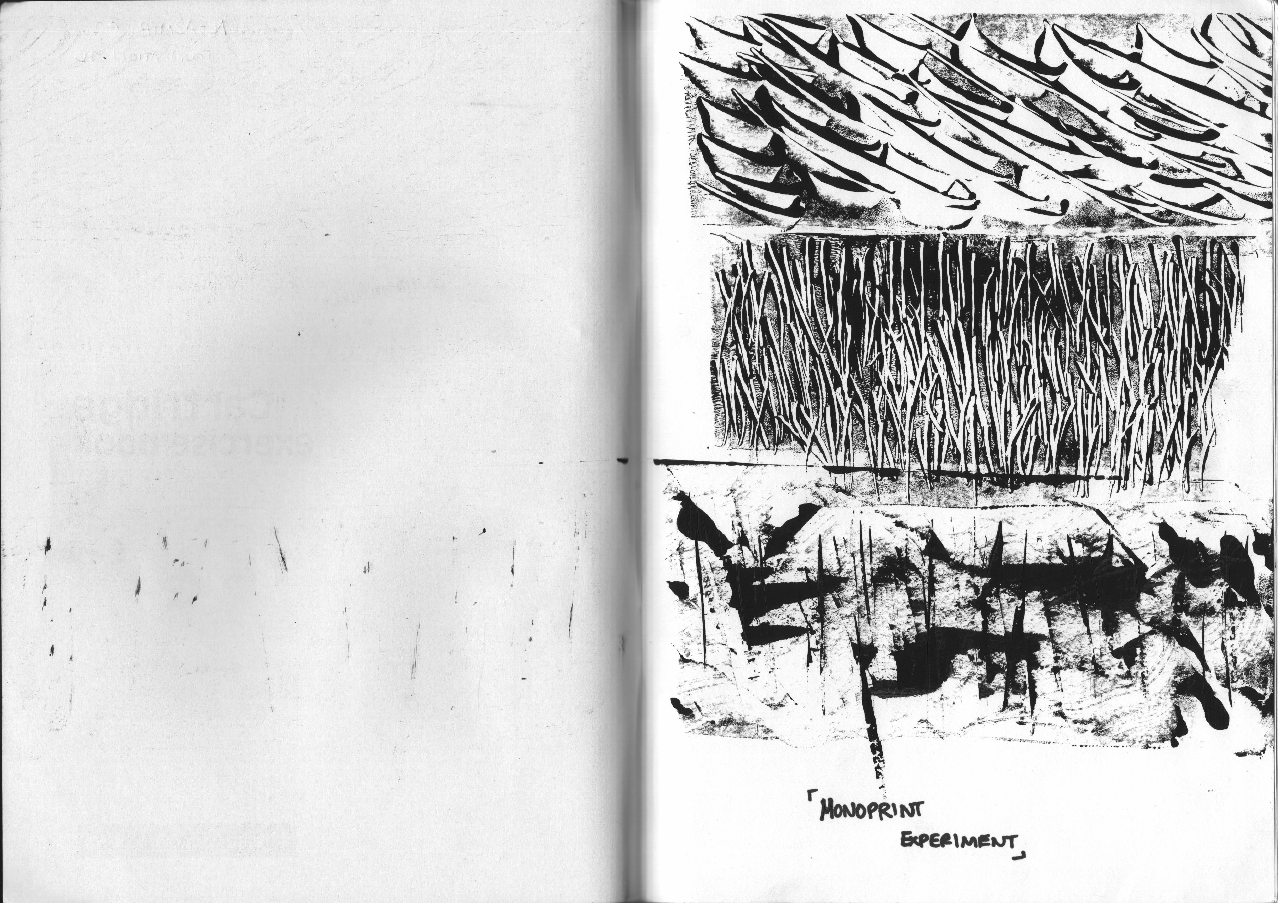
1) Spirit Of Adventure + Observant = Me
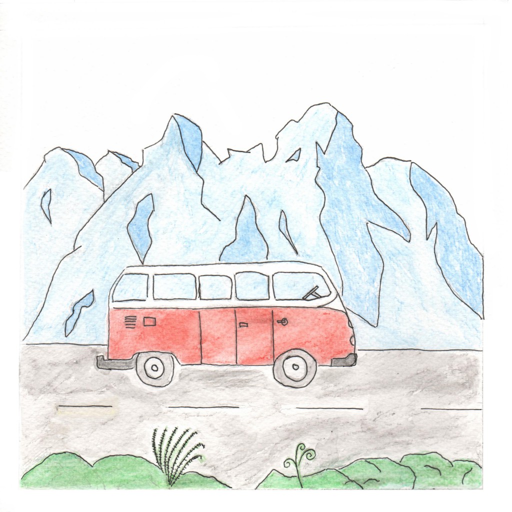
Spirit Of Adventure
Split Complementary
Main Colours: Red, Blue, Green
Explanation: The idea of going to different places with an adventurous mindset has always been something I really love doing. Taking on a different approach into going to different places allows me to explore and gives me a fuller experience. This whole experience of getting into a design school is a form of adventure on its own as I develop and discover myself to do greater things. The volkswagen in the image represents my idea of a roadtrip adventure with a couple of friends driving through ridges and ridges of mountains.

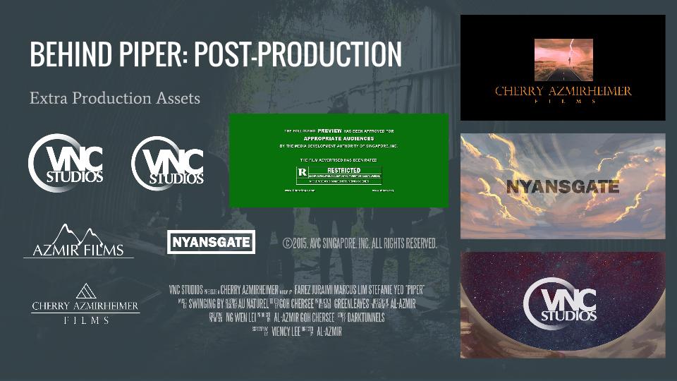
Observant
Triad Harmony
Main Colours: Orange, Green, Purple
Explanation: Being observant has always been a trait of mine since I was young. I’ve always been aware of the things around me as well as the people around me. Like noticing what they wear, what they are doing and even some of the littlest details that is often overlooked by other people. I’m a quiet person by nature, so for me naturally, listening to people and taking in what they say is a common practice for me. The gift of sight is a wondrous thing and we often take it for granted. I used the binoculars as a symbol to being observant and it is more of an exaggerated form to show i’m looking around and people-watching.
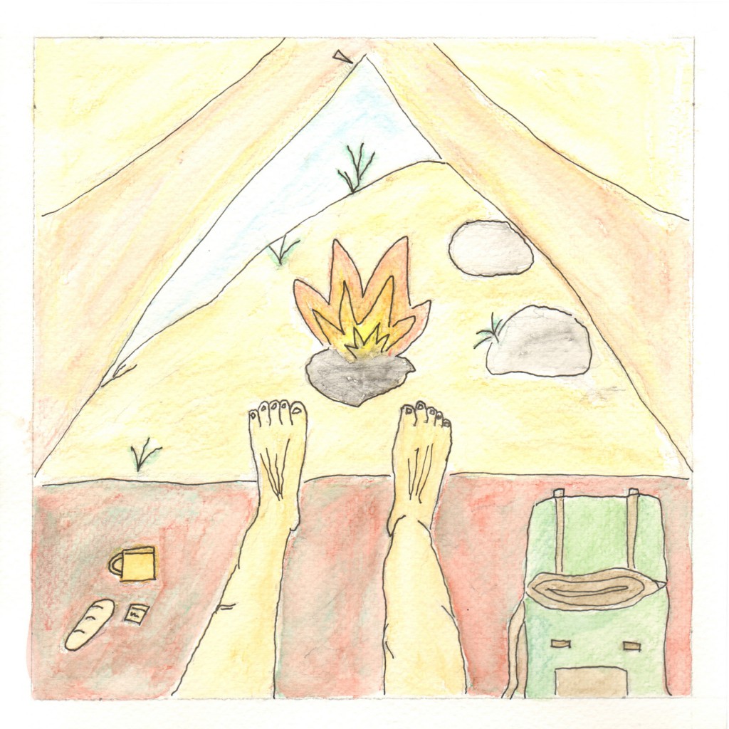
Me
Tetrad Harmony
Main Colours: Red, Orange, Green, Blue
Explanation: Spirit of adventure and being observant combines to form the ‘Me’ equation. This picture shows me being in a tent, using my visual senses to embrace the sights and sounds around me without any form of technology. I used slightly warmer colours to emphasise on a more natural atmosphere.
2) Courage – Hesitation = A Better Me
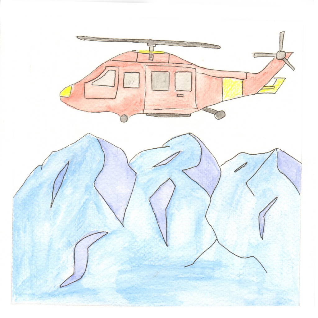
Courage
Triad Harmony
Main Colours: Blue, Red, Yellow
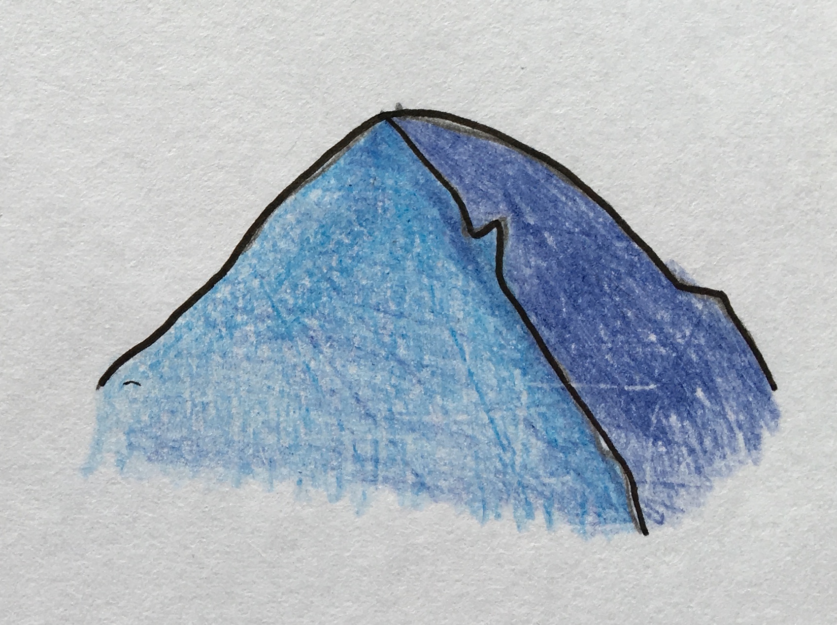
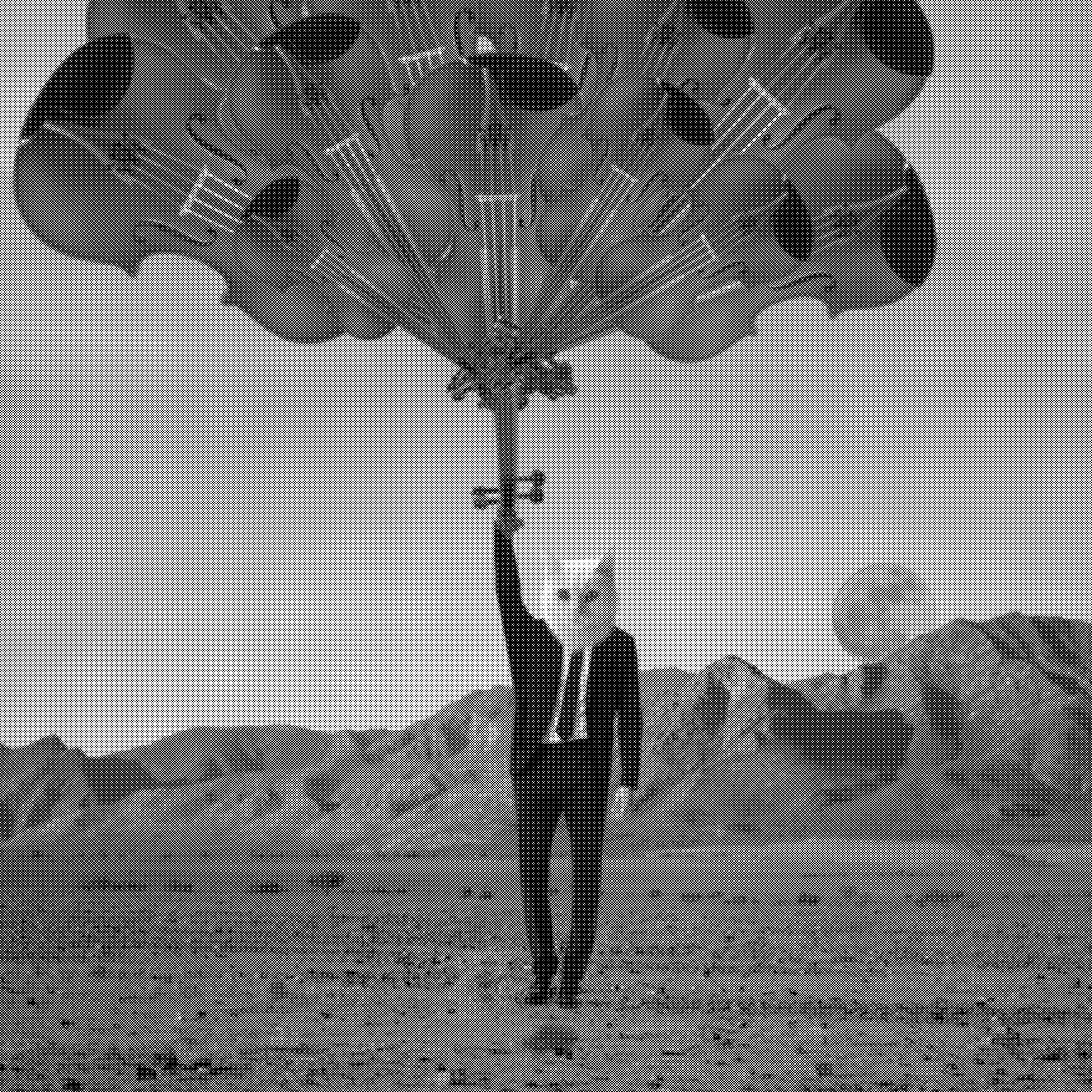
Explanation: Being courageous is something I wish I was better at when it comes to deciding on life decisions. I’ve always wanted to try parachuting off a helicopter. It is one of my life goals to achieve such a feat. For this picture, I made an establishing shot where the helicopter is flying above the mountains, showing a sense of height and showing a breathtaking view. I used red for the helicopter to give a strong contrast from the icy blue mountains below and it will direct your eyes straight to the helicopter first.
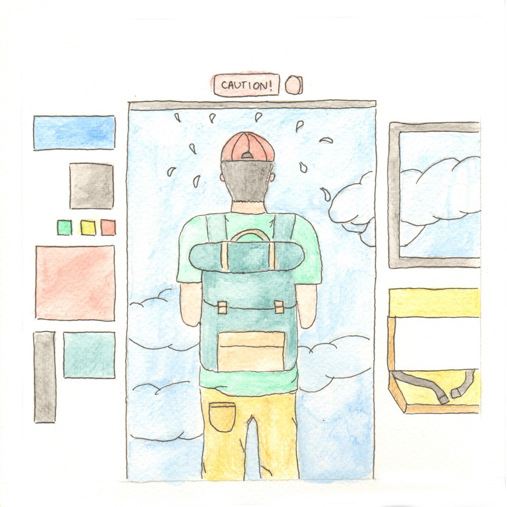
Hesitation
Tetrad Harmony
Main Colours: Blue, Green, Orange, Red
Explanation: Hesitation is the restriction that stops me from being courageous. I always hesitate and think of the possible scenarios that could happen if I say yes or if I say no. I like to think of the benefits that it brings to making a certain decision or whether it is not advisable to do a particular thing. In the picture, I used 4 different colours, mainly green for most part of the things on my body and blue being the sky. It shows me hesitating whether to jump out of the helicopter.

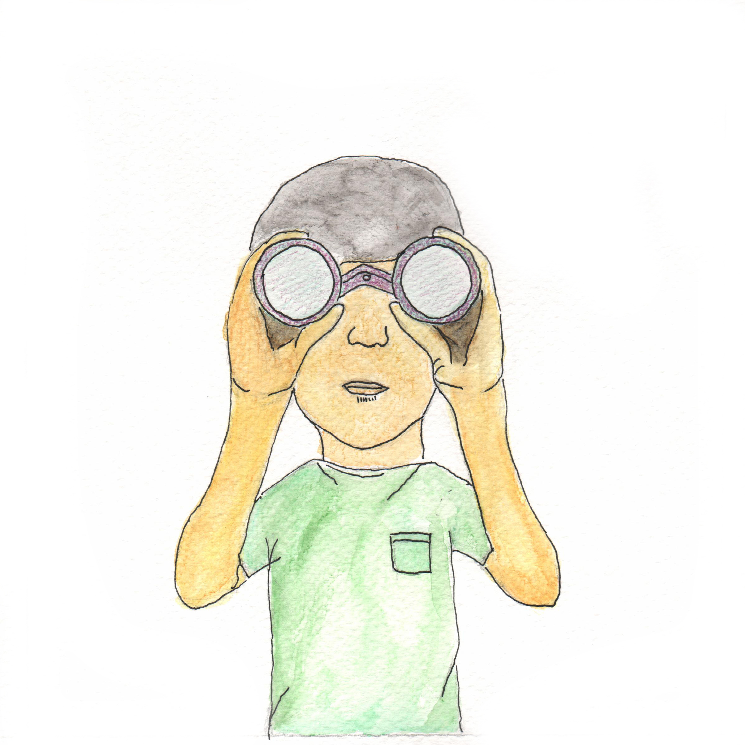
A Better Me
Split Complementary
Main colours: Blue, Red, Green
Explanation: Courage minus hesitation to form ‘A Better Me’. This picture shows me jumping out of the helicopter with a parachute deployed. It symbolises me stopping my hesitation to do things and telling myself to just do it and embrace whatever comes by. I used red to show contrast of the parachute with the blue sky.
3) Travel x Film = An Ideal Me
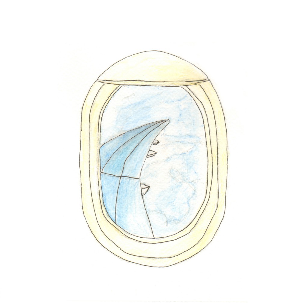
Travel
Analogous (3)
Main colours: Light Blue, Medium Blue, Dark Blue, Yellow
Explanation: Travel has always been my passion. I love the idea of going to places and exploring the culture and experiencing something out of my own comfort zone. In addition, I like meeting people from different parts of the world and getting to know them in depth, learning about their stories and just realising that other people might not be as fortunate as we are. This picture shows my perspective of being in an airplane seat, looking out of the window. I used mainly blue hues to show the clouds and the blue sky bouncing off the wing of the plane.
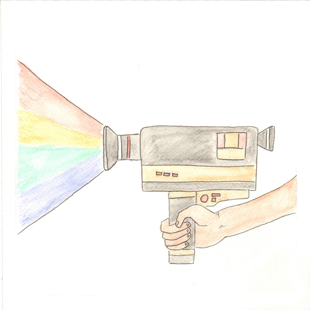
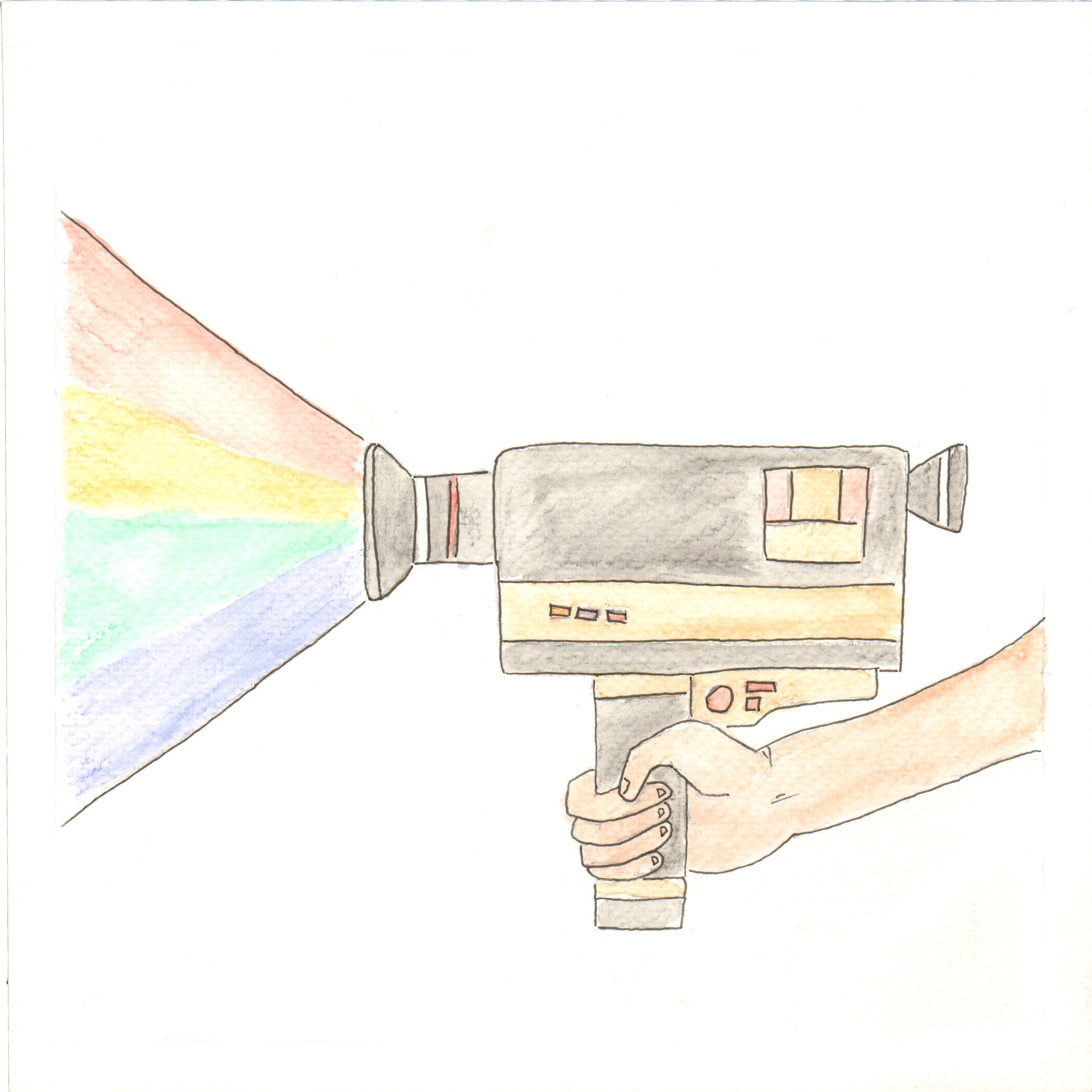
Film
Tetrad Harmony
Main Colours: Red, Orange, Green, Blue
Explanation: Aside from travelling, film is my next passion. I like to document my adventures through different countries and places, putting it together and sharing it with people. Film allows me to look back at my documentation of a place in the future and remembering all the good times I had at that particular place. It is just something I enjoy doing, the whole process of capturing a priceless moment in time. The video camera I used in the picture is a Super8 film camera, a traditional format that is rarely used in today’s time. It shows me holding the camera in one hand and the red, orange, green and blue hues forms a spectrum out of the video camera.
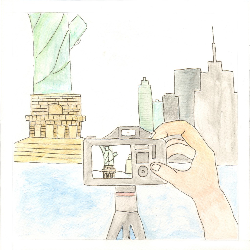
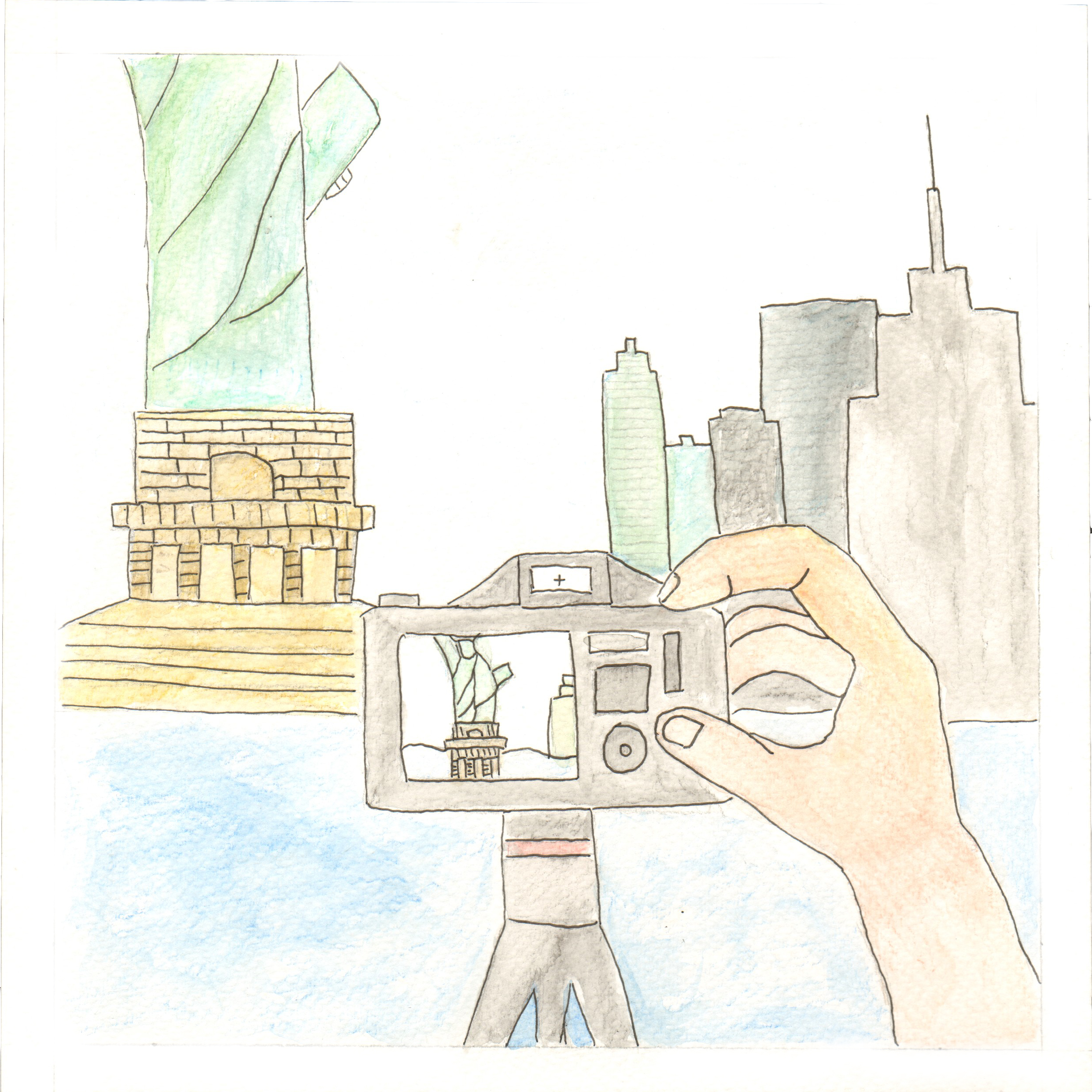
An Ideal Me
Analogous (5)
Main Colours: Blue, Yellow Green, Green, Orange , Yellow
Travel x Film forms ‘An Ideal Me’. This has always been my ideal path in life in the future. Being able to travel and getting paid to do it in the form of doing videography is a dream that i’m working towards. The picture shows me taking a video of the statue of liberty. I used mainly blue and green hues to achieve the visuals that is more pleasing to the eyes.
4) Stable Job + ‘Me’ Time = Me In Five Years

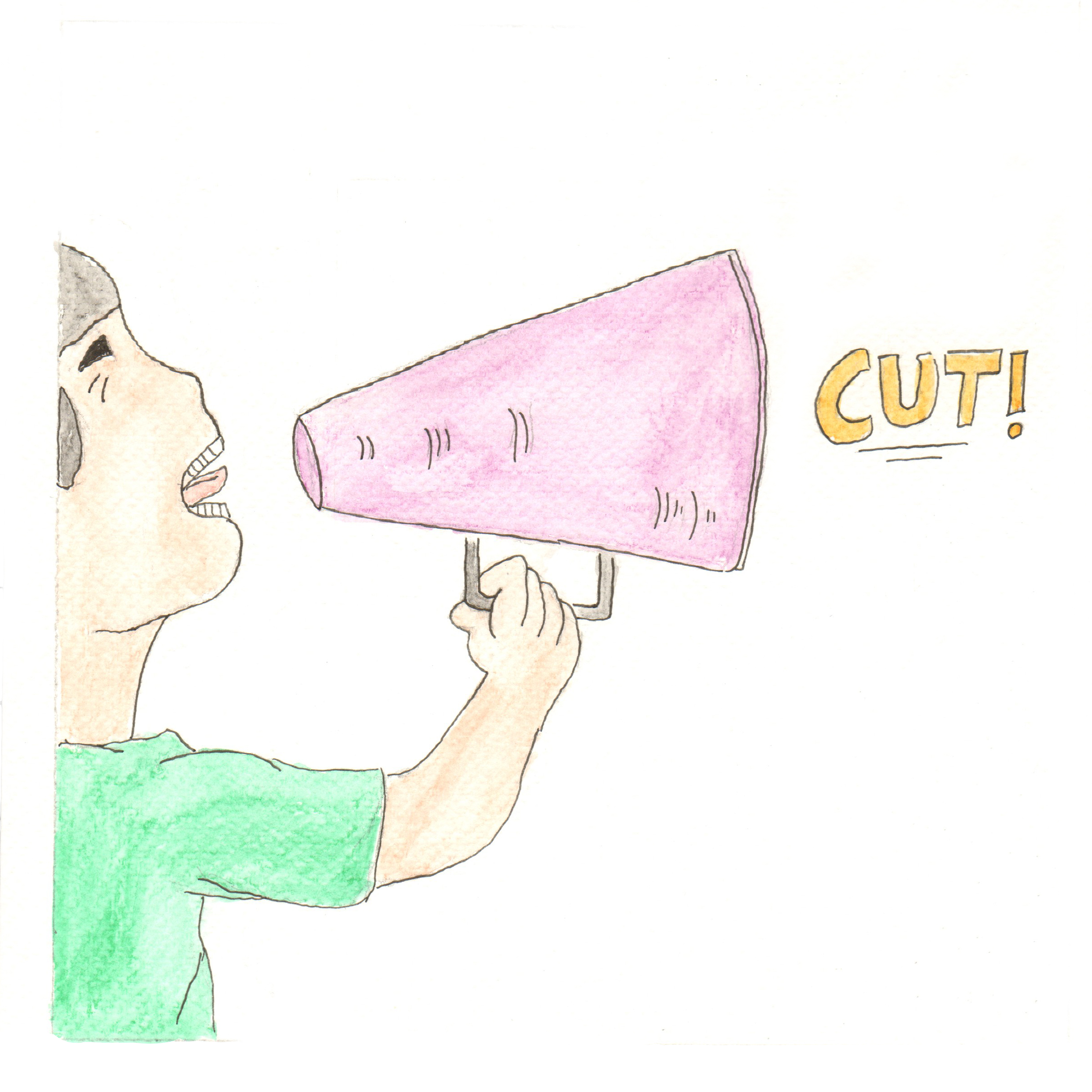
Stable Job
Triad Harmony
Main Colours: Purple, Green, Orange
Explanation: A stable job is something that everyone yearns for. A stable job would mean a stable life, with lesser worries of income issues. I put myself as a director in this picture, with me shouting ‘CUT!’ to symbolise something I would want to pursue, being a director for a movie and pursuing my passion for film.
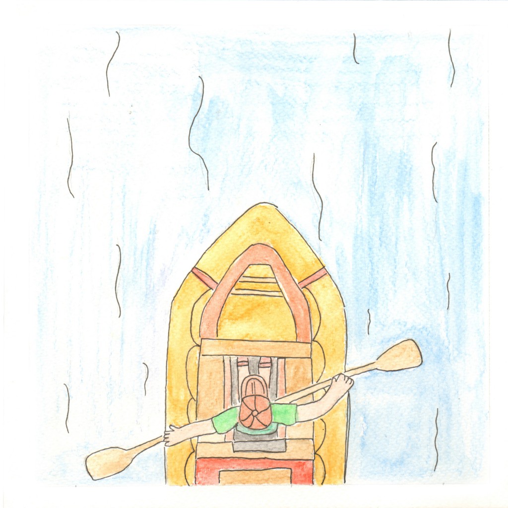
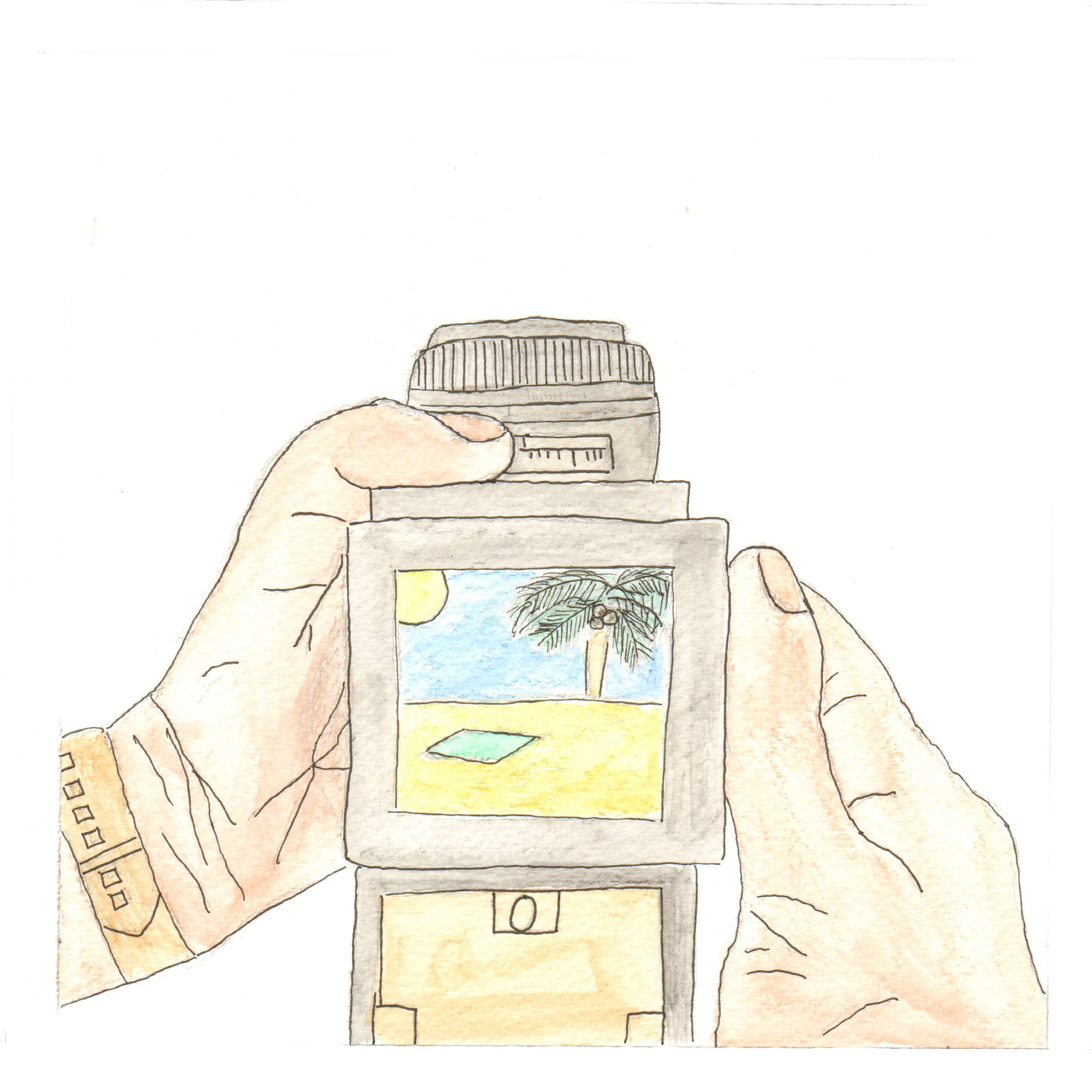
‘Me’ Time
Tetrad Harmony
Main Colours: Orange, Blue, Red, Green
Explanation: Apart from wanting a stable job, I also yearn for some ‘Me’ time, meaning to have time to do my own things without any form of commitments or boundaries. In the picture, I used mainly orange as a strong contrast to the blue waters to direct the attention towards the canoe. The whole picture symbolises me going through a carefree life, without anything to worry and drifting through life as it moves on, just like the canoe drifting with the water current.

Me In Five Years
Analogous (5)
Main Colours: Orange, Yellow, Yellow Green, Green, Blue
Explanation: Having a stable job plus having ‘me’ time forms ‘Me in five years’. I would want a mix of both having a dedicated job at the same time not be too bogged down by work and having my own free time to pursue my other passions. The picture symbolises me doing other passions apart from my job, like creating creative content to share with people.
Artists’ References
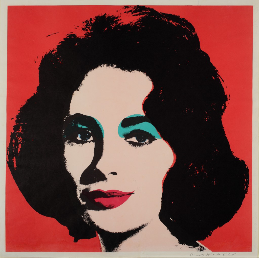
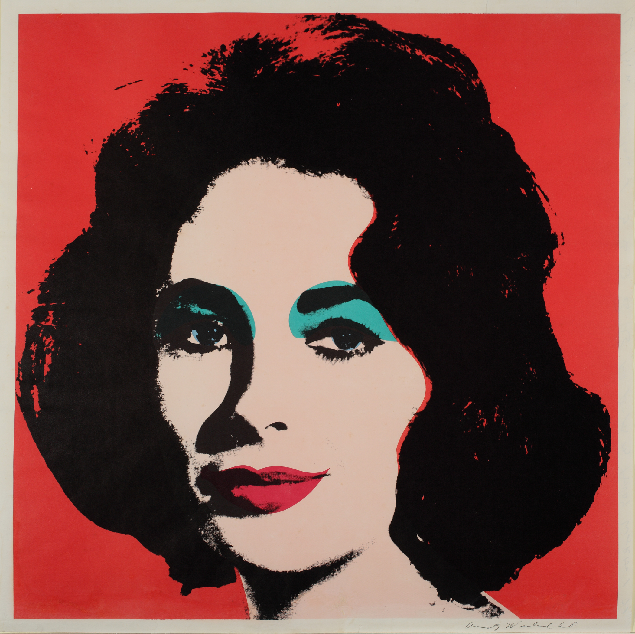
1) Andy Warhol
Illustrator Andy Warhol was one of the most prolific and popular artists of his time, using both avant-garde and highly commercial sensibilities. In the late 1950s, Warhol began devoting more attention to painting, and in 1961, he debuted the concept of “pop art”—paintings that focused on mass-produced commercial goods. In 1962, he exhibited the now-iconic paintings of Campbell’s soup cans. These small canvas works of everyday consumer products created a major stir in the art world, bringing both Warhol and pop art into the national spotlight for the first time.

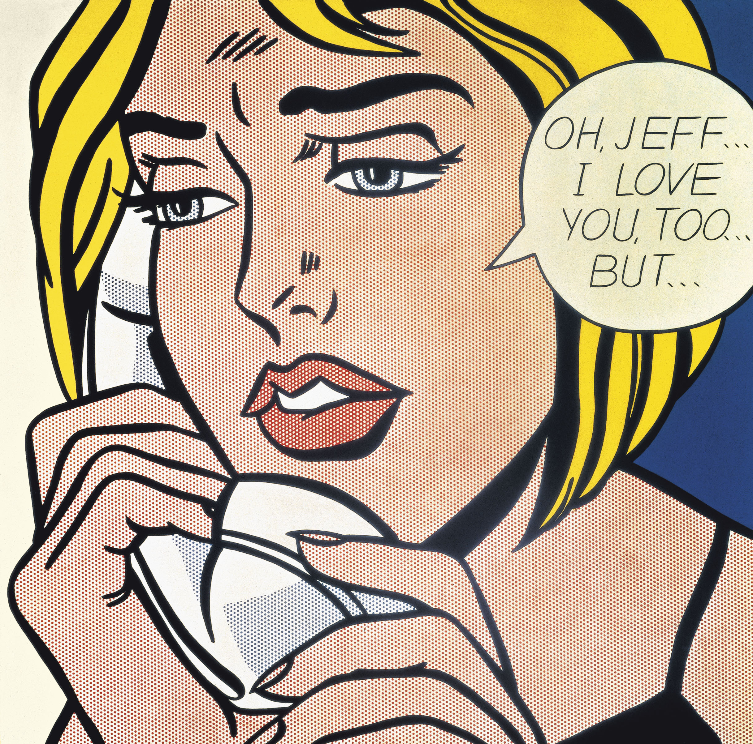
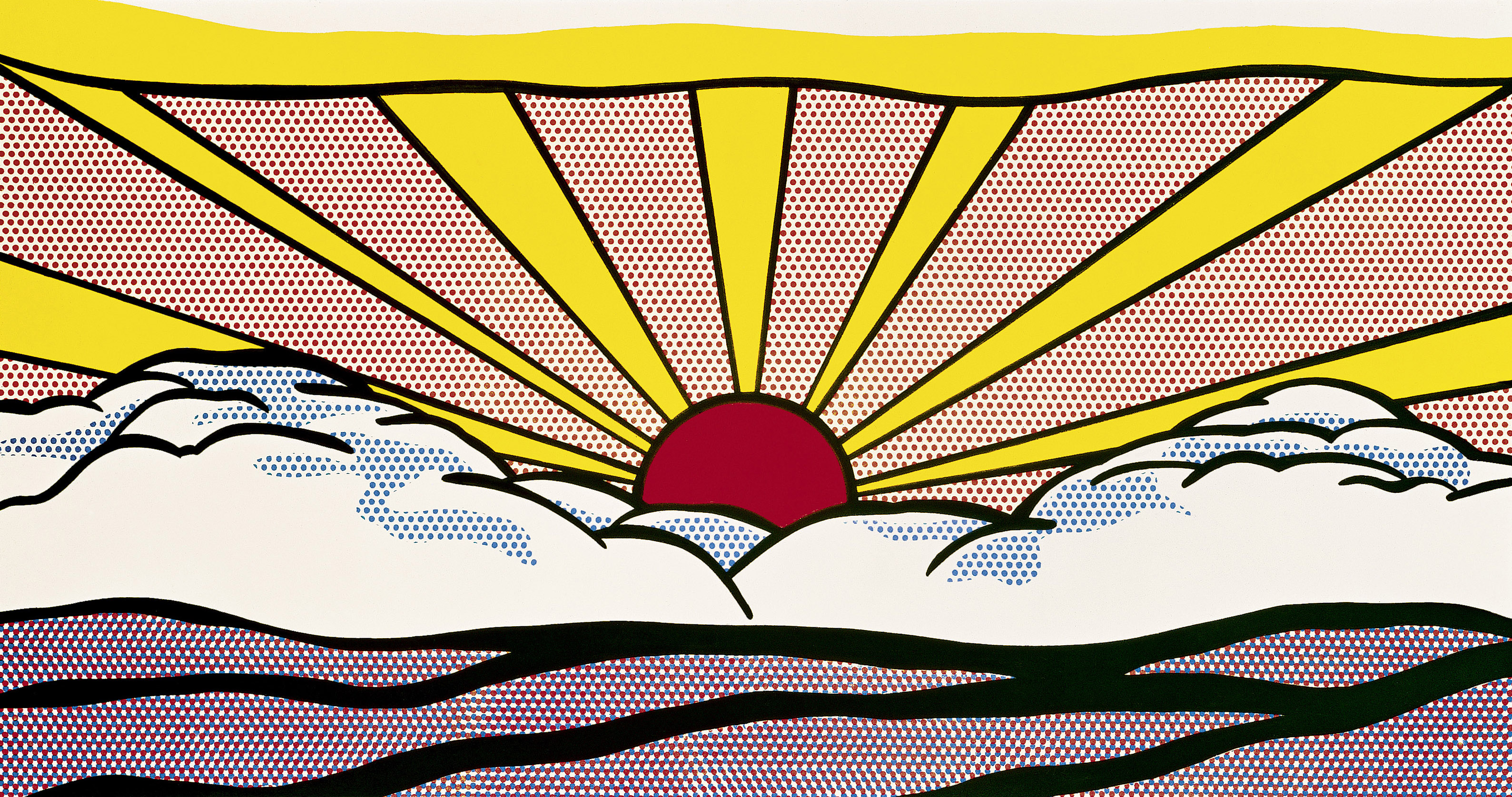
2) Roy Lichtenstein
Roy Fox Lichtenstein was an American pop artist. During the 1960s, along with Andy Warhol, Jasper Johns, and James Rosenquist among others, he became a leading figure in the new art movement. His work defined the basic premise of pop art through parody. Favoring the comic strips, his main inspiration, Lichtenstein produced hard-edged, precise compositions that documented while it parodied often in a tongue-in-cheek manner.


.jpg)
.jpg)
.jpg)