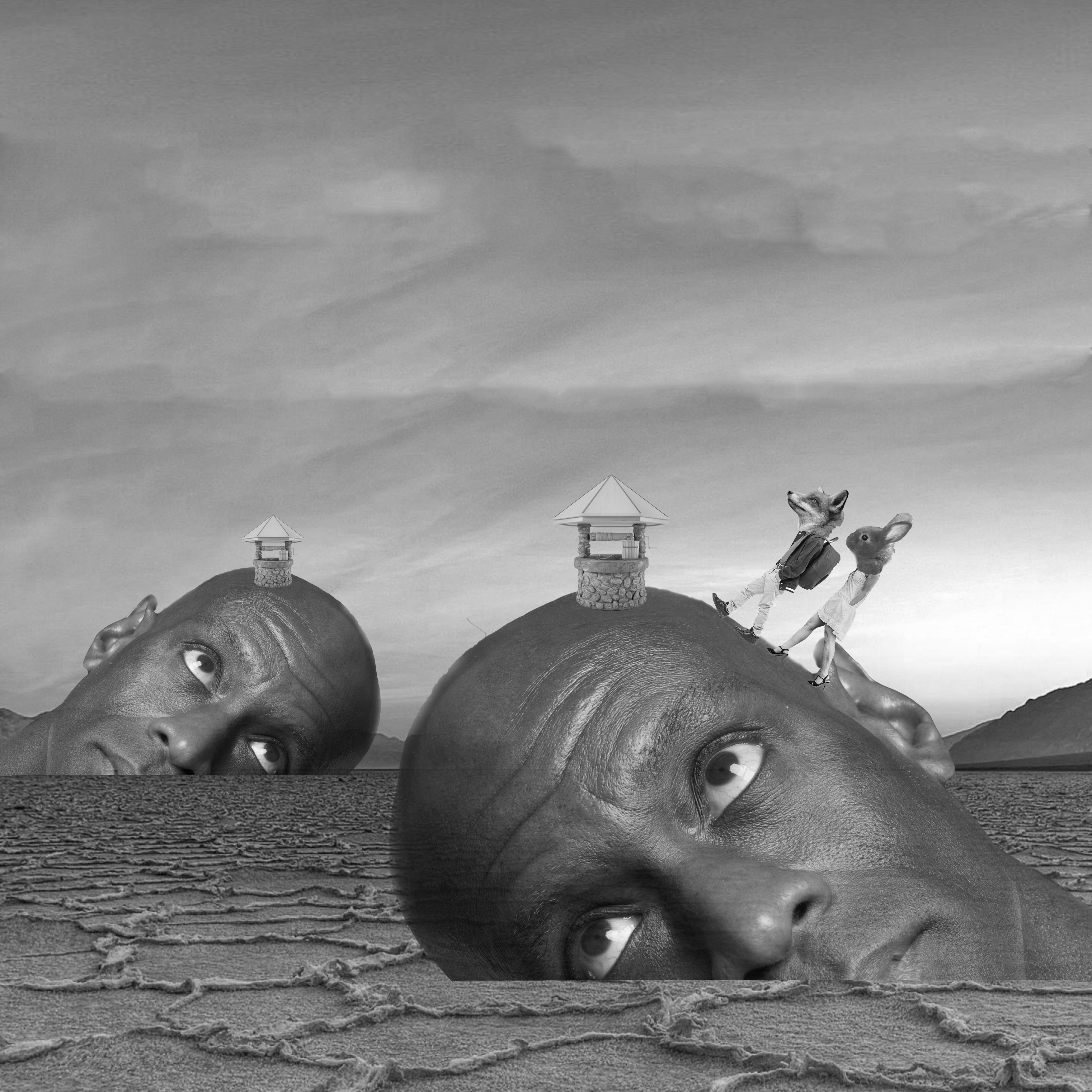
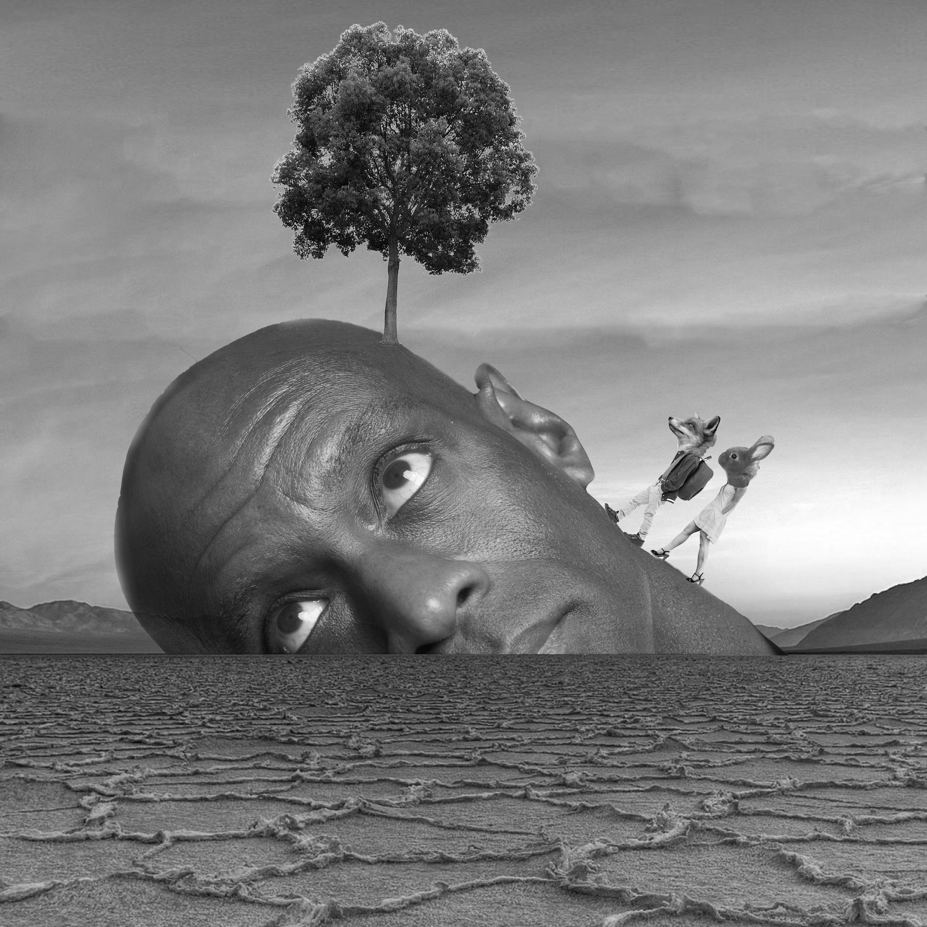
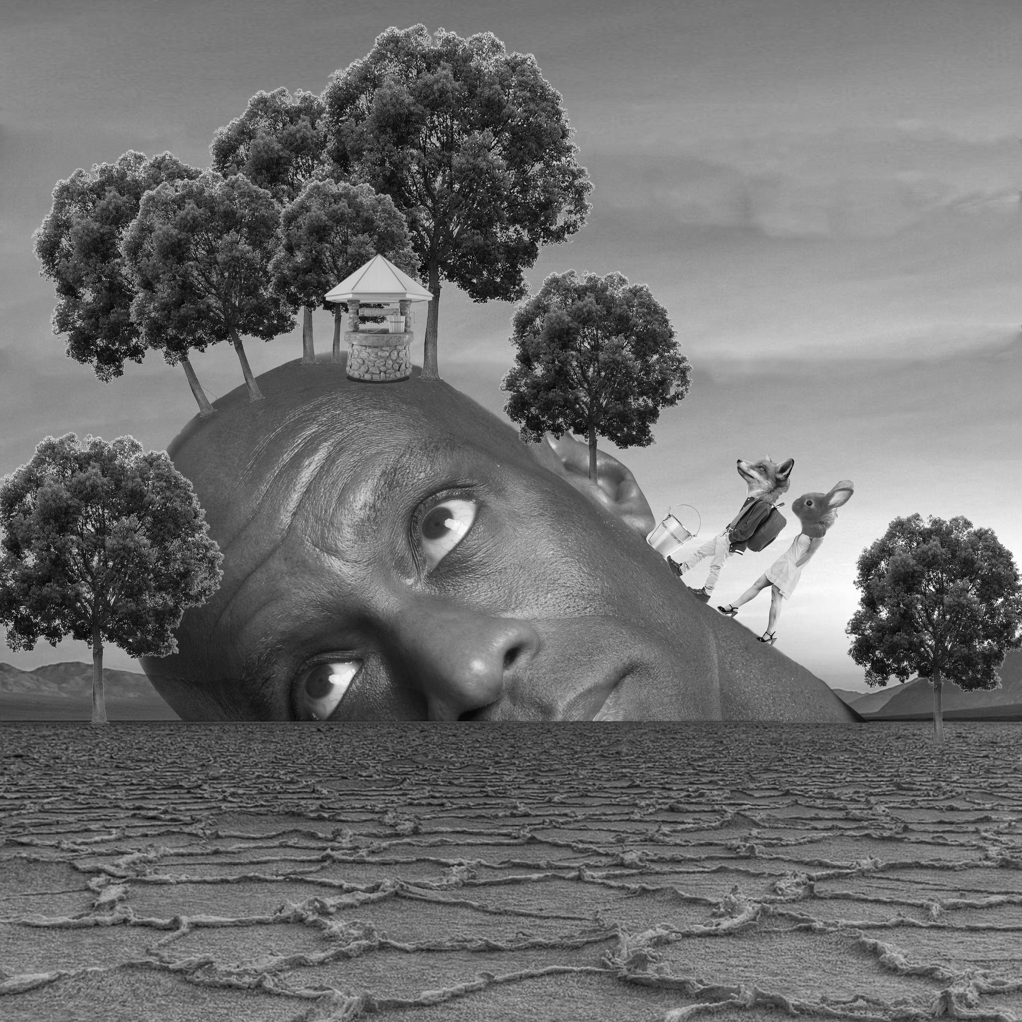
This is the behind the scenes of my final product for Project 1! If you’ll like to check it out, click HERE!
Adventure Seeker
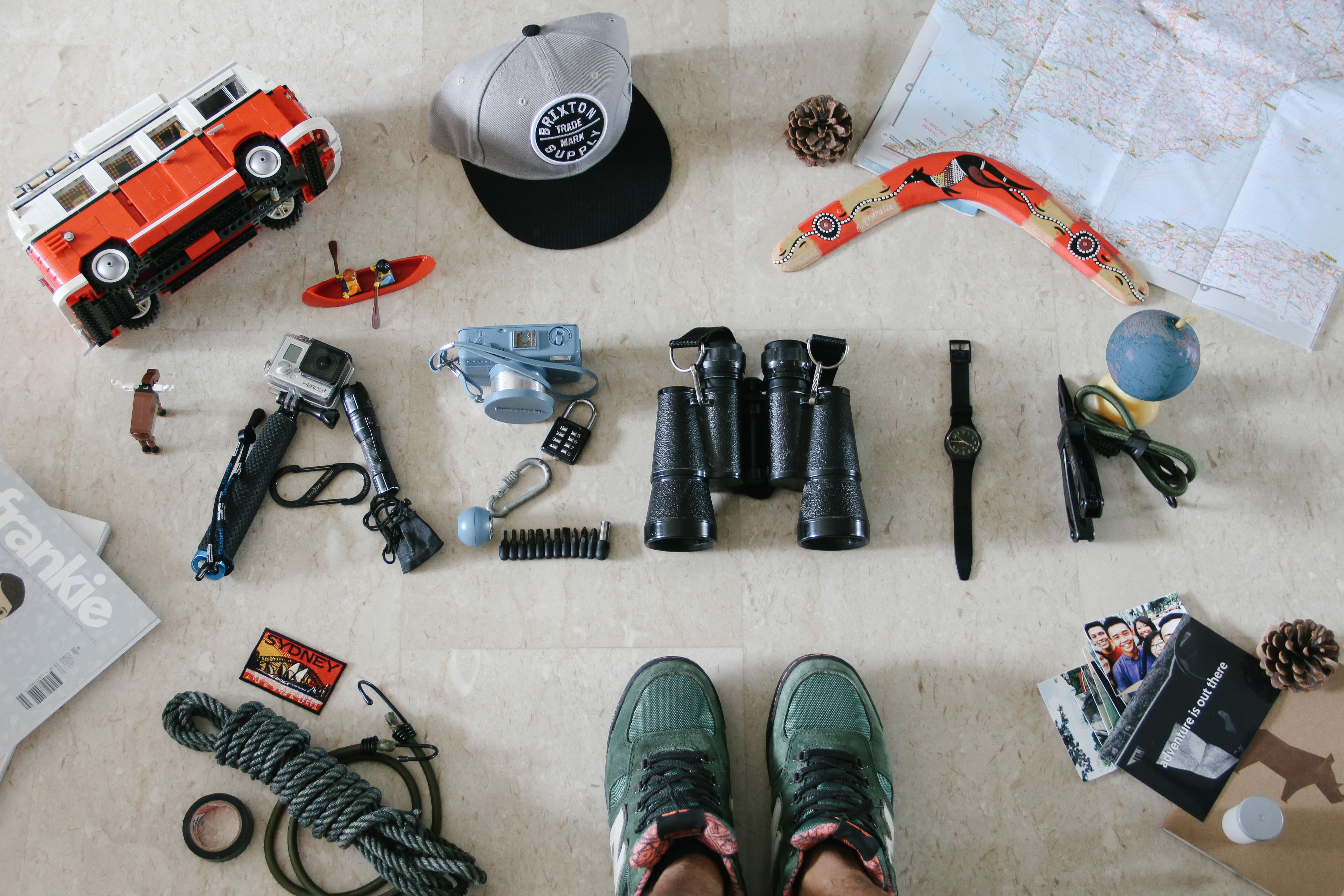
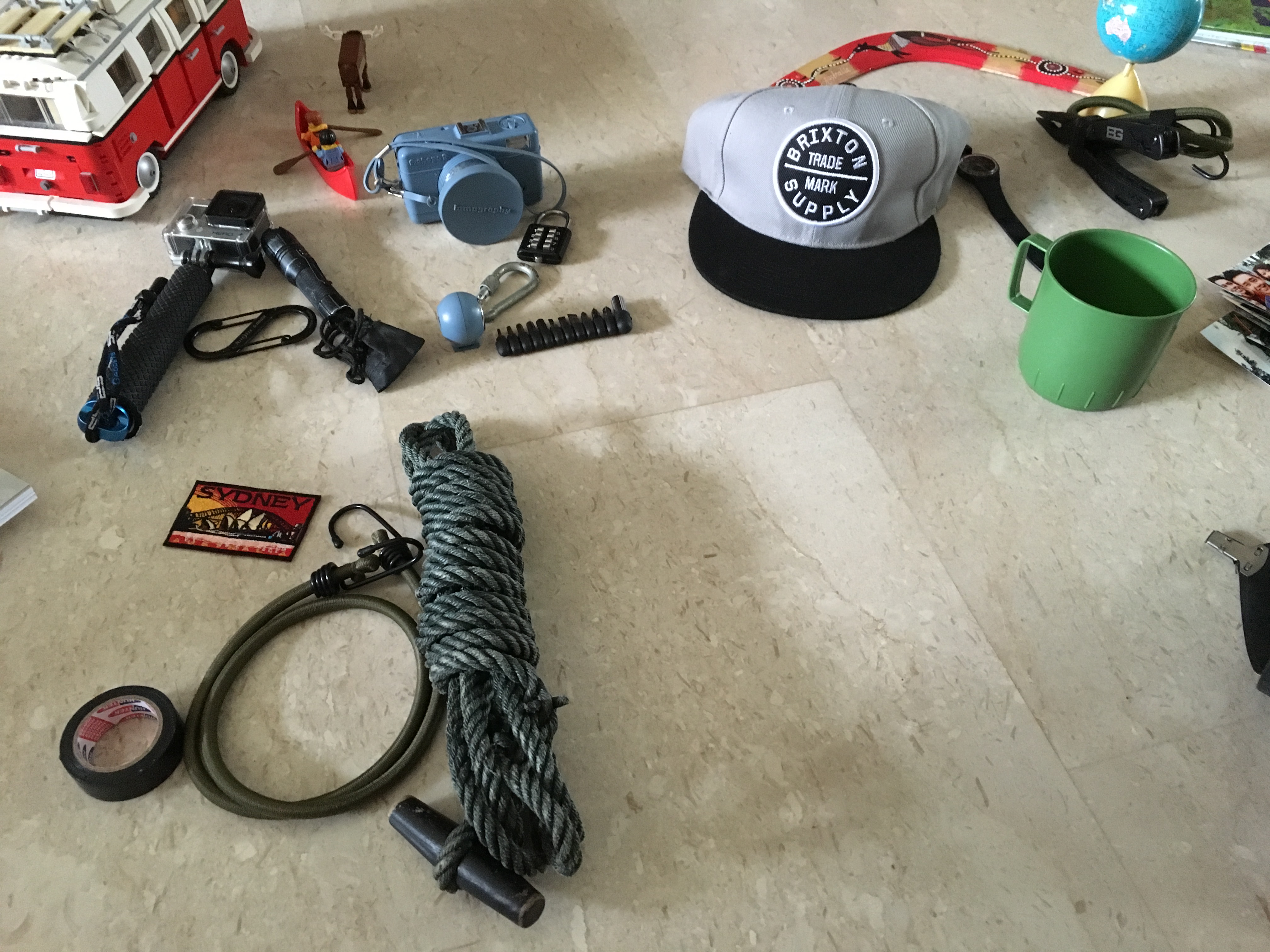
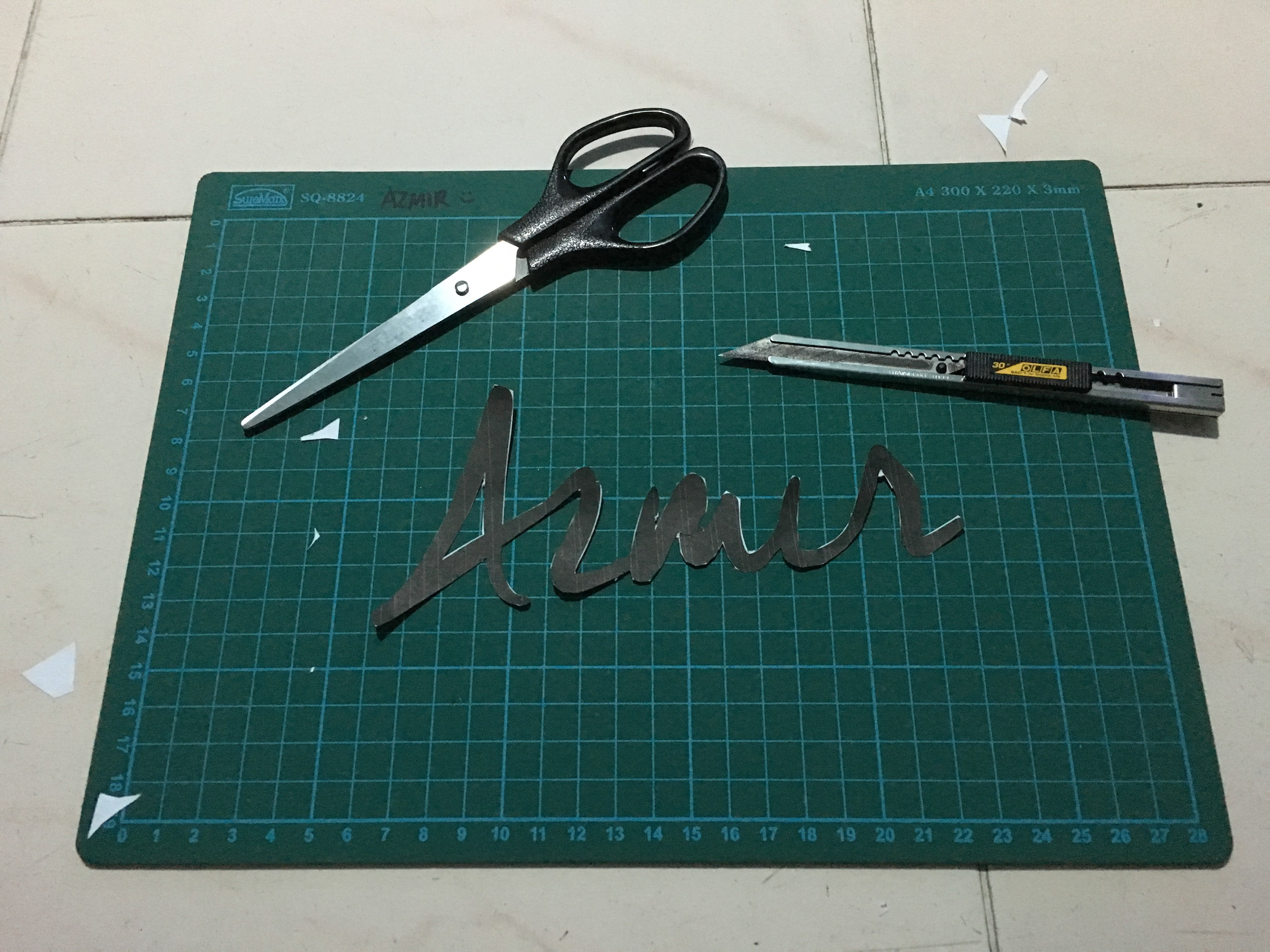
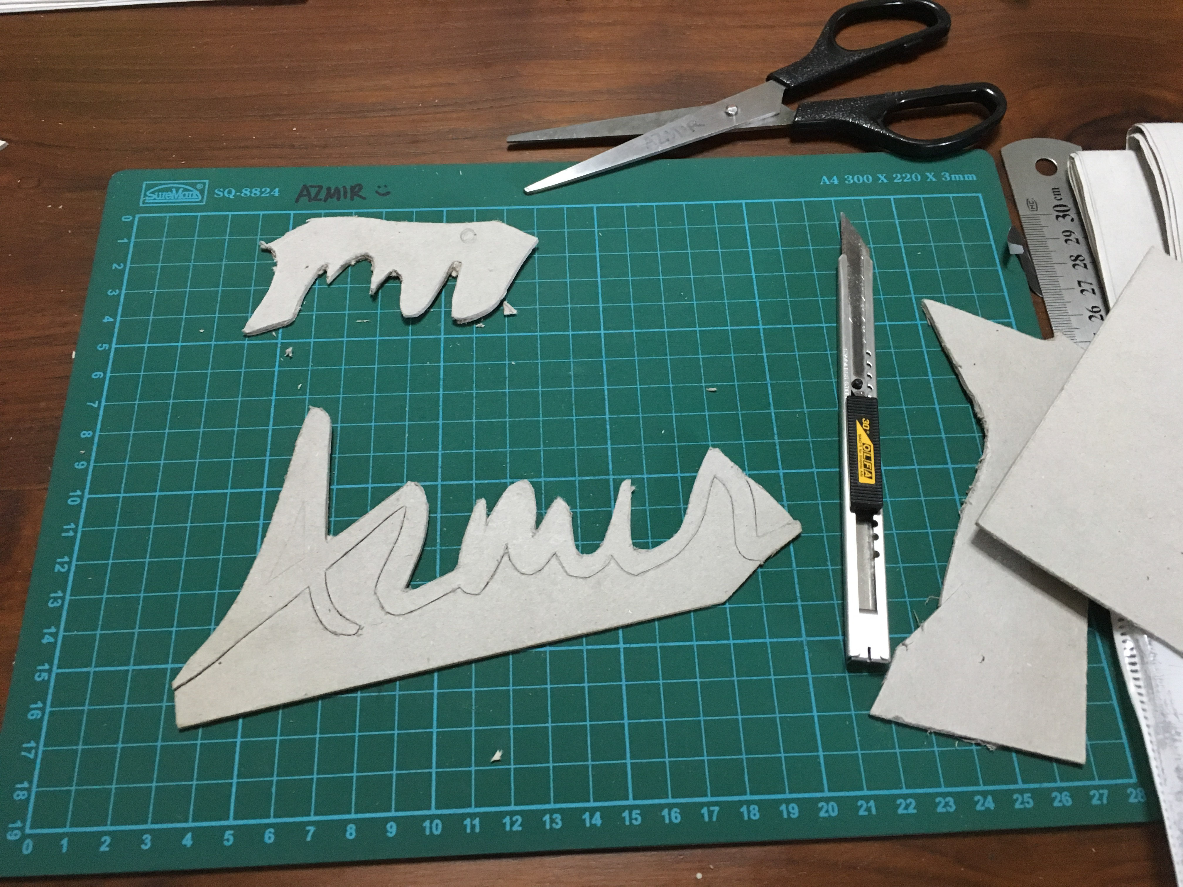
For this piece, I had to go around the house finding objects and items that meant ‘adventure’ to me. Initially, I wanted to play around with the idea of negative space which was brought up by Daniel during the group consultation. However, after much consideration, I felt that the use of negative space would mean that I would have to find even more objects around the house and that was already a challenge to begin with. I decided to settle with my initial idea of using objects to make the typeface instead which require less work. Below are some the images that eventually led to the final output of this piece.
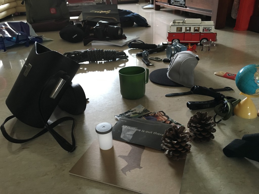
Setting the scene
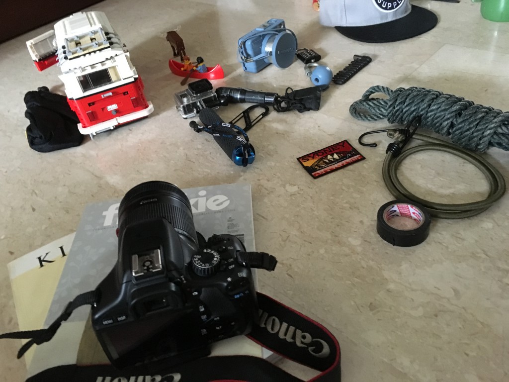
Making sure the items are placed properly
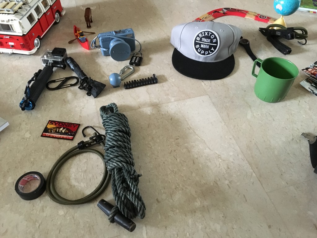
Side perspective of the scene
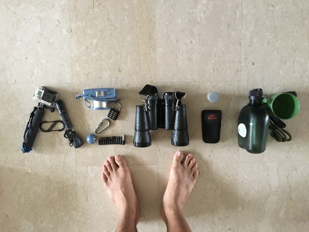
Test shot #1
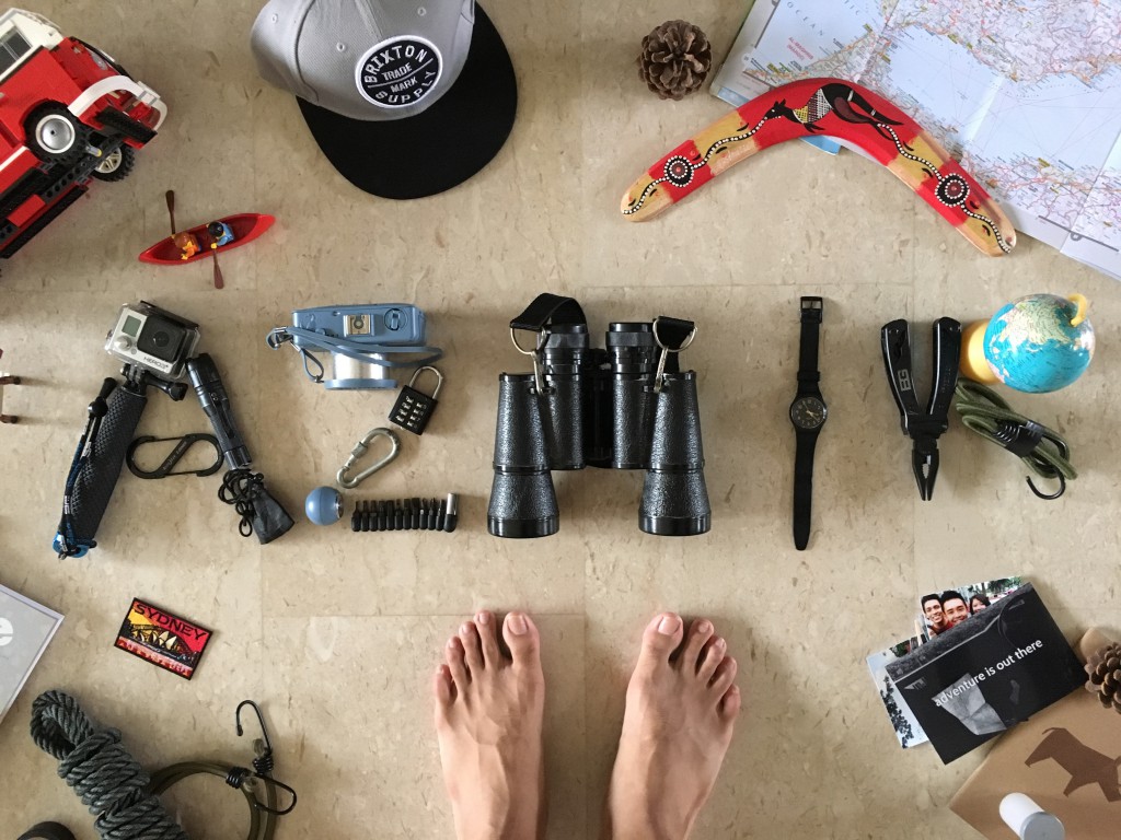
Test shot #2 (without shoes, tighter crop)
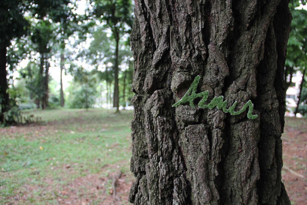
Tree Hugger
For this piece, there were a lot of hands-on work to be done prior to the execution.

Firstly, I browsed through the internet looking for a suitable font. This font is called ‘Cheddar Jack’, I typed it out on photoshop and printed it out to act as a template.
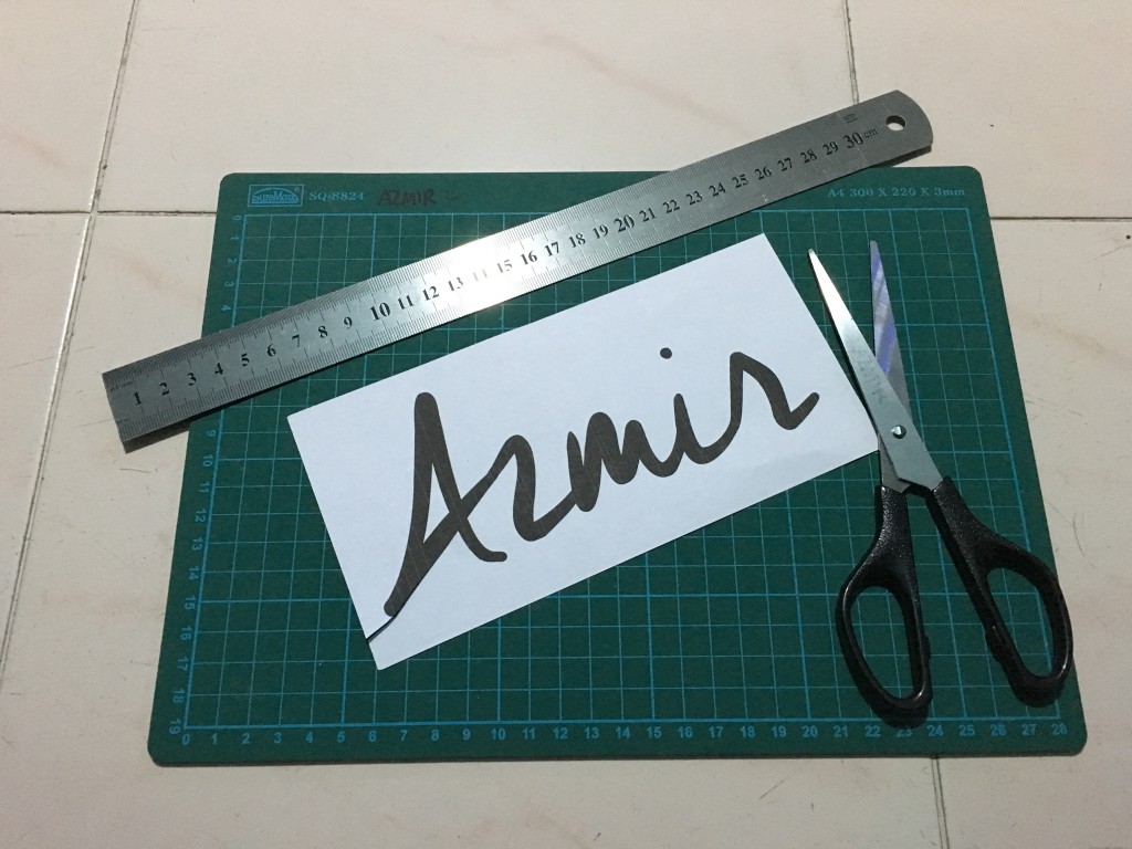
Once printed, I cut away all the white spaces to form my template.

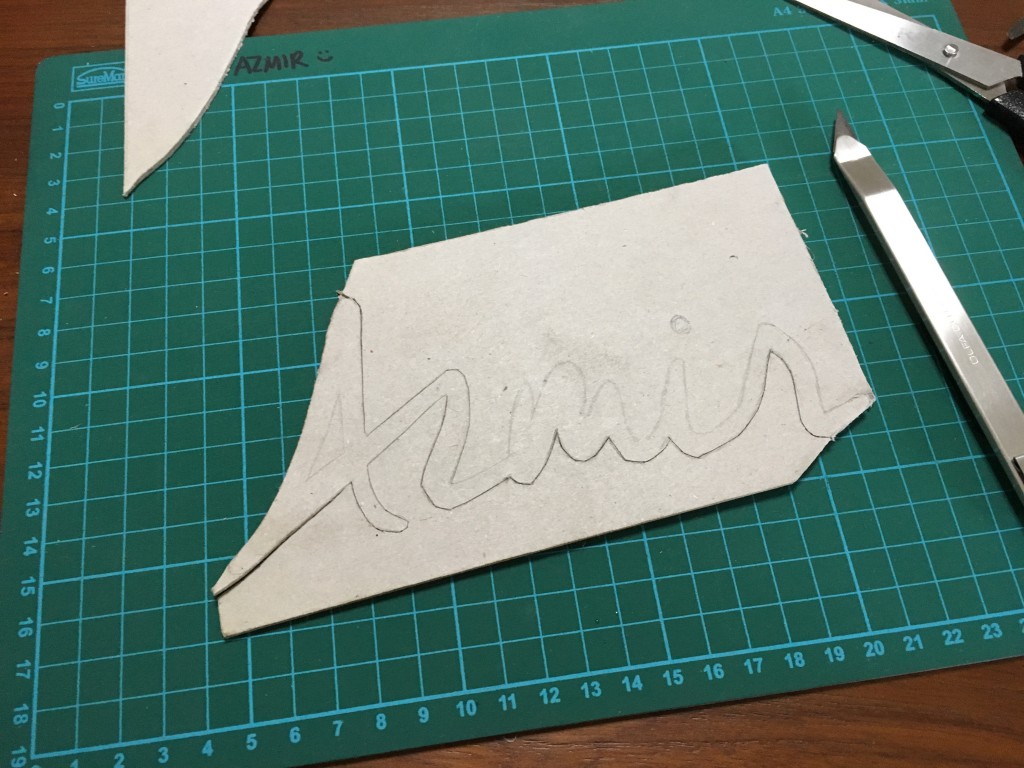
I laid the template over a piece of cardboard to create a much more sturdy template as compared to paper.

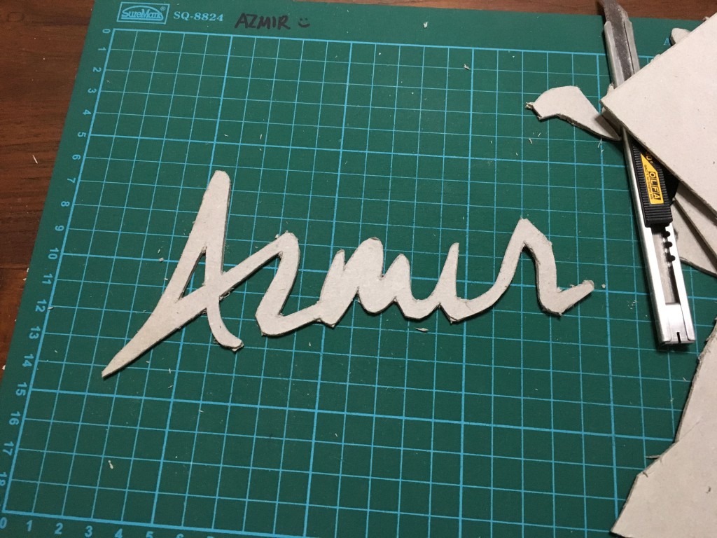
Just like in step 1, I cut the negative spaces out.

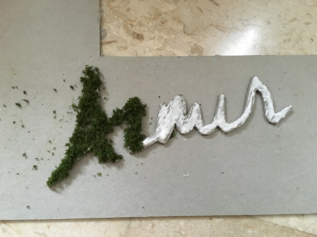
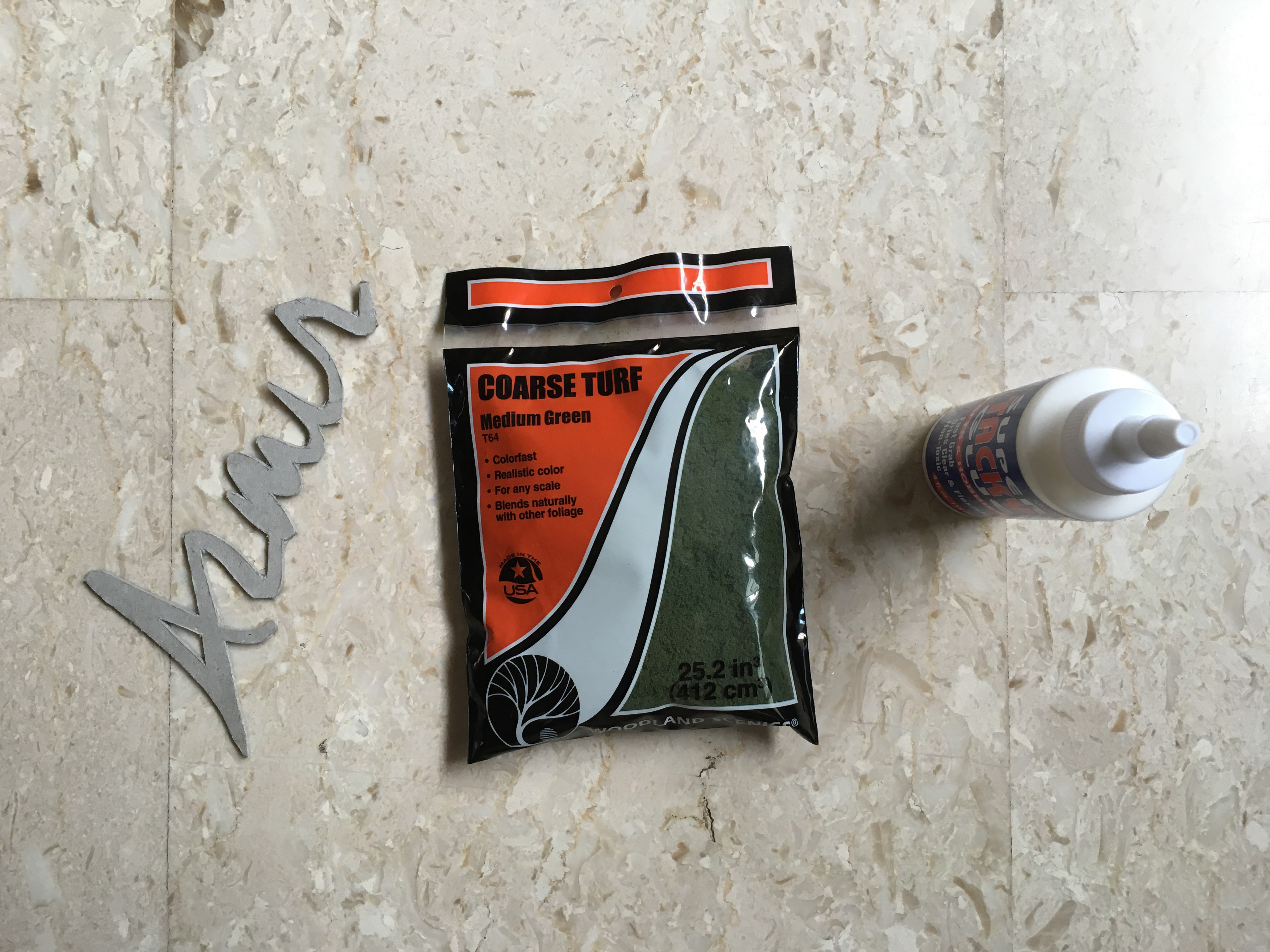
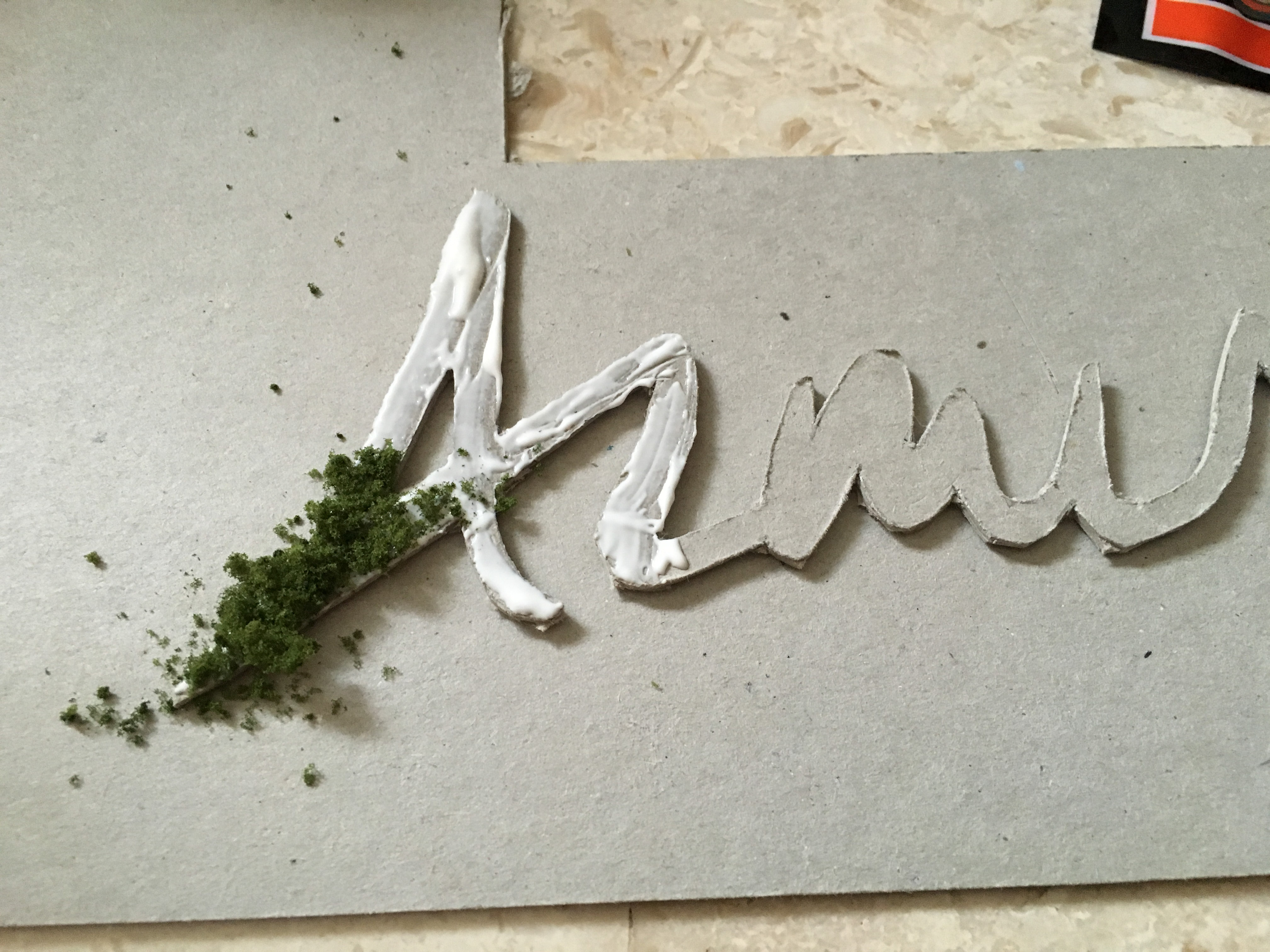
Materials for the next step

Next, I used PVA glue and sprinkle the moss over the top.
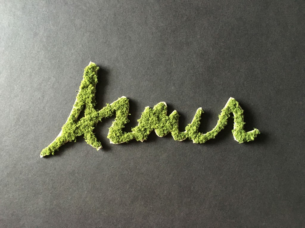
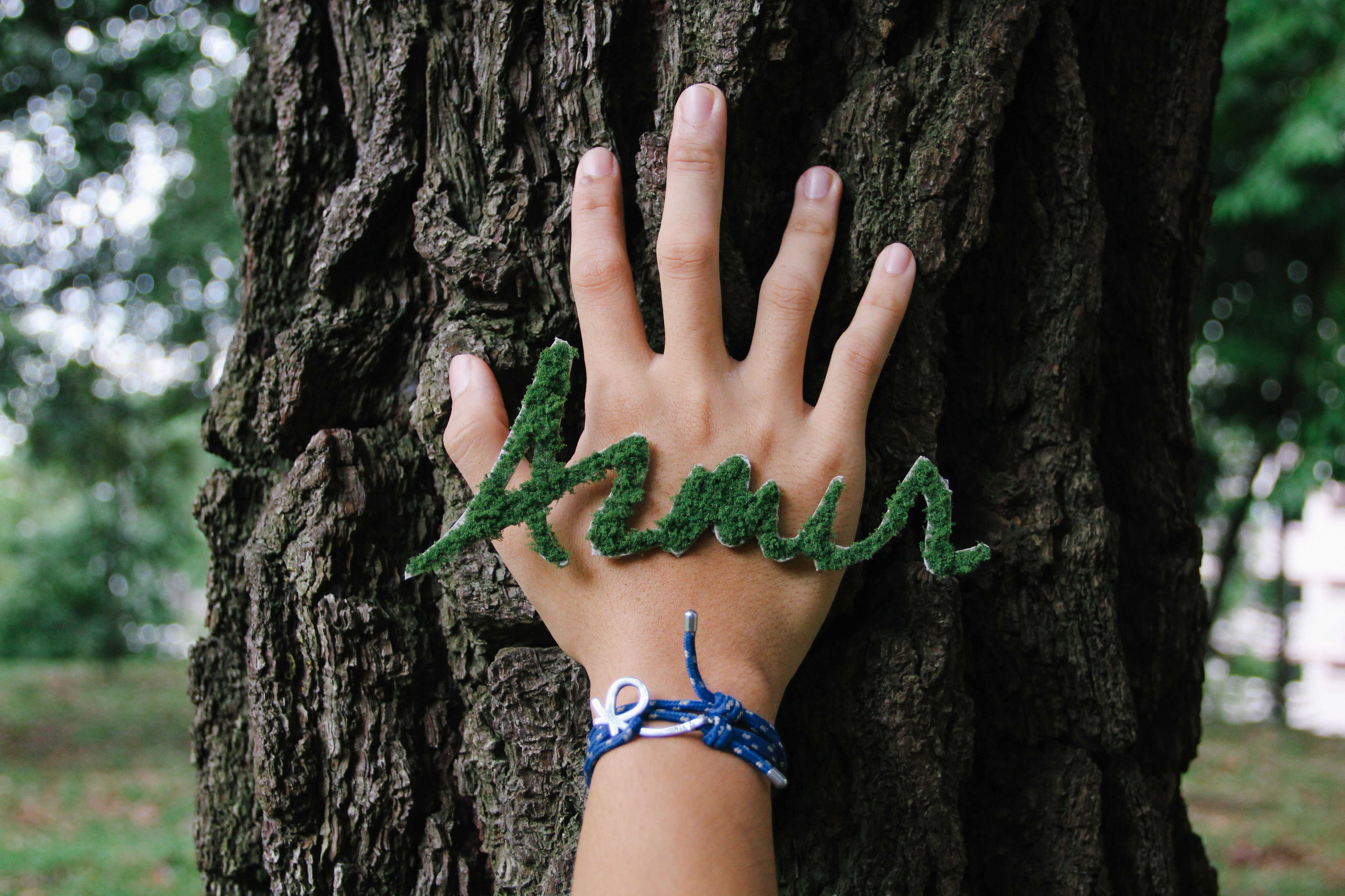
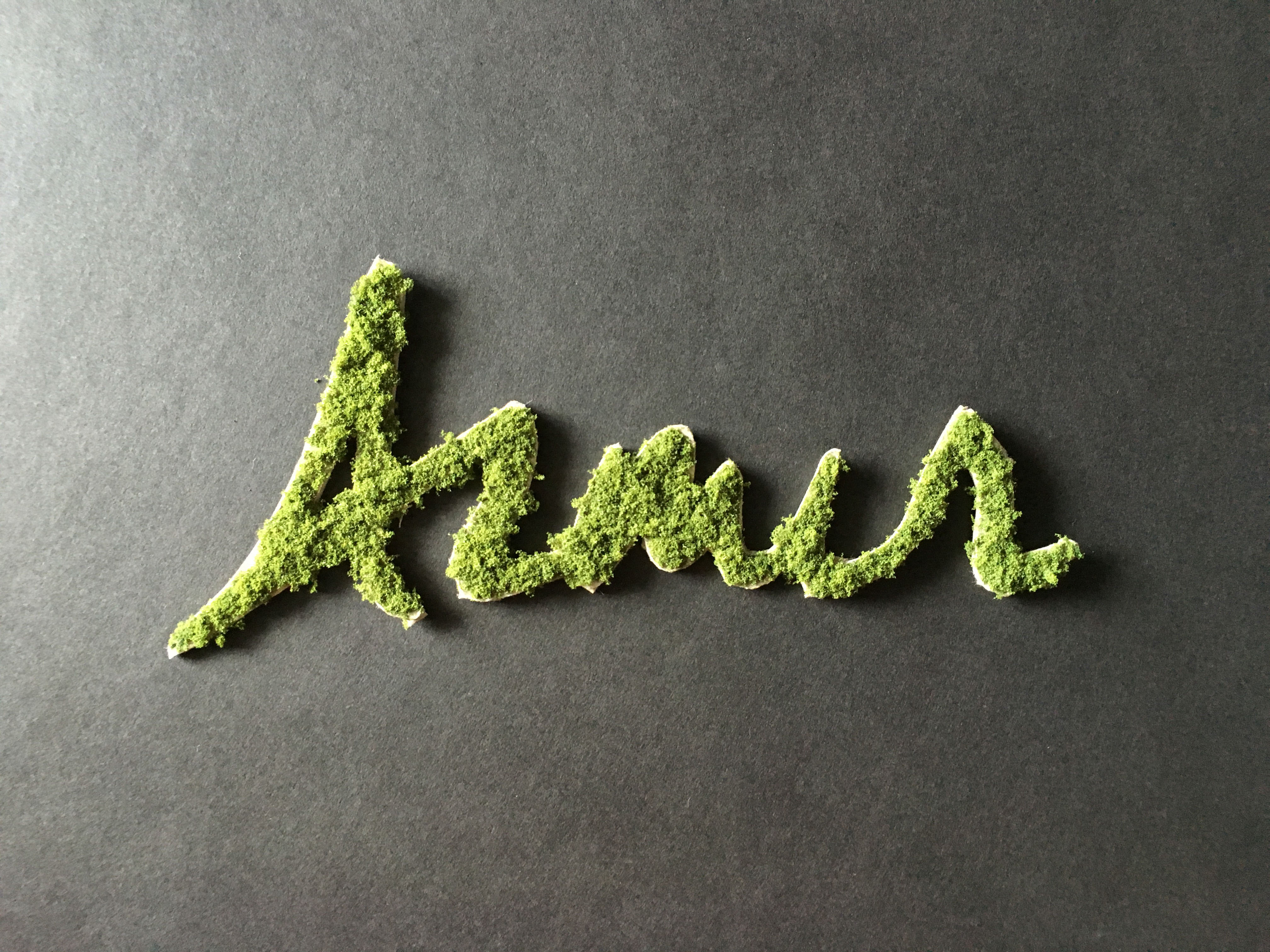
Completed product
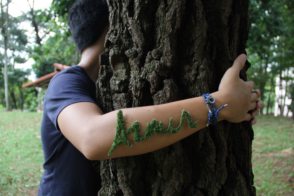
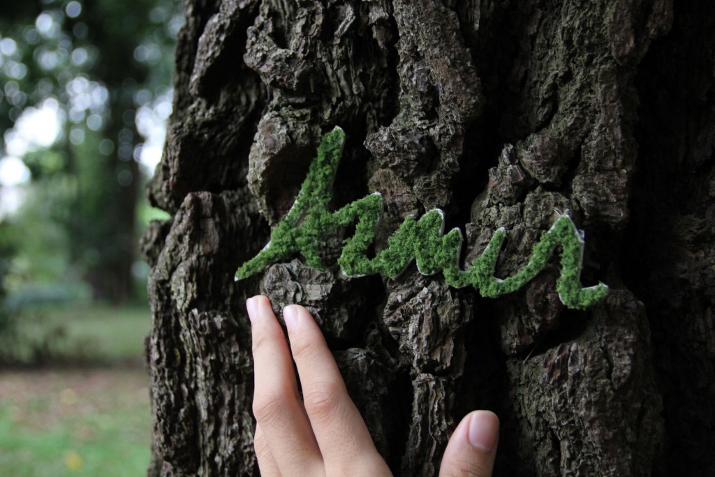
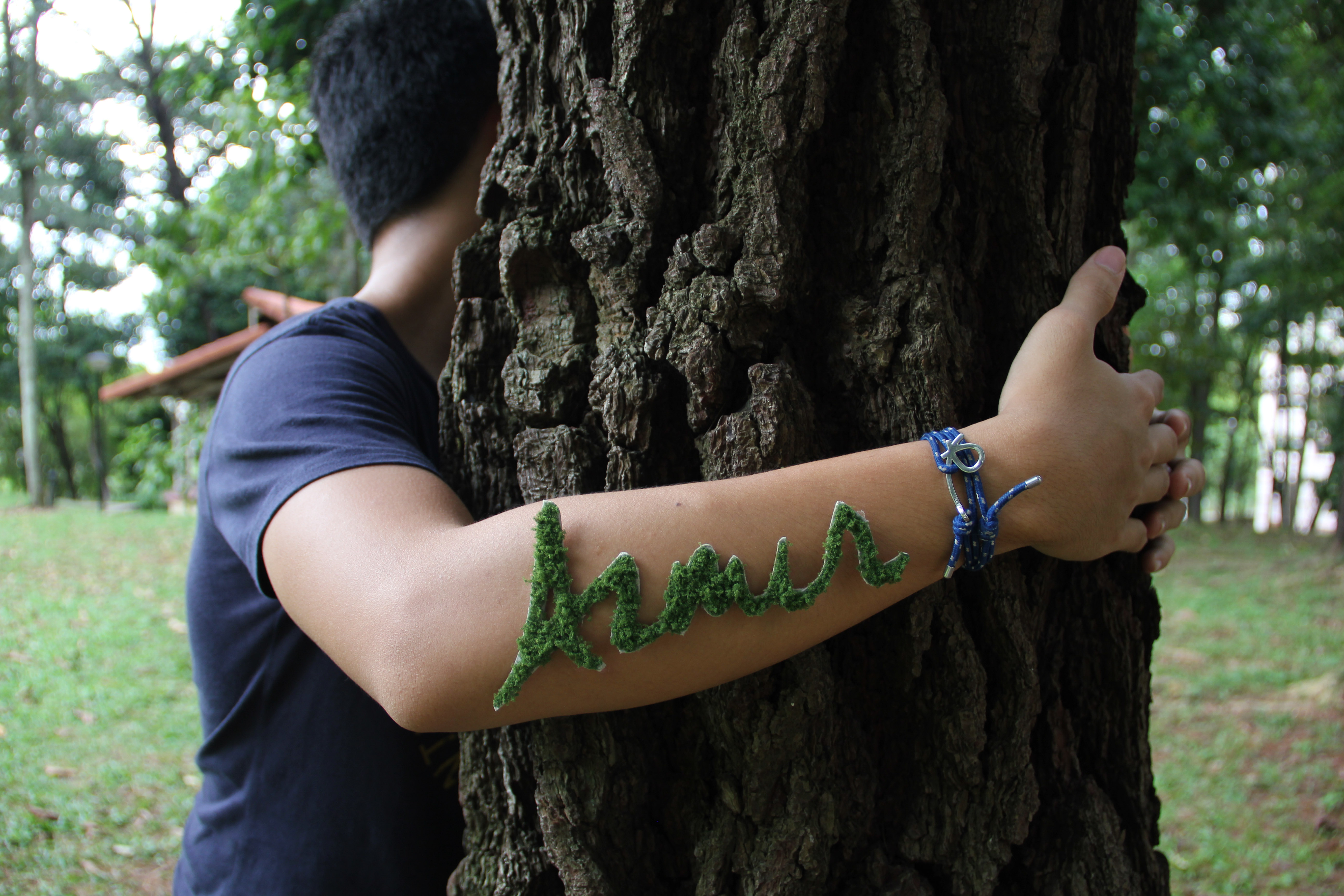
Next, I had the idea of placing it on my arm because it relates to my idea of wanting to lend a helping hand in conservation projects in the future. It took me several different shots and how its placed to get what I want. As the sun was setting, I had to make a quick decision of which composition that I want in order to get the best lighting possible. In the end, I managed to get exactly the perfect shot which is in the other OSS post.
Test shot #1
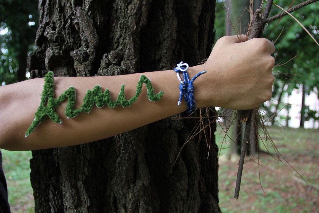
Test shot #2
Test shot #3
Test shot #4
Observant
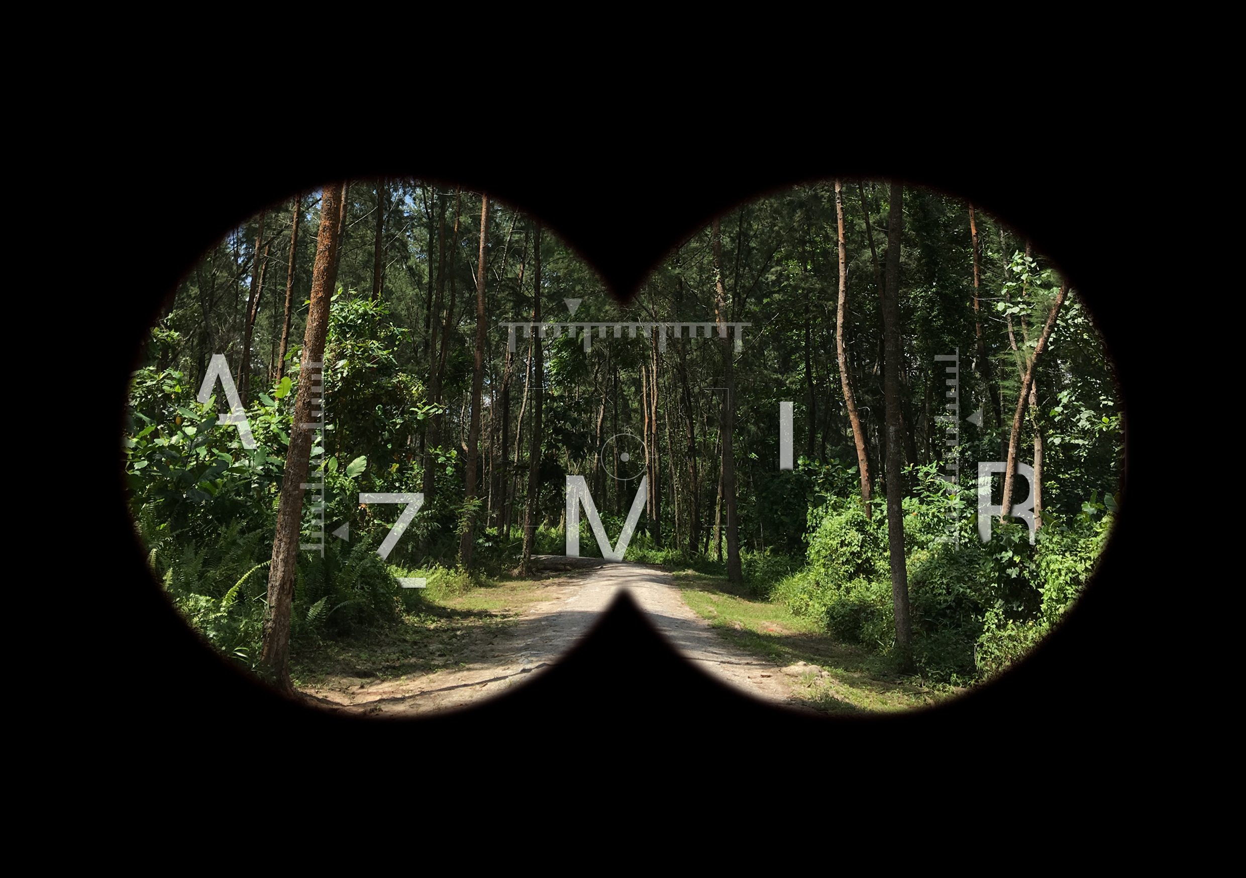
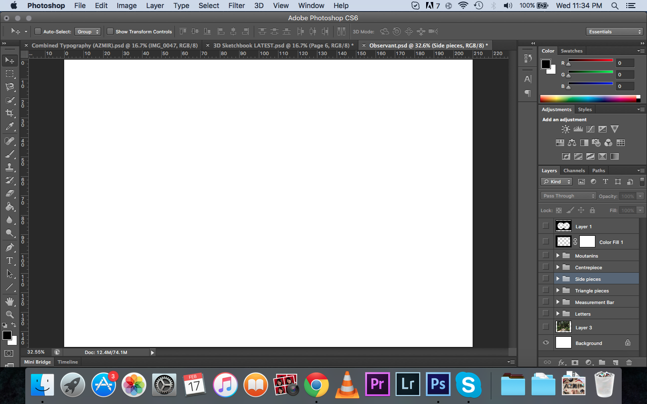
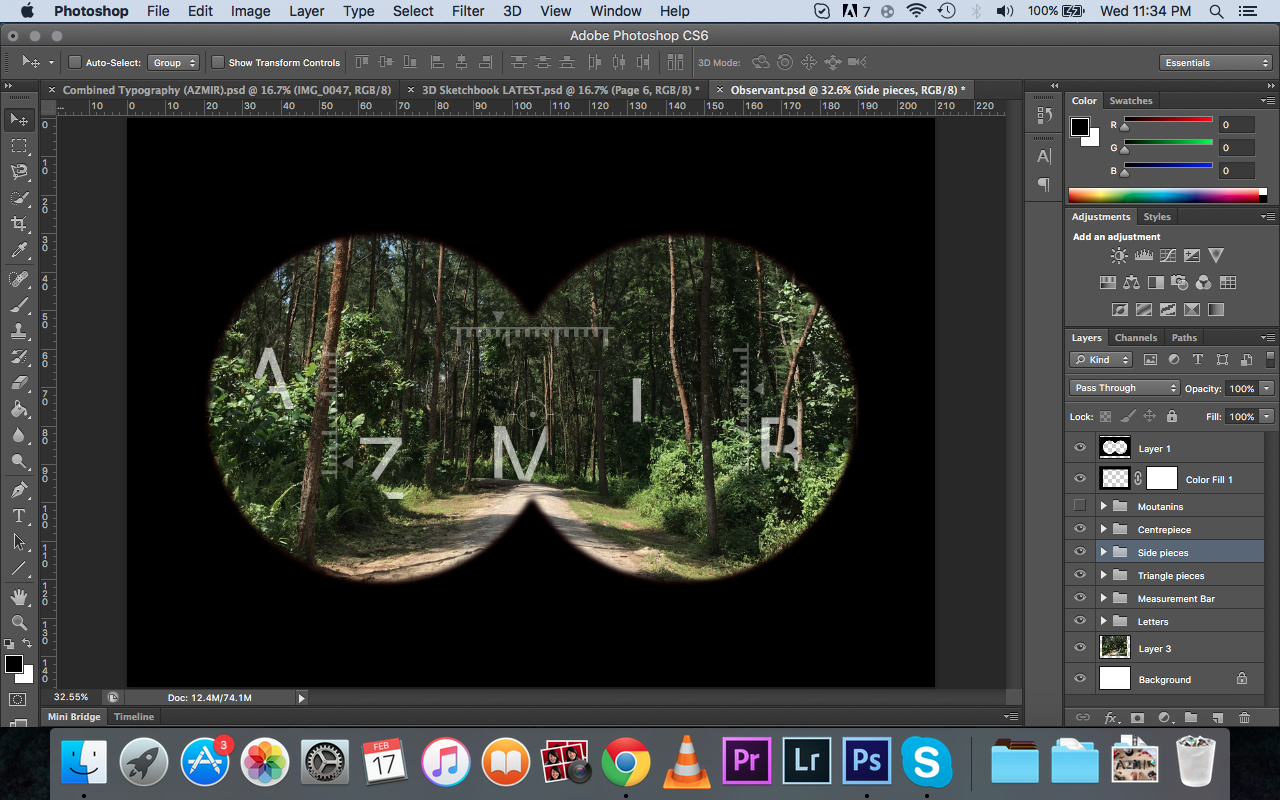
My initial idea for this piece was that I wanted to feature myself holding a pair of binoculars looking out and fitting letters of my name in between the lens, but after the group consultation, they suggested that I can consider using the inside view of the binoculars, basically in the perspective of the user using the binoculars. Therefore, I resorted to the use of Photoshop to bring out the binoculars effect and create my typography from there.

I started out with an A5 sized blank canvas.
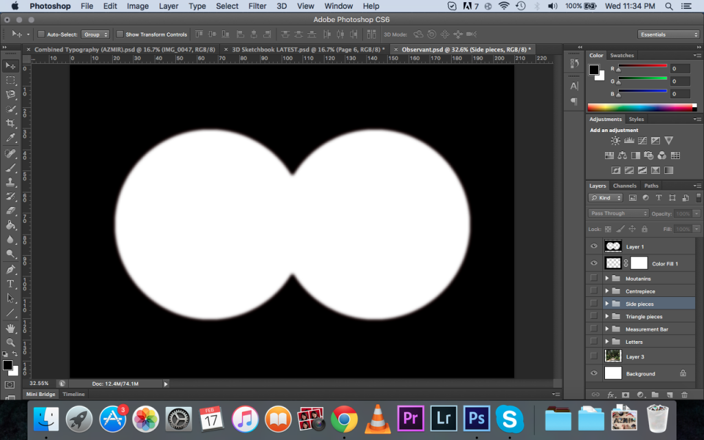
Next, I found the binoculars effect on google and decided to put it first as part of my composition.
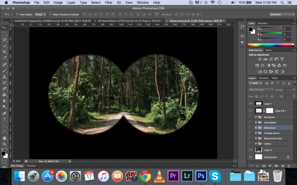
Next, I used a photo from a photowalk about a month ago in Coney Island. I really love this photo as it fitted with my overall theme of having earth and nature tones.

Next, I typed out my name letter by letter and painstakingly placed it in different parts of the path/forest. I decided it was best if the letters were spaced out throughout the composition so it doesn’t look like its squeezing to one side. Then, I played with the opacity of the letters so it does not look as striking and bold to make it fit into the forest. I also erased parts of the letters so as to make it appear that the letters are sort of hiding behind the trees and leaves (gives more depth to the letters).
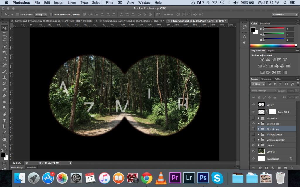
I went to look at more examples of how the view of a binoculars should look like and I added more details to it, giving it a measurement bars, making the whole binoculars effect more realistic.

Visual Storyteller
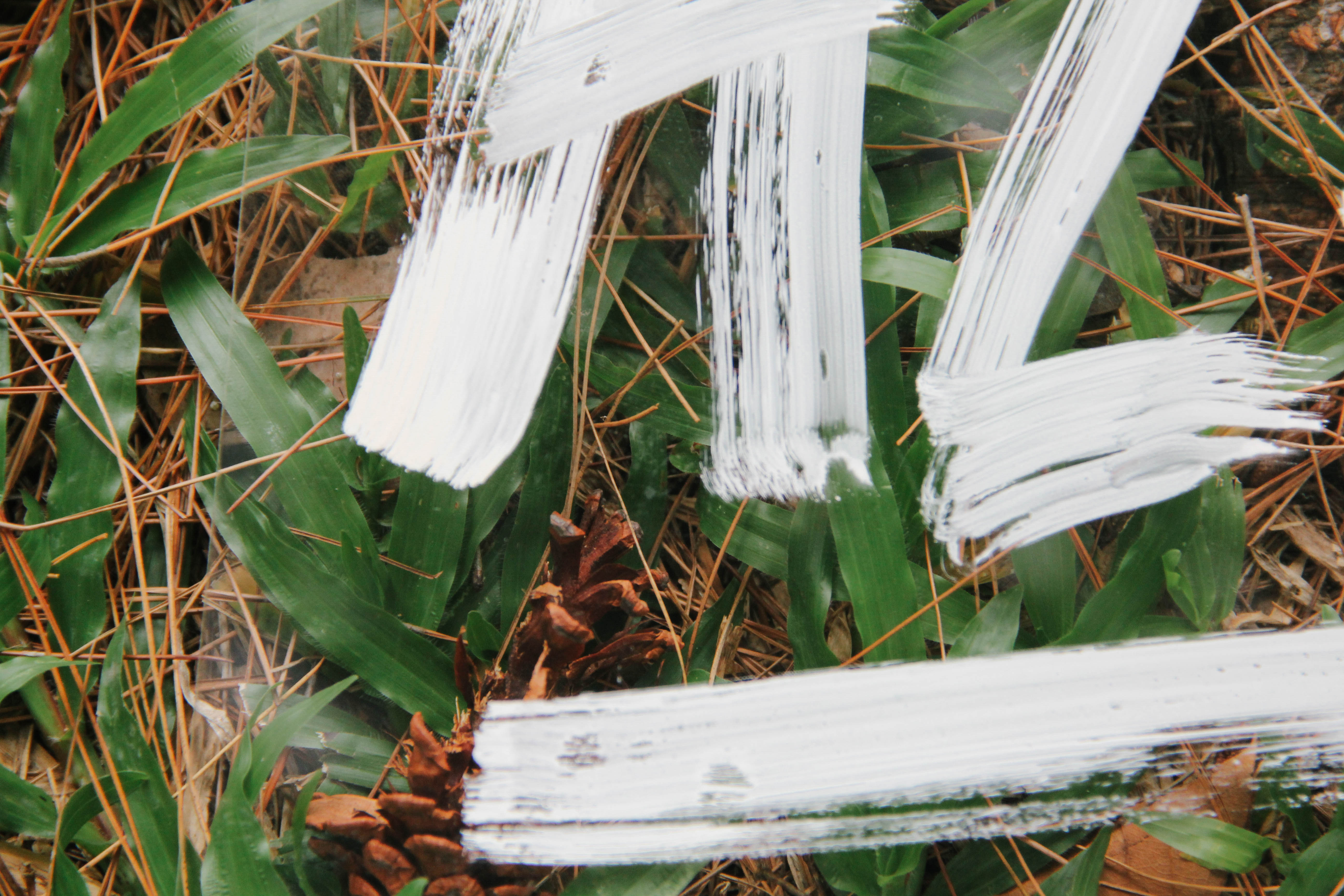
For this piece, there were a lot of preparation work to be done before actually getting to the final product. Firstly, I engaged the help of my friend who is good at doing typography to mimic a font called Edo SZ.


We first tried it on paper first to get the feel of how it is going to turned out.
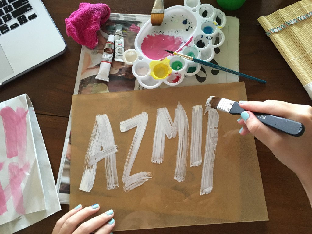
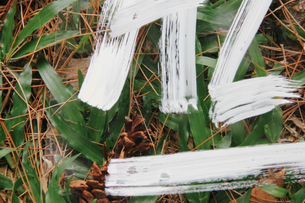
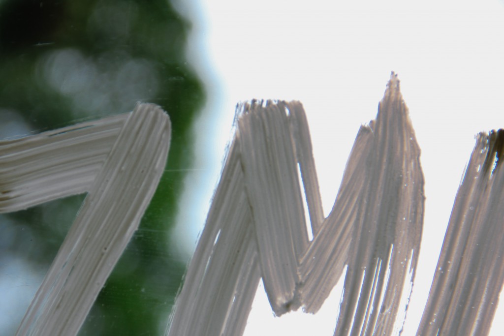
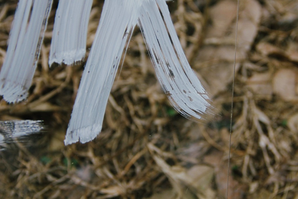
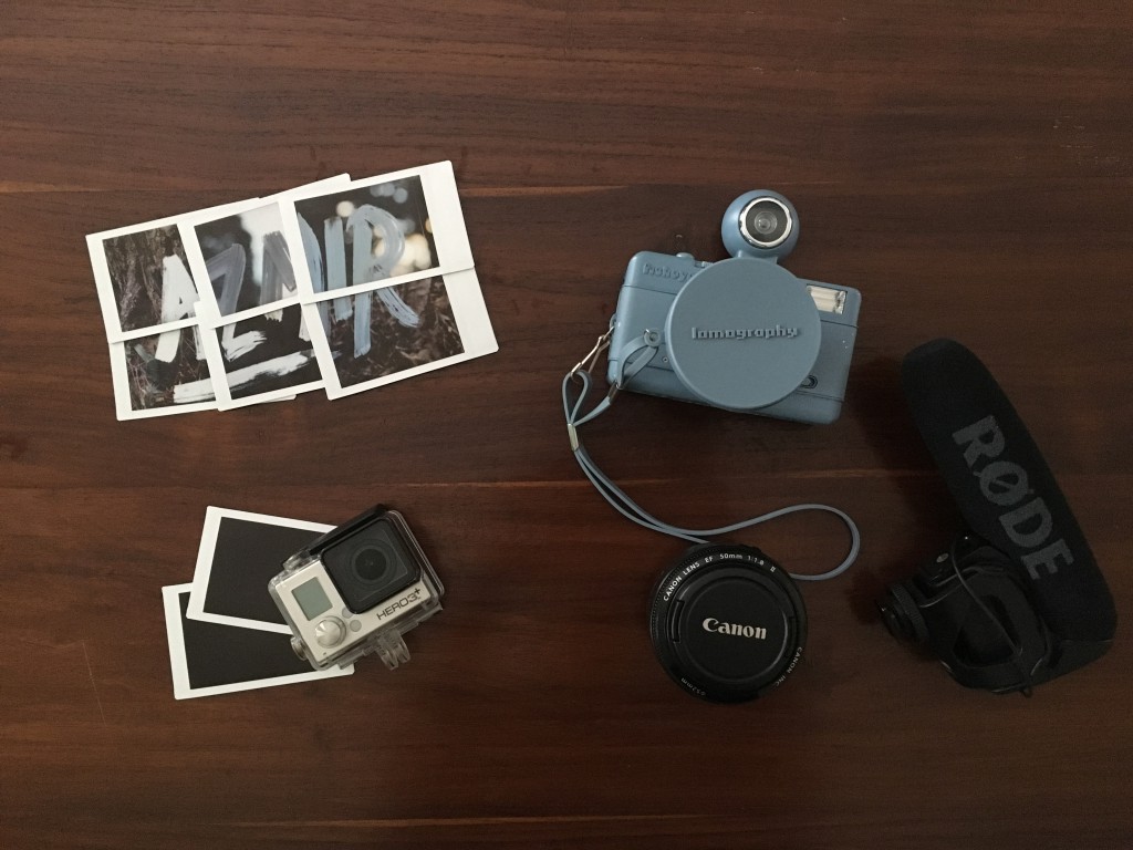
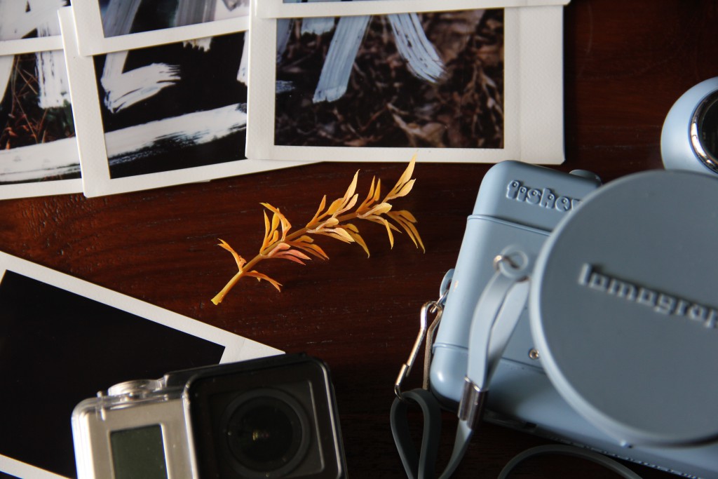
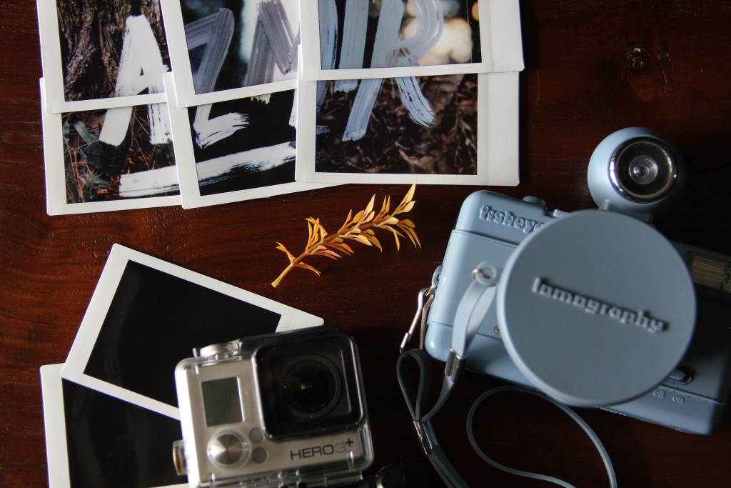
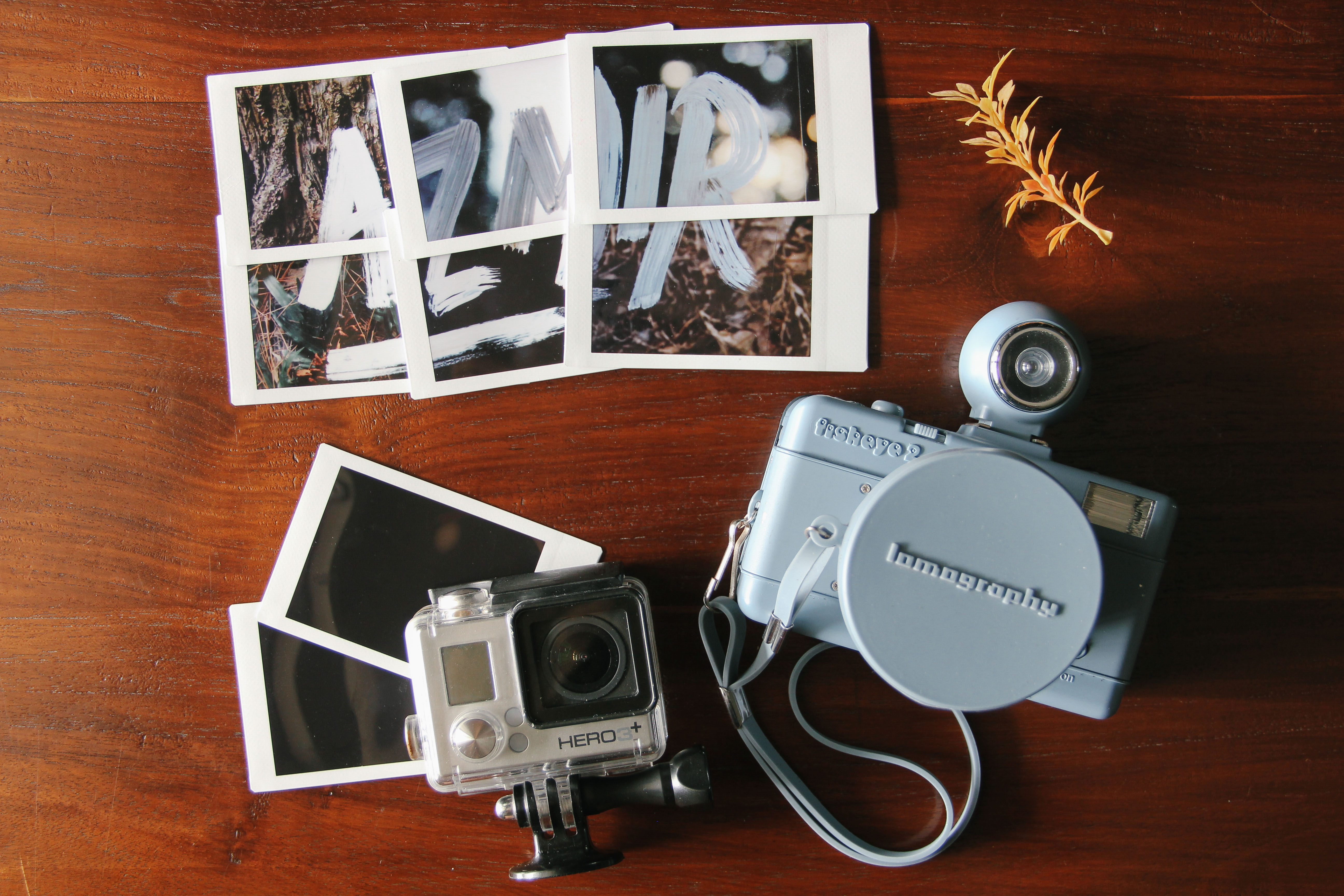
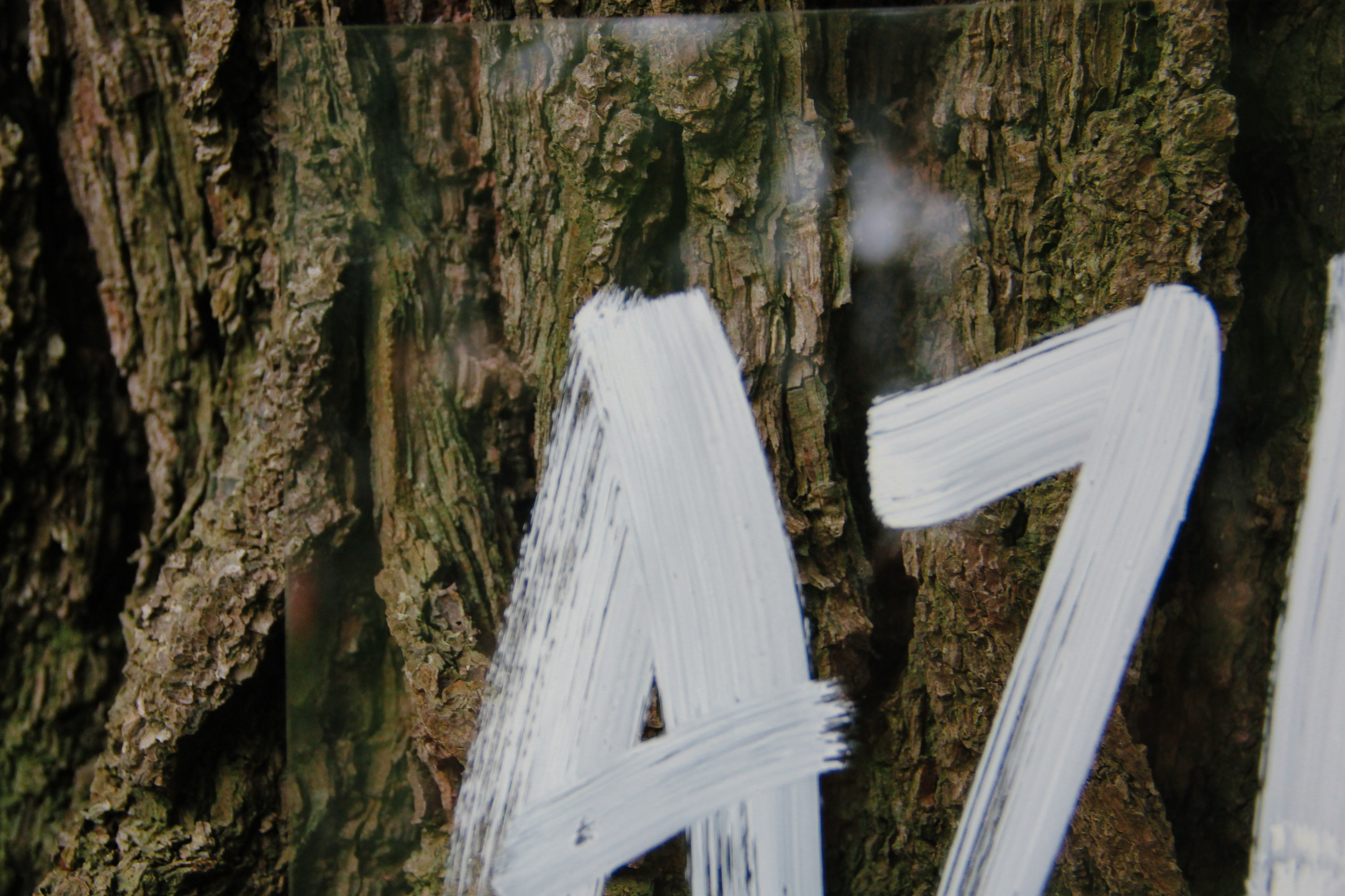
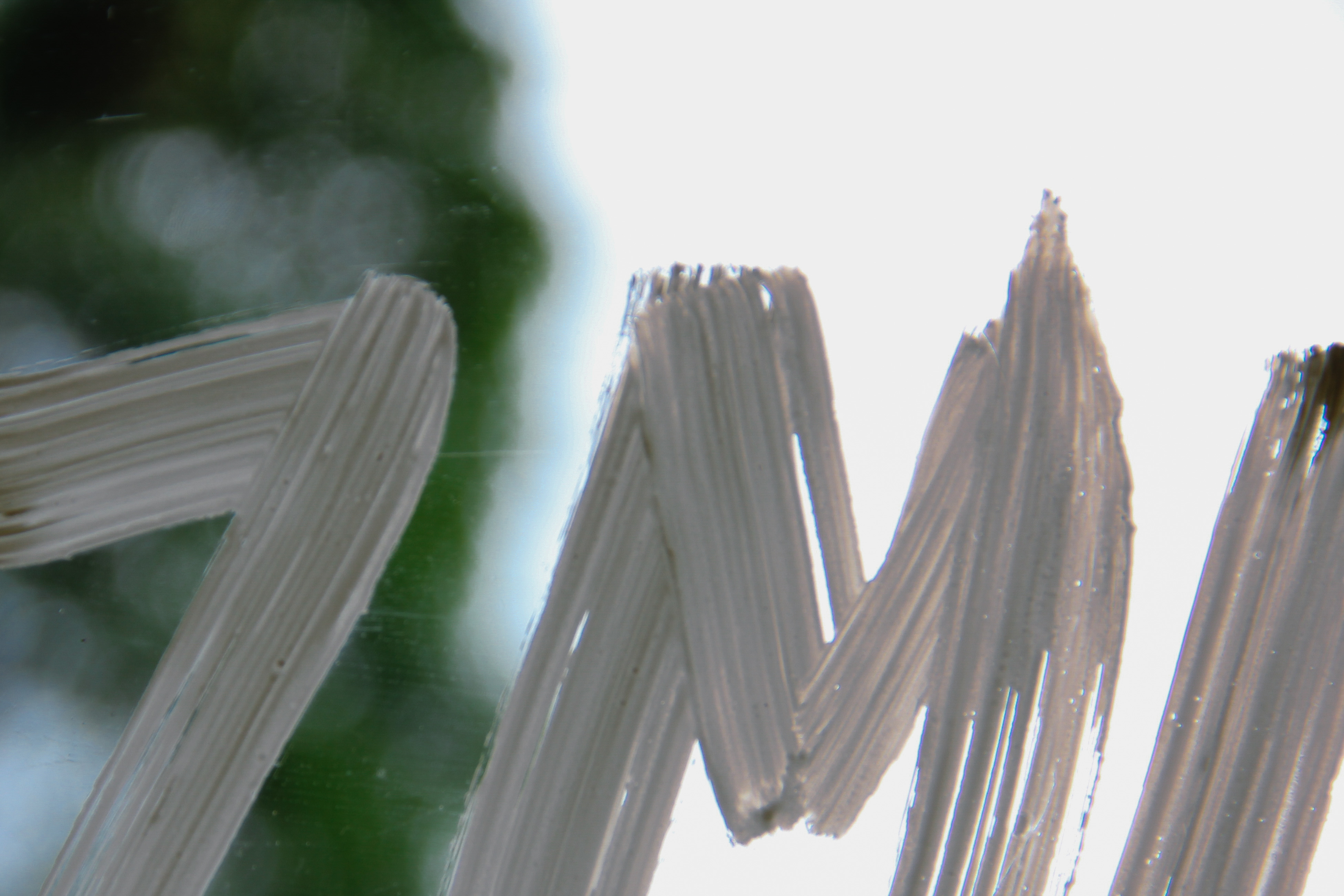
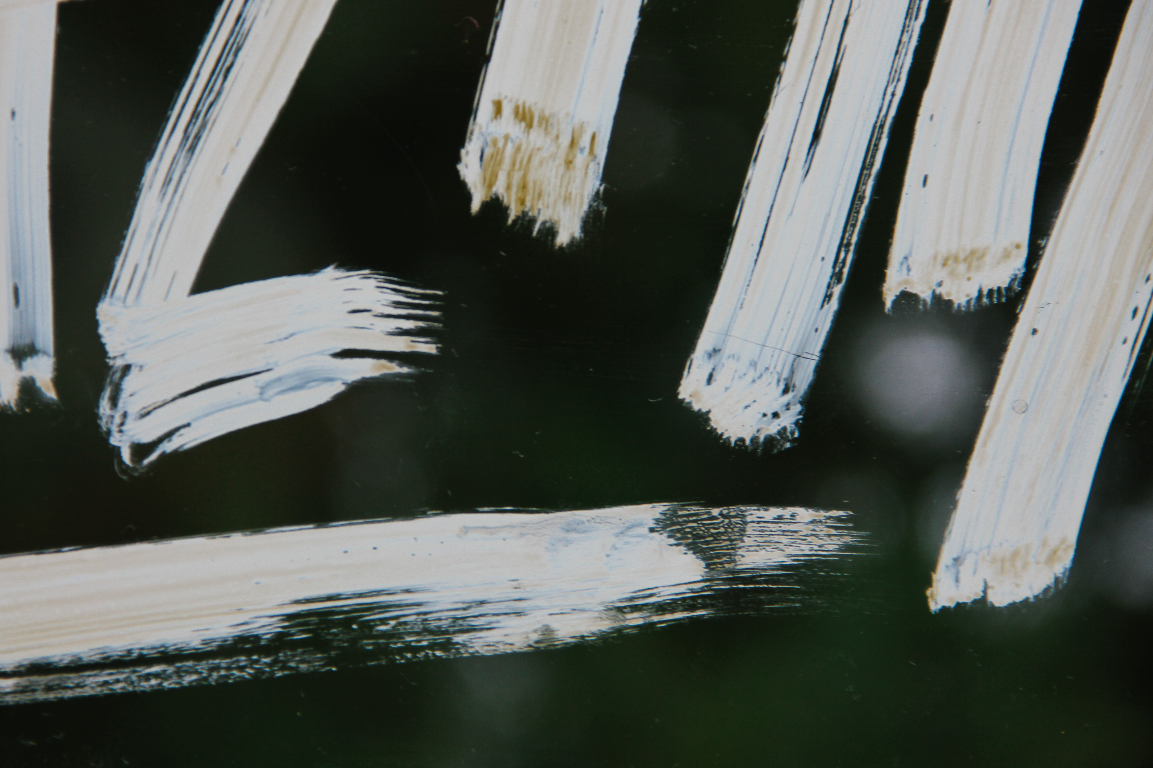
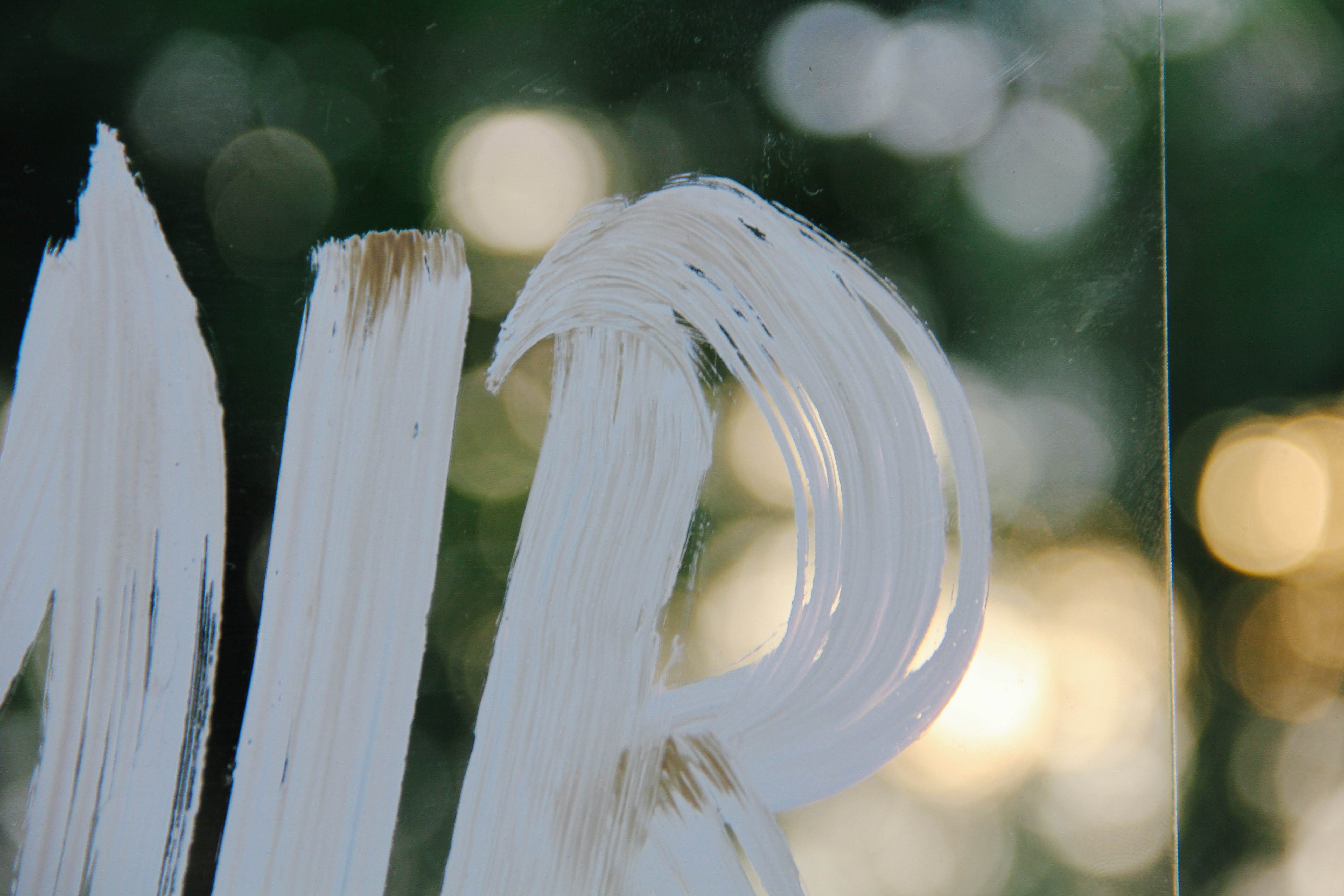
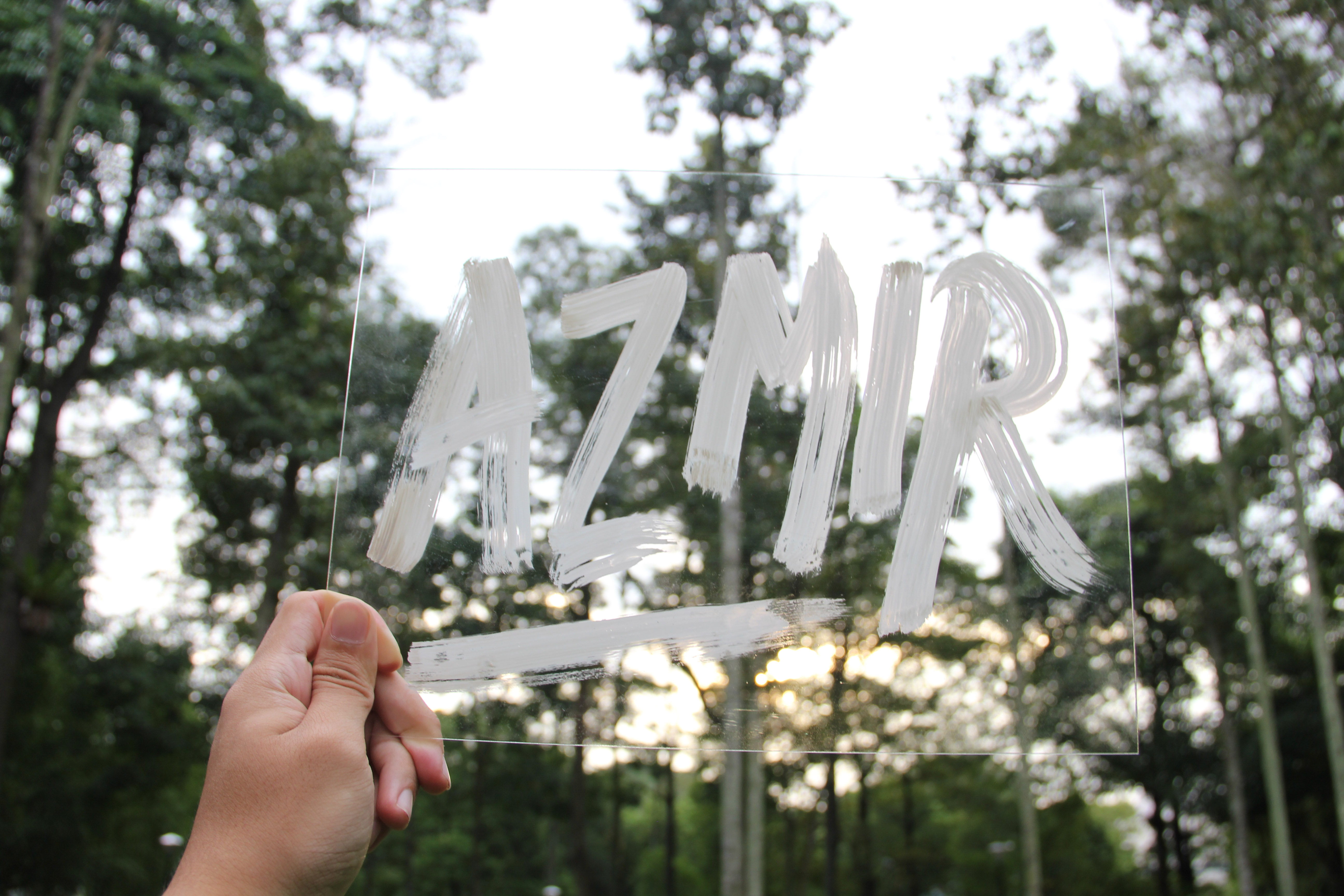
As I wanted the ‘paint’ look, we used gauche paint and a thick paintbrush. After numerous tries on paper, we were confident enough to do it on the acrylic piece itself. The idea of painting it on an acrylic piece is so that I could manipulate the background easily. As it is transparent, I was able to hold it up to any background that I want with ease and took a polaroid photo of it. Below are the shots that I manage to take with my polaroids.


It wasn’t easy trying to frame the shots and getting the polaroid to come out the way I wanted. It took me a few wasted tries to finally perfect the form that I wanted. As it was taken with a polaroid, it felt like a surprise every time the photo comes out because even though you frame the shots, the outcome will be slightly different even with a slight change in lighting conditions.
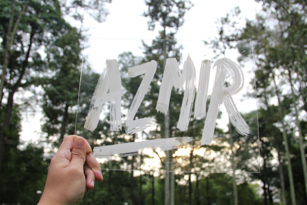
The whole acrylic piece itself against the background.
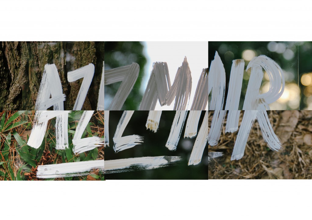
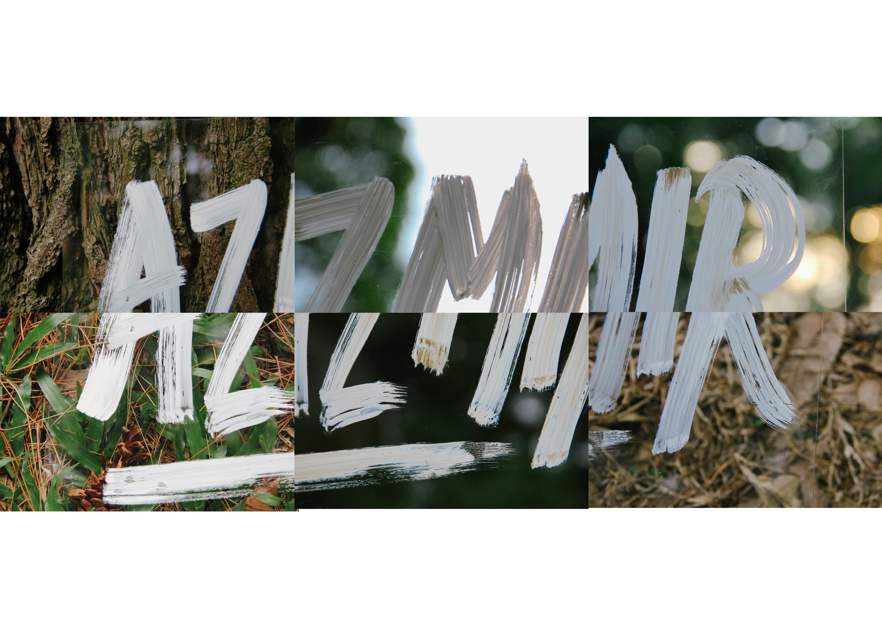
Visualizing the outcome of the final typography with each picture combined
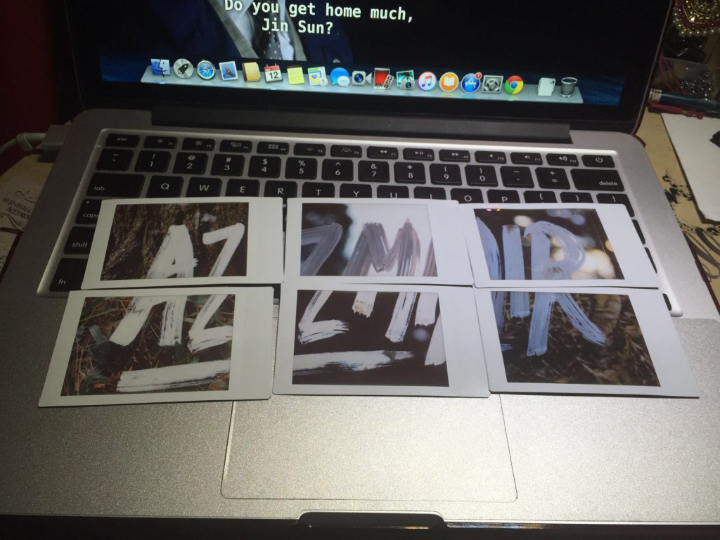
Putting it together.
Test shot #1
Test shot #2
Test shot #3


.jpg)
.jpg)

.jpg)