

A B O U T
The Garamond typeface was created by engraver Claude Garamond in the 16th century. Our current understanding of the Garamond font are interpretations of fonts that were inspired by drawings which were modelled after the punches of Claude Garamond.
C H A R A C T E R I S T I C S
Garamond was the first to craft letters to the medium. He was the first to deviate from a purely handwritten-style to make letters that would read better when printed. These letterforms were thinner and more delicate than those before it, which both allowed the ink to bleed on the page without overly distorting the words and used less ink. Other key characteristics include the way the top serifs of the lower-case letters curve back into the letter, the feeling of airiness from the generous openings in the letters, known as counters, and the tall ascenders. These letters were often used for printing of body text and books.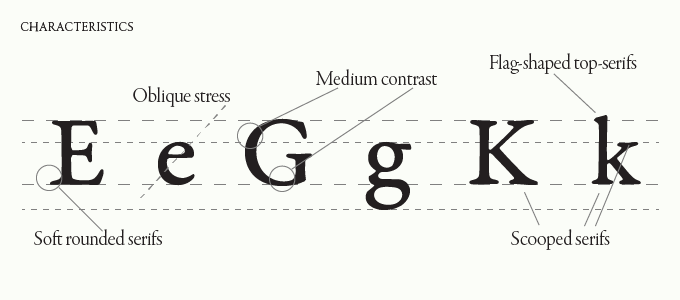
R E V I V A L
Garamond fell into decline in the 18th and 19th century, and people tried to revive the font, thus expanding Garamond into many different styles which have evolved into the modern Garamond fonts we have today.
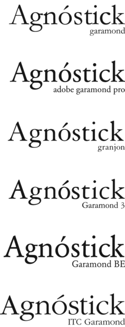
T H E D I F F E R E N T T Y P E S O F G A R A M O N D
Garamond has evolved in its own way and different types of Garamond font has been created depending on different inspirations.
R E F E R E N C E S
http://www.meaningfultype.com/garamond.html
https://medium.com/@thelittlereina/typeface-garamond-be1b8b01add8