Artist Reference for characters designs
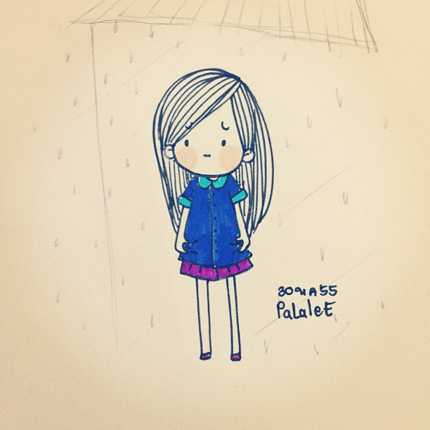
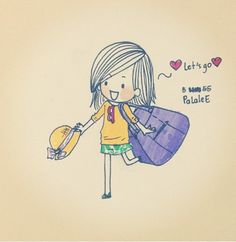
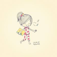
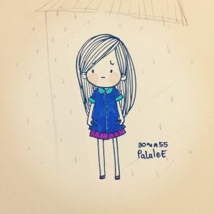
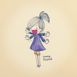
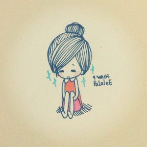
My artist reference is an artist whom I found on this website called flickr. Her name is Palaleez. She designs characters which appears to look simple, illustrative and also cute. She would also portray her characters according to the emotions that they are having. For example, the last image would be a lonely character while the image above it, which is the third image would show the character to be more excited and surprised. She would also portray her characters to be seen in her own everyday life and how she would feel or react to the situation. For example, the first one is when she portray herself of getting ready to go the beach and the colour of her shirt is more orange yellow to show that she is going to somewhere sunny and bright which is the beach. By noticing the background she uses, it is mostly put in a less intense tone but it is the colour of the background that helps portray the emotions her charcaters are going through. For example, the second one is a brighter background to show her in a good mood while the last one is a grey background to show her in a lonely and dull type of mood.
Thus, for the designing of my characters, I would follow her style of having characters which are mostly kid friendly, cute and illustrative. I also wanted to portray myself to be less sombre and in a more light hearted, lively way. Furthermore, it is also a way to remind myself of how I could be more positive instead of being sad and negative most of the time. Even though some of my emotions that I portrayed in my final work are lonely and boring, I would portray the characters in a more positive way by having my characters designed to look kid friendly and illustrative with the background in a more lighter tone instead of putting the background to be very intense. The background would also have various types of colours to portray the mood for my character. For example, I could use a duller colour for my negative emotions including boring and lonely and a brighter colour for my adventurous and indecisive characters.
Settings
Adventurous (setting and artist reference)

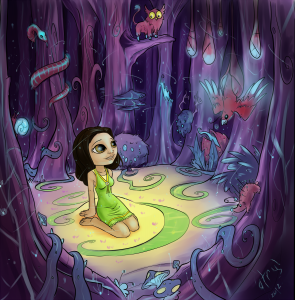

As for the settings, I thought I could have my settings to be in a more fantasy and dreamlike for one of my character that is adventurous. To me, when I portrayed myself as adventurous, I thought I could discover something new and thus, I would put myself into somewhere that is very new and has never existed before. Thus, the idea of a magical forest came into my mind.
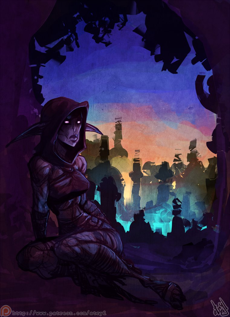
This Hungarian artist, Atryl is a professional in digital art and creates works that are mostly full of fantasy. By following his colour scheme of purple, pink and dark blue, I am able to set the dreamlike and fantasy mood of painting for my adventurous character.
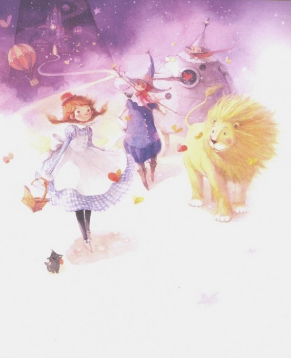
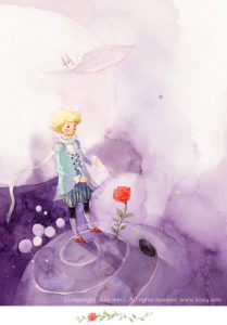
Another artist is Kim Min Ji who is a Korean illustrator who uses watercolour for many of his own versions of other childrens’ books including Wizards of Oz (third picture) and The Little Prince (fourth picture). He also has chosen to use pink and purple to create a whole dreamlike and fantasy image and adventure that his characters are embarking on. I am inspired by the way he uses watercolour which seems to be very controlled on the amount of water he uses so that his images would look brighter and viewers could see the details easily. The using of watercolour also helps to create a more childlike illustration because of how watercolours were not meant to look dark and they are more appealing towards the children’s eyes because of how such bright colours can create a les intense mood for the children. As a result, I would be choosing the emedium of watercolour for my final work and it would be a children illustration type of work.
Indecisive

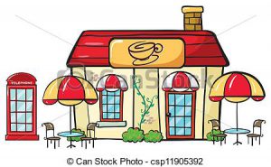
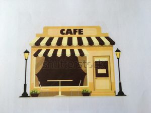
I was looking for a more cosy setting for my cafe and thus the third image would have the layout of a cosy setting and it is also a more obvious depiction that this is a cafe. I would also want to depict my cafe to be more bright and vibrant so that it will be aligned with the character that I want to portray as indecisive and this charcater is not really sombre or boring. Thus, for the colours, I would intend to make my cafe look mored and yellow but also keep the building to be in a warm colour range so that the whole cafe could be seen as not only cosy but it is also very welcoming to the viewers.
Lonely
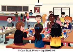
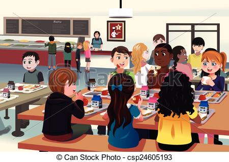
From the picture’s composition, I could actually see there is an odd one out in the whole image. The way I depicted loneliness would be a character who has no friends and is isolated away from everyone. Thus, this is the research image which I have found on how lonely people could be isolated from everyone. Furthermore, the student in the corner has a grey table while the other students are in colour which could strongly support my composition on the idea of loneliness.
Boring to Creative
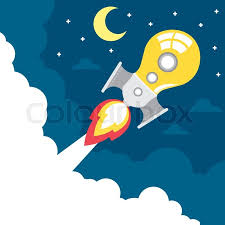

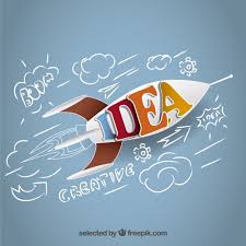
For the settings, I have decided to go with something that is more dynamic and in space to give the setting,Arts, Design and Media School a more fictional space. Thus, when I thought of the school, I would think of something dynamic like a rocket in space. However, instead of portraying the rocket as a rocket, I have searched for different ways to portray the rocket in the most creative ways possible. As a result, I have found most rockets are portrayed creatively in terms of using pencil and light bulb.
Magical Creatures Artist Refrence
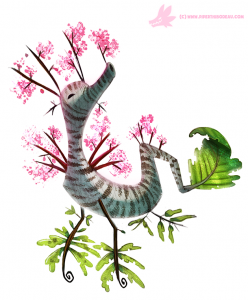
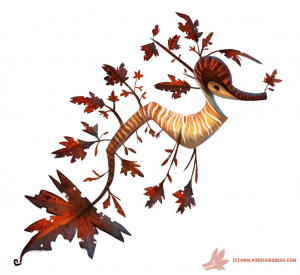
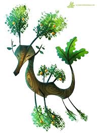
The result for my adventurous character in the magical forest would be to discover something new. For the part of dicovering something new. I do not want to make it too ordinary or something very simple such as discovering a treasure box of gold or discovering an unknown island in the forest. I would want the result to be more exciting and related to my theme of fantasy. Thus, I added in the fantasy creatures. Furthermore, magical creatures are something that does not exist in real life and I wanted my magical forest to be something that is more fictional.
I have tried searching on how magical creatures would look like and managed to find one artist who could do such character designs. His name is Piper Thibodeau from Canada. He is a freelance character designer and he creates amazing, whimsical and dreamlike creatures in his own art book called ‘Daily Paintings’.
I was inspired by how creative and original his creatures could be as one could tell that those charcaters are of his own creations and it is not something that exist in real life. Thus, by looking at how he portrayed his characters to be very dreamlike and fantasy, I would try to include some parts of his creatures as part of my creation but I would also add on to his creations by looking at all of his creatures first then I would examine his style of creation, after which I would make my own characters by following his style.