Artist Reference for final work
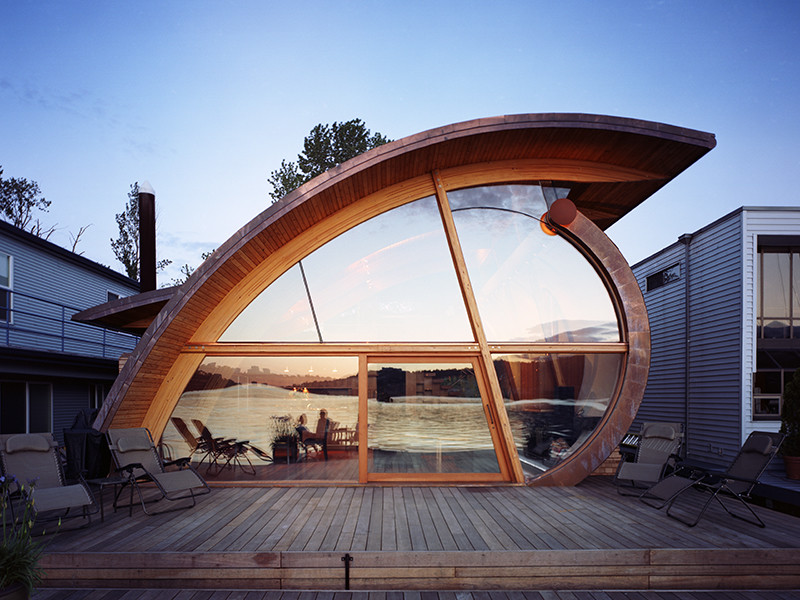
I was inspired by how such unique wave like structure could act as a roof for a house from this artist Robert Oshatz. Thus, I have decided to do a similar shape that is also a wave like structure but curving in a different way. Also, the combination of an inorganic shape with a geometric shape makes the work to seem less proportionate but still visually appealing to look at.
I initially had different ideas when I first encountered the theme called “Towards Zero Waste.” I was actually thinking on the meaning of waste and zero waste. Indeed, I have searched through the internet and found out that the meaning of waste is to use or expend carelessly, extravagantly, or to no purpose. It also means to describe a material that is eliminated, discarded as no longer useful or required after the completion of a process.
From there, I searched up the types of resources or materials that have been wasted including land, textile, water, food. Based on these resources, I narrowed my focus towards land, water and generally, the resources found on earth that are depleting. The final selection was also done based on some artist references which I found appealing and some of the research which I have found that is more appealing to me.
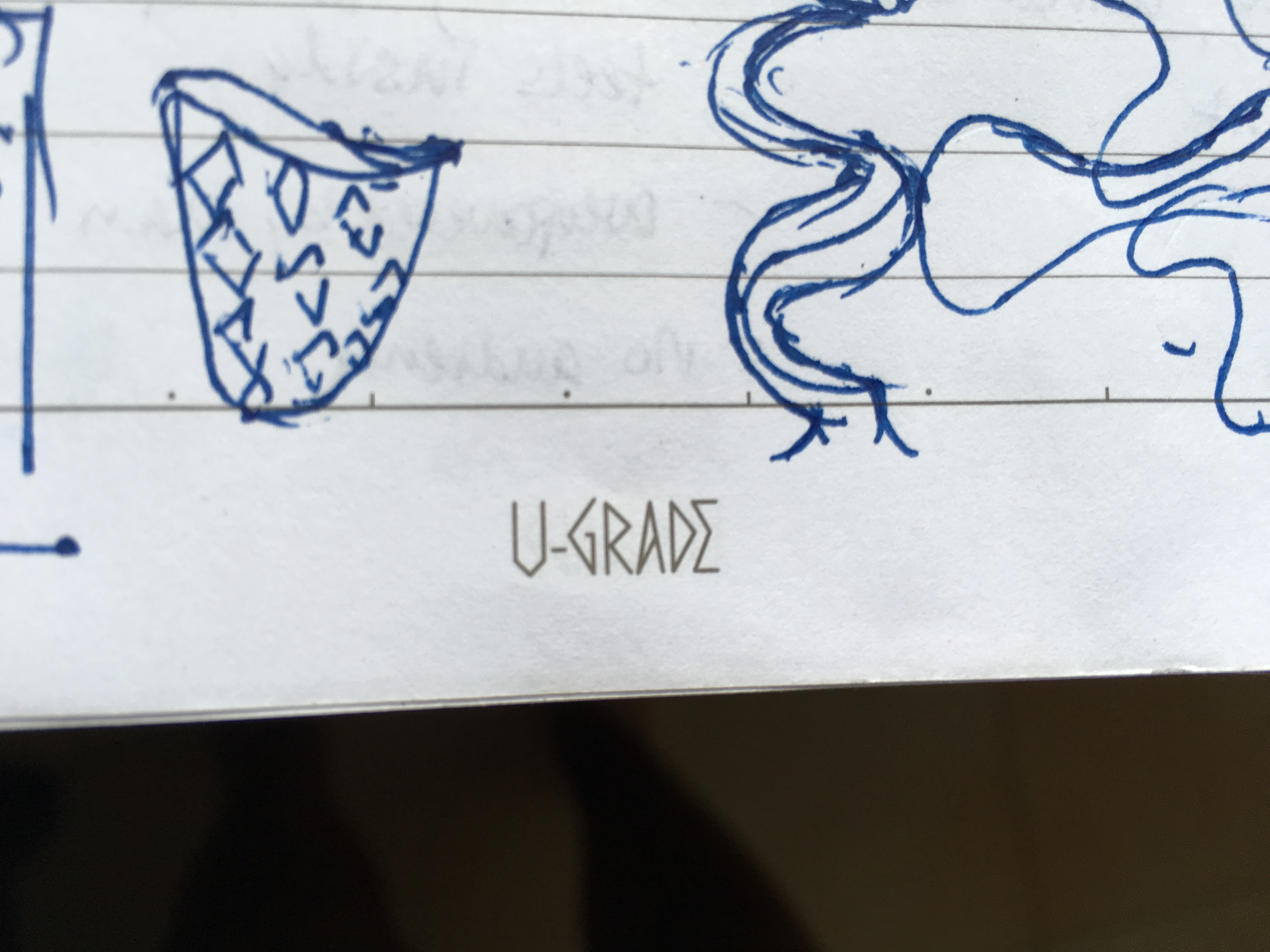
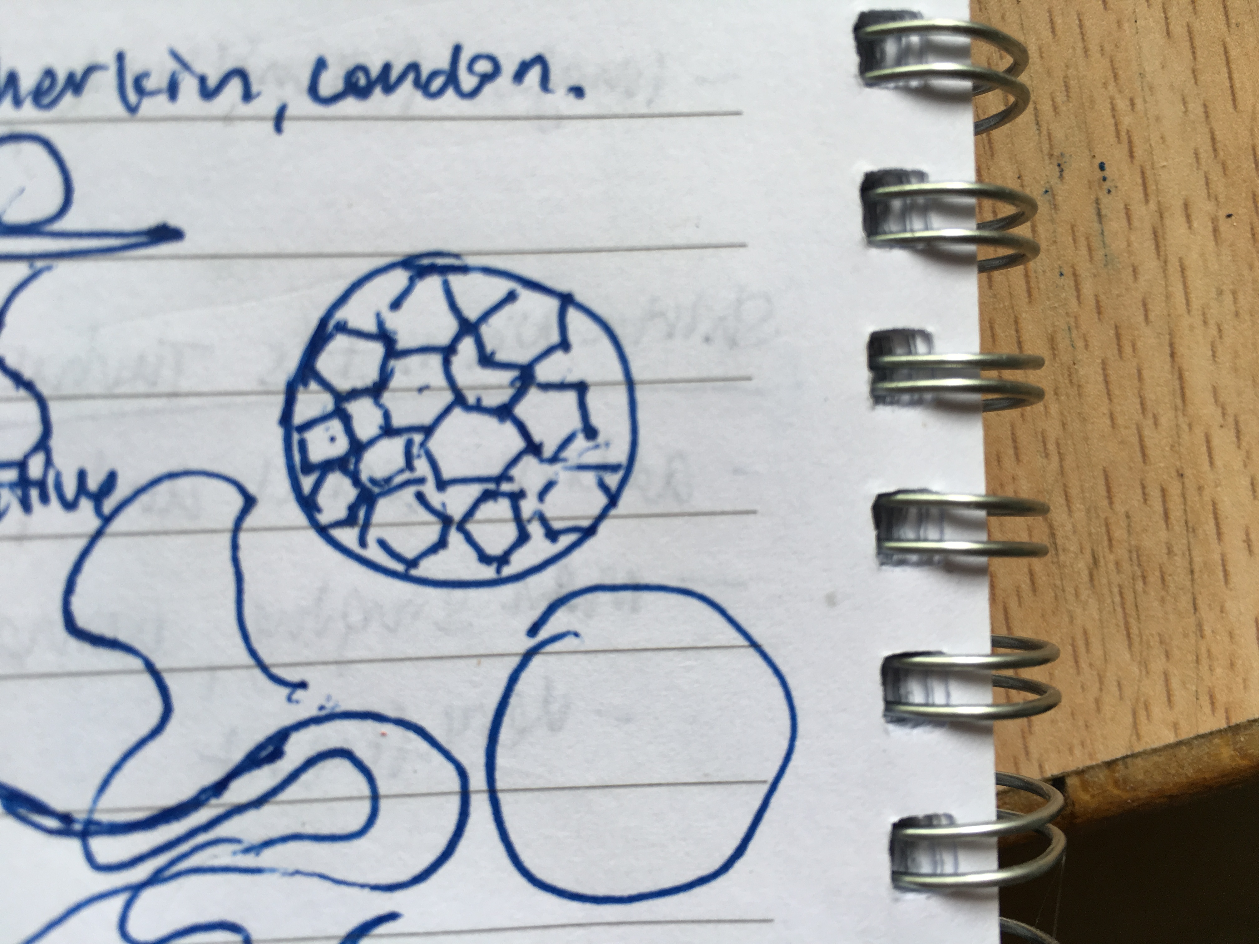
For example, in this sketch, I was inspired by the style from Constantin Brancusi’s Bird in Space. The way he captured the movement of the bird is done so elegantly and very simple just by using one shape to represent a bird.
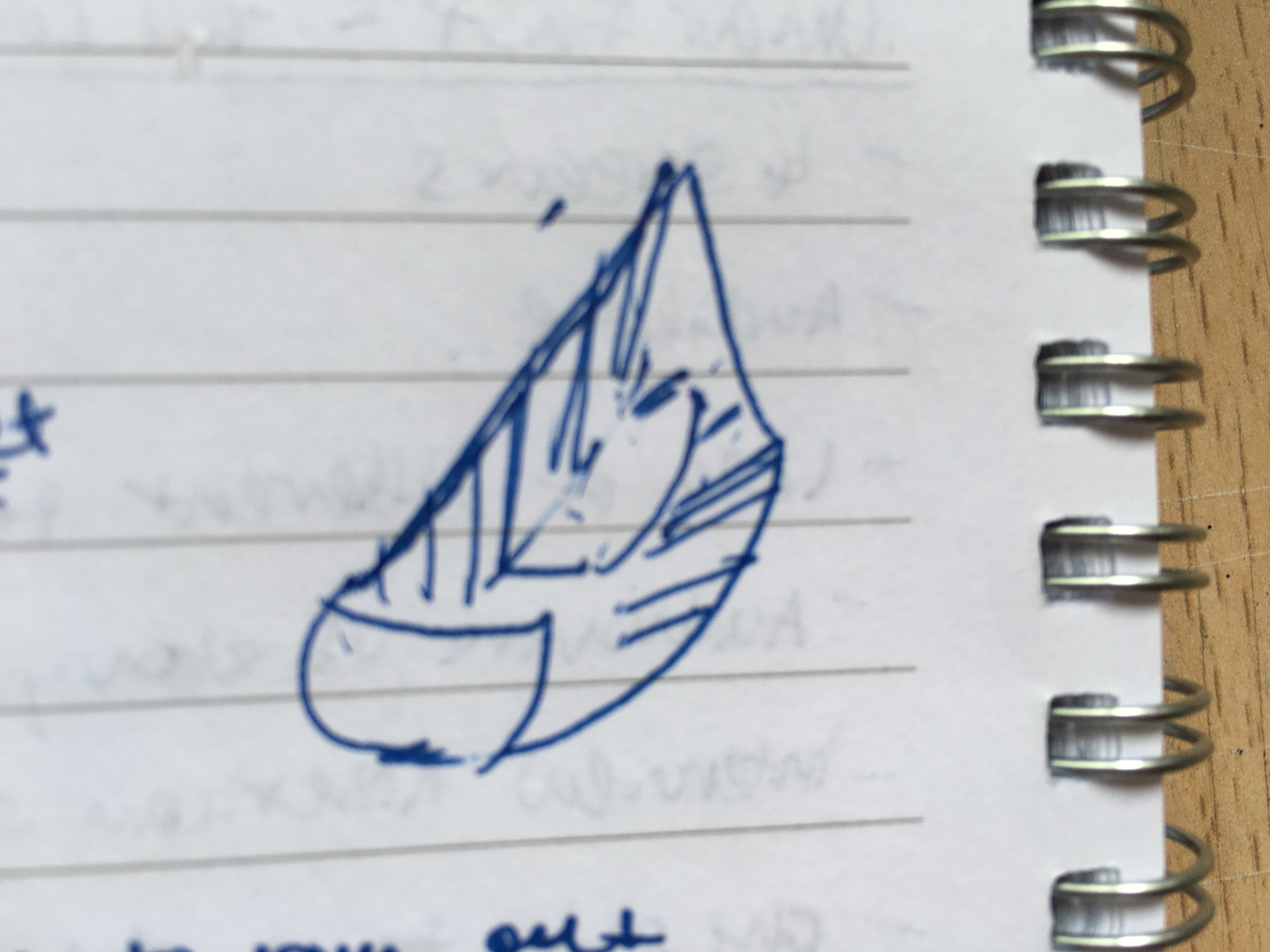

Similarly, in my work I wanted to represent the idea of how the earth may look like in the future if we continue to waste our resources and the resources start to deplete without us knowing it. Thus, instead of representing earth as it is in a round shape, I have just made it into a three dimensional curve like shape that resembles a wave. The lines would draw the viewers attention towards the hole in the work making them understand how our resources are slowly depleting if we continue to use them extensively and to no purpose. However, due to the technical difficulties that I have found in this idea, I have decided that I would focus my attention to my final idea instead.
I was shocked when I read this information on how Singapore as a clean and green nation could have some dark hidden truth behind it. The amount of waste thrown in the sea at all coastal beaches has increased year after year from 3.1kg in 2002 to 4.2kg in 2013. This shocking fact actually draws my attention to create such a work that could act as warning to the viewers on how such waste dumped into the sea would affect the marine life in the sea.
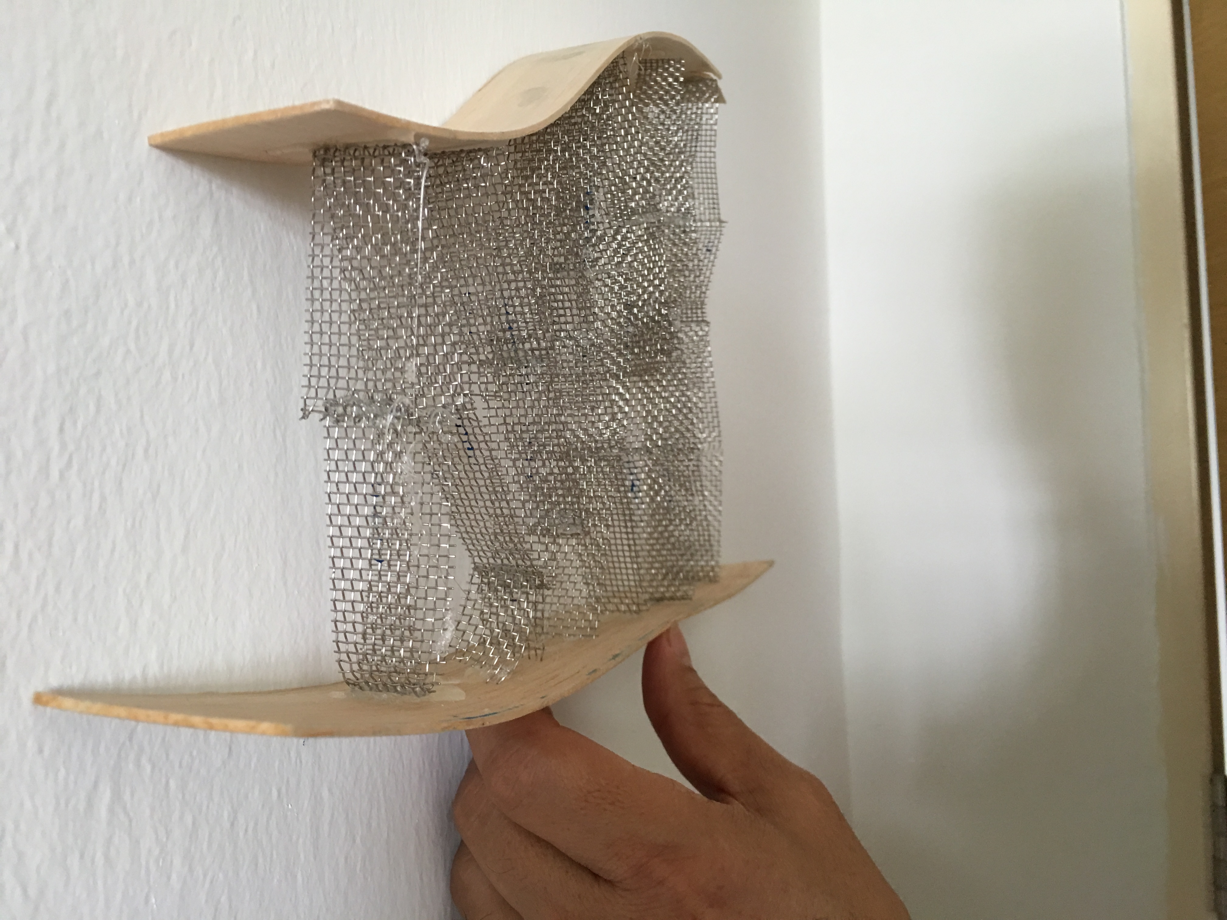
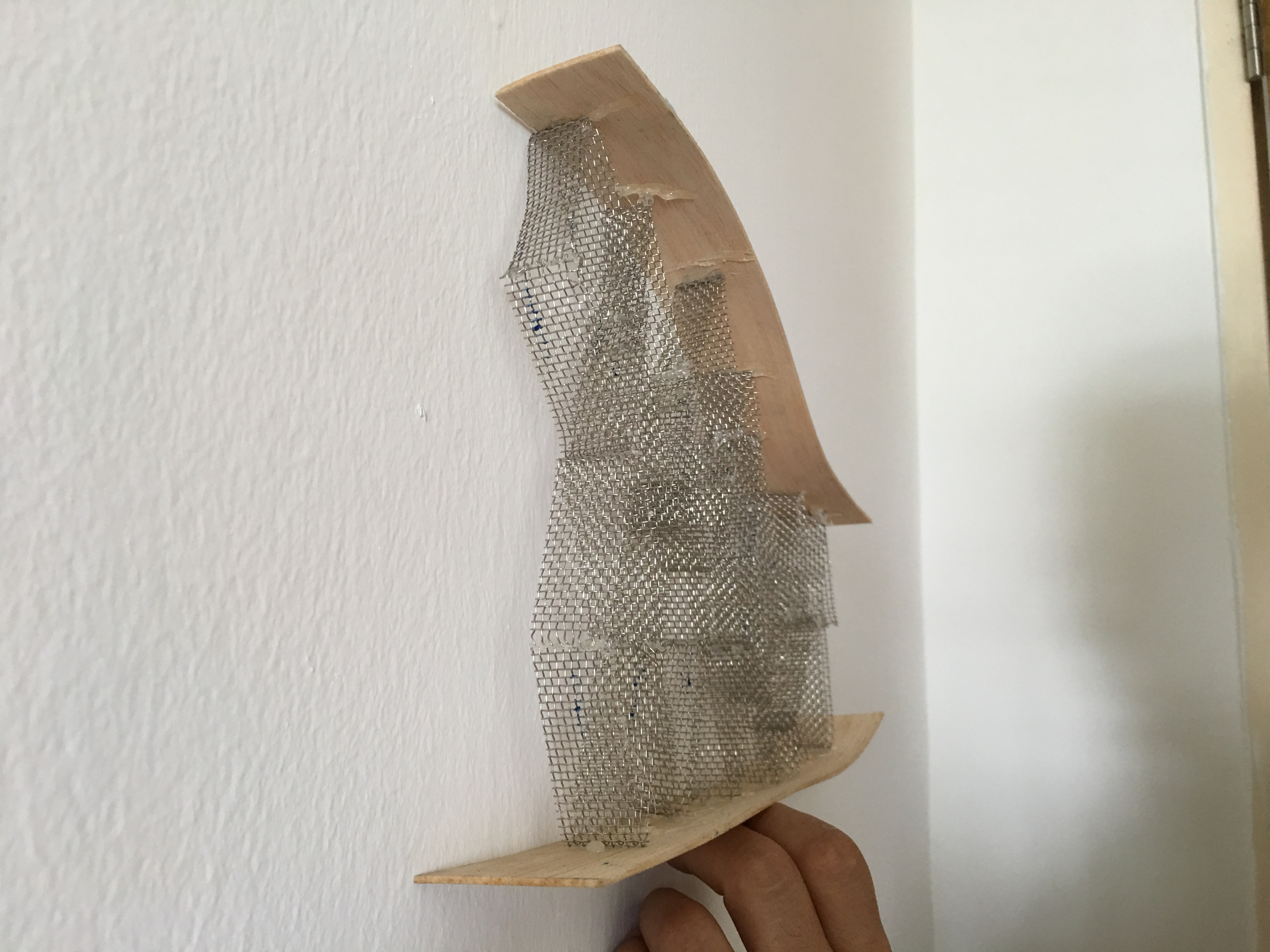
Exploration of material
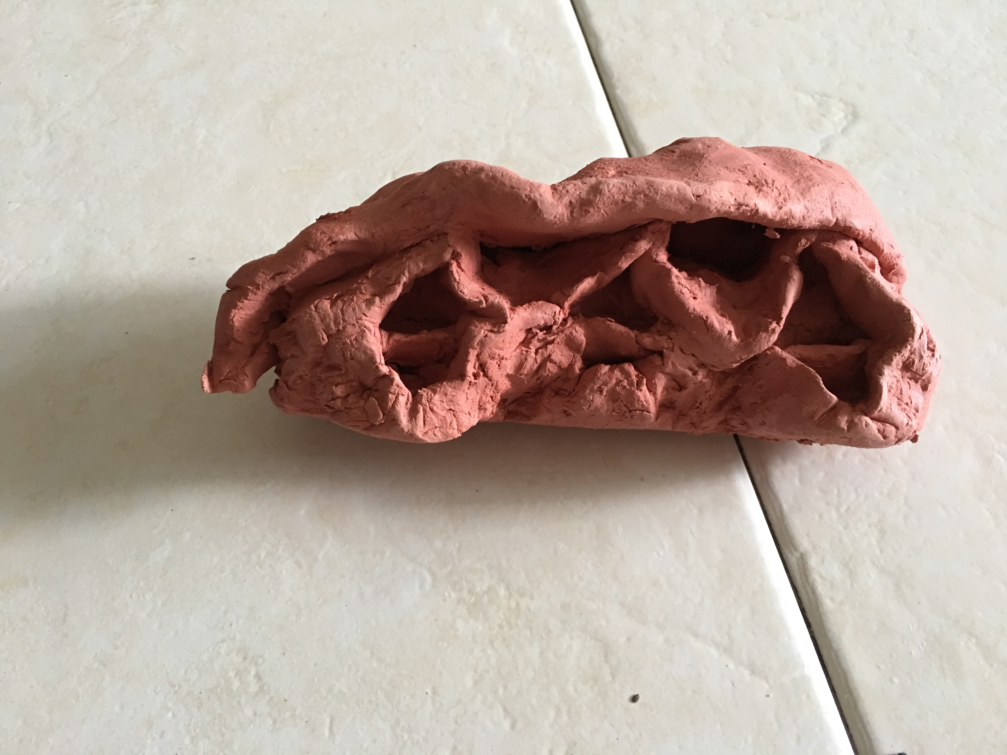
At first, I decided to go with a soft material such as clay to build my study model. This is because of how my design has a wave and fluid like structure at the top. Thus, I have decided to go with a soft material. However, this does not work for the sharp and jagged edges because of how the nature of the material has this ability to make the shape to appear inorganic but not sharp and geometric.
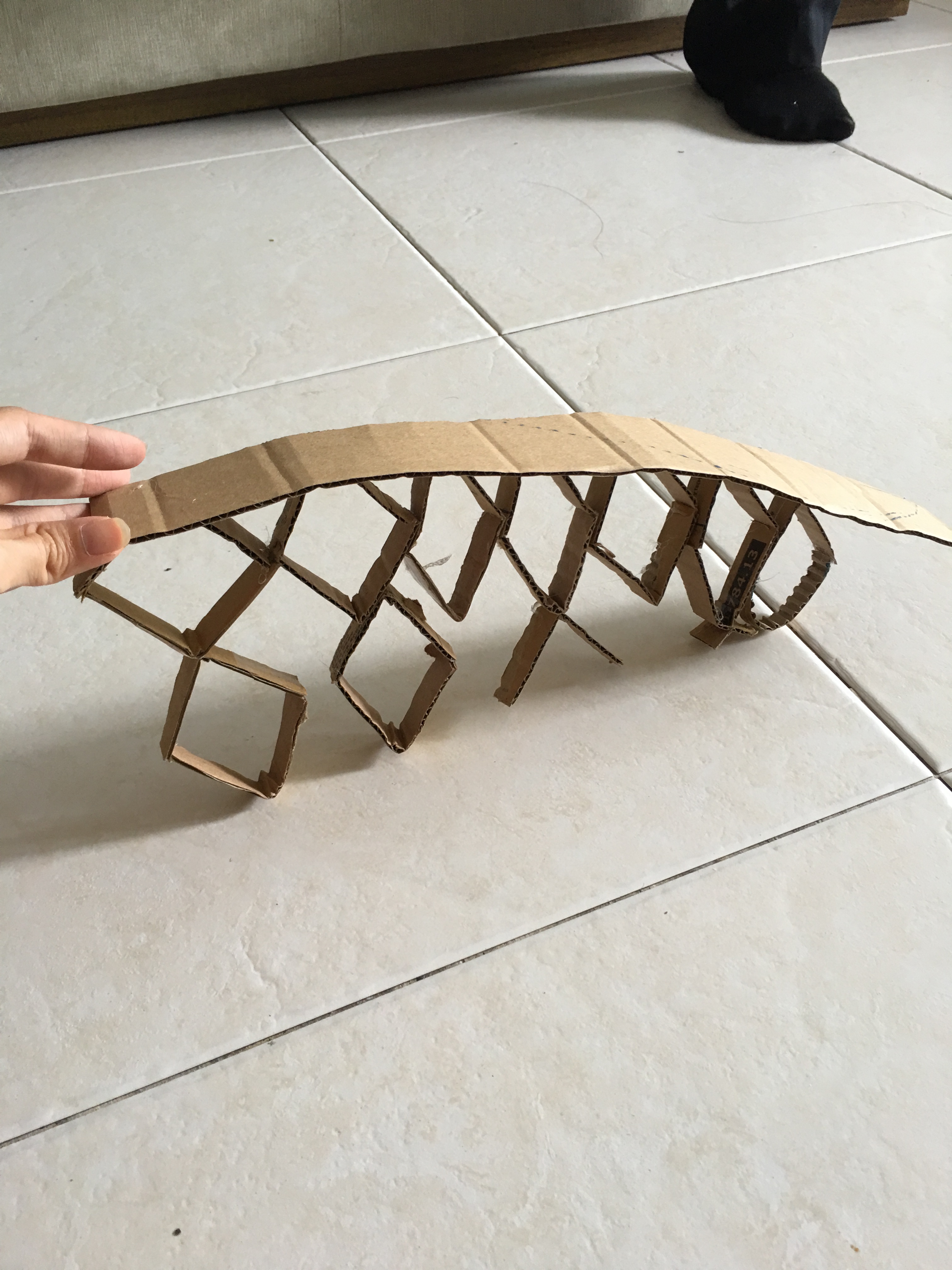
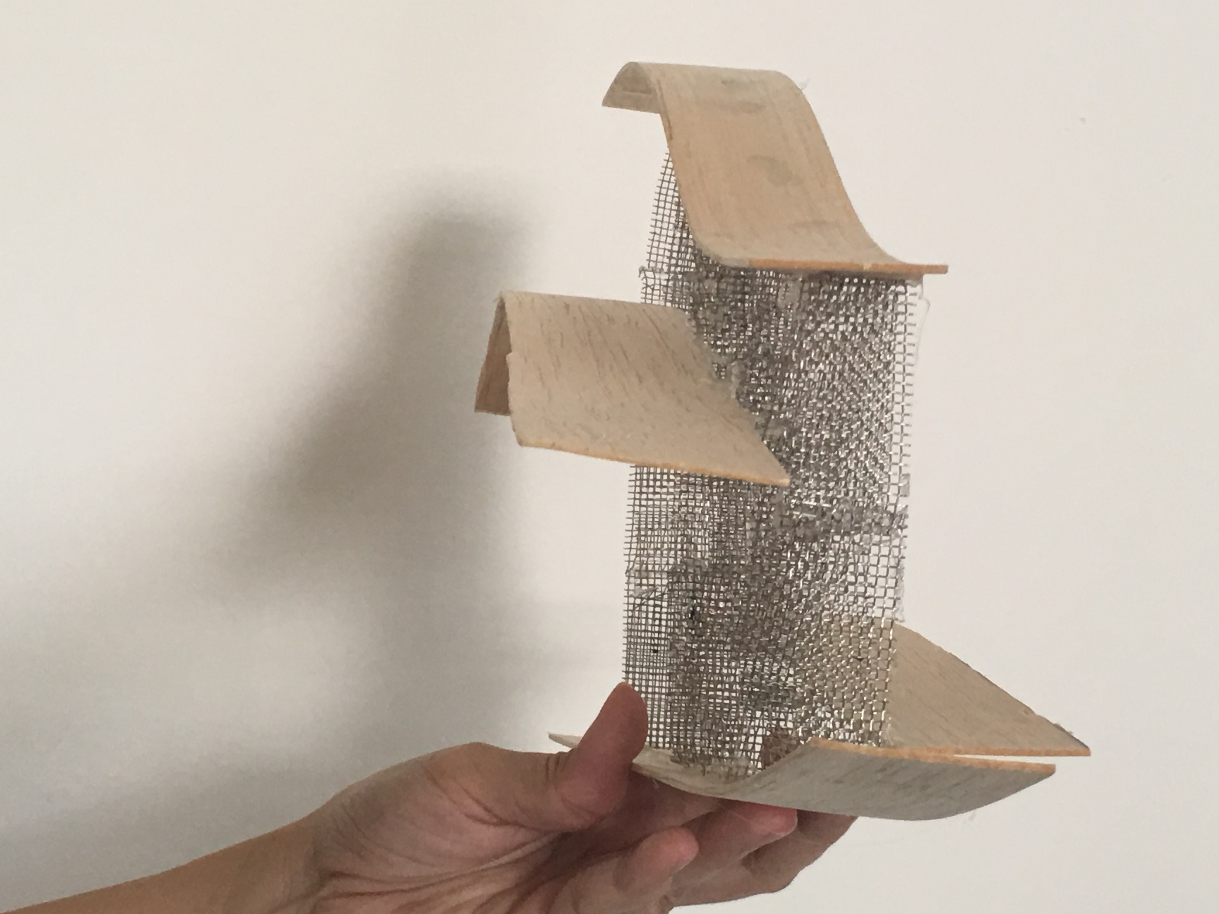
Then, I moved on to another material using a thin cardboard for my study model. I realised that it could make sharp and jagged edges because it is not just thin but it is also hard enough for me to cut into a sharp diamond. However, I realised that without a base, this sculpture cannot stand. Thus, I have decided that I should build a base to not just stabilise my structure but also to fulfil my idea of warning the viewers about the future consequences of waste dumped into the sea. I have also come to a conclusion on the type of materials I want to use is something thin and bendable for the wave structure and something hard for the diamond shapes.
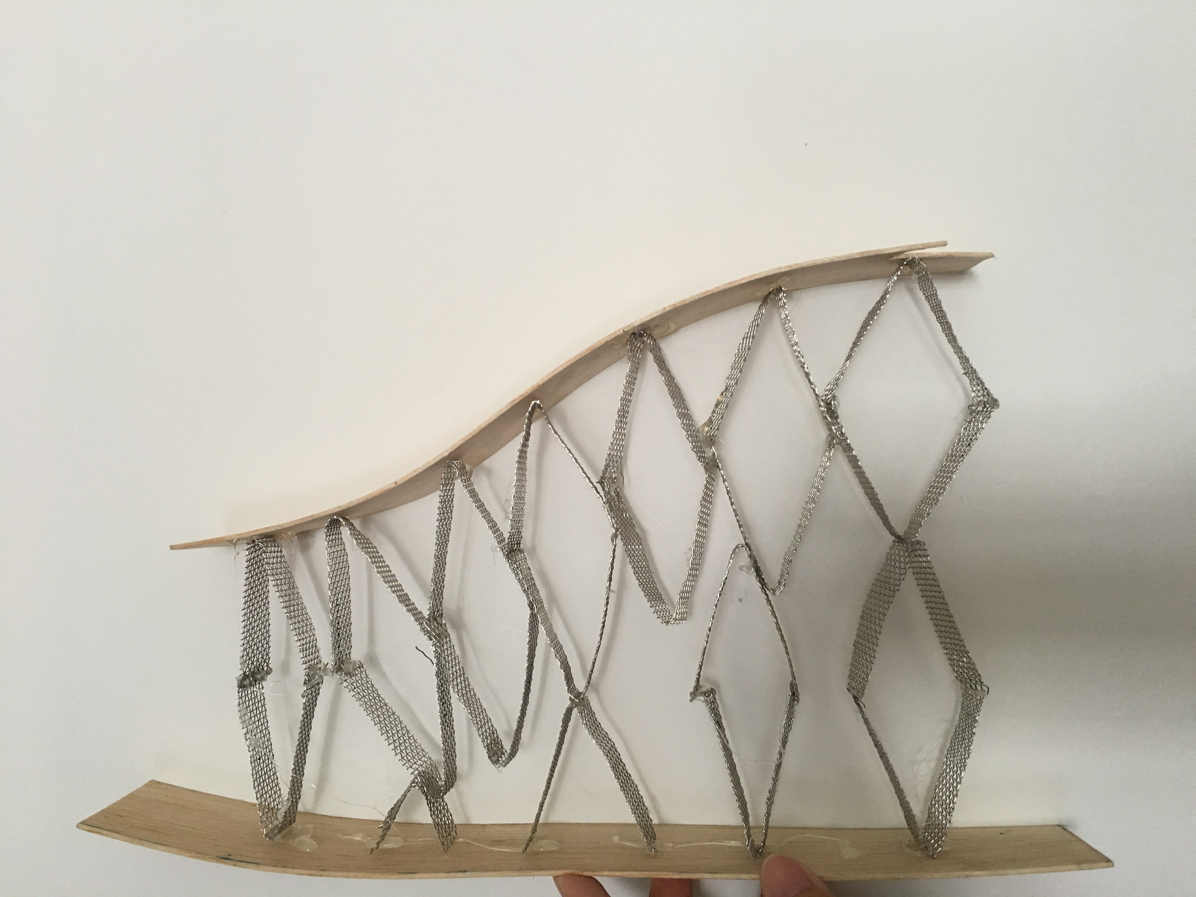
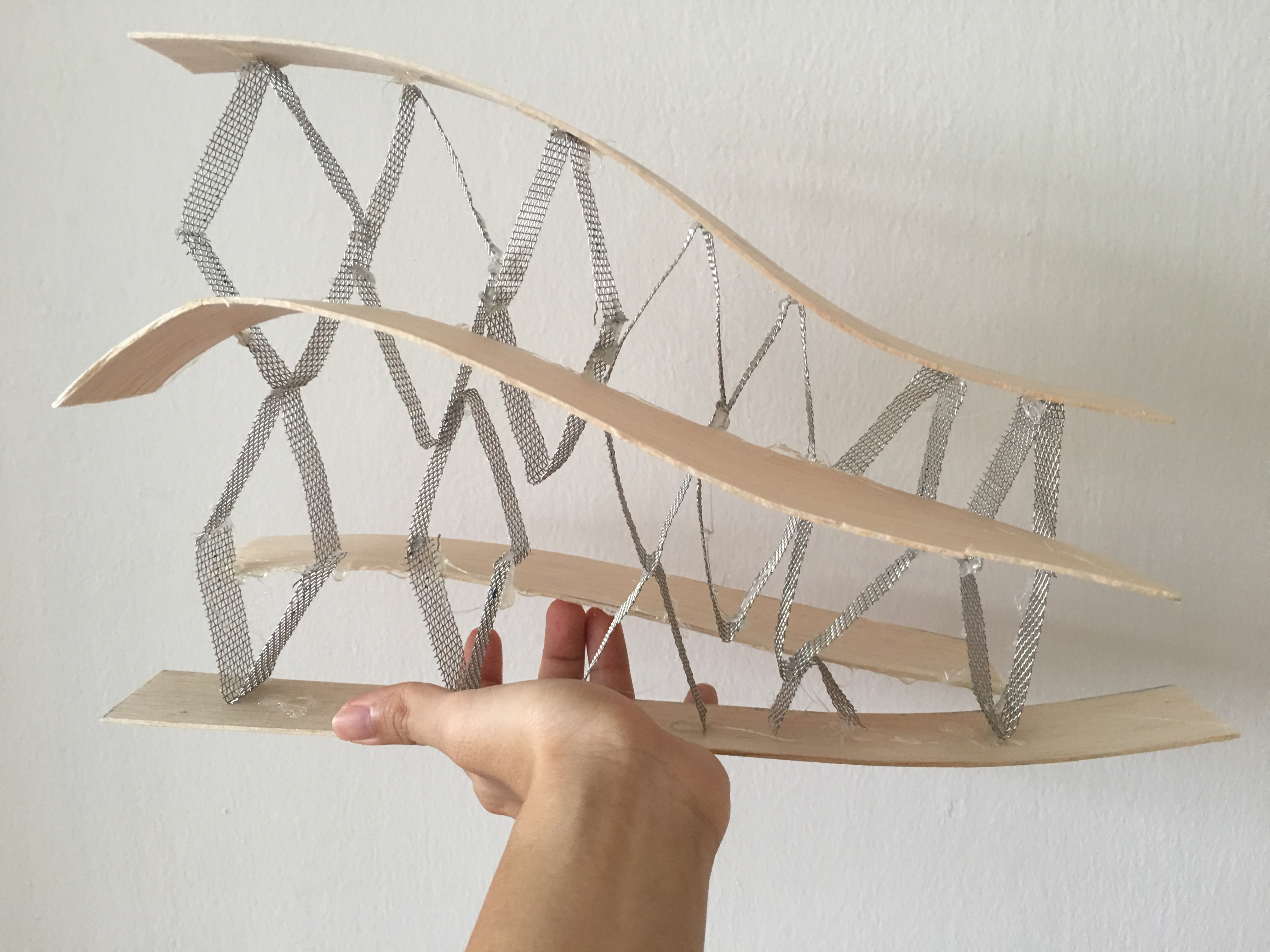
First Final Product
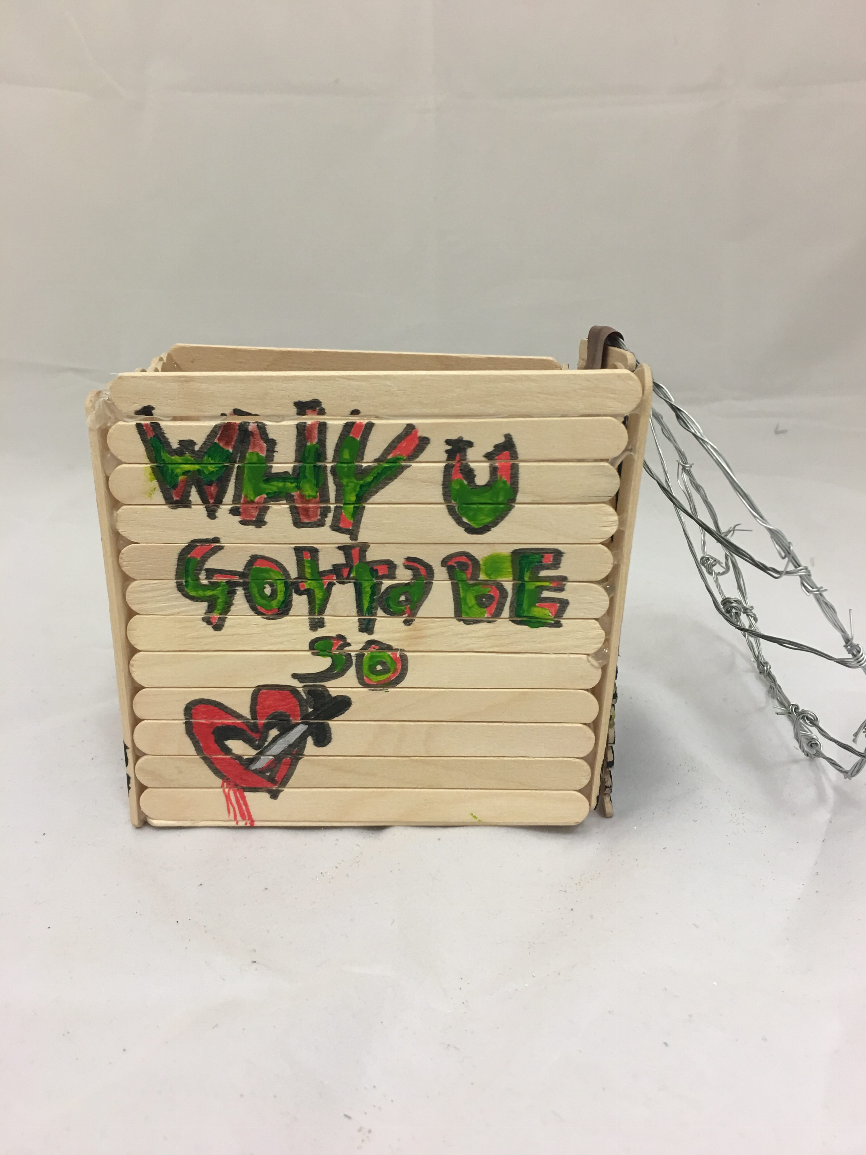
Front
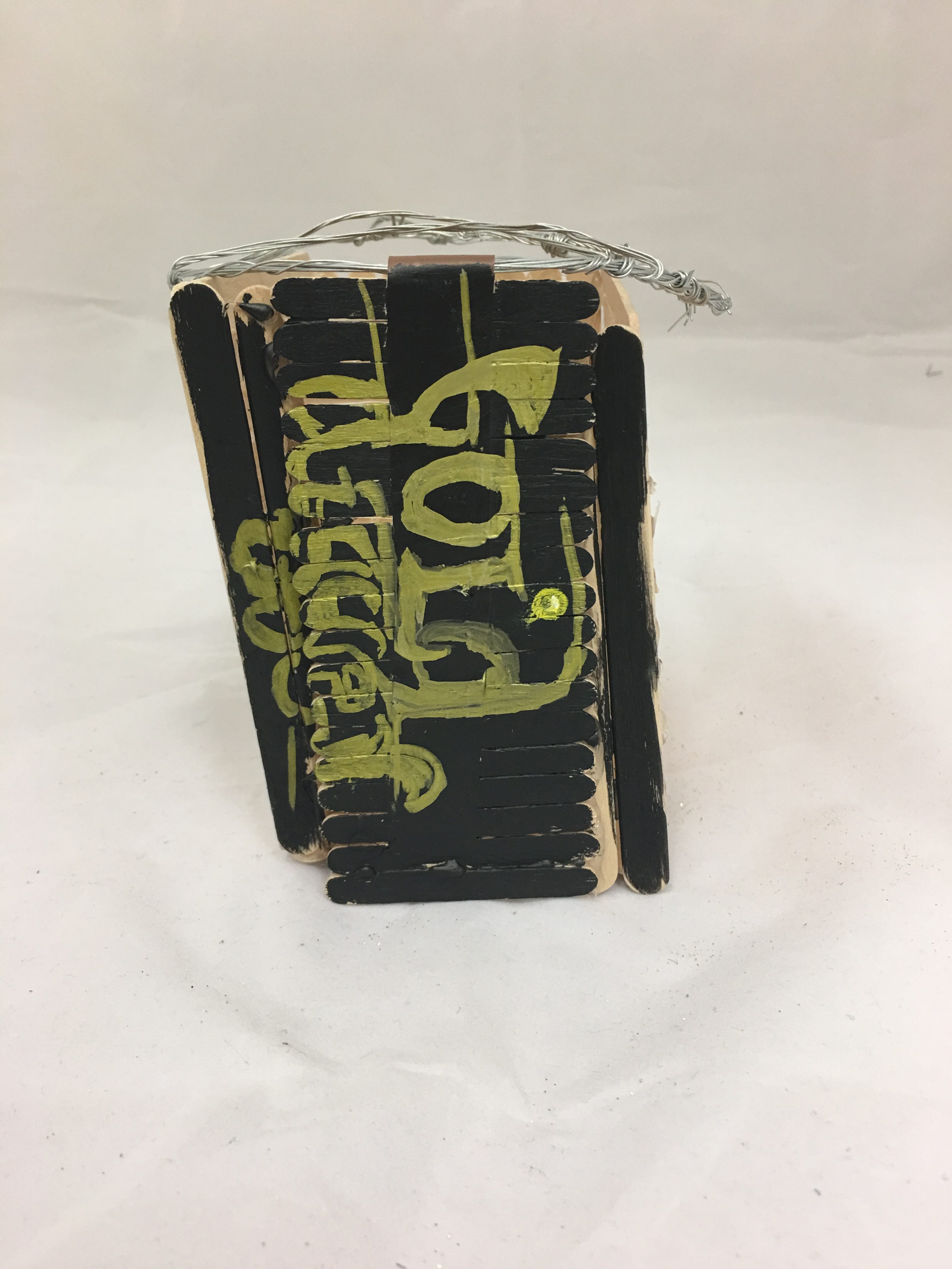
Back
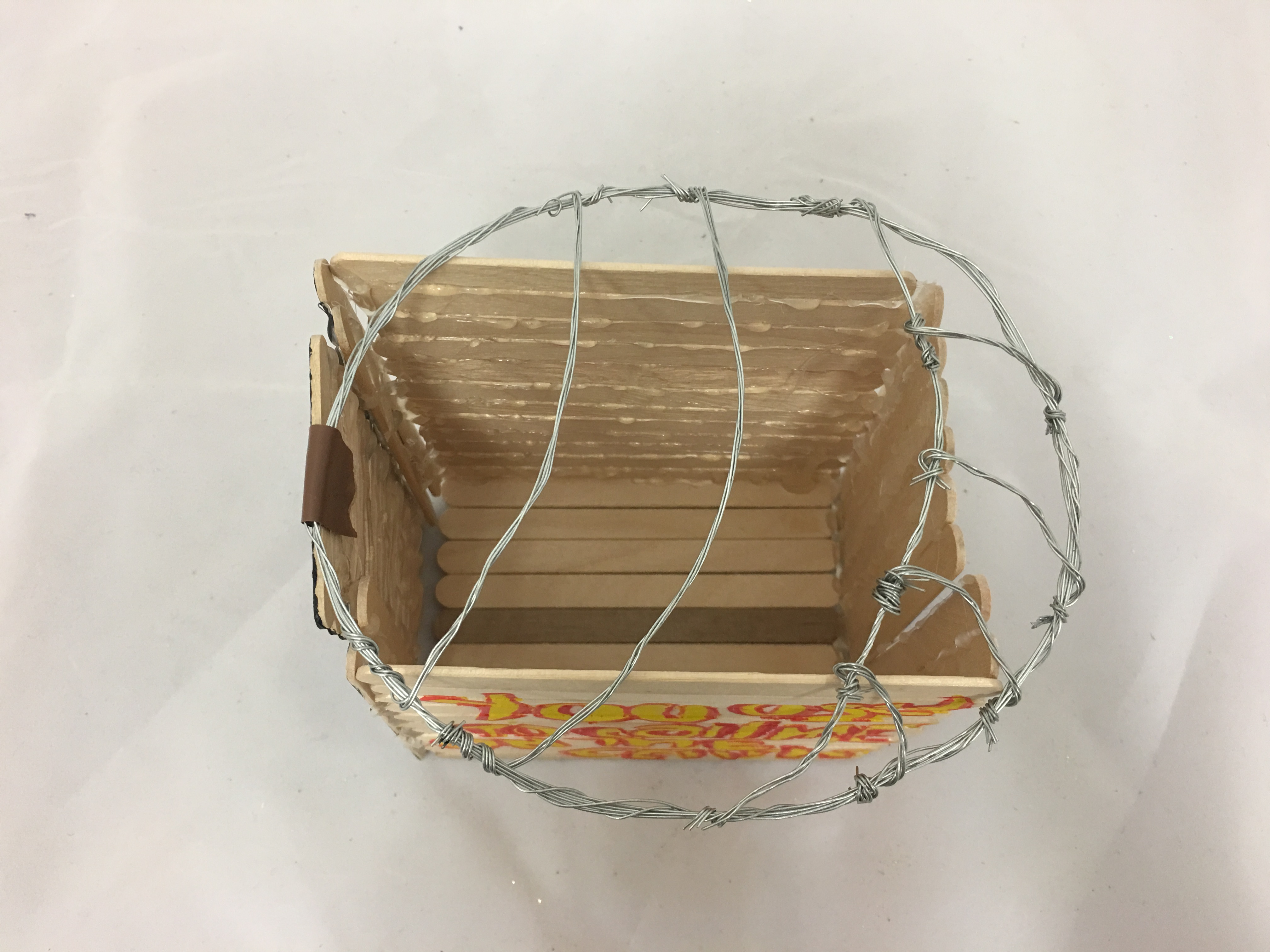
Left
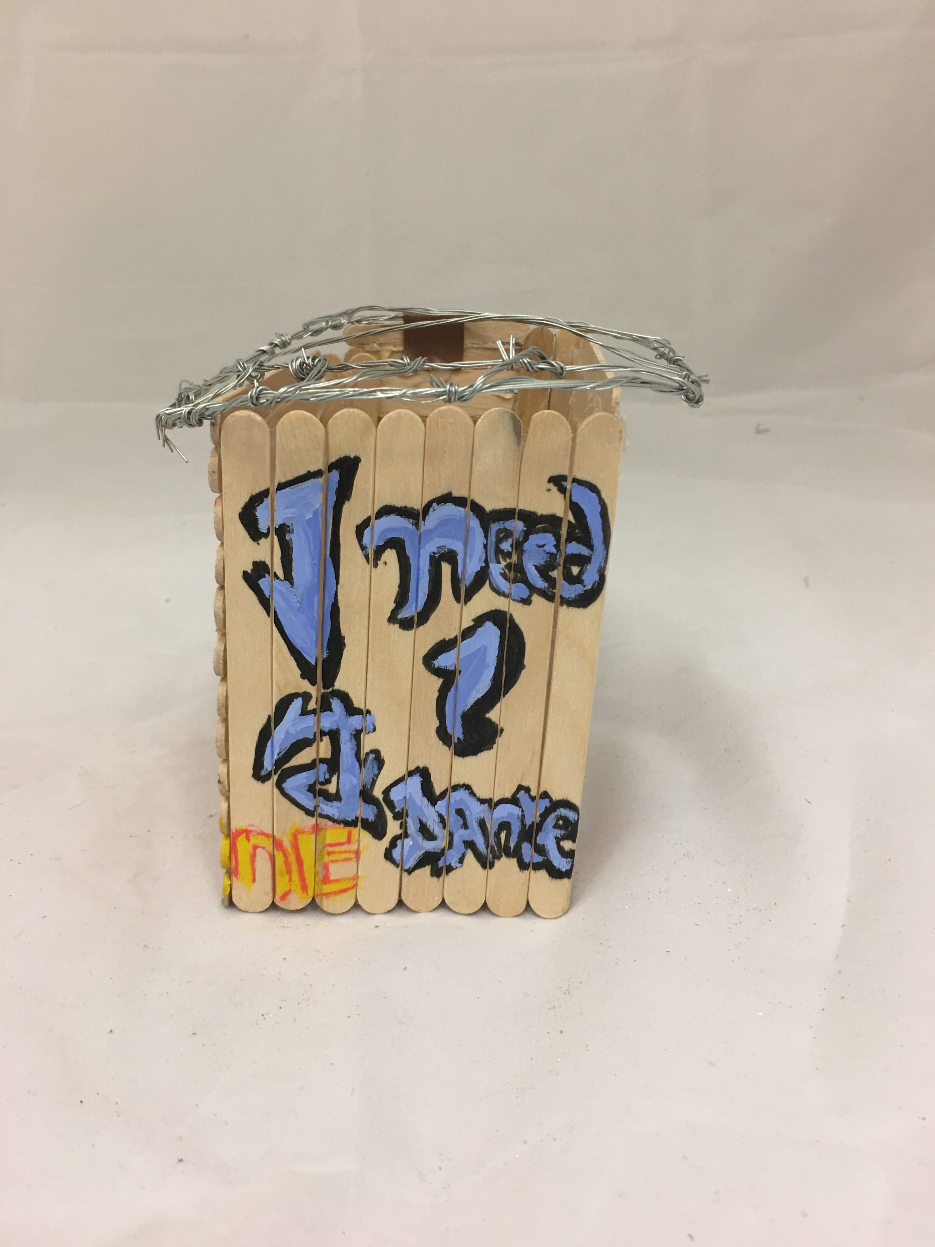
Right
The first final product may seem to look simple as there is not much of wood being used showing a lack of technical skills in my work.
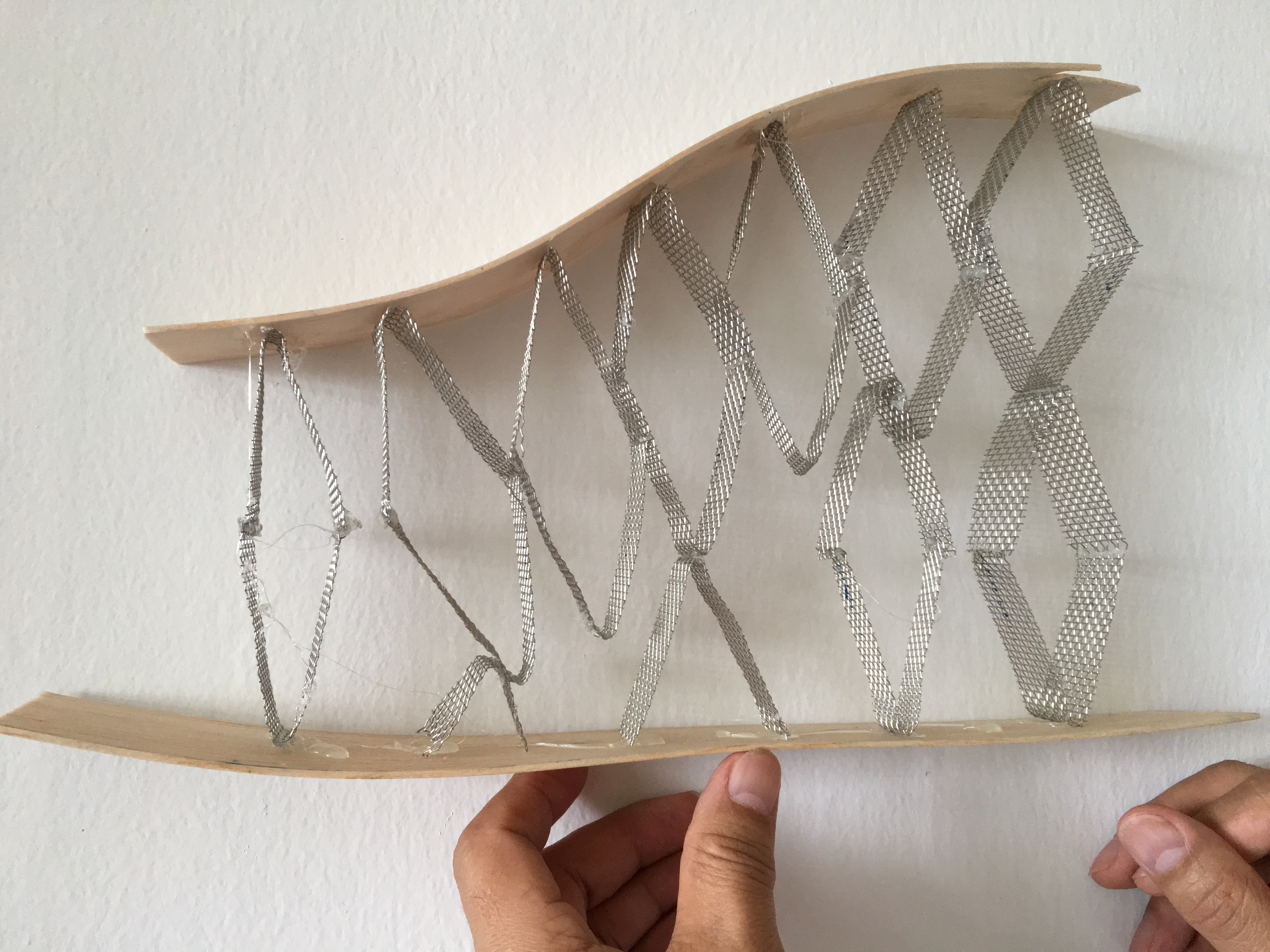
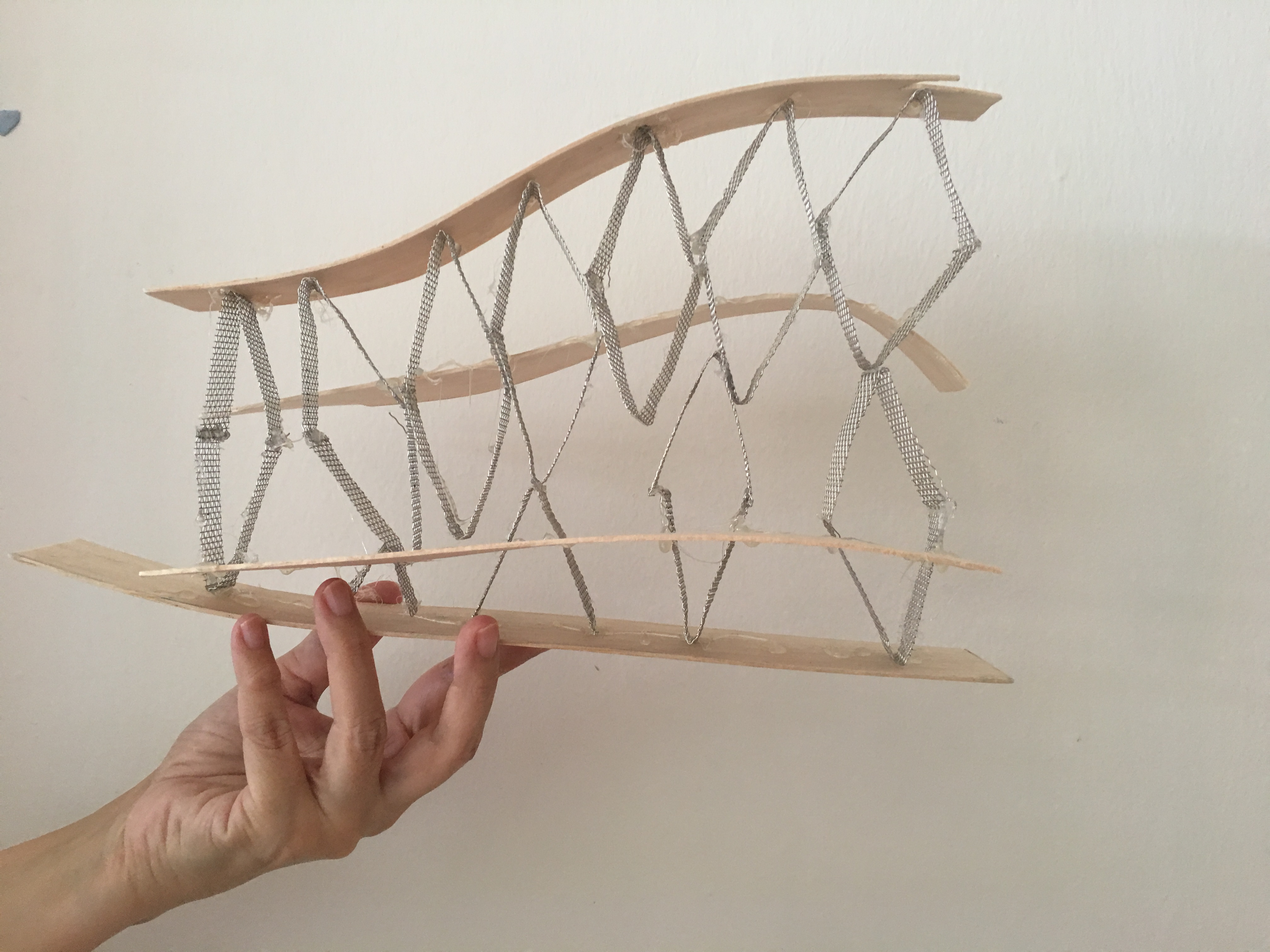
Final Product
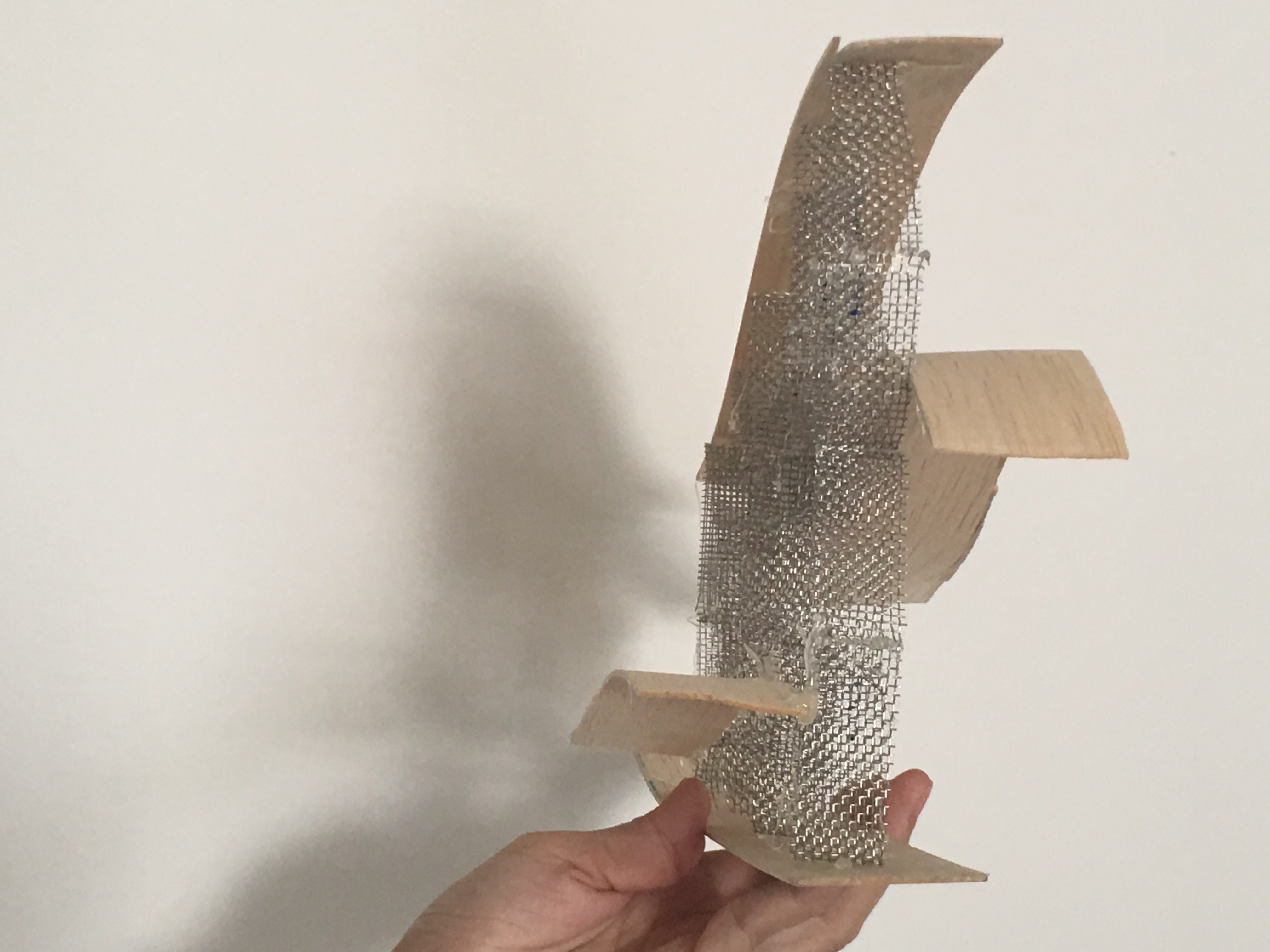
Peter suggested to me on adding more wave like structure around the diamond shapes. Then, I realised it does help to bring out the aesthetic of the structure and the fact that it looks like how the waste are dumped deep into the sea.
Front
Back
Right
Left
Reflection
This project helps me to discover the meaning of waste and how it can also affect a clean and green nation such as Singapore. The shocking fact on how Singapore can have such waste dumped into the sea makes me reflect about how we have been taking our resources for granted and using them extensively with no significant purpose. This artwork of mine does not just act as a warning towards viewers but also a reflection on how we have chosen to exploit our resources.