
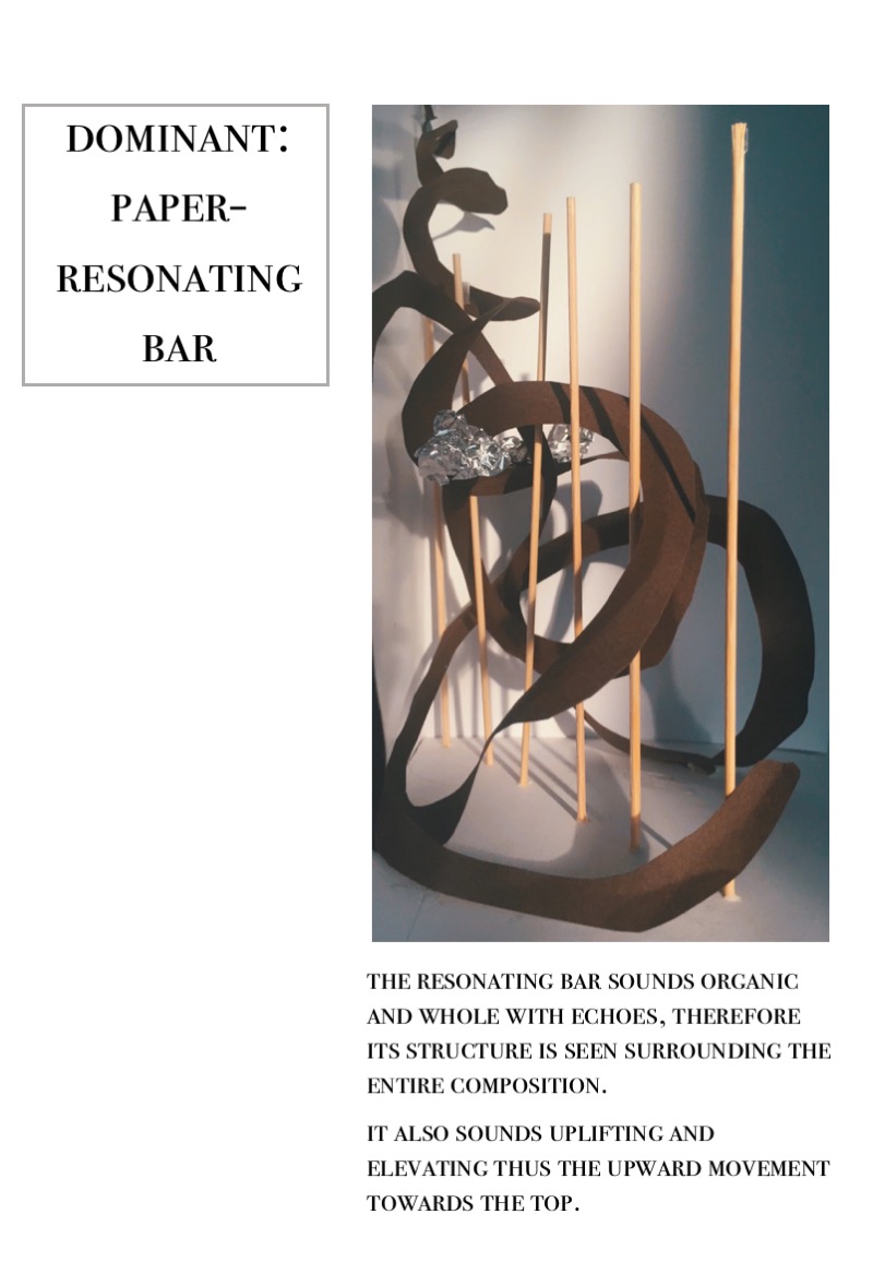
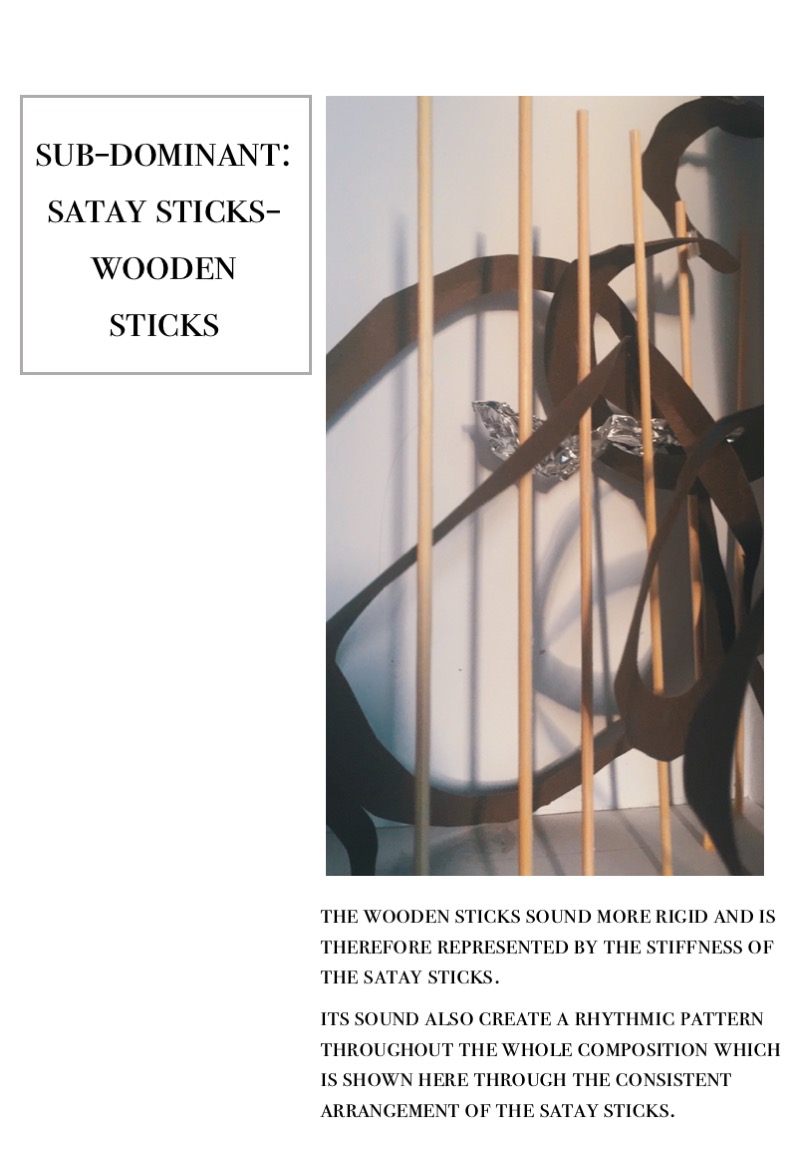
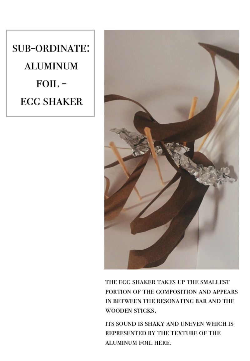
SOUNDFILE
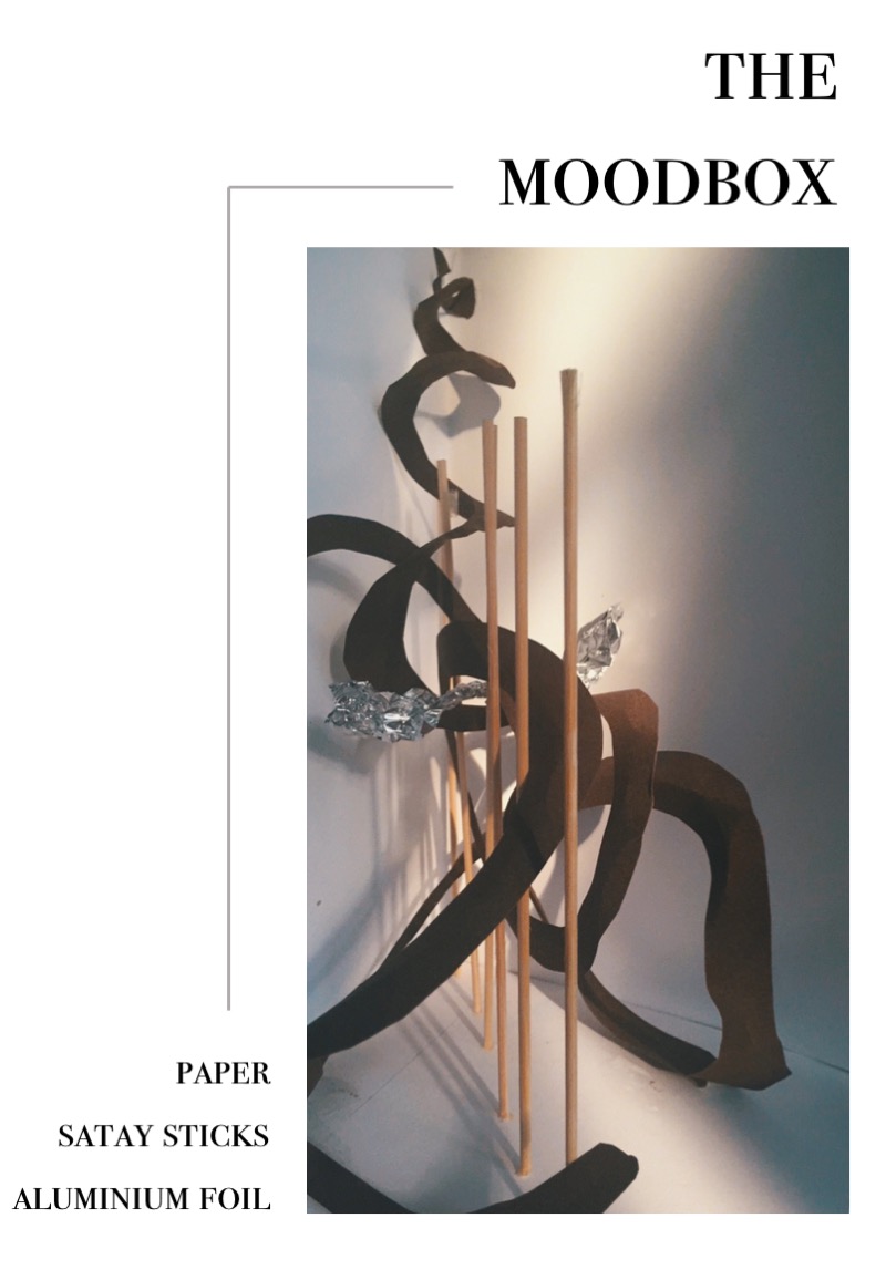
There are 8 posts filed in Foundation 3D 1 – G2 (2017) (this is page 1 of 1).
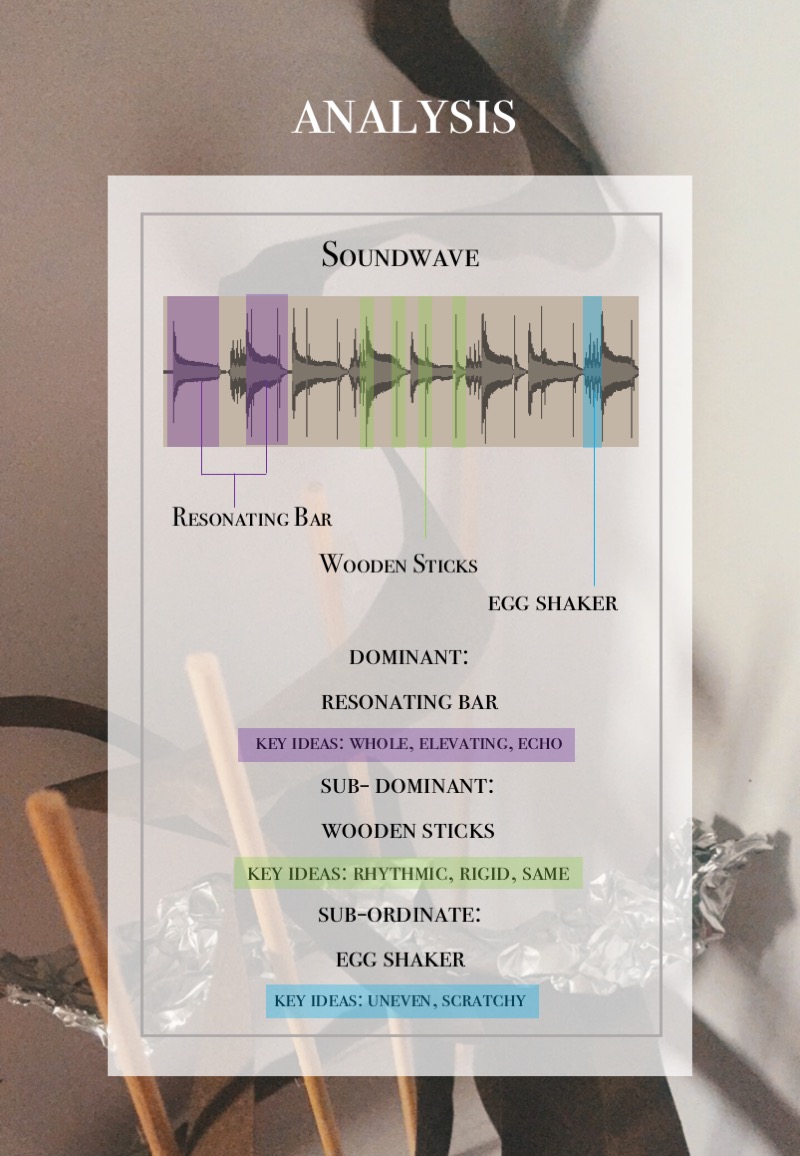
SOUNDFILE

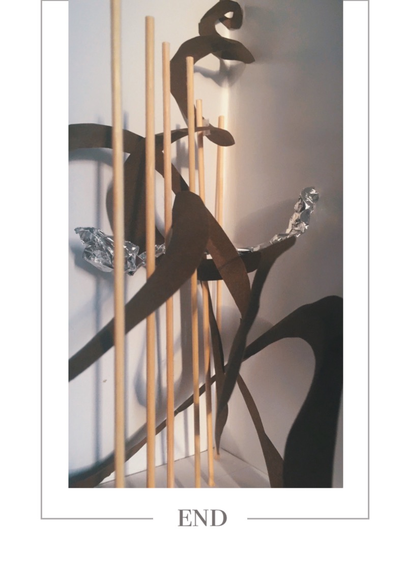
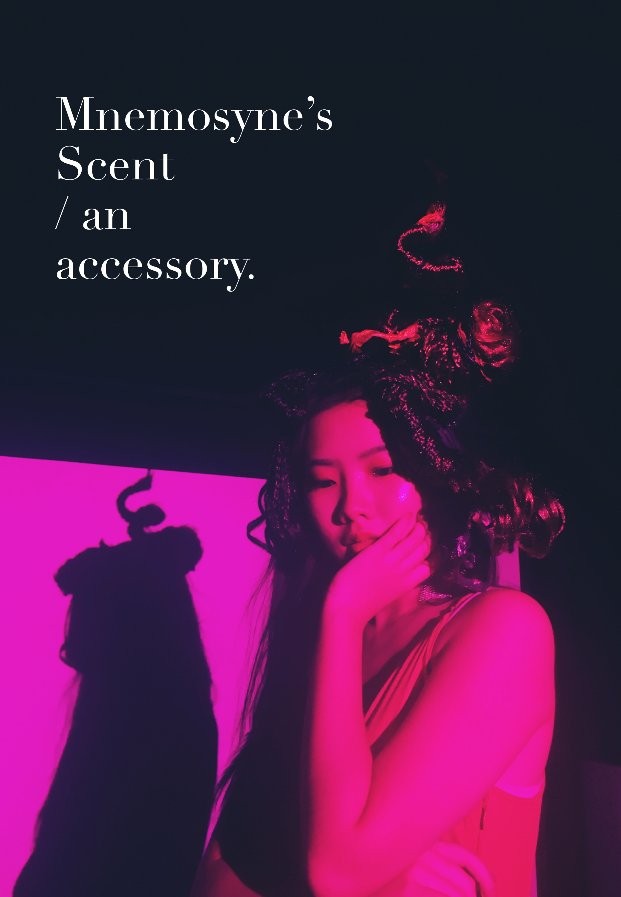
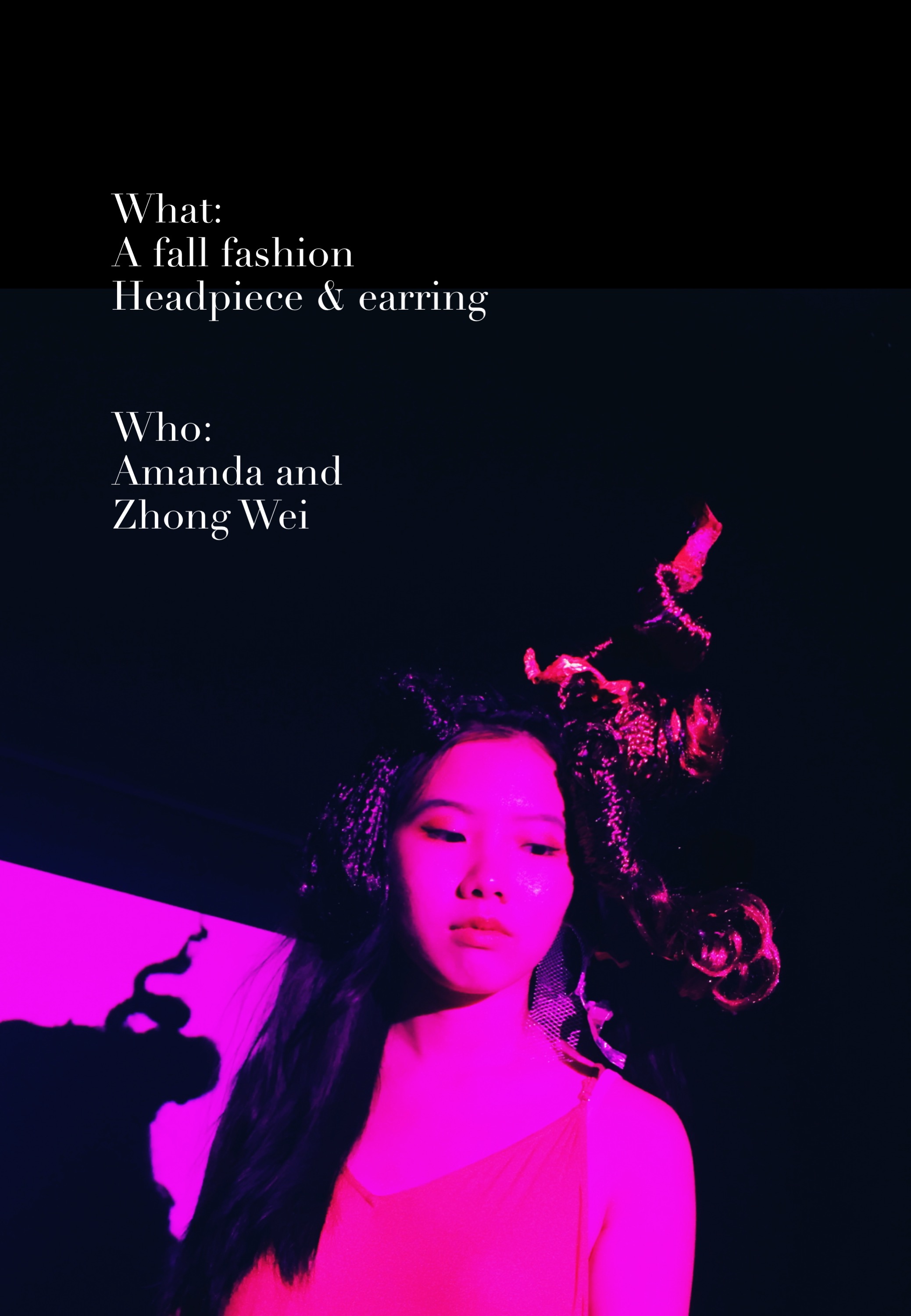
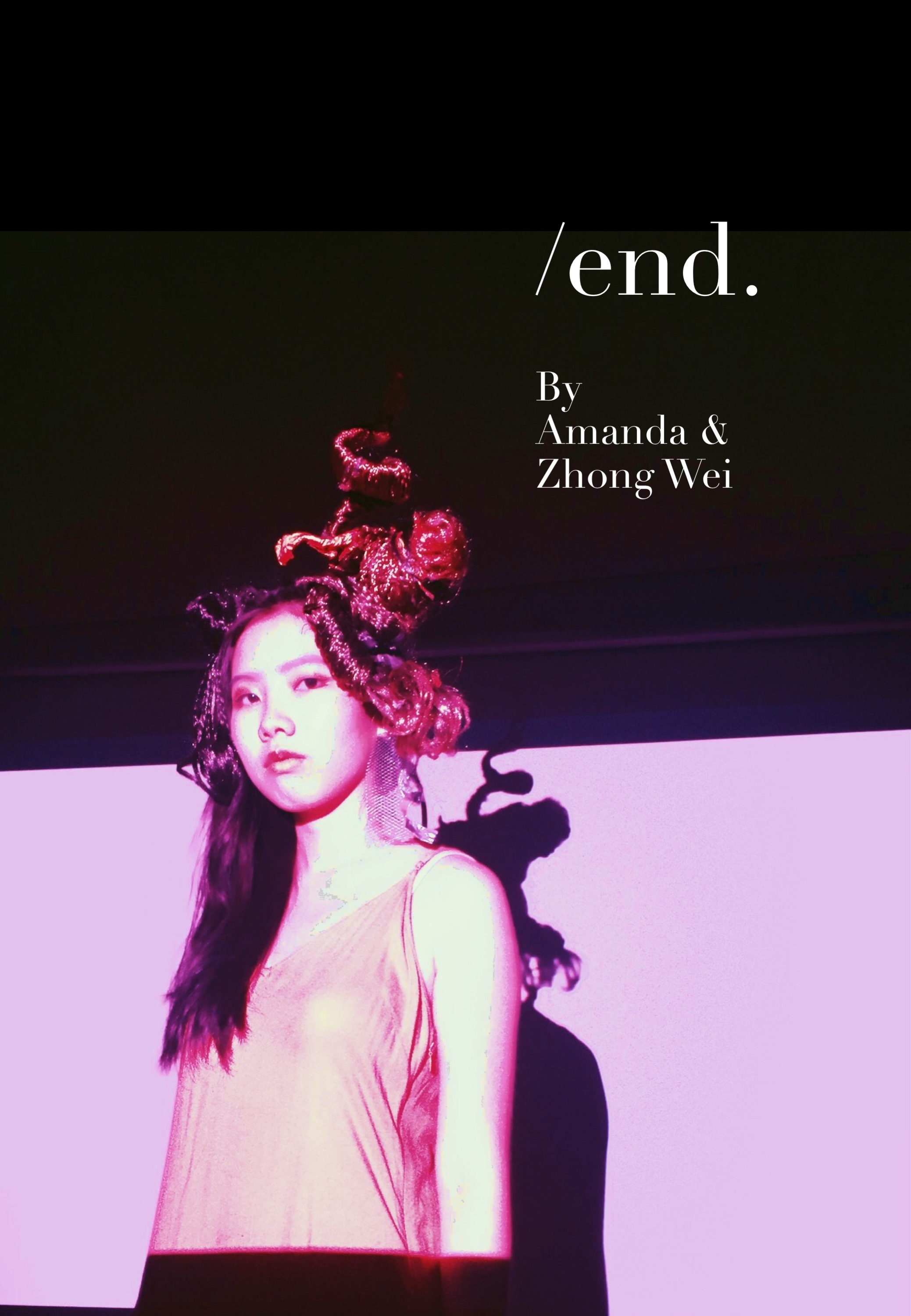
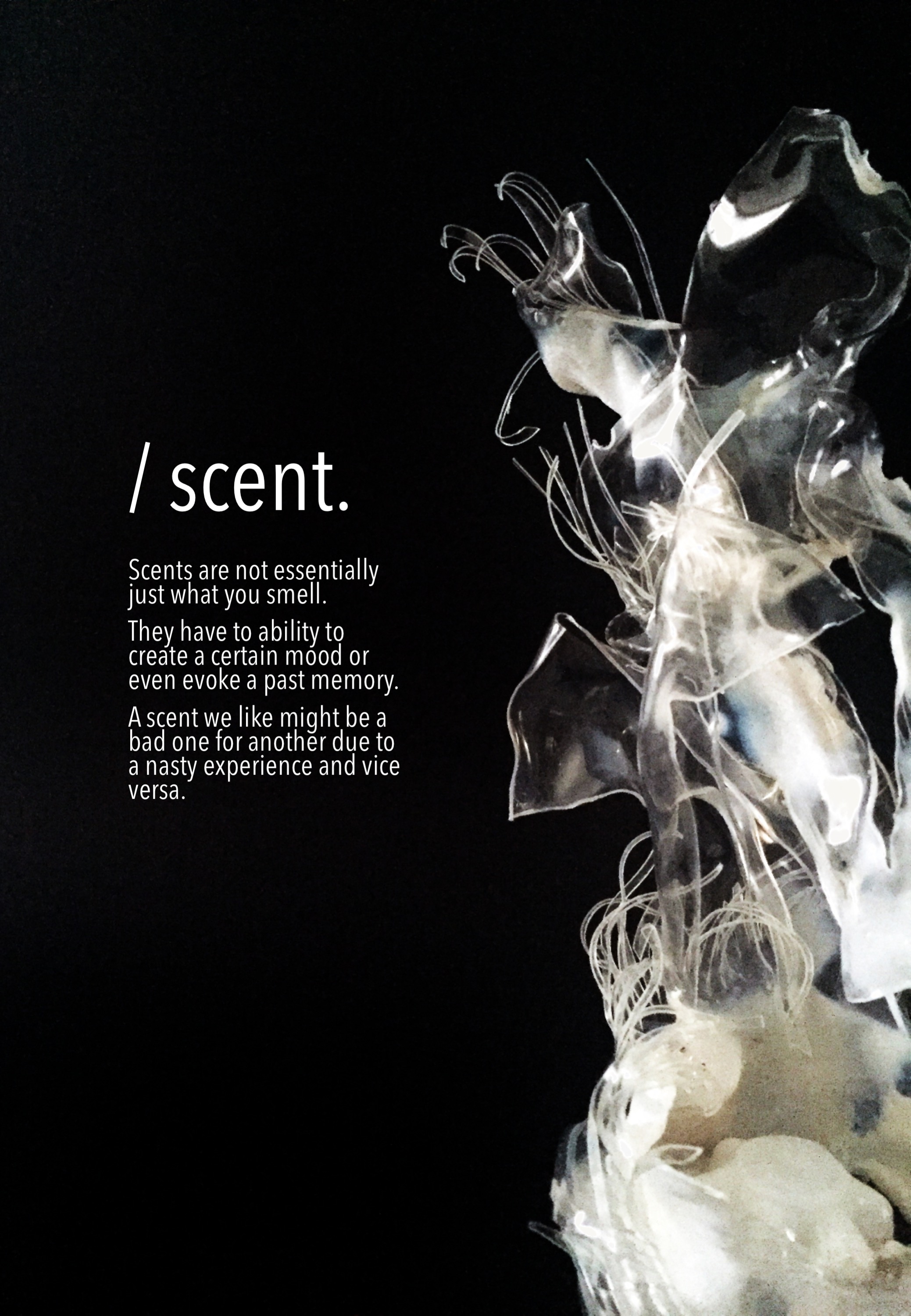
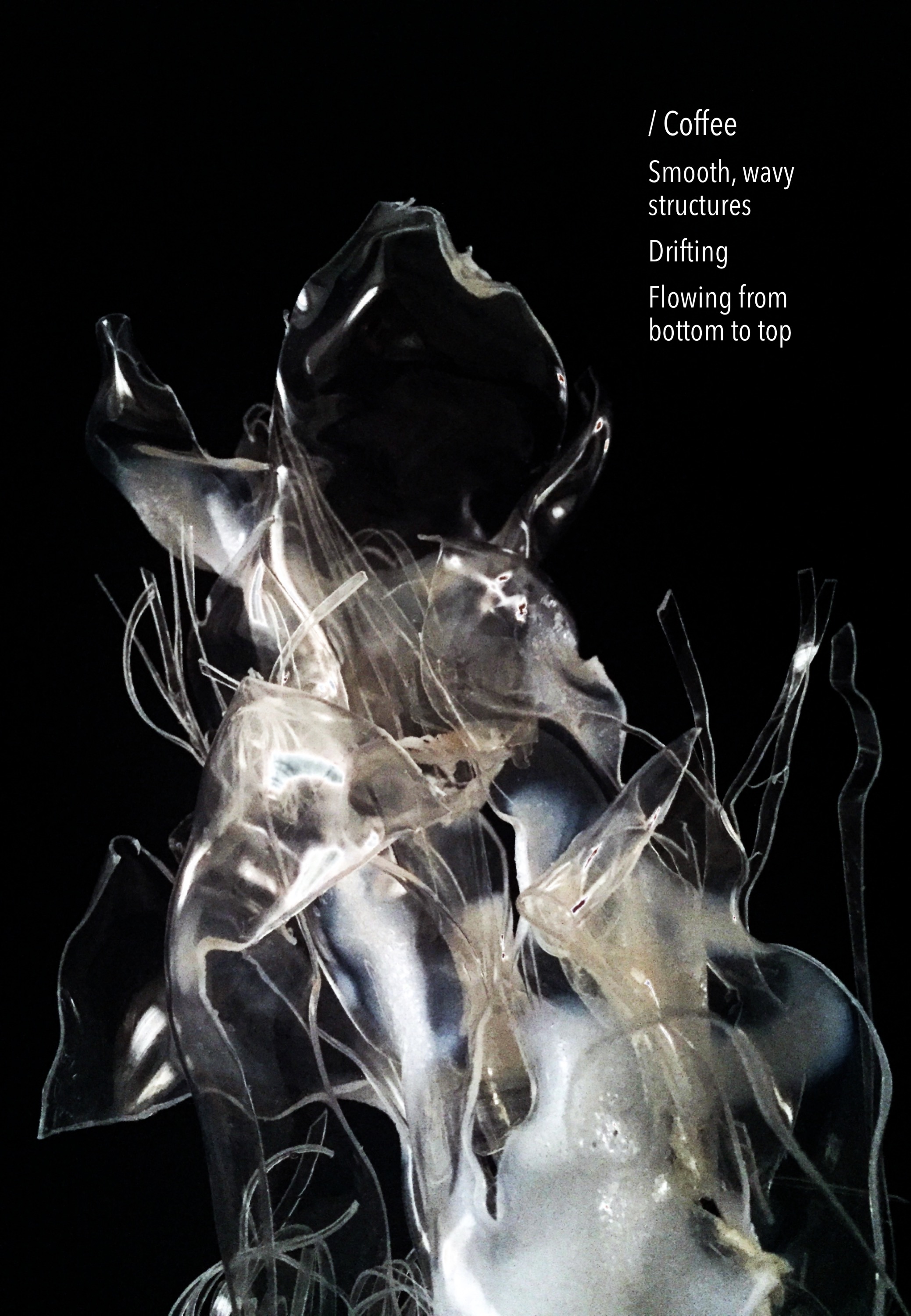
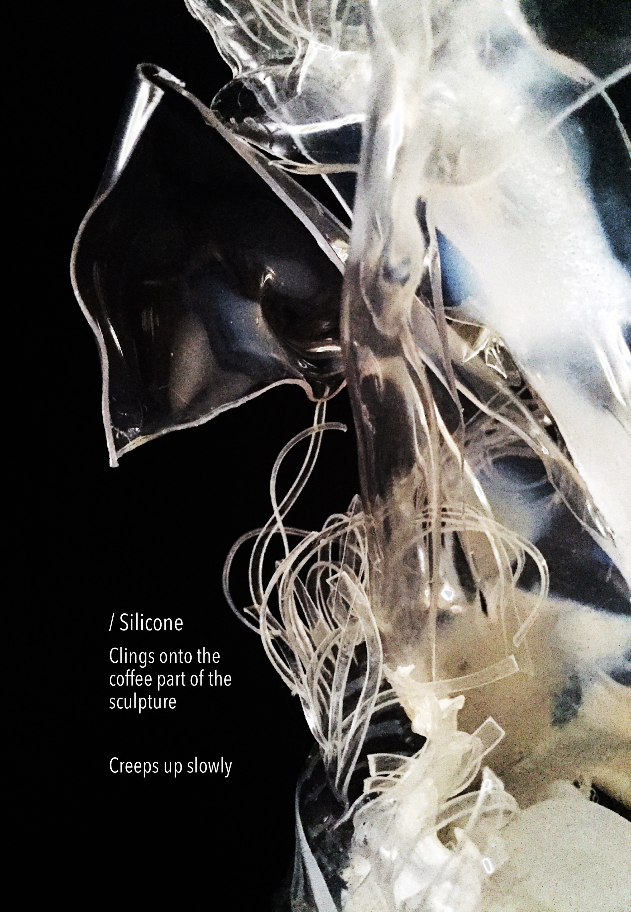
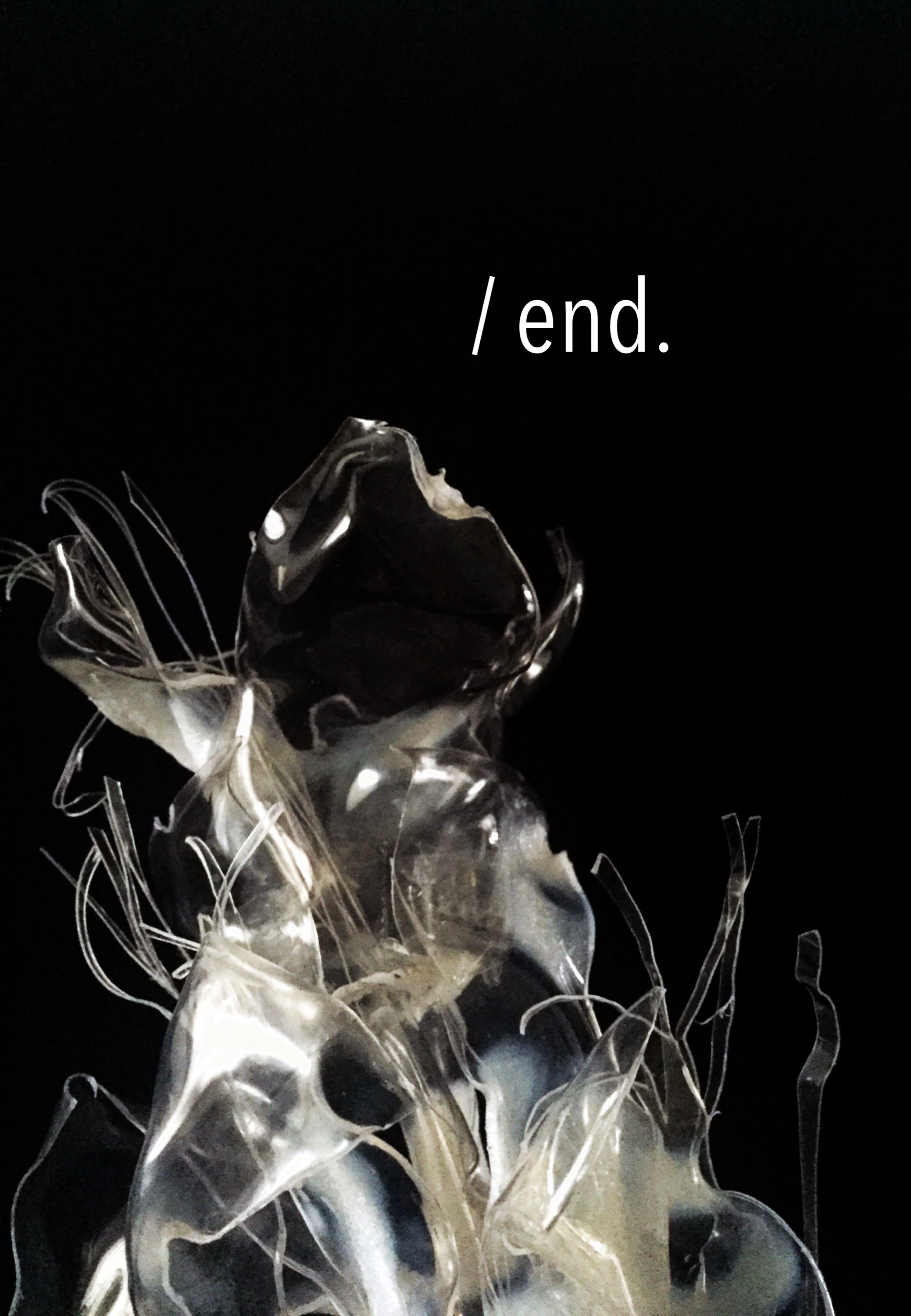
Final post of Mnemosyne’s Scent.
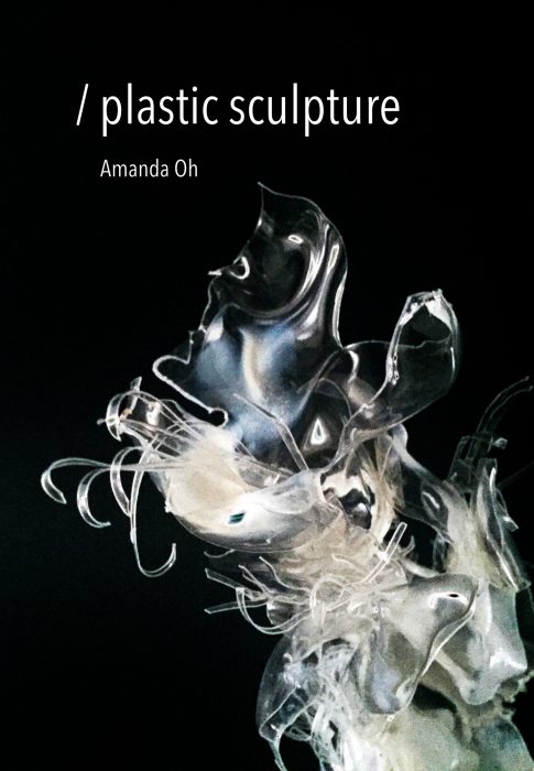
Previous posts on Planar forms and Plastic sculptures here:
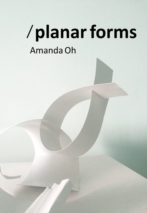
Amanda
Planar – https://oss.adm.ntu.edu.sg/am0002in/mnemosynes-scent-planar/
Plastic –https://oss.adm.ntu.edu.sg/am0002in/mnemosynes-scent-plastic-sculpture/
Zhong Wei
Planar – https://oss.adm.ntu.edu.sg/limz0141/3d-foundation-project-3-mnemosyne-scent-planar-design/
Plastic – https://oss.adm.ntu.edu.sg/limz0141/3d-foundation-project-3-mnemosyne-scent-plastic-sculpture/


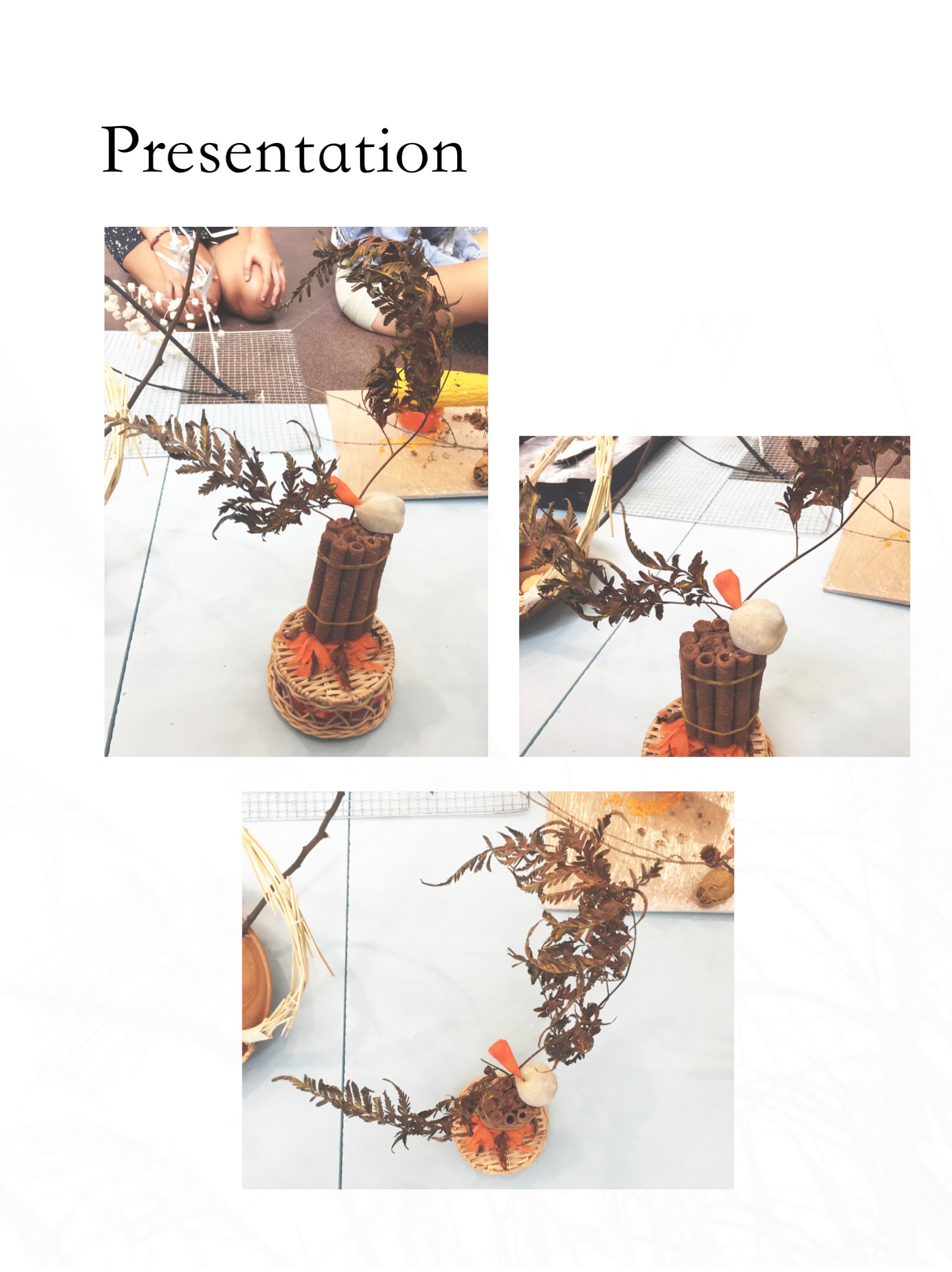
This post showcases the final documentation of the Gaia’s Ikebana project.
Following the first experimentation on Curvilinear volumes, https://oss.adm.ntu.edu.sg/am0002in/curvilinear-forms-first-attempt/ where my 2D Sketch Analysis is located, we were to come up with a composition with our sketch models using food. Also, another twist was to incorporate a branch in our composition and create an Ikebana arrangement. With that said, I first went on to research.
Ikebana
Ikebana is the Japanese art of flower arrangement. The key art styles used in Ikebana are simplicity and minimalism.
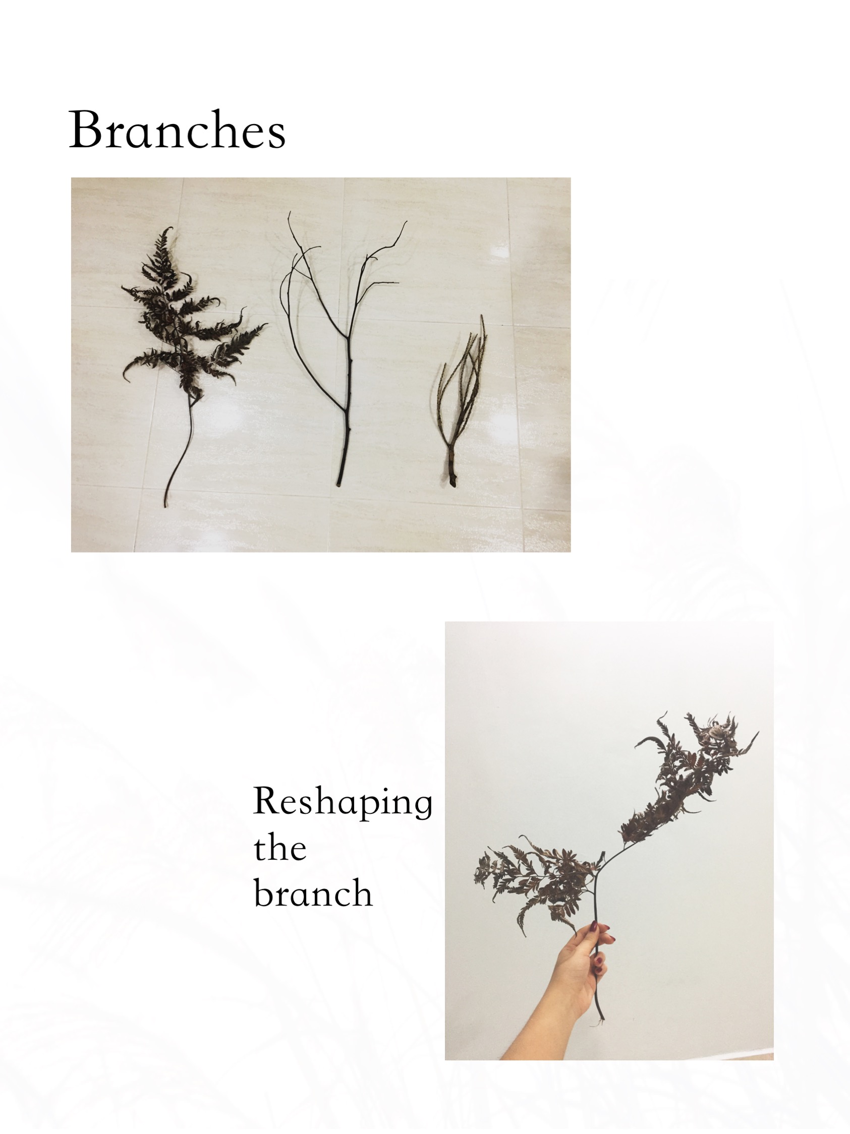
After some research on the types of Ikebana styles, I found myself drawn to the slanted style of Moribana.
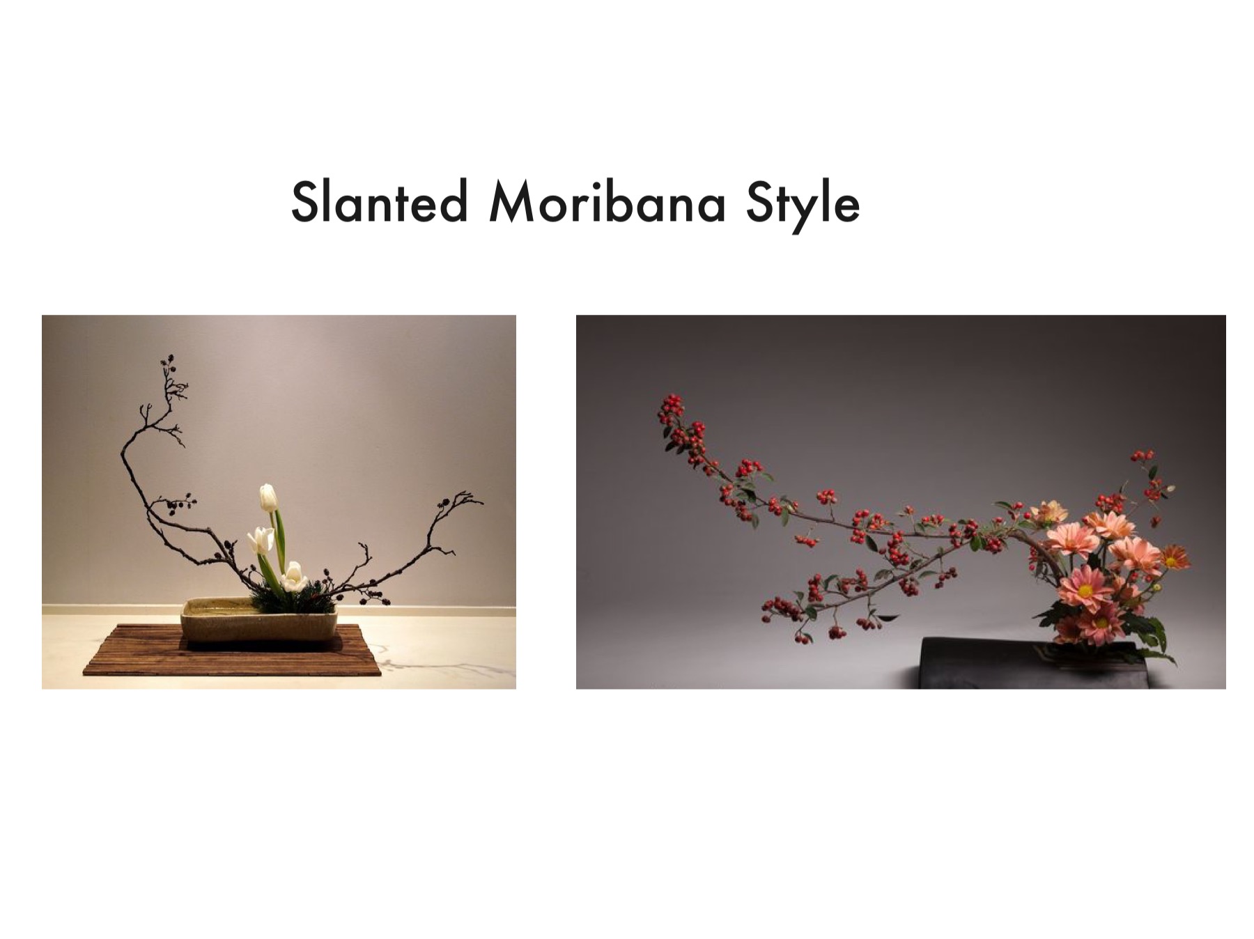
In this style, the branches are more freely arranged and gives the composition a softer look.
Theme
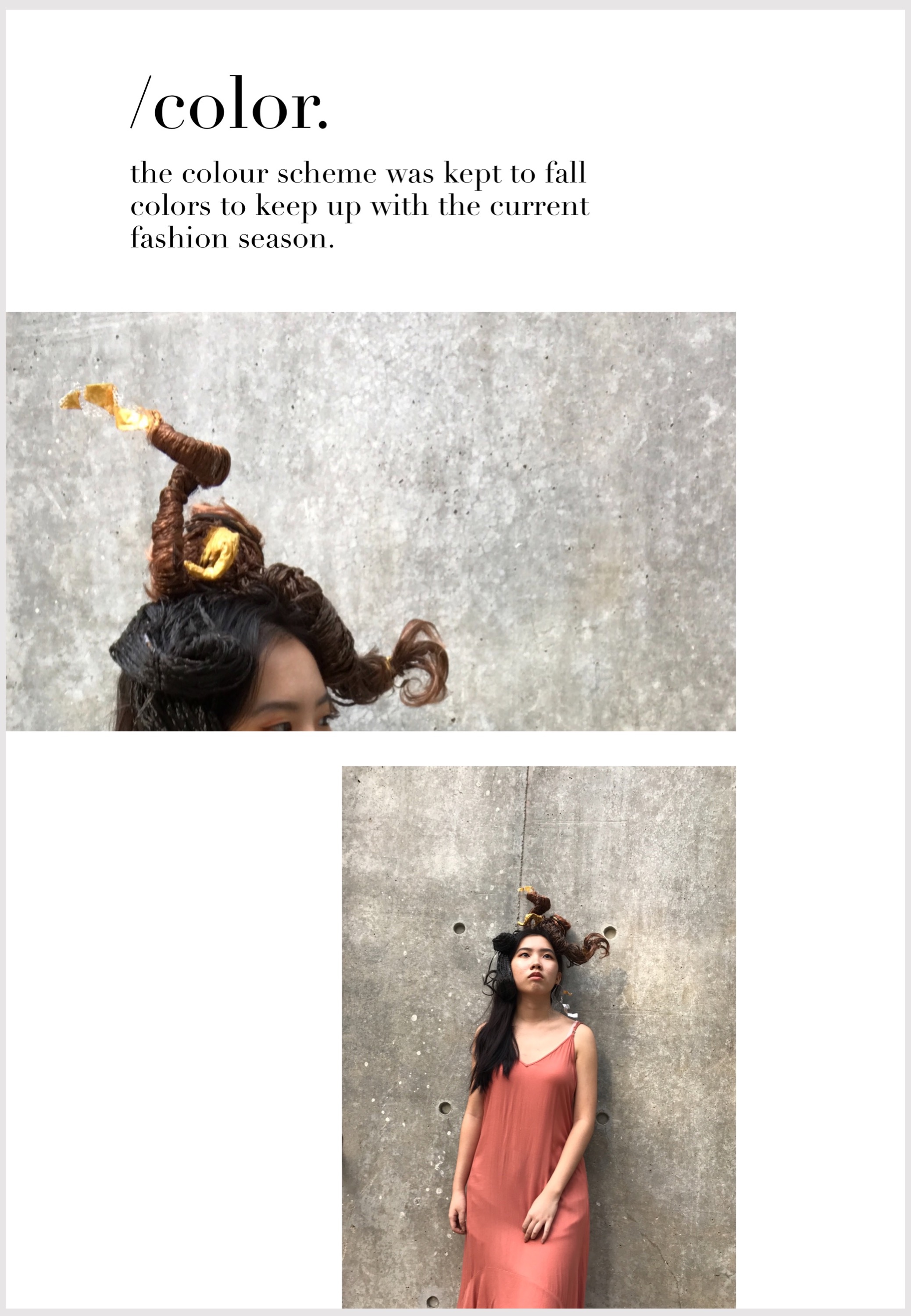
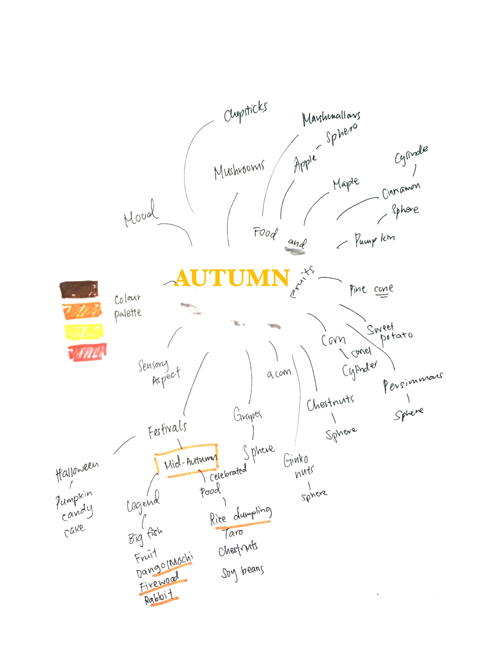
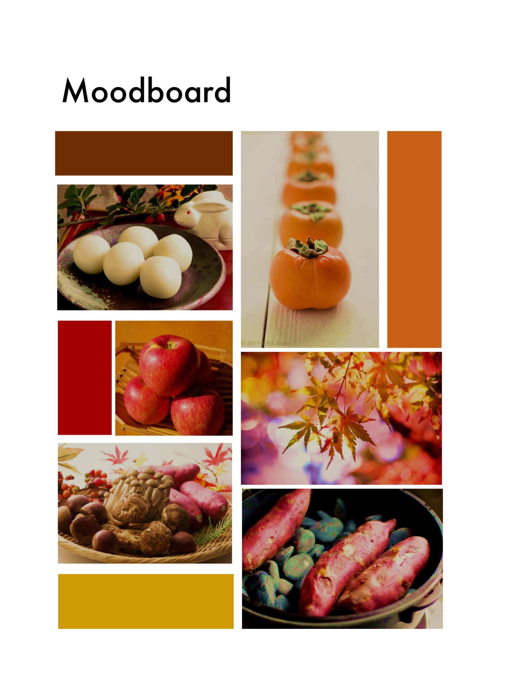
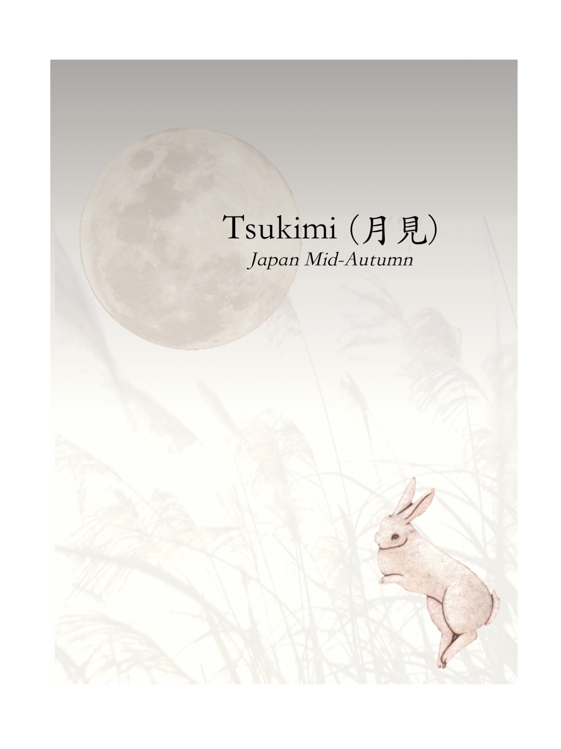
The seasonal theme I’ve got from this project is Autumn.

Here’s a mind map I did with all things related to Autumn.
I decided to go for a more oriental Japanese concept to suit the Ikebana mood. I then did a food research for inspiration and complied them into a moodboard.
With the research I did, I came up with a few concepts to work with.
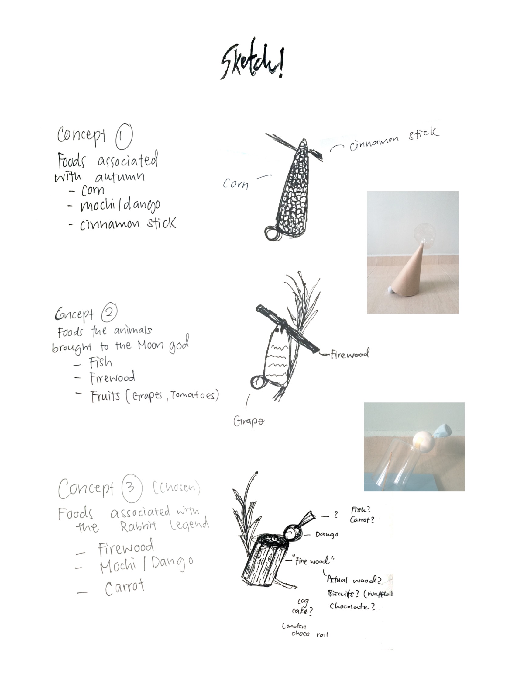
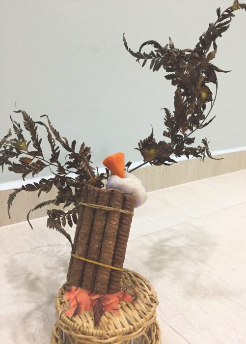
Chosen Concept
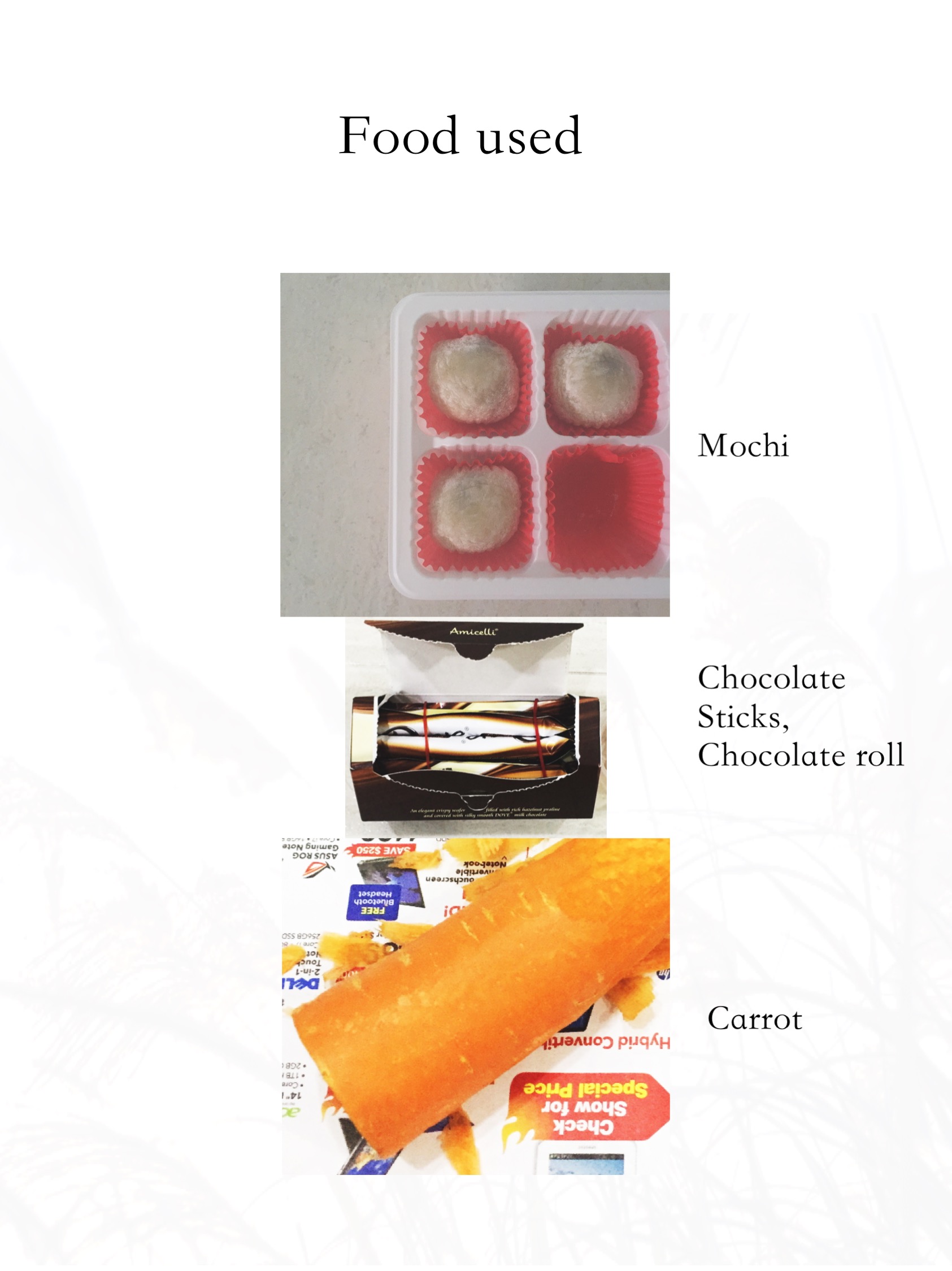
I used Chocolate Sticks and tied them together to replicate ‘Firewood’. Moshi was used as it is a traditional Tsukimi food and it also resembles a ‘Moon’. Lastly, the carrot signifies the ‘Rabbit’.
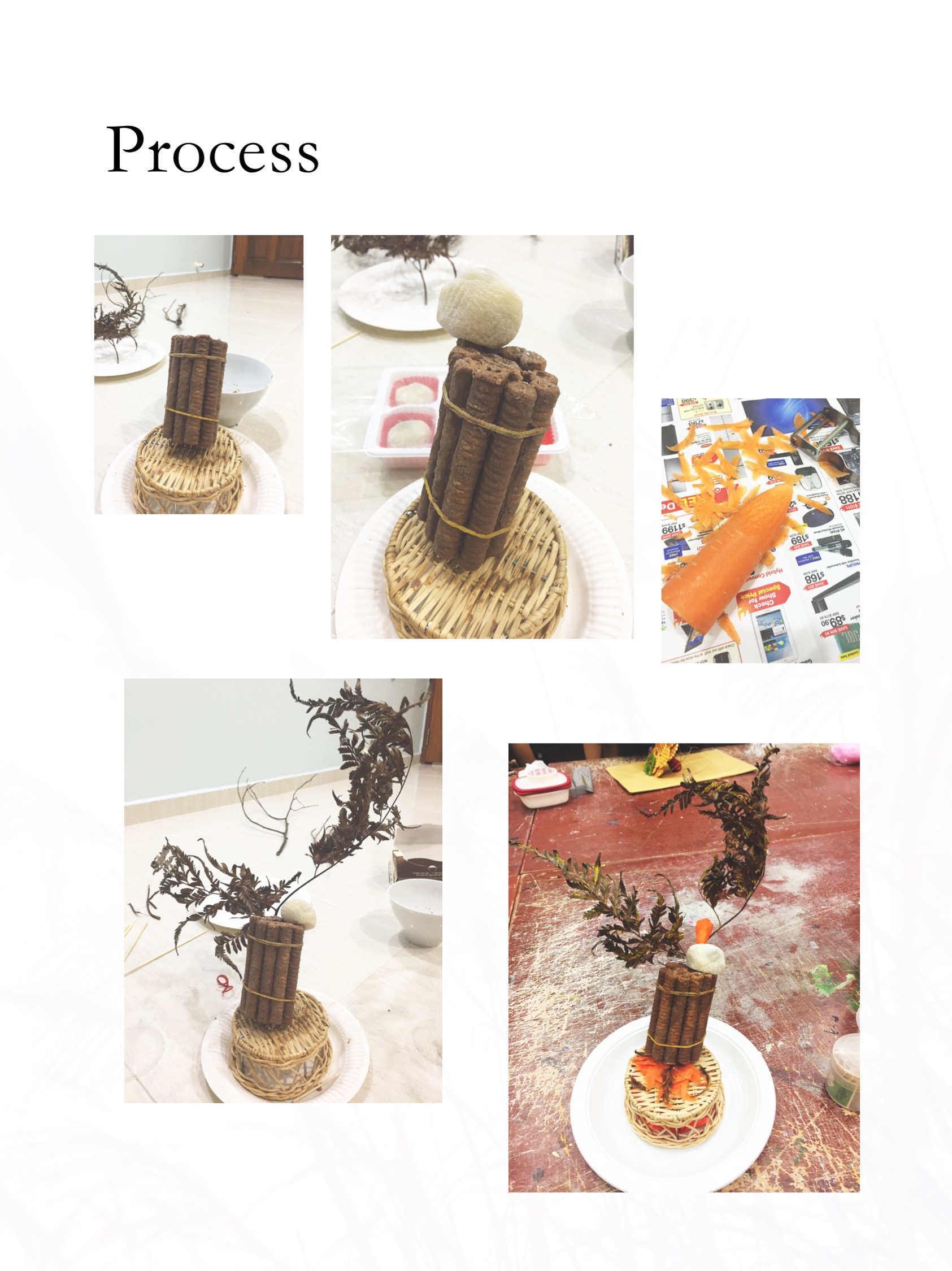
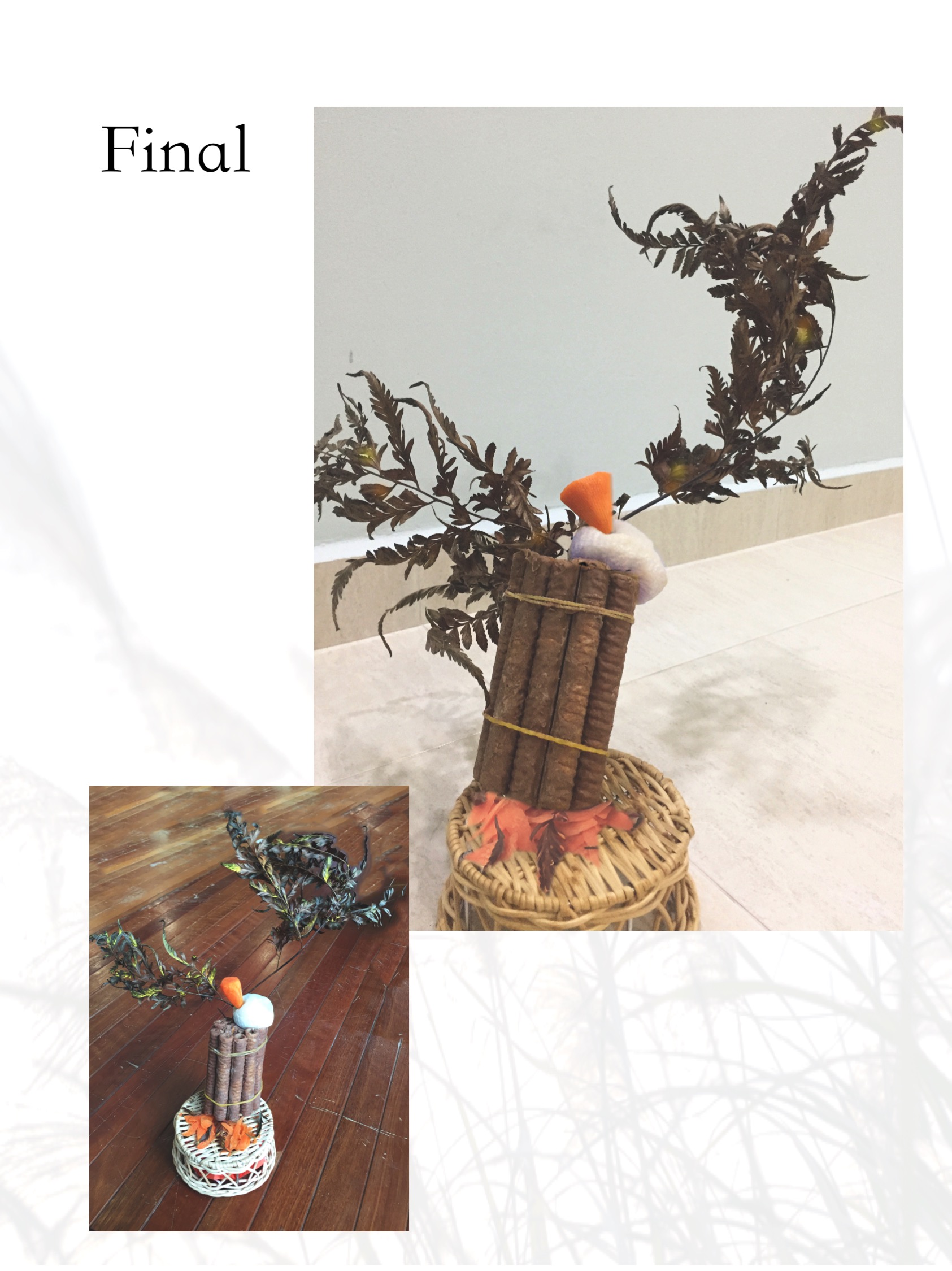
The ‘Firewood’ cylinder makes up the Dominant, the Mochi sphere is the Sub-dominant and the carrot cone is the Sub-ordinate.
Suggestions from presentation
The ‘Firewood’ could be longer and the carrot could be a smaller cone to show off the relationship between the Dominant, Sub-dominant and Sub-ordinate.
The base used could be a simpler flat wooden plate to avoid distraction.
References
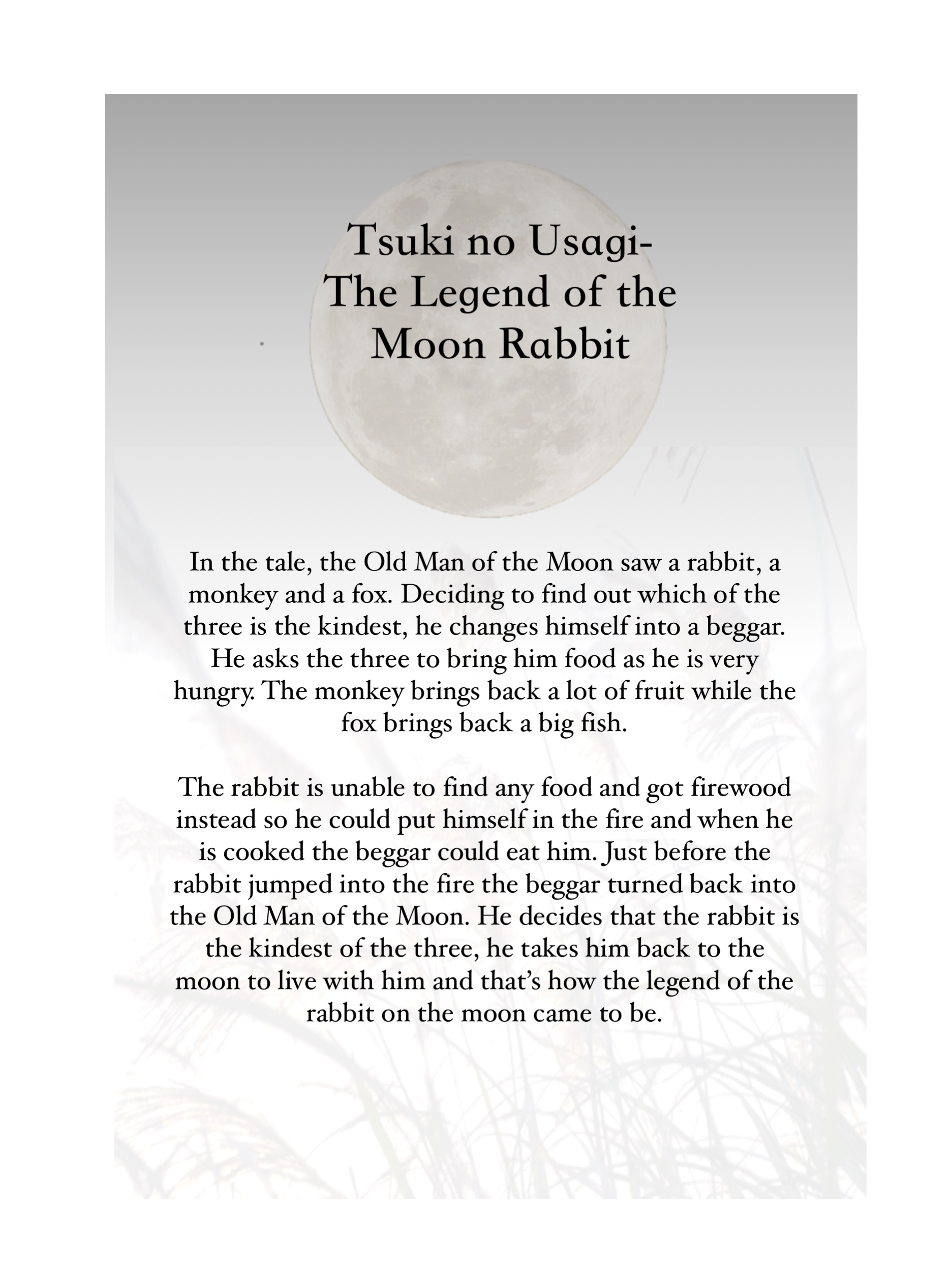
More about the Moon Rabbit legend:https://asianinspirations.com.au/asian-culture/japanese-moon-festival-legend/

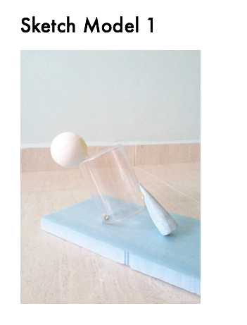
For this next project, we are working with curvilinear forms, namely cones, spheres and cylinders. We are also playing with diagonals this time round, as well as different types of balances- Independent, dependent and precarious.
This is my first attempt on curvilinear compositions using blue foam and ready made materials.


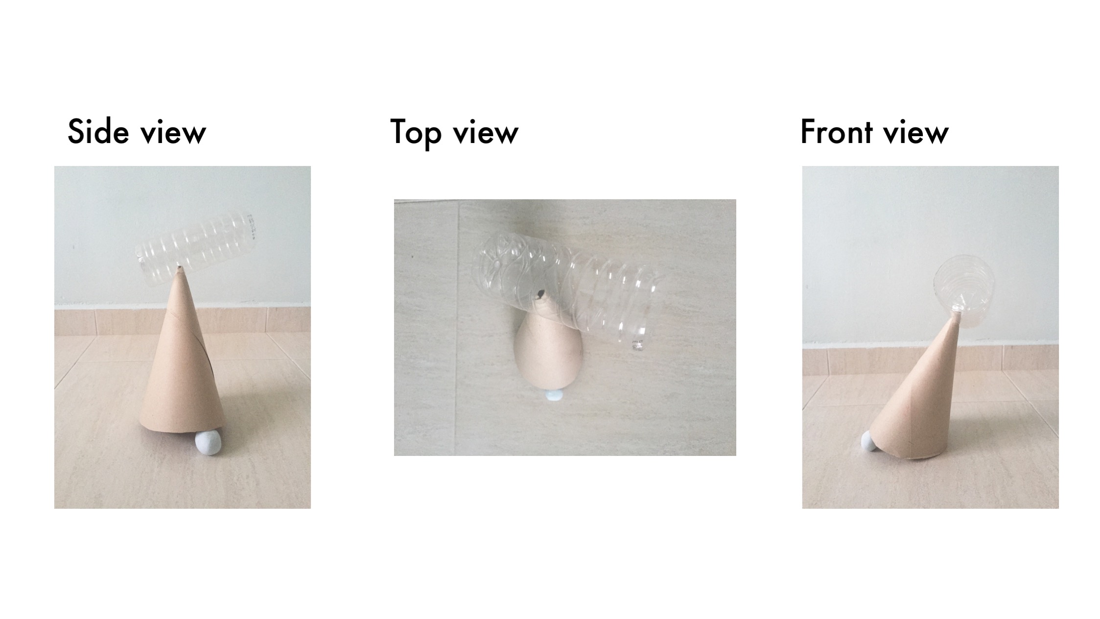
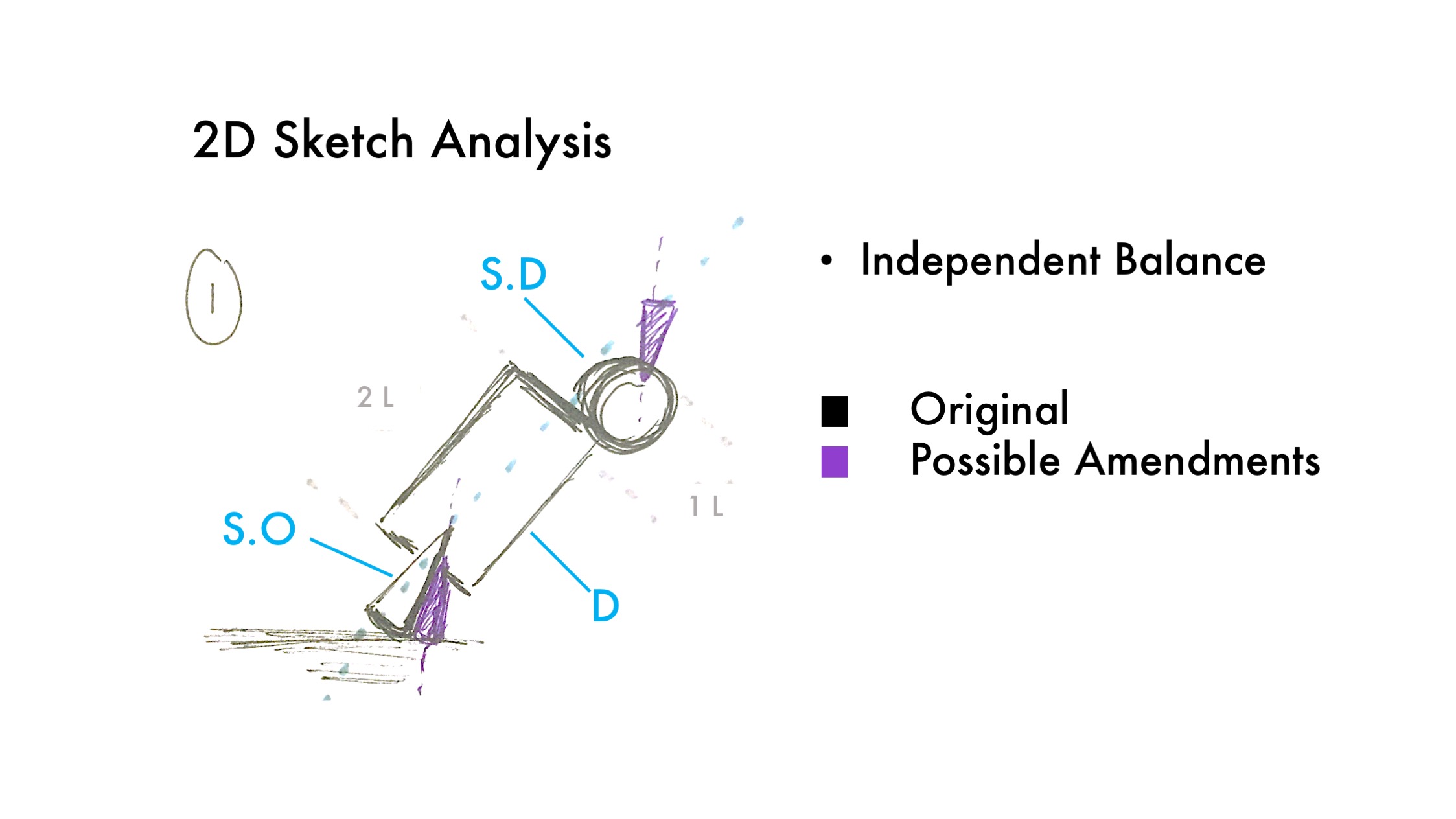
Changes to be made:
Making the cone smaller so there is a clear Sub-dominant and Sub-ordinate.
Changing position of the cone so that the apex can be seen
Going for a more zig-zag composition

Changes to be made:
Making the Sub-dominant shorter and thinner
Going for a more precarious balance
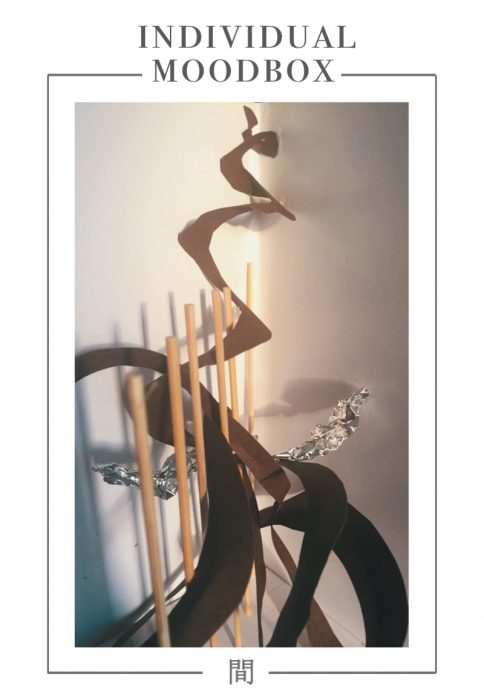
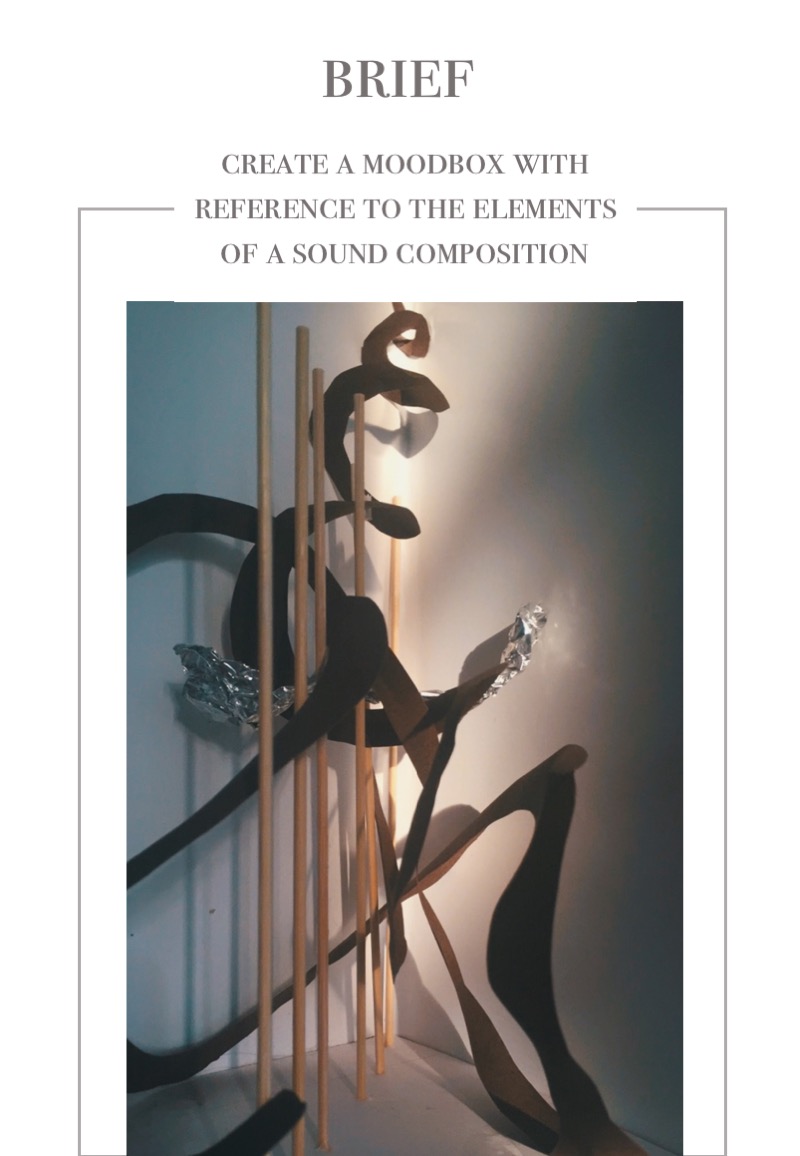
Following the previous lesson, we now had to implement what we have learned onto our boxes. This time, we had to construct our boxes based on the given theme.
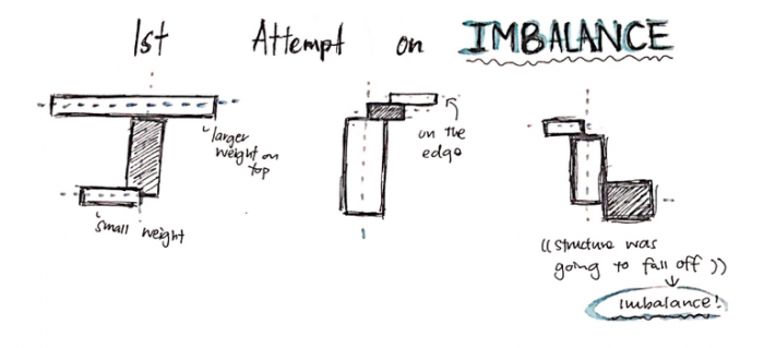
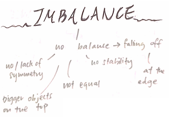
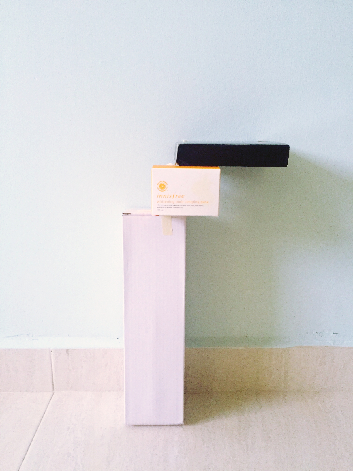
For this Pandora’s Box project, the theme I’ve gotten is ‘Imbalance’
What is Imbalance? It is the state or condition where there is a lack of balance or even proportion. Here is a mini chart I did relating to Imbalance.
With that, I began to draw out possible 2D Sketch Analysis for the composition of my boxes.
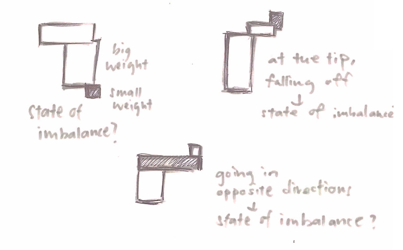
For my first draft, I finalised on these three concepts.
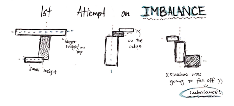
Then, I picked 2 of them to make up my box composition.
Concept 1
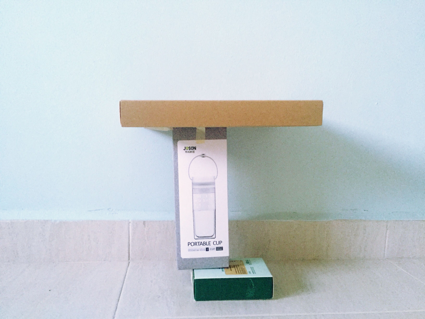
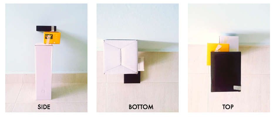
The main idea behind this concept is to have the larger weight on top and a smaller weight supporting it so that it seems like the structure isn’t supposed to balance but it does. The structure was made to have no symmetry and the boxes are of different sizes to show the dominant, sub-dominant and sub-ordinate.
Concept 2
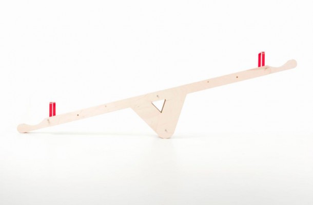
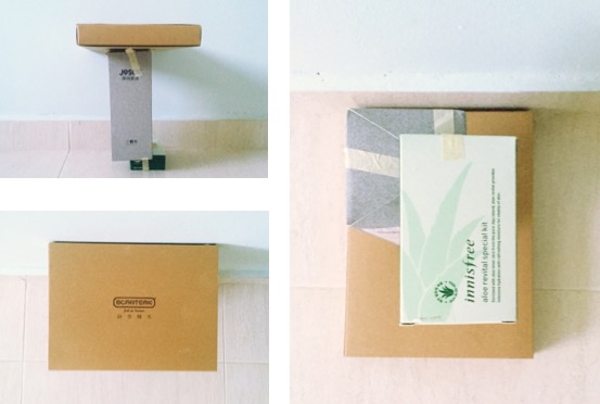
For this concept, I played with placing everything on the edge, so that it looks like they’re about to fall- causing imbalance. Compared to concept 1, the boxes are placed further on the edge, occupying around 1/4 of the space. Similarly, the structure is not symmetrical.
After consultation, concept 1 was chosen as the better model to show the concept of ‘Imbalance’. Some feedback on improvements to be made however was to place the boxes further off the edge so that it really gives off a sense of imbalancing.
Blue foam
With that in mind, I tried to made some adjustments on the concept by trying out on blue foam. I picked out some suitable pieces from the used foam corner and proceeded to cut them into shape. Then, I joined them by using the methods discussed in class such as ‘wedging’
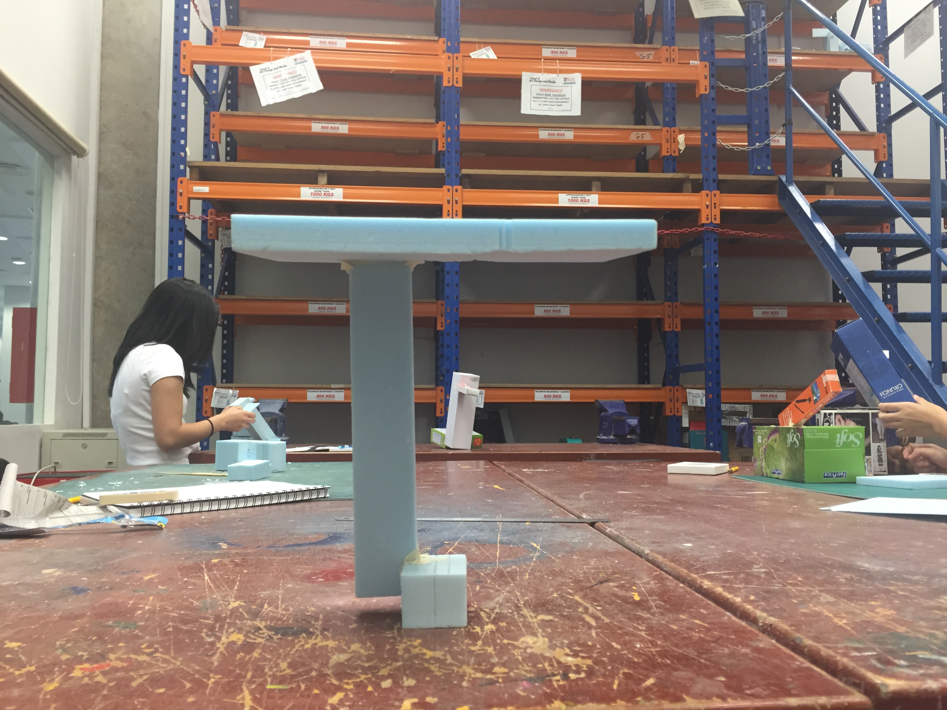
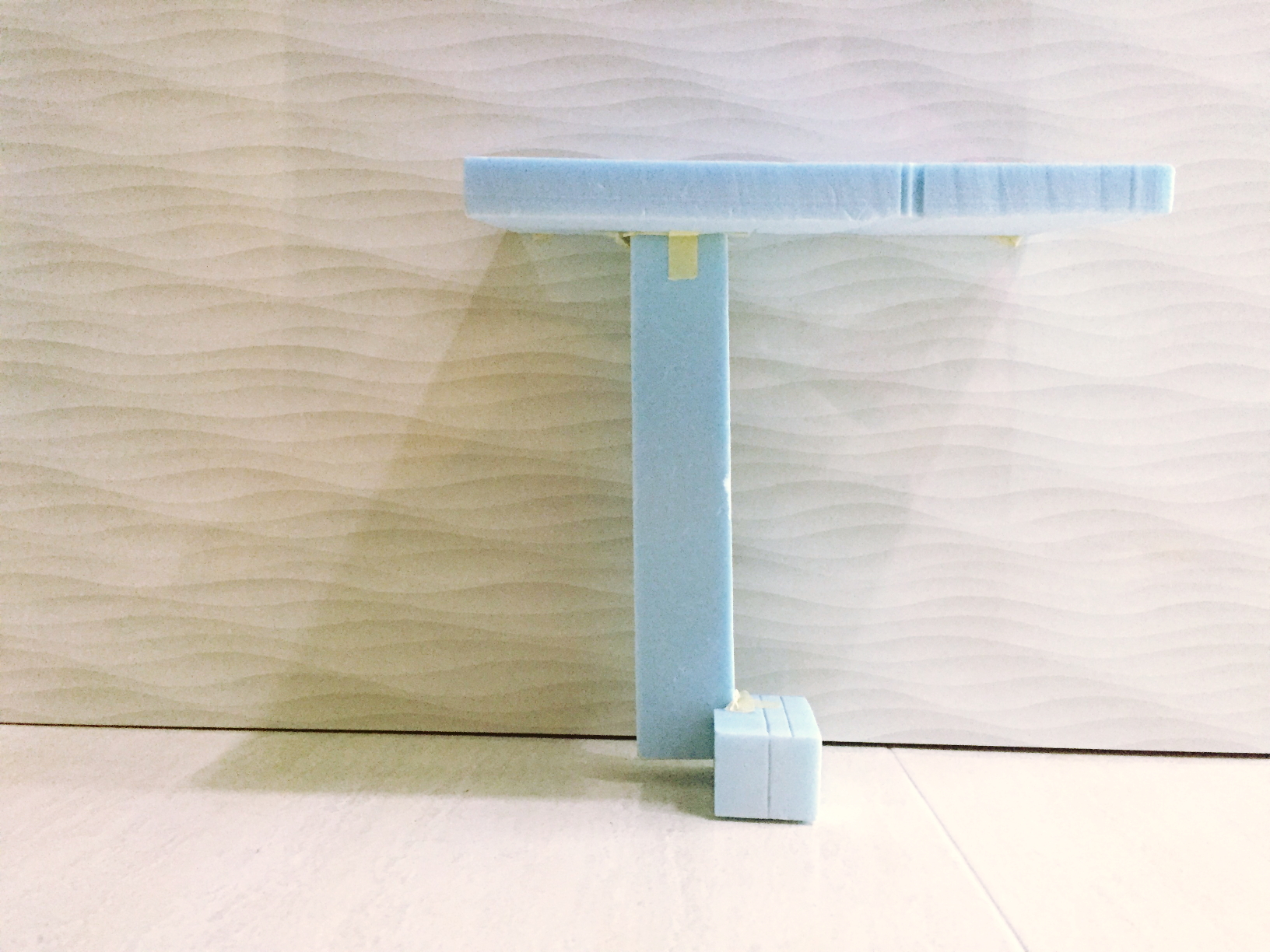
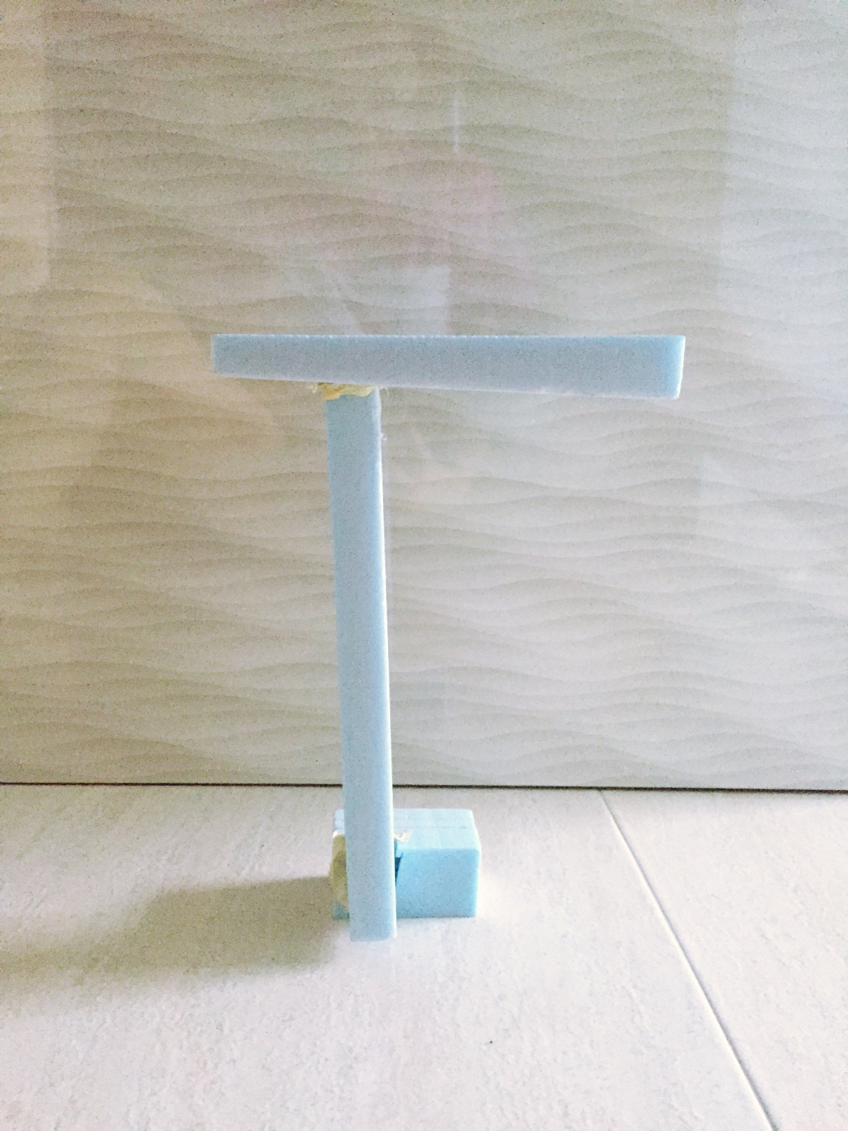
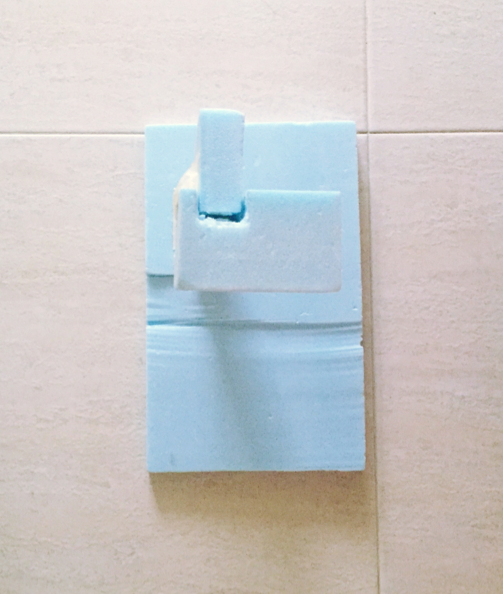
This is the structure I was able to come up with in class. This is not really a second attempt worthy model but just a test out I quickly did up during class to try out the blue foam. Nonetheless, it did give me some inspiration for ideation as I play around with the forms.
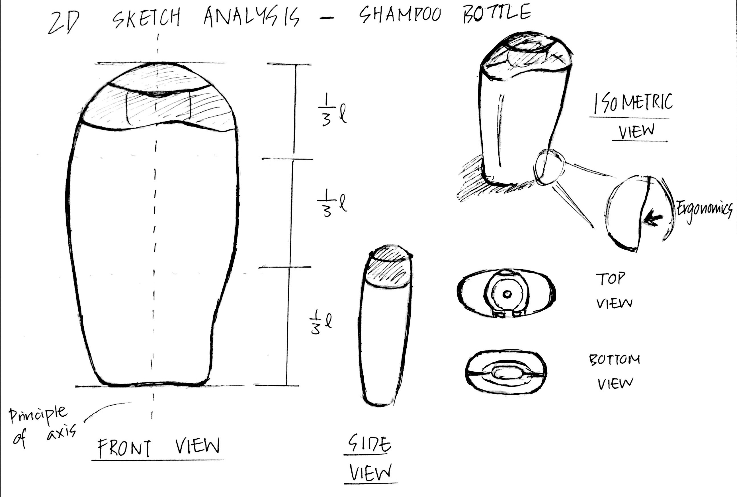
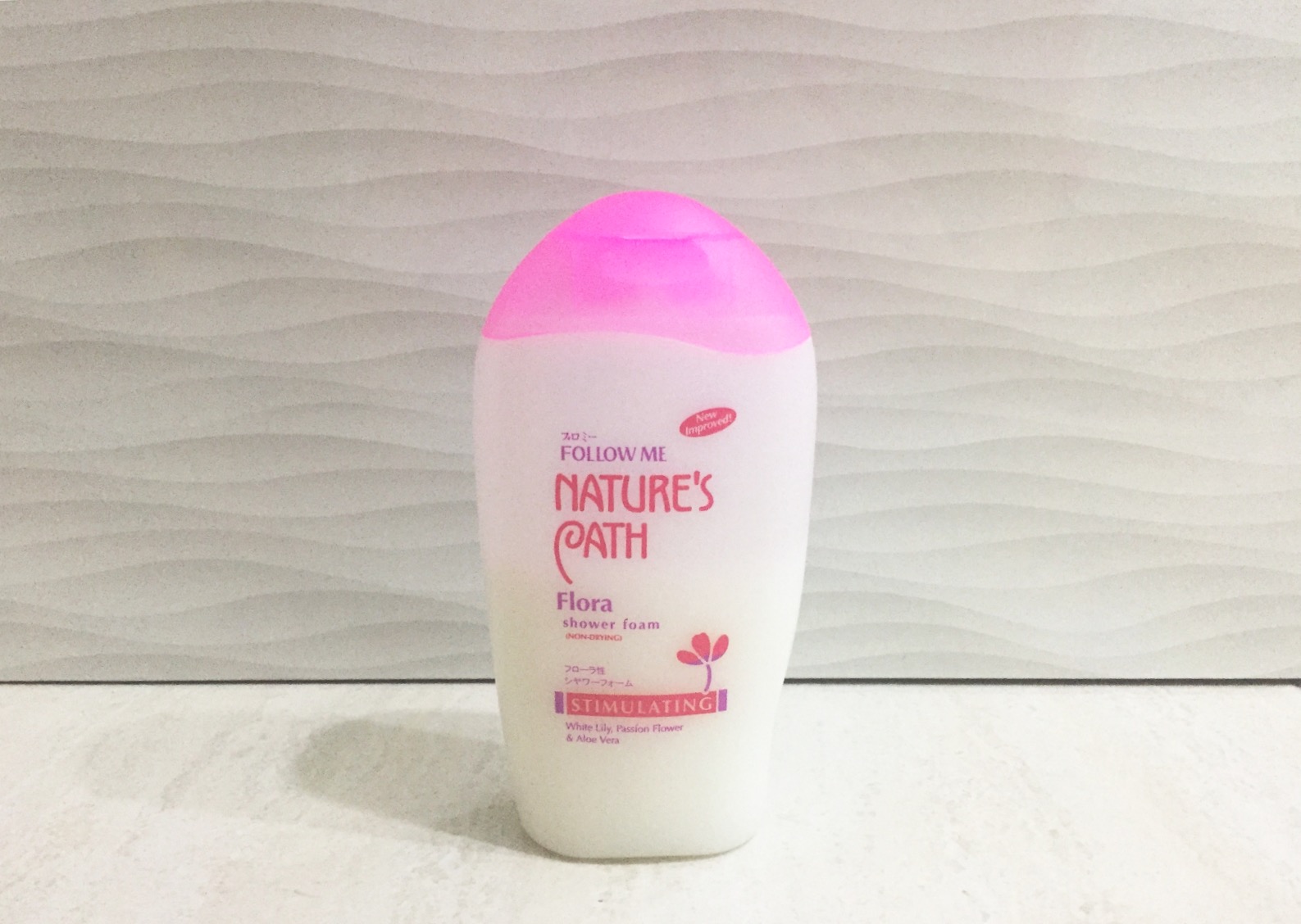
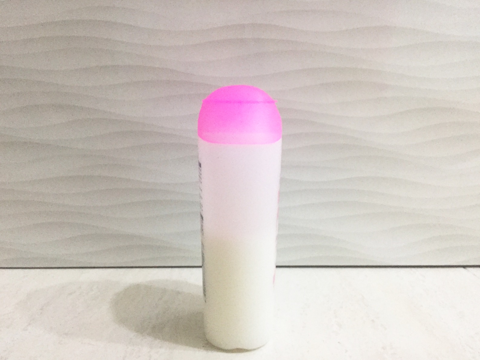
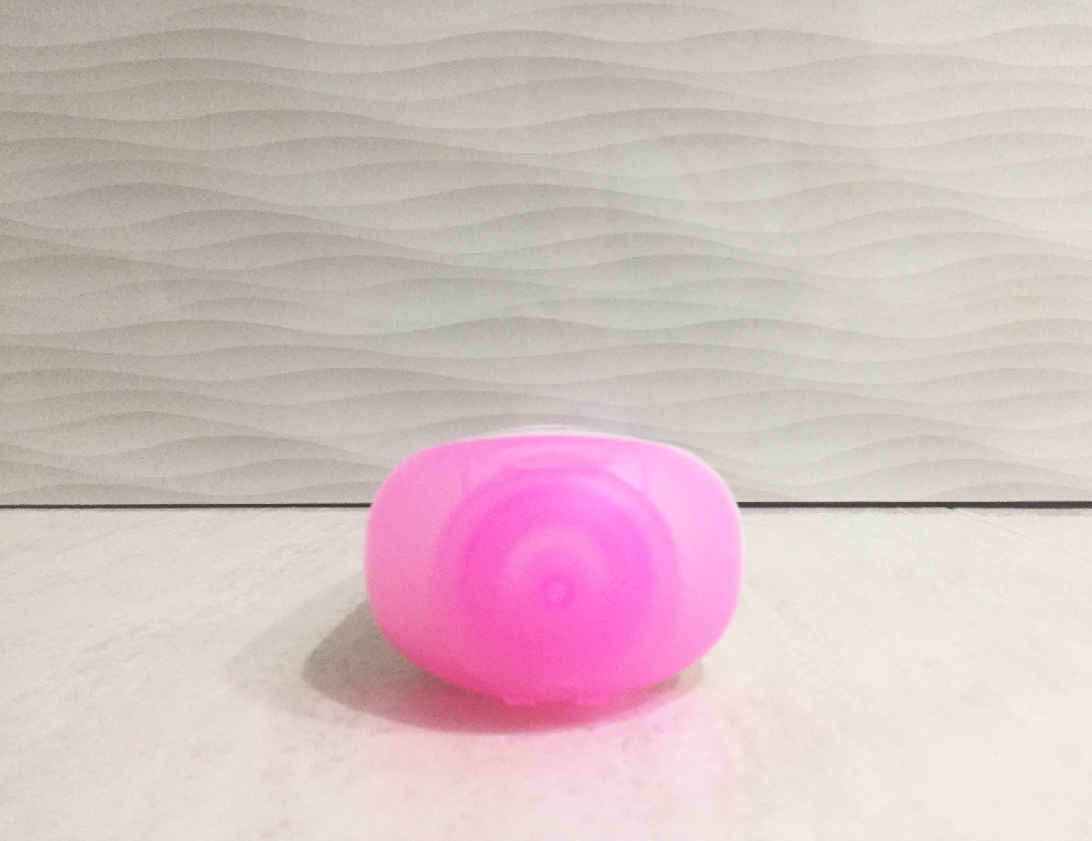
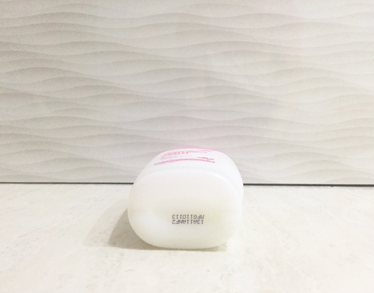
The object I’ve chose to share is this travel-size shampoo/body wash bottle. I found it rather intriguing due to its organic form, consisting of curves and flowing lines. One interesting point about this bottle is that it has a curved in dent on one of its sides for ergonomic purposes, making it easier for one to hold the bottle.

Analysis
The bottle is symmetrical on all sides except for the front/back due to the curved in dent. It is made up of two main colours, a large translucent white body and a pink cap, giving it contrast. The proportions of the bottle follows the rule of thirds, which helps with the aesthetics. The bottle has a matte finishing.
2D Sketch Analysis
Dominant/ Subdominant and Subordinate
In this case study, the dominant element is found to be the milky white body, which takes up the most space. The subdominant would be followed by the pink cap. As for the subordinate, in this case, it would be the texts on the bottle which serves as the finishing touch.