


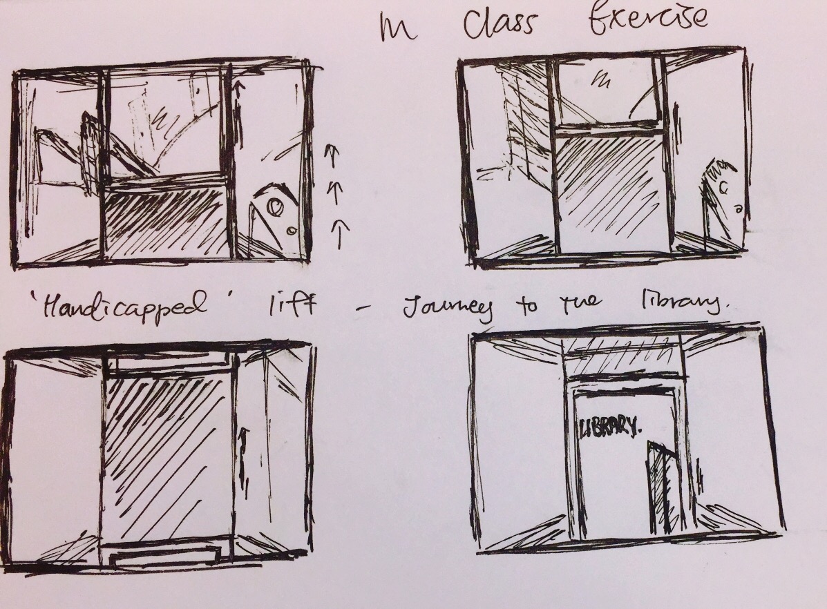
In class exercise- Clocktime- 30 seconds inside the handicapped lift
Sketch:
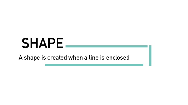
In this project, we move on to semiotics as we attempt to creatively change the meaning of a given object.
And the object I was assigned to by luck, was the Banana.
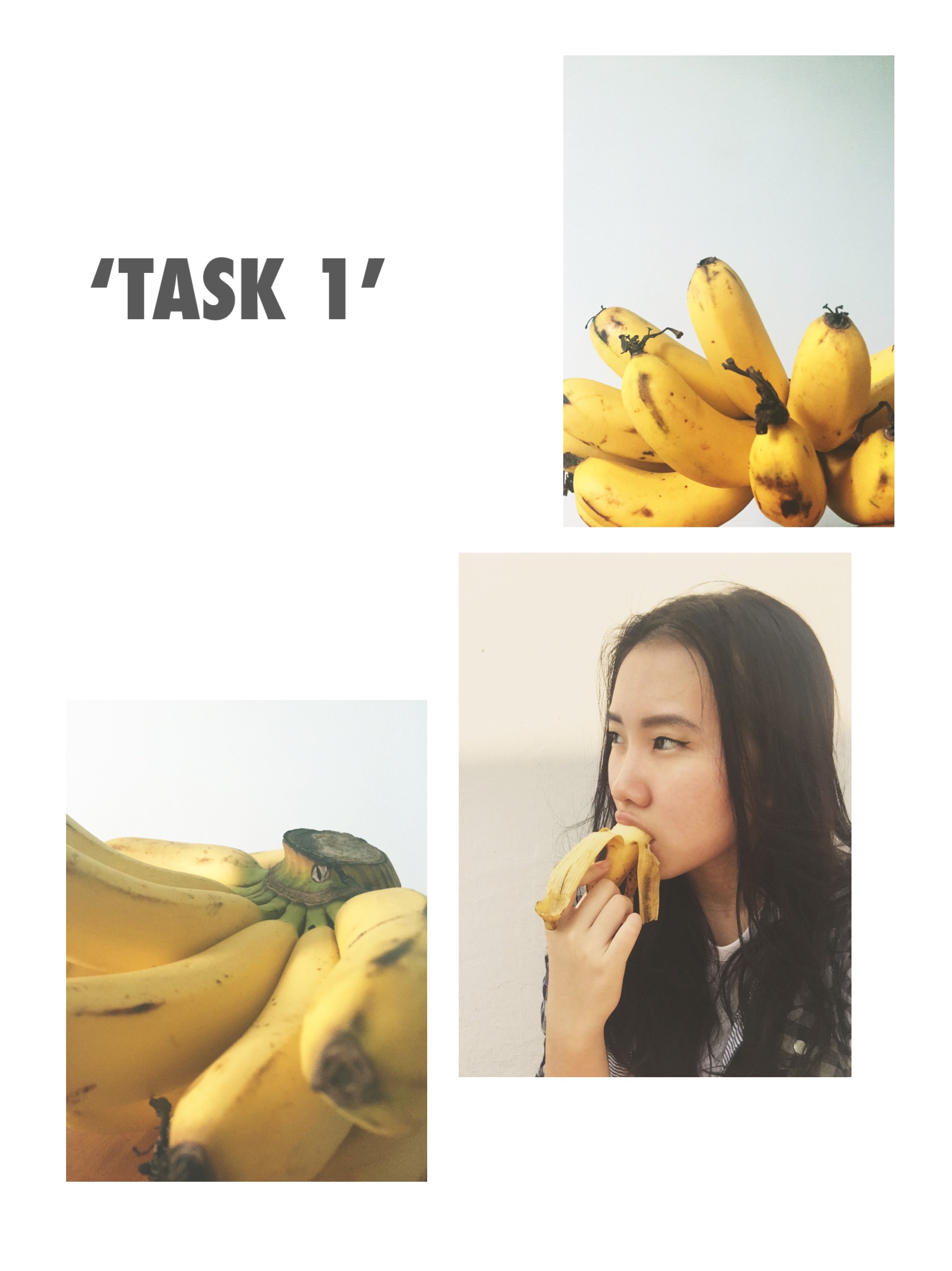
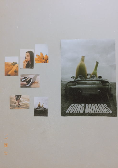
For Task 1, we were to capture the object as it is. For the first picture, I chose to capture the shape and structure of the banana. I shot it from a lower angle to show how the banana branches out in a bunch. For the second photo, I added a bit of human touch and familiarity by capturing me eating the banana. It is a close-up shot as bananas are usually found close to the person. The picture also shows the banana by itself instead of being in a bunch, as well as the parts of it- the flesh and the peel. The third picture plays with focus as I try to showcase the texture, colour as well as the stem of the banana, thus being a close up shot.
The whole series shows the banana as a bright and vibrant fruit, associated with a positive mood.

Task 2 is where I attempted to capture the cultural aspects of the Banana and subvert them. In the first picture, it shows one of the banana peel’s culture as a slip act. Banana peels on the floor often mean someone is going to fall and are often associated with comedy and embarrassment.
In the second picture, I subverted its context by turning the banana peel into a skating tool instead. The message here was that since the banana peel is so slippery, why not use it as skating shoes? Here, the object is subverted as the banana peel is now no longer just a useless skin of a fruit that would cause falls, but an actual sports item.
As for the third picture, (disclaimer: No photoshop went on in this picture except for the b/w filter, you can see it under the process below)
The subversion here lies in changing the vibe and colour that come with the banana. As mentioned earlier, bananas are usually associated as bright and comical. Now, what if they turn dark and serious? In this picture, the bananas are seated in a sports car on a road and the picture has a dark, gloomy, film noir mood, giving the bananas a ‘gangster/mafia’ look. Also, another subversion is playing out as further explained in Task 3.
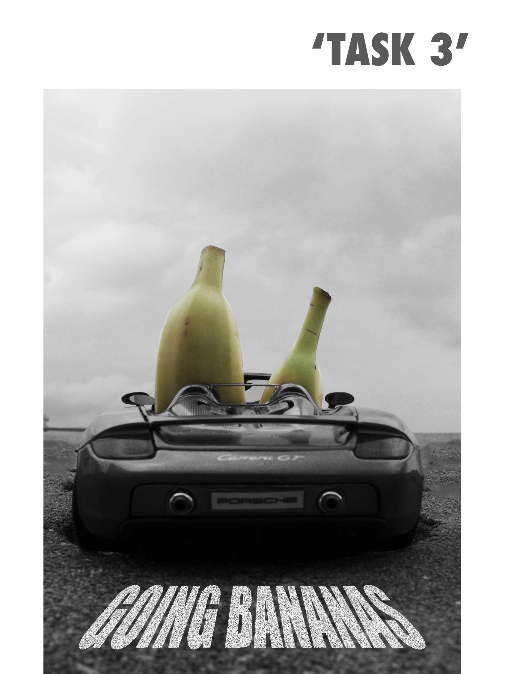
This poster is actually a subversion of two different concepts combined. First was the film noir concept that I mentioned earlier, the second subvert was on the quote itself. The phrase ‘Going Bananas’ is usually meant for someone going crazy. Now, what if I took it literally to mean that the bananas were actually going somewhere? And that was how this poster was created. By using this subversion, I gave human life to the bananas as they are now the drivers instead of fruits. I made this picture into a portrait so as to resemble a movie poster, and the quote was included to look as if it was on the road.
Here are some other test shots from Task 1 and 2 as I attempt to capture the bananas in its environment and culture from different angles.


Now, we move on to the subversion process which I feel is one of the most important aspect of this project.
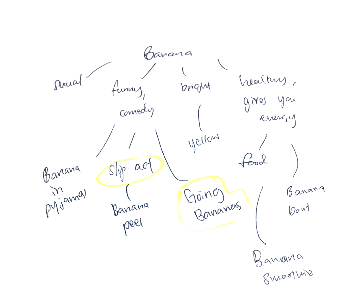
Before I can think of how to subvert the meaning of a Banana, I first have to find the original meaning of it, also known as Denotation.
Here’s a mini mind map I did regarding bananas.
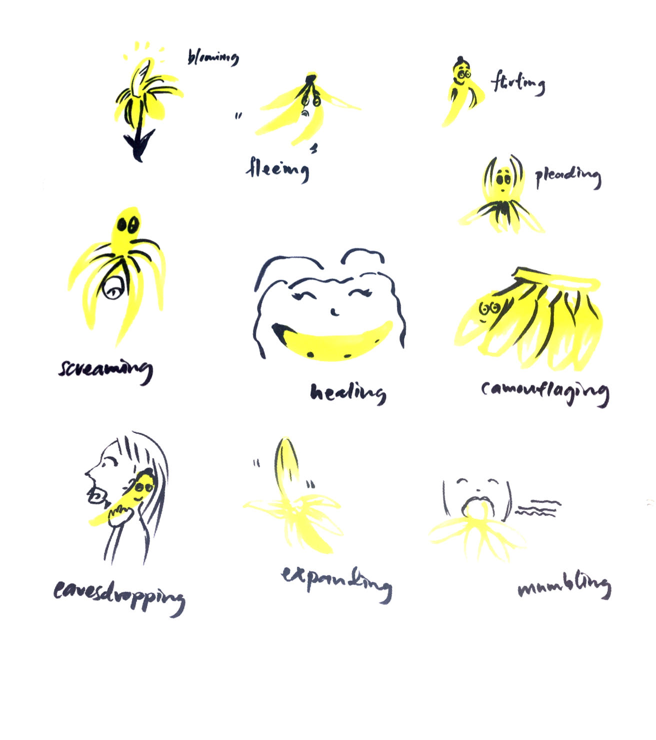
Also, here’s a brainstorming exercise I did in class where we combined action words with our object. With this exercise, I found that my object becomes personified, something I would like to try out in my final shots.
I also used templates that can help to come up with ideas, namely the Removal Template, Replacement Template and the Redefinition Template.
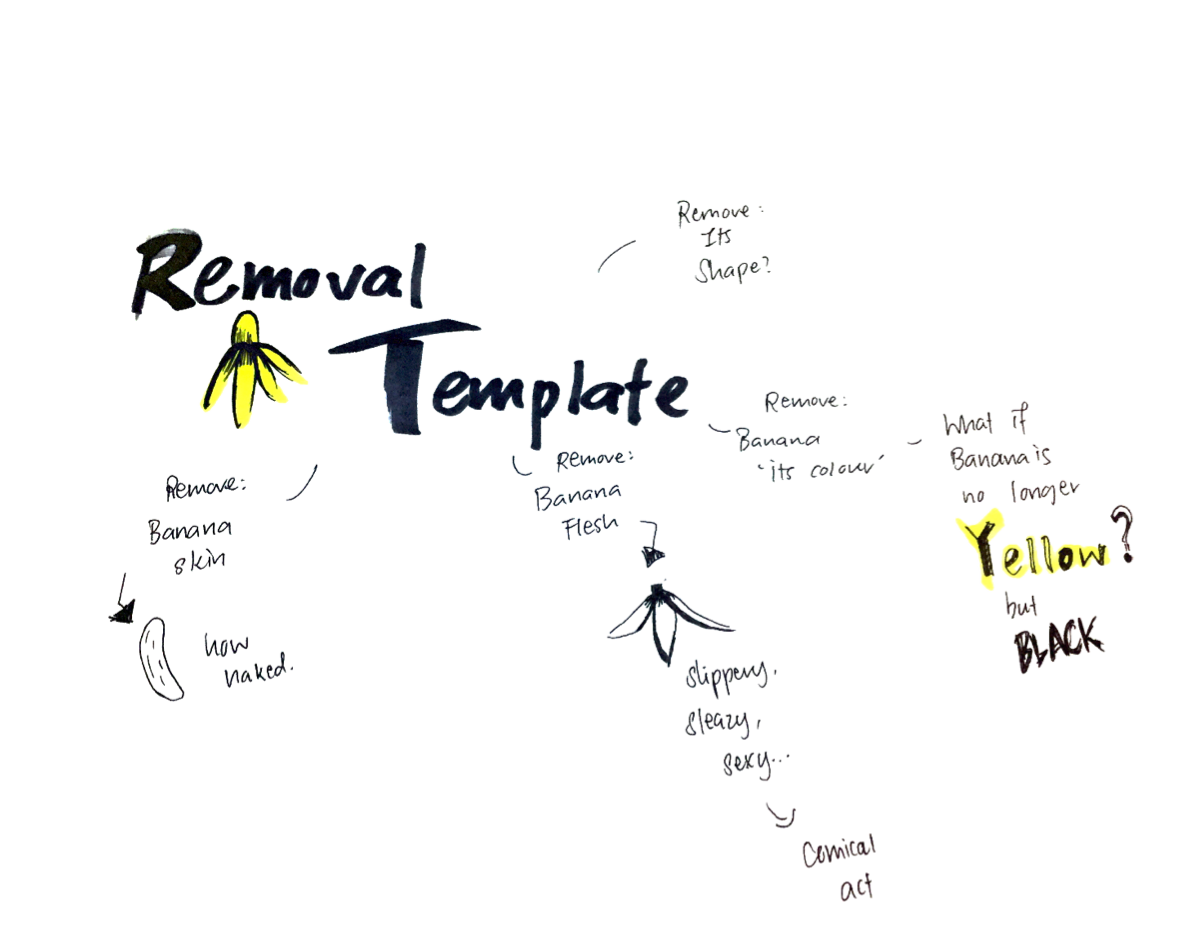

Key ideas from Replacement: Giving the Banana a dark twist.

Key ideas from Redefinition:
Taking Banana as a ‘slip-act’ to the next level.
The phrase ‘Going Bananas’ can have a different meaning.
From all the brainstorming I did, I came up with a few concepts to try out.
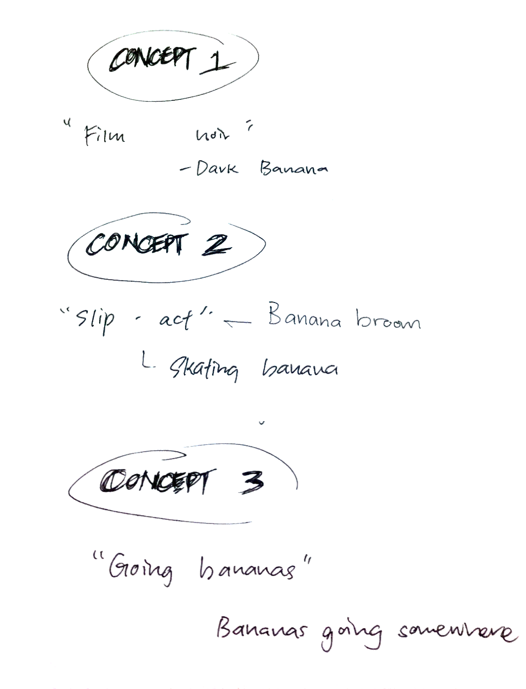
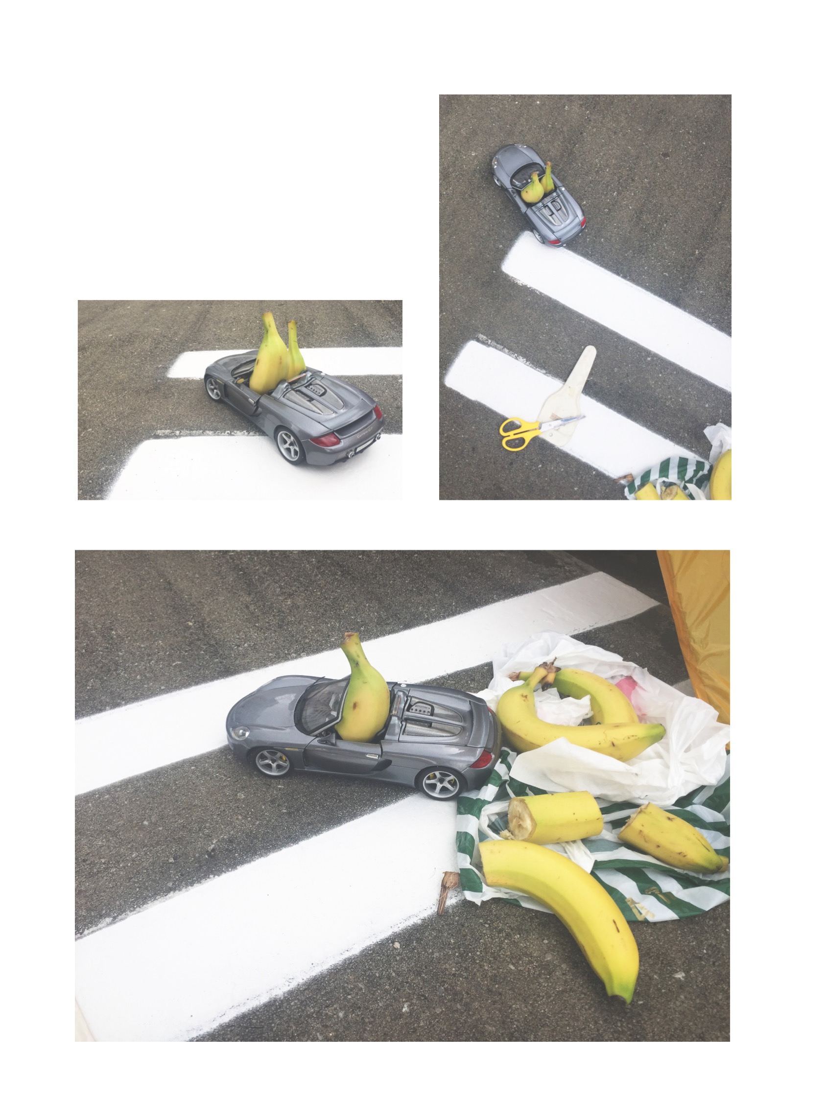
I then did some test shots with the concepts I came up with so as to compare them.
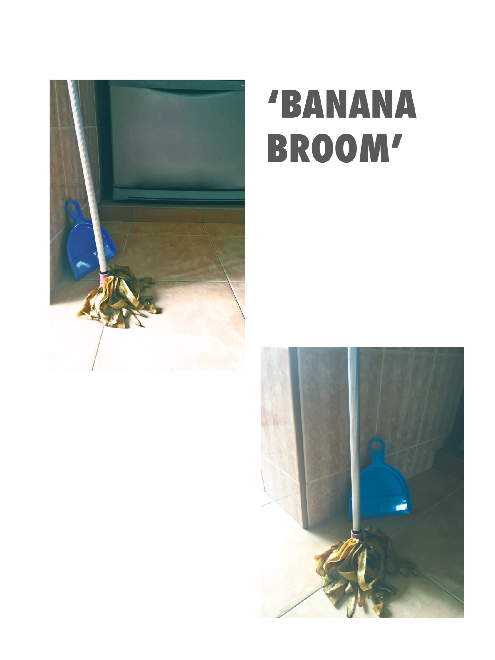

These are from Concept 2, which is to take slip-acts to the next level. In ‘Banana broom’, Banana peels are no longer the slippery waste that lie on the floors but the cleaning tool that cleans up the floor.
‘Skating Bananas’ was explained earlier and eventually chosen.
As for concept 3, I pondered over how to carry out this idea of Bananas going somewhere. I first thought whether I should show them leaving through a door, making it seem as if they were walking, have them carry luggages or should I place them in public places taking the transport as if leaving somewhere. However, I found that hard to execute as the bananas don’t have ‘hands’ or ‘legs’ to show off the idea of ‘going’. Just as I was thinking of whether I could add hands to the bananas, I suddenly thought, why not put them in a car so that it seems like they were driving off? That way, I don’t have to show hands and legs. And as I was expanding on that idea, I thought I could combine concept 1 and concept 3 together, so that its a ‘dark bananas going somewhere’ theme.
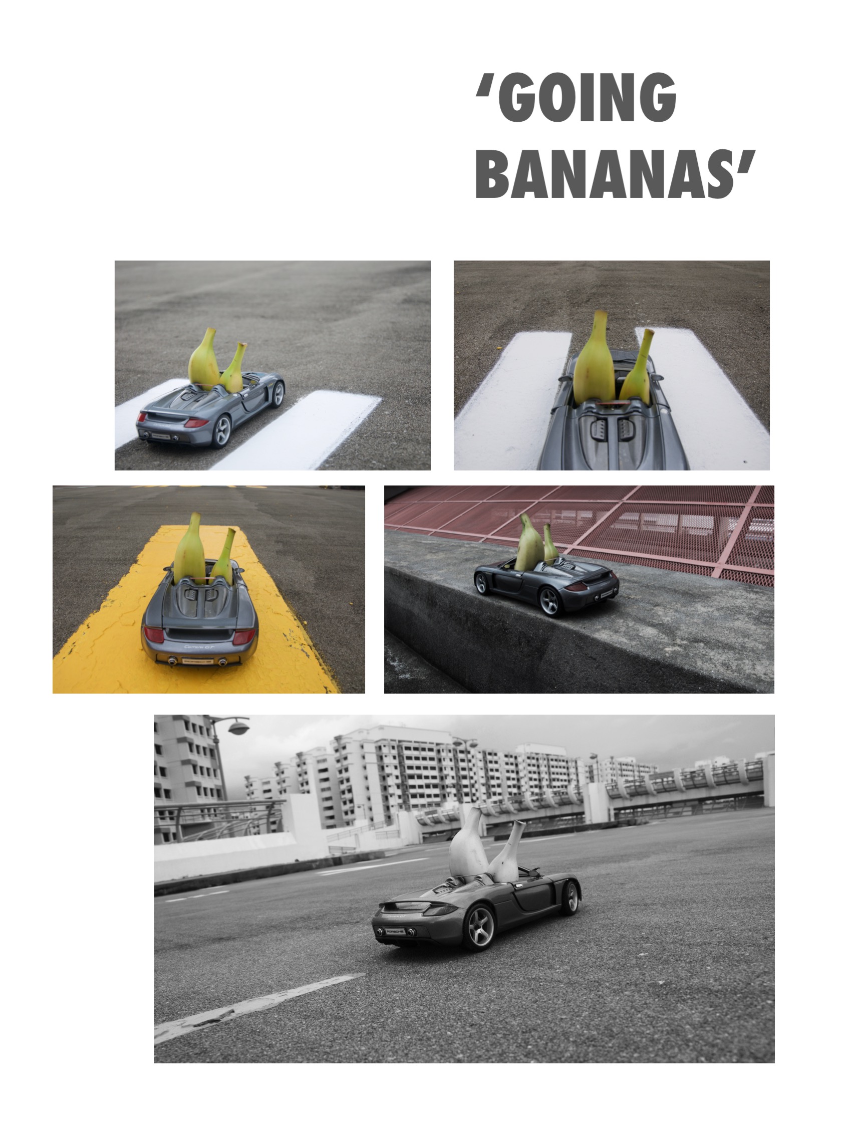
And there you have Mafia Bananas. For this theme, I stuffed the bananas into a toy car and shot it the rooftop of a car park so that it resembles a road.
I also experimented with different colour schemes to create that ‘film noir’ look. I tried desaturating the picture, b/w, and finally decided to go with a black and white filter but keeping the bananas still slightly yellow for a more interesting composition.

The final shot that was chosen was a picture I personally like a lot as it came really close to what I had envisioned. For this concept, I experimented with different angles and scale, and even tried slanting to create a more dynamic effect, but what I had in mind was a portrait back view of the bananas in a car with nothing but the road and the sky, as if they were going on a dangerous road trip.
I finally achieved it by trying out different locations at the car park. The only way to capture the road and the sky without taking the barriers surrounding the car park was to put the car on a slope and take the picture from behind it.

Here, I experimented with different locations but was blocked by flats and rails until I found the perfect slope and angle.
Personally, I found this combination of concept 1 and 3 to be the strongest out of all as I felt that the usual context of the banana was totally changed in this subversion. The play on the phrase ‘Going bananas’ also gave an extra kick in the composition and was therefore chosen as the final poster.
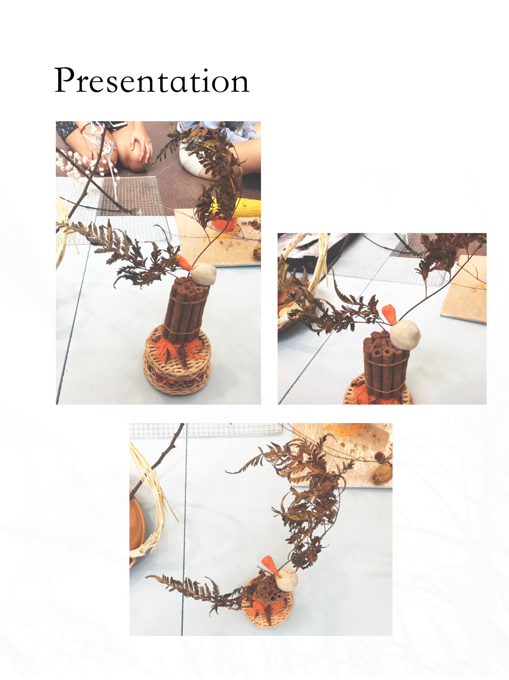
This post showcases the final documentation of the Gaia’s Ikebana project.
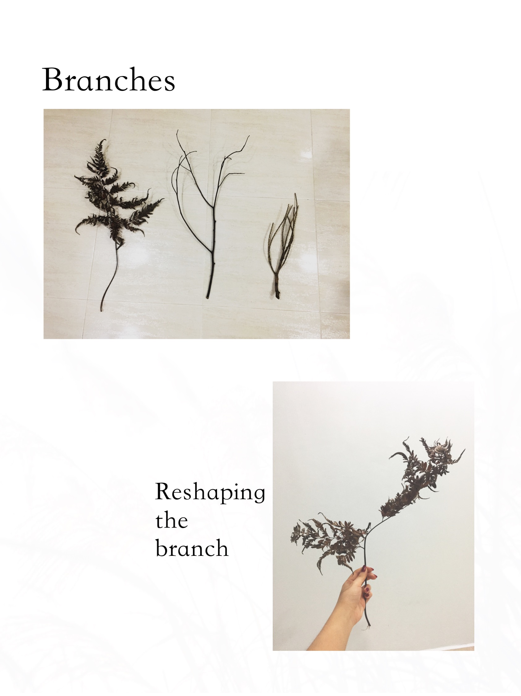
Following the first experimentation on Curvilinear volumes, https://oss.adm.ntu.edu.sg/am0002in/curvilinear-forms-first-attempt/ where my 2D Sketch Analysis is located, we were to come up with a composition with our sketch models using food. Also, another twist was to incorporate a branch in our composition and create an Ikebana arrangement. With that said, I first went on to research.
Ikebana
Ikebana is the Japanese art of flower arrangement. The key art styles used in Ikebana are simplicity and minimalism.
After some research on the types of Ikebana styles, I found myself drawn to the slanted style of Moribana.
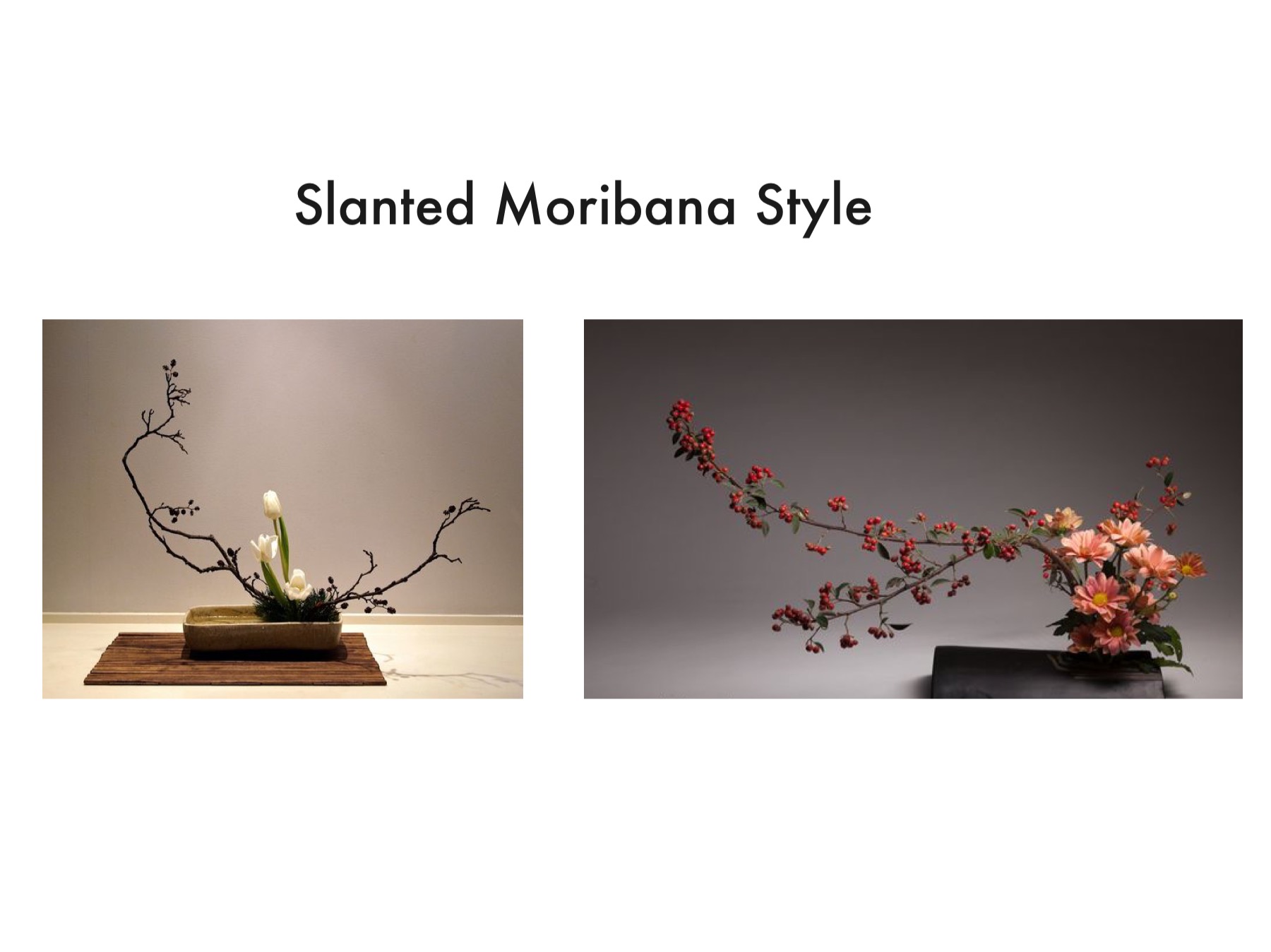
In this style, the branches are more freely arranged and gives the composition a softer look.
Theme
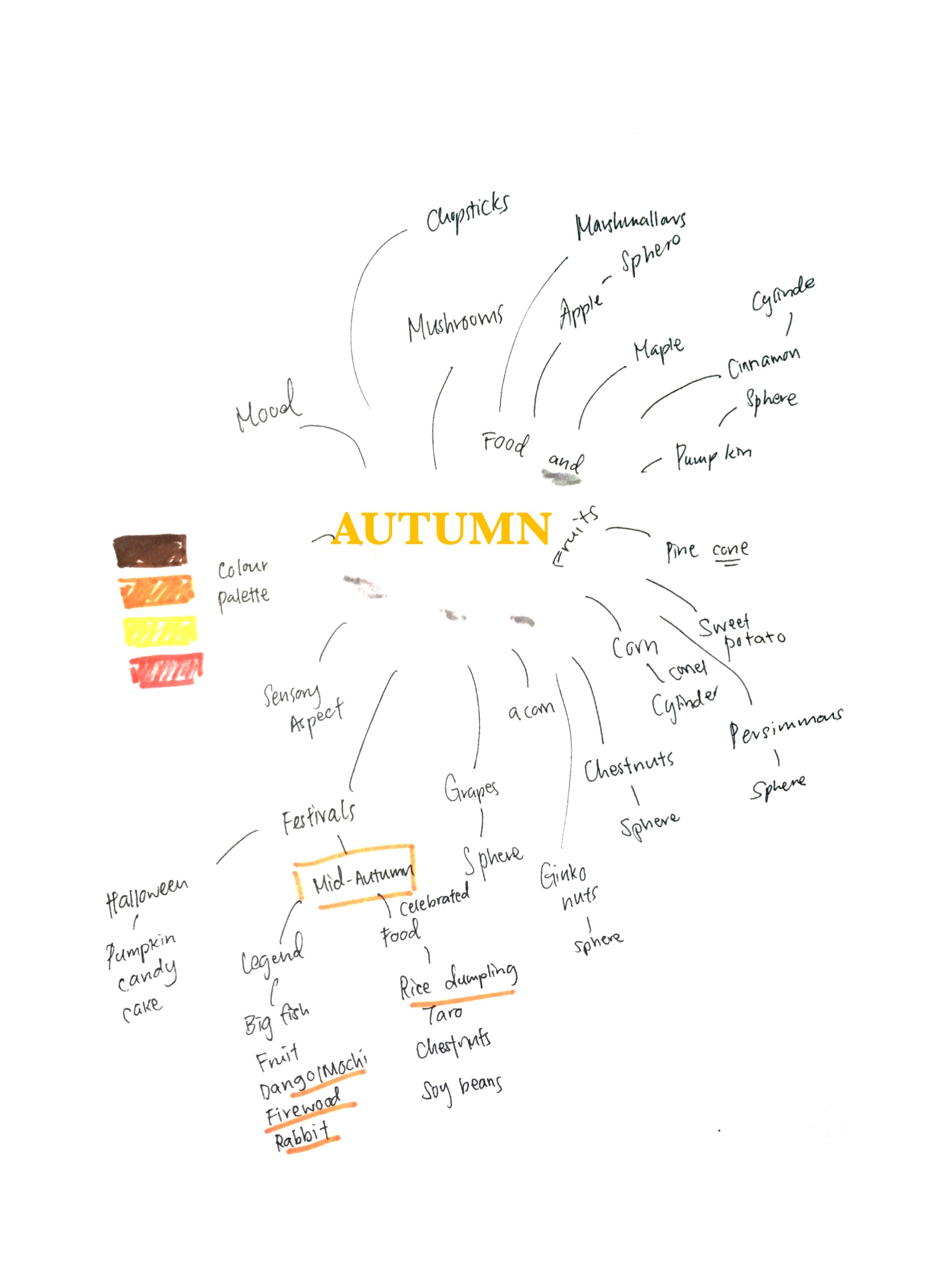
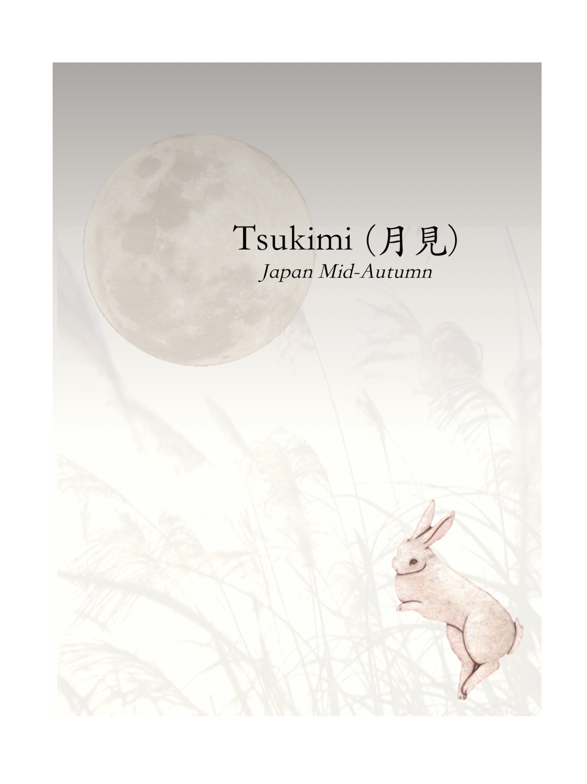
The seasonal theme I’ve got from this project is Autumn.
Here’s a mind map I did with all things related to Autumn.
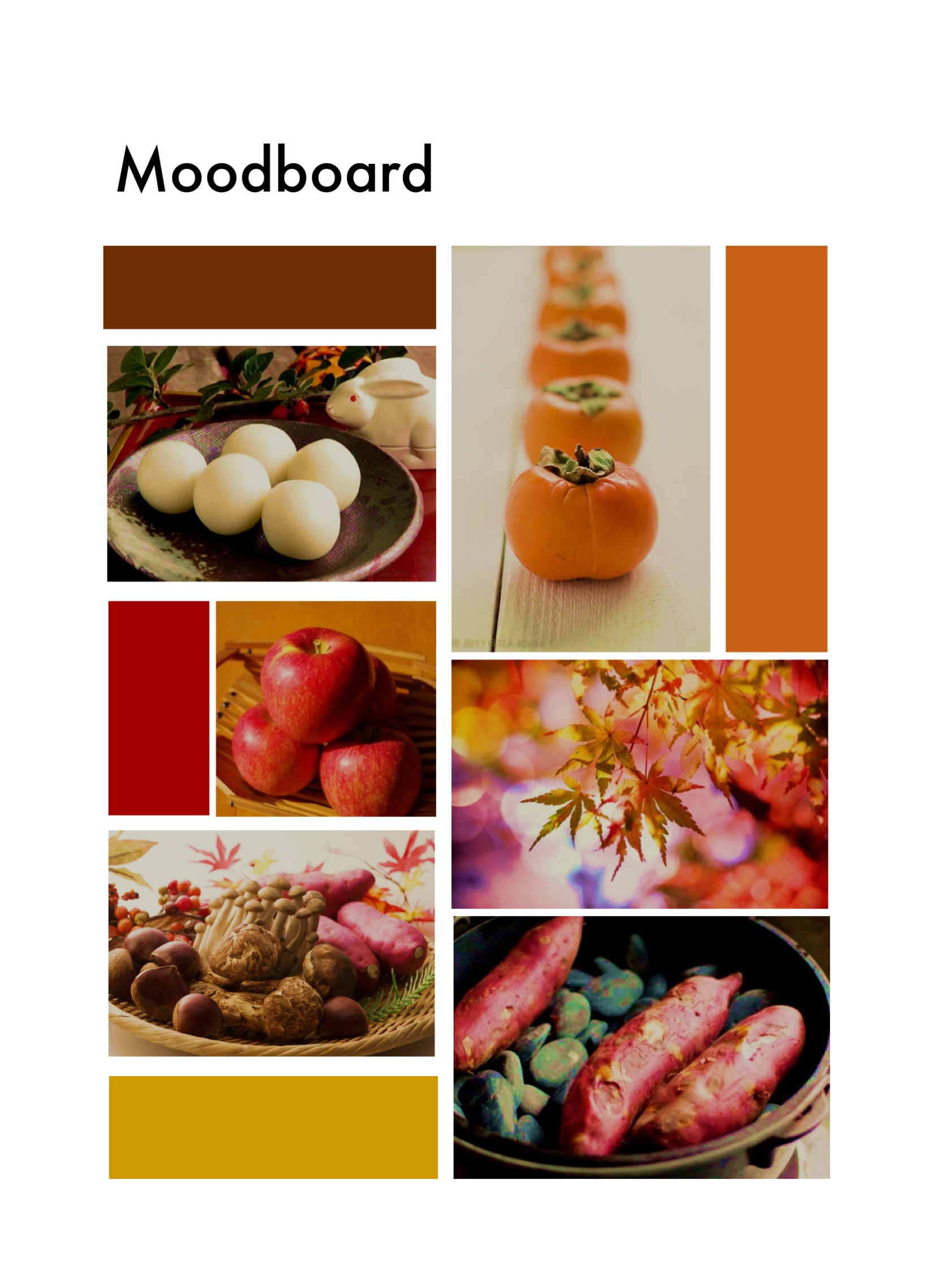
I decided to go for a more oriental Japanese concept to suit the Ikebana mood. I then did a food research for inspiration and complied them into a moodboard.
With the research I did, I came up with a few concepts to work with.
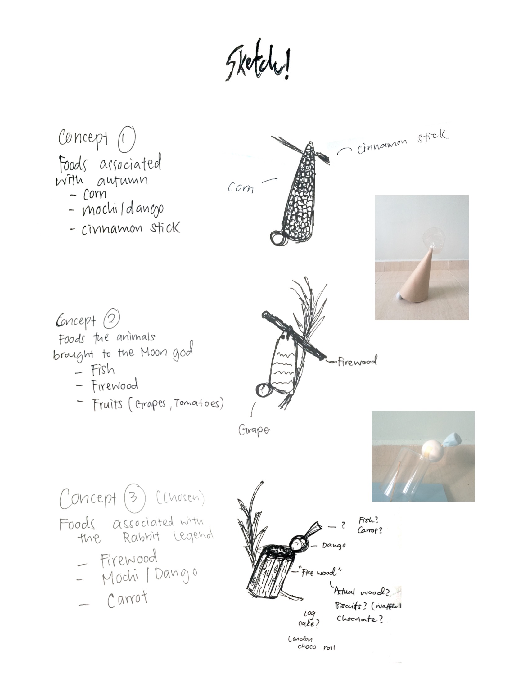
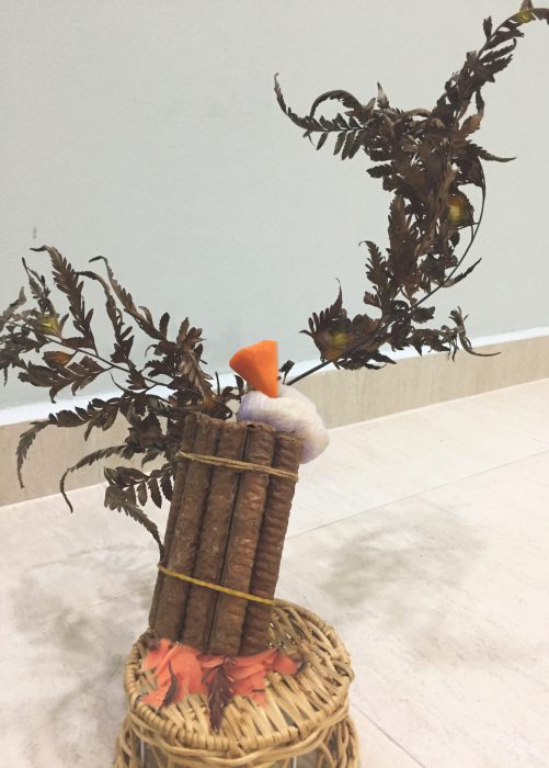
Chosen Concept
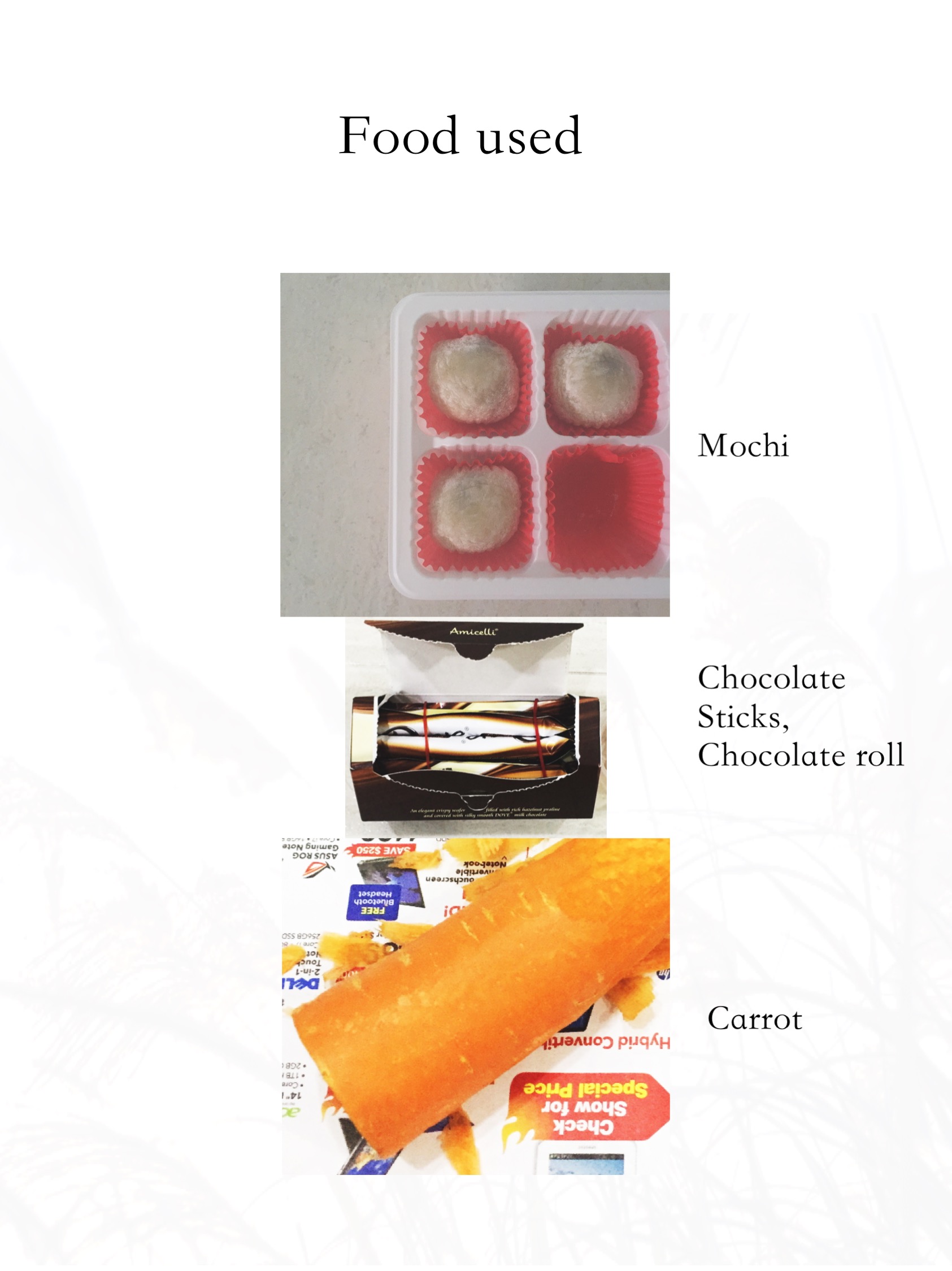
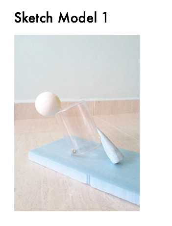
I used Chocolate Sticks and tied them together to replicate ‘Firewood’. Moshi was used as it is a traditional Tsukimi food and it also resembles a ‘Moon’. Lastly, the carrot signifies the ‘Rabbit’.
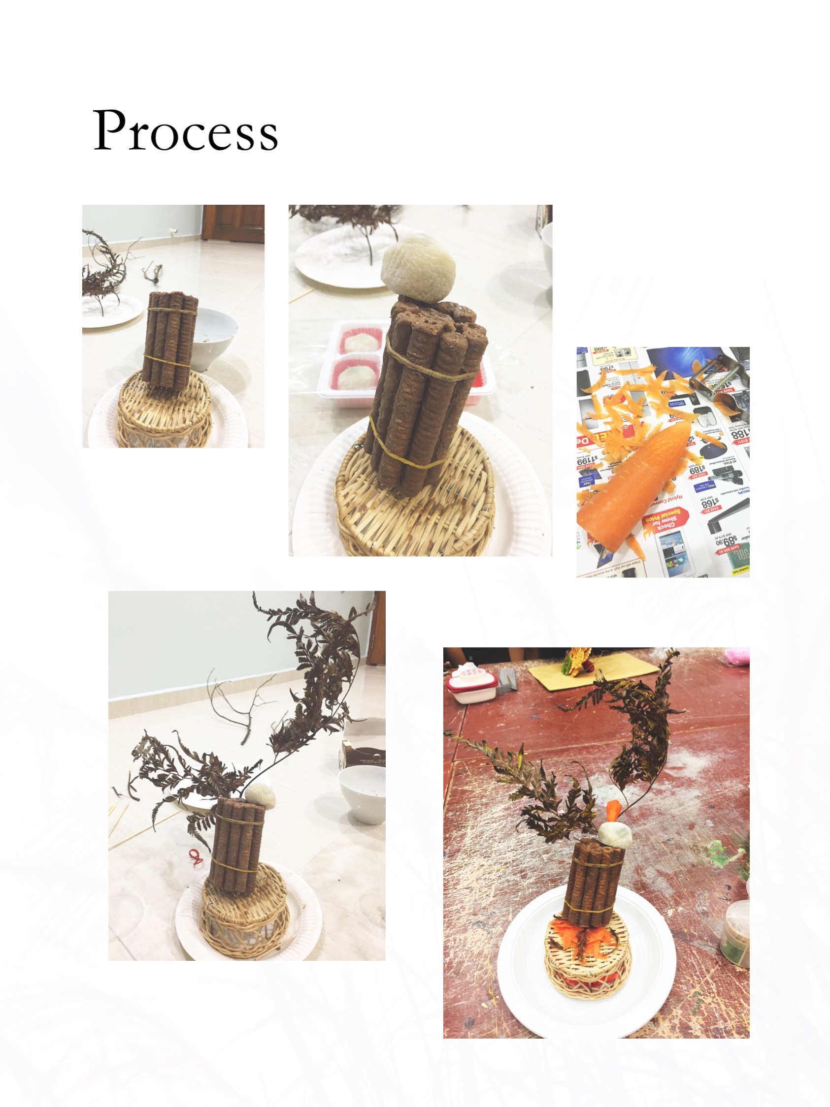
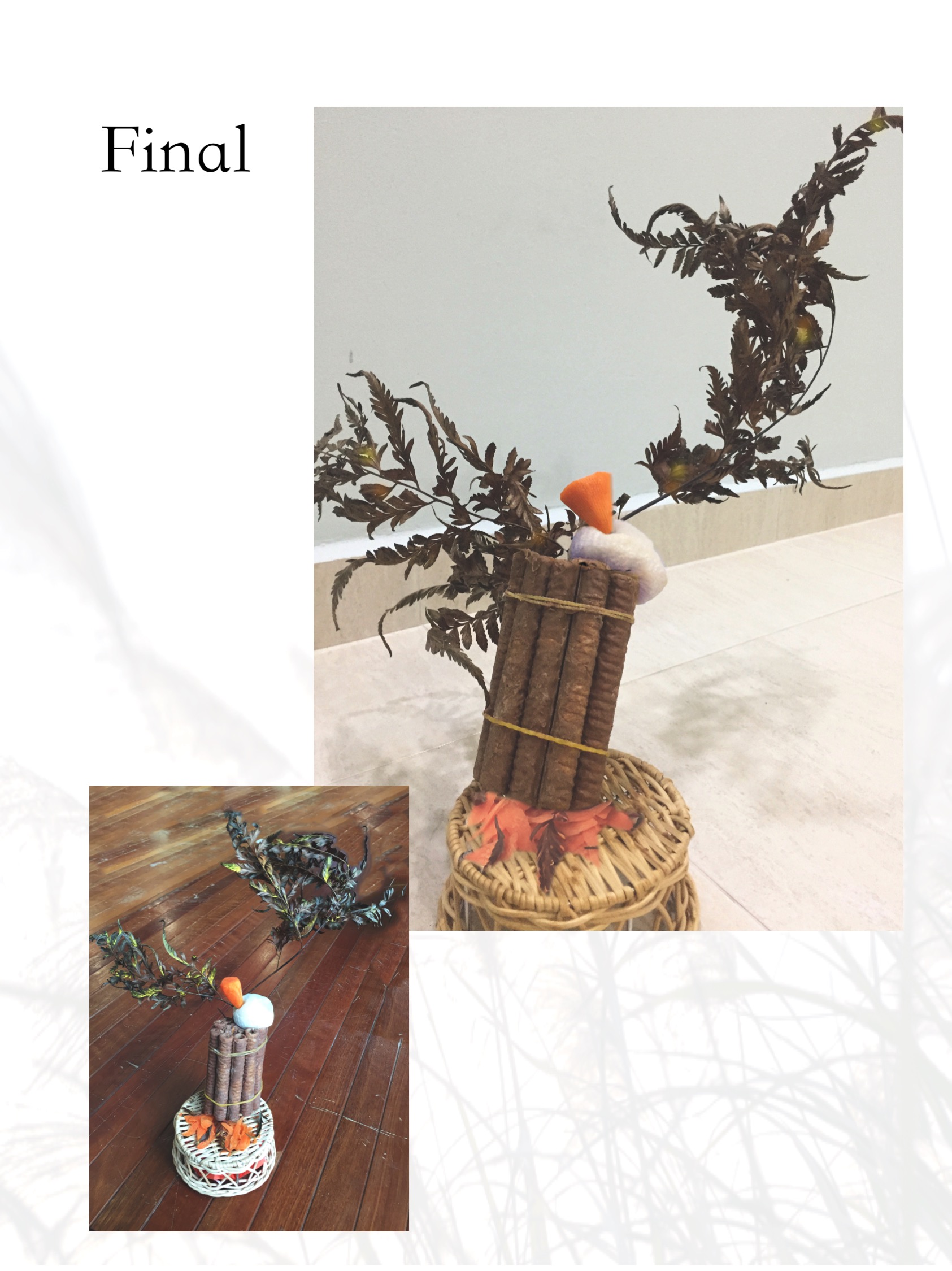
The ‘Firewood’ cylinder makes up the Dominant, the Mochi sphere is the Sub-dominant and the carrot cone is the Sub-ordinate.
Suggestions from presentation
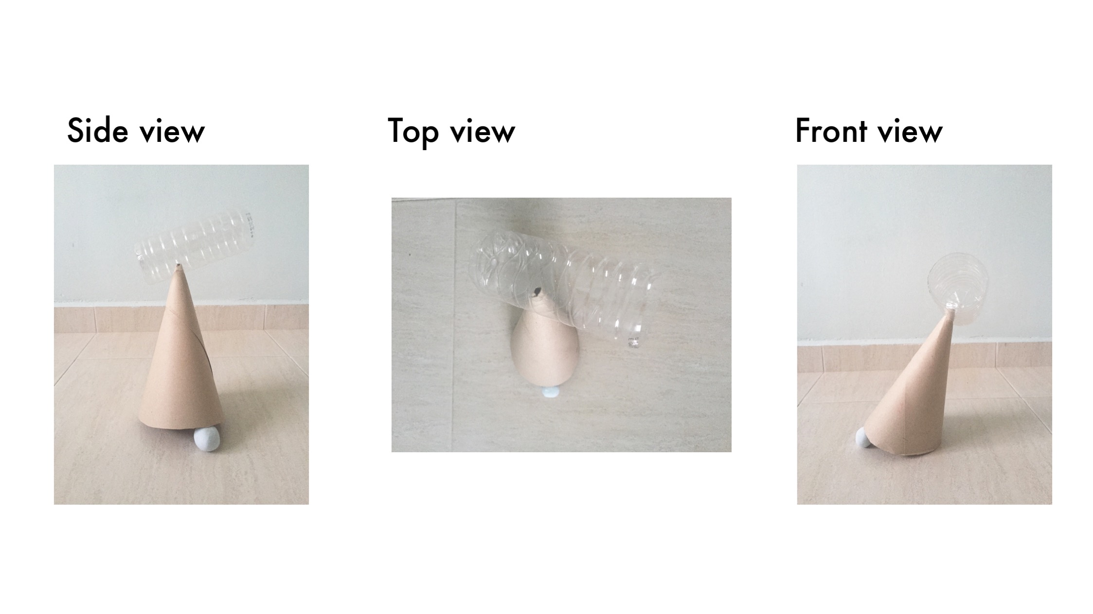
The ‘Firewood’ could be longer and the carrot could be a smaller cone to show off the relationship between the Dominant, Sub-dominant and Sub-ordinate.
The base used could be a simpler flat wooden plate to avoid distraction.
References
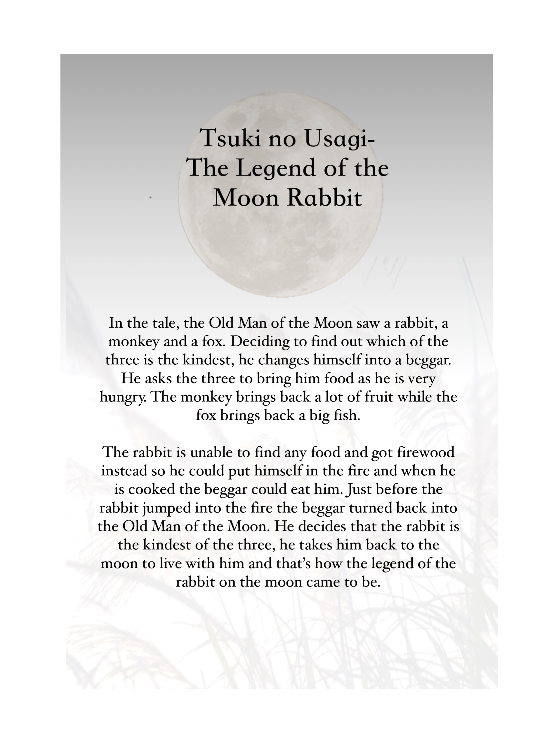
More about the Moon Rabbit legend:https://asianinspirations.com.au/asian-culture/japanese-moon-festival-legend/

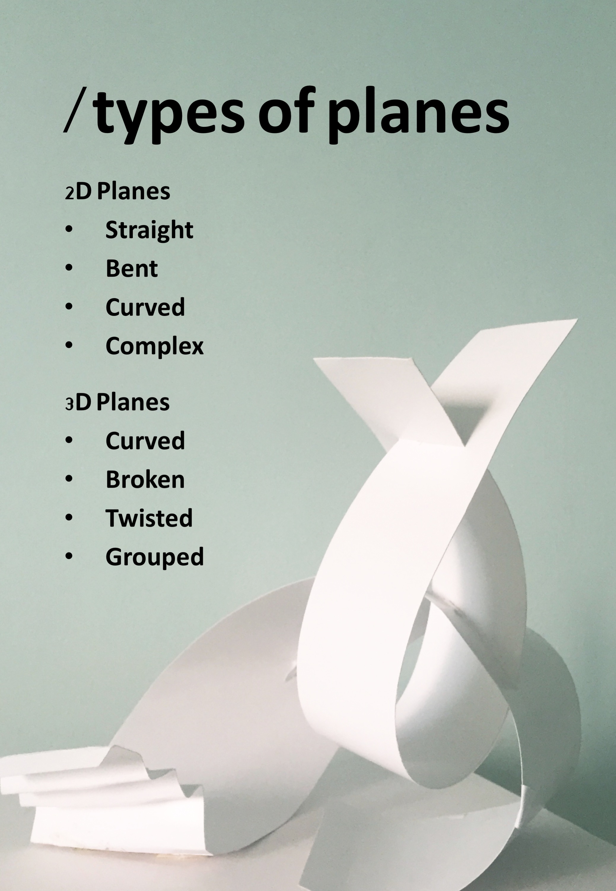
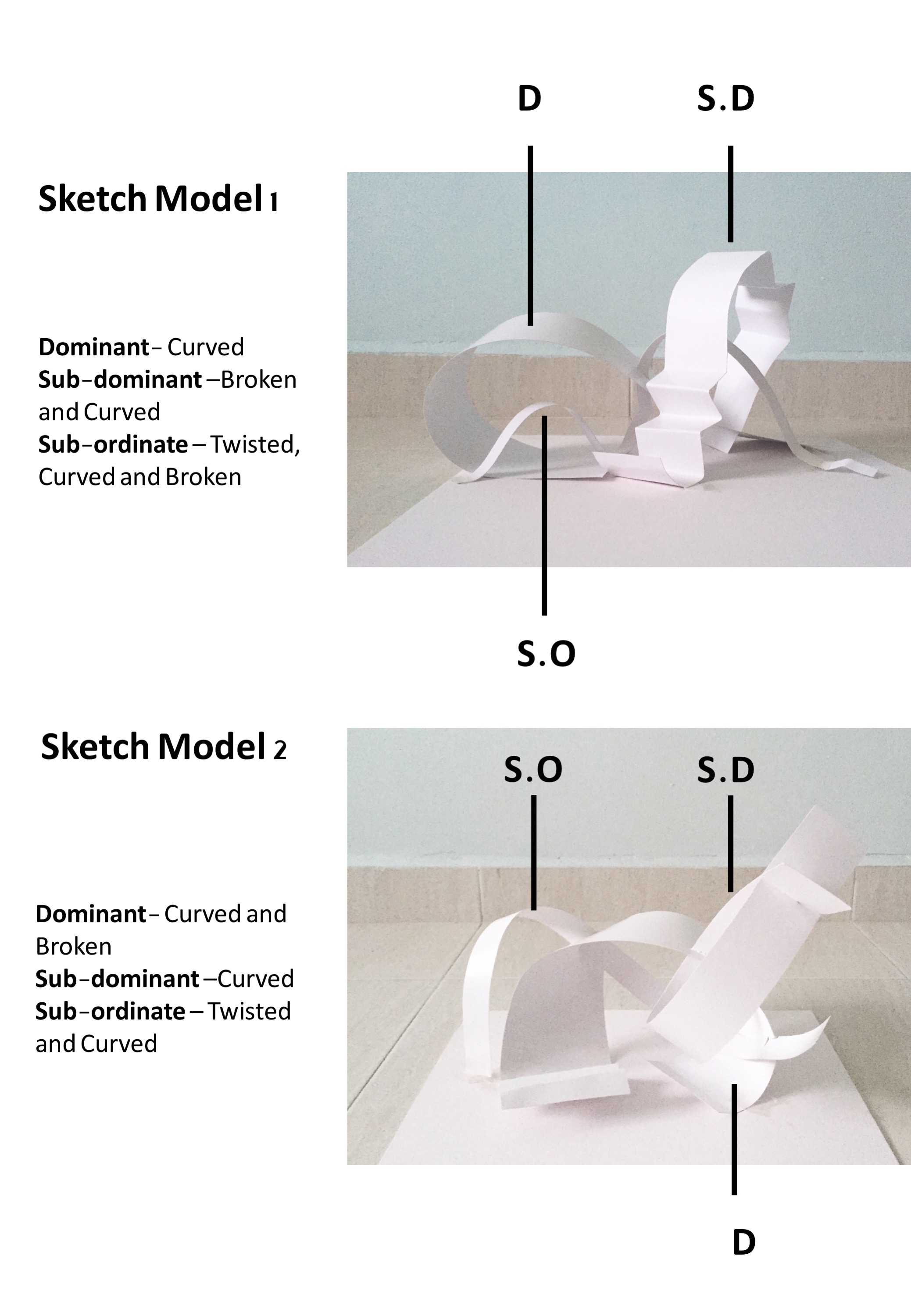
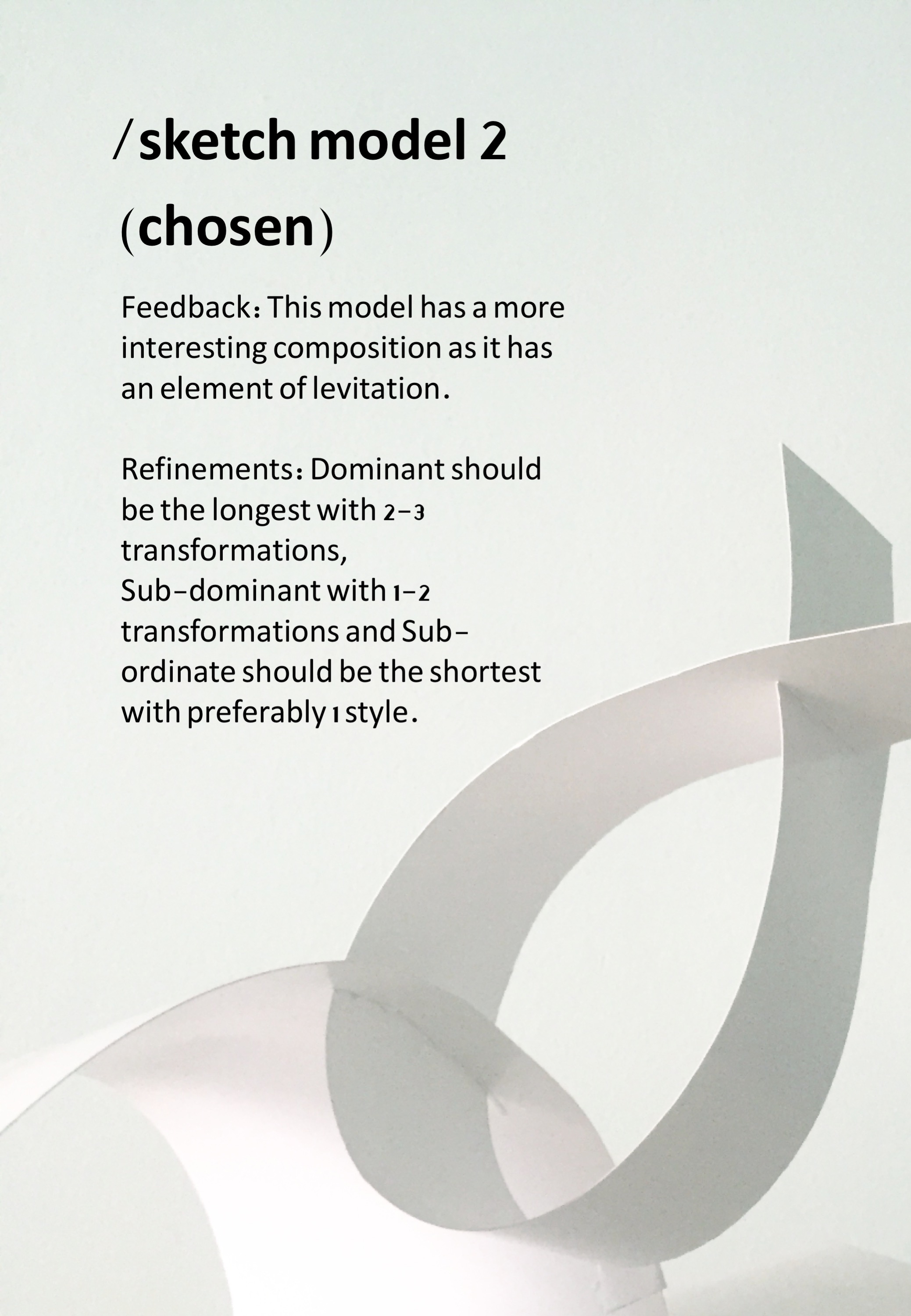
For this next project, we are working with curvilinear forms, namely cones, spheres and cylinders. We are also playing with diagonals this time round, as well as different types of balances- Independent, dependent and precarious.
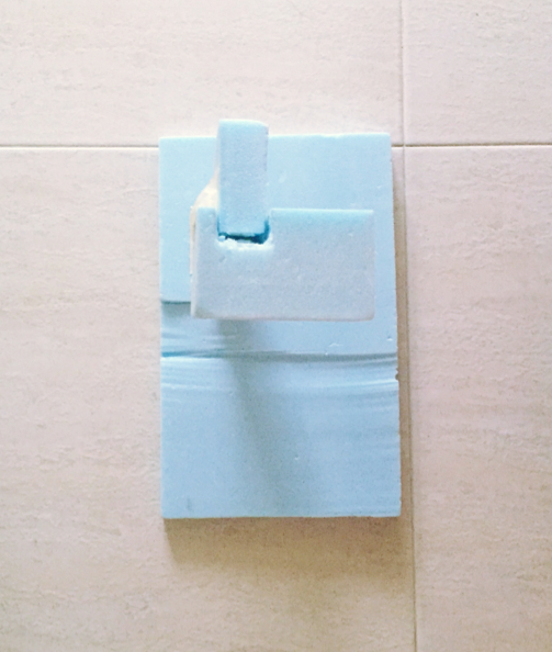
This is my first attempt on curvilinear compositions using blue foam and ready made materials.


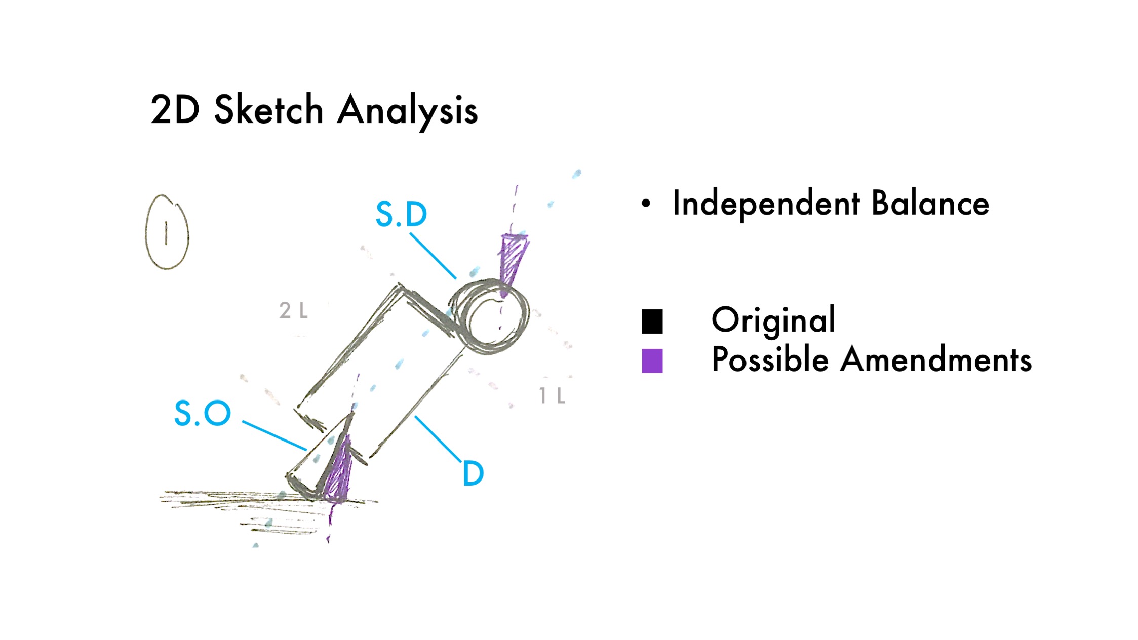
Changes to be made:
Making the cone smaller so there is a clear Sub-dominant and Sub-ordinate.
Changing position of the cone so that the apex can be seen
Going for a more zig-zag composition

Changes to be made:
Making the Sub-dominant shorter and thinner
Going for a more precarious balance

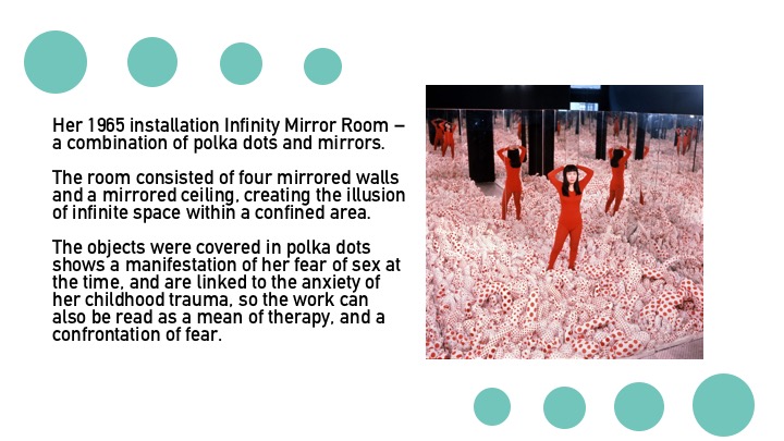
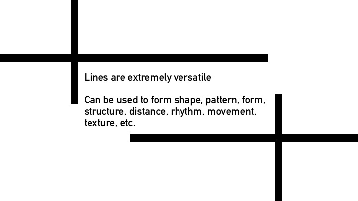
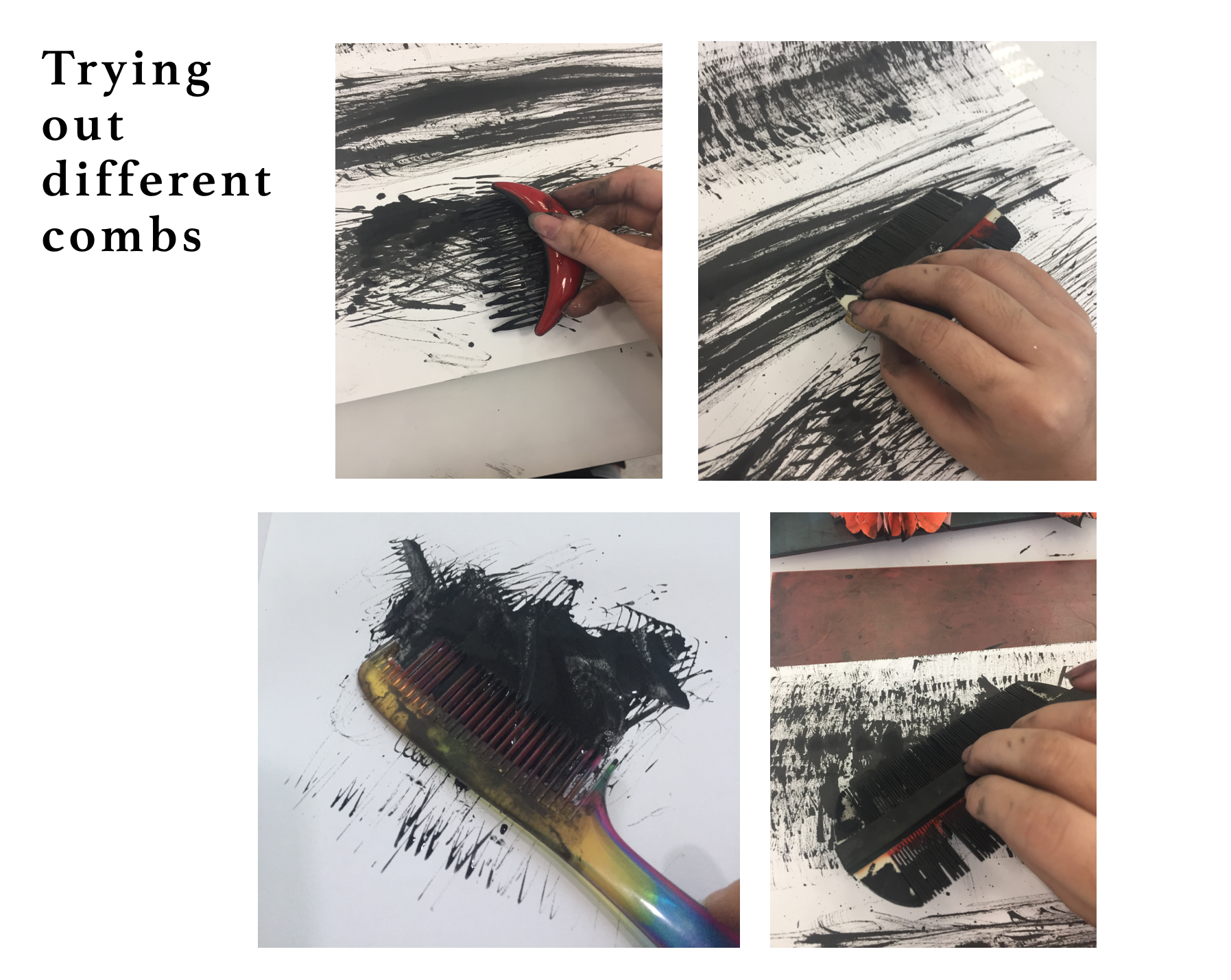
This post showcases other exploration methodology and line works which led up to the final work.
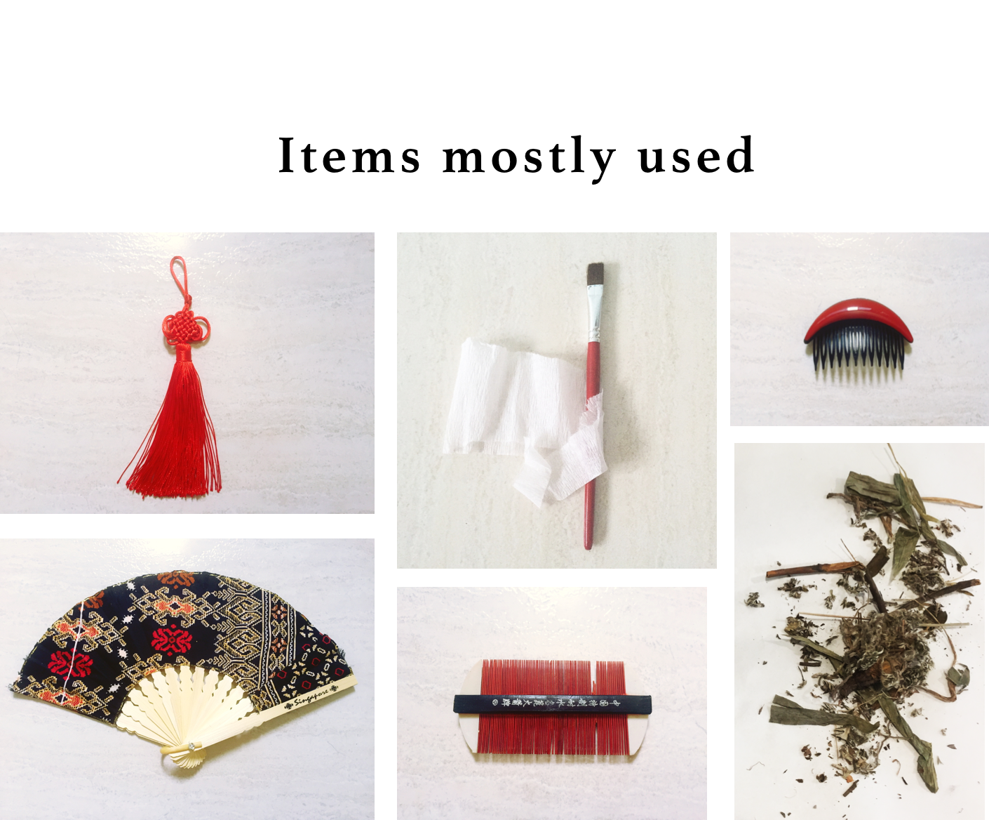
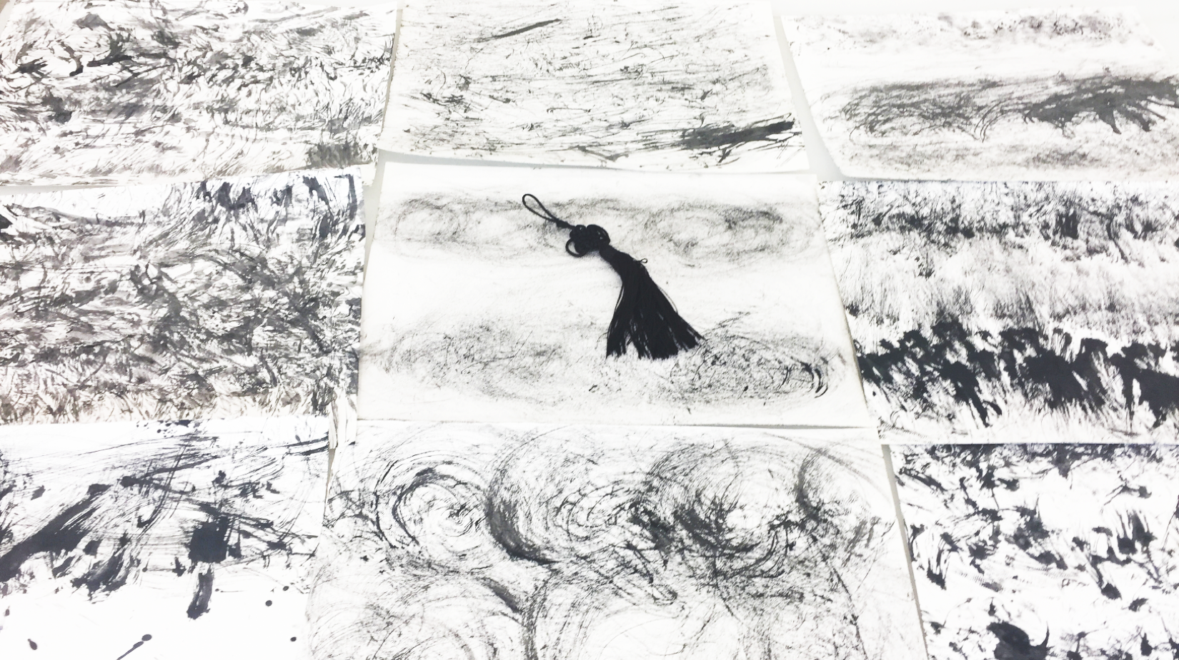
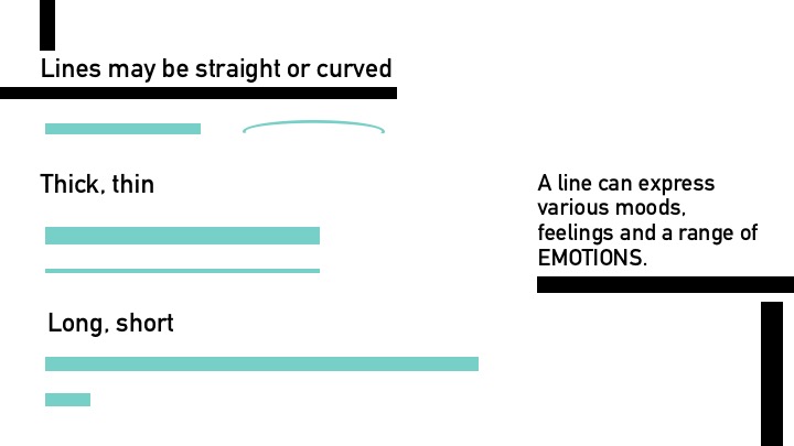
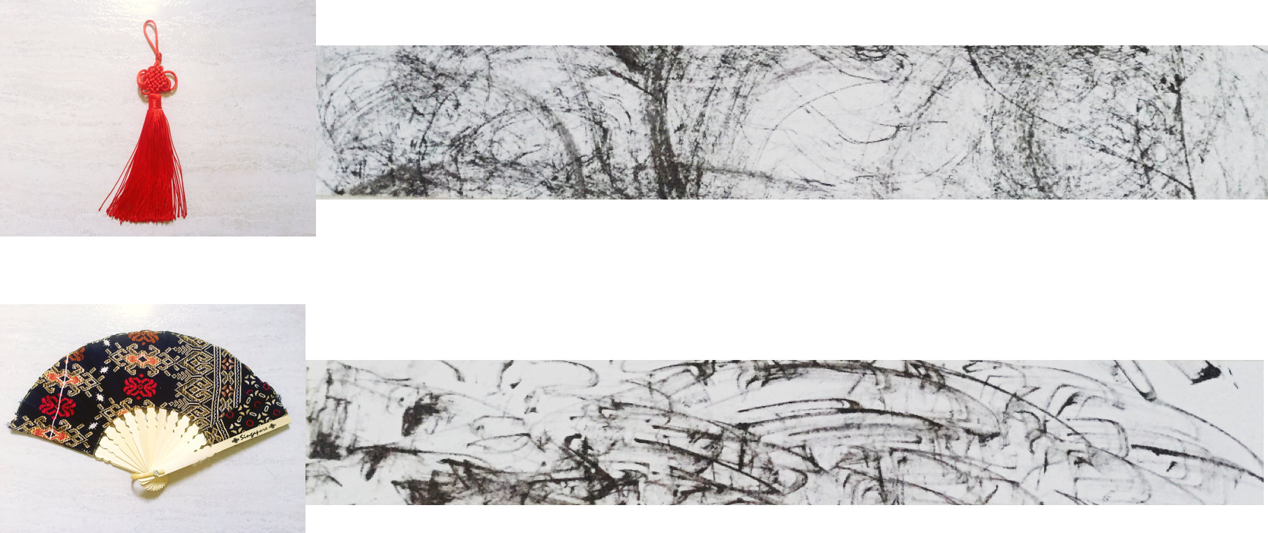
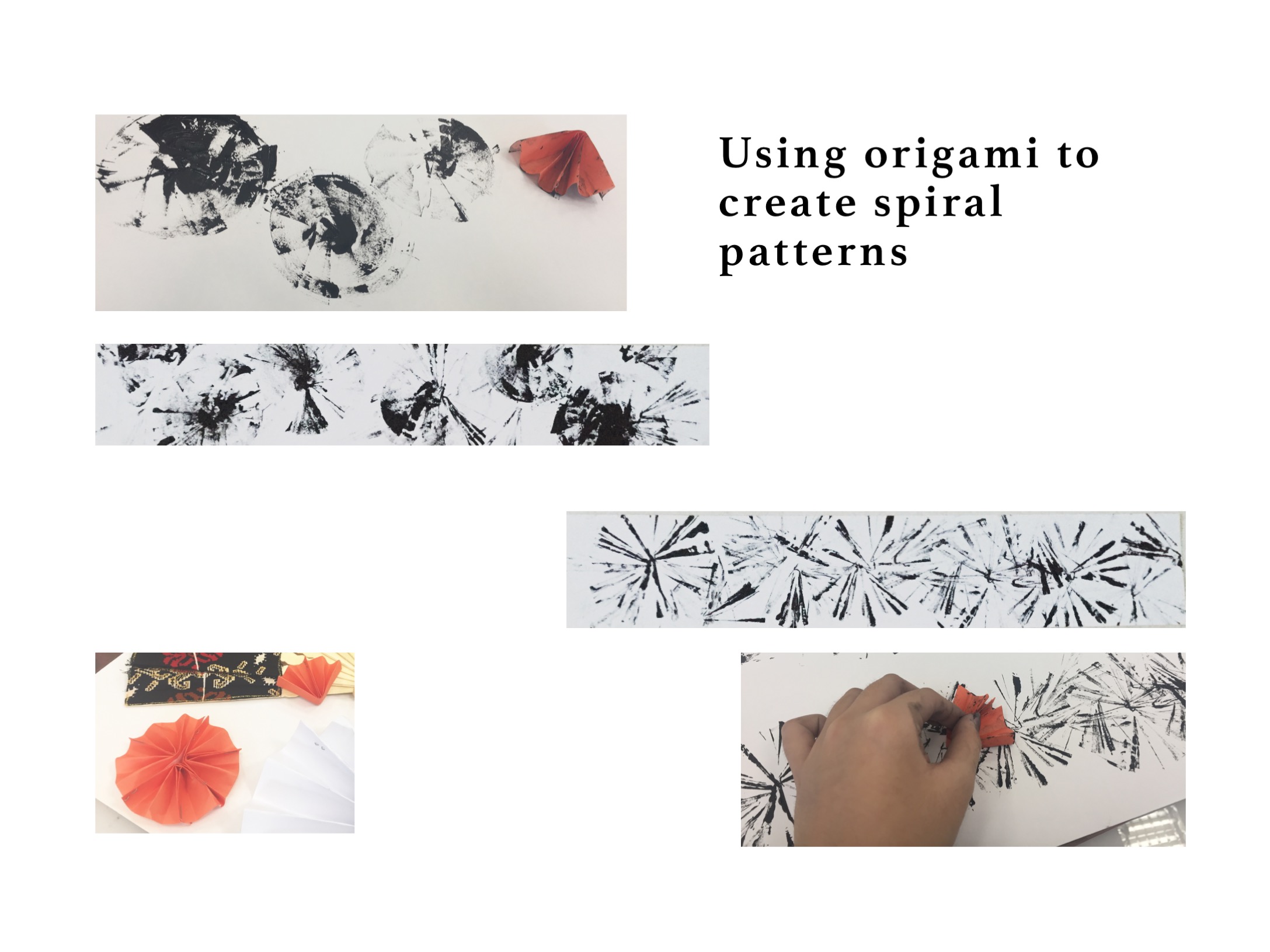
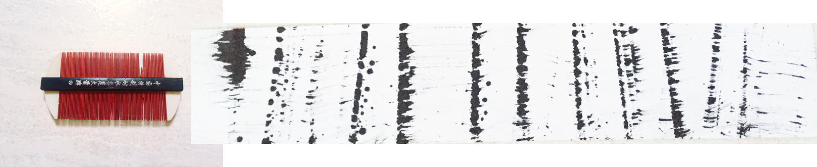
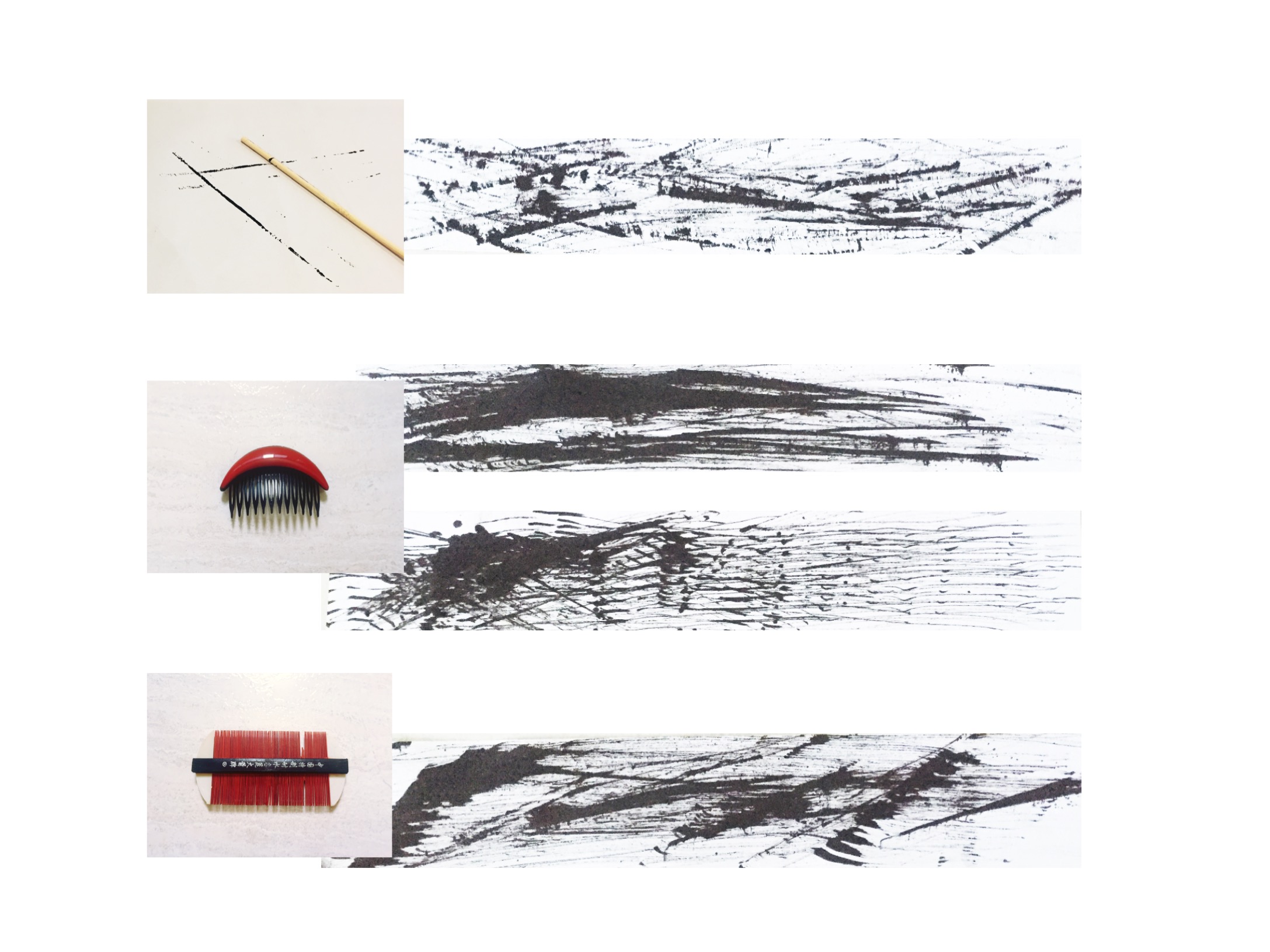
Behold, the versatility of this decorative ornament.
All the line works shown in the picture were made from the ornament.
Attraction
Creating swirls and ripples
Happiness
Grief
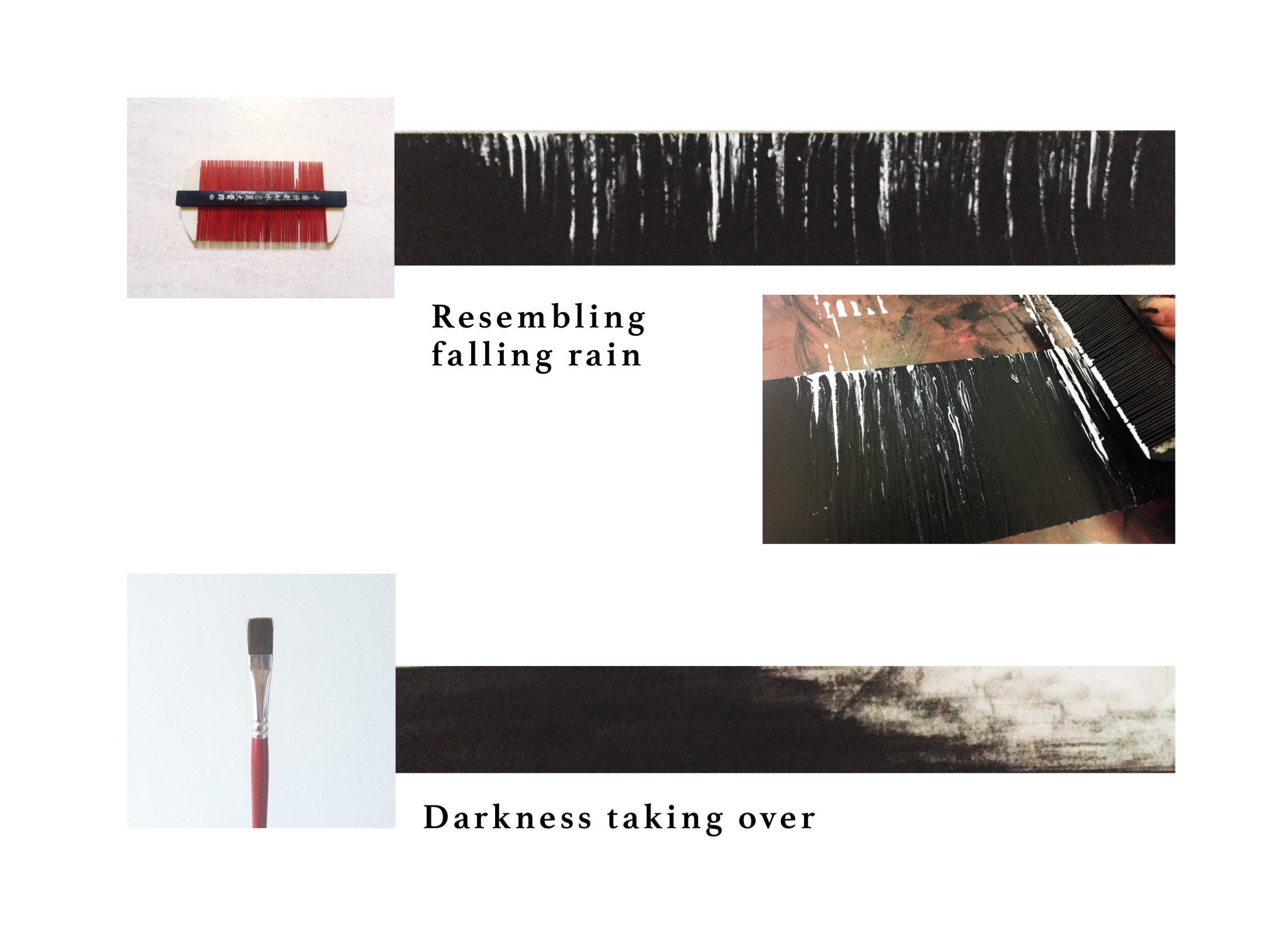
Shock
Wrath
Horror

Links to other related posts
https://oss.adm.ntu.edu.sg/am0002in/my-line-is-emo-research/
https://oss.adm.ntu.edu.sg/am0002in/mark-making-artist-research/
https://oss.adm.ntu.edu.sg/am0002in/final-project-1-my-line-is-emo/
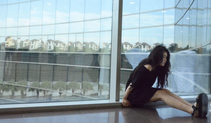
Model: Zhong Wei
Capturing the most striking details about her
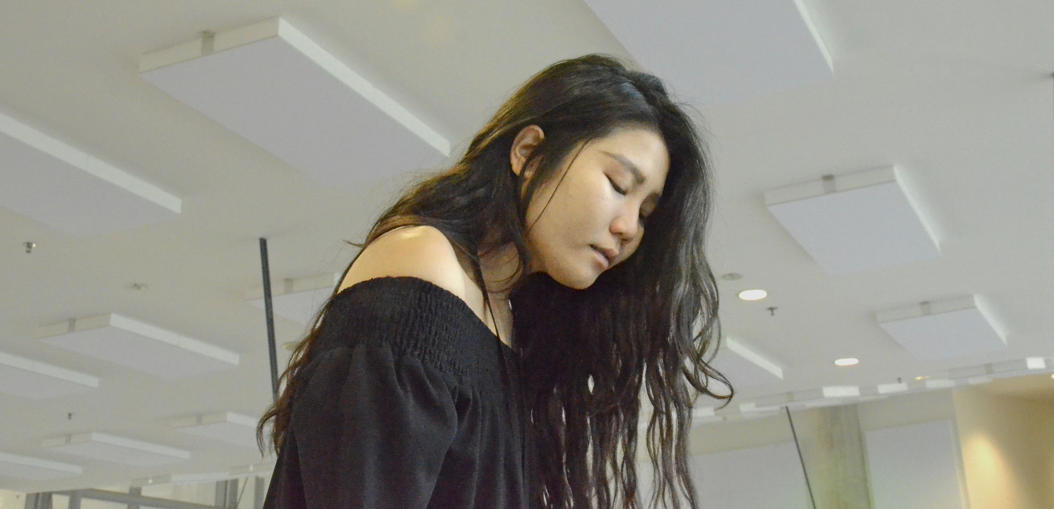
“Hair” (Low- angle, Medium close up shot)
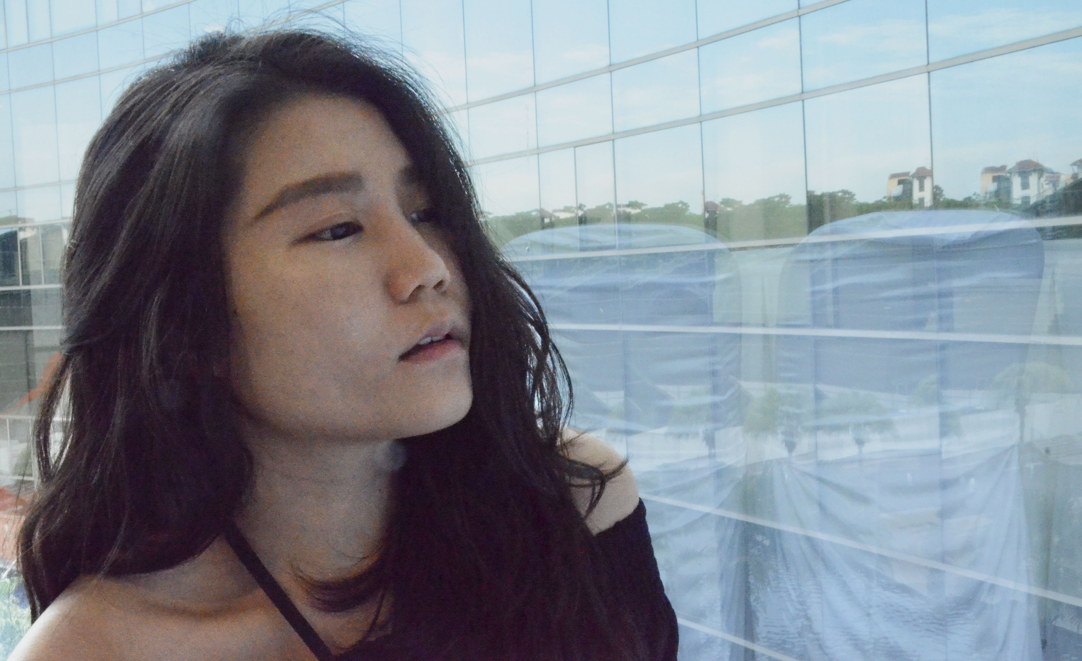
“Eyebrows” (Eye-level, Close up)
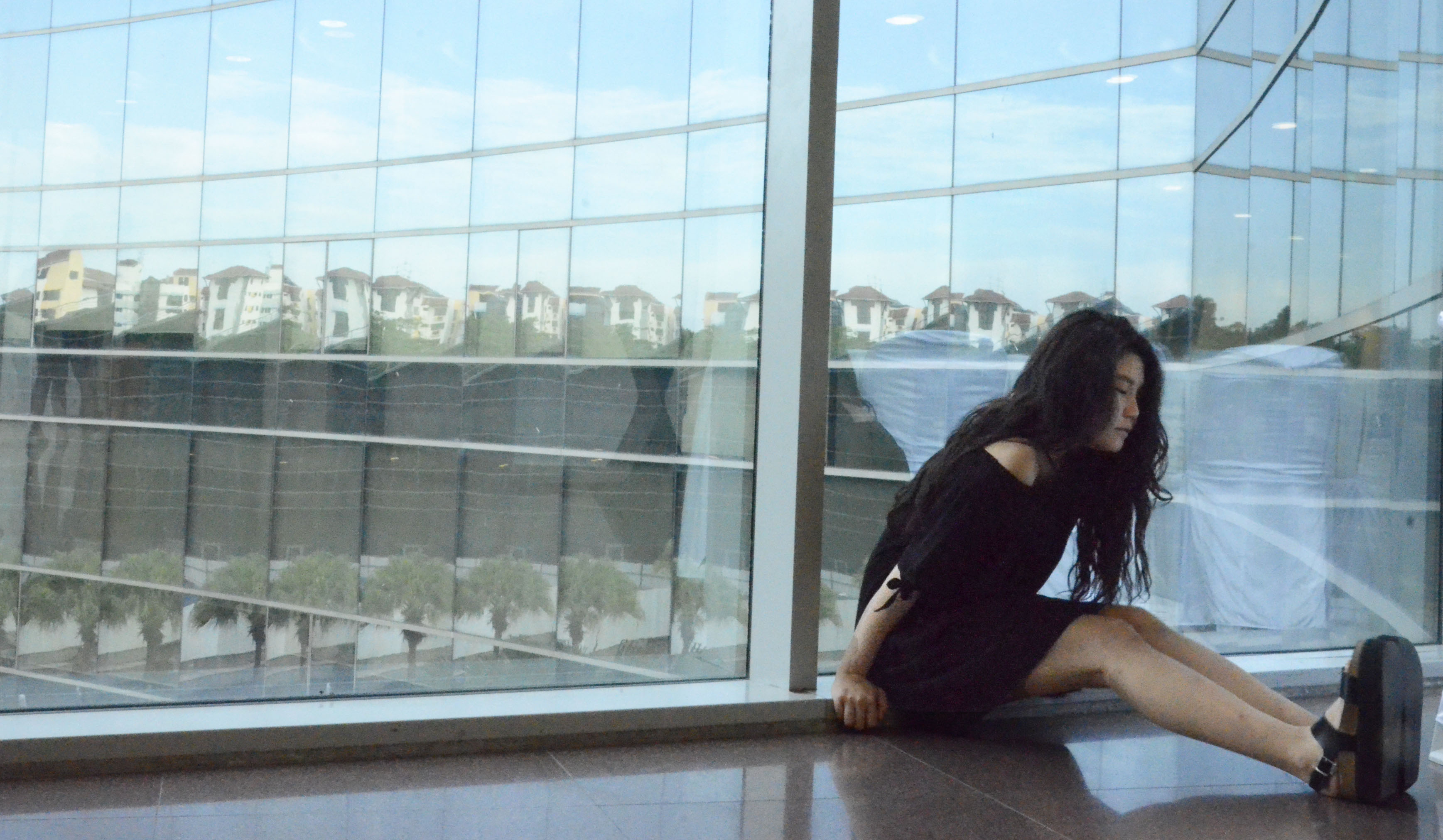
“Shoes” (Eye-Level, Long shot)
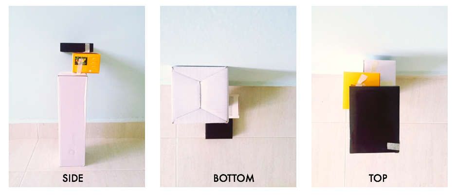
Following the previous lesson, we now had to implement what we have learned onto our boxes. This time, we had to construct our boxes based on the given theme.
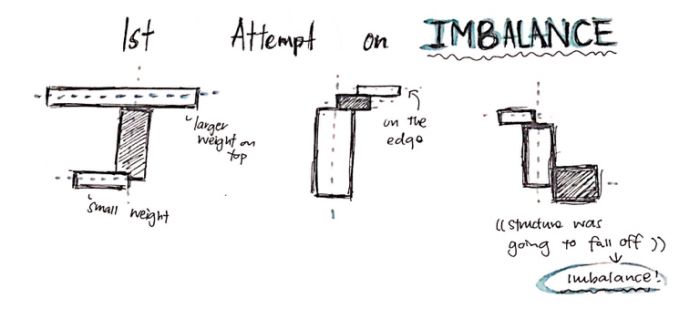
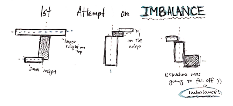
For this Pandora’s Box project, the theme I’ve gotten is ‘Imbalance’
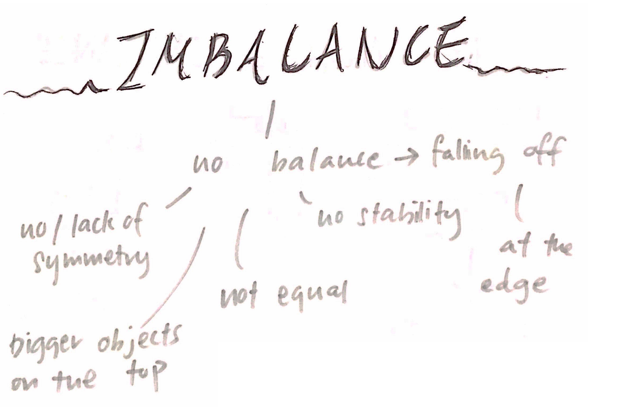
What is Imbalance? It is the state or condition where there is a lack of balance or even proportion. Here is a mini chart I did relating to Imbalance.
With that, I began to draw out possible 2D Sketch Analysis for the composition of my boxes.
For my first draft, I finalised on these three concepts.
Then, I picked 2 of them to make up my box composition.
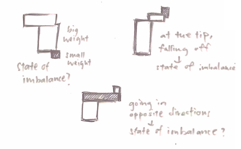
Concept 1
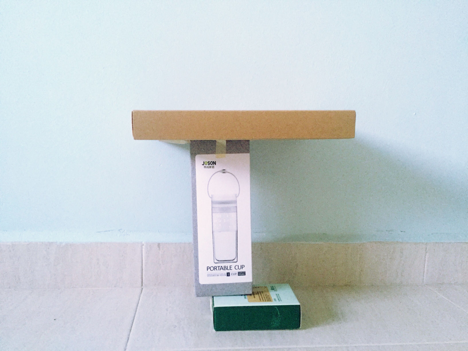
The main idea behind this concept is to have the larger weight on top and a smaller weight supporting it so that it seems like the structure isn’t supposed to balance but it does. The structure was made to have no symmetry and the boxes are of different sizes to show the dominant, sub-dominant and sub-ordinate.
Concept 2
For this concept, I played with placing everything on the edge, so that it looks like they’re about to fall- causing imbalance. Compared to concept 1, the boxes are placed further on the edge, occupying around 1/4 of the space. Similarly, the structure is not symmetrical.
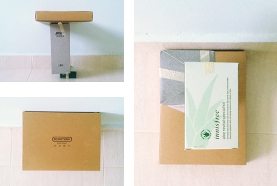
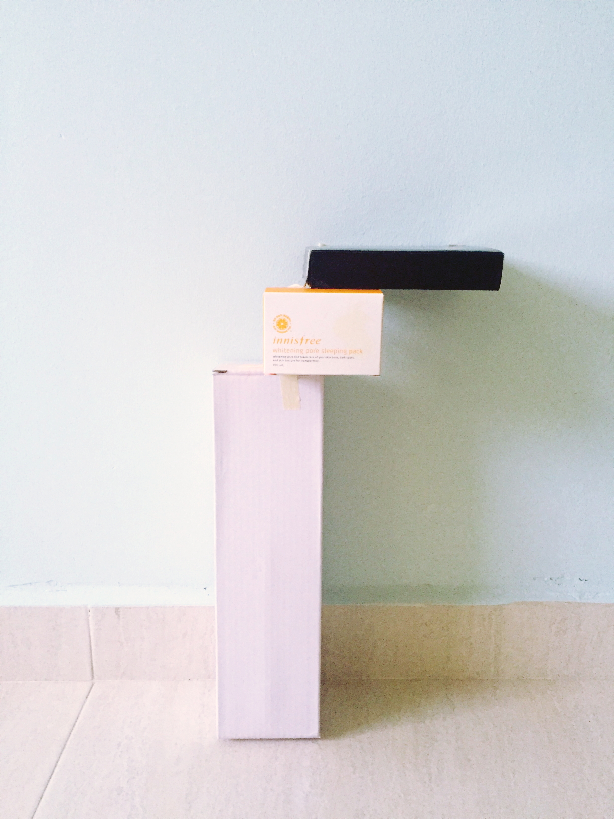
After consultation, concept 1 was chosen as the better model to show the concept of ‘Imbalance’. Some feedback on improvements to be made however was to place the boxes further off the edge so that it really gives off a sense of imbalancing.
Blue foam
With that in mind, I tried to made some adjustments on the concept by trying out on blue foam. I picked out some suitable pieces from the used foam corner and proceeded to cut them into shape. Then, I joined them by using the methods discussed in class such as ‘wedging’
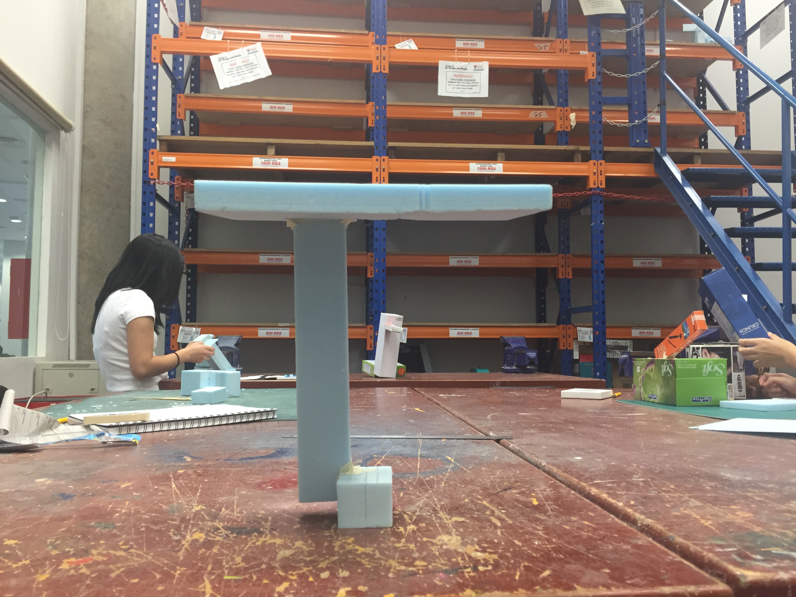
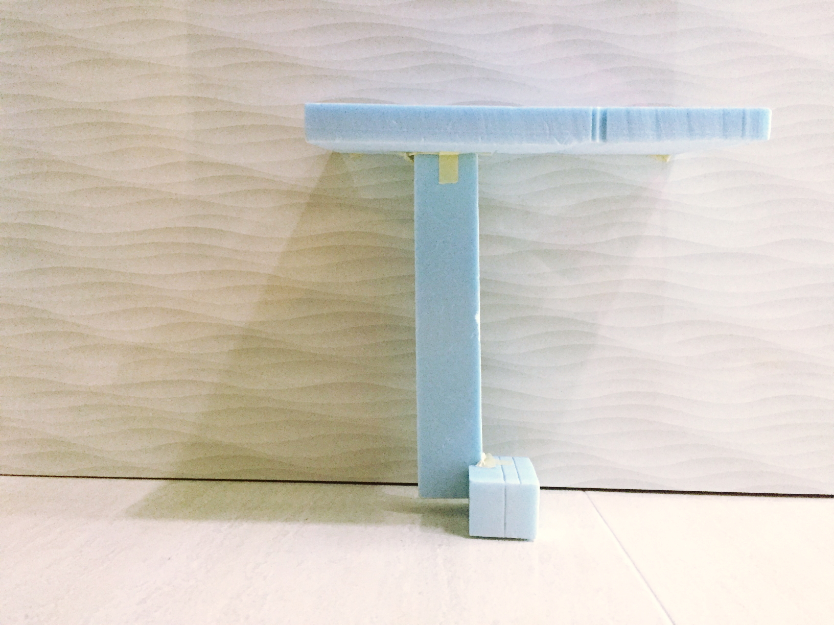
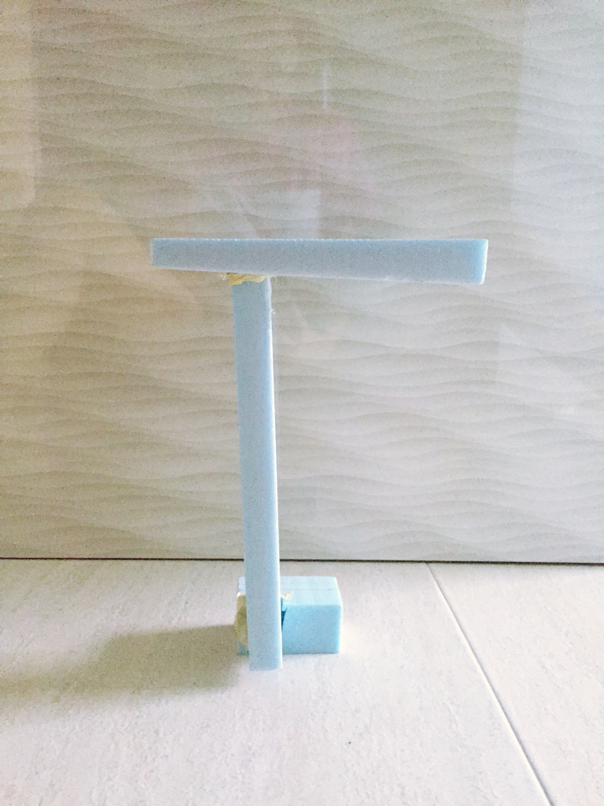
This is the structure I was able to come up with in class. This is not really a second attempt worthy model but just a test out I quickly did up during class to try out the blue foam. Nonetheless, it did give me some inspiration for ideation as I play around with the forms.