As some things didn’t work out for my initial first draft print, I made several changes.
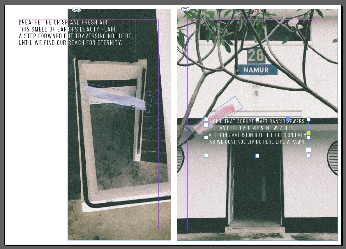
First, I converted the paint strokes digitally and made a range of colours to see how it fits.
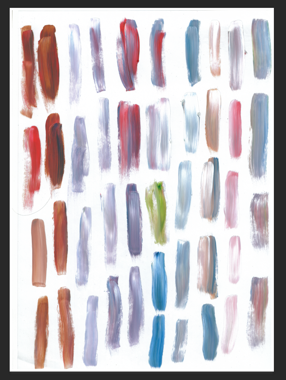
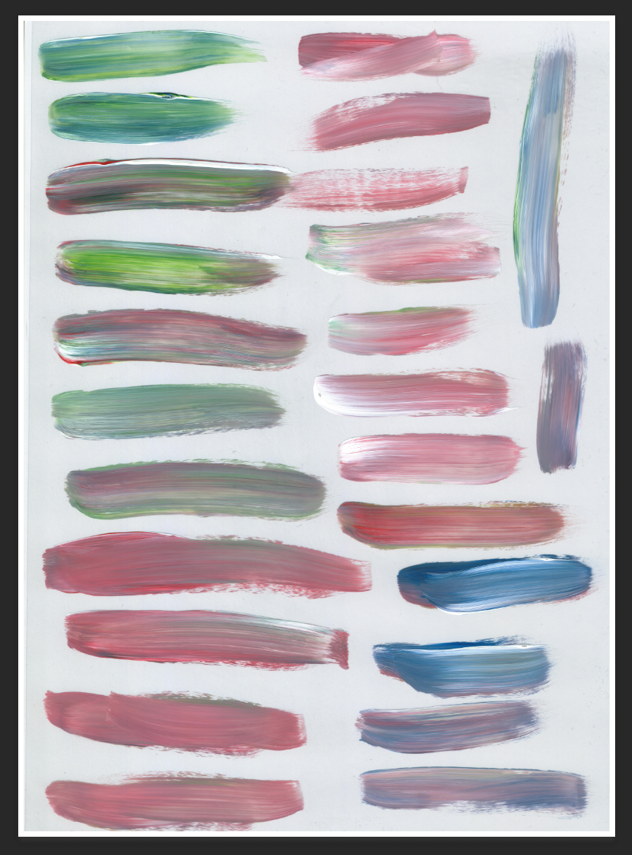
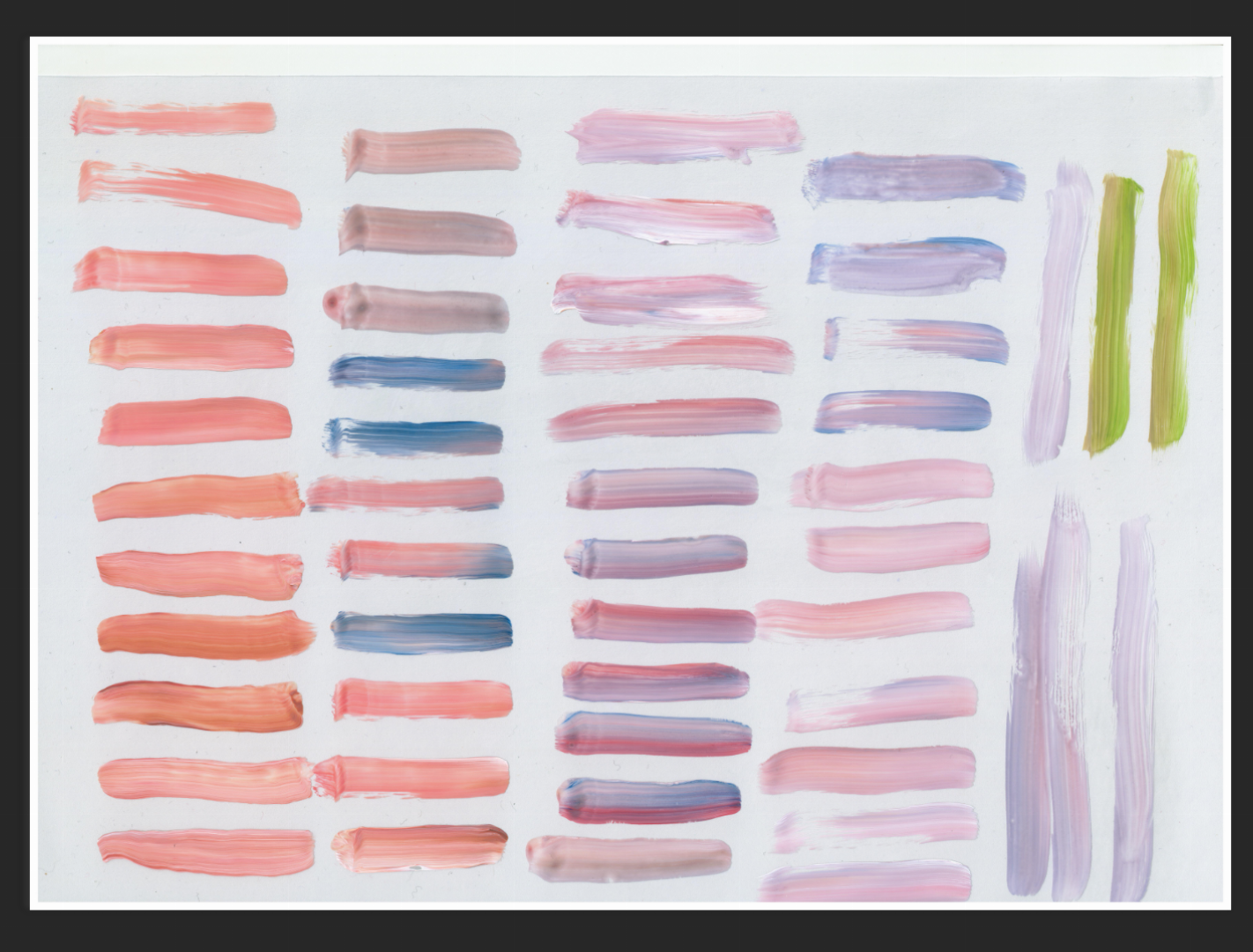
I scanned these strokes in so I could play with the opacity and see which colour range will complement the images.
Also, as some images didn’t work out, I play around with formatting to see which would fit better.
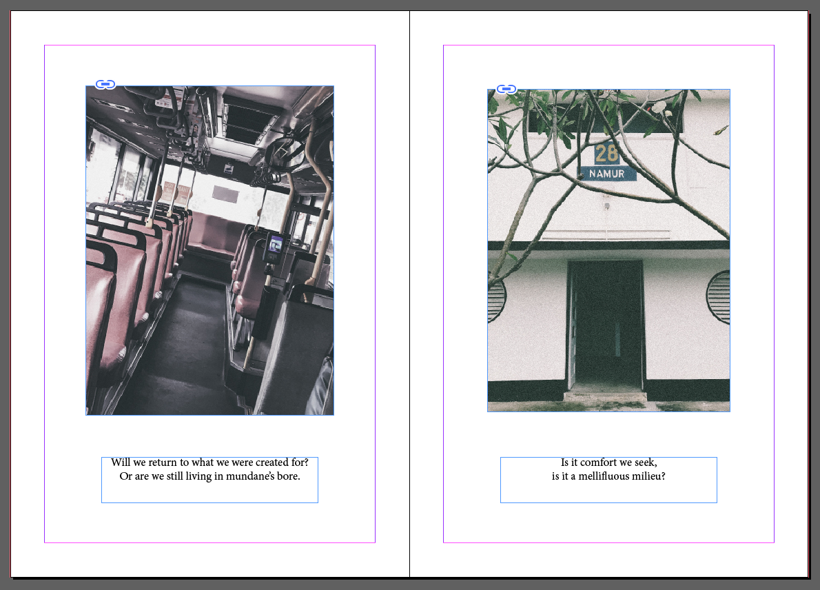
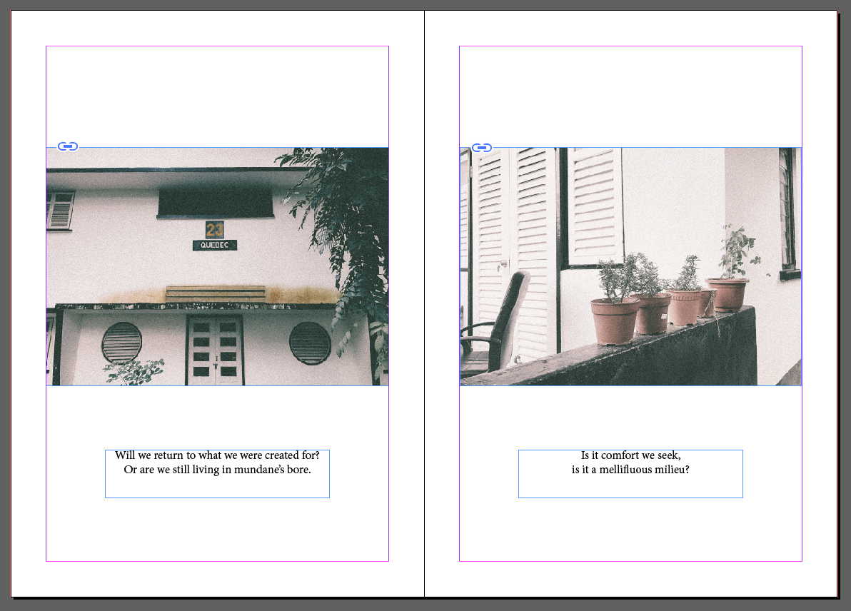
For this spread, I wanted to play with portrait images, however, when I tried to play with the landscape images in the second image below, I felt that it conveyed and helped bring out the idea further with the landscape images. Thus I would prefer the landscape images.
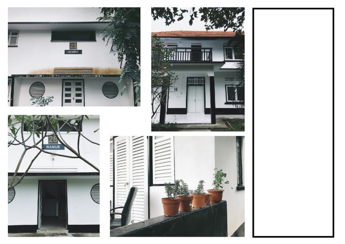
My center spread was initially a full image, However, I wanted to play with more images and dimensions in my zine, so I tried another layout, as seen in the first image below. I’m still trying to work out where the text will go for the first page in the spread.
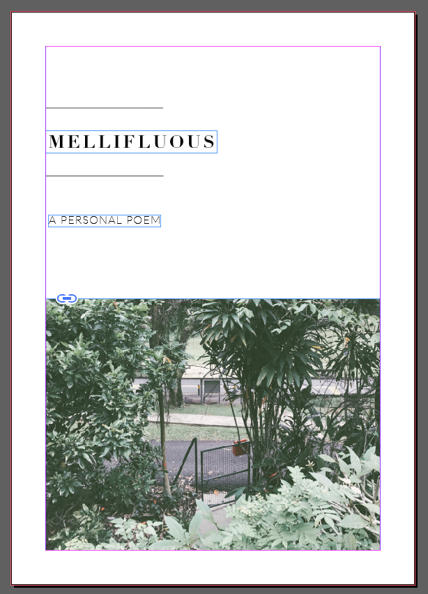
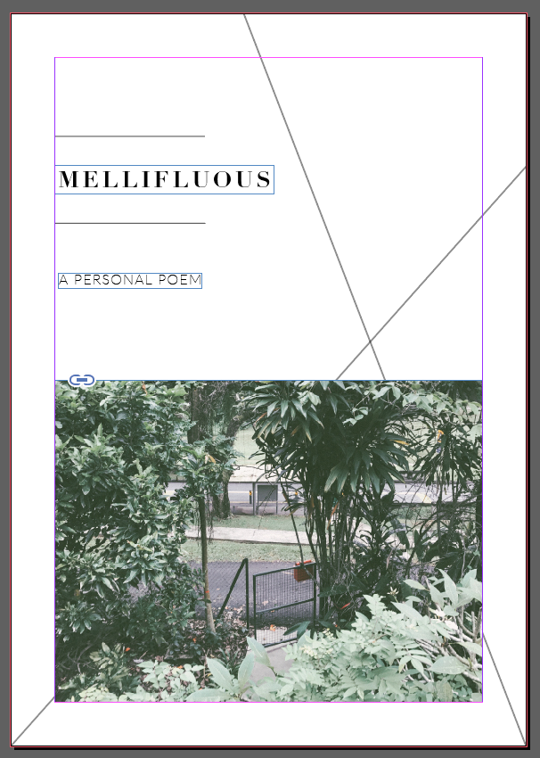
For my cover page, I wanted to play with different formats. I tried to align my title in the center of the page but I felt it was a bit plain, so I decided to add a minimal design to it. Thus I feel that aligning the title to the left would be visually better.
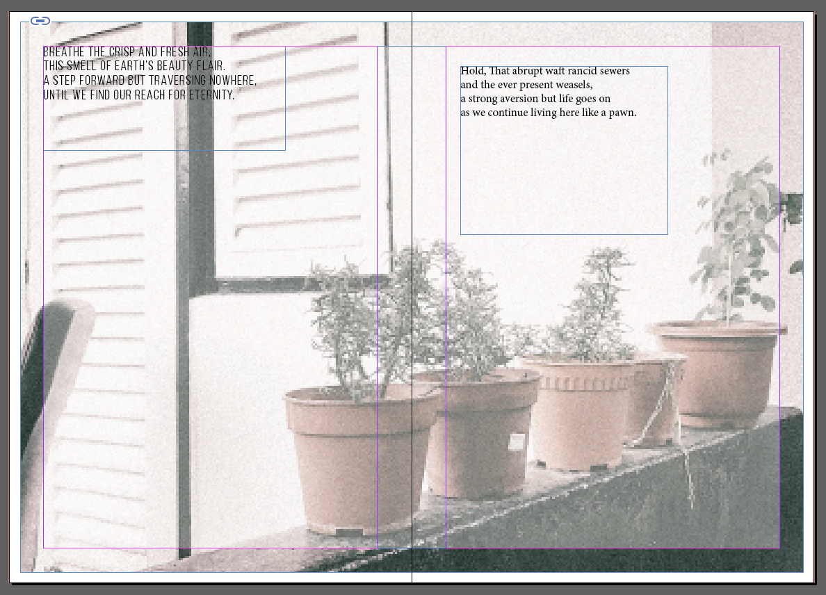
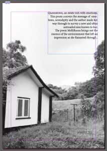
As compared to my previous picture for the end of the zine, the colours didn’t match the images and there was a lack of consistency, thus I changed it with a image that spoke to me a lot about the environment and surroundings to end it off. I thought of adding a small excerpt to give a final explanation about the message behind the zine.
I have yet to explore further with the paints and colours that I can play with. I would be doing that soon!
You must be logged in to post a comment.