2D2 | ZINE Progression (in print)

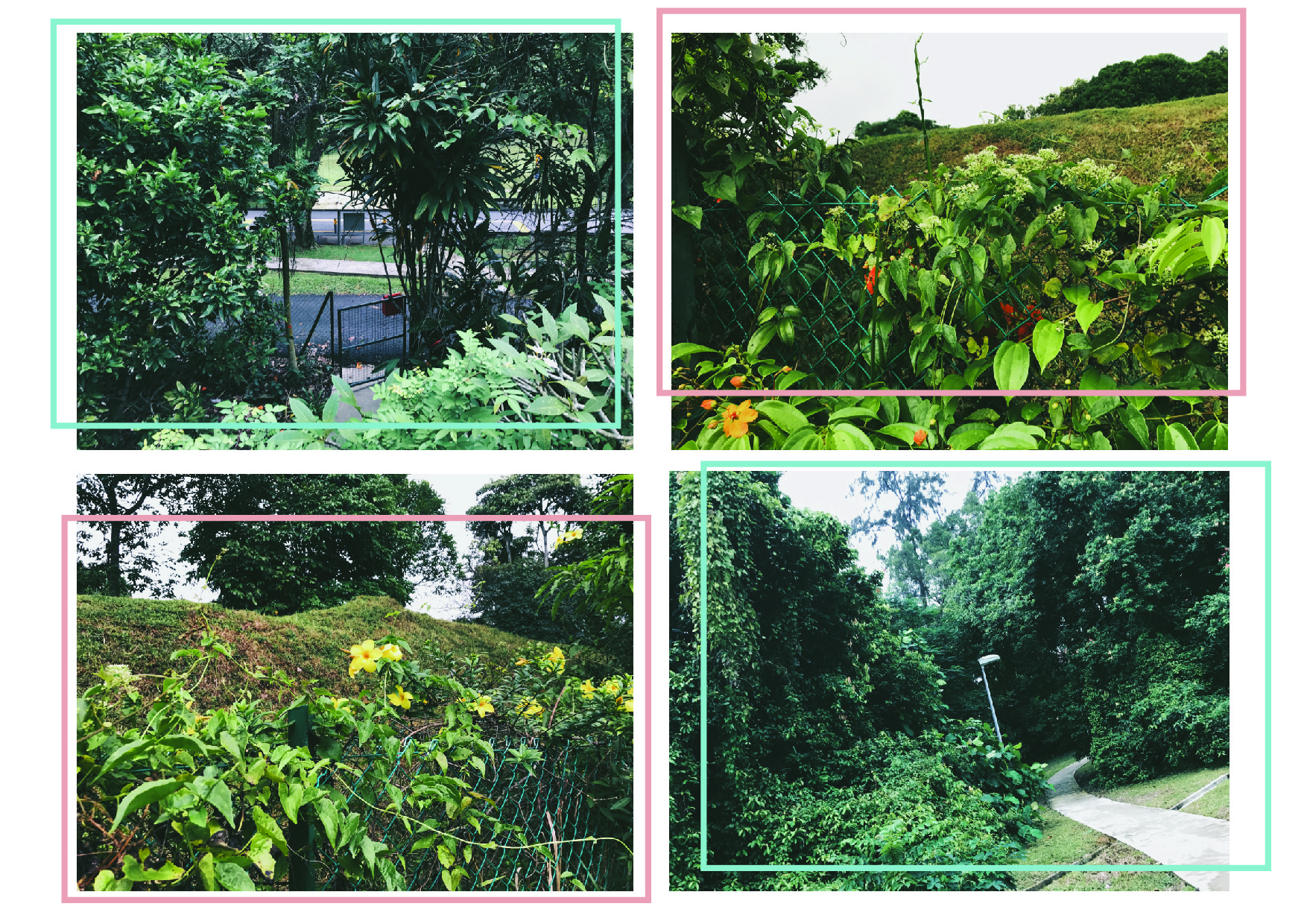
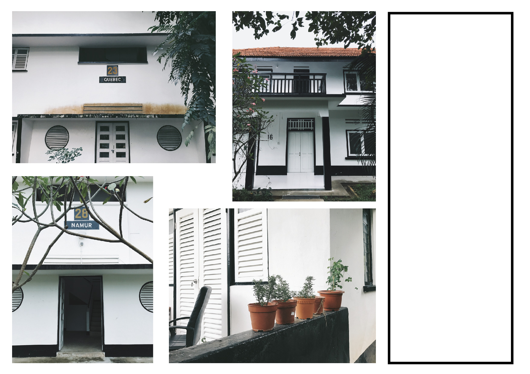
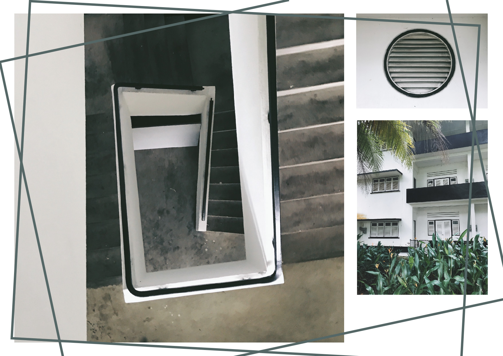
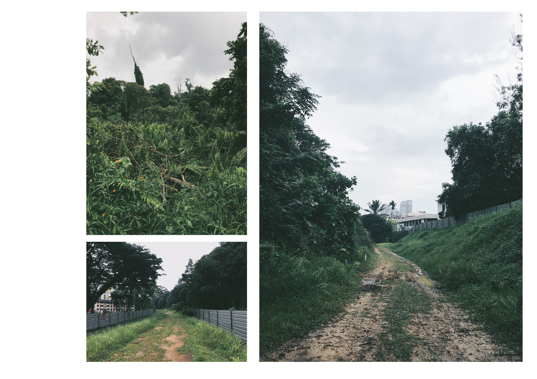
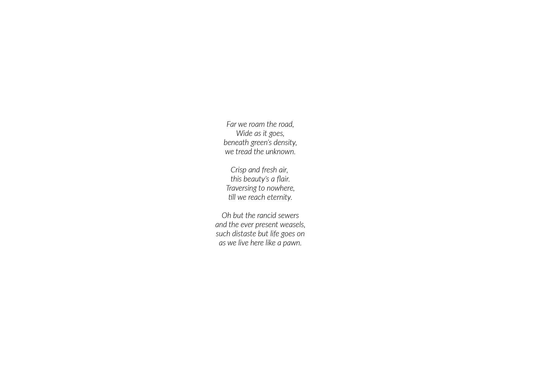
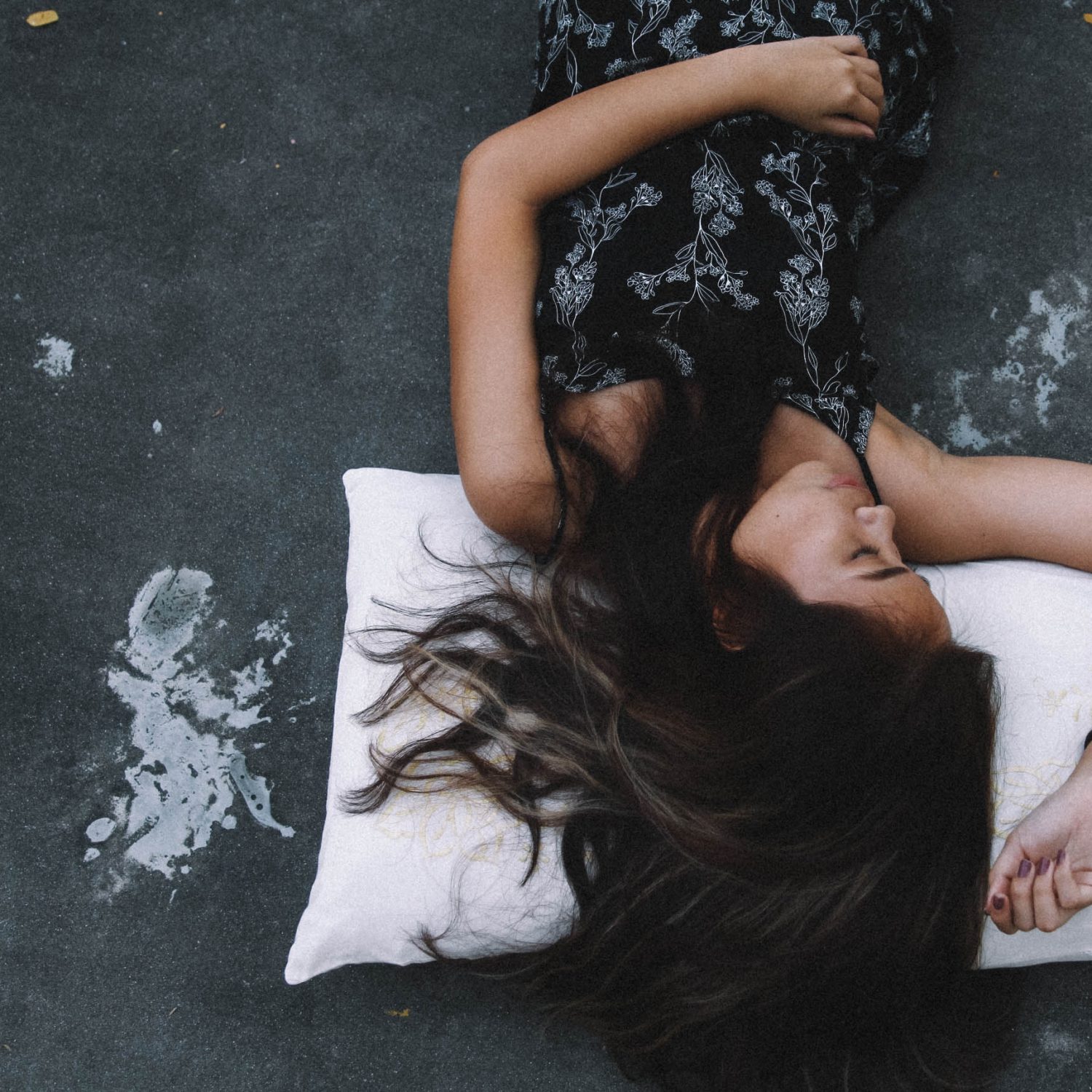
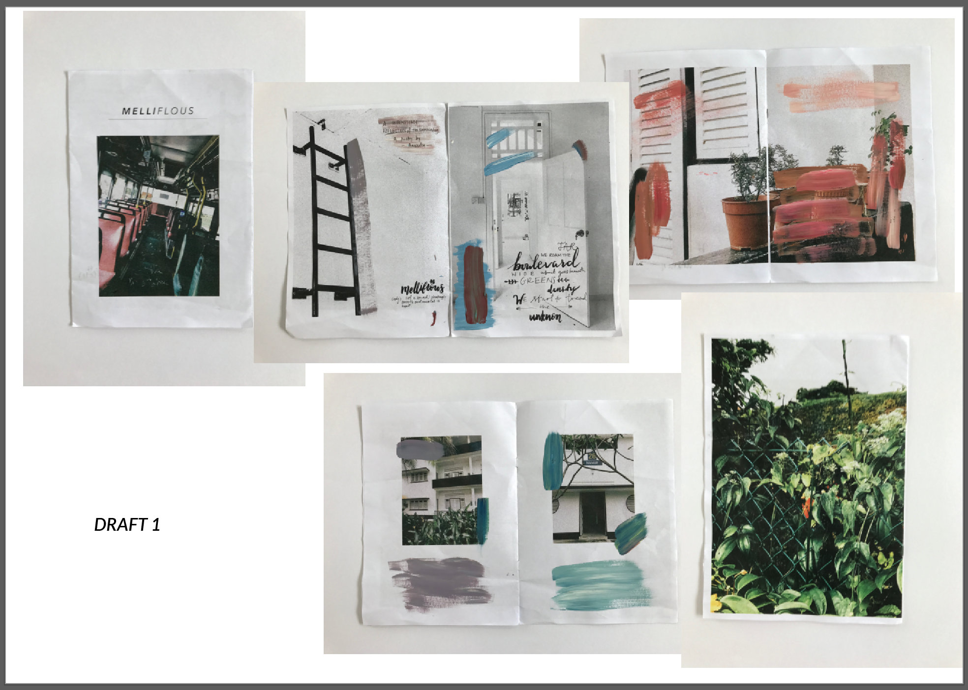
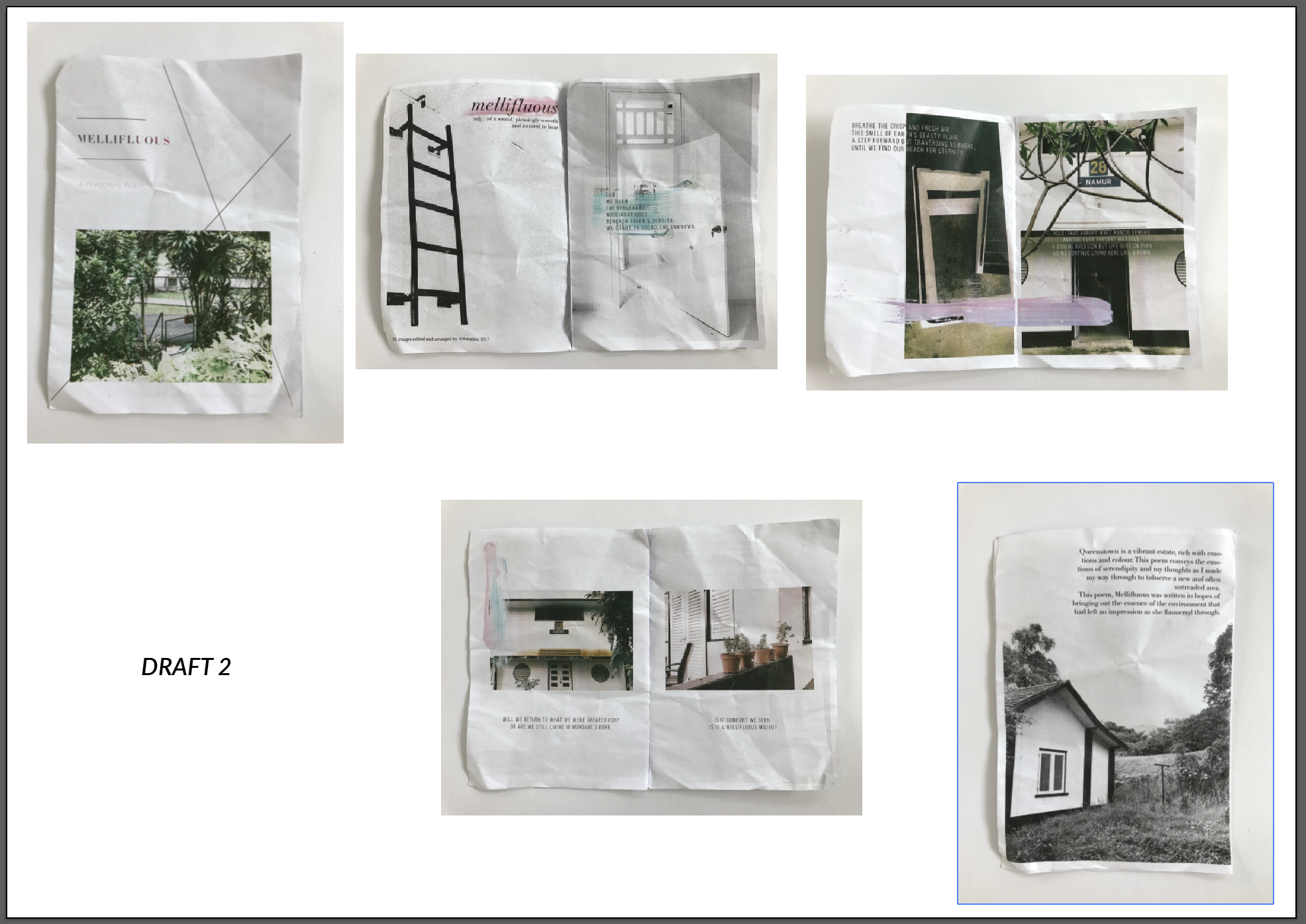
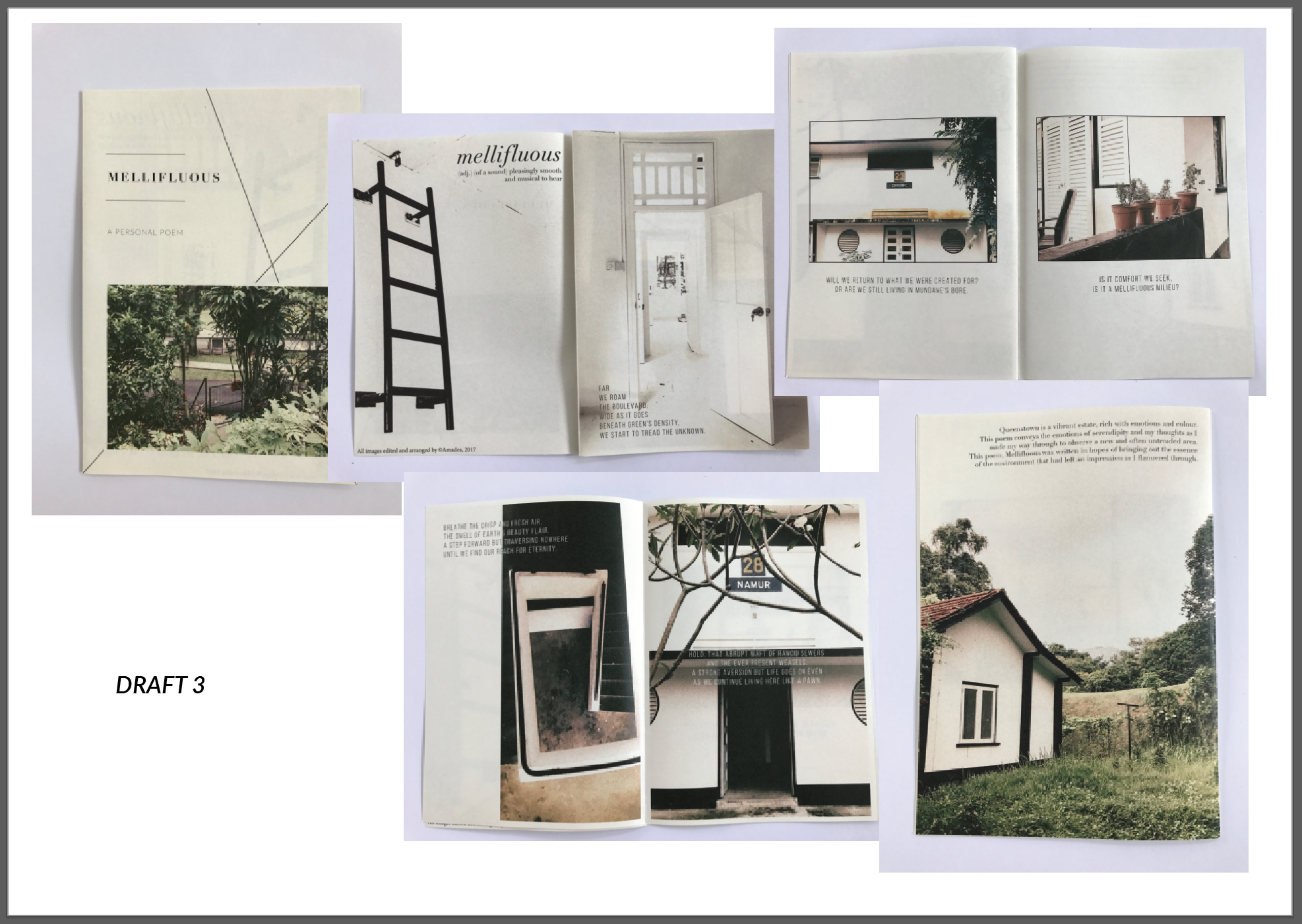
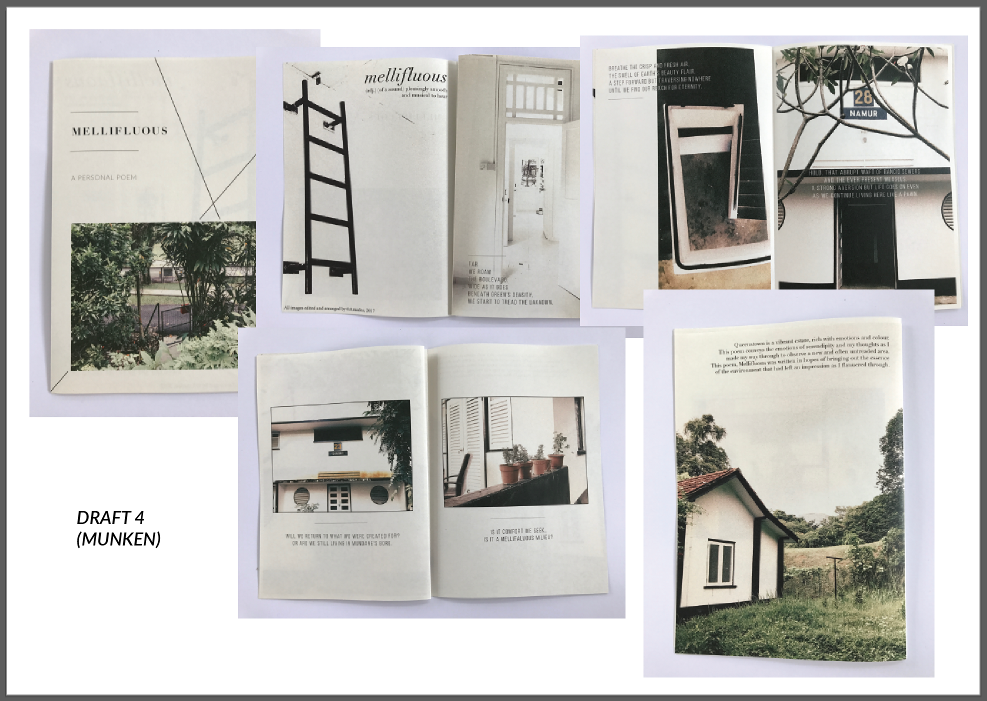
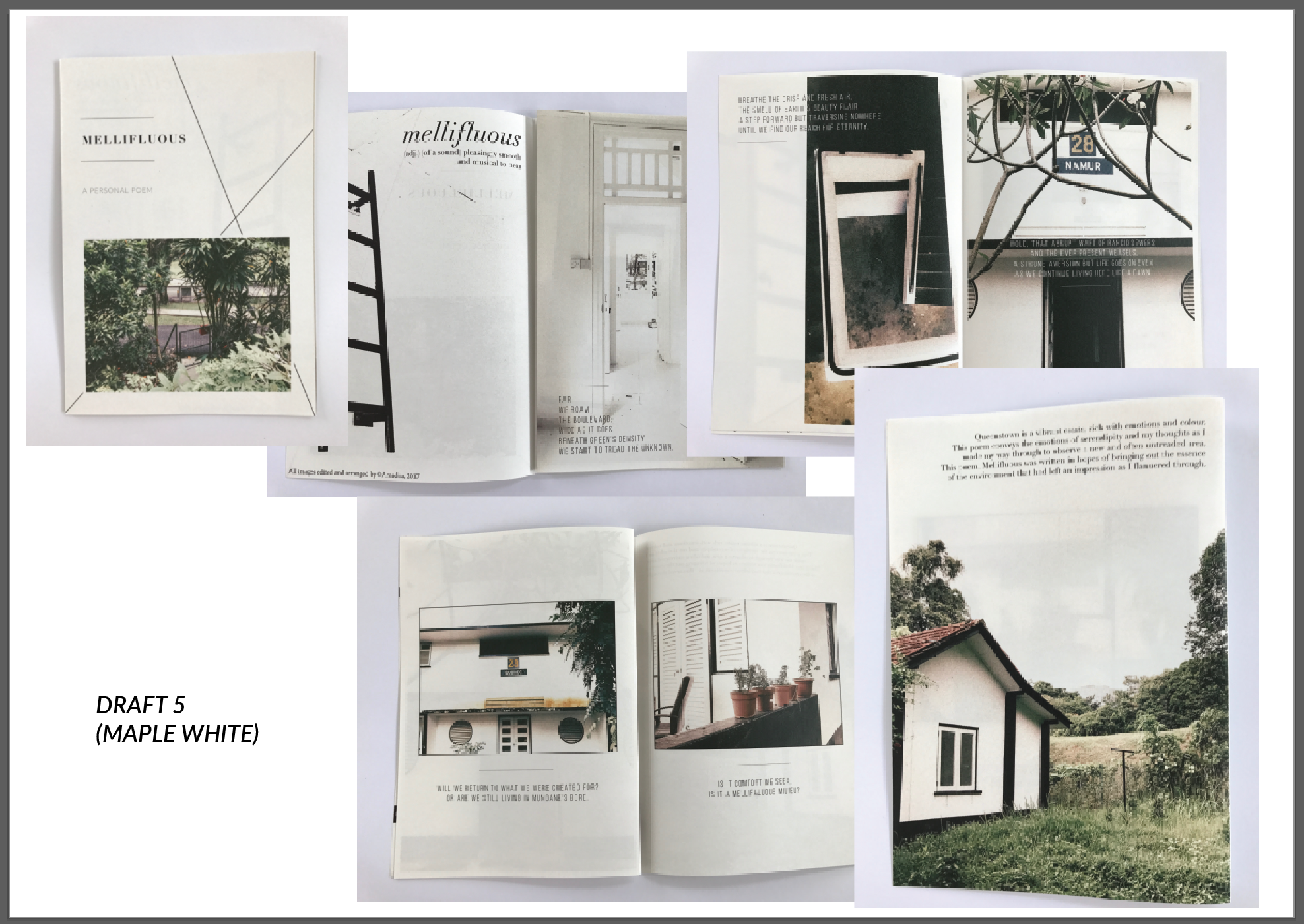
Here I present to you the printed drafts I had for my final project. Each draft contains a different edit and a build up to what I’ve achieved today.

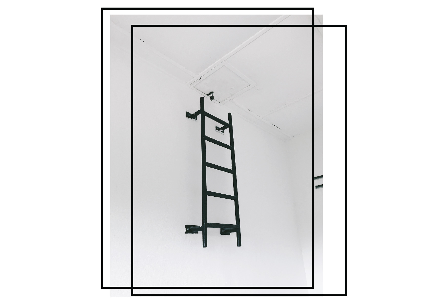
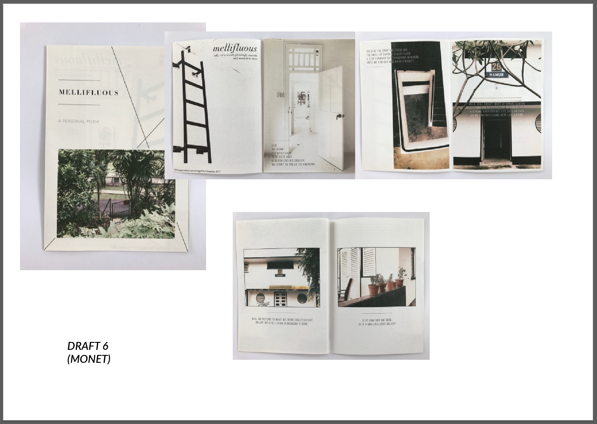
Draft 4, 5 and 6 helped me choose the paper that I want after seeing them in print. I finally choose to have my final print in Monet, 115gsm as I felt that I didn’t want the paper quality to be too thin even though it’s a personal zine because I want the structure as it is a poetry zine. The thicker paper also suited the colours from the contrasting toned images of my zine. The other people didn’t feel as solid and neither did it really bring out my vision.

Also, I didn’t bind it together as I wanted a raw authentic feel as the pages are flipped. I didn’t want the rigid feel of the papers sticking together.

Thus, this concludes my progression over the past few weeks while working on this zine.

Hope you enjoyed it.

2D | Zine Process (ll)


Here’s another update, I played around with the paint strokes that I created hoping to add a little spice, design element and spontaneity into it.

However, as it was going for a simple, classy poetry book, Mimi suggested that I don’t distract the viewers from the images and text with the paint strokes.

Also, working with the colour tones of the photos was fun in trying to create a balanced overall look to the zine.

I’ll be working on the next design in the meantime.

2D | Project 2: Zine – Research, photos and Part 1 presentation

Yes! I went to explore Queenstown (more towards Wessex and Commonwealth). Here is my journey that has helped to form my ideas.

I was very fascinated by the colours and contrast of the area and I wanted to document and explore that aspect.

But it’s time to go down and explore more, observe more and document more. Meanwhile, enjoy these images!

(p.s this poem is incomplete, but it’s in initial idea of how I want to link my photos to my Zine. Do wait for the complete one)