Blue Waves – Style 1

This post will be sharing my ideas and stills for my first idea. This came about because of the prominent blues that occur throughout the silk road and is a symbol for many different things ranging from it being Timurid’s favourite colour to a symbol representing death.

It also represents water and thus I want to link it to abstract ways of presenting blues and imagery that is fluid and morphs naturally like water.

RESEARCH REFERENCE

MOODBOARD


STILLS

These are created by using acrylic paint to create fluid art.
Something else that I would like to try would be created images with cyanotype printing because of the blue outcome of the prints.

ANIMATIONS

Tried using the displacement map effect on ae to create fluid water effects and here are my attempts.

https://drive.google.com/open?id=1EroHyeISrfQS5k0yIS0ug4SS5xt2_nzr

TYPO 1 | PROJECT 2

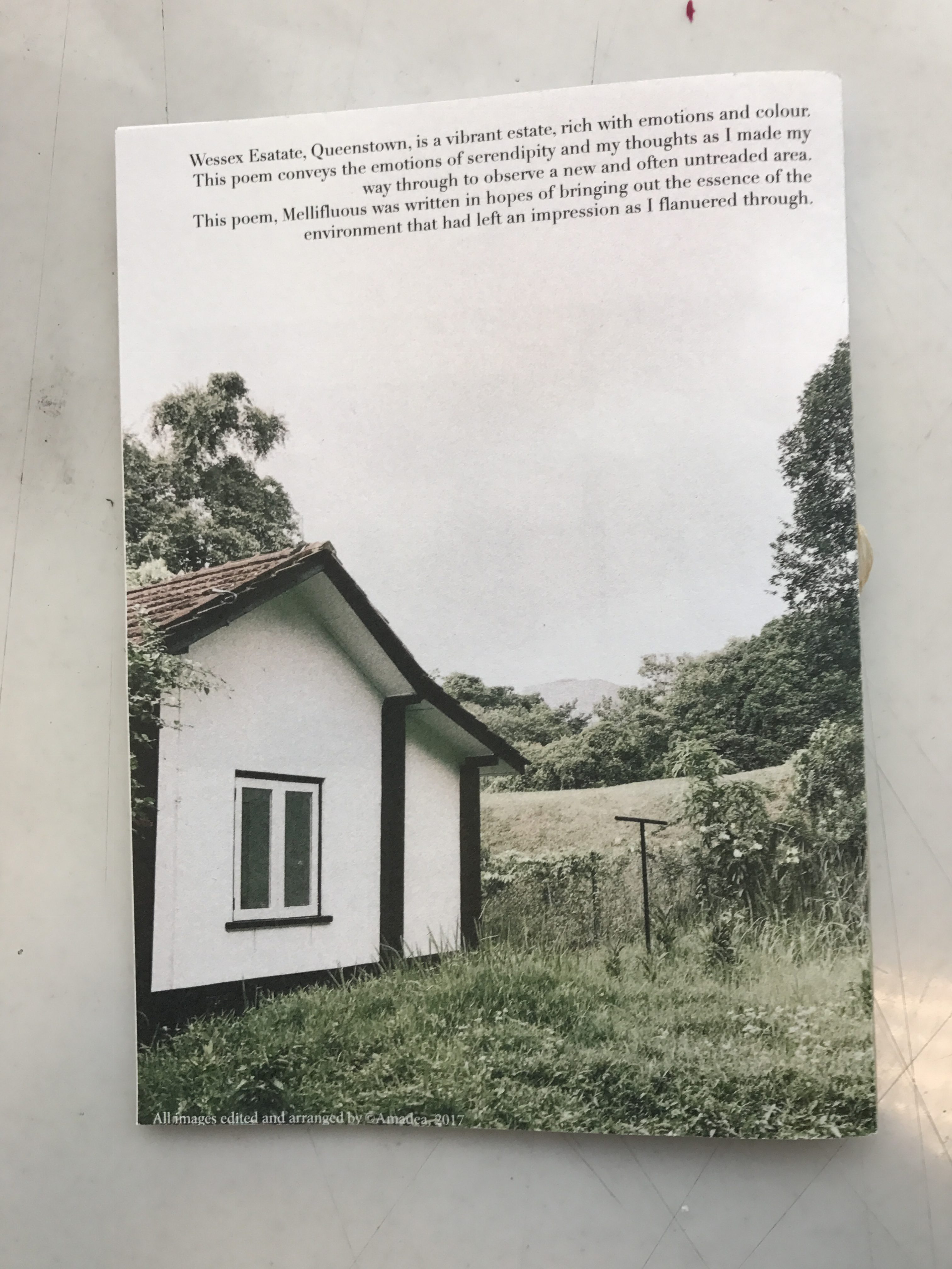
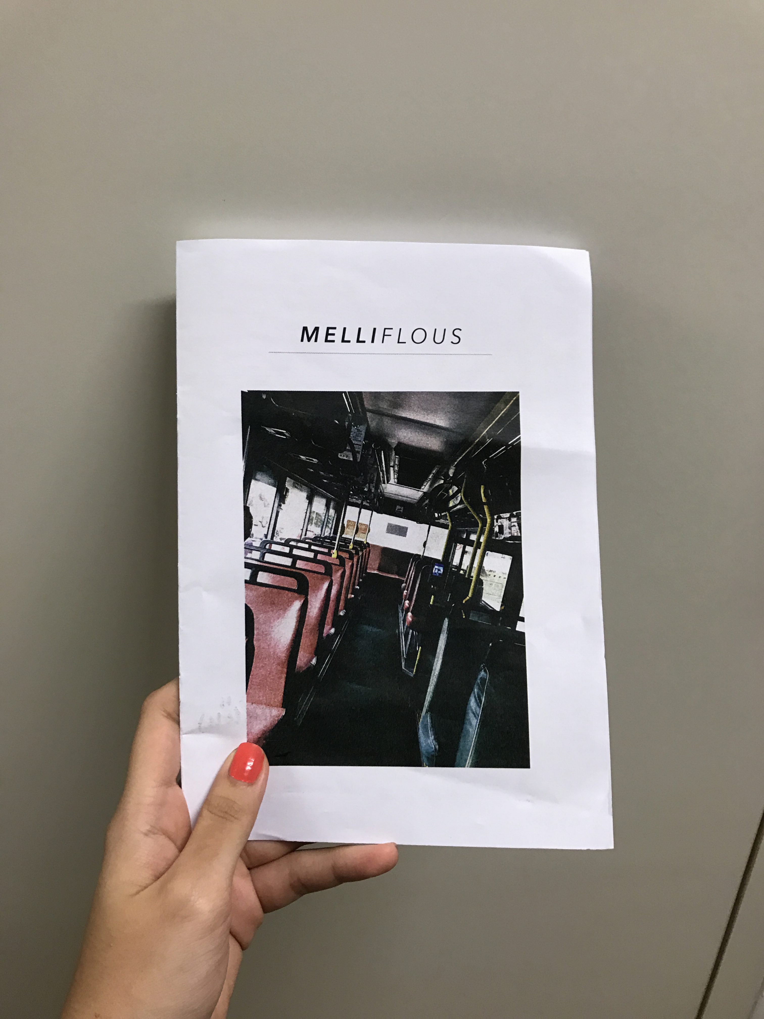
PROJECT 2a: Vernacular Type 


Location: Marketplace (Yishun)

I chose the Marketplace at Yishun as it is a place close to me. It was a place where I frequented and grew up in. I wanted to bring out the market vibes which is the common market lingo that ‘aunties’ and ‘uncles’ use for their purchases.  I thought of the different things that they would say and came up with:

“cheap can anot”

“one basket how much”

and a lot more Hokkien lingo that is exchanged – which I don’t really know of.

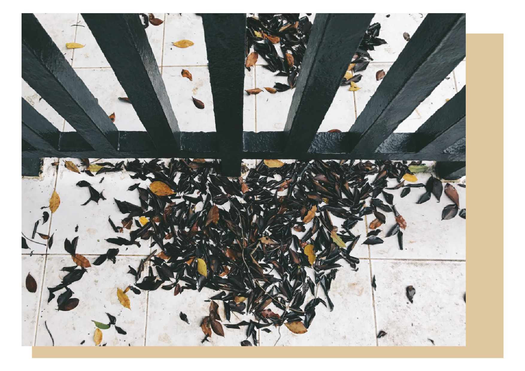
It was night by the time I decided to take pictures and I thought this would be a good setting because I wouldn’t usually go to the market at that time whenever i’m home. So I thought this would give me another perspective to the way I saw things at the market and I hoped it would give me another angle to the way I saw the signs and looked for types.

It was a challenge because a lot of things were foreign and I had to look at things different as compared to what i would usually if I made a trip there during the day doing the routine marketing. However, this time I was trying to pay attention to small details and pick on things that wouldn’t usually catch my eye. It was manageable at first, however as I went in further, I felt I was running out of things that caught my eye or had a type to it. I also wanted to choose types that would represent the market and also find elements would be visually recognisable by the general public and that they can associate it with the market.

After I got back, I edited them, sifting out the shapes and type that I could see and just had them in little blocks and exported them over to illustrator to lay them out. I didn’t really play with the contrast and brightness at first because, whatever I saw, I directly cropped it, thinking that if I saw it, others would too (mistake).

However, after the review with my peers and with Shirley, I started to understand better how ideas can be played around but it must still be fun yet clear in conveying the message to viewers.

Below is my first attempt at the quote

“Ah uncle, cheaper la, cheaper abit more can or not?”

Looking at it now, it is very messy and all over the place. I can read it, but unless the viewer knows what the quote is, the type isn’t conveyed very well in this.

I then shortened the quote to “Uncle cheaper abit can or not” because it was already cluttered and having too much type was abit confusing. I then changed and manipulated the images to amplify the type and letter I wanted to bring out. I also played with contrast, brightness and saturations etc. This helped to clearly directed the viewer to the letter without being too distracted.

I chose not to add any filters or over enhance my images because I wanted to continue bringing out the raw essence of the market and attributes of the market, which is: all over the place and messy with it’s market and very tradition culture and colours that we can associate easily with. I kept with the 1:1 ratio as to try and keep it consistent because of the already very vibrant colours.

Thus, I present my final quote and layout to you:


PROJECT 2b: Organic Type 


This is project 2b! We were tasked to created an organic type form

I first experimented with some drawings and a different quote which you can take a look here.

However, I felt that I wanted to change my quote and do other experimentations besides drawing a quote and creating that hand drawn type.

I moved to thinking about cut outs or painting. This image is of my planning the layout of a new quote that I chose. This quote is “You are what you eat” which stemmed from the original quote that I really love “I eat flowers because I am beautiful and you are what you eat.” I shortened the quote because I wanted to represent the first part of the quote by the type creation (using flowers) which I felt would give the quote a double meaning to it.

I wanted to try a cut out idea where I cut out the letters and layer flowers at the back of the type. However, I felt that it wouldn’t work out so well as much of the letters would be block letters, it would not have any variations or interesting elements to it.

My second idea was to paint and infuse flowers with it. I had some dried lavender, baby’s breath and several other flowers. I kept to a light colour palette of red, blue and white. These are the only colours used in this organic paint. I didn’t keep to a strict format but just freeform painted with a rough idea in my head of how I wanted to lay out the letters. So here is the first part of my painting where I placed the flowers on my type by layering paint on it, acting as a glue medium for it too. 

This is my final type, but I wasn’t very satisfied with it because I felt it wasn’t consistent and it wasn’t the ‘perfect’ type form that I could create. But I showed Shirley this and she seemed to like it and told me to go ahead with my application. What I learnt from this was that organic forms need not be perfect and you can find perfection from its imperfections. I learnt to appreciate what I created and grew to like it even though I know it isn’t perfect or the best, but it had a very raw feel to it. Furthermore, I was very satisfied with the play of colours and how I mixed the colours to create this colour palette. 

At the same time of this painting, I painted an abstract painting of similar colour tones in case I wanted to use it for any applications of further back my organic type up. I created it but little did I know I was actually going to use it in my application of this type.

This is my final poster. I chose a dark purple background as I felt it compliments the light and pastel colours here. It brought out the flowers and the pop of the lettering.

For my application, I was thinking of labelings or designs for flower tea or tea bags because of the flower theme and original quote, however Shirley suggested a cupcake box or box for food, so I decided to experiment with that too.

I printed out some samples to find which kind of box I wanted, what dimensions were needed to create the actual cupcake box.

I felt this was the best sizing however I also had to alter its dimensions because I wanted a transparent panel where the quote would be shown and I wanted the cupcake box to be standing vertically and not sitted horizontally.

Here, I drew out my own template of the box and adjusted the adjustments which was adapted from the above template. I created a panel to print the quote on transparency to lay over my box so you can see through and see the contents. For the pattern, I colour manipulated and edited my painting to fit the colour scheme slightly better and thus used it for the design of the cupcake box.

Here’s is the final product of the cup cake box with the quote imprinted on the transparent panel of the box.

Here are my other applications:

1, box

2, Flower tea label

3, Make up: Lipgloss and eyeshadow labelling and design

I chose to do a design for for make up because I thought the colour scheme fitted into it very well. Initially, I couldn’t think of more applications but then I thought then since make up is something used constantly and “consumed” externally, so I thought it was an apt quote and design to use on the products. So I used the same designs and layout and created the make up for both the lipgloss and eyeshadow palette.


What I took away from this project is to embrace the imperfections and creating type need not be perfect or to have a correct angle or that everything has to sit in perfection. I also learnt to better love things I create and try to find ways to enhance it or love it because it is imperfect.

I had a fun time for this project and I learnt not to stress to much over things that aren’t perfect and learnt to convey my ideas clearly and directly for viewers to see and appreciate.

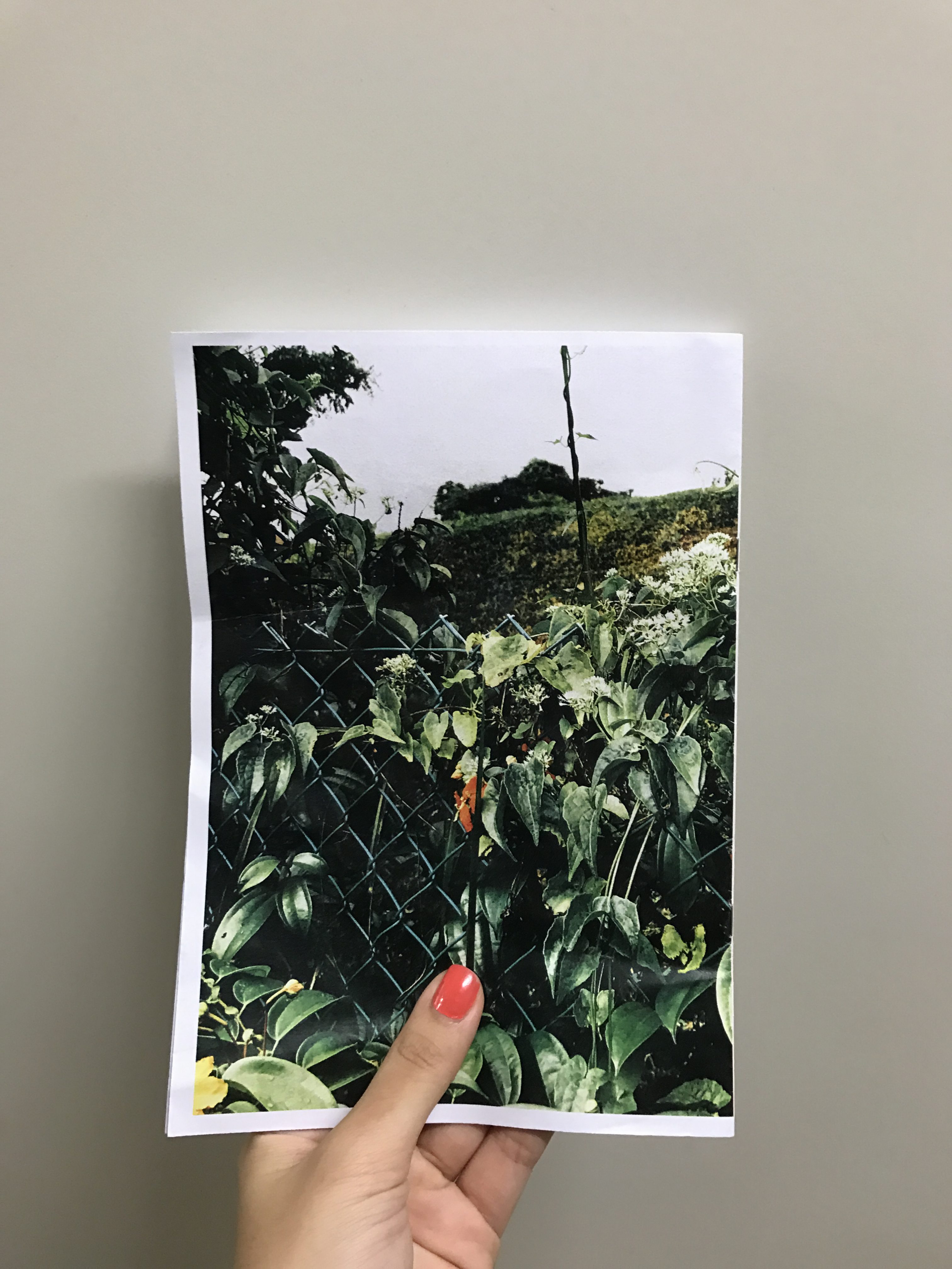
This is a photo of my presentation print set up in class, I was very pleased with the way the print came out and how the colours turned out. Initially, I used textured paper to print, however the ink didn’t seep or sit in properly even though the colours were nice. I printed it on a matt smooth paper finish and the image was much was much clearer and better, so I decided to present with this paper print instead of the textured one.

Hope you enjoyed the process!!
toodle noodles
xx

Patterns | Banner progress


From my previous paintings, I manipulated it and tried to find elements to piece together a more oriental background. I play around with colour, adjusting the saturation, hue and contrast etc. I manipulated the shapes, warping and skewing it. Also, I played around with the photoshop laying to try to find the best look to best match the banner. With the addition of the oriental herbs that i’ll soon try to incorporate, i’ll be more complete with the oriental abstract idea. However, the struggle now is that the image is very pixelated because of the extreme crop. But I also like it because of the texture and dimensions it gives to the banner. I’m not sure if I should kee the image of recreate it other forms.

But I hope you enjoy this first draft of the banner!

4D II | Project 3 – Time, space and Body

project 3 proposal

THE RINGING

By Amadea, Ryan and Zoe

Iliza iliza shlesinger iliza so good to see you GIF

We’re back with the last project and it’s a group one. Our project titled The Ringing is a performance piece that’s based on the myth about the bell curve and “the bell curve god” as many like to call it. Attached above is the PDF of our proposal.

The bell curve is an essential aspect of the grading systems in most of the educational institutes that we have attended. From Secondary school through to University, the bell curve will mark and affect our grades and thus it is important and a relevant topic to many.

We started with the preparation of the shrine and added on the addition aspects.

The Oscars oscars academy awards worship bow down GIF

We started with building the structure of the shrine.

Here, we have already painted and attached the shrine to the base. In order to make the curve, we used cane to create the curve structure.

we attached the bells and secured it with string and glue

We used small bells as we wanted to adapt it and so that it can be pulled and moved around

We had robes as part of the ritual and so we painted the indicator of our cult – the bell curve – on our robes.

Our sticks for drawing lots for modules to take for future semesters. We spray painted chopsticks gold and wrote the course code numbers on it for the participants to draw during the performance.


– THE MIDNIGHT OIL – A signifier in our performance about the “midnight oil” burnt during the late nights and sleepless studying nights

We created the candle and constructed a structure around it for it to sit nicely in the glass jar        

We attached the white cloth over to form the final shrine structure of the bell curve.


Solving Difficulties

In the process of making this installation, there were certain things that we had needed to consider.

Iliza scheming iliza shlesinger iliza GIF

-The Materials
As we look for suitable materials for our installation structure, we made a few improvisations to use materials that varied from what we had initially envisioned. Wooden sticks and poles found were mostly too thin. Though we had considered building two diagonal sticks forming a cross at the back of our structure as a stabiliser, we were concern that the sticks may be far too thin to hold the scale of our structure. In addition, having additional sticks may not be as cost-efficient as we would like. After further explorations with other materials, we picked up wooden frames sold in pieces that were very firm in thickness. The measurements of these wooden frames were in consideration of the length and bendability of the canes used as the ‘bell curve’ at the top of our structure. The main bell was improvised in using smaller bells with regards to cost, they were very effective in allowing the audience to create a longer ‘ring’ as the bells were pulled. A thin canvas was used for the base of the structure as other materials did not have a good size to match the length of the wooden frames.

 tv nickelodeon why stress melissa joan hart GIF

-The Construction
Another concern that we had was the attachment of the bent canes to the wooden structure; whether or not the bent cane will be stable in holding its position upon being pulled, as needed in the process of the performance. Two options that we were considering to use was glueing with wooden glue and drilling. In the attempt in drilling holes into the wooden structure, the bent canes were unstable as the holes made had rooms for the canes to shift. With a smaller drill bit, the canes were able to hold a firm, bent position. The holes were drilled three-quarter into the wood so that the cane will not slip through.

Lifetime crying upset adorable tired GIF

-The ‘Midnight Oil’ Candles
In our first approach in setting up the wicks with olive oil in small jars, wires were first used to secure the wick at a level slightly above the olive oil. Though as we light up the wick, it had were burned off completely in seconds. With cautiousness in a safe area, we then attempt to light the wick partly submerged into the olive oil. The wick lasted longer in this way and there were no troubles.

Iliza flirting hair flip iliza shlesinger iliza GIF


We took to create a mock session and filmed it for our documentation. In it, you can see the details of the altar and process of a procession. Also, it allowed us to see the difficulties and errors that we might have encountered that was have been reflected above.

We present to you our video here.

During the performance piece, we observed that everyone was laughing and found the project amusing. We acknowledge the absurdity of it and wanted to bring to life something that is seen to be fake and also show the extent to see how willing students are to go to lengths, such as some of our examples, in order to secure and hold on to their grades. We also wanted to perform and end the semester on a lighter note with this performance. Doing something very relevant to students around us helped the performance. Also, seeing everyone participate in this knowing that it was a hoax-ish cult ritual encouraged the performance work and the bring it through to the end. 

 denzel washington relief denzel phew relieved GIF

This performance installation brought to us new light and new experience in creating and doing performance art. Furthermore, we were able to engage the audience and bring them into our entire performance such that they also became performers in their own right. I think this experience taught our group a lot about performance art and installation. 

Iliza thank you bow bowing take a bow GIF

2D2 | Final Zine

ANNDDDD THIS IS THE LAST! There were some slight adjustments and this is the final piece that was submitted. Initially I wanted to omit the stapler binding and leave it as it is but bind it with a string, but just to follow and be aligned with the brief, I decided to stapler it on top of the string binding.

This process was a fun and pretty relaxing one. From visiting the site to changing my layouts of the zine. The printing process was an eye opener to really see the zine come to life and to see how layouts and designs work. I learnt to stick to my gut and really follow the design instincts in me, play with colour and make sure things are consistent. I felt that my eye for things were slightly more trained with this project and I look forward to more projects as such.

2D 2 | Zine Process (lll)

This was my second final draft.

Mimi suggested that I should add colour tones for p2 and p3 as it would be more visually coherent as all my pages were coloured already. I tried to find a consistent colour tone and thus achieved the spread from p2 and p3 as seen in the second image below. Also, on p2, the credits was a bit too jarring and out of place for that page, thus if it were to be place at the back it would be more seamless. Also, the black borders on p6 and p7 were to visually jarring as the blacks stood out far too much, especially on print, thus alot of the black lines in my zine were asked to be tonned down. I understood the reason and felt that if it were to be more visually appealing, it’ll have a more coherent look and the zine will flow better.


The final draft.

I had actually arranged my prints to be printed out in the format below, however, after looking at it in that manner, I felt it was a bit plain. I decided to add faint grey lines to give the zine a bit more structure and I felt it suited it visually. So you can see below the lines that I added that gave it more structure imo. In my previous post, you saw that I added paint strokes, but that felt contrastingly distracting but with the faint grey lines, i feel it appears to give good visual direction. The other changes I mentioned above can also be found in this draft.

And this, this was the final draft which I sent for printing.

In my next post, I will show you all the visual copies that I have for this project.

2D | Zine Process (ll)


Here’s another update, I played around with the paint strokes that I created hoping to add a little spice, design element and spontaneity into it.

However, as it was going for a simple, classy poetry book, Mimi suggested that I don’t distract the viewers from the images and text with the paint strokes.

Also, working with the colour tones of the photos was fun in trying to create a balanced overall look to the zine.

I’ll be working on the next design in the meantime.

2D | Zine Process – First Draft

This was my first draft. I printed it out as I wanted to try adding paint texture to it enhance different parts and bring out the spontaneity of the essence behind my piece.


After some feedback with my tutor, some changes and considerations are the size of photos, the layouts, how I can play with more photos, the colour consistency of the zine, an obvious change of the closing page of the zine and play around to see how the paint works in different opacities and colours.

4D II | Project 2 – Soundscape

D I S J O I N T E D  E X I S T E N C E

ARTIST STATEMENT

Often we move along day to day with a being present, that presence helps us acknowledge what we know and see around us. The absence of that being who would give us our bearings makes no difference as our being is attached to the surroundings and we move from place to place and hear common sounds around us. Despite this familiarity, sometimes we still choose to lose ourselves to the surroundings. In this we think of our own elements, feelings and how we are attached to familiarity. This soundscape portrays the absence of the human but the journey of a being. Take a walk with her, hold her hand and be part of this journey.

We attach ourselves to the surroundings, yet at the same time we detach our minds, going into things that have no link to what’s around us. I used common sounds such as construction sites, busses, the familiar sound of keys (home) and others. The journey of my soundscape is cheery and upbeat, very present. However, as we move on, there is a distortion of sound and a change in tone of the audio. This, I feel is the darker element of ourselves as we get detached from our present surroundings. Thus I went from a lighter tone to a darker distorted tone to convey and express the difference with our presence and mentalities.

CONCEPT DEVELOPMENT RESEARCH

ha ha, this was an interesting project as sound isn’t my forte and I wasn’t very clear of what soundscape or sonic portrait I should do as there were various themes that I wanted to explore. For example, the coffee shop uncle, the mama shop uncle or different locations. However, I finally decided on doing what was very present and evident to me, and it is something that affects me a lot, and that was the surroundings around me.

My initial sounds we very flat and constant, there was no journey but loud jarring sounds that didn’t really link. Then I tried to seamlessly tie them together so that it seems like that of a journey and how the constant sound of our surroundings are.

I feel the hardest part is how to portray and convey my ideas fully because my understanding of the theme and thoughtful may not come out fully and properly. What I did was try to change how I think and keep in mind the locations, movement and time that I needed to narrow down to.

Hope you enjoyed the audio clip and understood the message I wanted to convey. Thank you.

2D | Project 2: Zine – Research, photos and Part 1 presentation

Yes! I went to explore Queenstown (more towards Wessex and Commonwealth). Here is my journey that has helped to form my ideas.

I was very fascinated by the colours and contrast of the area and I wanted to document and explore that aspect.

But it’s time to go down and explore more, observe more and document more. Meanwhile, enjoy these images!

(p.s this poem is incomplete, but it’s in initial idea of how I want to link my photos to my Zine. Do wait for the complete one)