All posts by Amelia Yuliana

Forrest Gump: Final Prints

Two of my quotes are from the movie Mean Girls.

“Do you know why her hair is so big? It’s because its full of secrets.”

“So you agree? You think you really are pretty?”


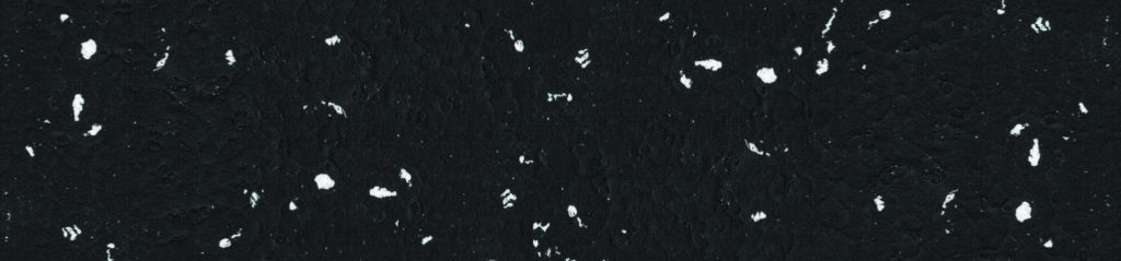
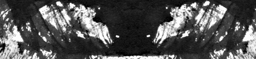
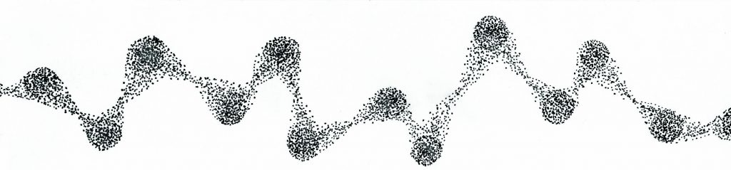
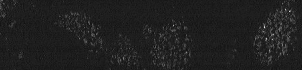
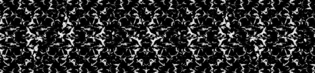
Here are my final prints accompanied by some examples of the images that I threshold to attain my final print.  Enjoy!

quote-1

avant-big-hair avant-big-hair

2012-headless-female-mannequin

body

0290c37fbc00be89920a1b67e8cfdb6c

0290c37fbc00be89920a1b67e8cfdb6c

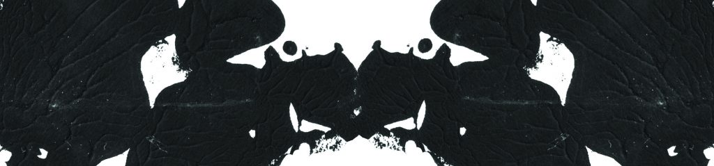
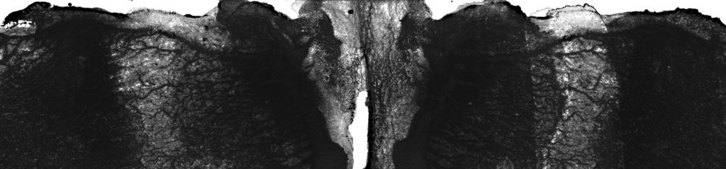
For this image and quote, I wanted to imitate the Mean Girl’s Burn Book style which was very pop and cut out style so instead of leaving the images nicely cut, I left the edges for the words uneven almost like a magazine cut out look. The concept behind this is more literal than the rest. I emphasis her head bigger than her body because it is too full of secrets that some of it are spilling out. I also made her lips bigger as someone who is full of secrets would always spread them.


quote-2 wenceslas_hollar_-_three_caterpillars_a_moth_and_four_butterflies

butterfly

8e0c8cae4924d5a8cb5c5c89400ac1f3

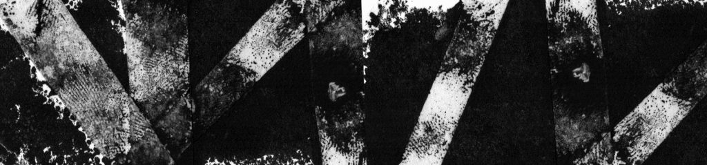
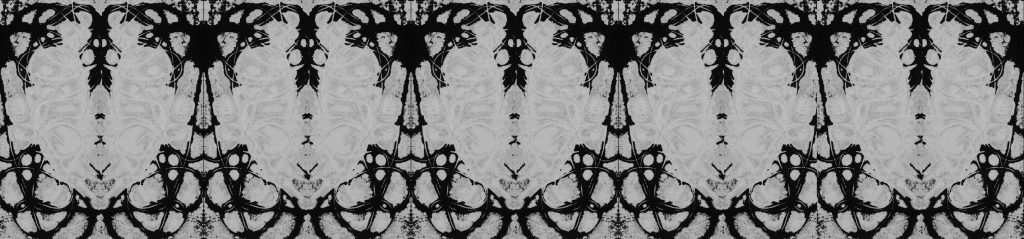
For this image and quote. I really like how the threshold effect is on the antique butterfly. I used butterfly to symbolise the idea of beauty with two eyes on it to show what is someone’s definition of beauty. I tried to make the butterfly like those that has like eyes on them. I decided to place numerous eyes around as the background as it represents how other would view your perception of beauty. I dissected the butterfly as well to show like ‘piecing together what is beauty’.

quote-2


best-free-swan-image-graphicsfairy

swan

400_f_101158011_txvzcaysgpe8b4ruoo172is6isbvycoh ugly-duckling

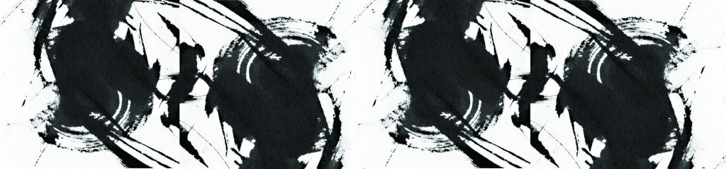
For this image and quote, I decided to play on the idea of the ugly duckling and the beautiful swan which is a common symbolism for what is beautiful and what is ugly. I multiplied the swan as they were the ones judging the ugly duckling in the centre. Arranging them in a linear line towards the centre it draws the viewer to the centre. I also played with negative and positive to show good and bad.

quote-3


girl

girl

galaxy

galaxy-copy

octopus


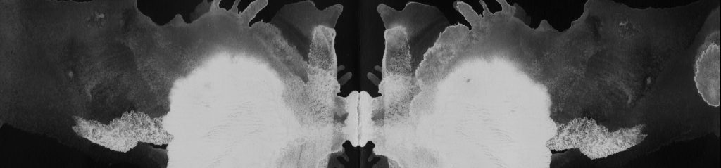
For this image and quote, I made it even more abstract and this is the meaning behind the chosen images. I took an image of a young girl sitting with hands together, unsure as the girl who thinks she is pretty. Sitting on a lily pad, which is her ‘safe area’. The background is a galaxy, because she is in her own world. Beneath her, tentacles are out to get her and they represent the people ‘attacking’ her in a judgemental sort of way.


By far the last composition is my most favourite but took the least amount of thinking and came at such a weird timing! Overall this was a fun assignment both hands on and off.


Project 2: Sequentially – My Bedroom Is A Nightmare

My storyline i decided to play around what were the possibilities that could happen in my room. This was because in a creepy sense i did experience some supernatural things in my room before and decided to reinterpret it into my movie in a less scary sense.

For the second project, I decided to do my story in a photo illustration kind of way after seeing Sebastian Del Grosso’s work of photo illustration! Here are some of his works below.


7c8683f464bc64f0202840dd03a56d2e sketch_feeldesain_00 stock-photo-120585983

Finally here attached is my movie and I hope you enjoy it!

Planar Construction: Individual

Hi guys! Here are my three sketch models and how I analyse them to be further improved. Also included is my individual planar construction. I added the pdf below so it can be viewed better 🙂


g07_amelia_003_artboard-2 g07_amelia_003_artboard-3 g07_amelia_003_artboard-4 g07_amelia_003_artboard-5 g07_amelia_003_artboard-6 g07_amelia_003_artboard-7 g07_amelia_003_artboard-8


Honestly I felt that my individual planar construction could be further improved in terms of making the voids more interesting. Thats all!

g07_amelia_003

Curvilinear Volumes: Japanese Snack + The Pizza That Got Away!

img-20160916-wa0008_1

japanese-food

So for my final model I’ve managed to manipulate it into a small rice cracker for the dominant that is accompanied with a chocolate ball for the sub dominant and a small pockey stick for the subordinate. Here i did a short little advertisement for the snack!


IMAG0233

pizza

Another application I did is titled ‘the pizza that got away!’ This is because since the dominant is tilted at an angle on an independent axis, it gives a sense of motion that it is rolling away. The sub dominant is the pepperoni slice that the chef only manage to put before it started to get away! So in midst of that, the chef threw a knife which is the subordinate, in hopes of stopping it.

Hope you enjoyed both of my application!

Thinking Sequentially – Text and Image

DSC_0874 copy

“Fire and Ice

Some say the world will end in fire,

Some say in ice.”

Not taking the meaning for fire and ice literally, we took the meaning of ‘chance’ in the poem whether it ending in fire or ice as the act of flipping a coin and getting heads or tails.


DSC_0881 copy

“From what I’ve tasted of desire

I hold with those who favour fire”

The sun represents the burning desire the arm wishes to achieve and grab hold.


DSC_0893 copy

“But if it had to perish twice,

I think I know enough of hate”

With already one arm letting go of the arm’s that needs help, it would be hateful that the arm holding on decides to let go a second time evoking a sense of pain and distrust like in the poem.


DSC_0904 copy

“To say that for destruction ice

Is also great

And would suffice.”

Showing the desperate need to hold on to just about anything for support that even something dangerous like the pen knife is suffice. Despite knowing it will harm the person.

Done by: Amelia Yuliana & Filzah

Curvilinear Volumes: Sketch Models and 2D Sketch Analysis

IMAG0233
IMAG0234IMAG0235IMAG0246_1

For my first sketch model and analysis, I have to make the subordinate which is the cone smaller and slender so it can protrude through 1/3 of the disc to be seen.


IMAG0237IMAG0238IMAG0240IMAG0247_1

For my third sketch model, I have to reduce the cylinder to half its size to make it more like the sub dominant while the cone, I plan to make it a little more short and broader to make it more dominant.


IMAG0241IMAG0242IMAG0243IMAG0248_1

For my last sketch model, I have to reduce the sphere to half its size to make it even more prominent.


In conclusion, I plan to use my first sketch model for my final as I think it has the potential to be a very interesting composition!

Props as Signifier

Hey! For the class activity we did, the object that I brought was a feather. It was actually modified whereby the tip could hold a pencil led but it fell apart. It is something close to me as I like feathers and before, it was a functional pencil which make it even more meaningful to use just like the olden times how people wrote.


Object as an Icon

1

For this photo the feather is an icon because I took a super close up shot of the soft and pull apart parts of the feather whereby feather is an icon for being soft, light and almost ways white. It is the ends at the side where one would usually run their fingers across.

2

For this photo, I shot the feather floating on water as an icon because it mimics a swan often seen, pure and white on the surface of the water floating gracefully so the feather translates that meaning of it.

3

As for my last photo, I took a shot of just my hand holding my feather as an icon in its literal form, people often take it as a tool for writing in the olden days then until now.


Object as Signifier

5

When I saw Danielle wearing her white shoes and saw my feather was the exact same colour, I immediately thought of the Nike winged sneakers and thought it would be a funny new meaning to a plain old feather. Its funny cause the actually Nike feather sneakers looks too much to wear about haha.

4

For the second new meaning, I got the help and took a low mid range shot of me using the feather as an access card. I thought it would be fun as in the world of magic and wizards like Harry Potter, feathers are often associated with and to combine a modern aspect for the access to the olden part of the feather is quite fun.

6

As for my last meaning, I thought it would be different as since the feather is already used as a physically tool for writing on paper, why not make it be a modern tool for writing like a stylus for the phone.

My Line is Emo: Final Work

These are my final 18 lines for the project & explained why the lines are representing the different emotions. I mainly focused on decalcomania with the mixture of mono print and hand drawn.

Optimism

Little speckles of ‘light’ among the darkness.


Envy

Veins/nerves stretching out.


Horror

Paint marks splattered up like a blood scene.


Disgust

Mimics the disgusting worm when scanned inside the stomach.


Longing

Different flow in opacity just like longing, coming and going.


Suffering

Looks like worn our bandage covered in blood from wear and tear.


Surprise

Something moving circularly suddenly goes out straight.


Excitement

Small spritze bouncing off here and there.


Relief

Just like tattered rain drops.


Enthrallment

Excitement like ripples in the water.


Anxiety

Never ending small strained lines, like reoccurring worries.


Arousal

The different open spaces at different areas in different sizes like arousal increasing little by little.


Exasperation

Fading out into small scribbles from a large one.


Tenseness

Stretching hair like structures in different strenuous directions in a confined area.


Hysteria

Different faces,skulls, brain neurone and such depicted inside.


Ecstasy

The opacity of the paint flowing almost shows ectasy or happiness experience in the brain.


Alienation

White faint marks left behind, like the feeling of alienation being left out.


Bitterness

Like someone feeling bitter, the very sharp points poking the heart.

Decalcomania and my artist reference, Max Ernst

Decalcomania comes from the French word dècalcomanie. Which derives from the French word decalquer, which means to transfer or copy.

It is highly used by surrealists artists that use the technique to achieve different patterns solely due to the process of chance. It is first created by putting ink or paint on a surface such as paper, and then another paper is placed on top and pressed down with pressure to create intricate patterns. Originally it was to transfer a patter onto pottery or canvas. One might be familiar with one of its common uses is the Rorschach test in which ink blots are used in a psychological test to analyse a person’s emotions or characters. If you all are interested, you can take a test here! http://theinkblot.com

Rorschach_blot_01
example of a Rorschach test inkblot

in a funny way, this method sort of coincides with the project of ‘my line is emo’


images

larger
Europe after the rain – by Max Ernst

My artist reference is a very popular surreal artist called Max Ernst. He is best known to employ the decalcomania technique to this famous painting called Europe after the rain. It was an eerie reflection on World War II as the Nazis took over. He was terrified of the horror around and had been condemned in a prison camp. It was here that he started to conjure up this painting and completed it after he managed to escape. There is a stark contrast between the clear blue sky and the seemingly dark ground with bodies. Here is a helpful link for a video that I chanced upon that someone managed to figured out how Ernst did his texture for the trees in his paintings. So instead of plastic I played around with other materials in between paper to achieve different textures! Enjoy!


Other than using simple materials like plastic wrap or even thread to make interesting imprints I have also discovered this interesting video that led to the success of many of my decalcomania prints resulting in interesting prints simply just by adding white glue! Here are some of my works that I did successfully by pressing the glue paint solely on its own or placing a material on top of it and then taking it out to get interesting results.

In decalcomania I learnt that one can also play and vary the amount of water added to the paint to make it more diluted allowing it to spread even more or just making it thick so it sticks more and upon removal will produce something.

On top of that, I discovered that decalcomania can also not only be done in just one fold or layer, but repeated! One can gradually add a little bit more water or paint depending purely on randomness and chance to what the result would be.

Thats the end of my wonderful discovery of decalcomania!


Process: Deriving emotions from mono prints and hand drawings

Olla! Here is an update on how I have managed to derived a few of my lines from a combination of trial and errors which includes mono printing, decalcomania (my own method) and also some hand drawn ones as well!


Scan 6
scan from monoprint
Scan 6 zoom
zoomed in on small blotch
Print 2
final photoshopped strip

To my surprise upon doing one of my mono prints, was that after scanning it looked like rubbish to me. I thought I couldn’t possibly can anything nice out of this scan. However upon zooming closely into a tiny blotch of paint, I was excited to see ‘nerve-like’ texture in the paint! I then decided to put that section in photoshop and adjusted it even more to emphasise on the ‘nerves’ and try to make it decalcomania since I was leaning towards that. This strip represented the emotion envy because when someone in envious of another person, you can feel the emotion twisting up and your nerves about to explode.


Notebook 2
decalcomania with thread & acrylic in notebook
Notebook 2 zoom
one of the imprints zoomed in
Print 6
photoshop of final print using decalcomania and inverse

For my trials with decalcomania, I was pleasantly surprised as well. What I did was to mix white glue and acrylic paint with a little water and paint onto the cartridge paper. Afterwards, i let some loose thread in a random way and folded the paper in half and left it to dry for awhile. Upon peeling, it left an interesting print but peeling the thread out from the paint also left an interesting imprint. So what I did was to inverse the entire scan and repeated it into a pattern to make it more decalcomania.


Scan 9
monoprint with my mark making tool
Print 15
final photoshopped strip

As for this strip, I used the mark making tool that I made that consisted of a brush being tied with a string and two different type of feathers at the end. For this print, I merely twisted the tip of both the feather end in a circular motion and found out that I liked the result it gave. I then proceeded to photoshop and repeat it to make it more decalcomania.


Print 8
emotion: irritaion
Print 9
emotion: exasperation
Print 10
emotion: arousal
Print 11
emotion: anxiety
Print 14
emotion: joy

Finally these are some of my hand drawn strips that are being scanned. Although I preferred to leave it hand drawn, Enhancing it just a little brings it out better.

What I have learnt at this end of the project is all the different and diverse ways one can play around in achieving different results and effects and some times digitally enhancing it a little really helps. It has taught me to not look at the big picture, but zoom in and discover the possibilities that can be obtained from what it seems like pure mess.