Category Archives: Process

Neighbourhood Explorer: Geylang Sipaku Geylang!

CONCEPT

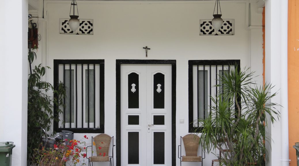
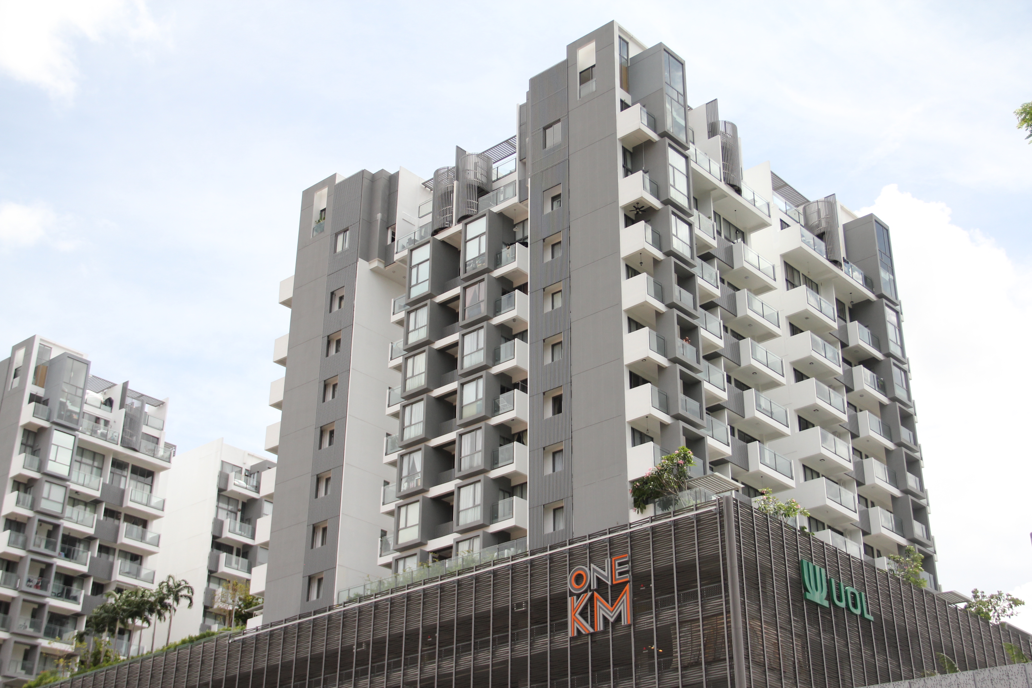
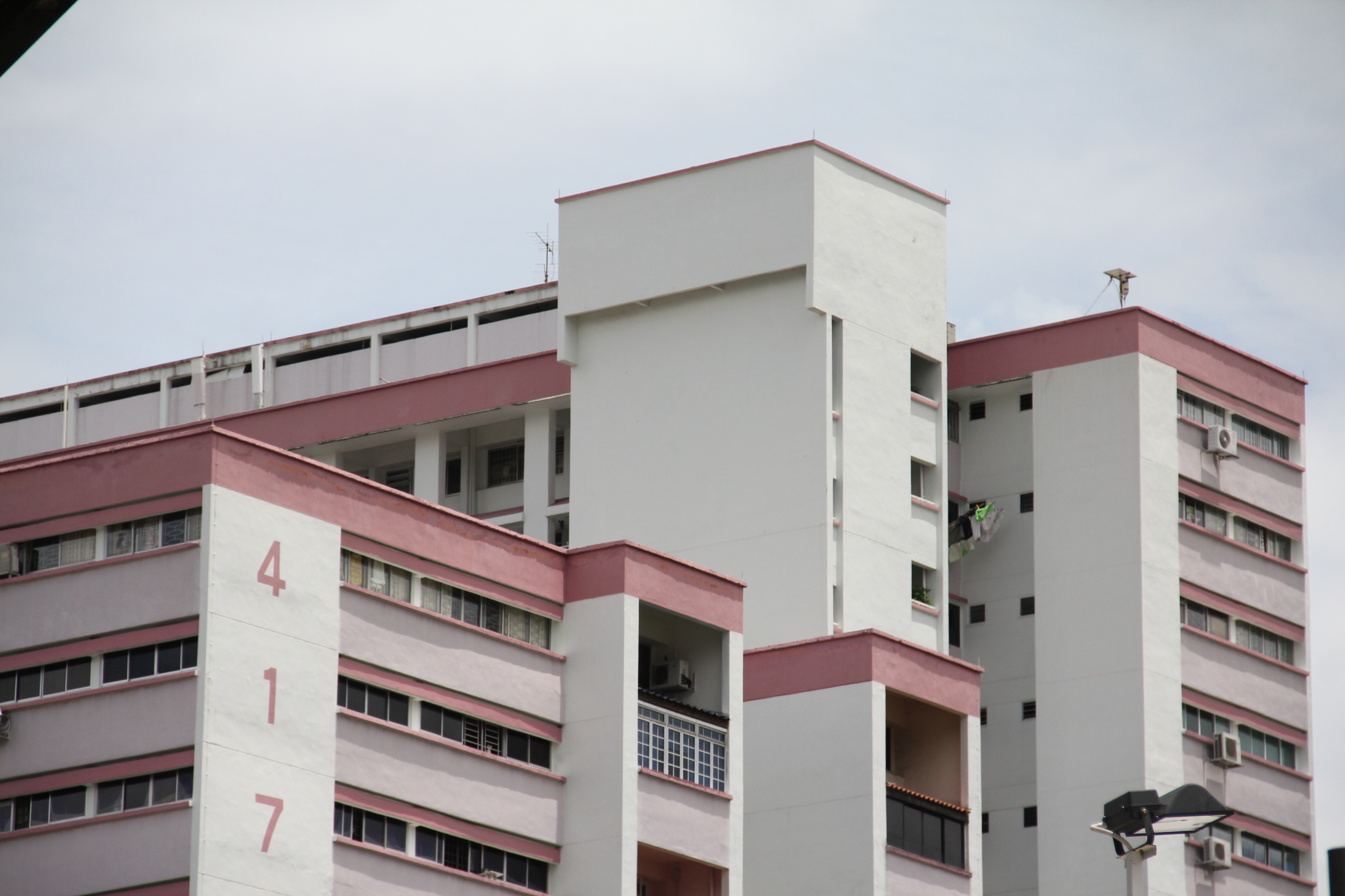
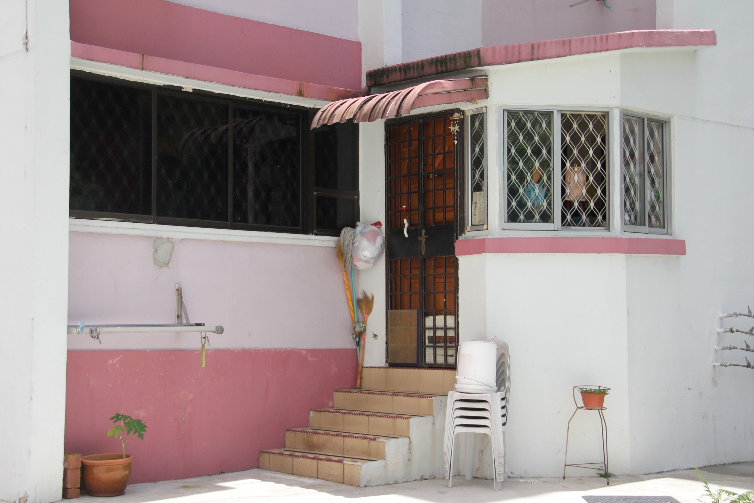
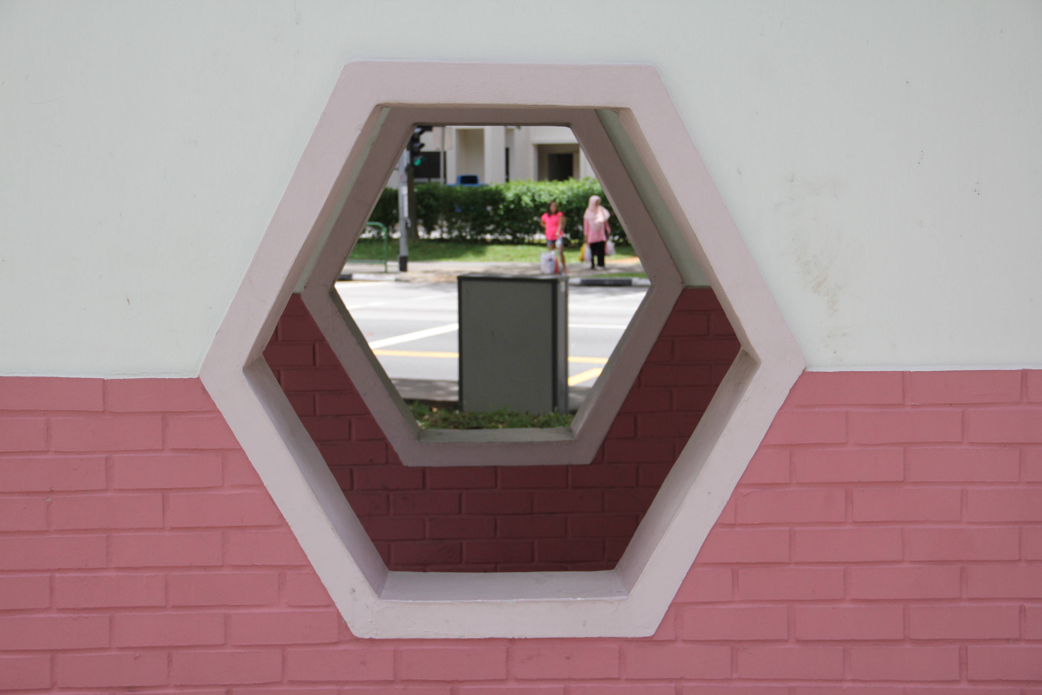
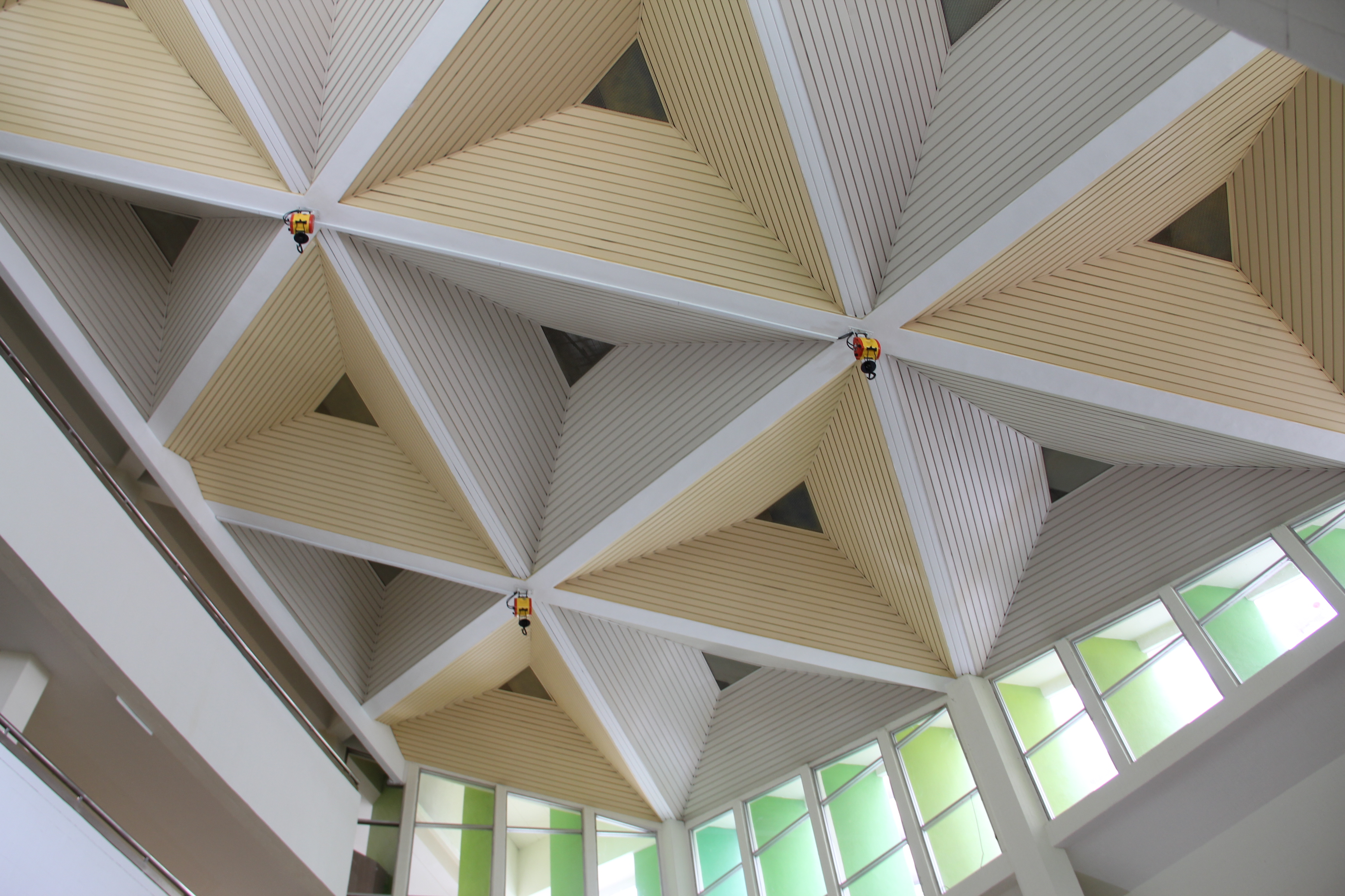
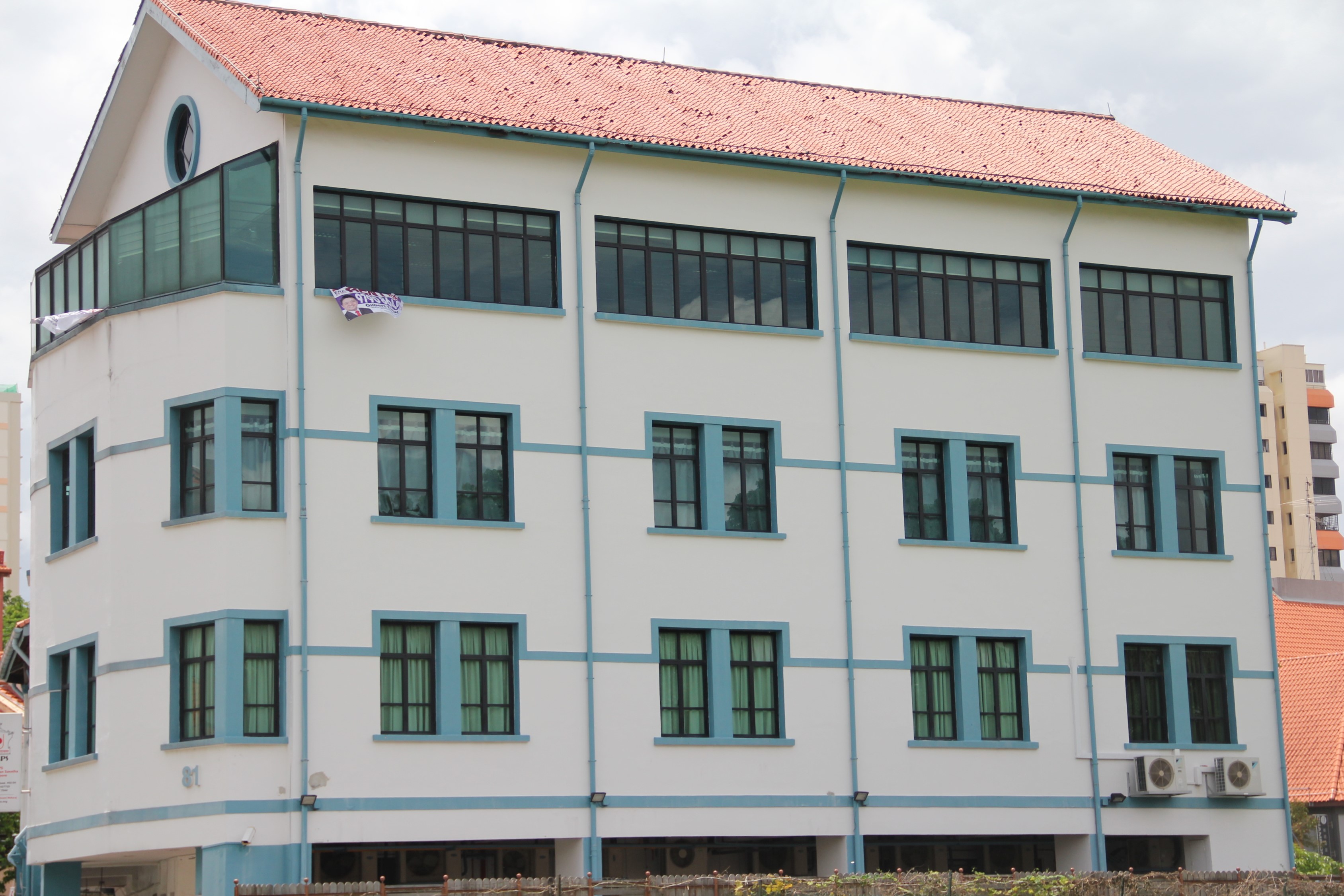
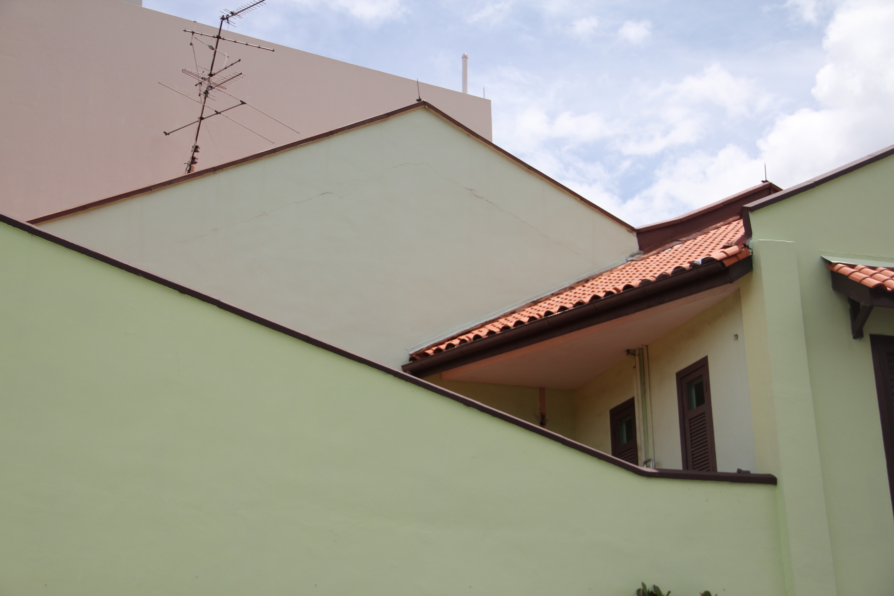
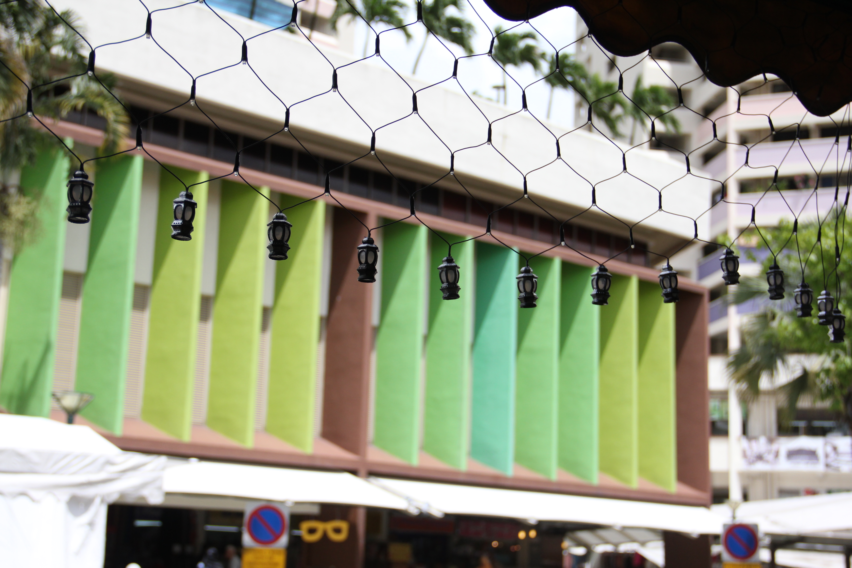
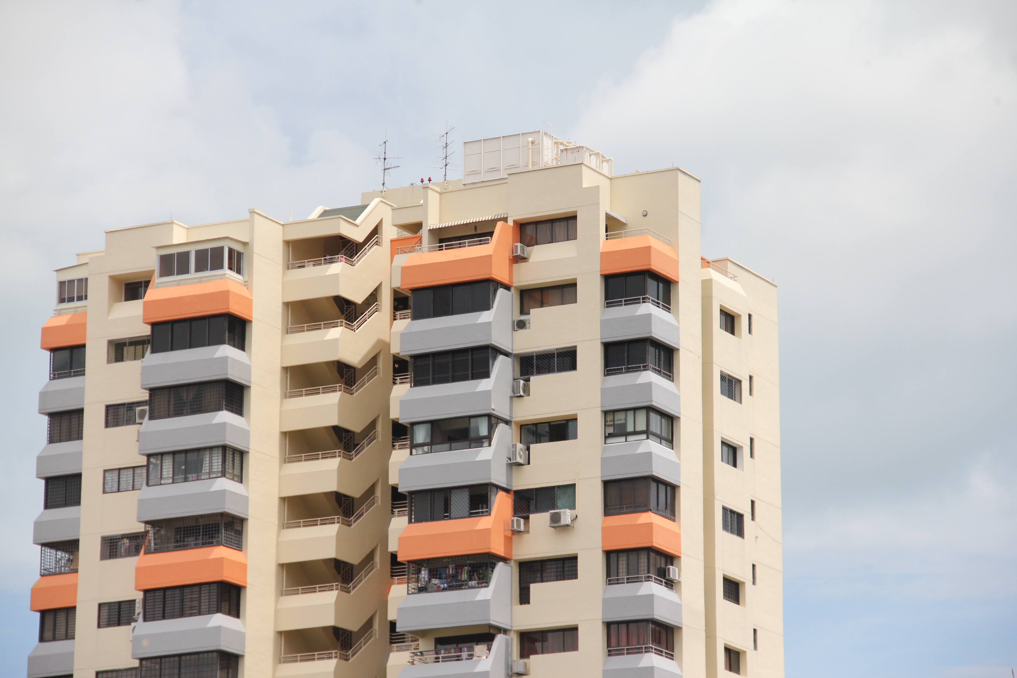
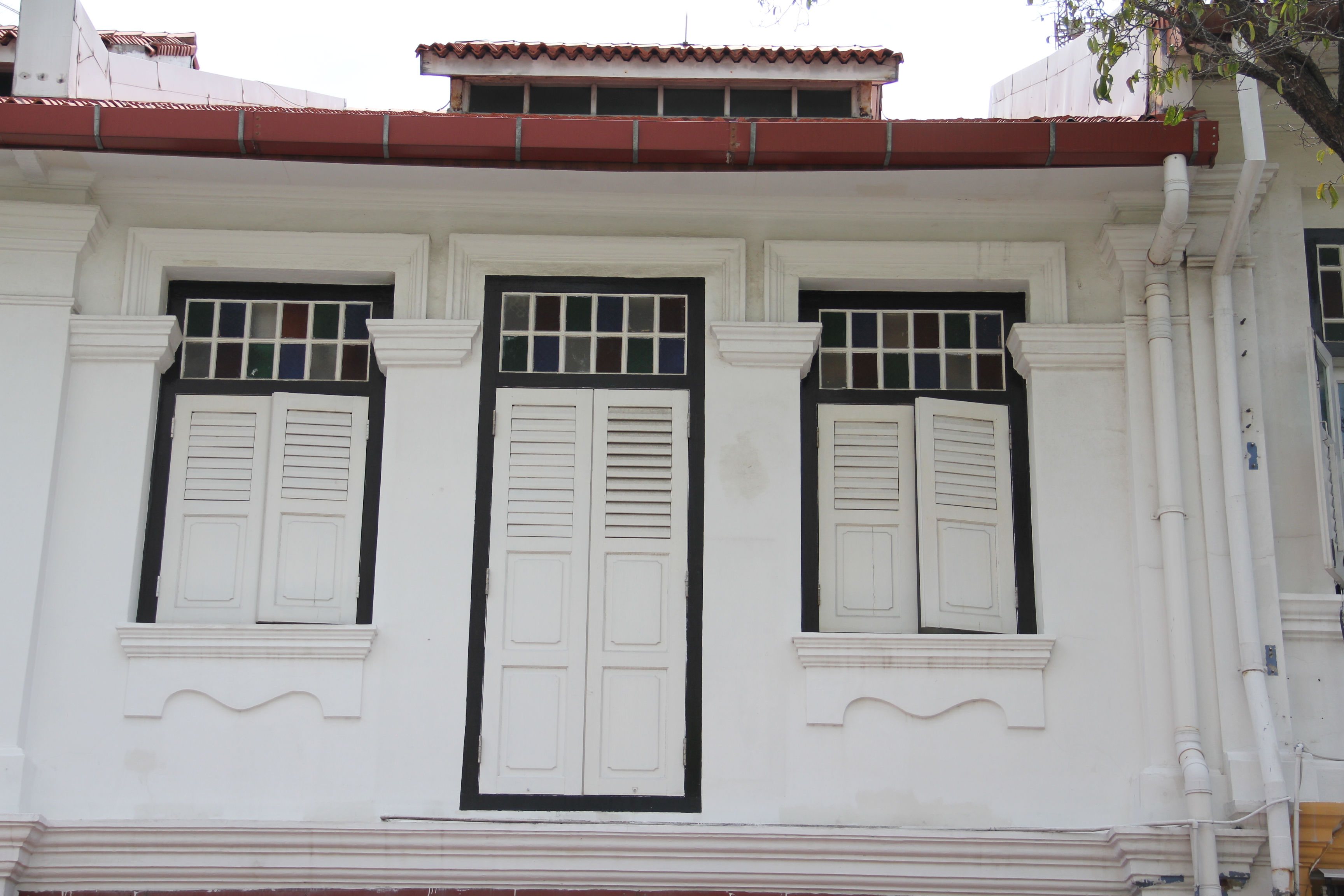
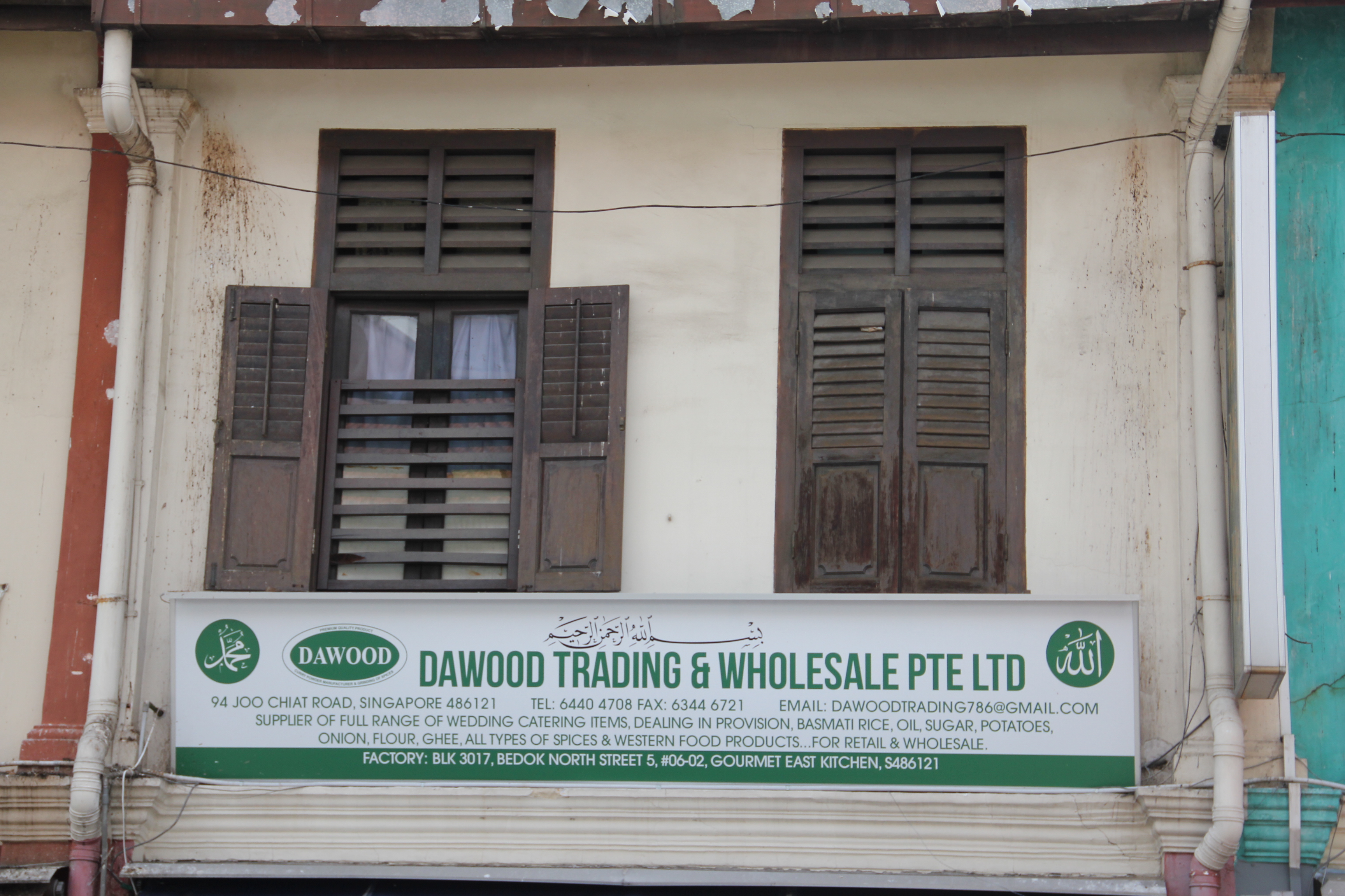
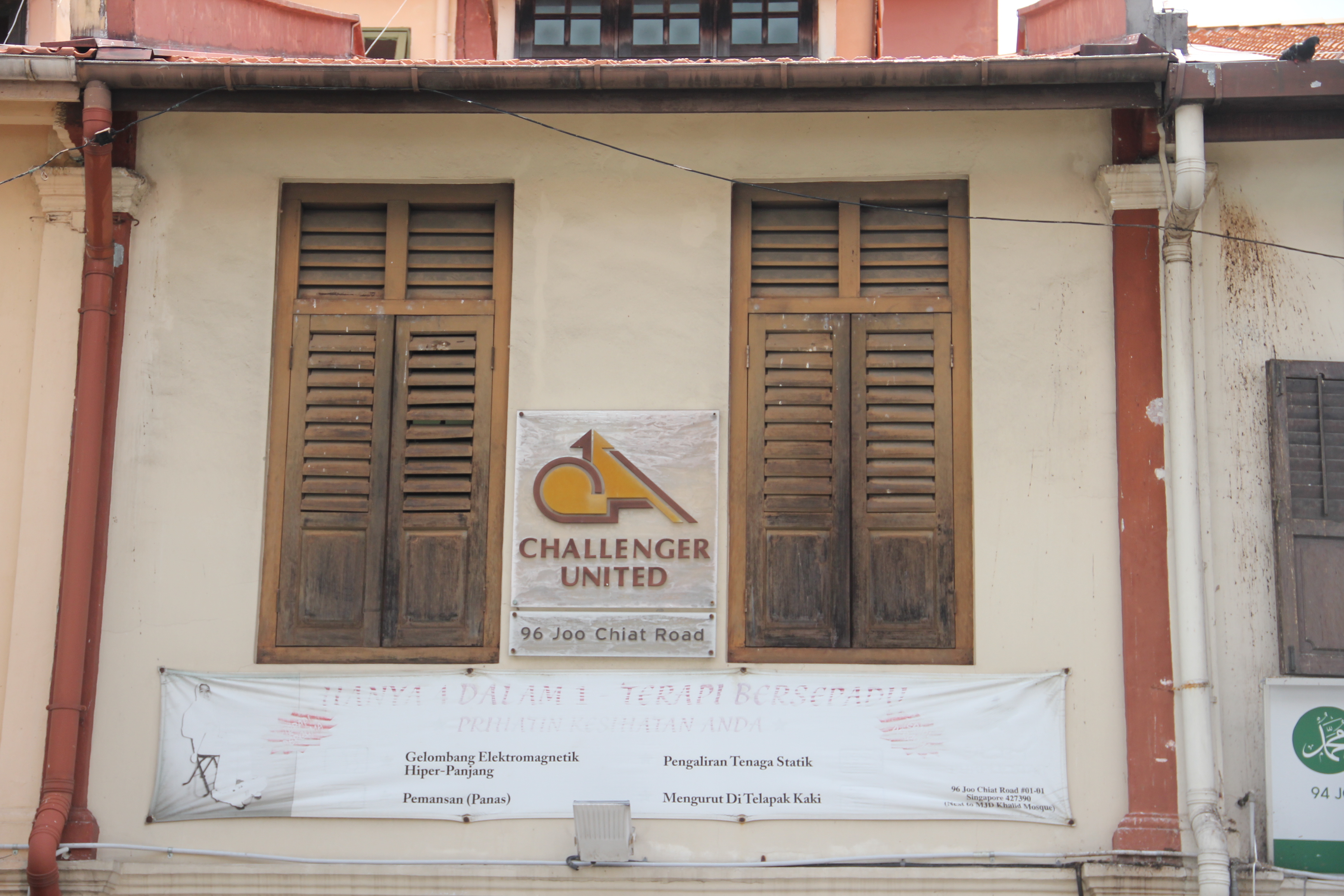
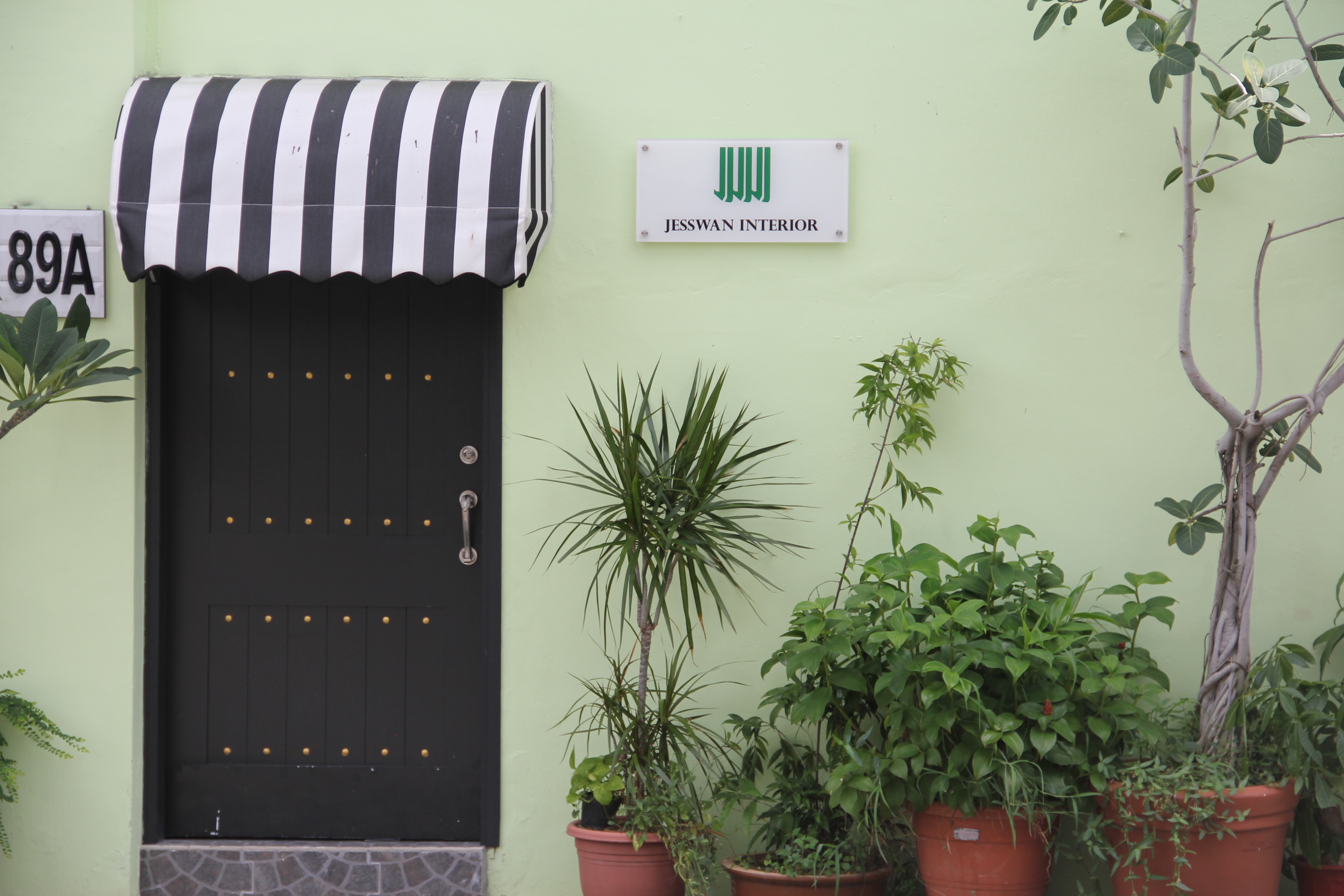
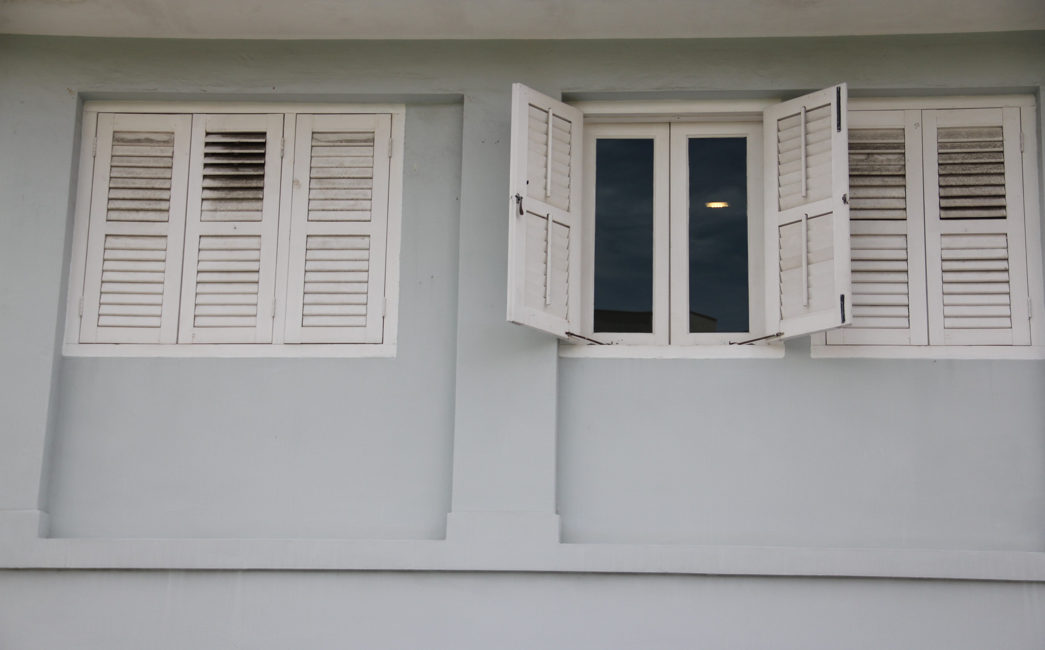
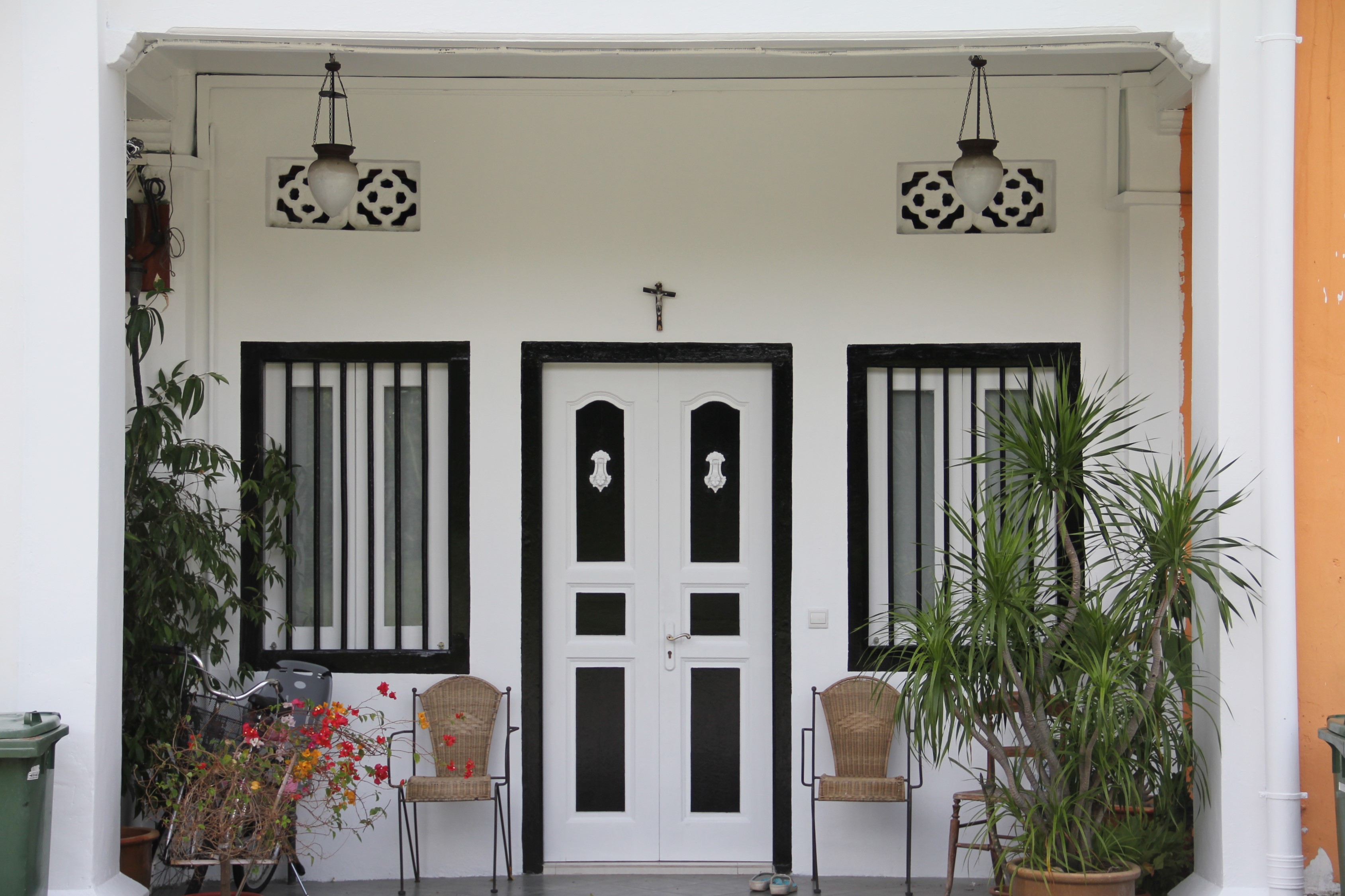
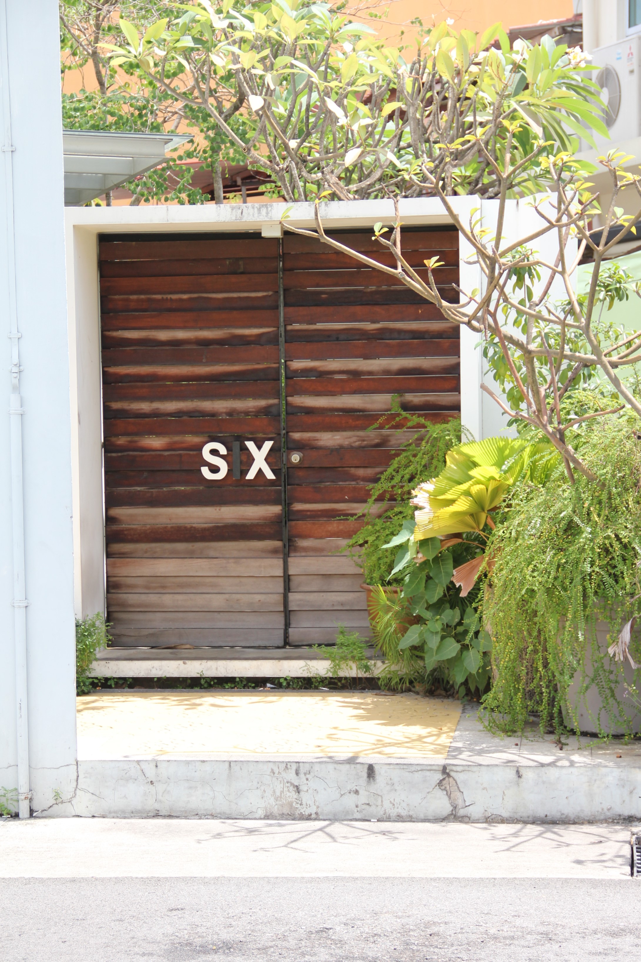
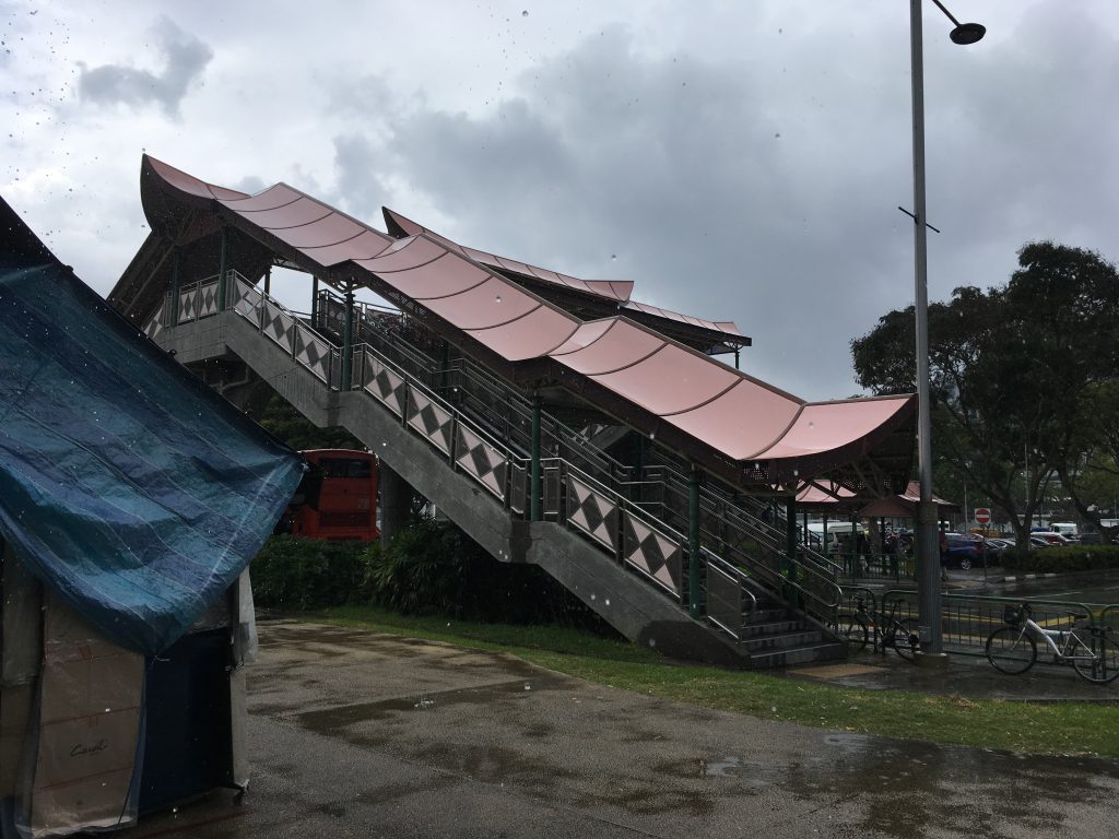
Moving towards the final of the zine project, I was using the different colours hidden deep behind the concrete front of Geylang as my main concept. The concept behind the zine was that how these small coloured areas are reminiscence of what left of the vibrant culture of Geylang that we knew.  I got more inspired when I saw more images like these.


CONTENT

I decided to add in poetry to accompany my photos as I felt that it would suit my zine better than just writing texts inside. I decided to base on the familiar song “Geylang Sipaku Geylang” and have my take on it. To me the song was somewhat like an invite to go back to Geylang together in a very lively and homely kind of way. So my poetry included a bit of Malay.


CURATING PHOTOS

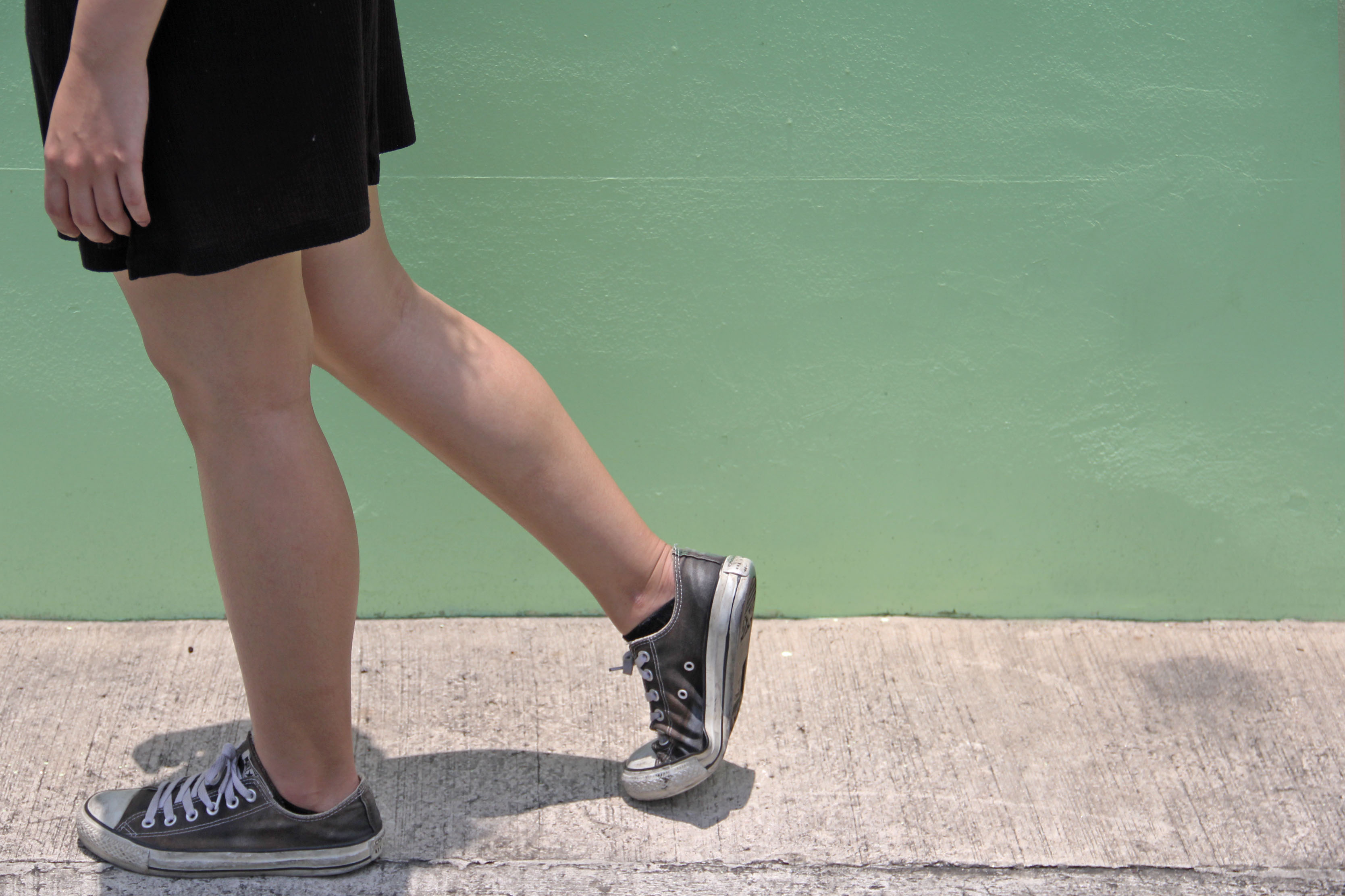
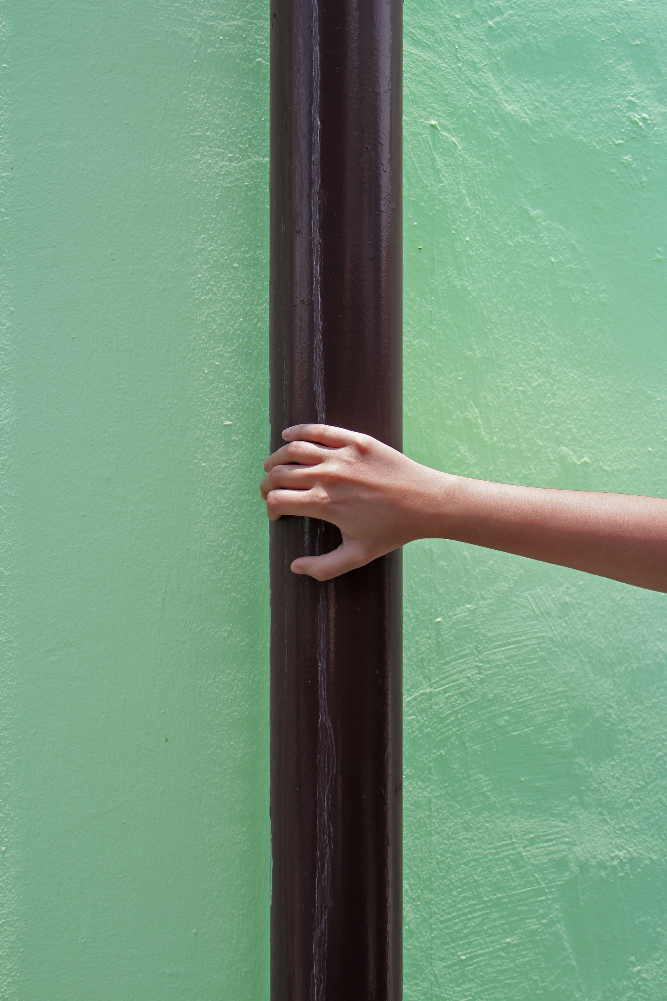
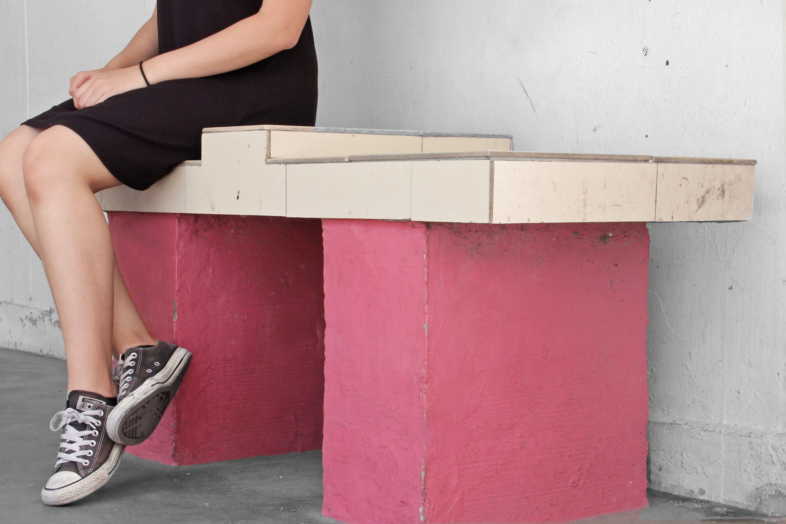
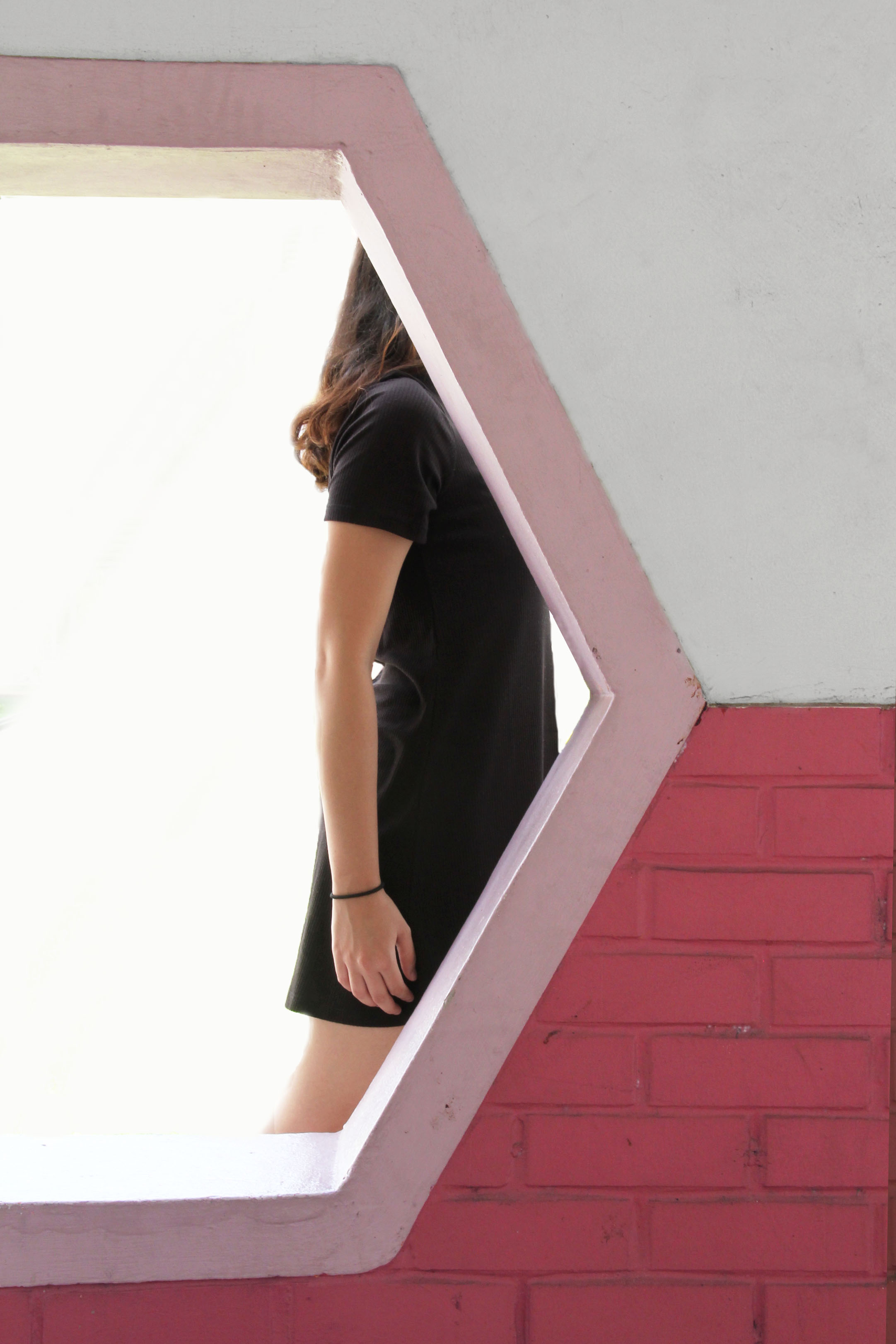
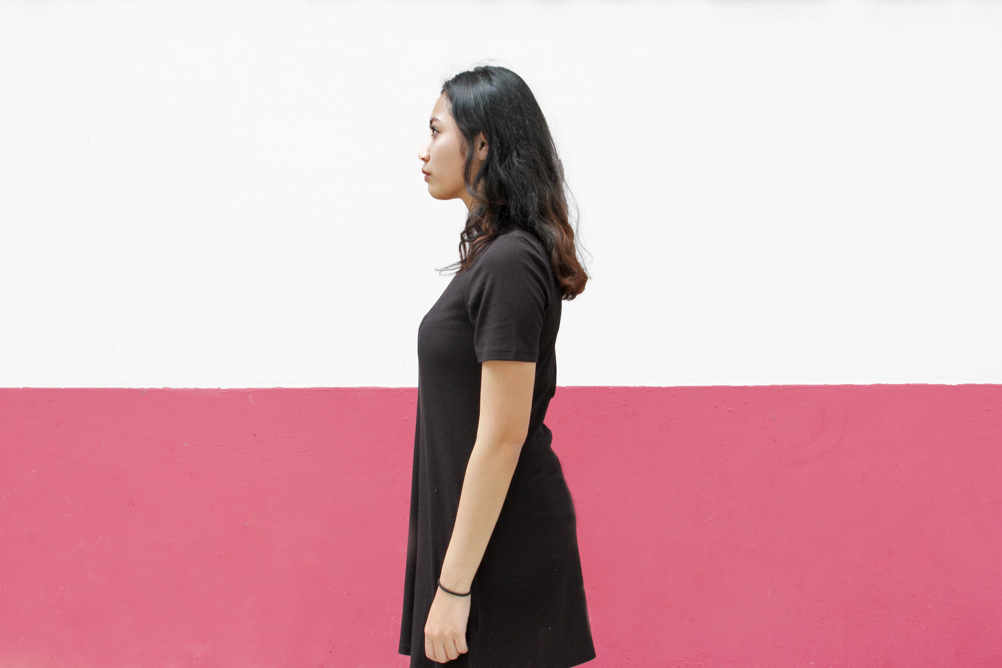
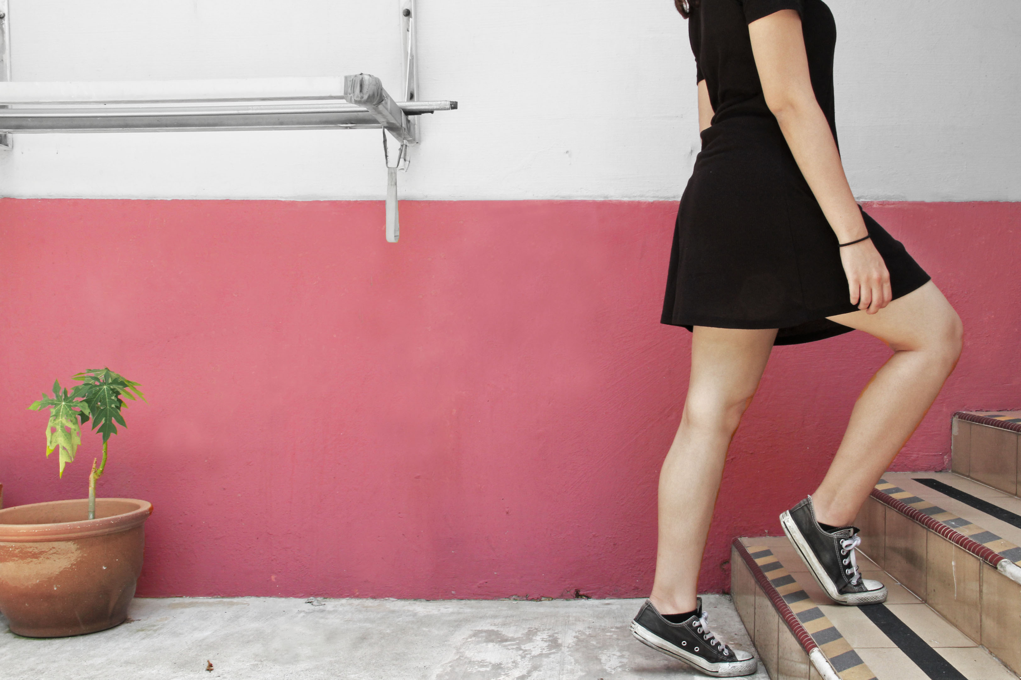
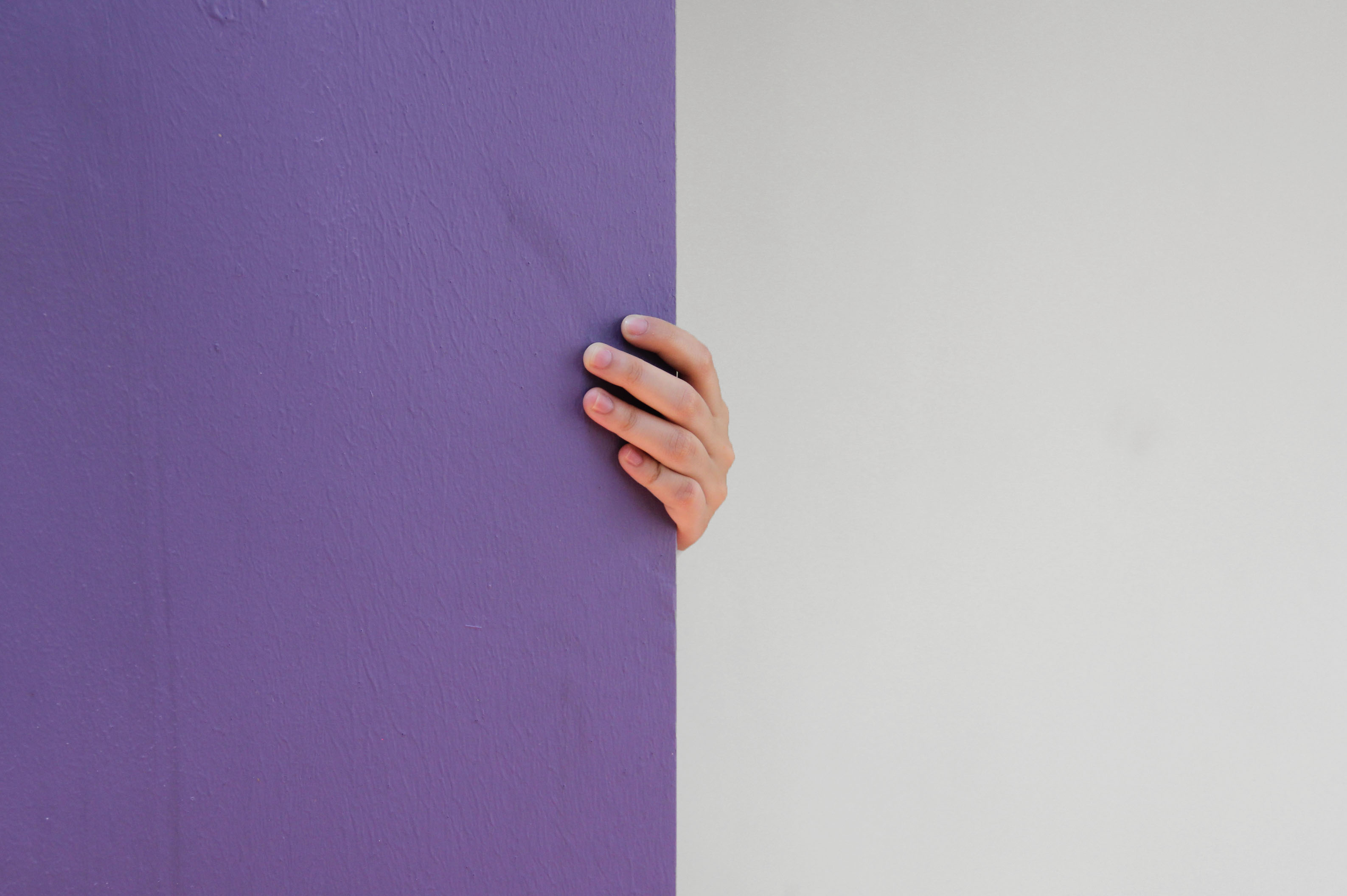
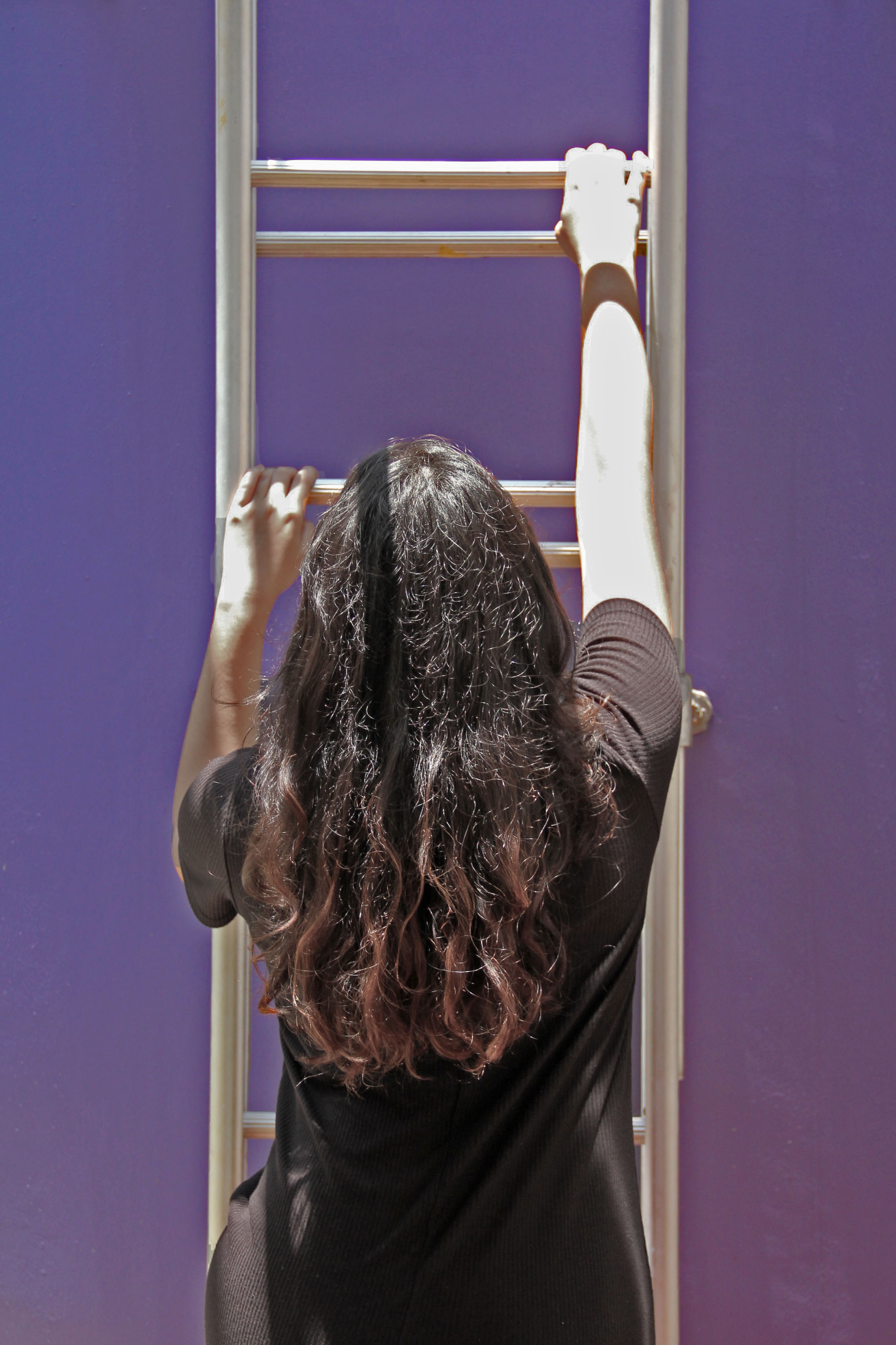
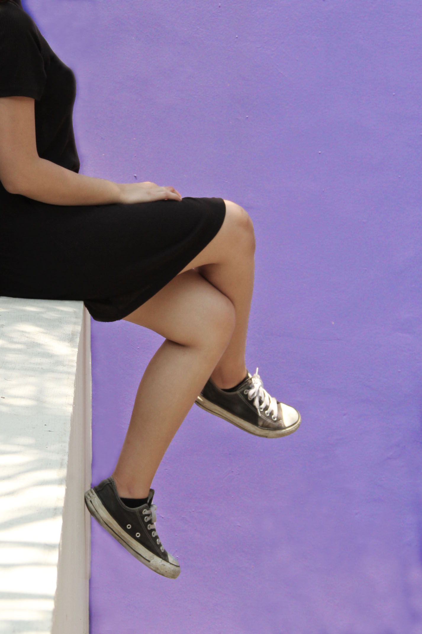
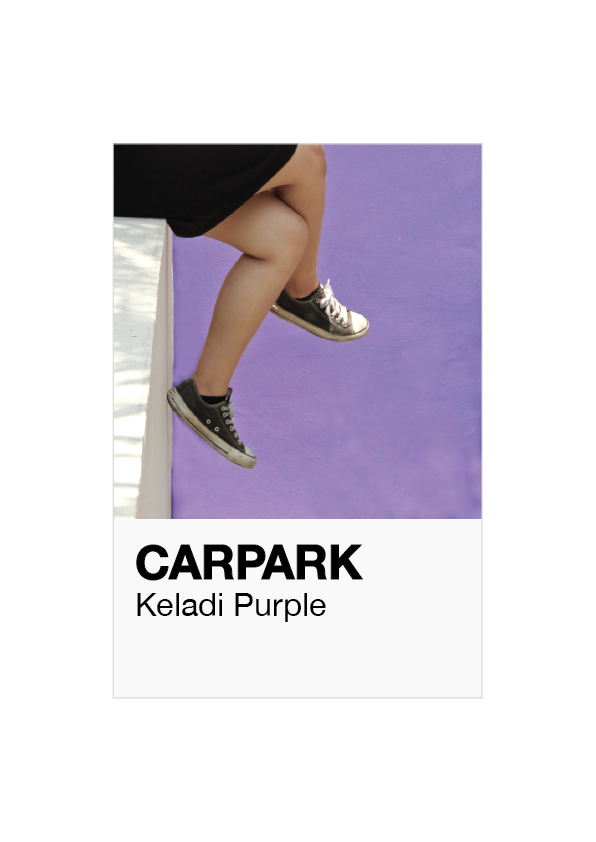
My past photos only showed architecture so I figured if I added a character inside, it would add more narrative to the zine. So with the help of a friend, I asked her to help make my photos more curated and almost as if she was discovering through these coloured places. I decided that I would only show different parts of her body so the main focus would be only the colour and architecture. I also edited the photos to bring out the colours more in photoshop and to get rid of the unnecessary elements in the photos. 

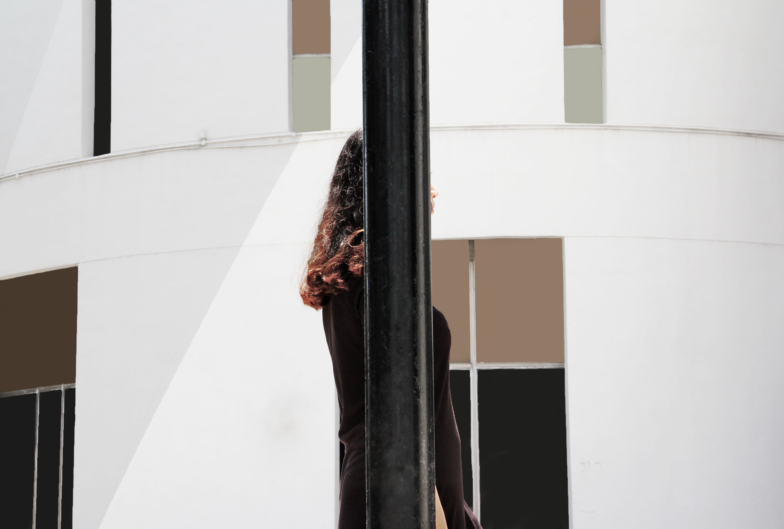
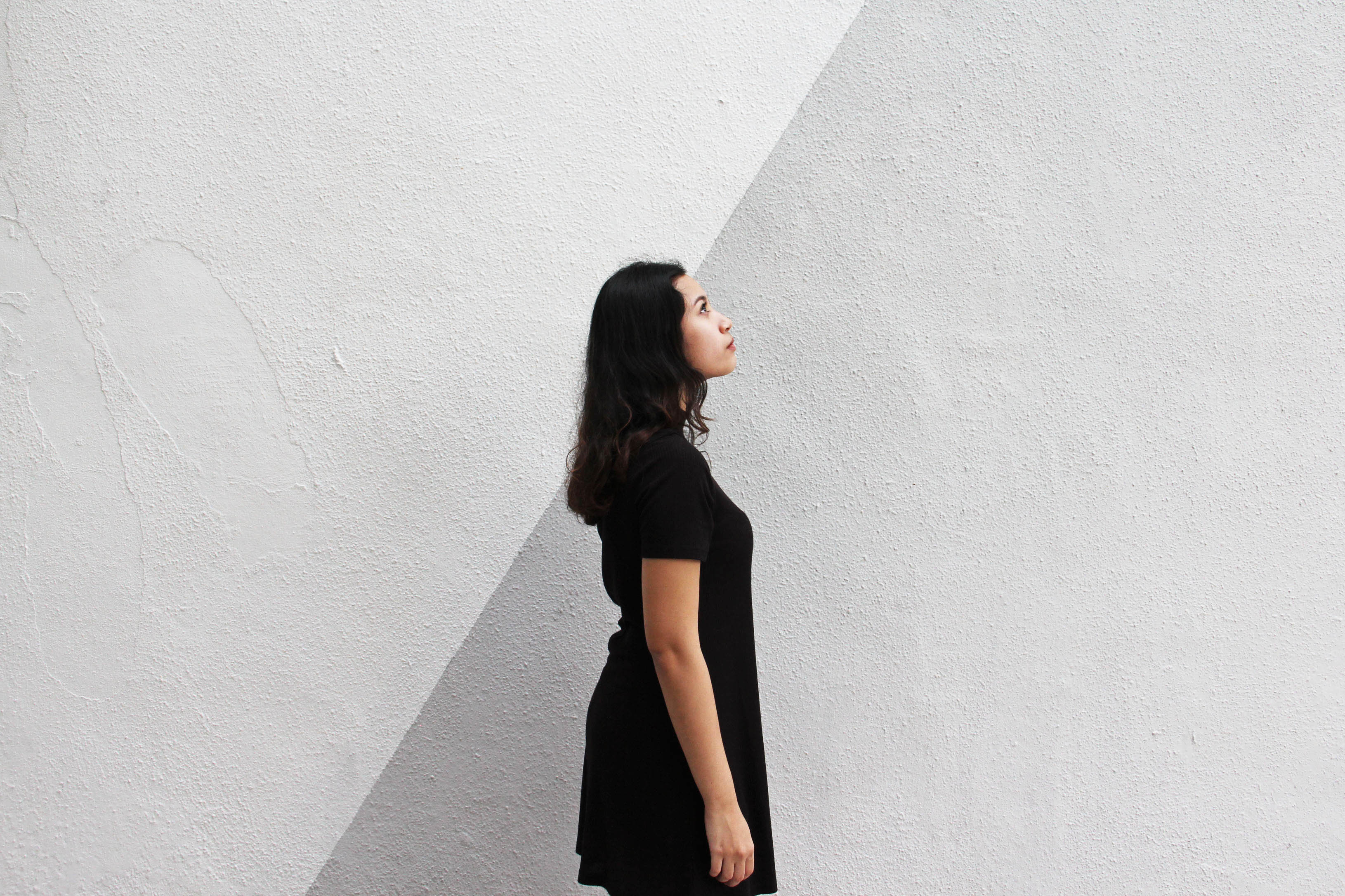
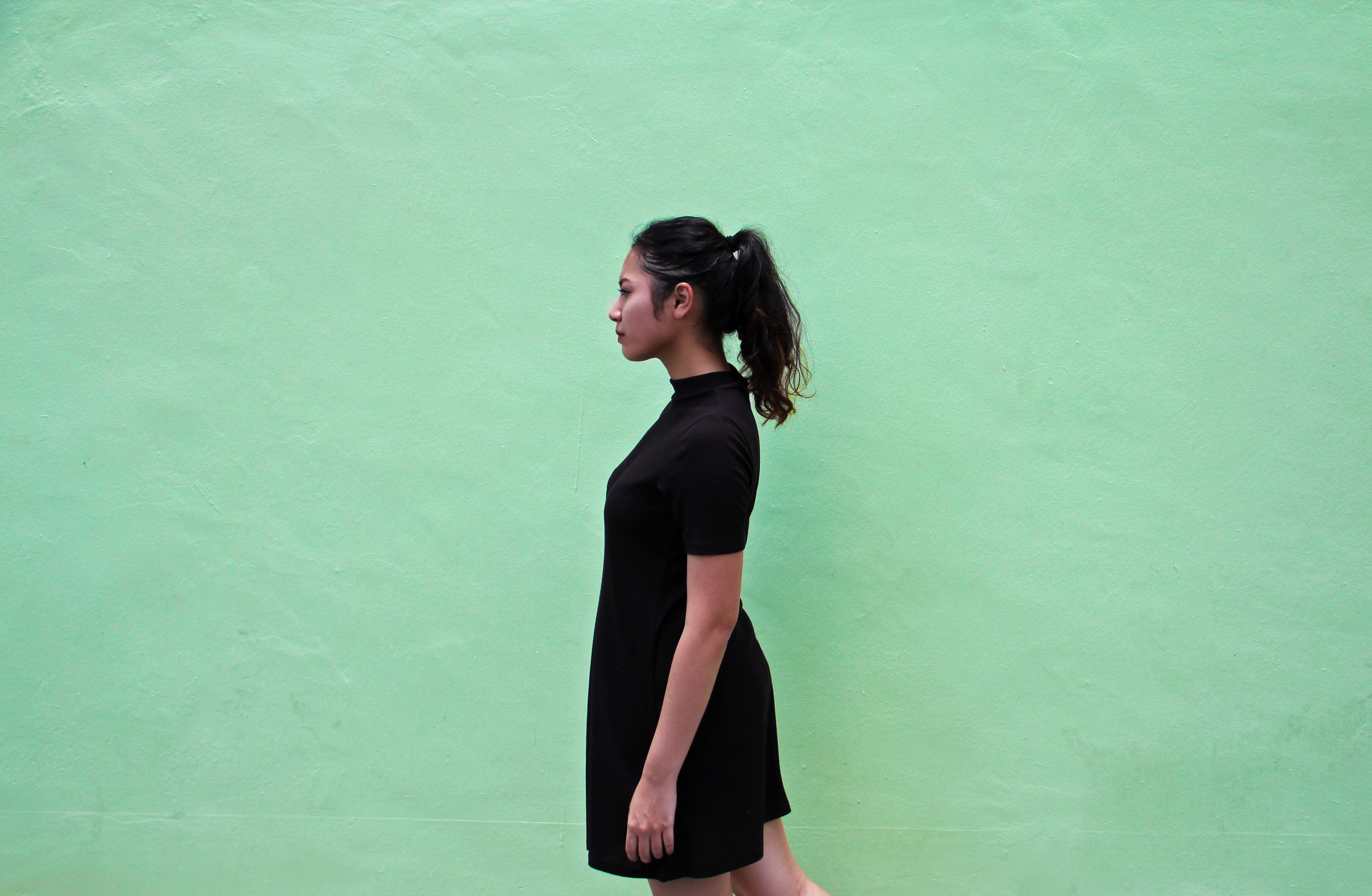
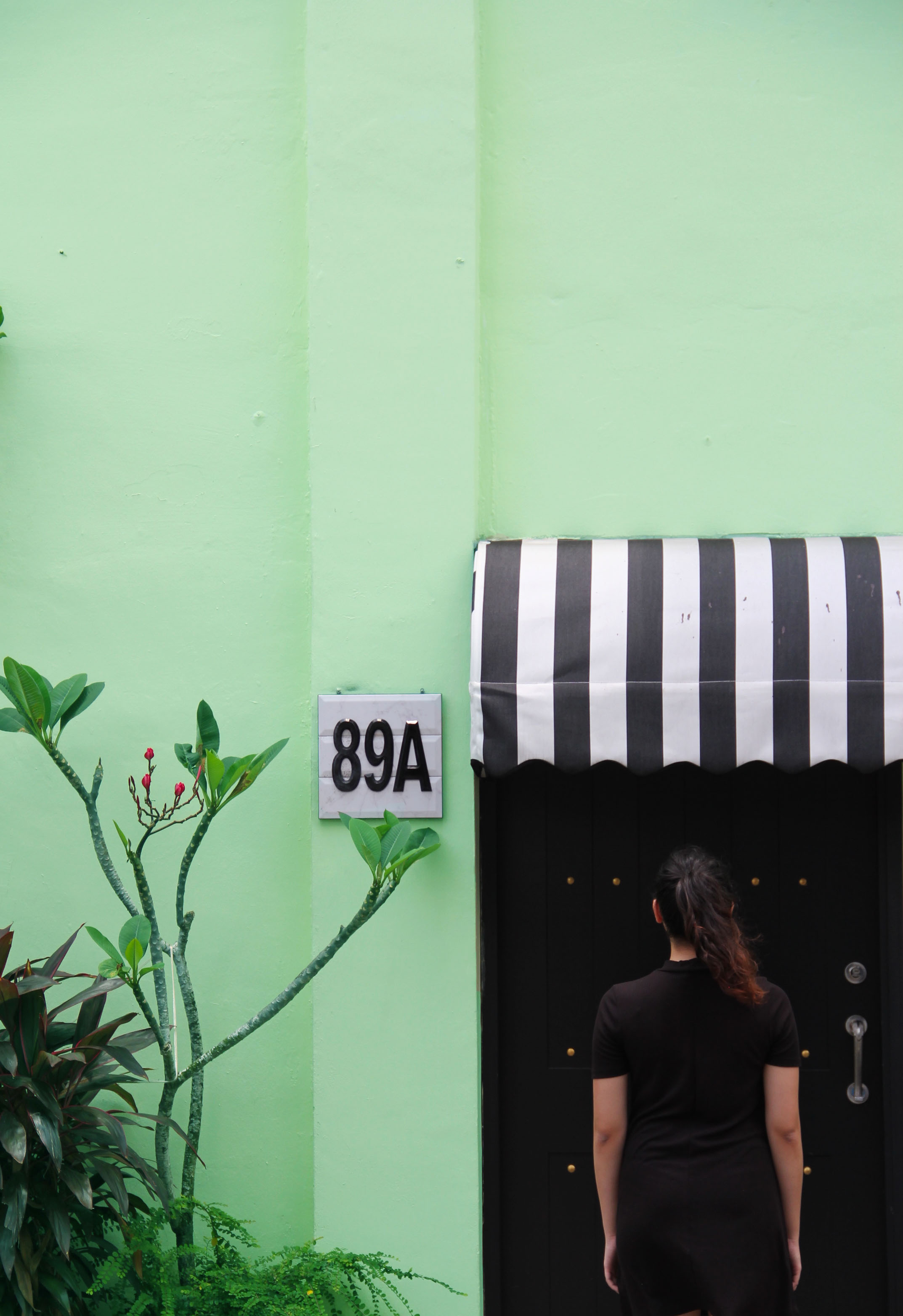
I also decided that it would be fund to curate the colours of Geylang into a Pantone kind of way. I found inspiration from this local photographer, Jonathan Tan. So what he did was to classify the different places in Singapore into their iconic colours. So here is my attempt on my own!

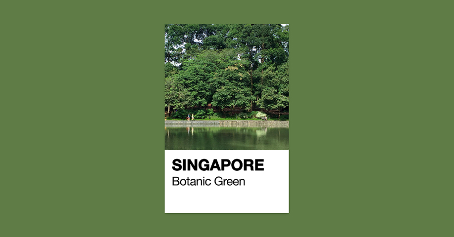
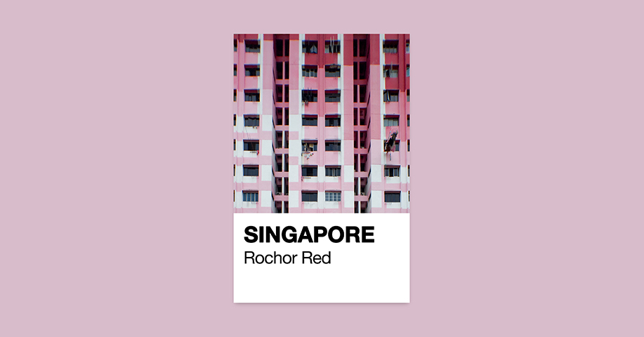
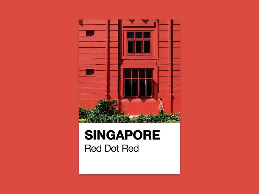
Attached is my zine! Geylang Pantone

One thing I have learnt from this project is to learn how to really curate photos and due to the restriction of the zine, how to best fit the content into minimal number of pages. I am looking forward to inputing more on what I have learnt about layout, typography and images and how to benefit from them into my future major!

Thats all!

Neighbourhood Explorer Round 2: Deep in Geylang

Hello! So I took a second round around Geylang to observe more closely if there was anything that I missed out from the first round. As for the first round, I only noticed the shopping malls, Malay cuisines at the marketplace and other normal stuff. So this round I made sure to stop at everything. In the end there were three elements that caught my eye, the architecture, doors and windows and the signages. These elements seem to breathe in more life and vibrancy the deeper I went into Geylang. On the surface, was a cold and commercialised place, loosing what we imagined Geylang to be.

Architecture

As you can see, infront there is a lot of construction going on and also the shopping malls placed all infant were grey in colour. It felt very foreign and cold and not what I expected of Geylang. However the deeper I went into, I discovered more character as I looked around and up. I made me feel as sense of warmth and life.

Doors and Windows

The deeper one goes into Geylang, you can see how colourful and unique each shophouse or homes are from their doors and windows. It makes me feel like each shophouse is expressing their own character from the way their doors and windows are painted or decorated making it different from one another, no two doors or windows are ever similar.

Signages

As you can see, in the front there were a lot of construction signs and with different fonts. The fonts were sans serif and very stiff and stagnant, whereas as you walk in deeper the signs became more decorative as they are hidden. If you don’t look up and around you probably won’t notice any of them. It took my second trip here to start noticing all this.

Conclusion to my findings: Geylang is cold and commercialised construction upfront, but behind it it full of colour and character!

My idea for the zine would be uncovering the layers of Geylang! I can do so in many ways, following by colour, or even just the 8 pages being the difference doors and each expressing different characters.

Attached is my presentation slide. Thank you for taking a look!

Neighbourhood Explorer

Thats all!


Neighbourhood Explorer Research | Geylang

Hello! So the place that i have been assigned to is somewhere that i am very familiar of. Geylang! It is known to be one of the most iconic Malay places in Singapore bursting with everything Malay ranging from the architecture, food and more. Though I am very much familiar with the place, upon roaming around i found little bits and pieces of the neighbourhood that caught my attention that never did. Here are some of those bits!

img_1767 img_1769

As you can see, so much good food! All these neons signs showing the various colourful kind of Malay food you can get here. (Some of the best, example their Kacang Pool). Looking at the different dishes an idea came that maybe i could do the publication in colour code, with each colour symbolising the iconic malay dishes here. So after my stop here, I decided to go across and walked further into Joo Chiat area.

img_1771 img_1772 img_1775 img_1776

So the more i travelled around the area, the more i realised that how every piece of architecture symbolises something unjquely Malay about Geylang. Eventhough something as simple as the lampost and the overheadbridge is something that is overlooked, it distinctvely has the essence of the Malay. I also walked past several shophouses that has its own distinctive styles. So an idea i had was that i could do a publication on the little things that make the architecture here uniquely Malay. Or I could also do on the different shophouses. And so I continued walking!

img_1777 img_1780

So another thing i noticed about the neighbourhood lastly was that how there was a traditional shopping mall as compared to a more modern one. The difference was oddlh strange showing how people would rather hang around and gather at the traditional mall rather than the modern ones. The difference was also the different shops there making the tradional one having a strange oldy tingy vibe than the modern. Another idea i could do is the publication on how the new blends with the old there.

Overall it was such a refreshing experience as it has been awhile since i’ve been there!

Que Sera Sera: Progress

So here is my progress for the four occupations that I have in mind!

Ballerina

a3zekto6lvencll7bse8hp-650-80 signpainter-housescript_font_preview

For the ballerina occupation, I went to research some of the best cursive fonts out there on the web. So I decided I would try to experiment with one that was less fancy than the other. I also experimented with the thickness of the ribbon as well using one that was thinner than the other. Here are the results!

ballerina-1 ballerina-2

So the top one was using an existing font called Noelan Script and directly copying the font style, whereas the bottom one was using the Sign Painter font however I manipulated it a bit to give it a more flow composition.

Feedback: Take photo and play with the lighting to further enhance or show the mood of ballet perhaps?


Astronaut

24bafb5e08efc3153f994a8e68df2bd0

99285

As for my astronaut occupation, I stumbled upon this interesting paper cut out concept and liked how they used the context of space and made the words not flat but float. I also figured a more solid and rounded and bold font would work better for this occupation to represent the planets that are in space. So here are the results!

astronaut-2 astronaut-1

So the one at the top is actually and entire font I made myself and decided to replace the letter A with just a triangle because it sort of looks like a spaceship shape! I also tried to kept the pointy edges but I think I feel that it was a little too overdone especially with the letter E. So the bottom, I actually cut out a little at the bottom of the letter A so it looks more recognizable, and also this font was actually the Halis Rounded font however I manipulated it a bit and made it a little thicker. I also played with the background decided which was more suitable.

Feedback: The letters all look the same now, so may be change the individual letters to show near and far like in space? Also take out the unnecessary and just keep the stars and all.


Tattoo Artist

ee4b102259630574e3a5cc8cd8f16a95

So for the tattoo artist I was little lost but I researched and found out that Inked Script is one of the best and easily recognizable font that is used. I decided to try out with photo shop to see if it would work.

tattoo-artist

Boo! Haha the end result really doesn’t look as legit as an actual tattoo. I added in the redness to show the rawness and condition of the skin just getting inked. So I have decided I will draw on my hand directly and take a photo.

Feedback: Tattoo is such a broad area that ultimately, if you are a tattoo artist you would want to showcase your best work? So maybe can go more crazy and out there and develop own drawing or font instead.


Musician

volstead

For this occupation, I decided that this font, Volstead actually reminded me of like those rock star signature fonts? And I had to use a cursive font as well as my idea revolved around that.

musician

So this is currently my idea, it is manipulating the Volstead font slightly into the guitar amplifier cable. I feel like it is a simple concept but it is easily recognizable what occupation this is! May be i’ll add in more like a collage kind of feel like those rock posters.

Thats all!


Que sera, sera : Research

Typography! Well I thought before I jumped into my occupations I’d take a look at Pinterest because its such a great place to get inspired and get ideas rolling in. Instead of immediately thinking of an occupation, I decided to look at the different mediums already explored first.498c38db84f16c23f6675e0b467038ca a902bb34e5fbcd75d70b1cd2fb524f27 c72b94b31569e77c187bdc714abbf581


So my four occupations are musician, tattoo artist, astronaut and a ballerina!

Musician:

1aca84ec4860b35e23d3e06aef79c95c 01f13f639d706981a7320648efbe9b1a 5cf319e0d227aa9d71a4071e00ab532a 75009a907182eac753ba17045aa8834d

As for musician, its very easy to manipulate the typefaces into individual instruments, and since I put musician I can either go into a specific kind of play around with all at one go. I think this typography will look nicer in black and white and clean style.

Astronaut:

6e696d43b68eff5cece99b30e2548933 9d80bd51a784812e86ca0876fe67cf26 24bafb5e08efc3153f994a8e68df2bd0 35b9971f4158b7bec4369a870324e635

With the astronaut occupation there is a lot of things I can play around with such as dealing with gravity and making the letters float, or the texture and colours of the planets and such.

Tattoo Artist:

77cf639ff6a14d6fd53e83b6e9809e74 055010b163883133d82367cc55bcba1b

As for this occupation i feel like i have to play around with both the typography and photo manipulation in order to get the content out. Also, tattoo has a lot of typography itself so maybe it is better to focus on those that are more easily recognisable as a tattoo font.

Ballerina:

6de47cc7f783f239f7d8418167955ec0 96643358c4789ef753847299b4c65b15 aa5539d8fbb5624c598b83da52ed3d13 debcfc60d832a67e670024fca6fb4bd4

For the role of the ballerina, I feel like can play into the material and also they always seem to associate the brushstroke font to a ballerina. The movement of the ballerina can also be manipulated into the fonts.


Okay gonna start ideation now, bye!