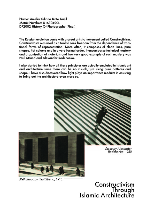
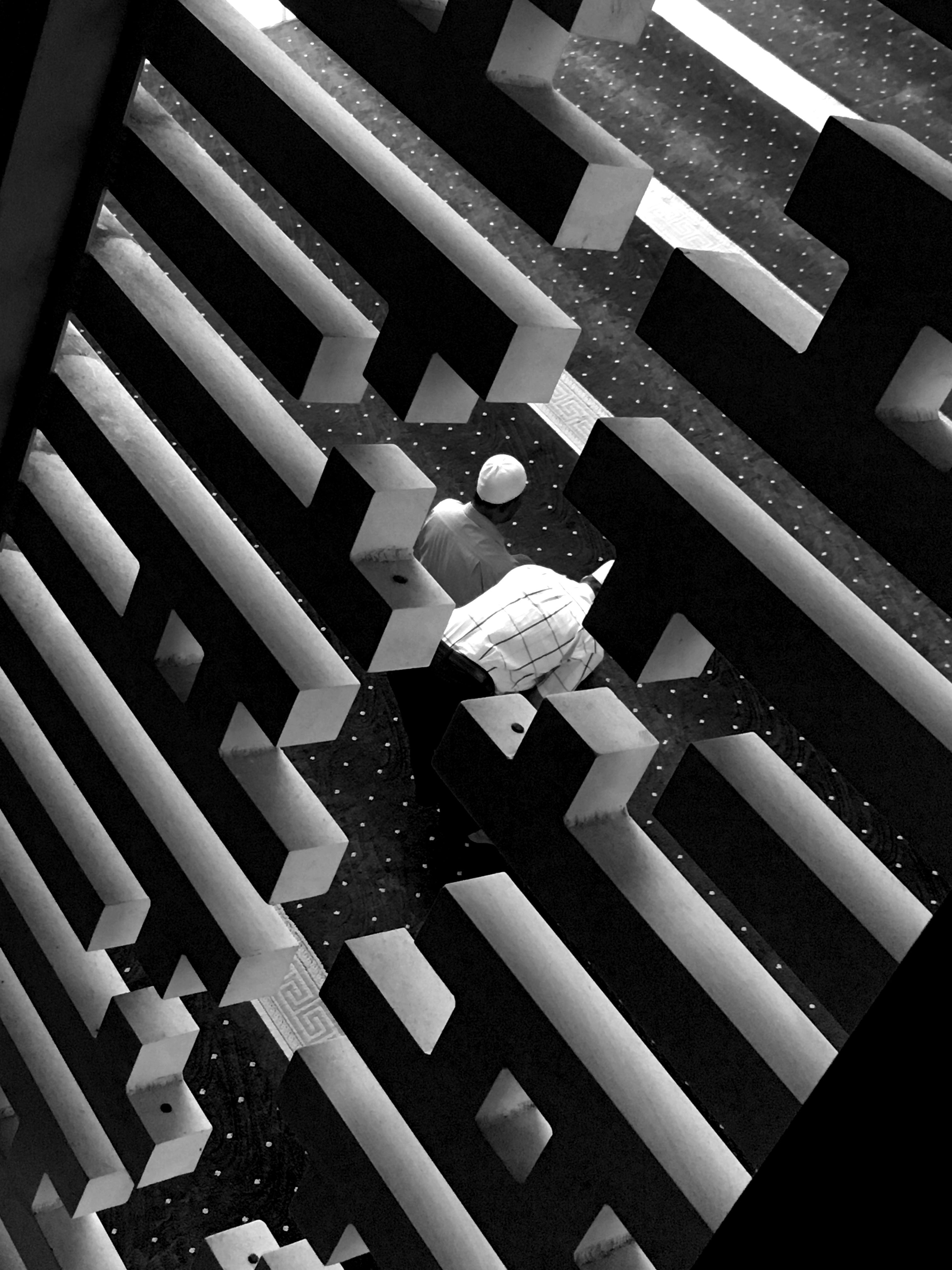
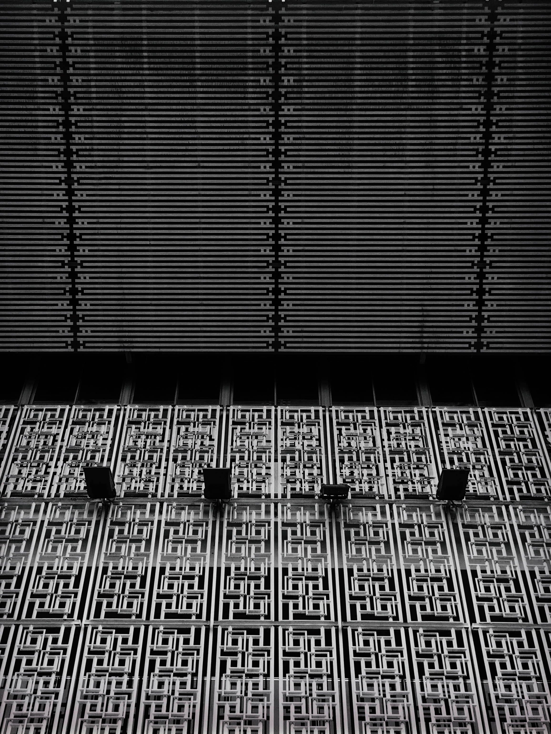
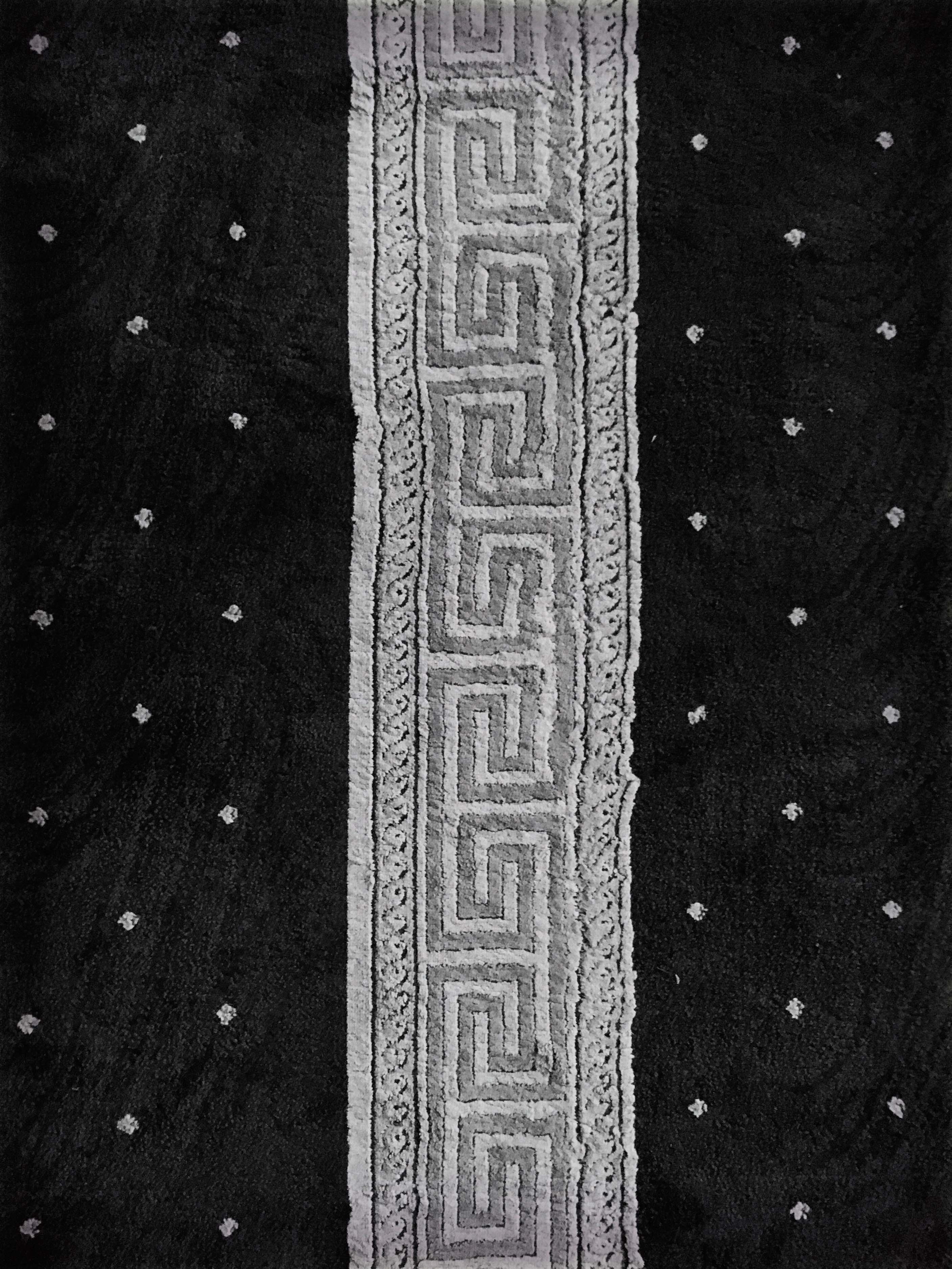
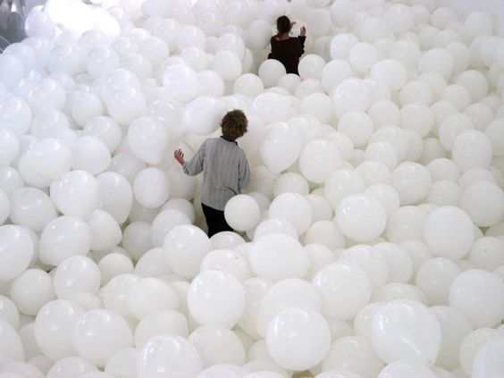
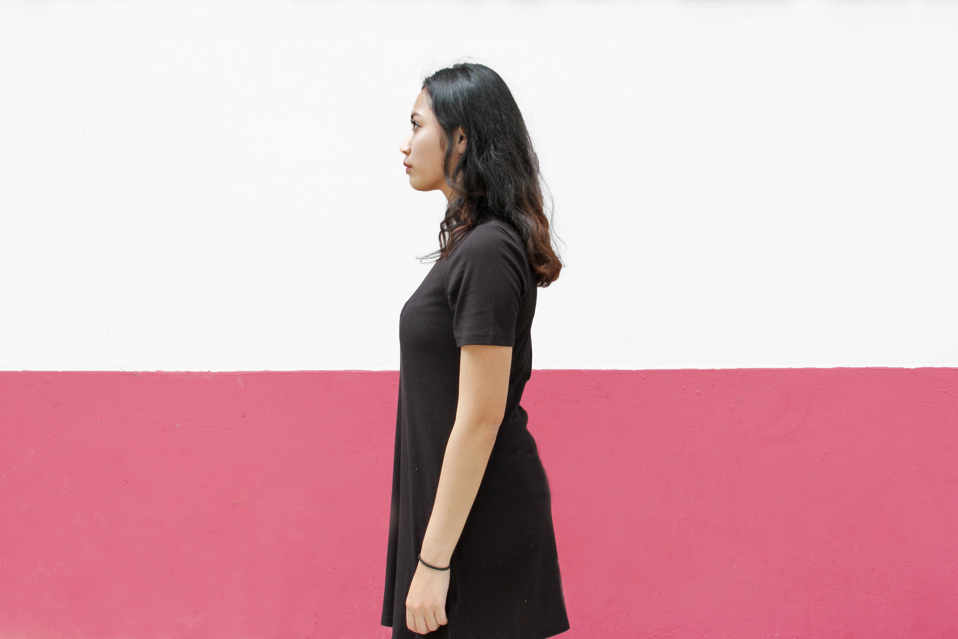
Original
Recreated

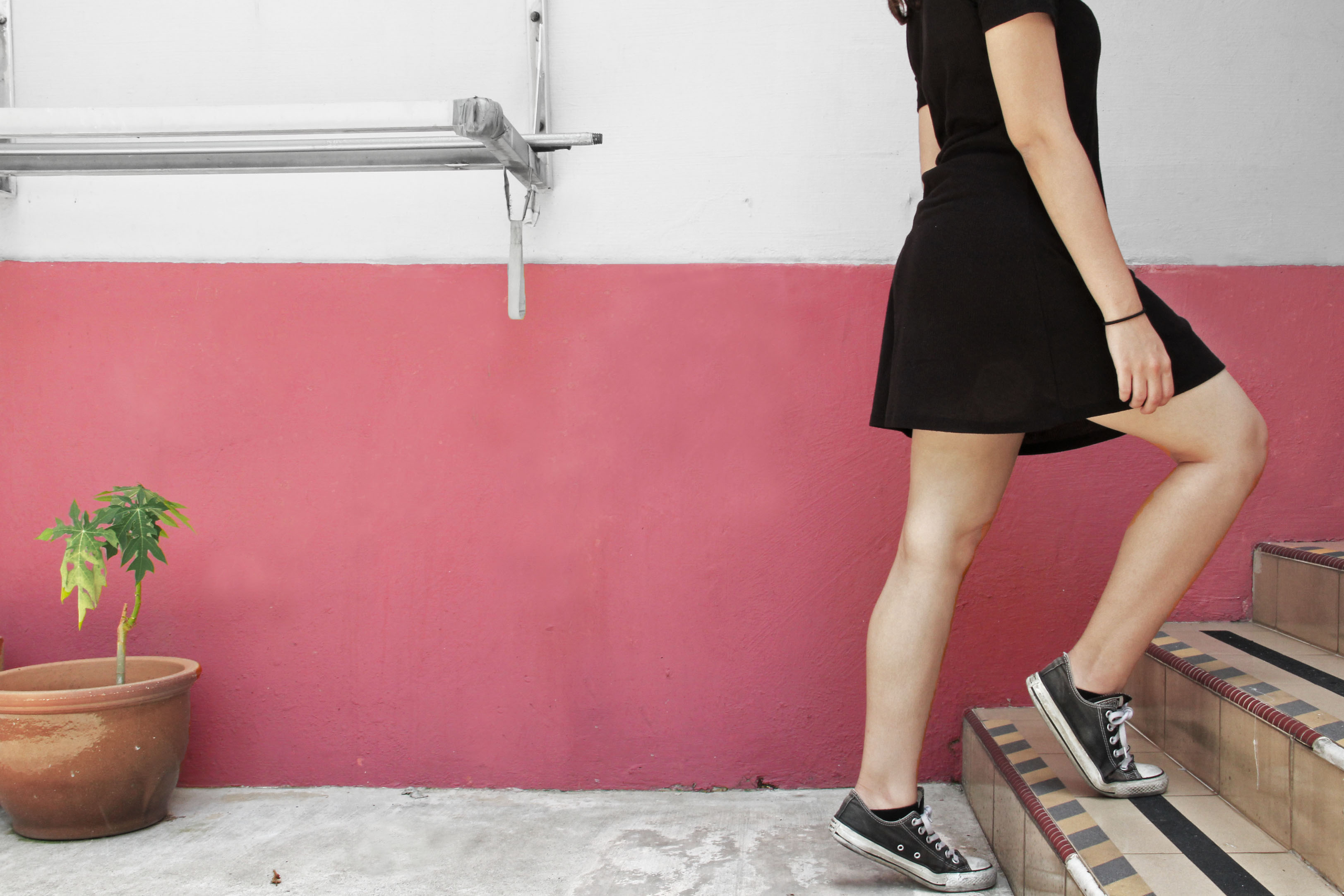
Original
Recreated
Empathise!
Definition
What is humanitarian aid? Humanitarian aid has been defined by our team as any form of act that improves the welfare and happiness of people. Millennials do seem to care to participate in such activities.
Interviews:
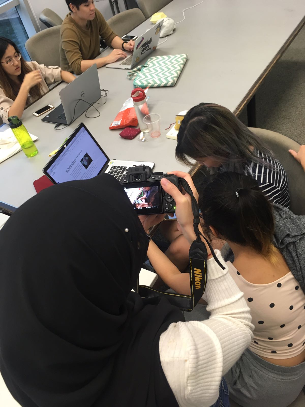
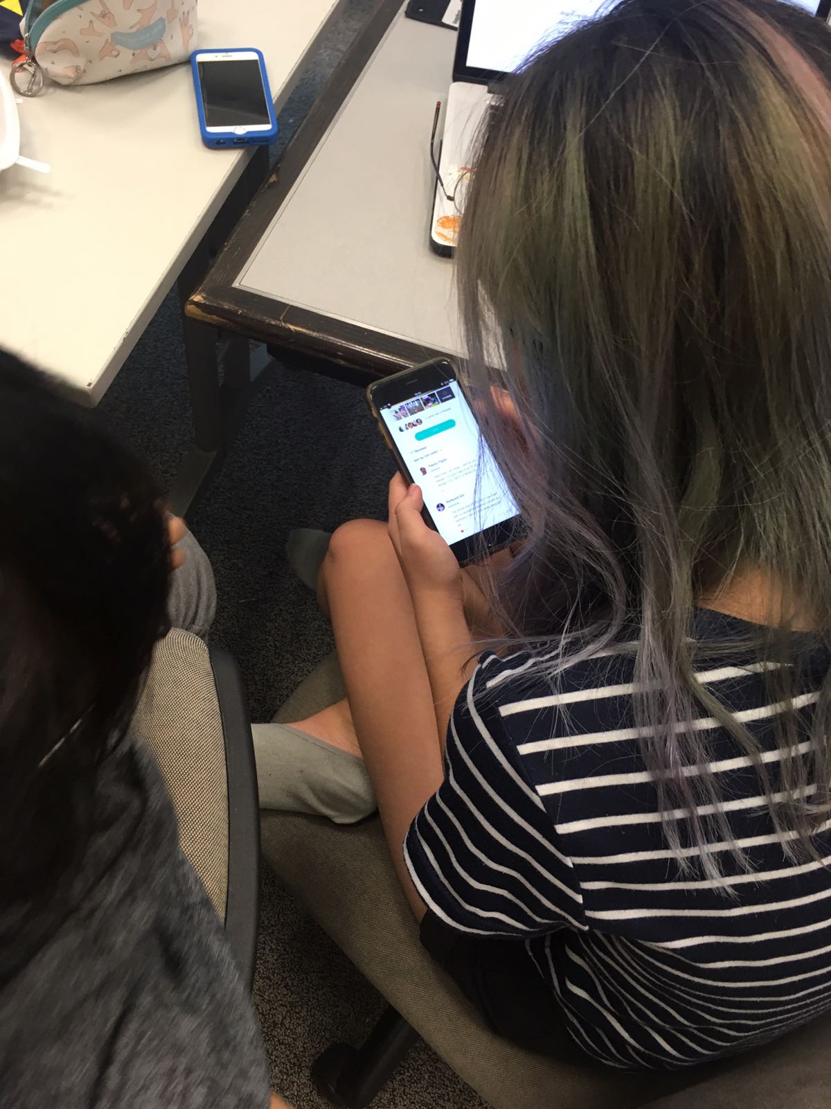
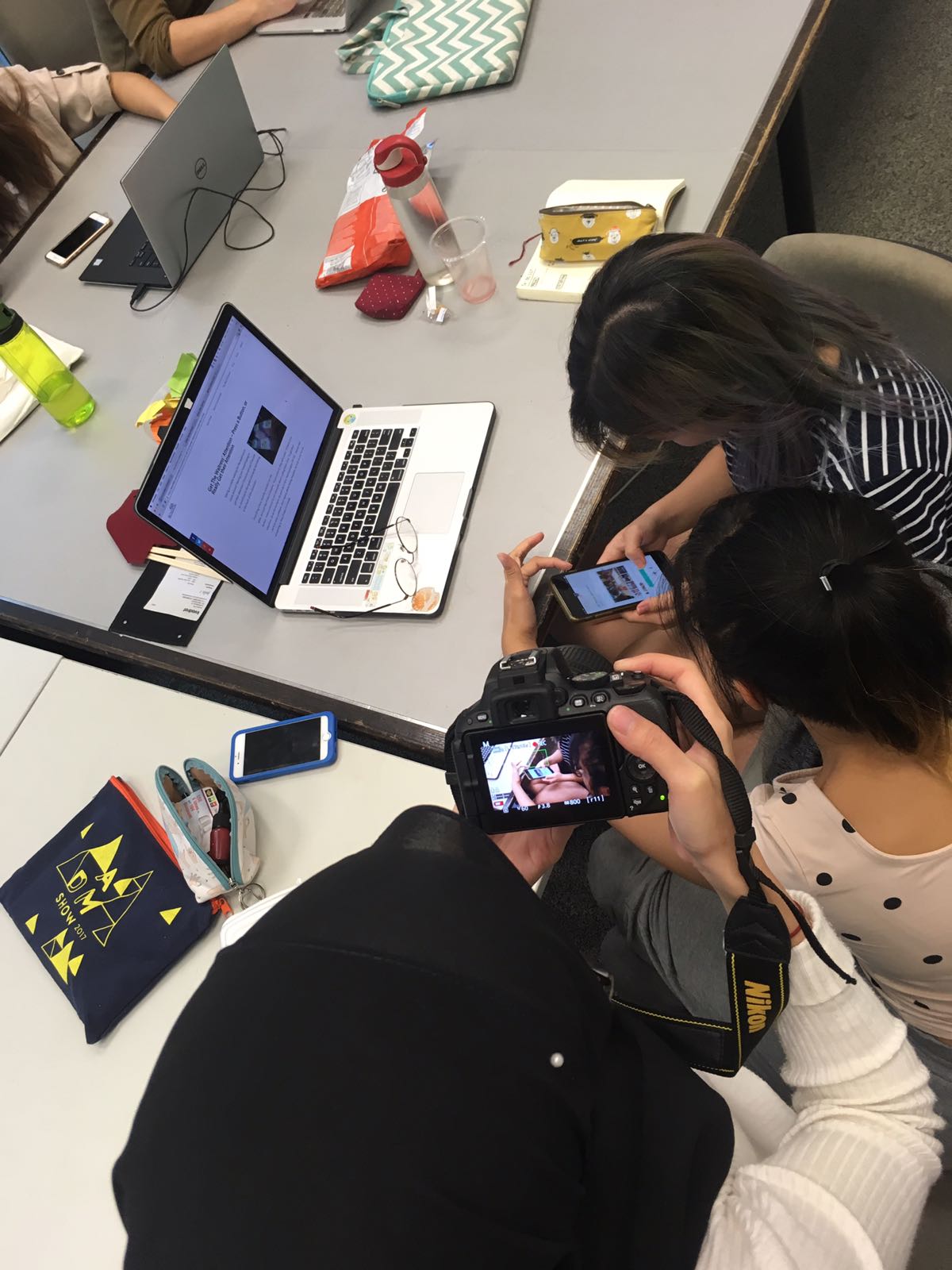
We interviewed students from NTU as they would be the main target audience for our concept aside from youths and the public.
Insights:
From our interviews we gathered feedback and insights regarding humanitarian work.


Passion
Many mentioned that they would be more inclined to participate in the humanitarian work if it coincides with their passion. So for example, volunteering for kids while teaching them art or business with a cause.
Time
Most students are not able to commit due to time constraints.
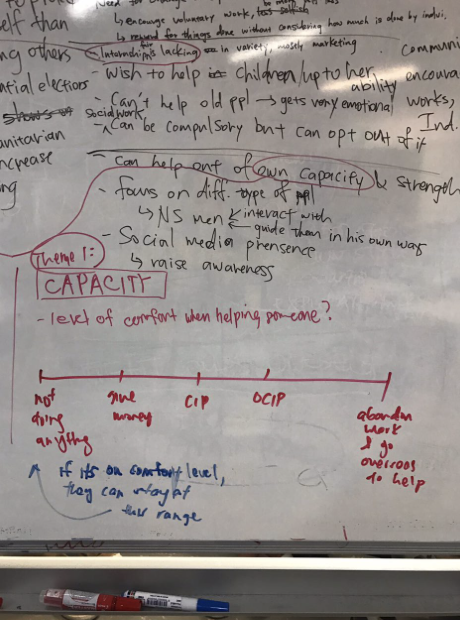
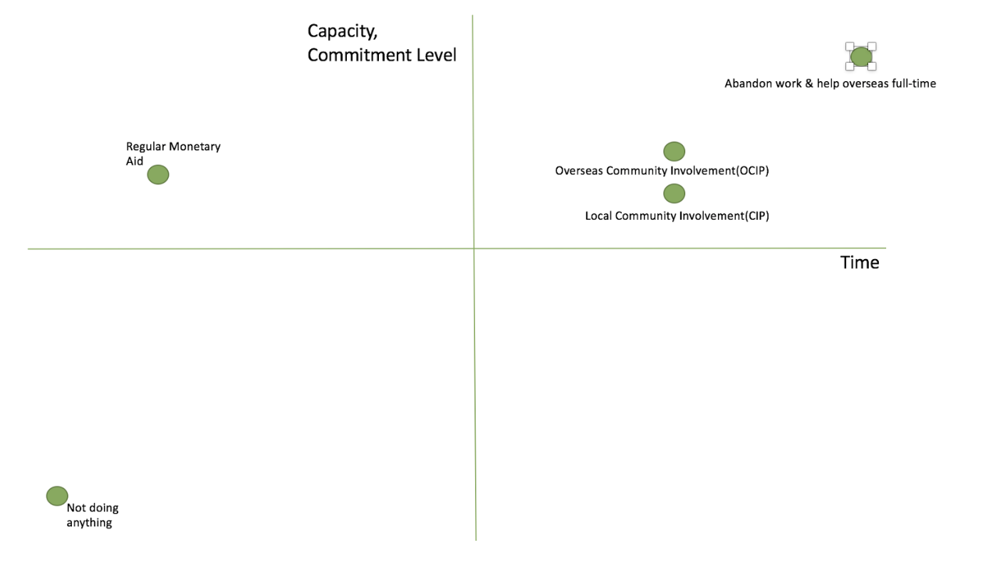
Capacity
Thirdly, each individual have different comfort levels and capacity. For example, one of the student mentioned that she would not want to volunteer for the elderly as hearing their story would make her emotional.
From here we identified our extreme users, those who actively seek to help others.
Happiness
Lastly, there was this quote that we feel encapsulates our entire aim of our concept and it is “ doesn’t matter what, as long as they are happy at the end of the day.”
Problem Statement!
Generally students do not participate in volunteer work as it does not coincide with their passion and they have time constraints. However, they express their desire to help others in the small ways they can.
Ideate!
Concept:
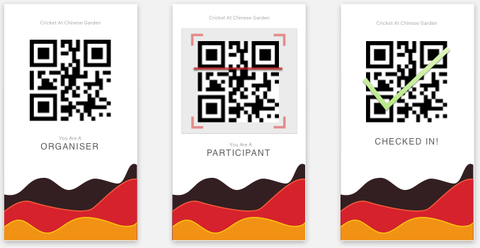
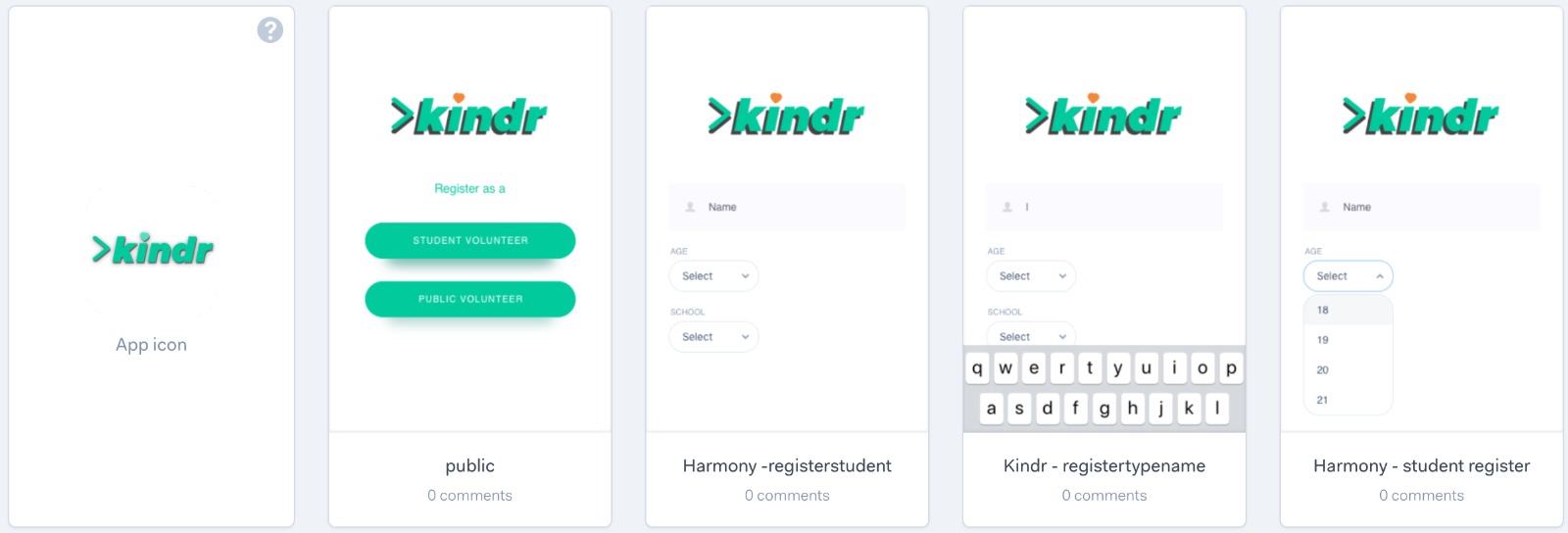
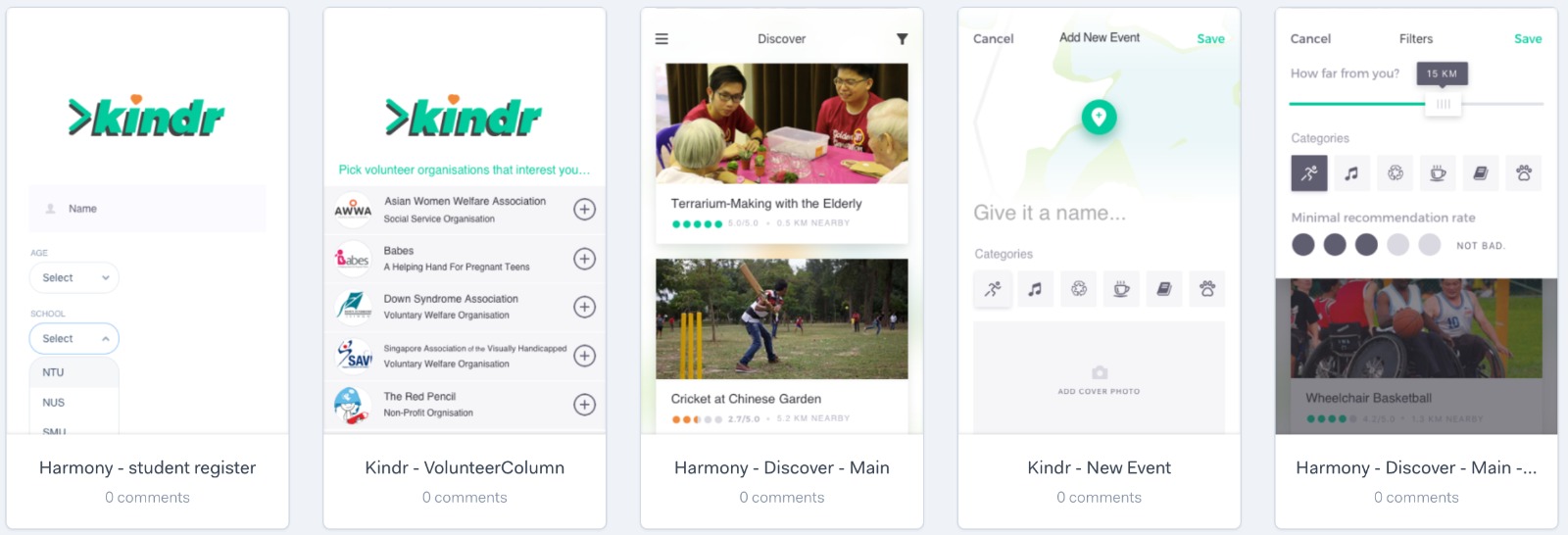
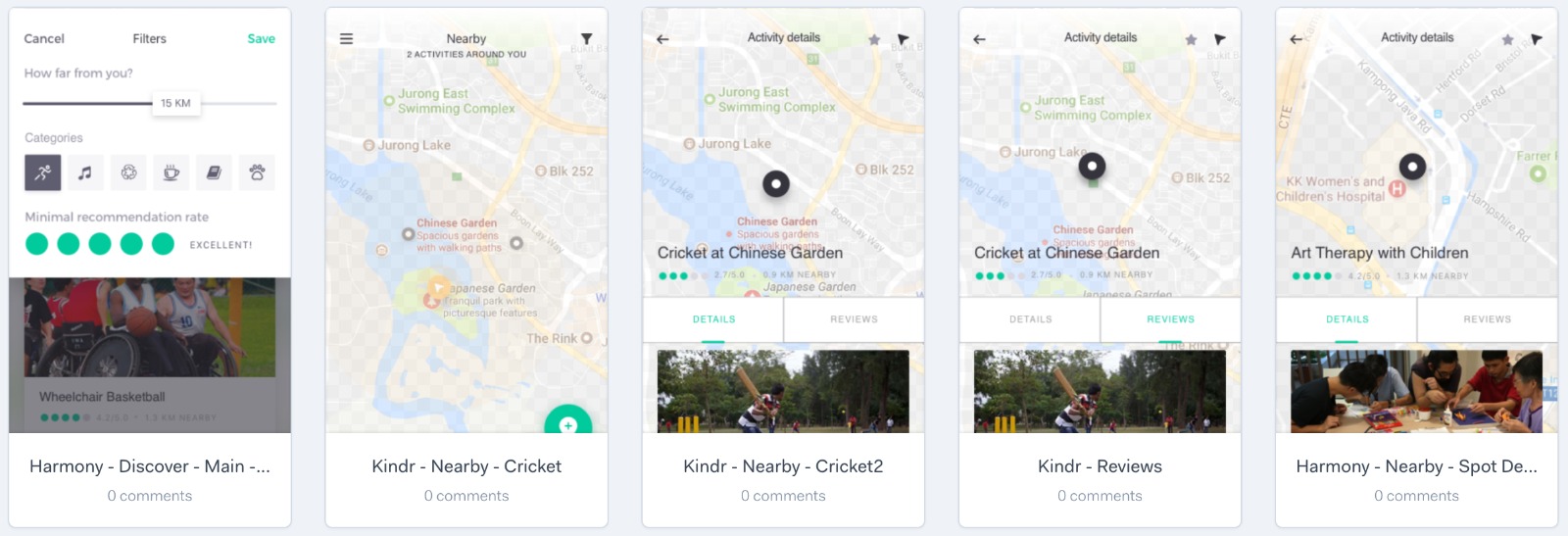
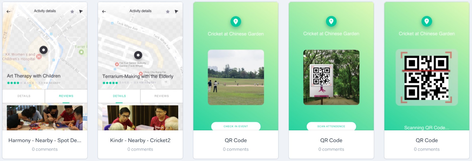
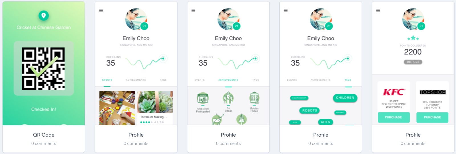
This leads to our app Kindr. We settled on an app as most students are usually on their their phones and it consumes less time as they can sign up immediately. The main selling point of our app is that it is humanitarian aid that caters to your interest and passion with short commitment period. Although such, the app works with well known organisations in Singapore such as Transient Workers Count Too and Hospices.
Thus, the app tried to solve two problems. On the one hand, the struggle some organizations face in order to gather volunteering youth and, on the other hand, the lack of information and appeal to younger generations to devote part of their spare time to low time consuming socially rewarding activities.
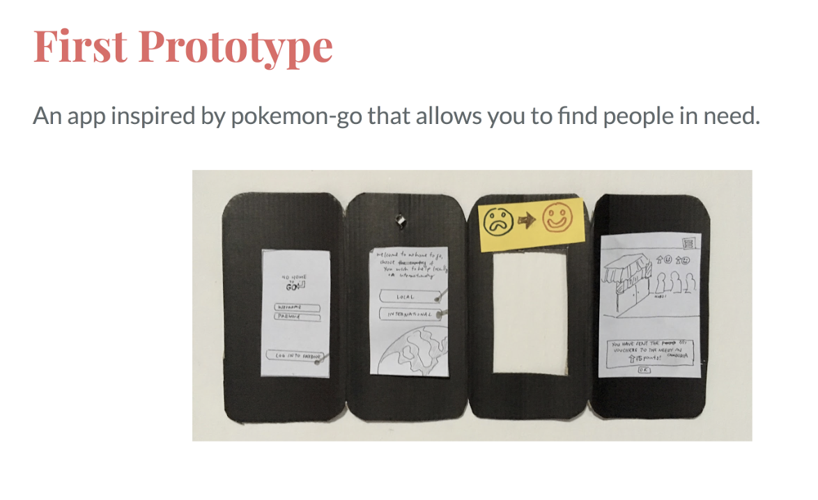
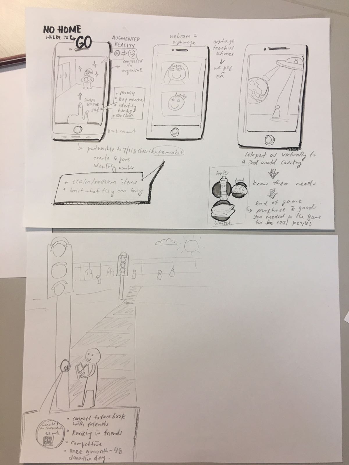
Prototyping!
Feedback and Testing for first prototype (no-home where to go):

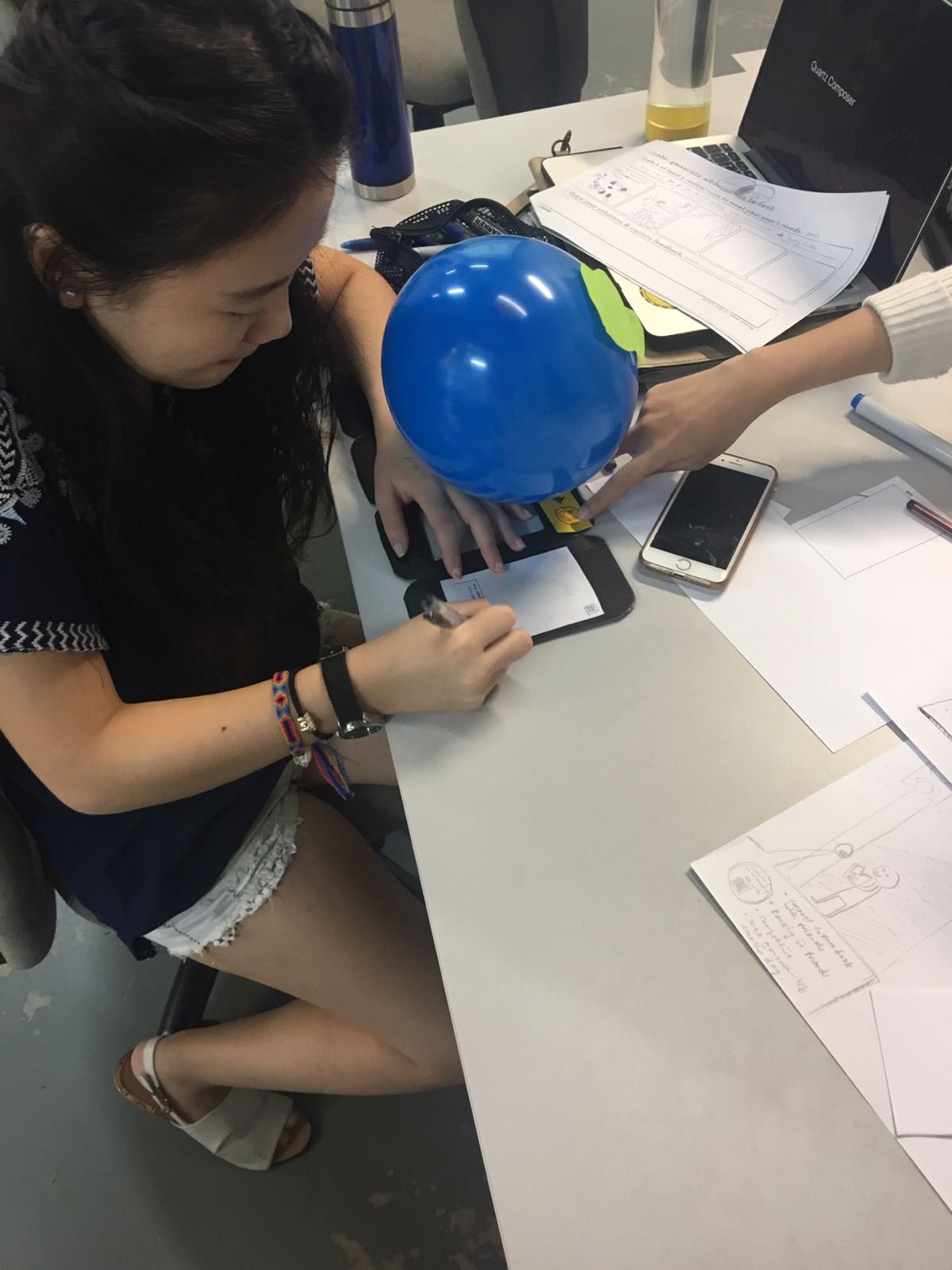
Feedback and Testing for second prototype (orange):
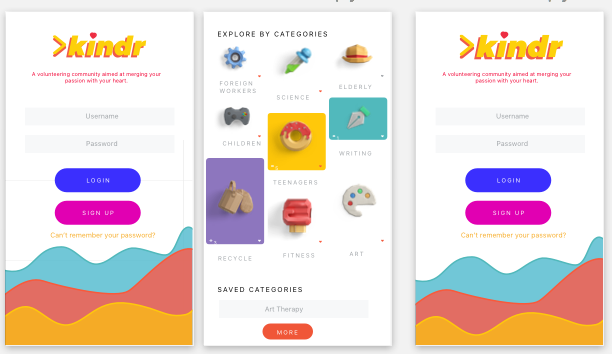


Feedback and Testing for final prototype (green):

Conclusion
Overall we enjoyed the entire process and learned how to apply Design Thinking in order to tackle problems from a human-centered approach. Our perspective of the problem itself evolved along the process as we asked further questions. Once we felt we were gathering good feedback on how we wanted to tackle the problem (ie, Kindr App), we started gathering feedback on design, usability and functionalities.
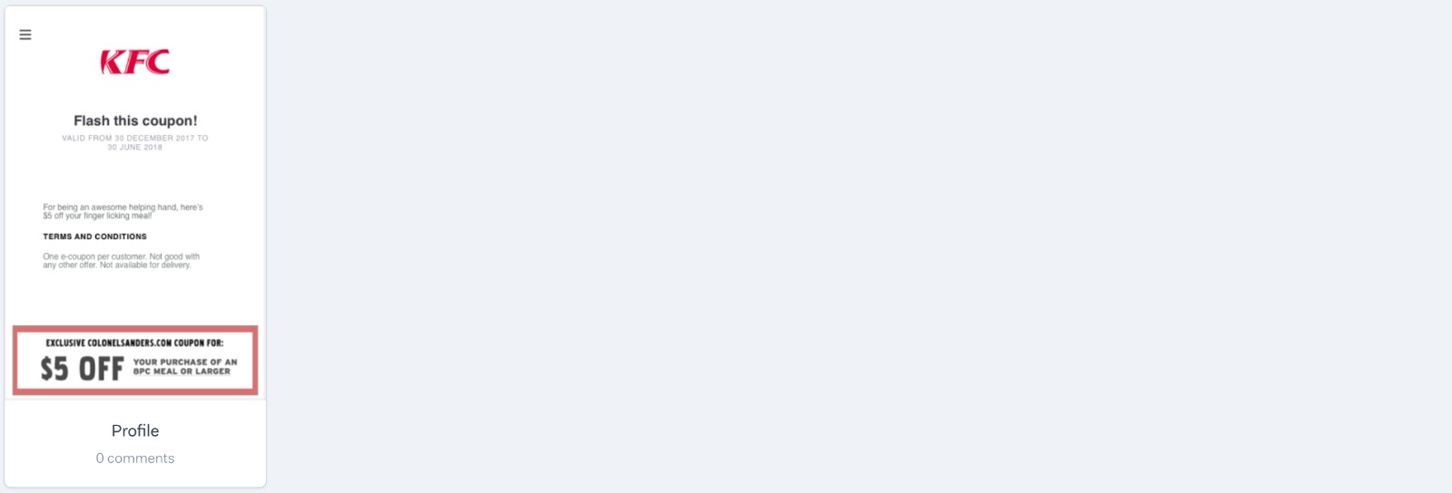
All suggestions were very useful to understand how the potential users visualised the solution, and what were “must haves” in our app, such as the organisations’ profile and the incentives to participate (ie, vouchers).
With this app we intend to build a bridge between those students who want to support other communities in different ways and those organisations who have the knowledge on how to tackle such problems. Through our app, we believe that together we can solve whatever.
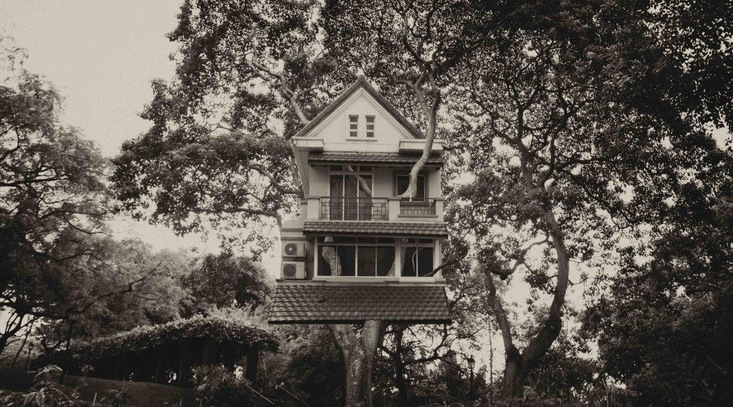
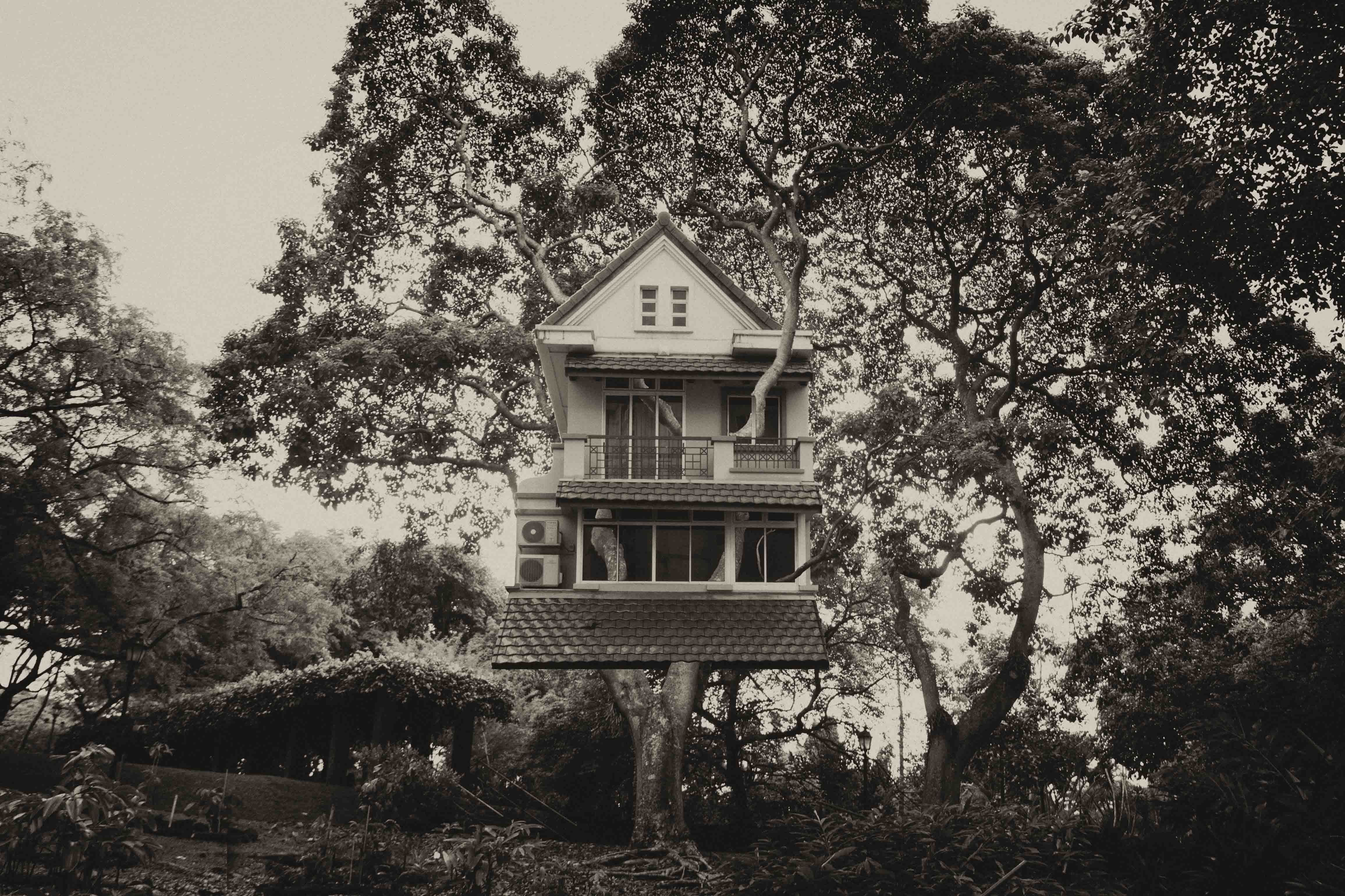
It is about time art came in.
Gustave Le Gray said this as he entered the era where photography was all about what the camera could perceive. He was already producing works that were for an art form by capturing landscapes and view of the Forest of Fontainebleau in 1855 and then moving on to capturing seascapes from 1856 to 1857.
He was successful in producing such an impressive large scale of work alongside the skills of the wet collodion process in 1851. This technique could capture the movement of the waves and the light from the sky. However these two needed different exposure timings. Amazingly what he did was to combine two separate negatives together! One of the sky and one of the sea.
By introducing this complex process, Le Gray was trying to actually create an idealised image. He was trying to give a more truthful sense of how the mind and eye would perceive and image rather than what the camera would capture nature. Often, the camera would capture almost a false representation of what beauty or meaning it actually holds.
This completely intrigued me. The process of combining two separate image to come up with an image that what the mind or eye actually perceives. So instead of completely imitating his style of photography, I thought I would imitate his thinking process. So what I did was to play around with different compound words that would make an idealised image. The three words are treehouse, skyscraper and fisheye. (See you start to imagine what they really are from the words itself into the image in your mind rather than what the camera can actually capture!) So I used photoshop to combine these images together and it was fun process. I added the filter that sort of even looks like the style Le Gray did. My most favourite is the treehouse as I feel its the most successful photo and the most fun was the fisheye because it is actually quite funny. Enjoy!


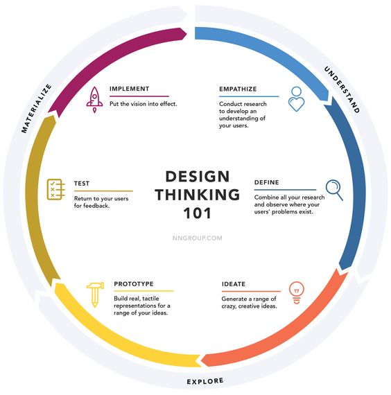
Empathise, define, ideate, prototype, test, implement!
How did we arrive to the topic of Identity?
The three of us decided to look back to our past projects and we all agreed that the alter ego one was the most meaningful one. So for Tisya’s case, she did the identity of Dory and the idea of getting lost in life and finding one’s self. As for Gerald, he did on the concept of duality in personalities and space relation to the human psyche and characteristics. As for myself Amelia, I did on Margo and the idea of being okay to get lost to discover oneself ultimately.
In conclusion, the similarity in all our projects dealt with the sense of an identity being lost. However that was still very widespread, so we decided to focus on on a smaller issue, and that being the local Singapore identity gradually being lost as modernisation comes into place.
Objective
Rojark revolves around the identity of Singapore – objects, people and places which are slowly vanishing or have vanished in our journey through development and modernization. It suggests this identity as something that is visibly tangible, but yet intangible, and is a representation of this part of our Singapore as something that future generations might not be able to identify with. This installation is a demonstration of a haphazard and futile attempt at the preservation of this identity, upon the realisation that it might be too late.
Purpose
_ hopes to evoke a sense of nostalgia and provoke a thought of our responsibility in the preservation of the Singapore identity through objects, people and places. We take for granted the uniquely Singapore factors that still exist around us now, which we might never get to see again as the country moves forward with the world. As our country develops, we have to make way for the future and abandon what no longer seems to fit in our context. A cultural heritage that is conserved and preserved is the country’s reflection on itself will guide the future generations in recognising our roots. This installation is much more than just preserving the physical aspect, but it also serves as an important reminder that we have to retain the inherent spirit and original ambience of these factors that make up our Singapore identity.
Concept
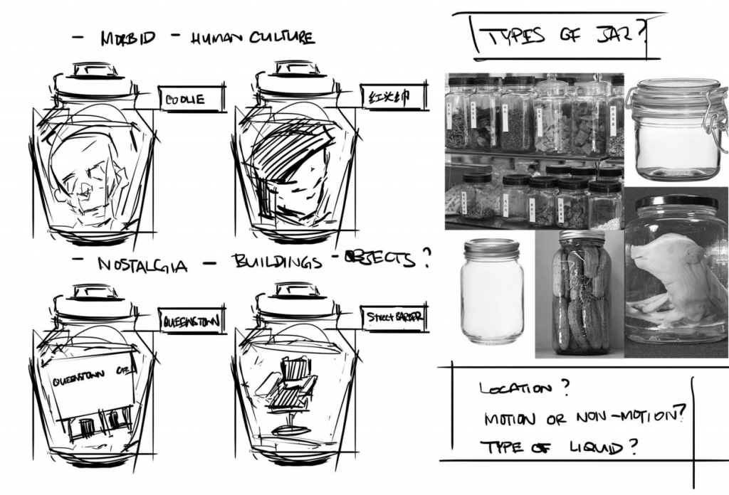
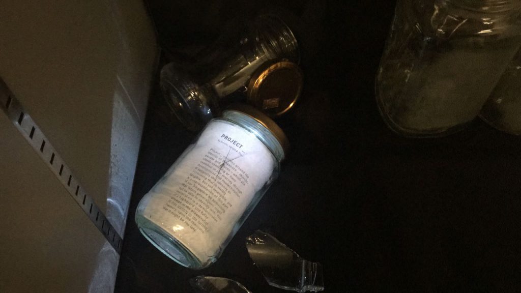
Jars will be used to emulate the preservation method similar to specimen collection or Traditional Chinese Medicine (TCM) style of preserving herbs or medicine. This gives both morbid and scientific enquiry sense of approach, on top of the emotive aspect, when viewing the installation.
INITIAL: We wanted to put actual objects into the preservation jars and experiment with liquid of different translucency and viscosity to give it a more faded facade. However we would face issues of finding the objects because of its rarity and size.
REVISED METHOD: Instead of actual objects, we will use a video projection against a frosted glass surface while trying to retain the liquid idea. It translates the idea of the object existing in an intangible form, like that of a memory, and reinforces the ominous foreshadowing of preservation of culture. It emphasizes on the idea of the object existing only as a memory once it disappears.

First Round Of Testing
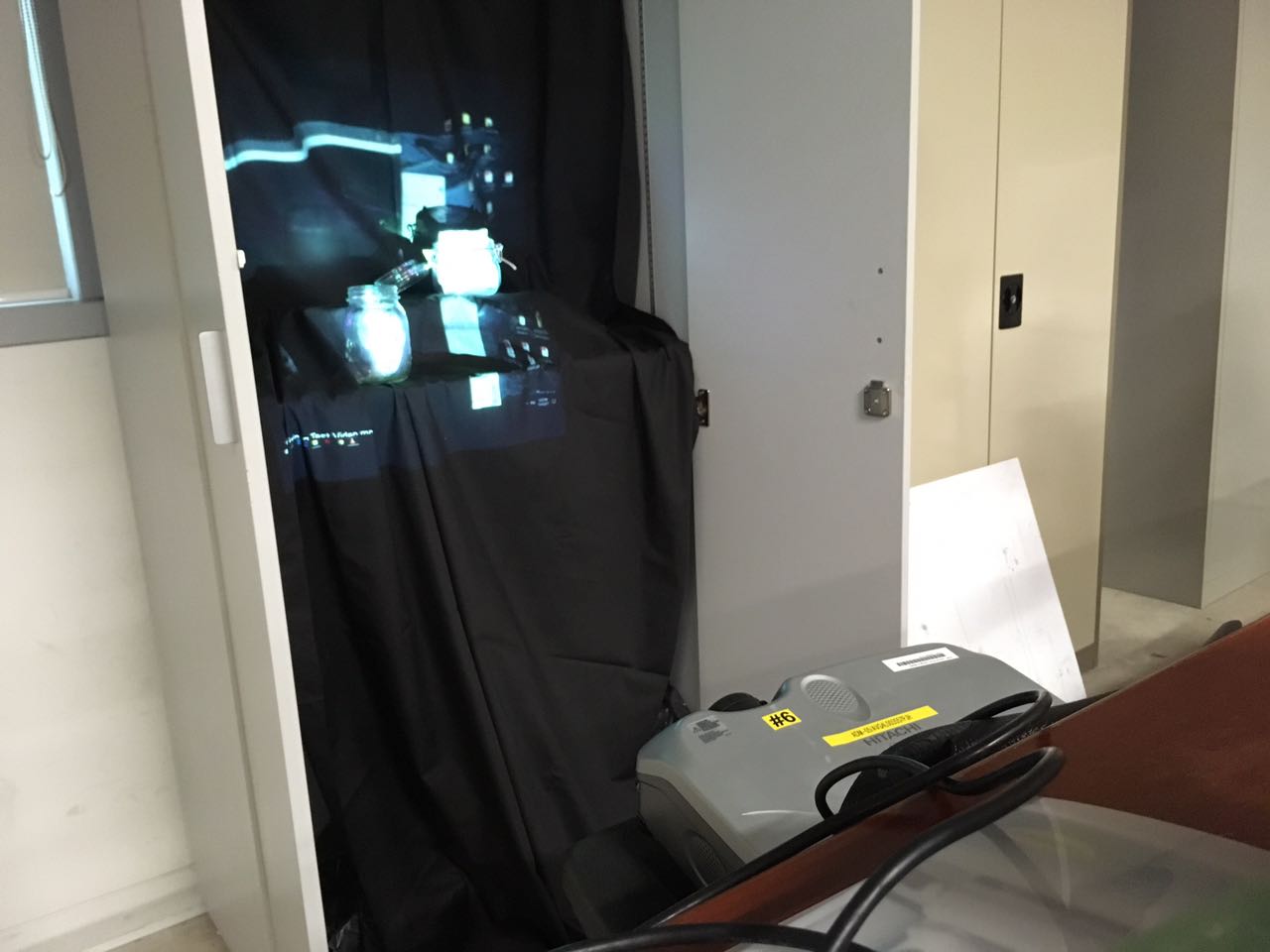
So from our first round of testing, we borrowed a projector and tried playing around with trying to project a video on a jar since that was one aspect of our concept. We also experimented with whether trying to project it from the front or from the back would be better and eventually settled for the front.
Second Round Of Testing

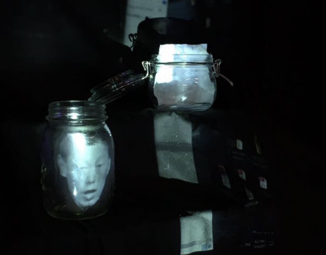

So from our second round of testing, we experimented with many different various ways and mediums. On top of that, since the TCM style of preservation had liquid inside, we also tried to play around to include it in. After few testings it was decided that water would make the image less clear so we decided to do without it. As you can see from the video, when water is added, it makes the projection inside less visible.

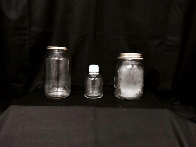
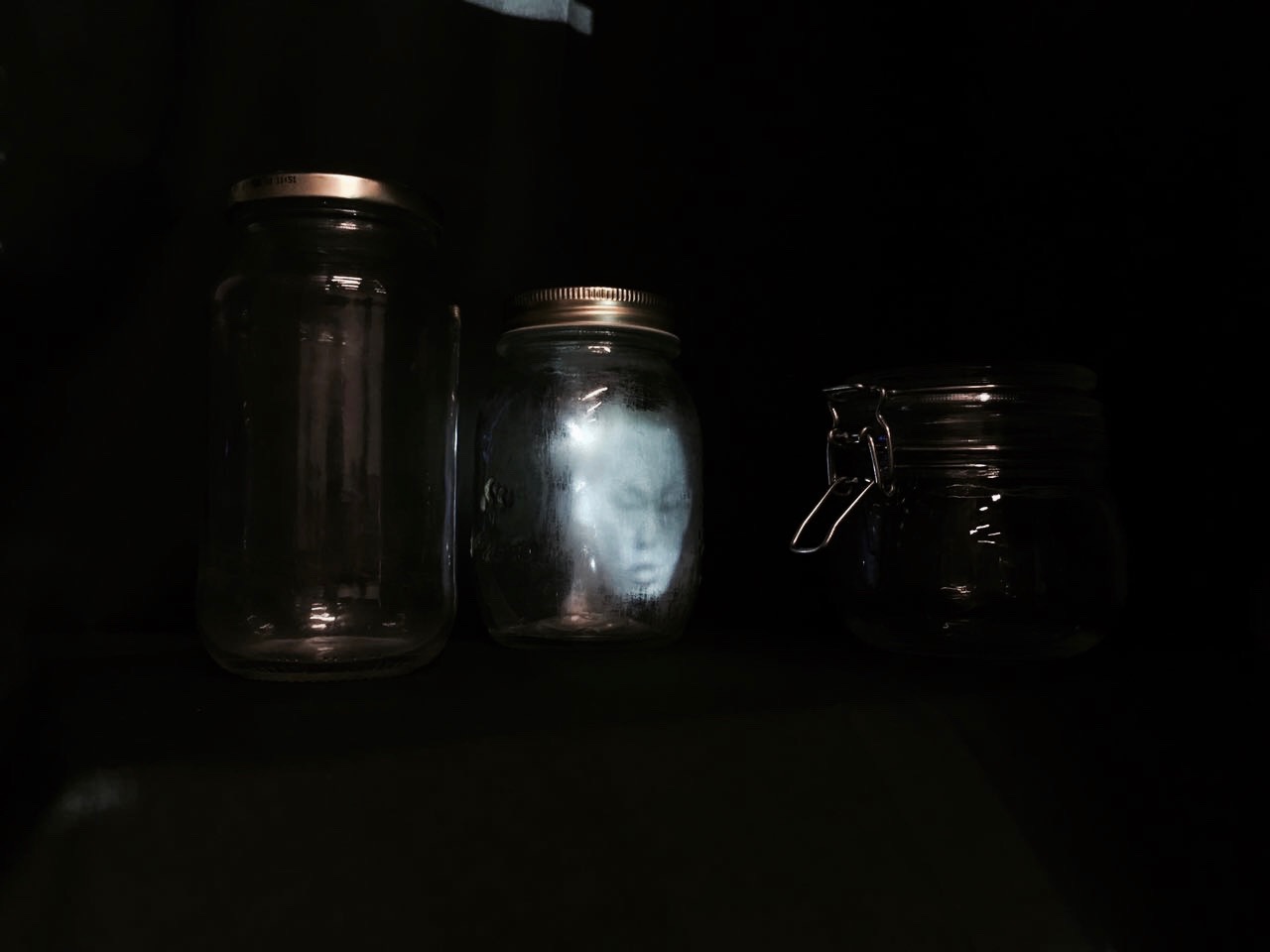
We also experimented with various jars we collected. We decided to collate jars instead of buying them all in a single specific style as we figured it would fit to our haphazard concept better. We tried to keep the style of the jars as cohesive as possible and tried to project both still images and videos and they both seem to turn out fine. We found out that the best way was actually to sand the glass jars on the inside without water. We then settled on placing them in the cupboard in two rows, stacking on top one another.
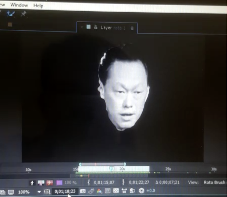
We also tried rotoscoping (one new skill acquired!) So from the rotoscoping it became evident that sizing mattered so we tried to do various sizes to see which fits better.
Final Round Of Testing

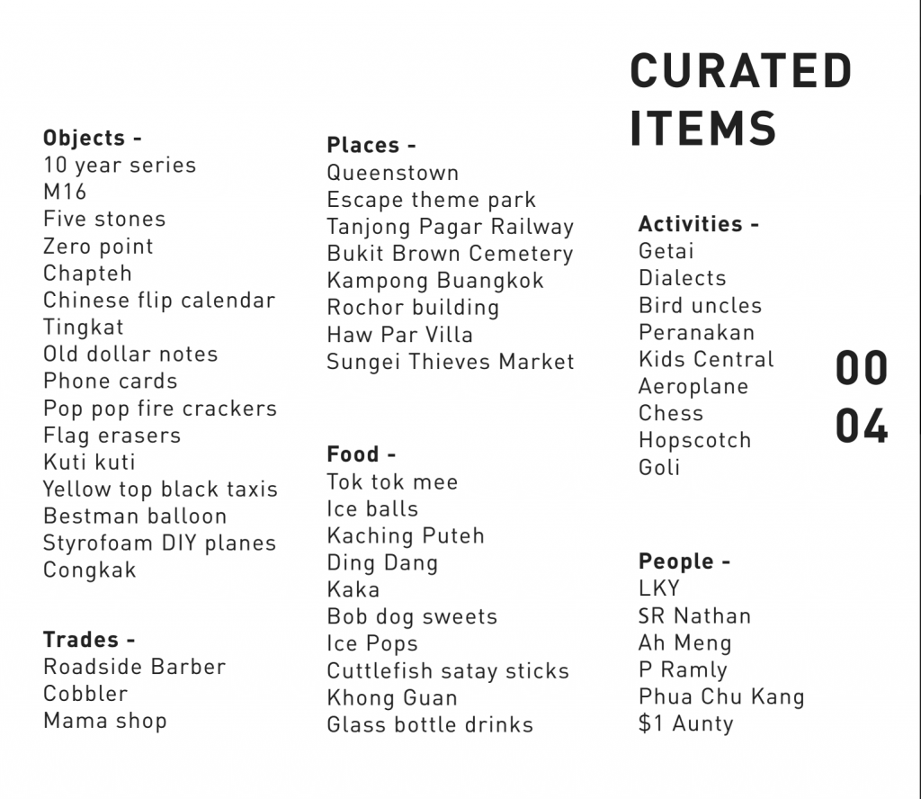
So for our final round of testing, we curated all our different objects, people and places and started piecing them together in after effects. We modified the number of projections in the end with it being 10 instead. How we did it was that one person was in charge of taking note of the projection mistakes and telling where and how much to shift the projection, while the other person was doing it on aftereffects. We also played around with the arrangement of the jars making sure it wasn’t visually heavy and was well balanced. Instead of placing all the jars in portrait format, we played around and decided to leave one or two tilted or landscape. We also placed broken shards of glass around the sides as a concept of some objects can no longer be contained and has vanished forever.
Soundscape
We also completely forgot about the soundscape but decided in the end it would be better if we added in sound of snippets of iconic speeches and songs that brings about the identity of Singapore better. We also curated it in a very haphazard and static kind of nostalgic feeling.
Final Projection

And here is one with reaction from our classmates!
Overall the audience felt very pitiful and sad upon watching our installation as they felt like it was such a waste that some of these items are no longer here in Singapore and that our generation was sort of lucky enough to embrace and experience all these objects, people and places.
Despite such feelings, there were those that felt that there was a sense of happiness in it too, after being reminded about the memories they have attached with these objects, people and places. There were a lot of happy reactions when snippets of their favourite tv show songs played. There was also a feedback how this entire experience felt like a community of people watching tv together on a small screen.
An interesting feedback was how these jars were very curated to a certain generation in Singapore. Given another generation if we were to say our parents or grandparents, it would in a sense be a whole new set of jars. Overall the new skills that we learnt such as rotoscoping, projection mapping and also even the conceptualising of our project were very benefitting and such a fun project to do!
Thank you for viewing!
CONCEPT
Moving towards the final of the zine project, I was using the different colours hidden deep behind the concrete front of Geylang as my main concept. The concept behind the zine was that how these small coloured areas are reminiscence of what left of the vibrant culture of Geylang that we knew. I got more inspired when I saw more images like these.


CONTENT
I decided to add in poetry to accompany my photos as I felt that it would suit my zine better than just writing texts inside. I decided to base on the familiar song “Geylang Sipaku Geylang” and have my take on it. To me the song was somewhat like an invite to go back to Geylang together in a very lively and homely kind of way. So my poetry included a bit of Malay.


CURATING PHOTOS
My past photos only showed architecture so I figured if I added a character inside, it would add more narrative to the zine. So with the help of a friend, I asked her to help make my photos more curated and almost as if she was discovering through these coloured places. I decided that I would only show different parts of her body so the main focus would be only the colour and architecture. I also edited the photos to bring out the colours more in photoshop and to get rid of the unnecessary elements in the photos.


I also decided that it would be fund to curate the colours of Geylang into a Pantone kind of way. I found inspiration from this local photographer, Jonathan Tan. So what he did was to classify the different places in Singapore into their iconic colours. So here is my attempt on my own!
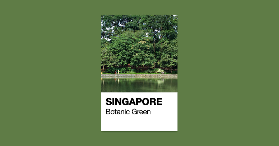
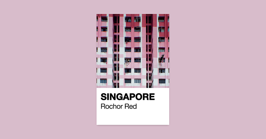

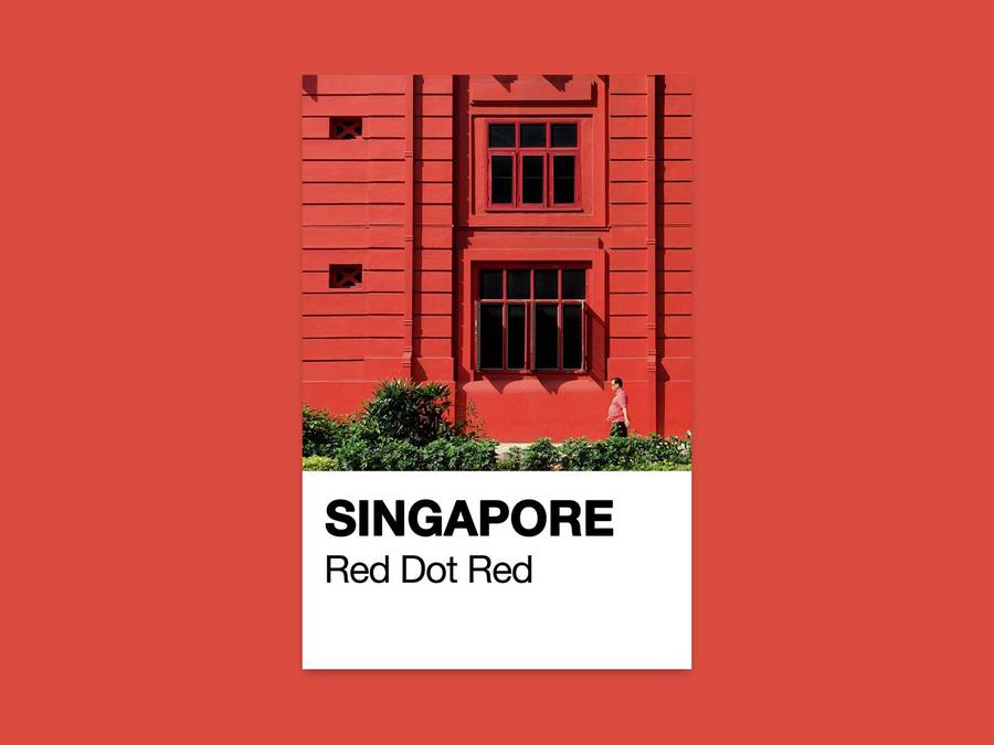


Attached is my zine! Geylang Pantone
One thing I have learnt from this project is to learn how to really curate photos and due to the restriction of the zine, how to best fit the content into minimal number of pages. I am looking forward to inputing more on what I have learnt about layout, typography and images and how to benefit from them into my future major!
Thats all!
So here is the breakdown on some of the progress we made with regards to our installation on the sense of our starfish-nemo-anemone!
SCENT
For the scent portion of our installation, we decided that we would be hanging a contraption that once pulled it would release a powdered scent. We initially wanted to be more like a trip-over-a-string thingy and suddenly poof the scent comes out but we figured it that method could only be done once. Instead this way, it would allow to be done repeatedly.
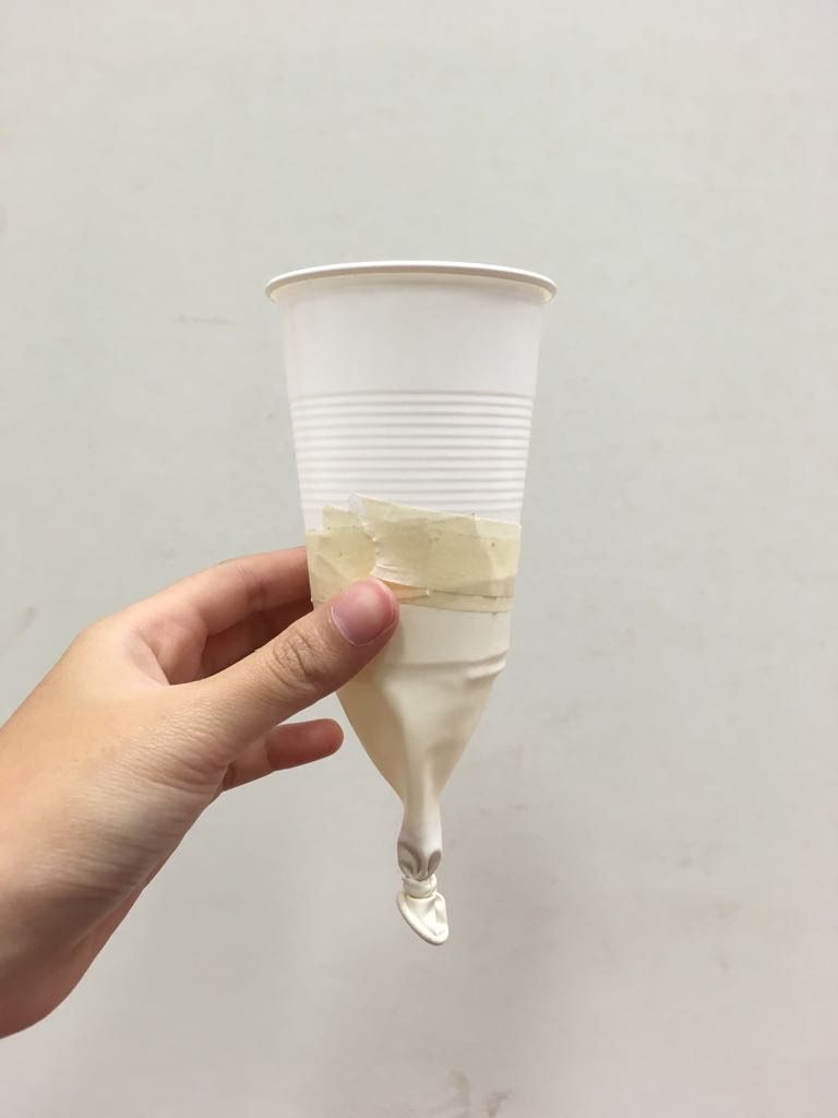
As you can see here, it is basically a slightly cut balloon taped to an open end of a cup. Inside the cup for this case was baby powder that was sweet smelling. Tugging and releasing the end of the balloon slightly would release the powder in mid air and allow the scent to be released!
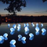
SIGHT
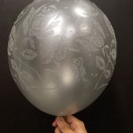
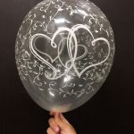
The sight portion of the installation ties in with the scent portion as little as there was an added idea whereby the cups would be painted with luminescent colours, and would hang in mid air. Upon seeing these blobs of light from afar, the user would move towards it, and try to reach for them. There would also be stationary white balloons lighted up by LEDs dimly all around. We also tried out and see different aesthetics of ballon to see what would fit out theme, but we settled with normal plain white ones!

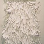
TOUCH
As for the touch, we were inspired by this video of how a balloon contraption moves on the internet. A piece of balloon simply stuck on a CD and due to the pressure, it moves in a very anemone-ish kind of way!
We experimented and tried with different way but we figured that it wasn’t the most reliable method for the movement. We realised that the surface of the floor and also how heavy and wide the base was played an important part. So this is the more mechanical method we found that we would try out!
So the idea would be that these little things would be attached with balloons and feathers and would be wiggling about on the floor dancing as touching and tickling the legs of the user as they walk through the space. This would also be the surprise anemone essence of the installation.
Also upon reaching for luminescent cups as mentioned above, the users would be tingled by a small metal ball/fuzzy object at the tugging portion, before pulling it.
Overall our installation would be in a dark room, with the kind of white playful aesthetic feel to it with a tinge/speck of colours in the room.

Moving on into our final project, we were told that we could make reference to either one of our previous projects that we felt we liked and to me, it was the alter ego. I realised that I’m more into towards the sense of discovery of one’s self and decided I would focus my research for the next project a bit more into that genre.


Everyware –
Cloud Pink is an interactive installation by Everyware. Everyware is a creative computing group by Hyunwoo Bang and Yunsil Heo. The duo mainly do works that appeal to the human action, user interface and speech. Their works always consist of something that appears merely normal on the surface such as a projection or sand, however invites the user to come into contact with it without providing any specific details. Upon interacting with the installation it gives them a sense of discovery of what is possible.
I feel like their installation always taps into your inner child like behaviour towards nostalgic and dreams, such as cloud pink. The feeling of stretching out as the child and wanting to reach into another world that is represented by the clouds. These of fabric as opposed to just a flat wall to interact with also puts into place everything nicely. Their installations may be simple with only a purpose but it always has that sense of play and discovery about one’s self.
Honey Leong & Prue Stent –


Moulding is a performance art piece by the duo Honey Leong and Prue Stent. Throughout this series, they deal with how the fluidity of materials interact with one’s body in the landscape. Generated spontaneously the wrapped bodies play with the idea of classical human forms and statues, making them dynamic, transient and ambiguous. The use of shrouds generates a sense of playfulness and freedom that comes with anonymity and acts as an expansive and weightless extension of the body. However embedded within their otherworldly beauty is also a sense of suffocation, restriction and alienation.
Majority of their works play with the discovery of the human body against various landscapes and material and though it may be a bit too gritty for some users due to the rawness of the human body, as for me, I feel that using the body as a medium to explore the perverse curiosity to interact with the allure of materials and objects. Their results are often unexpected and playful. It makes me question in what other ways can the human body be discovered within a constricted space, time and body.
Peter Campus –
![]()

Three Transitions is a video art created by the famous Peter Campus. The video consists of three short exercises or “transitions” in which he employs different visual and spatial effects. Throughout the video, he himself displaces and superimposes takes of his own body, which he makes interact with each other using chromo-key techniques. He deals with a lot of self-transformation and the body identity in his works while using a lot of studio camera work and video technology.
I like the idea of how he uses his own body as a paradoxical space and as a medium of self discovery though different reflections or mediums. I think it would be interesting to see how one’s self can be displaced in various ways in different spaces and the effect it will take on for the user interacting with it.
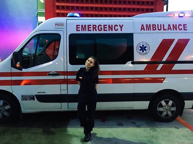
Being A Lifesaver (please use headphones)
Artist Statement
Immediately upon hearing how interesting it was to do a sonic portrait someone, I immediately thought of my very close friends that works as a paramedic. I have always been fascinated with the different types of cases she always told me whenever I asked about her job and they never fail to surprise me. She alway claim to have “seen it all” or “the worst possible” so for this project I thought I would make the listening feel what it feels like to be here. The ambulance siren is something very familiar to us all, however there are certain sounds in the soundscape that may seem bit odd, however has a very specific meaning. That if only you are experienced in the field, would know what type of case the paramedic is handling.
Research and Concept Development
So it was very exciting to start researching on the different sounds. AND as it turns out there is a specific signal/coding that they will play to alert the alpha/ambulance that they have been assigned to handle a case immediately. The coding here is the original sound recoding from the fireboats that I was lucky enough to have my firefighter friend record for me! I have never heard this before so it was very interesting.
So upon planning out the sequence of the sounds, I decided I would give the listener a little tidbit starting of the victim so they would have a head guess what the victim did. I then decided to put a short pause before transitioning to the paramedic portion.
Upon interviewing my friend, it seems that there is a lot of talking that goes on while they are on the way to the scene of the patient, however words would give way what happened to the victim so I decided to take it out and then just leave in as much sound effects as possible.
It was so fun because of the naturally chaotic scene, to play around with the left and right panning of the soundscape! So played around and decided to edit a lot into the panning to make the listener feel more affected 🙂