

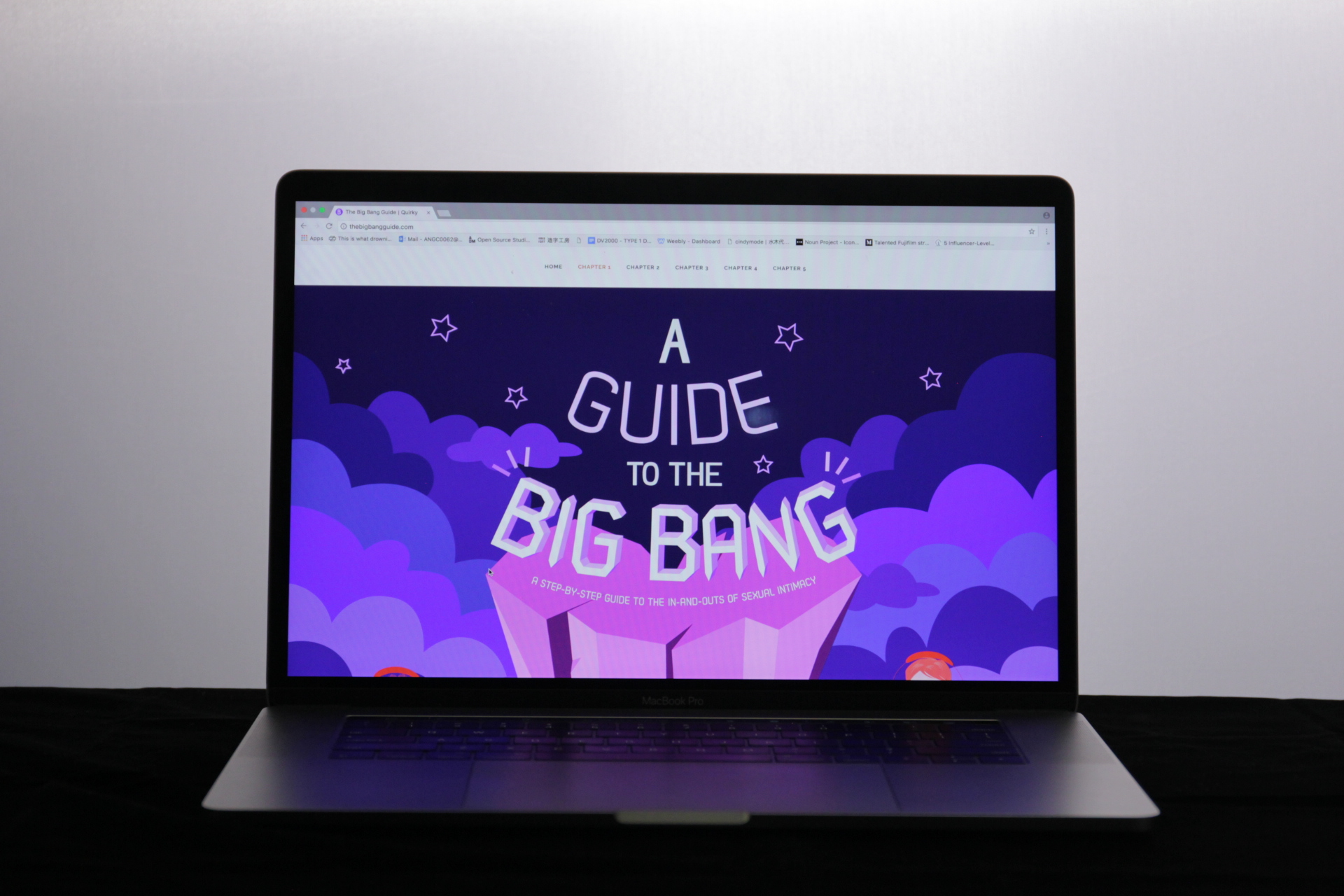
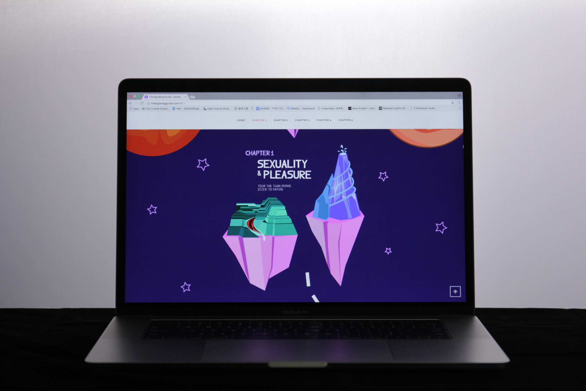
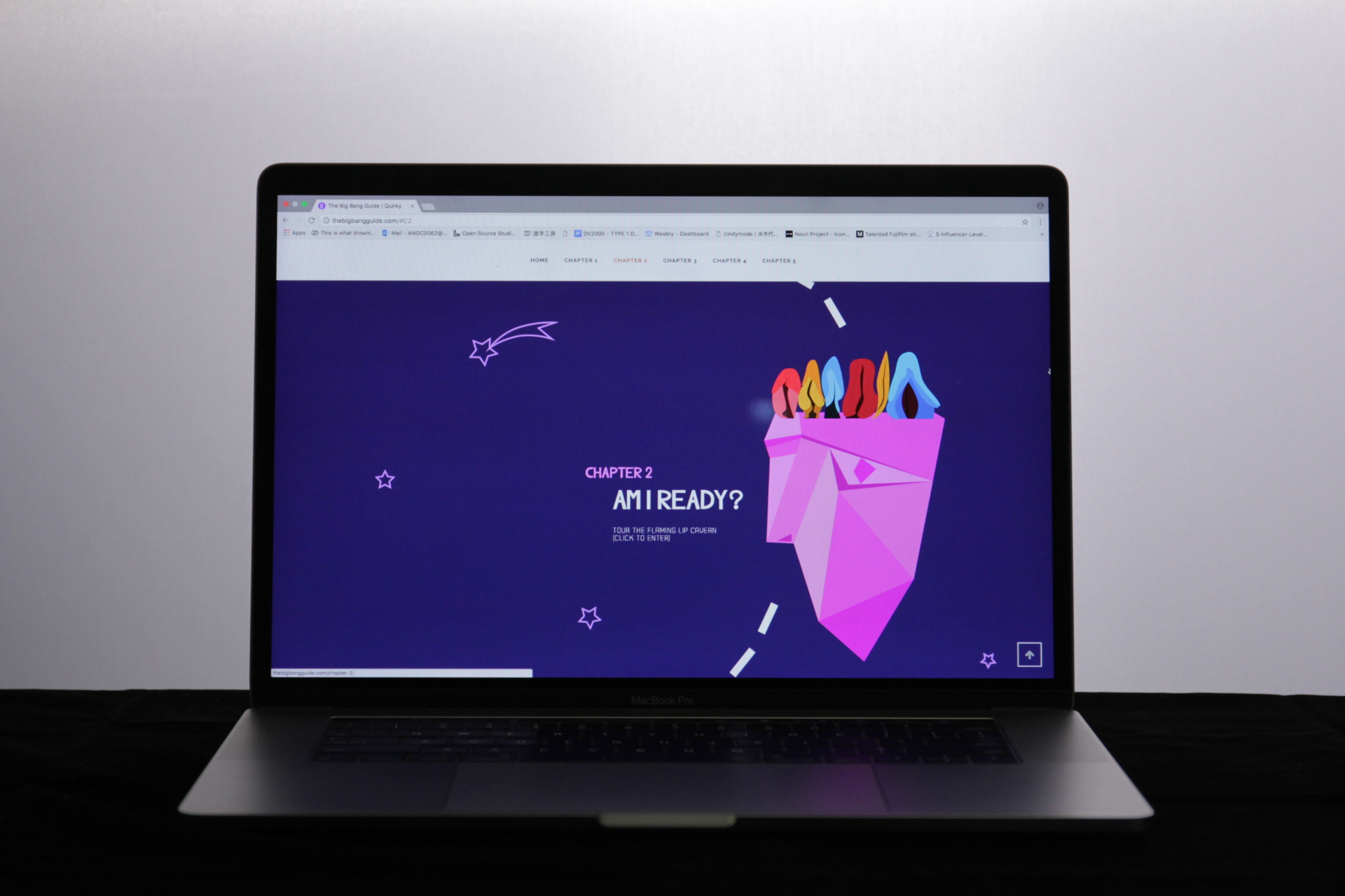
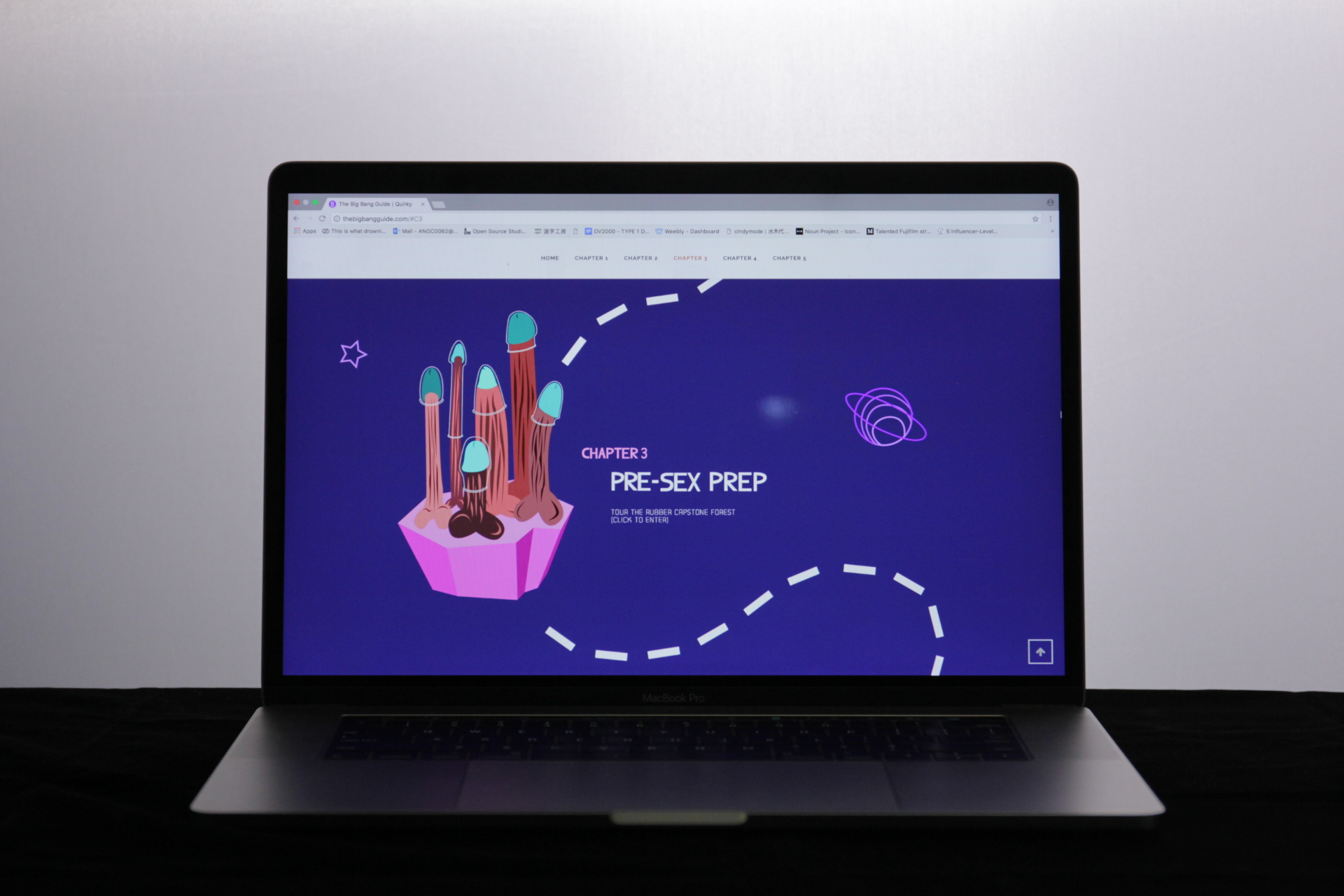
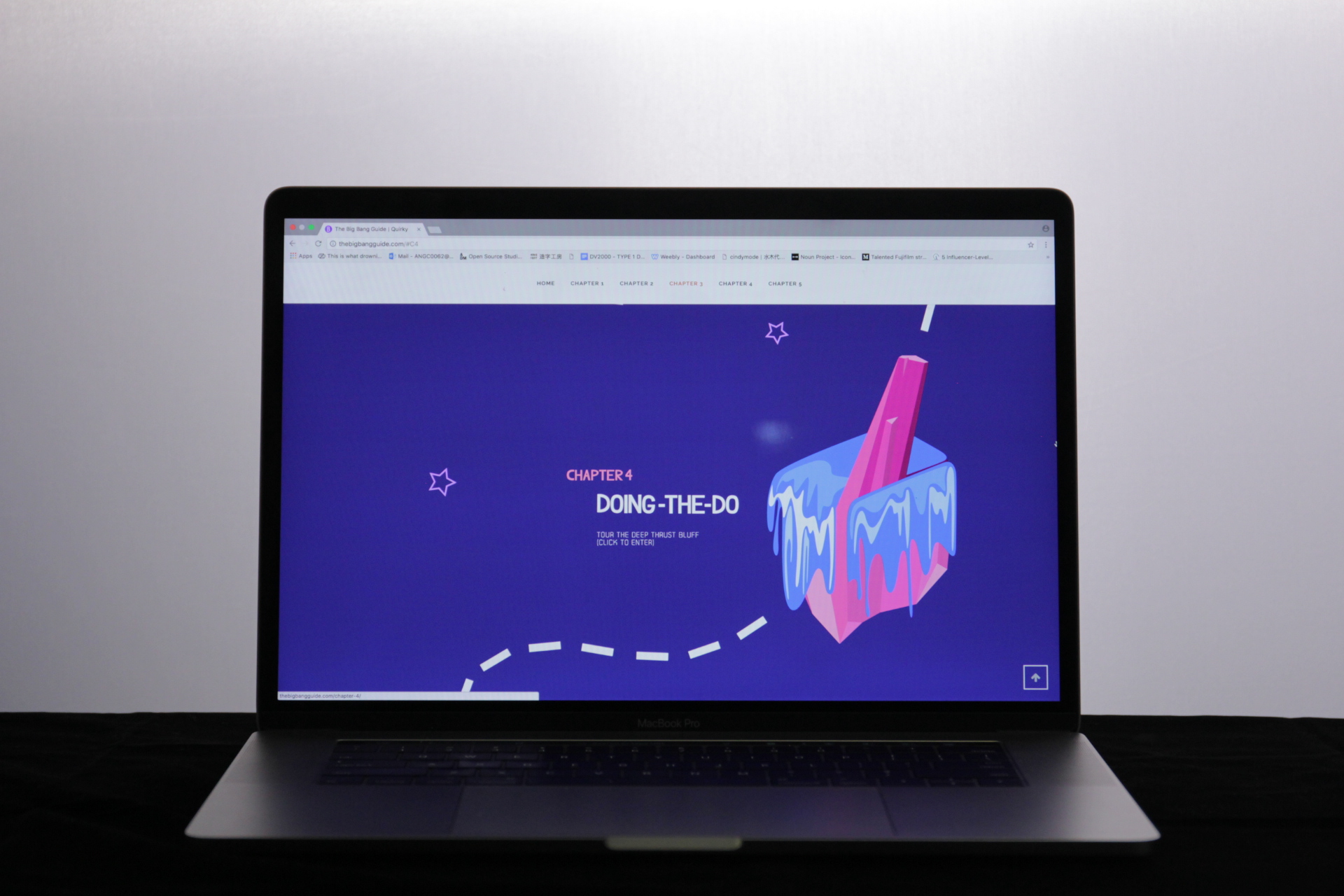
Live site can be seen at thebigbangguide.com. (Please view on desktop, full screen format, mobile version not coded yet.)
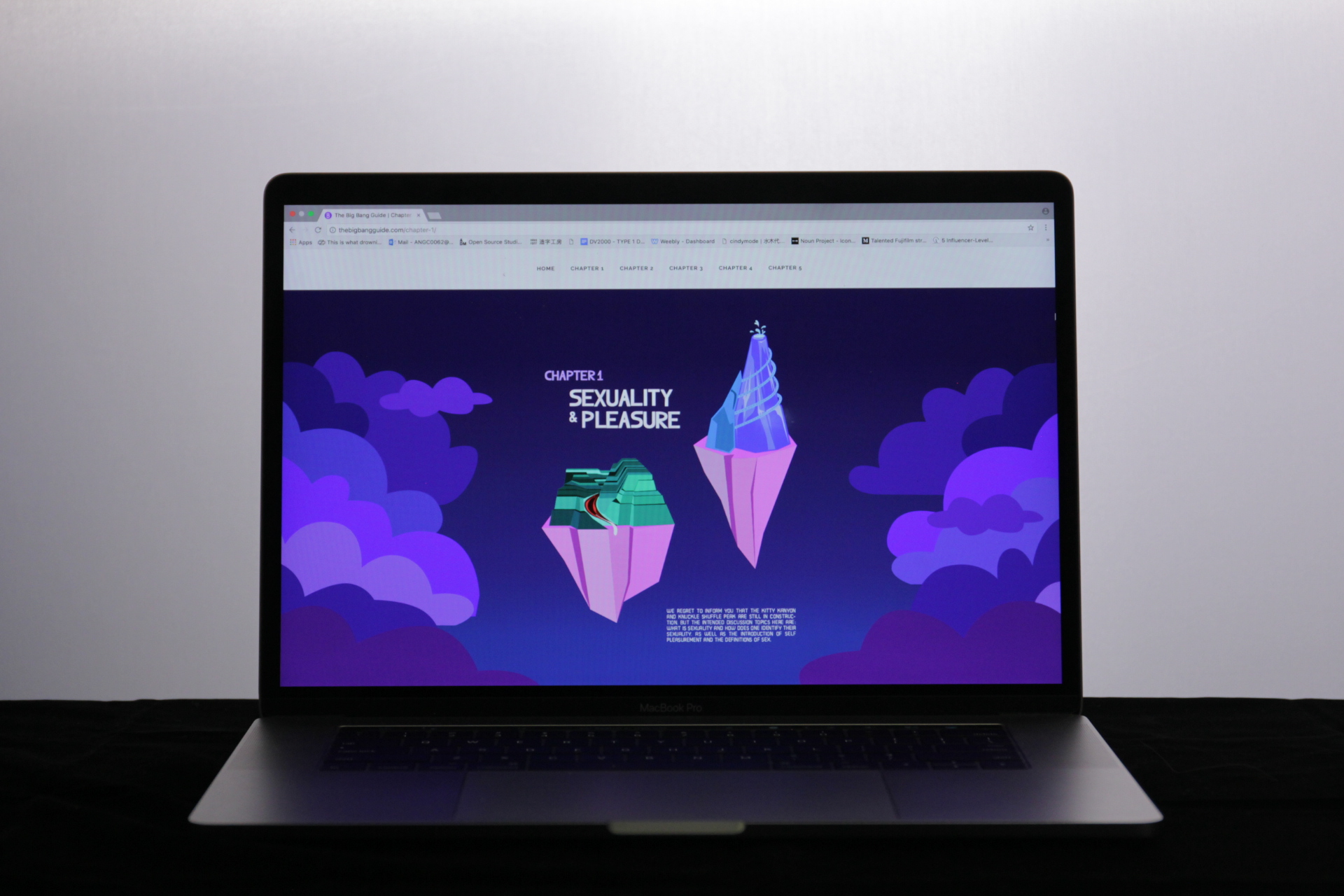

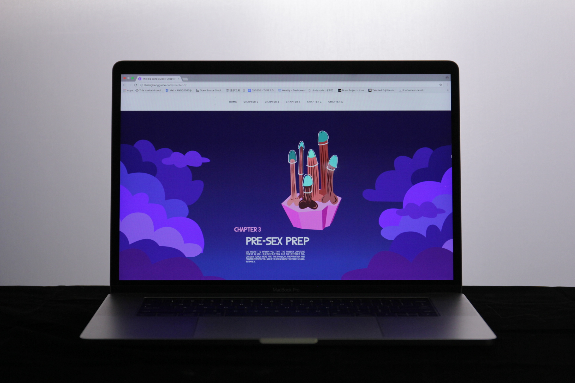
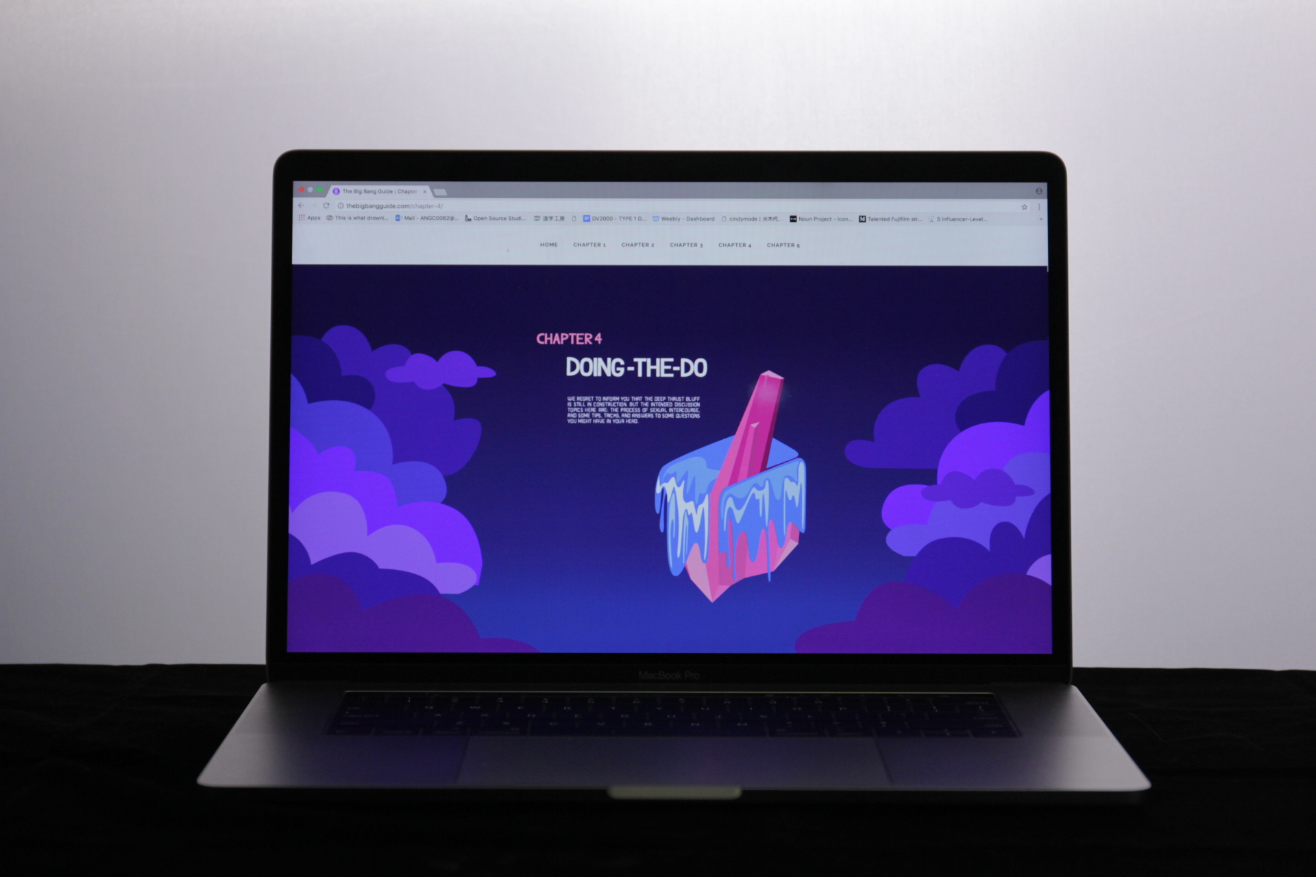
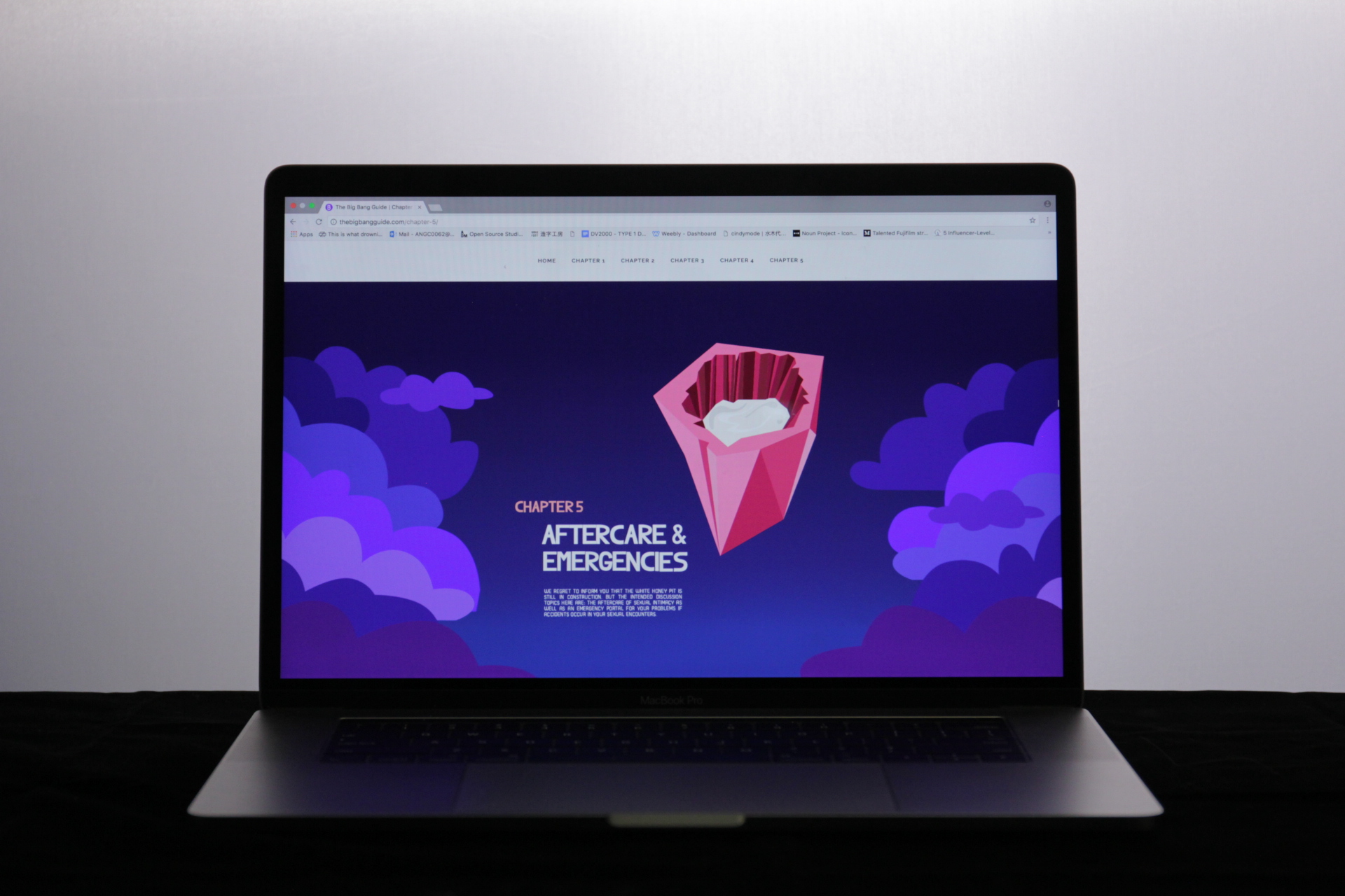
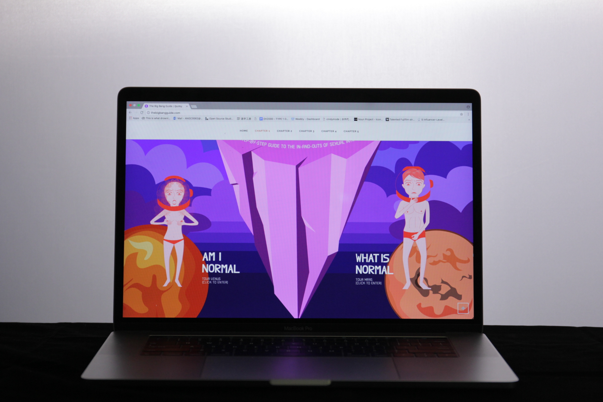
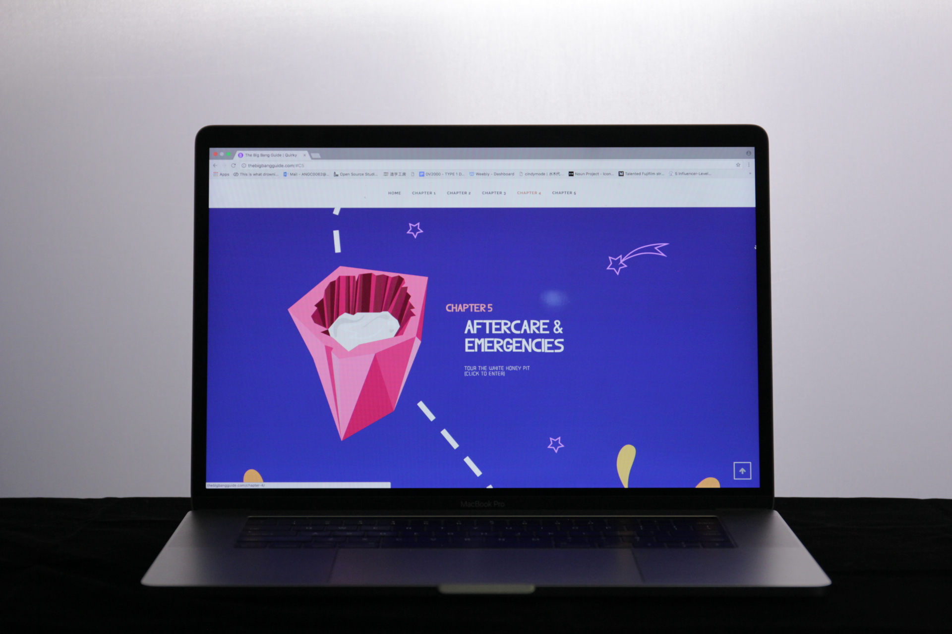
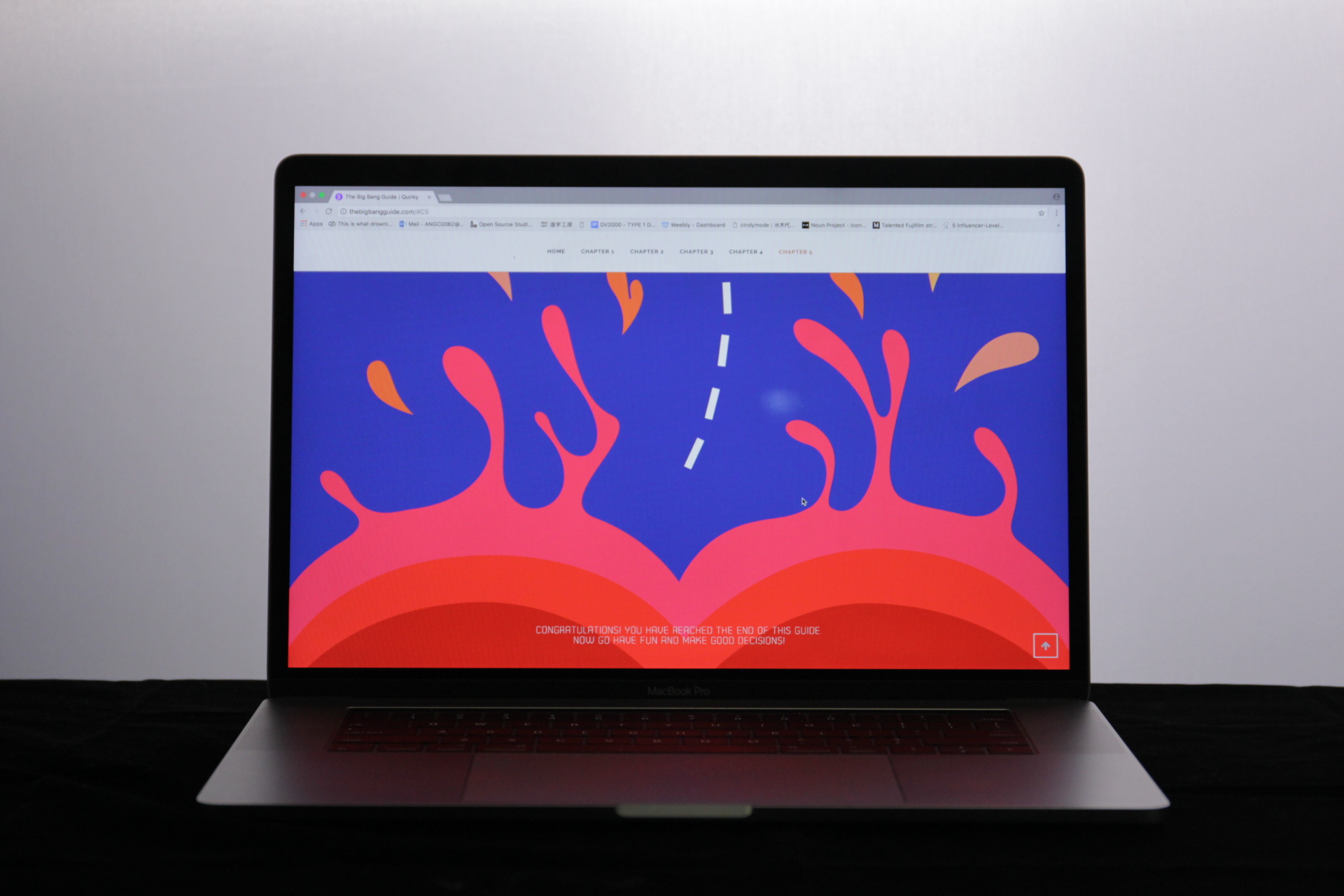
In the second project, I initially wanted to do a kit of some sorts or a publication. However, my target audience is mostly on their phones and online, thus, I decided to do a website instead. I wanted to go along with the theme of the infographic. The space themed, and at 3am I was thinking on how to do the layout when it hit me that I was going to do it in a game-like way, with different islands to visit.
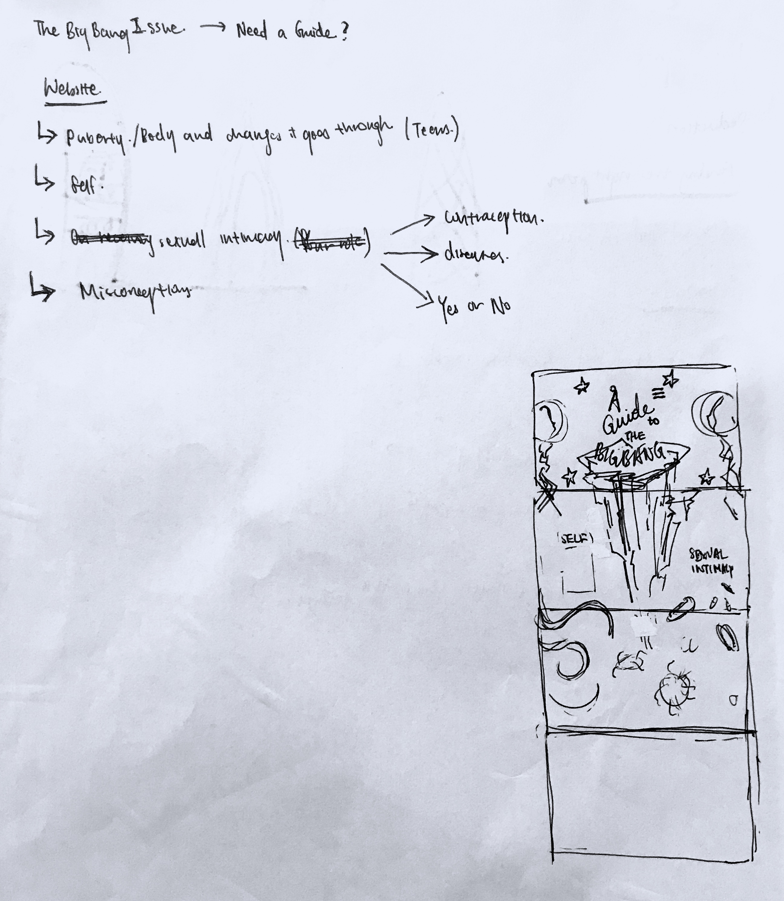
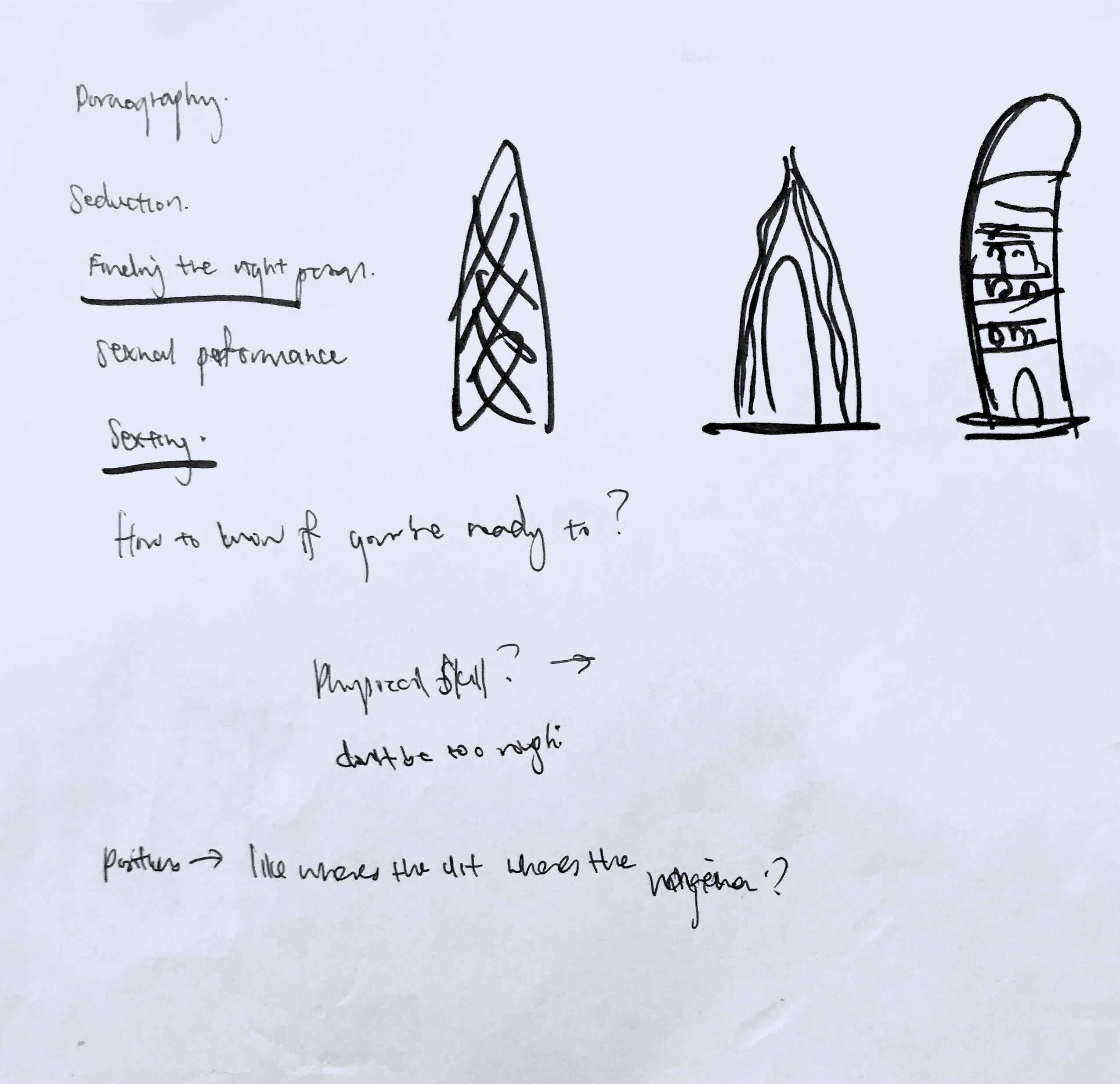
Thus, came layout and graphic planning. (The images are in chronological order of how they were conceptualised)
Initially I wanted to present my website in print format. But after the last consult with Michael he suggested I make it live. Even though it was extremely challenging, I am glad I undertook the challenge. There was so many restriction and resizing issues.
I’m grateful my friend introduced and gave me a crash course on how to use it. But due to the nature of my graphics and the placement, in the end I still struggled a lot on how to get it done with what I learnt about the wordpress.org builder.
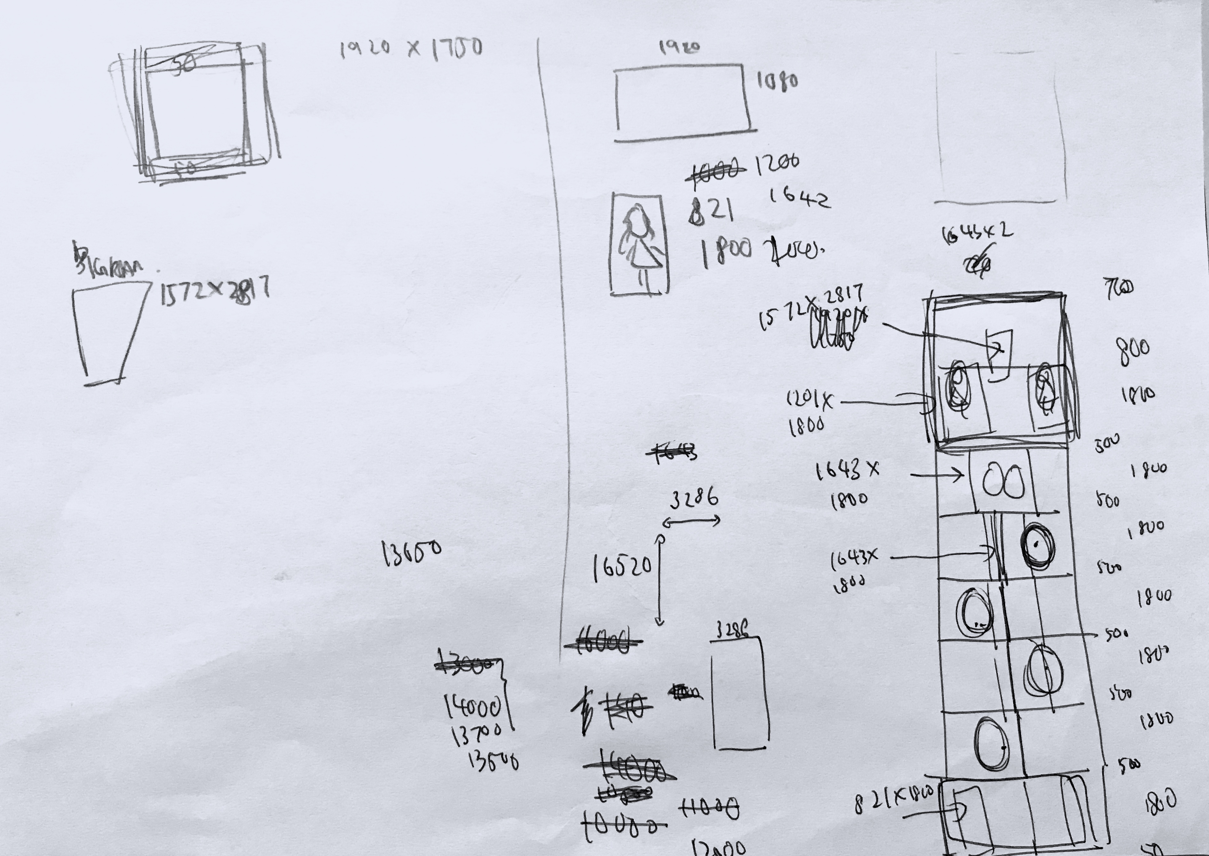
Look at the amount of math I had to do to give myself more playing space. Super proud it actually materialised.
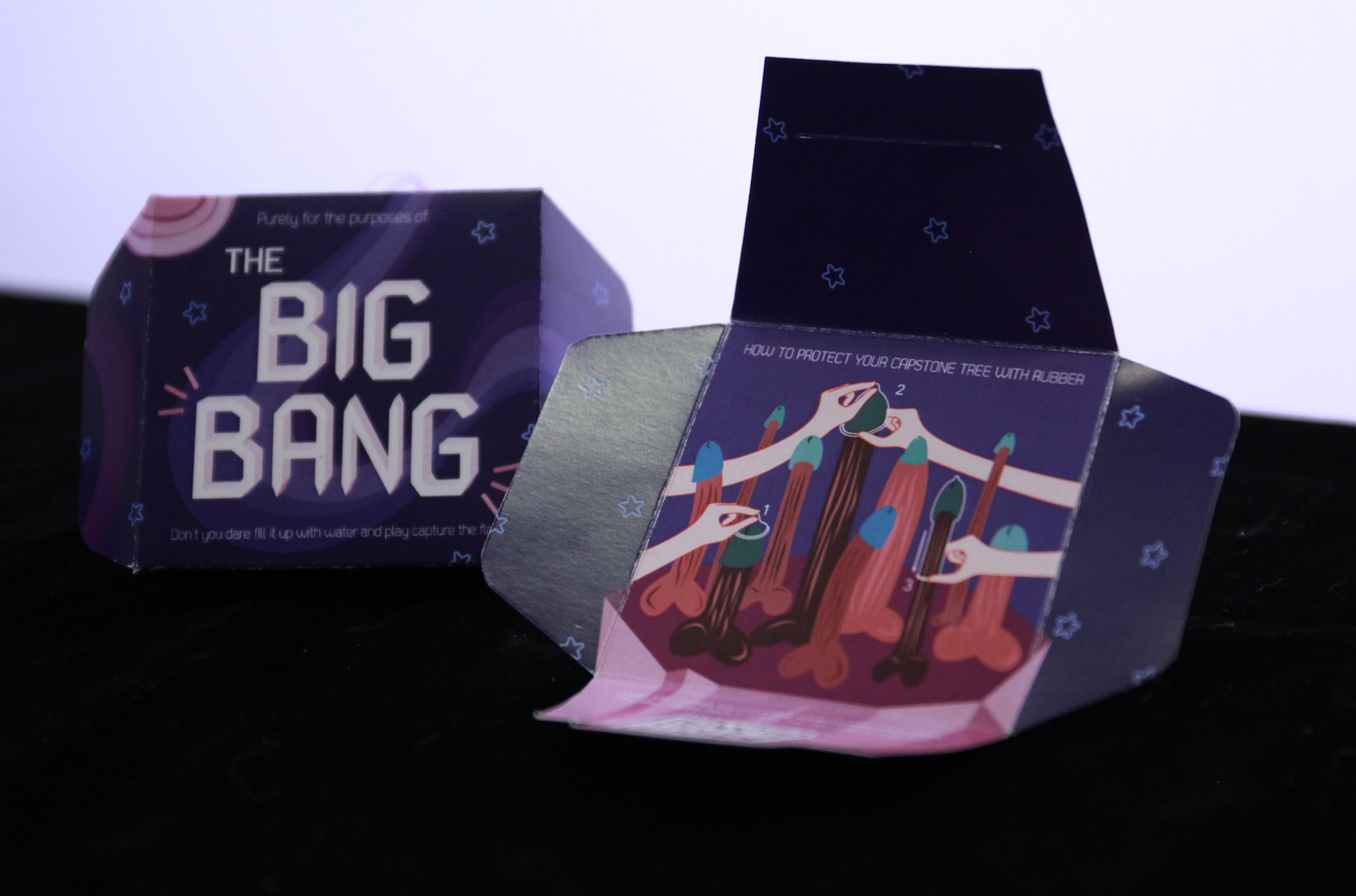
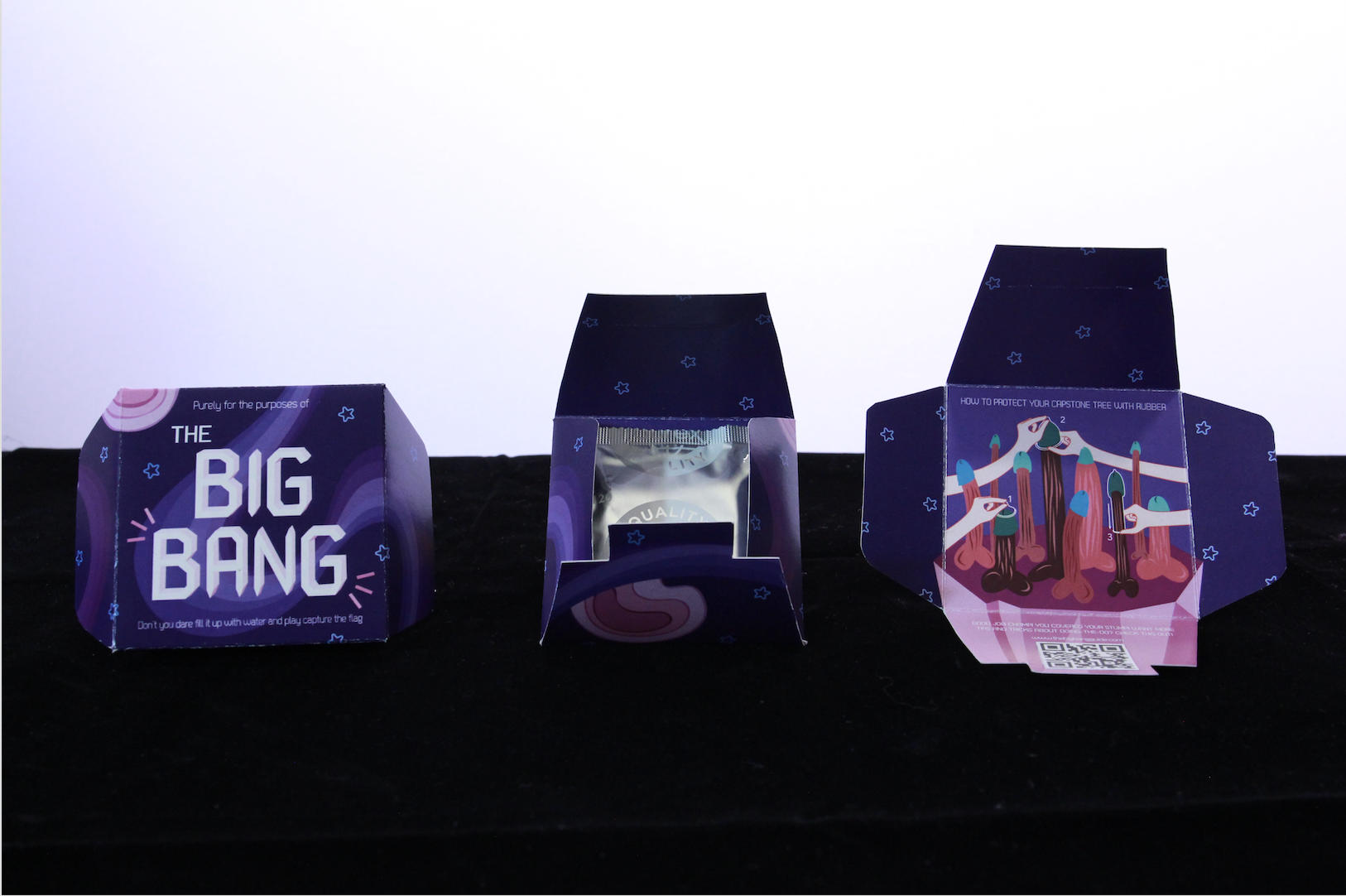
For the second article, Michael suggested I do something to promote my item. Intially I was thinking of crazy ideas like art installations. However, after consult, I realised it was really a bit farfetched. Thus, it was reduced to a standee. But I felt like there should be something given, so at the last last stretch, inspiration came for a condom packaging. Choosing to place the graphics I have on my website onto the packaging I was hoping it’ll attract the users to visit my website.
All in all, I am satisfied with the risks and challenges I undertook for this project. I tried website building and product packaging, two things I’ve never done before.
After narrowing my topic down to sex education, I decided to so some research on the topic.


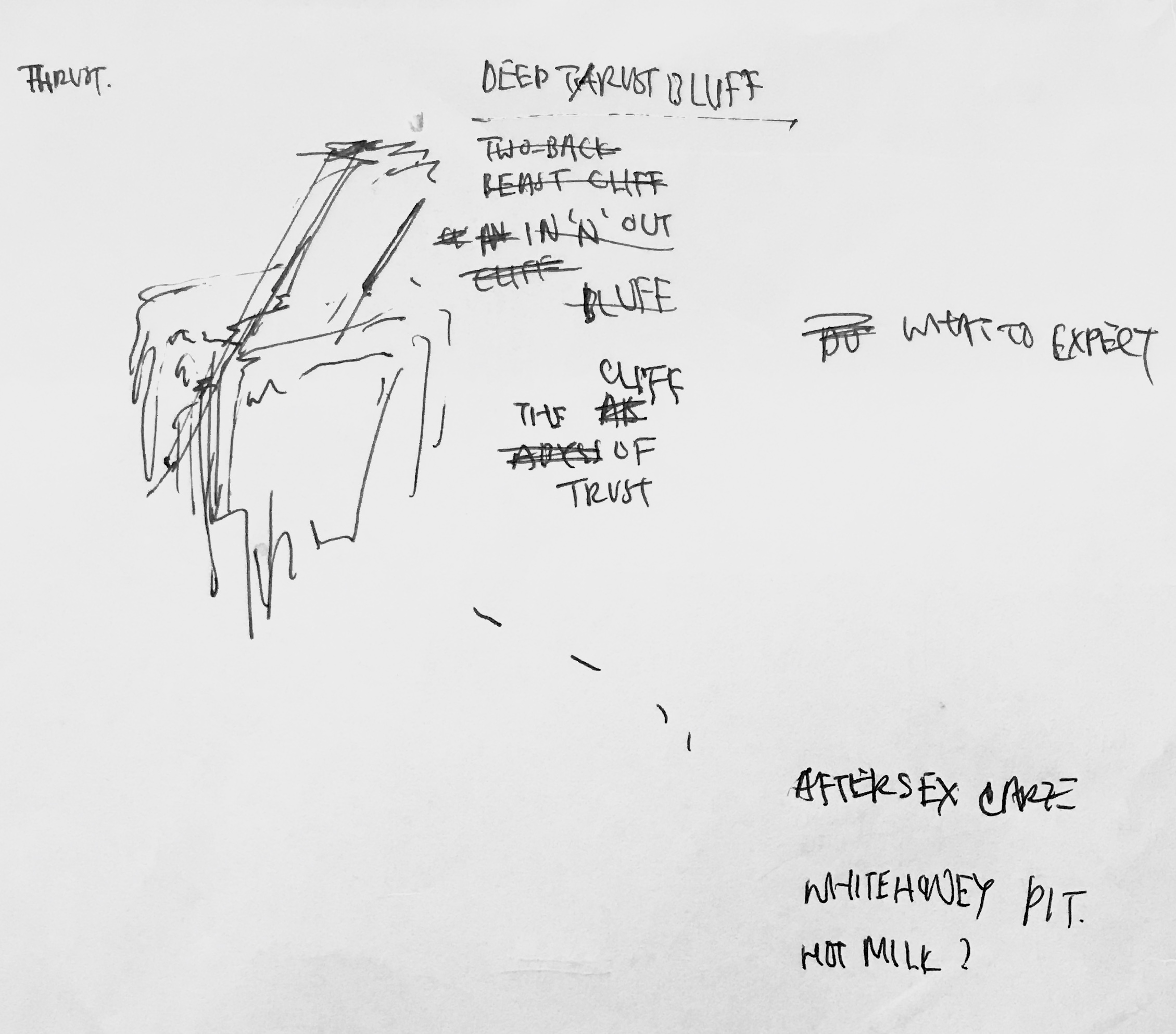
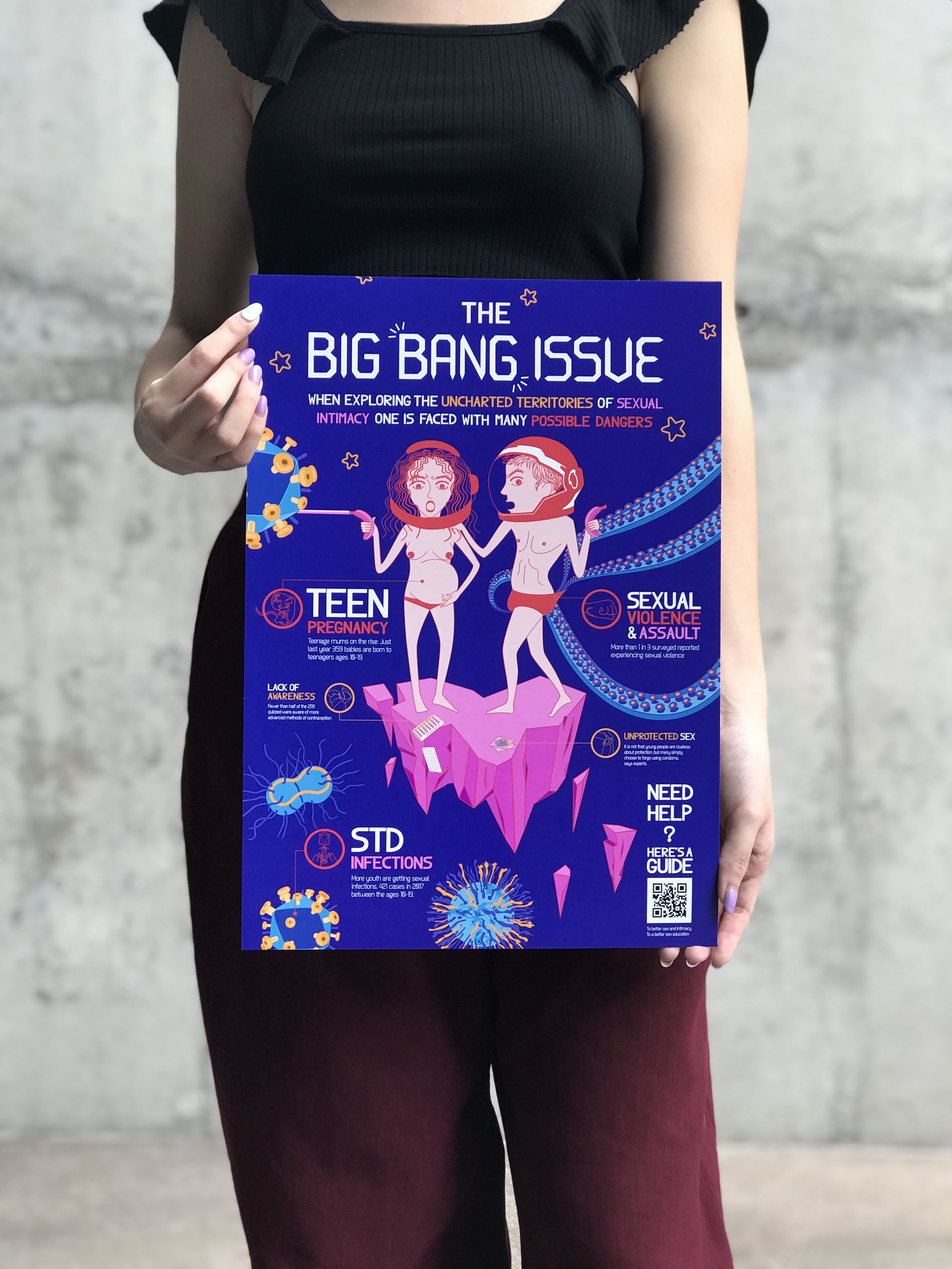
I read an article on how to make a good infographic, and I realised that infographics are not about cramming information into a graphic, but about sending a general message through cleverly chosen and presented information. I sifted through the amount of information and statistics trying to figure out how to organise them into an infographic that could send a message.
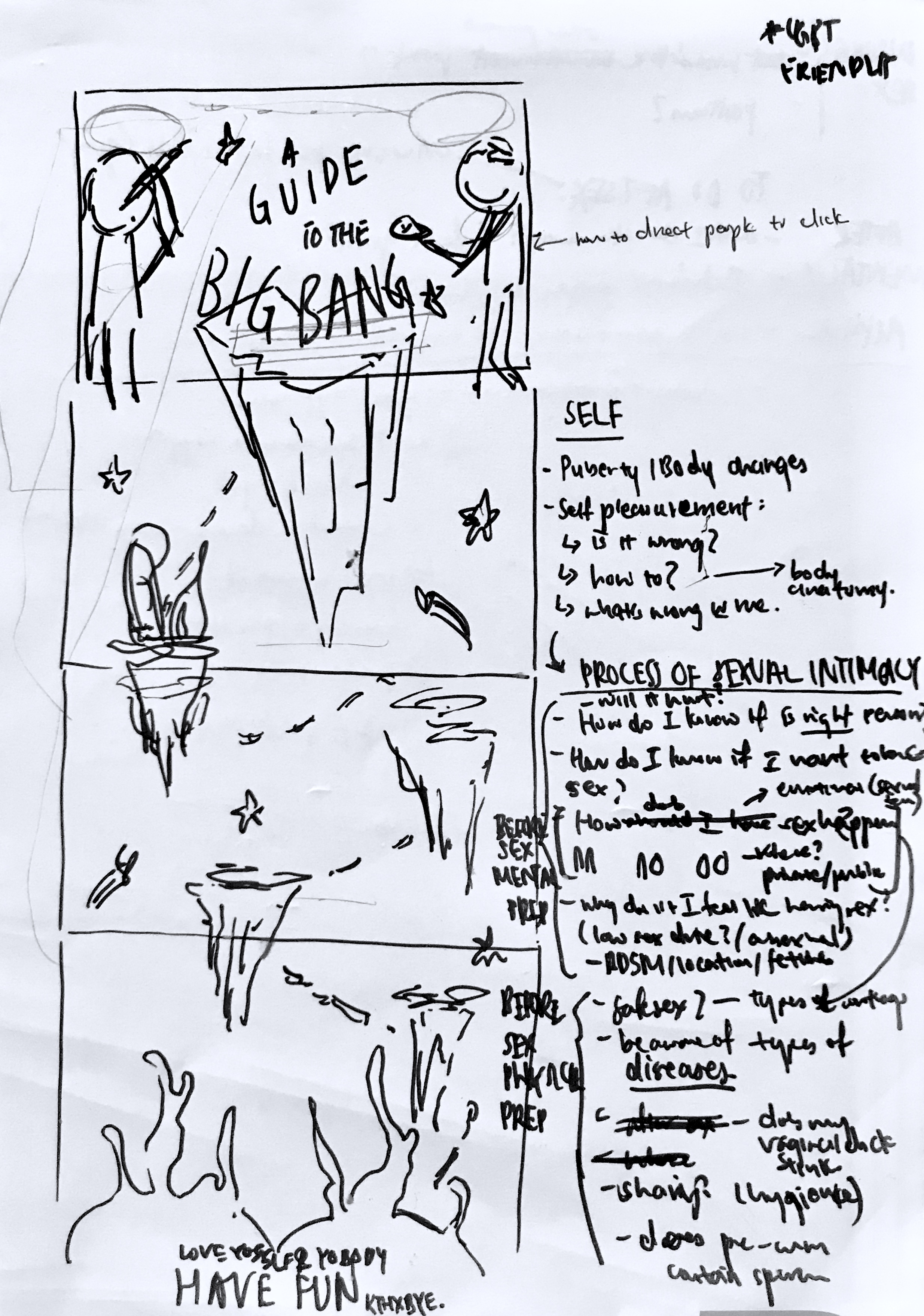
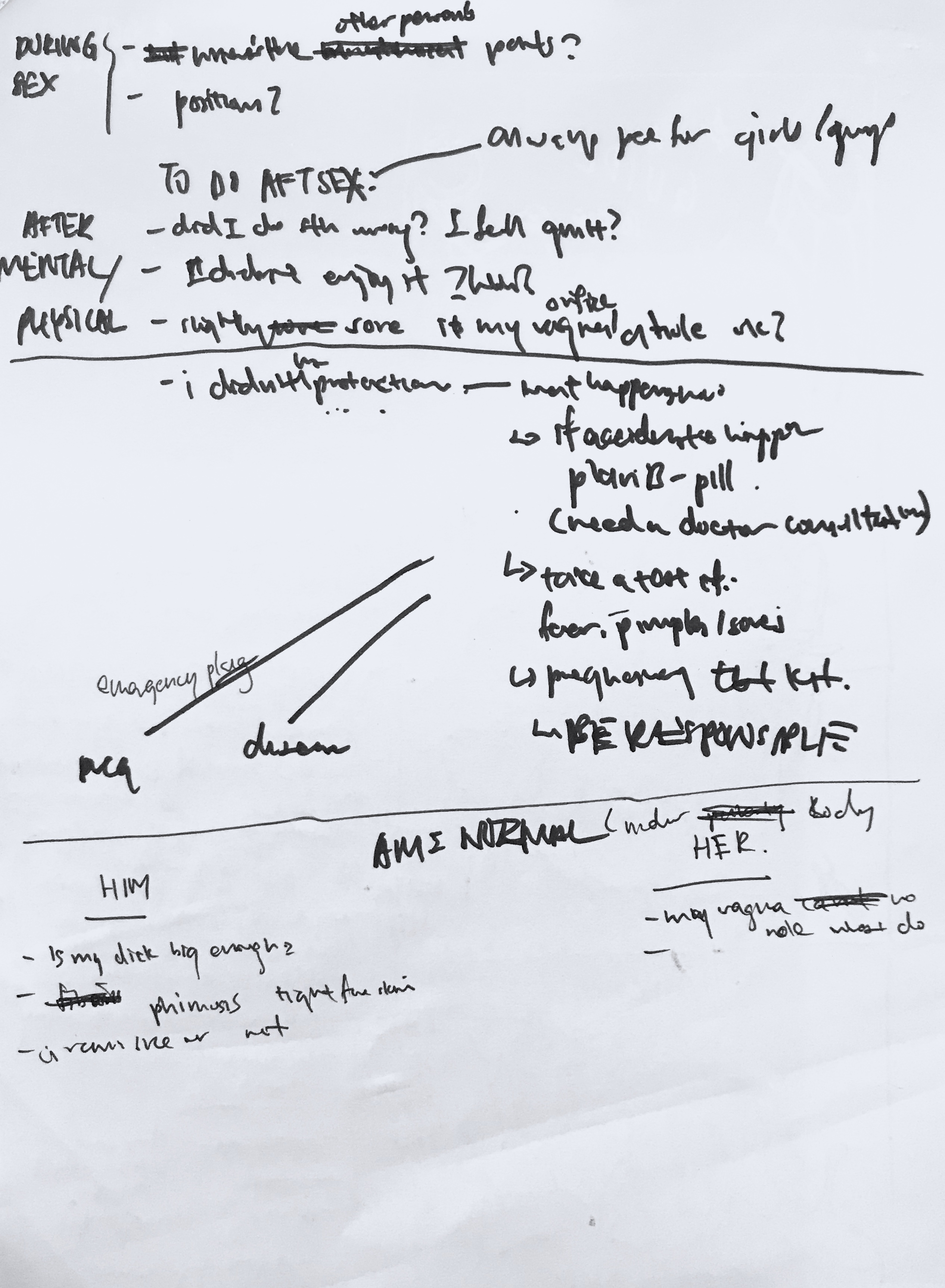
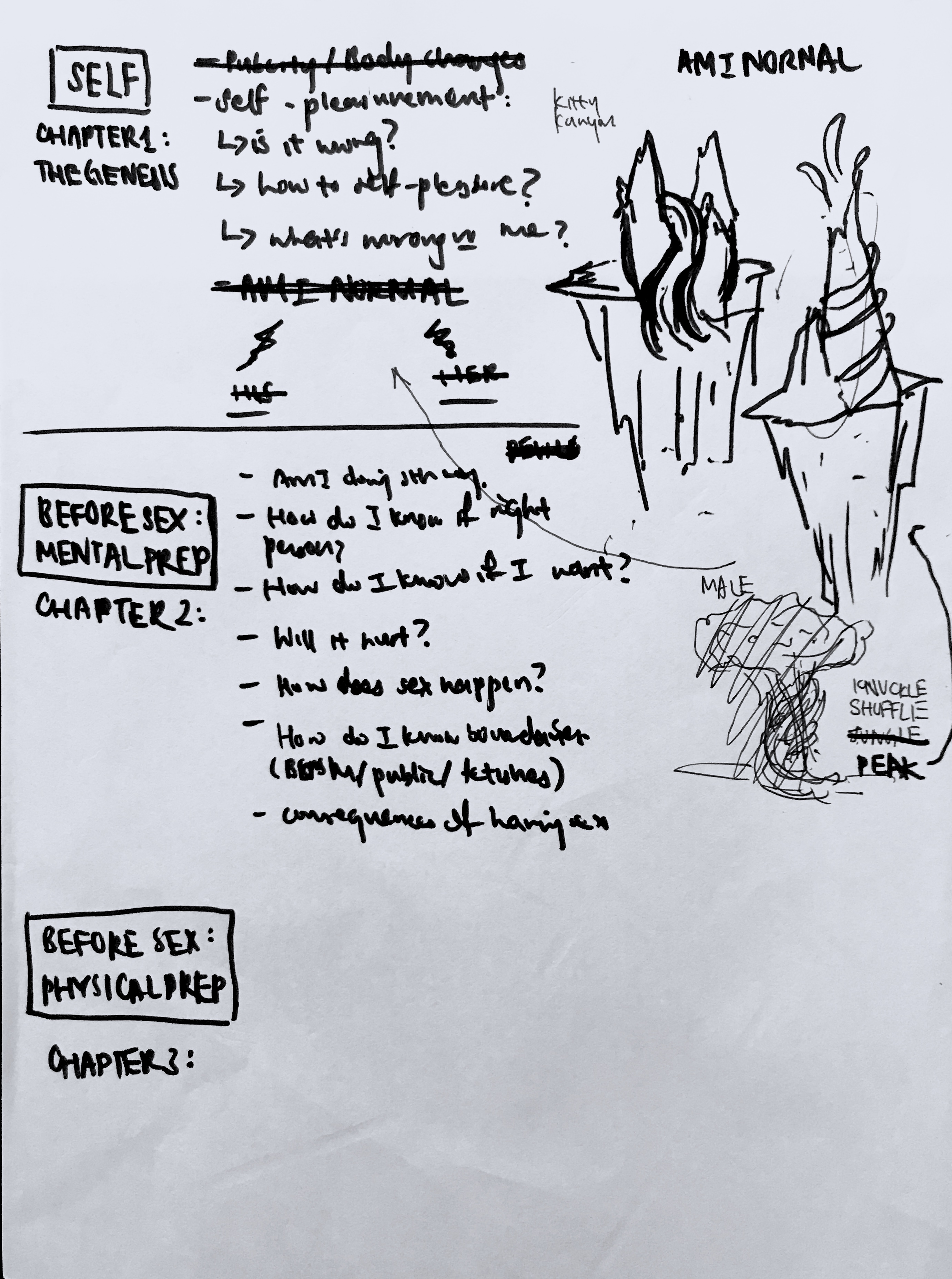
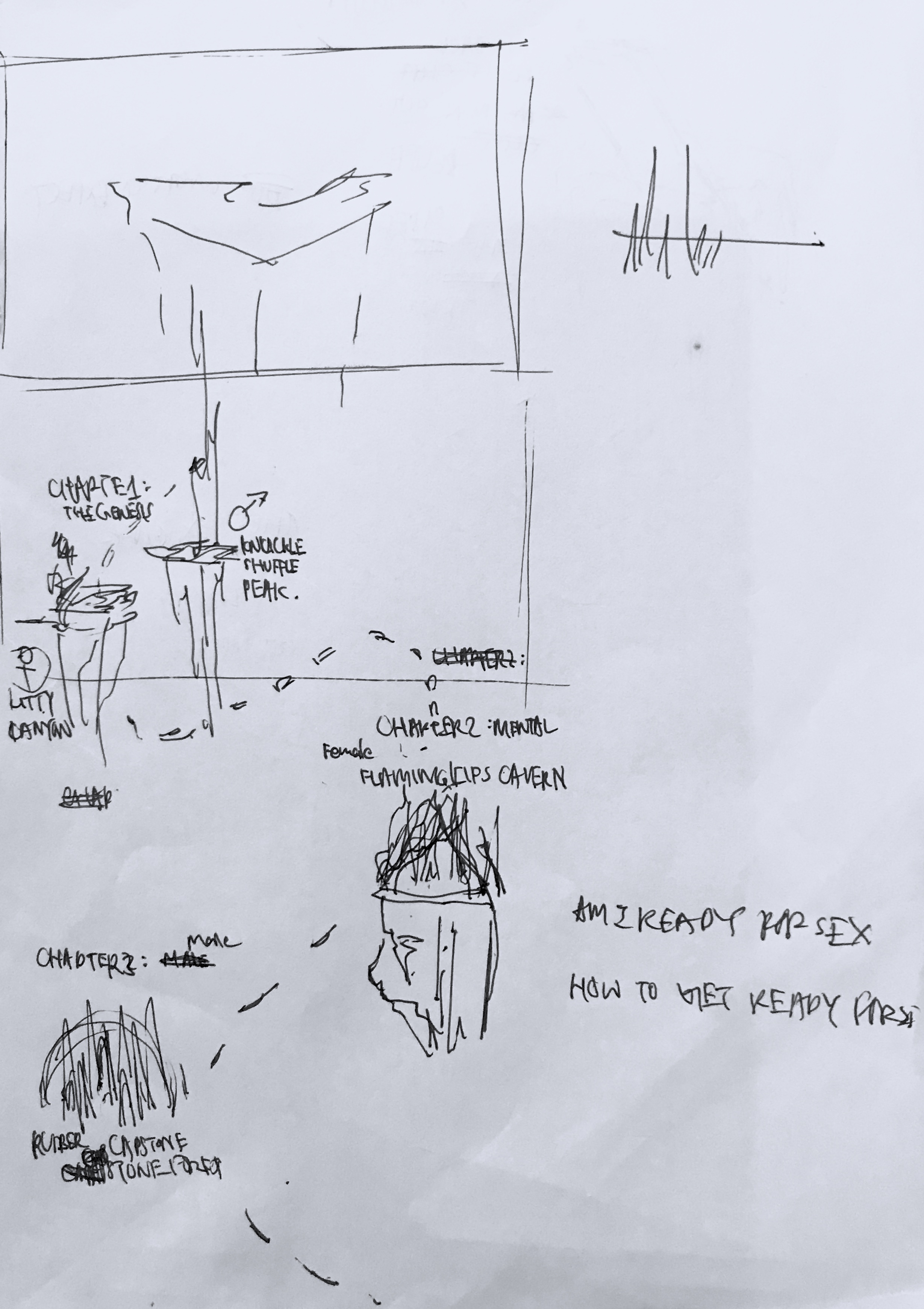
Initially I wanted to do a cause and effect to show the consequences of bad sex education. I was trying to think of a theme that is interesting to present sex in a non confrontational way. Then it hit me, the idea of women are from Venus, men are from Mars, and thus, a space themed idea.
Once I thought about it being space themed everything came together. The idea of sex being “unexplored territory” and all that.
However, after consulting with Michael I rethought the ideas and simplified the amount of information I was presenting. Instead of doing cause and effect, I was just going to present the consequences.
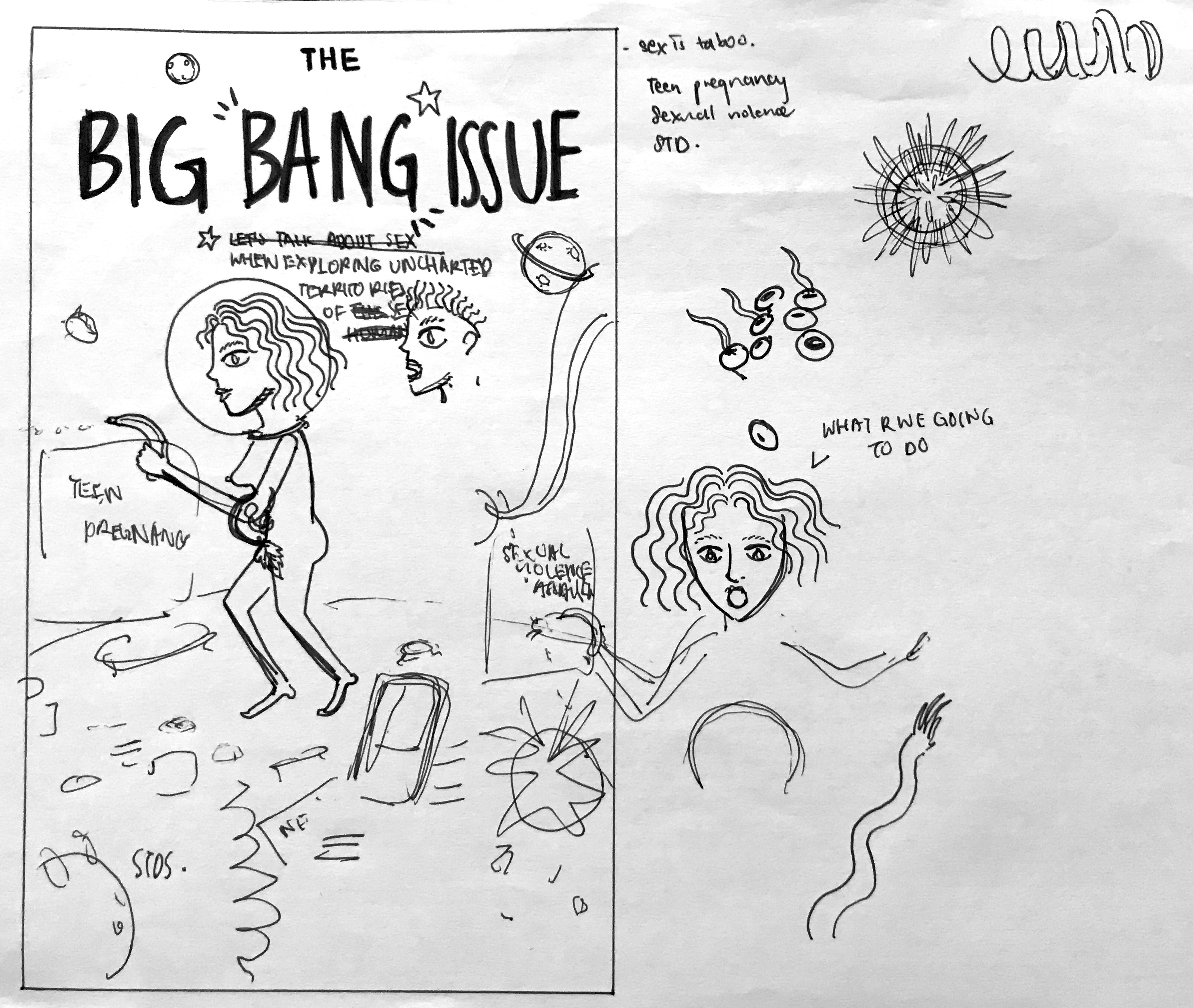
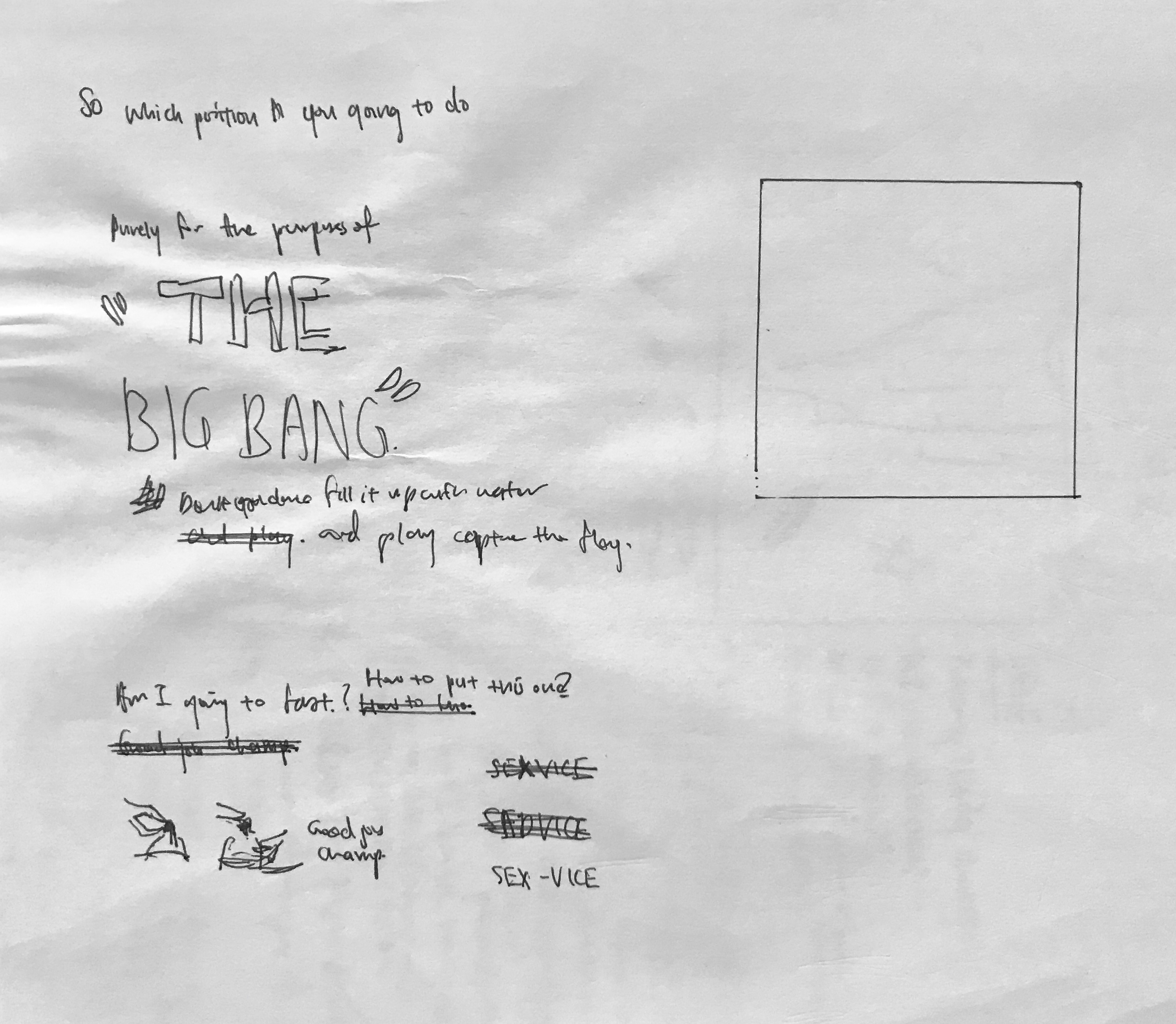
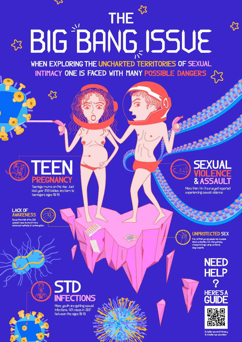
And from there I developed it further. For the last class discussion this was the infographic I printed:
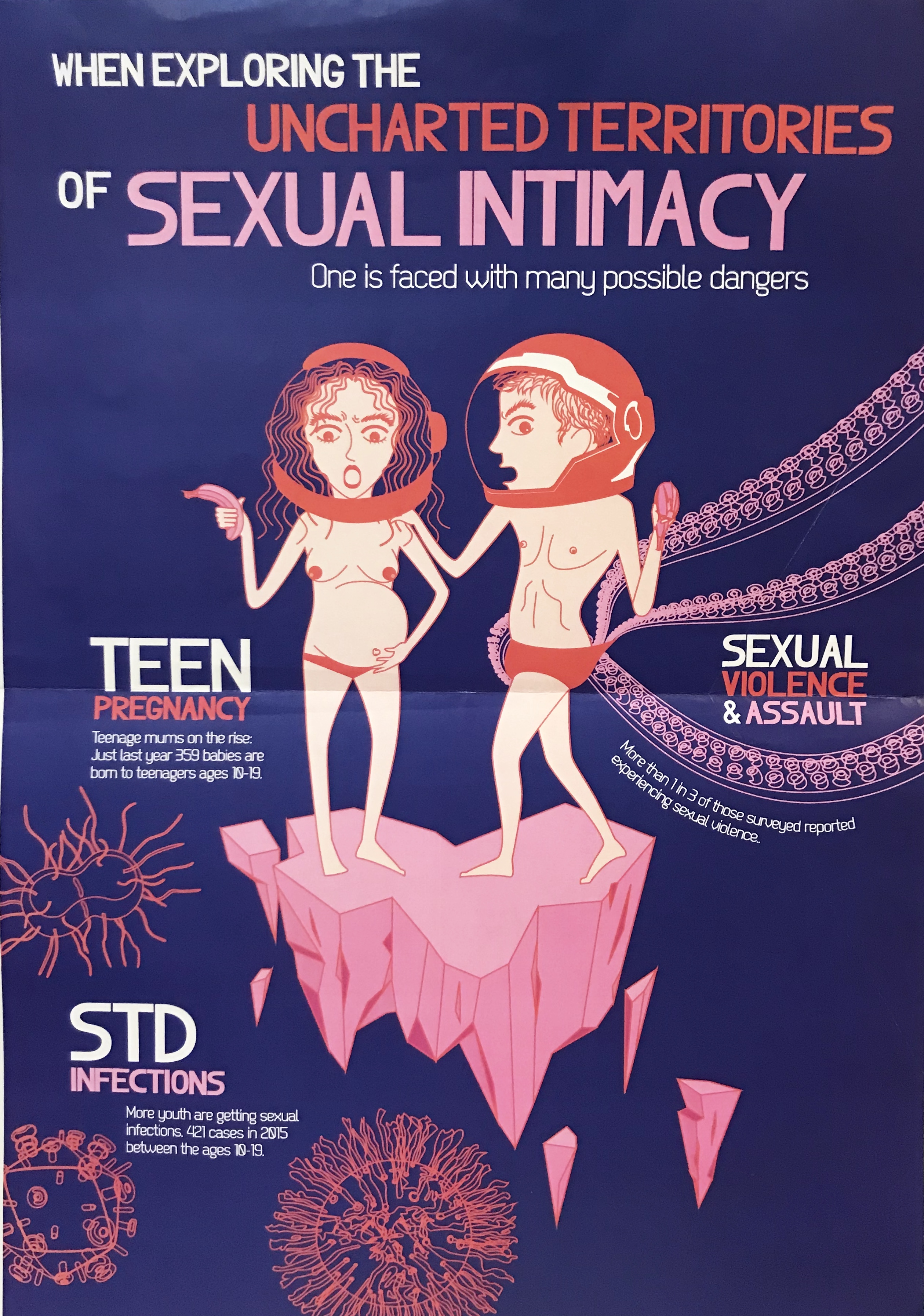
I think the class was receptive to the imagery and the colour themes. But the feedback was that it looks too much like a poster instead of an infographic. Thus, I worked towards adding icons and finishing the colouring in for the graphics. I considered just playing with outlines but I wanted to play with more colours.
From there I finished the final idea, which will be in the final post.
1.What are some of the current issues confronting our world today? Amongst them, what is of interest and a cause of concern to you? (250Max)
Sex Education
This encompasses the most basic information about basic human reproduction and how to make informed choices, and have healthy relationships with the self and others. It could also be expanded into topics of knowing how to give and acknowledge consent, sexual harassment, as well as, awareness of STDs and HIV.
Links:
https://www.huffingtonpost.com/entry/sex-ed-too-little-too-bio_b_9990828.html?utm_hp_ref=sex-education
https://www.huffingtonpost.com/entry/peggy-orenstein-girls-and-sex_us_57042d8fe4b053766188007e?utm_hp_ref=sex-education
http://www.straitstimes.com/singapore/experts-schools-have-role-but-sex-education-begins-at-home
http://www.todayonline.com/voices/comprehensive-sexuality-education-needed-ensure-safety-empower-decision-making
Stress Management
Stress from life, school, decisions, choices, it’s prevalent today, especially in Singapore’s fast paced environment. Different age groups face different problems.
Links:
https://www.coachingpositiveperformance.com/social-consequences-of-stress/
http://www.straitstimes.com/singapore/health/more-children-and-teens-are-stressed-out
https://www.nytimes.com/2017/08/17/upshot/preventing-teen-suicide-what-the-evidence-shows.html
http://www.apa.org/helpcenter/stress.aspx
https://www.psychologytoday.com/blog/in-practice/201303/why-stress-turns-depression
https://www.nimh.nih.gov/health/publications/stress/index.shtml
Self Esteem/ Body Image
Is common, especially affected by family, media, and society.
Links:
https://www.huffingtonpost.com/entry/real-beauty-is-real-you_us_58de32d5e4b04ba4a5e252bb
https://www.huffingtonpost.com/entry/body-hatred-is-learned_us_58d93d81e4b0c0980ac0e872
https://www.huffingtonpost.com/entry/i-dont-care-about-being-half-naked-on-the-internet_us_58d813e0e4b06c3d3d3e6ee7
Social Interaction
Many people face this, and sooner or later some people learn and some people don’t. I faced this as a teenager and wished that there was something to help me.
Links:
https://www.succeedsocially.com/relatedfactors
https://www.betterhealth.vic.gov.au/health/conditionsandtreatments/autism-spectrum-disorder-and-adults
https://www.anxietybc.com/self-help/effective-communication-improving-your-social-skills
http://www.adultsocialskills.com/howtomakefriends.htm
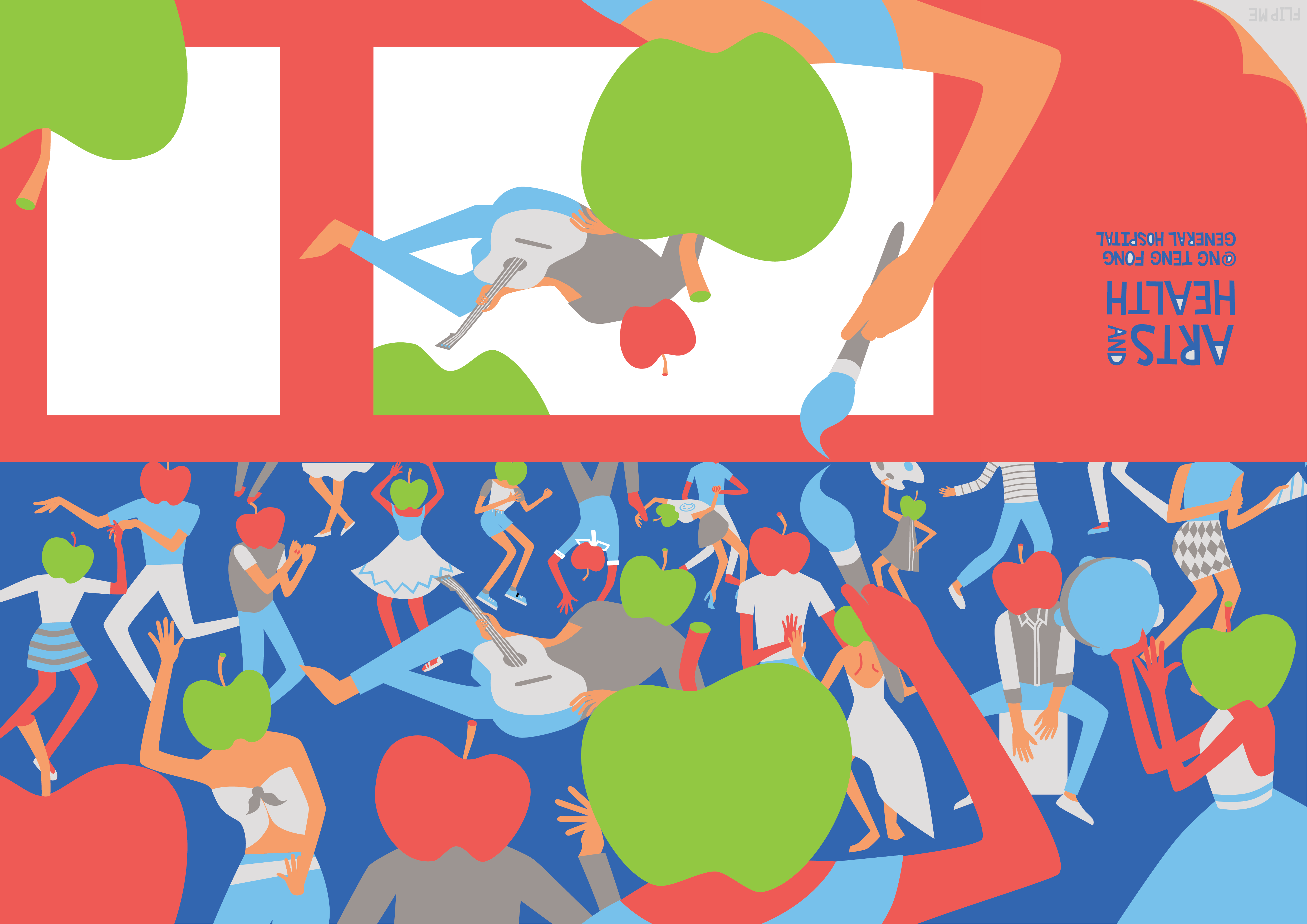
CHOICE TOPIC: SEX EDUCATION
2.Why is the issue important? Who does it affect and how? (200 words)
This issue is important because it affects everybody, reproduction, sexual intercourse is such a natural human process and need. However, the negative effects and problems arising from bad sex education are extremely hard to quantify. They are reflected in social issues like unprotected sex, lack of awareness about consent, harassment. All these problems could be avoided if the root problem is tackled, healthy and non-avoidance of sex related topics. There is a need to embracing sex and sexuality as a natural process of life and not treat it as something taboo.
3.Who do you need to communicate to, and why? (150 words max)
I think I need to communicate to the youth and young adults. Because these are the most impressionable ages, yet still more mature ages. I’m thinking of a more global design and target audience but if to tailor to local needs, I think a tongue in cheek approach and maybe using relatable design can make sex a less taboo topic in Singapore’s still rather traditional and conservative society.
4.How has visual communication contributed to address the cause?
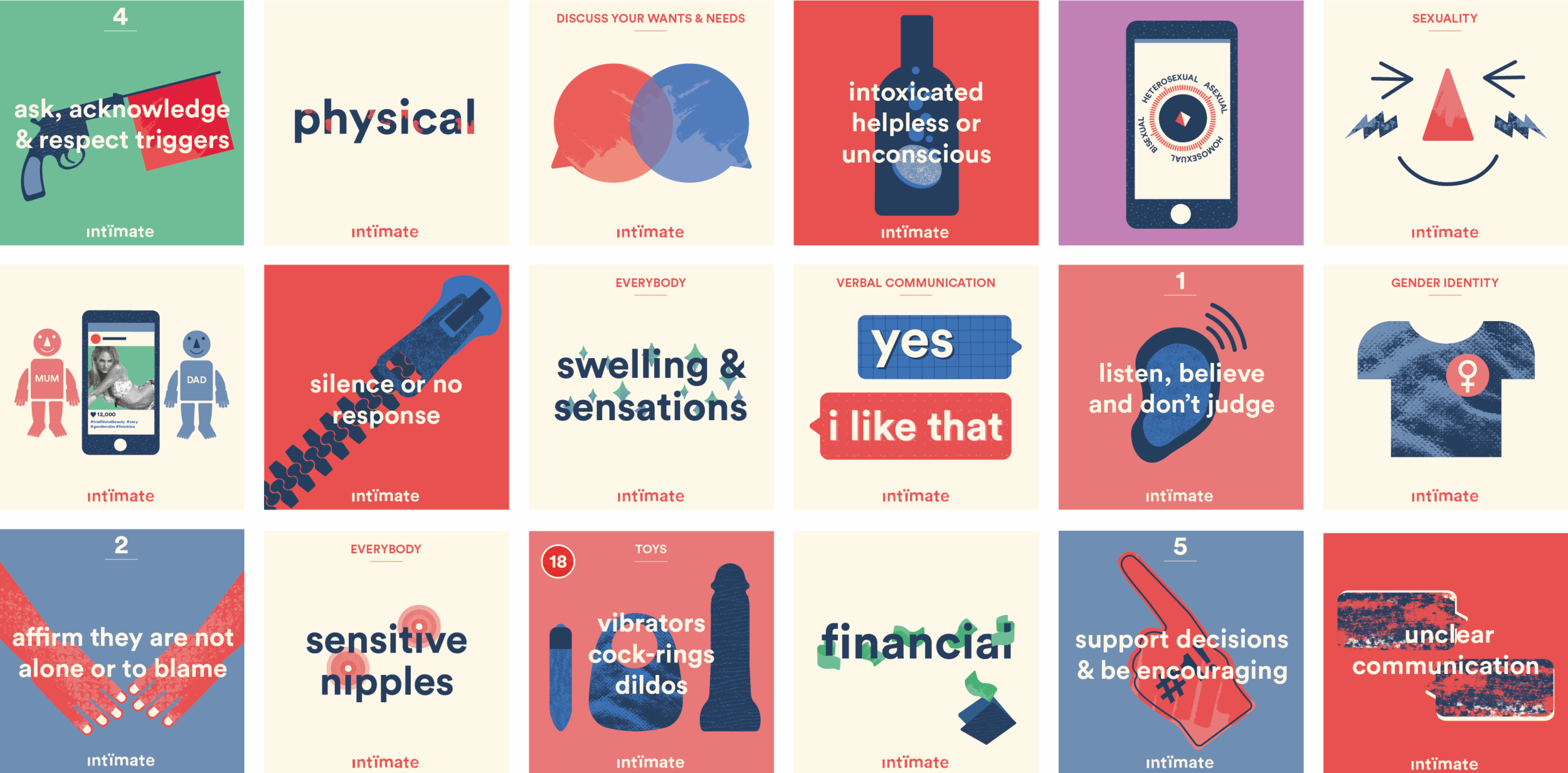
http://www.rebeccaduncan.net/intimate-sex-education/
I really like especially the type of the project, how it relates to body parts or sexual objects. The simple text also makes it easy to comprehend.
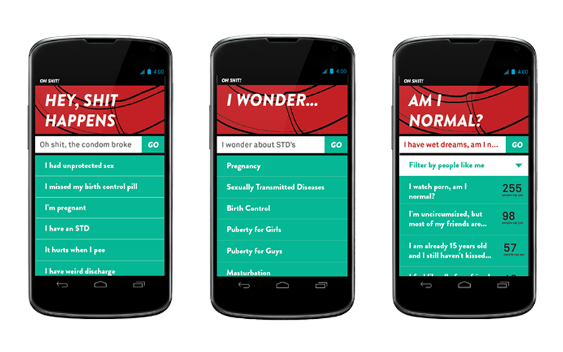
http://www.k-lewis.com/projects/ohshit.html
I like the informal use of language because it makes it very relatable. The tone is non judgmental and targets real concerns one might have towards sexual issues.

http://kdesignaward.com/exhibition/37487
The graphics here are bright and visually attractive, the cuteness of the subjects also makes it attractive to a younger age group.


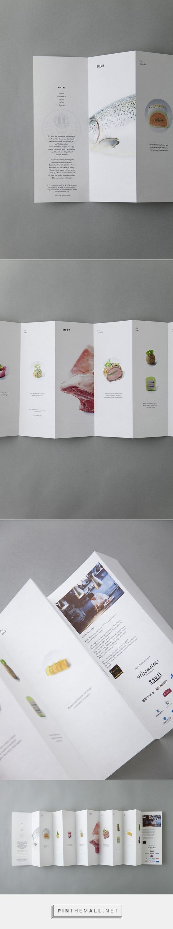
In the brief we were asked to look up on some brochures:

This is one of the brochures that caught my eye due to the fold and design. Even though the fold here used is extremely simple, it’s relevant and appropriate in imitating the way the BBQ cooker opened up, adding visual interest.
The below brochures I find aesthetic but I include them within this post because they triggered different ideas within me to work on:

The one on the left triggered ideas about the information placement, and the right triggered ideas on dye-cut.
INITIAL THOUGHTS AND PROCESS:
I was browsing inspiration on Pinterest on interesting folds. I knew I was going to continue my idea from the apple-head people poster, and I was looking for a simple-ish fold, to complement the simple flat graphics I had.

Then I found this and felt like the simplicity of the fold was what I was looking for. Most of the thought process and imagining happened in my head. I was initially entertaining the thought of making the idea open up into my poster like the example showed above, but I scrapped it as I wanted something different and I wanted every side of the brochure to have it’s usage.
Thus, I started sketching and came out with two ideas:
IDEA 1
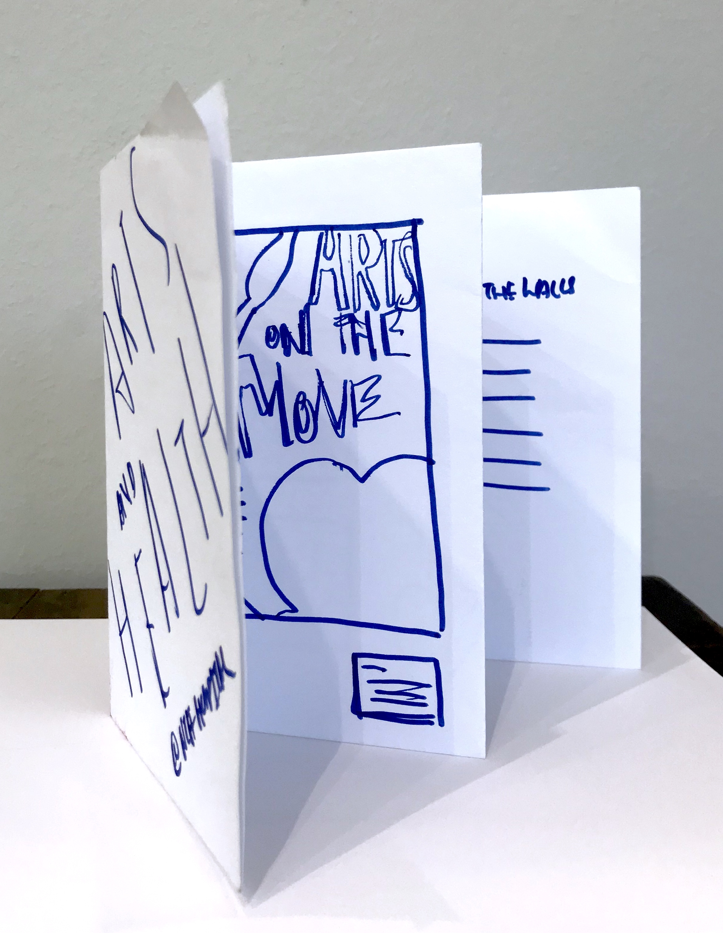


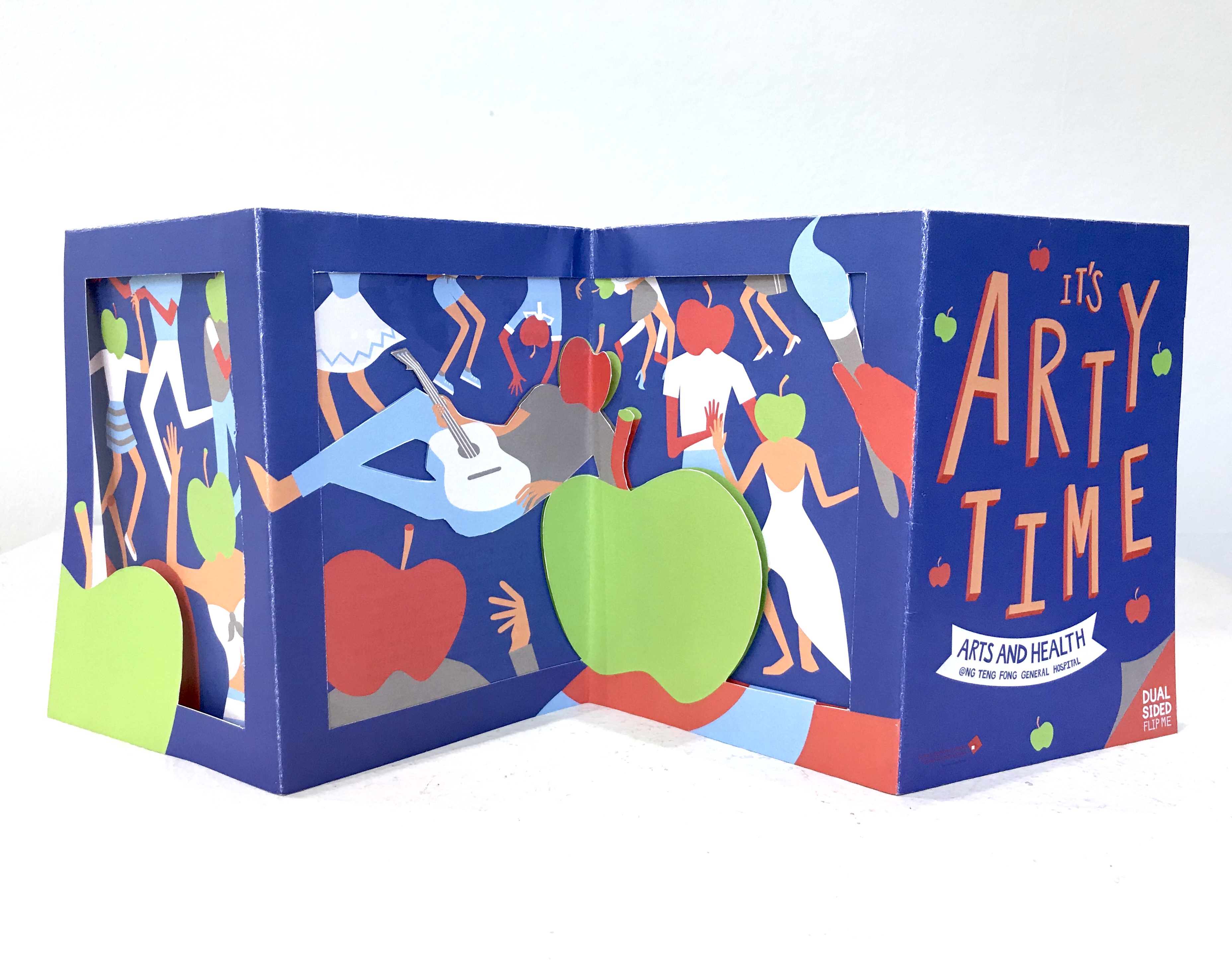
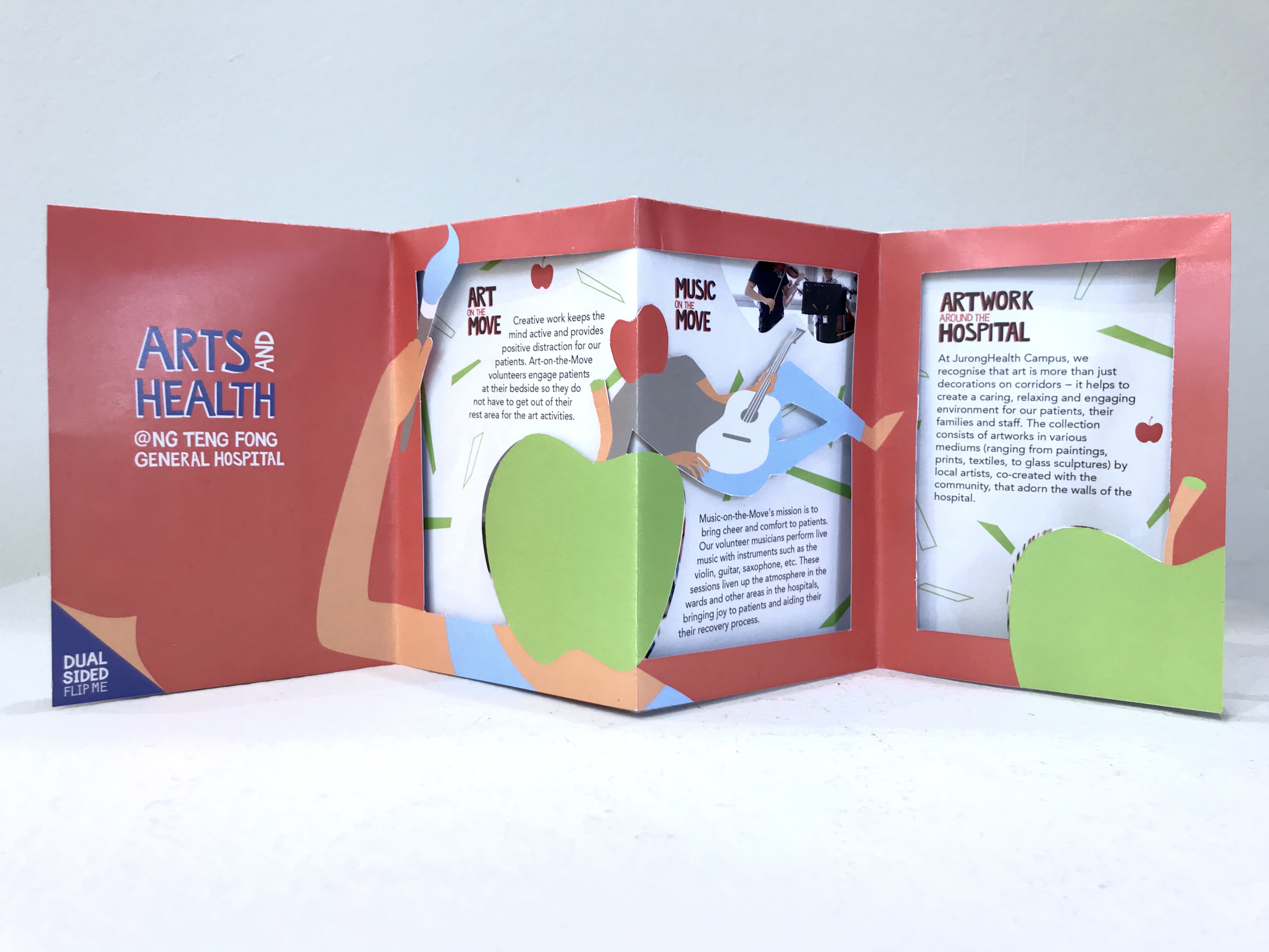
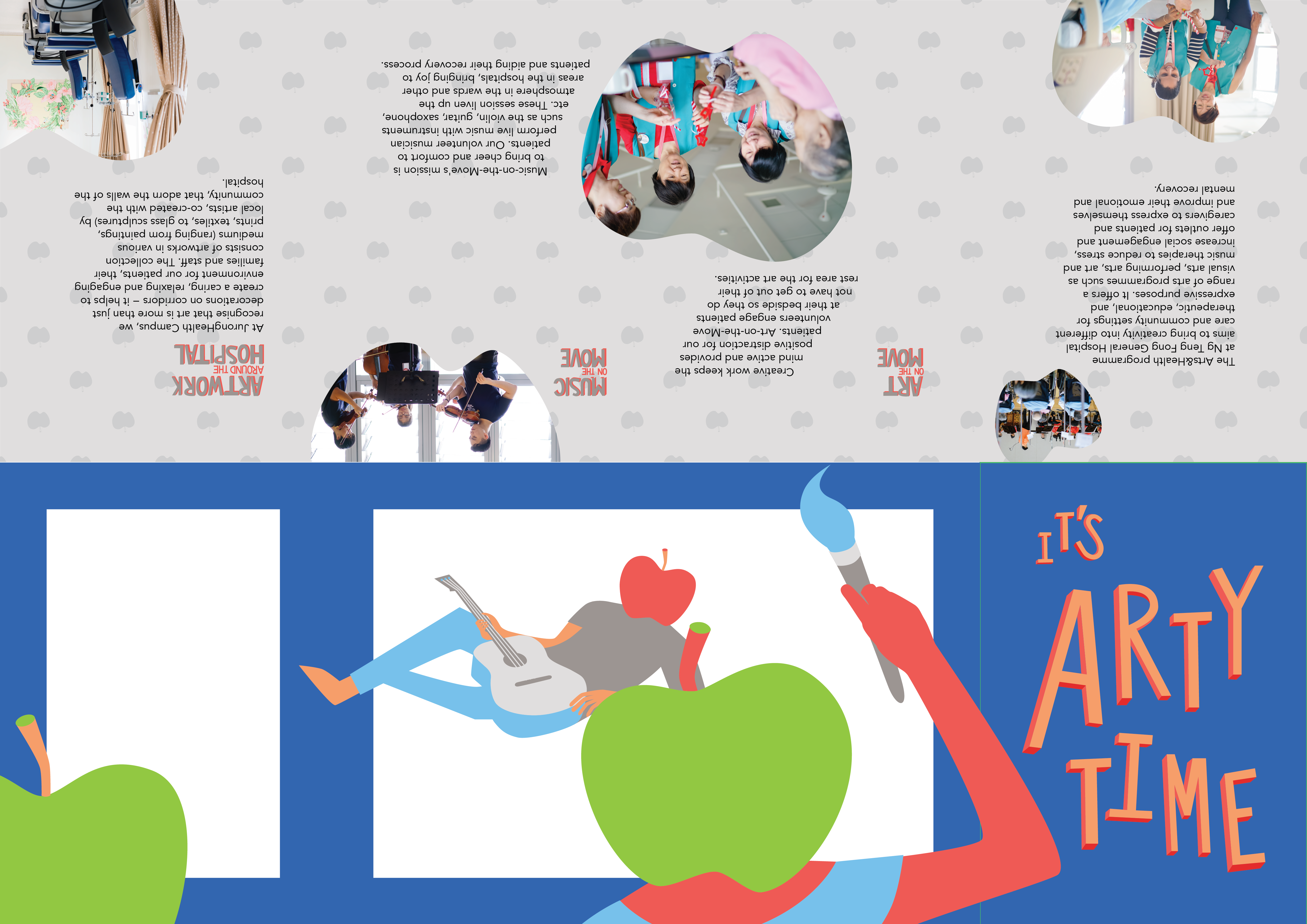
Idea 1 involves the arts and music on the move information being presented like artworks on a wall, and the back of the brochure ends off as information for artworks around the hospital. So the brochure space is a bit like an exhibition space.
IDEA 2

Idea 2 is the idea I developed and use and thus will explain in detail later in the post.
I really liked the dye-cut one and after class consultation, I decided to go ahead with that one. This is the digital version of my trial.
While this is the mock up of this trial:
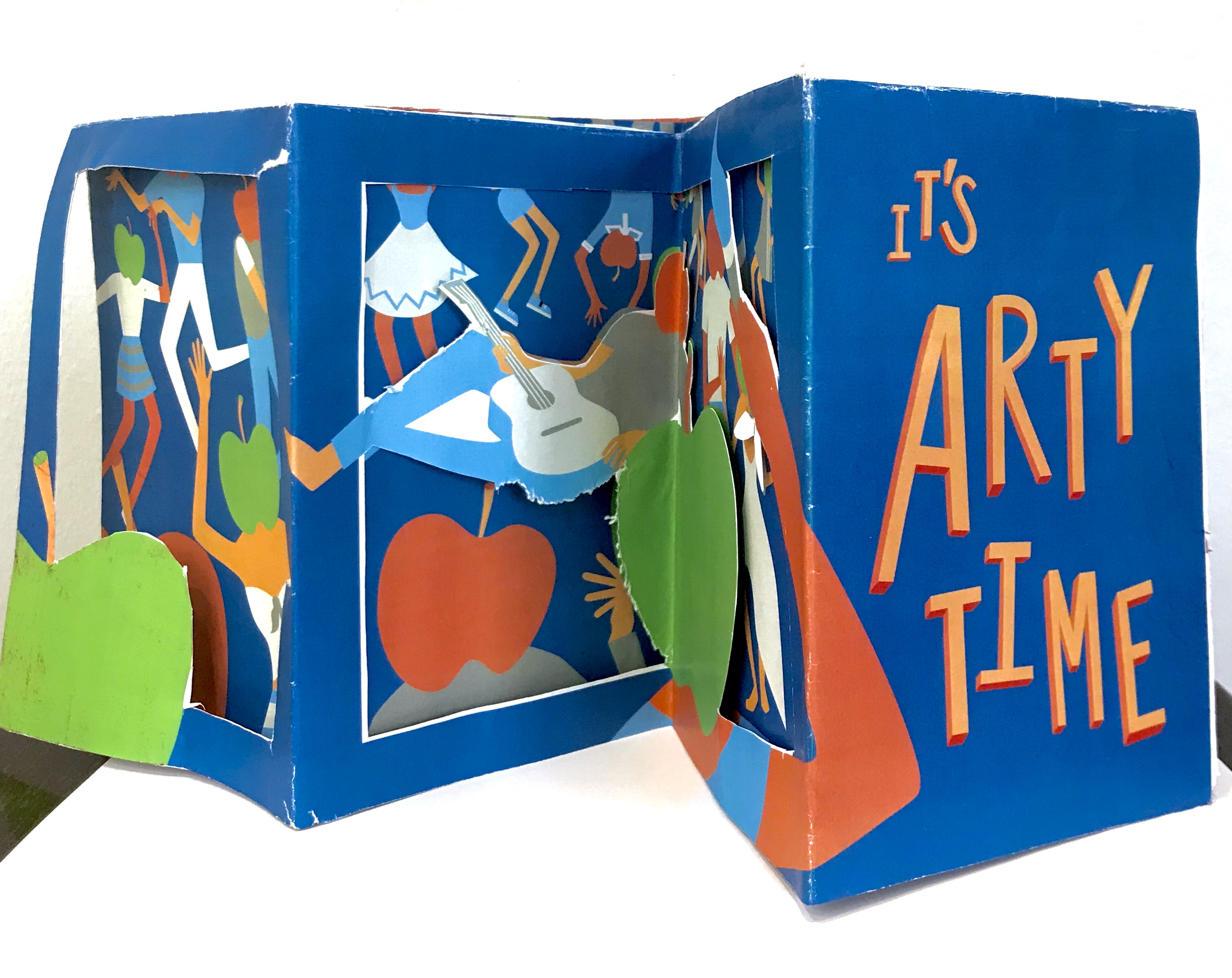
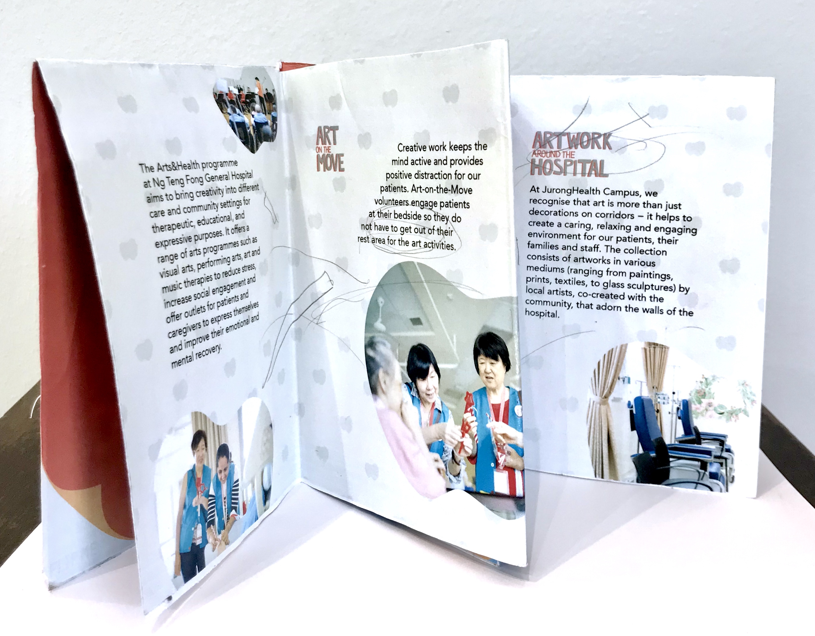
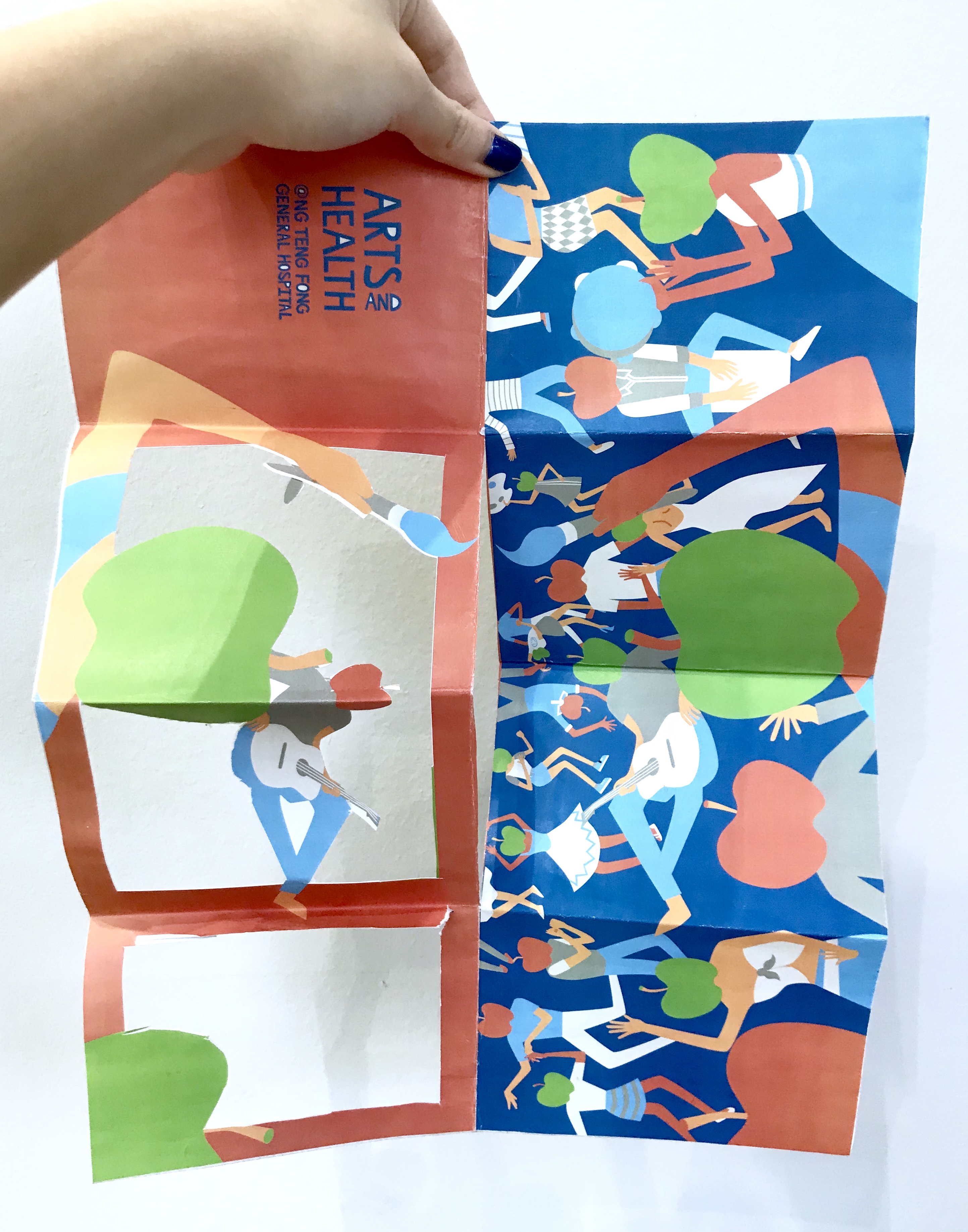
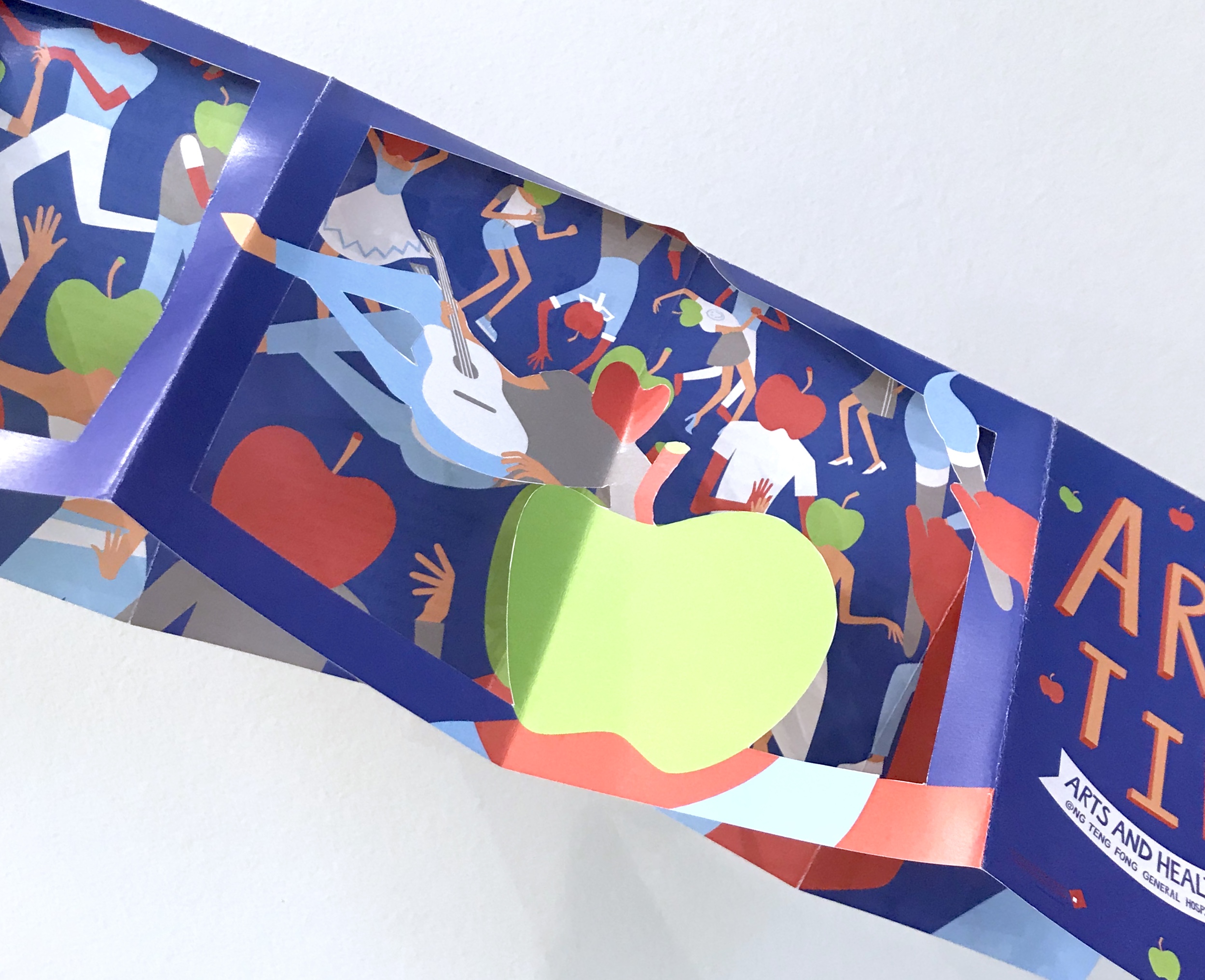
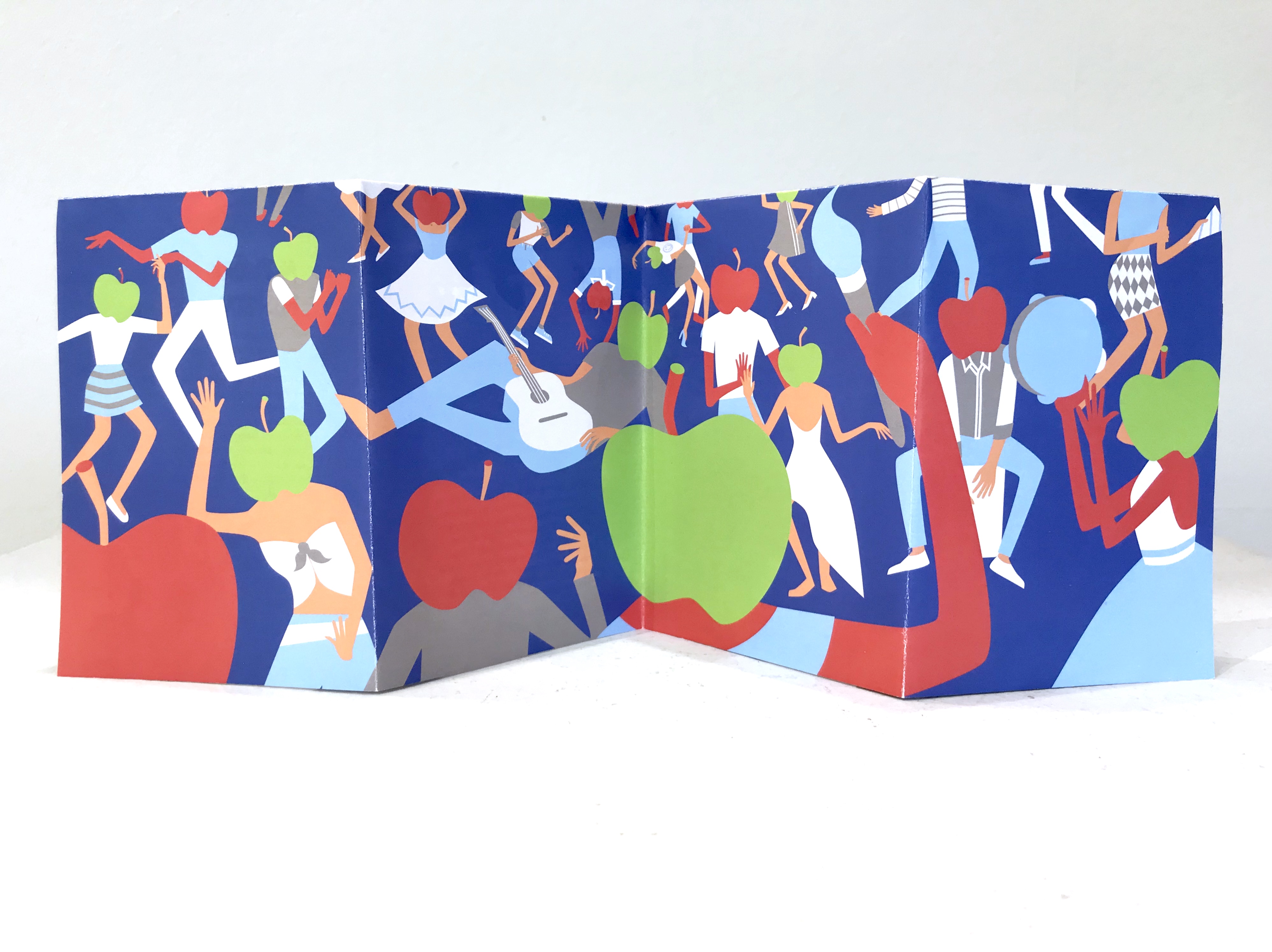
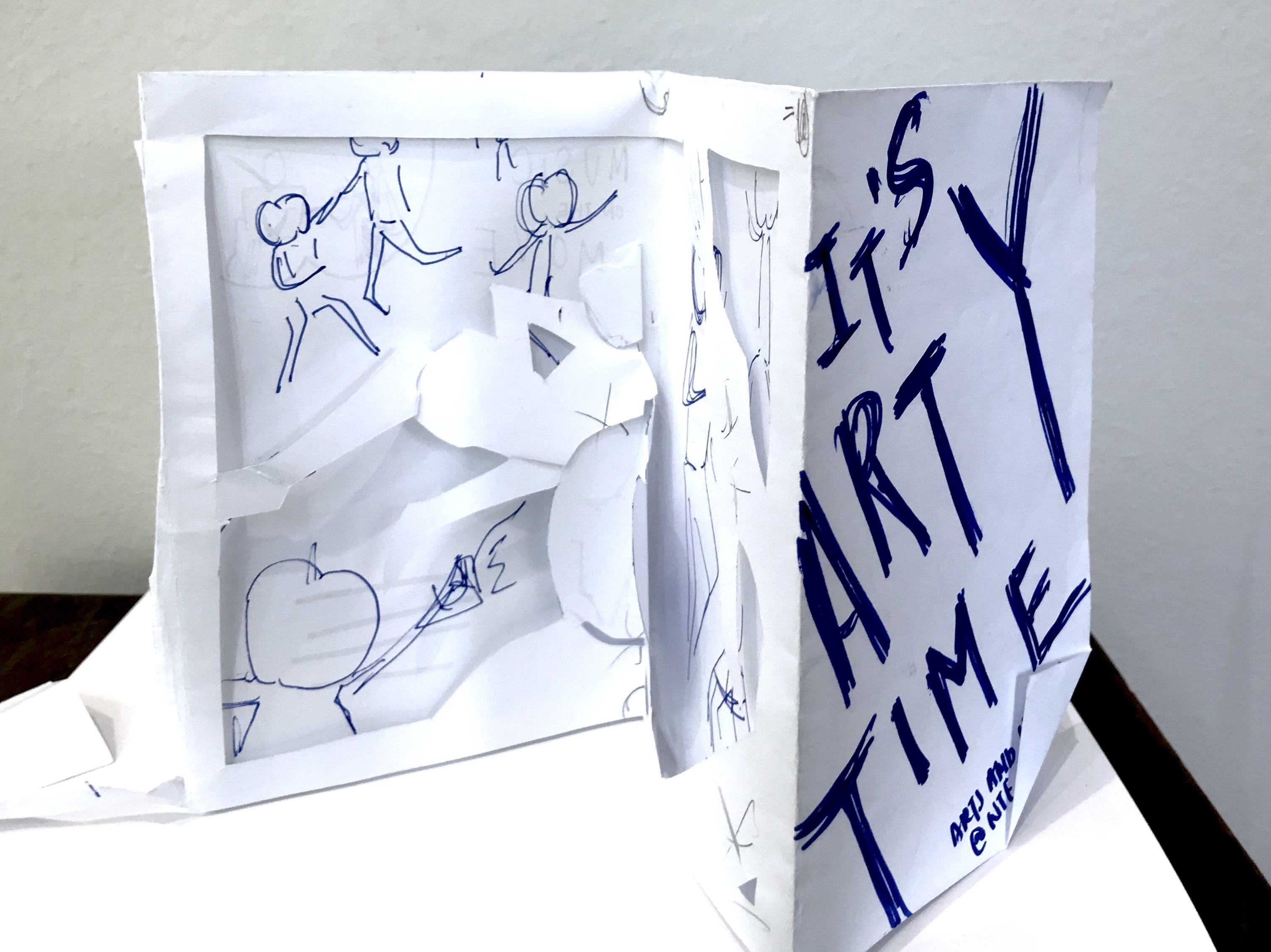
The concept, was the four folded spreads acted as a full piece instead of separate folds. On the side of the apple-headed humans it was supposed to be the side view of the fiesta on the poster. While, the side with the information was supposed to be a gallery like layout with the image within apple shaped crops. The other flap was a cut- out that could be flipped both ways to frame both the party, and gave a graphic element to the information sheet for “art” and “music” on the move respectively with different apple-head characters.
I consulted Michael, and the feedback he gave me was that due to the dye-cut, I neglect and has to compromise a lot on the layout of the information sheet itself. Thus, I had to take more note to introduce flow to the layout.
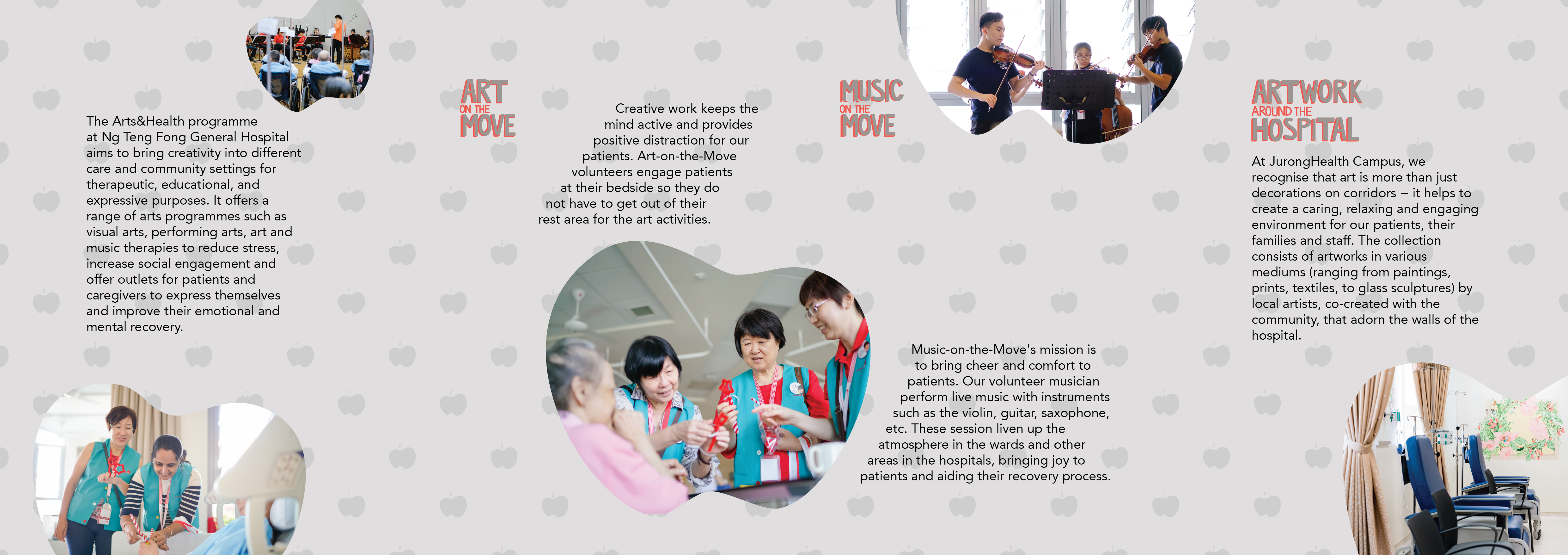
Before:
After:
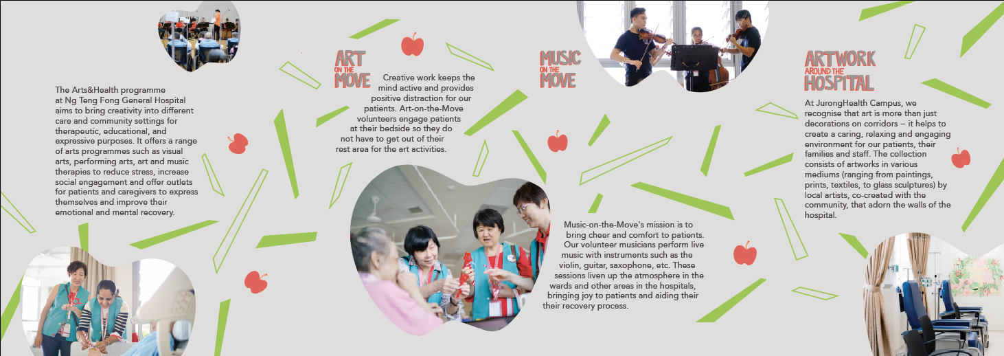
I spent lots of time adjusting the elements of the layout a lot more carefully.
The final post would be purely my final piece of work, so I would just include my learning points and reflections here:
I really got explore how to handle dye-cutting and layouts in this brochure. The final work I submitted was not the best, but I got to try out what I really wanted and I realised this dye-cuts might not be the best way to approach this brief or the project in general. Jerome also suggested a different flow of reading the brochure that could improve the brochure a lot, and I would work on that. Brochure layout is really an interesting skills to train and I hope to honed this skill. I also learn how important the printer would be in alignment and dye-cutting issues.
After doing visual research for part one of the project, I got inspired and came out with a few concept which I did in A5 sketches.

The first one (on the left) was supposed to be some sort of photography and illustrations overlaid on it. It was simple, very simple, and very safe idea. The second one (on the right) was an abstract idea. Like I thought ok let’s not do anything to do with arts or health, just something happy, thus, sunflowers. However, Micheal and the class feedback that it was a bit too simple, which I agreed, thus, I had to complicate the idea, make it more surrealistic. I wasn’t that interested in this idea, thus, I just decided not to pursue it.

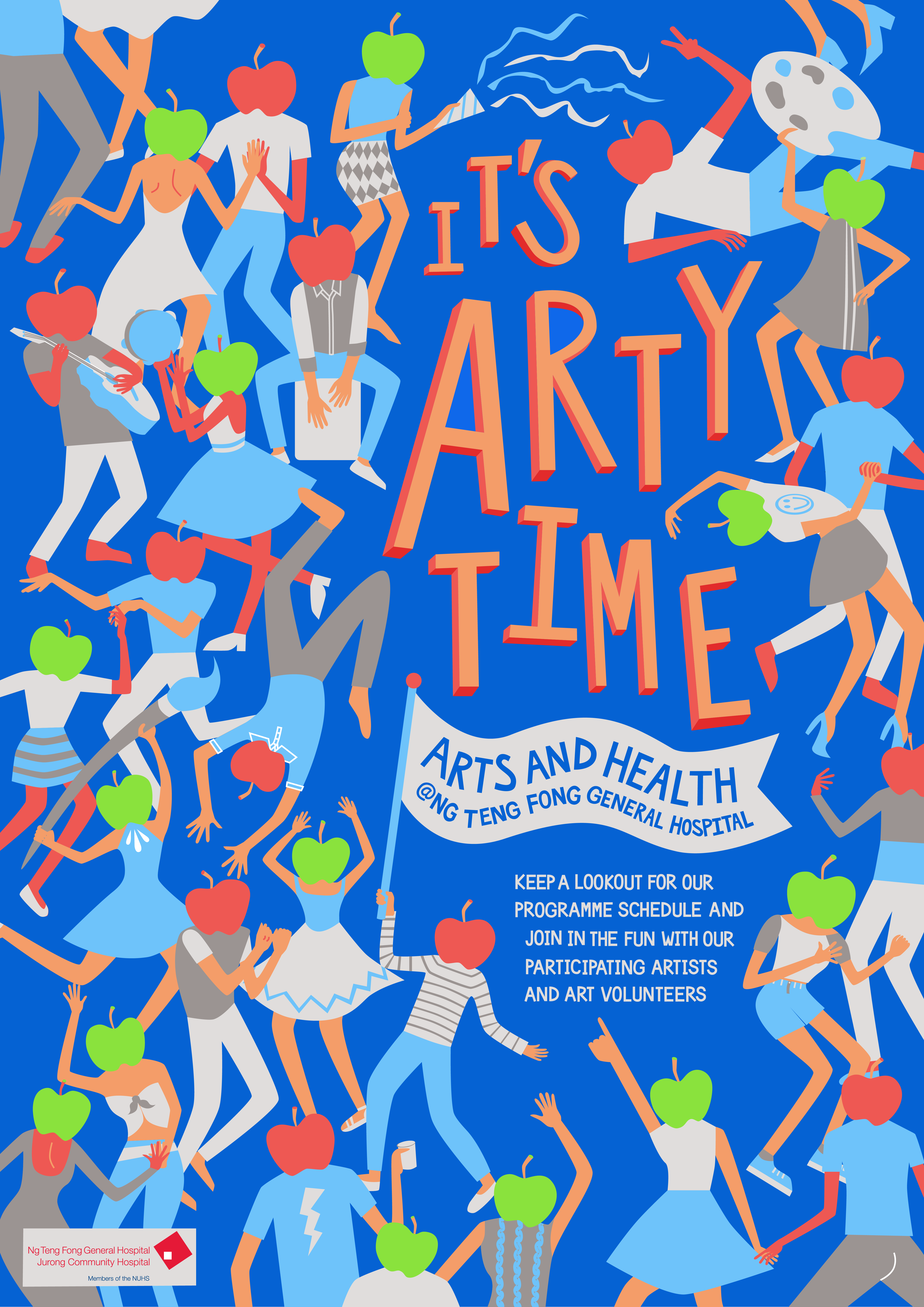
The third idea (on the left) was a very literal idea, brush to represent “arts” and apple to represent “health”. This was supposed to be photographic. It was so boring that it’s not really worth mentioning BUT it did lead to my final and best idea. The fourth idea (on the right) was inspired by the third idea. It was kinda like an idea of a sort of fiesta, with movement, liveliness and happiness. The fiesta with the dance, music, and art (brush) represents the “arts” part and the apple headed humans were abstract representations of “health”. At this stage I was purely thinking of imagery, and not slogans as I am not as good with words.
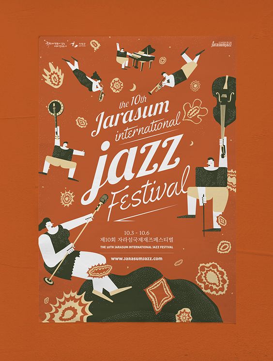
It was also inspired by several posters I saw in my research:

Thus, I started digitalising my work. Here are some preliminary sketches:
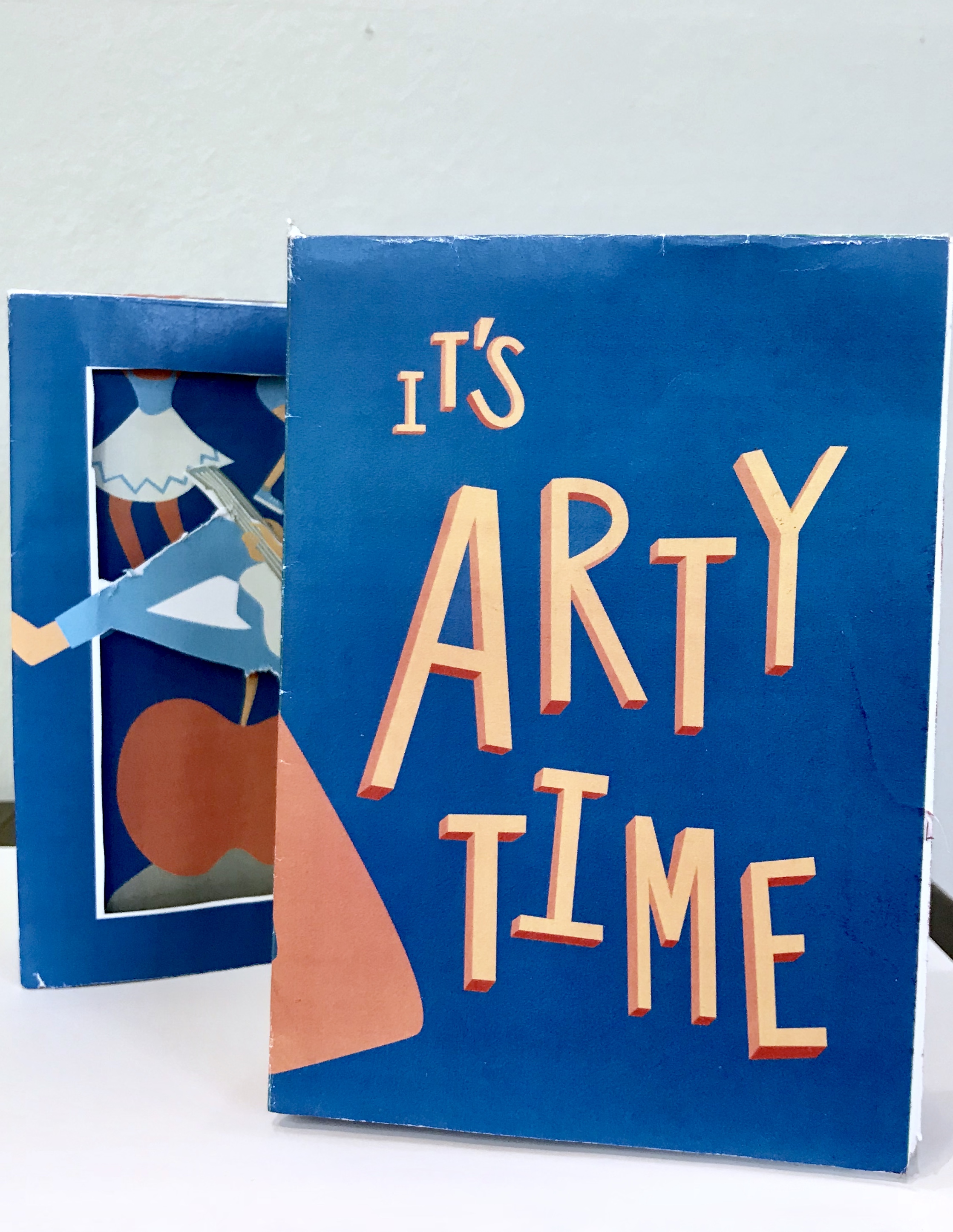
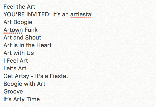
Due to the fiesta nature of my poster, I decided to go ahead with the slogan of “It’s Arty Time” among the list of slogans I came out with.
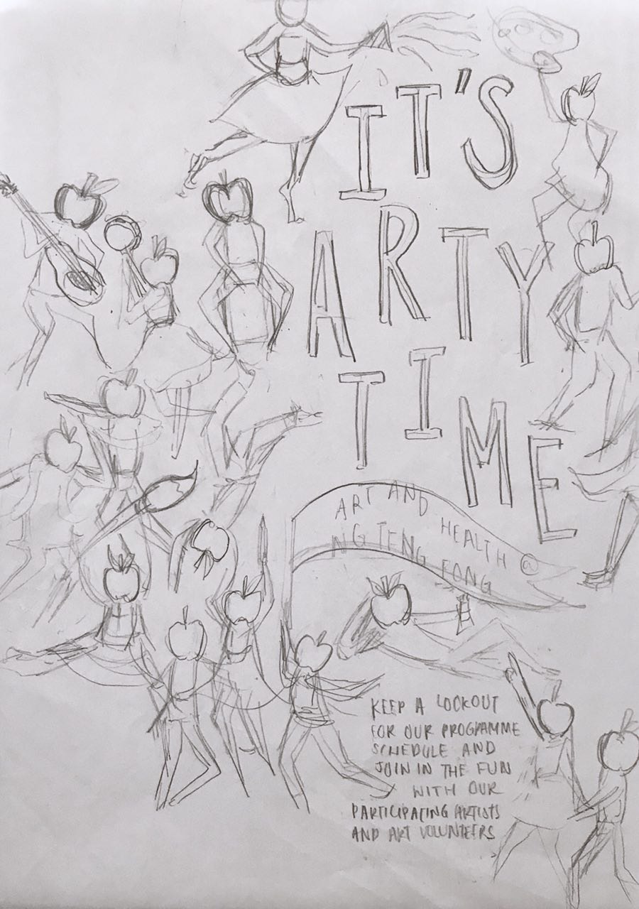

This is the first draft presented in consultation. I already thought through difference composition in the sketch process, thus, I didn’t do much experimenting with composition in the illustrating process. Each character was illustrated specially to fit the space I placed it in. Thus, moving them around was not an option.

However, during consultation, Micheal gave me some good feedback in terms of rearranging the position of the character in the bottom right corner, playing up the size and position of the “It’s Arty Time”, playing the poster to it’s full strength of whimsicality.
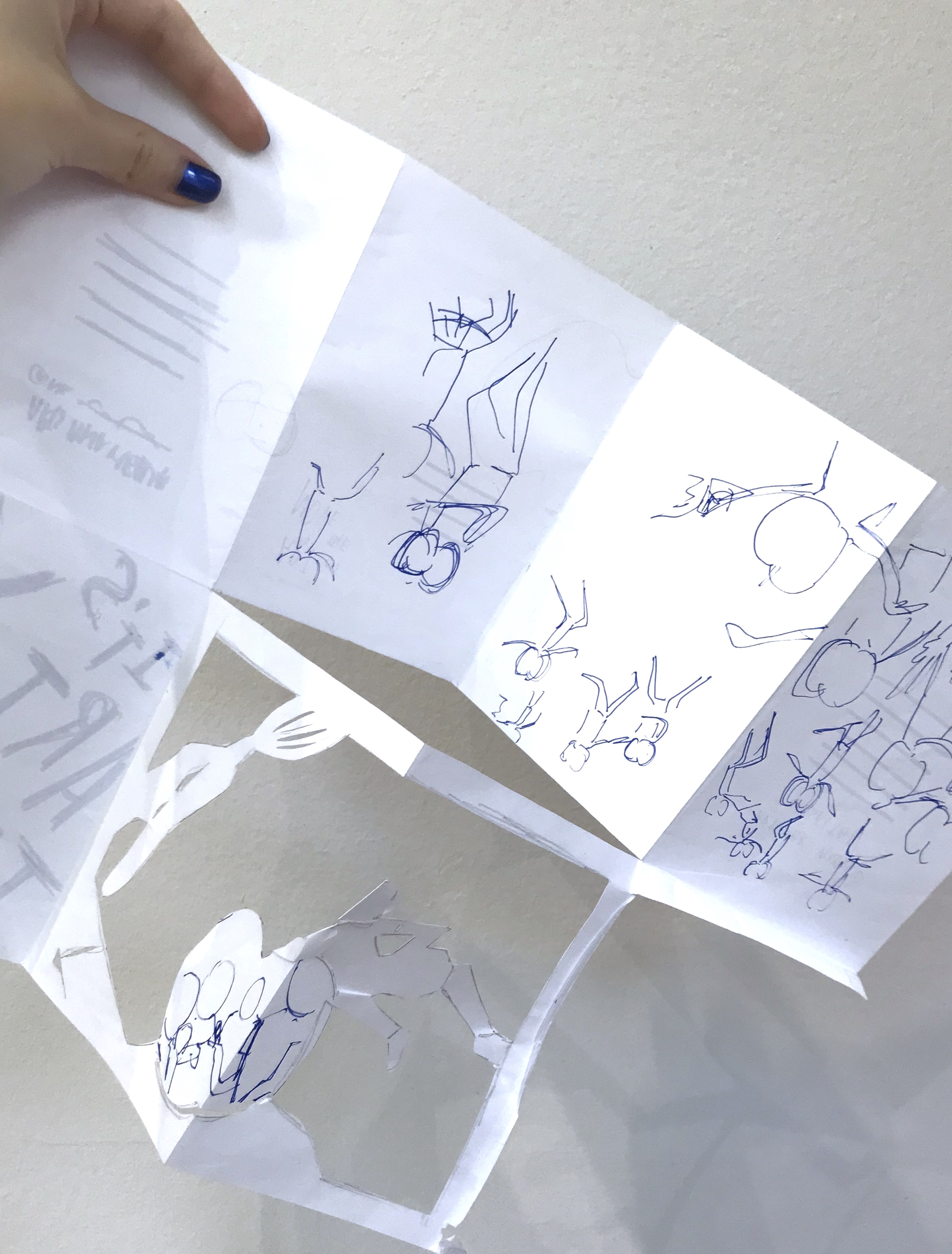
There was many shifts and edits of the characters, to fit everything in in the process, but was mostly small shifts in spaces.
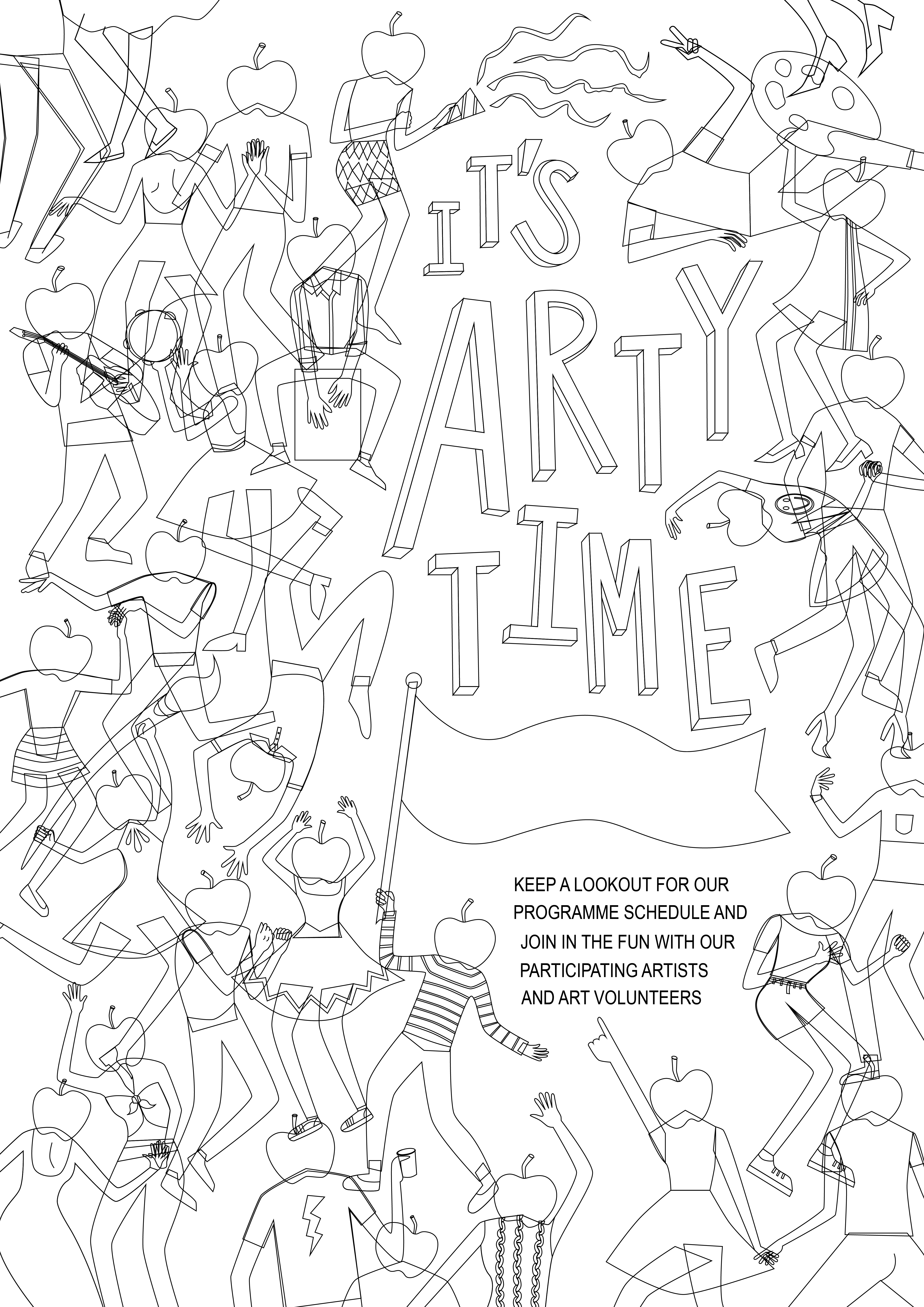
This is the close to the final draft of the poster:
After the illustrations were done, it was the colouring in.
This is my first colour palette.
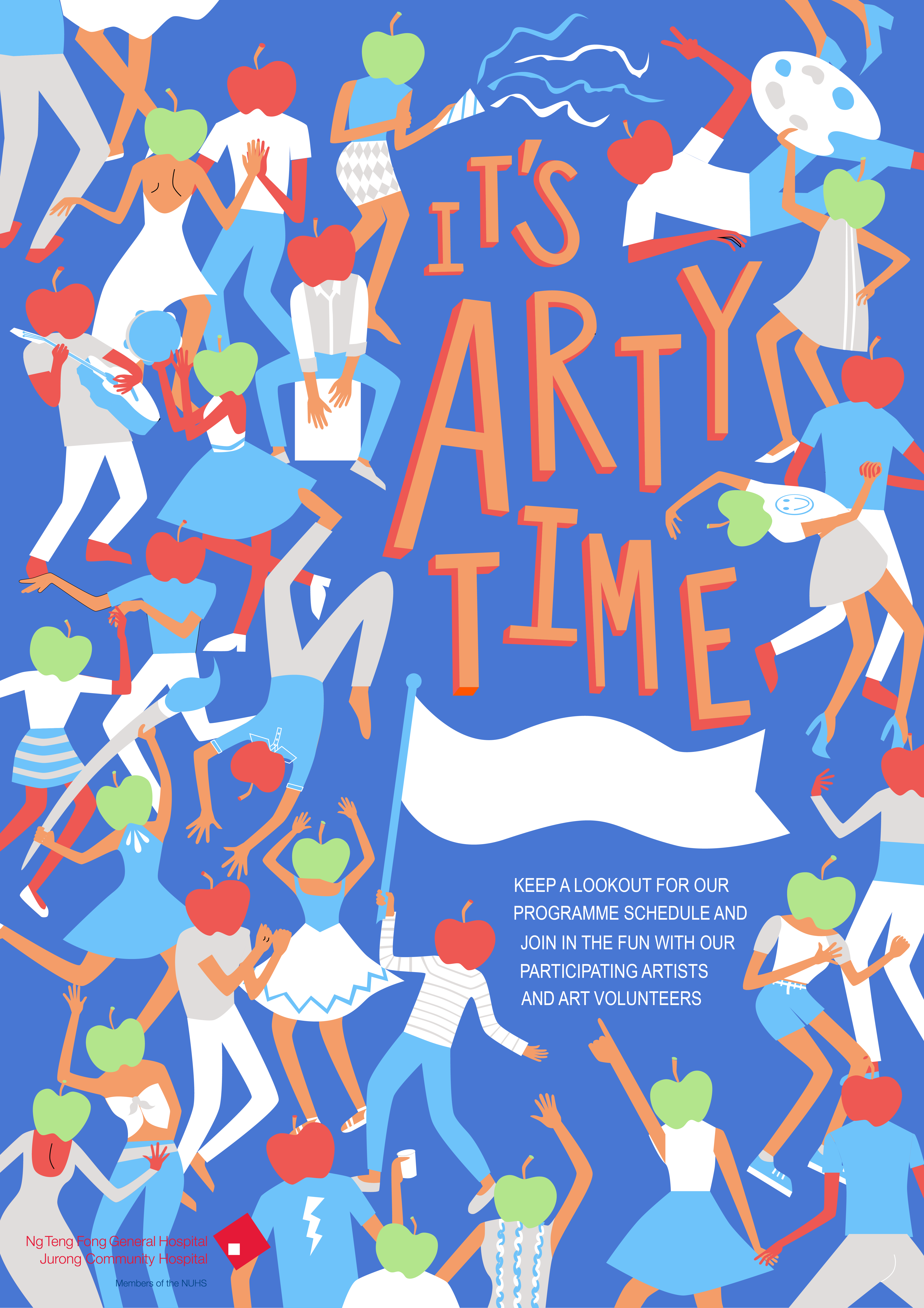
However, there was many problems in this one such as the lack of contrast and the fighting dominant forms.
Thus, more experimentation was done:
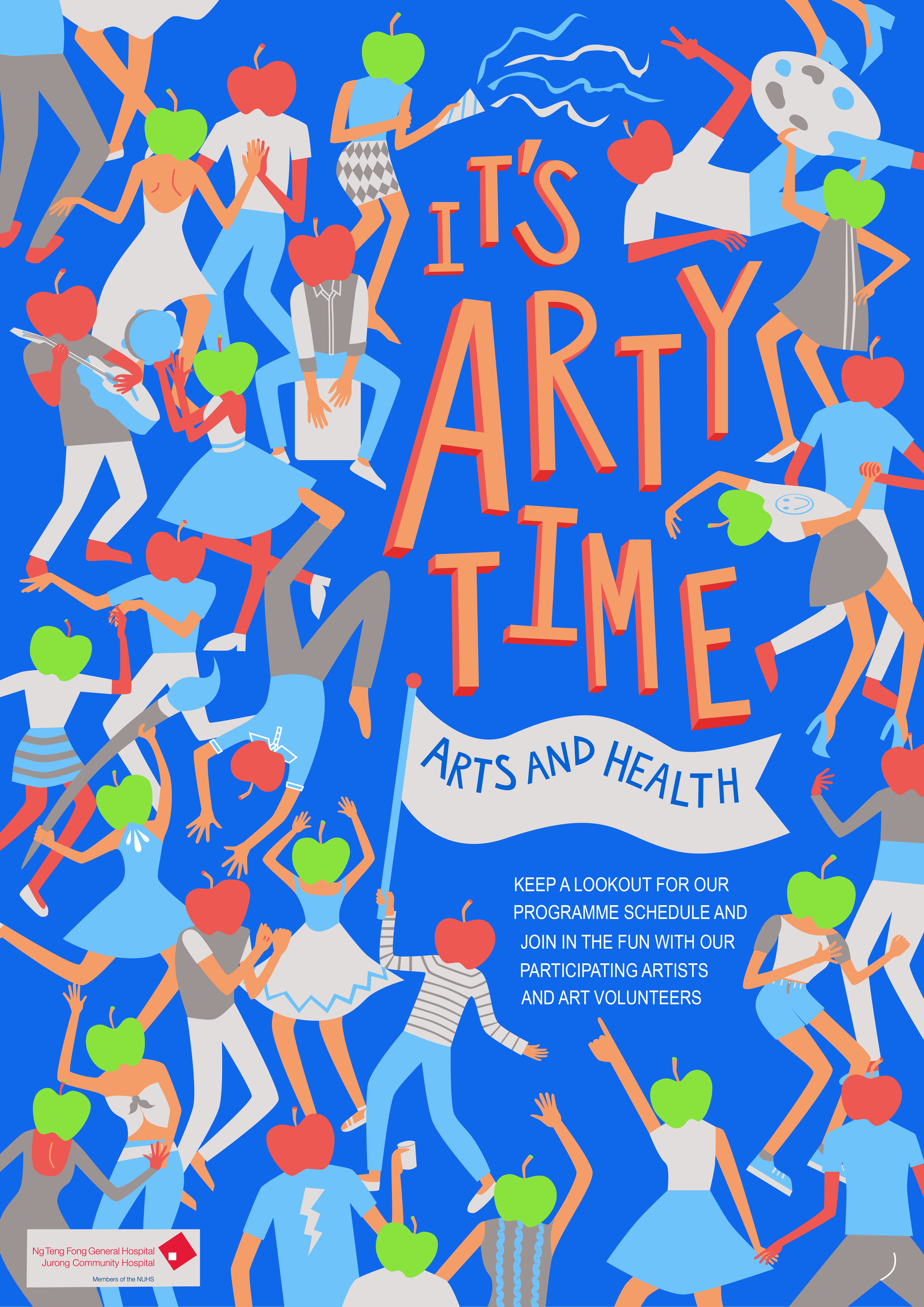
Another alternative colour scheme I explored but deemed a bit too arty for the target audience of the general public in the hospital:

As I slowly settled the colour scheme and cleaned up the illustrations, I finally completed my final product, which will be in the next post.