


There are 8 posts filed in Visual Communication 1 – G3 (this is page 1 of 1).
In the brief we were asked to look up on some brochures:

This is one of the brochures that caught my eye due to the fold and design. Even though the fold here used is extremely simple, it’s relevant and appropriate in imitating the way the BBQ cooker opened up, adding visual interest.
The below brochures I find aesthetic but I include them within this post because they triggered different ideas within me to work on:

The one on the left triggered ideas about the information placement, and the right triggered ideas on dye-cut.
INITIAL THOUGHTS AND PROCESS:
I was browsing inspiration on Pinterest on interesting folds. I knew I was going to continue my idea from the apple-head people poster, and I was looking for a simple-ish fold, to complement the simple flat graphics I had.

Then I found this and felt like the simplicity of the fold was what I was looking for. Most of the thought process and imagining happened in my head. I was initially entertaining the thought of making the idea open up into my poster like the example showed above, but I scrapped it as I wanted something different and I wanted every side of the brochure to have it’s usage.
Thus, I started sketching and came out with two ideas:
IDEA 1
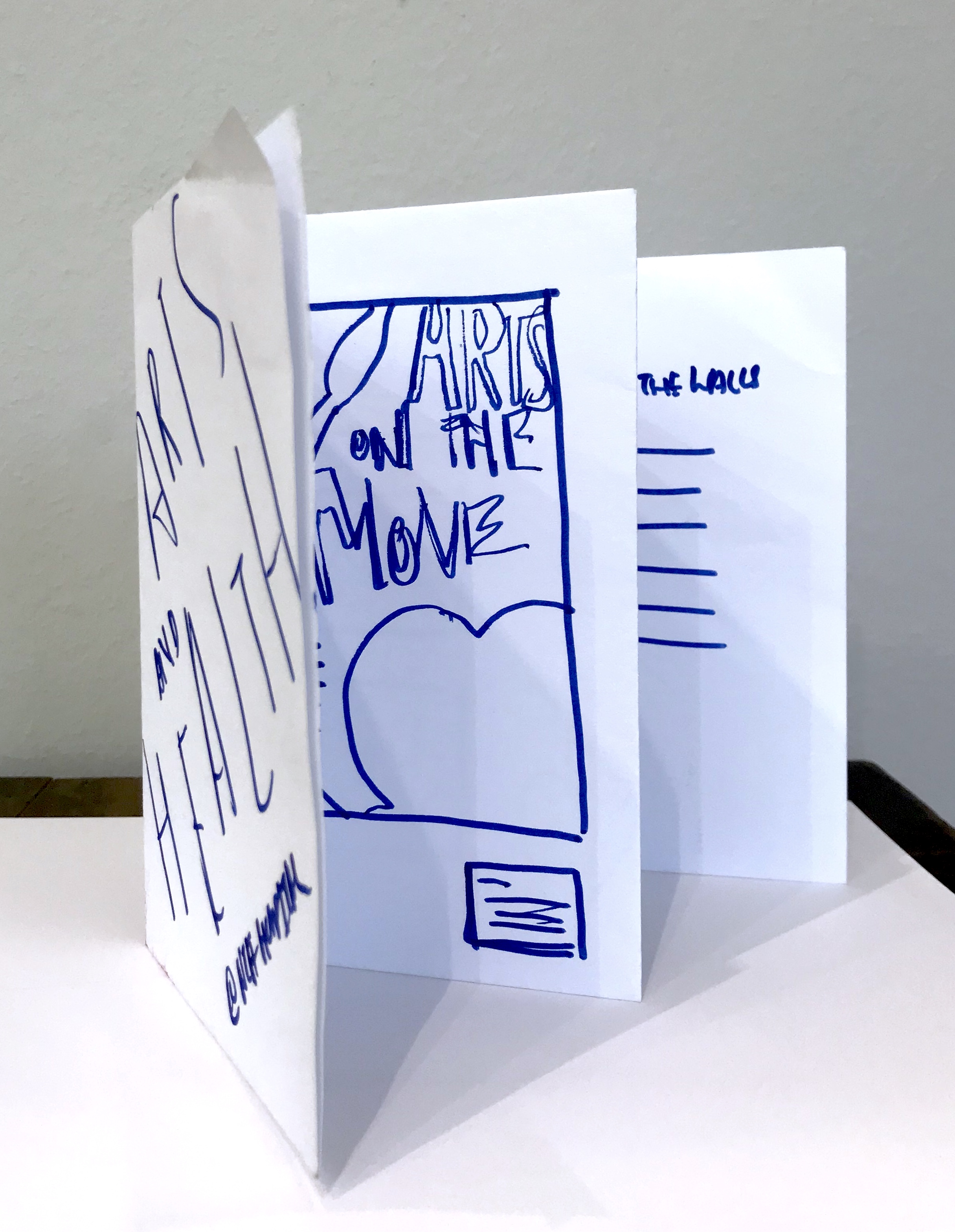


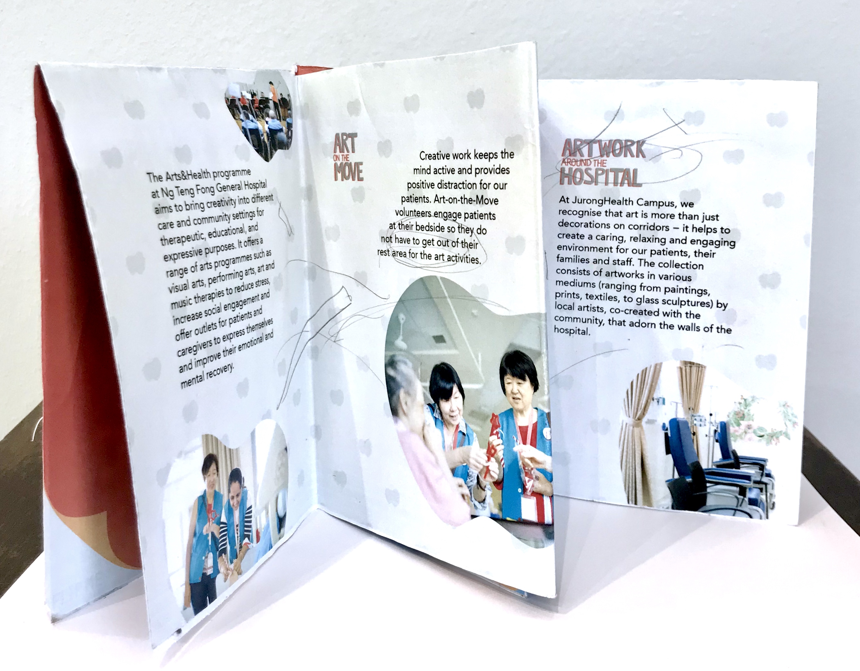
Idea 1 involves the arts and music on the move information being presented like artworks on a wall, and the back of the brochure ends off as information for artworks around the hospital. So the brochure space is a bit like an exhibition space.
IDEA 2

Idea 2 is the idea I developed and use and thus will explain in detail later in the post.
I really liked the dye-cut one and after class consultation, I decided to go ahead with that one. This is the digital version of my trial.
While this is the mock up of this trial:
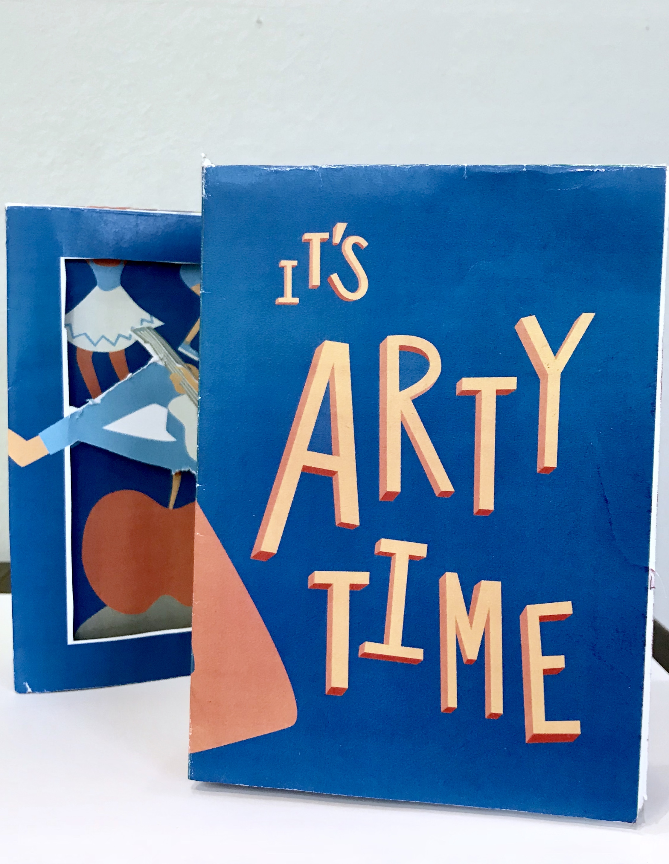
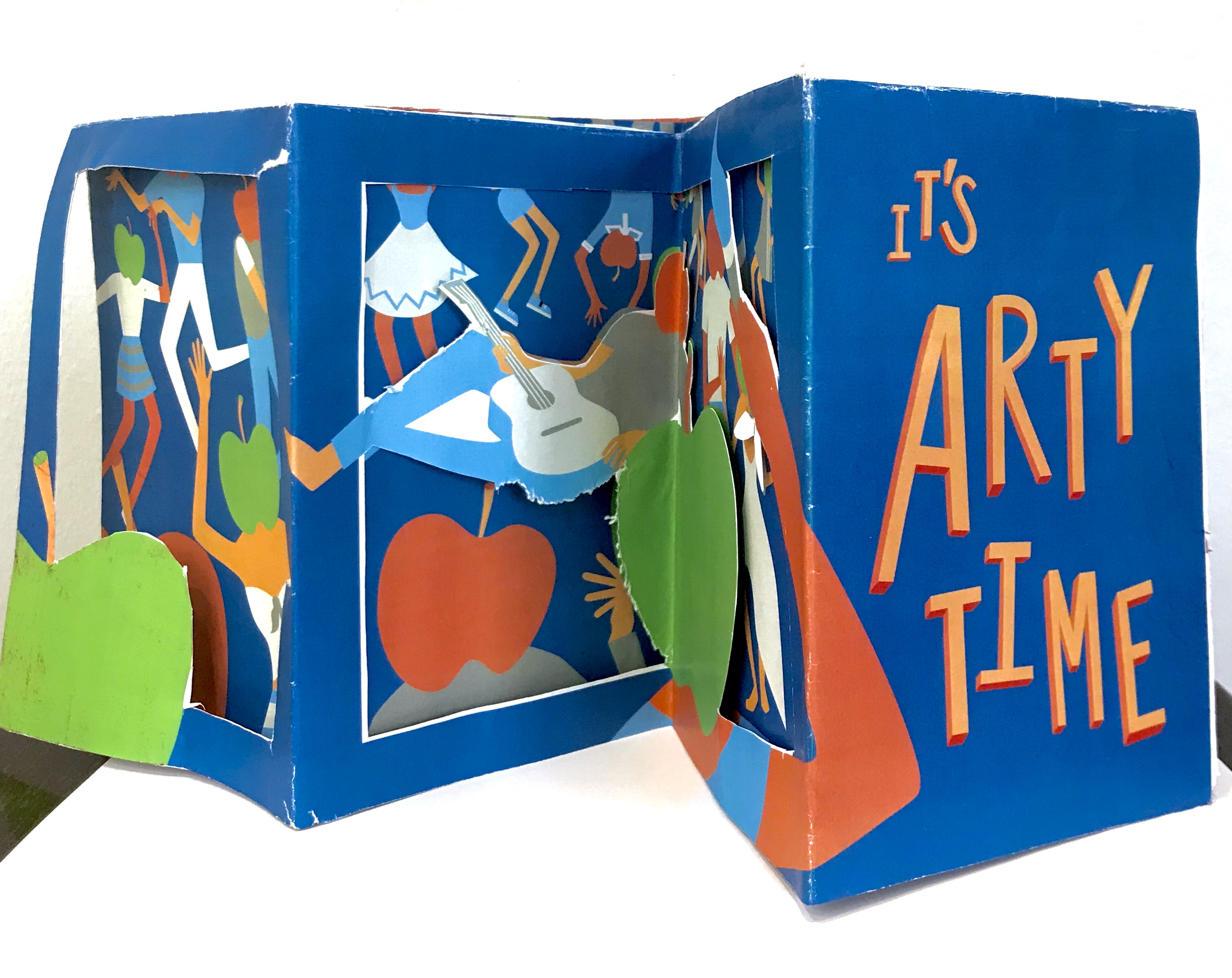
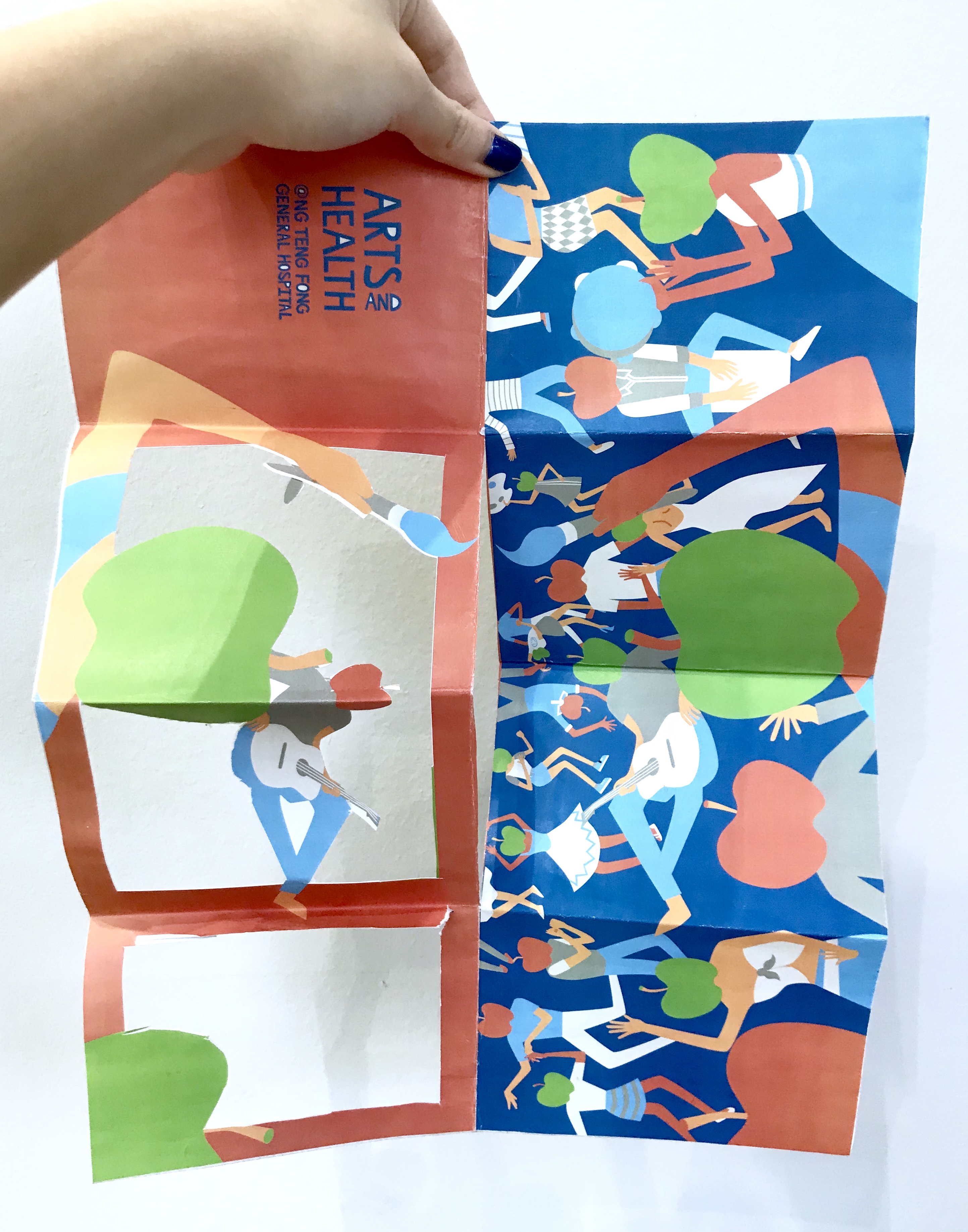
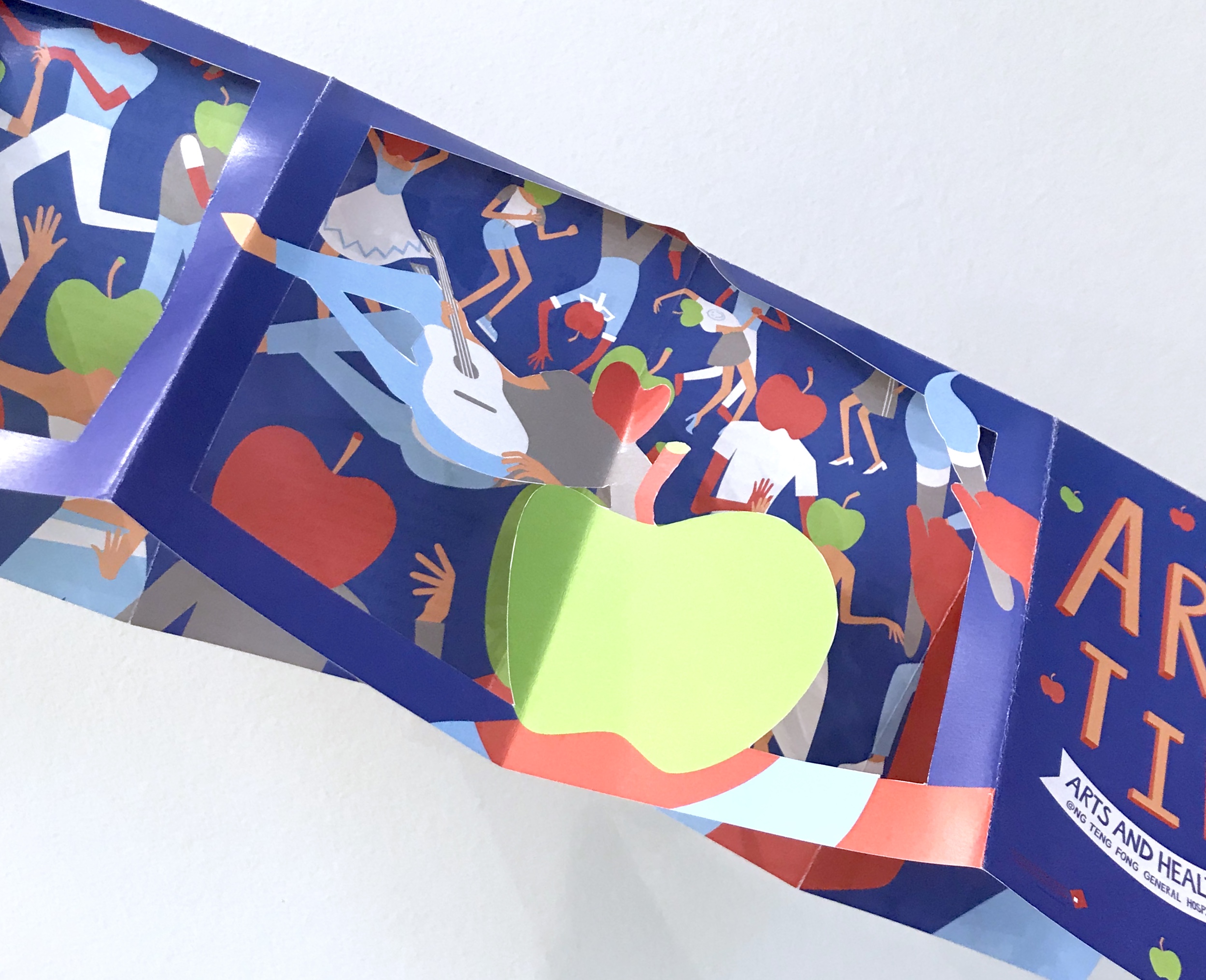
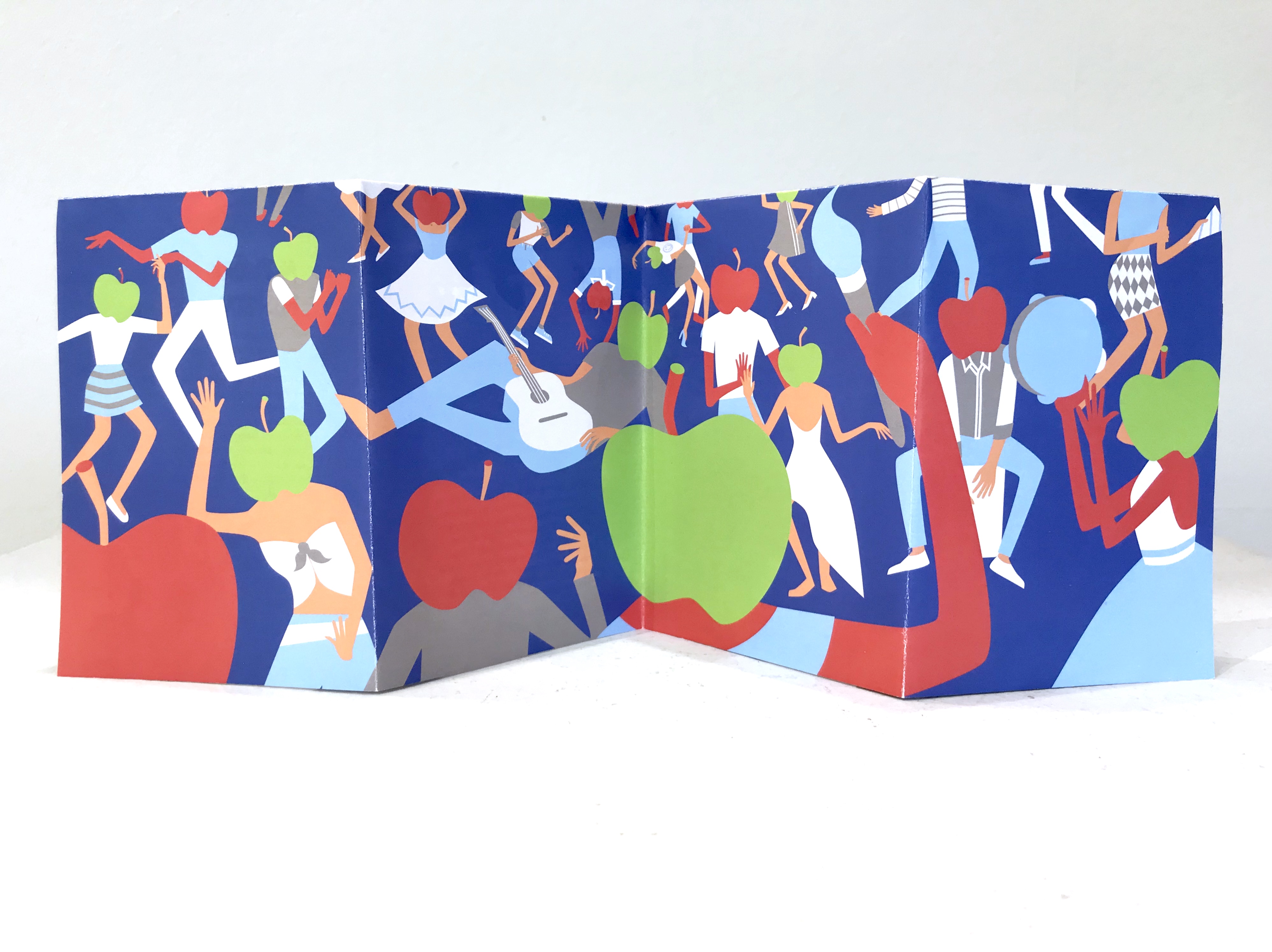
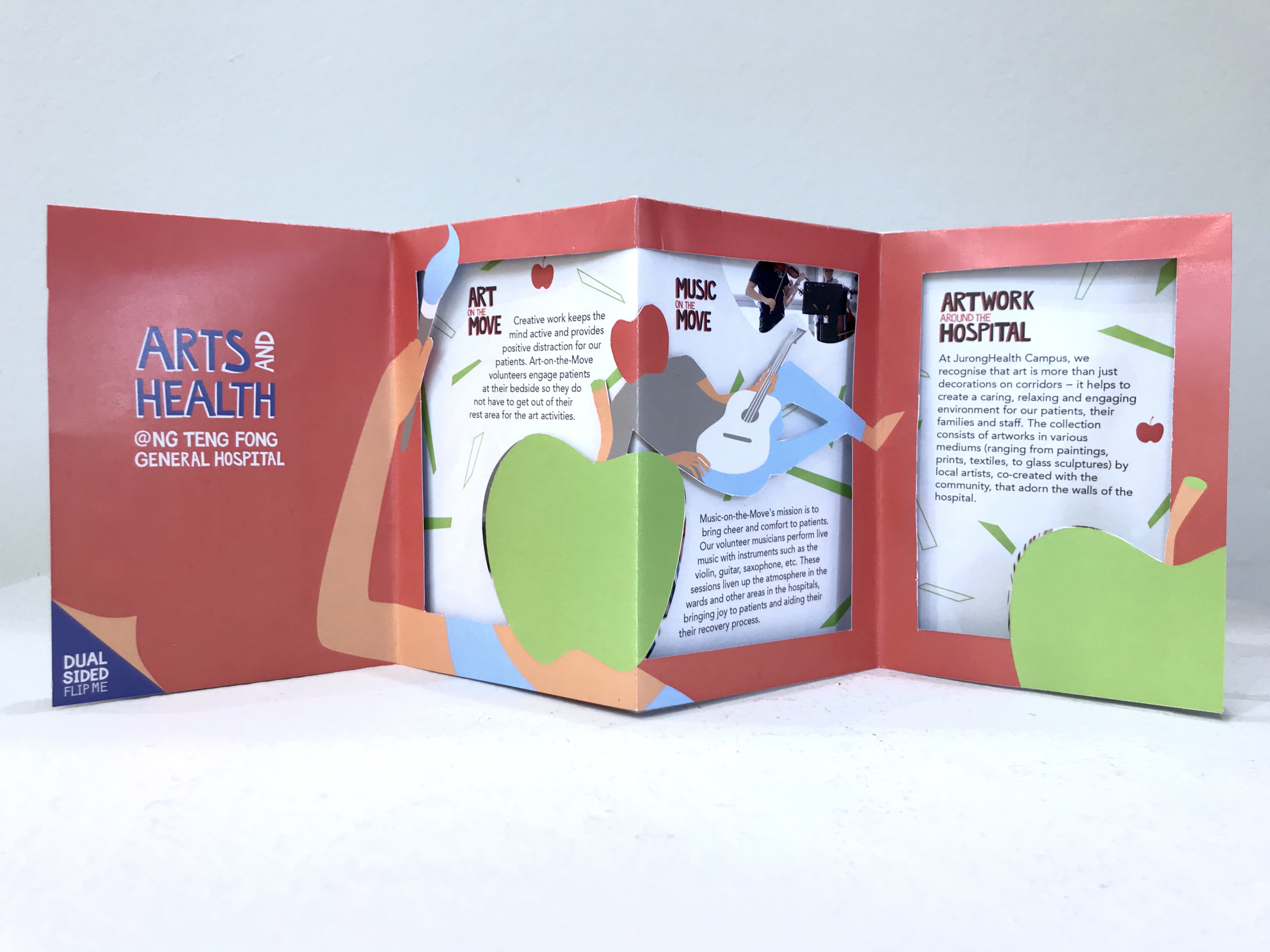
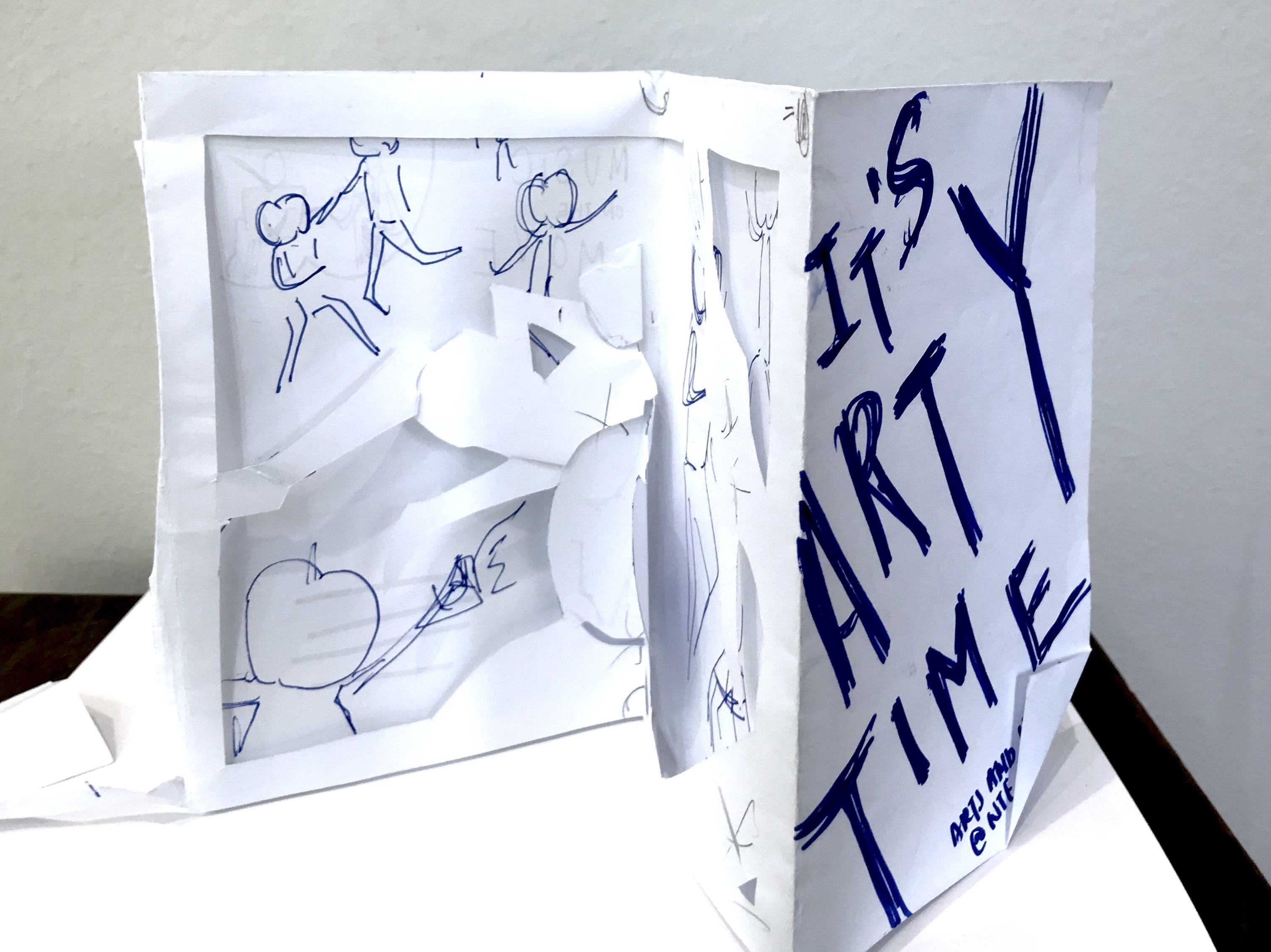
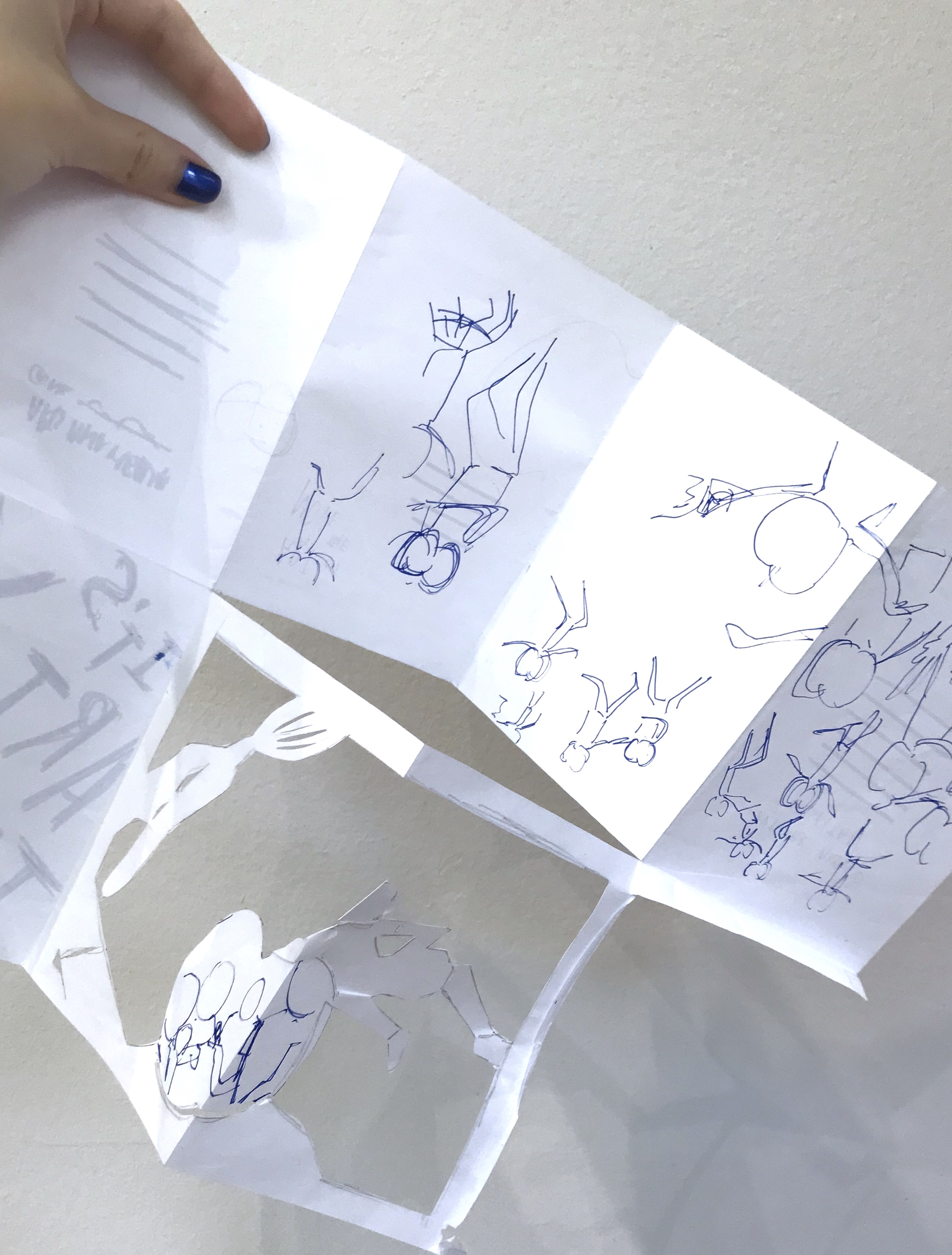
The concept, was the four folded spreads acted as a full piece instead of separate folds. On the side of the apple-headed humans it was supposed to be the side view of the fiesta on the poster. While, the side with the information was supposed to be a gallery like layout with the image within apple shaped crops. The other flap was a cut- out that could be flipped both ways to frame both the party, and gave a graphic element to the information sheet for “art” and “music” on the move respectively with different apple-head characters.
I consulted Michael, and the feedback he gave me was that due to the dye-cut, I neglect and has to compromise a lot on the layout of the information sheet itself. Thus, I had to take more note to introduce flow to the layout.
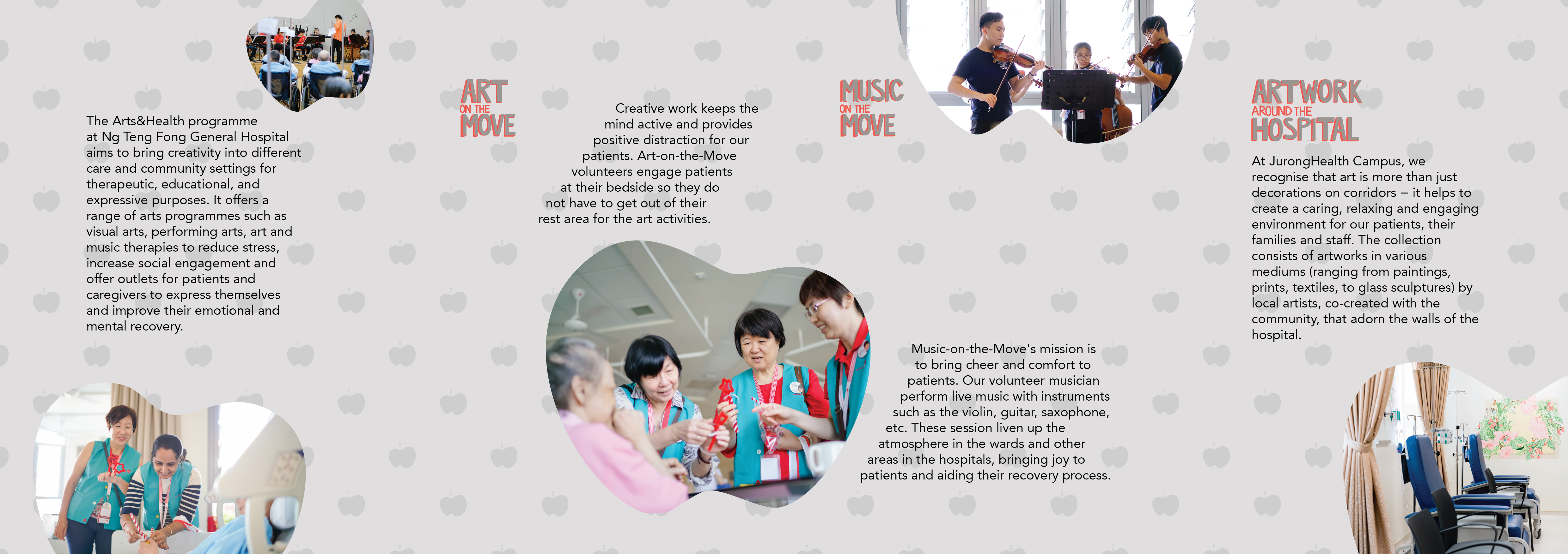
Before:
After:
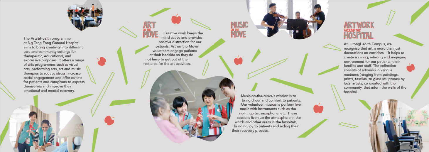
I spent lots of time adjusting the elements of the layout a lot more carefully.
The final post would be purely my final piece of work, so I would just include my learning points and reflections here:
I really got explore how to handle dye-cutting and layouts in this brochure. The final work I submitted was not the best, but I got to try out what I really wanted and I realised this dye-cuts might not be the best way to approach this brief or the project in general. Jerome also suggested a different flow of reading the brochure that could improve the brochure a lot, and I would work on that. Brochure layout is really an interesting skills to train and I hope to honed this skill. I also learn how important the printer would be in alignment and dye-cutting issues.
After doing visual research for part one of the project, I got inspired and came out with a few concept which I did in A5 sketches.

The first one (on the left) was supposed to be some sort of photography and illustrations overlaid on it. It was simple, very simple, and very safe idea. The second one (on the right) was an abstract idea. Like I thought ok let’s not do anything to do with arts or health, just something happy, thus, sunflowers. However, Micheal and the class feedback that it was a bit too simple, which I agreed, thus, I had to complicate the idea, make it more surrealistic. I wasn’t that interested in this idea, thus, I just decided not to pursue it.

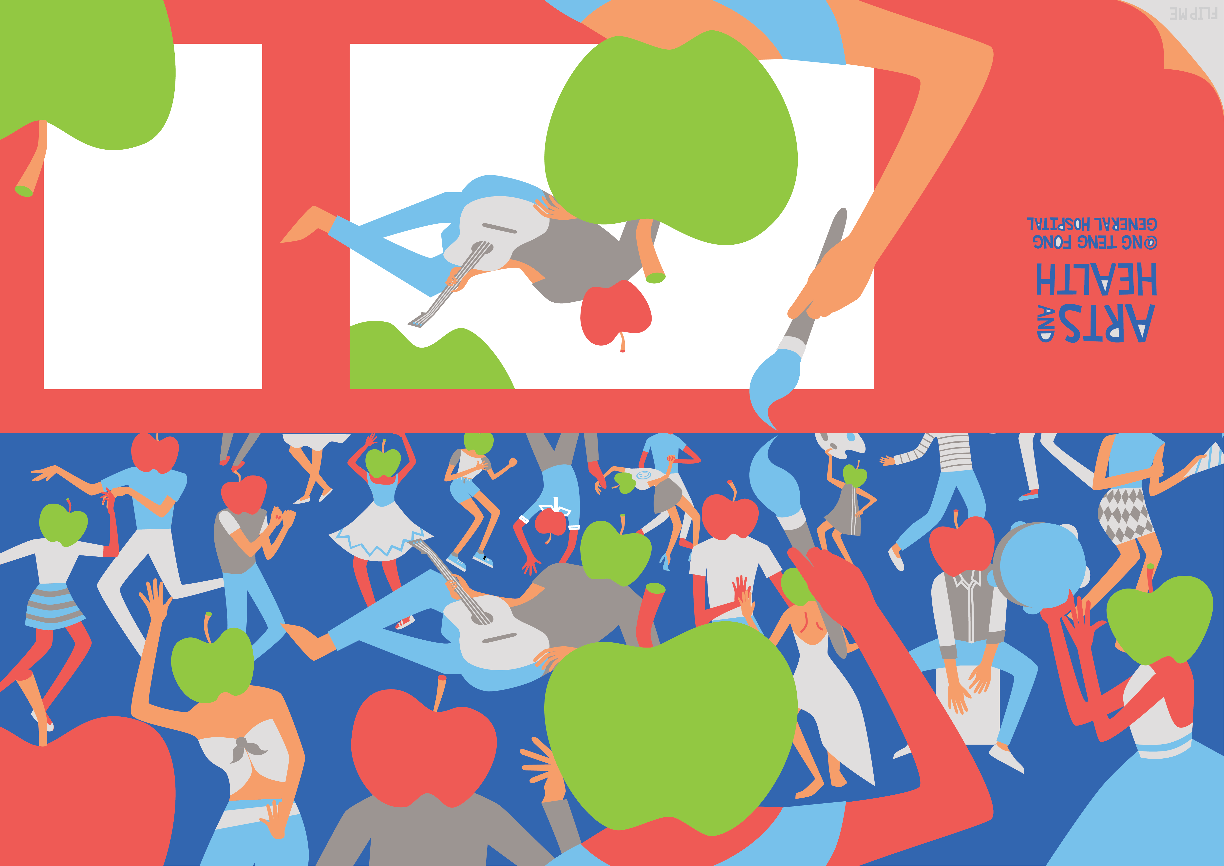
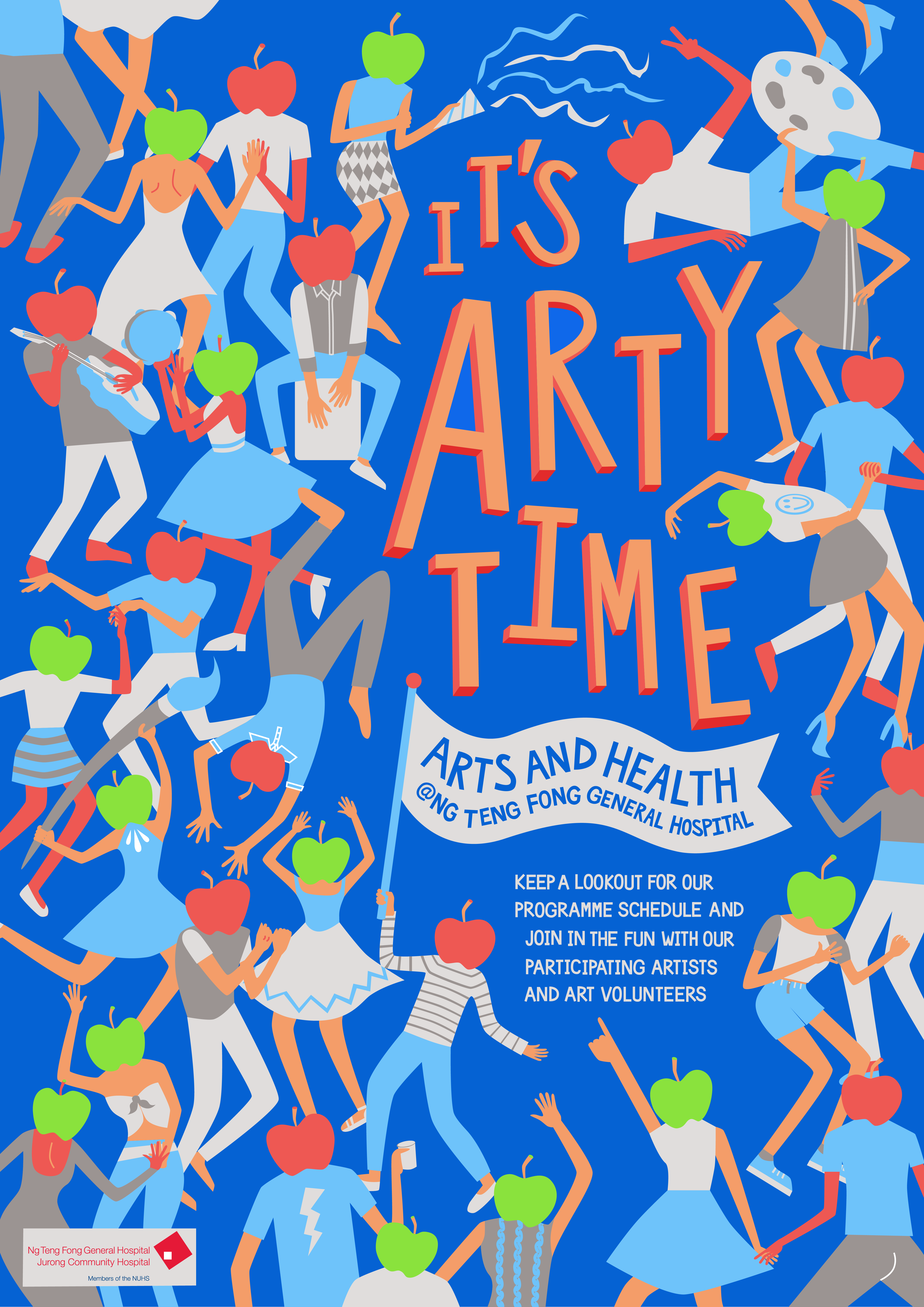
The third idea (on the left) was a very literal idea, brush to represent “arts” and apple to represent “health”. This was supposed to be photographic. It was so boring that it’s not really worth mentioning BUT it did lead to my final and best idea. The fourth idea (on the right) was inspired by the third idea. It was kinda like an idea of a sort of fiesta, with movement, liveliness and happiness. The fiesta with the dance, music, and art (brush) represents the “arts” part and the apple headed humans were abstract representations of “health”. At this stage I was purely thinking of imagery, and not slogans as I am not as good with words.
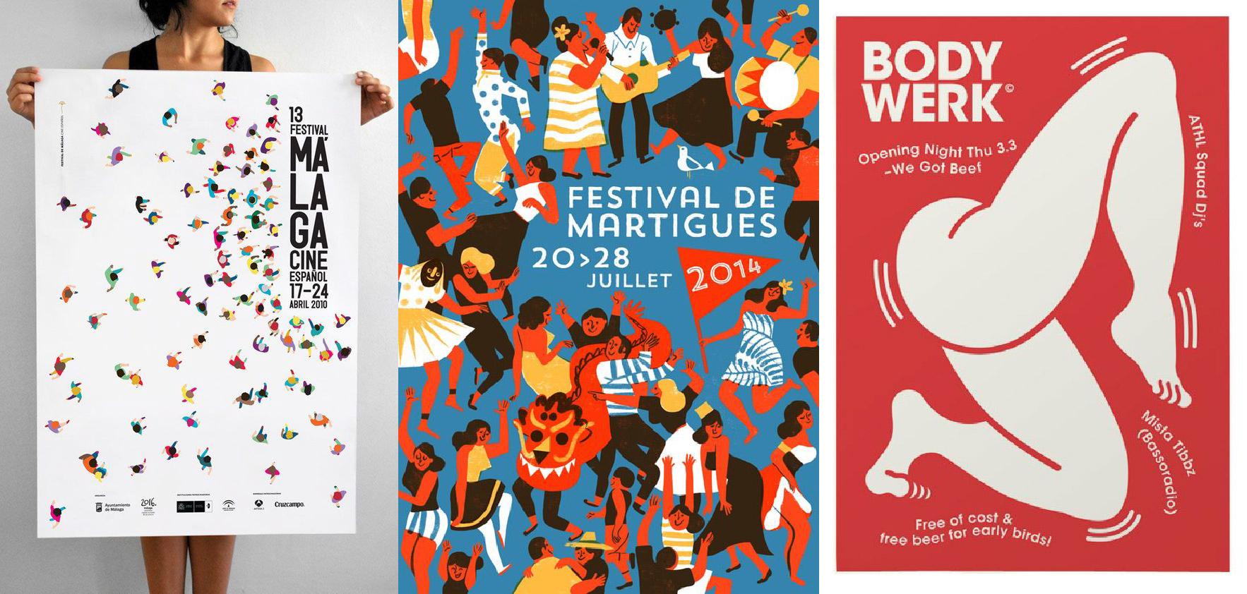
It was also inspired by several posters I saw in my research:

Thus, I started digitalising my work. Here are some preliminary sketches:
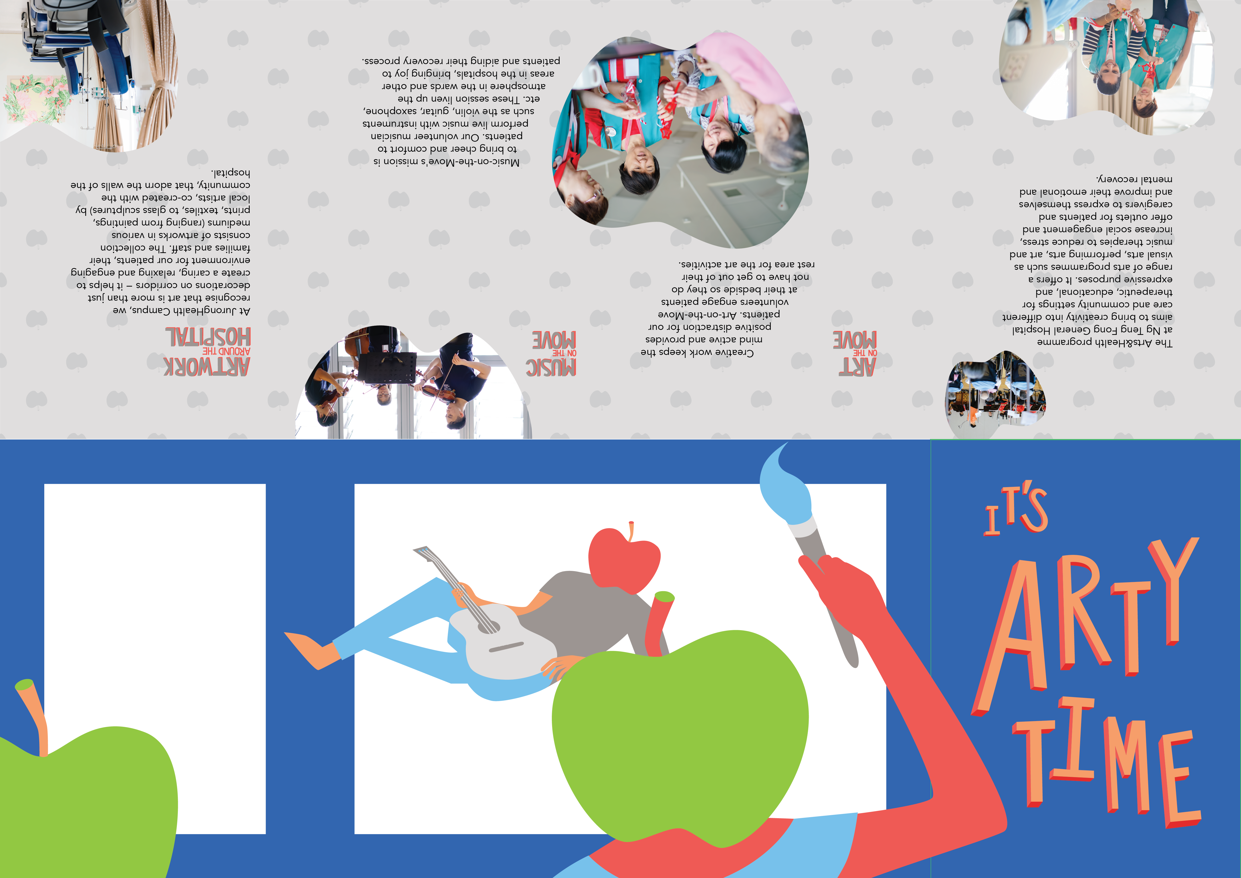
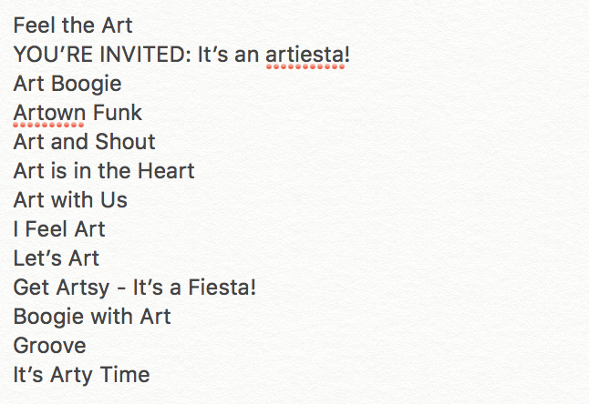
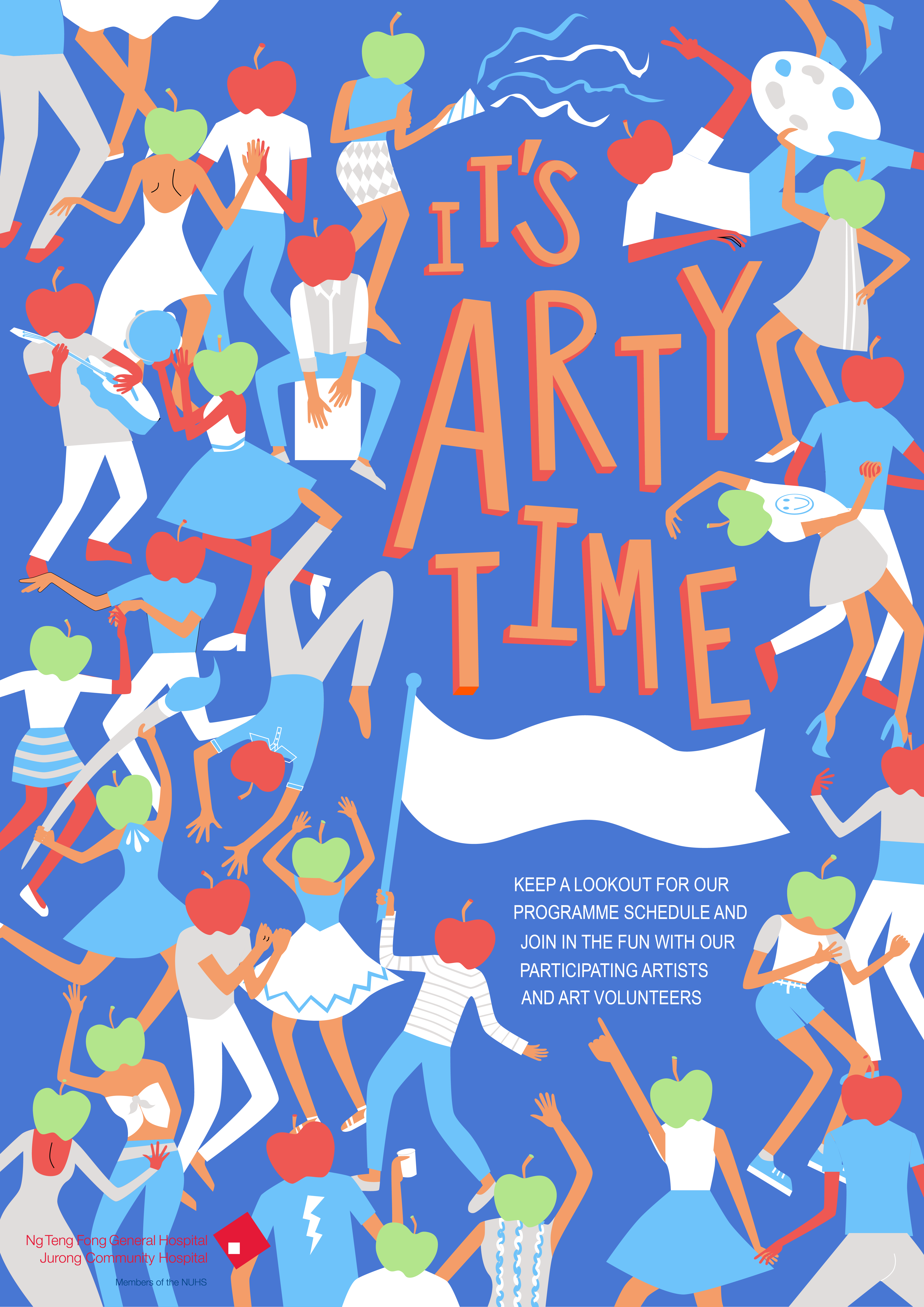
Due to the fiesta nature of my poster, I decided to go ahead with the slogan of “It’s Arty Time” among the list of slogans I came out with.
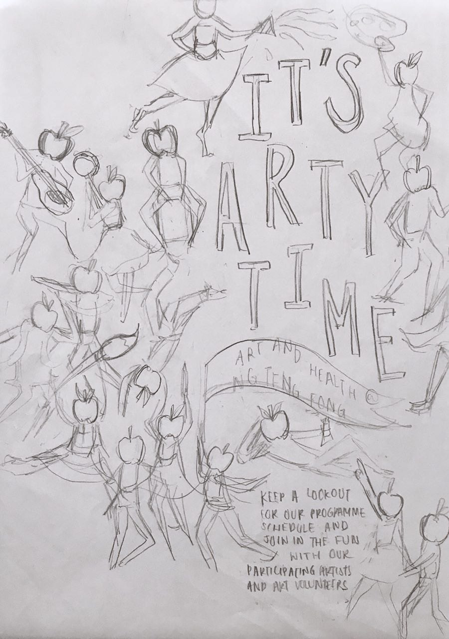

This is the first draft presented in consultation. I already thought through difference composition in the sketch process, thus, I didn’t do much experimenting with composition in the illustrating process. Each character was illustrated specially to fit the space I placed it in. Thus, moving them around was not an option.

However, during consultation, Micheal gave me some good feedback in terms of rearranging the position of the character in the bottom right corner, playing up the size and position of the “It’s Arty Time”, playing the poster to it’s full strength of whimsicality.
There was many shifts and edits of the characters, to fit everything in in the process, but was mostly small shifts in spaces.
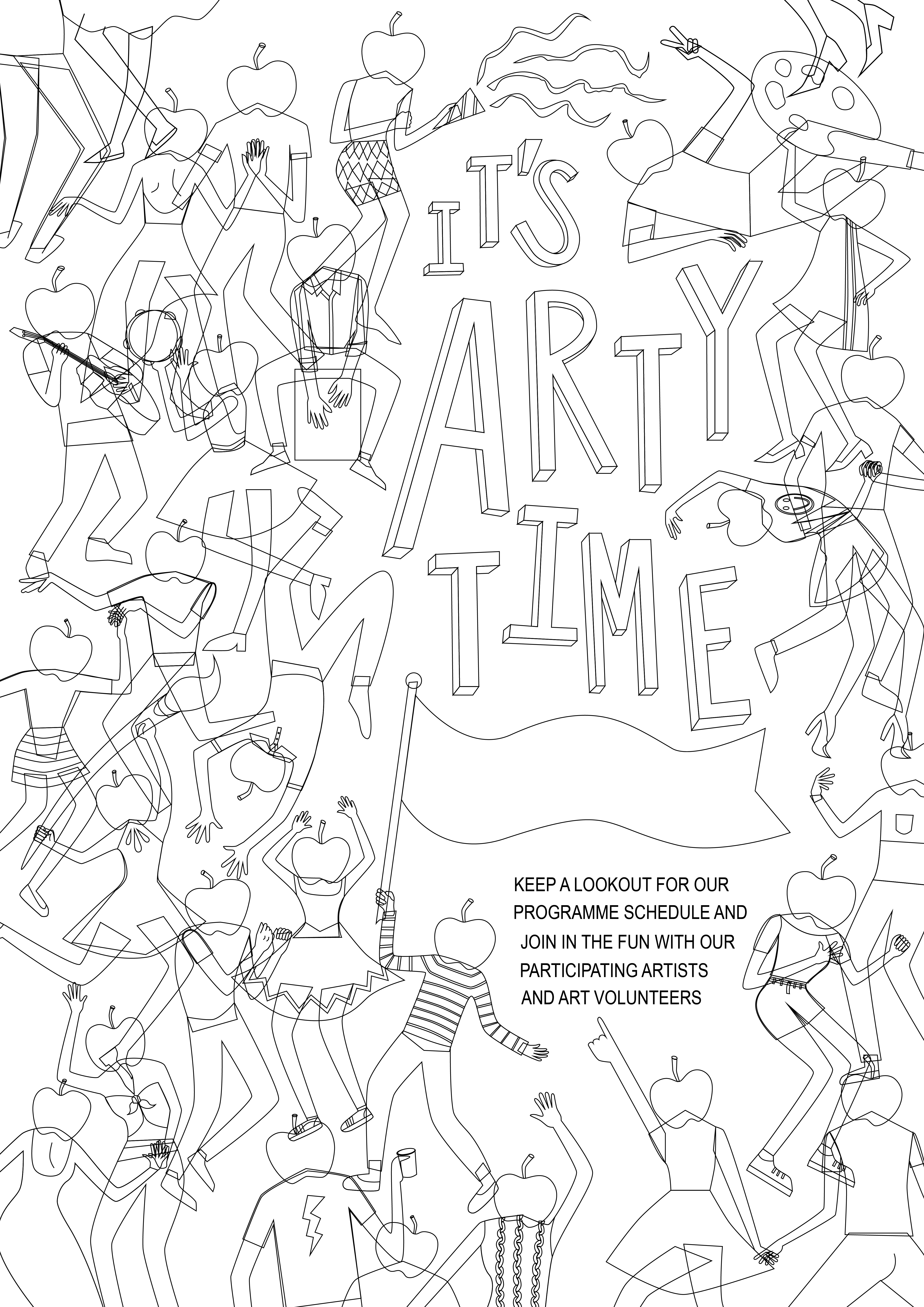
This is the close to the final draft of the poster:
After the illustrations were done, it was the colouring in.
This is my first colour palette.
However, there was many problems in this one such as the lack of contrast and the fighting dominant forms.
Thus, more experimentation was done:
Another alternative colour scheme I explored but deemed a bit too arty for the target audience of the general public in the hospital:

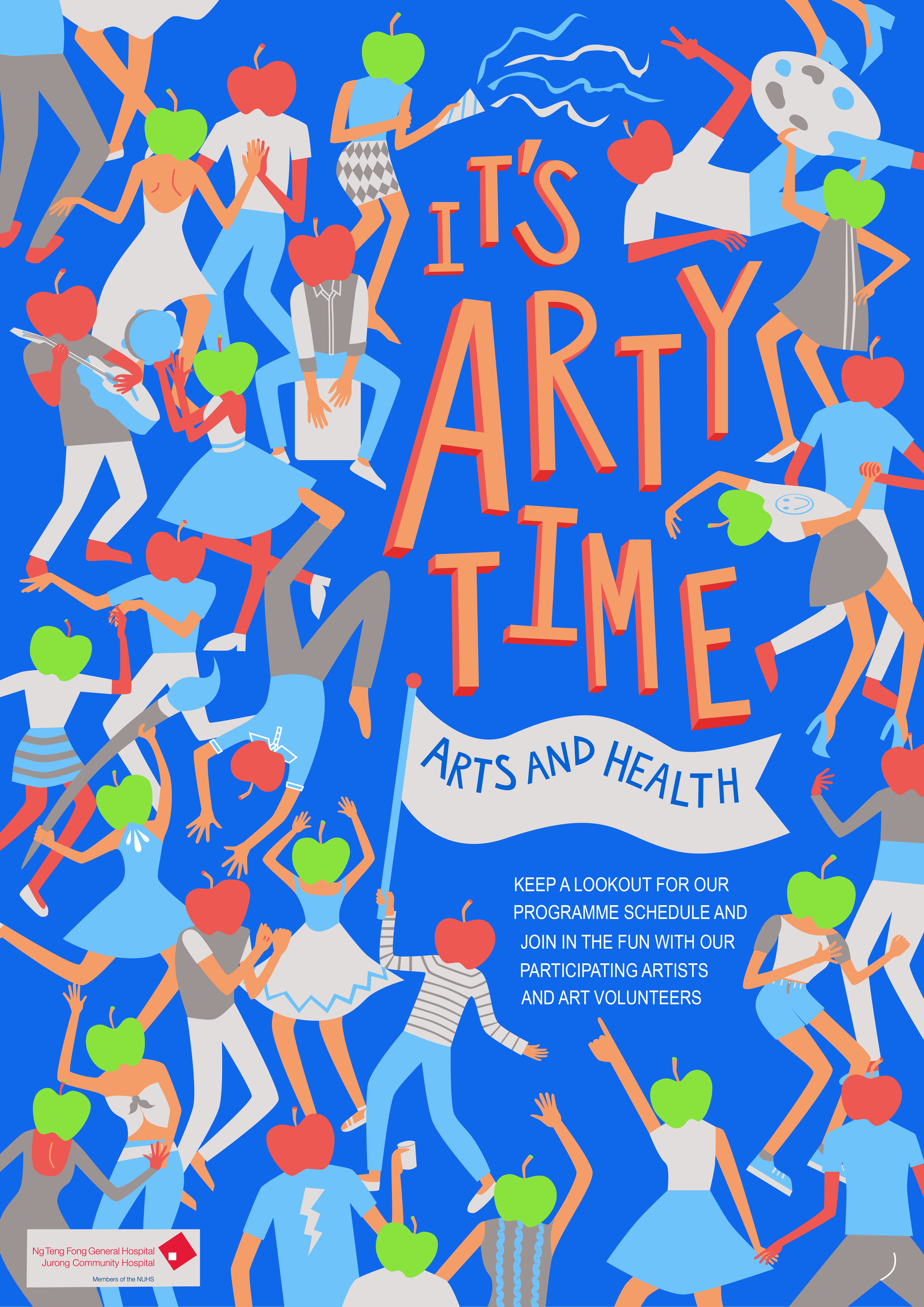
As I slowly settled the colour scheme and cleaned up the illustrations, I finally completed my final product, which will be in the next post.
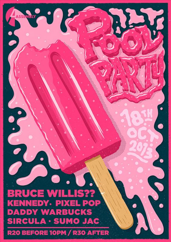
The poster is communicating a Pool Party happening on the 18th of October 2013.
The emotions the poster elicit are joy, whimsicality, and excitement.
The poster is captivating firstly due to the use of colour, a large bright pink patch on dark blue. Next the use of the large ice popsicle image is simple and eye catching. The melted pink ice cream further conveys the idea of wetness and splashing of the pool party. It generates interest because it is linked to the idea of refreshing, and fun, like eating an ice popsicle. Readability is definitely there as it is extremely straightforward the date in the ice cream splash and the rest of the details in blocks underneath.
I really like the approach of this poster. It’s different, it does not show anything about a pool or party, but the imagery instantly make me think of fun and joy, the type of party I would want to go for.
![]()
![]()
![]()
To translating my mood boards into design sketches, I did three themes of sketches in order of the mood board I posted in “Task 1”.
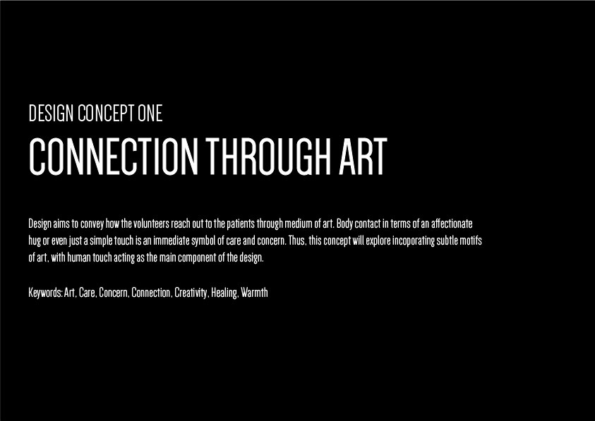
This was theme 1 exploring the concept of connection, thus human touch, and the paint strokes, signifying reach out through art.
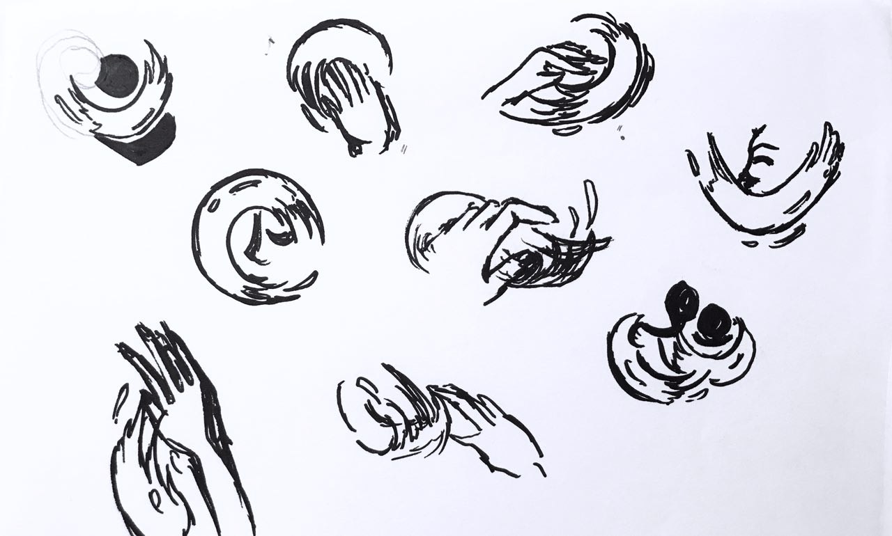
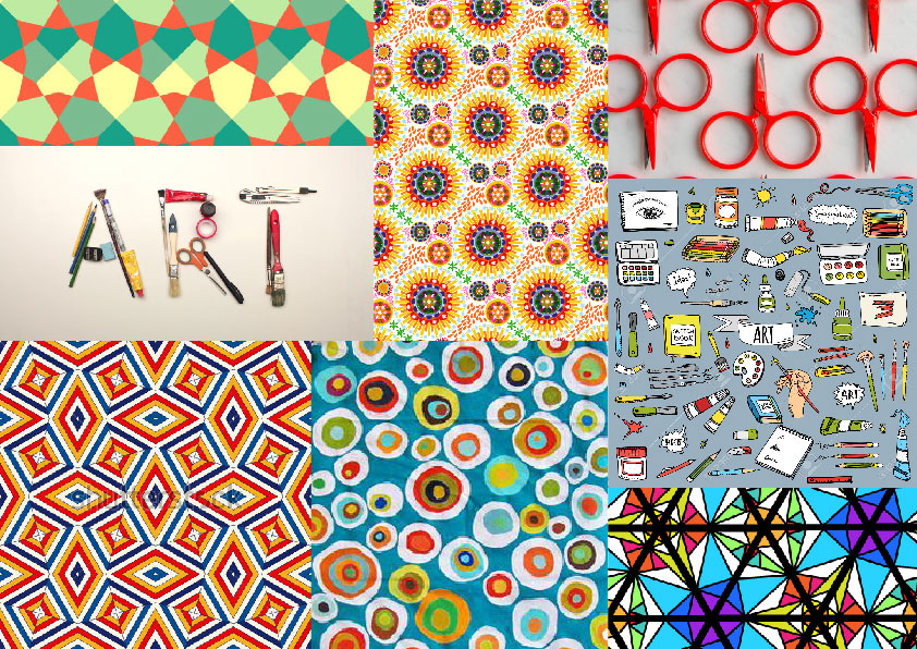
The second theme, kaleidoscope.

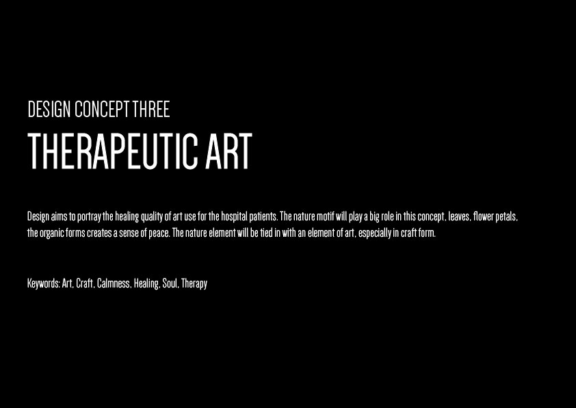
And the third, therapy through nature motifs.
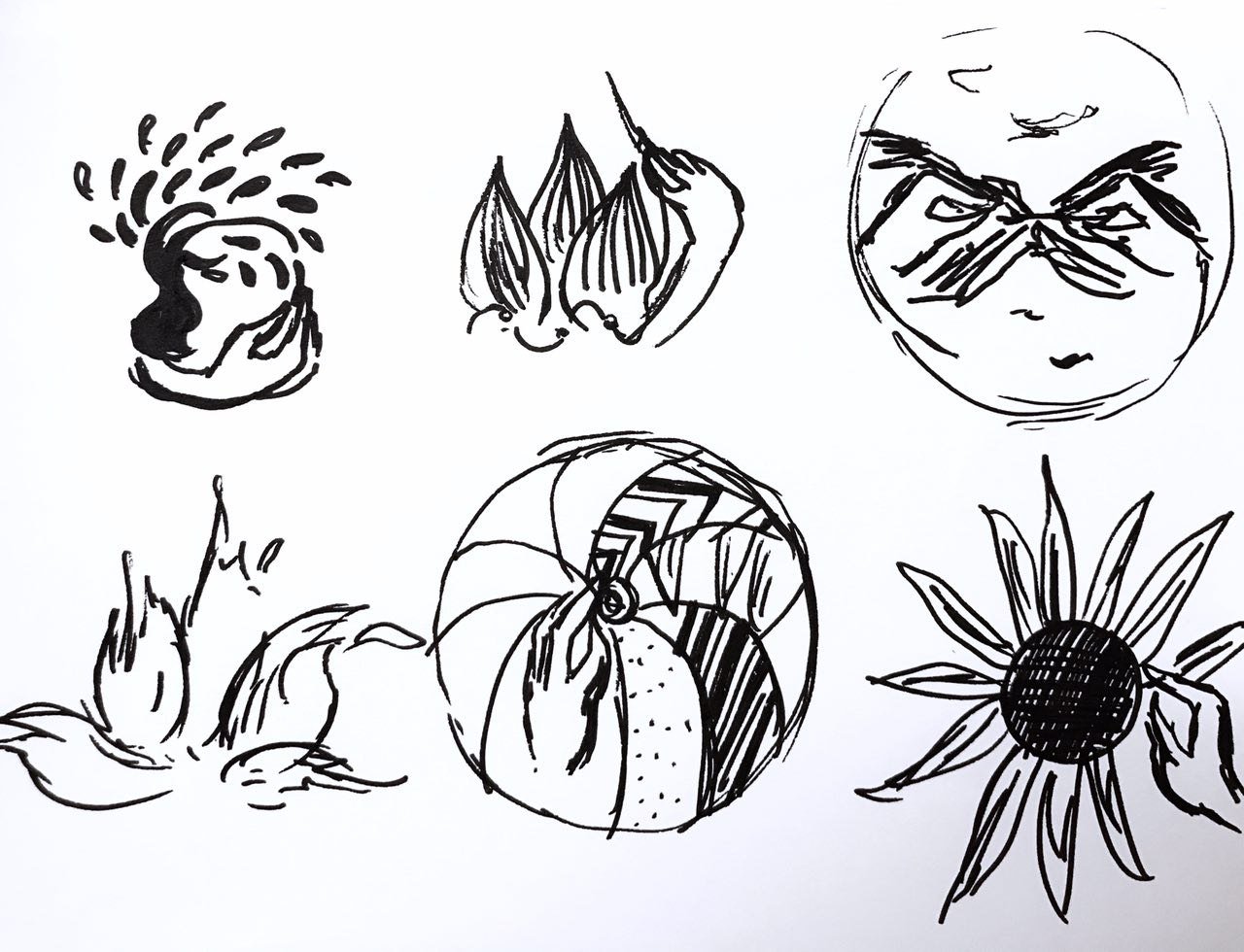
Through the first round of consultations, I was slowly starting to notice how I had to turn my designs more logo=like. Increase the relevance of these design and motifs to suit the theme “art on the move”.
Thus, I continued brainstorming and expanding on the first theme, which was my favourite theme. And upon the advice of Michael

Through the first round of critique and consultations, I was beginning to understand the requirements of this design more and more. I also began to take note of the importance of relevance in the design, How the design should speak “art on the move” in picture format, as well as the need to reduce certain design elements to for scalability purposes.
I decided to expand my first theme which was my favourite. With advice from Michael, I also incorporated elements from the second design into the first design to make the design be more relevant to the “art” part of “art on the move”.
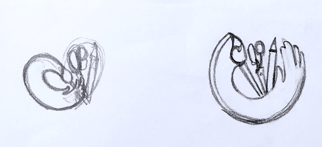
It was through repeated sketching that the idea of the heart formed in my head.
![]()
This idea took the outreached “paint brush” hands (reaching out through art) from the first thematic sketches and the craft tools from the second thematic sketches. Together it was supposed to portray a heart as a whole, a symbol of care. Separately, the paint brush hands represent the volunteer’s role in “art on the move”. The curvilinear stroke also provided a sense of movement. The tools increased the relevance of this design.
Two other designs I had the inspiration for was:
![]()
![]()
I quite like the third concept actually. But I felt the movement was missing from this design.
Finally, after much thought, I decided to stick to developing the first idea. I also simplified the stroke, and make the heart-shape more distinct, by using visual cues as suggested by Michael. Like the bending of the pencil. I think this really cleaned up the design. I also added in the text in a curvilinear format to enhance the round side of the heart.
![]()
After simplification and modifiying, this was my final piecce.
Next up is colour exploration:
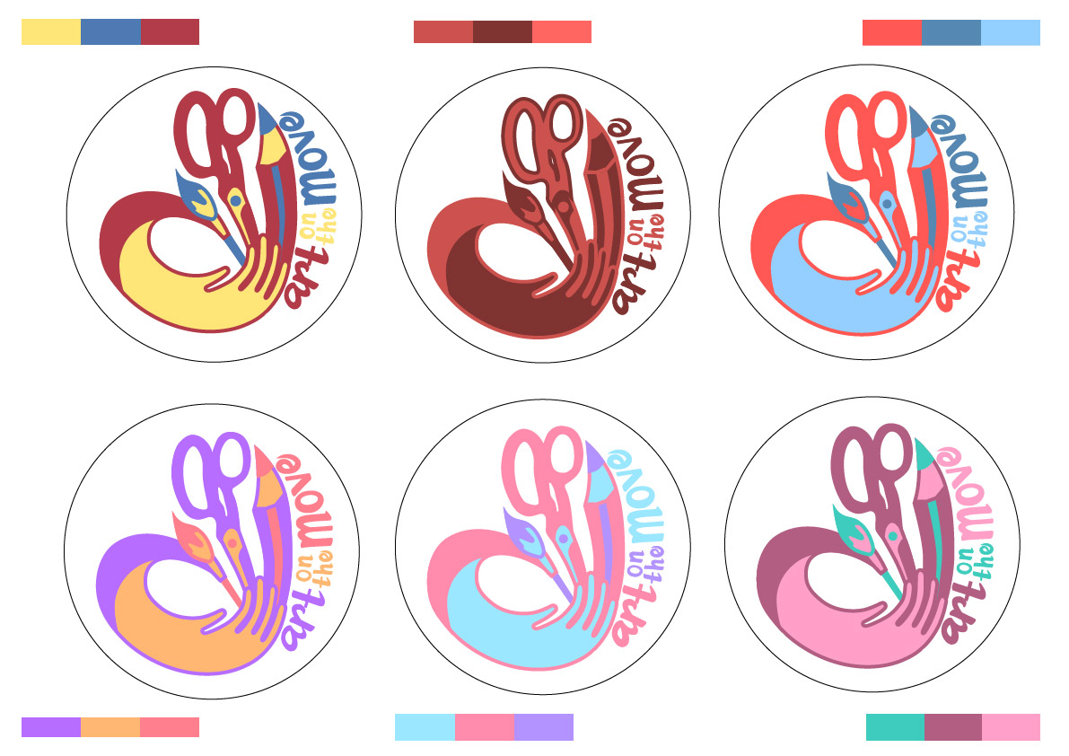
Through exploring these colours, I learnt how to manage the colours better. Like how to use certain colours at certain areas to bring the heart shape of the design.
Finally, I settled on
![]()
This is because, primary colours are very easily relatable. It looks harmonious, yet lively, connoting the idea of play.
The other variation would be ![]()
Because of its highly contrasting and eye catching colour combination.
Next up: Final Work
Design Aims
To design a button badge that – is interesting, fun, appealing to the volunteers as a collectible, and portrays the work the volunteers do.
Design should also contain the potential to be edited and made into a series.
Design Concepts