In the brief we were asked to look up on some brochures:

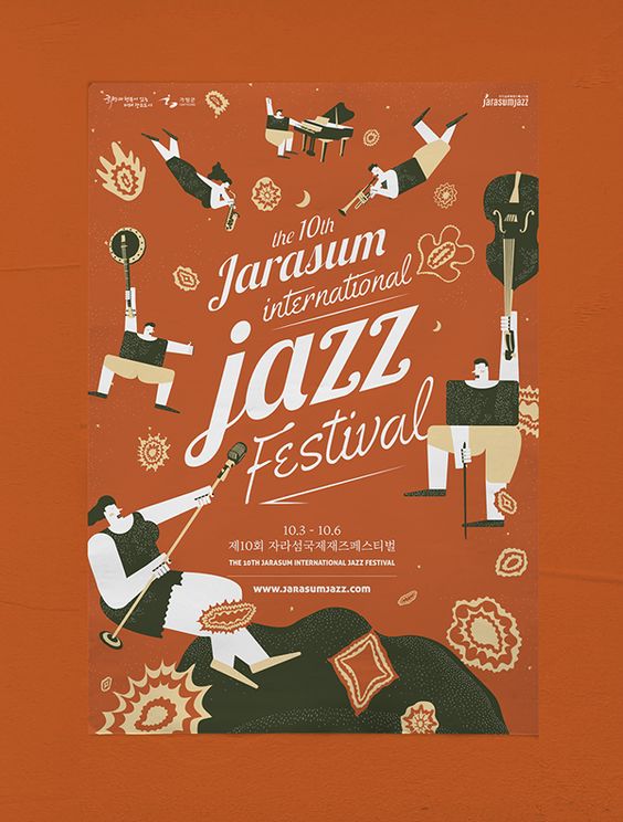
This is one of the brochures that caught my eye due to the fold and design. Even though the fold here used is extremely simple, it’s relevant and appropriate in imitating the way the BBQ cooker opened up, adding visual interest.
The below brochures I find aesthetic but I include them within this post because they triggered different ideas within me to work on:

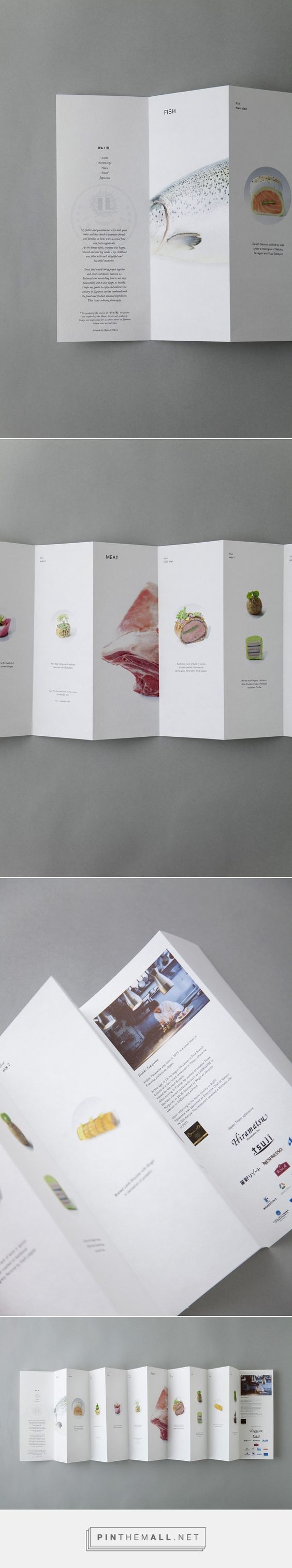
The one on the left triggered ideas about the information placement, and the right triggered ideas on dye-cut.
INITIAL THOUGHTS AND PROCESS:
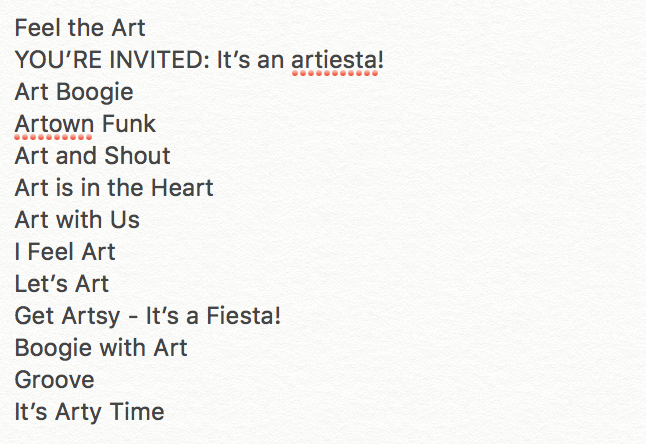
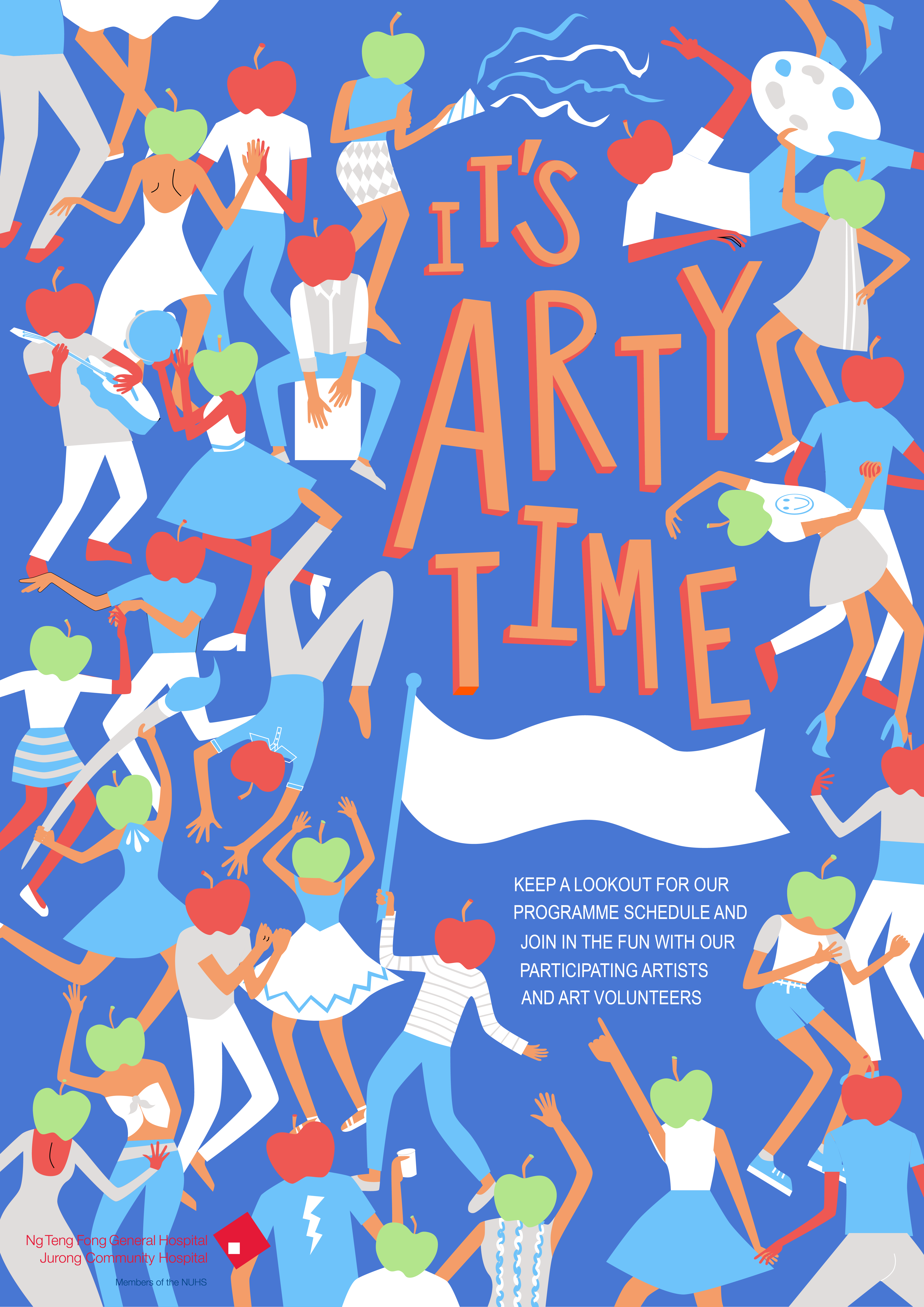
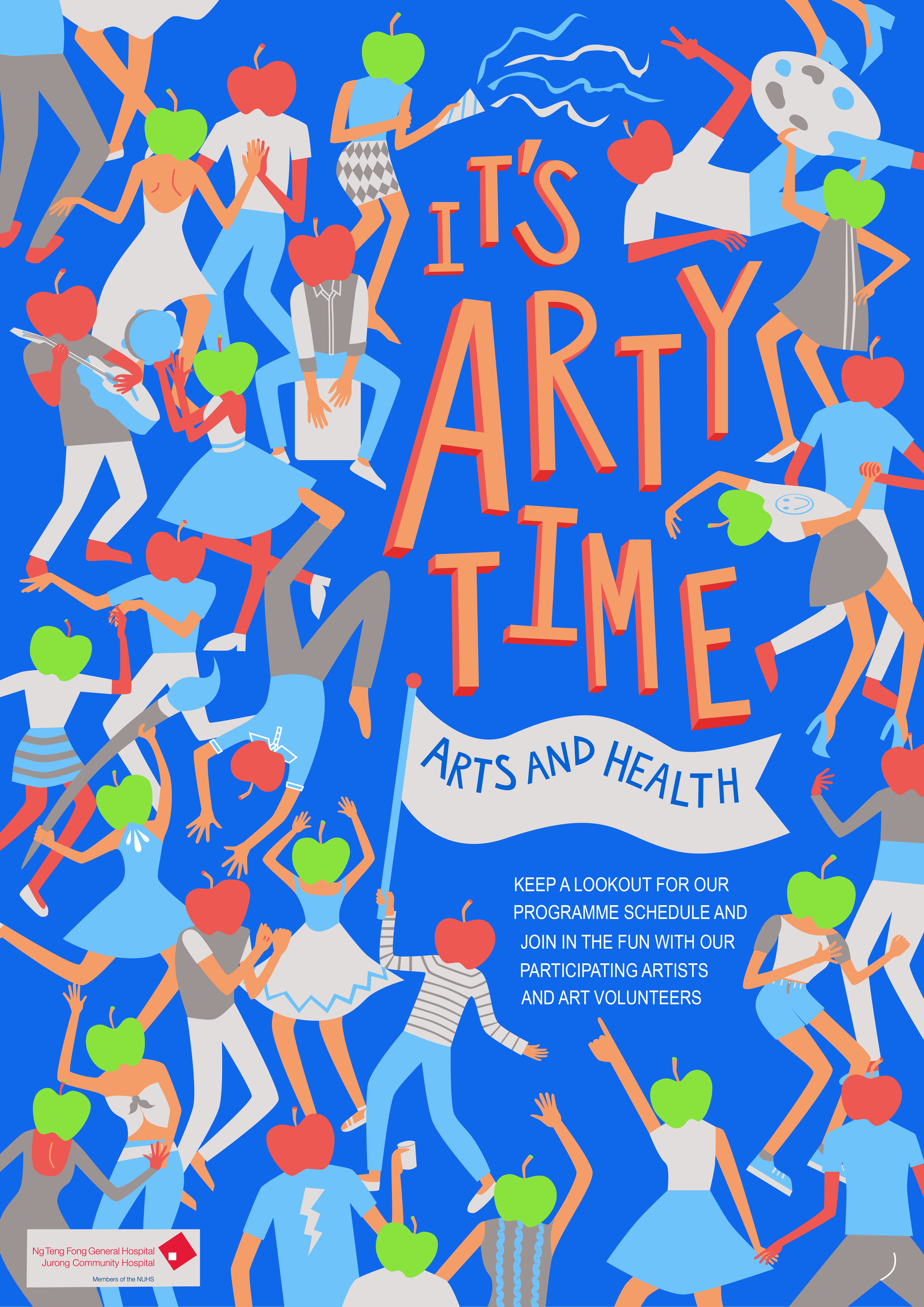
I was browsing inspiration on Pinterest on interesting folds. I knew I was going to continue my idea from the apple-head people poster, and I was looking for a simple-ish fold, to complement the simple flat graphics I had.

Then I found this and felt like the simplicity of the fold was what I was looking for. Most of the thought process and imagining happened in my head. I was initially entertaining the thought of making the idea open up into my poster like the example showed above, but I scrapped it as I wanted something different and I wanted every side of the brochure to have it’s usage.
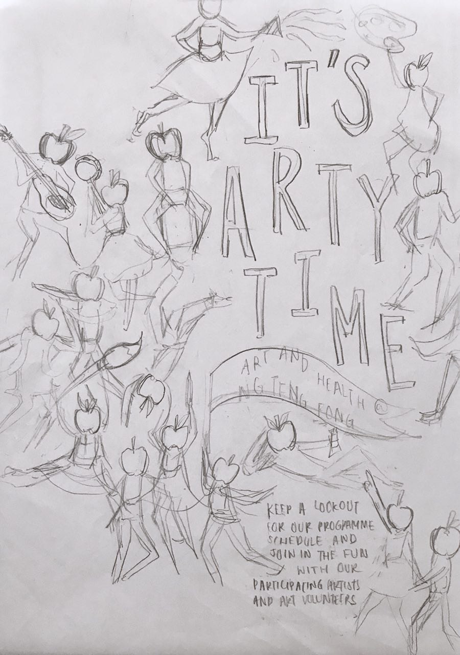
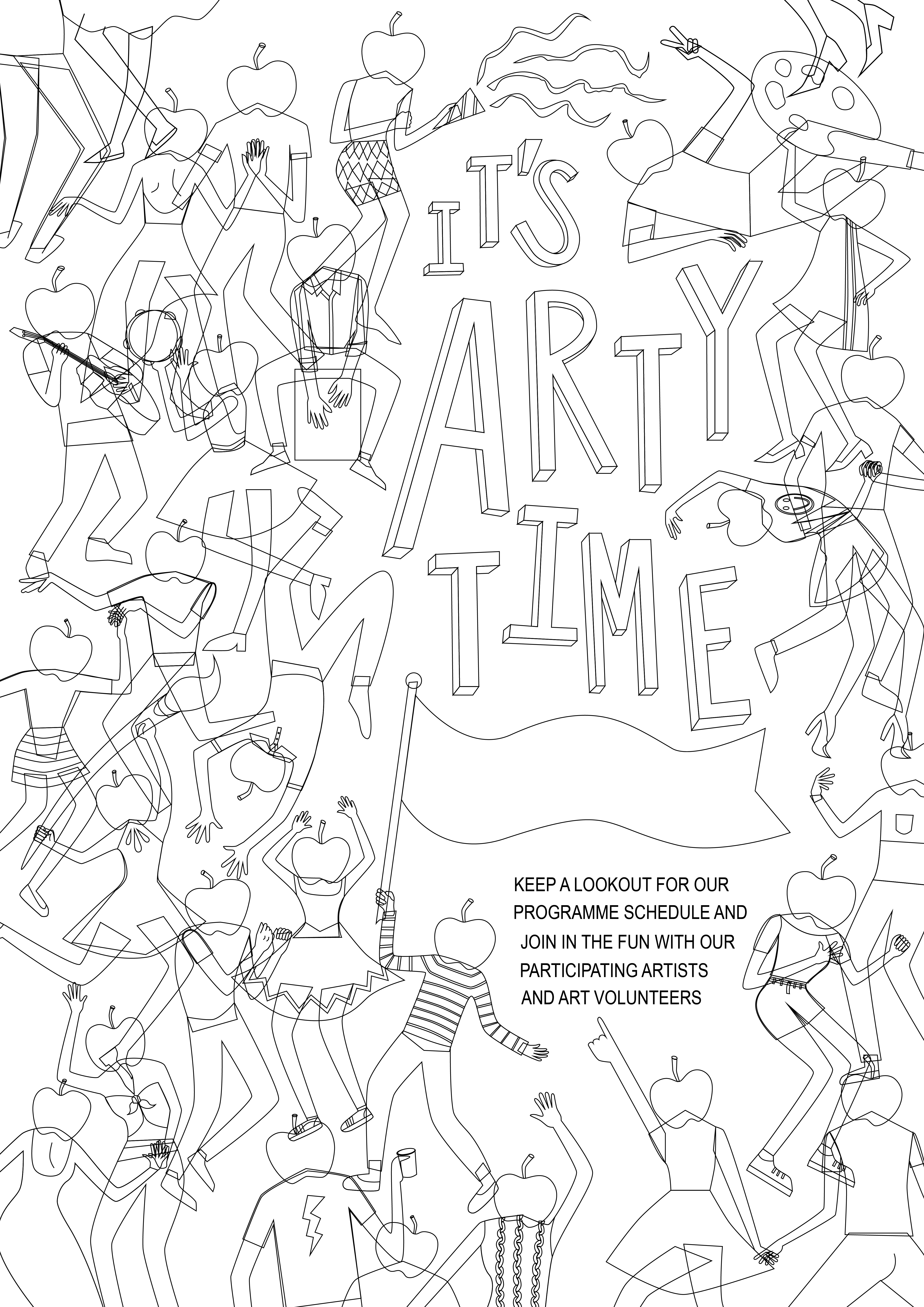
Thus, I started sketching and came out with two ideas:
IDEA 1
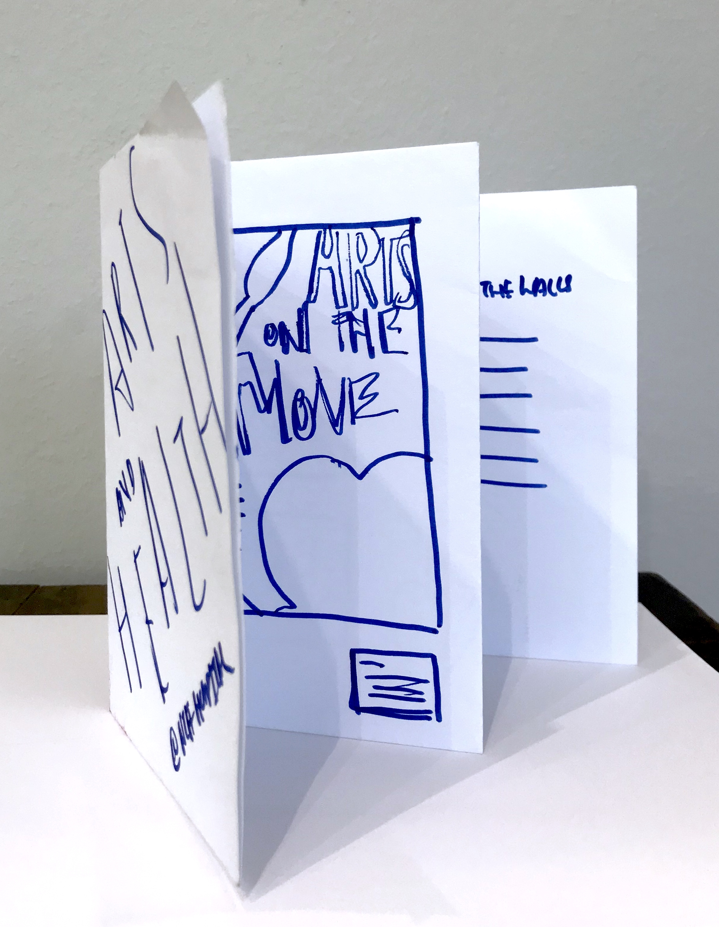


Idea 1 involves the arts and music on the move information being presented like artworks on a wall, and the back of the brochure ends off as information for artworks around the hospital. So the brochure space is a bit like an exhibition space.
IDEA 2

Idea 2 is the idea I developed and use and thus will explain in detail later in the post.
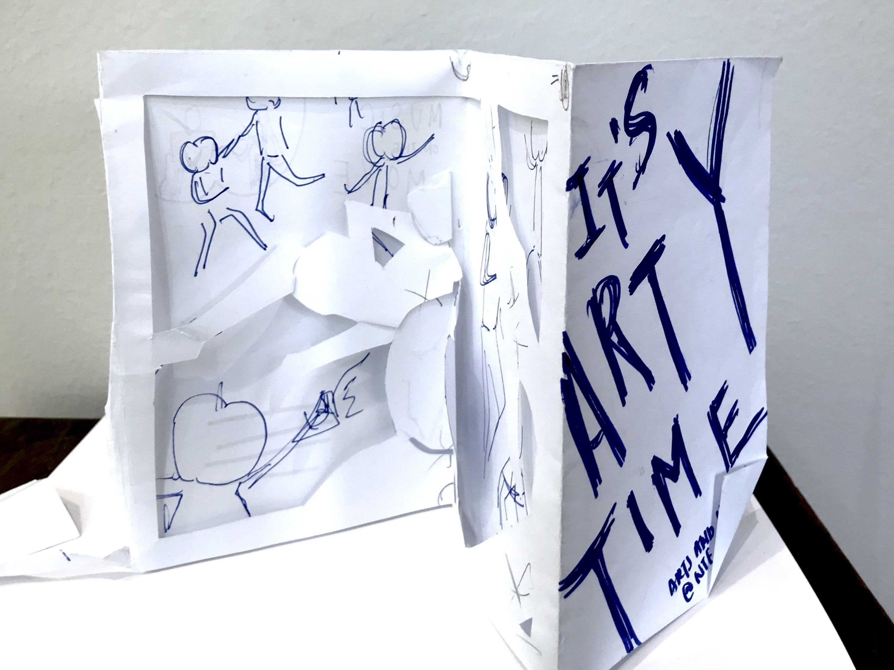
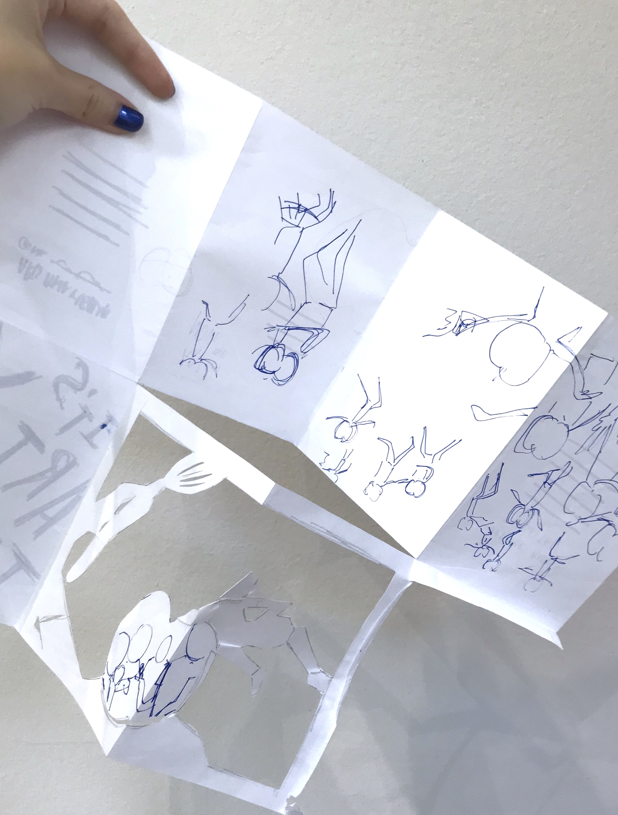
I really liked the dye-cut one and after class consultation, I decided to go ahead with that one. This is the digital version of my trial.
While this is the mock up of this trial:
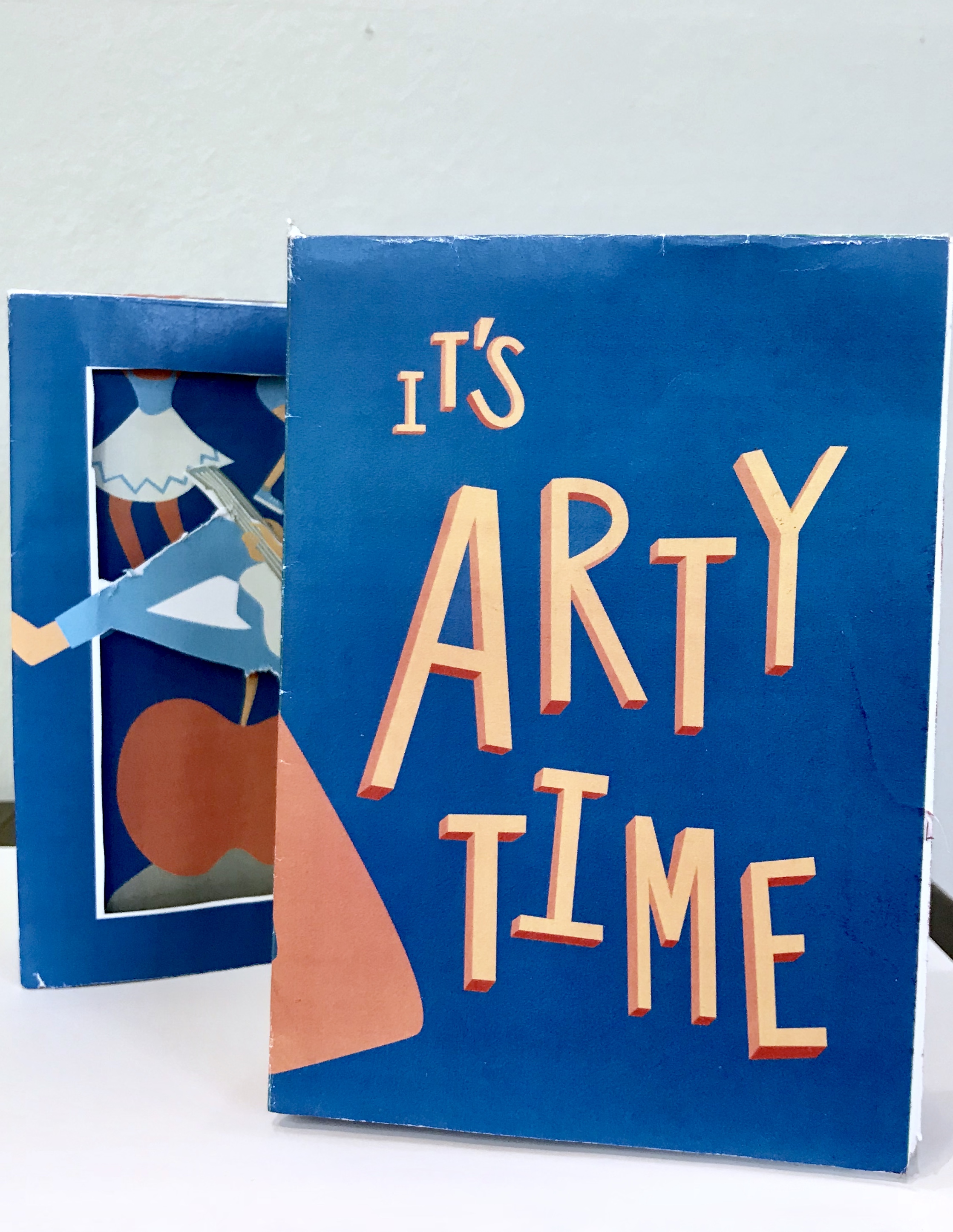
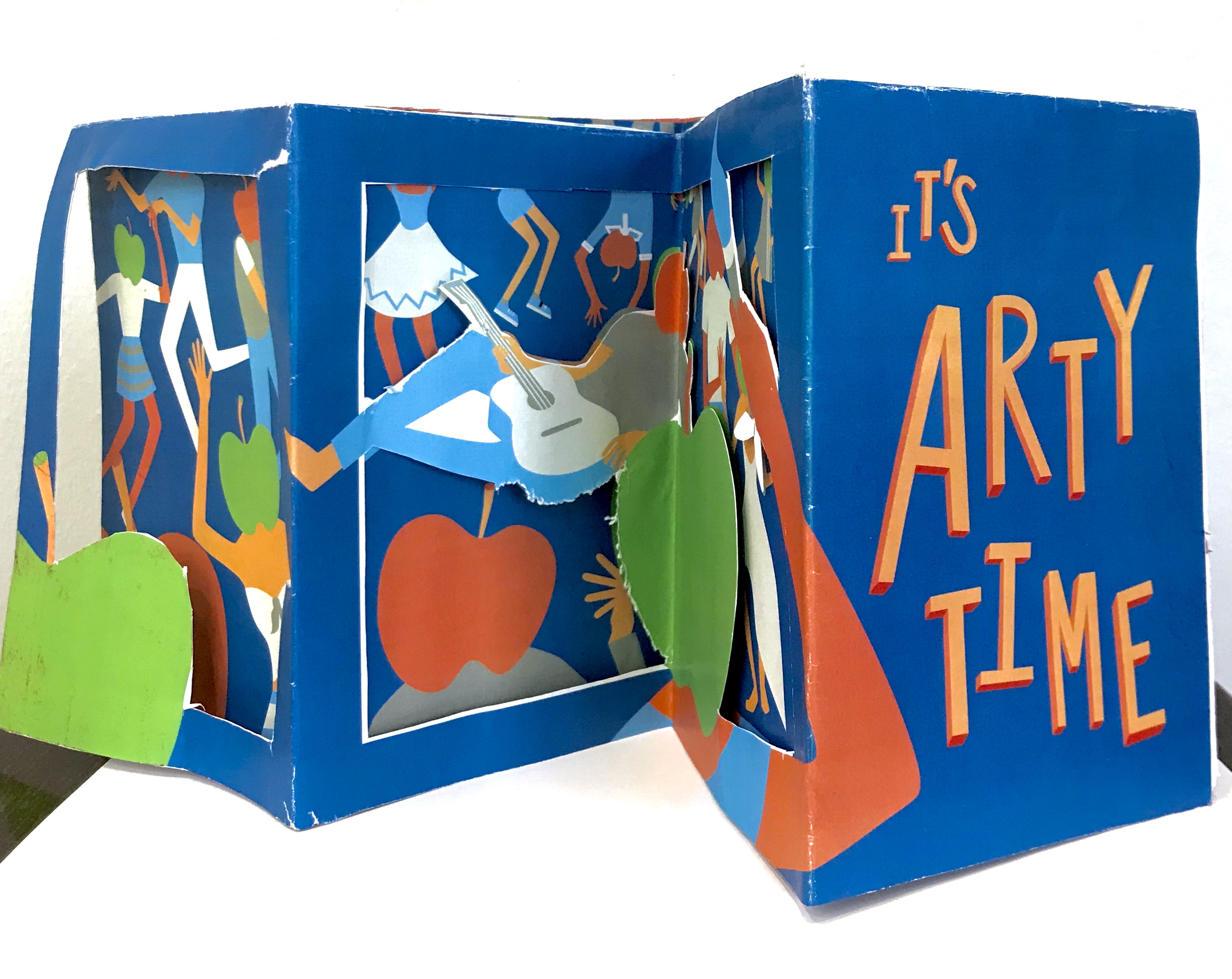
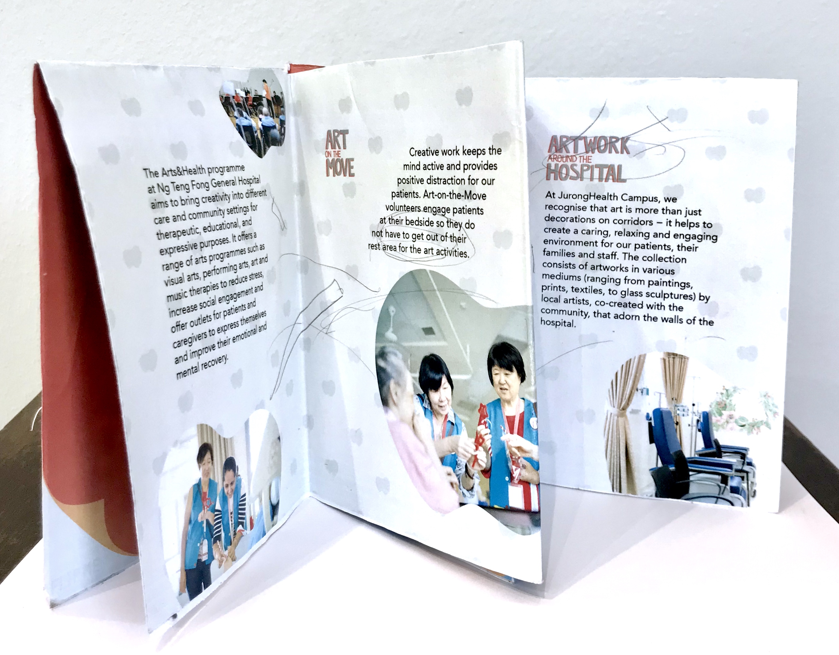
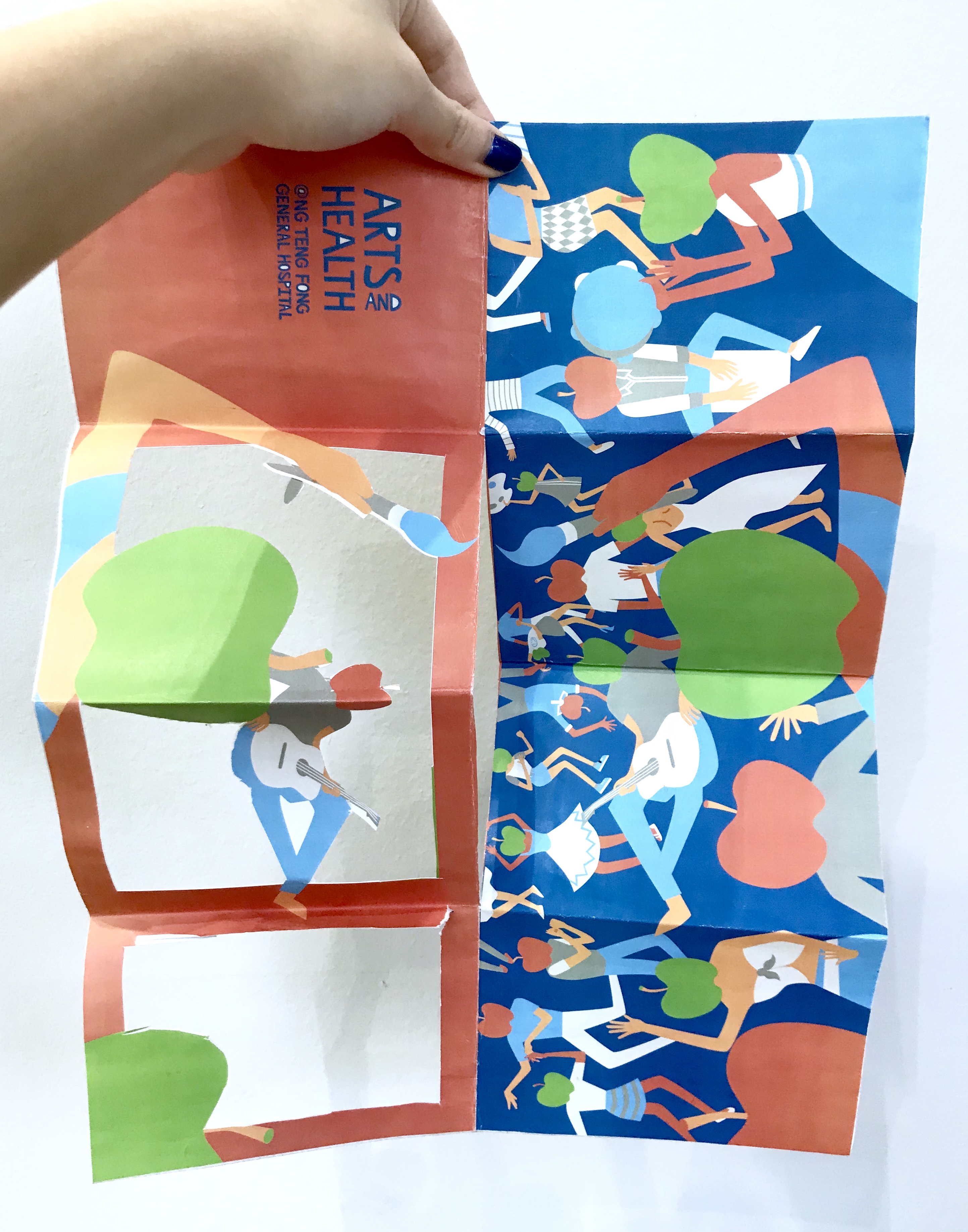
The concept, was the four folded spreads acted as a full piece instead of separate folds. On the side of the apple-headed humans it was supposed to be the side view of the fiesta on the poster. While, the side with the information was supposed to be a gallery like layout with the image within apple shaped crops. The other flap was a cut- out that could be flipped both ways to frame both the party, and gave a graphic element to the information sheet for “art” and “music” on the move respectively with different apple-head characters.
I consulted Michael, and the feedback he gave me was that due to the dye-cut, I neglect and has to compromise a lot on the layout of the information sheet itself. Thus, I had to take more note to introduce flow to the layout.
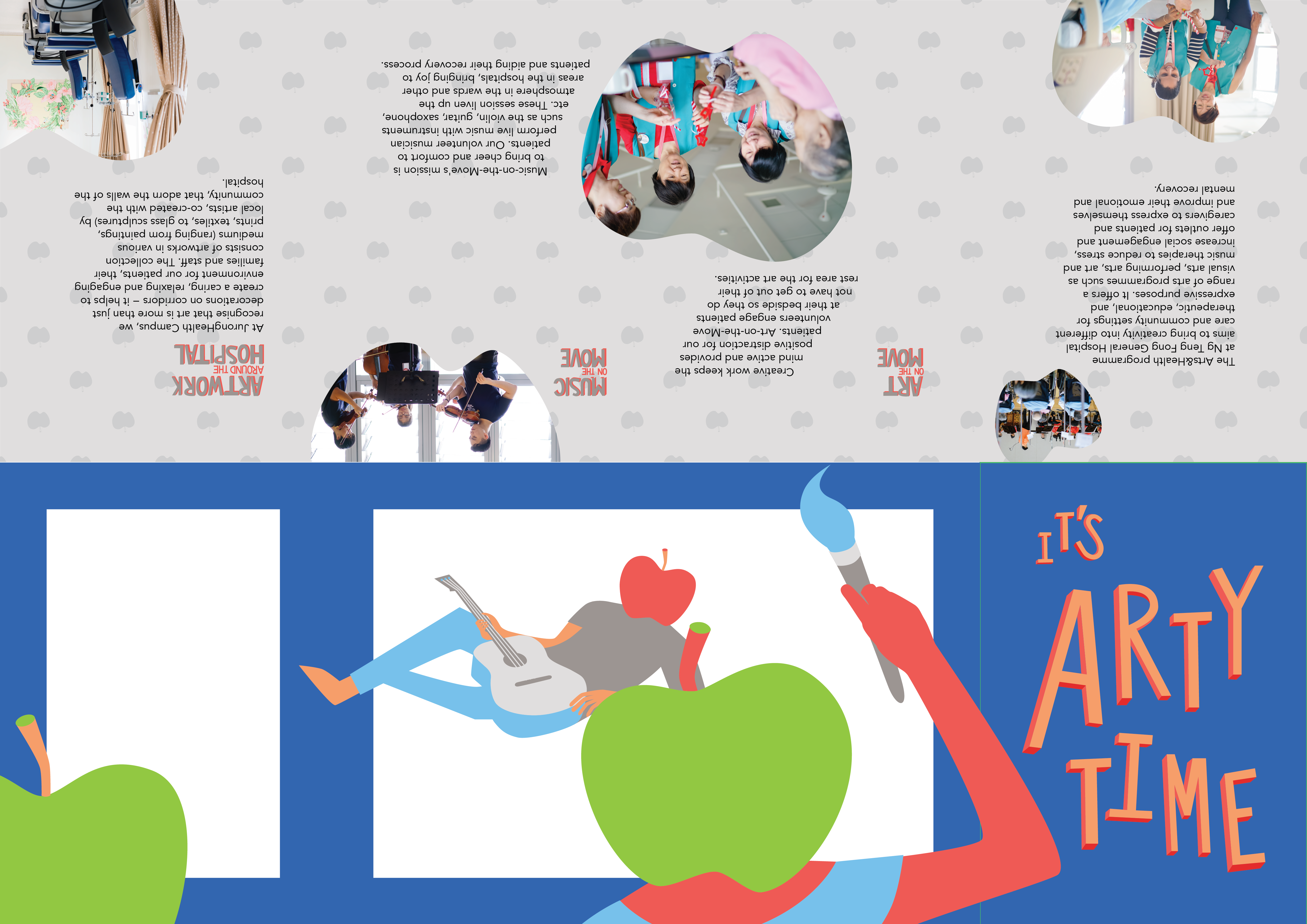
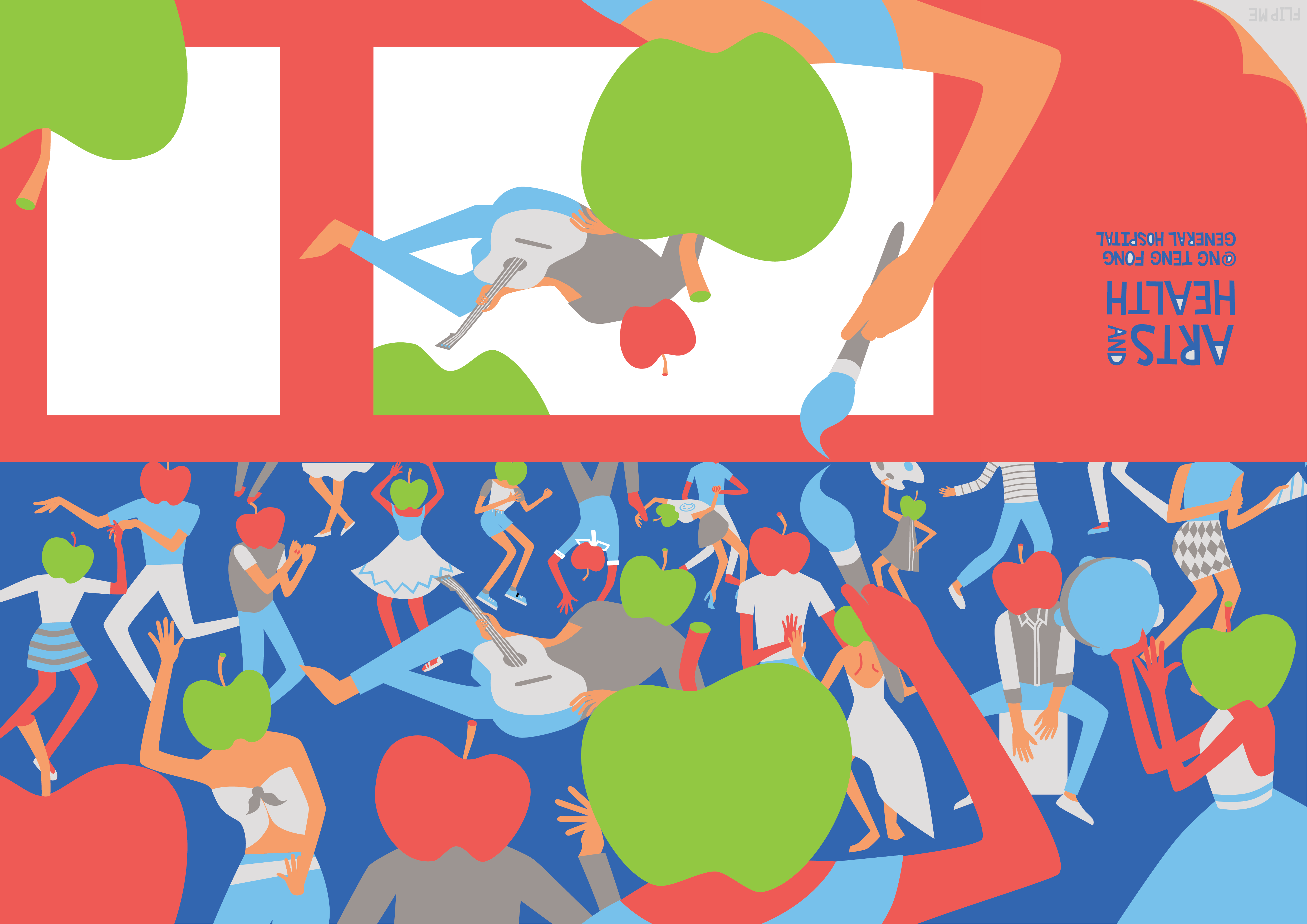
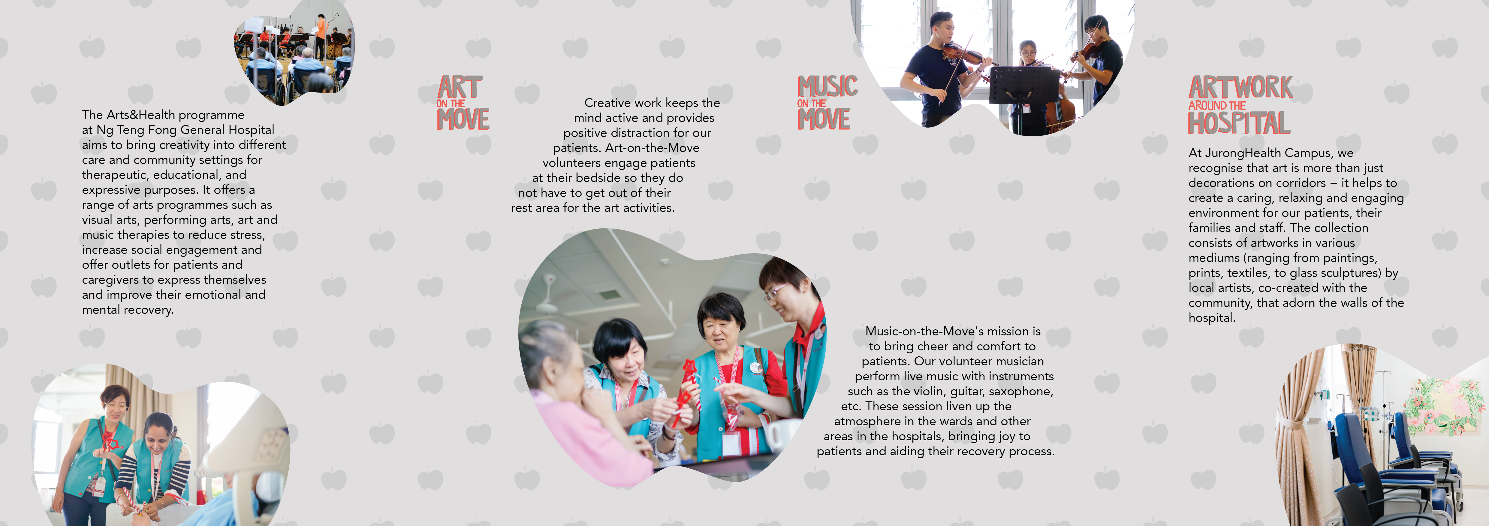
Before:
After:
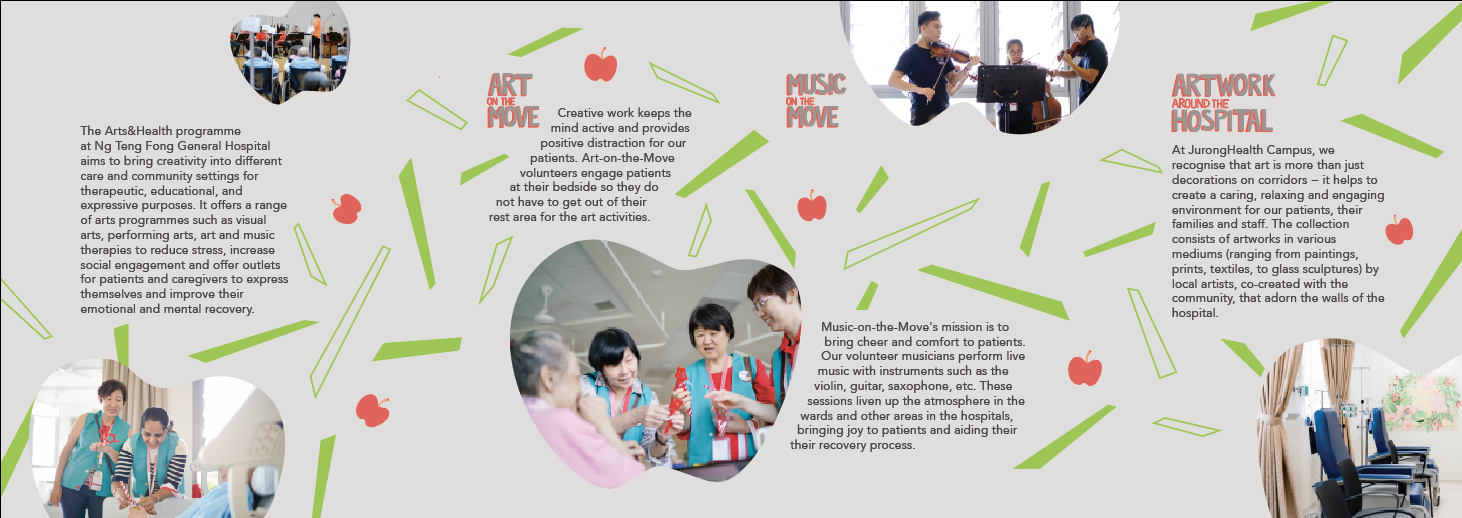
I spent lots of time adjusting the elements of the layout a lot more carefully.
The final post would be purely my final piece of work, so I would just include my learning points and reflections here:
I really got explore how to handle dye-cutting and layouts in this brochure. The final work I submitted was not the best, but I got to try out what I really wanted and I realised this dye-cuts might not be the best way to approach this brief or the project in general. Jerome also suggested a different flow of reading the brochure that could improve the brochure a lot, and I would work on that. Brochure layout is really an interesting skills to train and I hope to honed this skill. I also learn how important the printer would be in alignment and dye-cutting issues.