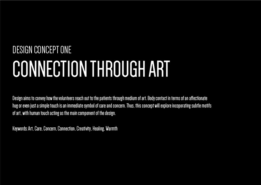
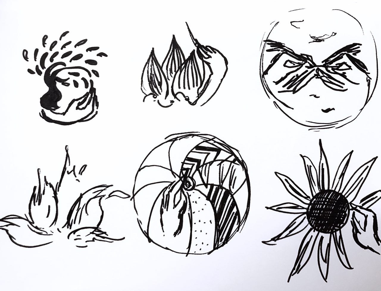
To translating my mood boards into design sketches, I did three themes of sketches in order of the mood board I posted in “Task 1”.
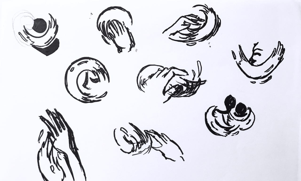
This was theme 1 exploring the concept of connection, thus human touch, and the paint strokes, signifying reach out through art.
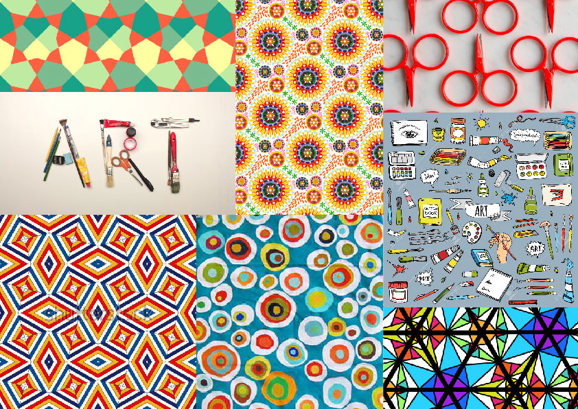
The second theme, kaleidoscope.

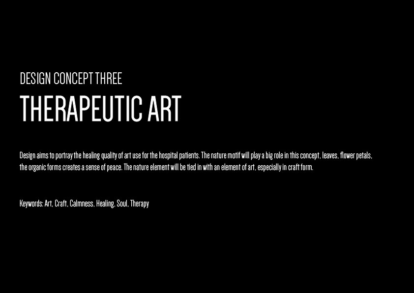
And the third, therapy through nature motifs.
Through the first round of consultations, I was slowly starting to notice how I had to turn my designs more logo=like. Increase the relevance of these design and motifs to suit the theme “art on the move”.
Thus, I continued brainstorming and expanding on the first theme, which was my favourite theme. And upon the advice of Michael

Through the first round of critique and consultations, I was beginning to understand the requirements of this design more and more. I also began to take note of the importance of relevance in the design, How the design should speak “art on the move” in picture format, as well as the need to reduce certain design elements to for scalability purposes.
I decided to expand my first theme which was my favourite. With advice from Michael, I also incorporated elements from the second design into the first design to make the design be more relevant to the “art” part of “art on the move”.
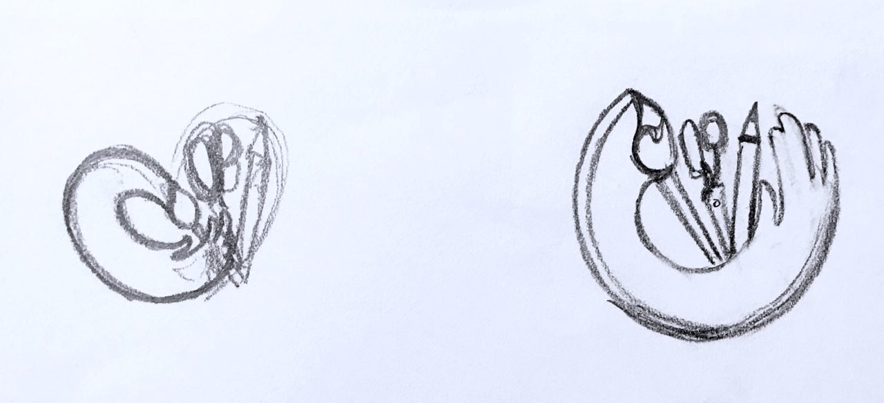
It was through repeated sketching that the idea of the heart formed in my head.
![]()
This idea took the outreached “paint brush” hands (reaching out through art) from the first thematic sketches and the craft tools from the second thematic sketches. Together it was supposed to portray a heart as a whole, a symbol of care. Separately, the paint brush hands represent the volunteer’s role in “art on the move”. The curvilinear stroke also provided a sense of movement. The tools increased the relevance of this design.
Two other designs I had the inspiration for was:
![]()
![]()
I quite like the third concept actually. But I felt the movement was missing from this design.
Finally, after much thought, I decided to stick to developing the first idea. I also simplified the stroke, and make the heart-shape more distinct, by using visual cues as suggested by Michael. Like the bending of the pencil. I think this really cleaned up the design. I also added in the text in a curvilinear format to enhance the round side of the heart.
![]()
After simplification and modifiying, this was my final piecce.
Next up is colour exploration:
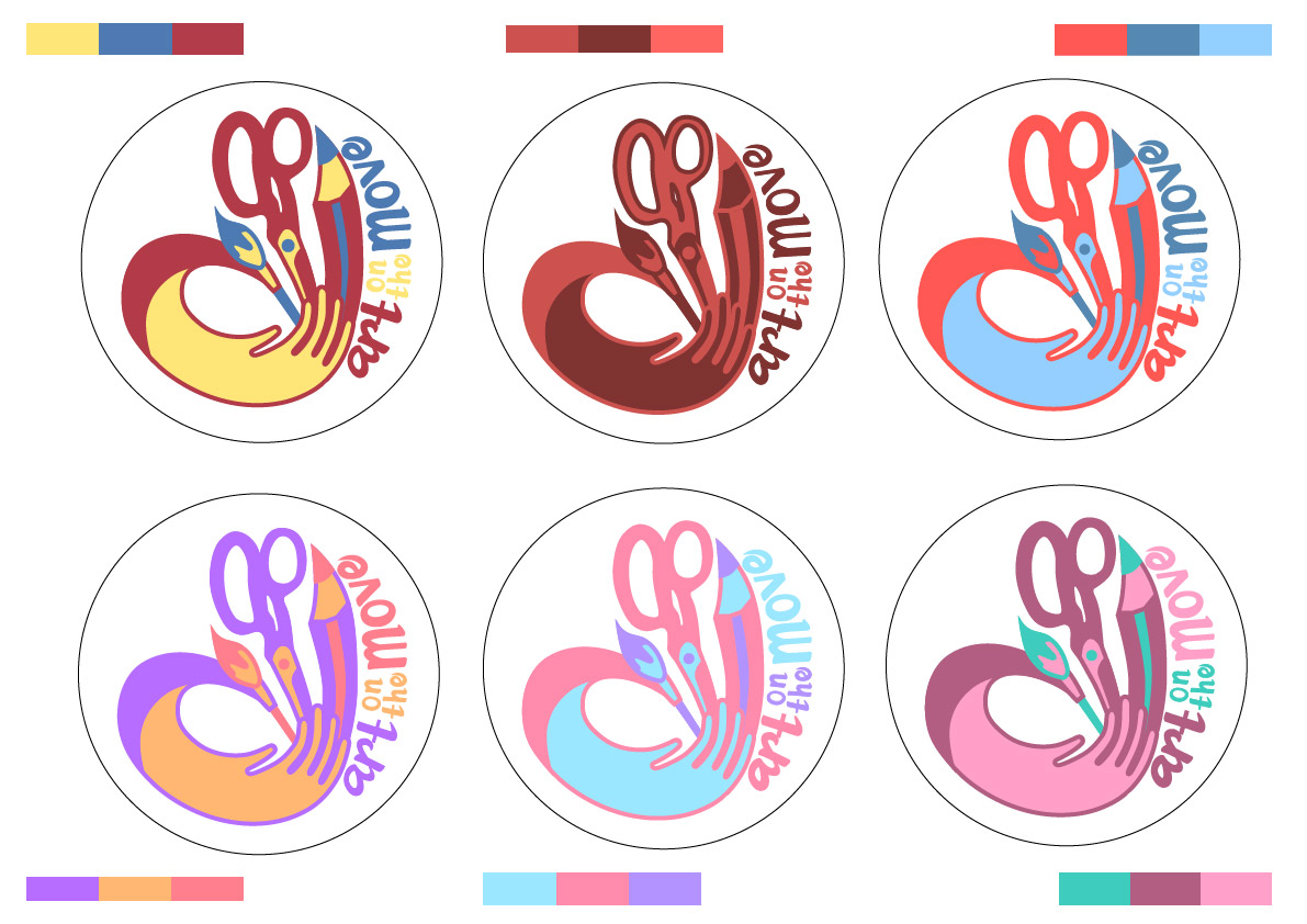
Through exploring these colours, I learnt how to manage the colours better. Like how to use certain colours at certain areas to bring the heart shape of the design.
Finally, I settled on
![]()
This is because, primary colours are very easily relatable. It looks harmonious, yet lively, connoting the idea of play.
The other variation would be ![]()
Because of its highly contrasting and eye catching colour combination.
Next up: Final Work