
There are 2 posts filed in Infographic Design Final (this is page 1 of 1).
After narrowing my topic down to sex education, I decided to so some research on the topic.


I read an article on how to make a good infographic, and I realised that infographics are not about cramming information into a graphic, but about sending a general message through cleverly chosen and presented information. I sifted through the amount of information and statistics trying to figure out how to organise them into an infographic that could send a message.
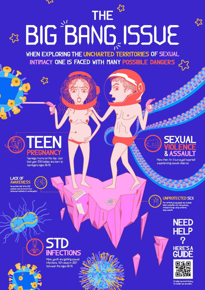
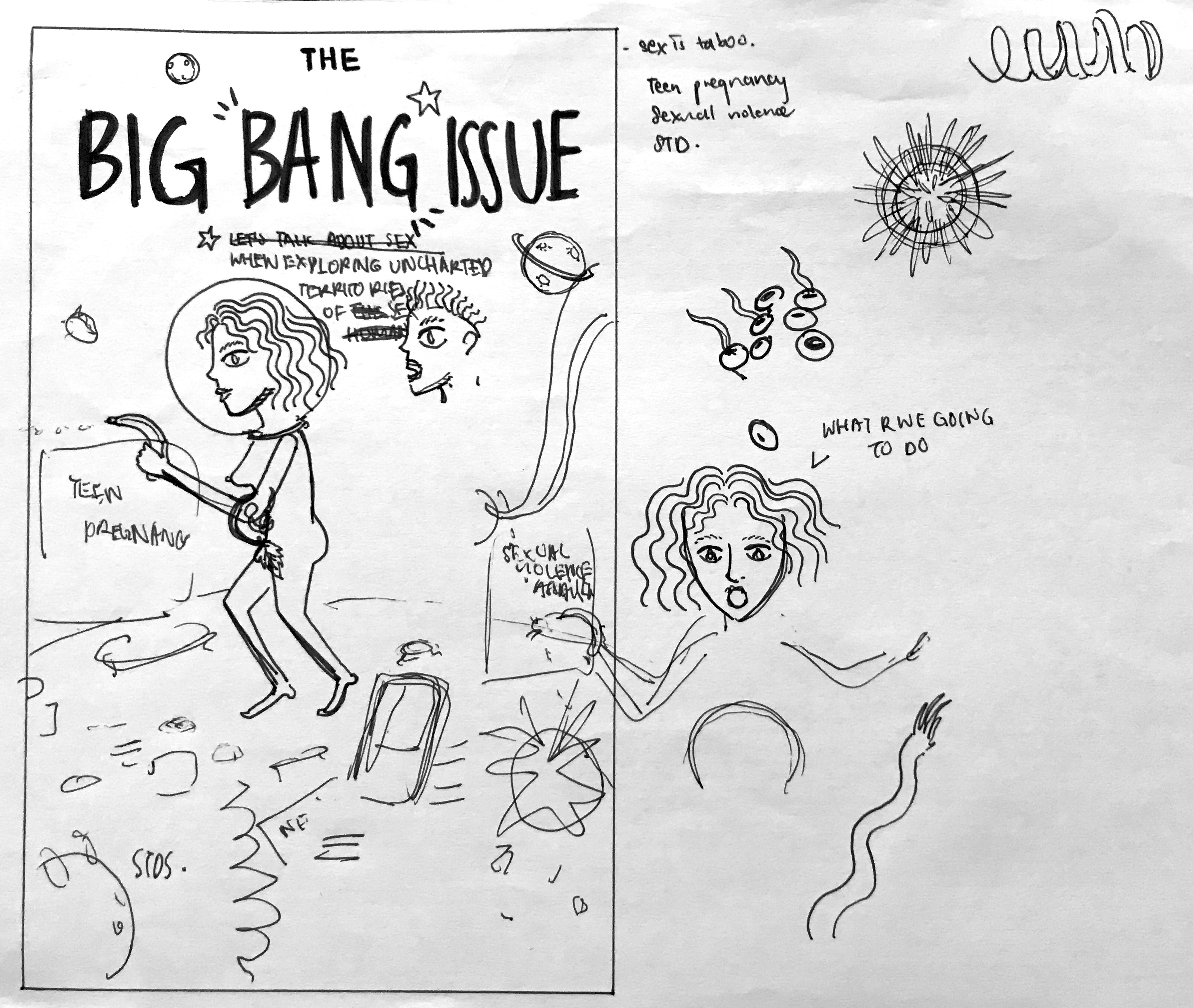
Initially I wanted to do a cause and effect to show the consequences of bad sex education. I was trying to think of a theme that is interesting to present sex in a non confrontational way. Then it hit me, the idea of women are from Venus, men are from Mars, and thus, a space themed idea.
Once I thought about it being space themed everything came together. The idea of sex being “unexplored territory” and all that.
However, after consulting with Michael I rethought the ideas and simplified the amount of information I was presenting. Instead of doing cause and effect, I was just going to present the consequences.
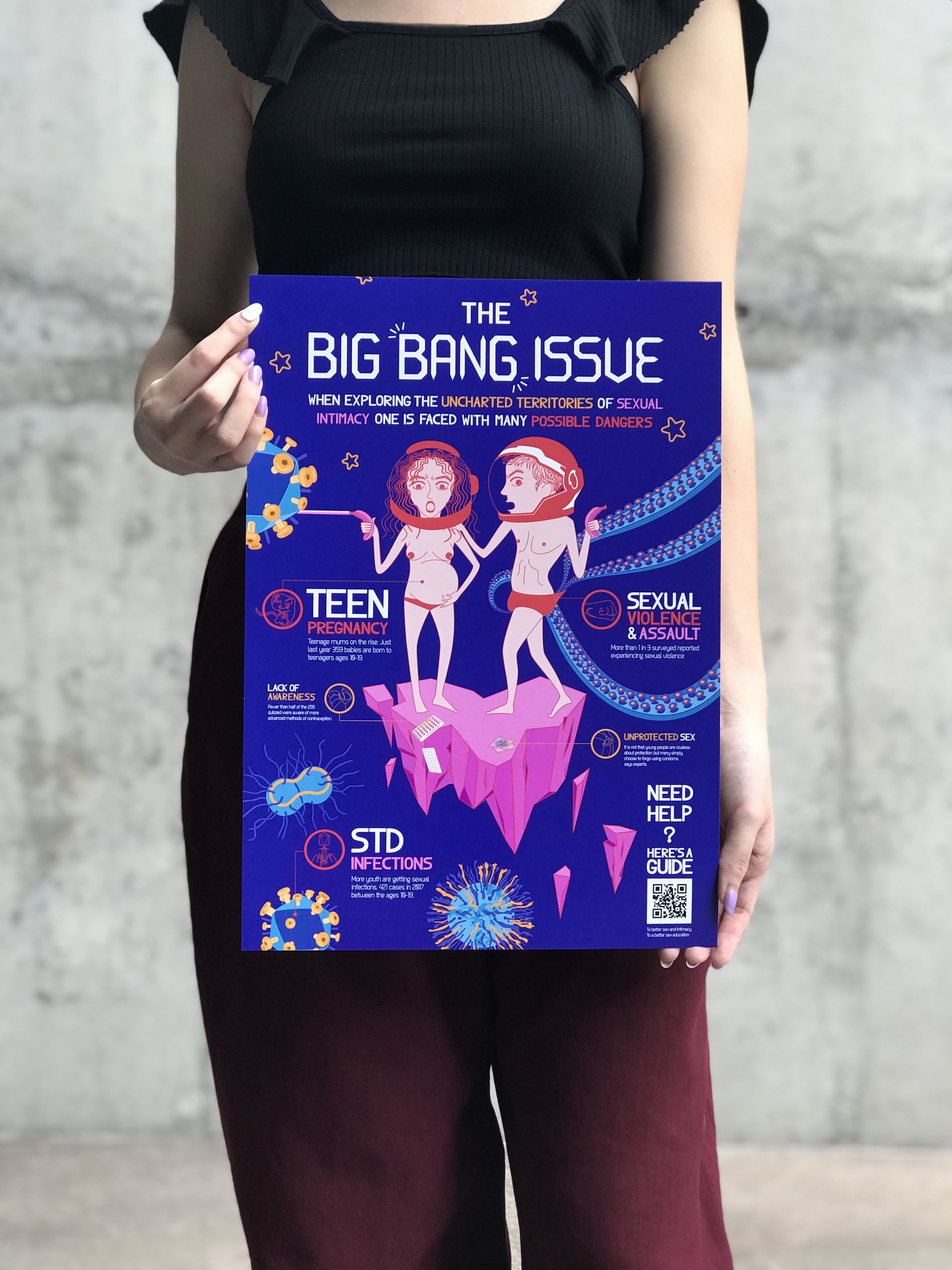
And from there I developed it further. For the last class discussion this was the infographic I printed:
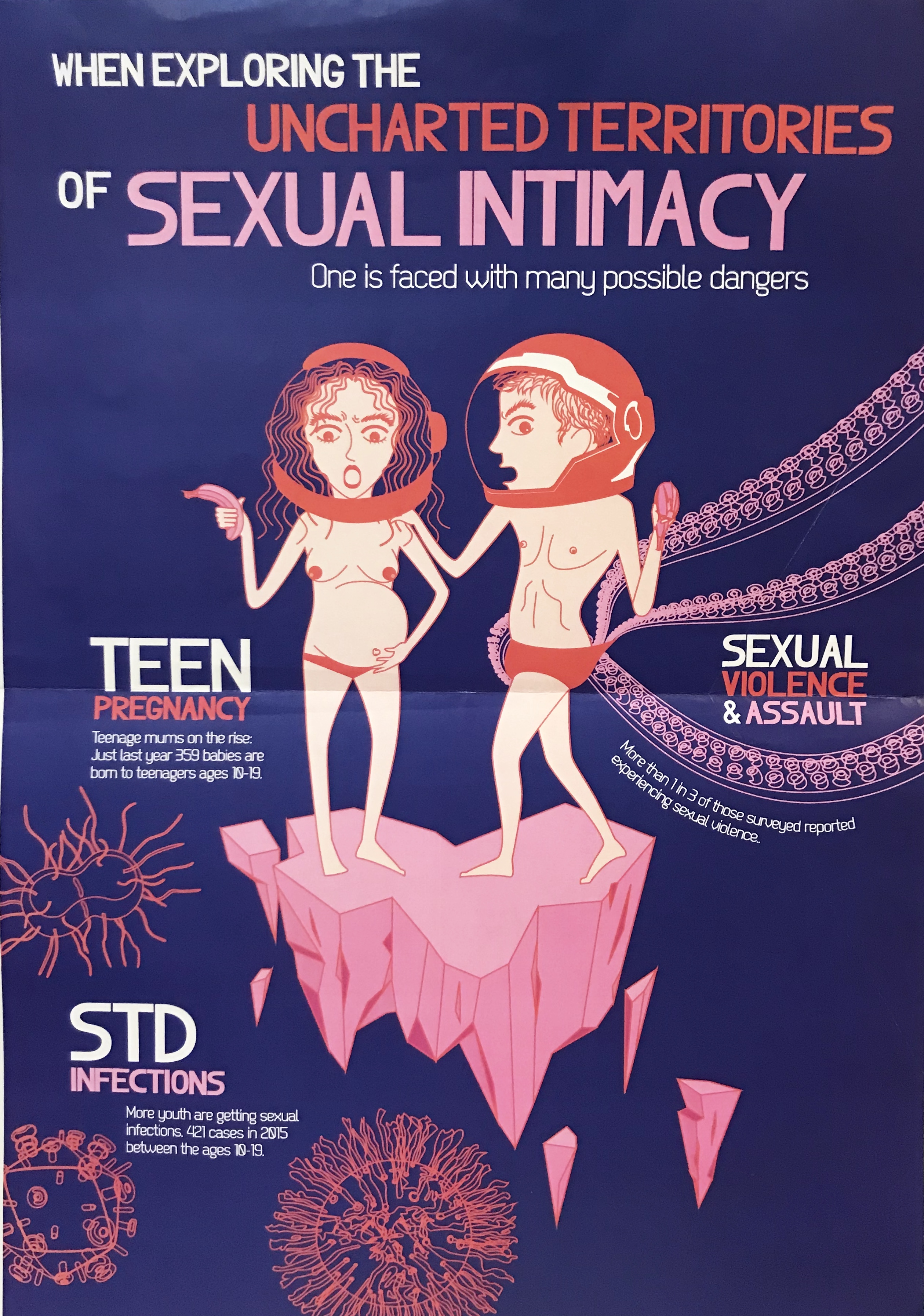
I think the class was receptive to the imagery and the colour themes. But the feedback was that it looks too much like a poster instead of an infographic. Thus, I worked towards adding icons and finishing the colouring in for the graphics. I considered just playing with outlines but I wanted to play with more colours.
From there I finished the final idea, which will be in the final post.