Finally, after all the exploration and learning, I managed to produce my final piece. In this post, I hope to do a summary about my concept, overall approach, as well as the individual scripts and the reasons why they were curated as such.
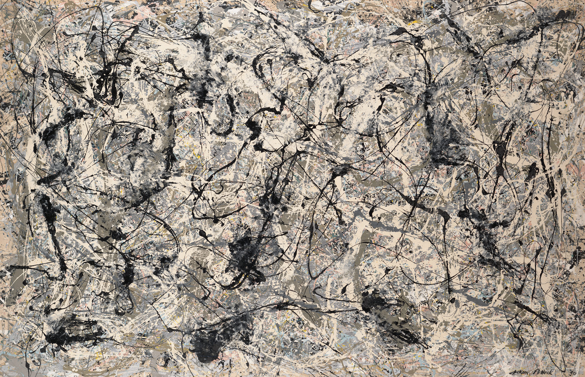
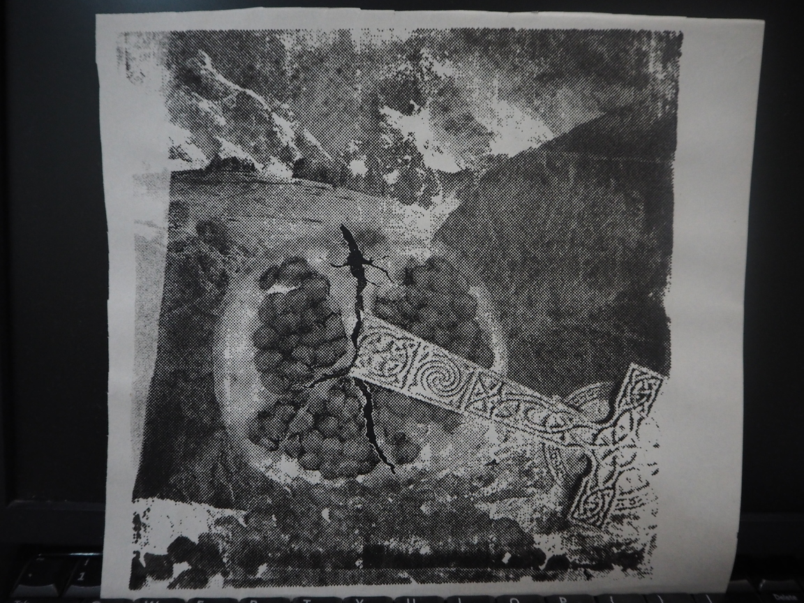
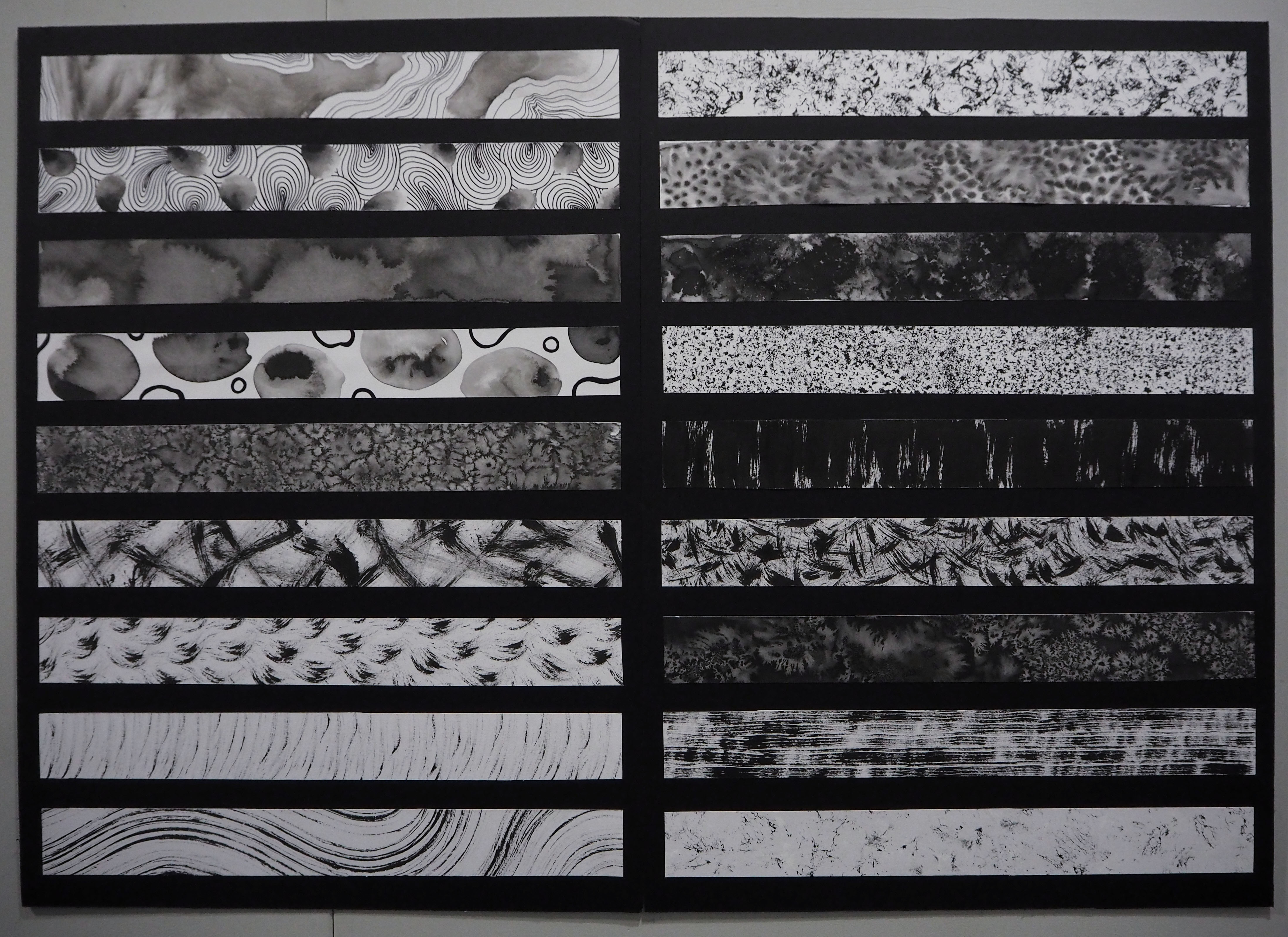
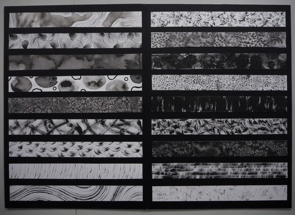 My Final Presentation of “My Line Is Emo”
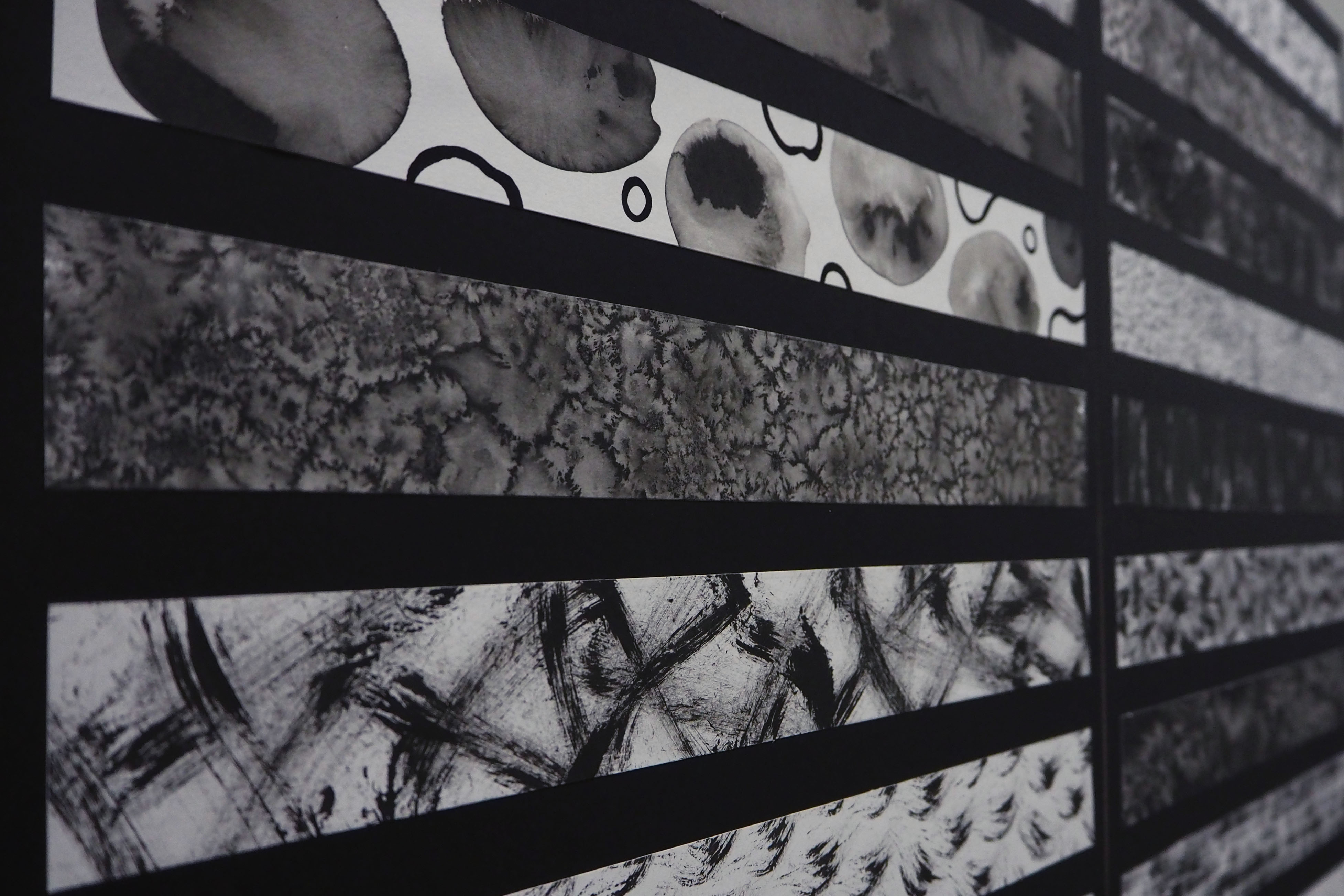
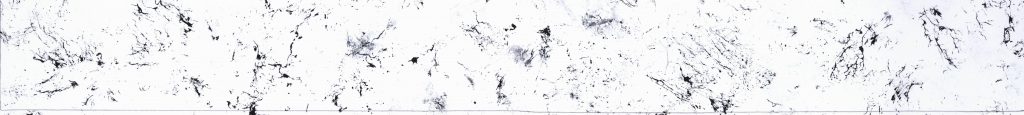
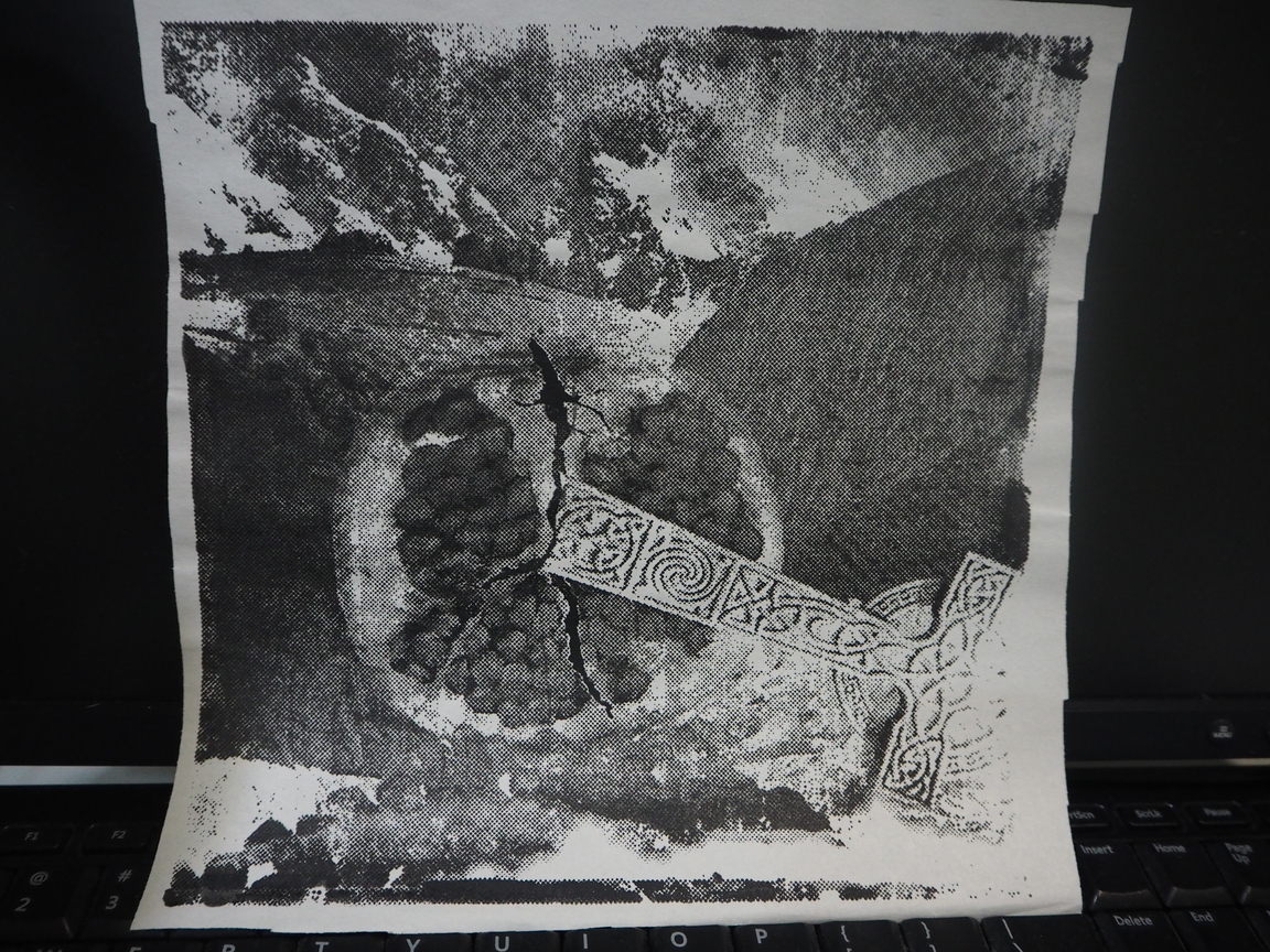
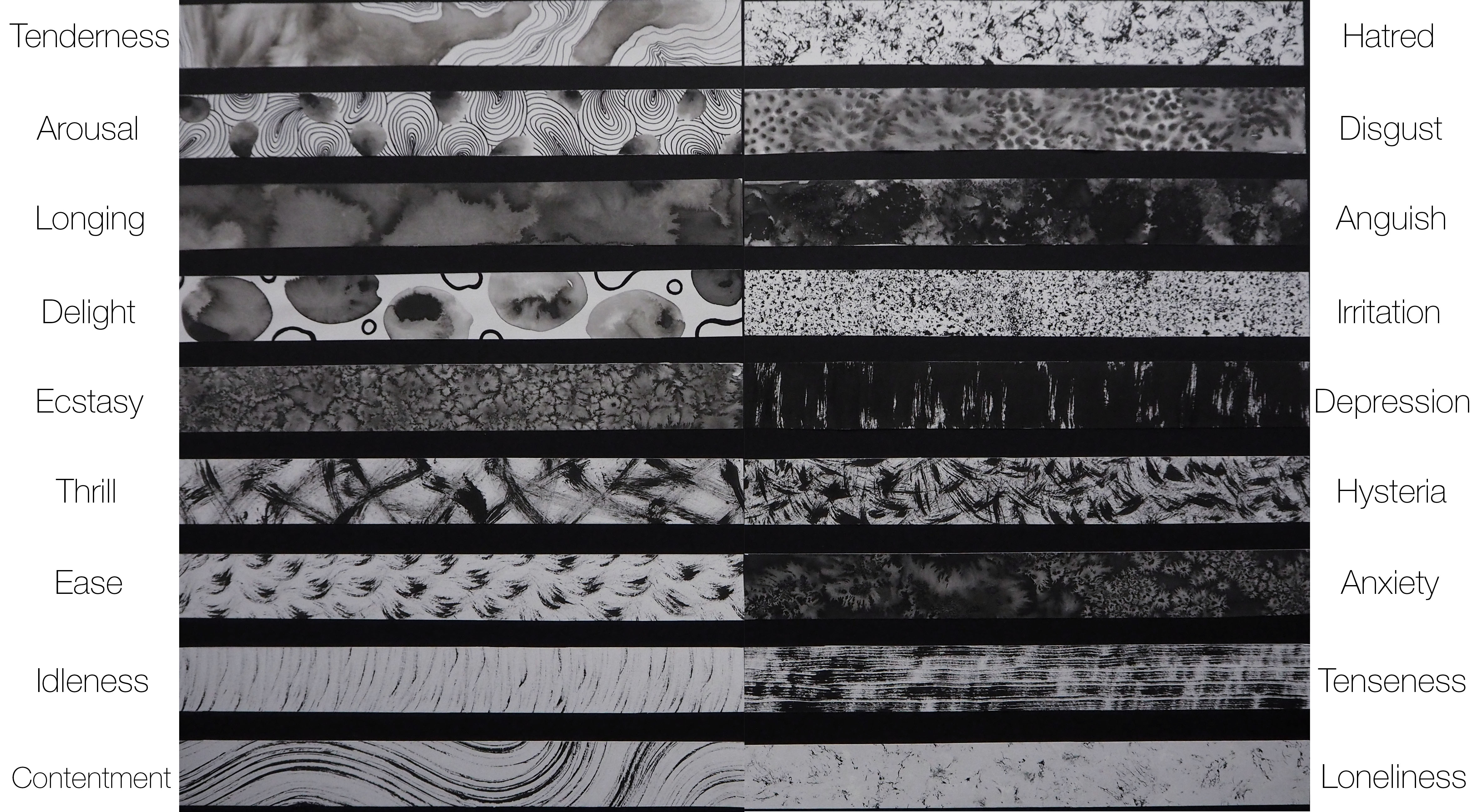
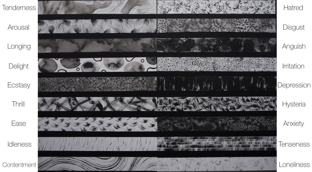 “My Line Is Emo” with labels
CONCEPT
My main concept is contrasting emotions. I feel that emotions do not exist as a singular entity. In order to portray emotions more apparently and realistic, the best way would be to place them next to similar or contrasting emotions, for both to complement and bring out each other.
My placement of strips follows my concept very closely. I started off by pairing negative and positive emotions off, usually grouping the emotions by their intensity, or relationship. From there I came out with this list:
Tenderness vs Hate
Arousal vs Disgust
Longing vs Anguish
Ecstasy vs Depression
Thrill vs Hysteria
Delight vs Irritation
Ease vs Anxiety
Idleness vs Tenseness
Contentment vs Loneliness
APPROACH
My approach was a blend of experimental and methodological. It started off extremely experimental for me to gain inspiration and insight into what mark making was about. Then, the methodological portion was when I paired off the emotions, and I would form an image of what I want each emotion to look like and how they should be created.
The approach I used could be summed up as one that was result-orientated instead of process-based. The process was not emotional, and does not imitate the body language of expressing emotions as it is focused towards producing an aesthetically pleasing piece that evokes the relevant emotions in the viewers.
I chose to standardise doing my marks on white drawing paper. As I wanted to limit my area of exploration to purely technique-based since mark making was already quite foreign to me.
18 EMOTIONS
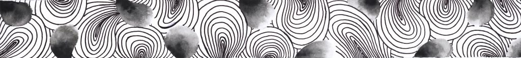
TENDERNESS
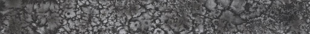
I chose to use paper marbling to present tenderness due to its light value and organic water mark shape. The faded swirls within the water mark further enhanced the emotion, as to me they symbolised the stirrings of the heart when one feels tender affection towards another.
While the topographic lines were some sort of geometrical reflection of the paper marbling marks. The density of lines increases as it reaches the middle, creating an effect of a denser core of emotions spreading outwards. That I felt was the way in which tenderness was expressed.
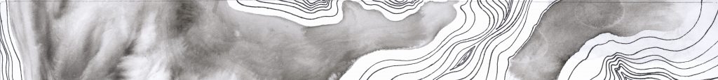
HATE
My interpretation of hate was not one of intense anger and aggressiveness. Instead to me, hate results from a sort of hurt and tenderness. Only when one cares, one would care enough to hate. There would be no reason to hate something you did not care about in the first place.
Thus, I wanted my hate to be presented in this rather delicate form of webbing. Where certain areas of the web are intensely darker, representing the tinges of anger in the hatred. While the other thinner lines branching out from the darker middles portrays the hurt and tenderness on which the hate is built on.
(TENDERNESS VS HATE)

Similarity is found in how I chose to portray both emotion with patterns that have a darker core that spreads outwards, through the pen work in tenderness, and webbing in hate. The relationship these two share are extremely close, even though the prints turned out to be rather different in nature.
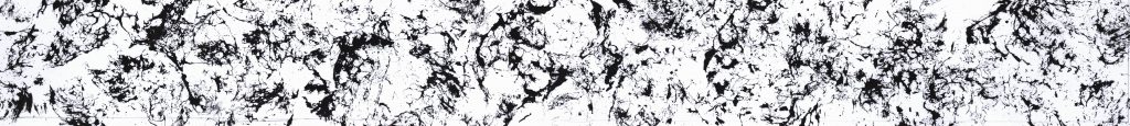
AROUSAL
This one is similar to tenderness, but the pattern of circular lines grows denser towards the middle and is done repeatedly across the entire strip. This is because I think for arousal, intense feelings of the core are higher in frequency and urgency, thus the overlapping of the amorphous forms.
DISGUST
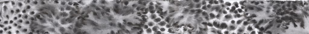
The many dots of ink spreading within water creates a disturbing pattern reminiscent of trypophobia-inducing images or that of bacteria. I feel this appropriately presents the emotion of disgust.
(AROUSAL VS DISGUST)

Both of these emotions are one that are of a rather physical nature. Physical arousal and attraction towards one could quickly turn into physical repulsion and disgust due to changes in circumstances. The contrast between these two would be while arousal is presented in large amorphous forms with dense cores, which are comfortable and hypnotising to look at; the small and dense nature of multiple ink dots instead evokes discomfort and irritation, in which disgust is founded on.
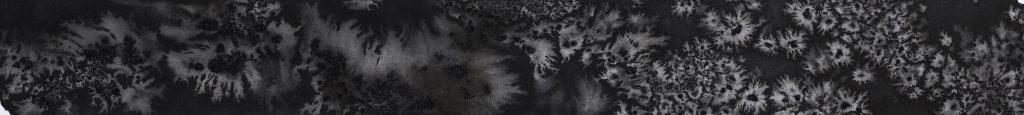
LONGING
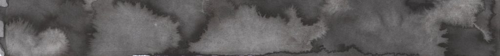
The ebbs of light values within the darker value suggests a sort of warm and hope within the neutral space of darkness. Thus, I felt that it was appropriate in expressing longing. However, I would like to highlight that the overall value of this piece is still rather dark. This is because longing, as positive as it is, has an undercurrent of suffering, that of not getting what one wants and pining for it.
ANGUISH
Dark circular ink blots suggests the pain felt in anguish and the web-like ink marks caused by salt on ink further represents the innate spread of emotion. The spaces with lighter values in between the dark blots of pain are used to create contrast between the dark blots and webs, and the background.
(LONGING VS ANGUISH)

Both look similar but the difference in technique highlights the slight difference between the two. Longing is done through the manipulation of water, by dabbing parts of the inky water dry, while anguish is done through salt in ink. The salt gives the forms a more defined web like edge, while the edge of the forms in longing are less defined and thus seem softer and more positive in nature.
Furthermore, forms in longing are of lighter values as compared to their background, and this is a total opposite in anguish. I chose to contrast these two forms are they are extremely similar in nature, both being of pining for something, but one is of positivity and anticipation, and the other is of pain and torture.
DELIGHT
The circular forms of ink drips in water looks whimsical, and reminds the viewers of bubbles, something associated with play, to evoke a feeling of delight. I added circular forms in with pen to create variation and to make it seem collage-like, something lighthearted and delightful.
IRRITATION
The density of irregular specks and marks creates a sense of discomfort, something that evolves into irritation when it reaches a point where it could no longer be overlooked.
(DELIGHT VS IRRITATION)

I decided to compare these two emotions as they are both not extremely intense emotions, but more of an underlying feeling. This is seen by the amount of negative space both pieces have. However, the size of the circular print in delight is bigger and not dense all, giving a sense of peace and joviality. While, the size of the circular print of irritation is small and dense, resulting in a rather claustrophobic effect and thus more aggravating.
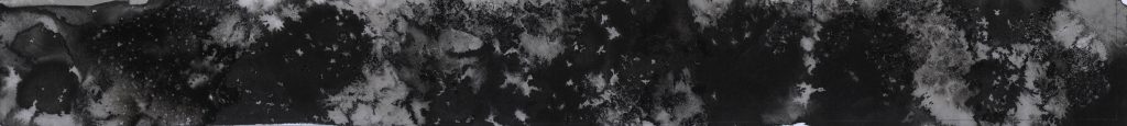
ECSTASY
Ecstasy I felt would be represented through using extremely trippy optical illusion diagrams, as it disorientates the viewer and allows them to experience the adrenaline in ecstasy. The salt in the ink piece creates an effect of an optical illusiondue to its many tiny amorphous forms causing the same swirling effect optical illusion diagrams have.
DEPRESSION

The piece has an overall really dark value, and slices of negative spaces within the black are covered with dry brushstrokes suggesting a downwards motions. The combination of these two factors really creates an effect of gloom and pessimism.
(ECSTASY VS DEPRESSION)

These two are very different in appearance, but they both have a sort of overwhelming energy and movement within the strips. Ecstasy has swirling motions and depression has an all-encompassing downwards sweep. Furthermore, both share overall darker values as both, even ecstasy, has an underlying tone of negativity.
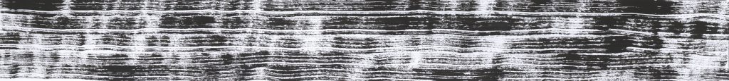
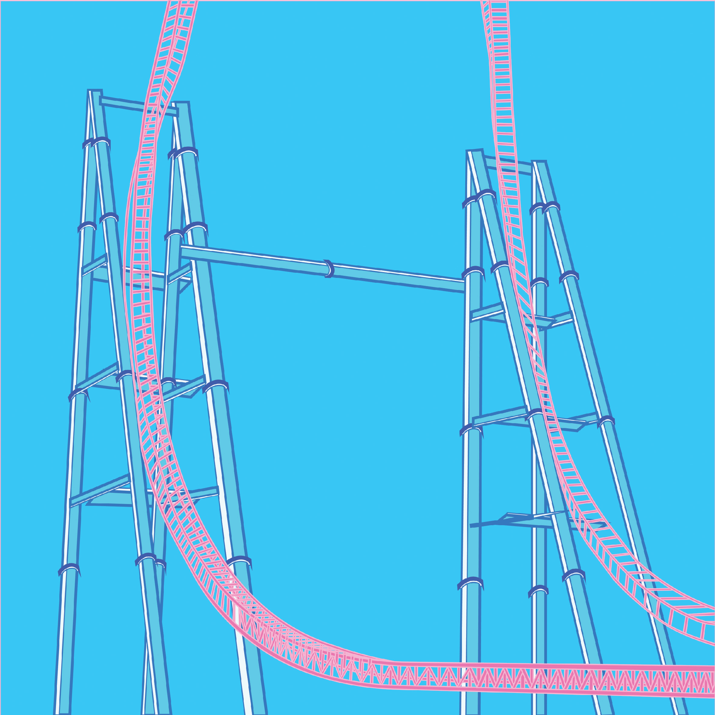
THRILL
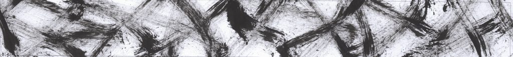
The zig-zag dry brush strokes of the piece, creates an intensity and energy within the composition. The sharp turns connotes the speed of the strokes. These strokes are reminiscent of the speed of the roller coaster, something that is thrilling.
HYSTERIA
While for hysteria, the strokes are of medium length, criss-crossing in random directions and of varying thickness. The complex nature of the composition reflects the messy state of mind of one who has hysteria.
(THRILL VS HYSTERIA)

I placed these two emotions in comparison as I felt they are emotions of similar intensity and energy, both running high on adrenaline. However, hysteria has the element of confusion and mess thrill does not have. Therefore, even though they are done in the similar style of dry brush strokes, thrill’s strokes are more straightforward, while hysteria’s are more complex.
EASE
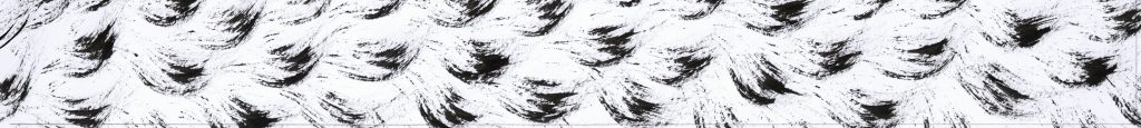
There is an illusionistic texture of feathers created in this print. Feathers are associated with lightness, and thus effectively conveys the emotion of ease to the viewers.
ANXIETY
This is created by salt in ink, and the accidental unequal distribution of water. The tiny splatters of salt on the right side of the composition shows the underlying discomfort and panic. Then it proceeds to flow into larger fluid and viscous lines on the left side of the composition, evoking the sense of nauseous and dizziness one might have while having a panic attack.
(EASE VS ANXIETY)

This two emotions are opposing emotions of the same nature. Feathery strokes are seen in both ease and anxiety, but within anxiety, the feathery strokes are liquidified into viscous strokes, thus making them take on a narrative of heaviness and suffocation, instead of the lightness of the dry brushed version.
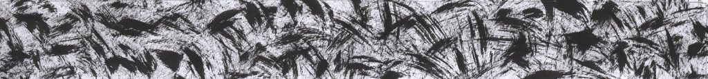
IDLENESS
The composition is made up largely of negative space with spiry brushstrokes all in an upwards motion. This was reminiscent of the lalang in the wind, a strong association with idleness.
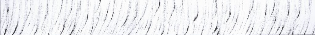
TENSENESS
The irregular negative spaces within each long stroke across the strip evokes a sense of uncertainty. Tension originates from this sense of doubt and suspicion.
(IDLENESS VS TENSENESS)

Both emotions are portrayed through the use of negative spaces. However, since they are completely opposing emotions, negative space is used to create a sense of freedom in idleness, but the constant switching between negative and positive space in teneseness is use to create a sense of constriction and restraint.
CONTENTMENT
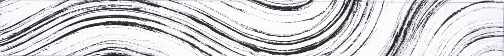
The calm satisfaction is conveyed through the smooth lines of the large S-shaped curves.
LONELINESS
The thin web-like lines lightly applied sparsely across the composition creates a sense of aching within the vast area of negative space which symbolises the emptiness felt when one is lonely.
(CONTENTMENT VS LONELINESS)

Both are similar in terms of being emotions of emptiness. Thus, both have an overall light value. However, contentment is a peaceful and happy emptiness, while the emptiness in loneliness is sad and hurtful.
This concludes my 18 lines of emotions. I really enjoyed this mark making journey as I learnt a lot about this initially entirely foreign topic to me. Looking back, some things I wish I had worked on more was to be more daring in exploring the different techniques, as well as explore other techniques. Also, Joy mentioned that I could have labelled my work, which was one area I wish I had taken into consideration before presentation.
Regardless, I have no regrets as I felt that I did my best and had lots of fun learning and making marks. Now, it’s time to catch up on some sleep!!


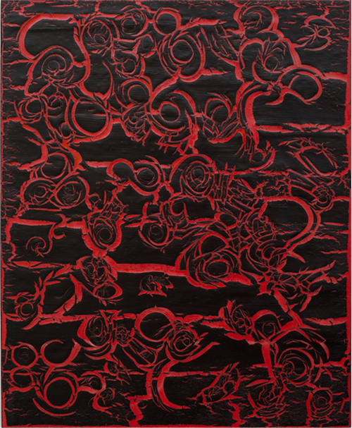
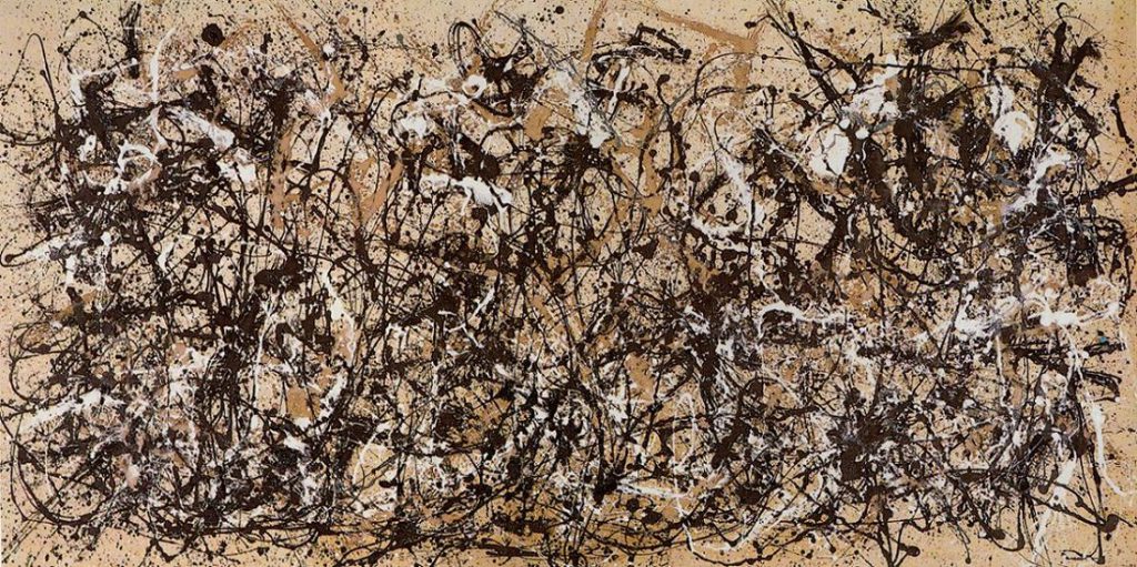
 Previous attempts of hate
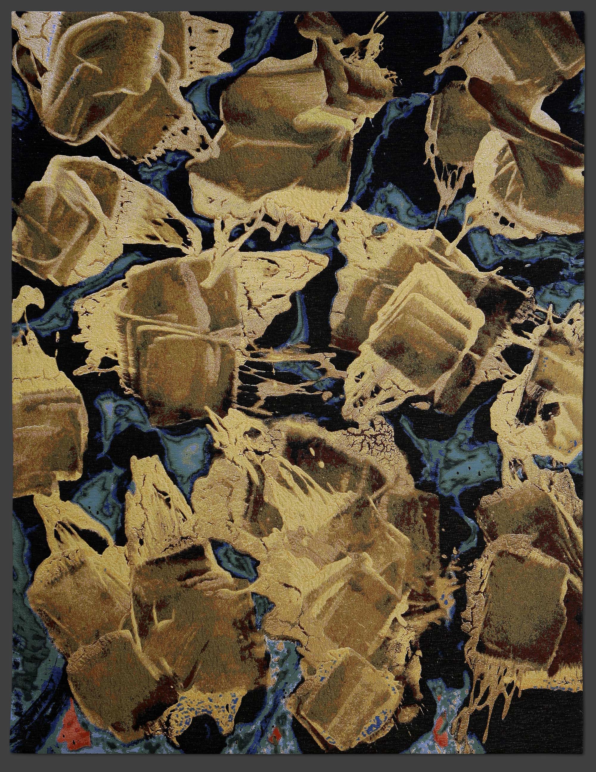
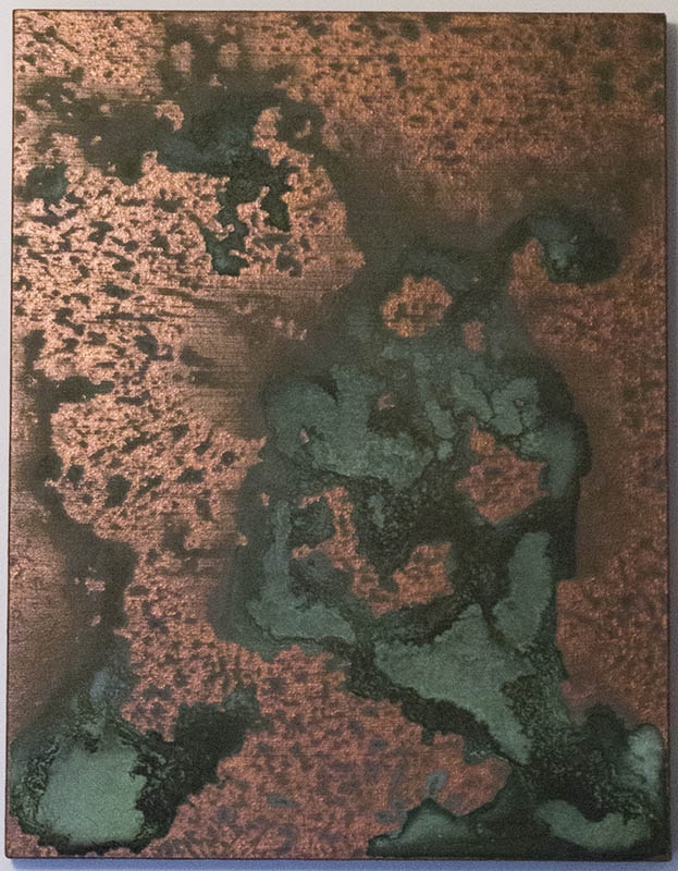
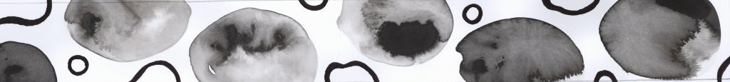
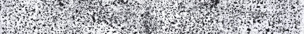
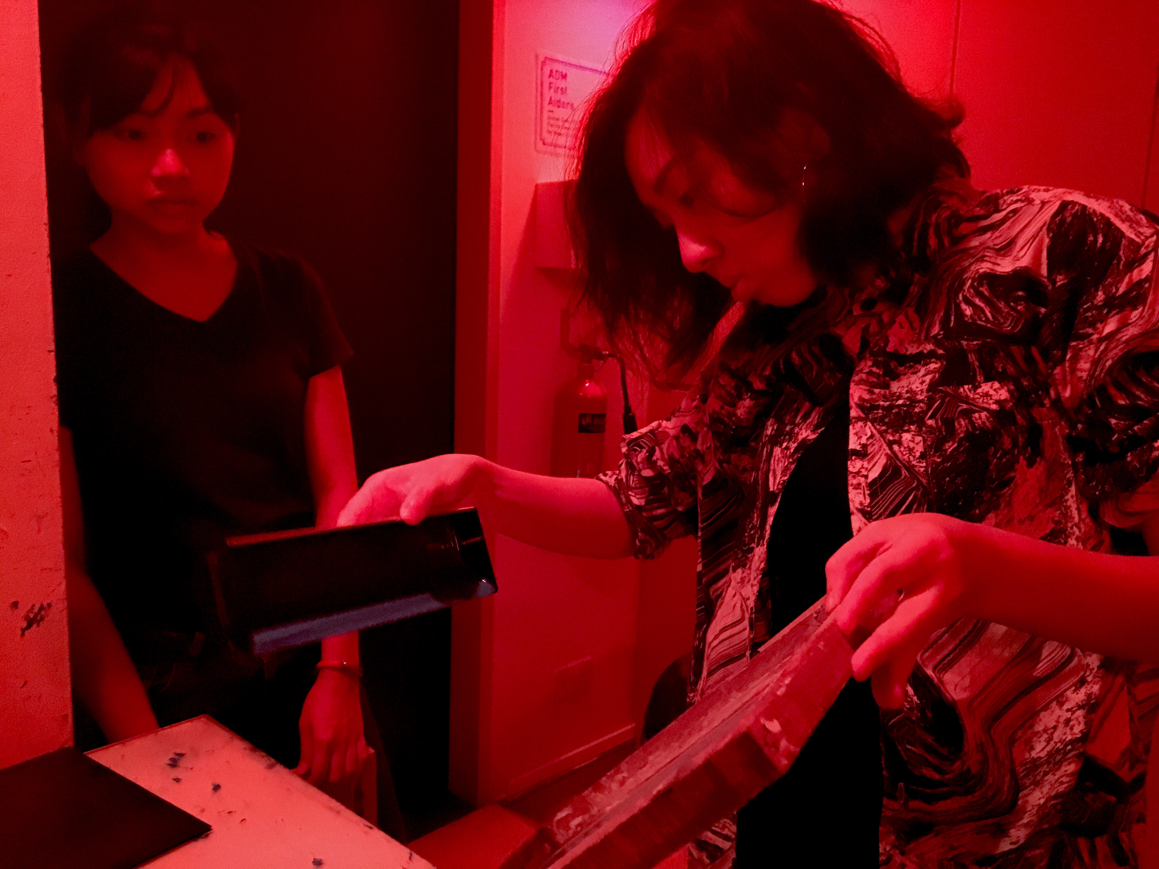
 Examples of my other attempts
 Examples of my other attempts
 Examples of my other attempts


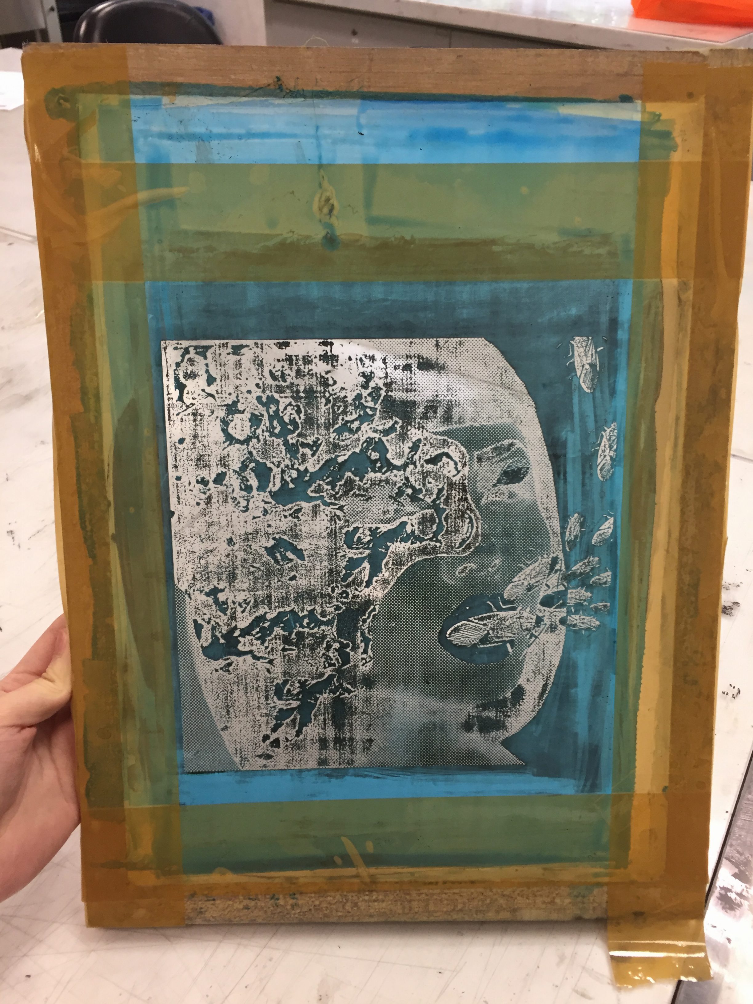
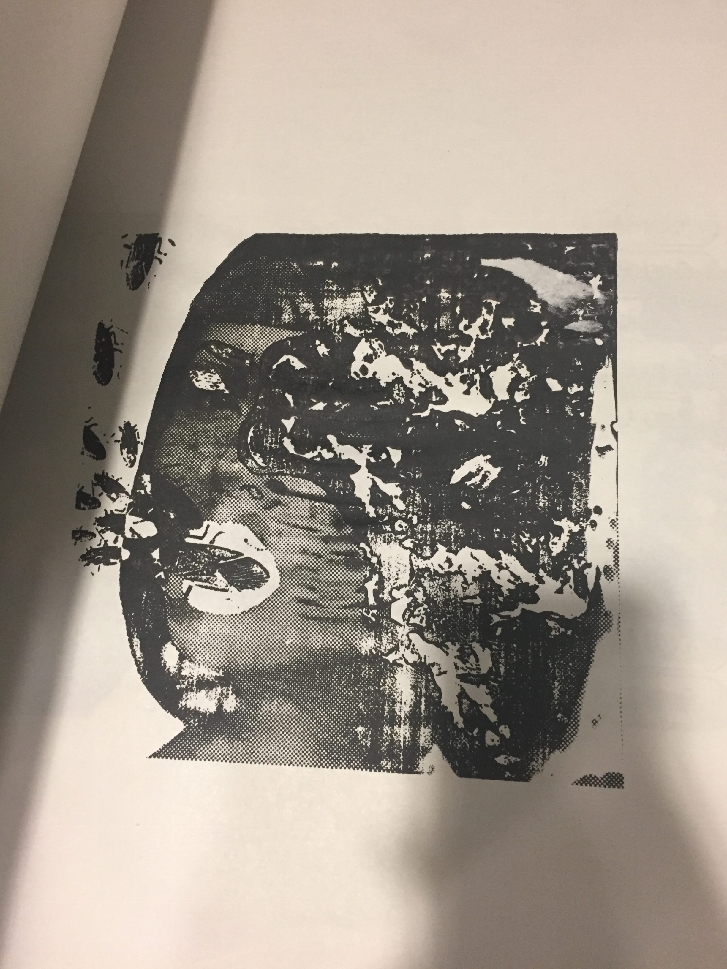
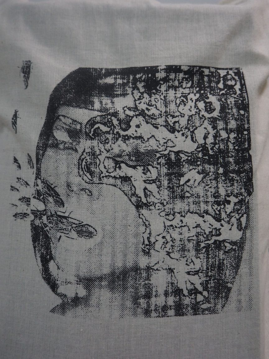
 Netting Print
 Binder Print


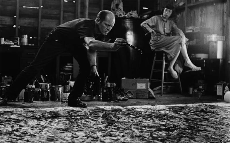
 Jabbing the brush violently into the paper