2D II Project 1: Que Sera Sera, Why not? (Final)


img_2260

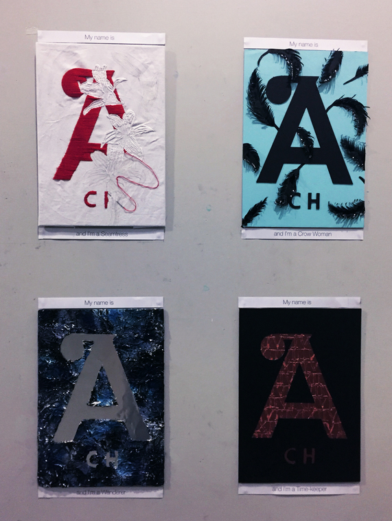
The overall theme for my Project 1 is that of Taboos in Society.

In my message, there is no sense of defiance or calling to go against society by bringing up these taboos. All I wanted to conveying is a form of inquisition, a questioning of “Why not?” Why not accept these taboos topics that as such an big, integral, and most importantly natural part of life.

The jobs I have chosen act as vessels to represent each taboo topic I have chosen. They are Seamstress to represent Sexuality; Crow woman to represent Feminism; Wanderer to represent the Unknown; and Time keeper to represent Death.

img_2253-edited

img_2271

Firstly, the seamstress. Here, the medium of embroidery is used to convey the idea of the seamstress. The unfinished embroidery with the needle carefully stuck in place suggest movement of the sewing in progress. The motif of the red “A” is a reference to Scarlet Letter by Nathaniel Hawthorne. I chose to use this reference as within this piece of literature, the theme of sexuality vs society is widely discussed and questioned. Thus, I felt it was extremely appropriate to use that to bring out my taboo topic of sexuality. With the scarlet letter, I included the floral motif of white lilies, representing innocence and purity, to contrast and bring out the bright red sexuality of the “A” more.

img_2212edited

img_2236

Next, the Crow woman is portrayed by the use of black feathers as a patterned print covering the entire blue background, reminiscent of sky and flight. The idea of feminism here is brought across through the medium in which the feathers are made. The feathers are made of metal sheets, and thus, even though at first glance, viewers might be fooled into thinking the feathers are soft and fluffy, they are actually strong and stiff. This mirrors the way society expects and often portray women as fragile and weak characters, they are actually resilient and dominant in their own right.

img_2249-edited

img_2190-edited

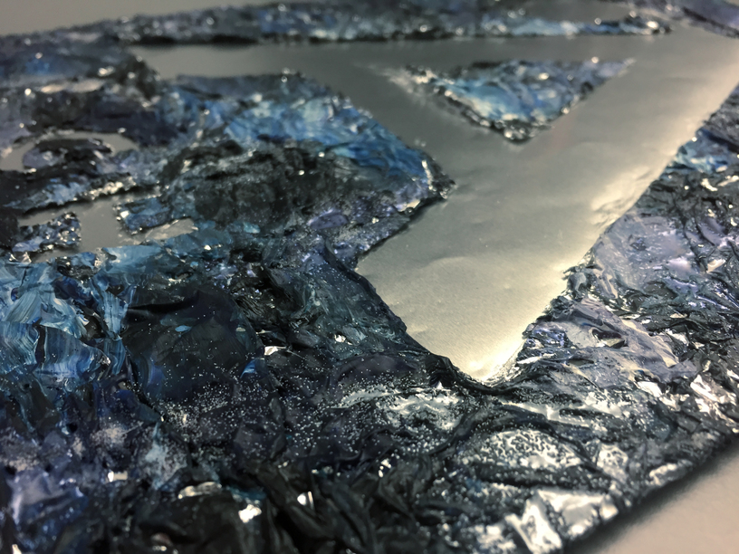
Thirdly, idea of the Wanderer is portrayed through the extremely abstract and textured surface of the background and the metallic type. This abstract background suggests the unknown the wanderer is exploring and the metallic reflective “A” acts as a window of opportunity and encouragement for the viewers to enter this world of foreign things and changes. Thus, the concept of both the unknown and the wanderer is portrayed as a whole in this composition.

photo_2017-02-11_20-46-52-edited

img_2240

Lastly, the Time keeper is presented in the medium of metallic embossing and foil sheet, evoking the imagery of gears, machinery, and in turn clocks. The roman numerals within the type is a combination of numbers of my different death dates and timings calculated with online death calculators, and thus, they suggest the topic of death. Furthermore, the numbers add to the imagery of time and clocks.

img_2208-edited

The format of my final presentation. In whole, I really enjoyed exploring these new mediums for this project even though they were really time-consuming. I met many challenges in time and skills, but I learn to be flexible and handle each problem correctly. I am proud of what I have achieved, and am glad to have completed this project. Looking forward to Project 2!

2D II Project 1: The Process of Getting a Job

The process to which I started off this project was rather methodological. Since Joy said it was okay to have jobs that did not exist in real life, I let my imagination go wild and just wrote down everything I thought of. Here are some examples:
Painter
Mermaid
Train-Watcher
Sea Spirit
Grim Reaper
Ice Cream Seller
Cloud surfer
However, I realised there was no real theme surrounding these jobs. So me being my results-orientated self, I thought about some mediums I was interested in exploring. One main thing was embroidery. Inspired by this image I saw on Instagram by @whitemag_

photo_2017-02-11_19-07-12

Somehow the floral motif gave me inspiration, and I was thinking about Scarlet Letter by Nathaniel Hawthorne. Simultaneously, I did up different variations of my name and decided that I liked the format of my initials “ACH” the best. So bringing these two ideas together I got the idea of using the red A in Scarlet Letter for my name, done in embroidery to represent sexuality. From there I decided the first concept of sexuality using the job of the main character Hester Prynne, as seamstress.

Next, I decided to use the topic of of taboo in society as the overarching theme to tie my entire project together. I quickly listed out several taboos in society, some of which I could tie in with some jobs I thought of earlier.

Death to tie in with the job of a grim reaper, which I later changed to time keeper but the concept remains the same. Feminism to tie in with the job of the crow woman, a persona I created that I felt could identify as a strong female character. Lastly, the unknown to tie in with the job of a wanderer.

After deciding the four jobs, I wanted the overall arrangement to look coherent. So I went about settling the colour schemes first.

colour-scheme

After deciding the colour I went about thinking about the compositions for each taboo.

For the sexuality + seamtress one, I decided to use the floral motif of white lilies, as an irony as white lilies are meant to symbolise purity and innocence.  I thought it would make the red A stand out more in contrast.

Here is the mock up composition I did on my computer.

for-reference-01

And some thread colour testing.

img_2268

Here is the process of embroidering.

img_2274

It was my first time doing embroidering, I just plunged head first into it without any experience. The main challenge I faced, was due to the inexperience, I could not complete the amount I aimed to achieve at the start of the project. So one week before submission, I decided to change the concept into completing half a composition and to suggest the process of sewing instead.

Next, moving onto the composition of the crow woman. I was inspired by searching photos of black feathers on Pinterest certain photos look extremely metallic.

rsz_boss-fight-free-high-quality-stock-images-photos-photography-feathers-black

Thus, I got inspired to using metal sheets to create feathers. This would bring out my message clearly as just as how society expects women to be meek and obedient but in actual fact women are strong and commanding in their own right, feathers are normally regarded as soft and fluffy, but in this case made of strong and hard metal.

img_2267

These are some mock-ups of metallic feather I did.

blue-02

Digital composition mock-up.

There wasn’t much challenges faced in creating these feathers as they were relatively easily to manipulate.

While for the composition of Wanderer, I was extremely inspired by this art work I saw at ArtStage 2017.

img_1672

rsz_img_1676

I loved the texture and effect I saw, and decided for the composition of the wanderer I wanted to do an abstract background like this one.

img_2108

img_2110

img_2111

How I achieved the effect was through the use of crinkled foil as a base. Then one layer of black acrylic paint, dried with a hot gun. Next, I proceeded to layer slabs of blue, white, slight purples, greys and metallic black acrylic paints onto the foil. After waiting for it to dry, I sprinkled silver and pearl blue embossing powder on several areas and using the hot gun, managed to create warped and uneven texture across the entire piece of foil.

There was quite of a challenges faced in creating this as I was never strong in creating abstract work, my first tries turned out dull and not eye-catching enough (these pieces would be stuck within the visual journal) and not textured enough. However, through my tries, I learnt to keep clean colours only strategically blending certain areas.

Lastly, the final composition. I knew I wanted to pursue a steampunk feel to the composition. However, I was struggling on how to bring out both the steampunk idea to go in line with the time keeper, and the idea of death. Initially I wanted to use the motif of Lycoris Radiata, done in metallic print within the “A”. This is because this flower is known as the flower of the other side (of living).

b071381356b094d597a14991673bcecd

However, during one of the consultation sessions, Joy suggested that if I used a floral motif for this composition, my overall four compositions might look too feminine as a whole. So in the end, I went online to these sites:
https://www.death-clock.org/
http://deathdate.info/s/death
http://deathtimer.com/
http://www.findyourfate.com/deathmeter/deathmtr.html

After calculating my death timings, I listed these numbers out and added them into my composition within the lettering.a-numerals-01

However, the process of executing this one was extremely tedious and challenging as I had no experience working with foil. It was both fragile yet extremely tough. I spent about five hours cutting out the entire number sheet.

img_2181

Next, I embossed a letter A onto black paper.

img_2191

img_2192

This was rather challenging as it was a large surface area to emboss and thus it ended up not being very neat. I solved the problem by pasting another black piece of paper over.

This is the process I went through in achieving my final compositions. I met with several challenges but I really had a lot of fun exploring different mediums. See you in the next post where I talk about my final product!