

CONCEPT
When I went to Chinese Garden, the place that intrigued me the most was the Bonsai Garden. I love how the bonsais are meticulously shaped that set against beautiful Chinese architecture. I was fascinated at how the twisting bonsais were set against differently shaped windows/ spaces extremely aesthetically with good design.
Then I thought about how Singapore was a Garden City, and how the greenery around Housing Estate are also very well integrated into the architecture.
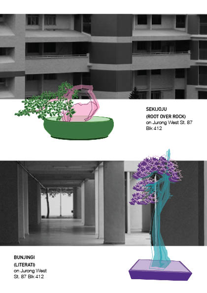
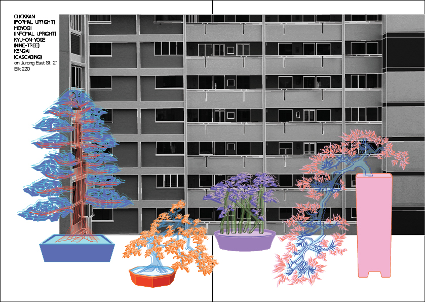
So bringing forward the concept from my previous infographic about “A Piece of China in Singapore”. I decided to juxtapose Bonsais against a backdrop of Singapore HDBs – a distinctively local icon, the way it would be arranged in a Chinese garden against Chinese architecture.
In addition to that general concept, I wanted the zine to also briefly introduce the types of bonsai, in terms of shape and structure.
Here is a list of some bonsai styles:

I was thinking other than portraying an abstract art concept, the zine could also be slightly practical in terms of being that of introducing different basic bonsai styles.
LAYOUT
As I am a result oriented worker, I decided on all the layouts first. Then I chose and picked from the list of bonsai based on shape, which was the best shape to go with which layout. This is because, in a Chinese garden, the arrangement of the bonsais were also based on design of the shape and how well it went with the architecture shape.

ART DIRECTION
I known from the start I wanted the bonsais to be illustrated and the HDB to be in a photographic style. However, I had some problems deciding the colour palette of the entire zine.
I didn’t want it to be black and white with two colours as in my mind, after visualisation, I found that to be extremely boring. Thus, I initially picked a colour theme of five colours for the bonsai. This is the first bonsai I tried the colour scheme on.

However, after trying the same five colours for a few more bonsais, I found that it still looked too consistent and without visual interest. Thus, keeping in mind a general direction of neon lights against a grayscale background kind of style, I put highly saturated, complementary and contrasting colours for different pots of bonsai.
Here are some examples:


Since I did detailed line work for the bonsais, I did not want to completely fill the shapes in. However, to leave them as pure line-work would not fill the space enough, and would look sparse. Thus, I decided on duplicating the layer, filling one and leaving the other as line-work.
However, as my art direction was sort of neon lights on grayscale, I tried to make the colour brightly vivid and with neon undertones like this bonsai below:

However, I realised when it was transferred to inDesign for printing, the colours dulled down. Afterwards, I found out from Joy that it was because neon colour printing required a special kind of printer, which had a minimum bulk printing. Thus, I had to make do with the duller shades. I feel they still turned out well, because the oriental style is more zen and usually come in more calm and desaturated colours, so the dulled down neon colours are a good mix between the crazy neon lights style I was going for and the non-vibrant calm palette of oriental zen bonsais.
Some inspiration photos:

 Next was the background, the art direction was to take photos of as geometric as possible a backdrop so that it’ll act as a good contrast for the organically shaped bonsai trees. Thus, there was a large focus in trying to zoom in on the angular lines of the HDB architecture.
Here are some photos I took:


I then selected them and then edited them increasing contrast, and making sure the shades are kept darker. However, after fitting them into the zine, the photography and illustrations did not feel integrated.
Thus, after consultations with Joy and several trials, I decided to outline the HDB with simple illustrative lines.

This integrates the illustration and photography well. Thus, I decided to use this style for the rest of my pages.
TYPEFACE
I chose the BAVRO typeface for headers as I felt the shape of the font had a slight element of Neon Lights. While I felt the Helvetica font complemented it well.

FINAL WORK


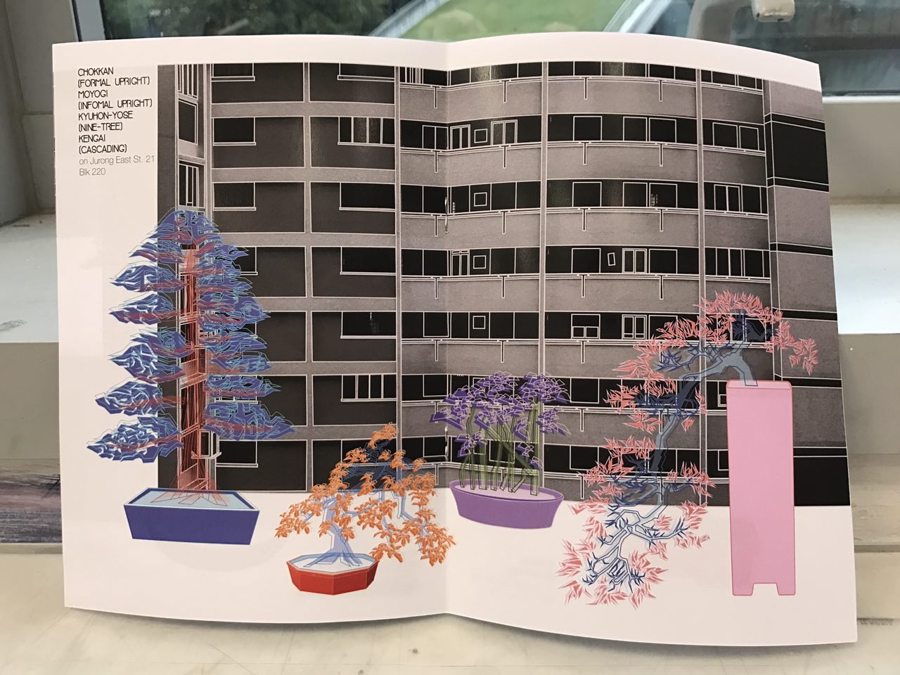
This is the final layout and design of my zine. It is mean to be read from left to right as that was how oriental books were arranged and I wanted to achieve that effect.
I’m pretty happy with how my zine turned out in the end, I loved my concept regardless of its abstractness and the resulting illustrative x photography style. Especially in comparison to my infographic, I think I have come a long way. However one thing I wish I could have done better was the feedback Joy gave me. I think I was still thinking in terms of artist and not so much designer. I would have to think of a better way to let my idea speak for itself, even more so because it is so abstract. This was a timely reminder at the end of the sem for me to further improve and learn for the upcoming year 2.
To conclude, I really enjoyed my time in 2D. I would like to thank Joy for being such an understanding and patient teacher. I know I wasn’t the easiest student to guide with my non-stop sprouting ideas, random artist blocks and non-design tendencies. But, thank you for guiding me through that and helping me see how I could integrate both my love for fine arts and the technicality of design. Will work hard to a achieve both in my works!!


Here are the links to my Infographic and research on Chinese Garden: