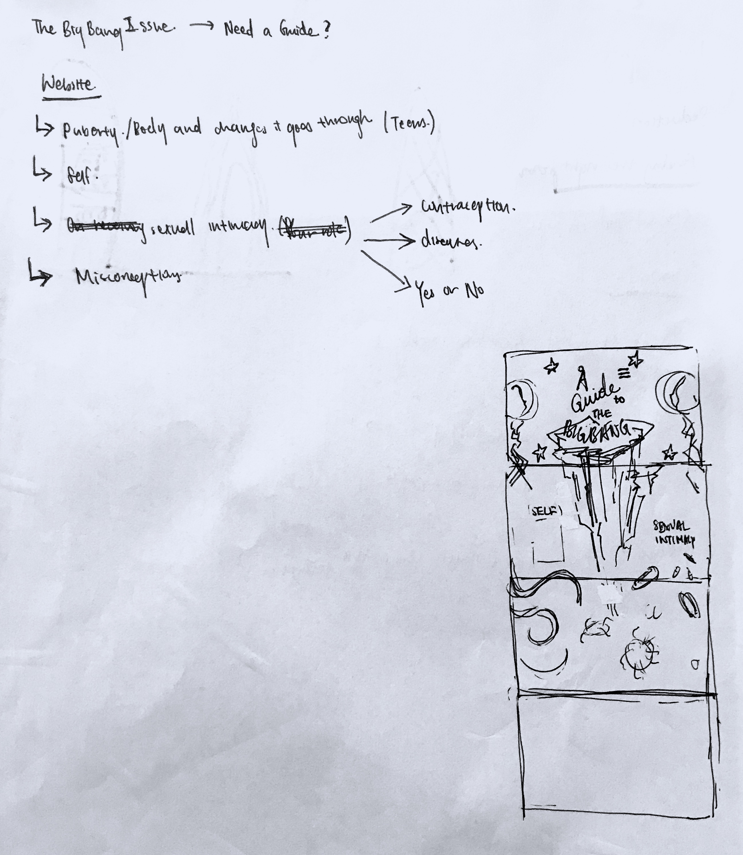
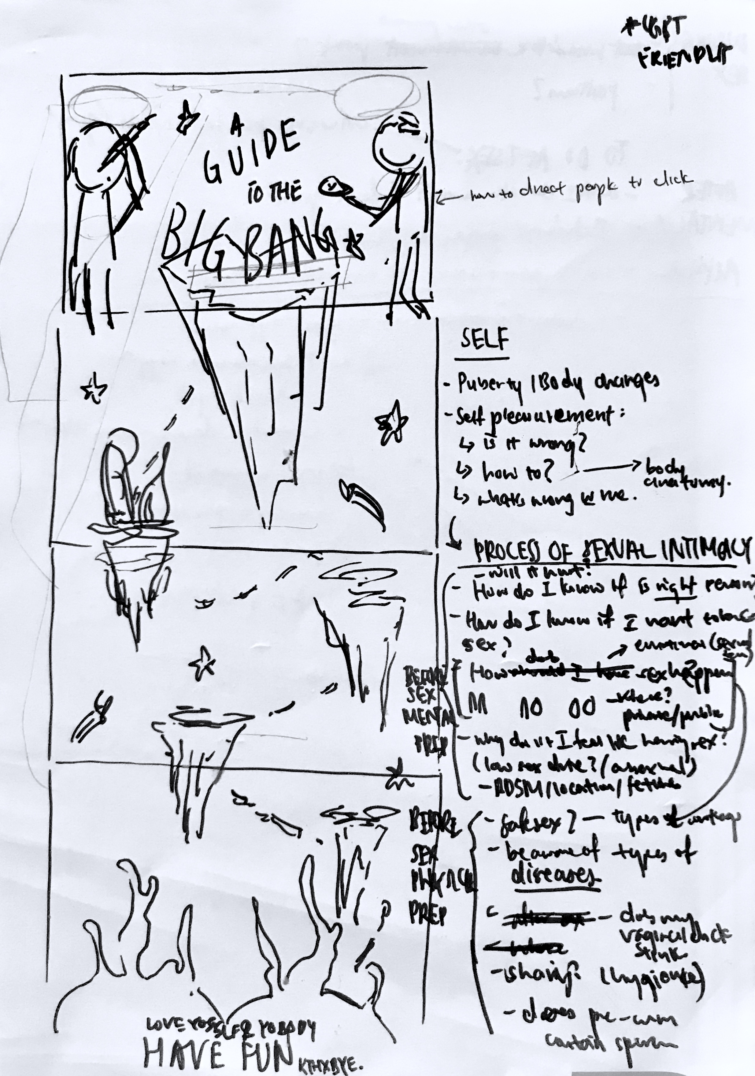
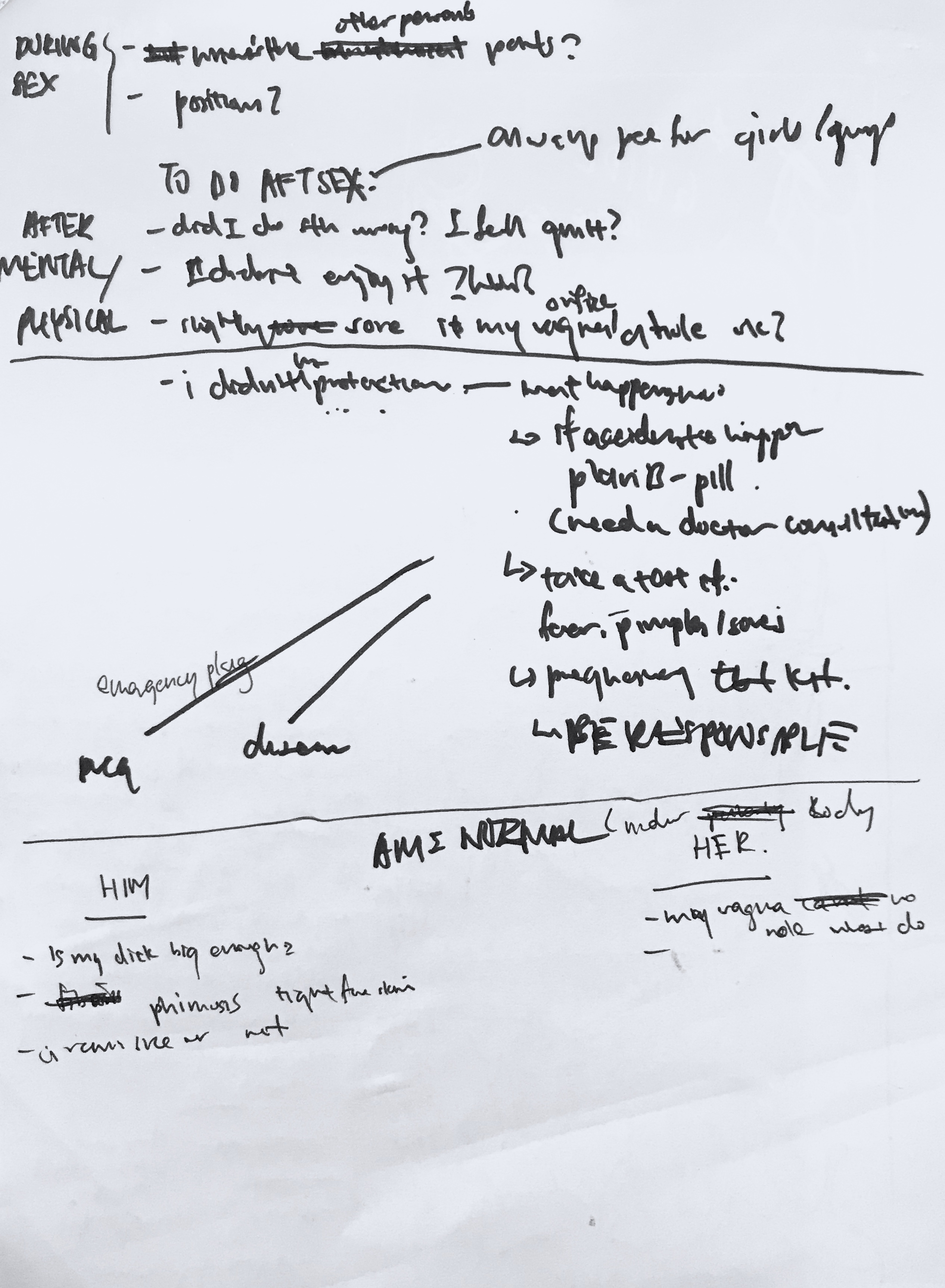
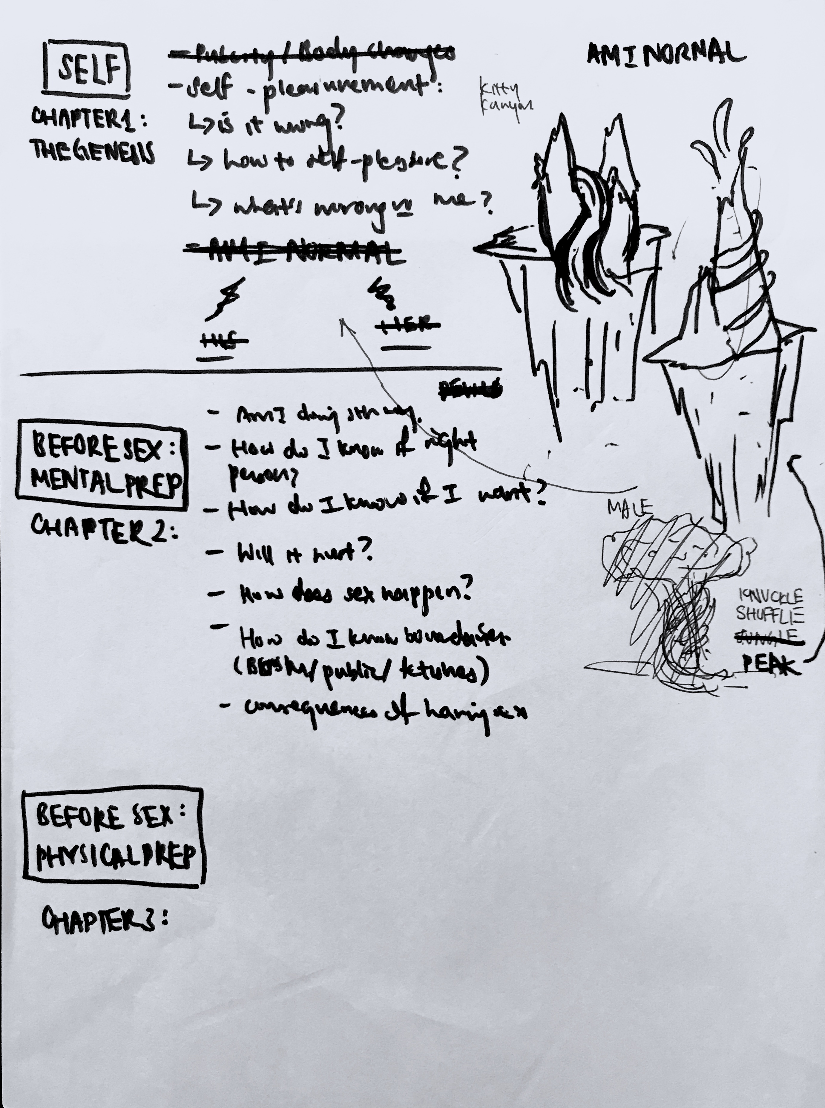
In the second project, I initially wanted to do a kit of some sorts or a publication. However, my target audience is mostly on their phones and online, thus, I decided to do a website instead. I wanted to go along with the theme of the infographic. The space themed, and at 3am I was thinking on how to do the layout when it hit me that I was going to do it in a game-like way, with different islands to visit.
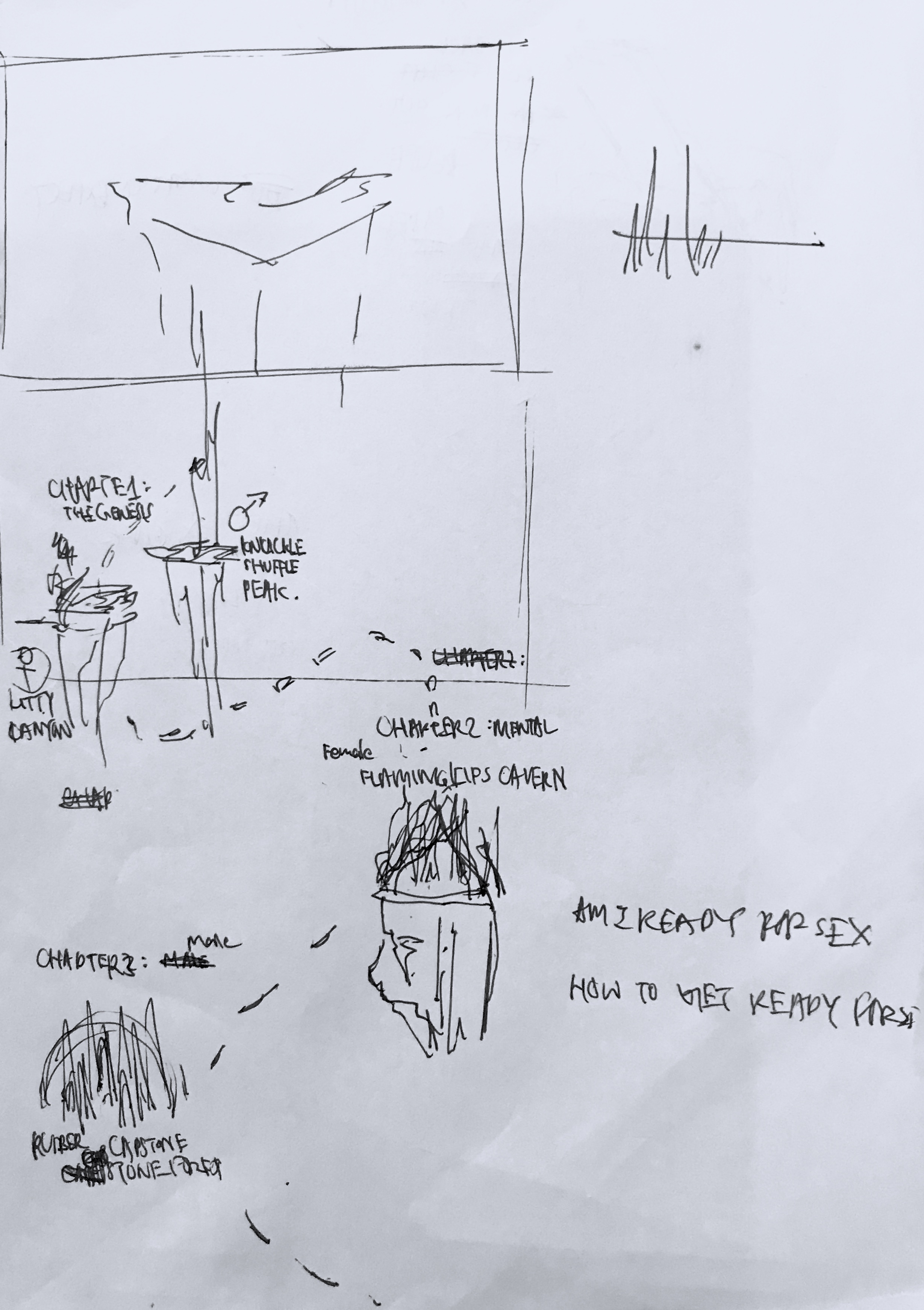
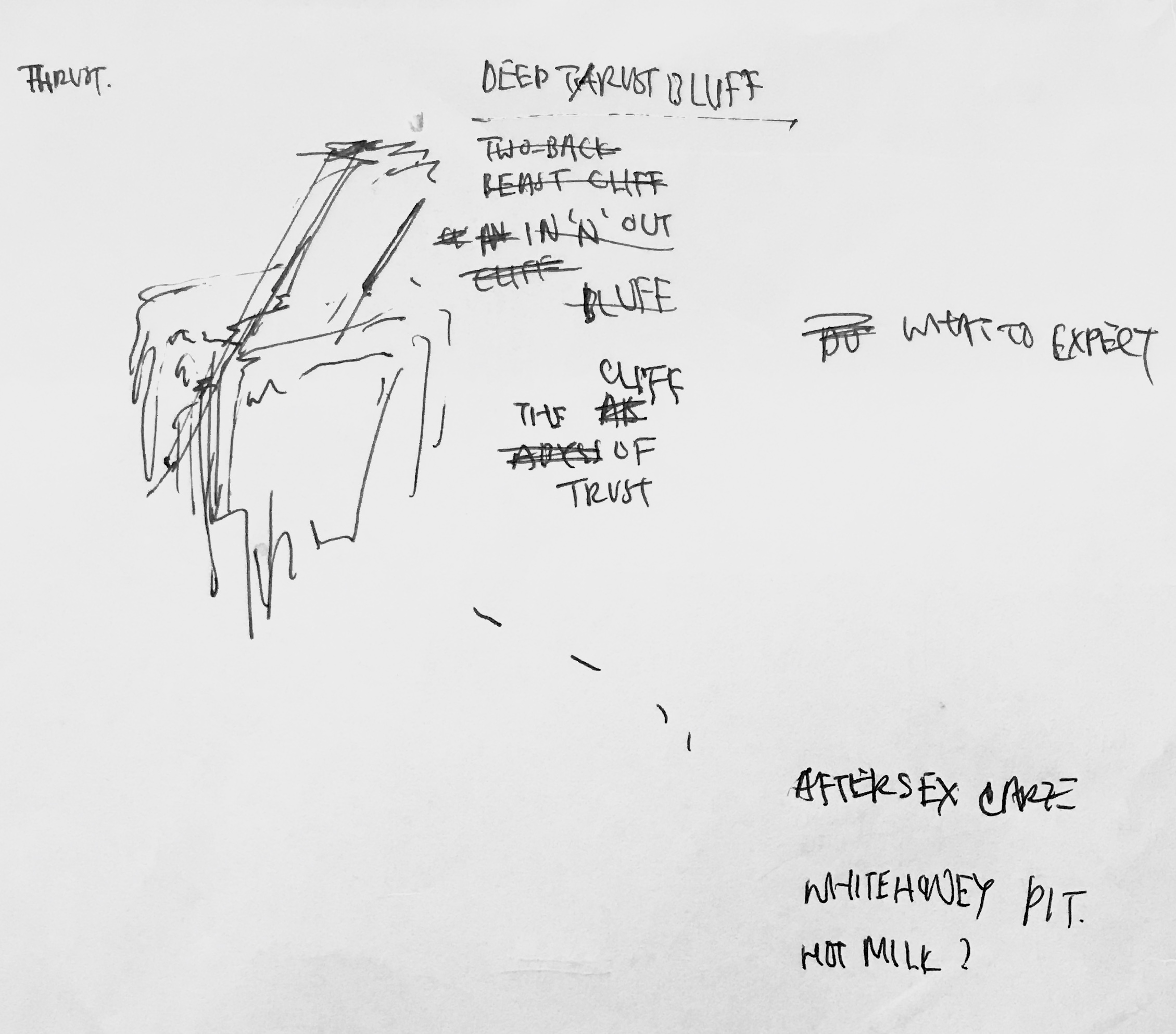
Thus, came layout and graphic planning. (The images are in chronological order of how they were conceptualised)
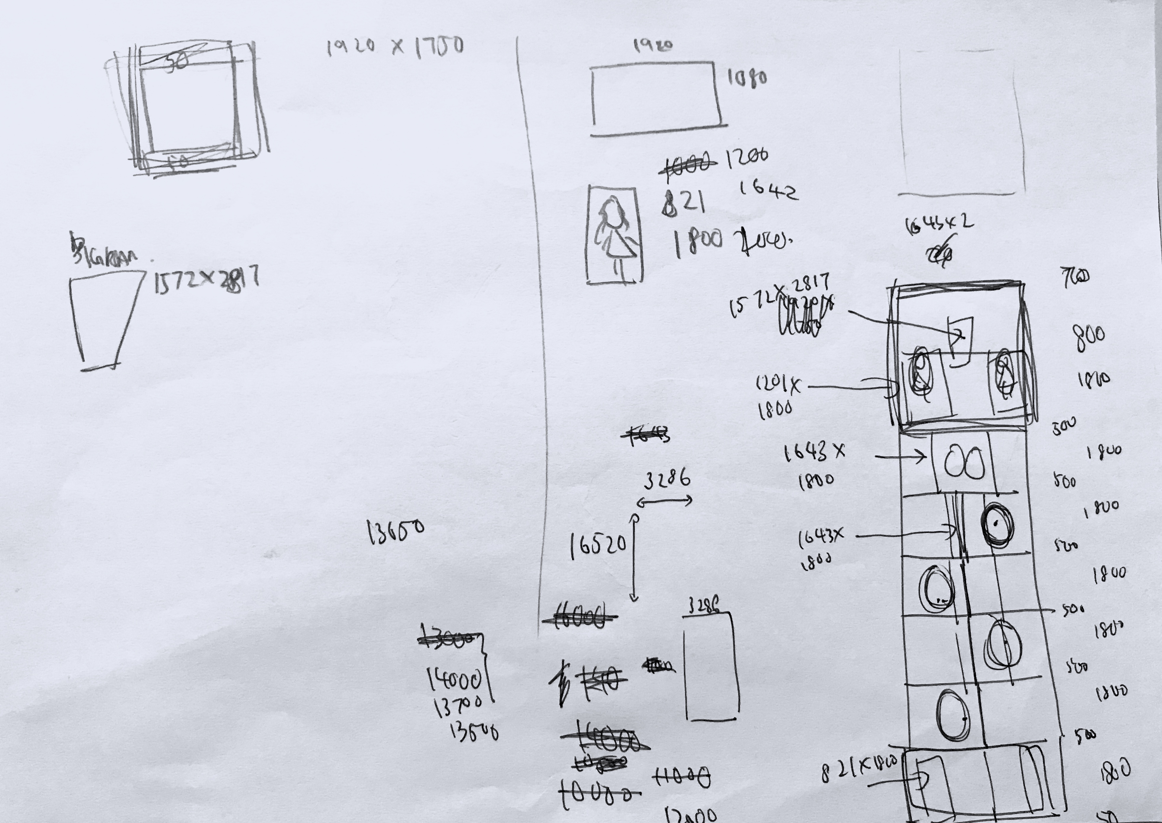
Initially I wanted to present my website in print format. But after the last consult with Michael he suggested I make it live. Even though it was extremely challenging, I am glad I undertook the challenge. There was so many restriction and resizing issues.
I’m grateful my friend introduced and gave me a crash course on how to use it. But due to the nature of my graphics and the placement, in the end I still struggled a lot on how to get it done with what I learnt about the wordpress.org builder.
Look at the amount of math I had to do to give myself more playing space. Super proud it actually materialised.
For the second article, Michael suggested I do something to promote my item. Intially I was thinking of crazy ideas like art installations. However, after consult, I realised it was really a bit farfetched. Thus, it was reduced to a standee. But I felt like there should be something given, so at the last last stretch, inspiration came for a condom packaging. Choosing to place the graphics I have on my website onto the packaging I was hoping it’ll attract the users to visit my website.
All in all, I am satisfied with the risks and challenges I undertook for this project. I tried website building and product packaging, two things I’ve never done before.
In the brief we were asked to look up on some brochures:
This is one of the brochures that caught my eye due to the fold and design. Even though the fold here used is extremely simple, it’s relevant and appropriate in imitating the way the BBQ cooker opened up, adding visual interest.
The below brochures I find aesthetic but I include them within this post because they triggered different ideas within me to work on:
The one on the left triggered ideas about the information placement, and the right triggered ideas on dye-cut.
INITIAL THOUGHTS AND PROCESS:
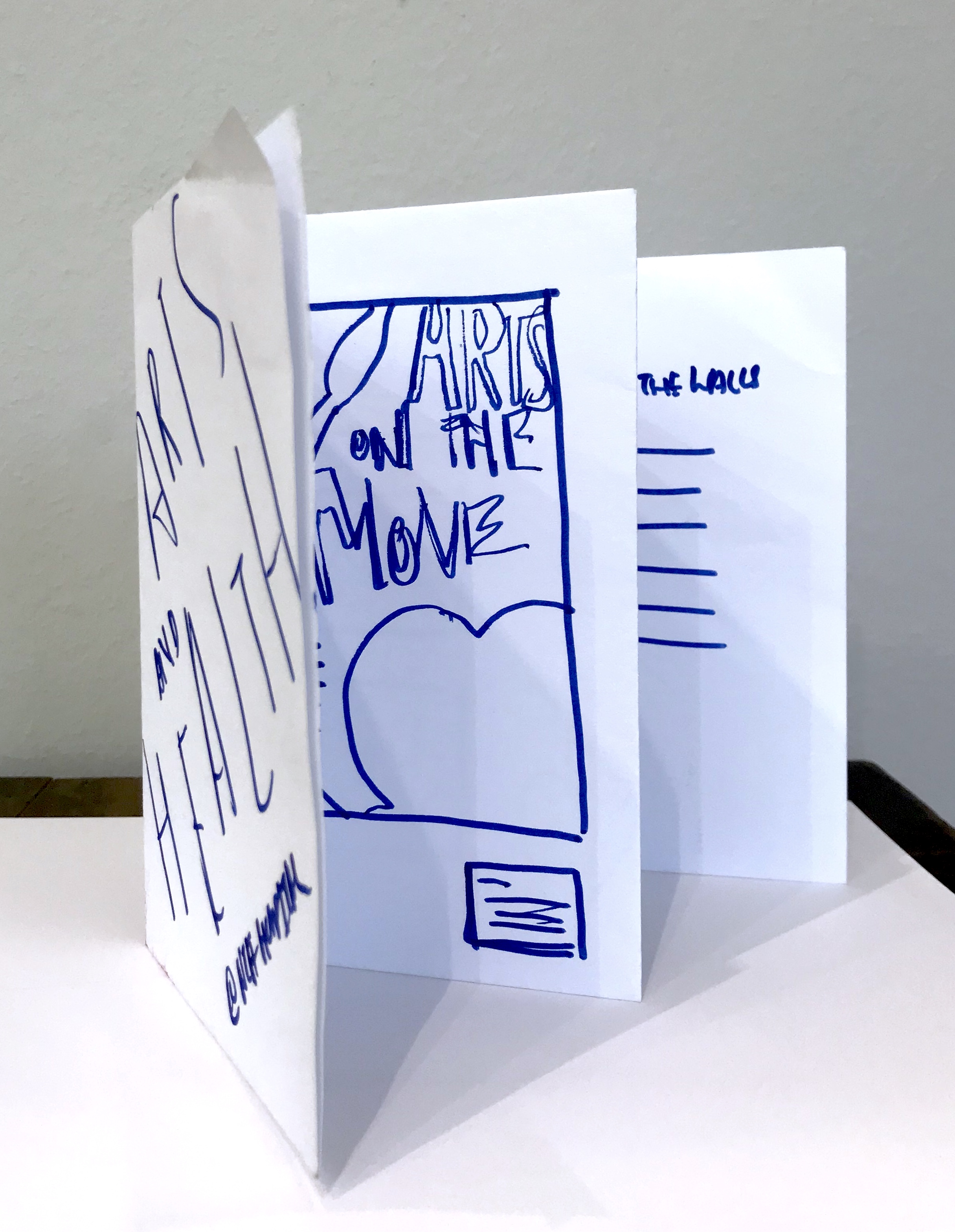
I was browsing inspiration on Pinterest on interesting folds. I knew I was going to continue my idea from the apple-head people poster, and I was looking for a simple-ish fold, to complement the simple flat graphics I had.
Then I found this and felt like the simplicity of the fold was what I was looking for. Most of the thought process and imagining happened in my head. I was initially entertaining the thought of making the idea open up into my poster like the example showed above, but I scrapped it as I wanted something different and I wanted every side of the brochure to have it’s usage.
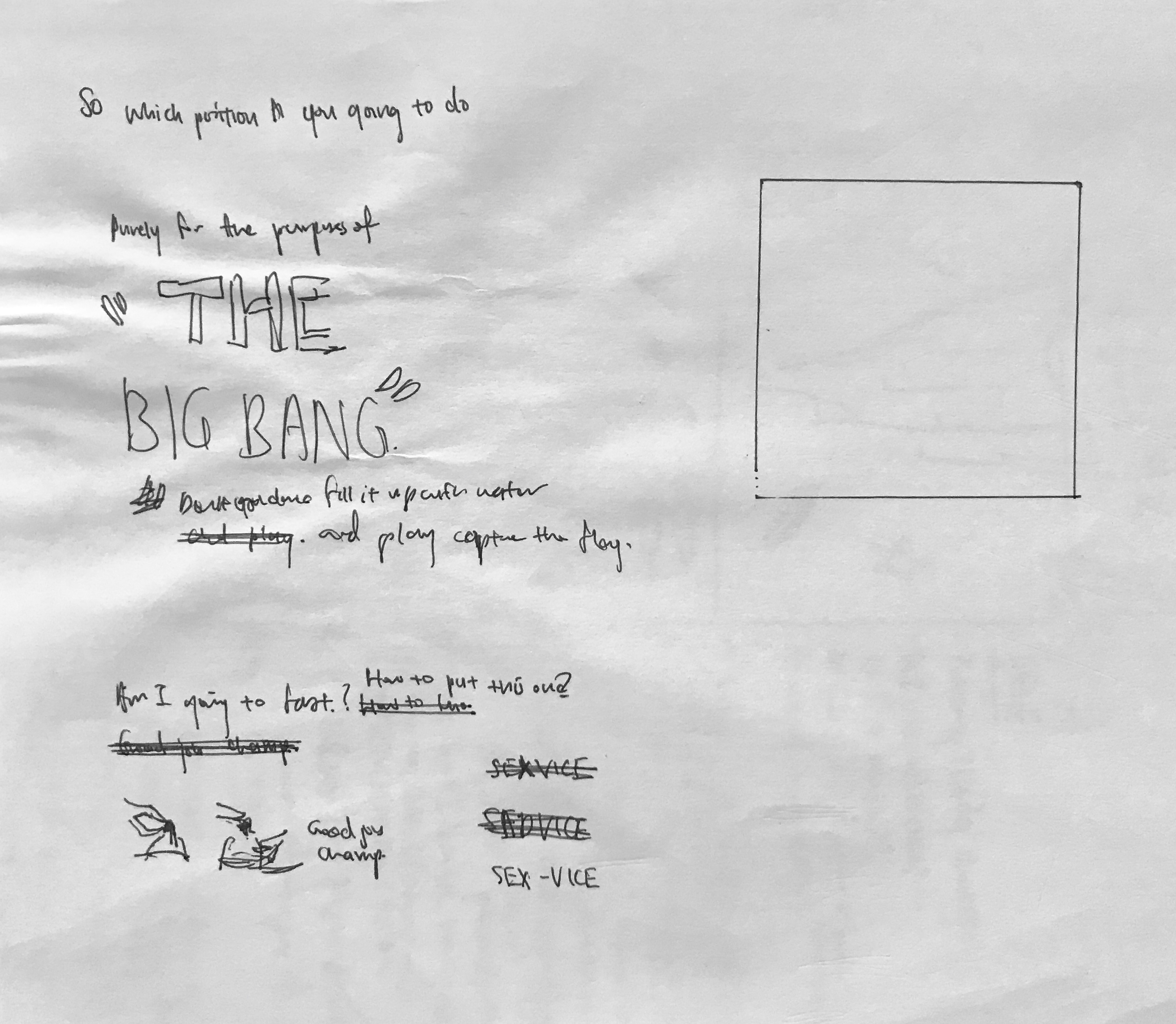
Thus, I started sketching and came out with two ideas:
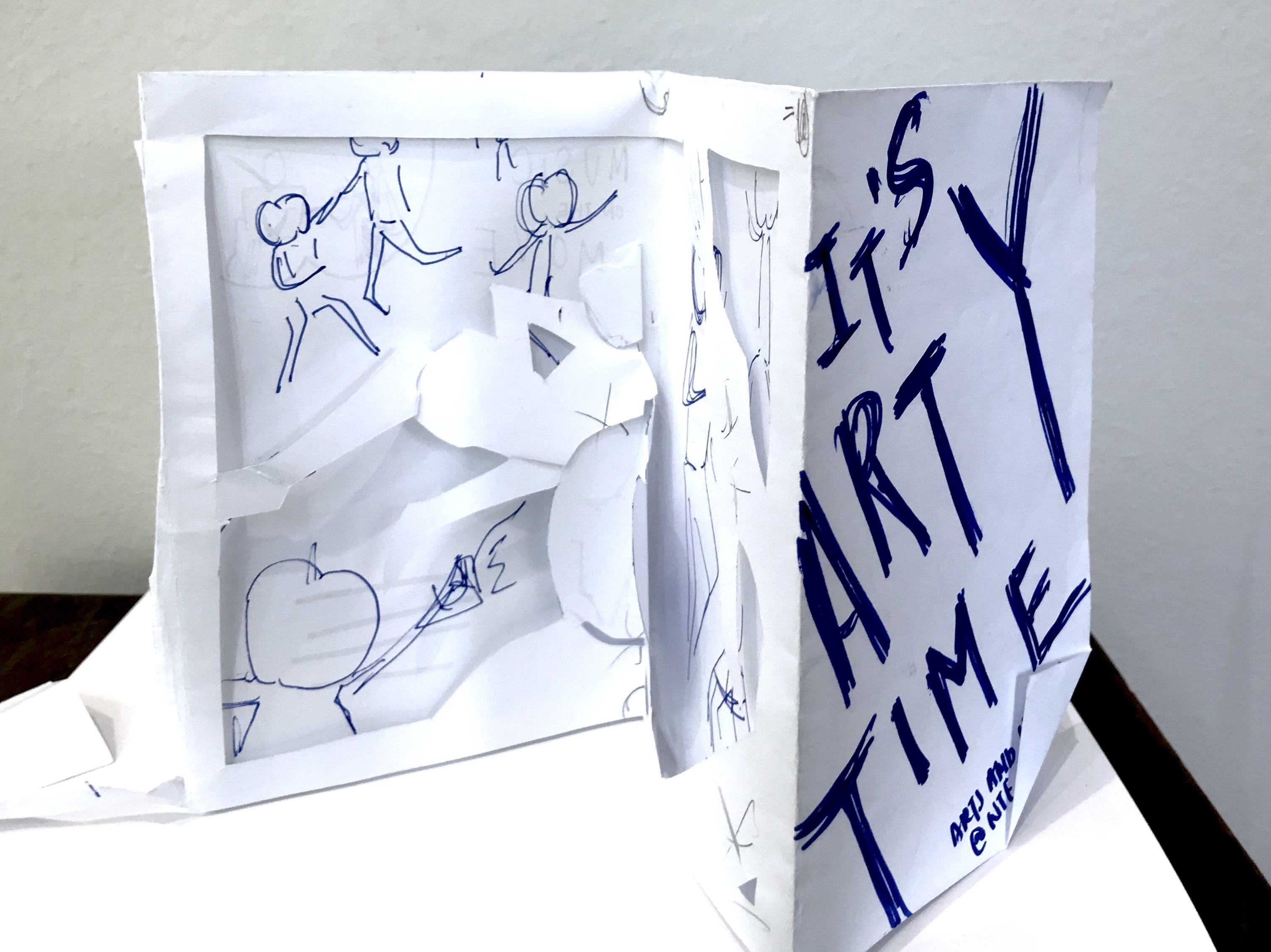
IDEA 1
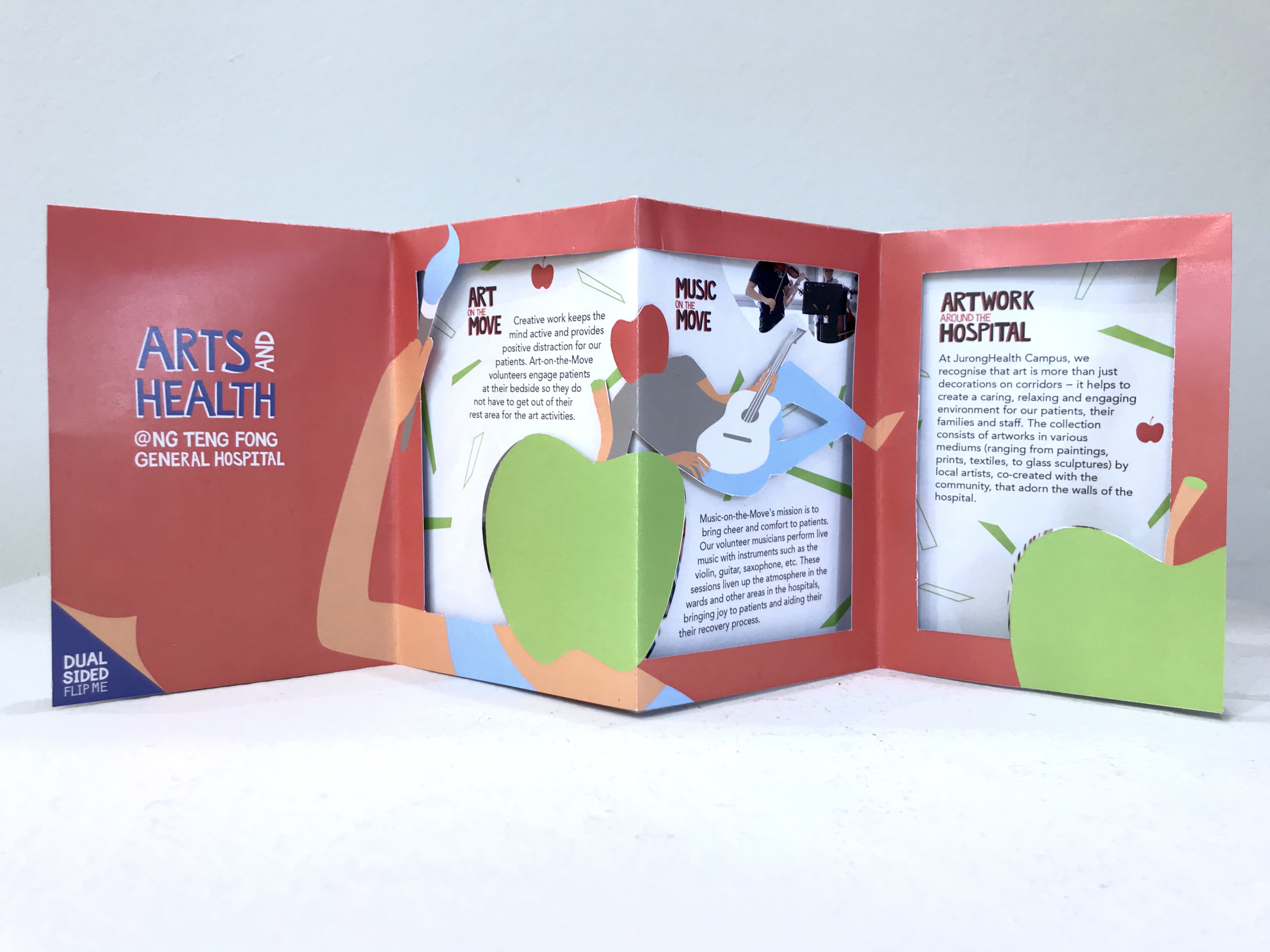
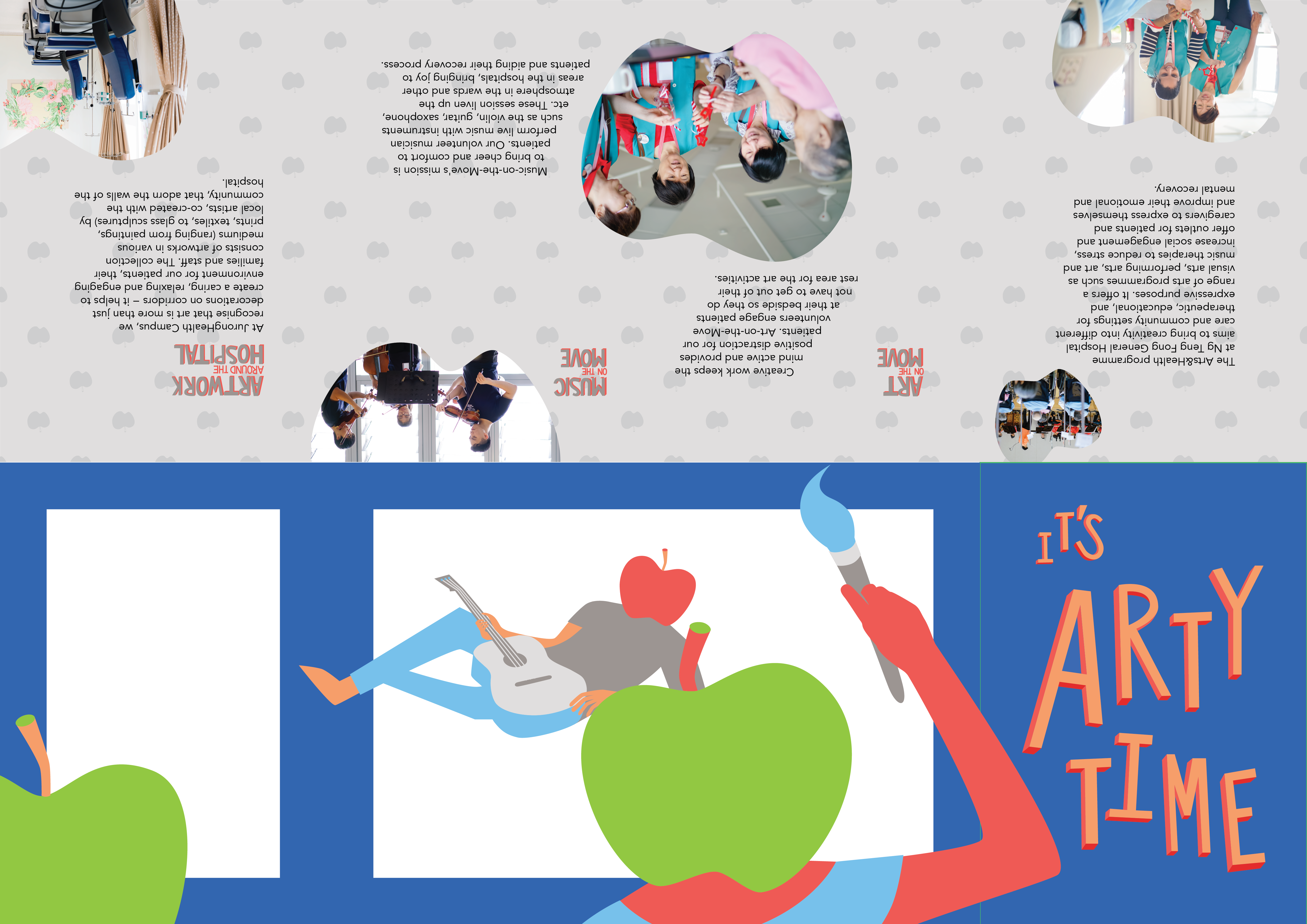
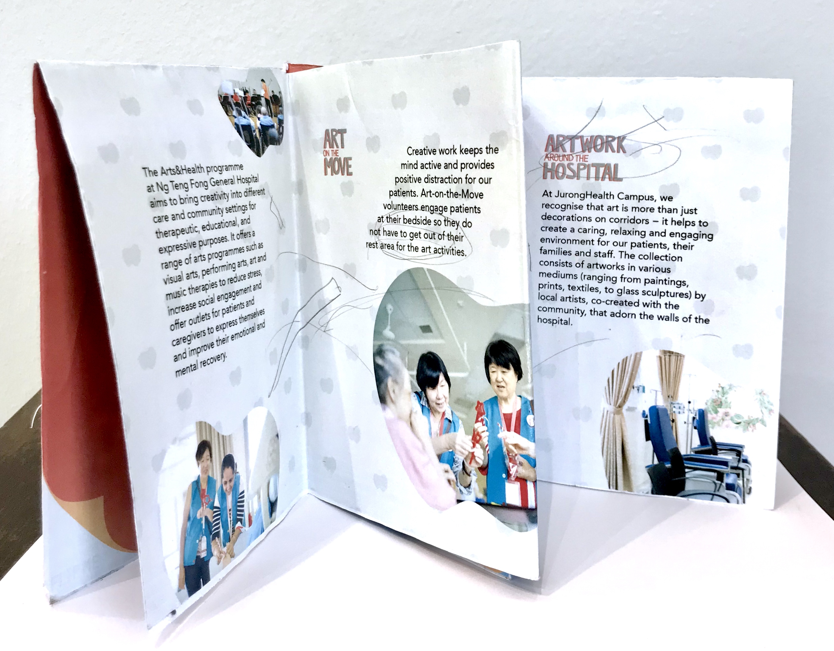
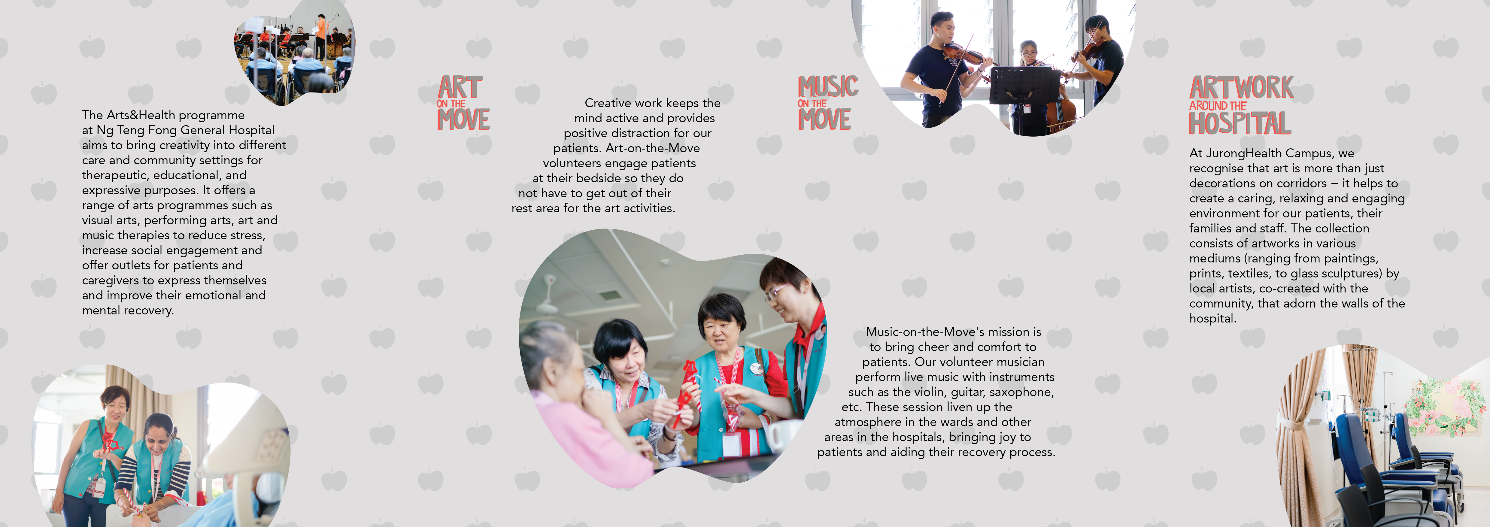
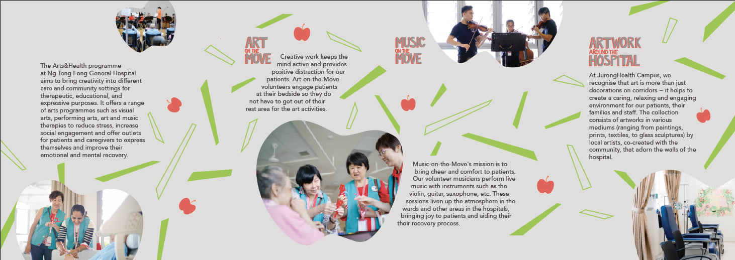
Idea 1 involves the arts and music on the move information being presented like artworks on a wall, and the back of the brochure ends off as information for artworks around the hospital. So the brochure space is a bit like an exhibition space.
IDEA 2
Idea 2 is the idea I developed and use and thus will explain in detail later in the post.
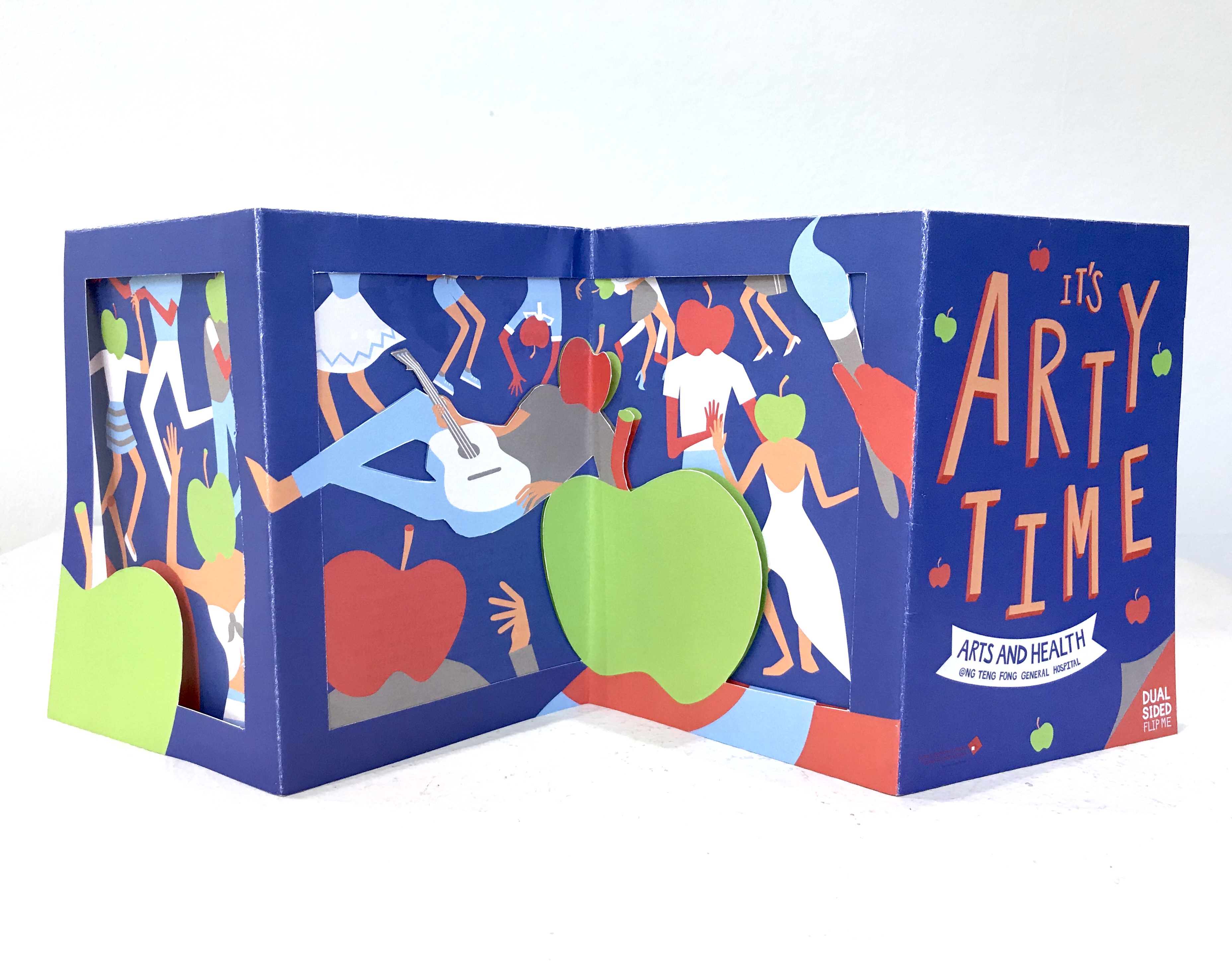
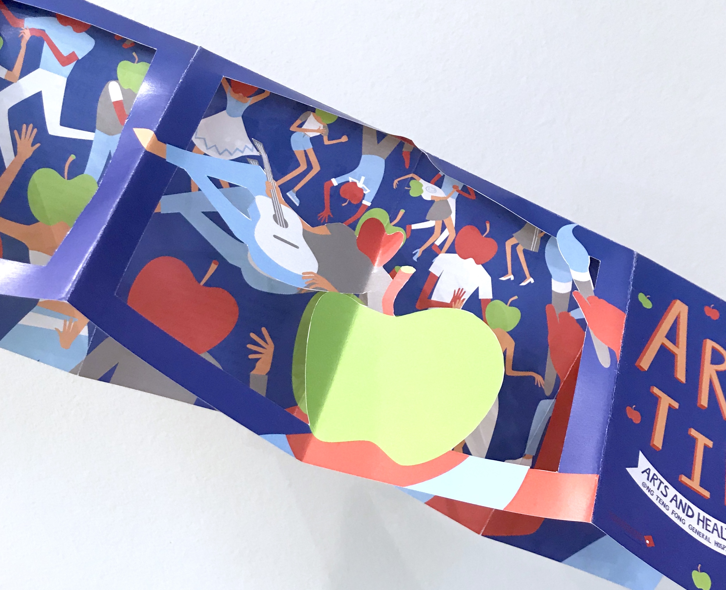
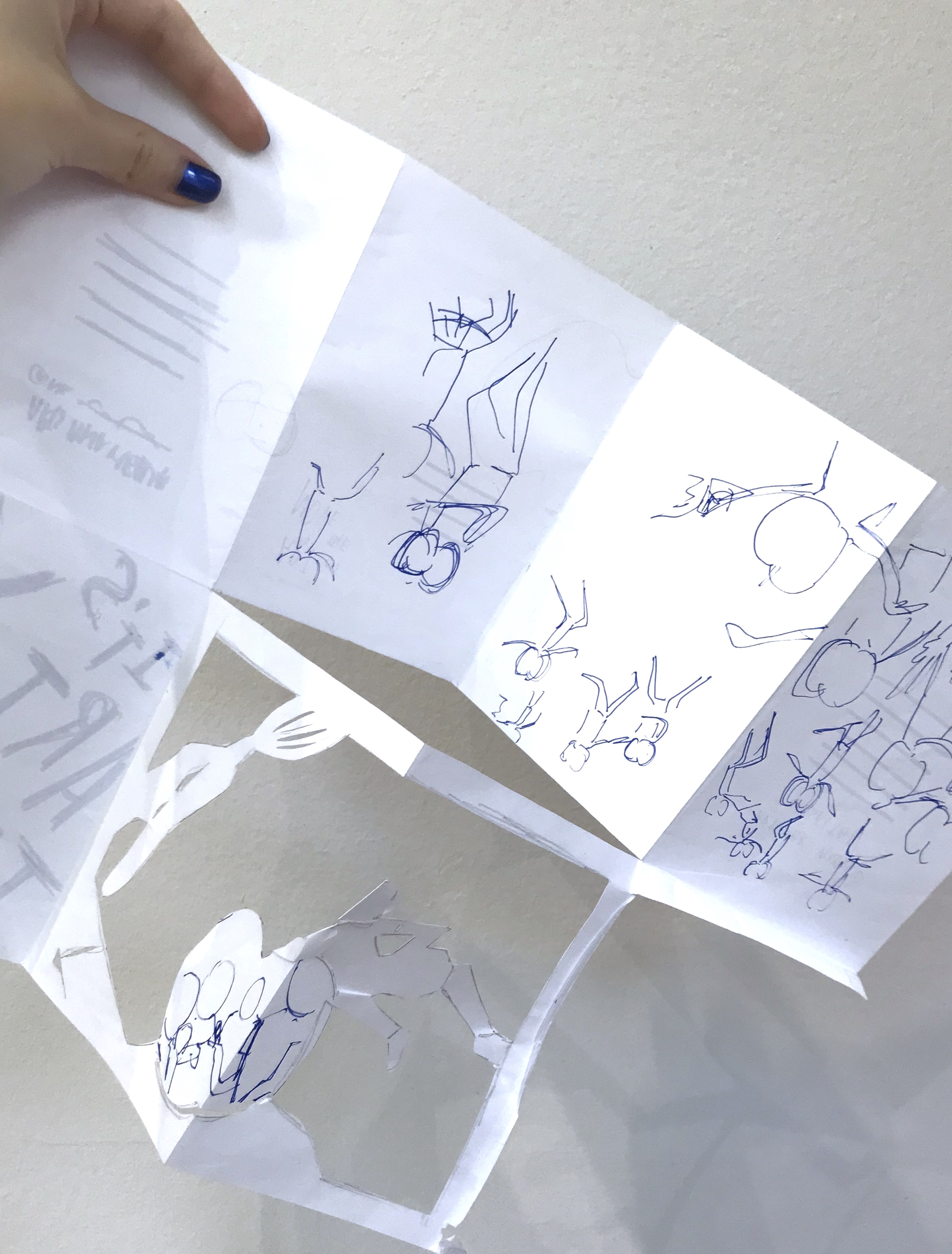
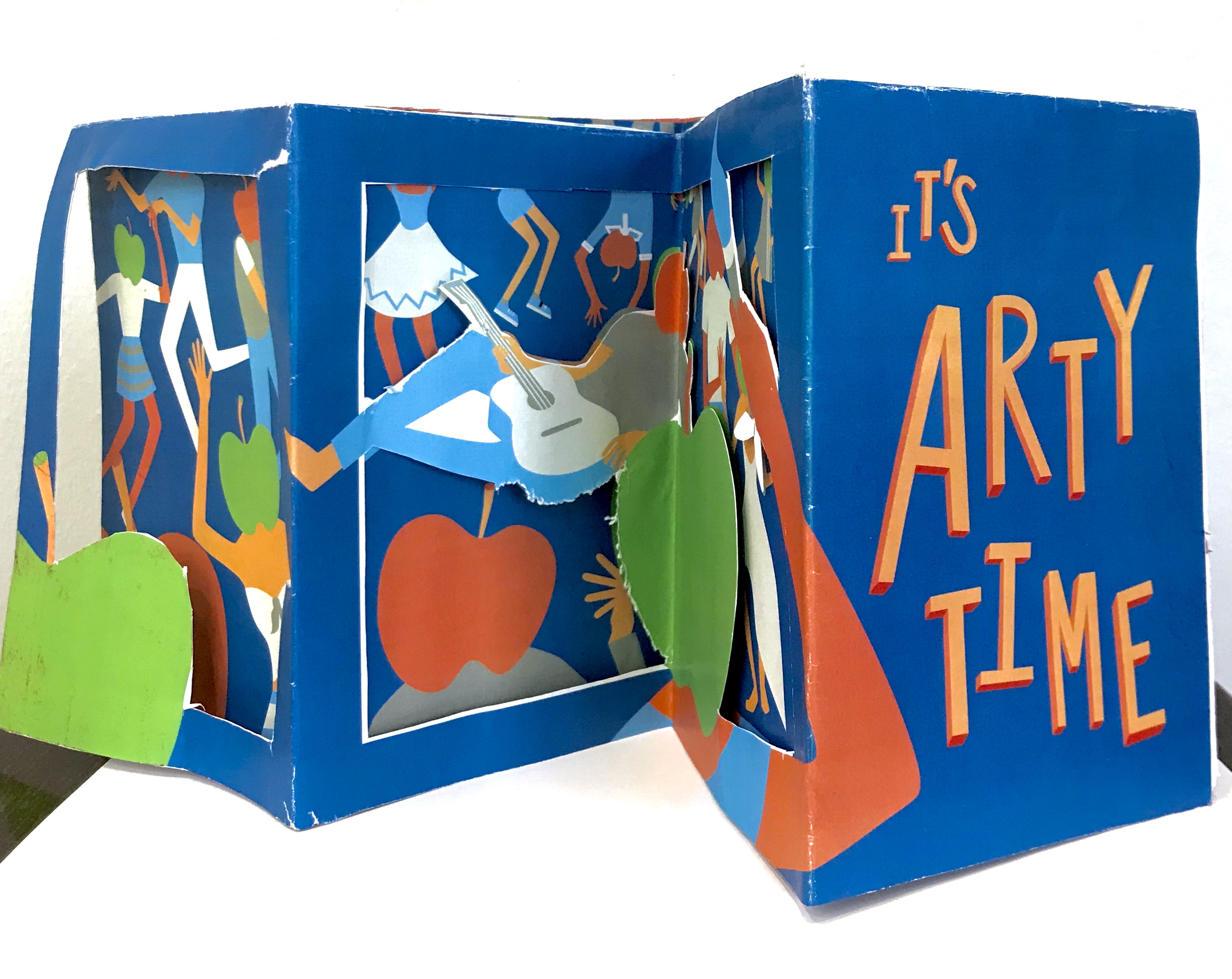
I really liked the dye-cut one and after class consultation, I decided to go ahead with that one. This is the digital version of my trial.
While this is the mock up of this trial:
The concept, was the four folded spreads acted as a full piece instead of separate folds. On the side of the apple-headed humans it was supposed to be the side view of the fiesta on the poster. While, the side with the information was supposed to be a gallery like layout with the image within apple shaped crops. The other flap was a cut- out that could be flipped both ways to frame both the party, and gave a graphic element to the information sheet for “art” and “music” on the move respectively with different apple-head characters.
I consulted Michael, and the feedback he gave me was that due to the dye-cut, I neglect and has to compromise a lot on the layout of the information sheet itself. Thus, I had to take more note to introduce flow to the layout.
Before:
After:
I spent lots of time adjusting the elements of the layout a lot more carefully.
The final post would be purely my final piece of work, so I would just include my learning points and reflections here:
I really got explore how to handle dye-cutting and layouts in this brochure. The final work I submitted was not the best, but I got to try out what I really wanted and I realised this dye-cuts might not be the best way to approach this brief or the project in general. Jerome also suggested a different flow of reading the brochure that could improve the brochure a lot, and I would work on that. Brochure layout is really an interesting skills to train and I hope to honed this skill. I also learn how important the printer would be in alignment and dye-cutting issues.
After doing visual research for part one of the project, I got inspired and came out with a few concept which I did in A5 sketches.
The first one (on the left) was supposed to be some sort of photography and illustrations overlaid on it. It was simple, very simple, and very safe idea. The second one (on the right) was an abstract idea. Like I thought ok let’s not do anything to do with arts or health, just something happy, thus, sunflowers. However, Micheal and the class feedback that it was a bit too simple, which I agreed, thus, I had to complicate the idea, make it more surrealistic. I wasn’t that interested in this idea, thus, I just decided not to pursue it.
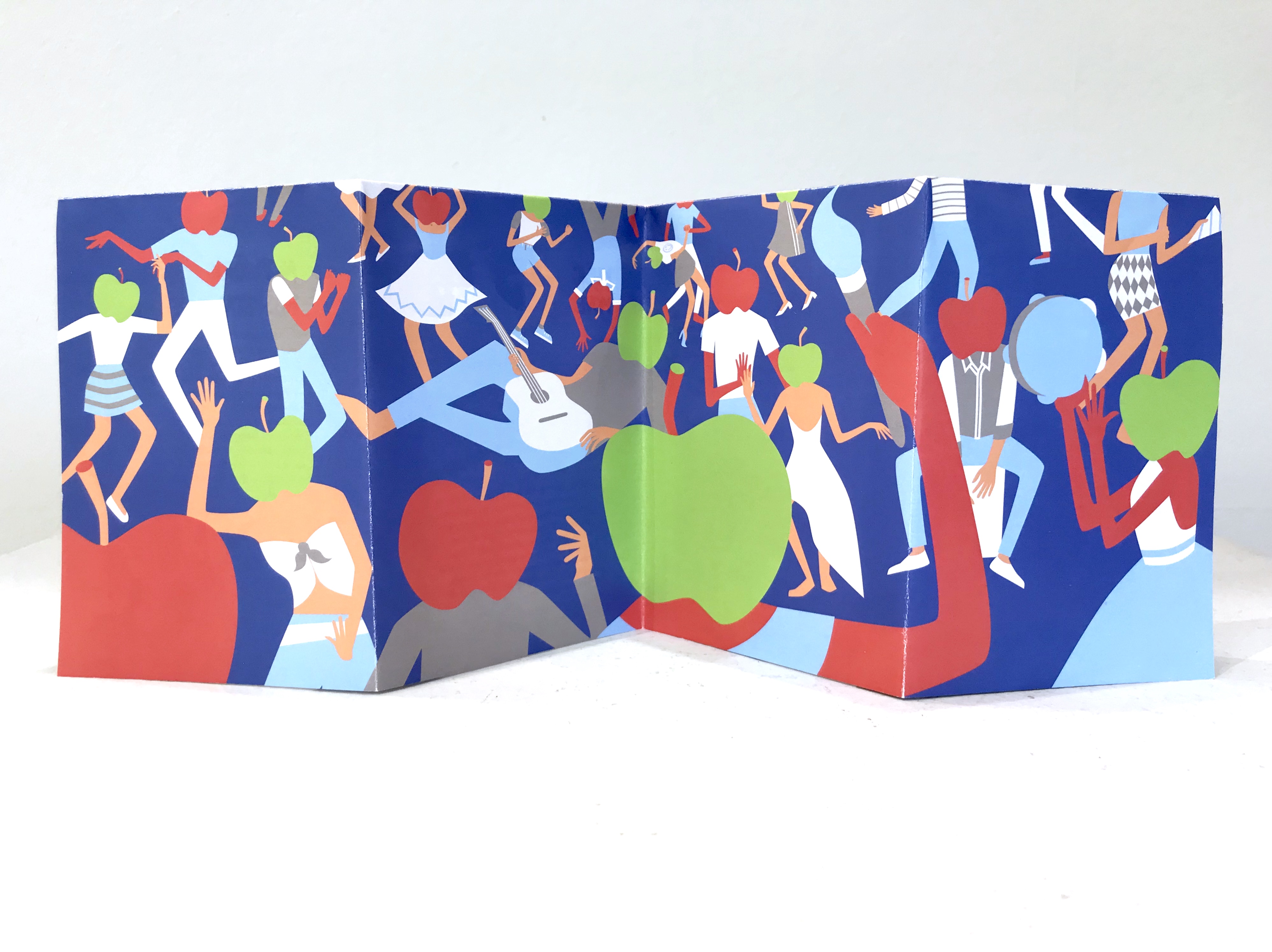
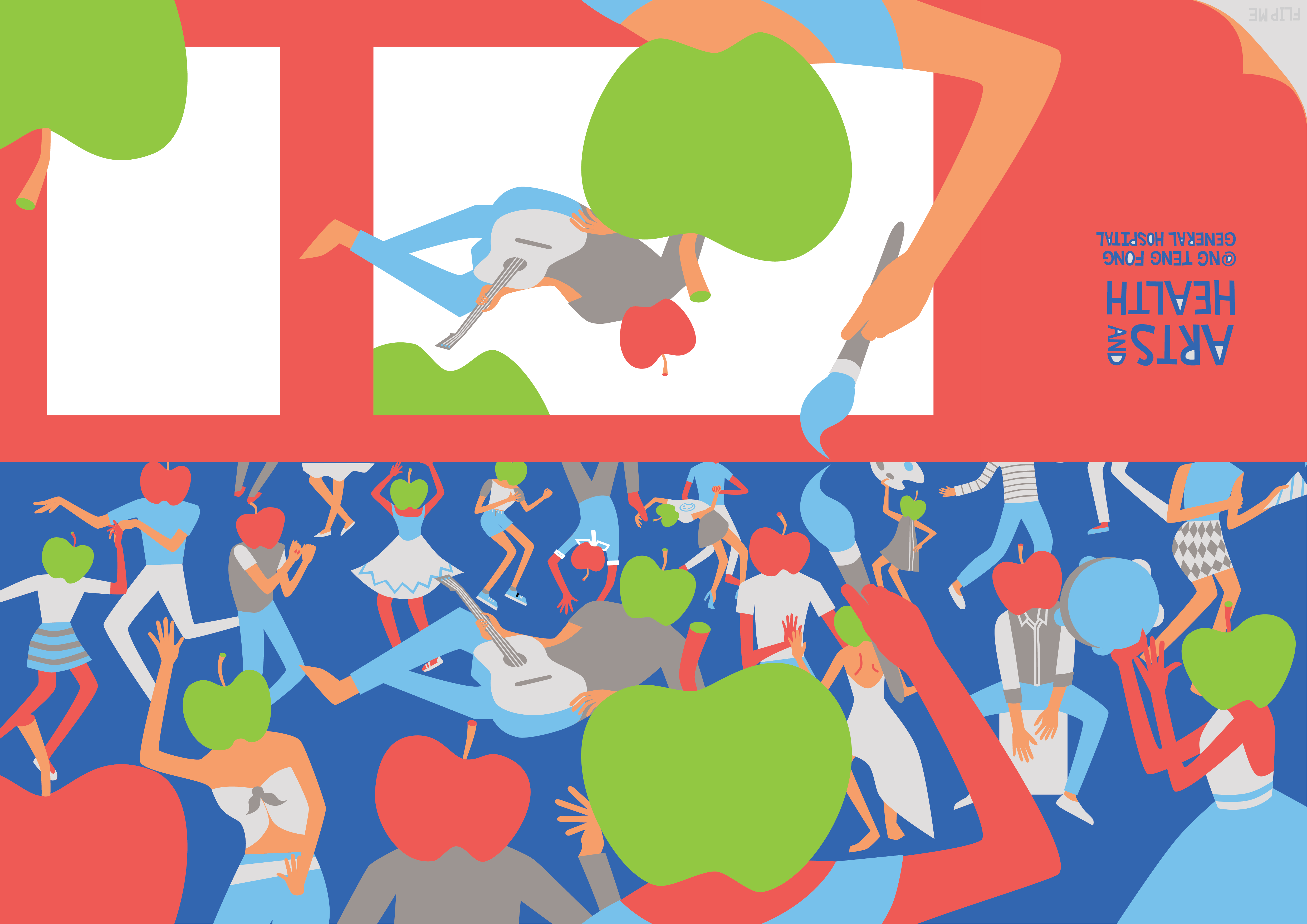
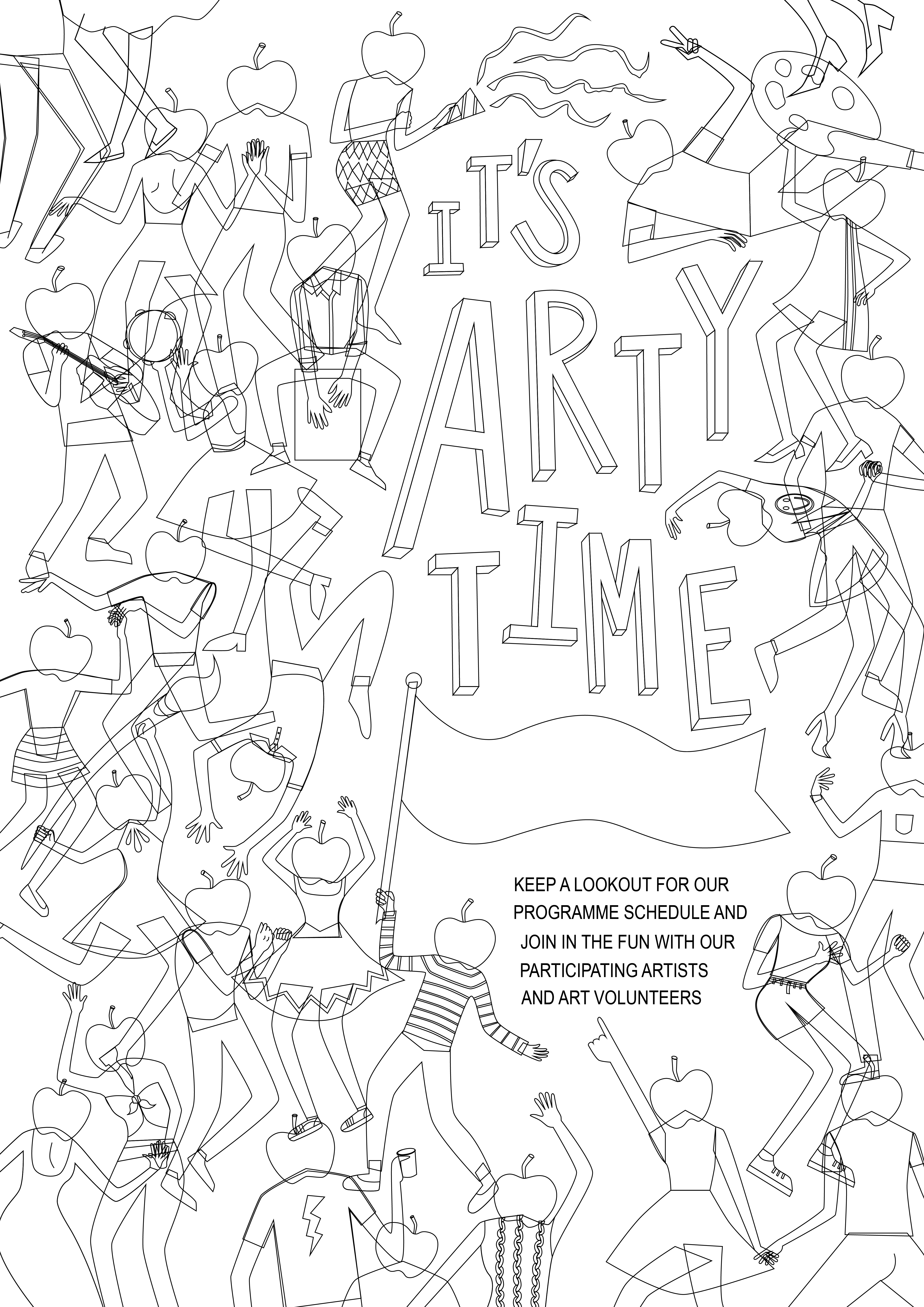
The third idea (on the left) was a very literal idea, brush to represent “arts” and apple to represent “health”. This was supposed to be photographic. It was so boring that it’s not really worth mentioning BUT it did lead to my final and best idea. The fourth idea (on the right) was inspired by the third idea. It was kinda like an idea of a sort of fiesta, with movement, liveliness and happiness. The fiesta with the dance, music, and art (brush) represents the “arts” part and the apple headed humans were abstract representations of “health”. At this stage I was purely thinking of imagery, and not slogans as I am not as good with words.
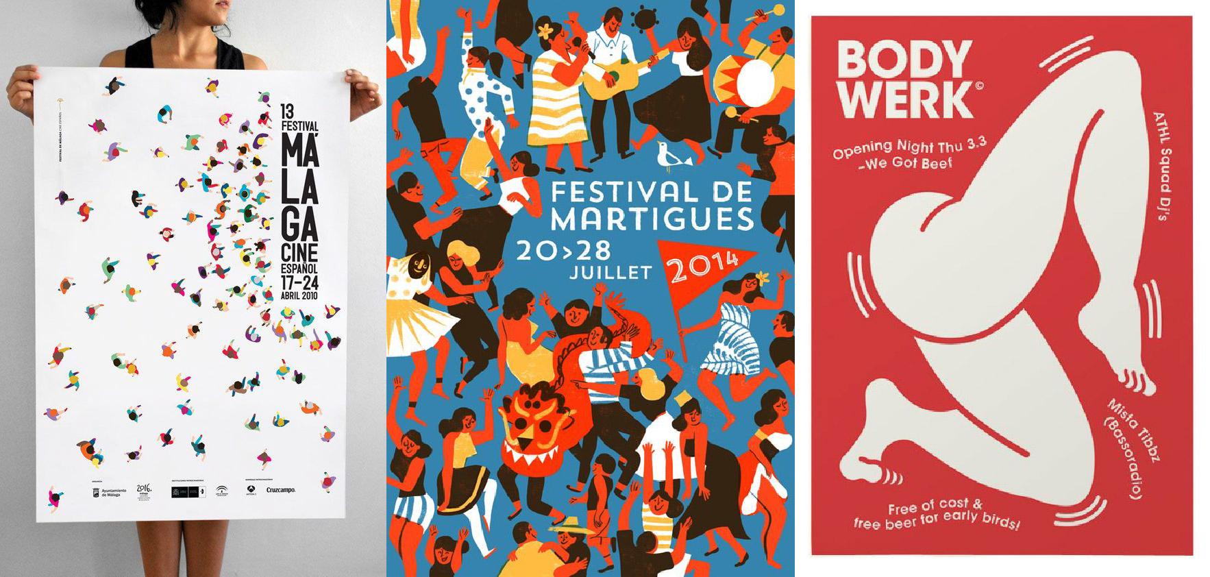
It was also inspired by several posters I saw in my research:
Thus, I started digitalising my work. Here are some preliminary sketches:
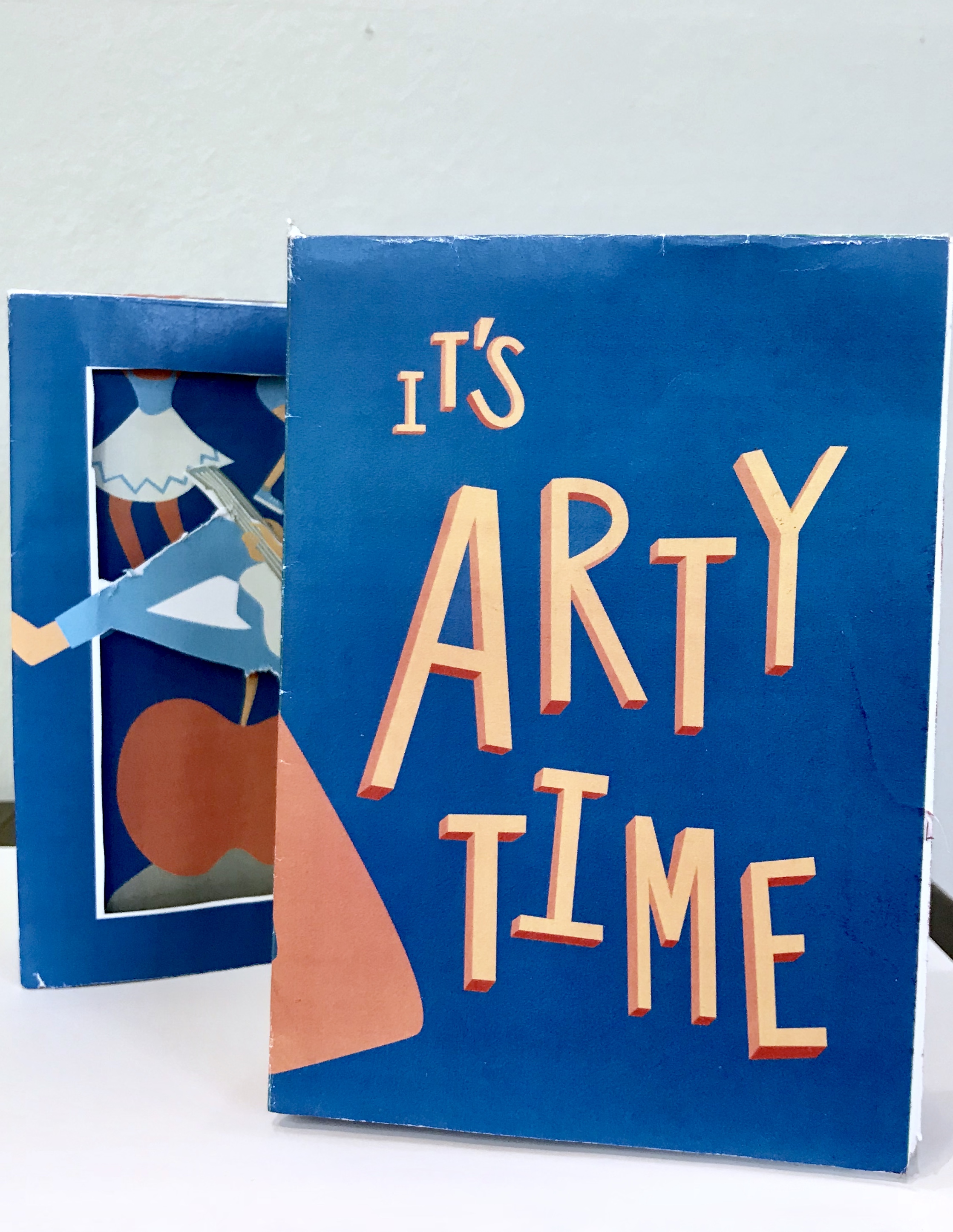
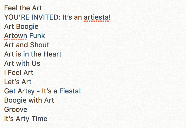
Due to the fiesta nature of my poster, I decided to go ahead with the slogan of “It’s Arty Time” among the list of slogans I came out with.
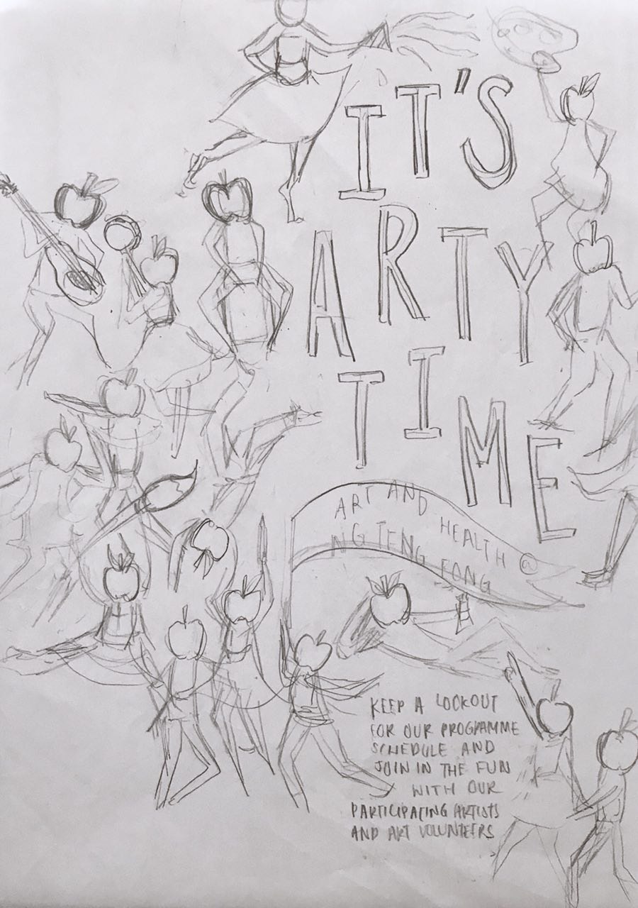
This is the first draft presented in consultation. I already thought through difference composition in the sketch process, thus, I didn’t do much experimenting with composition in the illustrating process. Each character was illustrated specially to fit the space I placed it in. Thus, moving them around was not an option.
However, during consultation, Micheal gave me some good feedback in terms of rearranging the position of the character in the bottom right corner, playing up the size and position of the “It’s Arty Time”, playing the poster to it’s full strength of whimsicality.
There was many shifts and edits of the characters, to fit everything in in the process, but was mostly small shifts in spaces.
This is the close to the final draft of the poster:
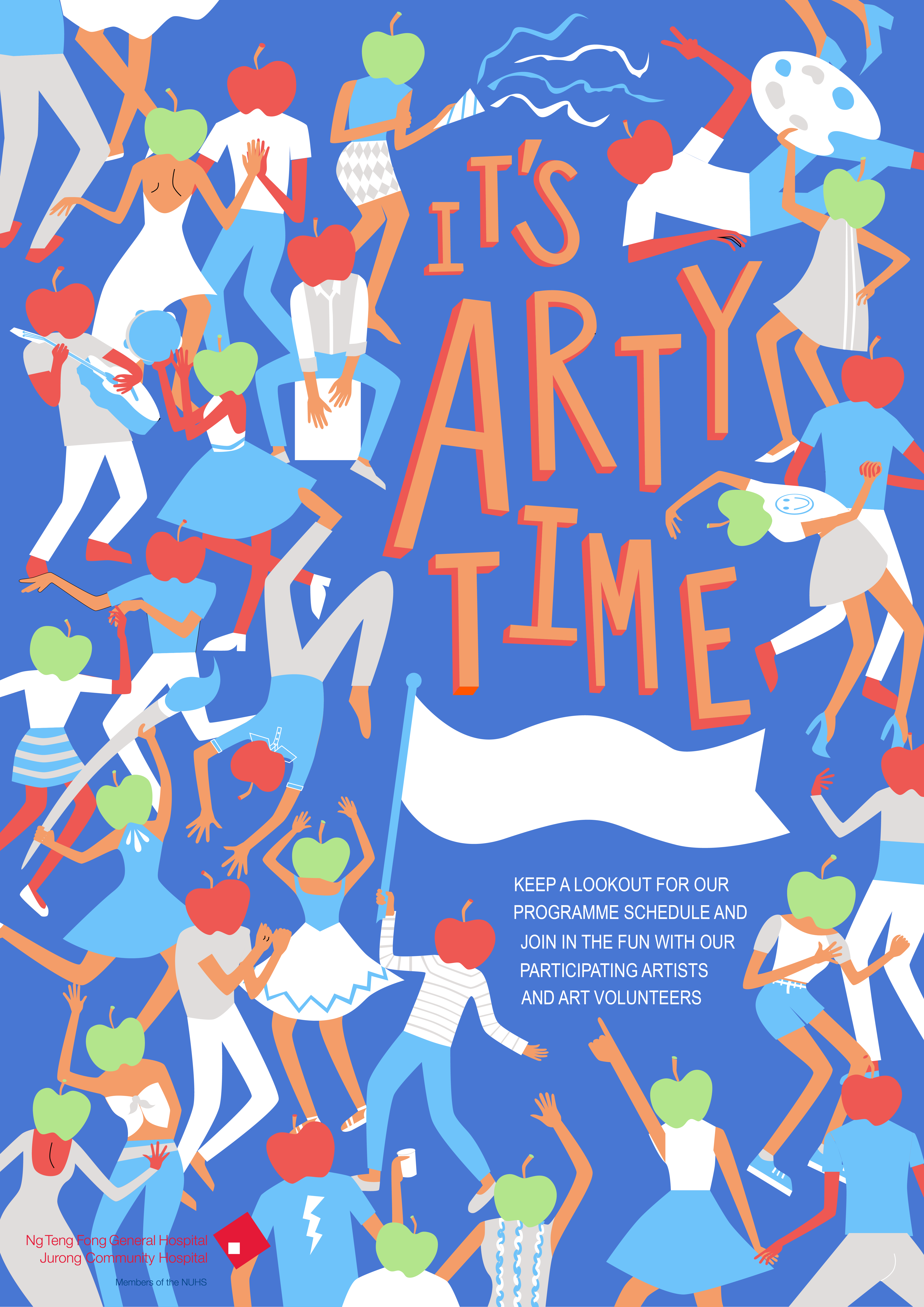
After the illustrations were done, it was the colouring in.
This is my first colour palette.
However, there was many problems in this one such as the lack of contrast and the fighting dominant forms.
Thus, more experimentation was done:
Another alternative colour scheme I explored but deemed a bit too arty for the target audience of the general public in the hospital:
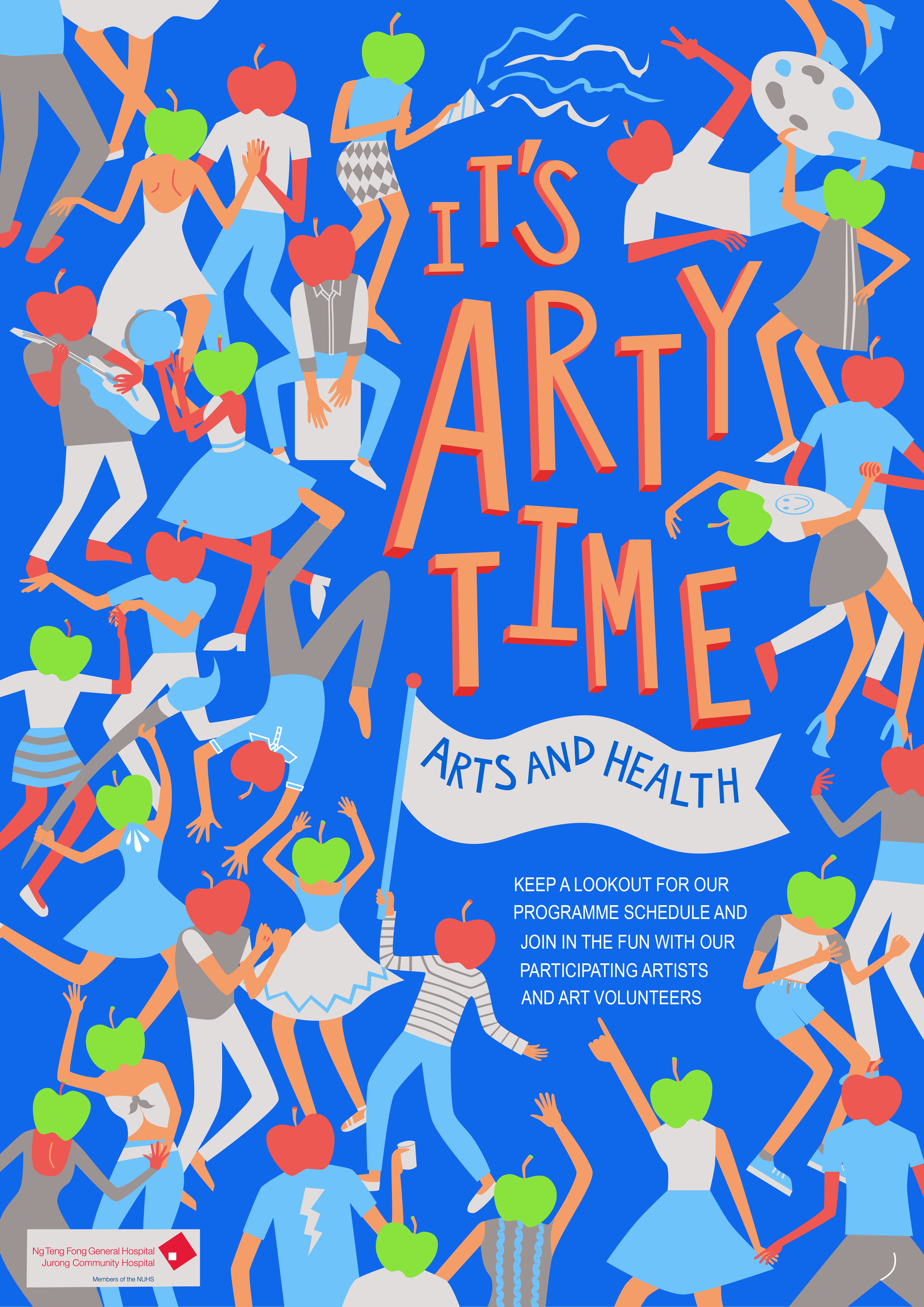
As I slowly settled the colour scheme and cleaned up the illustrations, I finally completed my final product, which will be in the next post.
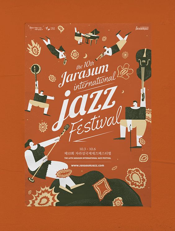
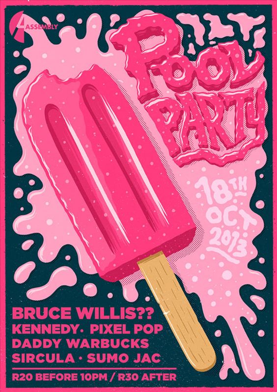
The poster is communicating a Pool Party happening on the 18th of October 2013.
The emotions the poster elicit are joy, whimsicality, and excitement.
The poster is captivating firstly due to the use of colour, a large bright pink patch on dark blue. Next the use of the large ice popsicle image is simple and eye catching. The melted pink ice cream further conveys the idea of wetness and splashing of the pool party. It generates interest because it is linked to the idea of refreshing, and fun, like eating an ice popsicle. Readability is definitely there as it is extremely straightforward the date in the ice cream splash and the rest of the details in blocks underneath.
I really like the approach of this poster. It’s different, it does not show anything about a pool or party, but the imagery instantly make me think of fun and joy, the type of party I would want to go for.
To translating my mood boards into design sketches, I did three themes of sketches in order of the mood board I posted in “Task 1”.
This was theme 1 exploring the concept of connection, thus human touch, and the paint strokes, signifying reach out through art.
The second theme, kaleidoscope.
And the third, therapy through nature motifs.
Through the first round of consultations, I was slowly starting to notice how I had to turn my designs more logo=like. Increase the relevance of these design and motifs to suit the theme “art on the move”.
Thus, I continued brainstorming and expanding on the first theme, which was my favourite theme. And upon the advice of Michael
Through the first round of critique and consultations, I was beginning to understand the requirements of this design more and more. I also began to take note of the importance of relevance in the design, How the design should speak “art on the move” in picture format, as well as the need to reduce certain design elements to for scalability purposes.
I decided to expand my first theme which was my favourite. With advice from Michael, I also incorporated elements from the second design into the first design to make the design be more relevant to the “art” part of “art on the move”.
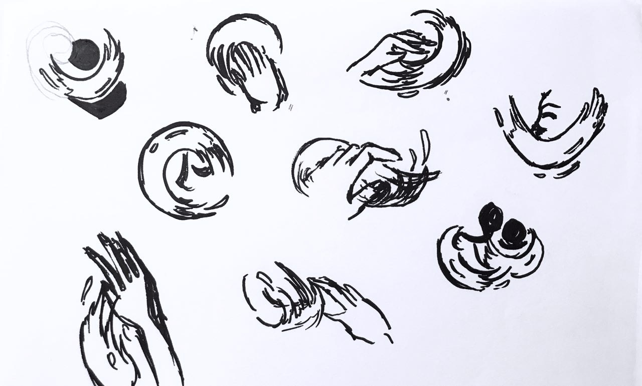
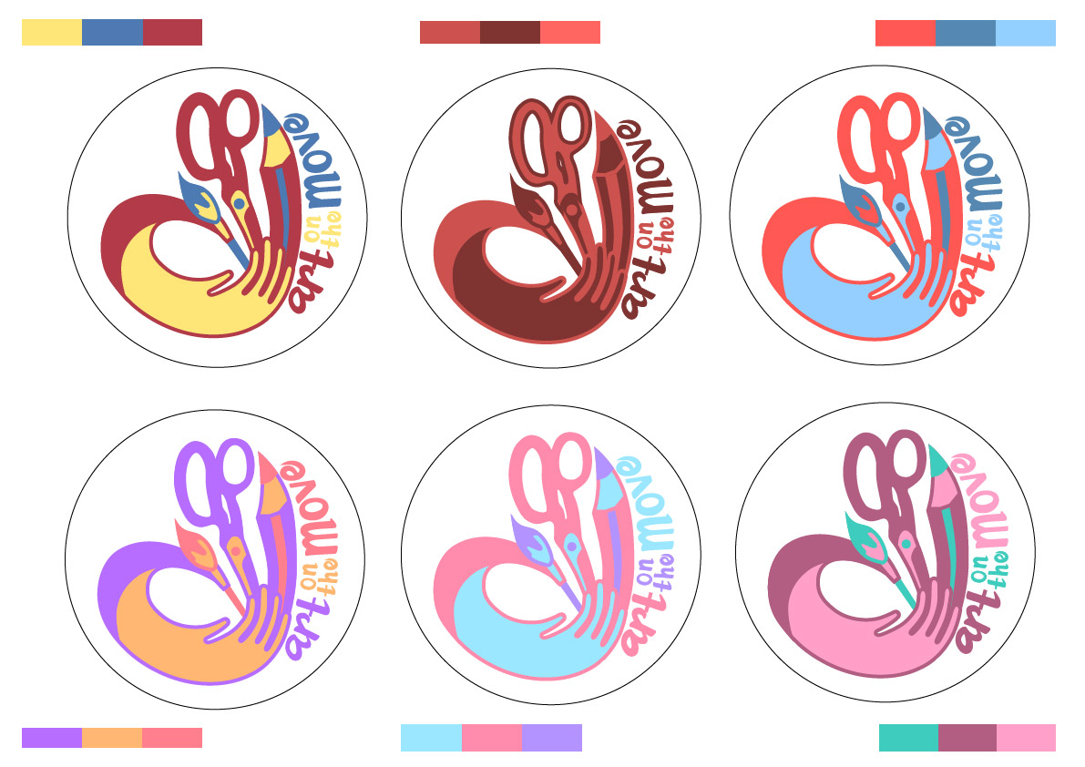
It was through repeated sketching that the idea of the heart formed in my head.
This idea took the outreached “paint brush” hands (reaching out through art) from the first thematic sketches and the craft tools from the second thematic sketches. Together it was supposed to portray a heart as a whole, a symbol of care. Separately, the paint brush hands represent the volunteer’s role in “art on the move”. The curvilinear stroke also provided a sense of movement. The tools increased the relevance of this design.
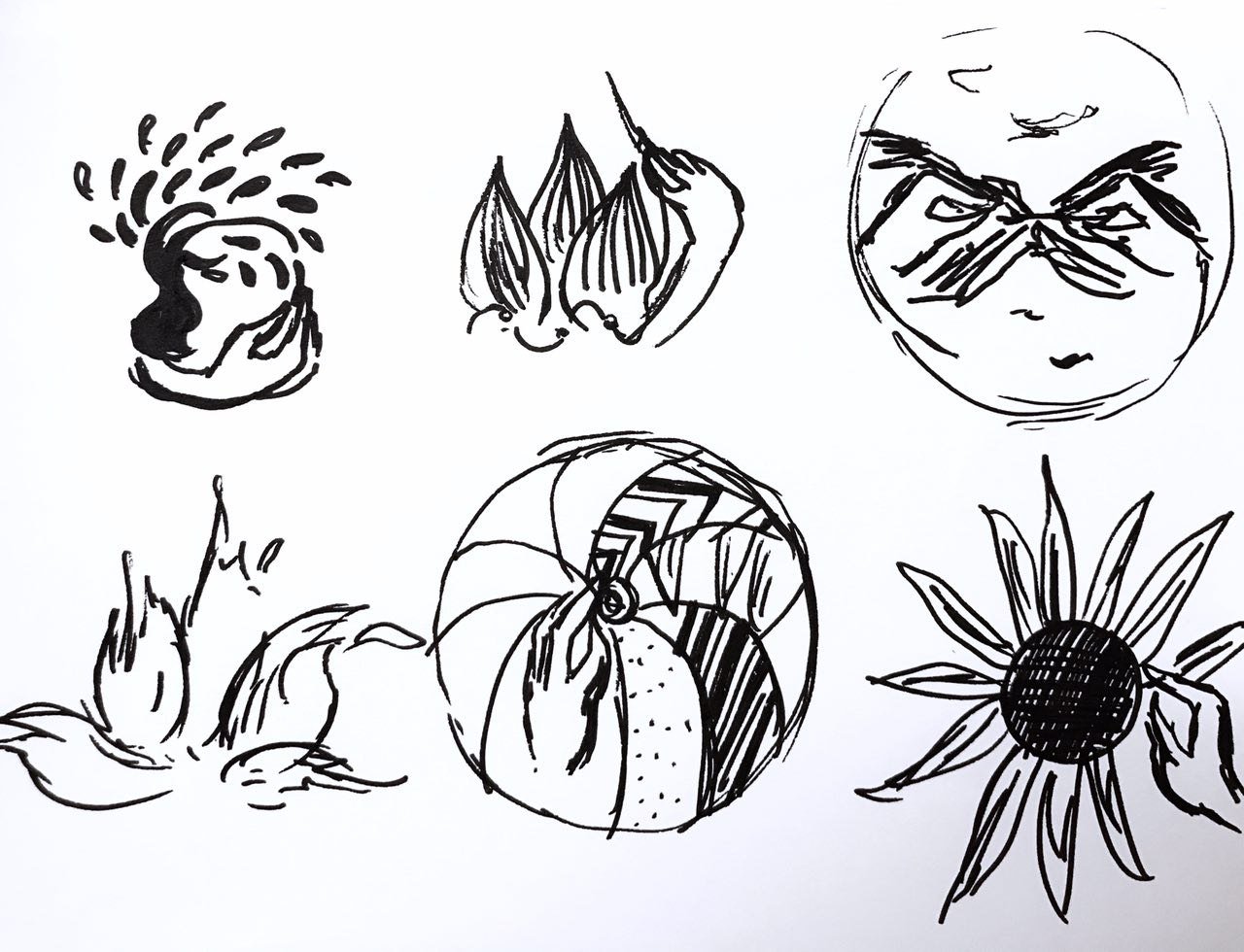
Two other designs I had the inspiration for was:
I quite like the third concept actually. But I felt the movement was missing from this design.
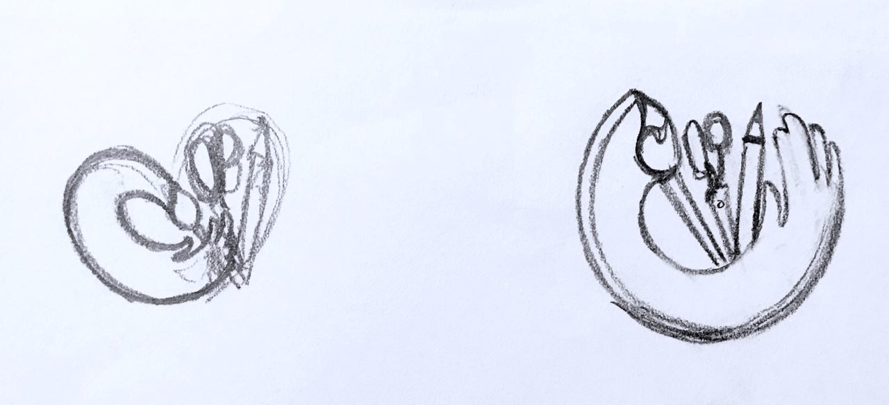
Finally, after much thought, I decided to stick to developing the first idea. I also simplified the stroke, and make the heart-shape more distinct, by using visual cues as suggested by Michael. Like the bending of the pencil. I think this really cleaned up the design. I also added in the text in a curvilinear format to enhance the round side of the heart.
After simplification and modifiying, this was my final piecce.
Next up is colour exploration:
Through exploring these colours, I learnt how to manage the colours better. Like how to use certain colours at certain areas to bring the heart shape of the design.
Finally, I settled on
This is because, primary colours are very easily relatable. It looks harmonious, yet lively, connoting the idea of play.
The other variation would be
Because of its highly contrasting and eye catching colour combination.
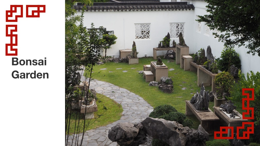
When I went to Chinese Garden, the place that intrigued me the most was the Bonsai Garden. I love how the bonsais are meticulously shaped that set against beautiful Chinese architecture. I was fascinated at how the twisting bonsais were set against differently shaped windows/ spaces extremely aesthetically with good design.
Then I thought about how Singapore was a Garden City, and how the greenery around Housing Estate are also very well integrated into the architecture.
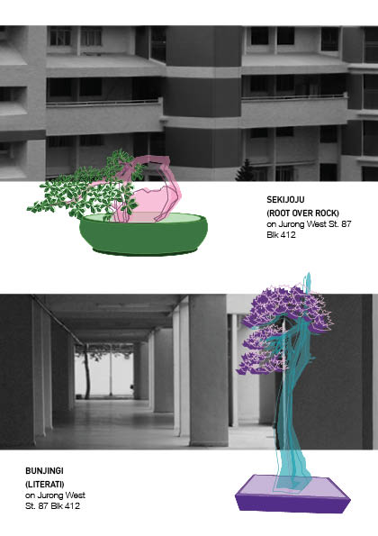
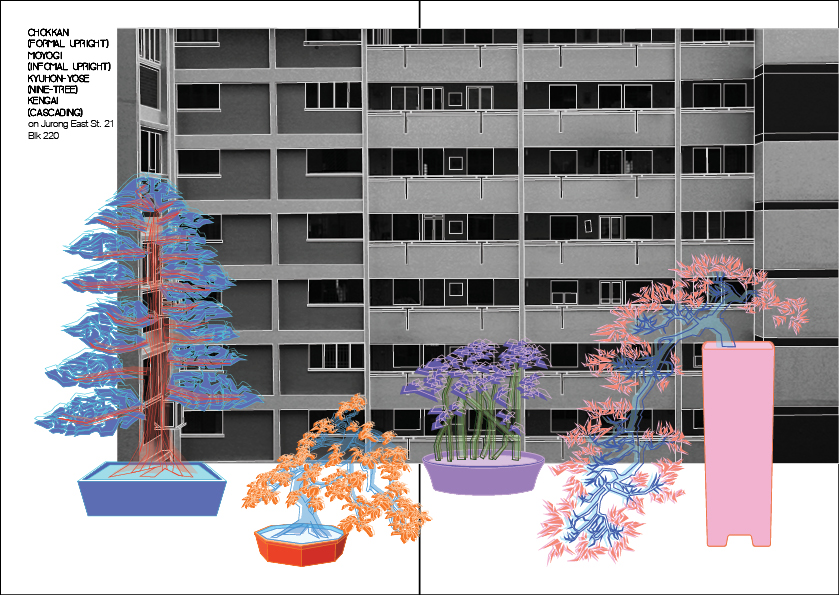
So bringing forward the concept from my previous infographic about “A Piece of China in Singapore”. I decided to juxtapose Bonsais against a backdrop of Singapore HDBs – a distinctively local icon, the way it would be arranged in a Chinese garden against Chinese architecture.
In addition to that general concept, I wanted the zine to also briefly introduce the types of bonsai, in terms of shape and structure.
Here is a list of some bonsai styles:
I was thinking other than portraying an abstract art concept, the zine could also be slightly practical in terms of being that of introducing different basic bonsai styles.
LAYOUT
As I am a result oriented worker, I decided on all the layouts first. Then I chose and picked from the list of bonsai based on shape, which was the best shape to go with which layout. This is because, in a Chinese garden, the arrangement of the bonsais were also based on design of the shape and how well it went with the architecture shape.
ART DIRECTION
I known from the start I wanted the bonsais to be illustrated and the HDB to be in a photographic style. However, I had some problems deciding the colour palette of the entire zine.
I didn’t want it to be black and white with two colours as in my mind, after visualisation, I found that to be extremely boring. Thus, I initially picked a colour theme of five colours for the bonsai. This is the first bonsai I tried the colour scheme on.
However, after trying the same five colours for a few more bonsais, I found that it still looked too consistent and without visual interest. Thus, keeping in mind a general direction of neon lights against a grayscale background kind of style, I put highly saturated, complementary and contrasting colours for different pots of bonsai.
Here are some examples:
Since I did detailed line work for the bonsais, I did not want to completely fill the shapes in. However, to leave them as pure line-work would not fill the space enough, and would look sparse. Thus, I decided on duplicating the layer, filling one and leaving the other as line-work.
However, as my art direction was sort of neon lights on grayscale, I tried to make the colour brightly vivid and with neon undertones like this bonsai below:
However, I realised when it was transferred to inDesign for printing, the colours dulled down. Afterwards, I found out from Joy that it was because neon colour printing required a special kind of printer, which had a minimum bulk printing. Thus, I had to make do with the duller shades. I feel they still turned out well, because the oriental style is more zen and usually come in more calm and desaturated colours, so the dulled down neon colours are a good mix between the crazy neon lights style I was going for and the non-vibrant calm palette of oriental zen bonsais.
Some inspiration photos:
Next was the background, the art direction was to take photos of as geometric as possible a backdrop so that it’ll act as a good contrast for the organically shaped bonsai trees. Thus, there was a large focus in trying to zoom in on the angular lines of the HDB architecture.
Here are some photos I took:
I then selected them and then edited them increasing contrast, and making sure the shades are kept darker. However, after fitting them into the zine, the photography and illustrations did not feel integrated.
Thus, after consultations with Joy and several trials, I decided to outline the HDB with simple illustrative lines.
This integrates the illustration and photography well. Thus, I decided to use this style for the rest of my pages.
TYPEFACE
I chose the BAVRO typeface for headers as I felt the shape of the font had a slight element of Neon Lights. While I felt the Helvetica font complemented it well.
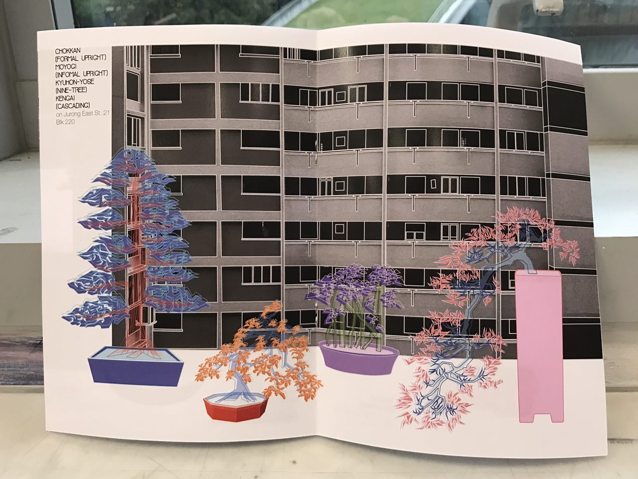
FINAL WORK
This is the final layout and design of my zine. It is mean to be read from left to right as that was how oriental books were arranged and I wanted to achieve that effect.
I’m pretty happy with how my zine turned out in the end, I loved my concept regardless of its abstractness and the resulting illustrative x photography style. Especially in comparison to my infographic, I think I have come a long way. However one thing I wish I could have done better was the feedback Joy gave me. I think I was still thinking in terms of artist and not so much designer. I would have to think of a better way to let my idea speak for itself, even more so because it is so abstract. This was a timely reminder at the end of the sem for me to further improve and learn for the upcoming year 2.
To conclude, I really enjoyed my time in 2D. I would like to thank Joy for being such an understanding and patient teacher. I know I wasn’t the easiest student to guide with my non-stop sprouting ideas, random artist blocks and non-design tendencies. But, thank you for guiding me through that and helping me see how I could integrate both my love for fine arts and the technicality of design. Will work hard to a achieve both in my works!!
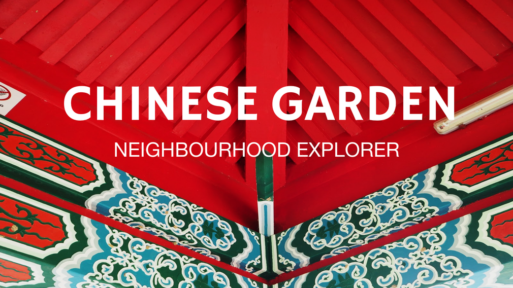
Here are the links to my Infographic and research on Chinese Garden:
Start of the last 4D II project is venturing into unknown fields wew. Admittedly, I am not completely foreign to the concept of installation art, video art, or performance art, as the A’level syllabus has managed to give me some knowledge about them.
To bring forward themes from precious projects, some themes I would be interested in developing would probably be, sexuality, the body and identity. Here are the artist researches that might be relevant to the upcoming project.
MARINA ABRAMOVIC
I know Wen Lei has covered her in class but genuinely and honestly, she’s my idol. I love her works. She is a Yugoslavia born performance artist. Her performance surround themes of pushing the body to extremes, the interaction between the artist and audience. Rhythm 10 is actually my favourite piece of her work, but since it has been cover, I’ll cover another one of my favourites.
Marina Abramović and ULAY. Imponderabilia. 1977/2010 Performance. Reperformed continuously in shifts throughout this exhibition for a total of over 700 hours. Courtesy Marina Abramović and Sean Kelly Gallery
In this work, Marina and her partner Ulay stood opposite each other, stark naked at an entrance to an exhibition in a way that people entering the exhibition had to squeeze through them, unable to avoid physical contact, and had to choose who to face. This particular work is about confronting the idea of the audience actively participating in the performance space, and being made aware of the human touch and their own bodies through the need to come into contact with a stranger. I think this work is relevant to my research, as the exploration of nudity, human contact, and the body is something I am interested in.
2. VITO ACCONCI
An American designer, landscape architect, and installation and performance artist. This artist I’m interested in particular one of his works called “Seedbed”. I though it was brilliant as it was a hidden performance art and more of sound art. The extremely disturbing and voyeuristic nature of the work is also rather amazing.
Vito Acconci. Seedbed. 1972 Medium: Super 8 film transferred to video (color, silent) Duration: 10 min. Credit: Gift of the Julia Stoschek Foundation, Düsseldorf and Committee on Media Funds
View the work here: https://archive.org/details/ubu-acconci_seedbed
In this work, the viewers entered a room with an empty ramp and unknown to them, Acconci himself is lying underneath the ramp masturbating. He would do this intermittently, while he was doing this he would speak out about his sexual fantasies, based on the movement of the visitor’s above. The tension between public and private was overwhelming.
Found on the Museum of Modern Art Website:
“The following text, which documents and transcribes Seedbed, was published in Avalanche magazine in 1972:
. . . I’m doing this with you now . . . you’re in front of me . . . you’re turning around . . . I’m moving toward you . . . leaning toward you . . .
Under the ramp: I’m moving from point to point, covering the floor . . . (I was thinking in terms of producing seed, leaving seed throughout the underground area).
I’m turned to myself: turned onto myself: constant contact with my body (rub my body in order to rub it away, rub something away from it, leave that and move on): masturbating: I have to continue all day—cover the floor with sperm, seed the floor.
Through the viewers: because of the viewers: I can hear their footsteps, they’re walking on top of me, to the side of me—I’m catching up with them—I’m focusing on one of them: I can form an image of you, dream about you, work on you.
. . . you’re on my left . . . you’re moving away but I’m pushing my body against you, into the corner . . . you’re bending your head down, over me . . . I’m pressing my eyes into your hair . . .I can go on as I think of you, you can reinforce my excitement, serve as my medium (the seed planted on the floor is a joint result of my presence and yours). You can listen to me; I want you to stay here; you can walk around me; walk past me; come back; sit here; lie close to me; walk with me again.
Reasons to move away from a space: there’s no need to stay—I’ve left something there, outside, that used to be here, inside—I’ve left something there that can grow, develop, on its own.
Reasons to move: I can move with an easy mind—what’s left behind is safe, in storage.”
This artist would be useful in my research as sexuality was a strong theme in my previous works and I would like to explore this theme again.
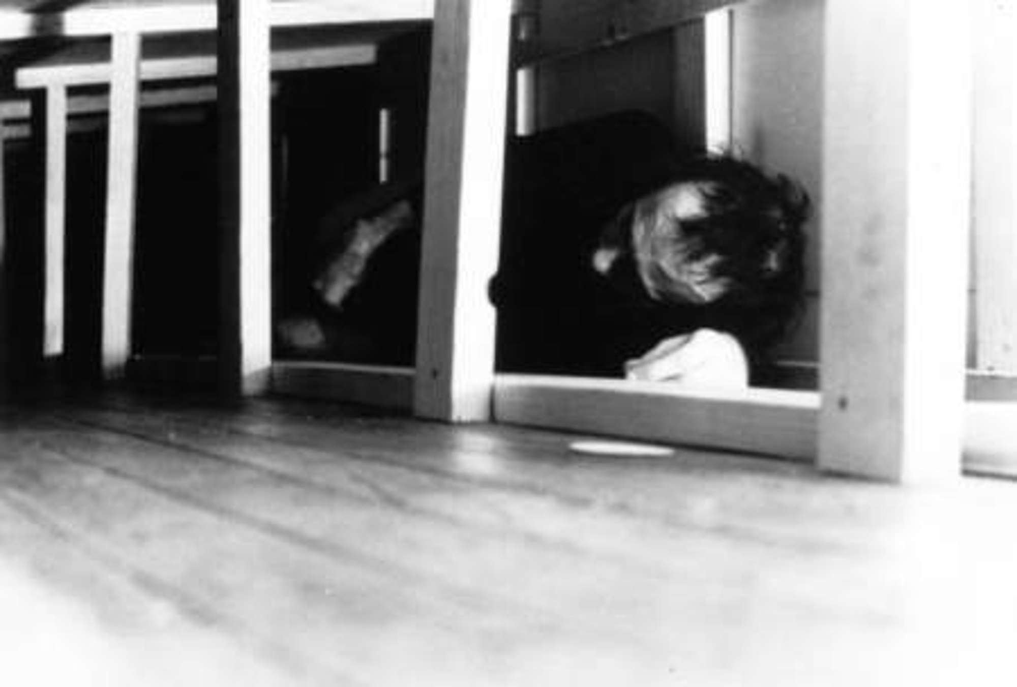
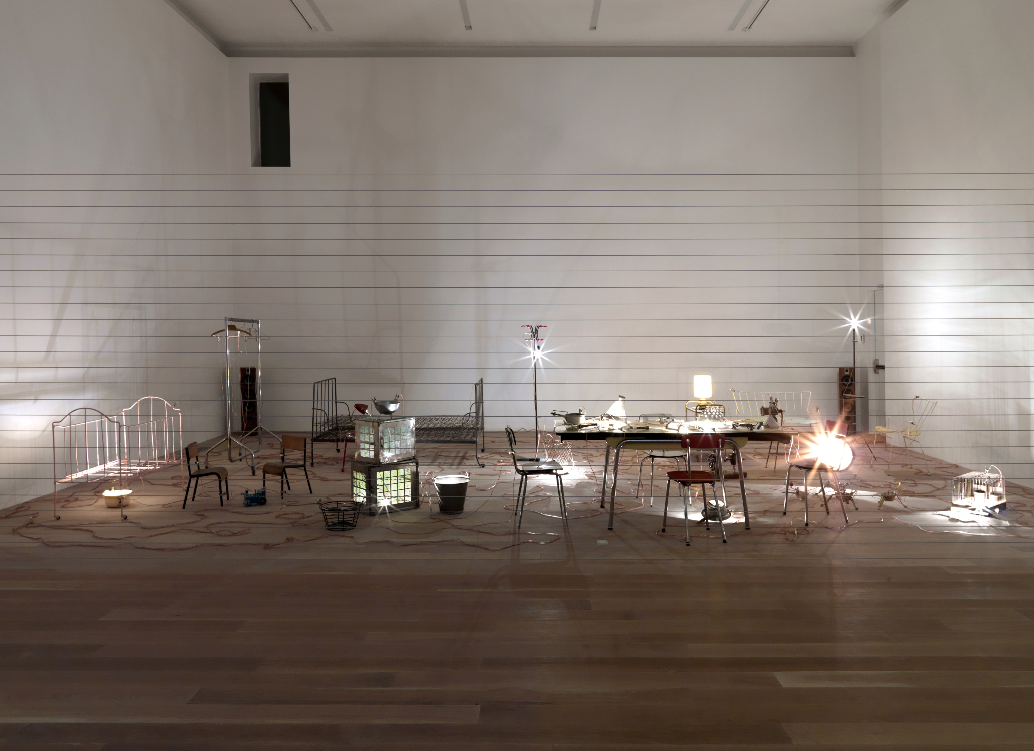
3. MONA HATOUM
Hatoum is a Lebanese born Palestinian installation and video artist. But the work I’ll be speaking about would be “Homebound” an installation art piece arguably sound art as well.
Mona Hatoum. Homebound, 2000
Kitchen utensils, furniture, electrical wire, light bulbs, dimmer unit, amplifier and two speakers , dimensions variable
“Homebound” is a piece of work consisting of pieces of homely furniture laid out across the room. Wires are placed intertwining the entire work, with live electricity current running through them. The buzzing sound of the live current with occasional crackle and pop as different objects light up disturbs the quietness of the gallery, making it rather unsettling. I like this piece of work, as the tension between the familiar “home furniture” and foreign and dangerous “electricity” current leaves an interesting feeling in the viewer.
I this this work is relevant to my research as tension is one of the methods to immerse the audience in an installation art or performance piece, and I think Hatoum did so really well in her work.
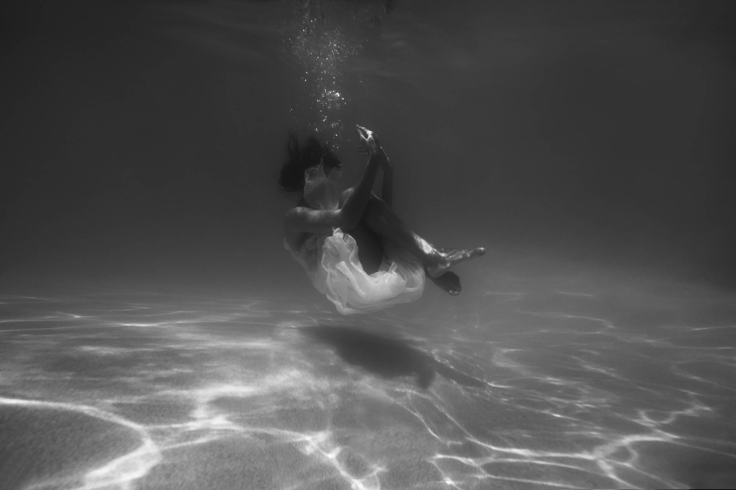
The clip is supposed to represent a metaphorical death, death of a person’s senses. My soundtrack is not narrative based but more of an emotional transition. The first part has indiscrete chattering, coffee-making machinery, and laughter. These represent the daily emotive way of living. However, along the way, the emotive sounds turned more and more odd and rather disconcerting. This is followed by a form of destruction, a shattering of one’s beliefs, a snap in the persona’s head, and the persona is plunged into a state of emptiness. There is a struggle to fight against the waves, but the persona eventually gives in to the calm stillness of the water.
CONCEPT DEVELOPMENT/ RESEARCH/ CHALLENGES
I developed the concept purely based on interest. I was more interested in trying to create sounds that conveyed a certain idea rather than ambient sounds. However, I needed to create sounds that had emotions. So I started recording some of the places I go to, and some conversations I had, my laughter, to evoke the sound of happiness. Then, I proceeded to record generator sounds for an empty alienating effect, and dunked the recorder into the pool to create underwater sounds. These were the sounds I felt represented a lack of emotion.
Throughout the entire clip, there was a consistent rhythm of my breathing, initially extremely calm and slow, after the plunge, became faster as the persona struggles to hold on to life. Finally, the persona gave up and embraced the silence.
An artist that has inspired me would probably be AquaSonic, a band that produces underwater music. Check out their music video:
The main challenge I had for this project is that I couldn’t imagine the soundscape in my head, unlike being able to visualise a design before completing it. Therefore, even when I had the concept, I had trouble trying to create a clip for the concept. I also had trouble manipulating the different clips as I was unfamiliar with the program used.
Another thing is how I love music and use it as both inspiration and an outlet of emotions, but we cannot use music to represent our emotions, which is one of the hardest thing I was faced with.
To conclude, I think I tried my best to create the soundtrack for such a concept. I had fun doing this project and I look forward to the last one.
Credit for royalty free music:https://www.freesound.org/people/13FPanska_Cerny_Jan/sounds/379008/
https://www.freesound.org/people/InspectorJ/sounds/344265/
After doing site-research and exploration, I decided to focus on elements that made a garden a Chinese one for my infographic. It was something I found extremely interesting as I could distinctively identify Chinese Garden apart from Singapore’s many other garden’s and park regardless of them sharing similar objects.
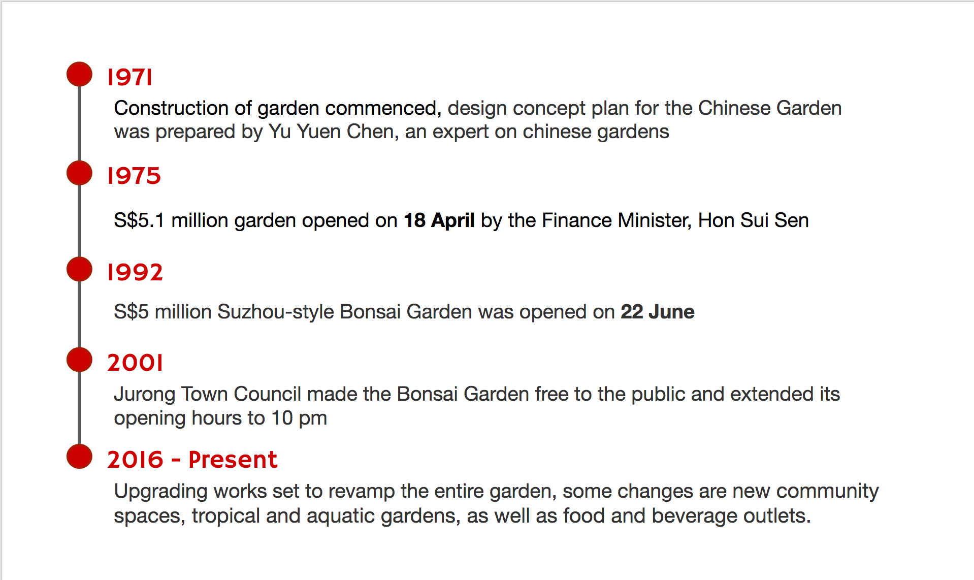
In my class presentation, I started off by giving a brief timeline of Chinese Garden.
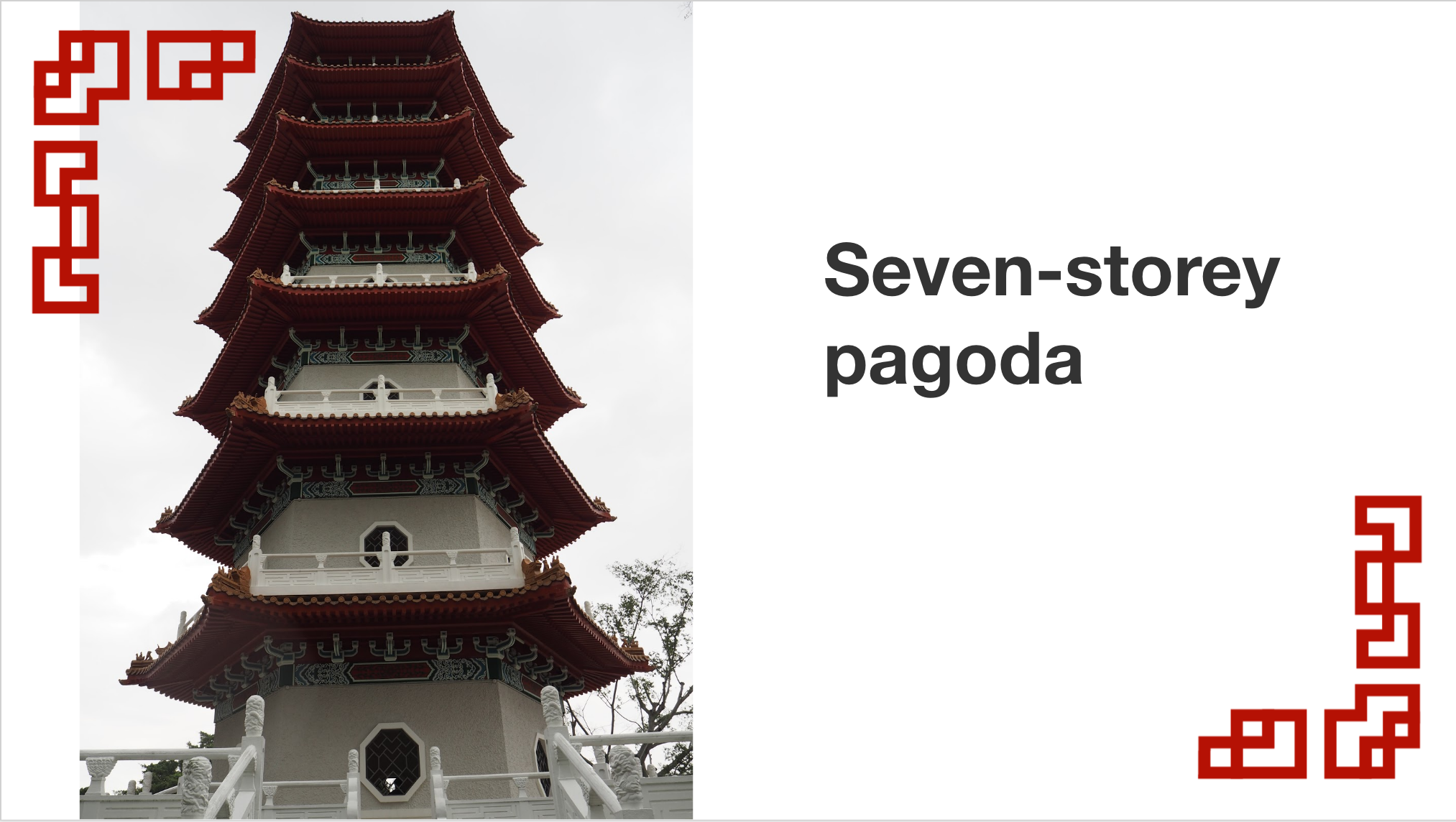
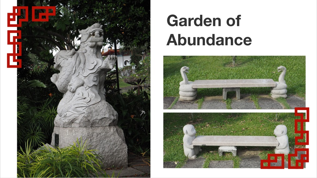
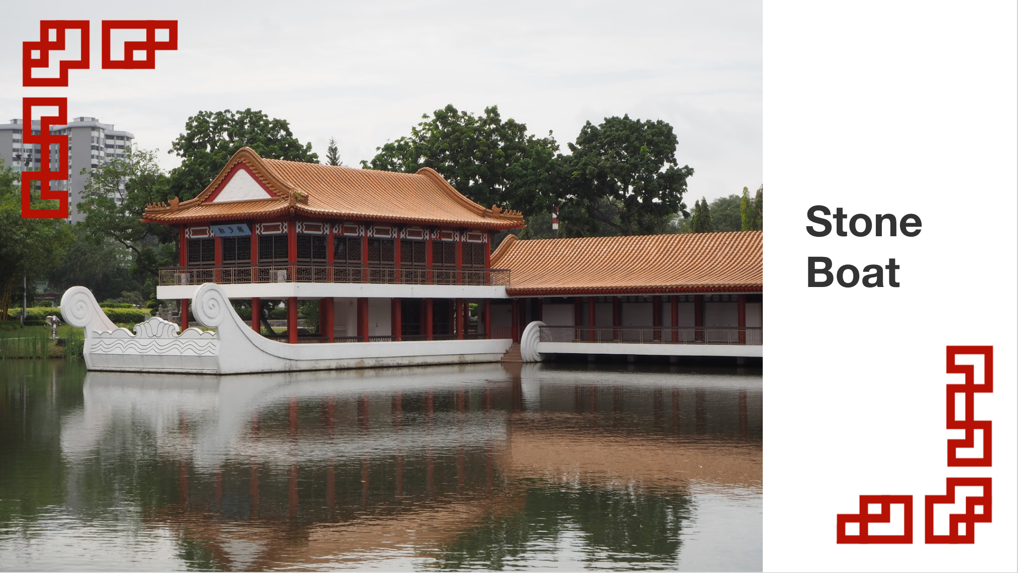
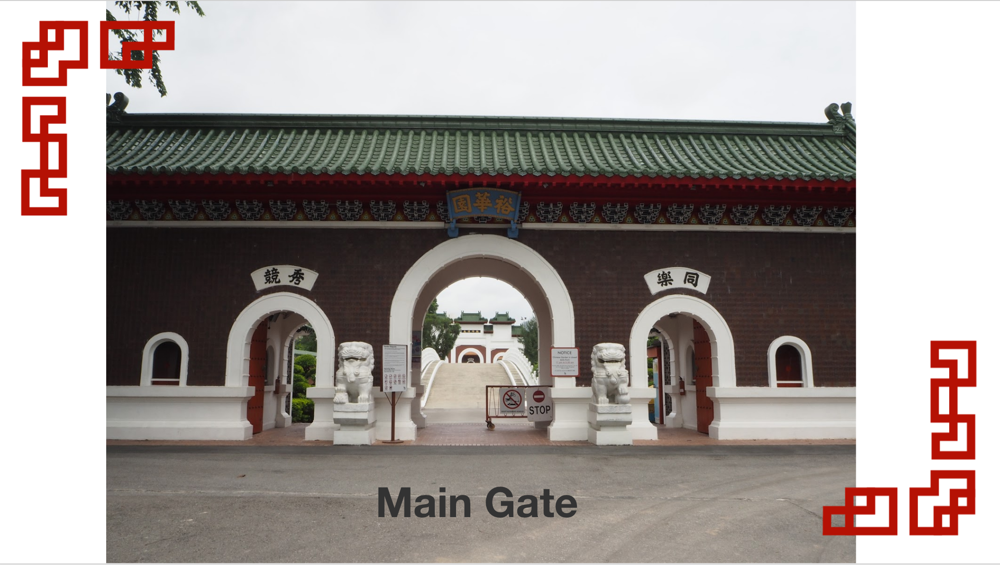
And the various landmarks of Chinese Garden. Some of which I have mentioned in the previous blog post.
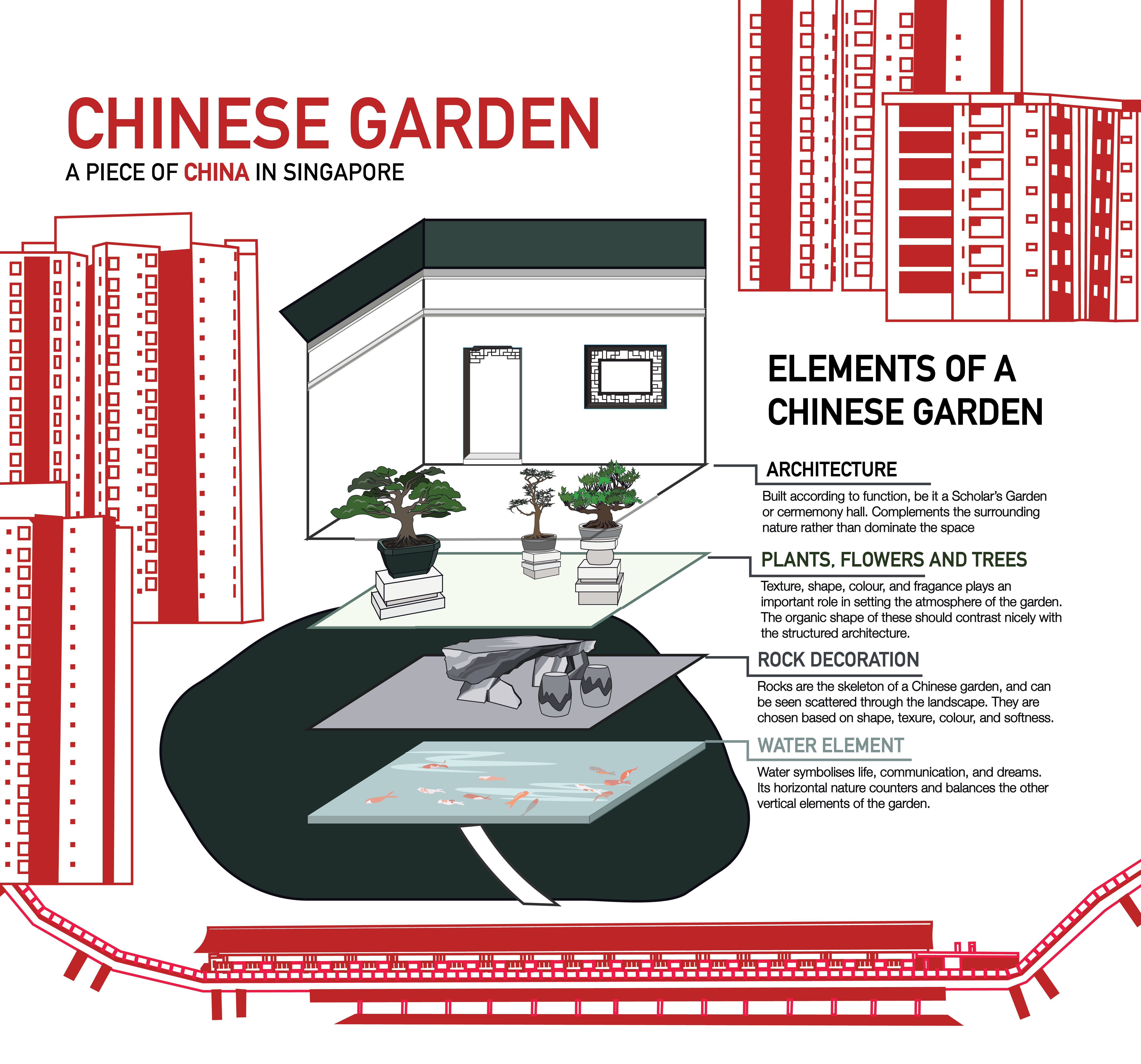
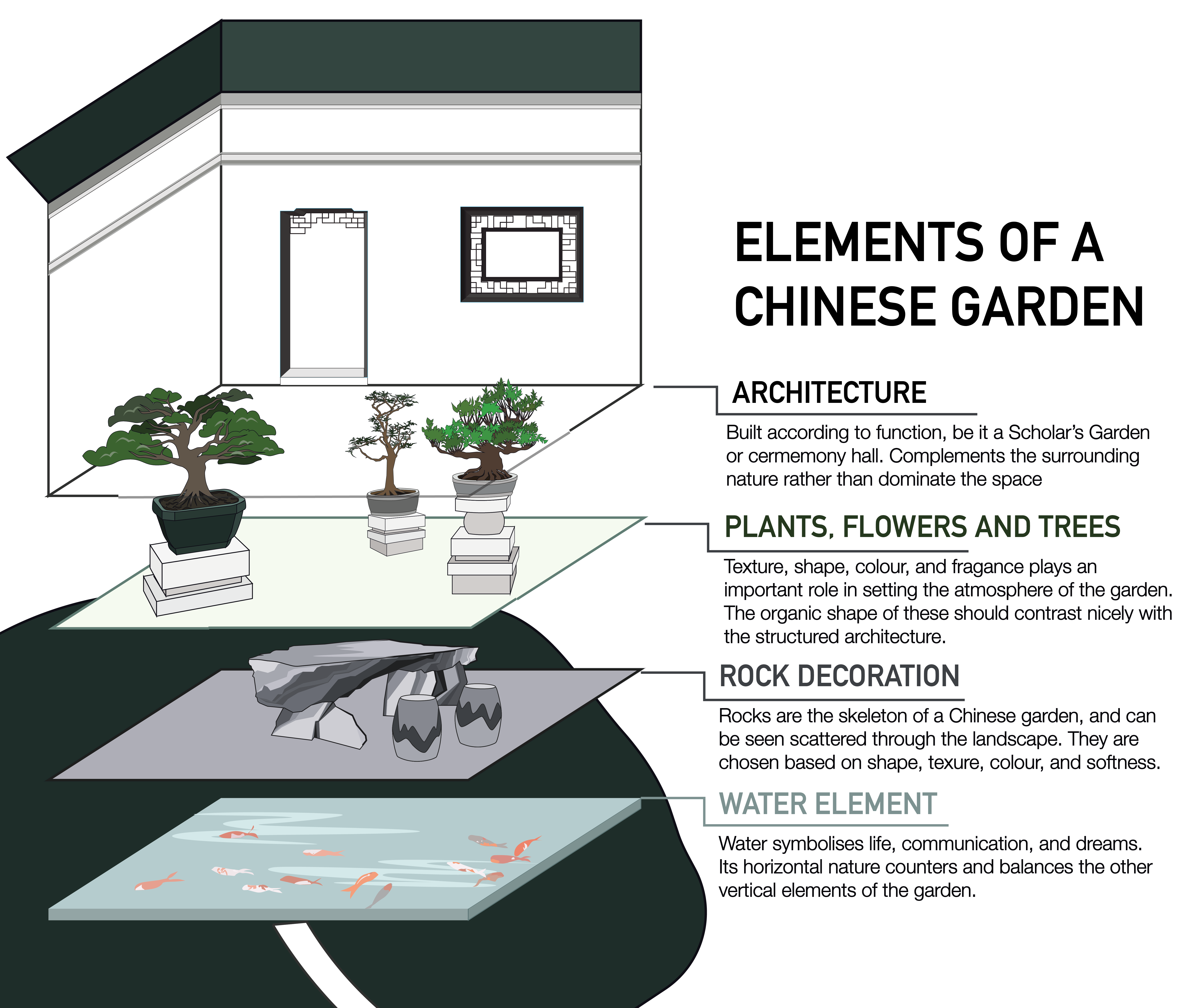
Next, my infographic:
My infographic is a dissection of the four elements of Chinese Garden observed in Singapore Chinese Garden. This piece of dissection is then presented as a piece of “China” brought and pasted into Singapore, represented by the red and white MRT and HDB blocks surrounding the dissection.
A closer view of the dissection. I split the explanation into four elements: Architecture; Plants, Flowers and Trees; Rock Decoration; Water Element.
For the architecture, I decided to illustrate the building design I saw in the Bonsai Garden of Singapore’s Chinese Garden. Similarly for the Bonsai Plants. For the illustration of the rock element though, I illustrated it using one of the many rock table and chair sets I saw throughout the entire garden, which I found really interesting. Lastly, the water element, modelled after a pond of Koi fishes I saw in one of the Pavilions.
Final thoughts, challenges, and reflection:
For this infographic, I faced challenges of colour scheme and visualisation. My initial visualisation was just mainly the dissection zoomed in the presented. However, to make it more Singapore site specific, as it was too generic, it would be better to place it within Singapore landscape. I struggled a lot in trying to visualise how to do so. I also struggled to incorporate the information into the illustration. I think if given a chance to redo this project, I would have changed the style of illustration, and not do such colouring, as it does not reflect as well as a bigger picture.
To move on from here, I’m looking forward to the zine project next, and hope to develop my graphics and style while presenting the Singapore Chinese Garden in a creative way.