

In this WIP post, I would like to share mostly about the methods and explorations I did while working on my final 18 strips. The techniques I used in my final work are loosely grouped into: Cotton wool dabbing, Salt in ink, Water in ink/Paper Marbling (and the ones with additional pen work), Dry brush, and a little bit of Mono-printing.
COTTON WOOL DABBING
This was a continuation from the initial explorations I did in the other post. There were improvements made in my technique to counter the problems I met previously. The issue was that the amount of ink in my palette had to be very little in order to coat just the surface of the wool. However, it was impossible to control the amount I pour each time. Therefore, I thought of painting a plastic surface with ink before coating the wool on that surface. That way the amount of ink would be appropriate.
 Previous attempts of hate
This was the print I visualised to represent hate. I wanted the entire piece to have a slightly darker value. I realised the trick to do so would be to re-coat the plastic surface each time I do the print, which was what I did in my last attempt.
Another emotion I did with this technique was loneliness.
Initially this was the print I visualised for tenderness. However, due to factor differences in coating of ink, I was unable to get the same effect I did in the previous times. Instead, the result I achieved reminded me more of loneliness. Tenderness and loneliness shared similar intensities, in terms of small ebbs of positive and negative emotions respectively. The difference lay in the nature of the mark. To me, tenderness should be portrayed by patches of faded dots, but this print had defined thin web-like lines, which was more suited to the more negative emotion of loneliness.
In addition, I was considering using this technique to create the emotion of longing.

However, because I did it in inverse, white paint on black ink, I felt it was too incoherent with the rest of the strips, and abandoned the idea.
SALT IN INK
There was two main methods I used in this technique. One was to paint the strip with plain water first, drip ink into the water, then sprinkle the salt in. Another was to paint the strip with ink mixed with water, then sprinkle salt in.
The first method I used to express the emotion of anguish.
A few problems I encountered in these attempts was accidentally dripping too much ink resulting in the salt not being able to create the mark effectively.
 Examples of my other attempts
However, I had to be careful not to drip too little or too apart. As all the ink drips in water created circular marks, and I did not want a polka-dotted print. So it was crucial to find a balance between the amount of ink dripped and the distance in which it is done so.
For the second method, I was very excited when I discovered it because it involved less variables as compared to the first method. I chose to use this second method to convey both esctasy and anxiety.
The only things I realised I had to be careful about was the amount of salt sprinkled and the duration in which the salt is left on the paper.
 Examples of my other attempts
Esctasy was a beautiful mistake, the original print when the salt was just sprinkled did not have so much negative space. However, I was inexperienced and left the salt on the paper to dry. It was then I learnt that the longer the salt is left on the paper the more the ink would be absorbed by the salt, thus leaving even more negative spaces behind.
I had better control over the salt while doing anxiety, but not so much over the distribution of inky water. However, I think the affect turned out desirable.
WATER IN INK
Longing was the emotion I was trying to convey. I wanted to create spaces of lighter value within spaces of darker value, but did not want the salt effect. Thus, I decided to use a dry brush to dry up certain parts of the strip.
While for disgust, I created small dips of ink in water reminiscence of trypophobic inducing images.
I had to be very cautious while dripping though, as the water would flow which results in the concentrated ink spots to dissolve and dispersed, ruining the effect I was going for.
WATER IN INK (WITH PEN)
This was one of the emotions I had the clearest image of what I wanted it to be. I was convinced that the curvilinear pattern could best represent arousal but did not want it to be the only strip fully done in pen. So I decided to incorporate ink within it.

Regretfully I did not manage to capture the process of creating delight (as seen above), but it was using similar techniques of ink and water with pen.
WATER IN INK (PAPER MARBLING)
This is one of the new techniques I tried. I did not think it would produce good results, as to my knowledge, paper marbling requires a certain kind of paint to make extremely distinctive marks. However, I felt that the light swirls of paper marbling could help me bring out feelings of tenderness. Thus, I decided to give it a try.
 Examples of my other attempts
The first few attempts were really bad. I tried really hard to control the ink swirling within the water on plastic, making sure it was neither to sparse nor too diluted. It was also really hard to ensure that the shape of the water could fill the strip. Thankfully I did manage to get a pattern that I was satisfied with.
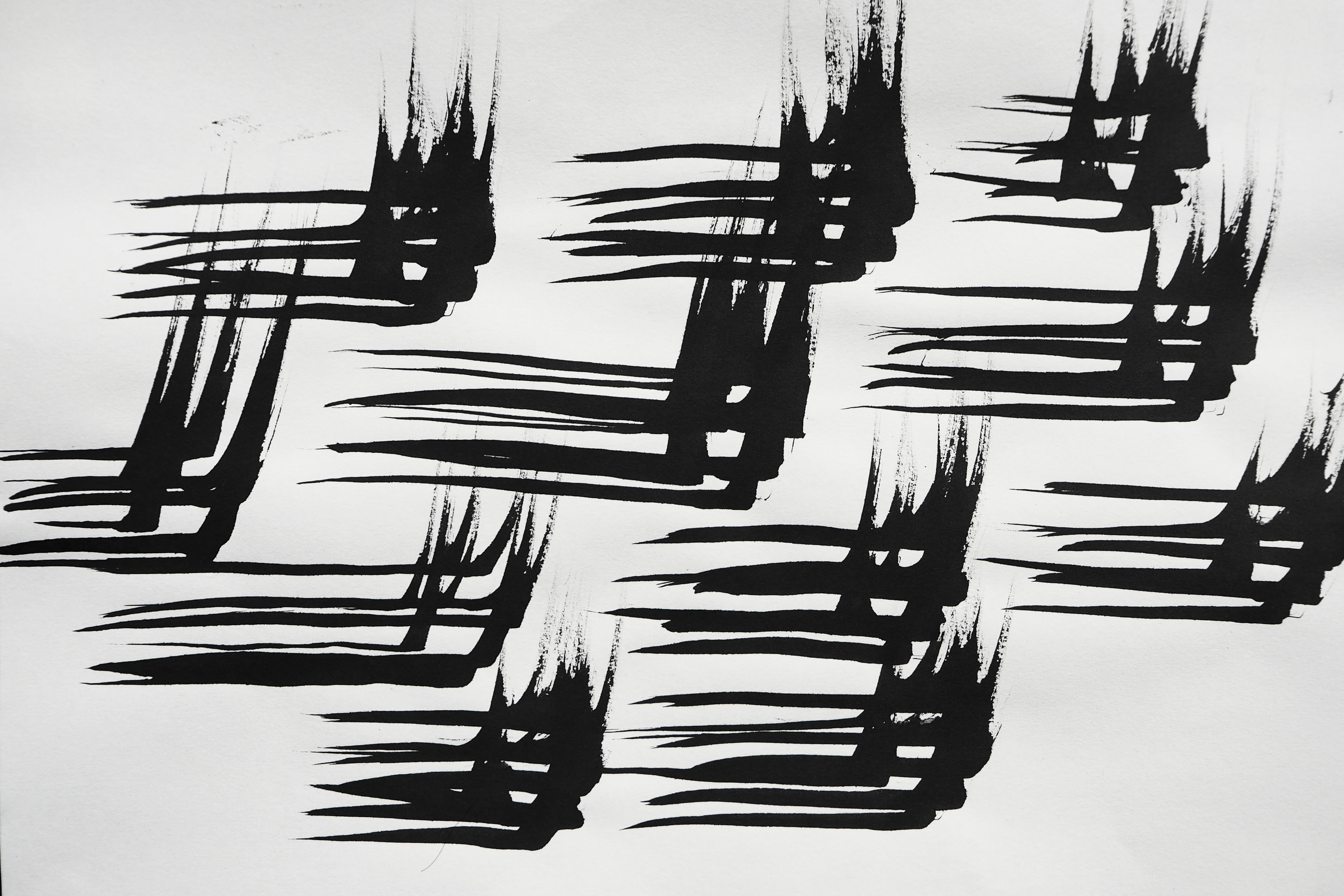
DRY BRUSH
I documented the process of creating this mark this time round. This is because I wanted to document how in creating thrill, a sense of fast motion strokes, my process of creation was filled with speed too. Thrill was one of the rare ones where the mark created revealed the process of mark making.
Tenseness was another one of such. While painting the strips out, I held my arm out unsupported, trying to draw a straight line as accurately within the strip as possible. I felt that the tenseness of my arm used to draw really reflected the emotion in the resulting mark.
Meanwhile, ease was a good example of how the process is different from the resulting mark. The process of creating ease was not slow, but brisk and precise. The required accuracy of the print made me really tense while making it. The brush had to be dry enough, but not too dry, to ensure a consistent and light print throughout.
For other emotions like hysteria, idleness, contentment, and depression, I used the same techniques reflected in the last post, so I would not elaborate further, but instead talk about their characteristics in the final post.
MONO-PRINTING
Even though I said I would not be doing mono-printing previously, I realised that the print created by a foam piece really helps created the feeling of irritation with the irregular dense specks.
With this, I am almost done with Project 1 and my journey of mark making. Look out for my next post about my final presentation and basic summary of “My Line is Emo”!


 Netting Print
 Binder Print


 Jabbing the brush violently into the paper


