
I was pretty clueless about what’s a zine and how it looked like and how to go about doing it, so I went to pinterest to hopefully clear my doubts and pretty much, I found some zines that were interesting to me.
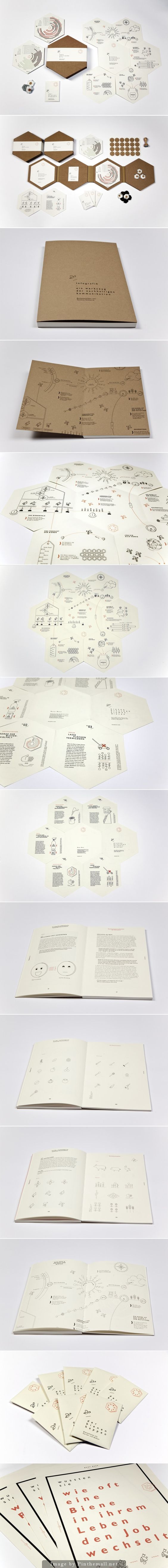
What interested me in this bee design was that while most zines were basically rectangular in shape, this was designed in the shape of honeycombs. It led me to think that the zine could be shaped in a certain way to better covey or complement the idea.
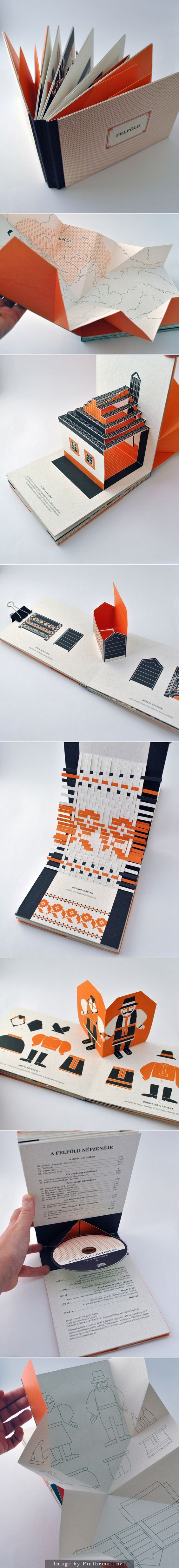
For the second one, I liked how blue and orange were constant themes in the zine, and also the interactivity of it. There were pop ups, layouts and paper art that I found were really lovely and how these were also able to better explain or make an idea more interesting.
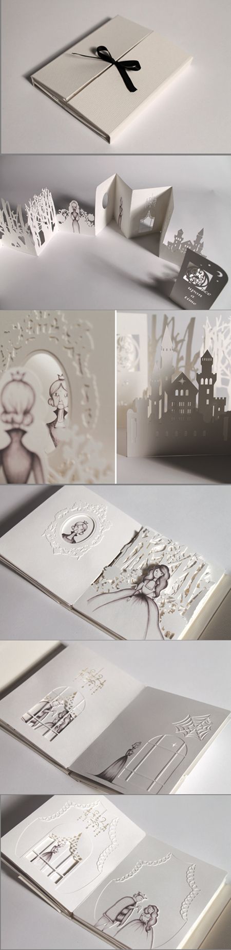
For the last design, I really loved the intricate paper cut outs and how each page was cut in consideration to the adjacent pages. I thought I could do something like this but sadly my paper cutting skills are of novice levels so I kinda did not go with the idea.