Point Of View Research

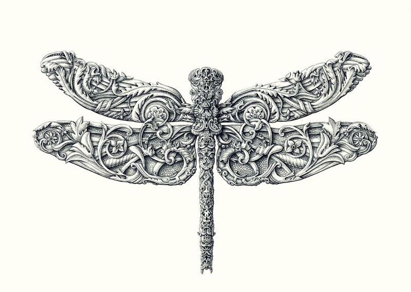
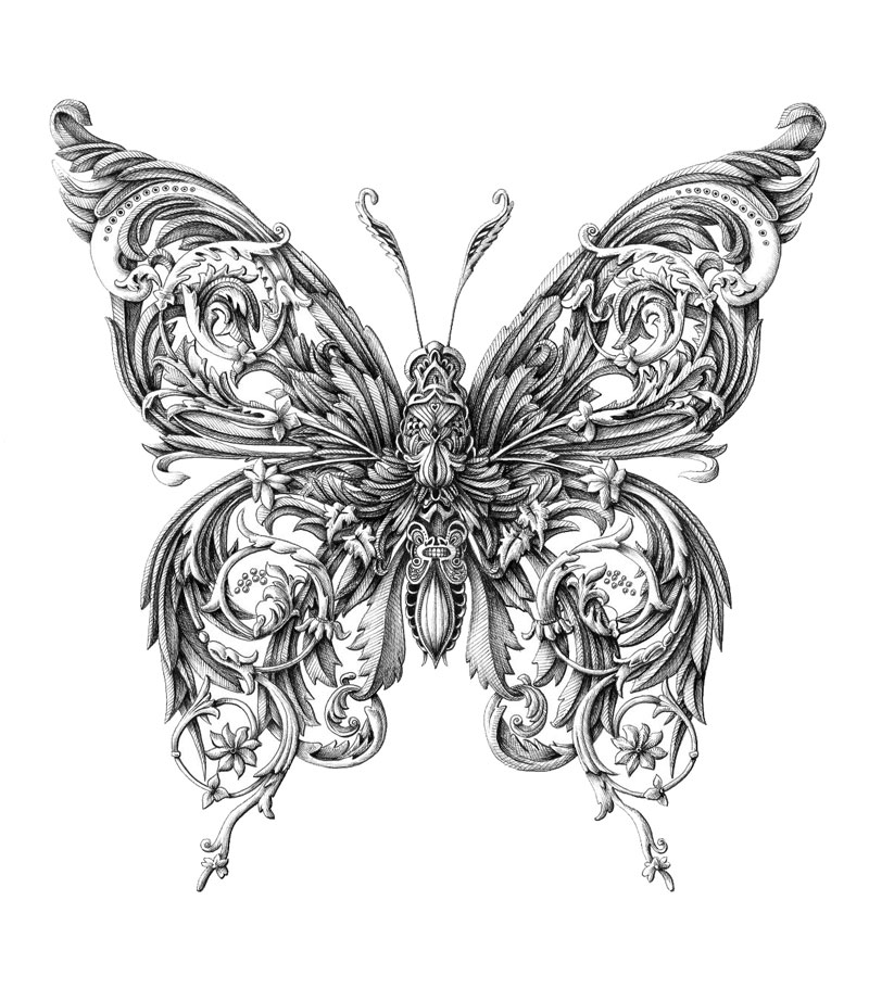
For this project, I have referenced from two artists. The first would be Alex Konahin. I particularly liked how the artist used flora and fauna to compose an insect and I think that the technique used is very detailed and hence I wished to replicate the same idea for my work.

alex-konahin-ink-illustrations-5 alex-konahin-ink-illustrations-14

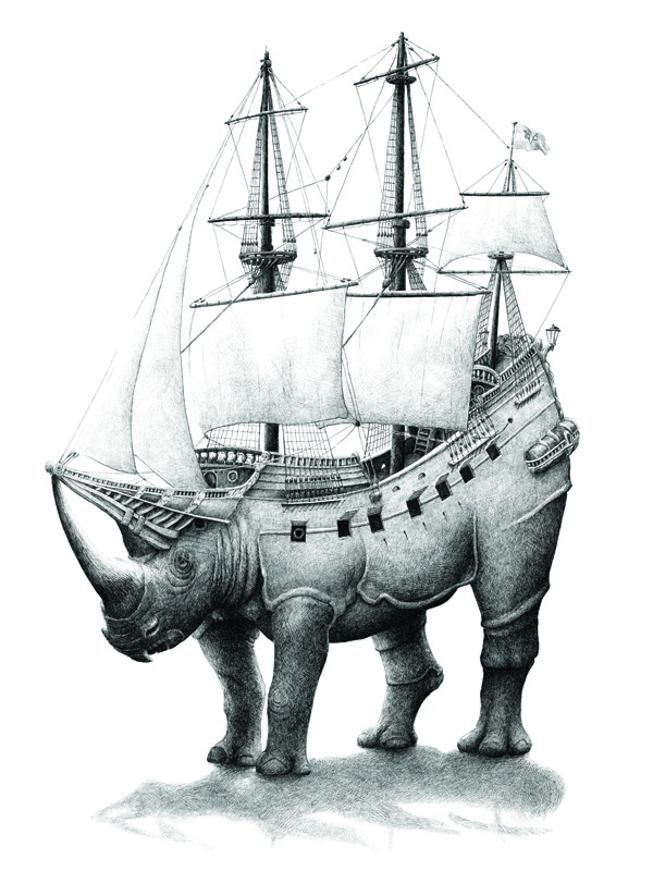
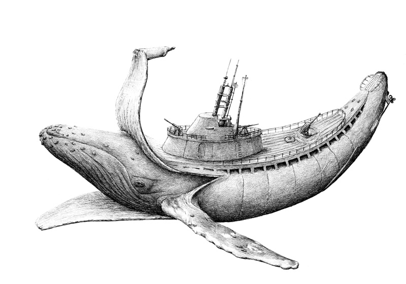
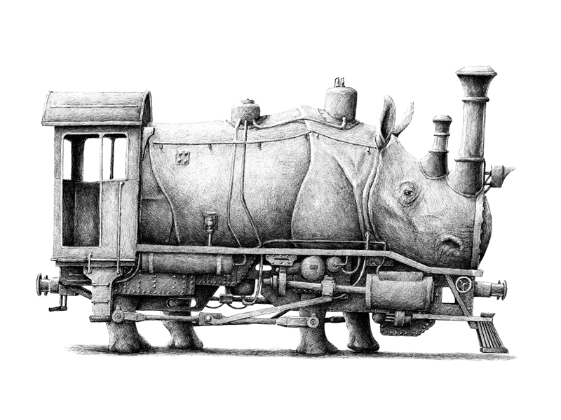
The second artist would be Redmer Hoekstra. I was amazed at how the artist used features of animals, such as the horns, to combine with parts of machinery and objects, and why he chose certain objects for certain animals is very apt. For example, the horns of the rhinoceros had been morphed into the train’s chimneys.

rhinoship rhinotrain whale

I find these combinations very fascinating and hence I have tried my best to display this in my work.

Research paper

Chinese Buddhist Art started out as similar representations of prototypes from India, and transformed over time due to the influences of Chinese culture and values.[1] Many new celestial Buddhas and Bodhisattvas were included in Chinese Buddhist Art, extending its focus to others besides Buddha Shakyamuni.[2] From the time period of the Northern Han Dynasty to the Tang Dynasty, and through the comparison of the Colossal Buddha in Cave 20 of Yungang of the Northern Wei Dynasty and the Buddha Vairocana in the Longmen Caves of the Tang Dynasty, we would be able to address the changes in art and religion when Buddhism arrives in China.


Buddhist Art in China could be characterized into three stages of development, with each stage being further integrated into China’s culture and artistic traditions.[3] The first stage of Chinese Buddhist Art, in the context of the Northern Wei Dynasty, closely revolved around foreign techniques and iconography. The second stage portrayed the combination of local art and techniques.[4] The third stage was during the Tang Dynasty, where “naturalistic representation renders the various Buddhist deities in a life-like and approachable manner.”[5]


Figure 1: Shakyamuni Buddha with attendant Buddha, Cave 20, Yungang, China, 45 feet high, Source: WC

Figure 2: Buddha Vairocana, flanked by disciples Ananda and Kasyapa, as well as attendant Bodhisattvas, built by Wu Zetian, Fengxian Longmen Grottos, Luoyang, China

The changes in Chinese Buddhist Art could be due to the changes in influences on Chinese Buddhist Art from different eras or places from travels.[6] In Figure 1, the details of the sculpture suggest close adherence to foreign influences in early Chinese Buddhist Art. Such details are the large wide eyes, the stiff smile, the prominent nose and the robes that cling onto the body of the Buddha. These features are largely similar to Indian Buddhist Art. Additionally, features such as the urna, the wisdom bump, the elongated earlobes and the seated position of the Buddha, similar to Indian influences of the Buddha in dhyanasana under the Bodhi tree.[7] Furthermore, the Yungang style is “characterized by the flattened zigzag folds on the diagonal hemline across the chest. The schematic rendering of the hemline has been associated with Central Asian styles…”[8] In Figure 2, the Buddha Vairocana has similar features to Figure 1, such as the wisdom bump, elongated earlobes and the seated formation. However, in contrast, the sculpture appears to have a more naturalistic style, with its robes flowing more realistically. “The rich bas-relief carving of the halo recalls late Indian prototypes…”[9] Tang Dynasty Art transformed into a more life-like and classical form, which was inspired by the Indian art of the Gupta period. This resultued from the Tang Dynasty’s openness to foreign influences and “renewed exchanges with Indian culture due to the numerous travels of Chinese Buddhist monks to India from the 4th to the 11th century.”[10]

[1] “A Closer Look – The Art of Buddhism – China,” Smithsonian, accessed March 9, 2016, http://www.asia.si.edu/exhibitions/online/buddhism/china2.htm.

[2] “Chinese Buddhist Sculpture: Characteristics, History,” Encyclopedia of East Asian Art, accessed March 9, 2016, http://www.visual-arts-cork.com/east-asian-art/chinese-buddhist-sculpture.htm.

[3] Patricia Eichenbaum Karetzky, Chinese Religious Art (United Kingdom: Lexington Books, 2014), 271

[4] Patricia Eichenbaum Karetzky, Chinese Religious Art (United Kingdom: Lexington Books, 2014), 272

[5] Patricia Eichenbaum Karetzky, Chinese Religious Art (United Kingdom: Lexington Books, 2014), 274


[6] Sonia Kolesnikov-Jessop, “The Changing Face of Buddhist Sculptures,” New York Times, January 21, 2009, accessed March 17, 2016, http://www.nytimes.com/2009/01/21/arts/21iht-jessop.1.19554771.html?_r=0.

[7] Banerji, “Indian Inputs to Chinese Art.”

[8] Dorothy C. Wong, Chinese Steles: Pre-Buddhist and Buddhist Use of a Symbolic Form (Hawaii: University of Hawaii Press, 2004), 48

[9] Patricia Eichenbaum Karetzky, Chinese Religious Art (United Kingdom: Lexington Books, 2014), 287

[10] “Buddhist Art,” last modified November 10, 2015, accessed March 17, 2016, http://www.religionfacts.com/buddhism/art.
4D HOME PHOTOS

I was not present for the actual day presentation of the eight photos depicting HOME so everything is here in this post. These are my eight photos that show what HOME means to me.

asda

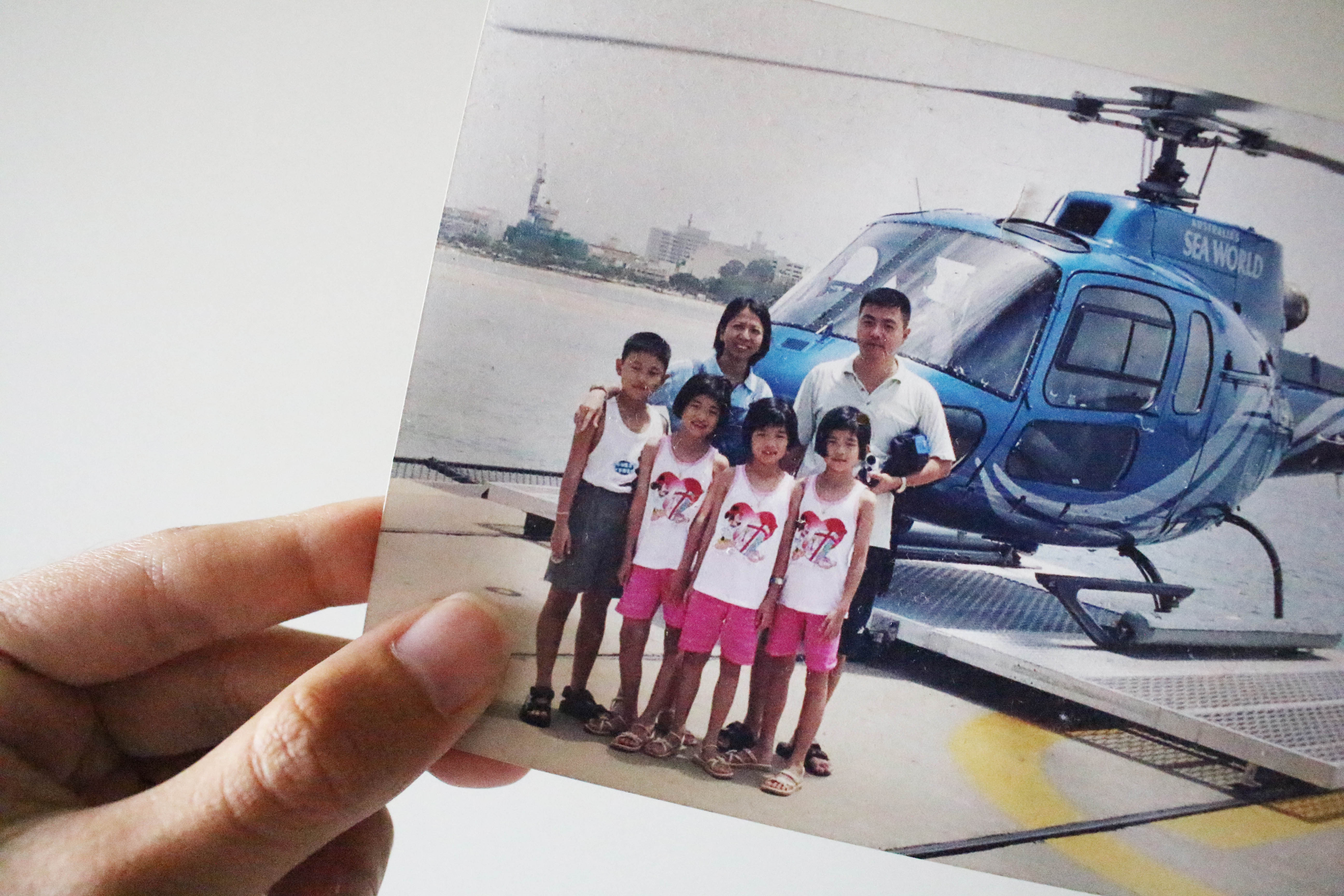
To me, the most important thing about home would be the people who live in it. And the most important people in my life would be my family. This is a photo of a photograph taken in 2003 and it was our first overseas family vacation together. As you can see, I am a triplet with an older brother and then my mum and dad.

xzcx

These bunch of people are my second family when bad things happen between me and my family. These are my close friends from CJ and all of them are younger than me by one year except for one of the guys. When I retained in CJ, they did not look down on me or treated my age difference as a big issue. They were the ones who were there for me and made JC life a whole lot more fun and easier, like letting me copy their homework and helping me answer questions in class when the teacher called me and bringing food so I won’t be hungry.

sdsad

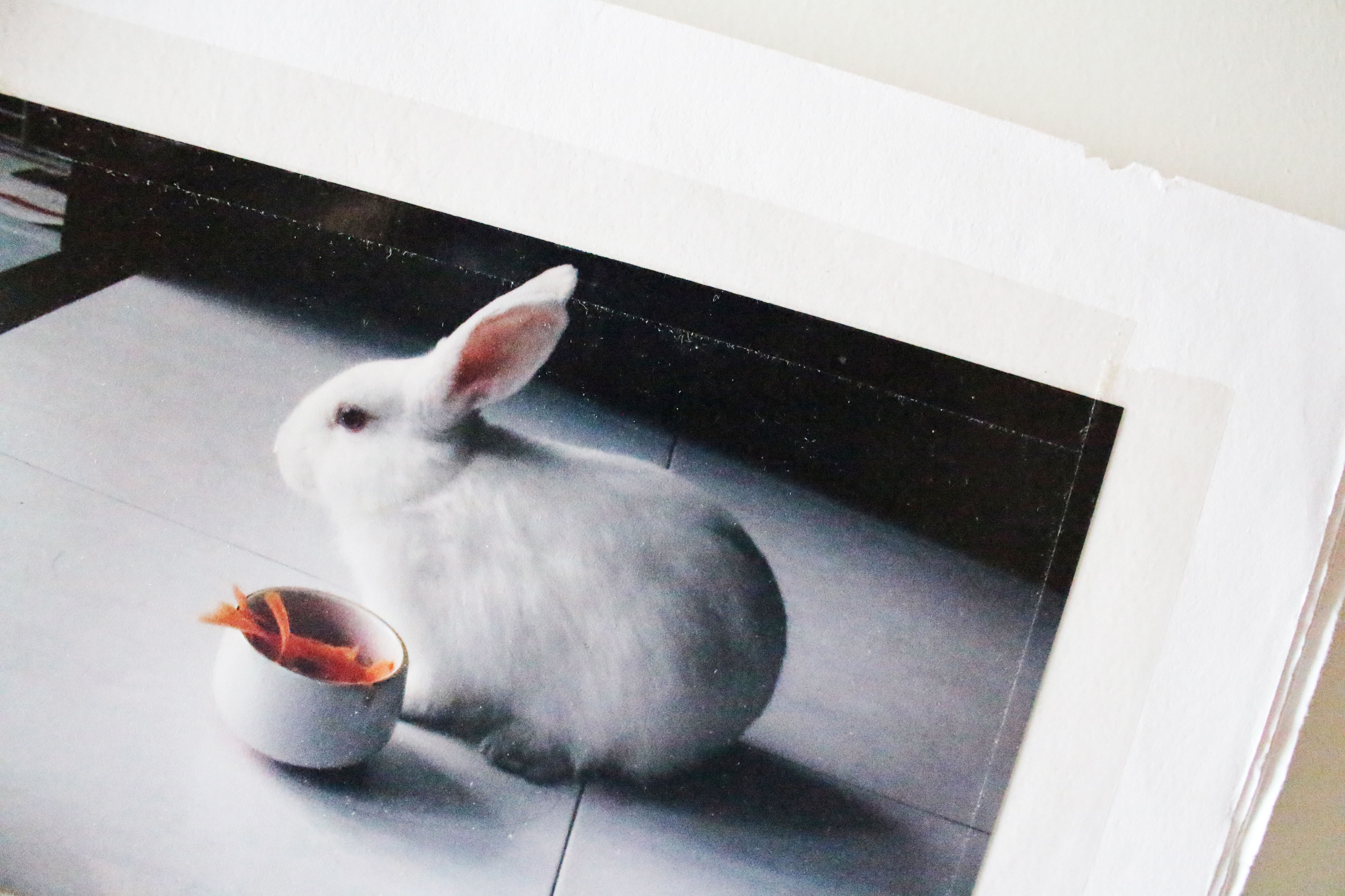
This was my pet rabbit. His name is Smudge. He passed away two years ago but he brought a lot of joy to my family. I would always look forward to going home as I would be able to see him, and he would always comfort me when I am down or be my chill buddy and both of us would just lie on the floor doing nothing. My mum loves him a lot too and she would always talk to him and bathe him every week. If you look closely, at the top of the page you can see his teeth marks. He used to love to go around biting and chewing random stuff.

xcvd

Another aspect of home would be the objects that make each home unique and different and personal. The most important object in my home would be my childhood pillow. His name is Ted and he is actually one year older than me. I would always bring him around, be it hall, home, overseas, chalet, hospital stays. With him around, I would sleep a lot easier and a lot better and when my mood sucks or I am very stressed out, I would hug him and that really helps a lot in comforting me.

ghfgb

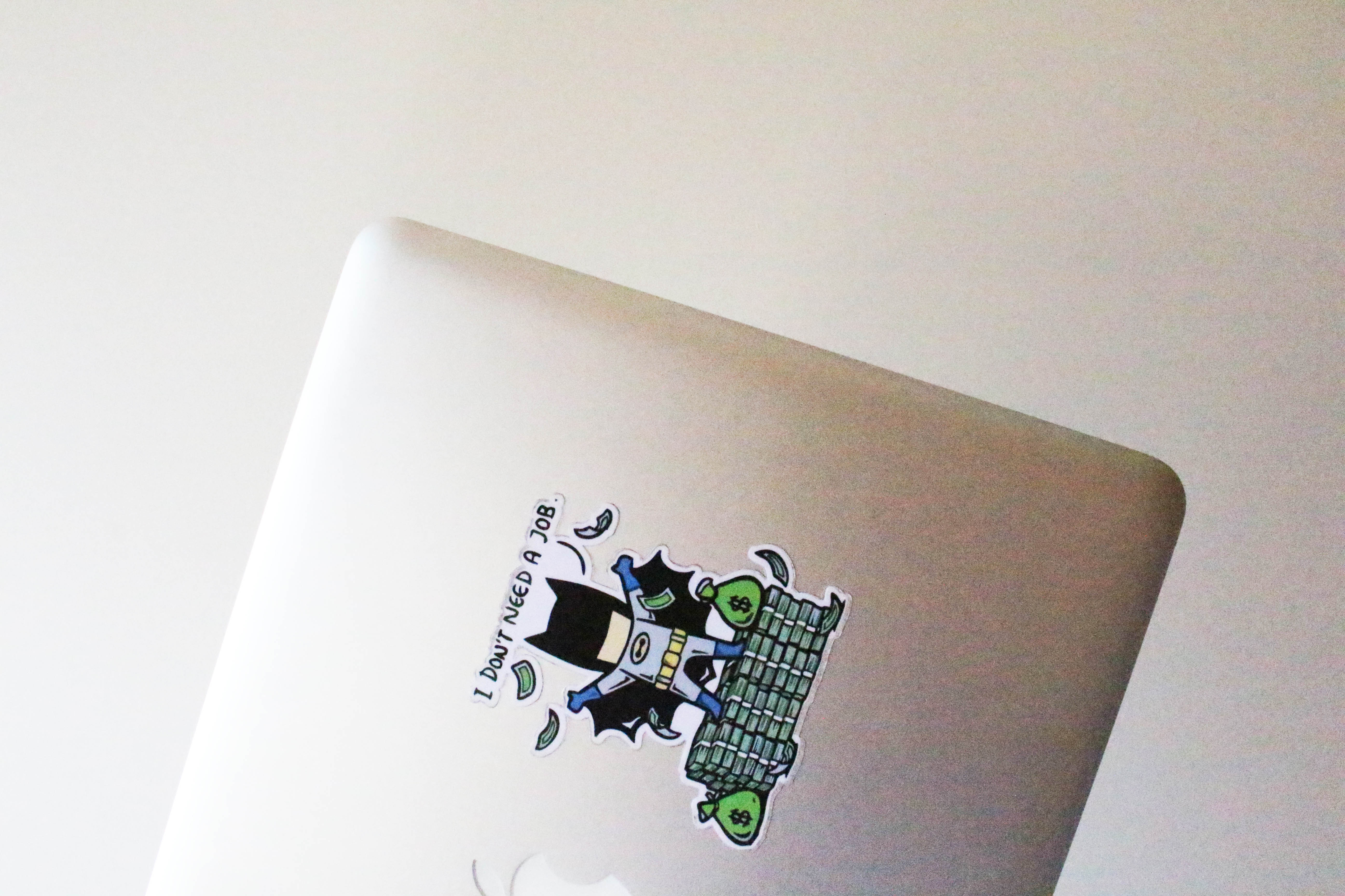
This is my laptop. Why it is important to me is because it is my first every laptop (because my siblings and I used to share computers) and it is a macbook (I always wanted a macbook because I thought they were cool). Also, it shows my dad’s love for me because it is a really expensive laptop and he still got it for me. You may think that is what every parent would do but my situation is a little bit different. I’m a bitch child meaning I give my dad a lot of problems because we are not close since I was young and so I would ignore him often and not listen to him and blackface him a lot at home. And even after all the anger and headaches I caused him, he still got what I wanted and that really meant a lot to me.

gfh

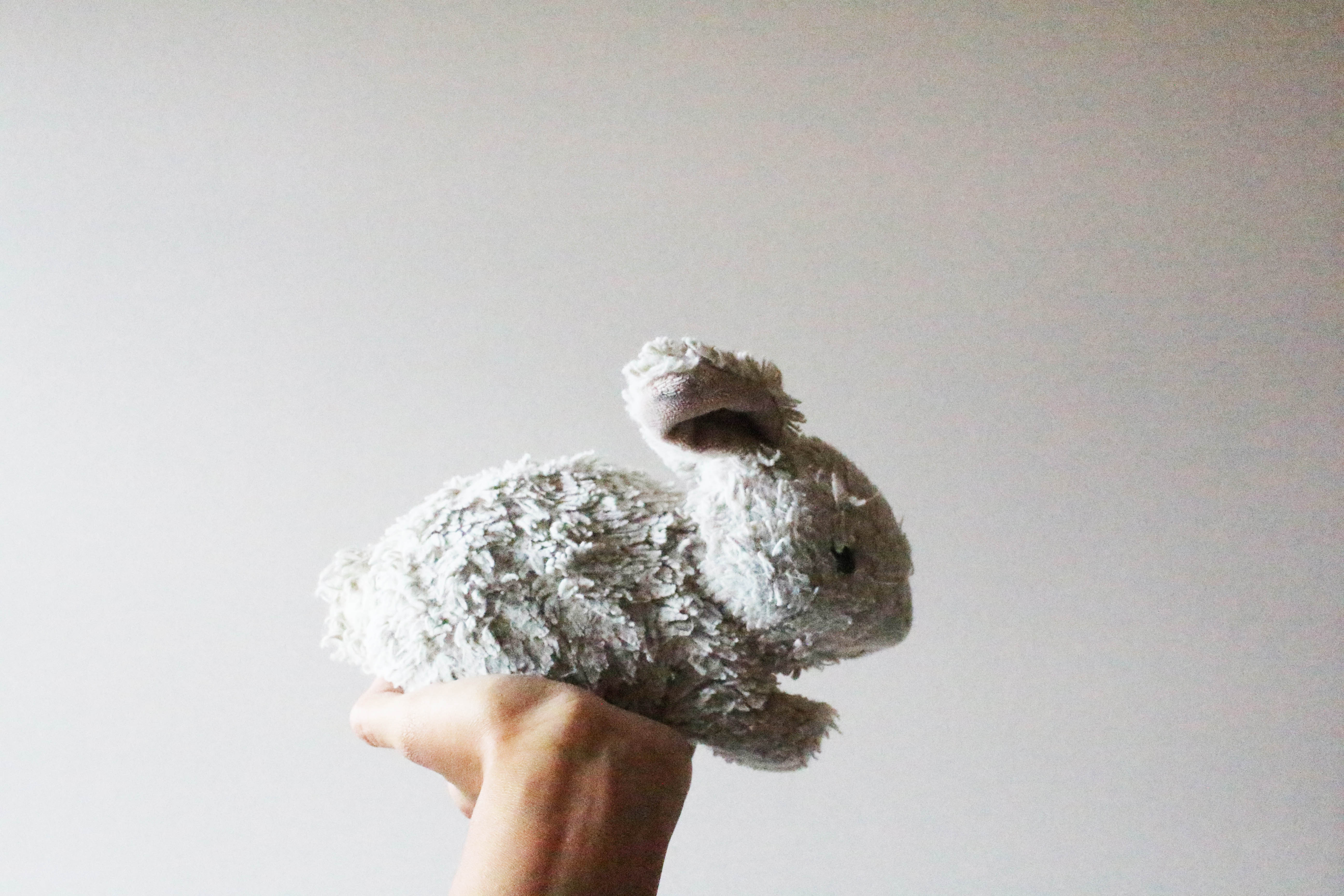
This is a rabbit stuff toy and it doesn’t belong to me, but rather belongs to my mum. However, I felt that this was a very significant object in my home as my mum bought it after Smudge passed away to remember him. She would carry it around at home, be it sleeping or watching television or doing her work. I thought it was really cute and it does remind me of Smudge as well. Hence, I took this picture.

trh

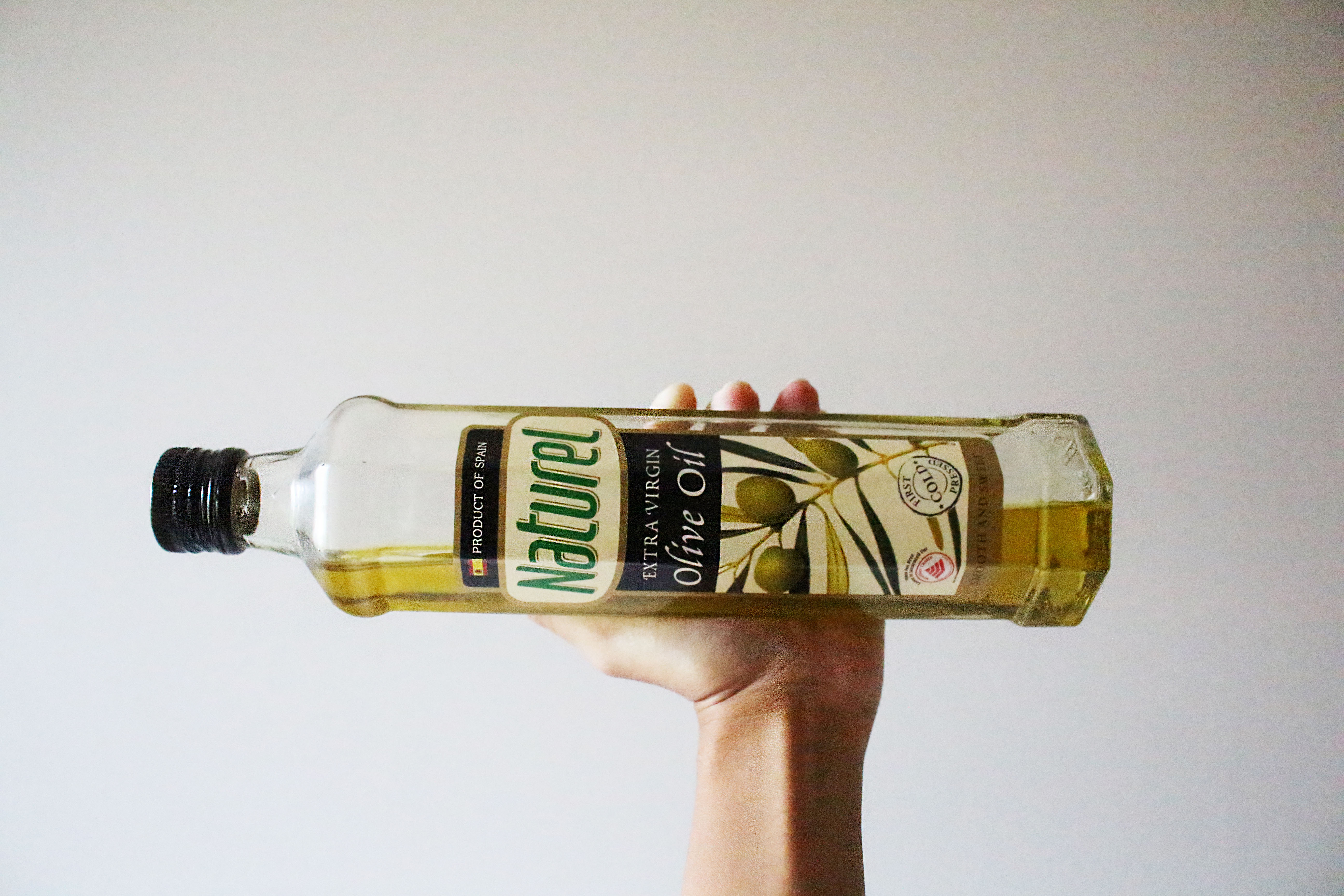
Another aspect that defines home for me would be the lifestyle or activities. This is just the oil we use to cook our meals. What I wanted to show through this photo was the importance of cooking in my family. Our parents wanted to make us more independent and hence started teaching us how to cook. And my dad decided that every Saturday would be Children’s Cooking Day where my siblings and I would be in charge of cooking lunch and dinner for the family on that Saturday. During that period of time, I hated Saturdays as the whole day would be spent on getting the groceries, cooking and cleaning up the kitchen.

jioj

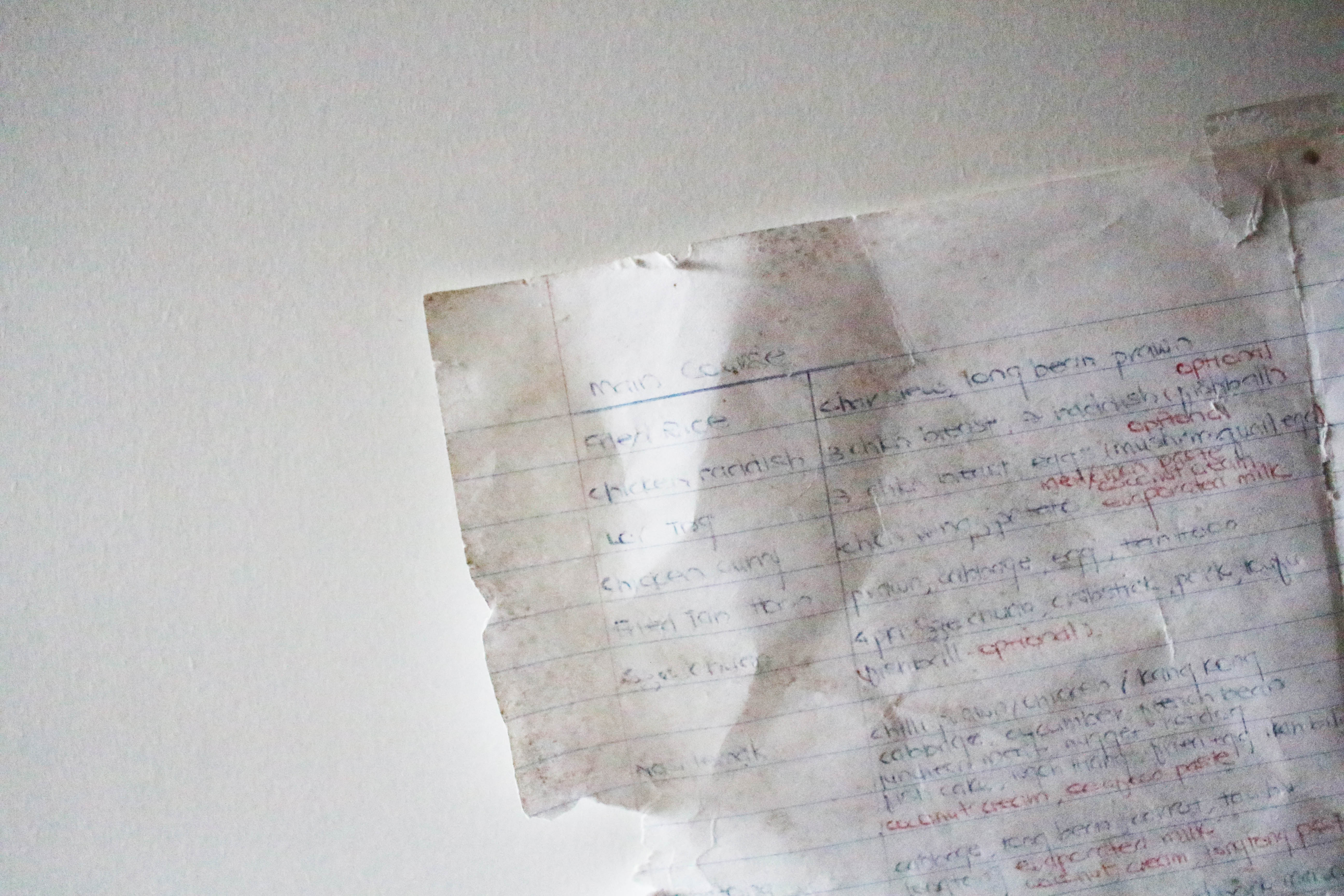
This photo shows the notes written by my mum when we started cooking. On that paper was a list of meals that she would often cook and the ingredients and instructions on how to cook them. She did this so that whenever we do not have ideas on what to cook, we can just refer to that piece of paper. Also, since there are instructions on it, we do not have to worry about our mum not being in the house when we are cooking as we can just refer to that sheet of paper. It can still be found on the refrigerator door after four years (explains why the words are faded).

INTRODUCTORY VIDEO

This isn’t a dance cause I can’t dance for nuts but this is a video that kinda perfectly describe my life. The first part was to show my life as a dragon-boater and it is just me basically rowing on the boat. The second part shows how I keep messing up or getting messed up by life and that once in awhile, I would do something stupid or something would make me look stupid. But, I’ll just laugh it off lol.

4D HOME VIDEO

This is my HOME video to kinda tell you guys more about my home lifestyle. Basically, it is done using stop motion animation. What I wanted to show from this video was the common meals that my siblings and I would cook for the family because in my home, cooking is an essential lifeskill and hence we were all forced to learn how to cook at the age of 12. Why they did this was because they wanted to make us more self sufficient and less reliant on them. And so I wanted to just show a video of what kind of meals I would usually cook and how I would cook it.

2D TYPOGRAPHIC PORTRAIT FINAL

These are my finalised works!

IMG_9800

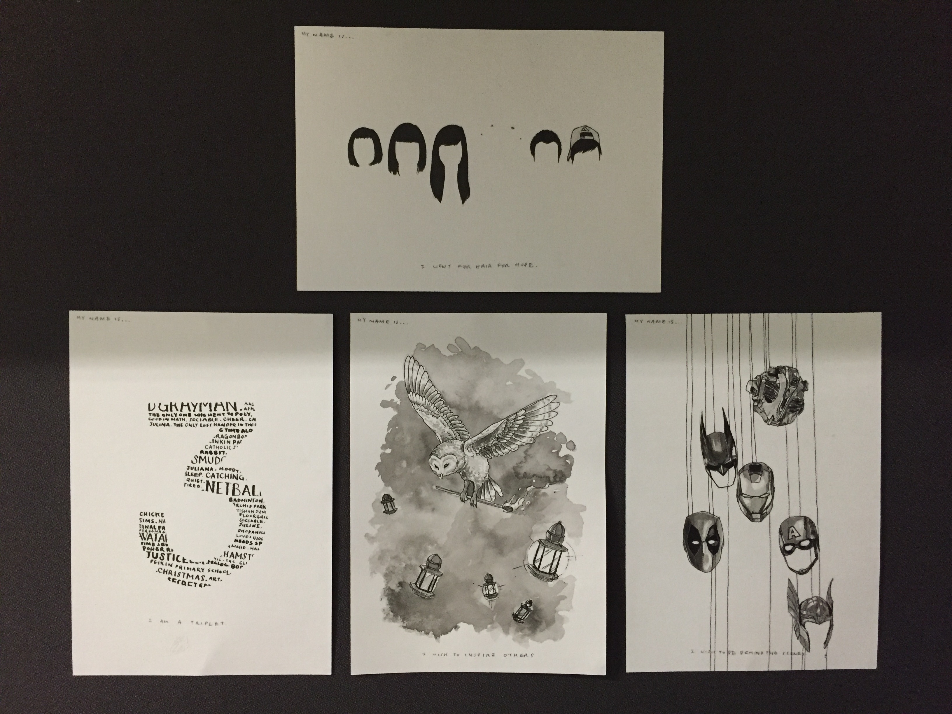
This is an overall view of all my four pieces.

ioi

My name is… and I am a triplet.

An introduction to myself would be a fun fact, and that is that I am a triplet. Hence, the number three is drawn. In the number, there are words from movies, games, traits, activities and names that are used to form up the number three. This was done to show the different personalities of my sisters and myself and the words that are slightly bigger were the things we used to do together or liked very much.

hiuh

My name is… and I wish to inspire others.

To show more about myself, I decided to use an owl to portray what I wish to do in the future with my artwork. An owl is usually associated with wisdom and is also seen as a messenger. Furthermore, the owl is carrying a matchstick and lighting unlit lamps. Through this drawing, I wanted to show that I wish to inspire others (lighting of lamps) or raise awareness for good causes through my artwork (matchstick) in the future.

hjk

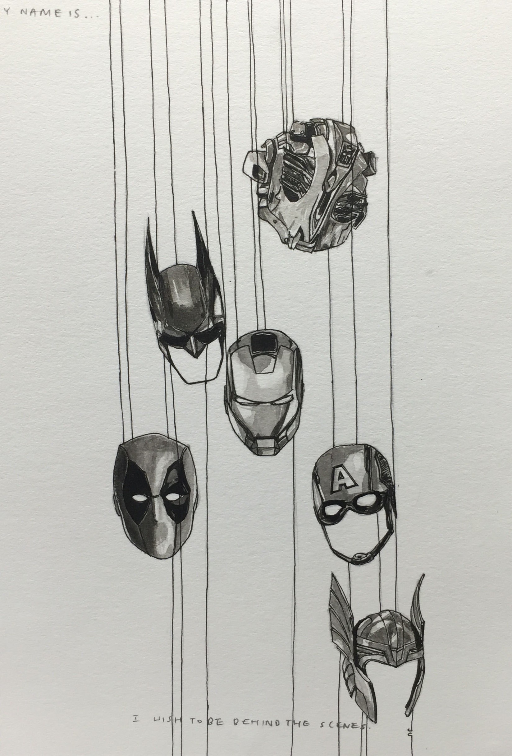
My name is… and I wish to be behind the scenes.

This piece shows masks of different characters found in different movies. I drew masks because for every mask, there is someone behind it. Hence, I wanted to show that I wanted to be behind the scenes of some of my favourite films such as Transformers, Deadpool, to help in the making of these movies. I wish to be on the film set for movies, especially action movies, as there would be explosives and lots of exciting things to do and I thought it would be fun and thrilling to be able to be part of it.

igyg

My name is… and I went for Hair for Hope.

For the last piece, I drew my hairstyles from 2012 to 2016, and in the middle is an empty space. What I wished to show was my participation in Hair for Hope 2015. Why I wished to show this was because it had a huge impact on me as I really felt how the cancer patients would feel when they lose all their hair. People would say it is just hair but hair makes a lot of difference and plays a huge role in appearance and confidence. When I shaved my head, I felt insecure and lacked confidence. I could not look people in the eye and avoided outings so as not to reveal my shaved head. Of course, I got mistaken a lot for a boy, even my grandpa thought I was his grandson. Overall, this was one of the major events in my life and I felt that it would be meaningful to share my experience with others so that they would know one of the difficulties faced by these cancer patients.

2D TYPOGRAPHIC PORTRAIT PROCESS

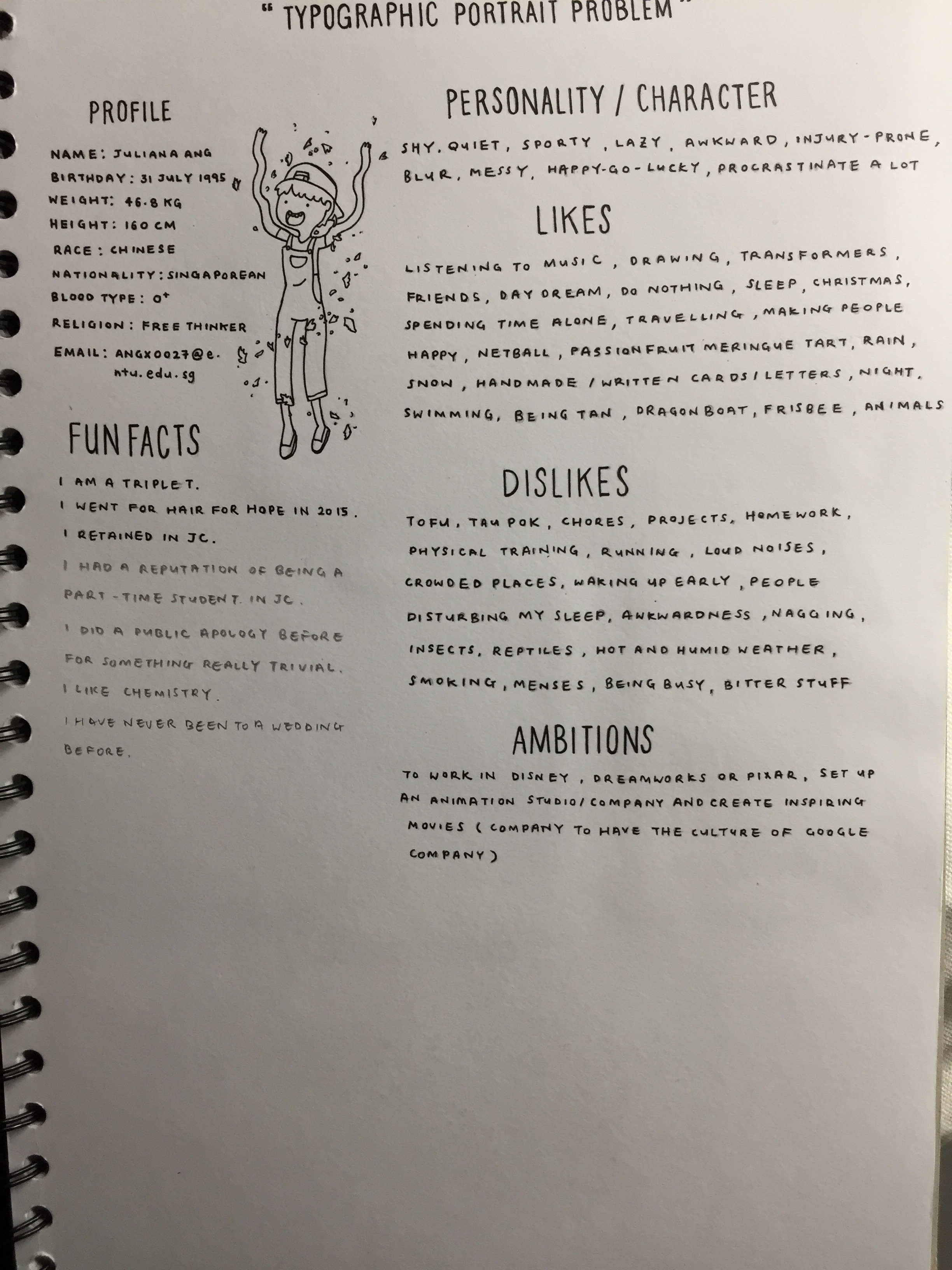
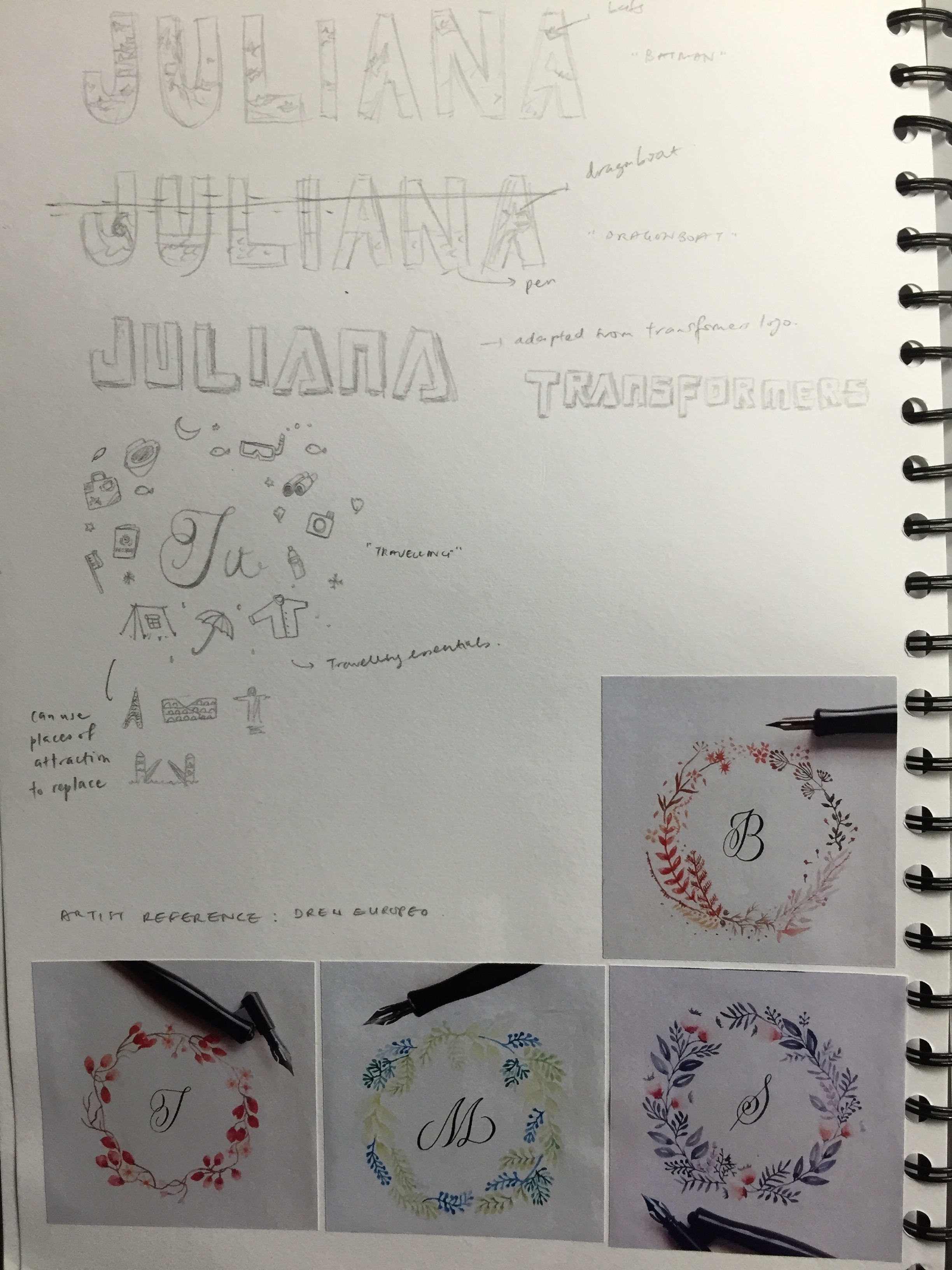
To start off this project, I decided to write about myself in terms of characteristics and personalities and likes and dislikes so that I would have a selection of attributes to choose from to present for this project.

IMG_9642

Initially, I wanted to draw my own face and use words that describe my personality to form the image like what Sean Williams did. However, I thought that would be too boring and hence I did not stick with the idea.

IMG_9643

With reference to Fran Efless, I wanted to draw objects that showed what I liked and use words in that category to form the image, similar to the inspiration from Sean Williams. However, after the first review, it was said to be too literal and needed to be more metaphoric. Hence, I scraped the idea as I would agree that if its too straightforward it would not be as intriguing as it should be.

IMG_9644

These are some doodles that were inspired from what I liked. The last design on the page was with reference to Drew Europeo. I loved his works as his works are simple yet beautiful and I wanted to try to replicate the technique. Basically, the design was to have my name be in the middle and surrounding my name would be little drawings of what I wanted to do or liked. However, it did not turn out to be as nice as I thought so I did not stick to that idea.

IMG_9645

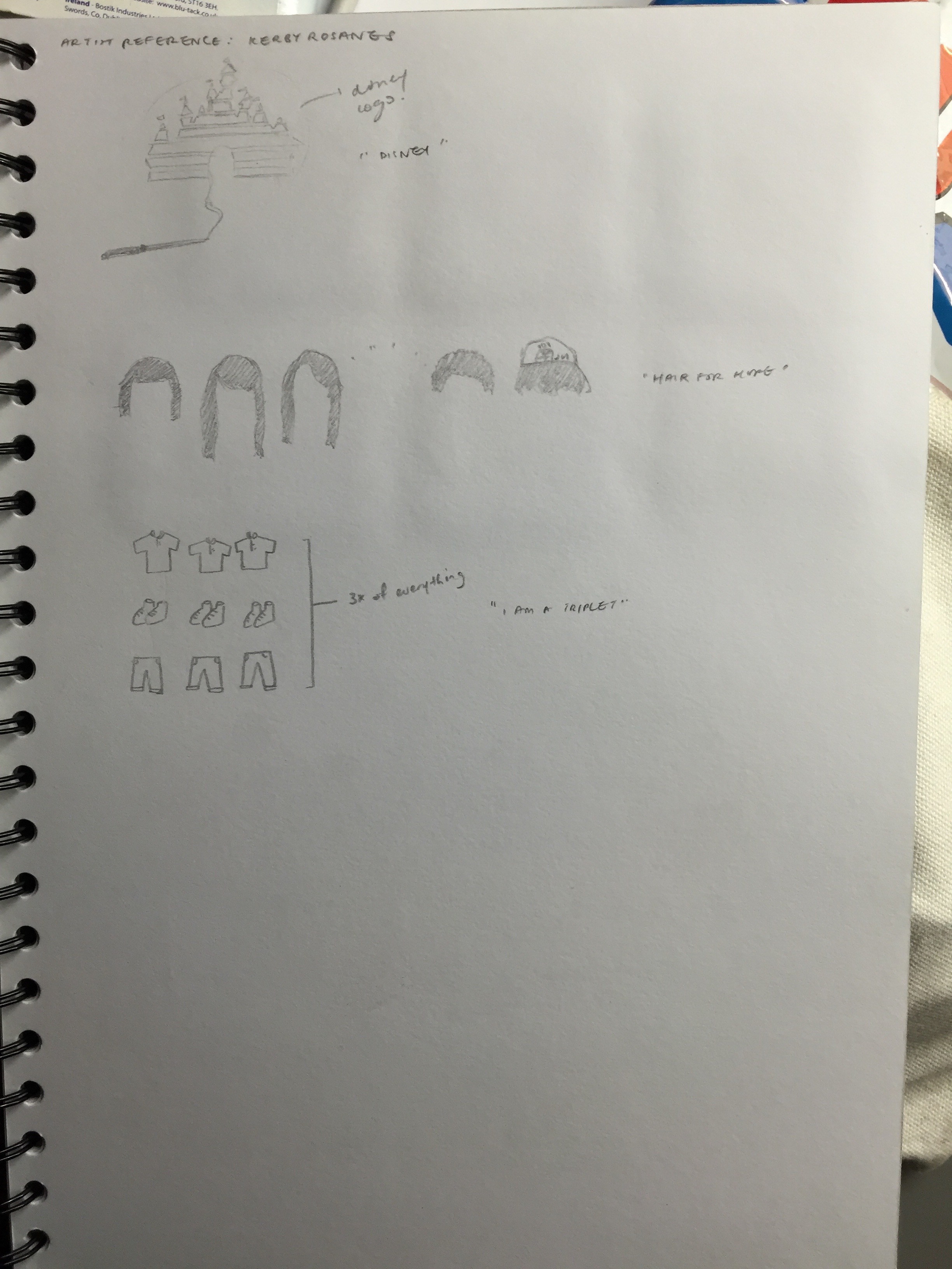
The first design was inspired by an artist on instagram called Kerby Rosanes, where I drew the logo of Disney to show my ambitions. However, given the problem of it being too literal, I decided to trash it as well. After one of the presentations on how we could go about doing our typographic portraits, I decided to do something similar as one of the slides talked about showing part of something instead of everything and from there came about the idea of showing my hairstyles (also cause the slides used hair as an example as well). It was simple yet I thought it conveyed the idea very well and hence became one of my finalised designs.

IMG_9646

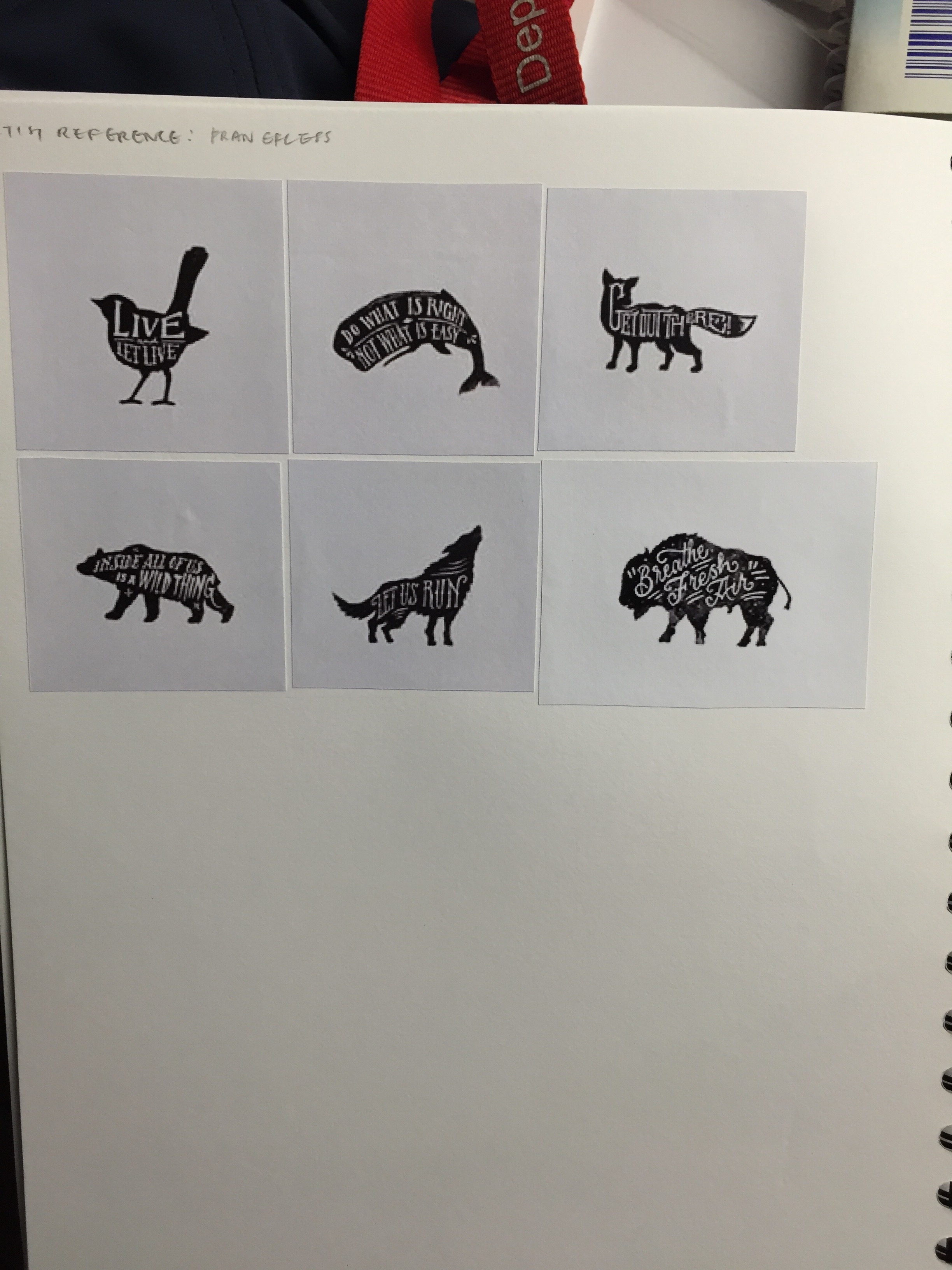
These are works from Fran Efless. I thought doing a drawing of an animal with similar traits as me would be interesting but I could not find one that was really apt for my personality and so I did not use this idea at all in my project.

IMG_9647

After a lot of thought (that was not penned down), I decided to use Sean Williams works as one of my inspiration for the finalised works. Also, I really wanted to incorporate the things I loved into my work, thus I tried to do it in a not so literal way and also by just showing part of it instead of the whole object.

HELLO

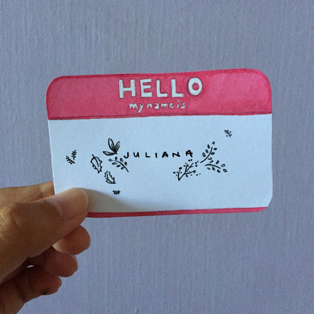
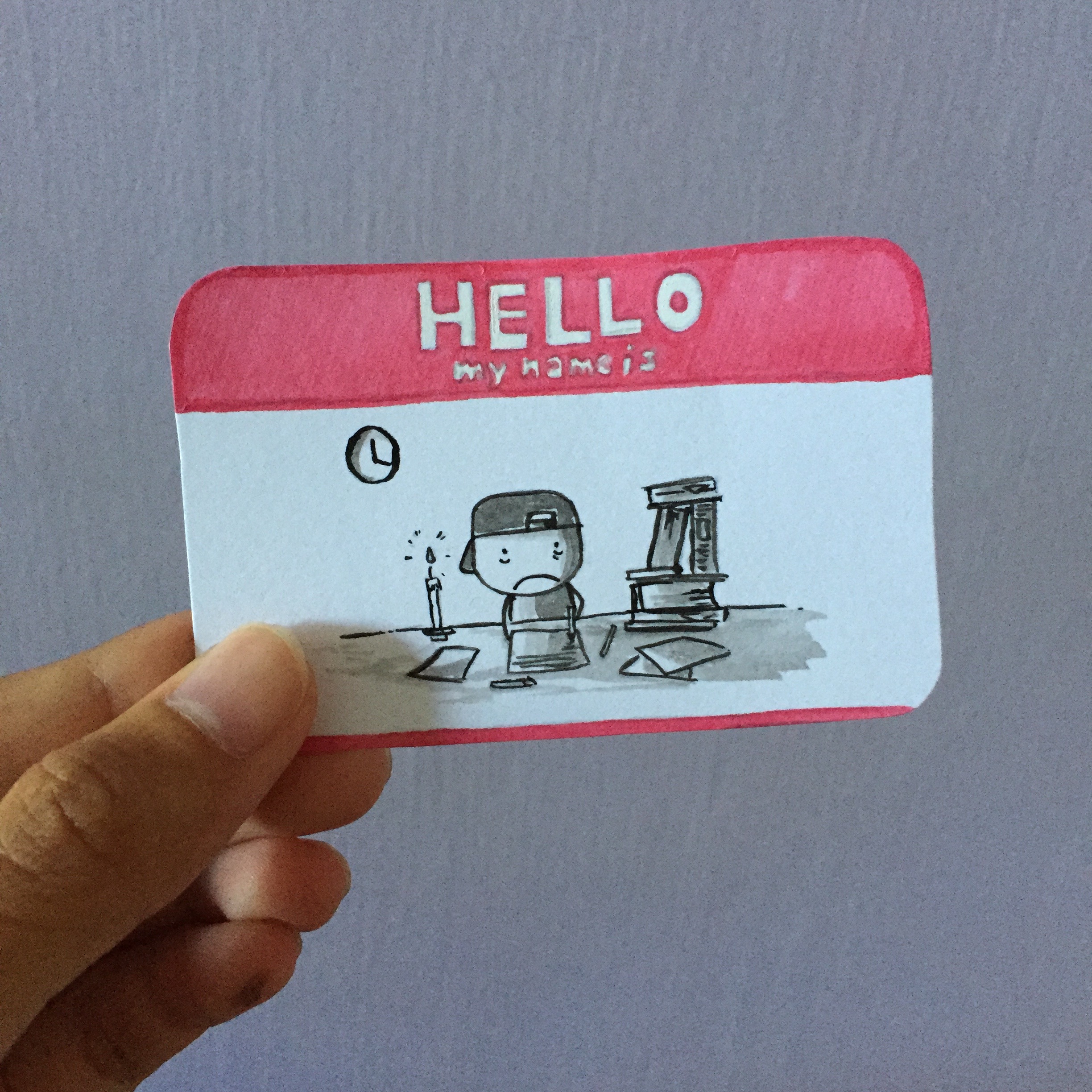
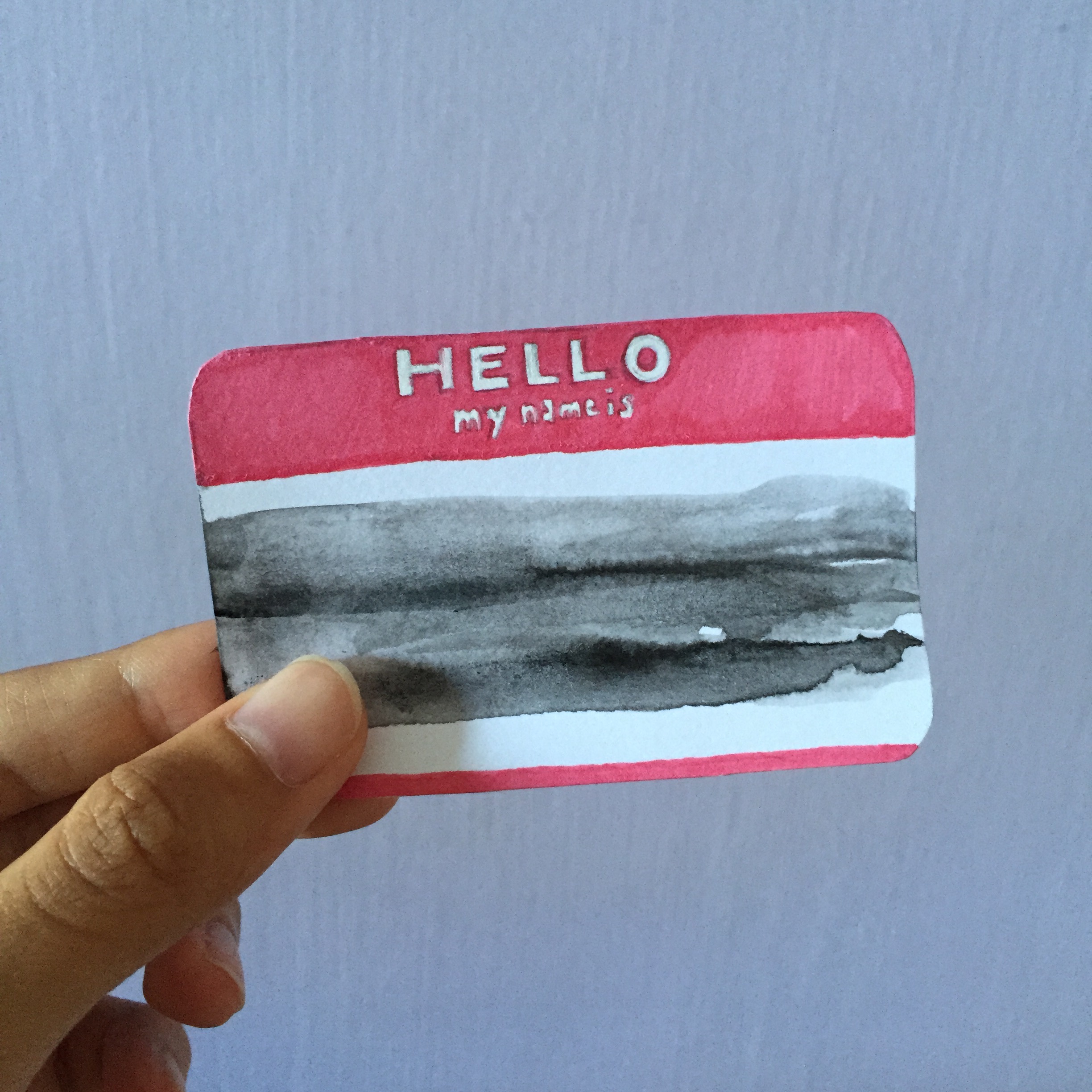
These are my three designs for HELLO. (I do not have the actual template so I drew out the template myself.)

The first design is just my name in my normal handwriting and a few fauna around it. I do love designs with nature as I find them to be very simple yet elegant at the same time, that was why I chose to draw leaves for decoration.

IMG_8859

The second design is a person with a cap (me) and the clock shows 4am. It basically portrays my attitude towards work accurately and all the time: last minute. I have a severe problem of procrastination and no matter how long the duration of a project is given, it would 70% of the time be last minute work.

IMG_8860

The last design was done by adding a lot of water to black ink and letting it flow to the sides by tilting the paper. I wanted to show that I am an anything person, like I like to go with the flow and decision making isn’t really my thing as I do not really care about a lot of stuff.

IMG_8861

All these are done in black and white as these are my favourite choices of colours to work with.

4D SINGAPORE DIARY

For this assignment, I chose Holland Village. Why Holland Village was because it brings back my CJ memories where we would come to this place once in awhile to hang and chill. I have not been here for quite awhile ever since I graduated from my school and hence I decided to revisit the place for this project. Also, Holland Village is known for its cafes and food, and given that Singapore is a food haven, I thought it was suitable for this project. In addition, Singapore is heavily influenced by different cultures and countries, and Holland Village is the perfect example of Dutch influences.
1
2

During the A levels period, I would come here early in the morning to study in a bakery called Provence. There cinnamon buns are the best I’ve tried so far, and so is their chocolate bread.

3

I’ve always wanted to try this cafe, but I haven’t got the chance to.

4

I came across this artwork while exploring and it immediately caught my attention and I did not see any wall mural before on my previous visits. Beside it, there was a small description of the artwork and it was actually done by an NTU ADM student for an SG 50 project. Basically, it is about how cats have become common sights at hawker centres and like eating out has been made more enjoyable by them, so the artist dedicated this wall mural to these lunch buddies.

5

6

And I found a cat soon after I saw the wall mural!!

7

As time passed, Dutch influences began receding but the most prominent feature that still showed that Holland Village was heavily Dutch influenced was the iconic windmill and the Holland Village shopping centre. I thought that it was really pretty and unique.

2D TYPOGRAPHIC PORTRAIT RESEARCH

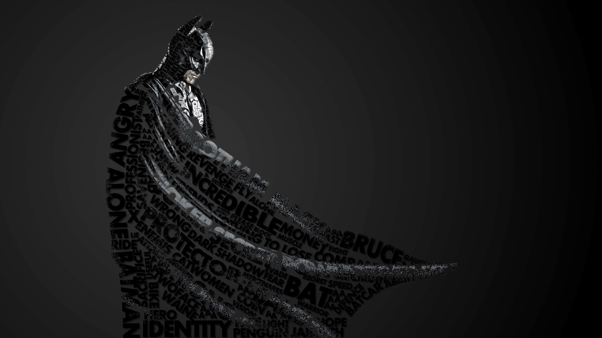
For my research, I came across 3 artists which I drew my inspiration from. The first one was Sean Williams. He used words to form an image of a person which I thought was quite creative and apt for this project.

781694-batman-text-typographic-portrait-typography b255e67e03126d275914a953341a3db1

The second artist I referred to was Fran Efless. I thought it would be cool to draw my favourite animals and write words in it that would be related to the animal, such as personalities or traits.

11326054_1596710450577070_1768893340_n 195b0a29007623.55dd91a2d1ce6

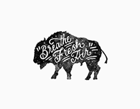
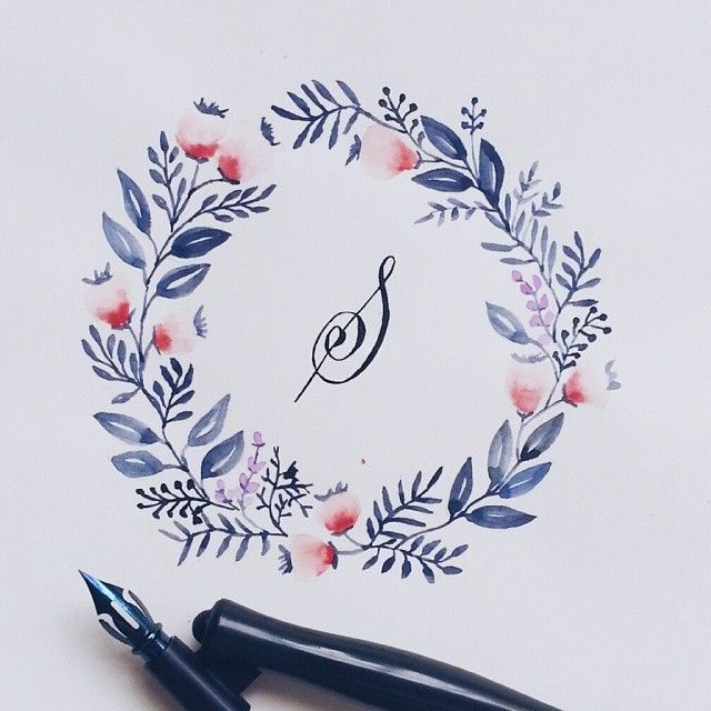
The last artist reference was Drew Europeo. I really loved these works as they are really elegant and pretty. Also, I am in favour of using watercolour techniques so it was an incentive for me to try out his works.

da7d9fb80994a5017ff403b31ba9a0fc c0a556ef8ec0f00ffe43914e1af0fb78