Thoughtful Interaction Design

Responding to the reading, find 2 examples of a product/project that you think are good examples of thoughtfully designed user experience. Be prepared to support your choices.

Core concept:  interaction design, design process, design situation and digital artifact.


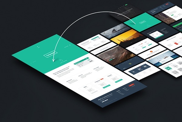
The first example would be the emergence of The Web App. I believe most of us are familiar with the term App , or Application, which is associated with the individual software applications that we download onto our mobile phones and other platforms. The App store and Google Play store are homes of these apps depending on our device platforms. We are so used to the intuitive nature of the apps, smooth without much load times.

The responsive website on the other hand is the evolution of our common website. When we resize our website window, observe if the content display changes. If it does, then that website is designed to be responsive. Google has placed emphasis on websites using responsive displays, rewarding them with higher search rankings. Since in the digital world, search rankings is king, the world followed.

Today, Google says that it is recommending Progressive Web Apps, which are again an evolution of the website. It is where websites act like apps. This is a major move seen in the tech world, as Google moves to bring greater user experience into the design of websites, as user preferences demand so.


The second example is Apple. Both the phone itself as well as its user experience were revolutionary at that point in time. Many believed that the different look and feel of the touchscreen phone was the main selling point, but many did not fully realise that what they fell in love with was the seamless user experience that Steve Jobs was all about.

Diary of Behavior

Why and What I use for:

Checking email, browsing the internet, communicating with others, playing with apps and social media.


Common uses:

Checking email, browsing the internet, communicating with others, playing with apps and social media. Most people use it as a time killer, such as while travelling. There are others who use it as entertainment during meals.


Day 2 behavior:

Boredom, withdrawal symptoms, lack of connection to the world, lack of knowledge, lack of immediate answers.

There really aren’t many alternatives to the connectivity and productivity that the phone gives. Electronic devices can replace the uses of the phone but disconnection from all these devices just leaves people disabled, electronically.


Interactive Environments & Experience Design

The presentation in class by the guest lecturer was indeed insightful. In particular, his suggestion to allow two participants interact with one another to create art allowed another dimension in my thoughts for the iLight proposal.

I met with the leader of the IEM team to convey our discussions in class, so that the IEM side can understand certain aspects of our angle taken for the iLight proposal. I shared with him the interaction design and i believe he was also impacted greatly by the additional ideas that could potentially be implemented.

One of my ideas to him was to allow various participants in contact with the motion sensor plates to create different colours using bit-wise activations. For example if there are 8 plates, which gives rise to 128 different possibilities of bit combinations. These can be mapped to colours, and if no one steps on the plate, it gives 0000000 mapped to white, where the jelly fish will be white colour. 00000001 may be mapped to red and so on.

Wk5: Future World

The visit to Future World was my first time there, but it did not disappoint. As part of the exposure and inspiration-finding for the iLights Festival, Future World consists of many installations which users could interact with. Its use of technology, as per the title ‘Future World’, was somewhat unexpected. The ability to use Xbox Kinect with objects and generating a real time display seemed like an unusual use of ‘gaming technology’ for creative interaction.


Also, the colouring papers provided allowed visitors to express themselves and bring their drawings to live via scanning it. The digitalised version would then appear within the animation world displayed on the wall and floor. Also, some drawings were able to be printed out as paper to be structured into 3D form.


Following which was the play area, where large lighted balls allowed visitors to play with them, generating sound and light. There was also user designed hopscotch and an interactive wall where visitors can swipe a chinese zodiac or word token and it would disappear and become the actual form on the wall.


The centrepiece was the Crystal Universe, which is the third generation of massive LED projects. Users could immerse and walk through arrays of LED lights from covering the top to bottom of the room. Unknown to them, it is actually part of a universe where at the end users can pick which universe to have a light display.


One done, we have a Q&A session with the ArtScience Museum director, who explained the various thought processes behind the installations. Firstly, the idea of bringing play to adults is an interesting concept, especially in a overly serious society like ours. We yearn to unleash the inner child within us. In a user experience angle, this concept is especially important, since it is a very good and effective way for users to be interest and willing to interact with the installation.

Also, a takeaway from the use of lights in all the installations was the creativity in using light in so many different ways. TeamLabs however is a large company with strong technology teams, thus is able to provide a more complex installation. As for the iLights proposals, our students could draw some inspiration and will definately have a stronger idea in mind.

Sustainability iLight

Sustainability is the ability to consume or use a resource responsibly, taking into consideration the ability of the resource to be produced and the impact on the future.


This is my preferred piece of iLight 2017.

In 2018’s theme of sustainability, sustainable materials would be the first to come to mind. However, there could be better ways of expressing sustainability though other means.

Wk4: You Are What You Carry

In a similar topic to Mobile Phones (Wk3), this week’s topic has a closer look to what we carry.  It is said from Chipchase’s research that Keys, Money and Phones are the most common things at the point of the TED talk, which till now has not changed much.

As written previously in my Wk3 post, the mobile phone is the centrality of our lifestyle today.  Keys and money can reside in our mobile phones. To not repeat the same concepts as the previous week, I shall discuss more about we are what we carry in our mobile phones.

Our touchscreen Android or iOS phones have evolved much since the launch of the first iphone. The word App was foreign then, and the App fever came upon us. The Apple App Store had and still has tons of Apps that come and go with time. They are joined by the Android App Store, the Google cousin of Apple.

Our phones have enough space to hold many many apps. Hence we do download perhaps a hundred, but only use 10 at times and always use 3. Similar to the concept that Chipchase has brought up with the items on our bags.

So the question here is which 3 are our most frequently used apps that define us? For most, they are messaging apps like Whatsapp, Telegram and WeChat. They form the bulk of our communication means with our friends. Next in line would be social media apps like Facebook / Instagram and Snapchat. For our working segment, the email app is one that directly concern their livelihood. In fact, it is possible to check which apps do we spend the most time on.

Ultimately, it is the stage of life, our priorities and our unique behaviour that shapes what apps we use. Research has shown that Facebook is used mostly by 25 and above, Instagram 16 and above, and Snapchat below 25. This is one of the studies into social media behaviour based on age segments that defines what we use and who we are.


Wk3: Anthropology of Mobile Phones

One of the points that Chipchase  has mentioned was that the top 3 things that people carry are: Mobile phones, keys and money. This is across cultures, ages and genders.

Despite this being many years ago, where keys provide security, phones connectivity and money basic necessities, in today’s context it is the same, yet different. How different? Well, as discussed in class the rise of e-Payment systems, notably in China, where WeChat rules. WeChat app can be used for anything under the sun, buying groceries to transferring money from one person to another. Keys on the other hand, can be digitized as well. Just install the hardware systems that can be linked to apps on the phone, and suddenly your car and home doors can be opened with your phone.

Ultimately, the central entity for all these is the phone. The phone has evolved from its giant humble beginnings to its sleek smartphone of today. Can it be displaced? Just as television sets can be displaced by personal laptops for its convenience to watch the same drama series, phones can be displaced as well. However, with today’s technology, the smartphone seems to be cementing its grip as the source of technology.


The second is on delegation. In the context of delegation, mobile phones allow us to transcend across space and time. It helps us overcome our limitations. It is instantaneous. It gives immediate satisfaction.


Third is that phones allow us to innovate. In today’s context, where phone apps are abundant, and chat or messaging apps are becoming a platform for apps. It will be likely to continue to be a great source of innovation.

Wk2 – Calibrating Your Cultural Compass

In the chapter Calibrating Your Cultural Compass, the author Jan Chipchase shares his tips on understanding other cultures. In the final few paragraphs, the element of design is brought into play, where local cultures can influence a product or service’s design in the local market.

One of the more striking comparisons was the McDonald’s menu in India, where the large consumer base of vegetarians has made the Indian menu different from most other McDonald’s. This is however not surprising to its consumers, given that vegetarians as well as high-carbohydrate diets are the norm in India. I may not have personally been in India, yet after having spent 3 months in Citi with majority Indian professionals as part of my internship, some of their subtle habits can be noticed.  Hence it is possible to have a understanding of other cultures despite not being in their native country.

While I recognize that some of the tips may be useful, I feel that no matter how one calibrates in a foreign culture, some interpretations may not be correct. A few days spent people watching may not give insights into their daily pains or joys, nor have a shortcut through time to understand the history and habits of the locals over the ages.

As a foreigner trying to understand or design a product for a foreign market, the ultimate goal is to have a design that the locals enjoy using and have a real impact in their lives. Absorbing the local culture is a good way to understand the basic fabric of the culture, but it is a small factor as compared to local user inputs on the design that works for them.


QN1: How effective are foreign designers in addressing the needs of a foreign market? Would local designers be better at this?

QN2: Should designs have a local flavour to it?

Response: The Design of Everyday Things

The design of everyday things play an important part of our lives, from doors to lights. As we go through our daily lives, we may or may not recognise or appreciate how some everyday things are designed to suit users needs. An example would be the water coolers around us, where red and blue tabs intuitively lets us know the temperatures of the water coming out. Yes, good design allows users to intuitively understand and know how to use a product. Other aspects such as affordance, feedback etc helps us with our intuition.


QN1: Would good design contradict with beauty and style? Eg. Salt and pepper are differentiated by the number of holes. It may or may not be intuitive for some people, but labeling explicitly SALT and PEPPER on the containers may not be the most aesthetically pleasing to the eye.


QN2: Would newer technologies require different user design requirements?