The part of this week’s lecture that particularly interested me was ukiyo-e’s influence on art nouveau posters and even on famous Western artists such as Vincent van Gogh. I really like how ukiyo-e was a product of Japan trying to avoid Western influences by literally closing their country off, but had such a huge impact on Western artists when shipped abroad. I would have thought that developing a unique artistic identity through seclusion would result in the works being perceived by foreigners as weird but perhaps we can explore a little bit more on the influence of ukiyo-e.
Ukiyo-e developed from traditional Japanese picture scrolls, and were made using woodblock prints. Making a print involved the collaboration of 3 specializations, namely the artist, block cutter and printer. I find it regrettable that only artists such as Katsushika Hokusai are remembered for their prints, even though they wouldn’t be possible without the block cutter and printer. Ukiyo-e prints sought to portray fleeting moments in everyday life, and most commonly depicted women using flat patches of colour.
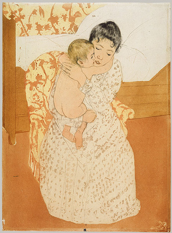
This print by Mary Cassat contains numerous examples of influence from ukiyo-e prints. Firstly the background (both the floor and bed) is made out of flat brown swatches with neither depth nor perspective, and the same can be said about the chair which blends into the wallpaper from afar. The colours used are also as unsaturated as those used in ukiyo-e prints, but what really highlights the Japanese influence is how the faces are portrayed. Both the woman and baby’s eyes are reduced to a thin, curved line which is a unique Asian feature, and the black-white gradient on the woman’s hair also resembles how women’s hair was depicted in ukiyo-e.
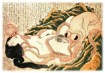
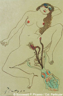
The focus on portraying women in art nouveau posters might also have stemmed from ukiyo-e prints, as from my research there were far less depictions of men, or perhaps ukiyo-e artists were better at drawing women. Even when depicting a woman engaging in sexual acts with an octopus, the image (top) still retains a certain amount of integrity and is seen as a piece of art, rather than Picasso’s sketch of the same scene (bottom) which resembles rude graffiti. One might argue that Picasso’s sketch was unfinished but I feel the difference lies in the ukiyo-e’s smooth yet realistic lines and pale tones, which is usually how dreams are perceived. Thus, when viewing the original (which is called The Dream of the Fisherman’s wife) a person is more likely to treat it as a fictional image and hence making the scene a little less distasteful.
The industrial revolution has always been a rather vague term for me as I never knew exactly what it meant, other than a period of progress, but after the last lesson (and a little bit of research on my own) I’ve come to a much better understanding of it. The industrial revolution was arguably the mother of all revolutions, for without it our lives would be vastly different.
To paraphrase the words of youtube smartguy John Green: every waking and sleeping second of your life is due to industrial revolution.
One thing that really surprised me was how the industrial revolution so drastically changed the way people live, for in the past people’s day began when the sun came up and ended before it got too dark to see anymore. Workers essentially followed the sun. After the invention of machines people from the country flocked to the city to work in factories, and their lives were scheduled around the clocktower.
Before the industrial revolution changes in technology were slow, and inventions like the spinning machine sought to make manufacturing processes more efficient, but like everything else it had its fair share of side effects. Working conditions in factories were terrible, wages were extremely low and people lived in slums. Marx spoke out against what he termed as ‘commodity fetishism’, where relationships between people were defined by money or commodities, and William Morris sought to put to an end the stream of ‘vulgar’ objects coming out of factories.
Technology brought along progress, but also a renewed appreciation for the past.
I feel that this is also reflected in our current society, where people are starting to take up interest in technologies of the past such as silkscreen printing and manual letterpress workshops.
I’m not entirely sure why this is so but I guess William Morris was right in saying that if people/designers are too far-removed from the process of creation (by becoming too digitalised and mass-produced) then works/products will begin to look cheap and devoid of any personal touch. I’ve read a couple of books about famous graphic designers and one piece of advice they all seem to give is to keep sketching, and it’s probably because drawing with the hand resembles the creative process more than moving things around a computer screen. The same could be said about the people who take up the activities mentioned above, where they derive more satisfaction in manually setting ink to paper than simply printing copies from a laser printer.
In conclusion, I don’t know what improvements in technology will bring about in the future, but I do know that along with the increased efficiency there will also be more appreciation for how things were done previously. Both of these extremes have their own setbacks. All I can strive for as a designer, as with almost everything else in life, is to use everything in moderation and hopefully produce beautiful things that William Morris would want to own.
Hello everyone I am getting really sick of OSS so I’ll keep this short.
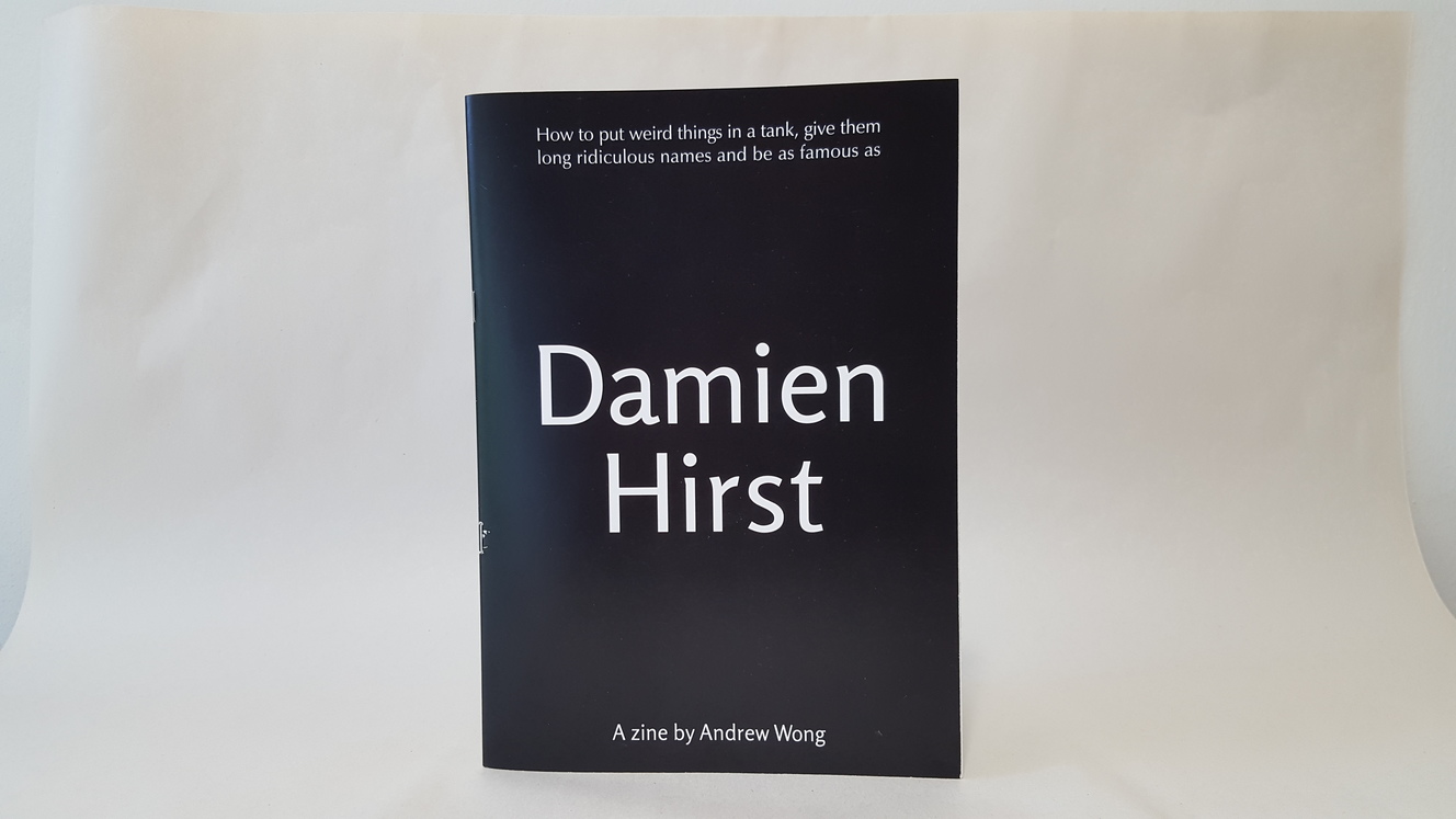
Final zine
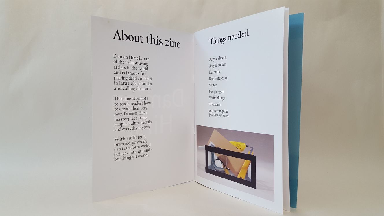
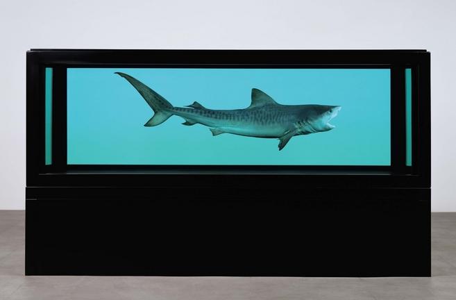
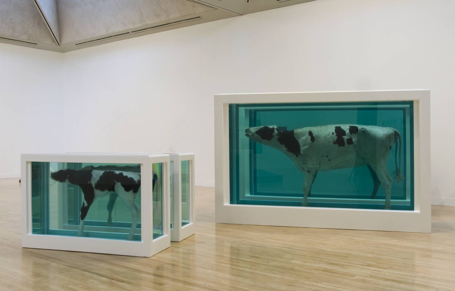
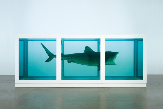
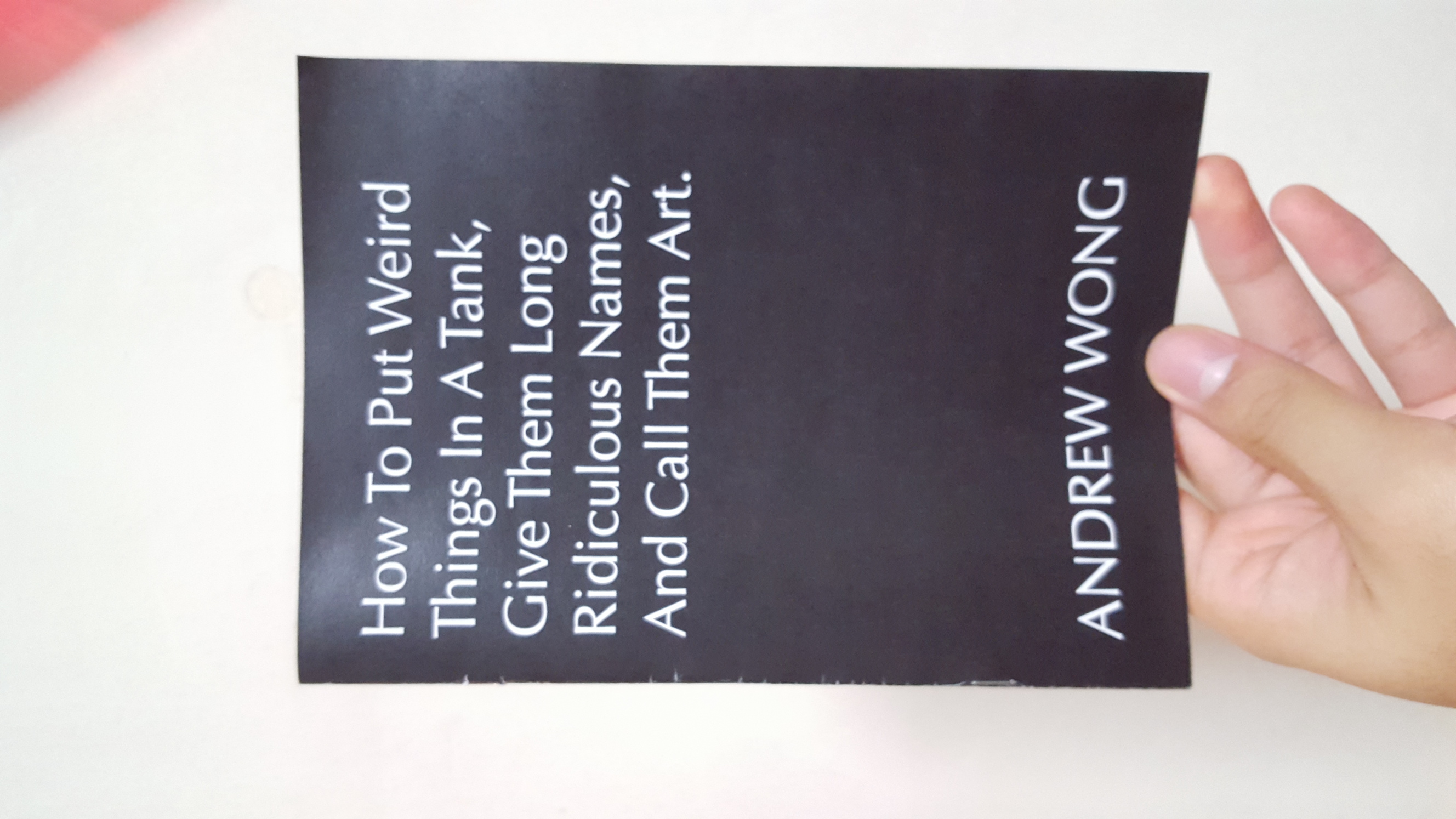
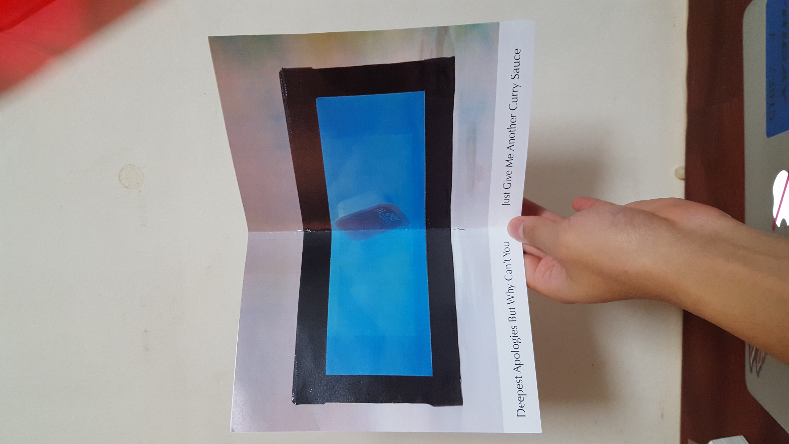
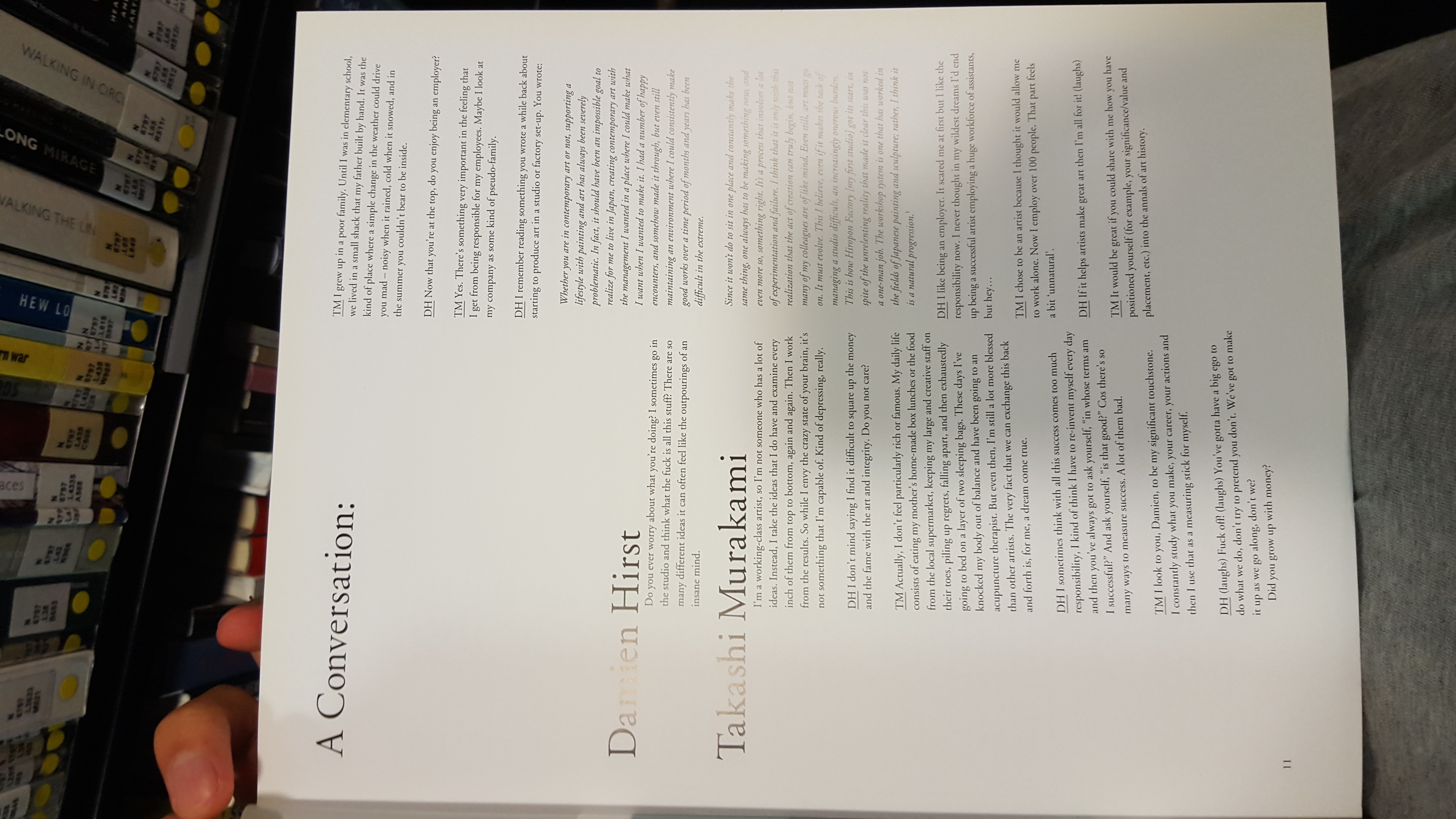
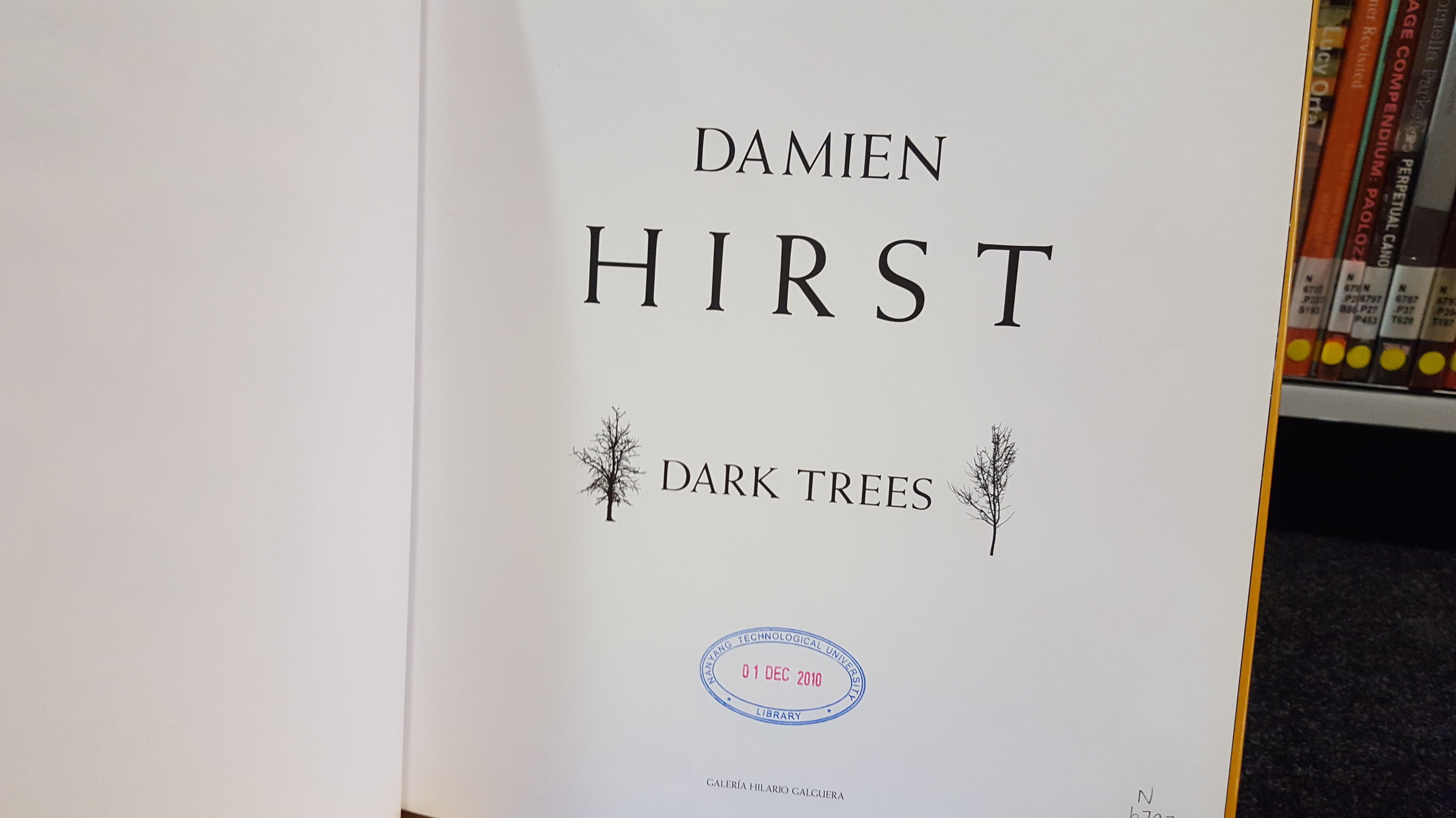
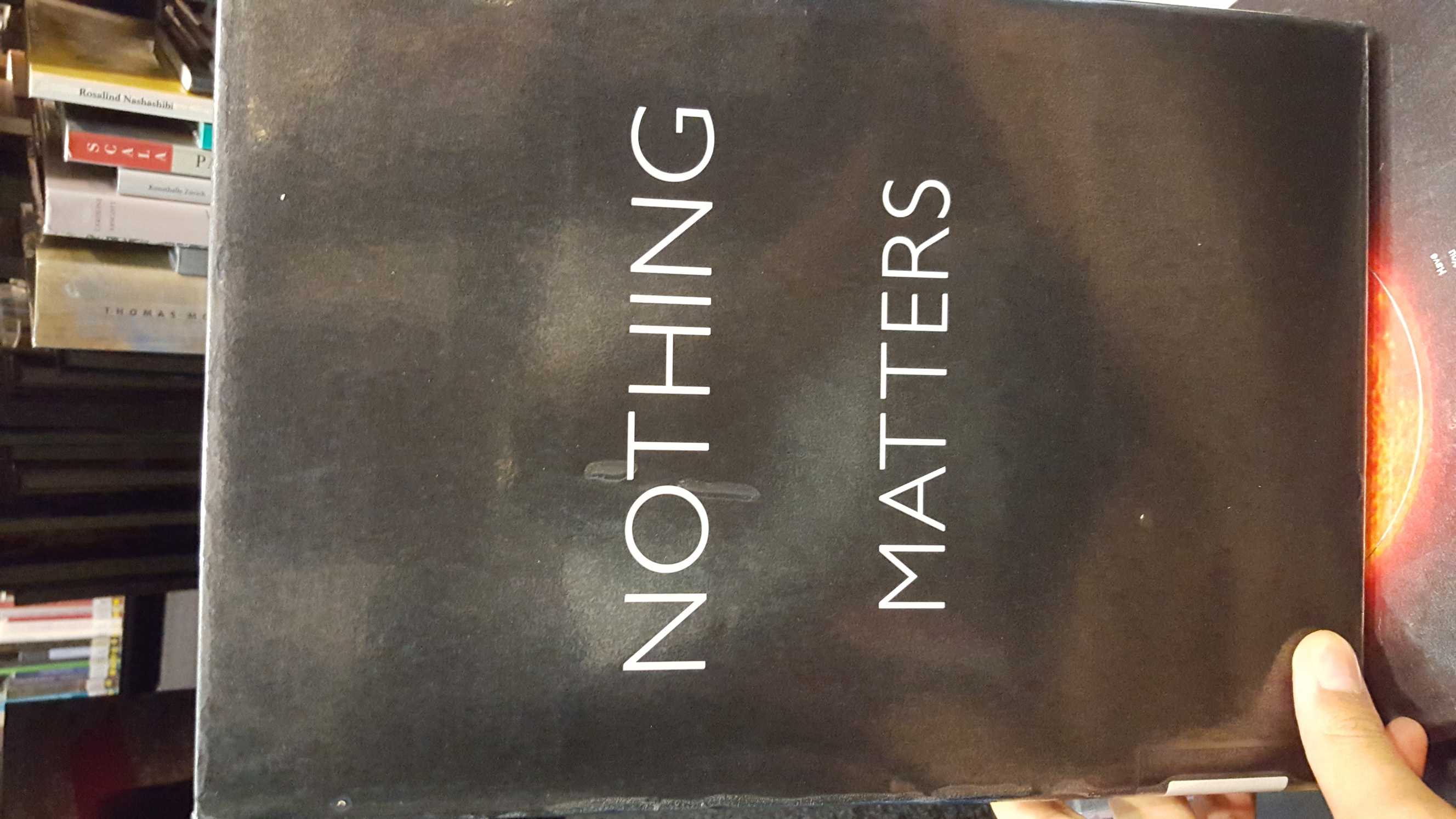
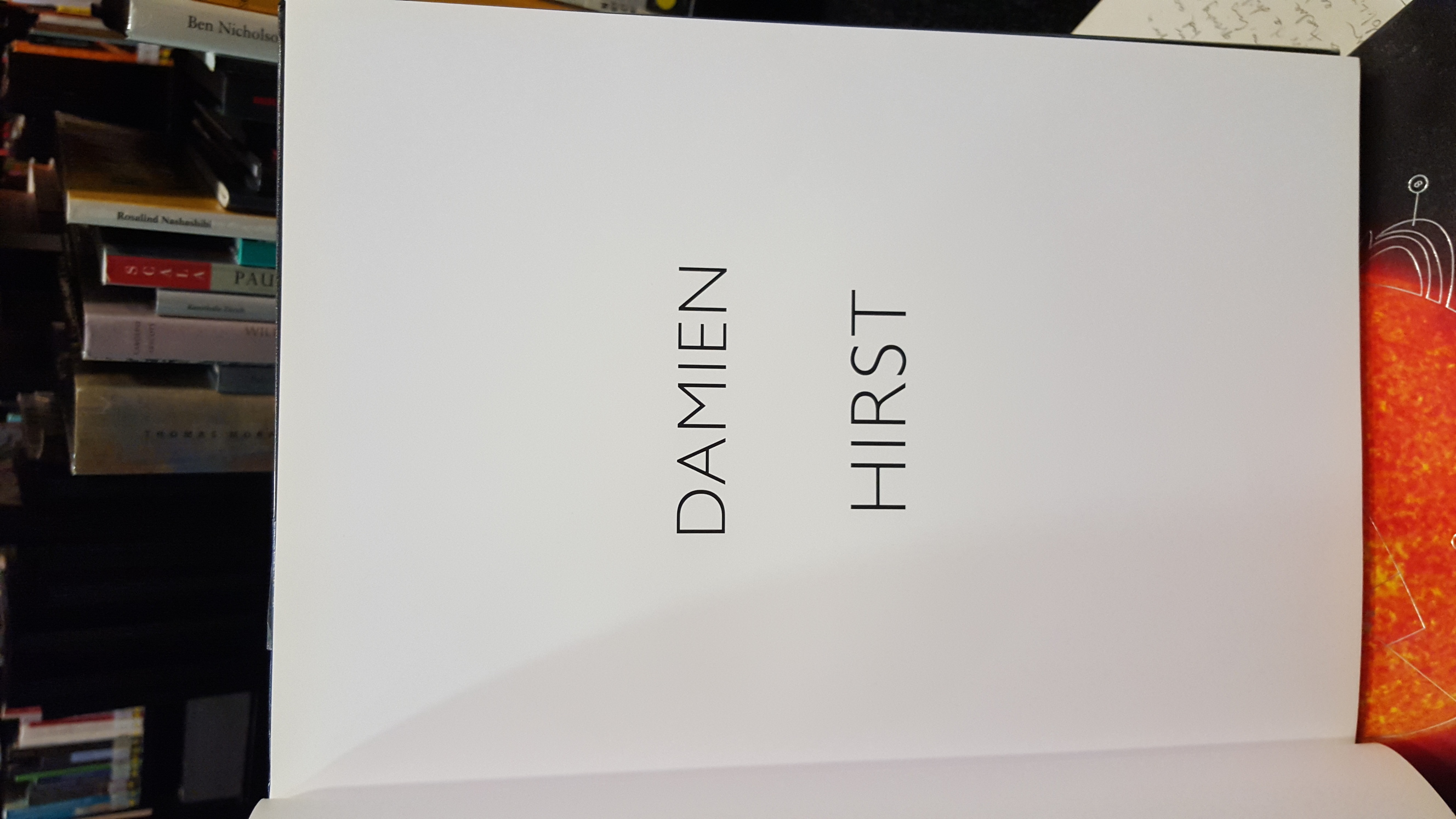
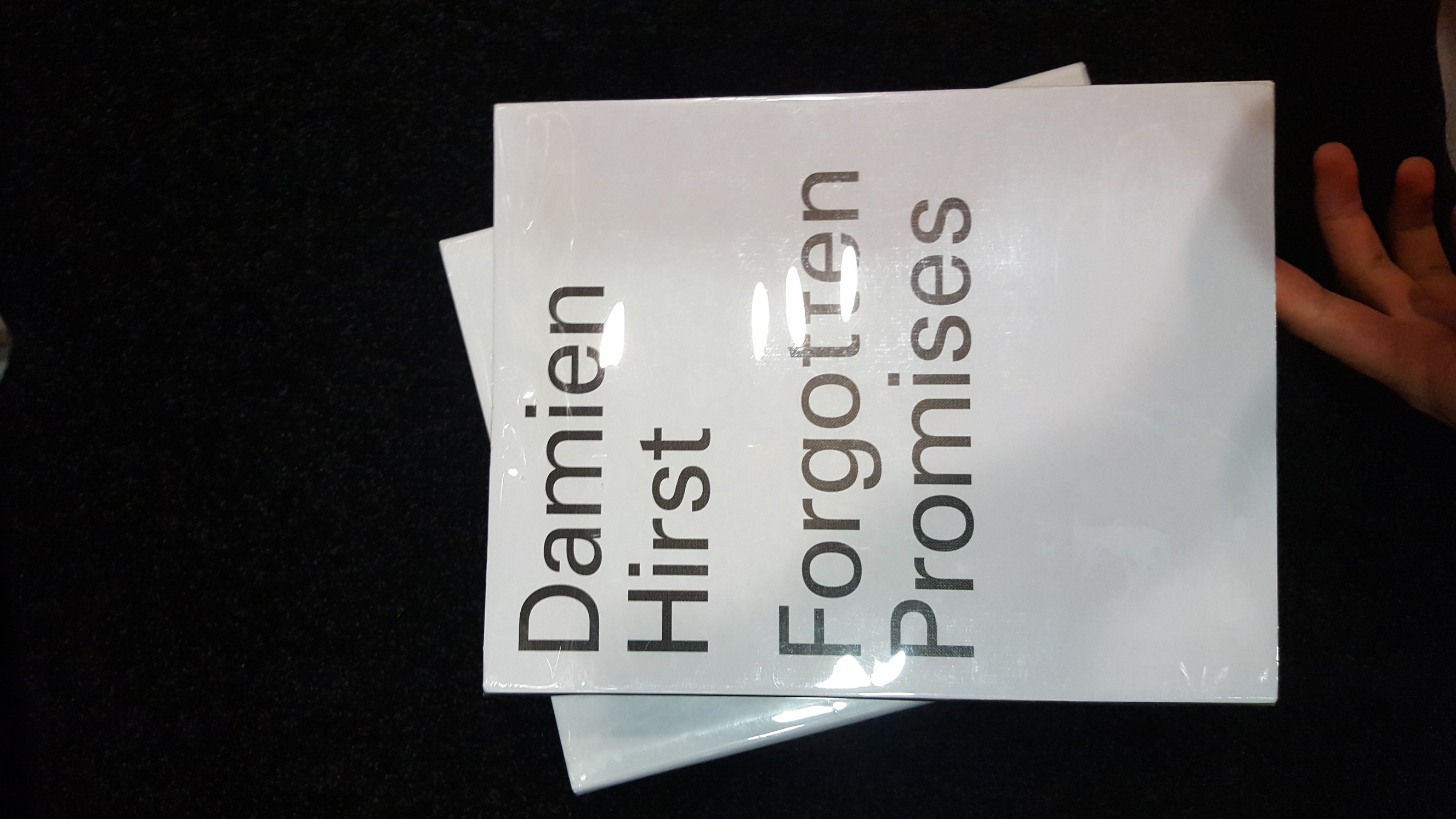
Yeah so for this zine I wanted to do a similar concept as my previous project, a sort of idiot’s how to guide, but this time on the infamous artist Damien Hirst. I don’t know about you but from what I’ve been reading/hearing he’s very well known especially in the art/design world, and everyone has an opinion on him. Unless you want nothing to do with the art world you should really check him out, especially since they teach his stuff at the exclusive NYAEP *jeng jeng*
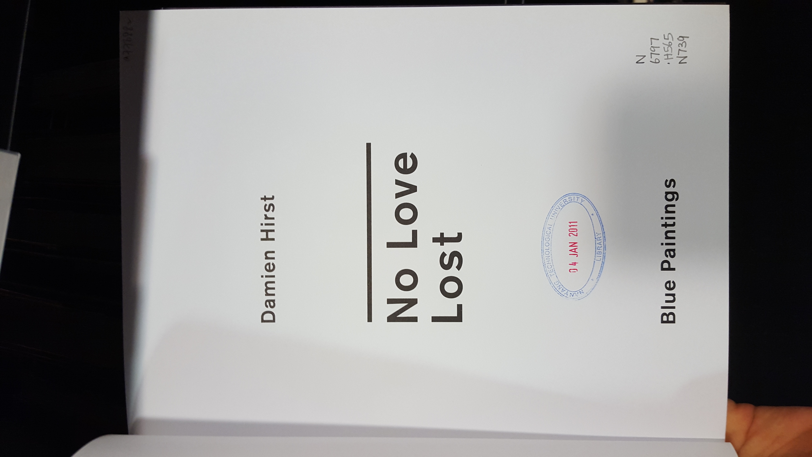
(the following are his actual art works and all images belong to the official website of master Hirst)
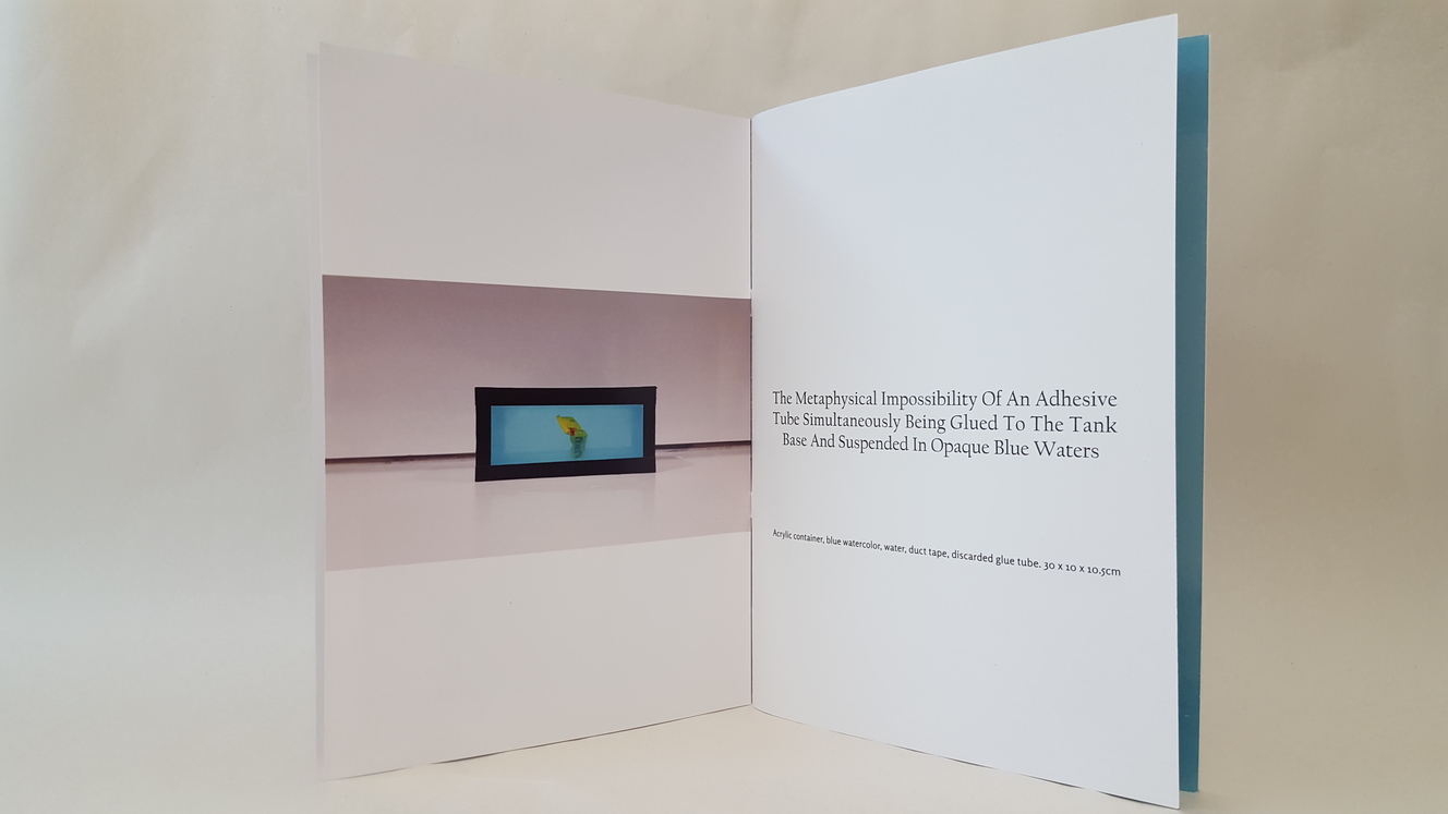
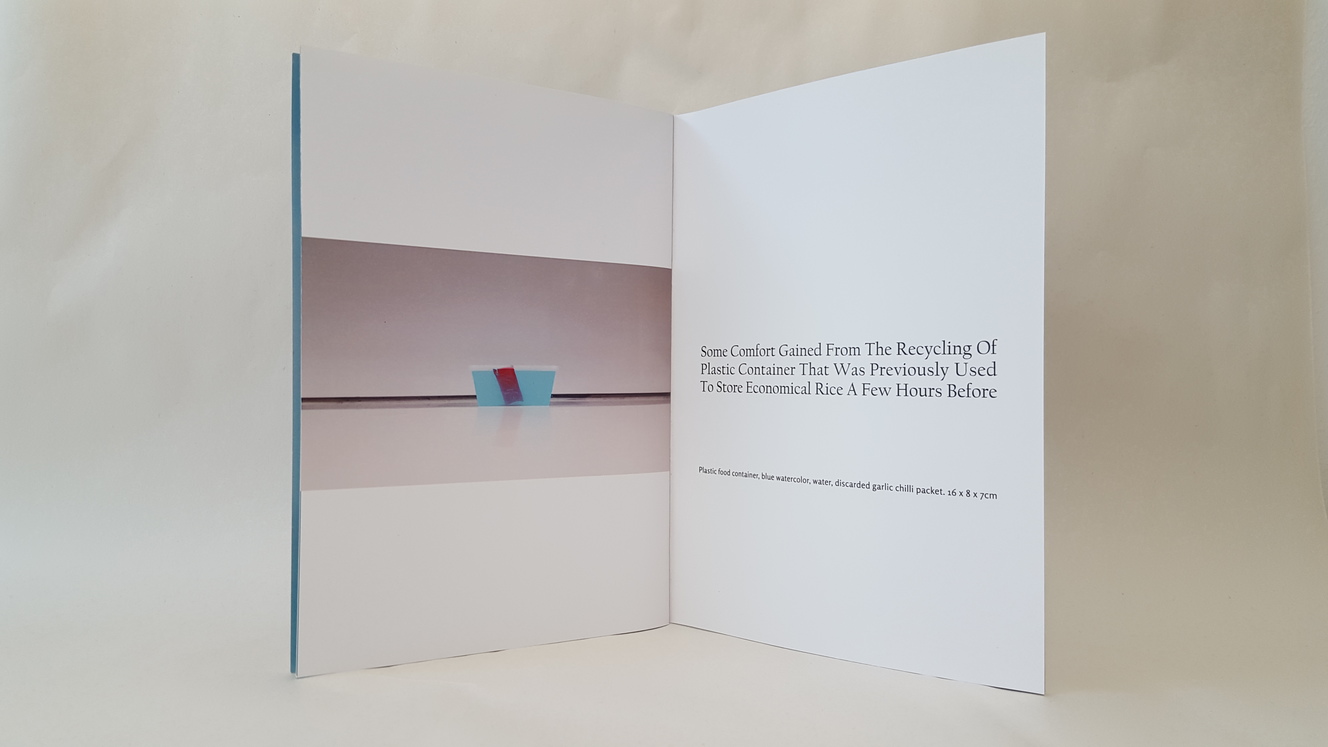
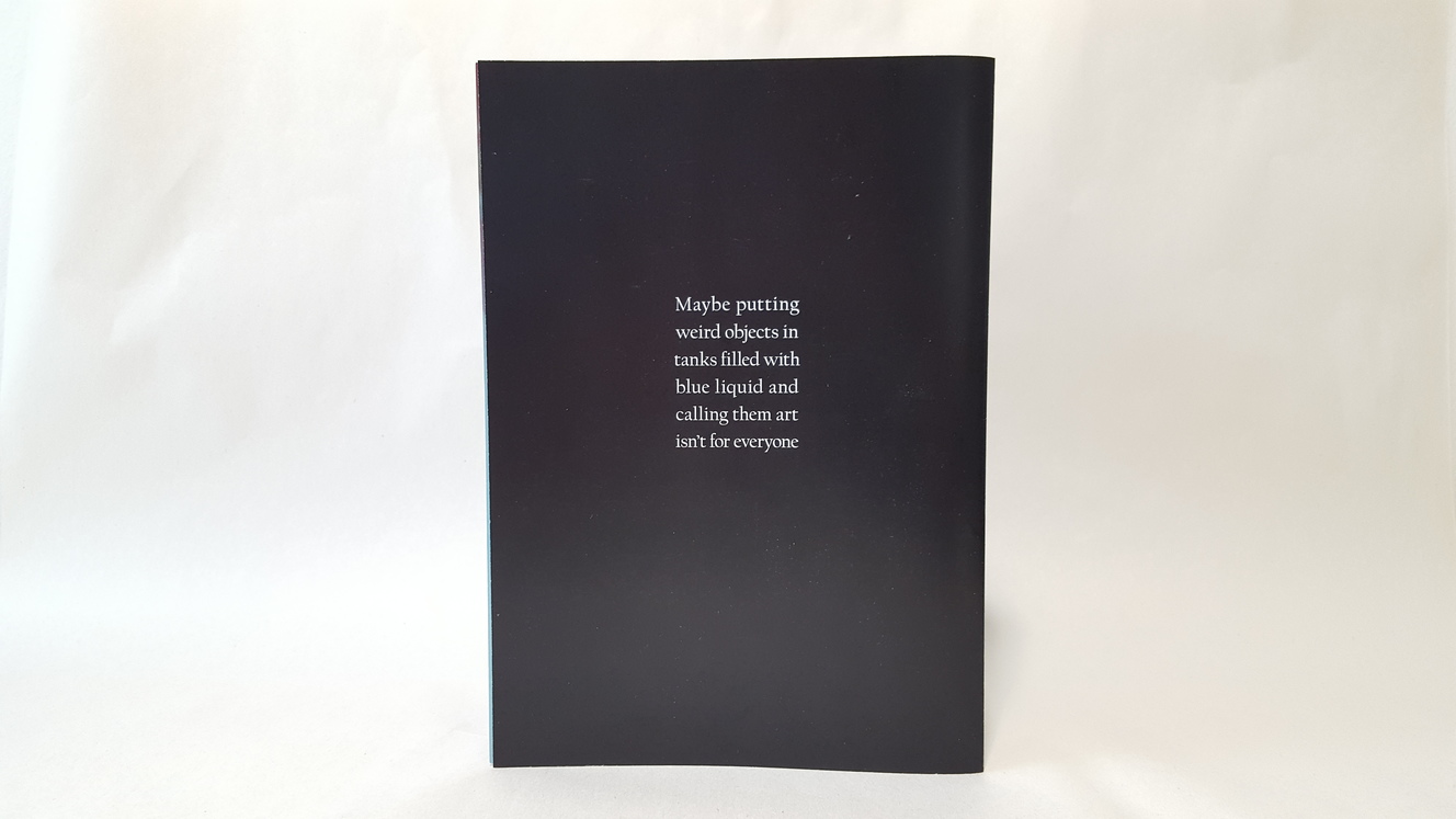
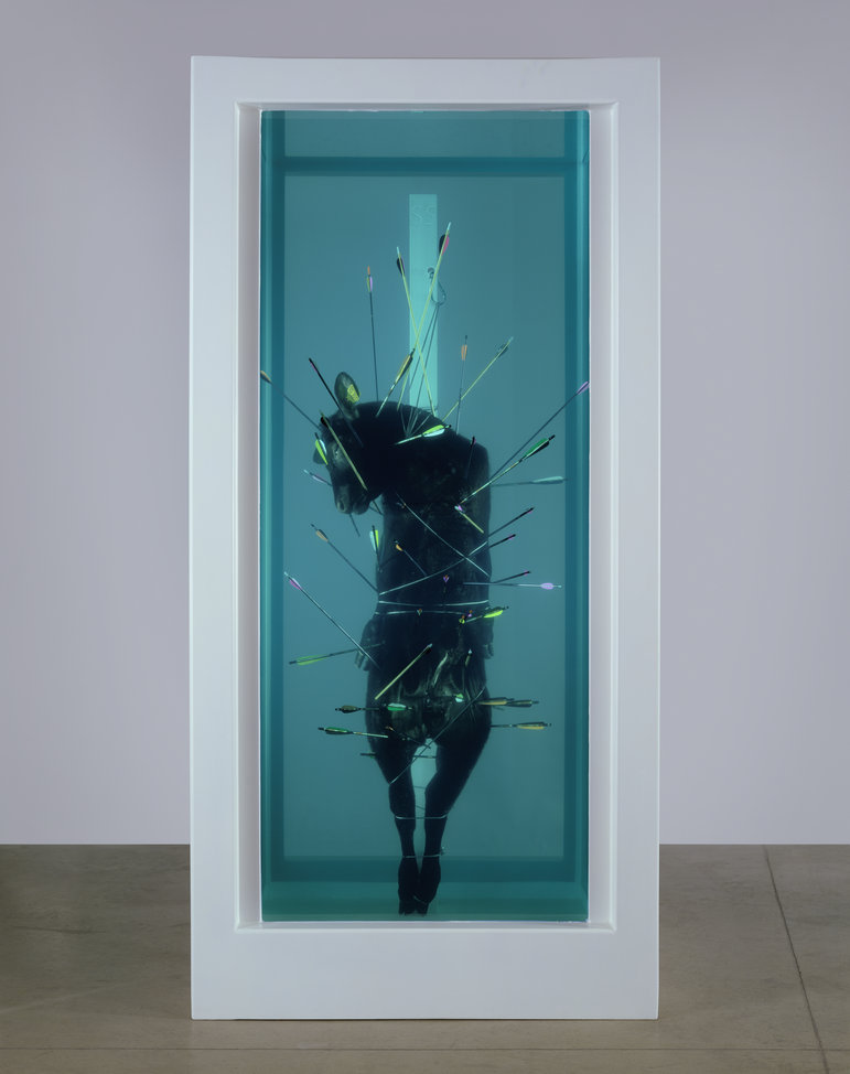
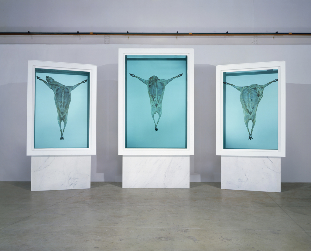
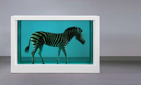
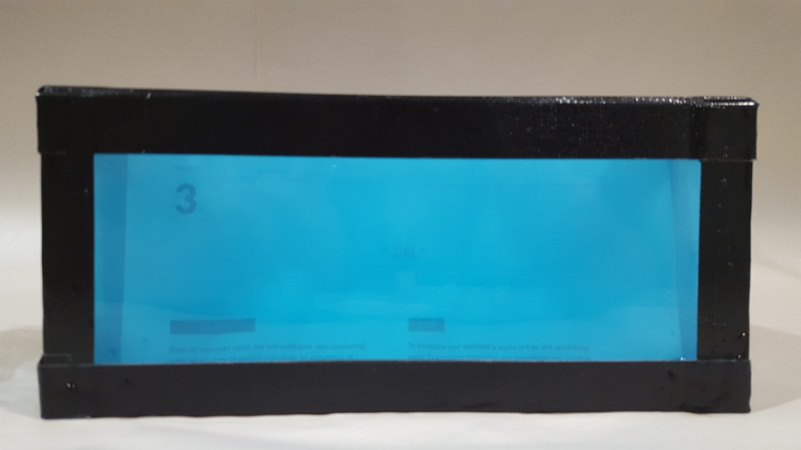
To sum it up Damien Hirst is one of the richest living artists in the world, and is most commonly known for placing dead animals in tanks (usually filled with a blue liquid called formaldehyde for preservation purposes) and giving them long pretentious names. Obviously there has been lots of controversy on whether Damien Hirst’s works can be considered art, especially since he didn’t actually ‘do’ anything to the objects/bodies. Personally I was very intrigued when first coming across one of his books in the library, but have gotten more suspicious after reading reviews about him. Honestly now I don’t quite know what to feel about his work, whether they’re actually great pieces of art or just the product of a rich man being pretentious, and that feeling is what I hope to convey with this zine.
And so this zine is like a handout/booklet trying to teach people how to be like Damien Hirst, but ends up failing.
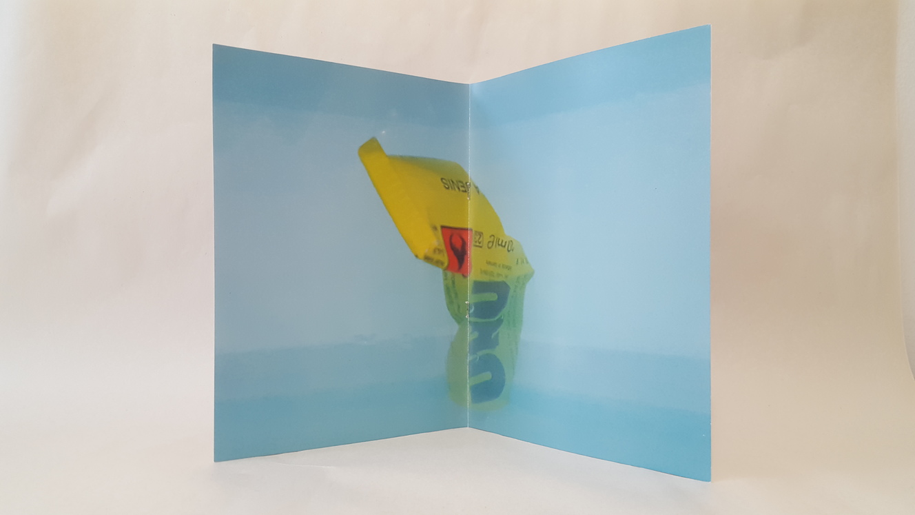
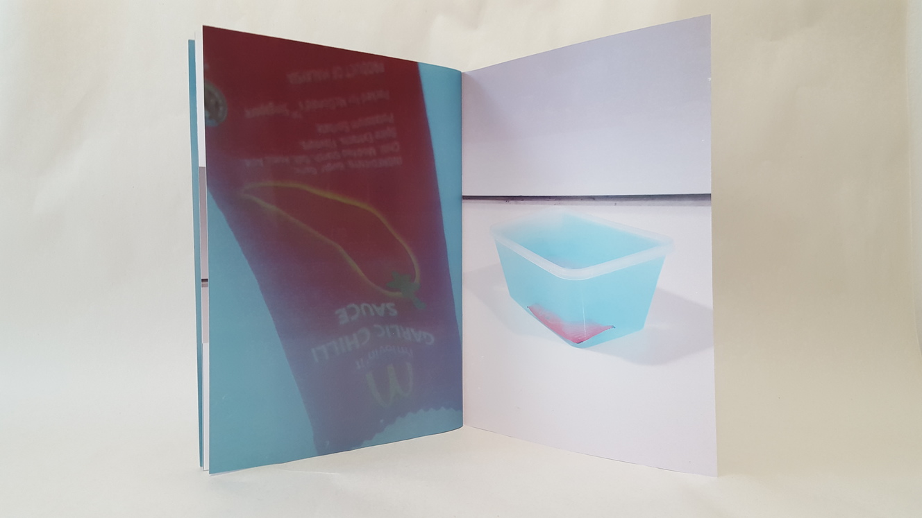
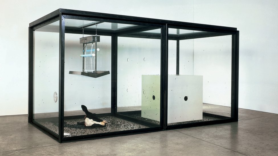
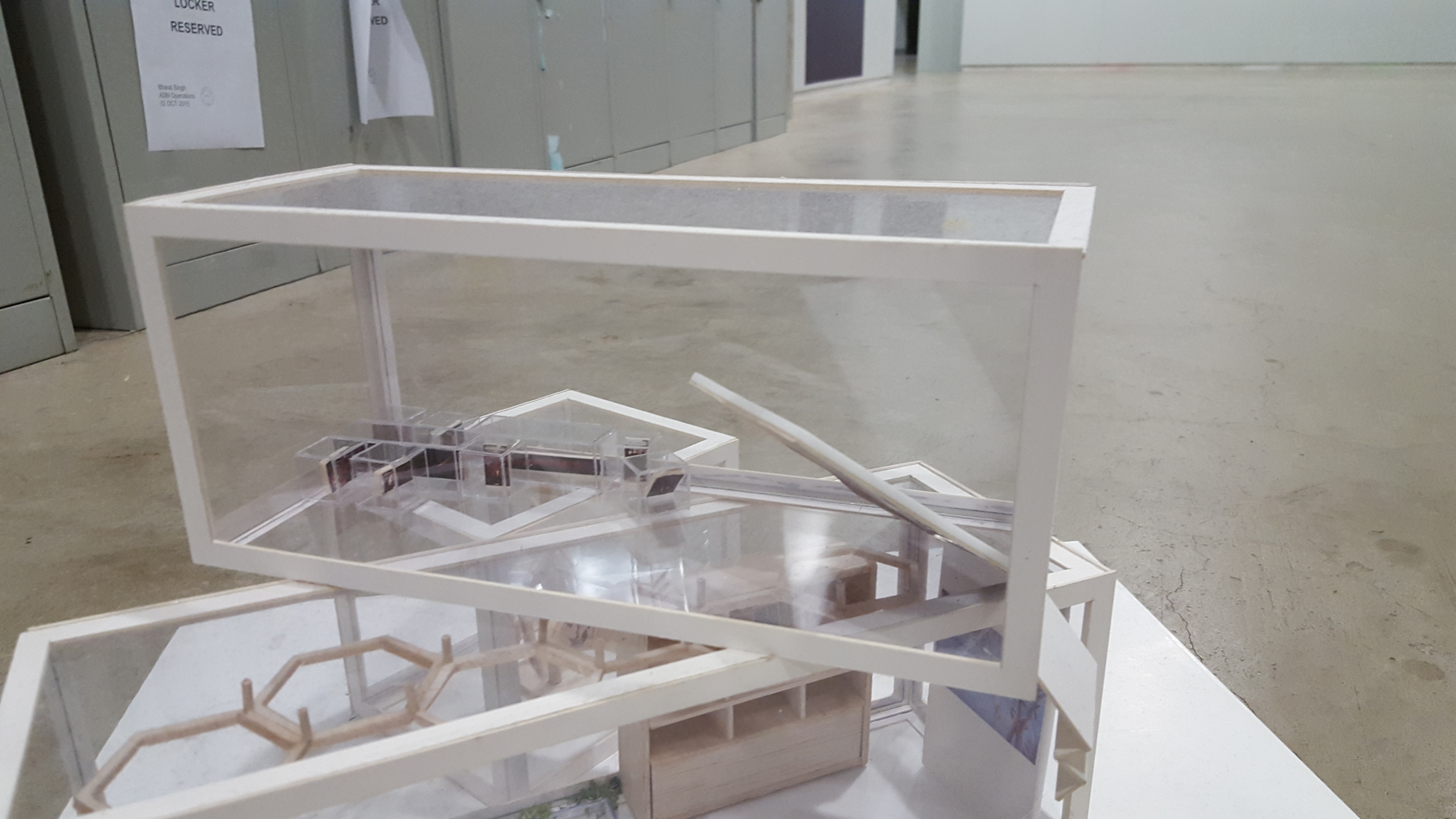
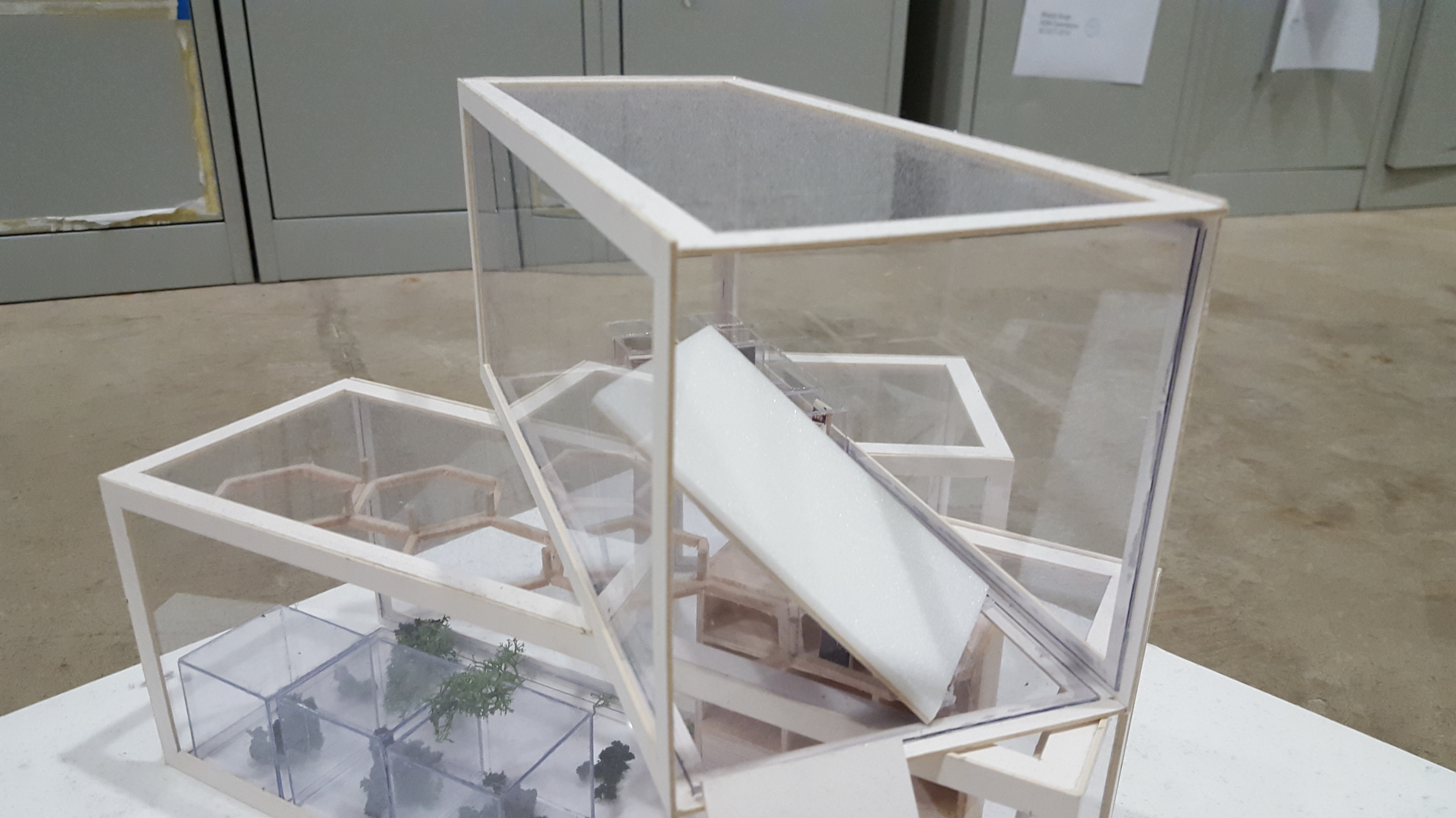
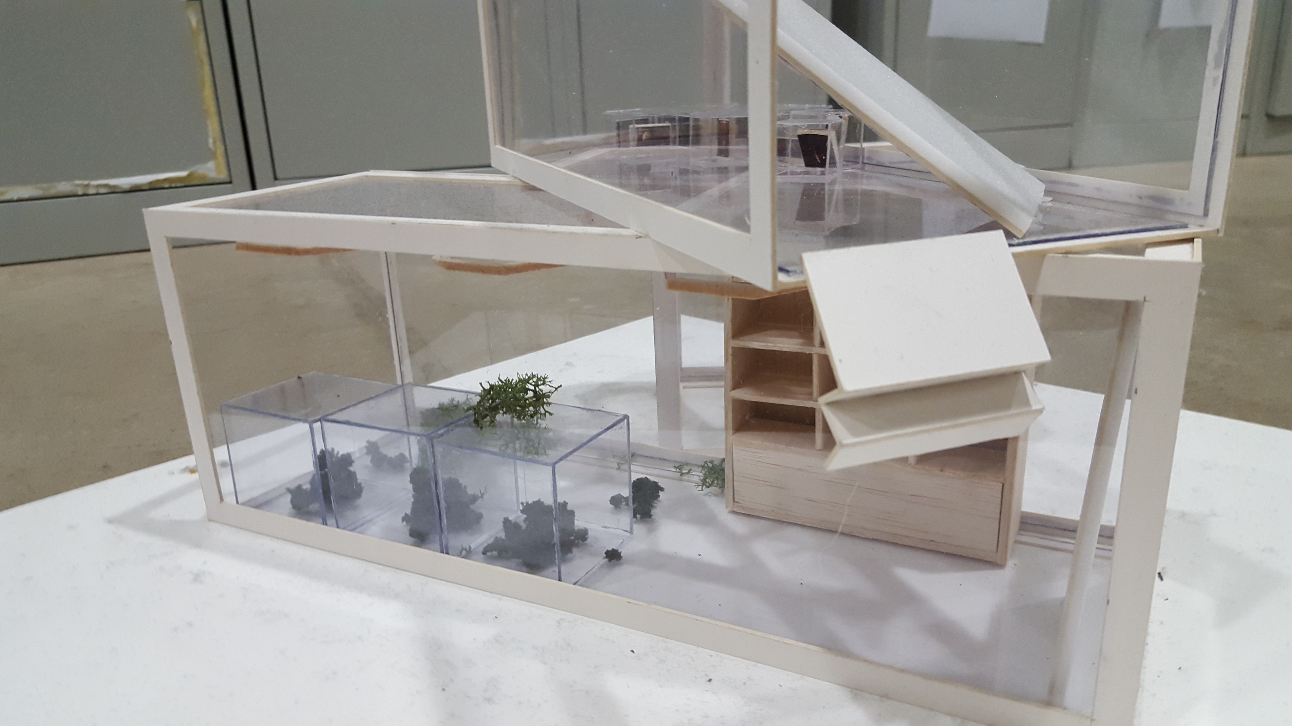
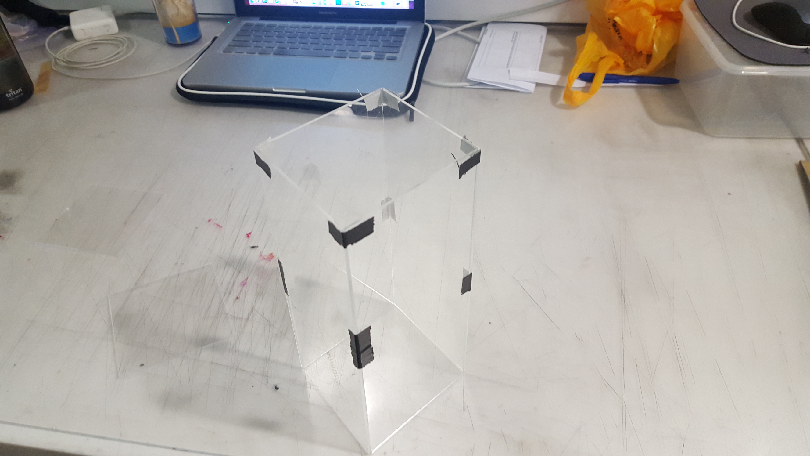
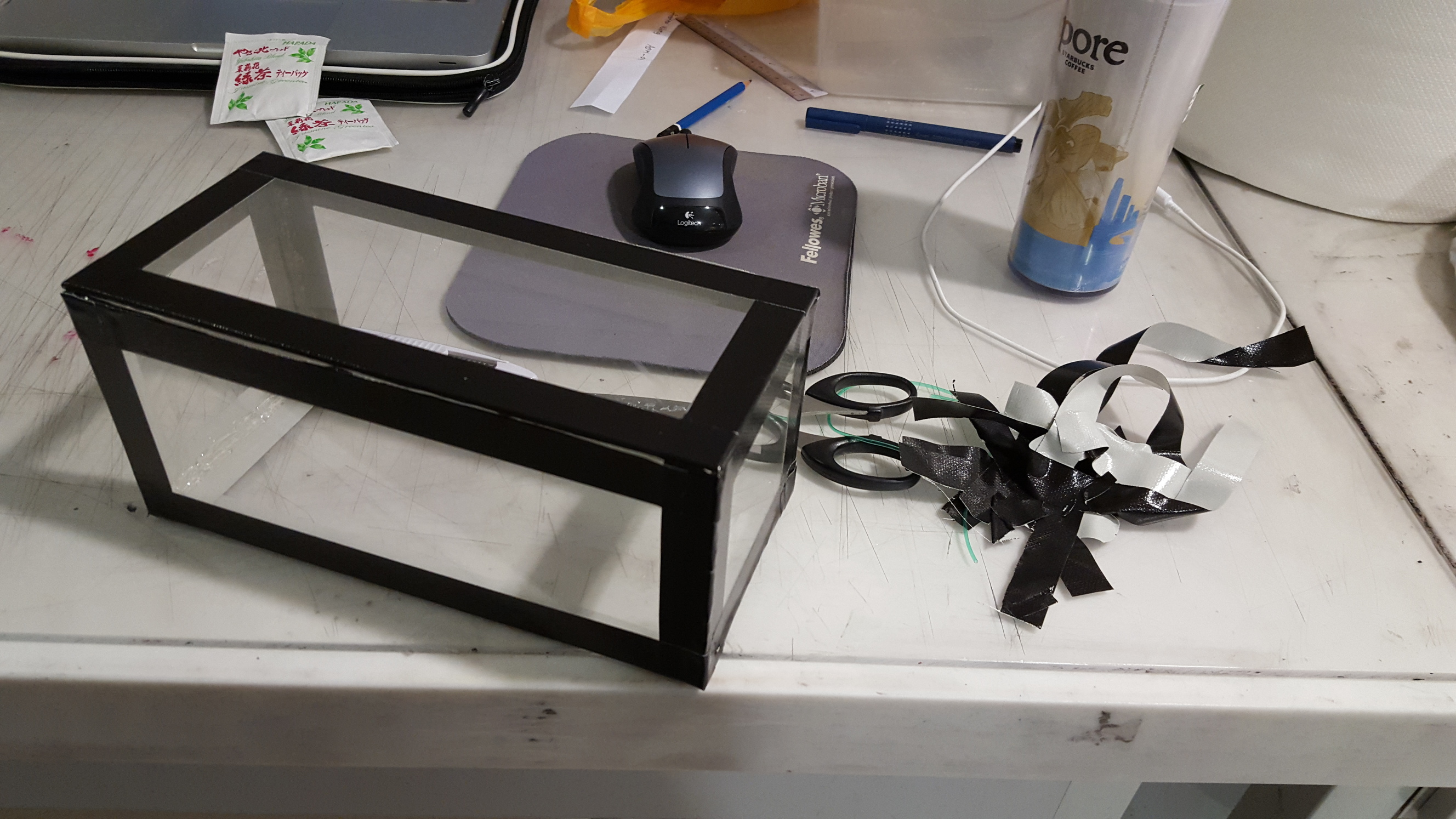
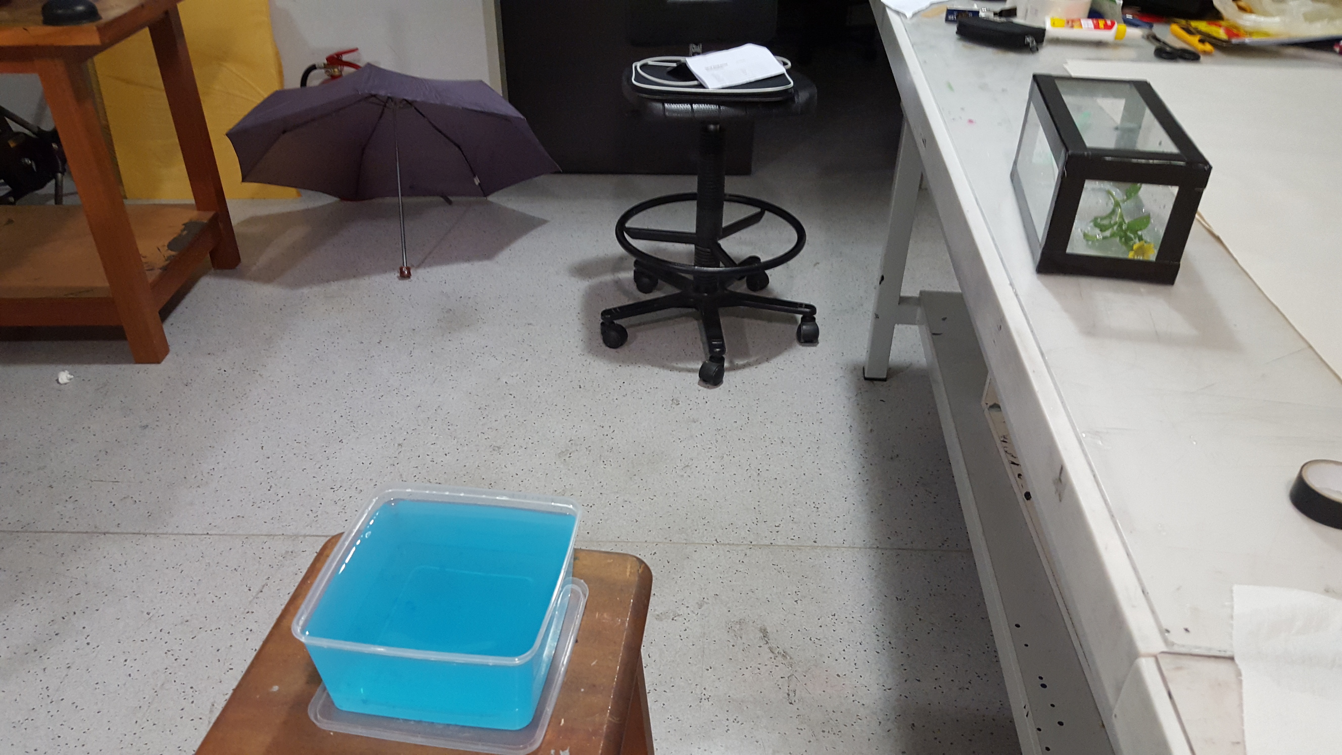
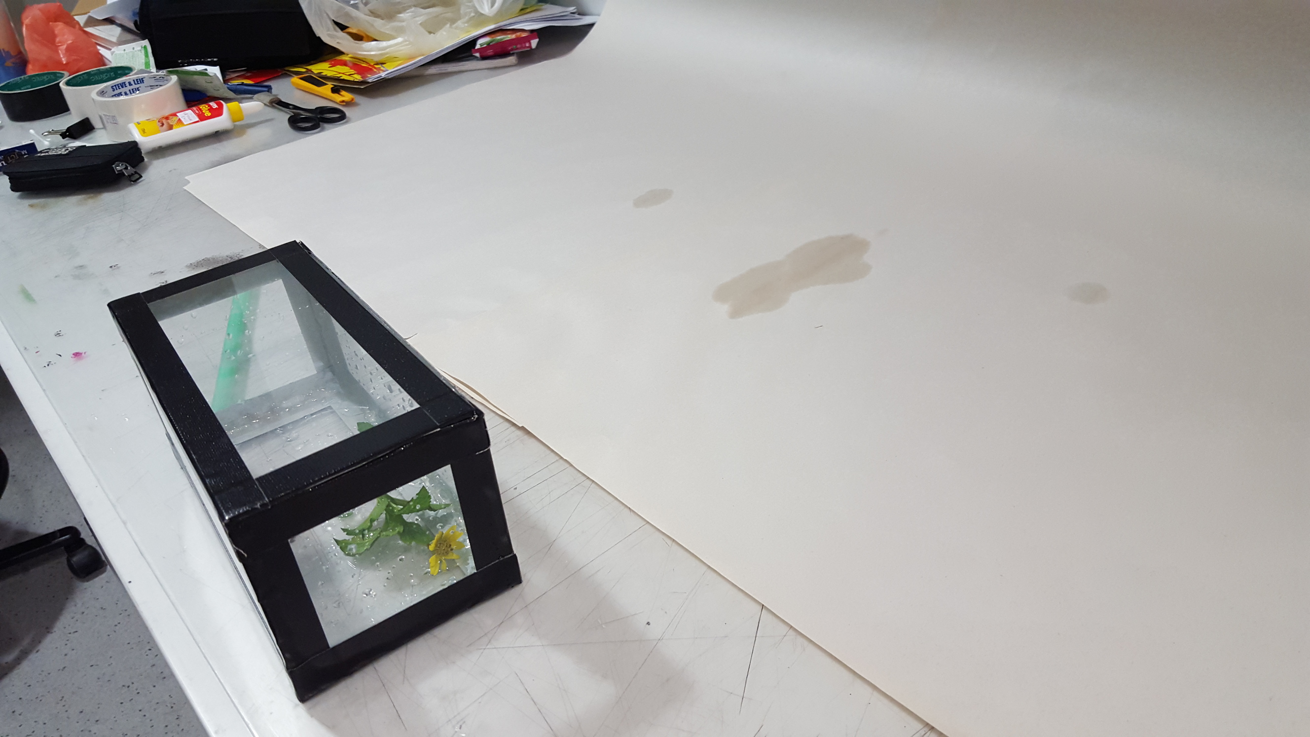
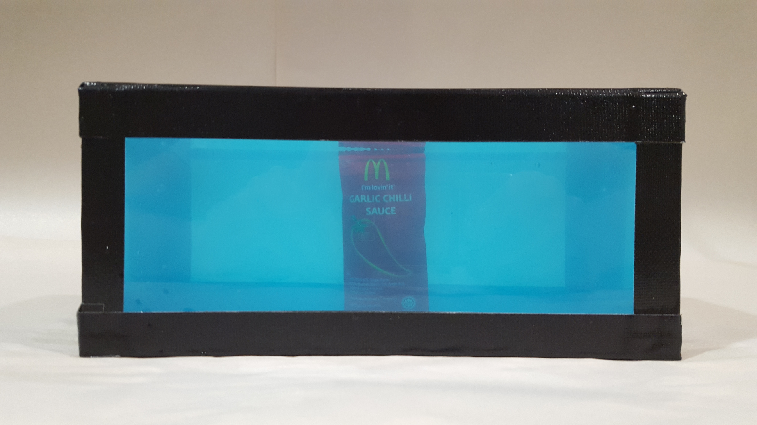
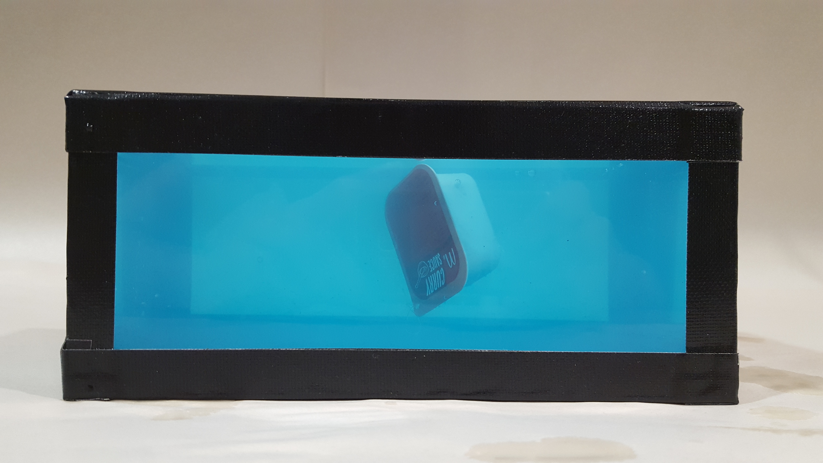
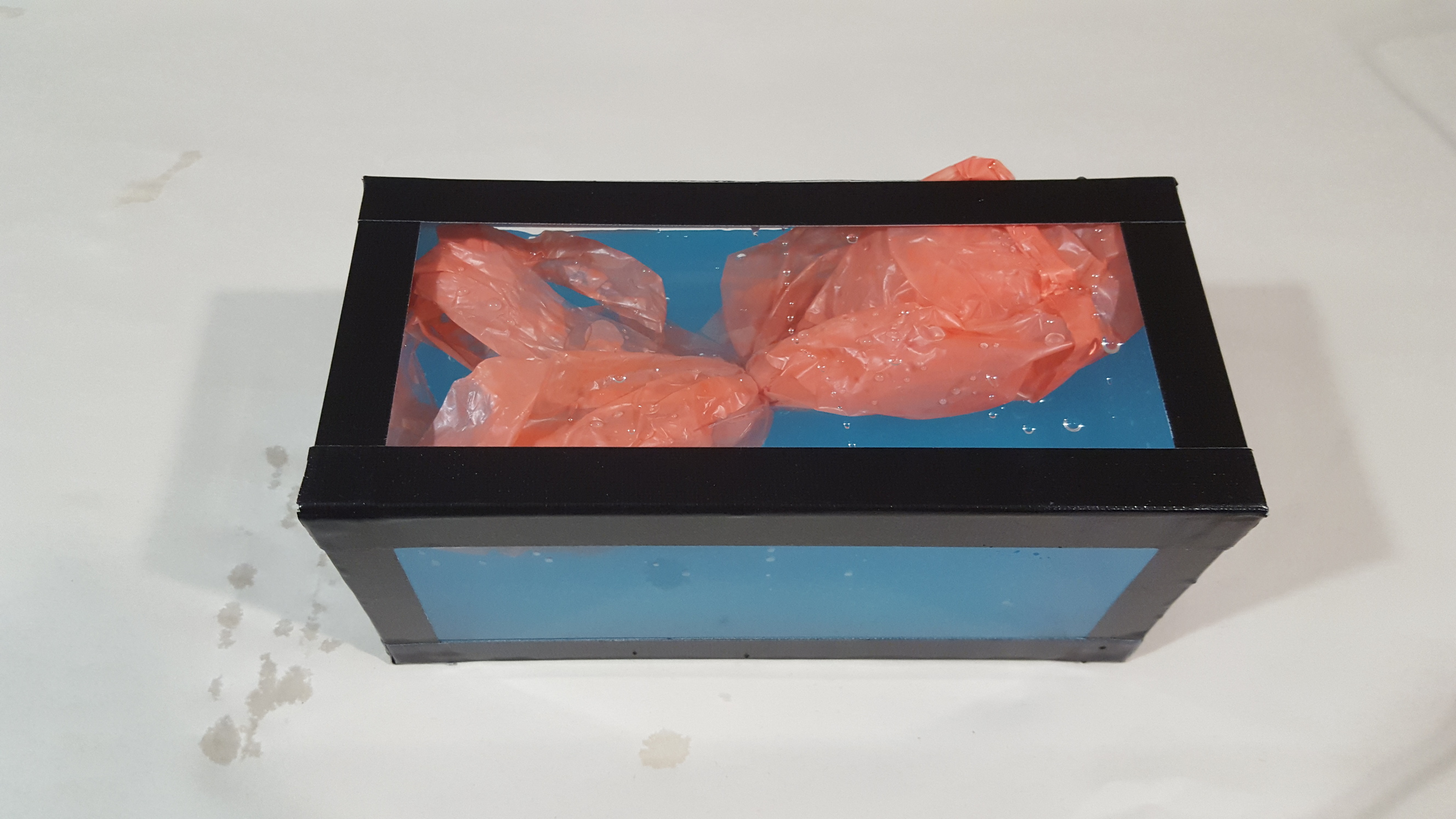
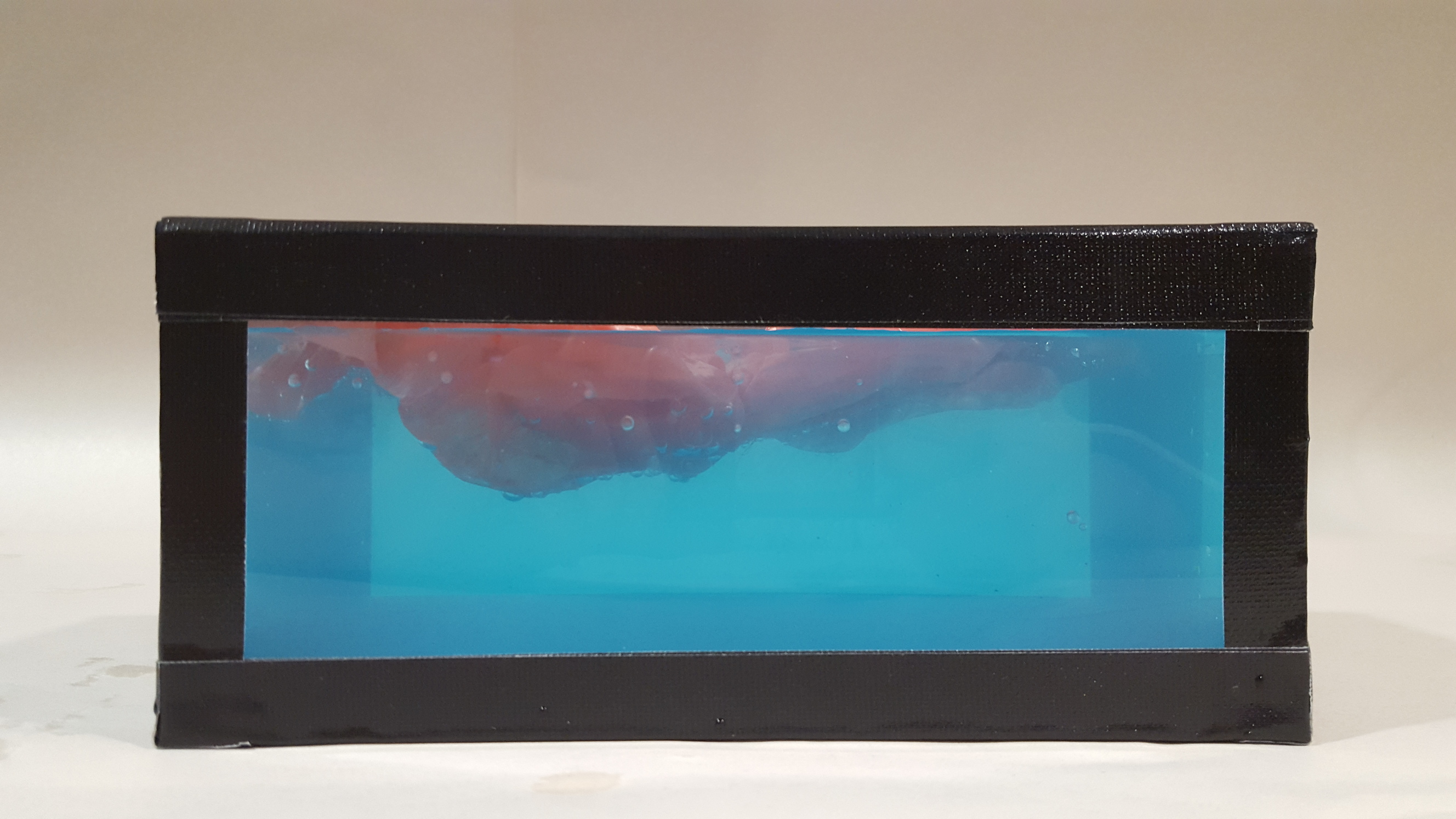
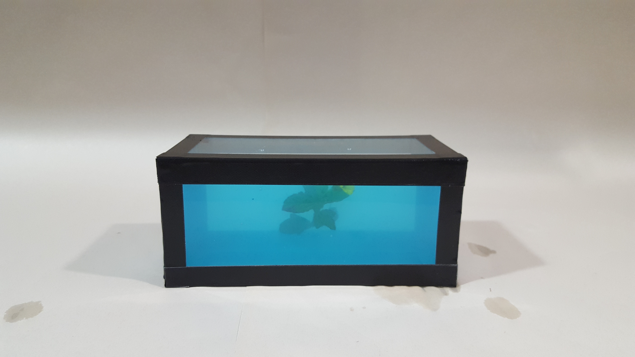
I initially thought of simply photoshopping weird things into pictures of Damien’s works but nah where’s the fun in that. So I decided to construct my very own Hirst box. The first 3 pictures are of some discarded box found on top of the b1 lockers and they served as a reference during the construction process.
Making the box
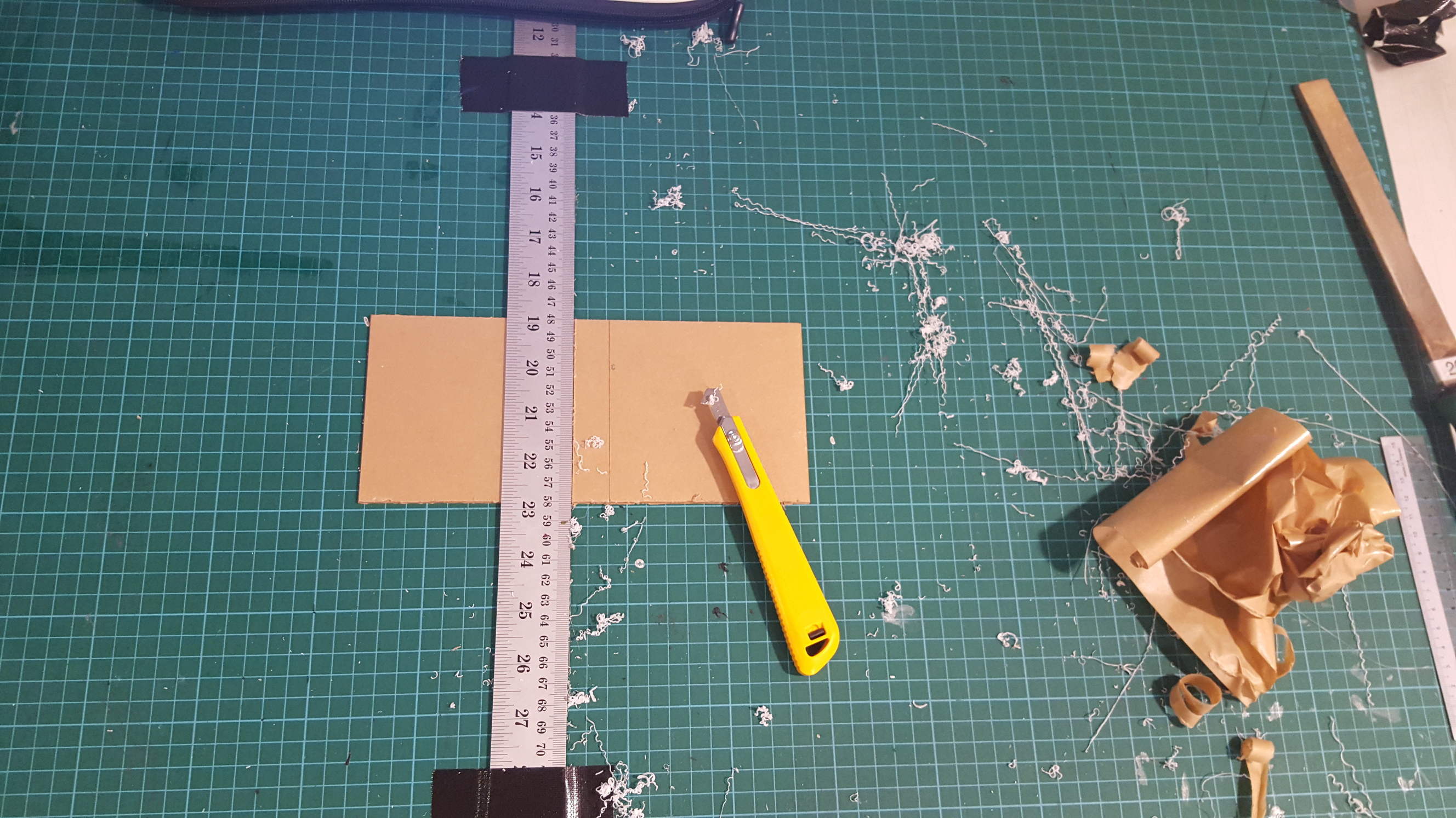
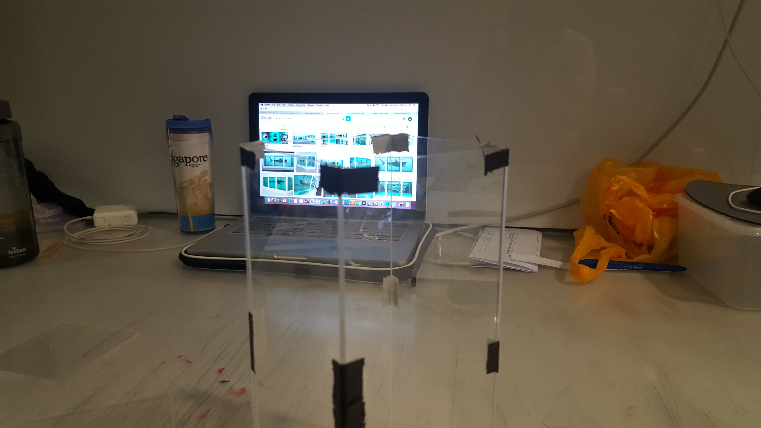
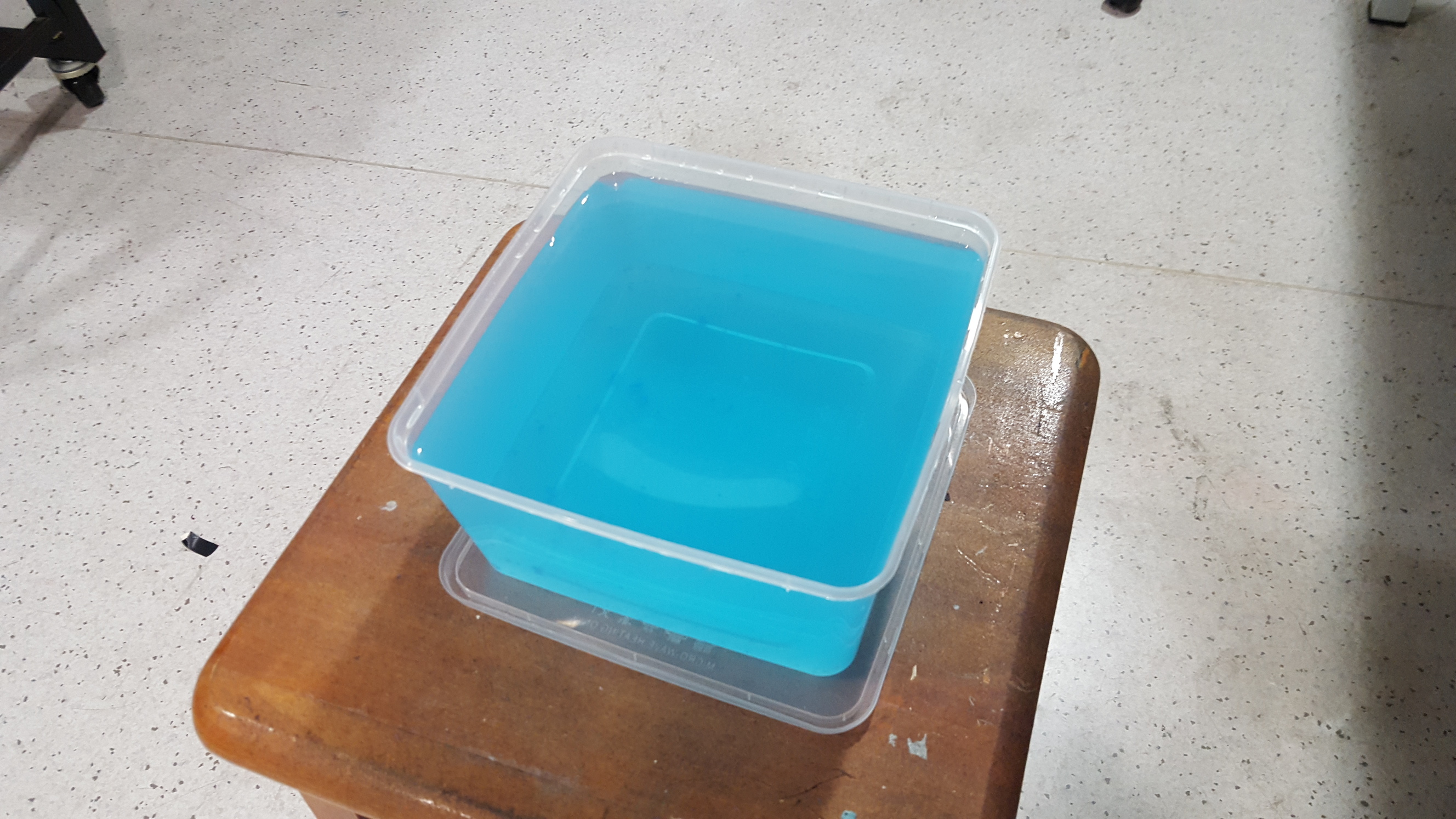
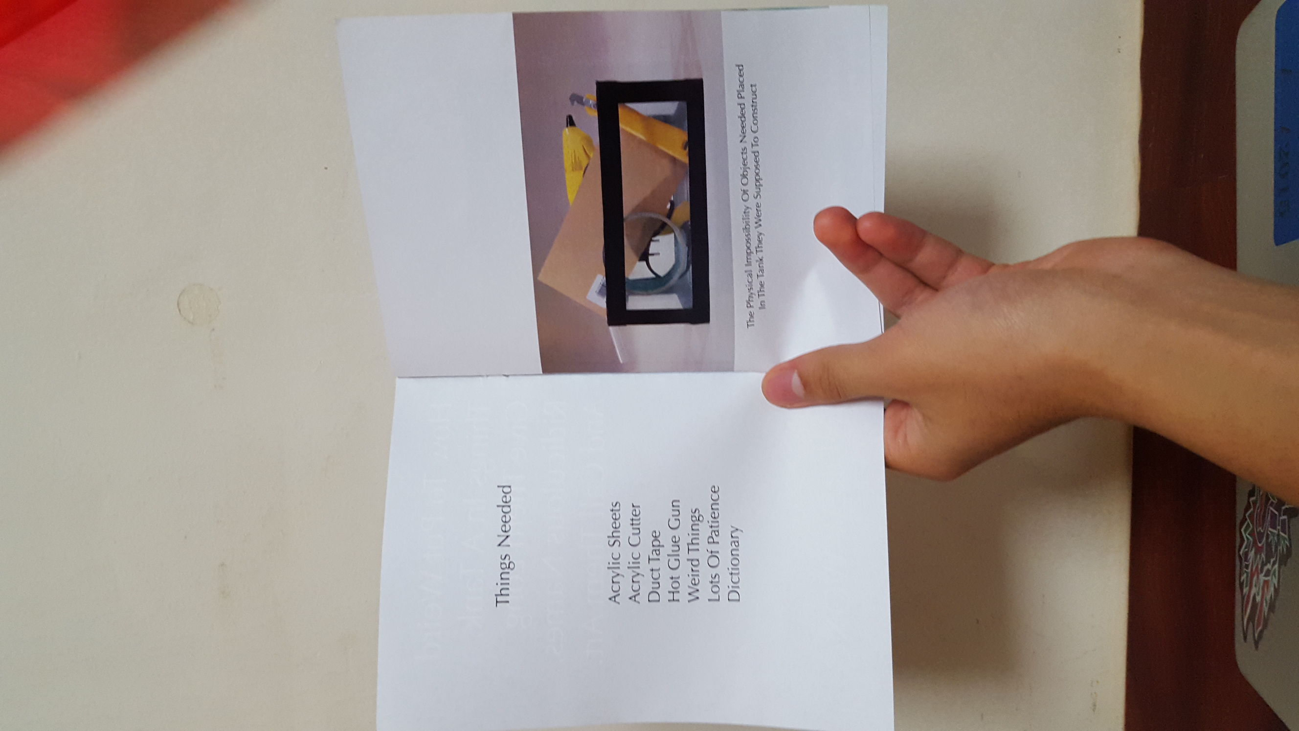
cutting (more like scraping) acrylic sheetslots of duct tape and hot gluefirst layer of duct tape, was deciding between using white or black tape, but in the end the white tape I had was too wide
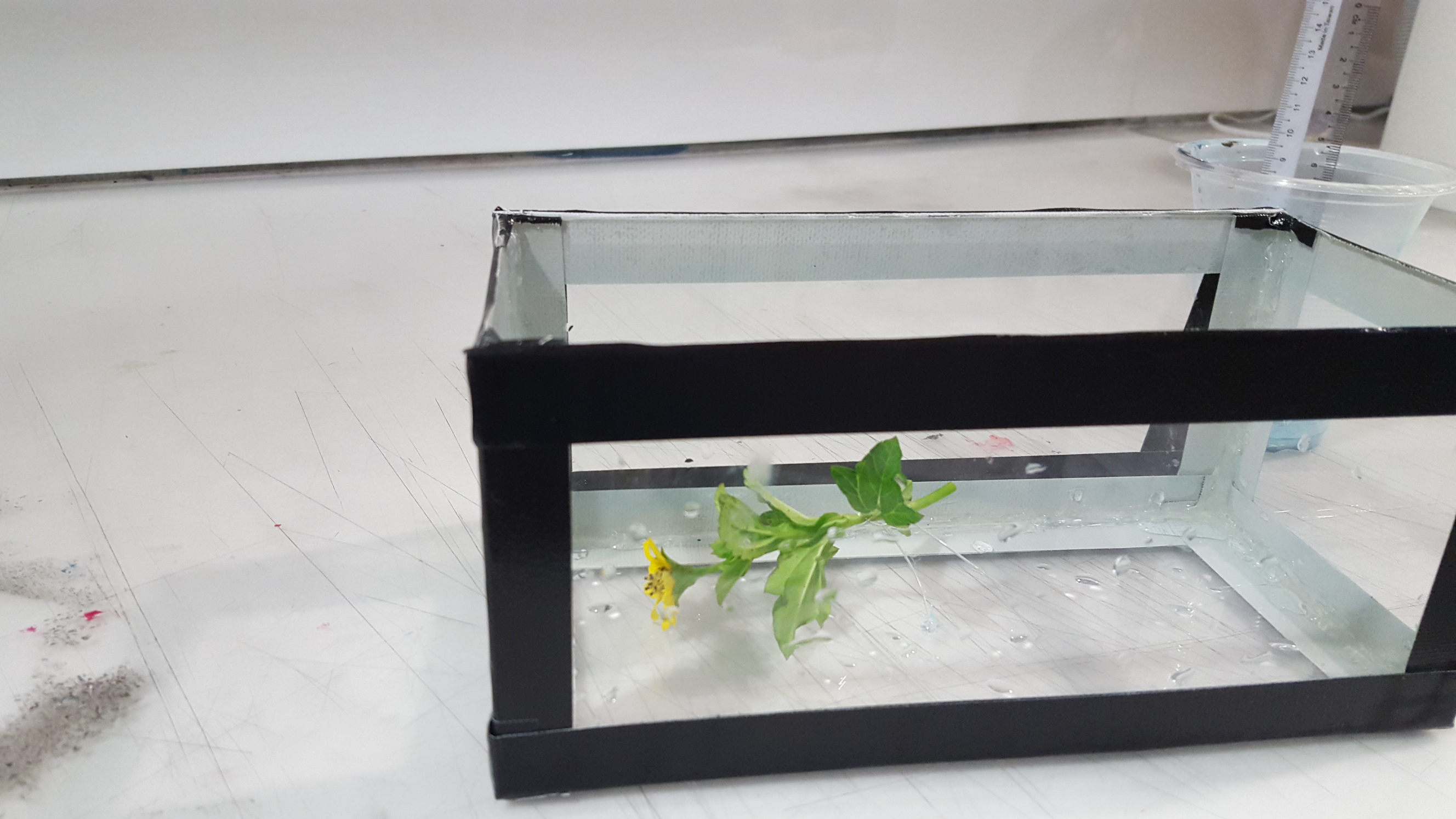
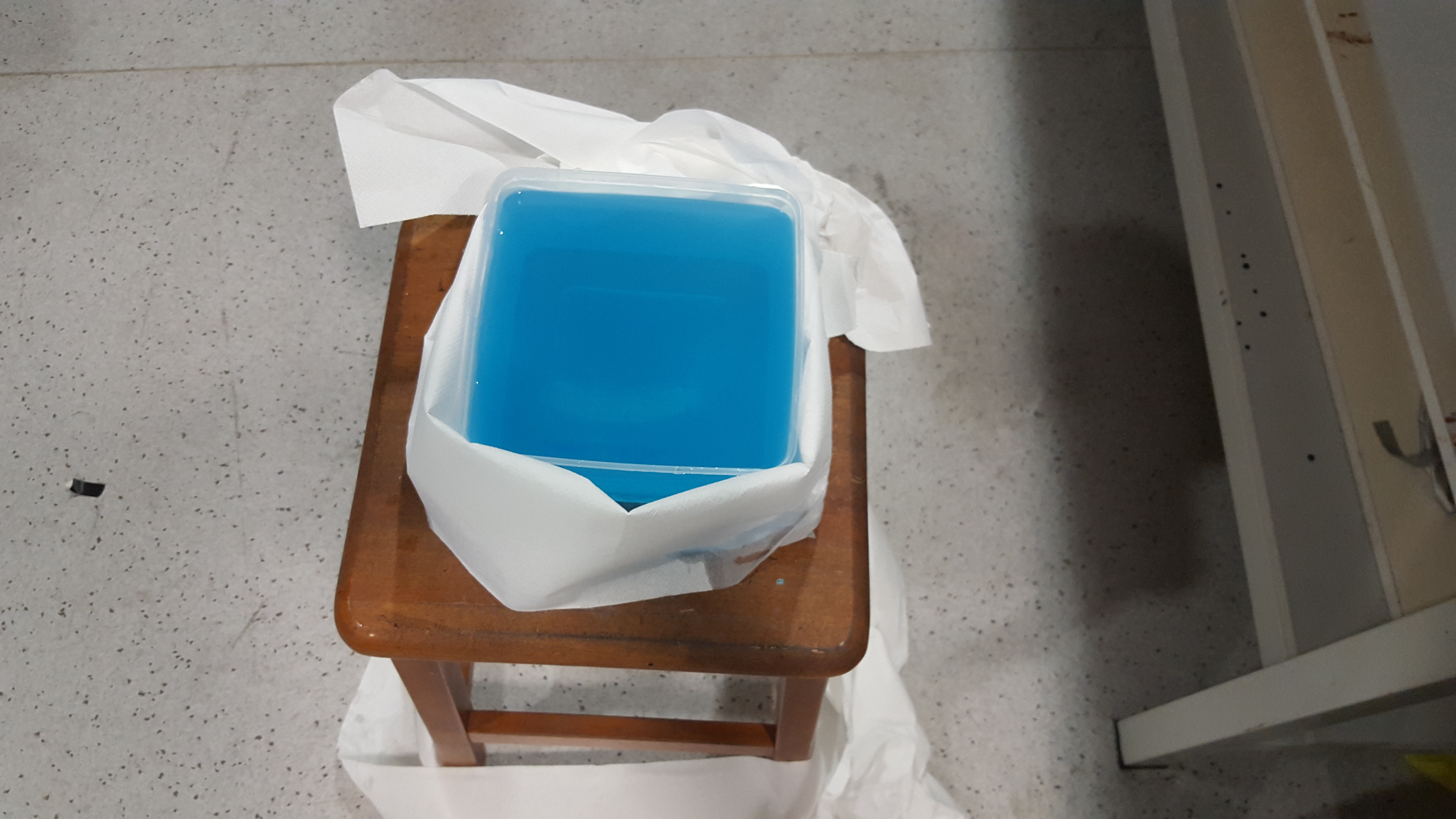
random flower plucked from b1, first trialmy reservoir of blue watercolour water
using newsprint sheets as a backdropthe paper towels didn’t really help tbh
More trials
the project 3 brief lolgarlic chilli packetcurry saucedo you ever feel like a plastic bagdrifting through the wind, wanting to start againrandom flower from b1
Initial draft
Feedback: longer/more pretentious titles, edit lighting in pictures to that of one taken in a real museum, short description on who Damien Hirst is and why he is famous, include price tag of works/materials needed, increase size of name in front cover, use glossier paper, include fake gallery contact information, wrap zine with ribbon etc to make it more formal, fake artist description, increase the satire, be mindful of font size hierarchy
So yeah and we arrive to my final zine. Don’t think it needs much elaboration/description as I think it is simple enough to be understood on its own. Here are some reference pictures of actual Damien Hirst books.
To be honest I was quite excited for this project as I felt it had lots of room for appropriation, which is something I quite enjoy doing and have done in previous projects. (https://oss.adm.ntu.edu.sg/awong011/2016/03/22/research-paper-on-chinese-paintings-lol-jk-project-2-final-post/) I feel that appropriation, if done well, can better express information about an object/person by letting viewers see it in a totally different light.
When our group first met up in class to discuss possible objects I had lots of fun coming up with ways to appropriate various objects/artworks we came across this semester. I had ideas like making a statue of a Buddha where one hand was raised in the ‘do not fear’ mudra while scrolling on a smartphone in the other, painting weird images on chinese ceramics and a lot more that were pretty wild. But after awhile I realised that I had difficulty forming a thesis statement with these wild ideas, which was a problem I faced in semester 1 where I would have grand concepts that lacked a coherent message.
After consulting with the stand-in teacher (I forgot her name I’m sorry) and Sujatha I got a better idea on how to form a relevant thesis statement for our object, rather than just flipping things on its head for fun.
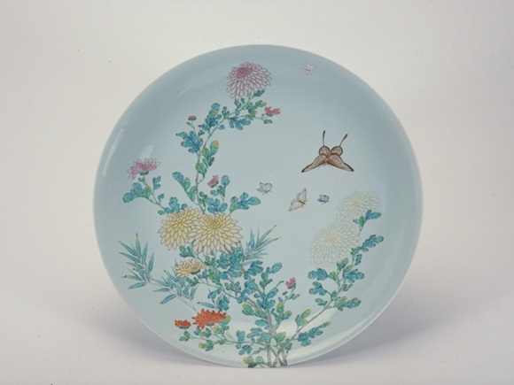
Another thing I learned from this process was that too many options limited creativity, which was evident when my team and I had lots of ideas but couldn’t quite settle on a object to focus on. In the end we chose a plate we saw at the Asian Civilisations museum and from there began the process of visual analysis/research/idea generation/consults to arrive at our final product.
In the end, I really enjoyed this process of working with my 3 other teammates (Chenyue, Fern and Ziyu) and is definitely more enjoyable than studying for a paper like we did last semester. See everyone around school next year! Cheers!
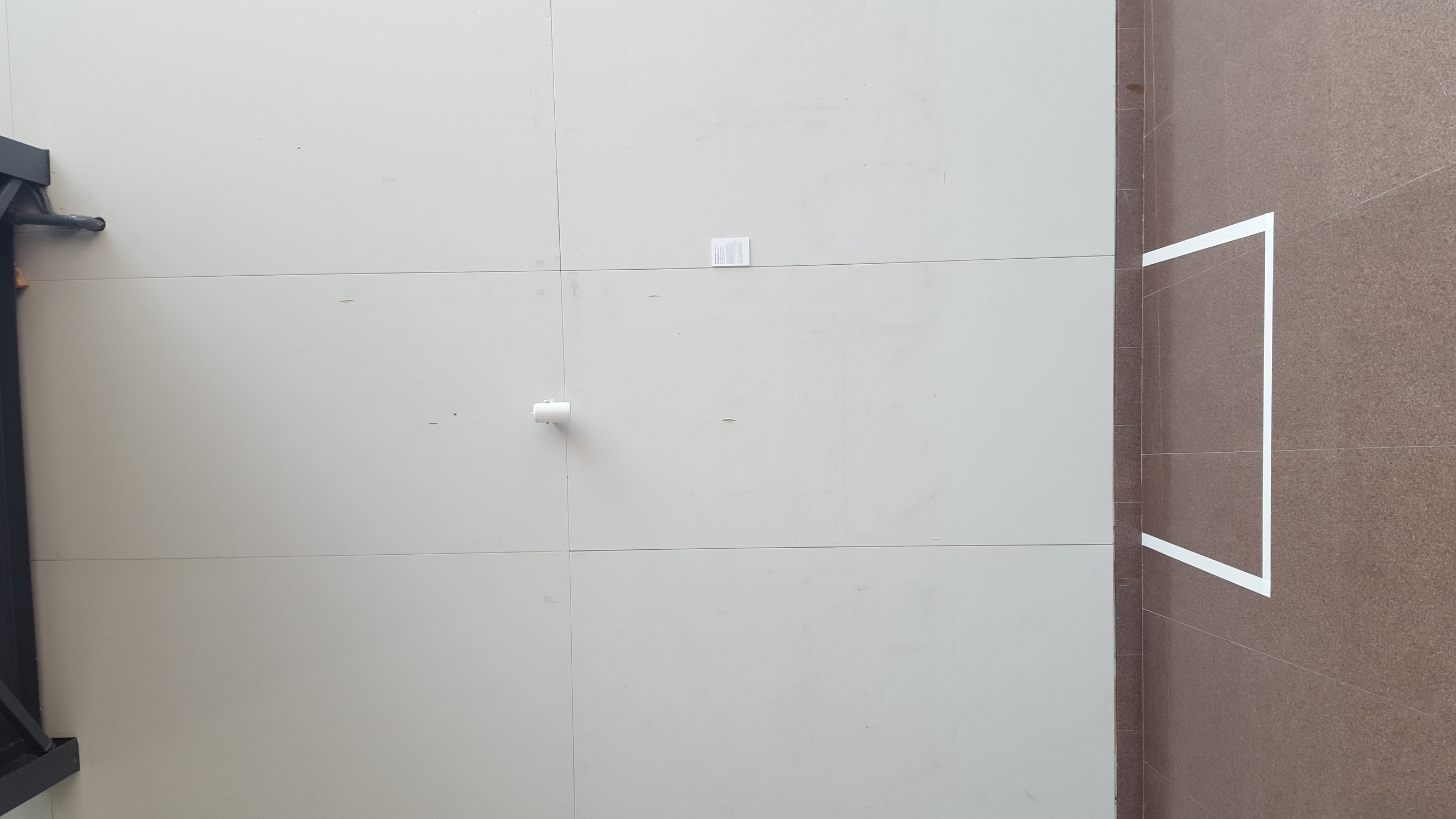
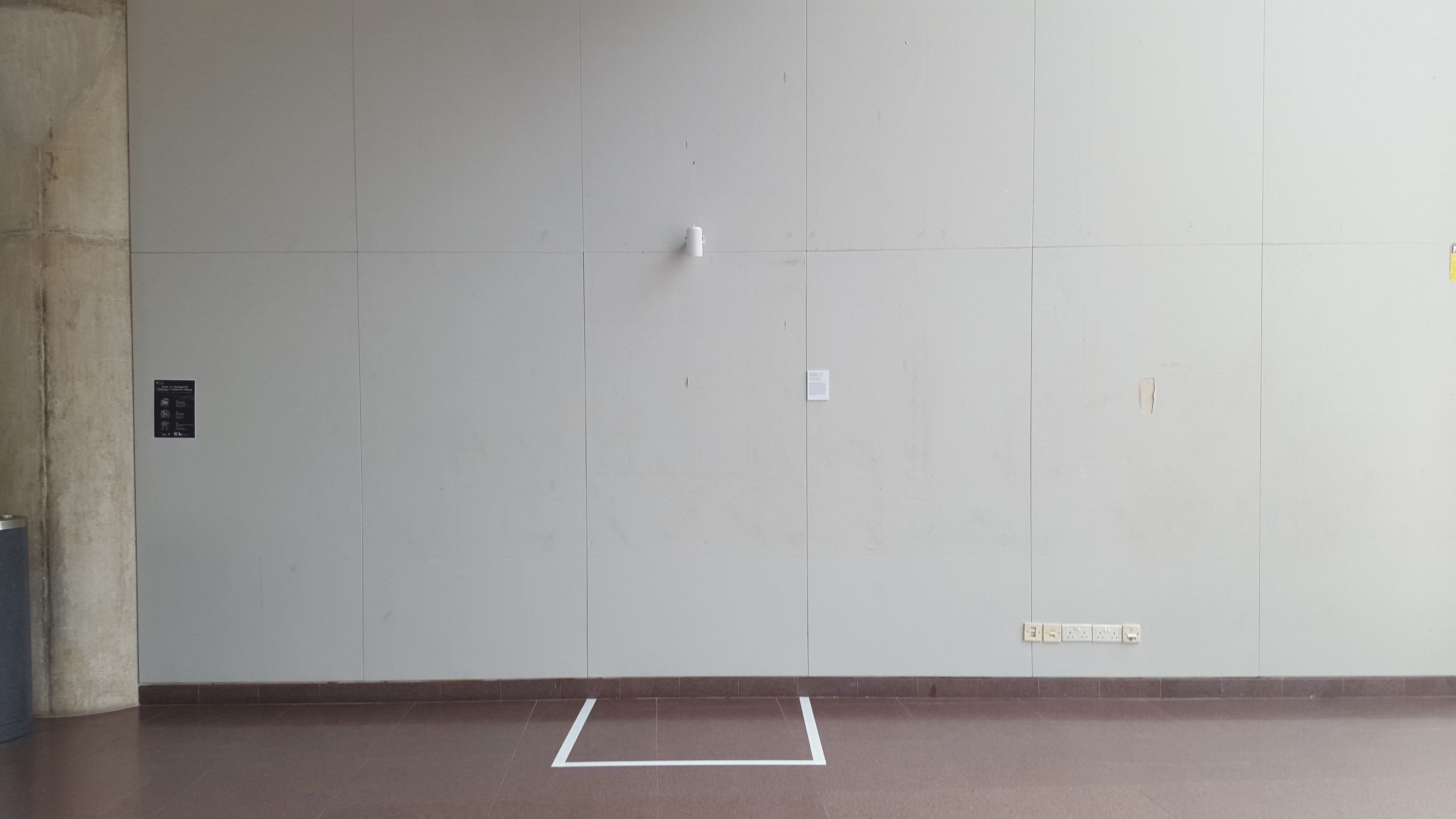
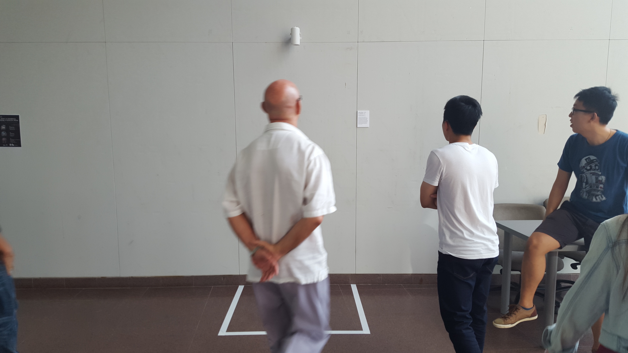
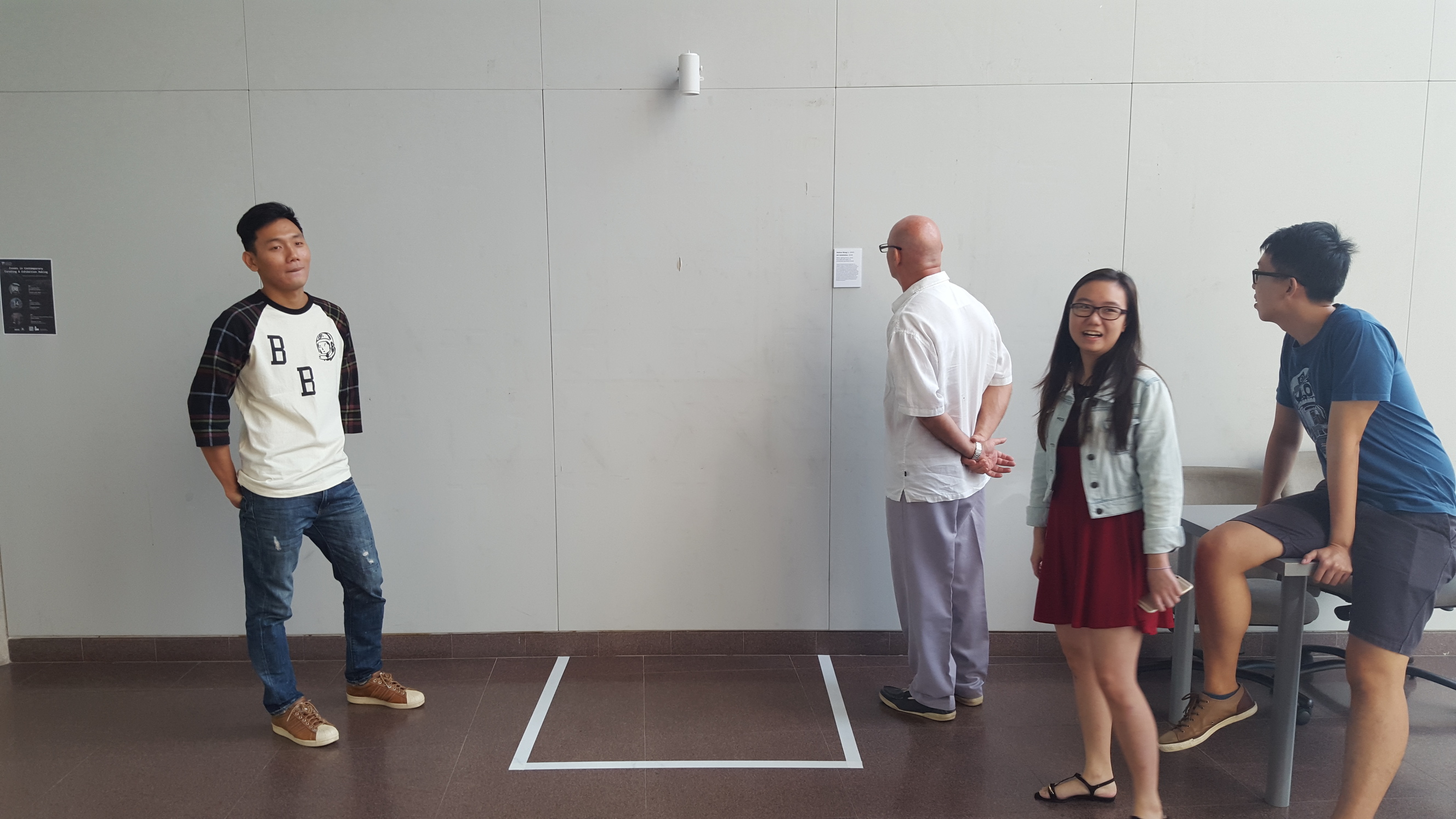
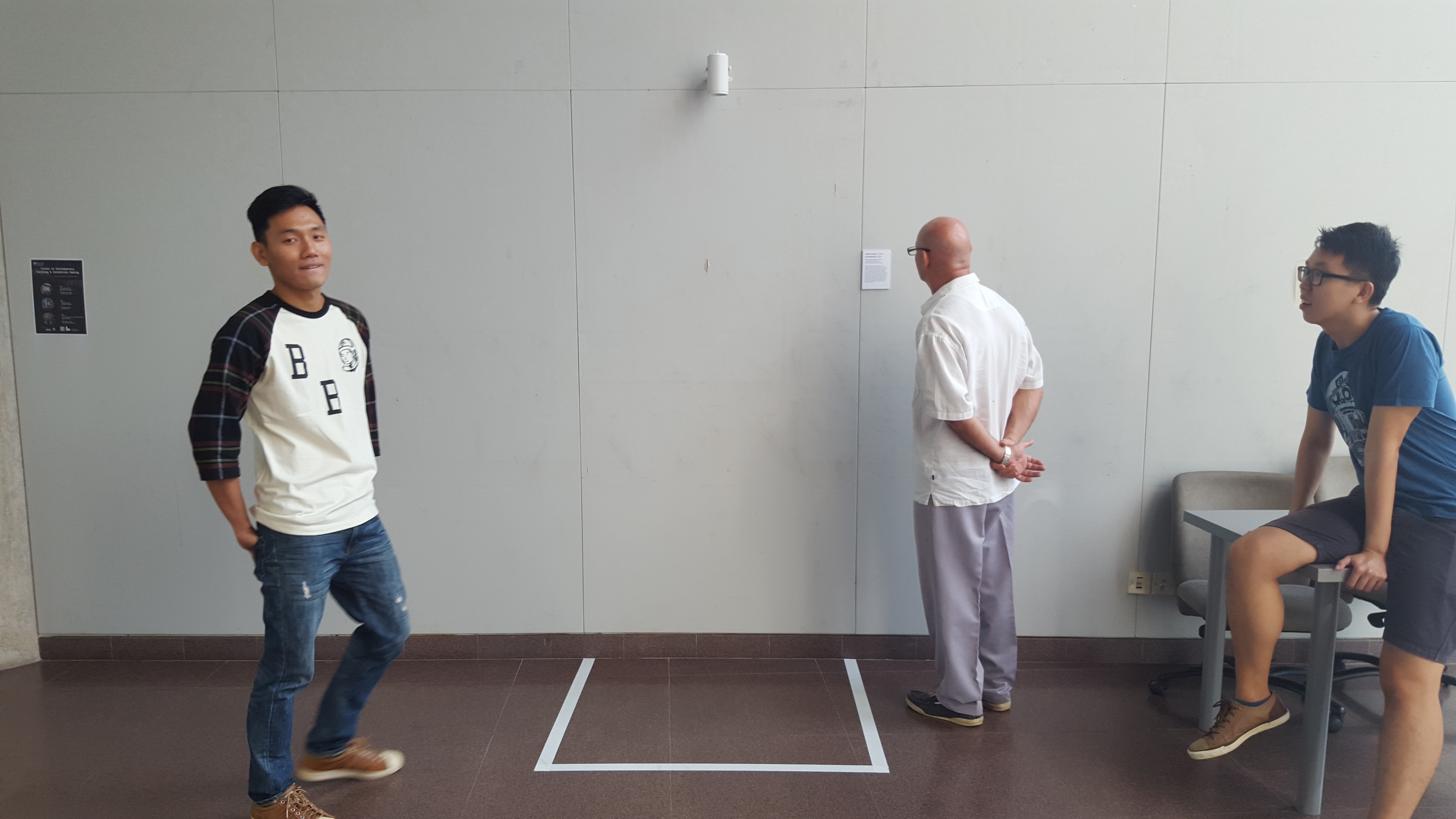
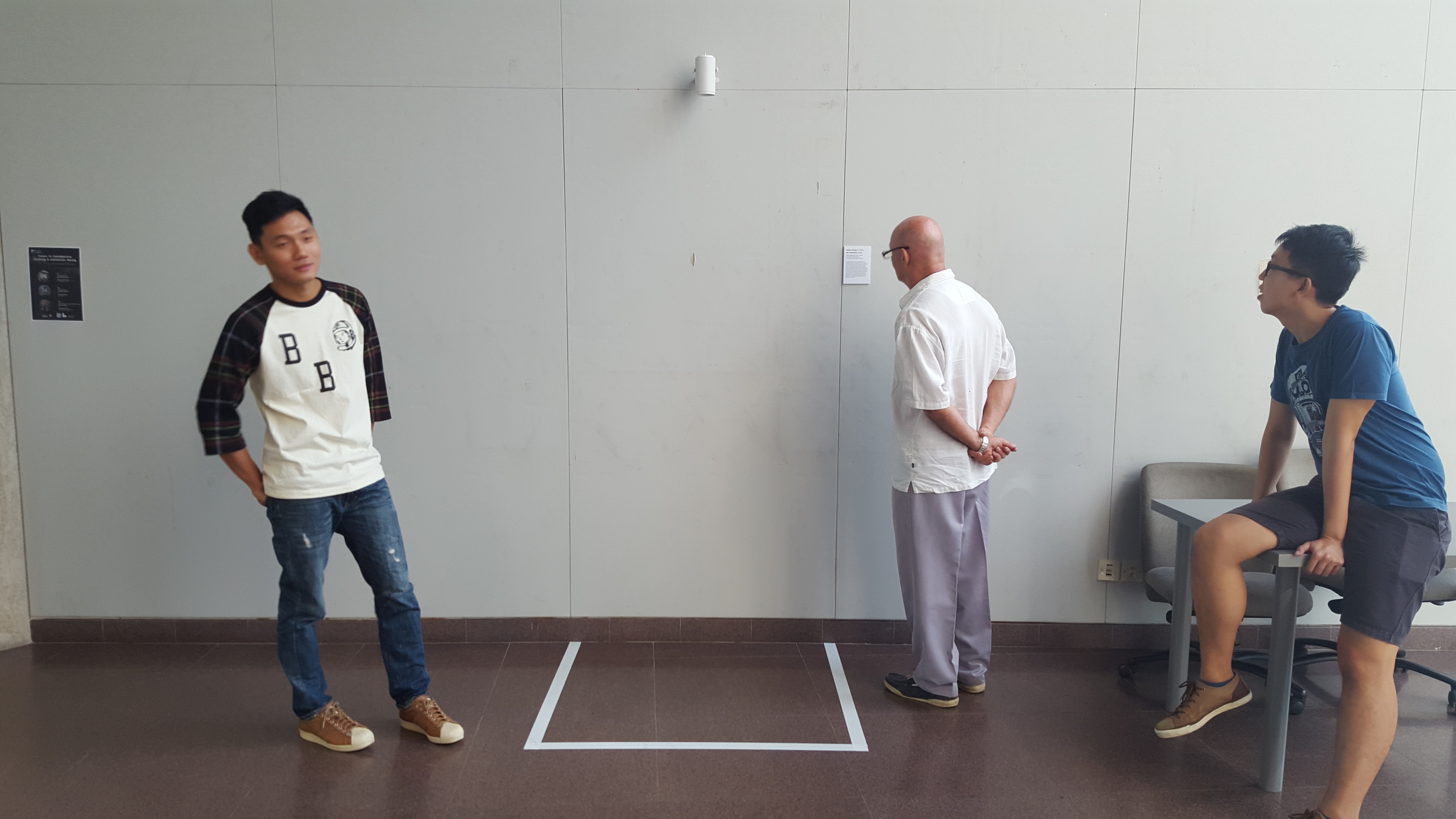
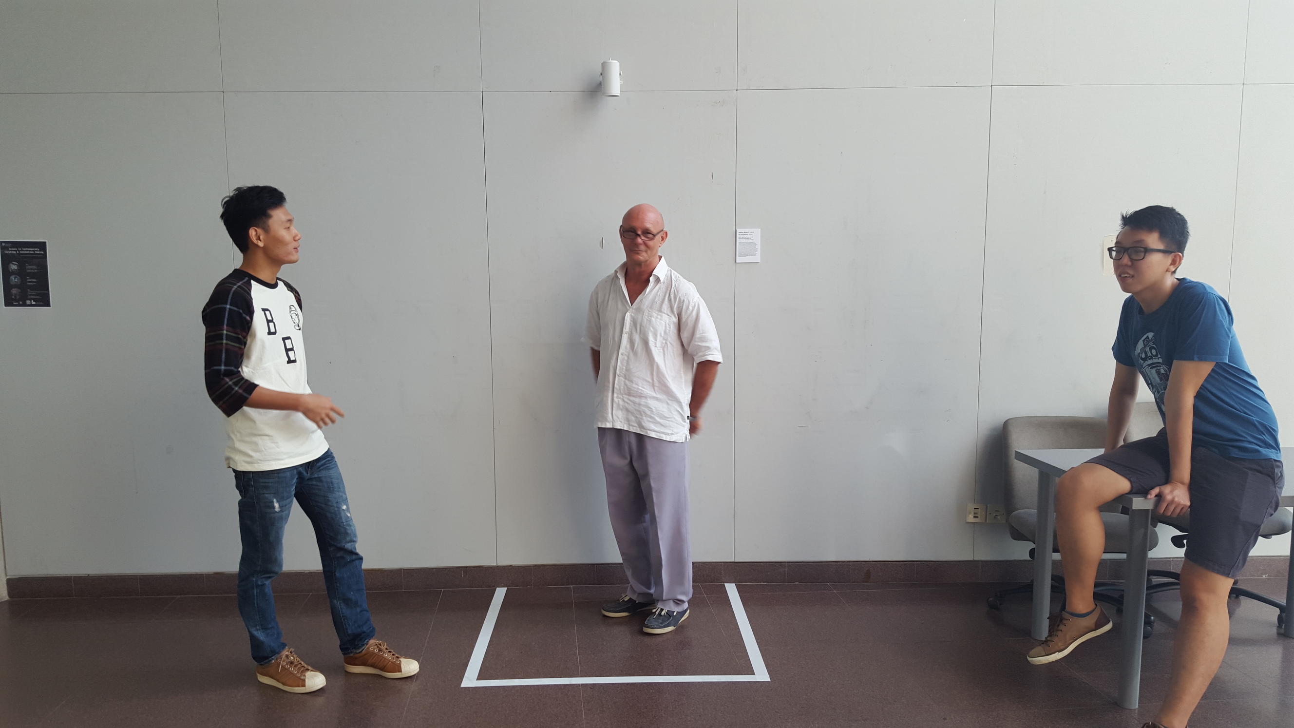
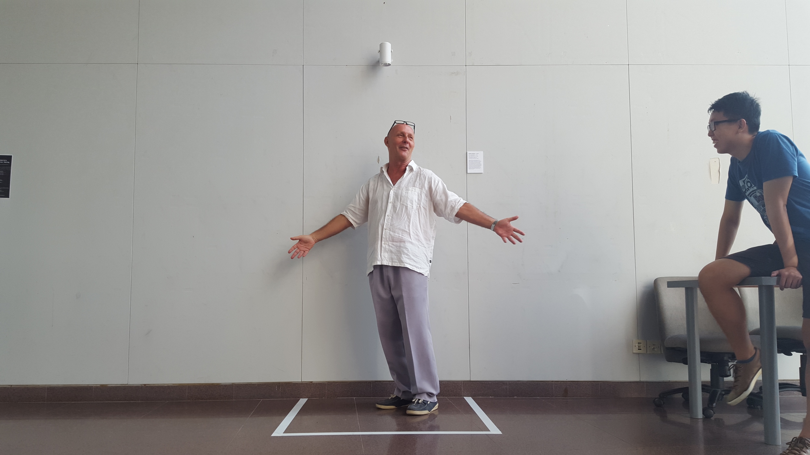
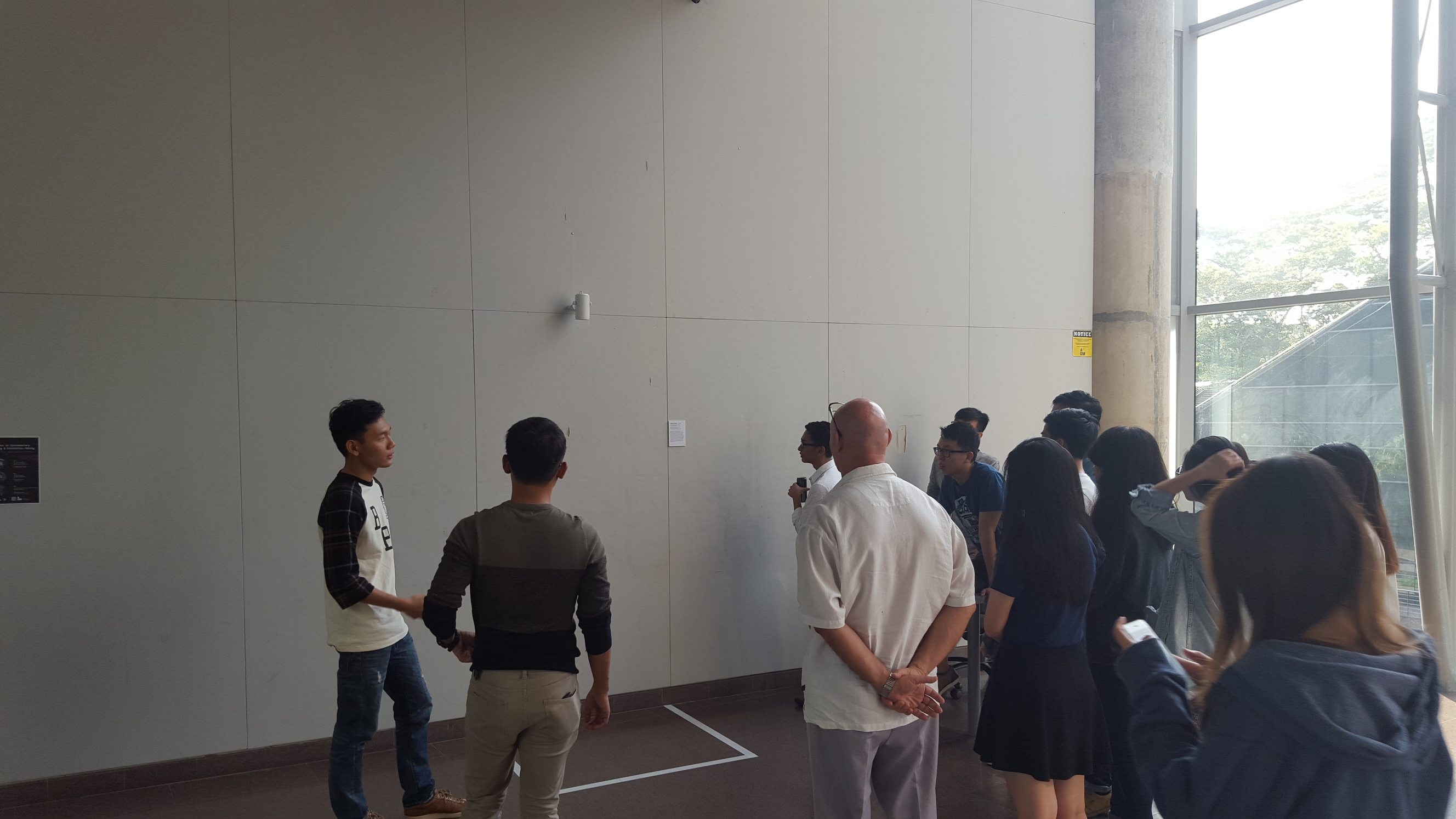
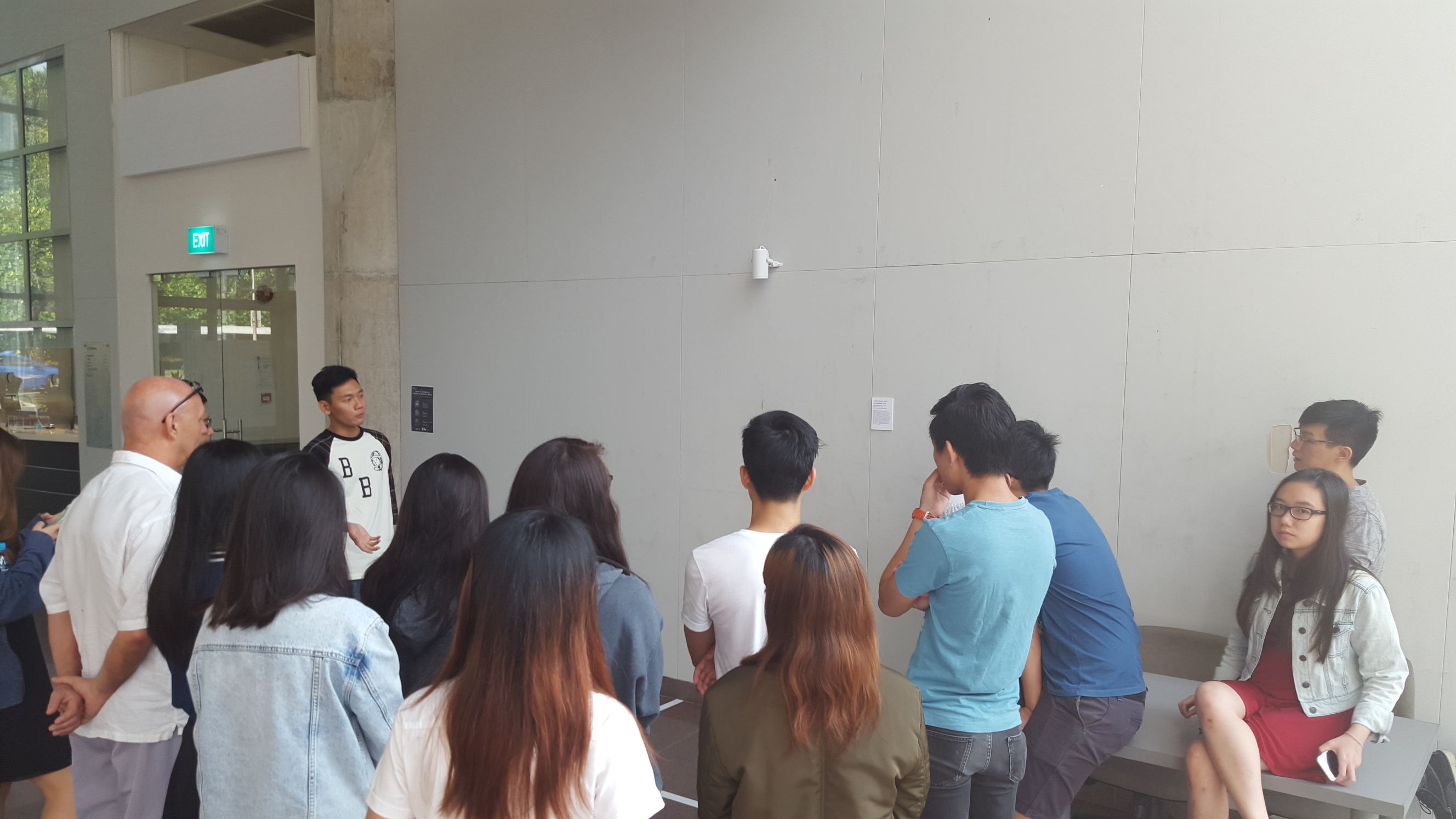
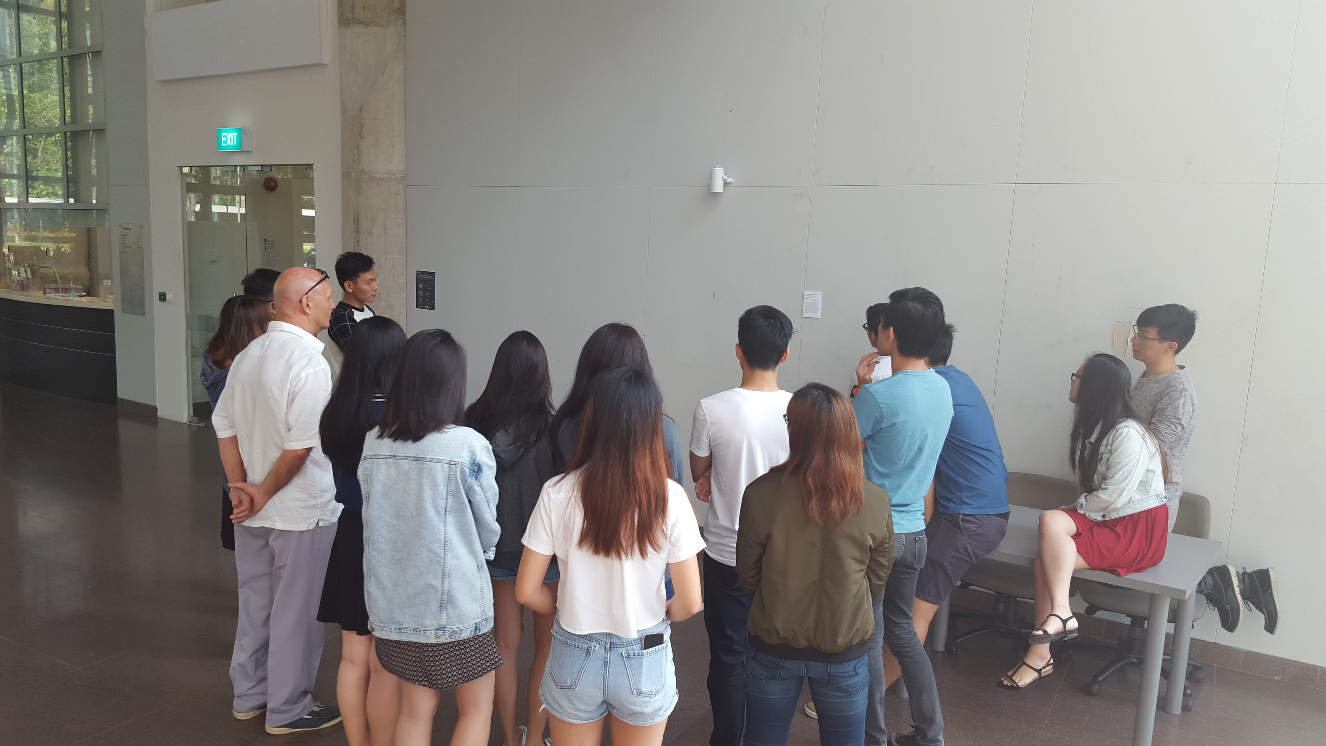
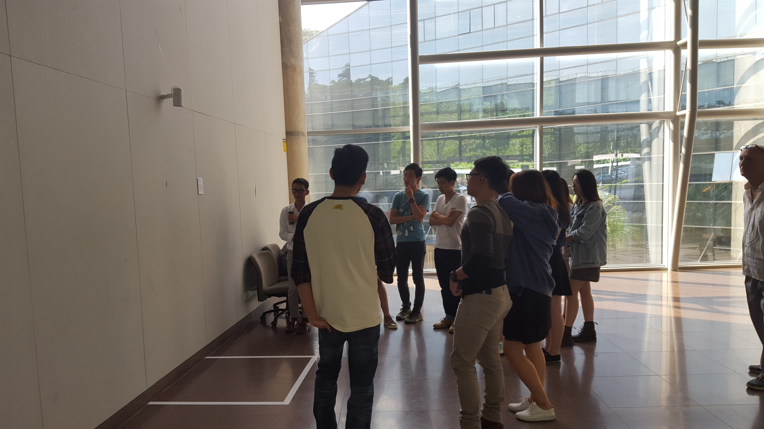
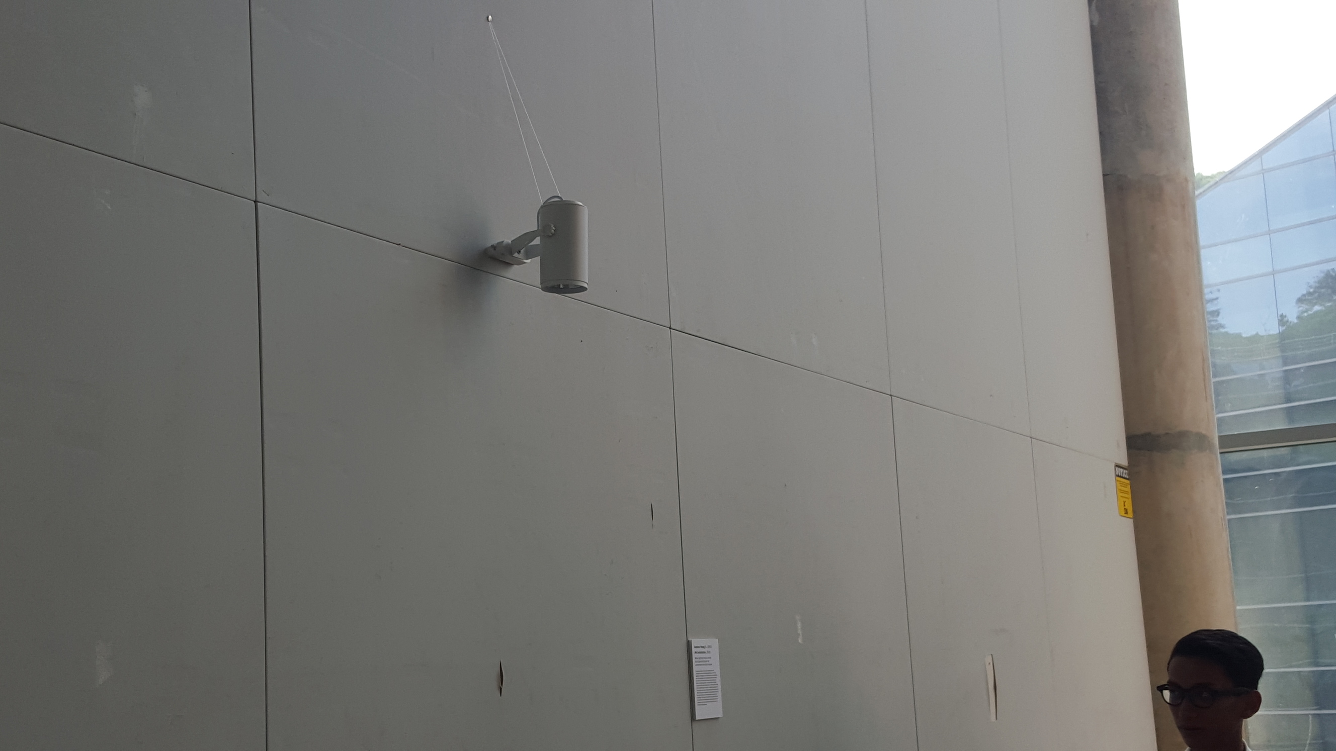
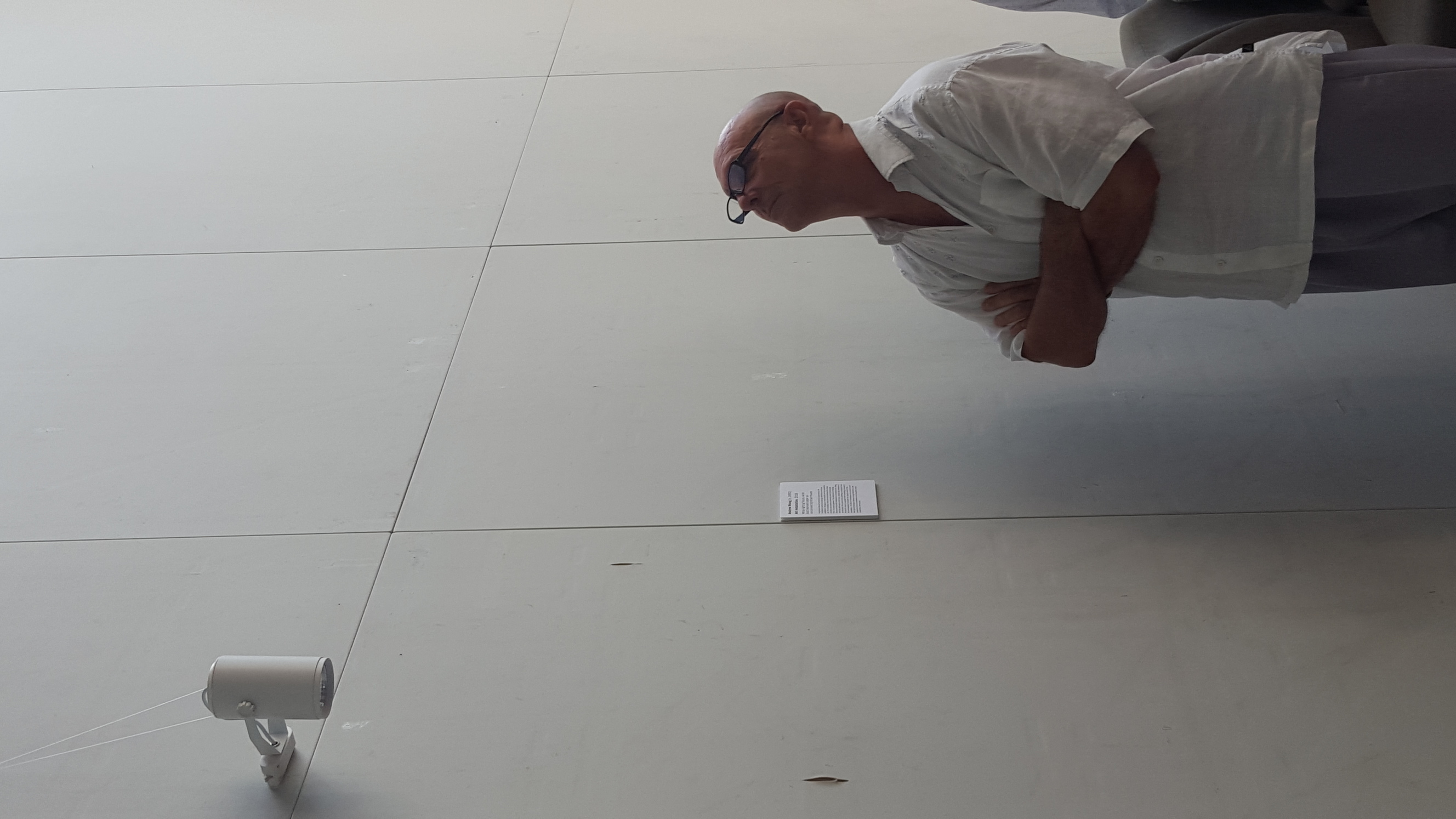
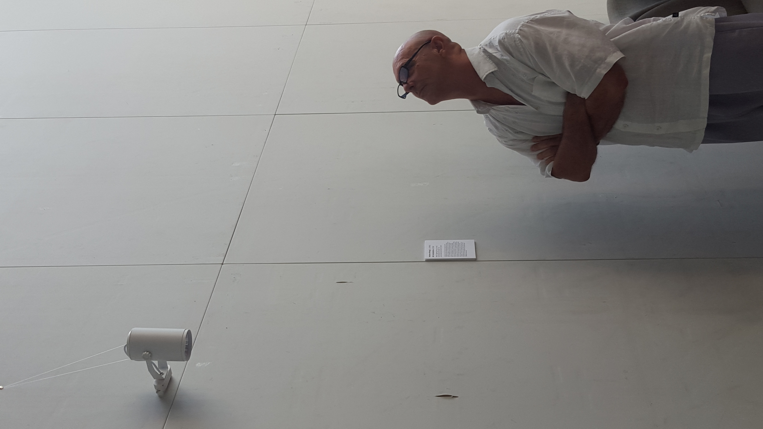
Inspired by Marcel Duchamp’s readymades, Art Installation seeks to challenge definitions of art and establish a dialogue on what exactly can be considered art. The installation blurs the line between the actual art piece and objects commonly used to demarcate them in curated galleries. The placement of lighting fixture and this artist statement on an empty wall, along with the white tape on the floor, implies the presence of an art piece. But a lack of any painting or sculpture then forces the viewer to question their prevailing concept of art and hopefully to include the objects used in this installation. The title Art Installation also points to how the objects fluctuate between being indicators of the presence of an art installation and being the actual installation themselves.
So my group (Ziyu, Chenyue, Fern and I) have chosen this particular ceramic as our main object.
This is a Chinese ceramic that was produced in the JingDeZhen kilns during the Qing dynasty, and was probably made for people higher up the social ladder such as emperors.
After researching, we found 4 main characteristics about this ceramic that we can come up with concepts for.
Christian influences on the development of this ceramic, mainly on the technological side
That it was catered to emperors in the Qing dynasty
Western-influenced designs such as the slight pink enamel
That it was later imitated by European countries
However we are unsure if these are suitable for this project and if suitable, how to come up with a thesis for it.
As mentioned by my group members in their posts our group has decided to focus on Chinese ceramics, namely functional ones like plates or bowls.
I remember seeing examples like the one pictured above at the Asian Civilisations Museum when researching for my team presentation and I thought we could generate some interesting visual responses to these ceramics.
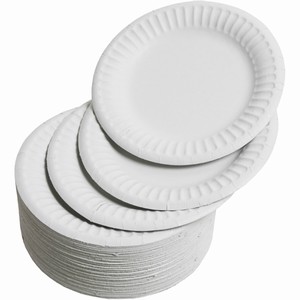
A possible idea/concept is to expand on the development of ceramics from esteemed decorations pieces/symbols of status to our current usage of them to hold food items etc. This difference is highlighted when comparing the highly valueable plate shown in the picture above with disposable paper plates, which hold almost no aesthetic value.
Thus a visual response could either be using high quality ceramic plates to hold everyday food items such as potato chips or painting on paper plates.
We’re currently still in the research phase and are exploring possible avenues to change the meaning of a ceramic/plate.
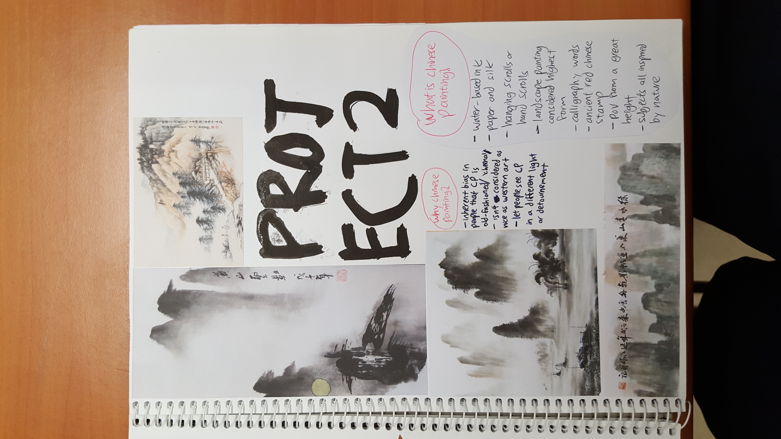
Question 6: How can Chinese paintings be interpreted in 6 different ways?
Chinese paintings are paintings done by Chinese people in the land of China, done using Chinese ink and Chinese paper, and usually depicts Chinese landscapes or animals in China or various important Chinese figures. They are usually accompanied by Chinese words or more commonly known as Chinese calligraphy. Chinese paintings also also sold in China. In this essay, written by a Chinese boy, I will attempt to show that Chinese paintings can be interpreted in 6 different ways.
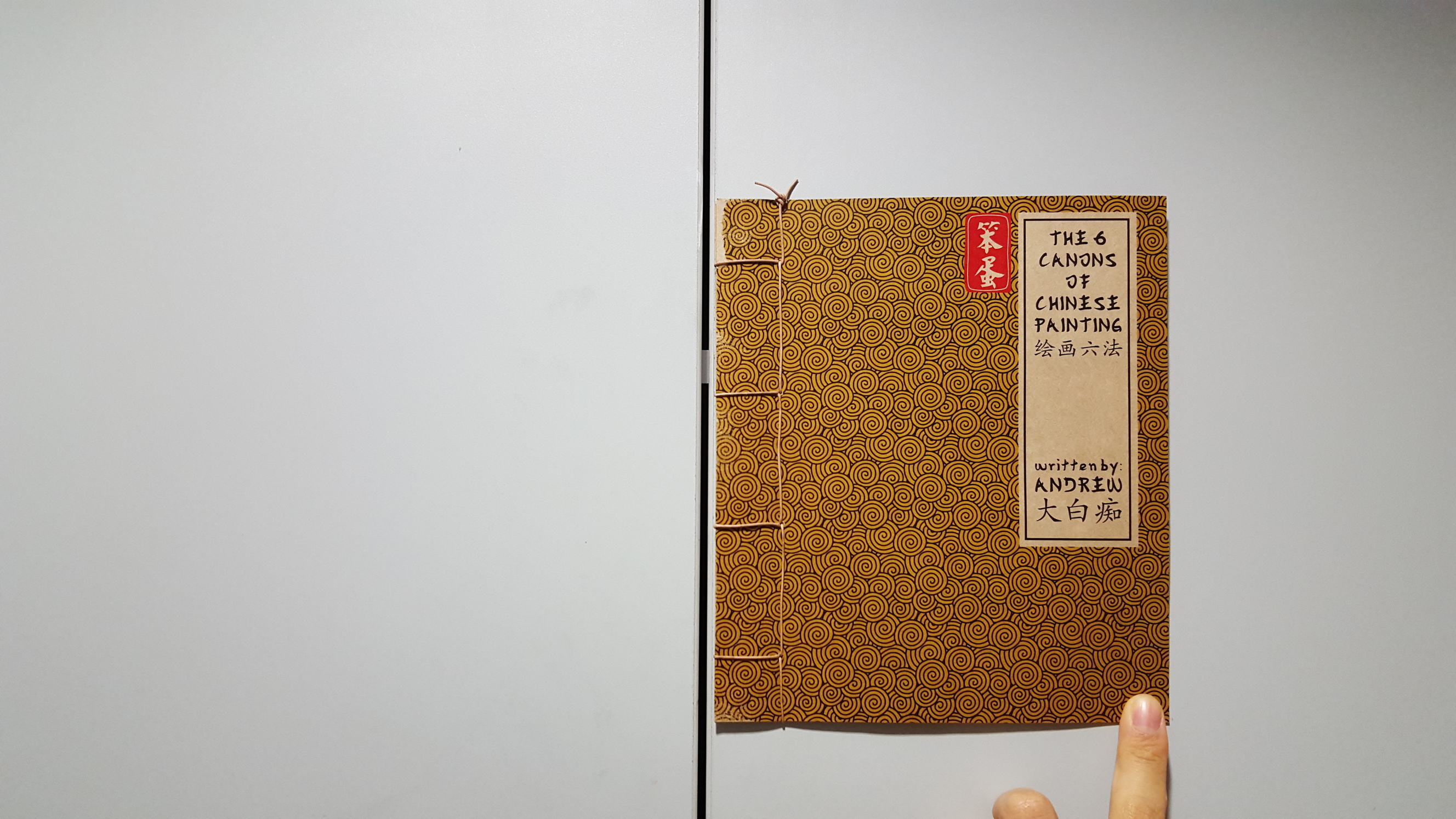
So hello everyone I chose Chinese paintings not to coincide with the art history essay (which I did on ceramics) but because I saw a book on it when brainstorming for initial ideas in the library, and also because I wanted to try something other than plain ol’ graphic design.
I also think that there is a certain inherent bias against Chinese paintings (more so if you’re Westernised like me) and people usually consider them to be ‘cheena’, ‘obiang’, old-fashioned or simply not held in such a high esteem as Western art. And that presents a perfect opportunity for me to change its meaning.
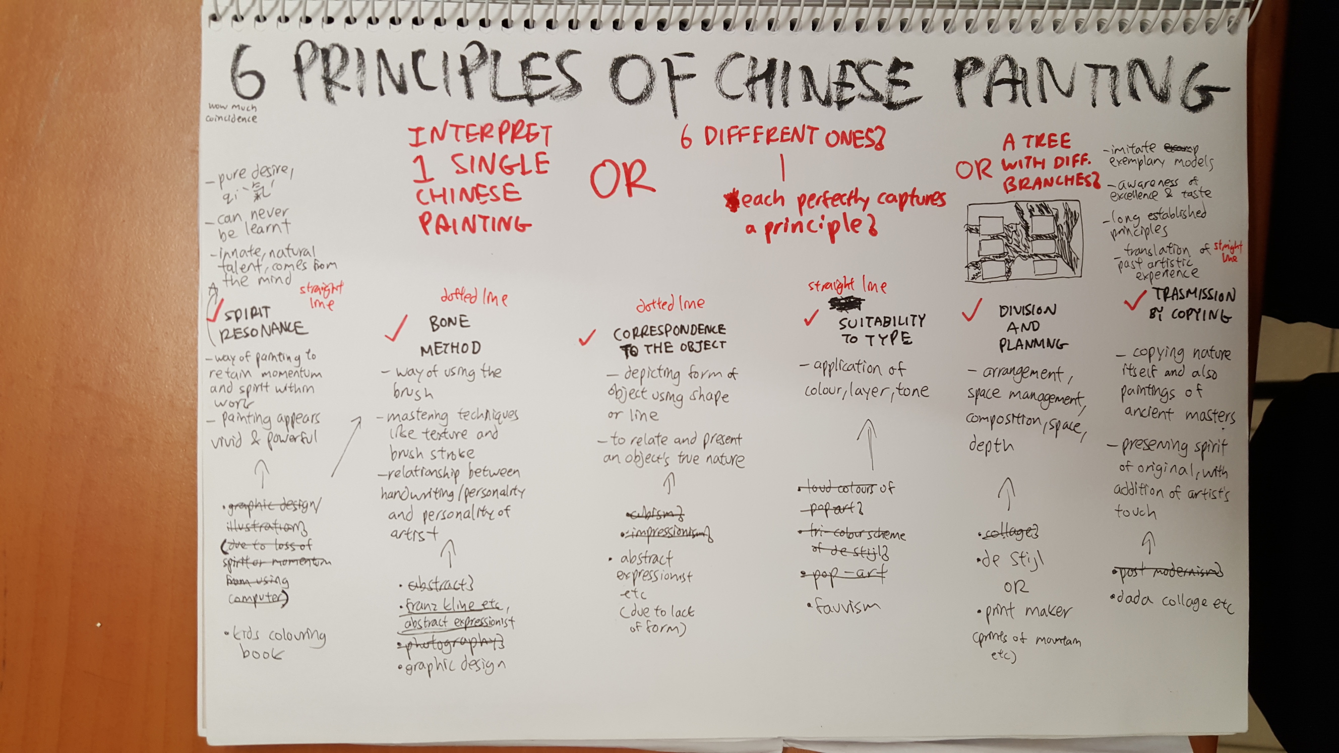
So when researching I found that there are 6 principles/characteristics of CP that was formulated by this ancient Chinese homeboy Xie He (who probably has eyes as small as mine) which you can read about here:
BUT I know most of you probably are too lazy to read it so Imma distill it here for you
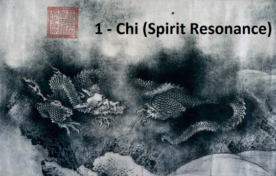
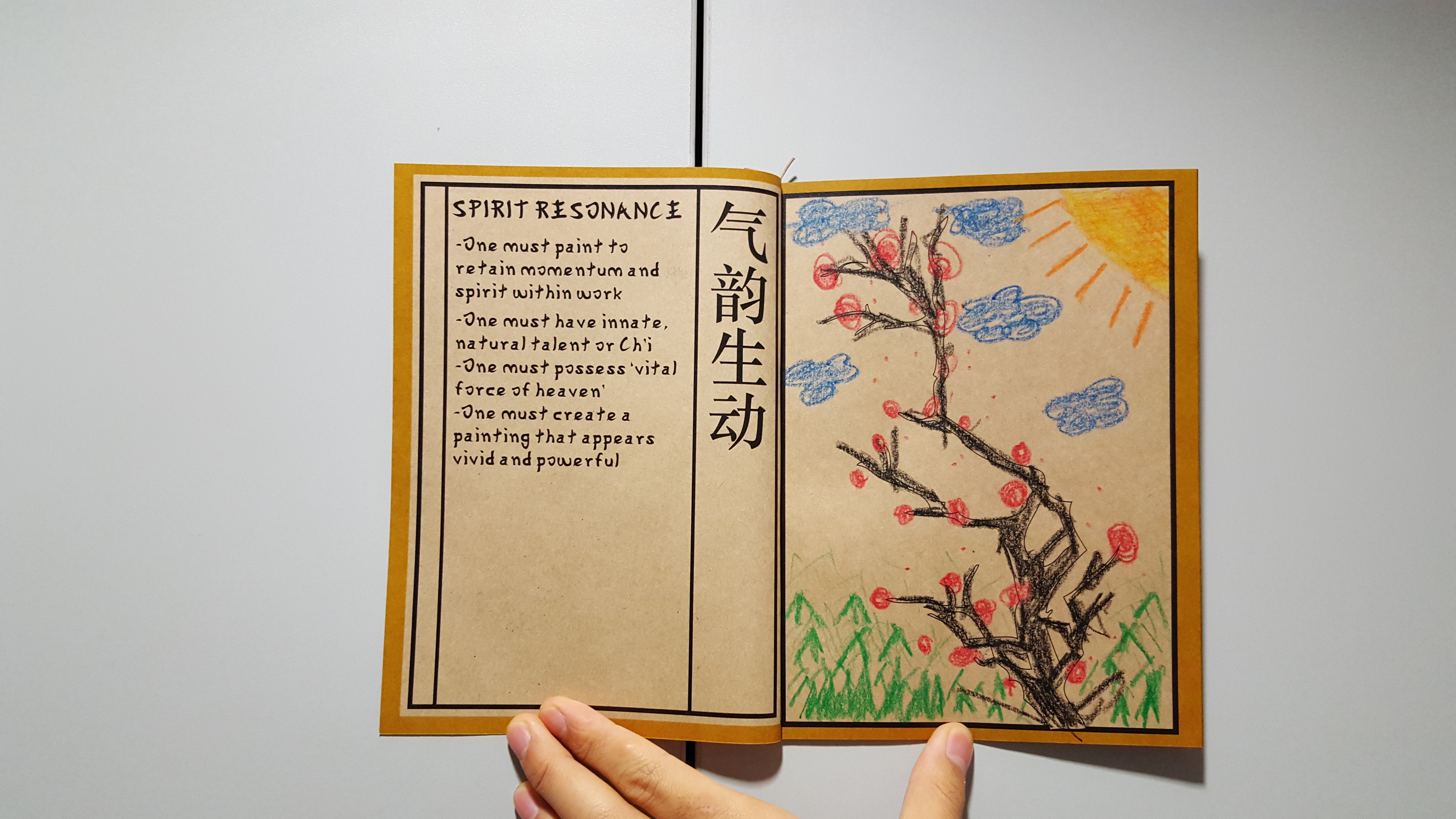
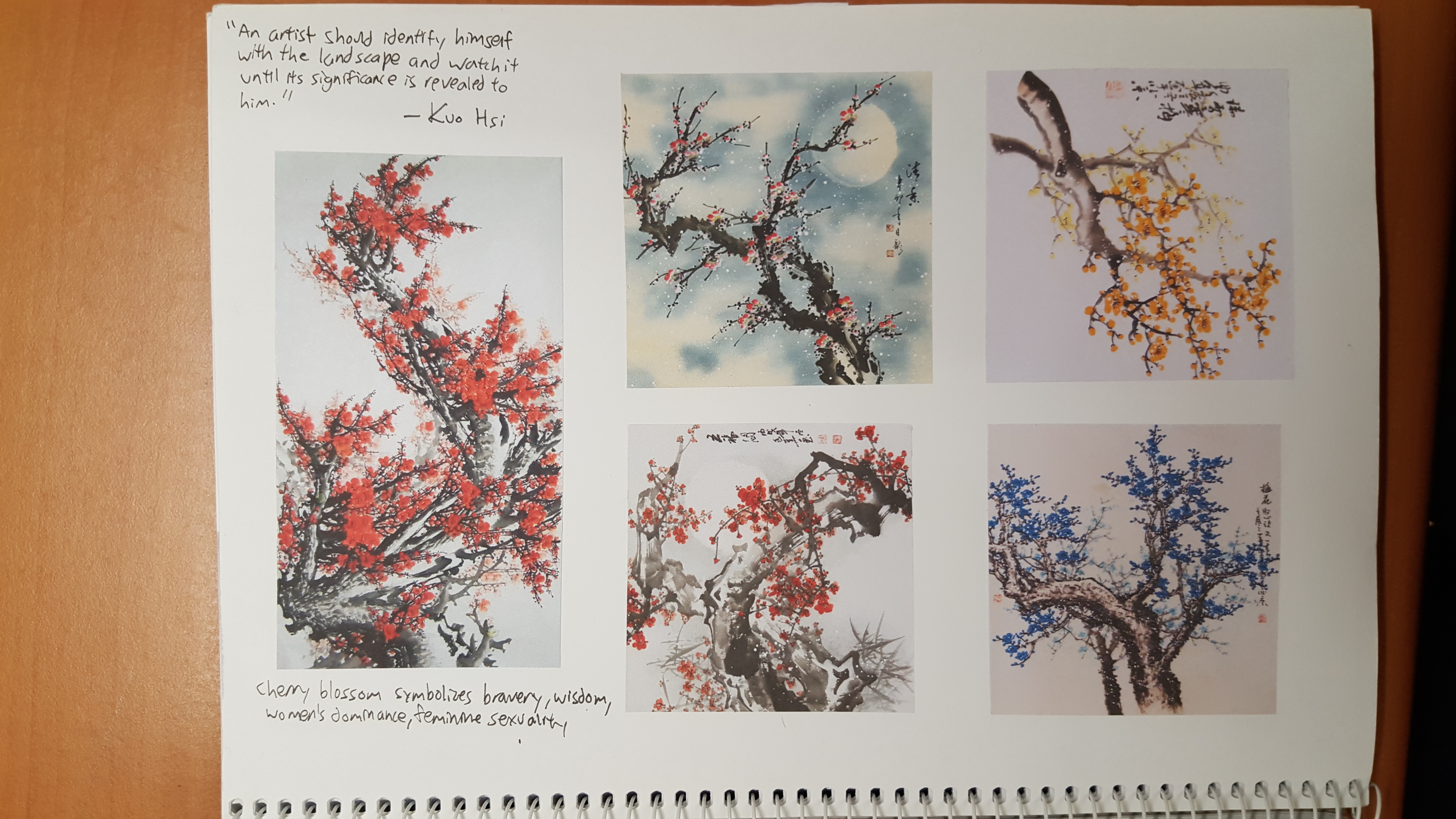
RULE NUMBA 1: Spirit resonance, which basically means one needs to paint with ‘Chi’/’energy’ of which is innate, and results in your painting looking vivid and powerful
I really don’t feel like visiting Chicago anymore so I’m just going to dump the link here http://www.paintwalk.com/2015/06/chinese-painting-principles-applied-to.html
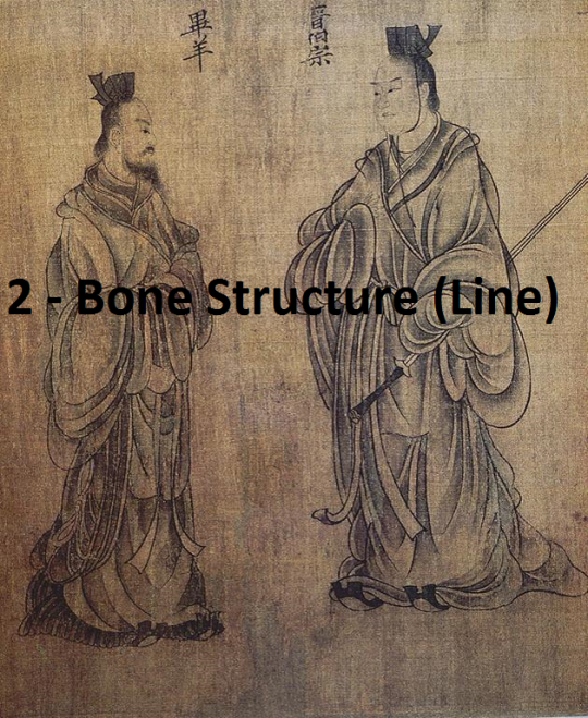
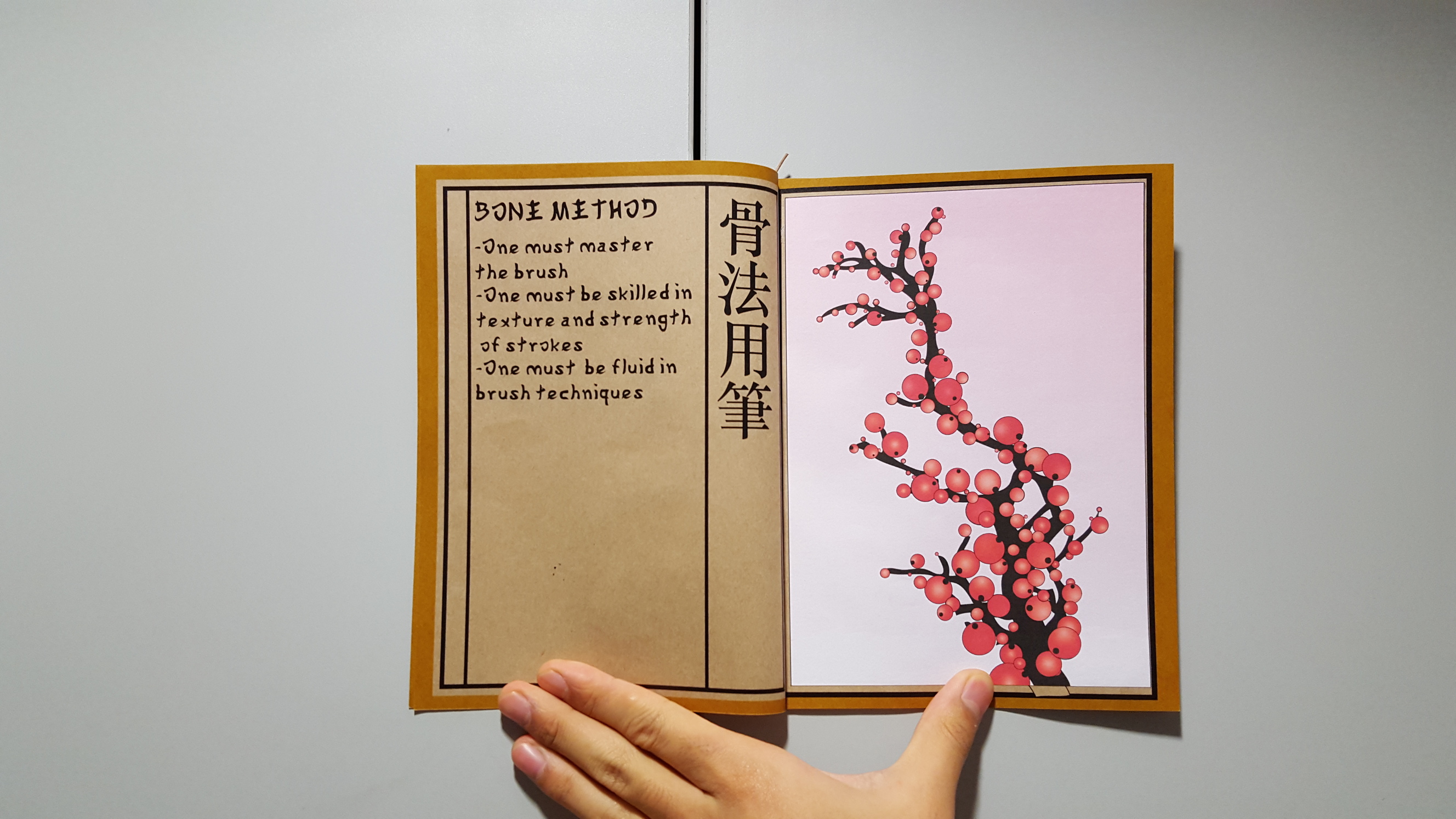
RULE NUMBA 2: Bone method, or essentially how good one is at mastery of the brush and it’s various strokes/pressures
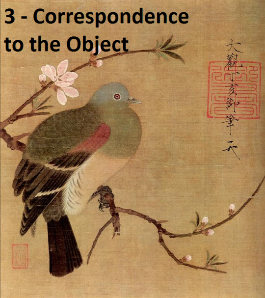
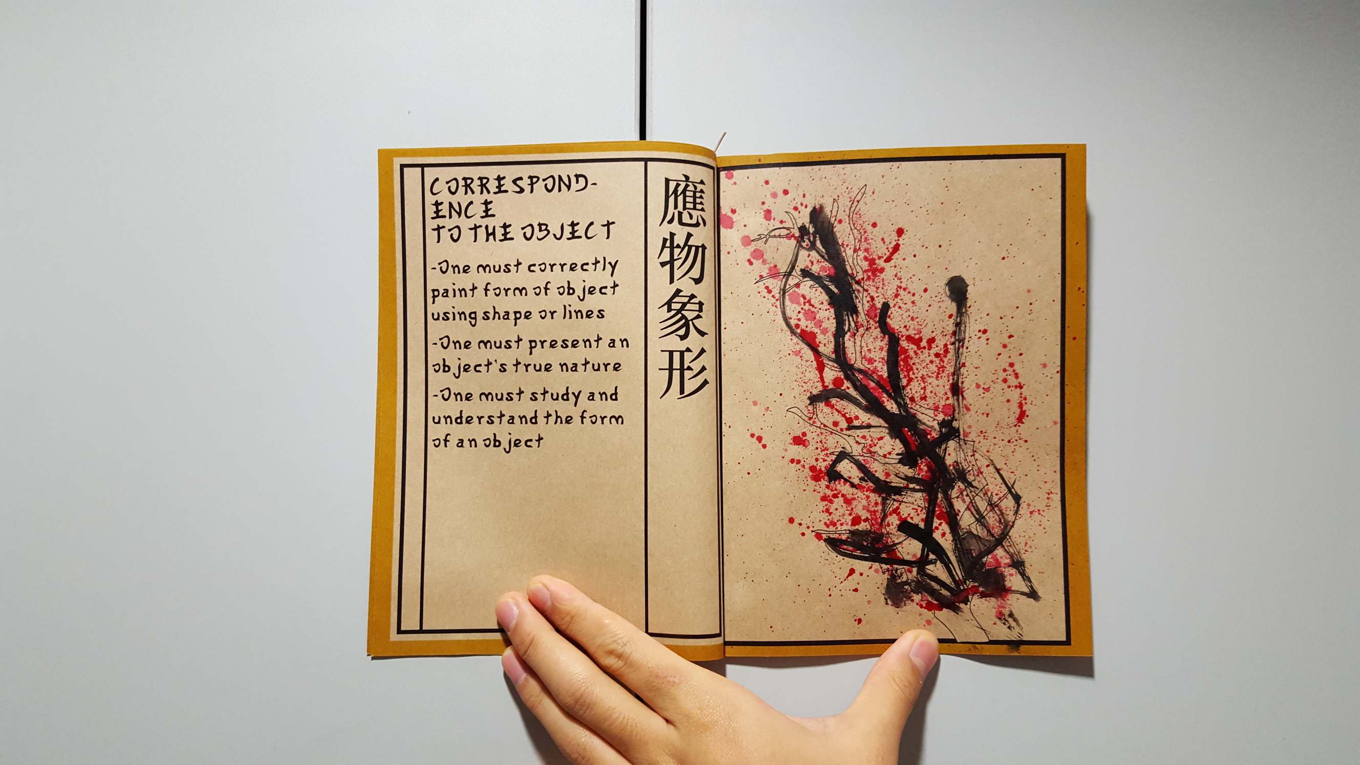
RULE NUMBA 3: Correspondence to object, or how well one depicts the correct form of the object/scene
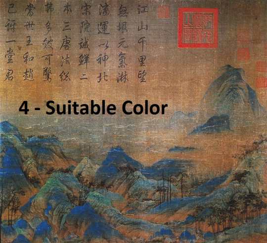
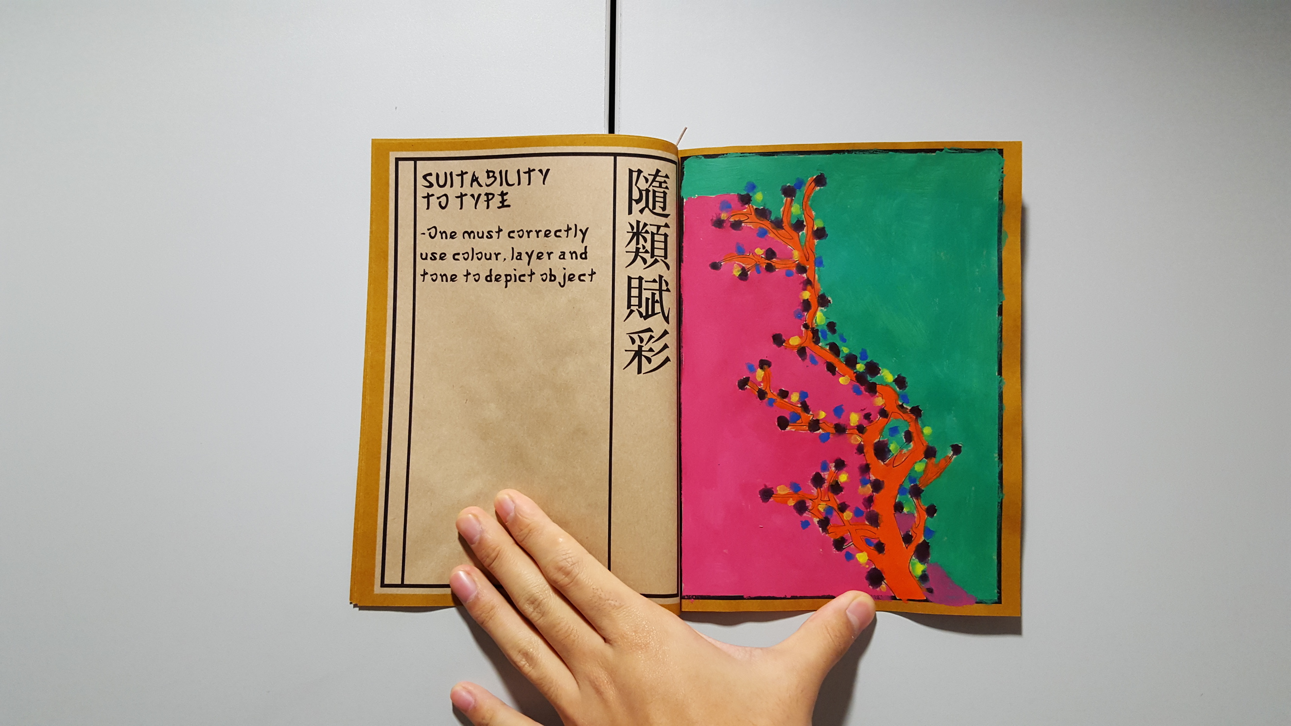
RULE NUMBA 4: Suitability to type, or correct use of colour
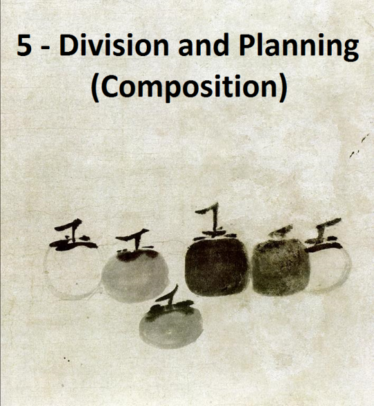
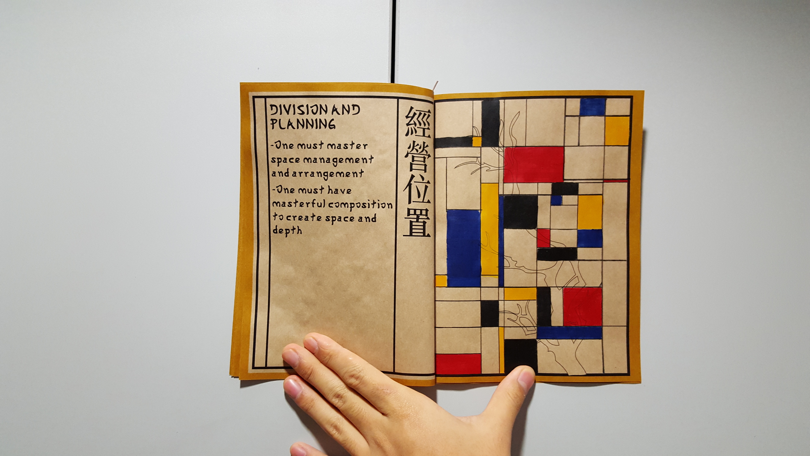
RULE NUMBA 5: Division and planning, or how you compose your painting/place elements to create visual hierarchy for ease of viewing
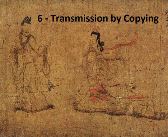
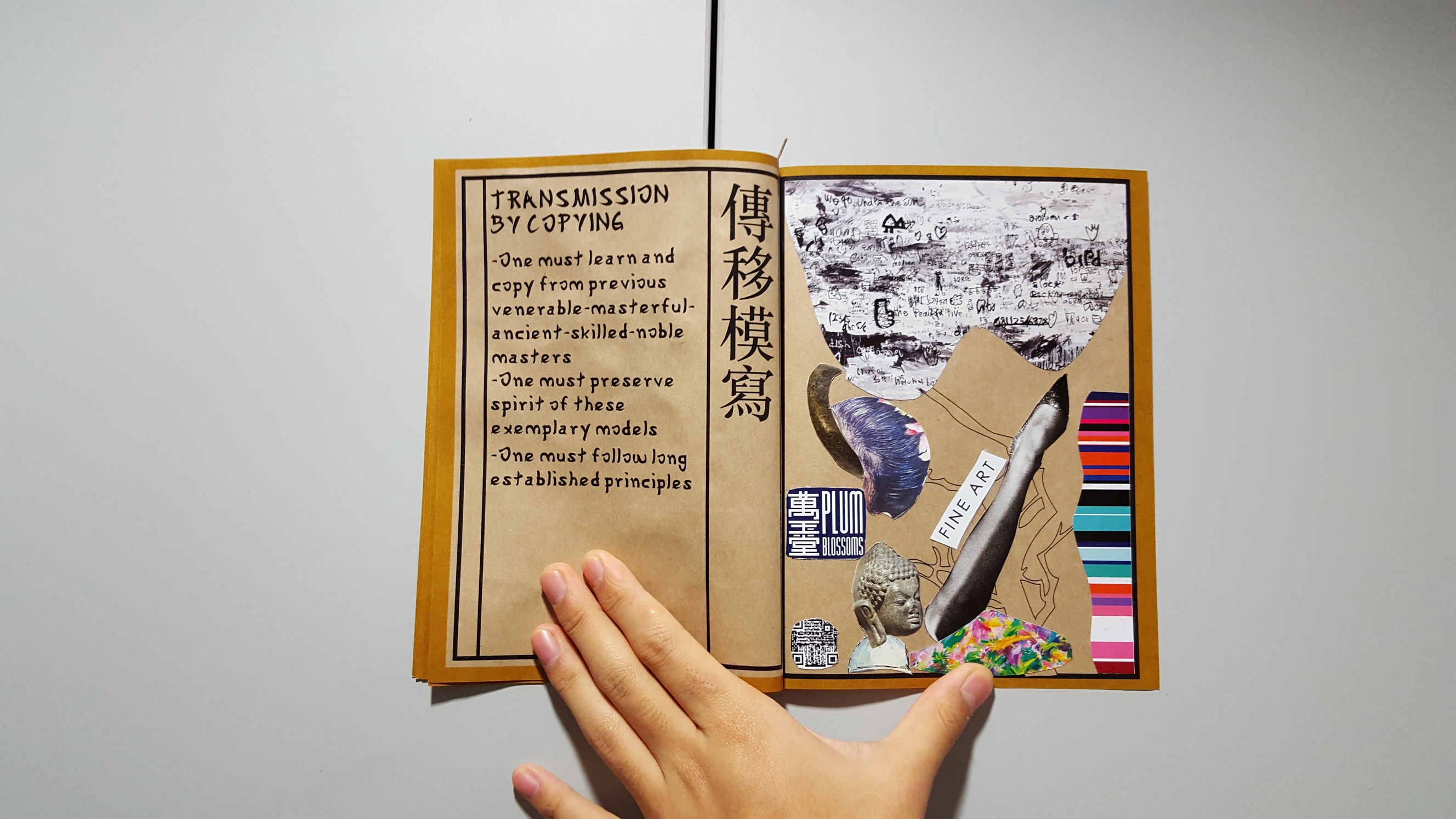
RULE NUMBA 6: Transmission by copying, or learning from copying old master’s examples and preserving long-established principles
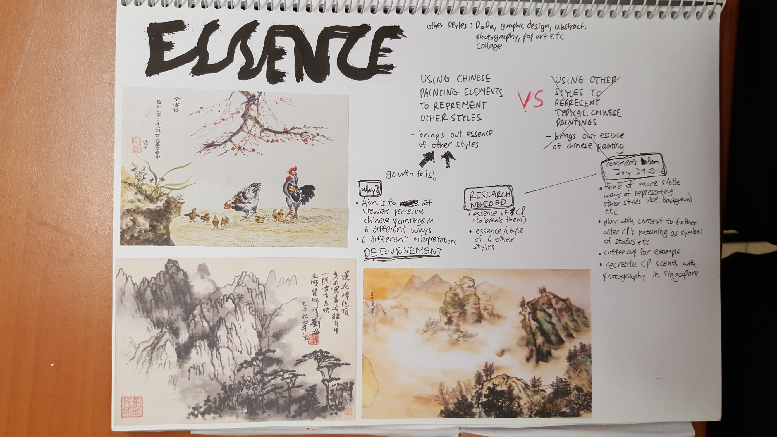
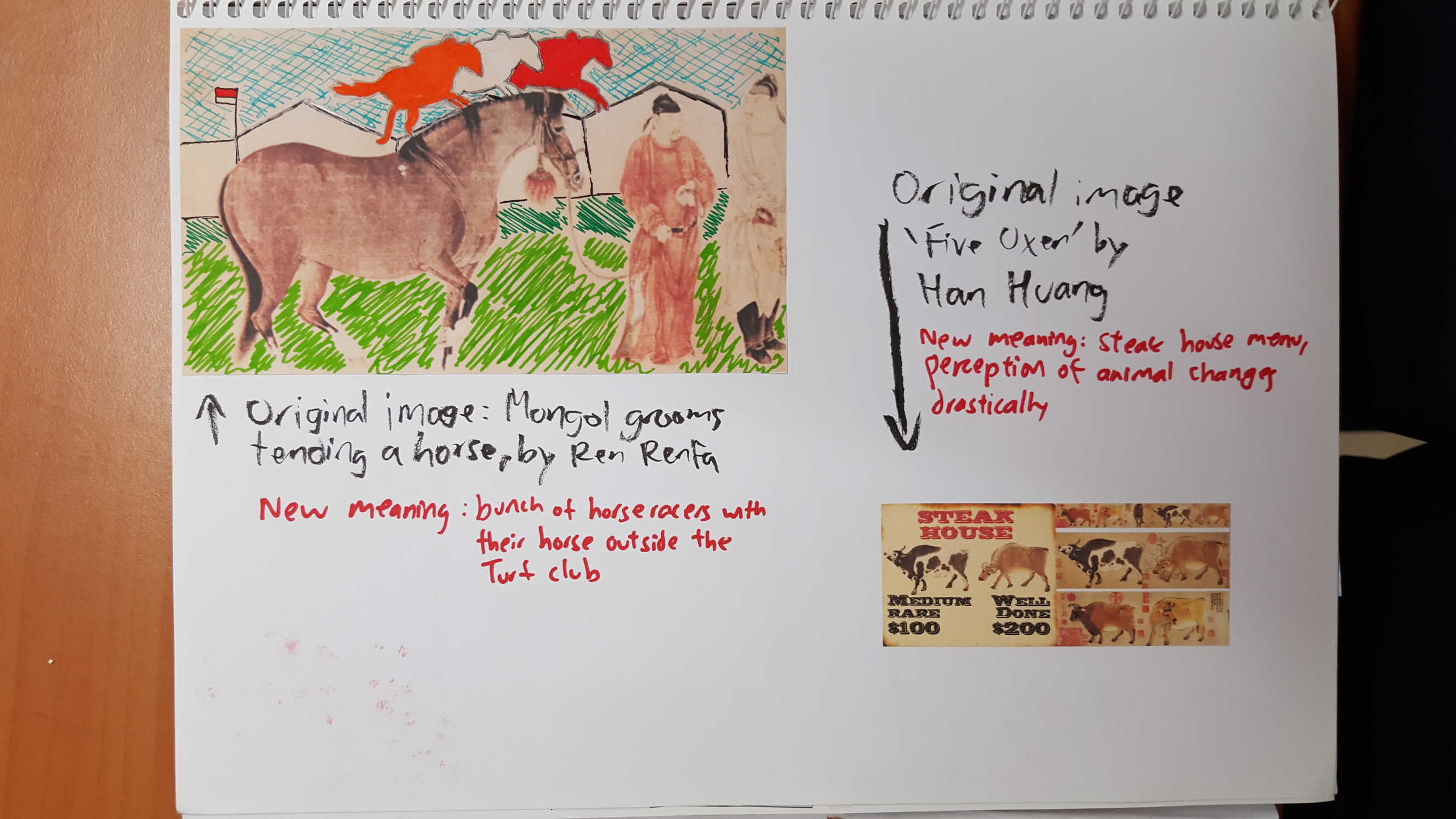
So what I did for this project is to interpret CP in 6 different ways, from the perspective of 6 different people who directly oppose the 6 rules above.
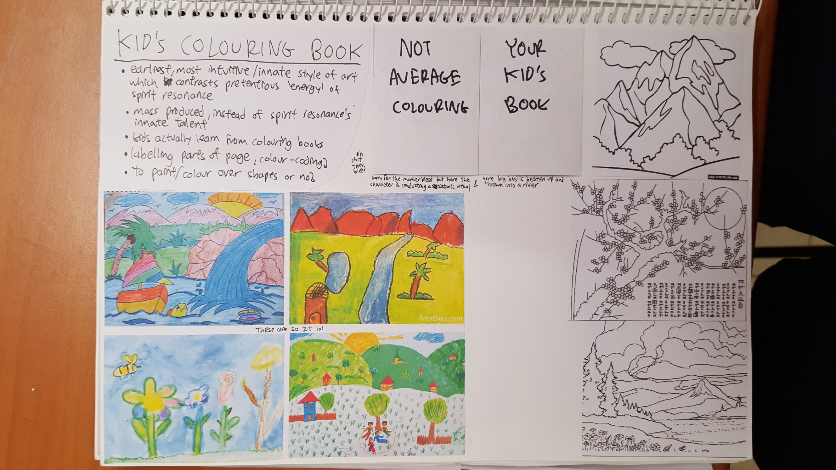
For example the first one, a kid’s drawing, is more of a kid’s interpretation of CP which everyone knows lacks any ‘spirit’/’Chi’ of sorts, thus directly going against the first rule of CP.
Maybe I’m thinking too much.
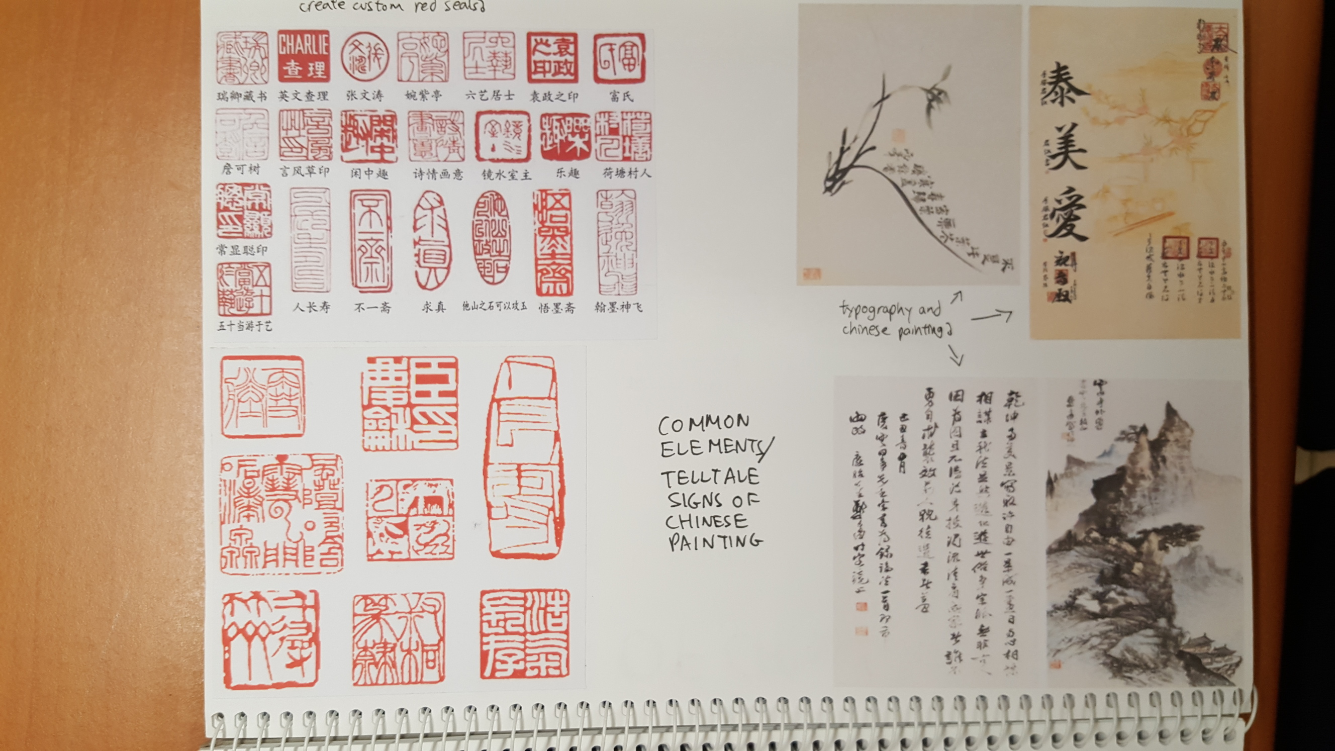
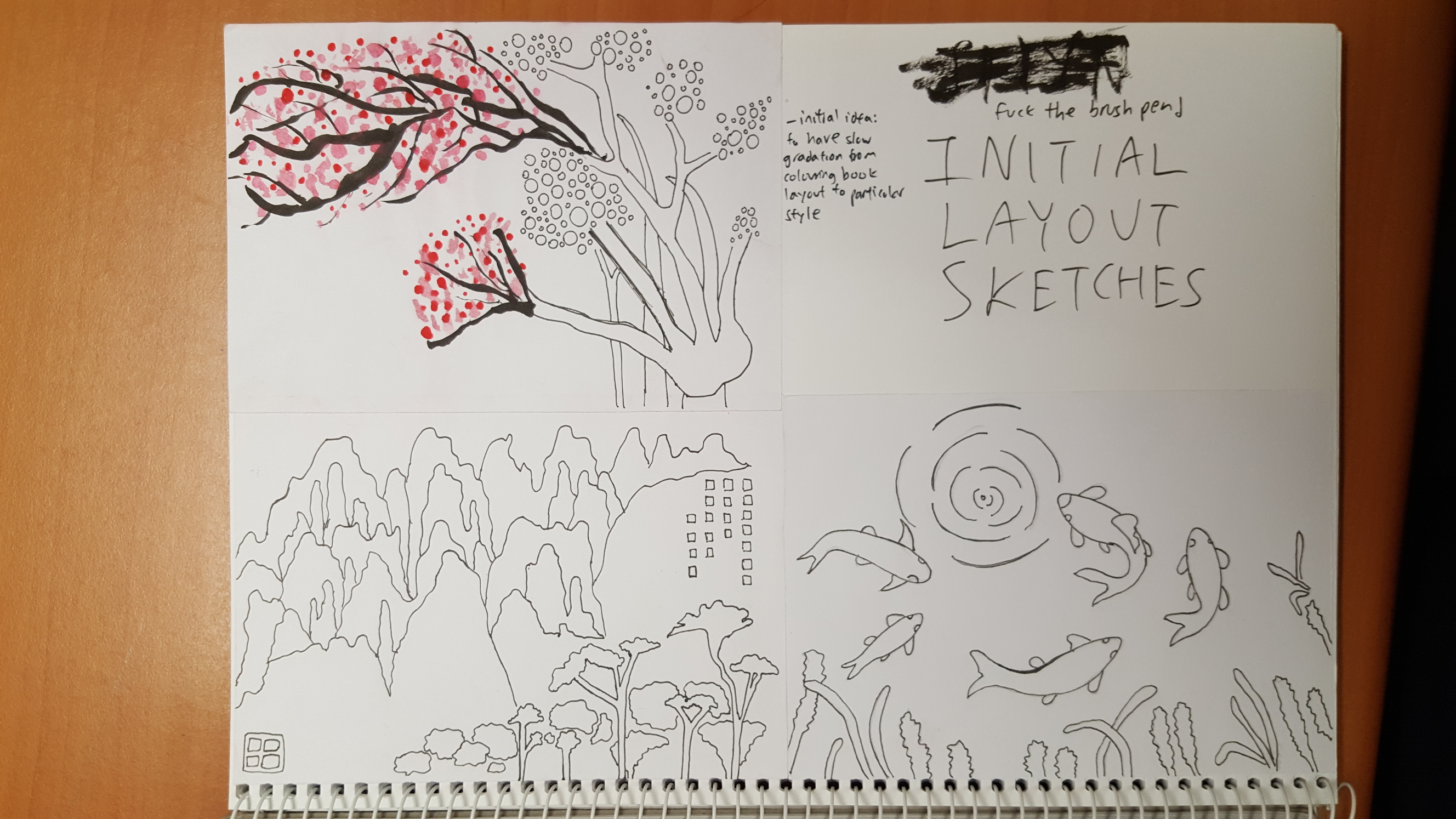
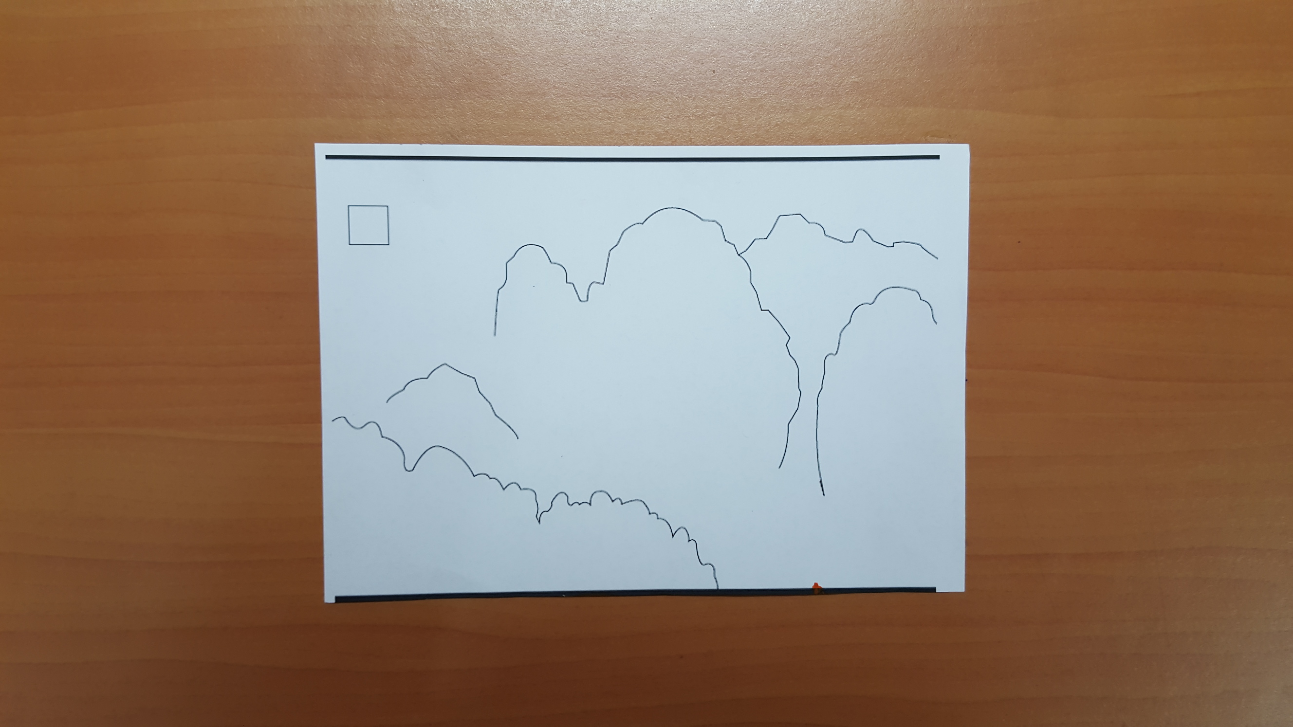
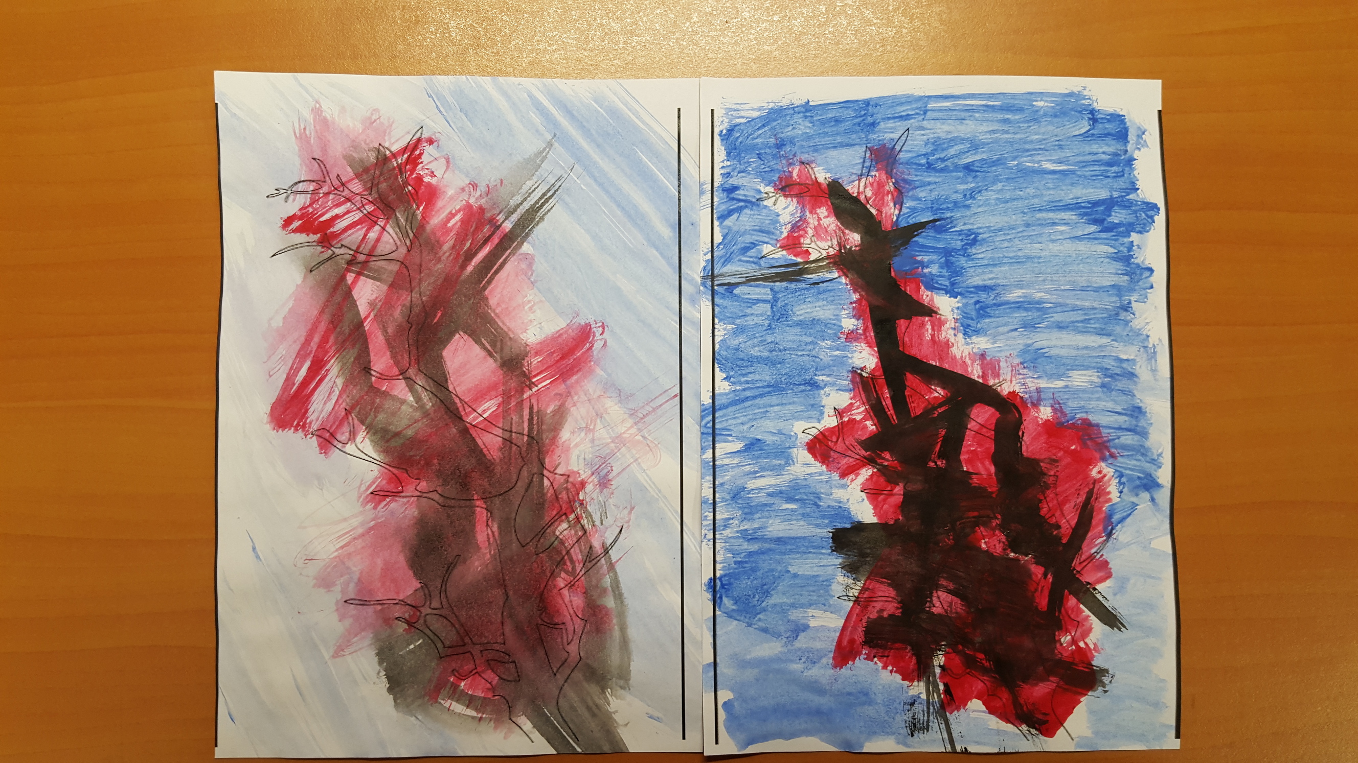
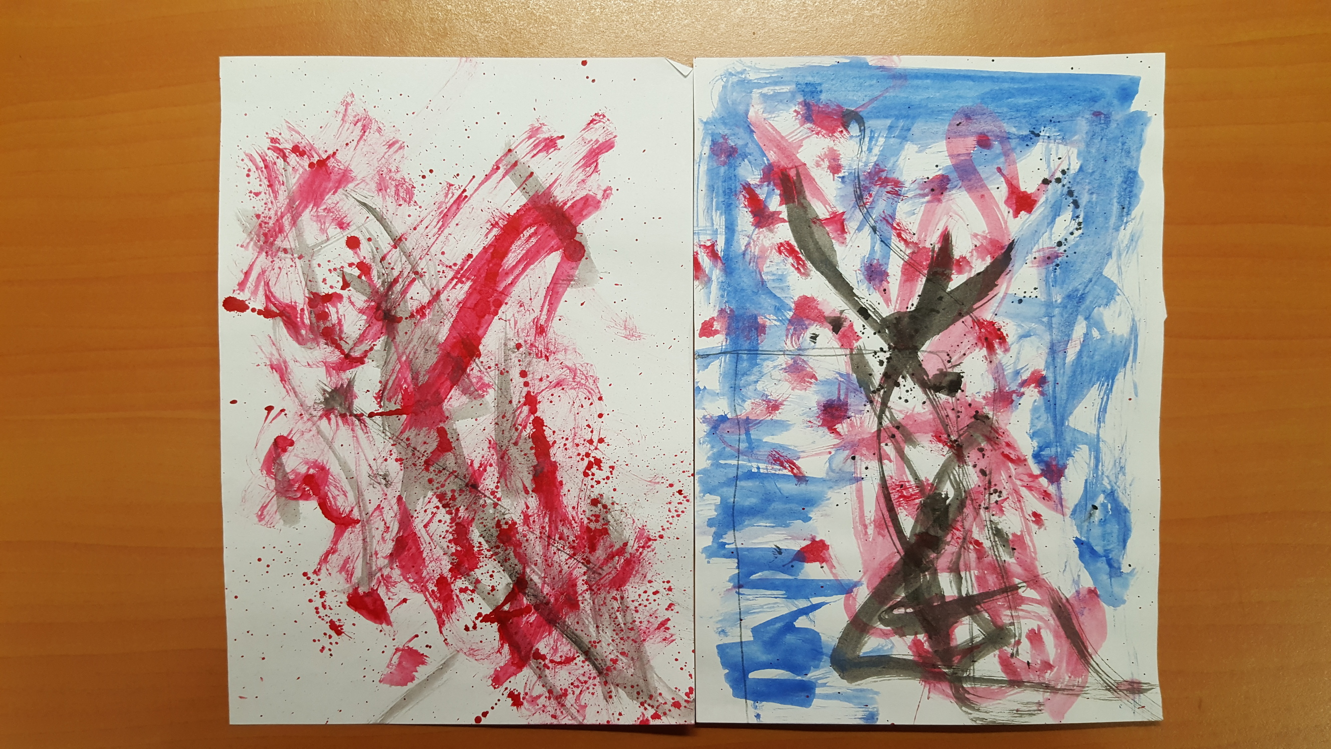
Okay so without further ado, here is my manual called The 6 Canons of Chinese Painting, where is it a colouring book of sorts to let people practice the 6 rules. A consistent template is used for all 6 pages, which is that of a cherry blossom tree.
Chinese painting in the POV of a kid
use of crayons and style of drawing etc makes it the furthest thing from what one would imagine to be a painting with ‘Chi’
comical style totally contrasts with that of esteemed Chinese paintings
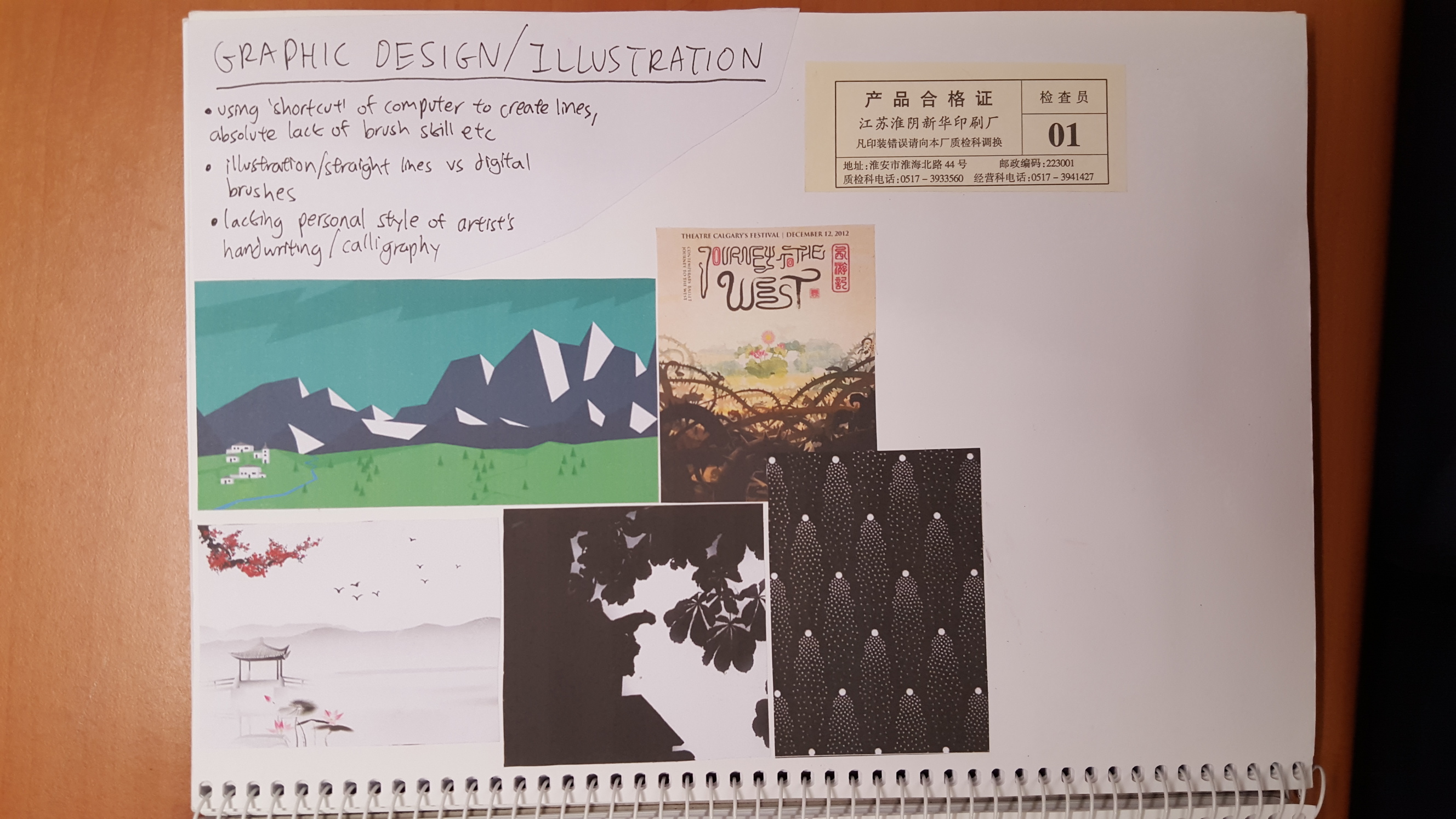
Chinese painting in the POV of a graphic designer
graphic designer’s interpretation totally lacks any use of brush/mastery of stroke, and is done entirely with vectors and flawless digital gradients (eat that watercolour!)
this design was pasted on the book rather than printed out on the page itself because to be consistent with the narrative of this being a colouring book, thus being was the only way the graphic designer would have to show his work (as he uses computers instead of brushes)
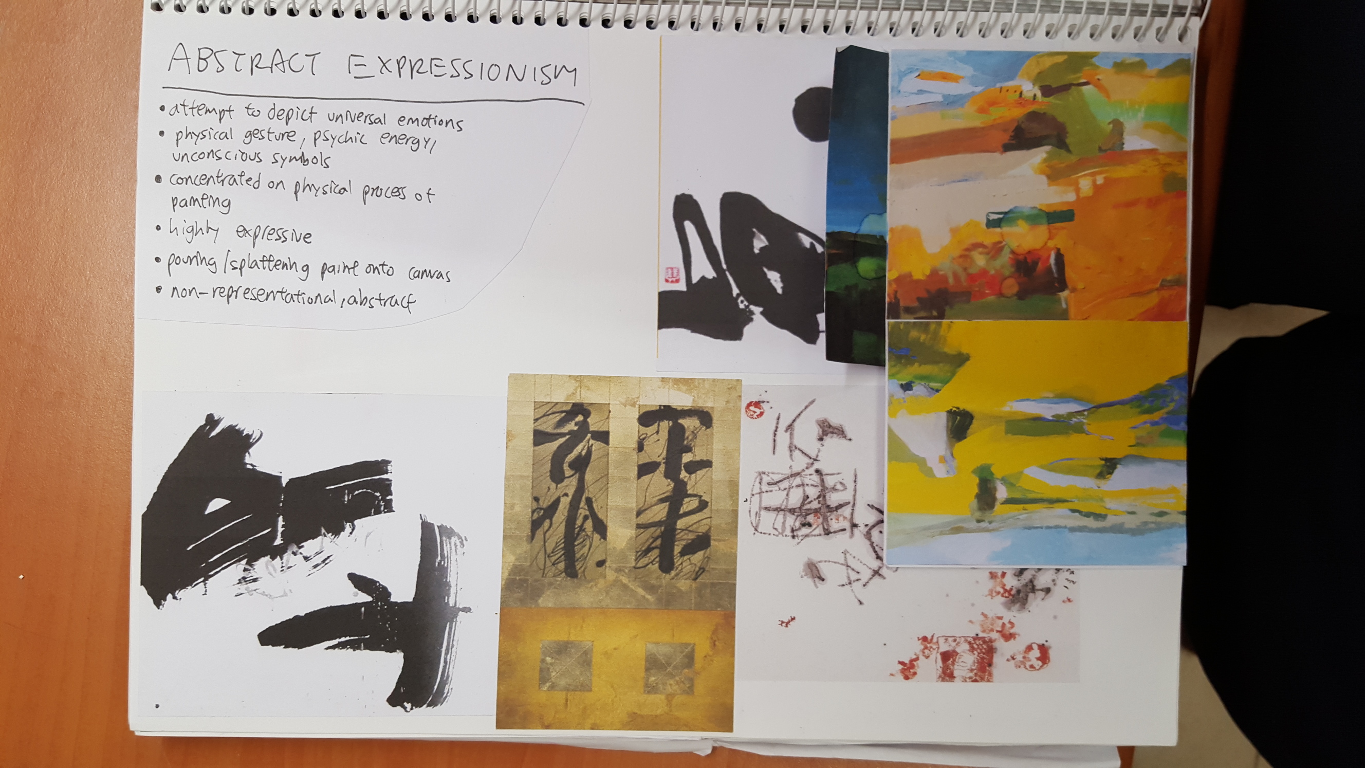
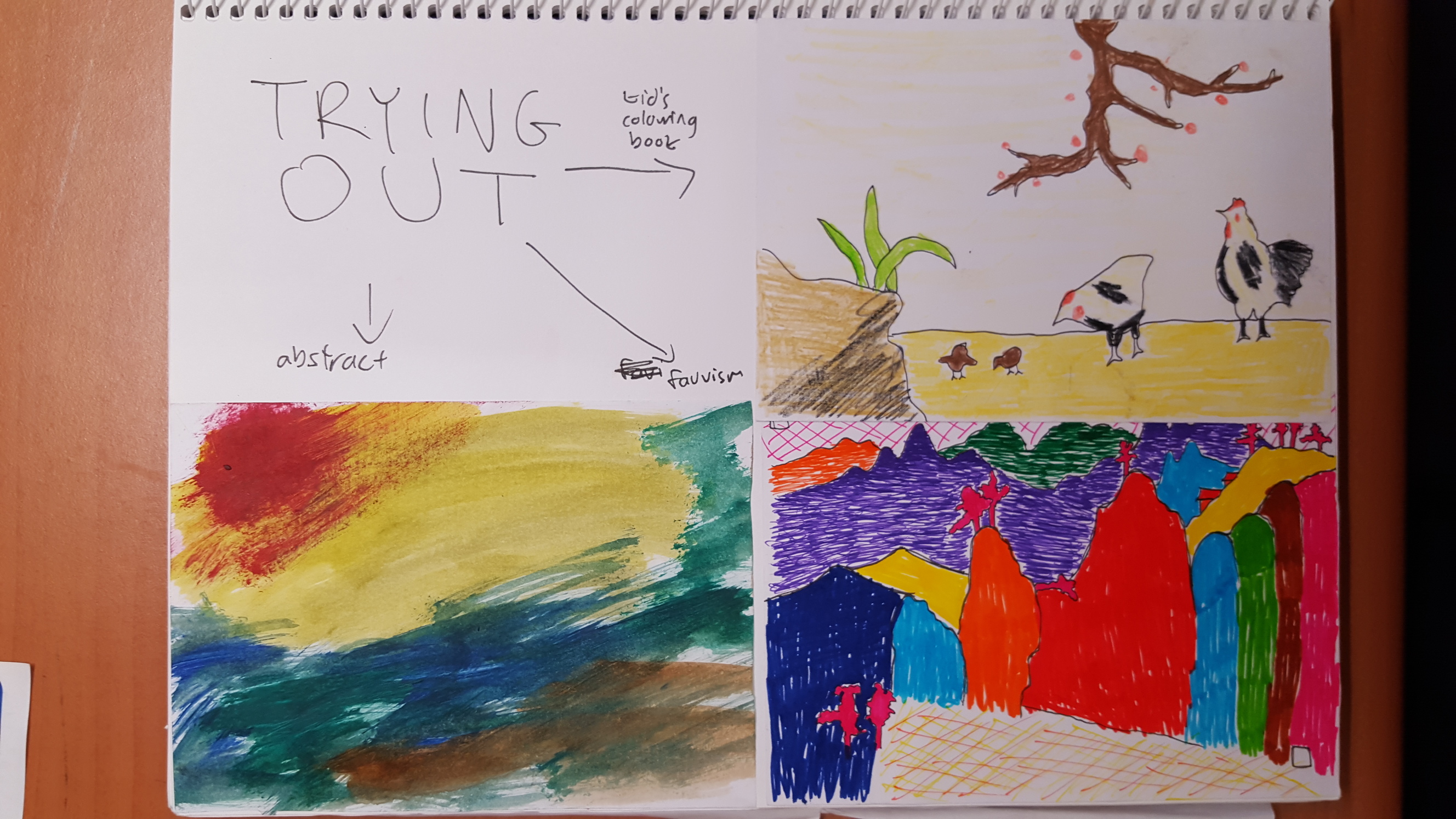
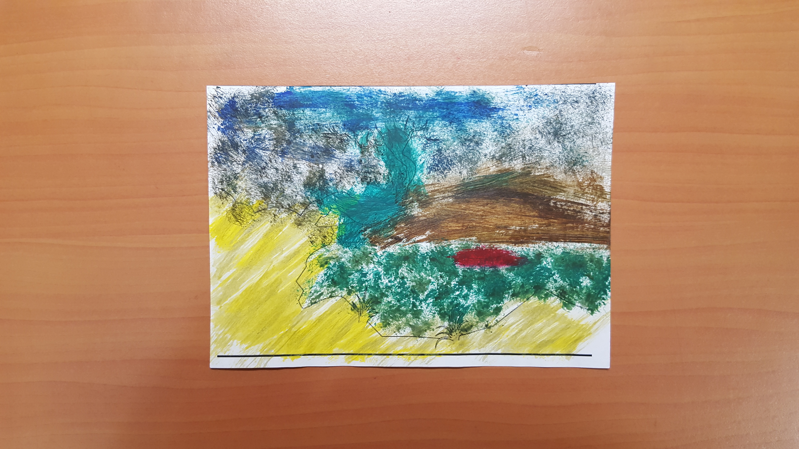
Chinese painting in the POV of an abstract artist
an abstract artist’s interpretation of CP totally lacks any visible form of a tree or cherries
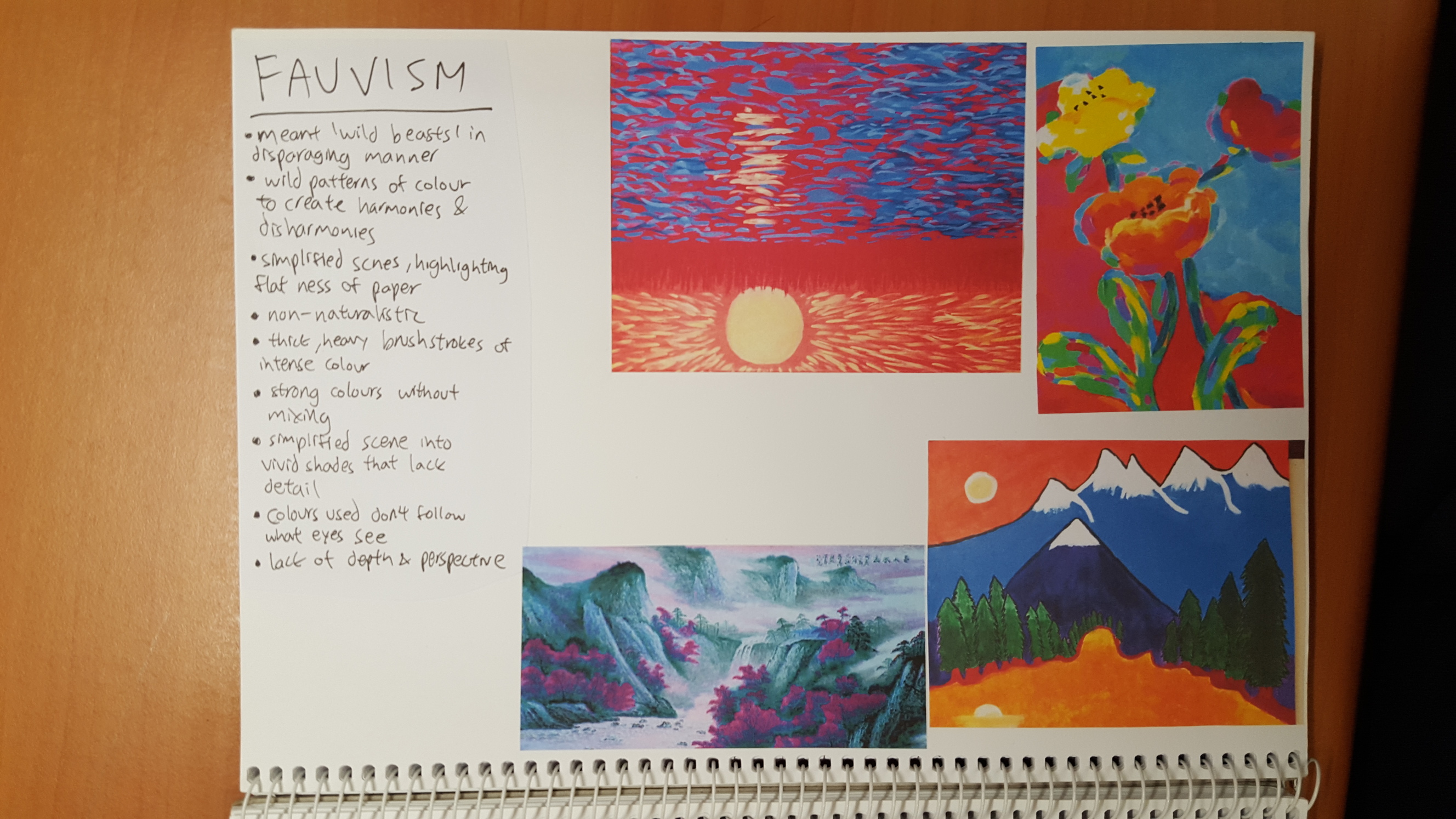
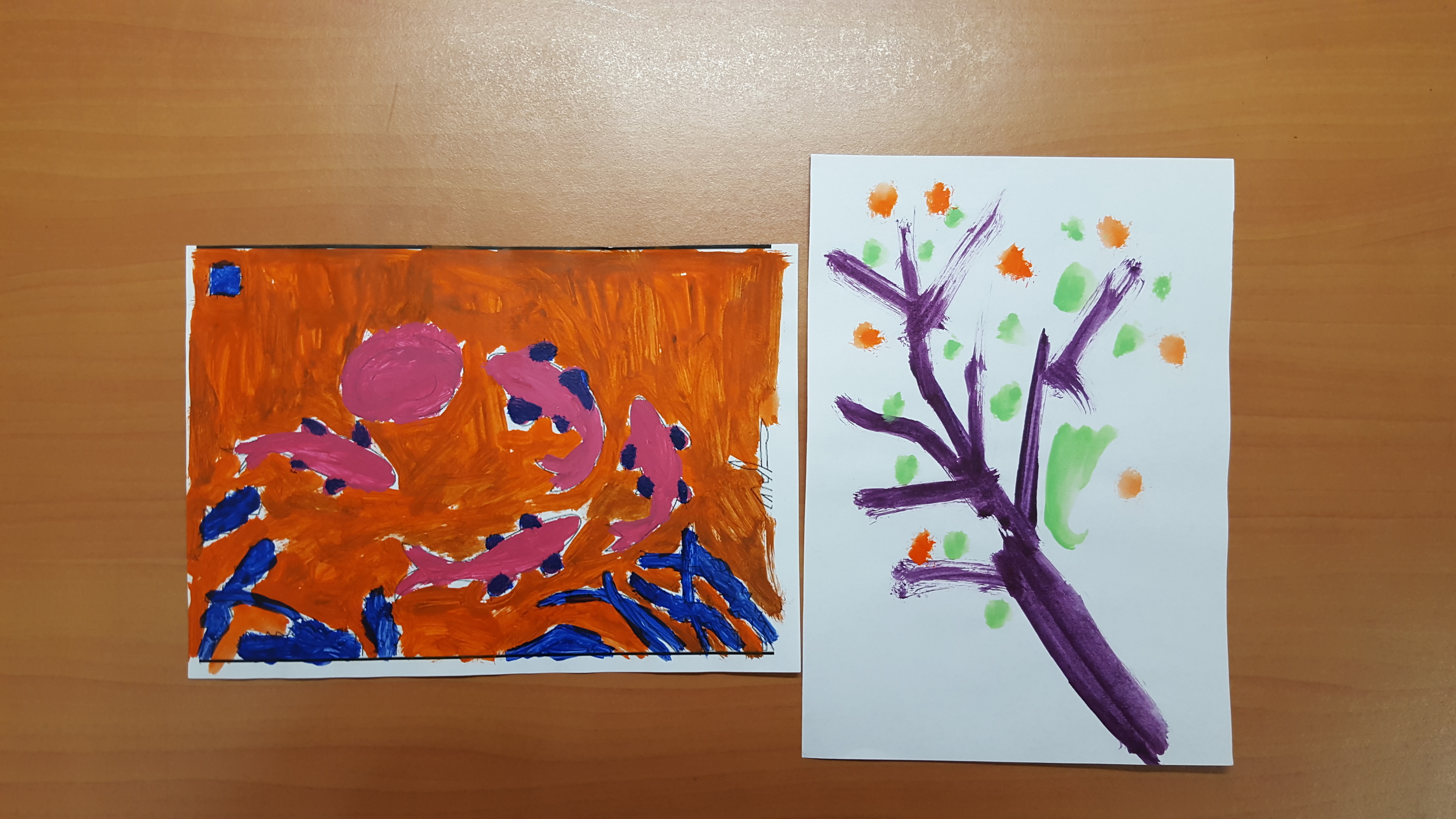
Chinese painting in the POV of a fauvist
Fauvism is an art style that was popular around the 1900s, where Fauvists would paint with non-naturalistic and wild colours
Fauvism paintings are also simplified, lacking depth, and the above mentioned qualities are expressed in this composition to contrast with this fourth rule
In hindsight the background could have been executed better where the pink/green line doesn’t follow the shape of the tree
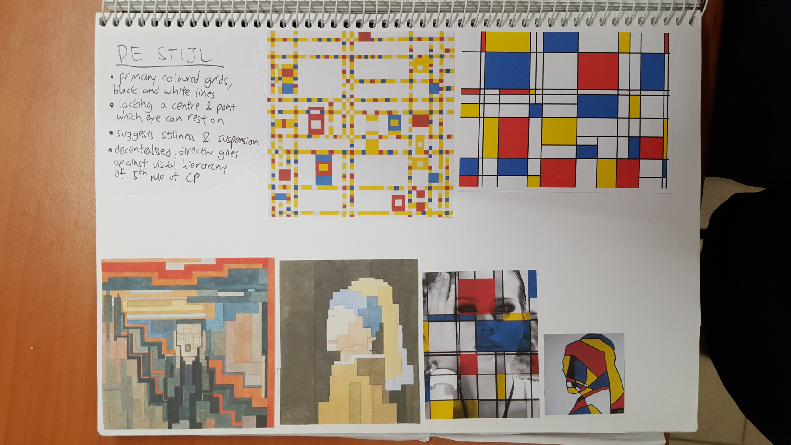
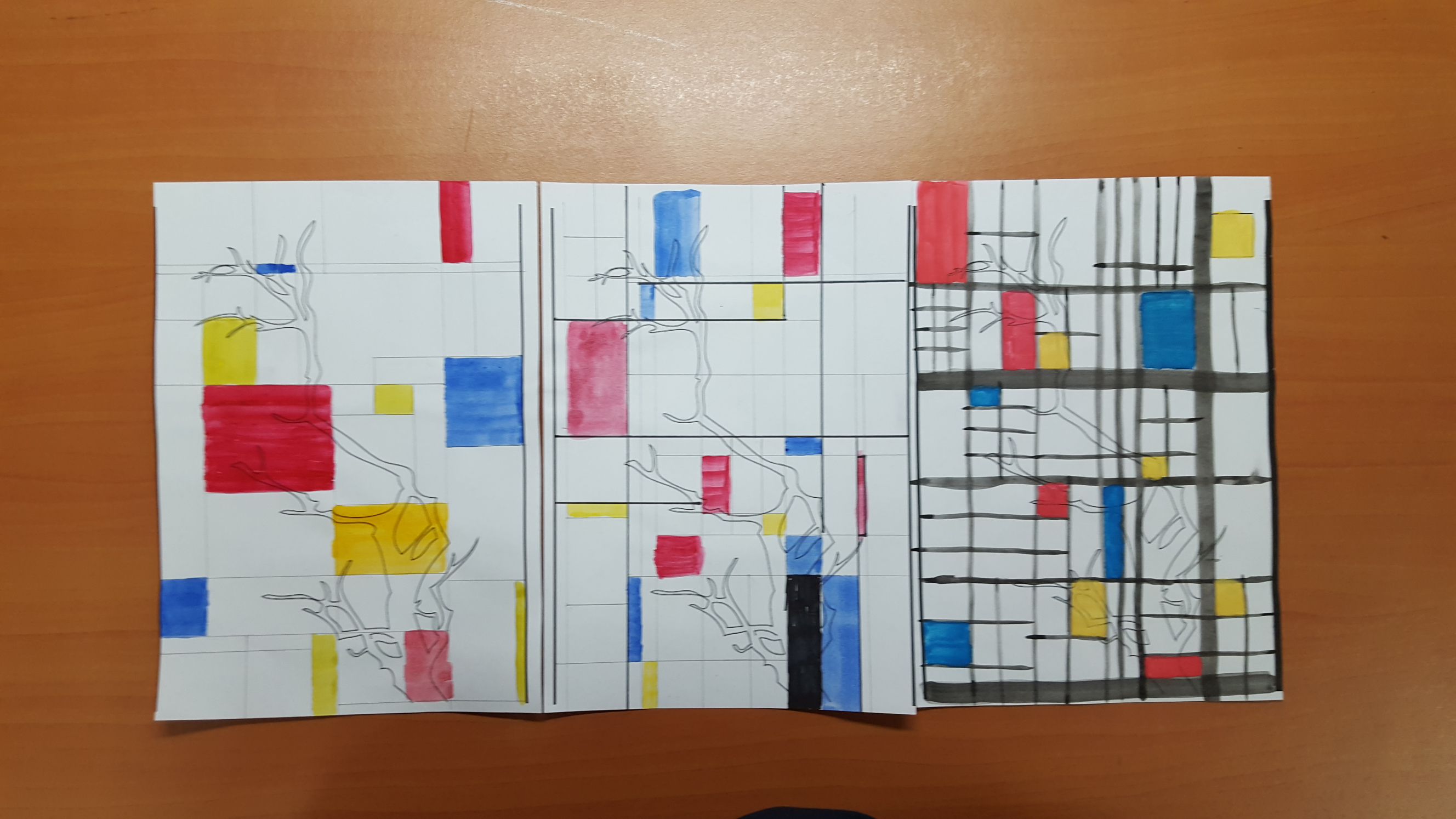
Chinese painting in the POV of a De Stijl artist
De Stijl is an art movement that advocated abstraction and depiction using shapes and colour (more specifically the 3 primary colours red, blue and yellow)
De Stijl pieces were very still (lacking movement) and had no visual hierarchy or place where a viewer’s eyes could fall on, thus contrasting with the rule by having ‘bad’ composition/layout
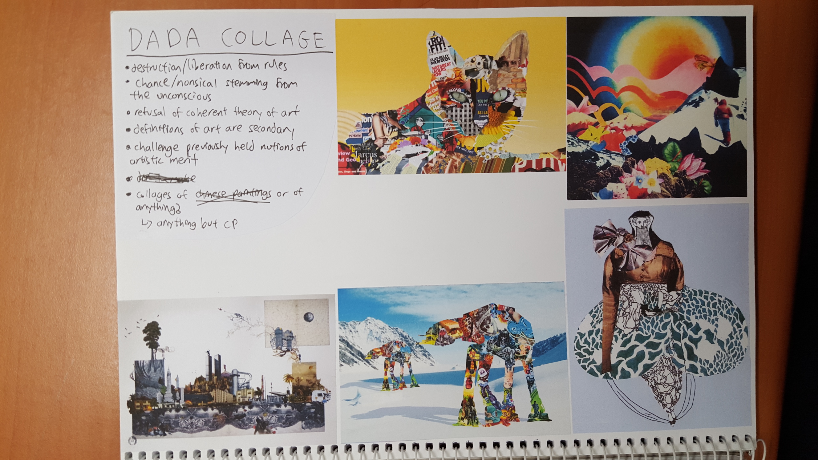
Chinese painting in the POV of a Dada artist
I’m sure most of you should have a rough idea of what Dada stands for but it essentially seeks to break away from rules/established principles and refuses to be defined
So this composition contrasts the last rule of CP by portraying something that doesn’t resemble anything like CP, using the famous Dada collage style (but not too dark/disturbing don’t worry)
The cut-outs were entirely from a discarded magazine found outside one of the prof’s room (Jesse Thompson I think)
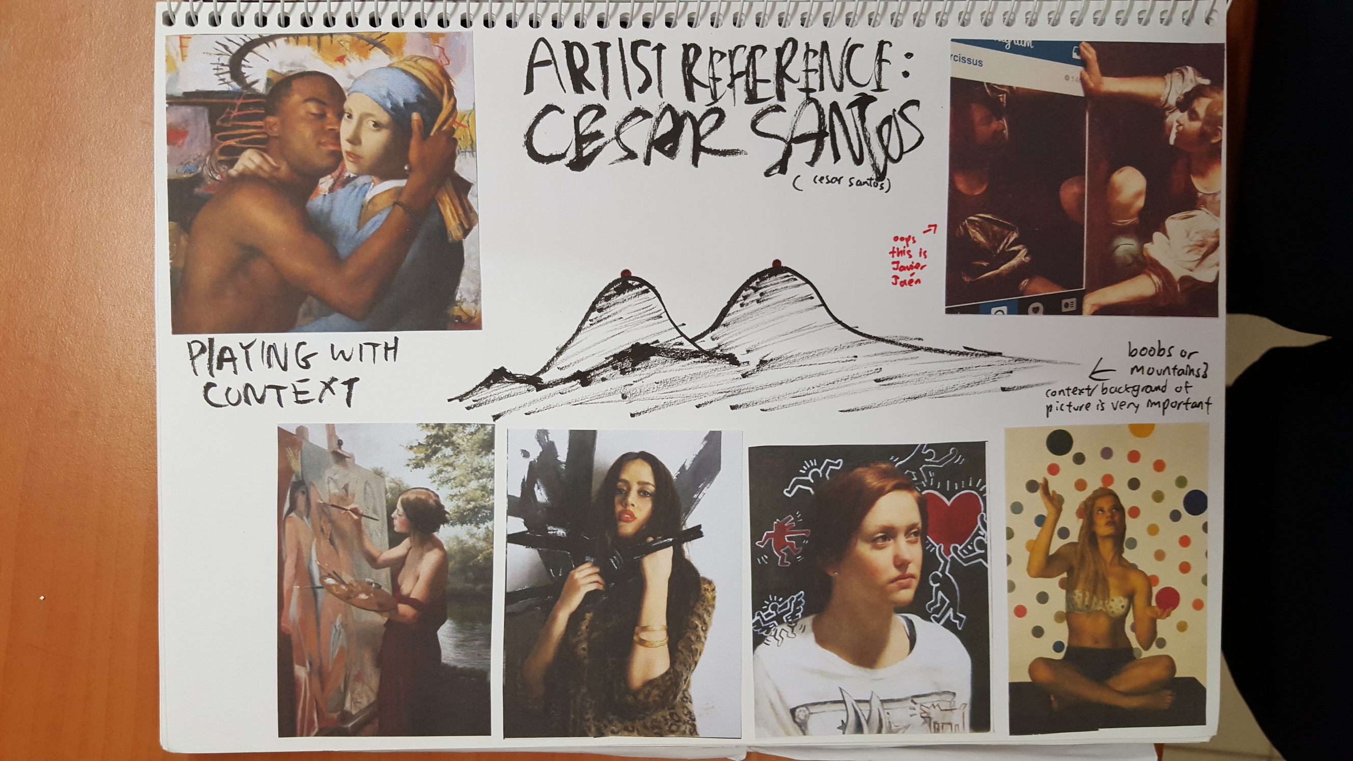
And there you have it! Not much explaining to do cos I think it’s pretty straightforward. Now on to my visual journal (which is the culmination of artist reference, initial sketches and idea generation)
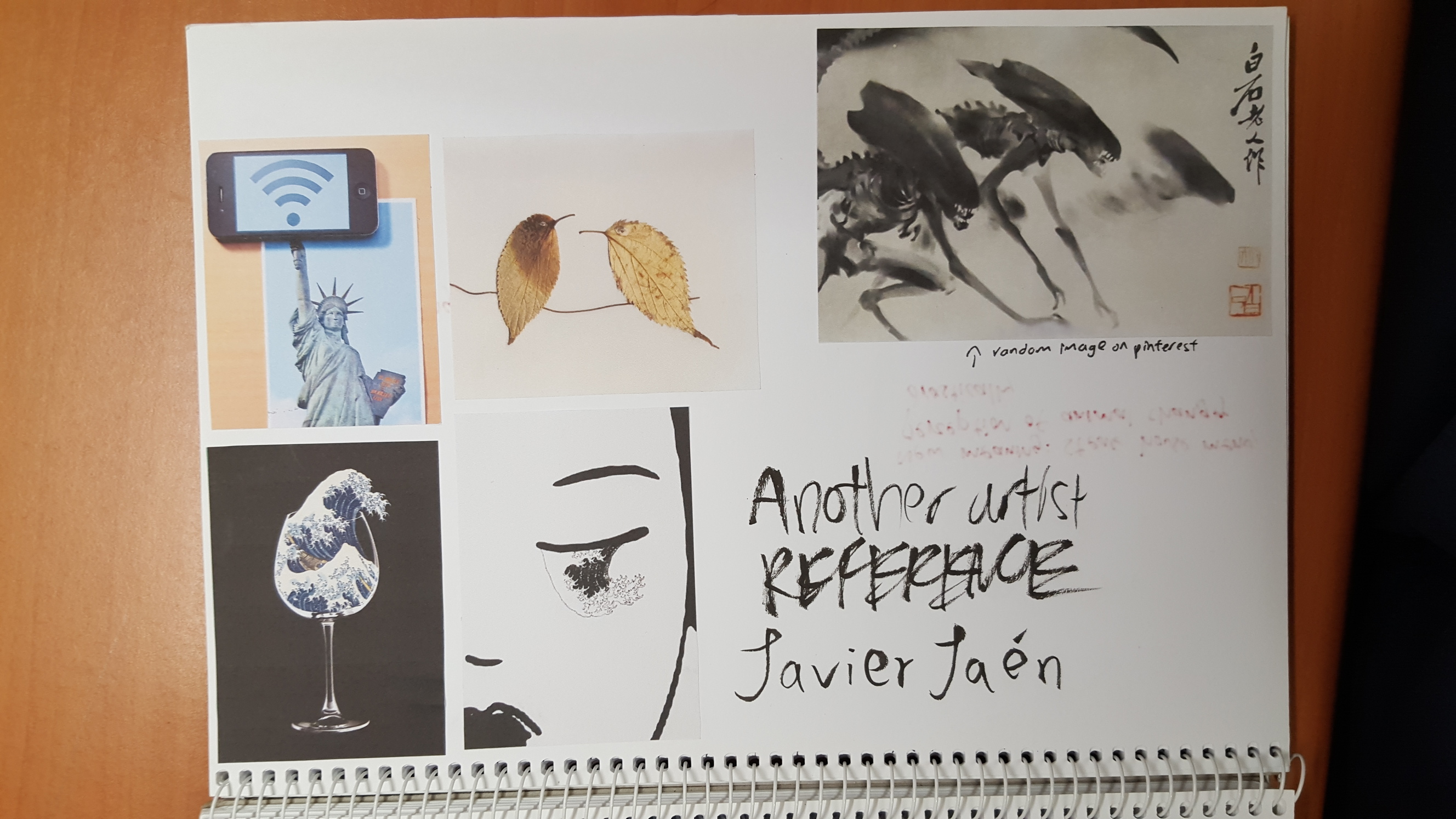
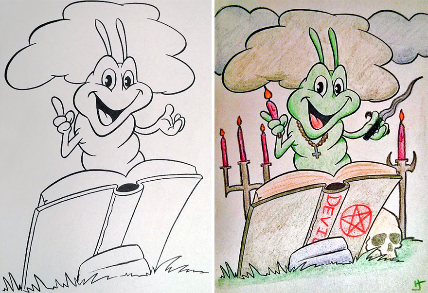
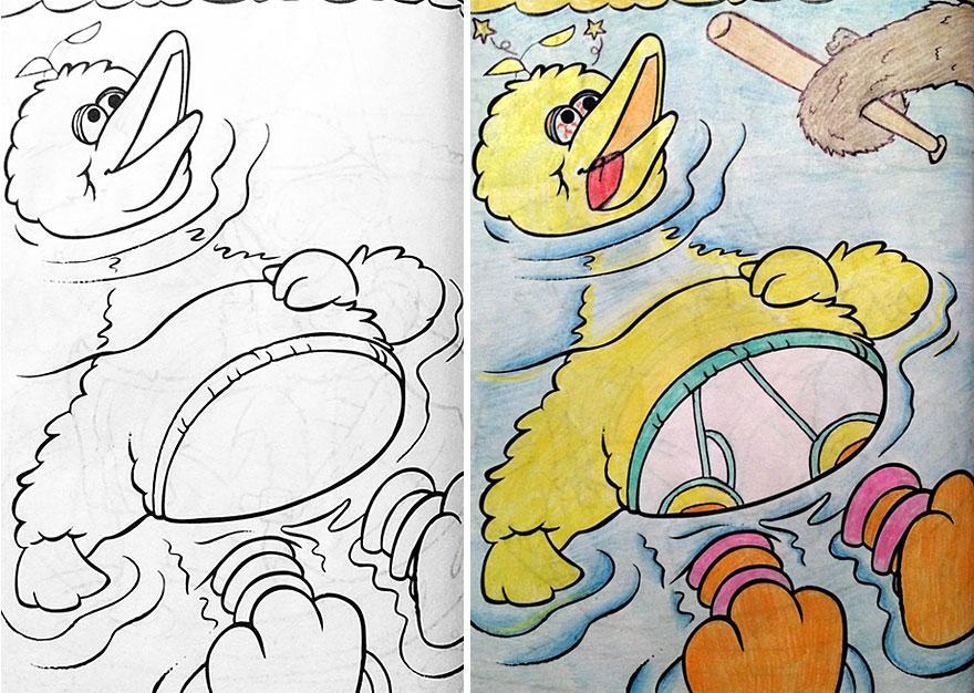
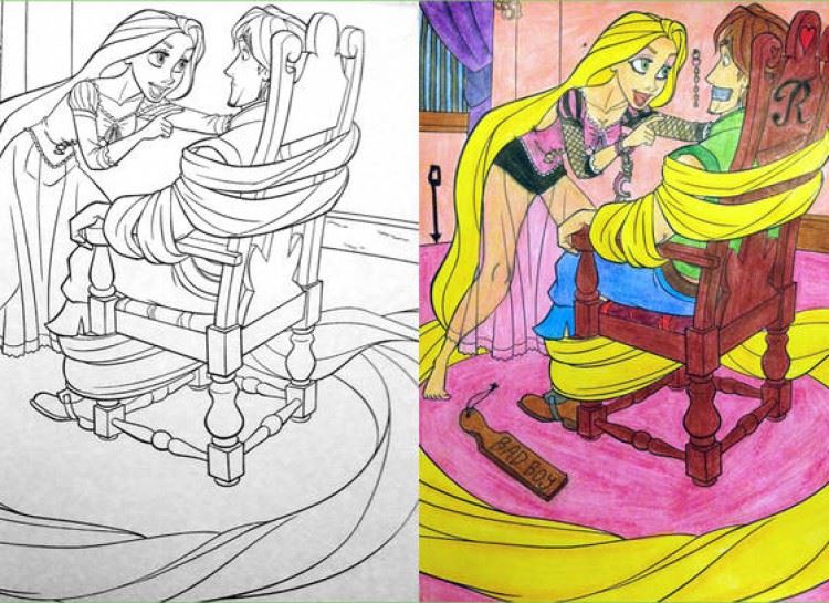
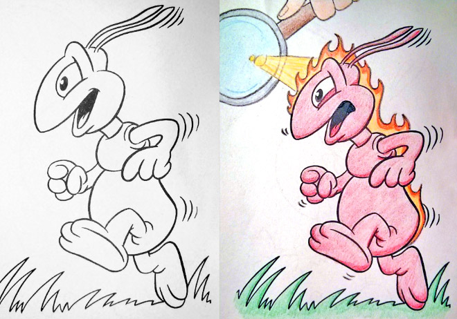
I was also very inspired by this series of inappropriate drawings on kid’s colouring books
Last but not least thank you to everyone who gave me comments, I was a little too preoccupied with making sure the stopwatch alarm didn’t ring for too long so I didn’t write a lot of notes but I’ll definitely look through everyone’s posts here and comment!
Really looking forward to making fun of more art styles for the next project!
Processed with VSCOcam with 4 presetProcessed with VSCOcam with a9 presetProcessed with VSCOcam with c9 presetProcessed with VSCOcam with a6 presetProcessed with VSCOcam with 4 preset