Reference artist 1: Catherine Kim (the graphic designer)


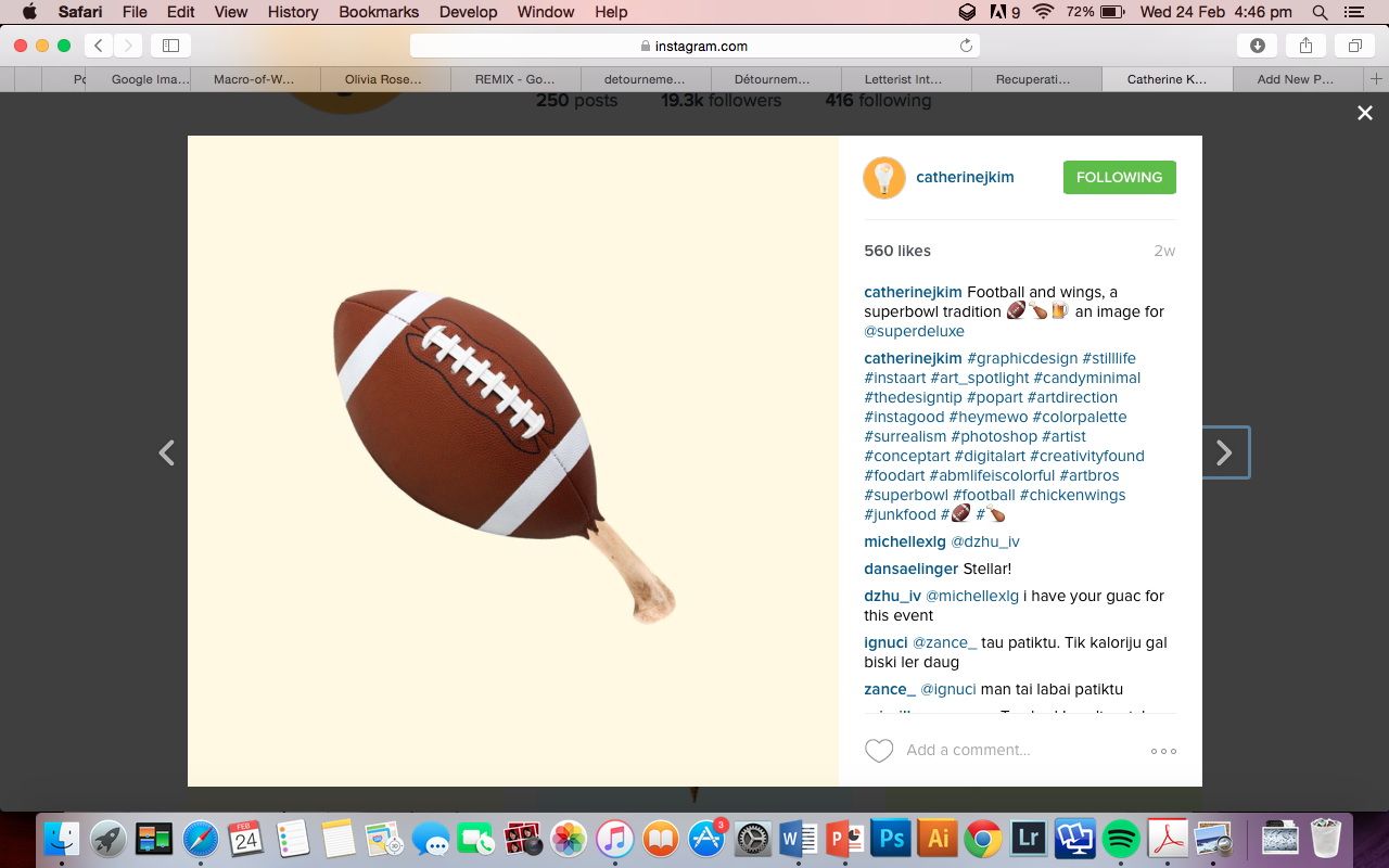
The egg yolk picture was literally the first picture that appeared on my instagram feed as I sat down on the toilet, and I was instantly drawn to Catherine’s ability to merge 2 different objects (who are related in a certain extent) such as football and chicken wings. She also does this in a clean manner without too much digital manipulation, which really brings out the multiple layers of meaning of objects/their names such as how the word ‘match’ can be used to refer to matchsticks or a tennis match. There is also a creative play on imagery which allows people to see things like the sun in a new light (pun not intended) which is kinda what we’re doing in project 2.
The first word that popped up in my head upon reading the project brief was one I probably came across last semester: detournement. Detournement is a french word that roughly means the ‘reuse of preexisting artistic elements in a new ensemble’ and was coined by the Letterist International, a artist collective based in Paris. The many topics and terminologies involved here are way too complicated but essentially the Letterist dudes were frustrated with the structure of poetry and how rigid it was, and sought to produce a new form of poetry/art simply by used alphabets in its purest form. These are all in a way related to dadaism/surrealism and is essentially a reaction to the perceived limitations/constrains of art at that time.
Long story short, detournement involves more than 1 object that undergoes a process during which their original meaning/importance is lost and a new one created. It makes people think about the original media/piece in a different light.
‘Détournement is thus first of all a negation of the value of the previous organization of expression.’


Reference artist 2: Ilya Kalimulin


http://www.creativebloq.com/illustration/7-alternative-interpretations-love-21619207
very cool article with 7 different interpretations of love.
A shoe from the perspective of a __________ is __________
dog, toy
nose, stench
ground, friction
feet, clothes
olympic swimmer, stupid decision
hypebeast, gun/knife (life lost)
laces, highly unstable
A right hand from the perspective of a __________ is __________
teenage boy, girlfriend
left hander, just a limb
boxer, his income/job
A chinese painting from the perspective of a __________ is __________
Sujatha, visual analysis
african native, nonsense
lion in africa, thin carpet
ink, quicksand
book on chinese painting, another page
An armpit hair from the perspective of a __________ is __________
cotton t-shirt, wet brush
metrosexual, ketchup in coffee (totes EW)
wind, annoying branches
the hair on your head, that retarded cousin who never showers
28 Feb Update
Okay I’ve decided to go with the main subject/theme of chinese paintings.
Why? I want to try something new other than plain old graphic design, it was one of the first books I saw when thinking of ideas in the library and I could really work on my water-based painting skills. Also I think that like many others my age, I’ll admit that I stereotype chinese paintings as being old-fashioned/’cheena’/typical-chinese-new-year decoration or simply not as appealing as Western forms of art and I think it’ll be interesting to challenge that inherent bias.
So currently I plan on using chinese paintings as my main theme and subject them to detournment/interpretation based on artistic styles/genres like abstract expressionism/graphic design/dadaist etc.
However I’m not sure if I should use the chinese painting style to portray things that don’t belong or portray typical chinese painting sceneries with different styles (like pencil, vectors etc)
Questions to ask Joy tomorrow: for the sentence ‘a chinese painting in the POV of an abstract expressionist is _____’ must I have a word for the blank or can I just convey the result with a picture? And also my main concern, which is how do I ensure that the result looks like it is done for a 2d project, rather than one for foundation drawing (more like painting)?
Oh I have a lot of pictures for visual references but OSS’s 3mb upload limit is a real pain in the bass so I’ll just show them tomorrow.
Here are some nice links
http://designtaxi.com/news/357845/Artist-Injects-Modern-Urban-Elements-Into-Traditional-Chinese-Paintings/
http://designtaxi.com/news/351277/Photographs-That-Resemble-Chinese-Ink-Paintings/
http://designtaxi.com/news/354438/Artist-Creates-Amazing-Splatter-Paint-Portraits/
http://www.plumblossoms.com/C%20N%20Liew/exhibition_calligraphic_evolution.html
http://www.plumblossoms.com/C%20N%20Liew/exhibition_calligraphic_evolution.html
A chinese painting in the point of view of __________ is ___________:
abstract expressionist (abstract shit)
graphic designer (show photoshop menu layout/vectors to form mountains etc)
dadaist (dada prints)
obese american (burger/hotdog/fast food joint in chinese painting style?)
comic book fan (comic book panels, superheroes in scenes, ‘swoosh’ effect
de stijl artist (cubist + the 3 primary colours)
cubist (cubist style)
collage artist (collage)
photographer (photographs)
pencil sketcher (sketched)
graffiti artist (using spray cans instead)
typographer (text properly aligned etc)
film director (the screen menu thingy on big video cameras idk)
Andy Warhol (colourful)
Michael Bay (explosions in China mountainside)
kindergarten kid (crayons)
minimalist