Have a look at the previous two updates 1 | 2 🙂
I A M B I L I N G U A L .
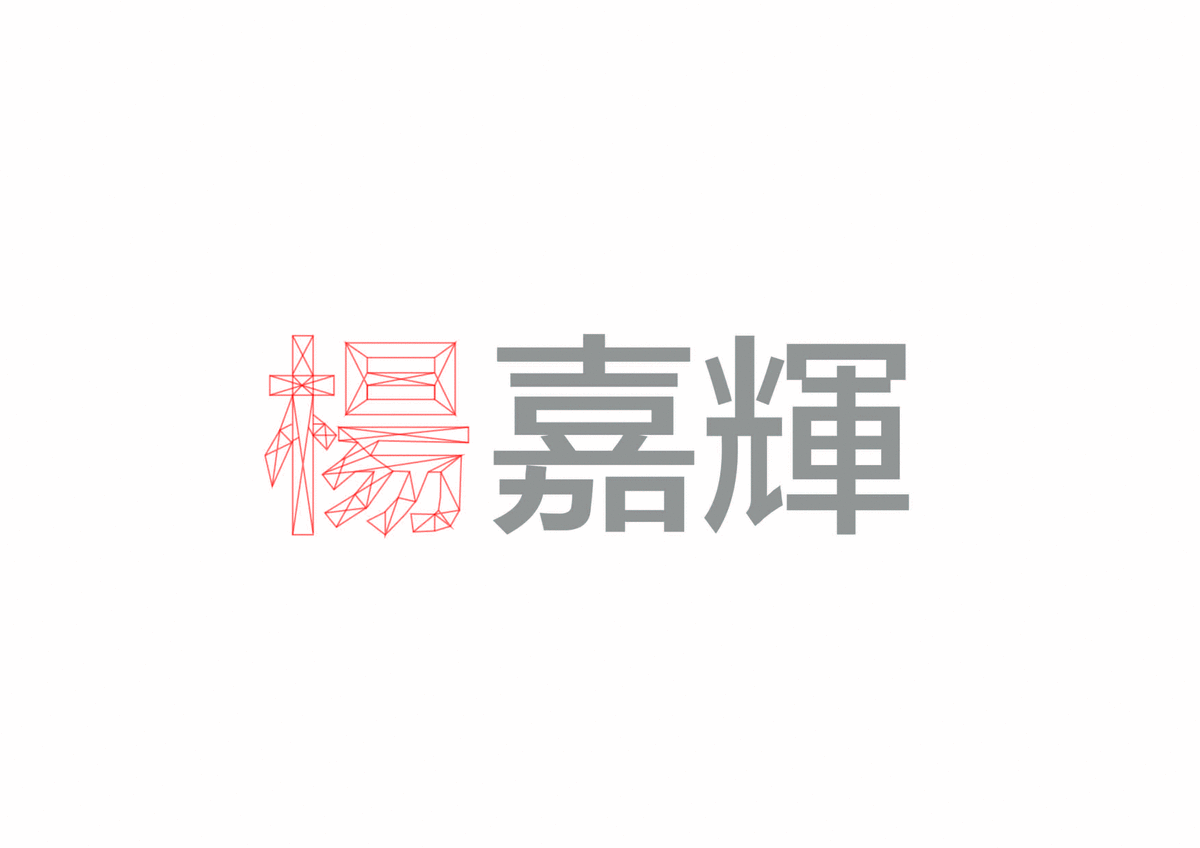
Initially I had the idea to combine the Chinese and English names together by half, but after doing so I found out that the words become unreadable which lose some of the meaning and does not look as aesthetically pleasing. I chose A, J and H for Alfred Yeo Jia Hui (both my English and Chinese first names). Not happy with the first draft, I looked at the different elements of the Chinese words and pin pointed the parts which are suitable for the integration of the individual letters and chose the following.
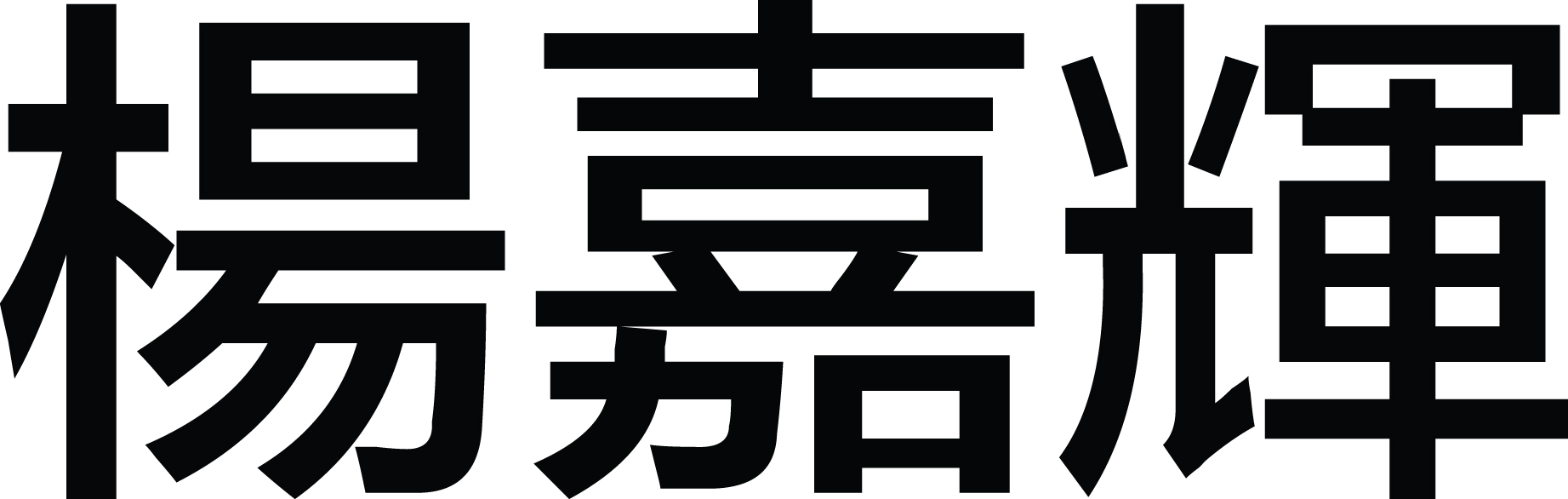

Quite pleased with the results, I decided to play around with the idea more and produced this, which was a mix of the letter A & Y found in each Chinese words to represent Alfred Yeo.

Feeling that the letters didn’t stand out as much as I wanted, I stretched them and achieved a more exaggerated look which was quite interesting and funny looking, I even created a gif! (More to come below lol :P)

I thought people could be confused with why the red parts were highlighted and doodled some indications using my Wacom! I thought it looked kinda cute and also tried the style in the next attribute (look below). But with further consideration, I decided to scrape the idea as I wanted to keep the look and idea of being clean. Some tidbits, the reason why I added the doodle is also because of my long time internet name @alfredoodles! (shamelessly promotes Instagram.) I showed the 2 versions for consultation and the majority of them felt that the first one was a clearer indication of being bilingual as the English letters were seen to be equally prominent while the second one had a stronger presence for the Chinese which was not my intention. Remember? 50/50! Feeling confident of my design, I chose it and as asked, polished up the thickness of the letters to create cohesiveness. I used the Chinese strokes as reference with how thick my English words were adjusted. Yay more gifs! ~


The end product looked great and here’s a look of it in comparison with the difference from before it was edited! Like a slimming advertisement?!?

End Product

I A M P U N – N Y .
Continuing with the previous work on the red elves (getit getit, red elf, elf red, ALF-RED?! Yes thanks I can tell that you’re not REALLY impressed).
I thought the ones I did were not as refined and decided to vectorise it myself using the pen tool.
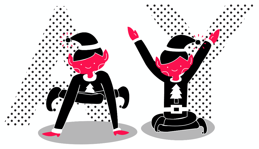
Here you can see how much better it looks! I thought it looks very much like a character you can find in Adventure Time!

As mentioned from above, I tried to incorporate the doodles. In this one I included the reactions that I get from people when I try my puns. Sigh, I’m funny friends, I am!

End Product
Deciding to exclude the doodles, the remains of it builds up toward the clean look I wanted in the series.

I A M C A U T I O U S.
From our last group consultation, from the sharing with Brenda there was the mention of having local motifs or suggestions that could be included in the design. I was inspired by this idea and decided to play along with my style of red and black.
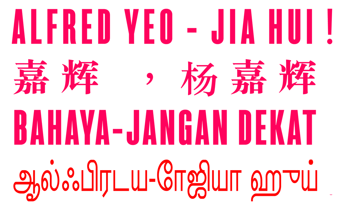
We always see this danger-keep out! sign around Singapore to an extent that we had grown accustomed to it to the extend of not taking notice of it anymore. I thought this could be a interesting concept and experimented with it.

I used google translate to do the other languages that I am not familiar with and also use a similar san-serif font called “Sorren” which I felt fit the look best. As the translation for my name in Malay is the same as the one in English, I kept the same words “Bahaya-Jangan Dekat!” which works in a way where if you read it from the top to bottom, it screams “ALFRED ALFRED! DANGER! ALFRED!!” like a reminder to me.
End Product
I A M I N D E C I S I V E ?
As testified by many of my friends and loved ones, I tend to be someone who is unable to have a clear set of mind in my decisions during my daily routine. I remember my mum chiding me about this matter with my extensive usage of the sentence “I don’t know”. She would constantly want me to make a decision, and as much as this trait sometime do surface, I’ve been trying my best to keep it down.
I am always fascinated by hidden meanings in a logo or word and have been trying to include it in my personal logo which sadly have not been made or those that I had done was not to my standards. For this design, I suddenly had a revelation of having the hidden word IF? in my name in the bathroom one day and immediately created this piece, thus there was not much process in this (opps!).
End Product

(include picture of me holding up my printed art pieces) < To be added tomorrow! Check back this space for… a picture of me… see Ziyu I can be narcissistic too! Lol okay k thx bye.

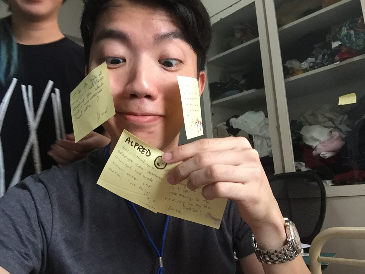
AND OMG THANKS EVERYONE FOR THE NOTES… 4 of you. <3


