2D Fdn II: Zine (Final)

Below I would be explaining a bit on the process towards the final outcome! Scroll all the way down to the final product if you want to skip it!

  1. Inspirations.
  2. Binding methods.
  3. Paper choices.
  4. First mock-up.
  5. Second mock-up.
  6. Final Zine.

    Inspirations

    moodboard

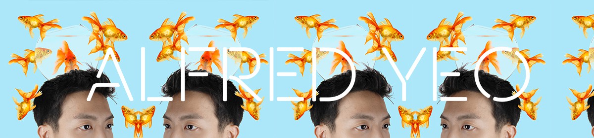
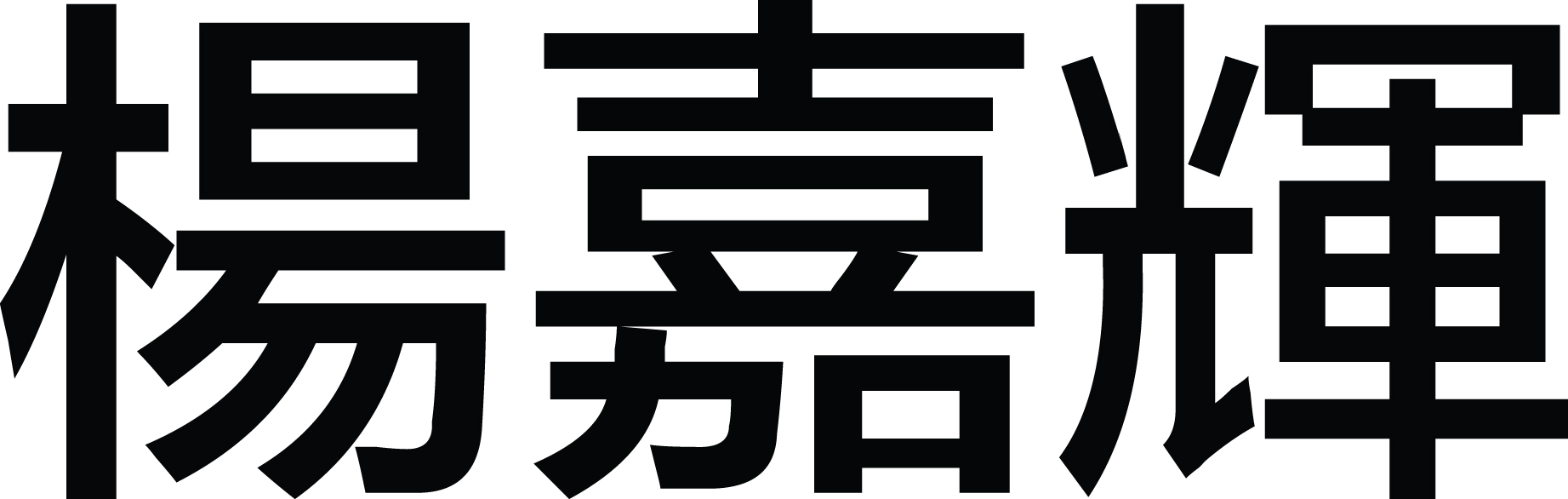
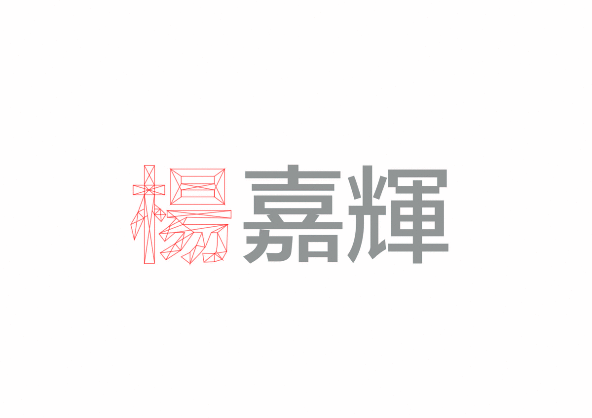
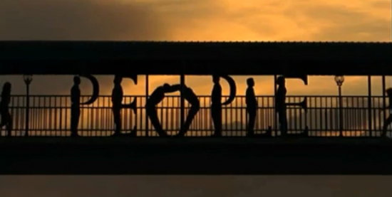
From my first assignment which was using typography to create my name. I noticed that I really enjoy having an individual focused colour as it made the works stand out more, and in contrast to b/w it could also deliver a different meaning.

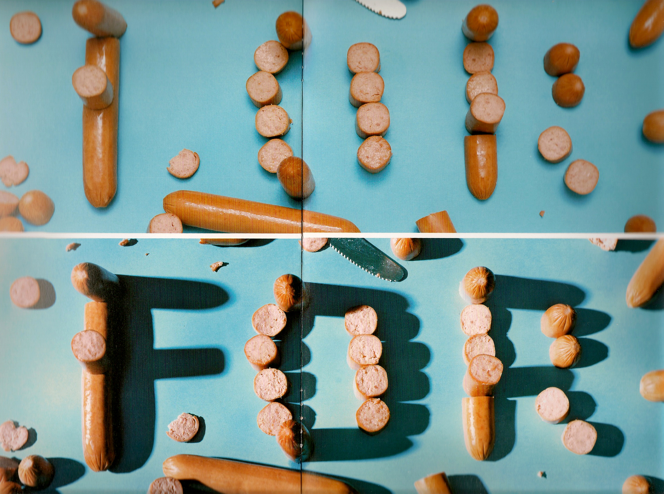
I can’t seem to find it but there was a piece I did in polytechnic where I used the colour red in a b/w poster about back ache to deliver an effective message about pain in that area.

Screen Shot 2016-04-17 at 1.25.22 pm Screen Shot 2016-04-17 at 1.27.34 pm

During the process, I also went for my brother’s design FYP show in Temasek Polytechnic and took some pictures of books they have created that I found interesting.

IMG_8221 IMG_8219

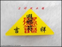
Last but not least, I found an accordion bind noisesg book at the counter of ADM and was quite excited to see and touch something so closely related to my inspiration.

NOISE-Insta-facebook v4


Binding Methods

Having both brother from TP and Lasalle, I constantly see them creating books and using different methods of binding. These intrigued me and made me can’t wait to do it as well.

spines1

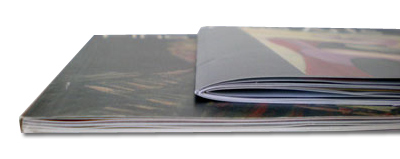
I initially wanted perfect binding, but felt that 2 pieces of paper would not justify the action and went ahead with saddle stitching my book for the first mock-up with thread. (Left: Perfect binding, Right: Saddle stitch)

Here is a link I found on some consideration you can make when choosing your binding methods. They only introduce the saddle stitch method and perfect bind, but also included some tips on gutter space and paper choices which I found really useful.

587641206916745

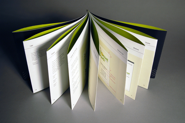
I found this french fold binding really interesting but did not go for it.

5fe342d3b7b4697c0cc7da8823eccc11

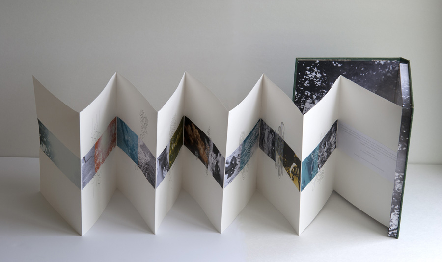
The accordion bind which I chose as the final as I found it to be more engaging, but also as its difficulties which I will explain below.


Paper Choices

A little hindsight on zines. They are self-published books that are able to express the creator’s ideas without it being censored, edited or watered down by a middle man. Everything holds together as a diy concept and has an authentic element towards it. Some controversial topics that were used previously were political, feminism or even on LGBT rights.

Moving towards that direction, I consciously created something that is not overly produced but also not under produced as well.

851416962_10677177479525848035

80-90GSM: Normal printing paper, too thin for my liking.

140-170GSM: Ideal paper as it is not too flimsy and not too hardy as well.

250-300+GSM: Too professional-like for me and does not convey the ideal of a zine.

Colours: I tried on white paper but thought it looked too sterile for me, and experimented with off-white.
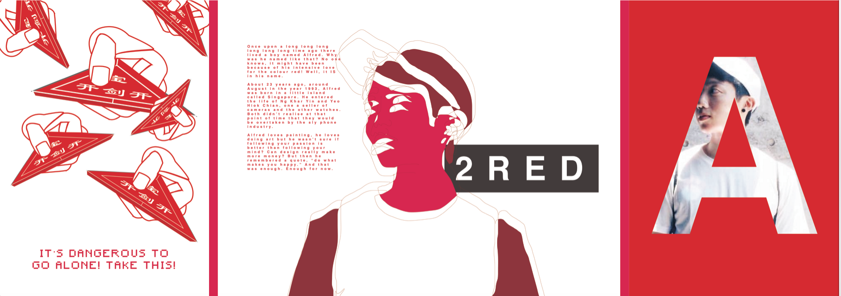

First Mock-Up

Screen Shot 2016-04-17 at 2.59.53 pm

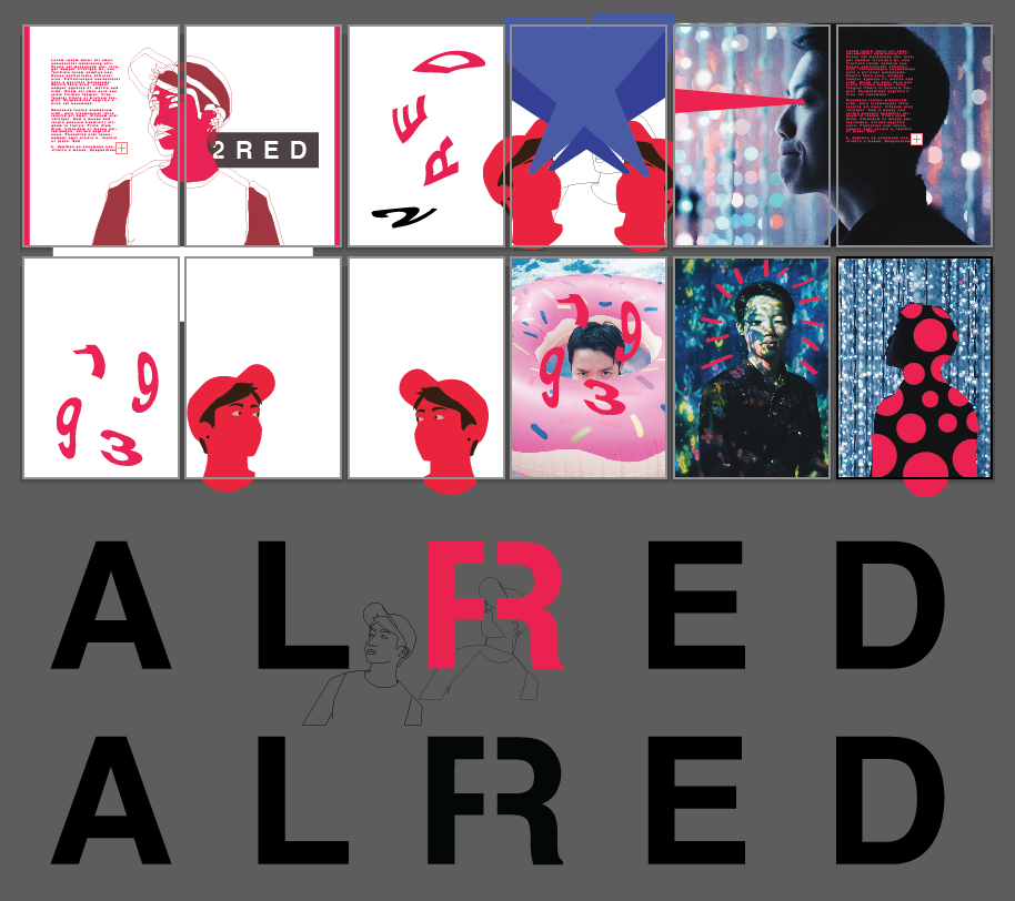
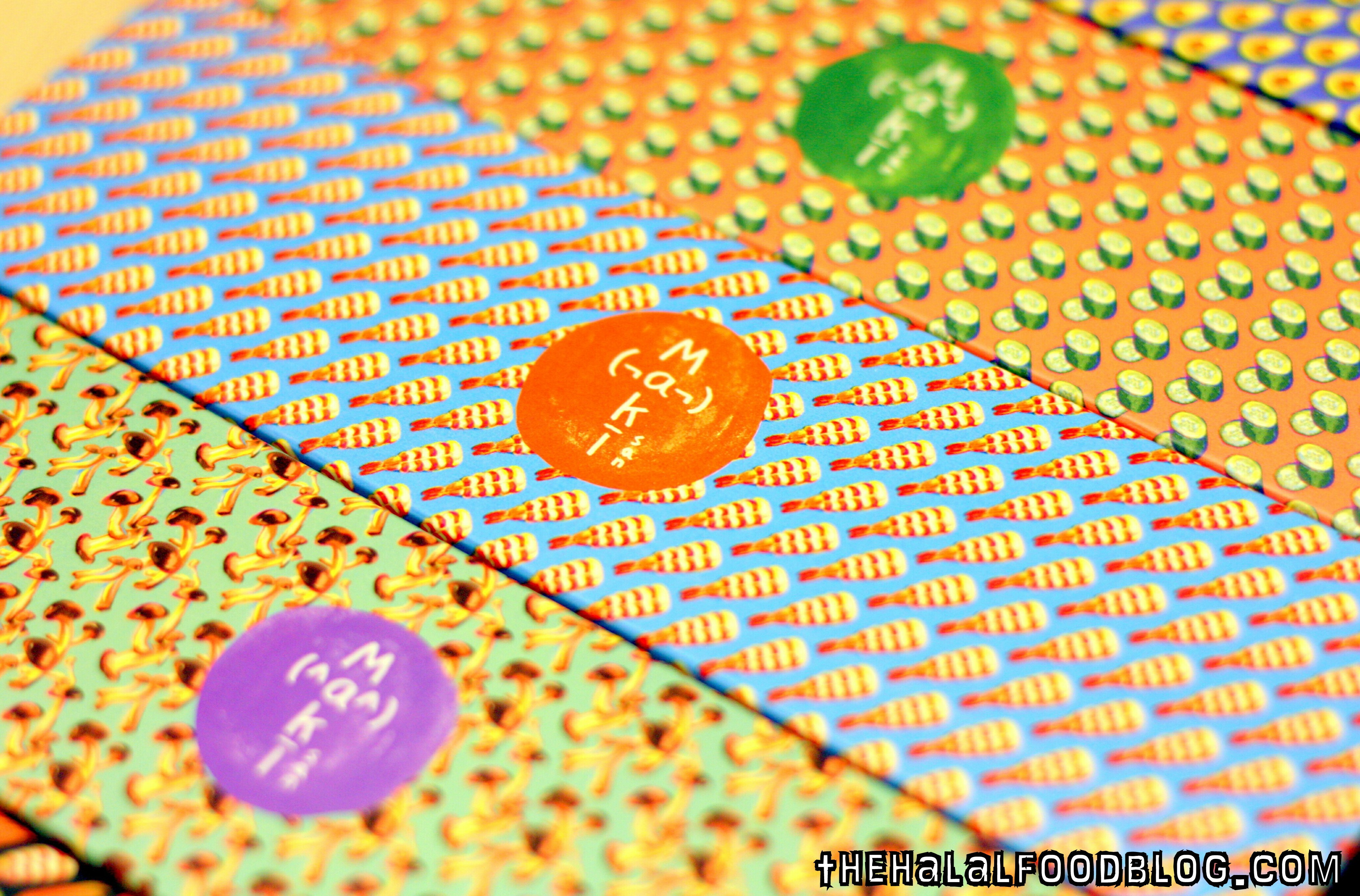
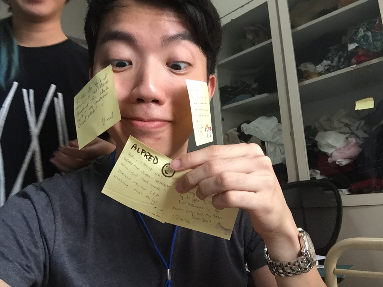
As you can see, there was an excessive usage of red and also a mixed of illustrations and photos. The binding that I used for this is the saddle stitch with thread. The tread that I used were too thin and it broke the next day when I went for consultation.

From this, we took into consideration that:

  • The first 2 page looks good.
  • 8 and 9 could be played along more.
  • The colour red works well.
  • I should explore on more binding methods like accordion bind.
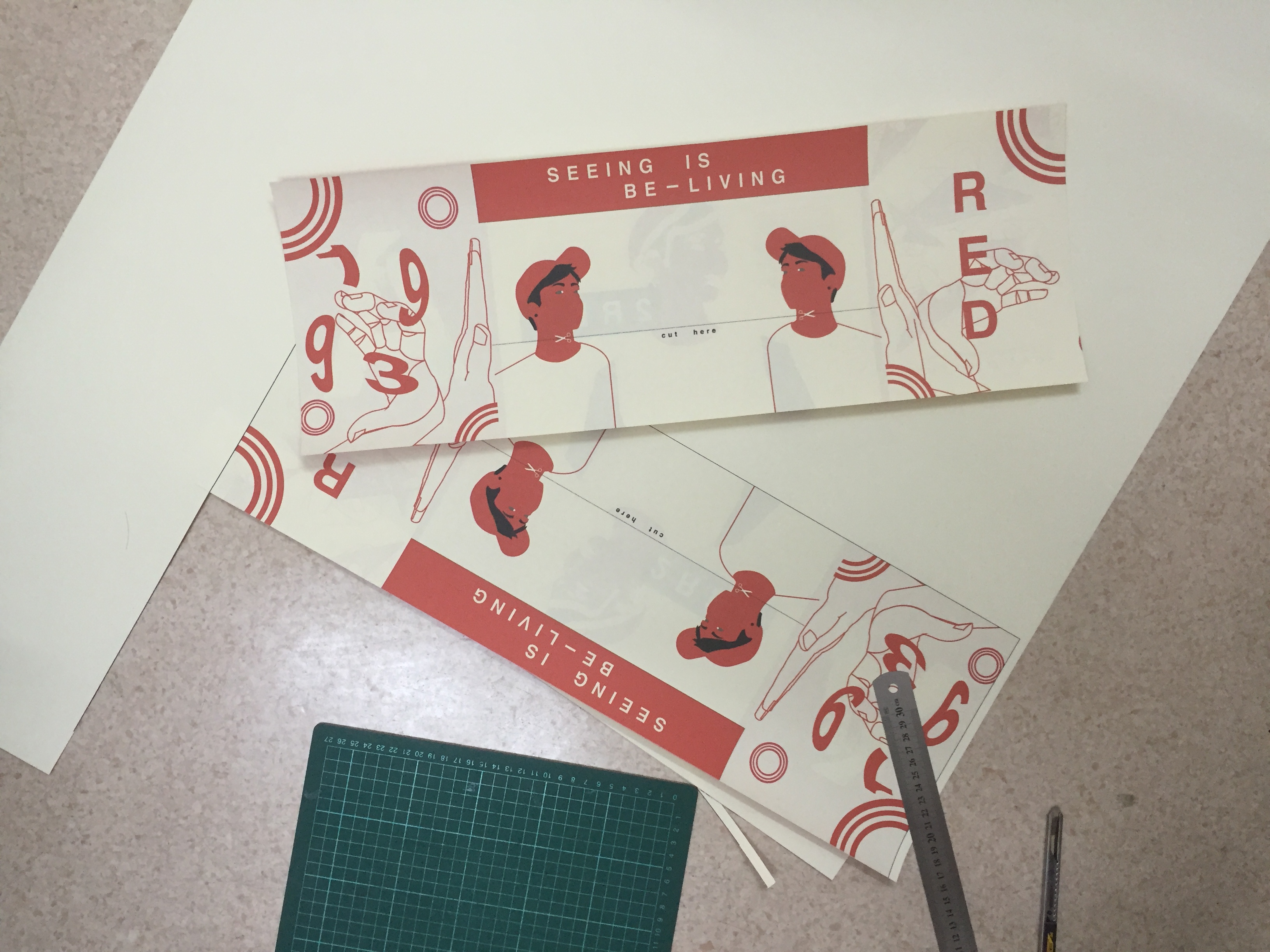
    Second Mock-Up

Screen Shot 2016-04-17 at 3.28.20 pm Screen Shot 2016-04-17 at 3.28.12 pm

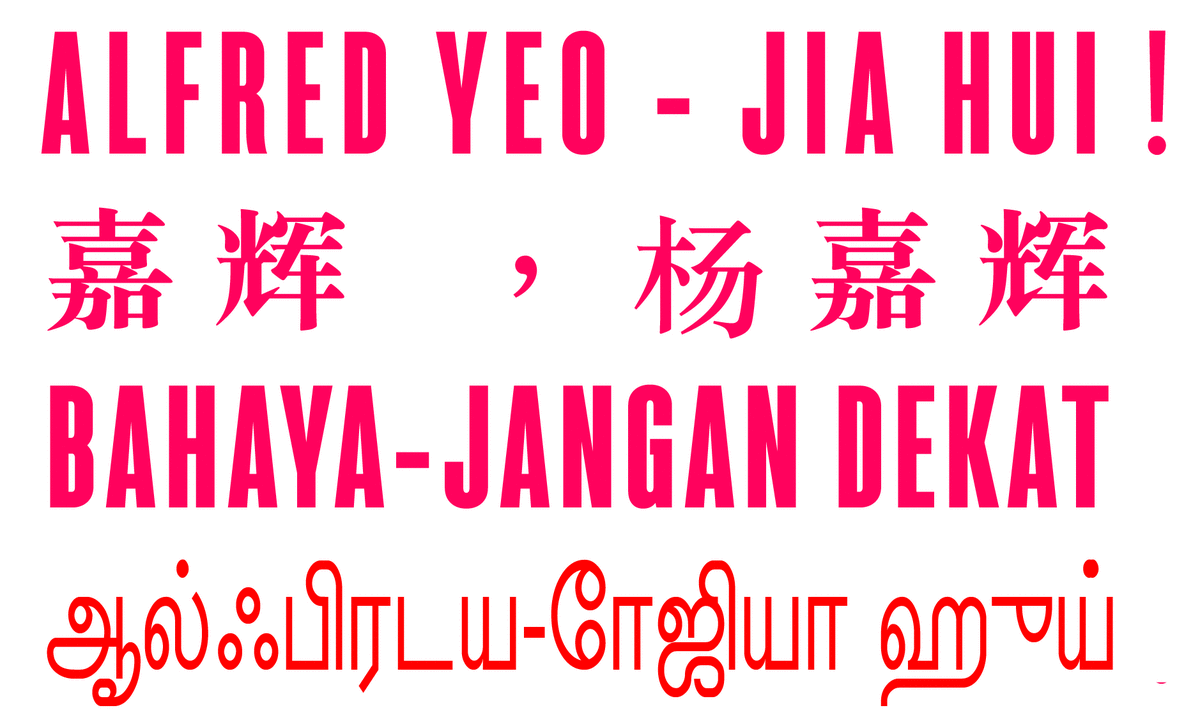
I added the elements from the “point of view” assignment like the talisman and the hands.

Print

Changes to be made:

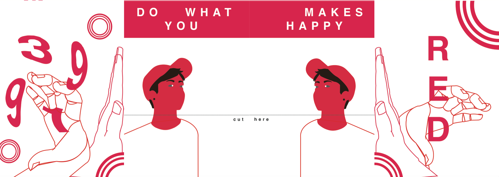
  1. Write 1993 instead of 3991.
  2. Work on “Do what makes you happy” quote, might be seen too far apart and as individuals.
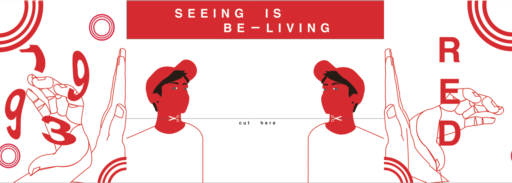
  3. “Cut here”? Cut where, make it clearer.
  4. Words too small, far apart, and contains widows and rivers.
  5. Picture in the letter “A” too pixelated, change into one that is higher res.
  6. The tone of red was not consistent.
  7. Printing too small (Miscalculated and printed it into A6 instead.)
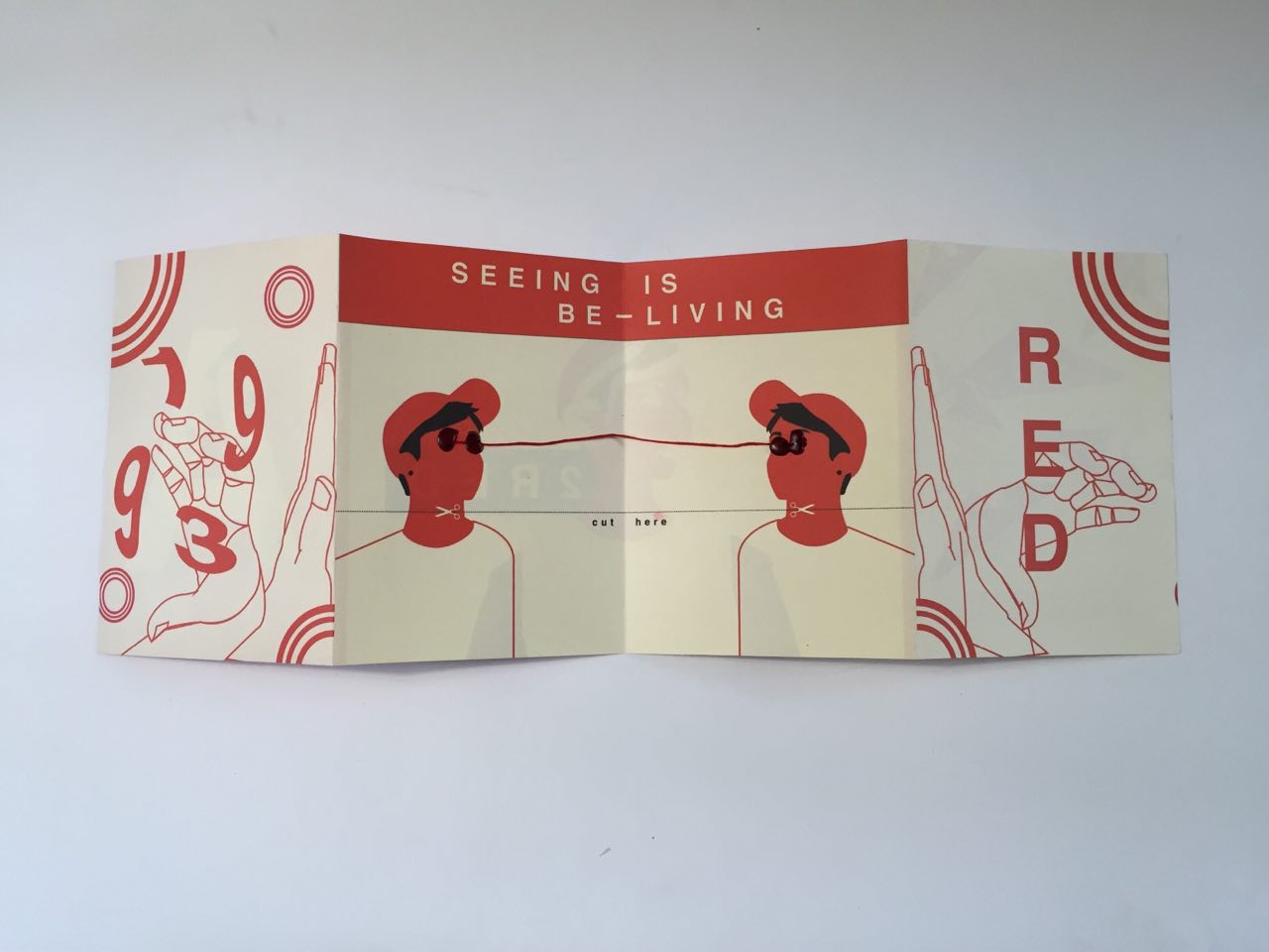
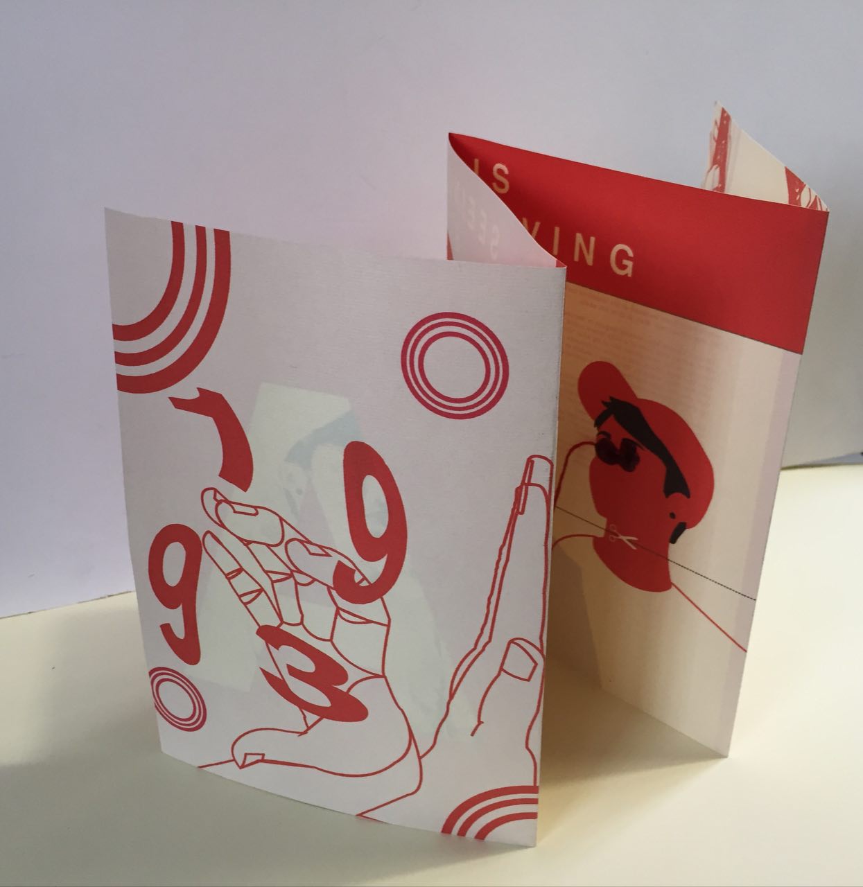
    Final!

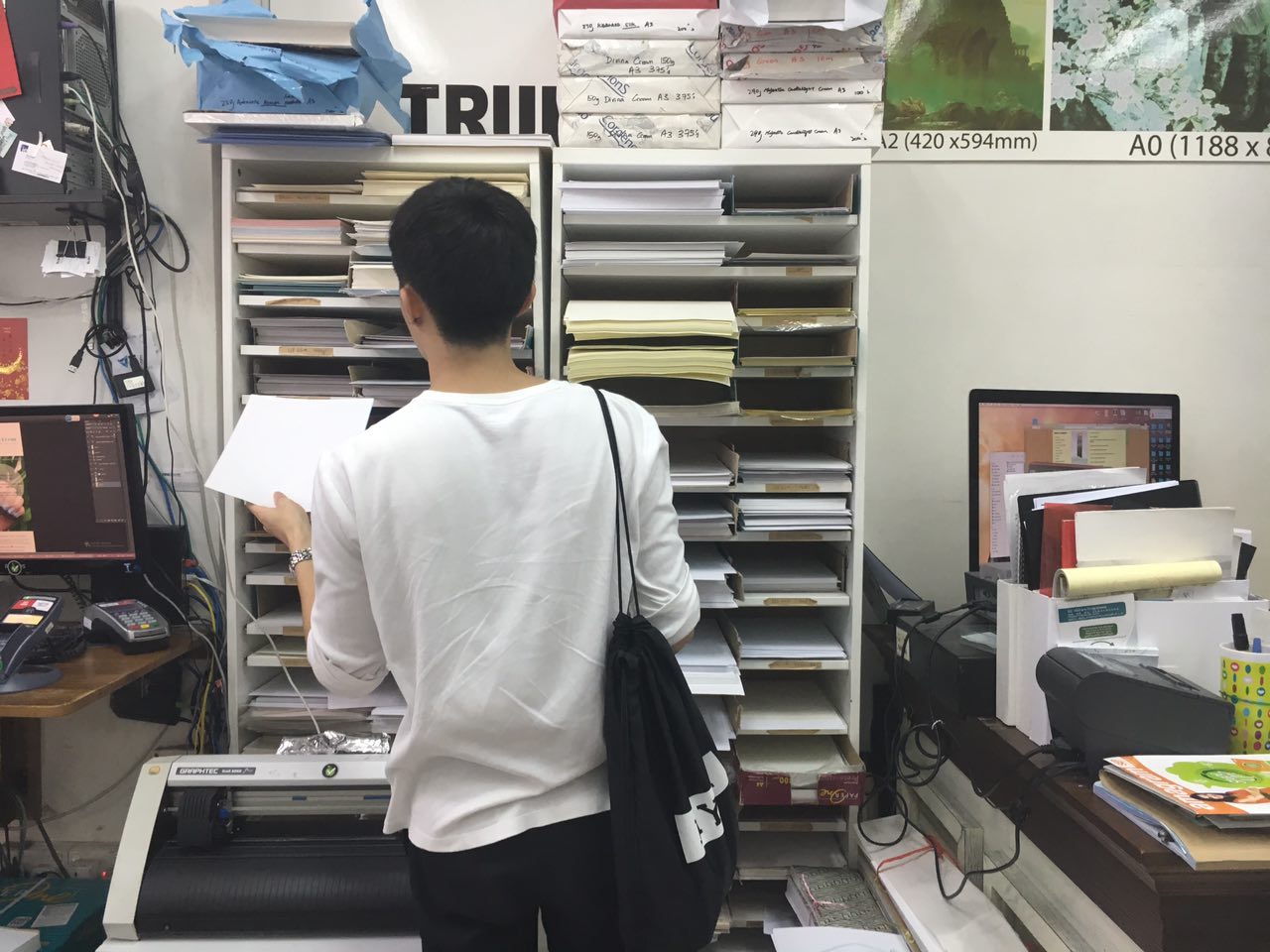
    As my printing were too small in the previous round because I thought A3 would be enough to accordion bind an A5, but no. I tried to source out for printers that printed A2 double sided but were to no avail until my younger brother recommended “Leadership printing” at peace centre and was told to bring my own paper.

Logically I brought an A2 paper which I bought from “Fancy Paper” and walked over to the printing shop, but was told that I needed an A1 paper instead as their machine could only fit that size for my need. Thus, I walked back to get my paper again and then back to print. Horrible experience, but thank god Darren was with me to get me going!

IMG_8394

Omg look at how ridiculous this looks like. Leadership must be the bane of environmental extremists.
IMG_8397

Printed 2 just in case I made a mistake, which I did. -.-

851302634_1999313532131603937

I accidentally dripped the wax somewhere else on the paper than the eyes. One of the drip can be seen on the word “here”.
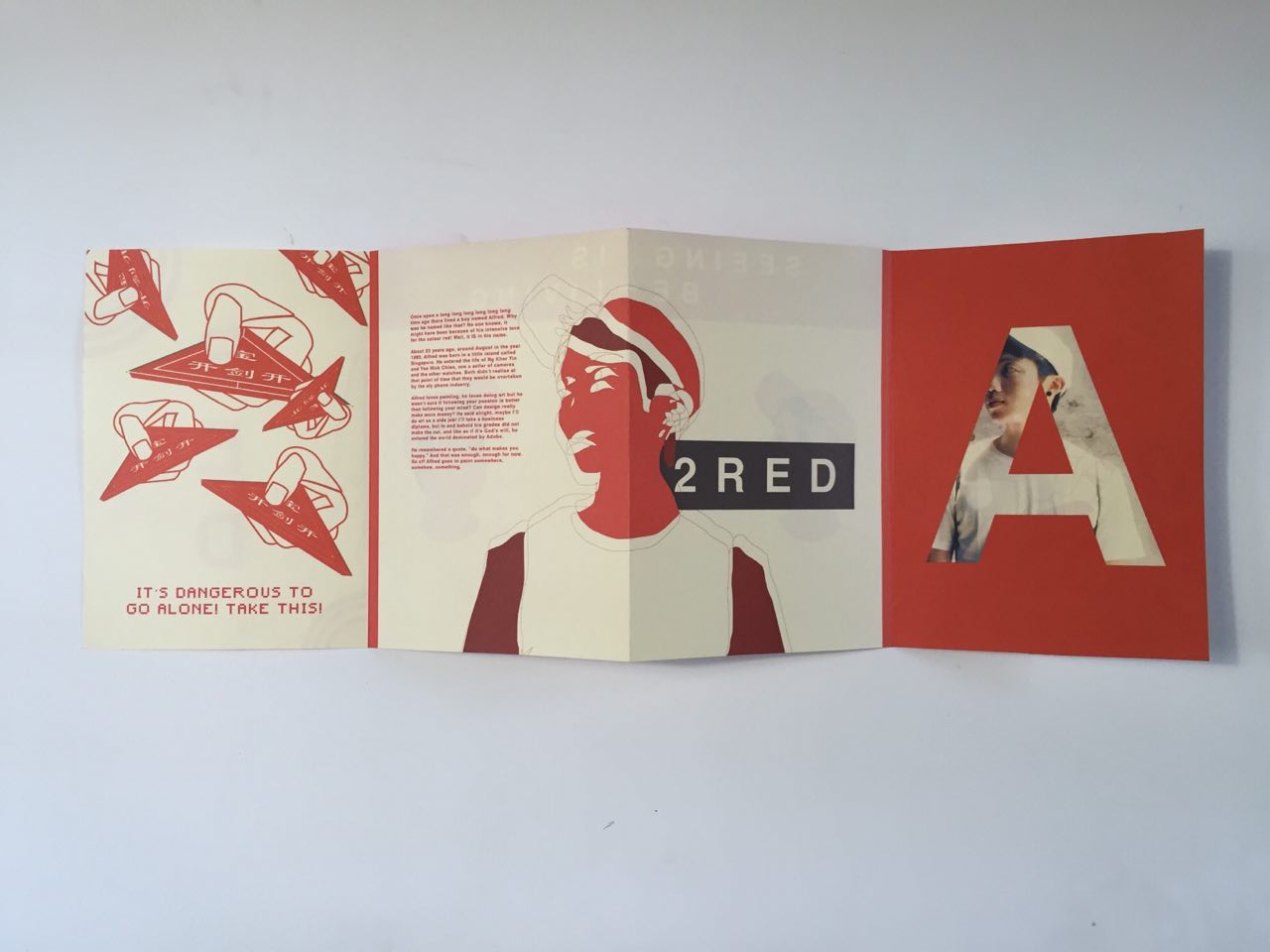
Screen Shot 2016-04-17 at 3.59.44 pm Screen Shot 2016-04-17 at 3.59.35 pm

851411687_7783798046285690791

851418873_11187264711714707191

851308264_16149355628703764625

To be improved:

  1. The paper used might be too yellow which caused the red to turn into a tint of orange, which contradicts with the title of the book.

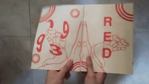
Taken the consideration of an accordion bind, I made it interactive with the hands clapping, and the pulling of the red strings as you open and close the zine as seen in the gif above.

Conclusion

Overall, I really enjoyed the works that I did this semester more than the ones I did in sem one as I am able to explore more items and also to allow my own style and creativity to be seen more prominently.

The last creation of zine was really amazing as I was able to do something that I have always thought about doing, but was not able to because of the lack of motivation. I learned that you have to be extremely meticulous with what paper, binding, design, text, colours you used in a book and it could make or break your work! I also believe that we only had a small glimpse of the viscomm life, and I can’t wait!

I would definitely miss this class (Joy and my lovely classmates) and please say hi when we meet in the corridors! 🙂

THANK YOU!


2D Fdn II: Point of View (Final)

First of all, thanks for all your affirmations!

Hello hello, welcome to the perspective from the ordinary made extraordinary… PAPER! Wooooo *throws confetti*

Truthfully I didn’t start out strong in this assignment, I was really stuck and thank god for the consultation that made me push the ideas! Phew.


I started my designing process trying to find a style that I wanted for it, I created this repetitive design unconsciously and included a sleeping character into it to have a little different element, and mainly the fact that it looks adorable. LOL.

paper (WIP)-01

Joy mentioned that it looks a lot like something maki-san would do! I agree!

I thought hard about it and didn’t follow this idea as I felt it was a little too simple and I wanted to push myself a little more than this in this assignment.


From the 1 to 1 consultation, we derived towards the idea of trying out illustrations into photographs, or vice versa. I was a little apprehensive as my photography skills were not as polished, and some of the location like the yoga room or a hospital bed were not as accessible to me.

On my defence, I did try out the photo style in one of the perspectives which was “paper in the perspective of a lazy soldier is a pair of paper underwear.” This is me decked in my old NS uniform and holding up an underwear which was replaced with a illustrated origami version of it. Not gonna show you the one with my real underwear, privacy people! Lol!

I brought it to the group consultation and had comments that it looks very crystallised, or was gem-like, that was not what I had in mind and feel it didn’t portray the aspect of a paper material. I did not continue this style.

Print


Paper in the perspective of a “pao” (bun) is a sauna towel.

I started having the idea of paper being the mat of the pao, only because of how it looks which is exactly like a bun sitting on a piece of paper. But thinking in perspective of why the paper was needed and what purpose does it serve. I concluded that it was just a platform for the dough to be placed in the steamer hygienically. Which brought me to how they are cooked…

Steamer, steamer, ah ha! How about a pao “sauna”? And that was how the idea was born.

sauna-01

I started with depicting the bun sweating in a sauna, and was humoured by it. Oh god, I laugh at my own jokes. (this was what I showed in the group consultation)

sauna3-01

I added more buns and as suggested by the group to create some paper to be more obvious as a towel like slinging it on the “neck” or placing it on the “face”.

sauna7-01

I changed the coloured of the plank wall to show more contrast, and also added the halal logo which we often find in the paper of our favourite pao. I also exchanged the pandan pao into a salted egg one. (woohoo!)

sauna9-01

I added more steam, changed the location of the halal logo to not make it look too forced, and also added a glass wall and a tray ceiling to hint of the fact that they are in fact in a glass heater displayed as delicacies.

Screen Shot 2016-03-24 at 12.14.09 am

Some reference picture I used while creating the pao and halal logo.

FINAL

sauna12-01

Last but not least I added a tong for a dynamic look, and this ends as my final piece.

Feedbacks for improvement: Add water droplets on glass to heighten the reality of it being in a steam box.

Screen Shot 2016-03-24 at 12.13.50 am

Here you can see the pen tool of the final piece.

Here’s a gif to show the process! You can see some images that I didn’t include as I only showed the key points of the changes. Enjoy!
ezgif-2487265507


Paper in the perspective of a origami is a yoga session.

Thinking of the element of a paper, I thought of how bendy it is and how easy creased it can become. It made me think of the paper cranes that I did in primary school when I was young and then had the ah ha! moment to associate how humans bend themselves in yoga classes. 

3-01

Firstly I created the background setting of a yoga class, adding the anytime fitness logo on the wall which you see popping up everywhere nowadays as a little witty approach. The colour purple and black were also used throughout to have a better-rounded look. Yoga mats were placed randomly to mimic reality, nothing is perfectly straight in real classes!

4-01

I added the orgami, and added a perfectly folded crane (the perfect form) surrounded with random folded papers to mimic people who have difficulty doing the poses. As you look at the back of the class, you see a paper aeroplane??? How bad good can you be to turn into something else. Lol!

5-01

Next, I added crumbles of paper to represent those who literally just gave up. See aeroplane, you’re not so bad!

FINALyoga-01

Finally, to complete the image, I added the shadows like how I did for the pao seen above to stylise the look of the image.

Screen Shot 2016-03-24 at 12.11.40 am

The working outline of the final piece.

Here’s a gif again to show you the different layers I used! 🙂ezgif-1453625811


Paper in the perspective of a lazy soldier is a paper underwear.

Using the photo that I showed earlier on top, I used it as a reference and created the illustration below, I first did the background on the left and then duplicate it to the right (which was the doorway in the picture.) I thought it looked better as it drives the attention to the centre.

4-01

I noted that one of the important element of this perspective was the pixelated army uniform pattern. I google searched the pattern which can be seen on the left with the white borders and live traced it using illustrator to create a vector pattern of it on the left.

Screen Shot 2016-03-23 at 11.37.25 pm

Final

9-01

From this end product, you can see that the paper underwear (created with a lower opacity formed the texture and look of a tissue paper) looks more realistic and I added the tissue box at the back to convey the message clearer.

ALSO, adding a personal touch, I added the number tag which can be seen in every BMT boy’s outfield bag, this was the one I had when I was in the samurai coy.

Screen Shot 2016-03-24 at 12.09.40 am

The working file, lol look at all the image clippings using the pixel pattern.

This is the gif when compiled together! 🙂
ezgif.com-resize (2)


Paper in the perspective of a rock is a bully 🙁

Using the wordplay of the game “scissors paper stone”, I  looked into what the rock would be feeling when it has been defeated by the paper. A bully is what he is!

1-01

I illustrated the iconic dragon playground that every Singaporeans would be able to identify with to add some local element like what I have been doing in this series.

851322655_12002936703159311395

Knowing how I wanted the paper and stone to look like, I used my own hand to create the action and referenced it from there.

Screen Shot 2016-03-16 at 9.56.39 am copy

This is how I line my items and separate them from their different section of colours.

Screen Shot 2016-03-24 at 12.30.28 am

I considered using this as the tree in the background but decided not to as it looks too complicated and would destroy the style that I was going for.

Final

7-01

In the final piece, although not the main focus of my series, I decided to tackle a little on racism where the minorities (Indians) might have moments where they feel bullied by the majorities (Chinese).

Feedbacks for improvement: Try more colour compositions to allow the hands to pop out from the background better.

Screen Shot 2016-03-24 at 12.41.27 am

The working file behind the coloured images.

The gif showing the background to the foreground.
ezgif.com-gif-maker


Paper in the perspective of a finger is a trip to the hospital.

Continuing on the witty series, we have the dramatic finger! In the world of fingers, the most evil thing you can do to it is stick it up your nose  ass have a finger cut! Blood spilling and shit, omg you would have thought it was cancer. 

3-01

In this layout, I tried my hands to specially create the elements from the background moving to the foreground. It was very neat and you can see the transition from the layers in the gif below.

10-01

This is how the finger looks like all weird and bloody, but the paper shred stuck to the wound was not that obvious to me.

Final

12-01

Because of that, I added the panicky paper with the missing paper shred at the bottom left to provide a clearer storyline!

Feedbacks for improvement: Add a hospital logo to make it coherent with the series. (eg. SGH)

Screen Shot 2016-03-24 at 12.51.58 am

The outlining of the hospital bed.

The gif showing the intense layering of this piece.ezgif.com-resize (4)


 Paper in the perspective of a taoist priest is his weapon!

For this perspective, I wanted to again make it comical, and Joy suggested something like the image below:

Screen Shot 2016-03-24 at 1.13.03 am

I thought it looked really funny and decided to use it as my reference.

Sorry for the bad quality! I couldn’t find one that was good. But I used this as my weapon in the image as I felt it fits it well.

851334050_16388030072977475565

Not knowing the angles of how someone would be like being handed a talisman, I folded a paper and took a picture of it to use as reference.

8222375-Seamless-Dragon-swatch-pattern-Stock-Vector-chinese

To add on to the outfit of a Taoist priest, I noticed that their yellow robes were often patterned with motifs of dragons or Chinese elements. I thought it was a crucial part to distingue his role and added it in, which you can see in the final piece below.

Final

7-01

This is how the final looks like, I also added the ghost behind to add on to the fact that it really is a weapon (against them).

In the end, I thought this looks very nice and dynamic and gave a very 3D feel with the hand seemingly reaching out for you.

Screen Shot 2016-03-24 at 1.16.05 am

The outline of the final work.

This is the gif to show the layering of the Taoist, the talisman and the curious/ frightened ghosts!ezgif.com-gif-maker

THANK YOU! 

In the end, I really enjoyed this assignment and is really proud and pleased with my final pieces! Though a little regretful that I did not step out of my illustration comfort zone, maybe I shall do something in my personal time during the holidays! 🙂

2D Fdn II: Point of View (Research)

18 Points-of-view

  • A paper from the point of view of a student is an essay.
  • A paper from the point of view of a tree is murder.
  • A paper from the point of view of a rock is bullying.
  • A paper from the point of view of a dead person is an obituary.
  • A paper from the point of view of a pen is a lover.
  • A paper from the point of view of a book is a warm embrace.
  • A paper from the point of view of a taoist is a weapon (talisman).
  • A paper from the point of view of a printer is food.
  • A paper from the point of view of a Pao is a mat.
  • A paper from the point of view of a origami is a yoga session.
  • A paper from the point of view of a Tori Kerry is a heartbreak.
  • A paper from the point of view of a finger is a cut.
  • A paper from the point of view of a lazy soldier is his underwear.
  • A paper from the point of view of a graduate is power.
  • A paper from the point of view of a instagrammer is their make shift background.

Artist references

Colour blocking

http://www.bespoke-bride.com/2015/02/23/75-colourful-instagram-accounts-that-you-need-in-your-life/

Screen Shot 2016-02-25 at 9.08.29 am


2D Fdn II: Typographic portrait problem (Final)

Have a look at the previous two updates 1 | 2 🙂


  • Final & their Process

I   A M   B I L I N G U A L .

Initially I had the idea to combine the Chinese and English names together by half, but after doing so I found out that the words become unreadable which lose some of the meaning and does not look as aesthetically pleasing. I chose A, J and H for Alfred Yeo Jia Hui (both my English and Chinese first names).chineseNot happy with the first draft, I looked at the different elements of the Chinese words and pin pointed the parts which are suitable for the integration of the individual letters and chose the following.

original
chinese

Quite pleased with the results, I decided to play around with the idea more and produced this, which was a mix of the letter A & Y found in each Chinese words to represent Alfred Yeo.

chinese

Feeling that the letters didn’t stand out as much as I wanted, I stretched them and achieved a more exaggerated look which was quite interesting and funny looking, I even created a gif! (More to come below lol :P)

ezgif-4230147580

I thought people could be confused with why the red parts were highlighted and doodled some indications using my Wacom! I thought it looked kinda cute and also tried the style in the next attribute (look below). But with further consideration, I decided to scrape the idea as I wanted to keep the look and idea of being clean. Some tidbits, the reason why I added the doodle is also because of my long time internet name @alfredoodles! (shamelessly promotes Instagram.)Screen Shot 2016-02-18 at 10.01.14 pmI showed the 2 versions for consultation and the majority of them felt that the first one was a clearer indication of being bilingual as the English letters were seen to be equally prominent while the second one had a stronger presence for the Chinese which was not my intention. Remember? 50/50! Feeling confident of my design, I chose it and as asked, polished up the thickness of the letters to create cohesiveness. I used the Chinese strokes as reference with how thick my English words were adjusted. Yay more gifs! ~

ezgif-3673517844

ezgif-959055264

The end product looked great and here’s a look of it in comparison with the difference from before it was edited! Like a slimming advertisement?!?

ezgif-3030408107

End Product

Screen Shot 2016-02-18 at 10.07.18 pm


I   A M   P U N – N Y .

Continuing with the previous work on the red elves (getit getit, red elf, elf red, ALF-RED?! Yes thanks I can tell that you’re not REALLY impressed). 

I thought the ones I did were not as refined and decided to vectorise it myself using the pen tool.

Screen Shot 2016-02-18 at 11.21.40 pm

Here you can see how much better it looks! I thought it looks very much like a character you can find in Adventure Time!

ezgif-728679363

As mentioned from above, I tried to incorporate the doodles. In this one I included the reactions that I get from people when I try my puns. Sigh, I’m funny friends, I am!

elf-drawing-01

End Product

Deciding to exclude the doodles, the remains of it builds up toward the clean look I wanted in the series.

Screen Shot 2016-02-18 at 11.36.21 pm


 I   A M   C A U T I O U S.

From our last group consultation, from the sharing with Brenda there was the mention of having local motifs or suggestions that could be included in the design. I was inspired by this idea and decided to play along with my style of red and black.

We always see this danger-keep out! sign around Singapore to an extent that we had grown accustomed to it to the extend of not taking notice of it anymore. I thought this could be a interesting concept and experimented with it.

851316798_2603287288510943136

I used google translate to do the other languages that I am not familiar with and also use a similar san-serif font called “Sorren” which I felt fit the look best. As the translation for my name in Malay is the same as the one in English, I kept the same words “Bahaya-Jangan Dekat!” which works in a way where if you read it from the top to bottom, it screams “ALFRED ALFRED! DANGER! ALFRED!!” like a reminder to me.

ezgif-3974149342

End Productlala


I   A M   I N D E C I S I V E ?

As testified by many of my friends and loved ones, I tend to be someone who is unable to have a clear set of mind in my decisions during my daily routine. I remember my mum chiding me about this matter with my extensive usage of the sentence “I don’t know”. She would constantly want me to make a decision, and as much as this trait sometime do surface, I’ve been trying my best to keep it down.

I am always fascinated by hidden meanings in a logo or word and have been trying to include it in my personal logo which sadly have not been made or those that I had done was not to my standards. For this design, I suddenly had a revelation of having the hidden word IF? in my name in the bathroom one day and immediately created this piece, thus there was not much process in this (opps!).

ezgif-3262060626

End Product

4


(include picture of me holding up my printed art pieces) < To be added tomorrow! Check back this space for… a picture of me… see Ziyu I can be narcissistic too! Lol okay k thx bye.

851312402_10833238520265900582

AND OMG THANKS EVERYONE FOR THE NOTES… 4 of you. <3

851322711_7993986911702167178

2D Fdn II: Typographic portrait problem (Update Pt.2)

HELLO IT’S ME. Were you expecting Adele? Hahahaha too bad.


  • An update on my progress and thinking process! 

Initially I had a lot of ideas and tried my hands to experiment with different techniques as you can see from my previous post. One of them which I left out on the update was the wax dripping effect that you can see below.

851322934_1641856273039113175

ˆ A & Y for Alfred Yeo.

851334081_829289659984310788

ˆ As I finished, I noticed that the wax was hot enough to significantly melt the paper to reveal a translucent back which cheekily said the very singlish “YA”.


I had the idea of using red strings to form my name, and was thinking of using my Chinese name to symbolise my oriental heritage. Before I did it hands on, I wanted to see how it would look on the screen.2-013

ˆ I decided to experiment how it would look with a black background and even changed the colour of the line into a neon green. This creates another feel and look from the red against white and was a delight to discover.

ezgif-2756868218

ˆ In comparison.


I also refined the scribbled elf I drew previously and live traced it in illustrator as you can see below.

FullSizeRender zs-01

Looking at how there was a large amount of red in my work, Joy recommended me to play around with it, and even suggested dripping the red wax to colour the faces and hands of the elves which were intended to be red.


  • Inspiration from artist

Zhang Xiaogang

As I was having the first consultation, I suddenly remembered of ZXG’s bloodline series which emphasis on his strong colour on muted backgrounds, and also the use of red lines betweens human connections to represent the blood line.

I thought they looked neat and created my finals with a modern twist but along the same idea which I will upload after the presentation! For now have a look at his works below! Amaze-balls.

2D Fdn II: Typographic portrait problem (Update)

Update on the assignment:

  • Started my hands on the sugar experiment that I mentioned in class.

IMG_6885

  1. Template ready!

IMG_6887

2. Stolen sugar from Mcdonald’s ready!!

IMG_6889

IMG_6890

3) Lining up the sugar with the print.

IMG_6894

4) And now we wait…

Untitled-1

5) ANTS!

My name is Alfred, and I am a condiment.

As sugar is normally added to dishes to boost their taste, I feel that I although might not taste the best alone (too sweet!), with the synergy of someone else, things will work out better.

Also using the characteristic of sugar, it is something that attracts ants, though I work best with people, people like pest might come along as well, and sometimes I could be too trusting or gullible to avoid falling into bad situations.

  • Stuff I did and presented in the last class:
IMG_2016-01-21 02:16:16
Imagine the elf red, now it’s an elf that’s red! (ALF-RED) Yay!
Screen Shot 2016-01-21 at 1.49.29 am
Colour blind test in my initials, quite cool right? *pats back*


Typography research

Hey Alfred Here! 🙂

Back in my poly days I touched a little on typography learning about things like leading, kerning, spacing, various rules to create a better design and even tried my hands on creating some! Here are 2 below for an example:

b760e05264a28f7ffa59009ca1c9b3ab copy
Creating a visual image with the poem that was given to us. The poem was related to being trapped as a human in the oppression with what people say.
30e36aeec91ce552ae4d07613e121ed6 copy
Creating visual meaning with the word “magnetic”.

On my leisure time, I too follow various instagram accounts for inspirations, one of my favorite is this account called @goodtype. From using coffee as a medium to write out good morning, to having stop motions, there is almost no limit to what you can do with type to enhance the look and meaning behind it.

FireShot Capture 1 - Goodtype I Strength In Letters @goodtype Instagr_ - http___websta.me_n_goodtype


Handmade Typography

As cliché as what many would say, I love how something is handmade, it expresses authenticity and as flawed or rugged it may look, it’s beautiful.

Here are some of the type designed that I personally enjoyed:


Stefan Sagmeister

He is a New York-based graphic designer and typographer. His motto is “Design that needed guts from the creator and still carries the ghost of these guts in the final execution.”

From his works, you can see his bold expression of using textures and experimentations on bringing the type to the next level. Many of his works are made in a large scale as you can see below.


Attributes about myself & Ideas

  1. Glow in the dark paint
  2. Flowers to piece into my name
  3. Candies
  4. Constellation design
  5. Colour Test
  6. Maze
  7. Red Elf, get it a ALF-RED. (Pun-ny)
  8. Sugar as type
  9. Blur/ Mosaic
  10. Coins
  11. Stitching

Screen Shot 2016-01-21 at 1.49.29 am
Trying my hands on creating the colour test with my initials, A & Y.
IMG_2016-01-21 02:16:16
“Red” elf in the form of an A.

IMG_2016-01-21 02:16:25
Trying to see how it will look like with thumbtacks and strings to replicate the look of constellations, and failing miserably. Lol.

IMG_2016-01-21 02:16:21