First of all, thanks for all your affirmations! ♥

Hello hello, welcome to the perspective from the ordinary made extraordinary… PAPER! Wooooo *throws confetti*
Truthfully I didn’t start out strong in this assignment, I was really stuck and thank god for the consultation that made me push the ideas! Phew.
I started my designing process trying to find a style that I wanted for it, I created this repetitive design unconsciously and included a sleeping character into it to have a little different element, and mainly the fact that it looks adorable. LOL.
Joy mentioned that it looks a lot like something maki-san would do! I agree!

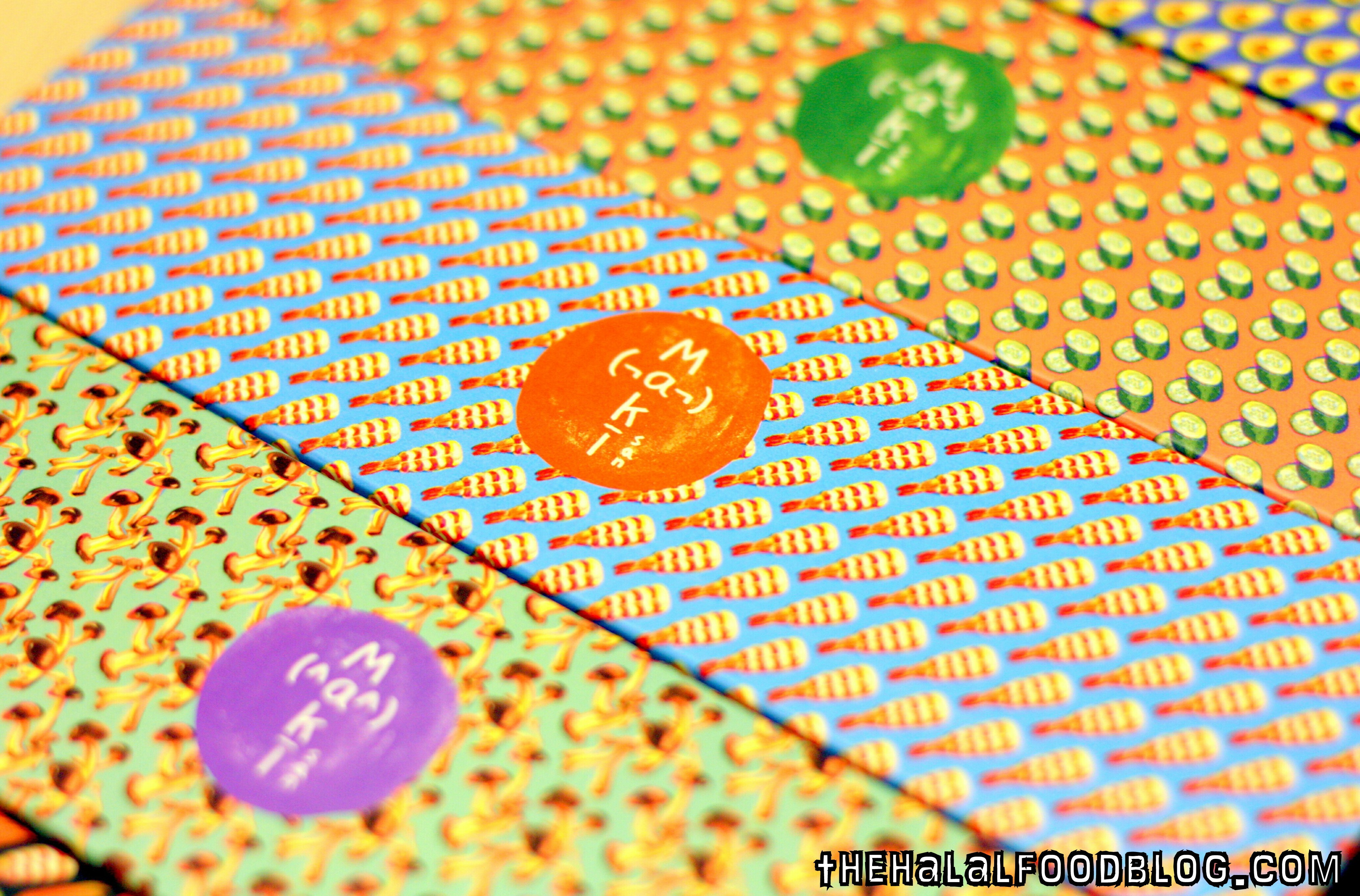
I thought hard about it and didn’t follow this idea as I felt it was a little too simple and I wanted to push myself a little more than this in this assignment.
From the 1 to 1 consultation, we derived towards the idea of trying out illustrations into photographs, or vice versa. I was a little apprehensive as my photography skills were not as polished, and some of the location like the yoga room or a hospital bed were not as accessible to me.
On my defence, I did try out the photo style in one of the perspectives which was “paper in the perspective of a lazy soldier is a pair of paper underwear.” This is me decked in my old NS uniform and holding up an underwear which was replaced with a illustrated origami version of it. Not gonna show you the one with my real underwear, privacy people! Lol!
I brought it to the group consultation and had comments that it looks very crystallised, or was gem-like, that was not what I had in mind and feel it didn’t portray the aspect of a paper material. I did not continue this style.
Paper in the perspective of a “pao” (bun) is a sauna towel.
I started having the idea of paper being the mat of the pao, only because of how it looks which is exactly like a bun sitting on a piece of paper. But thinking in perspective of why the paper was needed and what purpose does it serve. I concluded that it was just a platform for the dough to be placed in the steamer hygienically. Which brought me to how they are cooked…
Steamer, steamer, ah ha! How about a pao “sauna”? And that was how the idea was born.
I started with depicting the bun sweating in a sauna, and was humoured by it. Oh god, I laugh at my own jokes. (this was what I showed in the group consultation)
I added more buns and as suggested by the group to create some paper to be more obvious as a towel like slinging it on the “neck” or placing it on the “face”.
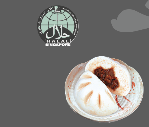
I changed the coloured of the plank wall to show more contrast, and also added the halal logo which we often find in the paper of our favourite pao. I also exchanged the pandan pao into a salted egg one. (woohoo!)
I added more steam, changed the location of the halal logo to not make it look too forced, and also added a glass wall and a tray ceiling to hint of the fact that they are in fact in a glass heater displayed as delicacies.
Some reference picture I used while creating the pao and halal logo.
FINAL
Last but not least I added a tong for a dynamic look, and this ends as my final piece.
Feedbacks for improvement: Add water droplets on glass to heighten the reality of it being in a steam box.
Here you can see the pen tool of the final piece.
Here’s a gif to show the process! You can see some images that I didn’t include as I only showed the key points of the changes. Enjoy!

Paper in the perspective of a origami is a yoga session.
Thinking of the element of a paper, I thought of how bendy it is and how easy creased it can become. It made me think of the paper cranes that I did in primary school when I was young and then had the ah ha! moment to associate how humans bend themselves in yoga classes.
Firstly I created the background setting of a yoga class, adding the anytime fitness logo on the wall which you see popping up everywhere nowadays as a little witty approach. The colour purple and black were also used throughout to have a better-rounded look. Yoga mats were placed randomly to mimic reality, nothing is perfectly straight in real classes!
I added the orgami, and added a perfectly folded crane (the perfect form) surrounded with random folded papers to mimic people who have difficulty doing the poses. As you look at the back of the class, you see a paper aeroplane??? How bad good can you be to turn into something else. Lol!
Next, I added crumbles of paper to represent those who literally just gave up. See aeroplane, you’re not so bad!
Finally, to complete the image, I added the shadows like how I did for the pao seen above to stylise the look of the image.
The working outline of the final piece.
Here’s a gif again to show you the different layers I used! 🙂
Paper in the perspective of a lazy soldier is a paper underwear.
Using the photo that I showed earlier on top, I used it as a reference and created the illustration below, I first did the background on the left and then duplicate it to the right (which was the doorway in the picture.) I thought it looked better as it drives the attention to the centre.
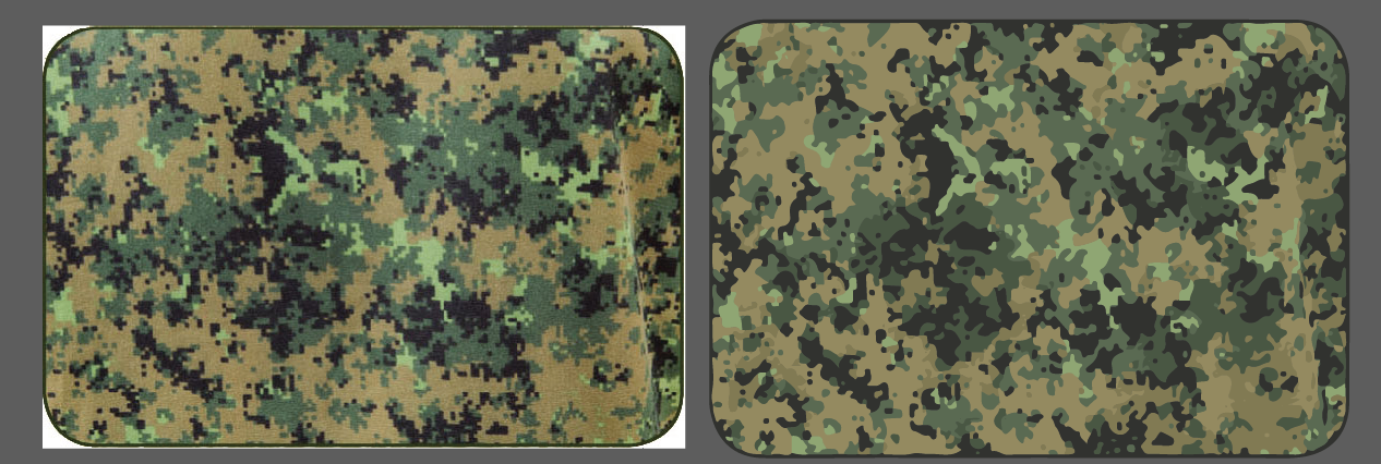
I noted that one of the important element of this perspective was the pixelated army uniform pattern. I google searched the pattern which can be seen on the left with the white borders and live traced it using illustrator to create a vector pattern of it on the left.
Final
From this end product, you can see that the paper underwear (created with a lower opacity formed the texture and look of a tissue paper) looks more realistic and I added the tissue box at the back to convey the message clearer.
ALSO, adding a personal touch, I added the number tag which can be seen in every BMT boy’s outfield bag, this was the one I had when I was in the samurai coy.
The working file, lol look at all the image clippings using the pixel pattern.
This is the gif when compiled together! 🙂

Paper in the perspective of a rock is a bully 🙁
Using the wordplay of the game “scissors paper stone”, I looked into what the rock would be feeling when it has been defeated by the paper. A bully is what he is!
I illustrated the iconic dragon playground that every Singaporeans would be able to identify with to add some local element like what I have been doing in this series.
Knowing how I wanted the paper and stone to look like, I used my own hand to create the action and referenced it from there.
This is how I line my items and separate them from their different section of colours.
I considered using this as the tree in the background but decided not to as it looks too complicated and would destroy the style that I was going for.
Final
In the final piece, although not the main focus of my series, I decided to tackle a little on racism where the minorities (Indians) might have moments where they feel bullied by the majorities (Chinese).
Feedbacks for improvement: Try more colour compositions to allow the hands to pop out from the background better.
The working file behind the coloured images.
The gif showing the background to the foreground.

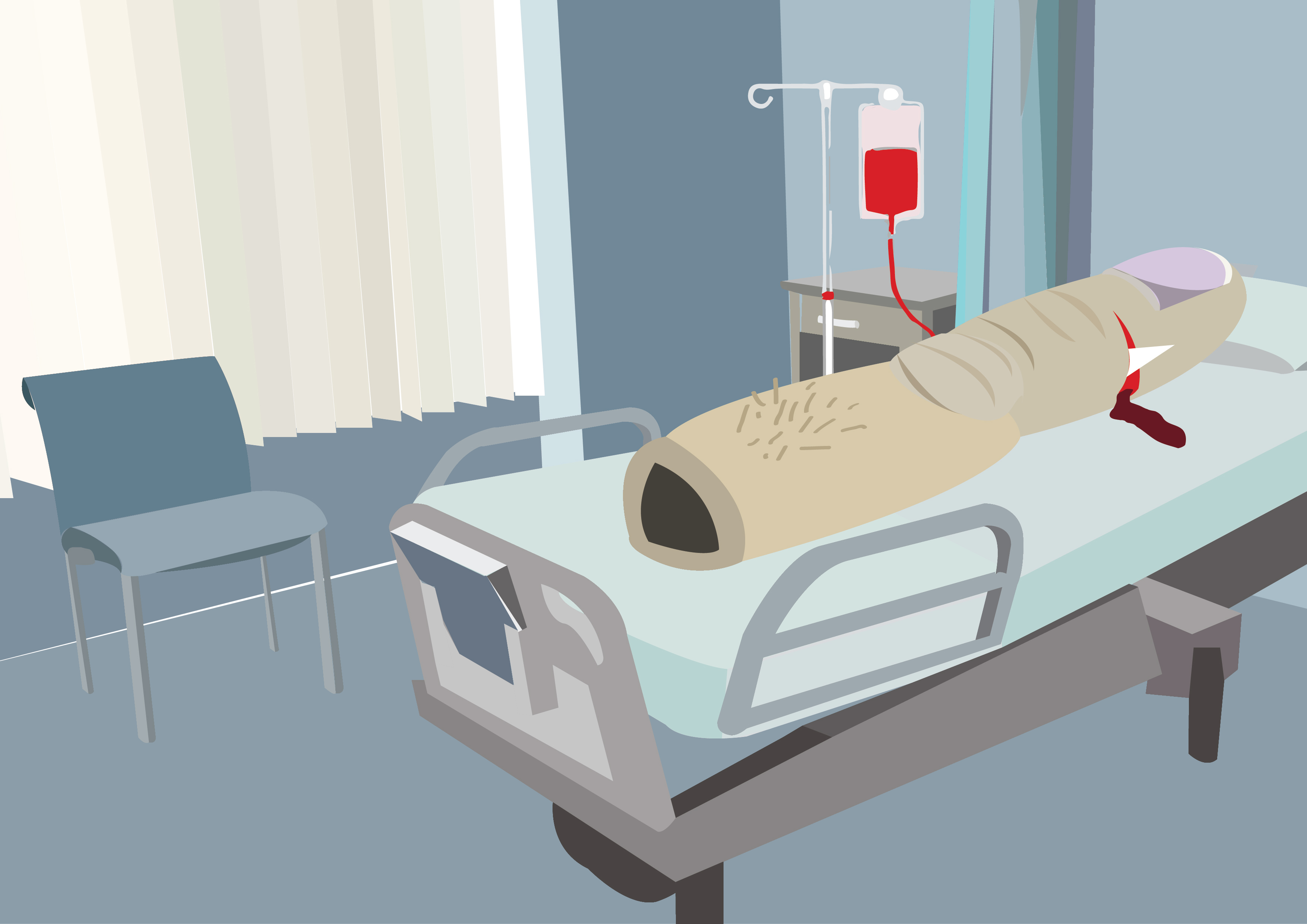
Paper in the perspective of a finger is a trip to the hospital.
Continuing on the witty series, we have the dramatic finger! In the world of fingers, the most evil thing you can do to it is stick it up your nose ass have a finger cut! Blood spilling and shit, omg you would have thought it was cancer.
In this layout, I tried my hands to specially create the elements from the background moving to the foreground. It was very neat and you can see the transition from the layers in the gif below.
This is how the finger looks like all weird and bloody, but the paper shred stuck to the wound was not that obvious to me.
Final
Because of that, I added the panicky paper with the missing paper shred at the bottom left to provide a clearer storyline!
Feedbacks for improvement: Add a hospital logo to make it coherent with the series. (eg. SGH)
The outlining of the hospital bed.
The gif showing the intense layering of this piece.
Paper in the perspective of a taoist priest is his weapon!
For this perspective, I wanted to again make it comical, and Joy suggested something like the image below:
I thought it looked really funny and decided to use it as my reference.
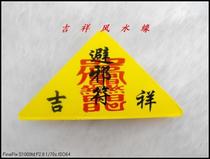
Sorry for the bad quality! I couldn’t find one that was good. But I used this as my weapon in the image as I felt it fits it well.
Not knowing the angles of how someone would be like being handed a talisman, I folded a paper and took a picture of it to use as reference.
To add on to the outfit of a Taoist priest, I noticed that their yellow robes were often patterned with motifs of dragons or Chinese elements. I thought it was a crucial part to distingue his role and added it in, which you can see in the final piece below.
Final
This is how the final looks like, I also added the ghost behind to add on to the fact that it really is a weapon (against them).
In the end, I thought this looks very nice and dynamic and gave a very 3D feel with the hand seemingly reaching out for you.
The outline of the final work.
This is the gif to show the layering of the Taoist, the talisman and the curious/ frightened ghosts!
THANK YOU!
In the end, I really enjoyed this assignment and is really proud and pleased with my final pieces! Though a little regretful that I did not step out of my illustration comfort zone, maybe I shall do something in my personal time during the holidays! 🙂


