4D Fdn II: Visualisation for expanded cinema

Are we really living? 

In this setting, we created a commentary towards the take on life, on how fast paced you are, of how much you are constantly moving, constantly working, constantly trying to do more.

Are you really living life to the fullest? When was the last time you stopped and look at the sky? The last time you took a big breath not because of the large amount of work, but of the smell morning brings?

1

2

3

Equipment: 3 projectors, sound amplifier.

  1. You see Fast paced people walking (orchard road, CBD area, north spine)
  2. The sound is jarringly loud, the clutter of life feels as though they are trying to grab you into their scene.
  3. A black screen hits you without warning and the sound stops.
  4. Your ears are trying to get used to it.
  5. A series of peaceful and relaxing video appear, sunrise, slow paced people walking, etc.

What would you regret most if you died now?

What does happiness mean to you? A high rank in your career, money to spend without a care in the world or a beautiful house?

Close your eyes and imagine that you’re at your own funeral—a bit morbid I know, but there’s a reason for it. Now think about what you’d like people to say about you. What kind of a life do you want to lead? People die with all kinds of regrets. Don’t be one of them.

In a website we found which asked people what they regret the most, these are 20 that was listed here.

  1. I wish I’d cared less about what other people think.
  2. I wish I had accomplished more.
  3. I wish I had told __ how I truly felt.
  4. I wish I had stood up for myself more.
  5. I wish I had followed my passion in life.
  6. I wish our last conversation hadn’t been an argument.
  7. I wish I had let my children grow up to be who they wanted to be.
  8. I wish I had lived more in the moment.
  9. I wish I had worked less.
  10. I wish I had traveled more.
  11. I wish I had trusted my gut rather than listening to everyone else.
  12. I wish I’d taken better care of myself.
  13. I wish I’d taken more risks.
  14. I wish I’d had more time.
  15. I wish I hadn’t worried so much.
  16. I wish I’d appreciated ___ more.
  17. I wish I’d spent more time with my family.
  18. I wish I hadn’t taken myself so seriously.
  19. I wish I’d done more for other people.
  20. I wish I could have felt happier.

We realise that many of them are of relationships and thought that we could tackle on it more.

4

Equipments: 2 Projector, Sound amblifier, table, black rose.

The sound would be of people reading out what their regrets are, similarly like listening from the point of view of the dead.

Since the sound is so in your face, we thought that the other elements could be more symbolic, and that is why we added the black rose and even moth on the screen since they are traditionally taught to be “your relative visiting you”. 


No phone zone.

We unadmittedly are addicted to the little pieces of metal we have in our hands. Taking that into account, we wanted to make a commentary about that issue.

No Phone Zone logos

  1. Before you enter the room, there would be a box to deposit your phone, there is also a number lock for it just in case you don’t feel safe with it lying around outside.
  2. You enter and you see people’s faces hanging around the room, and even pasted or projected on the wall.

It is a really in your face style that shouts out to people HEY LOOK AT MY FACE. Have some real human interaction.

Thank you! 😀

Histories of Art II: Visual Response Proposal

Chosen subject: Indian Buddhism

Group Mates: Chio Jo Inng, Alfred Yeo, Evangeline Ng, Lu Jia Xian

Museum Visited: Asian Civilisation Museum
Chosen Object: Gateway Bracket with four shalabhanjikas

Print

Some cheeky snapchats I took when we visited the ACM! 😛

“Wanna be on top”- America’s next top model reference, haha.


You can identify Yakshi by her huge bosom, curvy figure and excessive pieces of jewellery.

We decided to appropriate this particular sculpture that we saw at the Asian Civilisation Museum.

File_001 (1)

Yakshi was traditionally considered a goddess of fertility because of her figure. However, in a modern context, such a voluptuous body would be linked to the idea of sexuality rather than fertility and baby making.


Modern interpretation

From what I have found, one of the modern interpretations was the Malampuzha Yakshi recently refurbished by Kanayi Kunhiraman, but was first created in 1969.

http://www.thehindu.com/todays-paper/tp-national/tp-kerala/yakshi-to-get-a-facelift-after-45-years/article6847088.ece

As you can see it presents her really provocatively from my viewpoint.


Our Proposal

We thought it would be interesting to remove Yakshi from her past context to bring across the exploitation of a woman’s body for sexual purposes. To make this point stronger, we decided to create a FHM cover featuring Yakshi.

FHM

support #bosombuddies y’all! 😀

2D Fdn II: Point of View (Final)

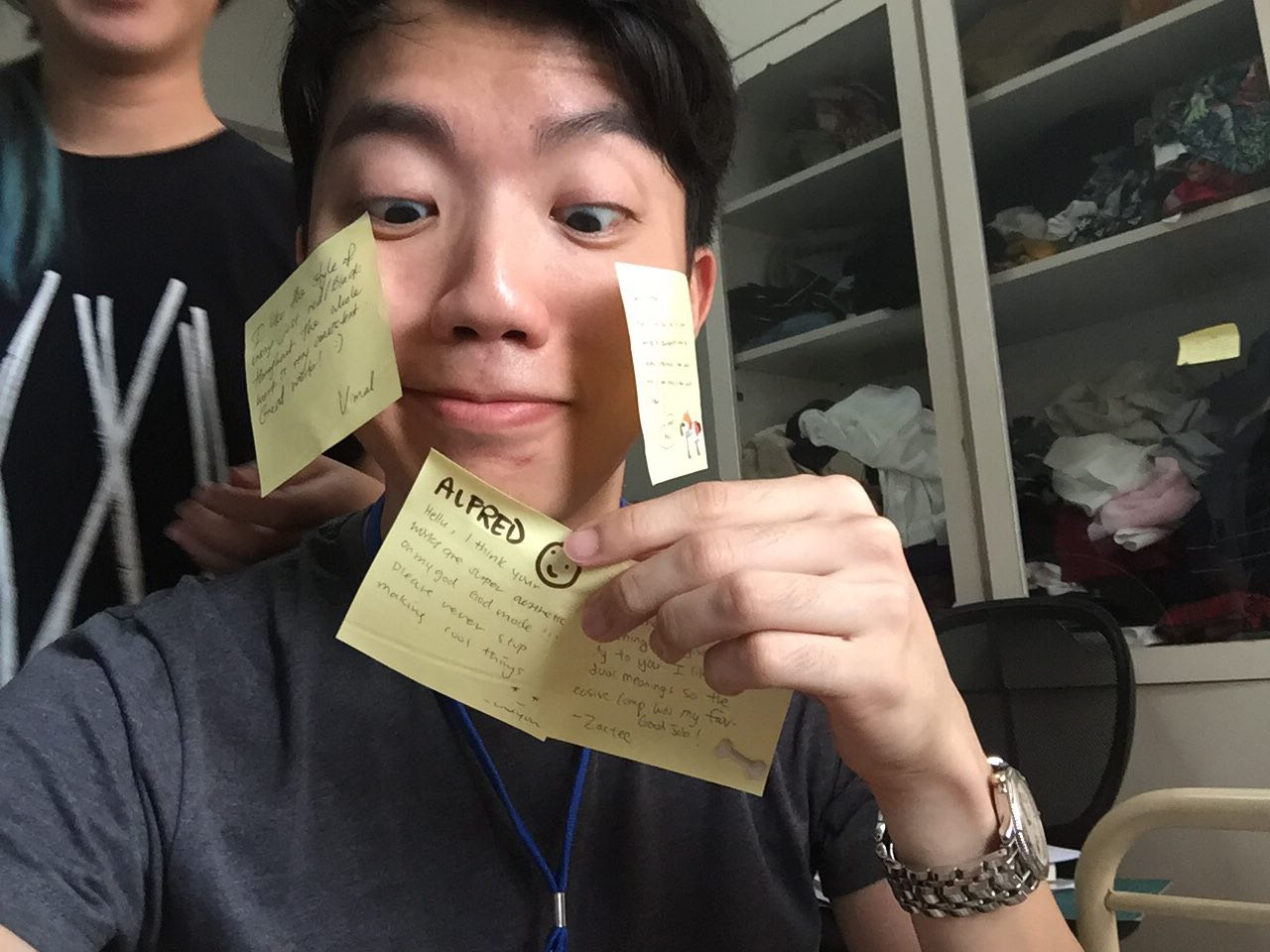
First of all, thanks for all your affirmations!

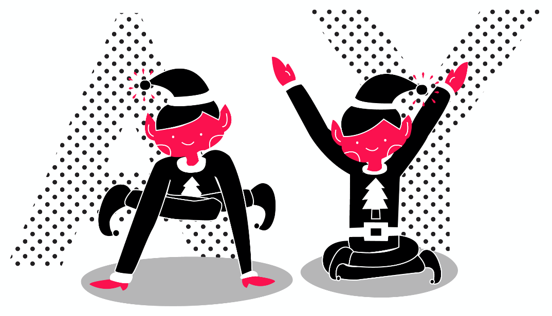
Hello hello, welcome to the perspective from the ordinary made extraordinary… PAPER! Wooooo *throws confetti*

Truthfully I didn’t start out strong in this assignment, I was really stuck and thank god for the consultation that made me push the ideas! Phew.


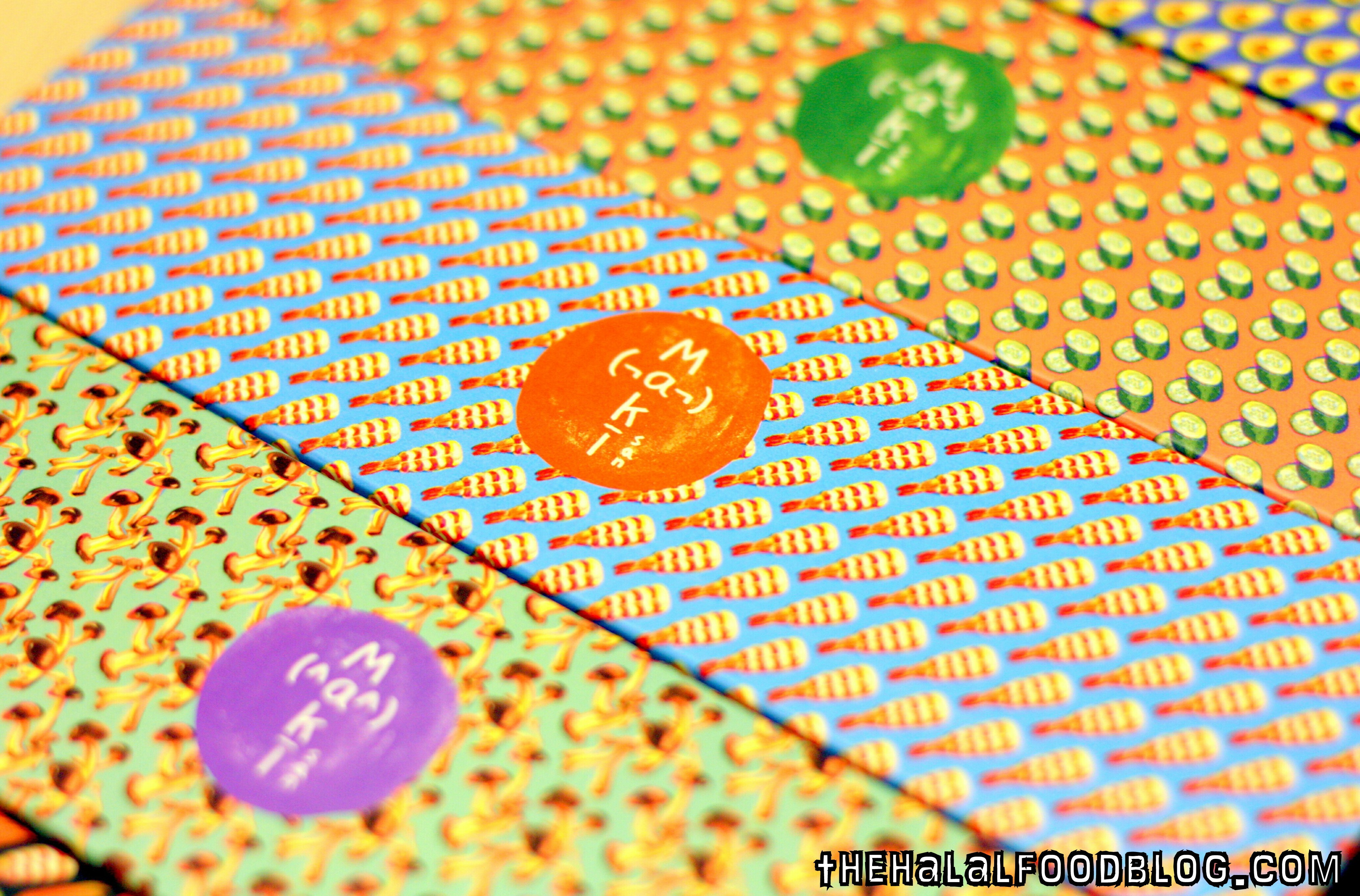
I started my designing process trying to find a style that I wanted for it, I created this repetitive design unconsciously and included a sleeping character into it to have a little different element, and mainly the fact that it looks adorable. LOL.

paper (WIP)-01

Joy mentioned that it looks a lot like something maki-san would do! I agree!

I thought hard about it and didn’t follow this idea as I felt it was a little too simple and I wanted to push myself a little more than this in this assignment.


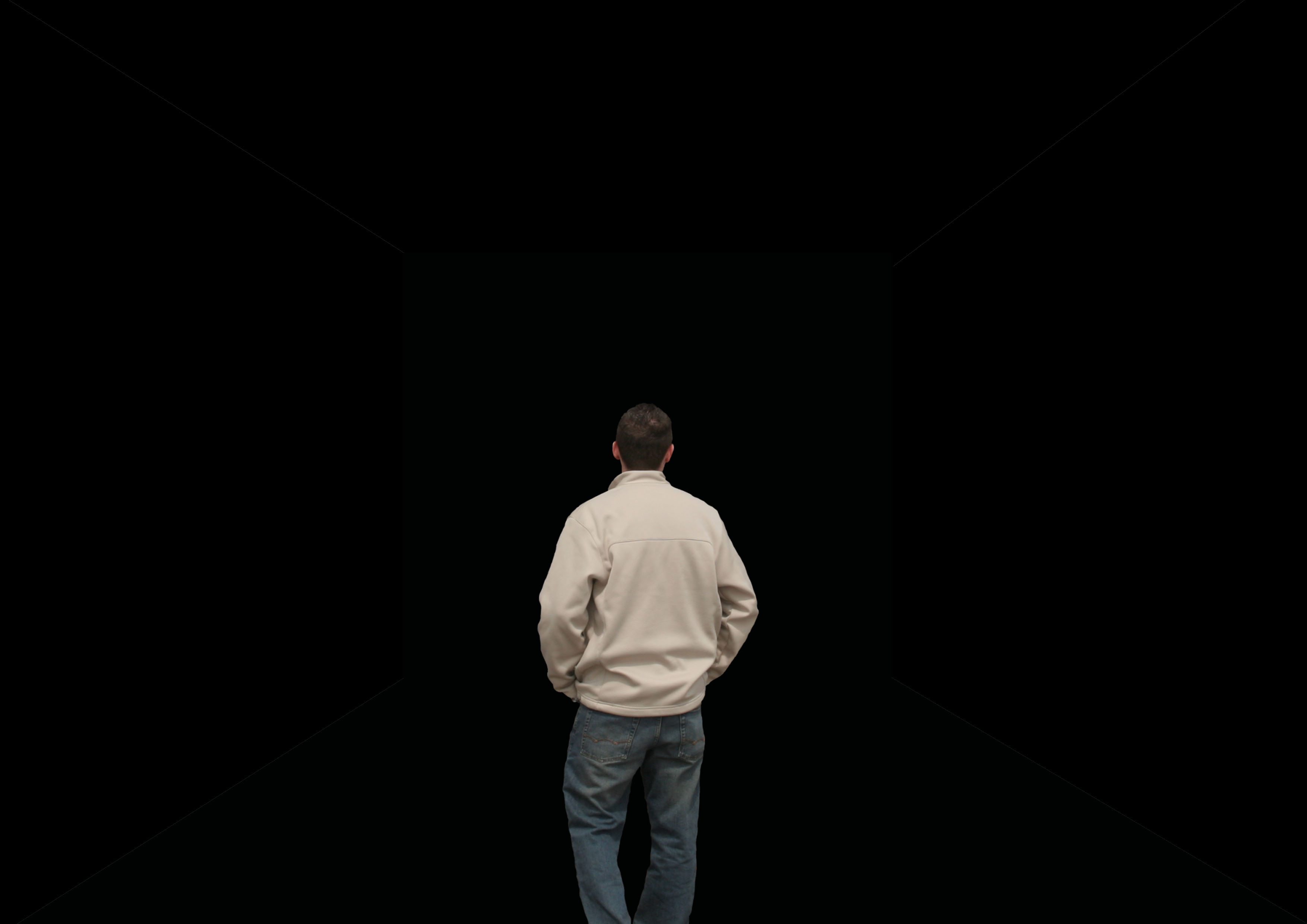
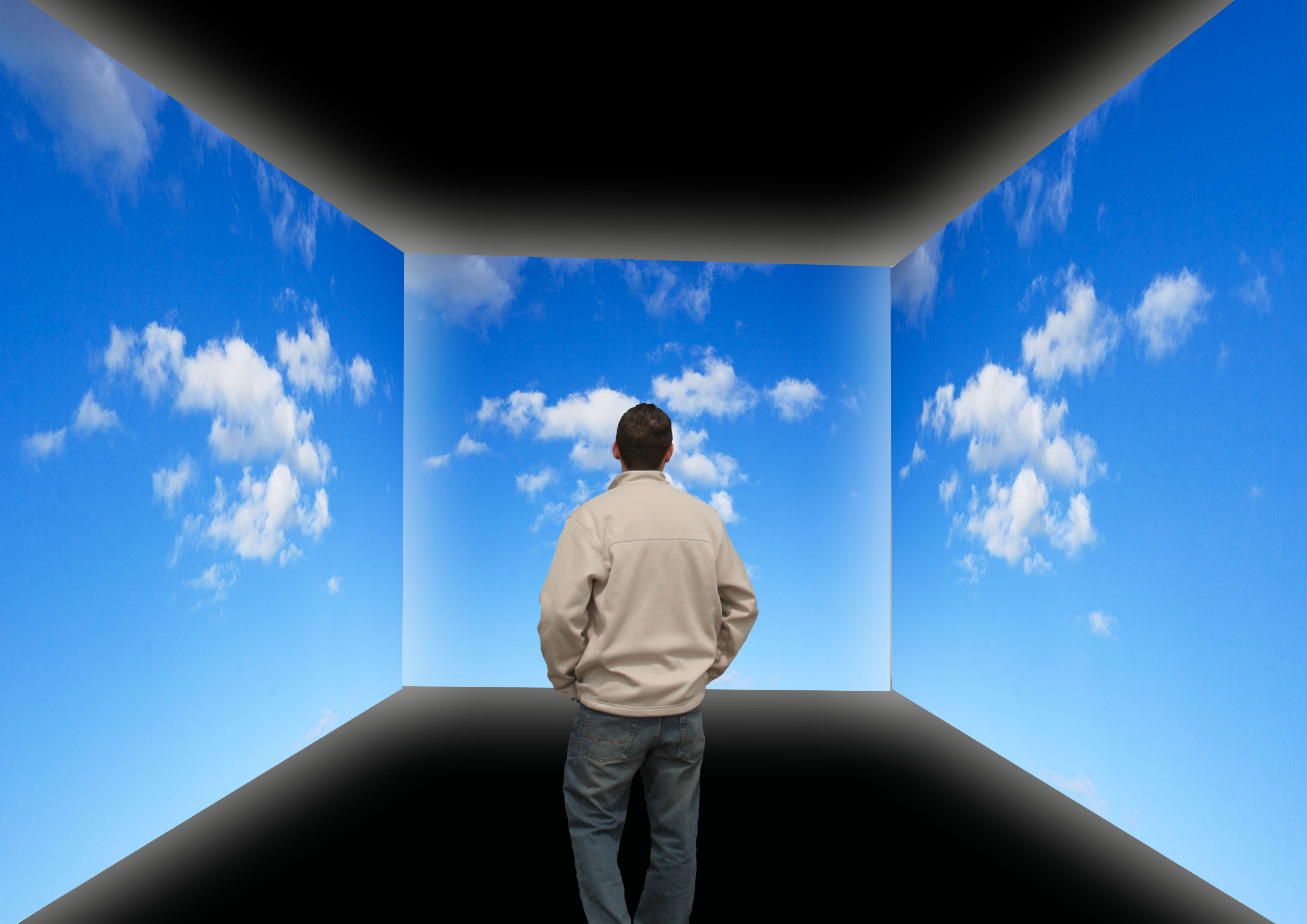
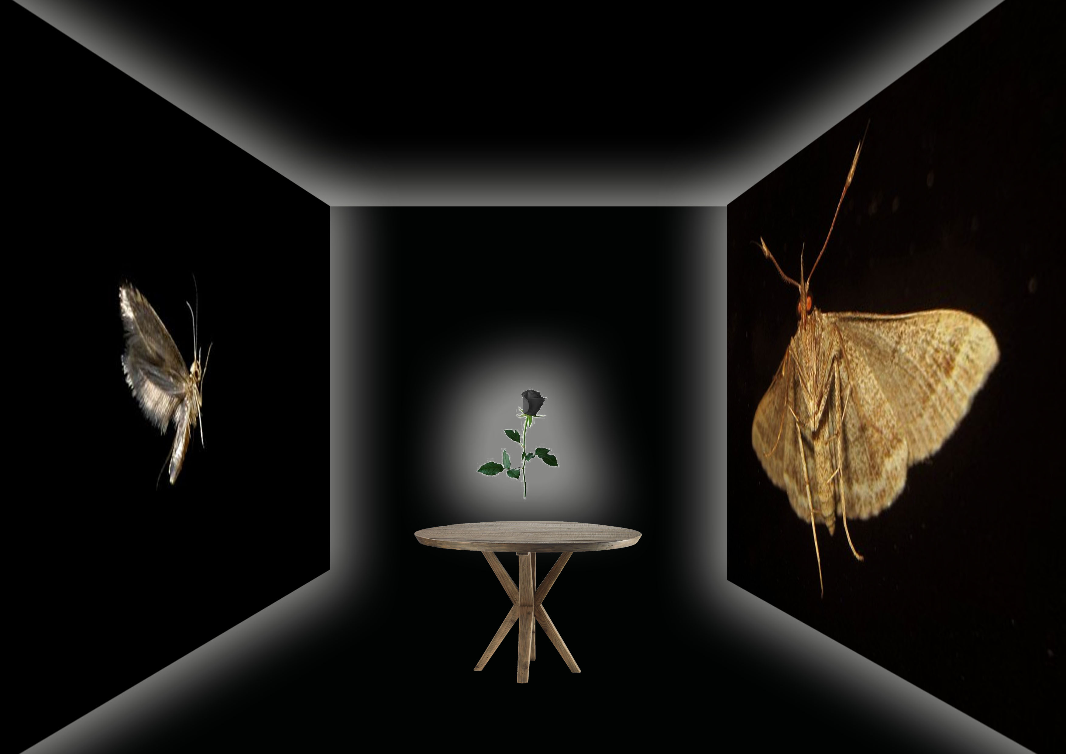
From the 1 to 1 consultation, we derived towards the idea of trying out illustrations into photographs, or vice versa. I was a little apprehensive as my photography skills were not as polished, and some of the location like the yoga room or a hospital bed were not as accessible to me.

On my defence, I did try out the photo style in one of the perspectives which was “paper in the perspective of a lazy soldier is a pair of paper underwear.” This is me decked in my old NS uniform and holding up an underwear which was replaced with a illustrated origami version of it. Not gonna show you the one with my real underwear, privacy people! Lol!

I brought it to the group consultation and had comments that it looks very crystallised, or was gem-like, that was not what I had in mind and feel it didn’t portray the aspect of a paper material. I did not continue this style.

Print


Paper in the perspective of a “pao” (bun) is a sauna towel.

I started having the idea of paper being the mat of the pao, only because of how it looks which is exactly like a bun sitting on a piece of paper. But thinking in perspective of why the paper was needed and what purpose does it serve. I concluded that it was just a platform for the dough to be placed in the steamer hygienically. Which brought me to how they are cooked…

Steamer, steamer, ah ha! How about a pao “sauna”? And that was how the idea was born.

sauna-01

I started with depicting the bun sweating in a sauna, and was humoured by it. Oh god, I laugh at my own jokes. (this was what I showed in the group consultation)

sauna3-01

I added more buns and as suggested by the group to create some paper to be more obvious as a towel like slinging it on the “neck” or placing it on the “face”.

sauna7-01

I changed the coloured of the plank wall to show more contrast, and also added the halal logo which we often find in the paper of our favourite pao. I also exchanged the pandan pao into a salted egg one. (woohoo!)

sauna9-01

I added more steam, changed the location of the halal logo to not make it look too forced, and also added a glass wall and a tray ceiling to hint of the fact that they are in fact in a glass heater displayed as delicacies.

Screen Shot 2016-03-24 at 12.14.09 am

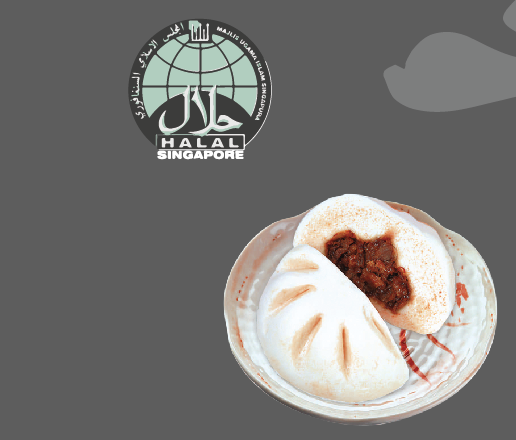
Some reference picture I used while creating the pao and halal logo.

FINAL

sauna12-01

Last but not least I added a tong for a dynamic look, and this ends as my final piece.

Feedbacks for improvement: Add water droplets on glass to heighten the reality of it being in a steam box.

Screen Shot 2016-03-24 at 12.13.50 am

Here you can see the pen tool of the final piece.

Here’s a gif to show the process! You can see some images that I didn’t include as I only showed the key points of the changes. Enjoy!
ezgif-2487265507


Paper in the perspective of a origami is a yoga session.

Thinking of the element of a paper, I thought of how bendy it is and how easy creased it can become. It made me think of the paper cranes that I did in primary school when I was young and then had the ah ha! moment to associate how humans bend themselves in yoga classes. 

3-01

Firstly I created the background setting of a yoga class, adding the anytime fitness logo on the wall which you see popping up everywhere nowadays as a little witty approach. The colour purple and black were also used throughout to have a better-rounded look. Yoga mats were placed randomly to mimic reality, nothing is perfectly straight in real classes!

4-01

I added the orgami, and added a perfectly folded crane (the perfect form) surrounded with random folded papers to mimic people who have difficulty doing the poses. As you look at the back of the class, you see a paper aeroplane??? How bad good can you be to turn into something else. Lol!

5-01

Next, I added crumbles of paper to represent those who literally just gave up. See aeroplane, you’re not so bad!

FINALyoga-01

Finally, to complete the image, I added the shadows like how I did for the pao seen above to stylise the look of the image.

Screen Shot 2016-03-24 at 12.11.40 am

The working outline of the final piece.

Here’s a gif again to show you the different layers I used! 🙂ezgif-1453625811


Paper in the perspective of a lazy soldier is a paper underwear.

Using the photo that I showed earlier on top, I used it as a reference and created the illustration below, I first did the background on the left and then duplicate it to the right (which was the doorway in the picture.) I thought it looked better as it drives the attention to the centre.

4-01

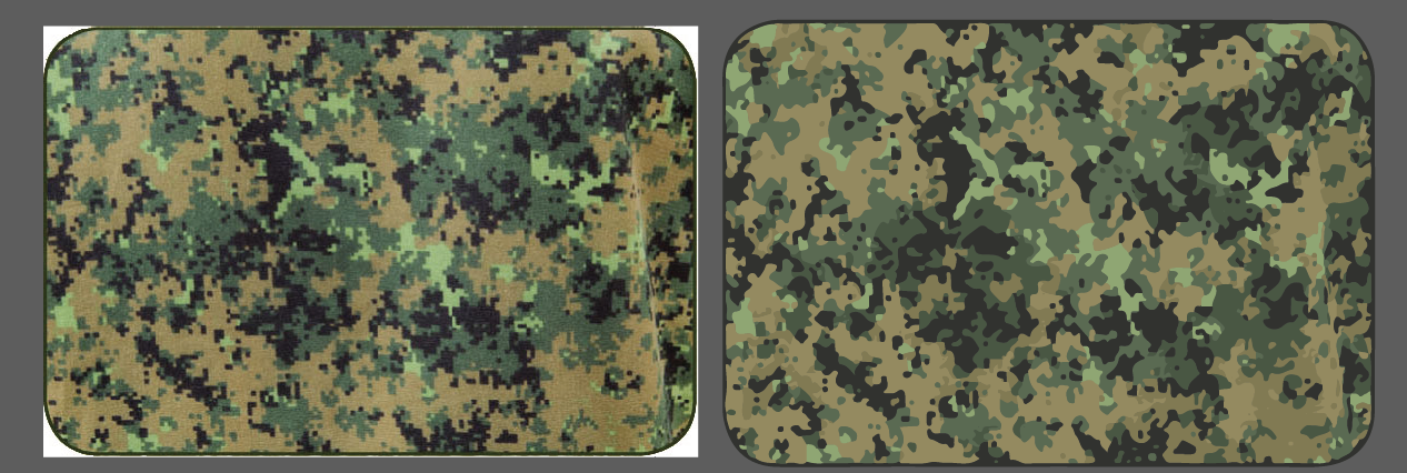
I noted that one of the important element of this perspective was the pixelated army uniform pattern. I google searched the pattern which can be seen on the left with the white borders and live traced it using illustrator to create a vector pattern of it on the left.

Screen Shot 2016-03-23 at 11.37.25 pm

Final

9-01

From this end product, you can see that the paper underwear (created with a lower opacity formed the texture and look of a tissue paper) looks more realistic and I added the tissue box at the back to convey the message clearer.

ALSO, adding a personal touch, I added the number tag which can be seen in every BMT boy’s outfield bag, this was the one I had when I was in the samurai coy.

Screen Shot 2016-03-24 at 12.09.40 am

The working file, lol look at all the image clippings using the pixel pattern.

This is the gif when compiled together! 🙂
ezgif.com-resize (2)


Paper in the perspective of a rock is a bully 🙁

Using the wordplay of the game “scissors paper stone”, I  looked into what the rock would be feeling when it has been defeated by the paper. A bully is what he is!

1-01

I illustrated the iconic dragon playground that every Singaporeans would be able to identify with to add some local element like what I have been doing in this series.

851322655_12002936703159311395

Knowing how I wanted the paper and stone to look like, I used my own hand to create the action and referenced it from there.

Screen Shot 2016-03-16 at 9.56.39 am copy

This is how I line my items and separate them from their different section of colours.

Screen Shot 2016-03-24 at 12.30.28 am

I considered using this as the tree in the background but decided not to as it looks too complicated and would destroy the style that I was going for.

Final

7-01

In the final piece, although not the main focus of my series, I decided to tackle a little on racism where the minorities (Indians) might have moments where they feel bullied by the majorities (Chinese).

Feedbacks for improvement: Try more colour compositions to allow the hands to pop out from the background better.

Screen Shot 2016-03-24 at 12.41.27 am

The working file behind the coloured images.

The gif showing the background to the foreground.
ezgif.com-gif-maker


Paper in the perspective of a finger is a trip to the hospital.

Continuing on the witty series, we have the dramatic finger! In the world of fingers, the most evil thing you can do to it is stick it up your nose  ass have a finger cut! Blood spilling and shit, omg you would have thought it was cancer. 

3-01

In this layout, I tried my hands to specially create the elements from the background moving to the foreground. It was very neat and you can see the transition from the layers in the gif below.

10-01

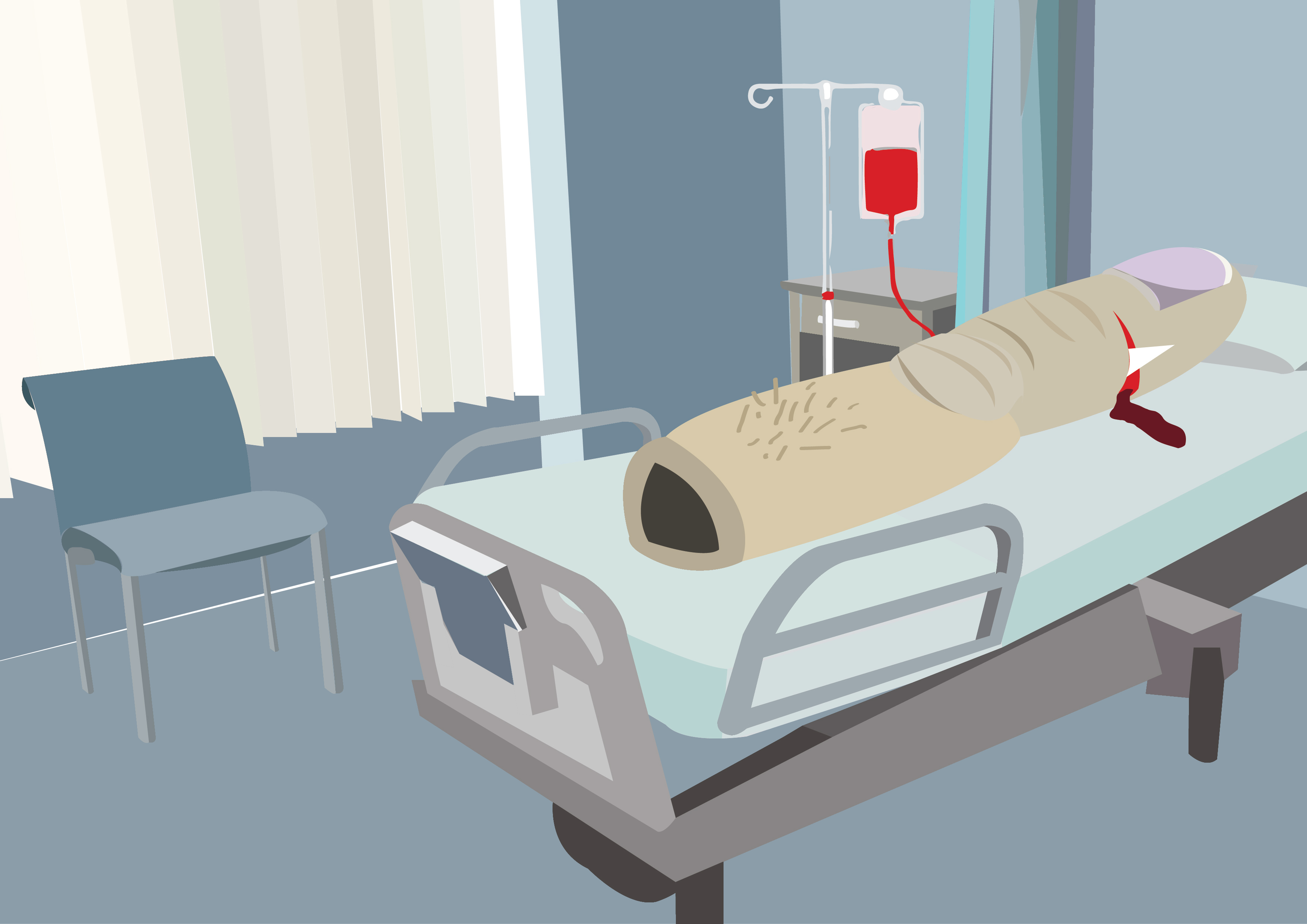
This is how the finger looks like all weird and bloody, but the paper shred stuck to the wound was not that obvious to me.

Final

12-01

Because of that, I added the panicky paper with the missing paper shred at the bottom left to provide a clearer storyline!

Feedbacks for improvement: Add a hospital logo to make it coherent with the series. (eg. SGH)

Screen Shot 2016-03-24 at 12.51.58 am

The outlining of the hospital bed.

The gif showing the intense layering of this piece.ezgif.com-resize (4)


 Paper in the perspective of a taoist priest is his weapon!

For this perspective, I wanted to again make it comical, and Joy suggested something like the image below:

Screen Shot 2016-03-24 at 1.13.03 am

I thought it looked really funny and decided to use it as my reference.

Sorry for the bad quality! I couldn’t find one that was good. But I used this as my weapon in the image as I felt it fits it well.

851334050_16388030072977475565

Not knowing the angles of how someone would be like being handed a talisman, I folded a paper and took a picture of it to use as reference.

8222375-Seamless-Dragon-swatch-pattern-Stock-Vector-chinese

To add on to the outfit of a Taoist priest, I noticed that their yellow robes were often patterned with motifs of dragons or Chinese elements. I thought it was a crucial part to distingue his role and added it in, which you can see in the final piece below.

Final

7-01

This is how the final looks like, I also added the ghost behind to add on to the fact that it really is a weapon (against them).

In the end, I thought this looks very nice and dynamic and gave a very 3D feel with the hand seemingly reaching out for you.

Screen Shot 2016-03-24 at 1.16.05 am

The outline of the final work.

This is the gif to show the layering of the Taoist, the talisman and the curious/ frightened ghosts!ezgif.com-gif-maker

THANK YOU! 

In the end, I really enjoyed this assignment and is really proud and pleased with my final pieces! Though a little regretful that I did not step out of my illustration comfort zone, maybe I shall do something in my personal time during the holidays! 🙂

4D Fdn II: Appropriation (Allie Mac Burroughs)

  1. Why can’t artist simply make his own content? Analyse why and how the remake critiques the original. How do the artists view their own works in relation to others?
  2. Think hard about the material interpretation, motivation of the artist, viewing and social context and the reaction to all.
  3. Is it ok to copy and reuse materials of others in contemporary art? It is a necessary evil to critique a particular issue or status quo.

alliemcburroughs

In 1933, Walker Evans creates a photographic series depicting a family of workers during the Great Depression. Some of these images, such as the untitled portrait of Allie Mac Burroughs, became an icon in the history of photography, as well as symbol of the Great Depression.

In 1981, appropriating artist Sherrie Levine exhibited in New York her photographic series called After Walker Evans. Levine photographed the famous series of Walker Evans directly from an exhibition catalogue.

In 2001, another artist, Michael Mandiberg scanned and posted online the photos that Sherrie Levine appropriated from Walker Evans. He also created a website entitled aftersherrielevine.com, where the photos appropriated by Sherrie Levine once protected by copyright become available for further appropriation by any user of the website.


This fact applies entirely in the instance of appropriators such as Levine or Mandiberg and helps us understand that they do not, in fact, really go against the Foucaultian understanding of the author’s death. It is true, however, that their work seems in fact to reinforce and reaffirm the artist’s authorial function rather than undermine it. ‘Who is speaking’, namely whether it is Levine or Mandiberg, is, indeed, not only important, but imperative. Levine and Mandiberg are Foucaultian followers in as much as they prove through their undertaking that the author is nothing but a function of the text, a label, or in Agamben’s terms, a gesture.

The appropriators use the Foucaultian distinction as part of their tactics. The author function is, according to Foucault “characteristic of the modes of existence, circulation and functioning of certain discourses within a society”. He works also as a sort of projection “of the operations that we force texts to undergo, the connections that we make, the traits that we establish as pertinent, the continuities that we recognize or the exclusions that we practice”. The appropriators have assimilated this lesson by acknowledging the fact that by changing the name, one changes the way we operate on the texts, the connections and exclusions we rush to create.


4D Fdn II: Project 02, Sound and Image

Binaural recording

It is a method of recording sound that uses two microphones, arranged with the intent to create a 3-D stereo sound sensation for the listener of actually being in the room with the performers or instruments.

Baby don’t leave me (Horror) #1

Synopsis:

(Ext. A rainy night) (Int. Dark home)

A father opens the door to the room where his daughter is crying, he stops and stares for a second and went back outside.

While doing so, he receive text messages from his wife who was worried of him, she seem urgent.

He didn’t reply them and proceed to load his gun.

He walks back in as the cries of the baby increases, he fires multiple shots, the baby stops crying, his ears suffered the ringing, dogs were barking from the sudden noise.

He shots again, the ringing stops.

The dog and the thunderstorm continues

(Fade out)

Noise used: 

  1. Heavy rain
  2. Baby crying
  3. Foot steps
  4. Whatsapp notification
  5. Door opening and closing
  6. Gun reloading
  7. Gun shots
  8. Dog barking
  9. Ear ringing

Mood

The moods that I wanted to portray:

  • Dark
  • Gloomy
  • Annoyed
  • Frightened

Reasons behind the edits

I wanted the audience to be able to go into the minds of the 1st person who in a way could have been so annoyed by the baby’s screeching wails and that led him into killing it. I understand that it would be hard to portray psychosis into a 90 second sound clip, but I would like to try to at least lift up the skirt on that matter and allow the listeners to be transported into the scene. That’s the ultimate goal.

Moodboard

cryingbabybw-e1325879851836

Software Editing

Screen Shot 2016-03-15 at 3.36.11 am


Warhead (Comedy/War) #2

Synopsis:

A guy enters bathroom.

As soon as he starts peeing, the sound of gun and war starts playing.

An announcement of bomb awaits his poop.

He flushes and washes his hands.

He switched the shower head on and as soon as the water hits, the sound starts.

He exits and sighs.

Noise used: 

  1. Background dripping toilet dripping sound
  2. Peeing
  3. Flush
  4. Background gun shoots
  5. Bomb announcement
  6. Poop splashing upon water
  7. Washing of hand
  8. Foot steps
  9. Shower
  10. Sigh

Mood

  • Dark comedy
  • Monotonous (in contrast with the war)

Reasons behind the edits

I wanted to conjure up an commentary of the war that people are getting sick and tired of it. In a way of comparing war towards the activities people do in their bathroom, it is lowly and not something people are delighted to discuss. The sigh at the end wraps up the feeling I wanted to portray, and sort of like a relief sigh that it is over.

Recording Sounds

851322319_17599846030450703505

851316700_6343300506434795355

There are also sounds of the atmosphere in the toilet which was the constant dripping of the water which I felt was very important to create a realistic sound clip.

Editing

Screen Shot 2016-03-15 at 4.14.20 am


Below is one other sound that I recorded and found really interesting, the horns from the karang guni, even though I did not use it, I wanted to share some discoveries that I would not have taken noticed if not for this project.

Hears (lol) the end! 🙂

Histories of Art II: Week 8 Introduction and Paragraph

  1. What is Chinese tomb art? Compare two terracotta figures from the Qin dynasty.

Chinese tomb art was started with the belief of an after life and that early rulers has to be provided even after they pass, similarly like an extension of their worldly life. The most prominent example of this was set in the Qin dynasty which was reigned by Emperor Qin Shi Huang where he ordered the reproduction of thousands of terracotta figures in preparation for his grave. The figures mainly resemble soldiers and that in one of the discovered pits, pit no. 1, it contains more than 6000 figures of warriors and horses. Narrowing on the terracotta who were archers, you would notice that the ones who were kneeling were armoured while the ones standing were not. One would wonder, why would the Emperor have some protected and some not. Wouldn’t it to be logical to have all of them decked in armour, or was it to mimic as closely towards real life to heighten the reality of an after life?

The material of each terracotta figure were made differently to represent and accentuate their different roles as Emperor Qin’s warriors. The standing archers were dressed in a robe-like texture which was emphasised with the creases and folds on it. The fact that they are standing further stresses that they are in need to be moving around and thus have material that would be “allowed for speed and maneuverability”1 for close fighting. In contrast, the kneeling archer were dressed in a scale-like armour which appears to be of a harder material based on the straight and non malleable texture. This again based on the way they are position, kneeling down, you can deduce that they were meant to be at a stagnant position when in need of battle and thus does not have the necessity to wear materials that require for better movement. Looking at the different armour and materials that were decided for each individual role, you can tell that they were genuinely mirrored and represented as soldiers that are in a real combat, they “were not fancy but were efficient”2.

The sizes were made in exact ratio for the terracotta army. For both the standing and kneeling archer, they were seen to have sizes that replicate to the size of a human, the standing being approximately 178cm, while the kneeling 122cm. From this you can notice that they are created in a way that it is mathematically correct and that if the standing terracotta were to be bended in the same way as the kneeling, they would have roughly the same height. Looking into this, it again emphasis on how they are created in a way that realness was put into emphasis. The efficiency of the terracotta working in the after life and it being replicated as closely to real life must have been a real concern for Qin Shi Huang.3


1 Ledderose, Lothar. Ten thousand things: module and mass production in Chinese art (Princeton University Press, 2000), 53. 

2 Ledderose, Lothar. Ten thousand things: module and mass production in Chinese art (Princeton University Press, 2000), 64. 

2 Ledderose, Lothar. Ten thousand things: module and mass production in Chinese art (Princeton University Press, 2000), 68.


Histories of Art II: Essay Proposal

What is Chinese tomb art? Compare two terracotta figures from the Qin dynasty.

Introduction:

  • Explanation of Chinese tomb art
  • Information of the Qin dynasty
  • Information of the First Emperor
  • Information of the terracotta army
  • Tentative claim: Why would the terracotta army have such individually different facial features even in a time when communism is so strong? One theory is that the First Emperor believe in an after life was so strong that he wanted to mimic the real life (people with different looks) to fit in after he rule in his death.

Body:

  • Introduction to the Kneeling Archer
  • Explanation on features
  • Introduction to the Terracotta Sergeant (I was thinking if I should have 2 of the same rank & position, like another kneeling archer, to boost my claim of individualism even in a situation when they are meant to be the same)
  • Explanation on features
  • Compare their features and explain the similarities and differences

Conclusion: 

  • Briefly present all the information again
  • Conclude your argument or present new thought/ways of looking at the issue if I have any.

2D Fdn II: Point of View (Research)

18 Points-of-view

  • A paper from the point of view of a student is an essay.
  • A paper from the point of view of a tree is murder.
  • A paper from the point of view of a rock is bullying.
  • A paper from the point of view of a dead person is an obituary.
  • A paper from the point of view of a pen is a lover.
  • A paper from the point of view of a book is a warm embrace.
  • A paper from the point of view of a taoist is a weapon (talisman).
  • A paper from the point of view of a printer is food.
  • A paper from the point of view of a Pao is a mat.
  • A paper from the point of view of a origami is a yoga session.
  • A paper from the point of view of a Tori Kerry is a heartbreak.
  • A paper from the point of view of a finger is a cut.
  • A paper from the point of view of a lazy soldier is his underwear.
  • A paper from the point of view of a graduate is power.
  • A paper from the point of view of a instagrammer is their make shift background.

Artist references

Colour blocking

http://www.bespoke-bride.com/2015/02/23/75-colourful-instagram-accounts-that-you-need-in-your-life/

Screen Shot 2016-02-25 at 9.08.29 am


2D Fdn II: Typographic portrait problem (Final)

Have a look at the previous two updates 1 | 2 🙂


  • Final & their Process

I   A M   B I L I N G U A L .

Initially I had the idea to combine the Chinese and English names together by half, but after doing so I found out that the words become unreadable which lose some of the meaning and does not look as aesthetically pleasing. I chose A, J and H for Alfred Yeo Jia Hui (both my English and Chinese first names).chineseNot happy with the first draft, I looked at the different elements of the Chinese words and pin pointed the parts which are suitable for the integration of the individual letters and chose the following.

original
chinese

Quite pleased with the results, I decided to play around with the idea more and produced this, which was a mix of the letter A & Y found in each Chinese words to represent Alfred Yeo.

chinese

Feeling that the letters didn’t stand out as much as I wanted, I stretched them and achieved a more exaggerated look which was quite interesting and funny looking, I even created a gif! (More to come below lol :P)

ezgif-4230147580

I thought people could be confused with why the red parts were highlighted and doodled some indications using my Wacom! I thought it looked kinda cute and also tried the style in the next attribute (look below). But with further consideration, I decided to scrape the idea as I wanted to keep the look and idea of being clean. Some tidbits, the reason why I added the doodle is also because of my long time internet name @alfredoodles! (shamelessly promotes Instagram.)Screen Shot 2016-02-18 at 10.01.14 pmI showed the 2 versions for consultation and the majority of them felt that the first one was a clearer indication of being bilingual as the English letters were seen to be equally prominent while the second one had a stronger presence for the Chinese which was not my intention. Remember? 50/50! Feeling confident of my design, I chose it and as asked, polished up the thickness of the letters to create cohesiveness. I used the Chinese strokes as reference with how thick my English words were adjusted. Yay more gifs! ~

ezgif-3673517844

ezgif-959055264

The end product looked great and here’s a look of it in comparison with the difference from before it was edited! Like a slimming advertisement?!?

ezgif-3030408107

End Product

Screen Shot 2016-02-18 at 10.07.18 pm


I   A M   P U N – N Y .

Continuing with the previous work on the red elves (getit getit, red elf, elf red, ALF-RED?! Yes thanks I can tell that you’re not REALLY impressed). 

I thought the ones I did were not as refined and decided to vectorise it myself using the pen tool.

Screen Shot 2016-02-18 at 11.21.40 pm

Here you can see how much better it looks! I thought it looks very much like a character you can find in Adventure Time!

ezgif-728679363

As mentioned from above, I tried to incorporate the doodles. In this one I included the reactions that I get from people when I try my puns. Sigh, I’m funny friends, I am!

elf-drawing-01

End Product

Deciding to exclude the doodles, the remains of it builds up toward the clean look I wanted in the series.

Screen Shot 2016-02-18 at 11.36.21 pm


 I   A M   C A U T I O U S.

From our last group consultation, from the sharing with Brenda there was the mention of having local motifs or suggestions that could be included in the design. I was inspired by this idea and decided to play along with my style of red and black.

We always see this danger-keep out! sign around Singapore to an extent that we had grown accustomed to it to the extend of not taking notice of it anymore. I thought this could be a interesting concept and experimented with it.

851316798_2603287288510943136

I used google translate to do the other languages that I am not familiar with and also use a similar san-serif font called “Sorren” which I felt fit the look best. As the translation for my name in Malay is the same as the one in English, I kept the same words “Bahaya-Jangan Dekat!” which works in a way where if you read it from the top to bottom, it screams “ALFRED ALFRED! DANGER! ALFRED!!” like a reminder to me.

ezgif-3974149342

End Productlala


I   A M   I N D E C I S I V E ?

As testified by many of my friends and loved ones, I tend to be someone who is unable to have a clear set of mind in my decisions during my daily routine. I remember my mum chiding me about this matter with my extensive usage of the sentence “I don’t know”. She would constantly want me to make a decision, and as much as this trait sometime do surface, I’ve been trying my best to keep it down.

I am always fascinated by hidden meanings in a logo or word and have been trying to include it in my personal logo which sadly have not been made or those that I had done was not to my standards. For this design, I suddenly had a revelation of having the hidden word IF? in my name in the bathroom one day and immediately created this piece, thus there was not much process in this (opps!).

ezgif-3262060626

End Product

4


(include picture of me holding up my printed art pieces) < To be added tomorrow! Check back this space for… a picture of me… see Ziyu I can be narcissistic too! Lol okay k thx bye.

851312402_10833238520265900582

AND OMG THANKS EVERYONE FOR THE NOTES… 4 of you. <3

851322711_7993986911702167178