Image Making Through Type
Brief
Create typographic portraits by using your whole name, part of your name, your nickname or your initials to describe your future job. Each solution must consider: choice of typeface, style, size, weight, use of upper and lower case characters as well as space in between the letters. Additionally, the future job had to be something relatively imaginative and wacky.
Ideation
There are endless potentialities when it comes to imagining wacky jobs and funky future careers. However, it is not easy to visualise all these jobs. To me, I believed that it was important to choose jobs that had significant elements that aided the creation of a visual interpretation. Additionally, the representative visual should not be too obvious and direct which would take the fun out of the project.
After brainstorming, discussions with friends and scrolling endlessly on the internet for inspiration and ideas, here’s the list of possible wacky jobs I came up with:
Disco Repairman
Vending Machine Operator
Shredded Cheese Authority
Waterslide Tester
Paradise Island Caretaker
Scarecrow Lifeguard
Bread Scientist
Dumpster Diver
Fortune Cookie Writer
Cheese Grafitti Artist
Satan’s Secretary
With further discussion with Shirly and my consultation group, we narrowed down the more possible and interesting options that I should continue working on. The four options were:
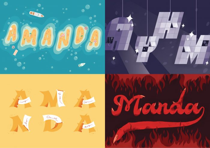
Paradise Island Caretaker
Disco Repairman
Fortune Cookie Writer
Satan’s Secretary
Job 1
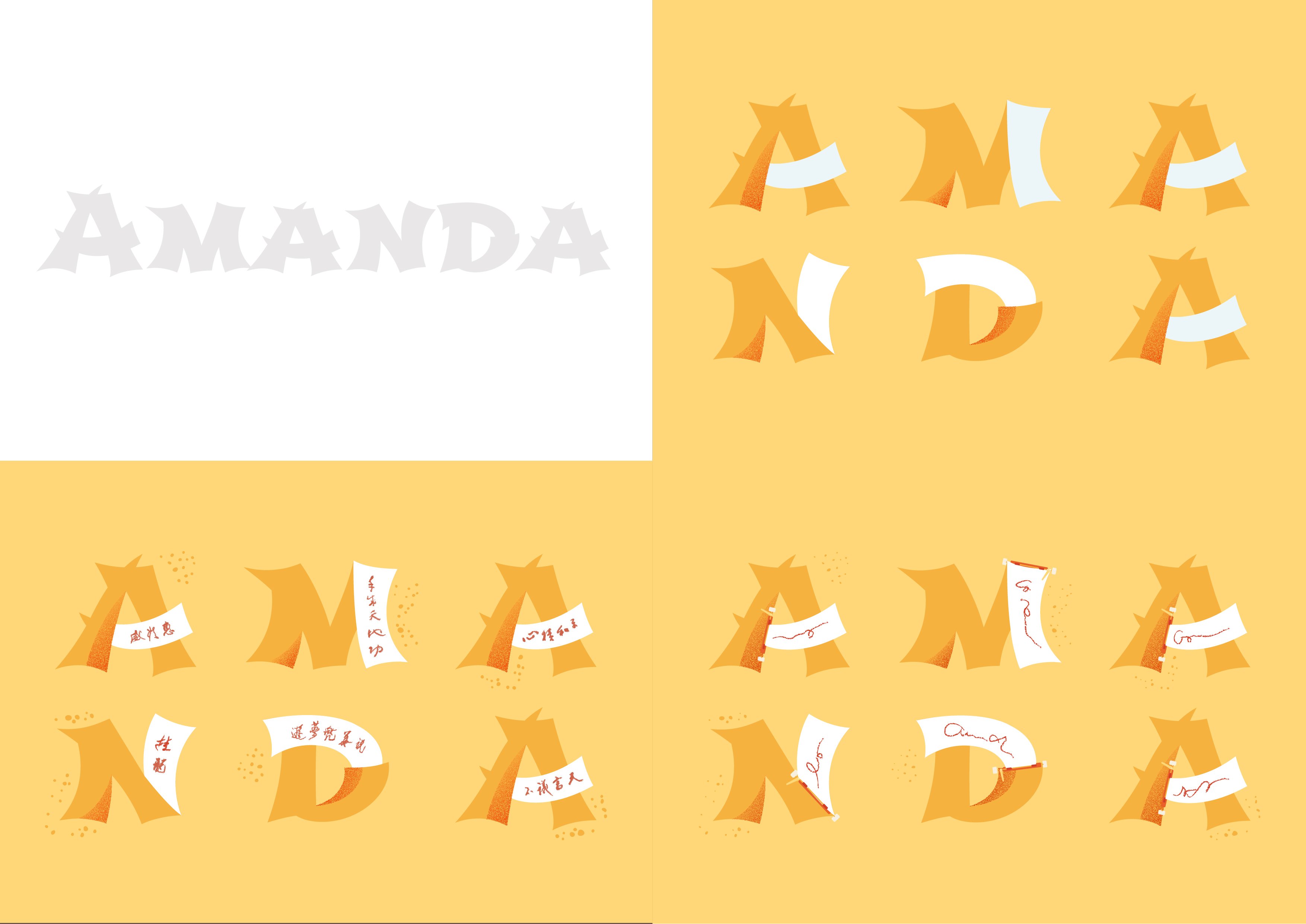
Island Paradise Caretaker
Moodboard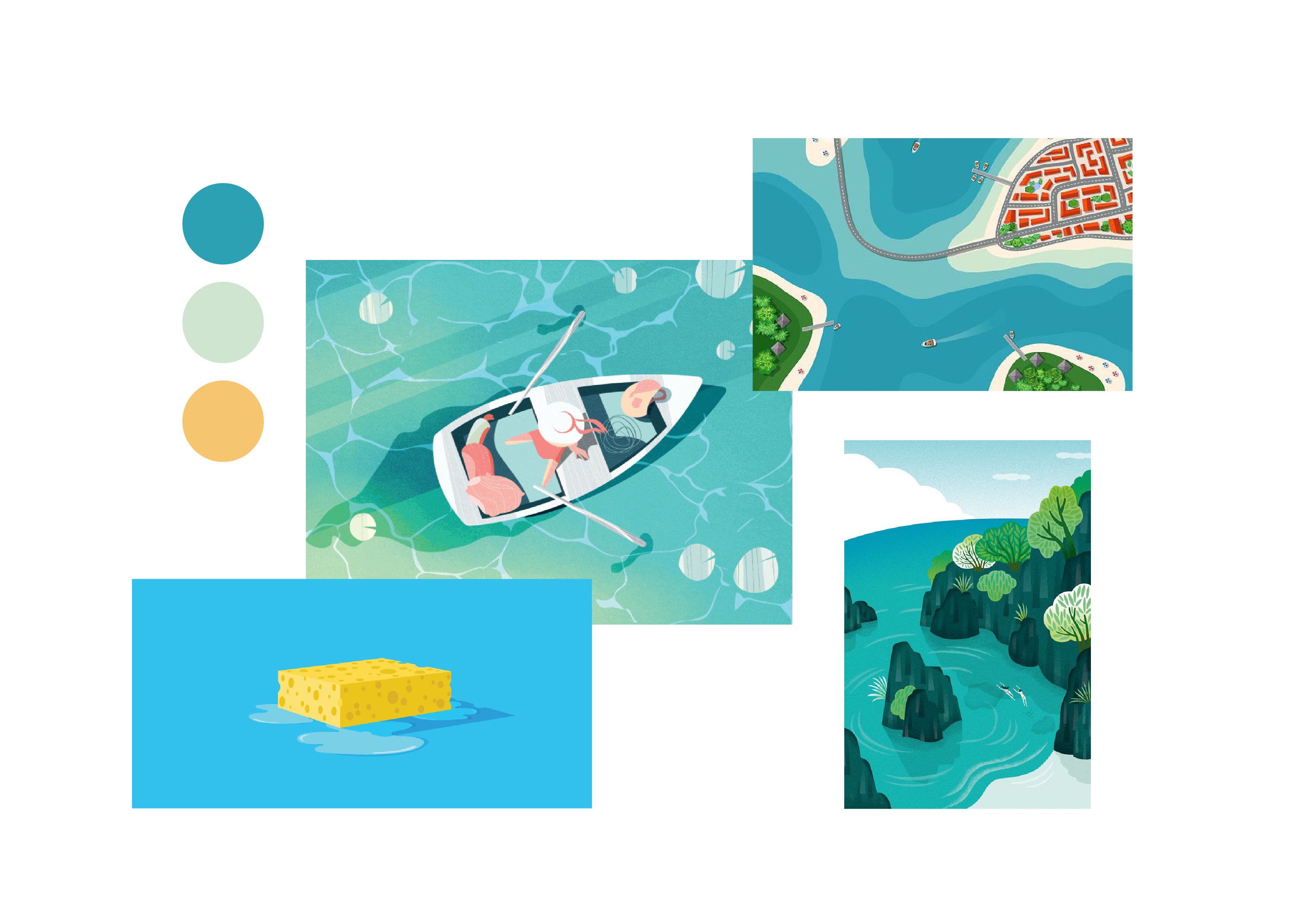
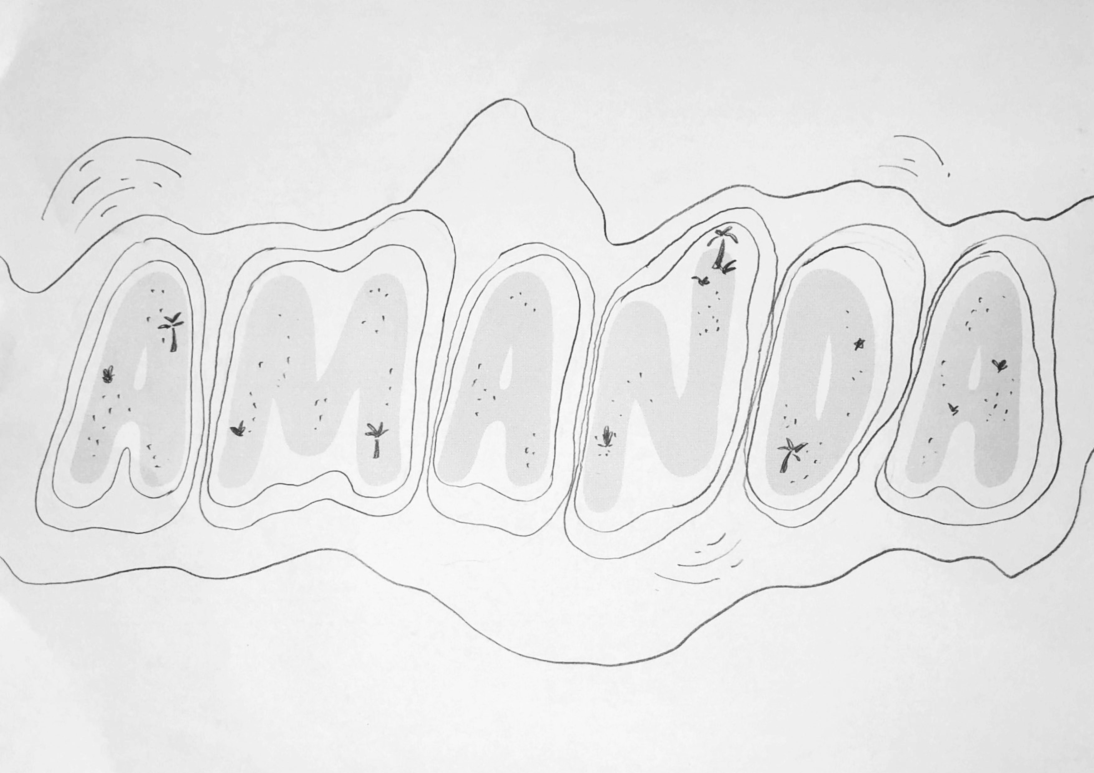
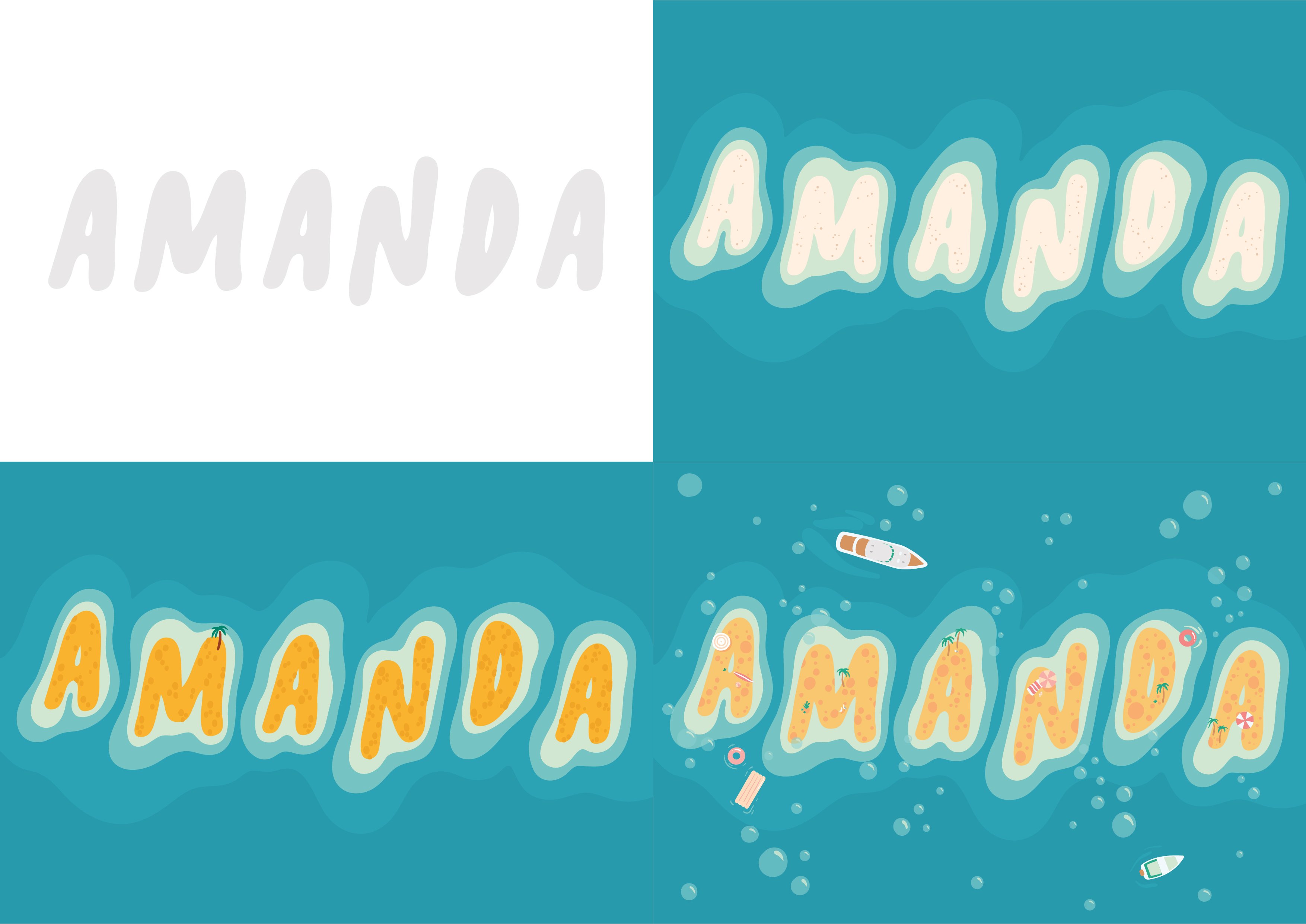
The visuals of an island and paradise were easy to interpret and visualise, a beach, palm trees and blue waters. However, it was the caretaker part that had me cracking my brains. What exactly does a caretaker do?
After more in-depth research and conversations with fellow peers, I found out that the job scope of a caretaker was one who deals with the cleaning, repairs and the overall protection of the area they are in charge of. I decided to focus on the “cleaning” aspect of a caretaker. To represent it, I used the texture of a sponge and the element of bubbles.
Sketches
Development
The visuals of an island and paradise were easy to interpret and visualise, a beach, palm trees and blue waters. However, it was the caretaker part that had me cracking my brains. What exactly does a caretaker do?
After more in-depth research and conversations with fellow peers, I found out that the job scope of a caretaker was one who deals with the cleaning, repairs and the overall protection of the area they are in charge of. I decided to focus on the “cleaning” aspect of a caretaker. To represent it, I used the texture of a sponge and the element of bubbles.
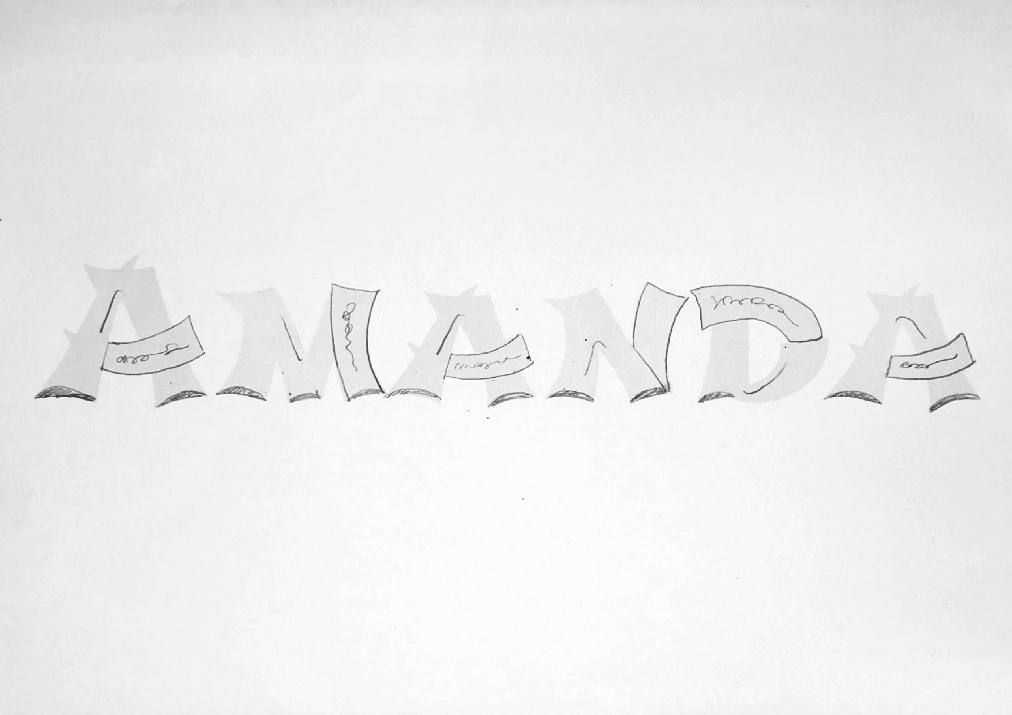
I started off choosing a typeface that was more lively, fun and organic to replicate the curves and irregularity of that of an island. The handwriting bubble font I chose was called “bubblegum”. In order to make the text more dynamic and spontaneous, I played with the orientation and positioning of the alphabets. The alphabets were to be the visual representation of paradise islands. I realised the textures of island sand and a sponge was pretty similar, hence to incorporate the aspect of a caretaker I switched up the texture of sand for some sponge texture. Boats, bubbles and island “fun” details were added to make a more elaborate design.
Job 2
Fortune Cookie Writer
Moodboard
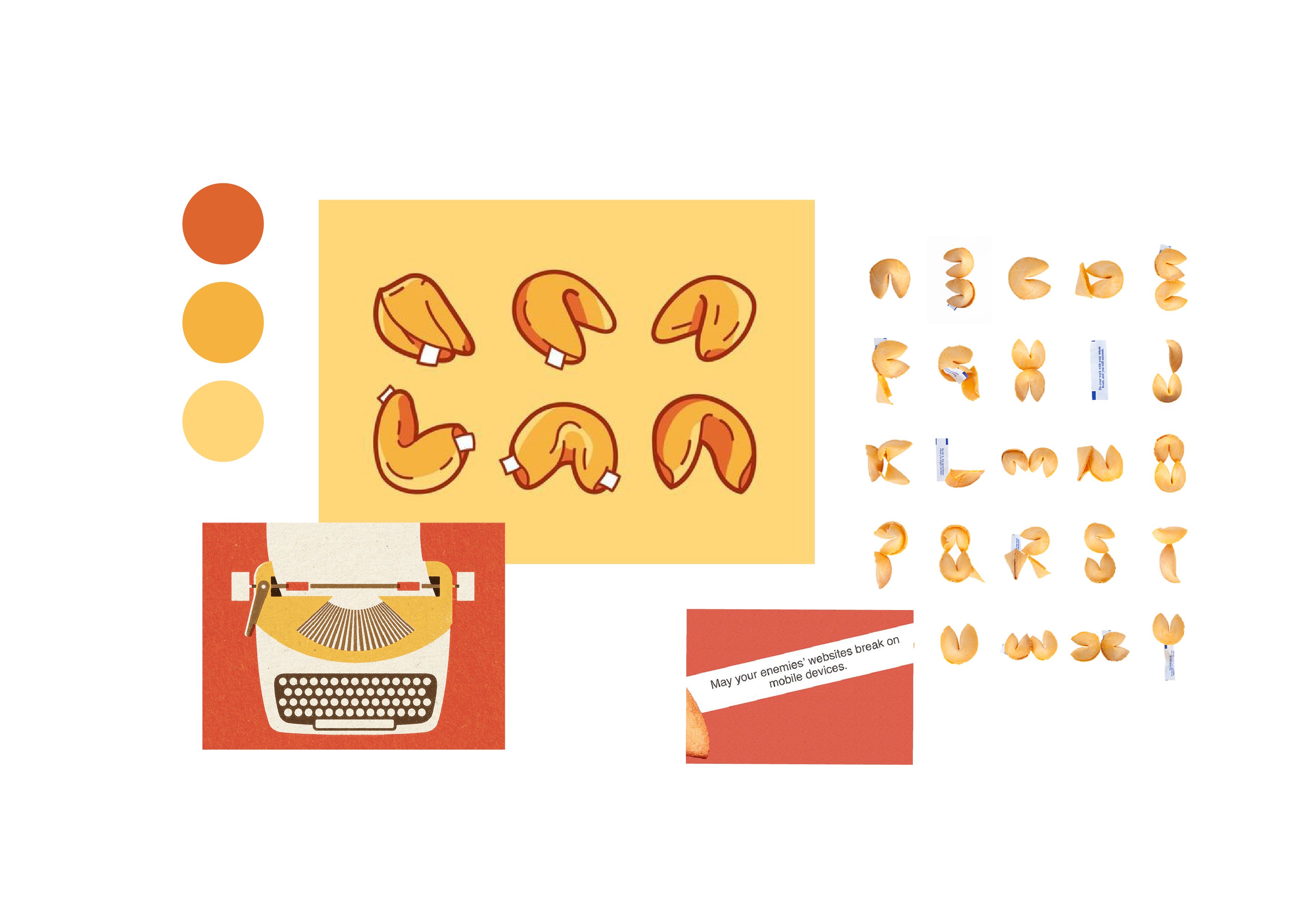
For the fortune cookie writer design, I used the fortune cookie itself as the main texture and shape of the type.
Sketches
Development
After more in-depth research and conversations with fellow peers, I found out that the job scope of a caretaker was one who deals with the cleaning, repairs and the overall protection of the area they are in charge of. I decided to focus on the “cleaning” aspect of a caretaker. To represent it, I used the texture of a sponge and the element of bubbles.
I started off choosing a typeface that was more lively, fun and organic to replicate the curves and irregularity of that of an island. The handwriting bubble font I chose was called “bubblegum”. In order to make the text more dynamic and spontaneous, I played with the orientation and positioning of the alphabets. The alphabets were to be the visual representation of paradise islands. I realised the textures of island sand and a sponge was pretty similar, hence to incorporate the aspect of a caretaker I switched up the texture of sand for some sponge texture. Boats, bubbles and island “fun” details were added to make a more intricate design.
For this fortune cookie writer design, I used the fortune cookie itself as the main texture and shape of the type.
To start, I decided to look for an English typeface that had Chinese characteristics or elements. The font that I chose is called “Shojumaru”. This typeface was perfect for my design. It not only depicted the Chinese elements I was looking for but also had a style that allowed me to integrate the message of a fortune cookie into the type itself.
However, after creating the basic fortune cookie typeface, it seemed rather plain and literal, lacking the aspect of a “writer”. Thus, I took to the internet in search of elements that could represent a “writer”. That’s when the idea of using the features of a typewriter came to me. By taking the part where the typewriter churns out paper and placing it before the fortune cookie note, it created a scene where the note was being written and printed out of each of the cookie.
Initially, I tried using Chinese characters on the fortune notes of the cookies. Unfortunately, the intricacy of the Chinese characters seemed to take away the attention of the whole fortune cookie font, hence, I switched it up for some scribbled handwriting instead.
Job 3
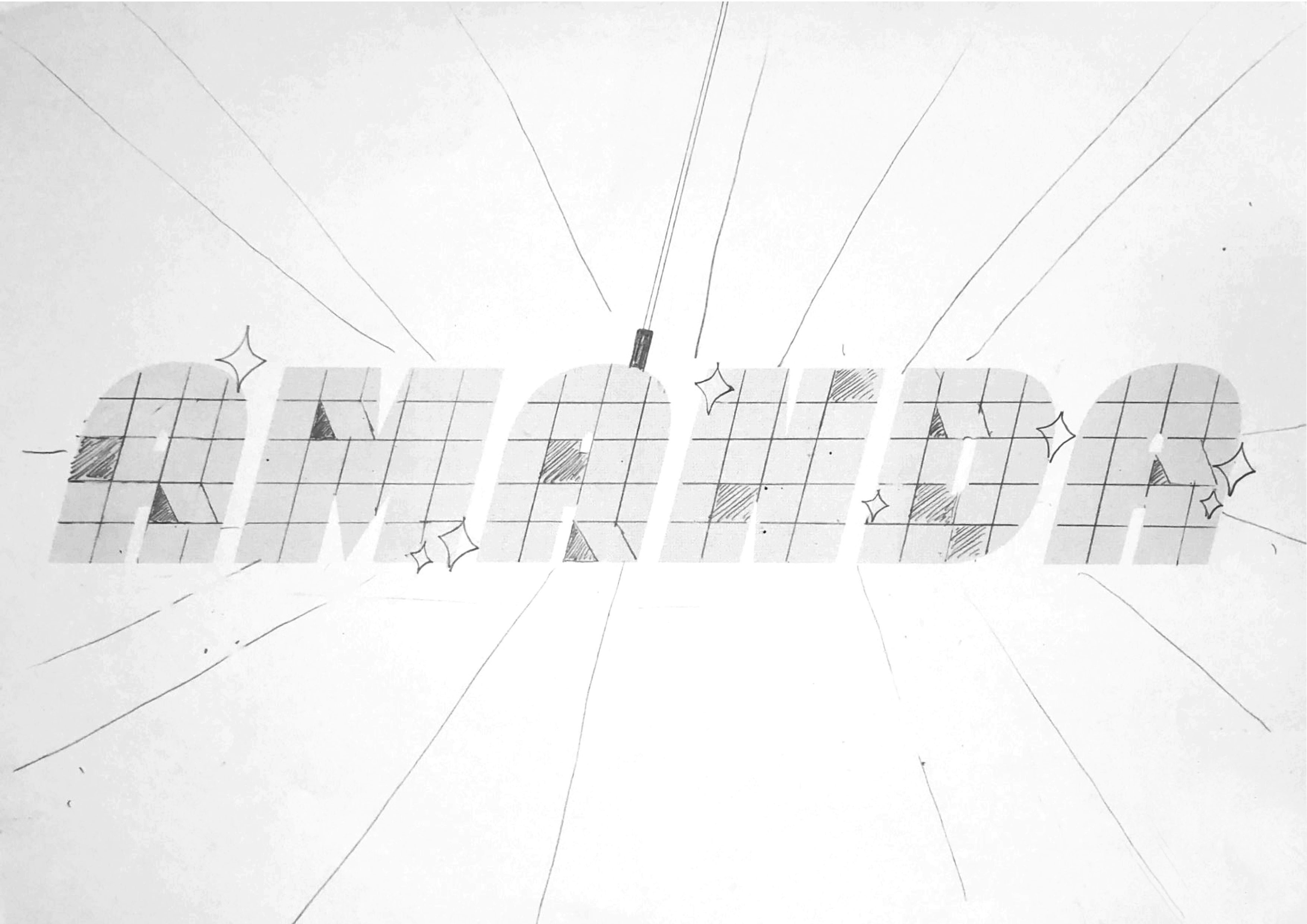
Disco Repairman
Moodboard
To symbolise a disco repairman, the two main features I used in my design are the disco ball and elements of a broken machine that needs to be repaired, such as frayed wires and spoilt gears.
Sketches
Development
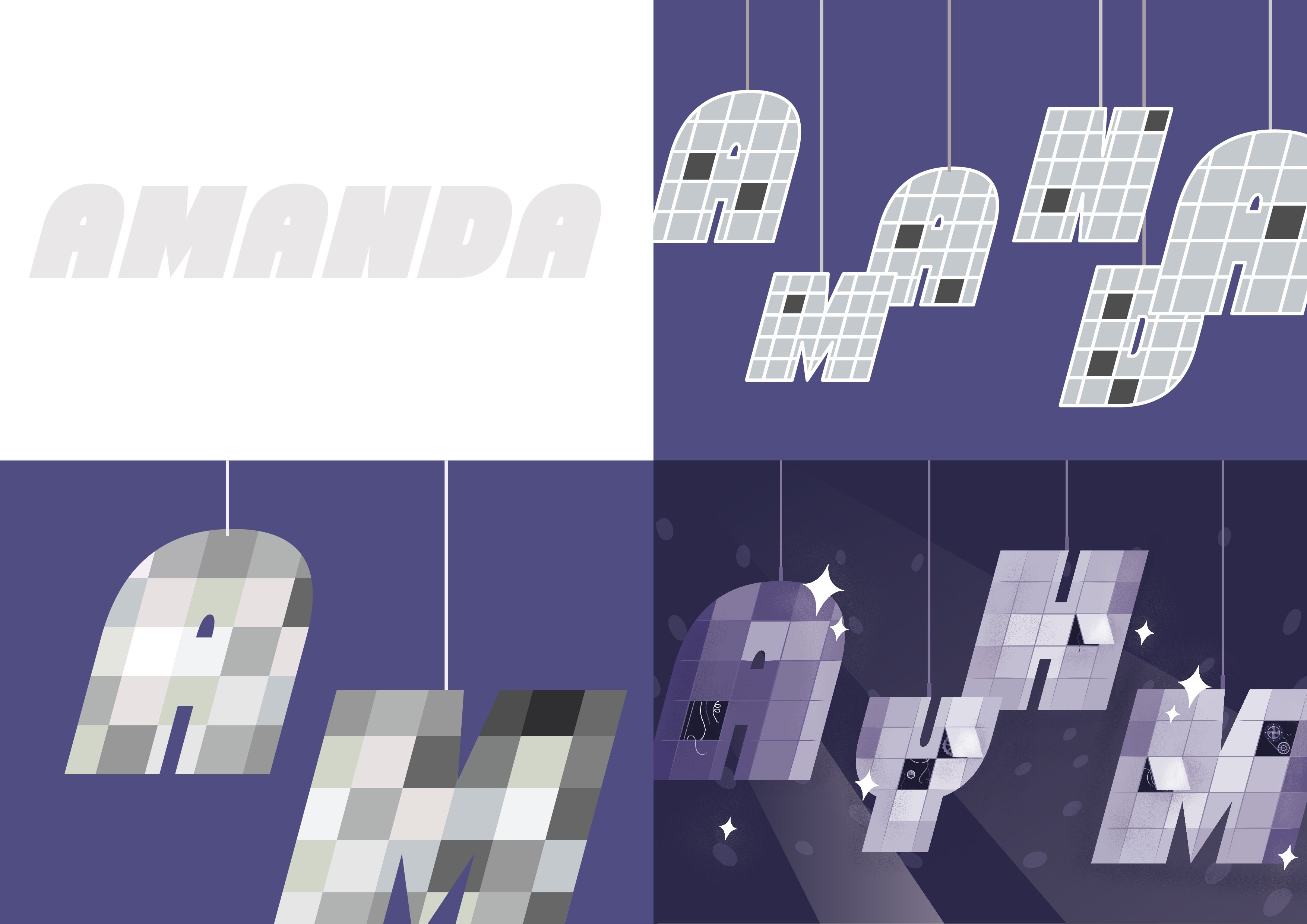
I used a sans serif typeface called “Chunky Funks”, a regular block-ish font that fits the tiled mirrors of a disco ball. Recreating the reflective mirror texture was really a challenge as I wanted the disco ball to look relatively three-dimensional although they were in a flat design. At first, I tried using an outline to illustrate the tiles but it looked cartoonish and really flat. I recalled the illustrator workshop we had in class and I attempted to use the grain effect we learnt to give the tiles texture, highlights and shadows. This made the tiles look way more real and “reflective”.
I tried playing with the hierarchy of the alphabets using scale and position to imitate the effect of the disco type being in three-dimensional space. Lastly, to give the true effect of disco, I added the lighting effects!
Job 4
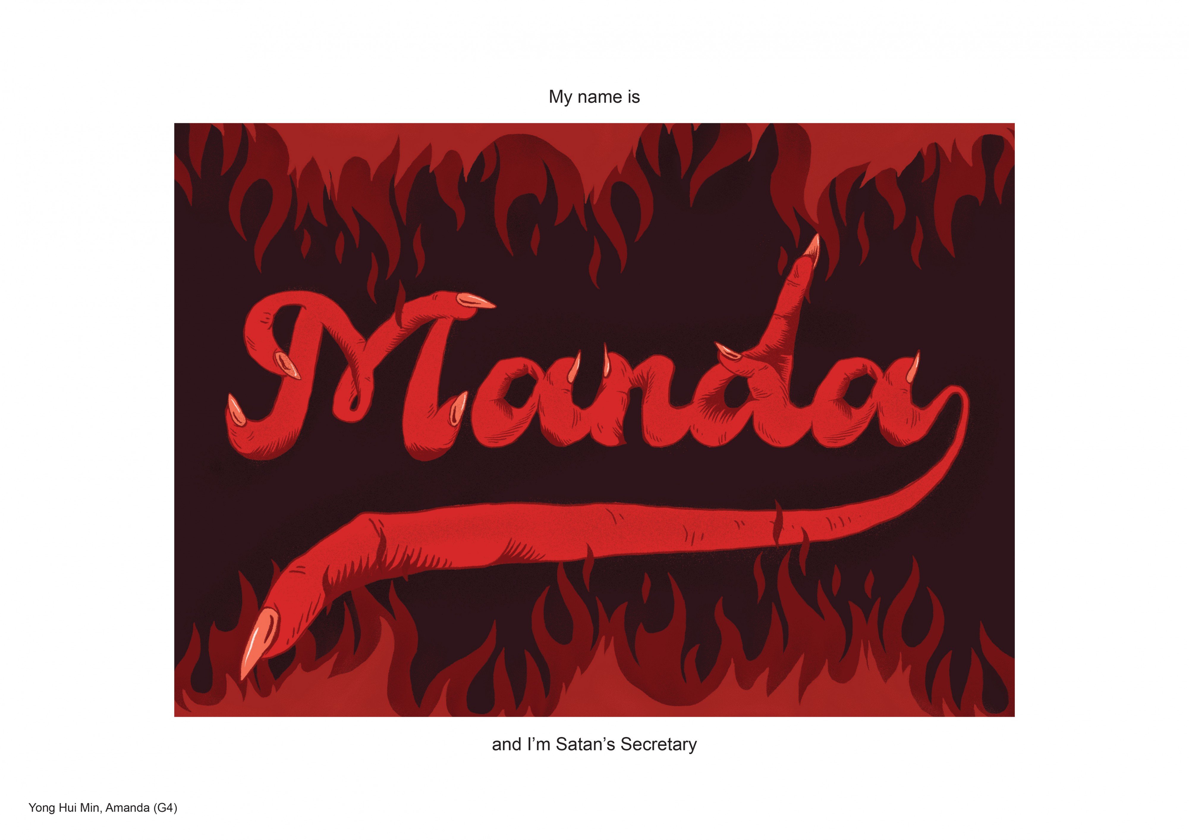
Satan’s Secretary
Moodboard
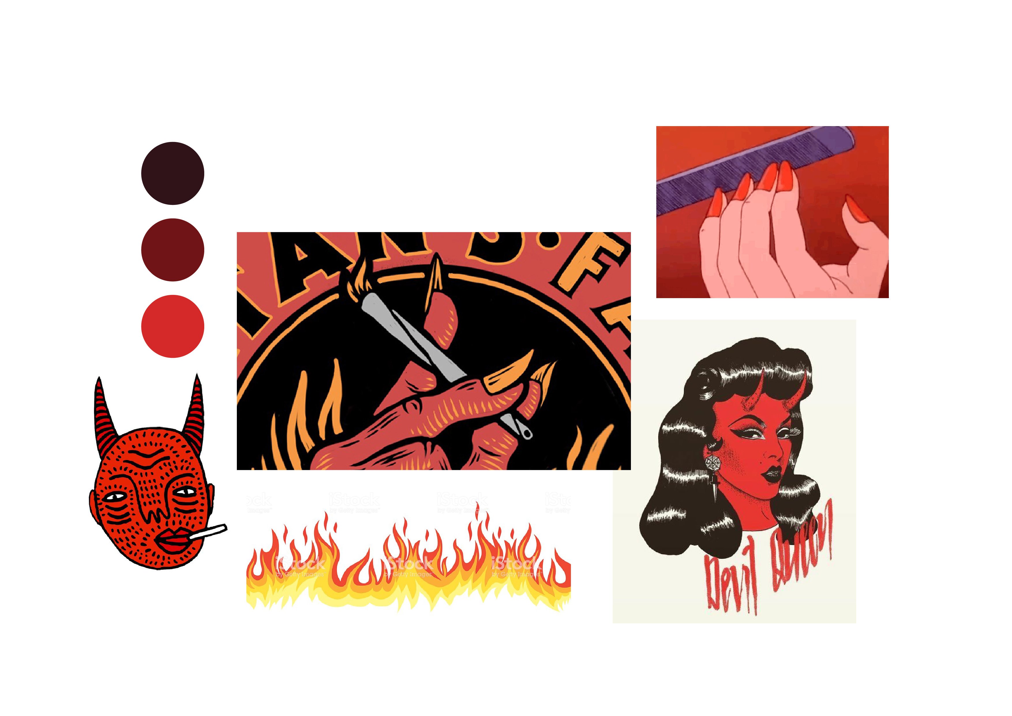
For this design, I wanted to create a comical looking representation of Satan as I felt that my chosen career, Satan’s Secretary, was poking fun at him. To represent Satan I felt that it was crucial to include the colour red and as a representation of a secretary, it was long nails.
Sketches
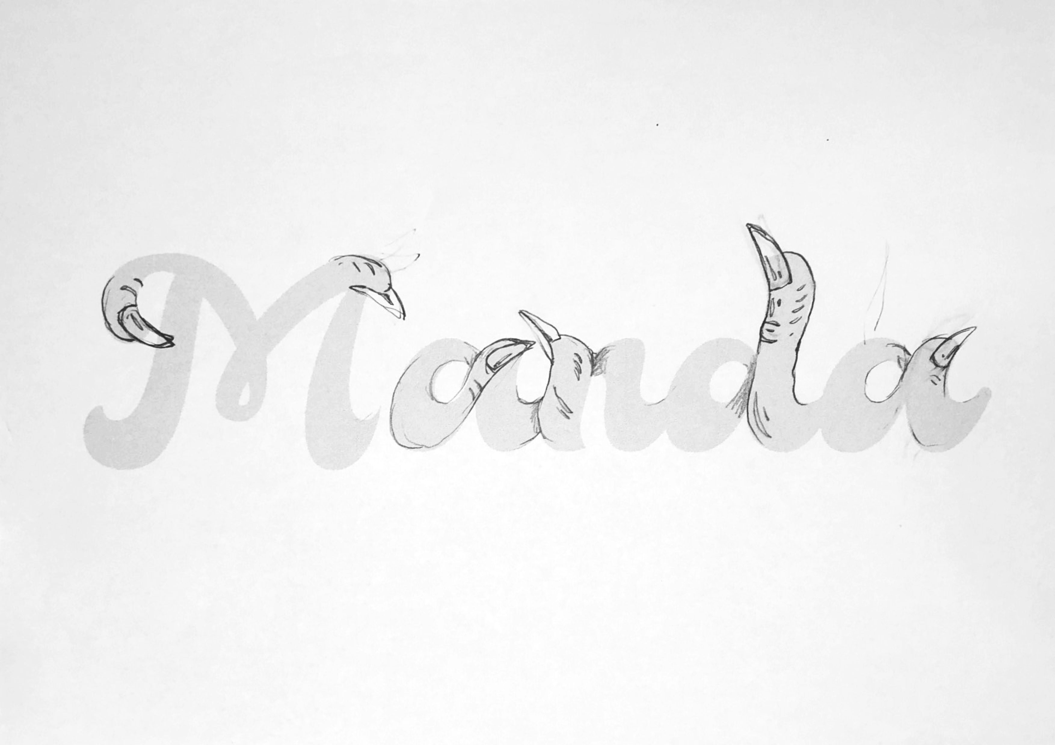
Using fingers to form a text was really difficult and I had to sketch it out multiple times before the fingers finally looked “correct”.
Development
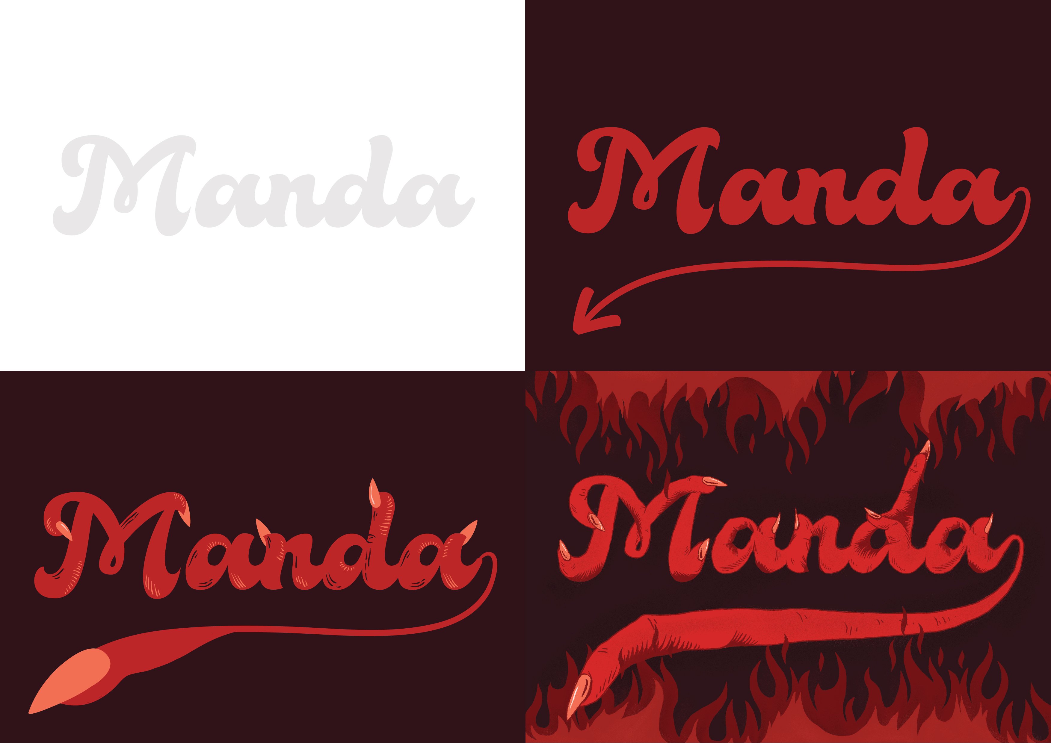
I started with the base using a cursive typeface called “BellaFree” and added on the details and textures of a finger. I first did this in illustrator, however, the vector graphic effect made it a little too “cute” so I switched over to Photoshop to use a sharper pressure brush that would make the type “fiercer” and more organic like a finger. The pressure brush also helped to create more definition and realistic finger wrinkles.
For the background, I decided to use the “eternal flames of hell”. Basically just fires to represent Satan and his home, hell.
Conclusion
This was a really exciting project where I was able to use my full imagination to create both a new typeface design and a “never-before-discovered career”. It stretched my ability to think out of the box by learning to adapt textures into type. This assignment was also a good way to introduce type as it got us to understand the elements and features of different styles of typography as well as the emotion a specific type can depict.
The biggest challenge I faced in this project was probably coming up with the elements that could symbolise the jobs. It was also really challenging compositing the various elements together such that they would tell a cohesive story and portray the wacky job I had chosen. However, I believe challenges are meant to help us grow and learn, without the feeling of frustration and desperation we will never learn to adapt and move forward. Form the class presentation, I also noticed multiple of my classmates were using different techniques to create three-dimensional type and that is something I had not thought of doing. If given the chance, I think I would have wanted to explore more on techniques and try out more different youtube tutorials. I believe it is through such assignments that we get to explore and try out new things.