Anxiety Toilet Conceptualisation

Anxiety Toilet


Idea

When seeking peace and quiet during a sudden anxiety attack, one would usually consider a toilet as the first place of refuge. With the given privacy of a toilet, one can stay hidden from the public eyes and avoid breaking down.

However, the Anxiety Toilet is not the toilet for such situations. As a dark object, the Anxiety Toilet will amplify the fear of anxiety in an enclosed space. Our interaction uses sound and light to amplify common symptoms of anxiety such as hyperventilation, panic, worry, stress, sweating, trembling, fatigue and increased heart rates.

Calming jazz music plays when there’s no one using the toilet, acting as a false place for “anxious refugees”. Once seated on the toilet bowl, the proximity sensor will be triggered causing the lights to flash and sounds of paranoia to play. The textured wall in our set up creates an optical illusion along the walls as the shadow bounces off the crevices of the walls. The sound effects start off rather gentle at first but soon amplifies with heavy breathing and loud white noises accompanied by flushing sounds.


Process

You can view our process video through the link below:

“Anxiety Toilet Process”


Materials

  • Arduino Board
  • Bread Board
  • IR Sensor (SHARP GP2Y0A41SK0F)
  • RGB LED Strip (2812B)
  • External Power Source
  • Wires
  • Crocodile Clips


Instructions

Step 1

Connect IR sensor in the following sequence to Arduino Board:

Red Wire (VCC) to 5V

Black Wire (Earth) to Ground

Yellow Wire (DATA) to A0


Step 2

Connect 2812B LED Strip into the Board and to the External Power Source:

Red Wire (VCC) to + of Outlet

Yellow/White Wire (Earth) to – of Outlet

Green Wire (DATA) to Pin 3


Step 3

Connect to the Arduino to your Device and link it to Processing for Music to be played via Minim.


Reflection

This project has allowed me to truly understand the connection between tech, design and interaction. 

It has shown me what a key role interaction plays in design. Often we end up design “for ourselves”, in the sense that if something works for us we assume it works for everyone. However, though the various project tests in class I came to realise how different people often had different reactions and actions to the same given object or space. I realised how we can’t simply expect people to interact and do things in a certain way, instead, we had to understand the behaviours of people and readjust our designs to them.

It was also really interesting dabbling into the world of coding. In all honesty, most codes still seem like a foreign language to me. However, they are no longer a complete blur, I can now understand some simple codes and their functions. Although coding was really tough, it was really satisfying to see the code work and I think that made all the work worth it.

This project and module has really broadened my knowledge of the interaction design field and has made me much more curious and appreciative for interaction design. 

Despite all the challenges along the way, I am glad there was Lei to guide us through all the disruptions in our codes and lastly, I am thankful for having a great group mate, En Qi. We were able to split the work evenly and were on the same page throughout the project.


You can view our showreel through the link below:

“Anxiety Toilet”


A group effort with:

En Qi

Form and Visualisation Final Assignment

“In”


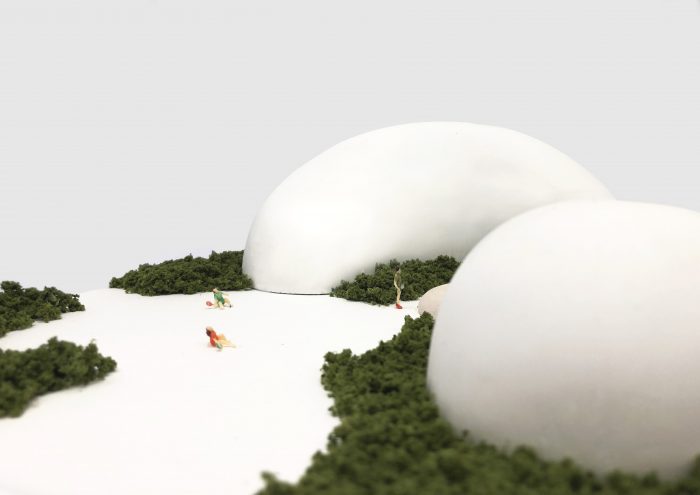
“In”, like its name, encourages people to come in and immerse themselves with nature and design.

The two organic shaped buildings in “In”, were created with a minimalist style and approach in order for them to stay subtle, giving the exterior nature elements the main focus of the space.

The larger building in “In” is an Environment Design museum that will exhibit and feature design works of environmental sustainability, while the small building will be a reception space. The exterior area is meant for the people to simply enjoy the natural elements while relaxing.


You can view my Design Report through the link below:

“Design Report”


Graphic Form Project 2B CPJ

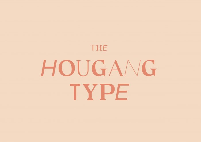
Locale : The Hougang Type


Brief

For this project, we were tasked to create an A5 size 8pp zine that explores the neighbourhoods we lived in. We were to showcase our neighbourhoods from our own perspective. 

I have lived in Hougang all my life and I thought that this would be a great opportunity for me to really display what I knew about Hougang as well as what I loved about the place. Twenty-one years in the same place is a really long time. I lived, breathe, studied and grew up in Hougang. Most of my fondest memories of my friends and family are all within walking distance in the vicinity of my neighbourhood. 

Hougang is my home.


Ideation

Honestly, I actually enjoy taking aimless walks around my neighbourhood with some music on, and I often opt to walk from place to place within my neighbourhood if I wasn’t in a rush for time or when the weather wasn’t too crazy. One thing I often conclude was that Hougang was really a hidden beauty.

I feel that Hougang still retains much of my childhood nostalgic interpretations of Singapore, especially in the type. To be brutally honest, the type in Hougang is nowhere near any graphic designer’s standard, however it authenticity and old “school-ness” is what makes it so simple and beautiful. The handwritten signs and Chinese calligraphed shop branding have their own uniqueness and I felt this was something I wanted people who do not live and live in Hougang to take a second look at and appreciate. In this day and age, we are often so preoccupied in our own worlds, looking at those tiny rectangle screens, we call phones to look around and appreciate the beauty that surrounds us, it was even proven in the survey I conducted for research where 62% of those surveyed admitted to being oblivious to their neighbourhoods.

Therefore, my idea was to create a zine that appreciated the type in Hougang. The zine was titled, The Hougang Type, which connotates two meanings. The typography in Hougang and the type of beauty in Hougang. 


Inspiration

For the design of my zine, I drew inspiration from the concept of brutalism. Brutalism in graphic design is a myriad of systems fonts, irritatingly positioned images with no distinctive hierarchy and a lack of symmetry. It was basically any design that could evoke a headache.

In other words, when you encounter a brutalist design, you certainly won’t miss it. And this was the same view I wanted people to have for the type in Hougang. Despite the visually offensive, raw and retro designs of Hougang’s type, I didn’t want people to miss it. Instead, I wanted these “ugly” type to call out for attention in order to be appreciated for their own beauty.

Here are some designs I drew inspiration from…


Developments

Of course, despite knowing what I wanted to do and how I wanted to do it, actually doing it is much more difficult and the results are often unpredictable. 

Below are my developments in design…


Cover

Initially, I wanted a purely type-based cover. However, after consultations with Shirley, she explained how a pure type cover may be a bit unattractive as compared to a vibrant cover with imagery.

First Spread

For the first spread, I wanted it to be an introduction to the zine as well as a guide on how to appreciate type. If one followed the flow chart, it is actually a step by step guide. At first, I planned to simply use contrasting typefaces to create the design however by doing so I was not really using typography from Hougang and that would defeat a zine that main purpose was to showcase the special type in Hougang. Thus, I brought my camera and went all over the neighbourhood looking for the words I needed.

Second & Third Spread

Initially, I was going to split the second and third spread into either two of the categories, type in architecture, type in people and type in things. However, after shooting the images I came to realise that there were a lot of overlaps within these three categories and eventually decided to use both spreads to simply showcase the unusual and beautiful type hidden in signages and communications in Hougang. 

Back Cover

The back cover was pretty straightforward. I wanted a clear key line map that matched the style of my zine to show and guide viewers through Hougang to view the beautiful hidden type. 


Conclusion

All in all, despite the sleepless nights and photoshoots under the scorching sun, this was a really fun project where I got to go around my favourite place in Singapore. My very own neighbourhood, Hougang.

In all honesty, I kinda believe this assignment was designed for us, who may have lost touch with the places we grew up in as we have grown older. This is especially relevant for those who may live on campus, far away from their homes. It definitely gives us a good reason to go back and revisit our homes and surrounding neighbourhoods. the project has also reiterated the importance of paying attention and appreciate our surroundings. I hope this project continues on for the next batches of design students in ADM! 

Project Development Drawings

Ideas

Here are some ideas we came up with for a possible dark object.

1. Staring Eye

2. Breathless Mask

3. Anxiety Toilet

4. Sweaty Palms Glove

5. Cold Sweater


How does your audience experience your project?   

Our Anxiety Toilet will be a live size installation where the audience gets to physically be in the space and interact with the various elements that create a sense of anxiety.


Is it for a single person to engage with your project or for multiple participants concurrently? 

Our project is only for a single person to engage with at a time.


What is the interaction or situation you are creating for your audience? 

We are trying to simulate a sensorial experience of how one would feel under anxiety. Our experience will be created with various interactive elements that will be triggered upon the audience’s interaction with the objects in the toilet. For example, upon closing the door to the toilet, the light will start flashing and turning red. As the participant sits on the toilet bowl, it will trigger a sound of heavy breathing and heartbeats. Lastly, touching the toilet roll will cause it to start erratically unrolling itself making a mess in the toilet. These sensorial elements are designed to enhance the feeling of anxiety in a small space.


What is the intention of this interaction? 

Our intention of this experimental interaction is to highlight the rampant amount of people suffering from anxiety in recent years due to external factors such as rising stress level. According to the World Health Organization (WHO), 1 in 13 globally suffers from anxiety. The WHO reports that anxiety disorders are the most common mental disorders worldwide.

As a dark object, rather than aiming to help those who suffer from anxiety, our projects aim to rampant the simulated effects and feeling of anxiety. Our sensorial experience makes use of various senses that get triggered during an anxiety effect, hearing, breathing, sight and touch. 

We chose a toilet set up as the space for our project as many who suffer from anxiety often have the urge to go to the toilet, both to use it and as a safe space when in public. Thus, we are redesigning a regular toilet cubicle to change from “safe haven” to an “anxiety nightmare” upon interaction.


A group effort with:

En Qi

Research Critique 6 Destructive Games

‘Helena’


In 2000, Marco Evaristti, a Copenhagen-based and internationally renowned artist and architect, first exhibited ‘Helena’. ‘Helena’ was an art installation featuring ten blenders, each filled with water housing a goldfish, positioned on an ordinary kitchen table. The blenders were visibly connected to a power source, making the rules of the game implicitly set out from the start. Anyone who pressed the ‘on’ button on the blender would result in the liquidising of a live fish.

This work caused unprecedented controversy and still raises questions about the use of animals in contemporary art. It was considered one of the most controversial artwork of the past twenty years involving live animals.


What is the main purpose of the concept of destruction in the arts?

The main purpose of the concept of destruction in the arts is to create value.

While an engineer’s principal objective is to create, artist and researchers have oft reverse this underlying principle and instead explore destruction. Artists explore destruction as a form of raising one’s excitement through irreversible consequences which in turn creates an unusual and personal experience for the participant. The concept of destruction brings about the transience of art. Destruction is able to convert a material value into a social value by generating a conversational artefact that allows the owner to engage with an audience. Thus, destruction inherently not always negative. Destruction could indeed be positive.

We believe that this counter-intuitive insight would not have been possible without reversing the intuitive statement “creation creates value” to the counter-intuitive statement “destruction creates value”.

This is an excerpt from the paper “Destructive Games: Creating Value by Destroying Valuable Physical Objects” by David Eickhoff, Stefanie Mueller, and Patrick Baudisch.

In relation to the concept of destruction to create value, ‘Helena’ applies a similar theory. Marco Evaristti uses the “destruction” of goldfishes to raise awareness on how one acts in regards to one’s sense of morality. There are no rules or instructions at his installation, the blenders are only switched on at a participant’s will, it is entirely up to the participant’s morality to interact with the installation very well knowing that they will probably “destroy” the goldfish.


What effect do irreversible consequences have on the participants of the artwork?

The irreversibility of consequences increases the risk and excitement of the destructive experience. The irreversible consequences make a participant’s decision in “real time” and a crucial factor in the outcome of the destruction process. However, research from the paper “Destructive Games: Creating Value by Destroying Valuable Physical Objects” has revealed that the fascination of destruction itself is not enough to outweigh the loss of the participants. Destruction has to create value that exceeds the value of a participant’s damaged objects in order for them to enjoy the artwork. This can be seen through the game of destructive Tug-of-War.

In ‘Helena’, Marco Evaristti categorised his participants into three groups “The idiot, who pushes the button; the voyeur, who loves to watch; and the moralist, who will judge the action”. Despite the difference in actions, each participant still causes the same results and irreversible consequences which in turn becomes a lasting memory for them which they will share in conversations, be it good or bad.


What value does destruction bring to the artwork?

The interaction of each participant during the destruction experiment inevitably becomes a lasting memory for them and is bound to affect them positively or negatively. Such a unique experience oft turns into a conversational topic, creating a social value out of the destruction. The value of destruction is what it in creates.

Marco Evaristti believed that it was sometimes necessary to sacrifice one means for the sake of another. To him, the lives of the goldfishes were a necessary means to reveal and raise awareness of the social mechanism that he found out of balance.


You can view my presentation through the link below:

Helena