(Click to enlarge all images)
For my zine, I decided to focus on an aspect of my site I mentioned in my presentation – the bizarre juxtapositions that I could find upon closer inspection of the organization in Mustafa. Although there is an overarching organization to the items, some items don’t “go” together, making for an organized mess. My response to this, was then to create my own categories for these organized messes.
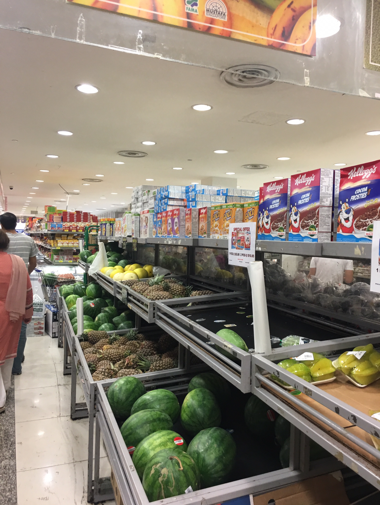
I started by looking at some of the weird juxtapositions.


(In order)
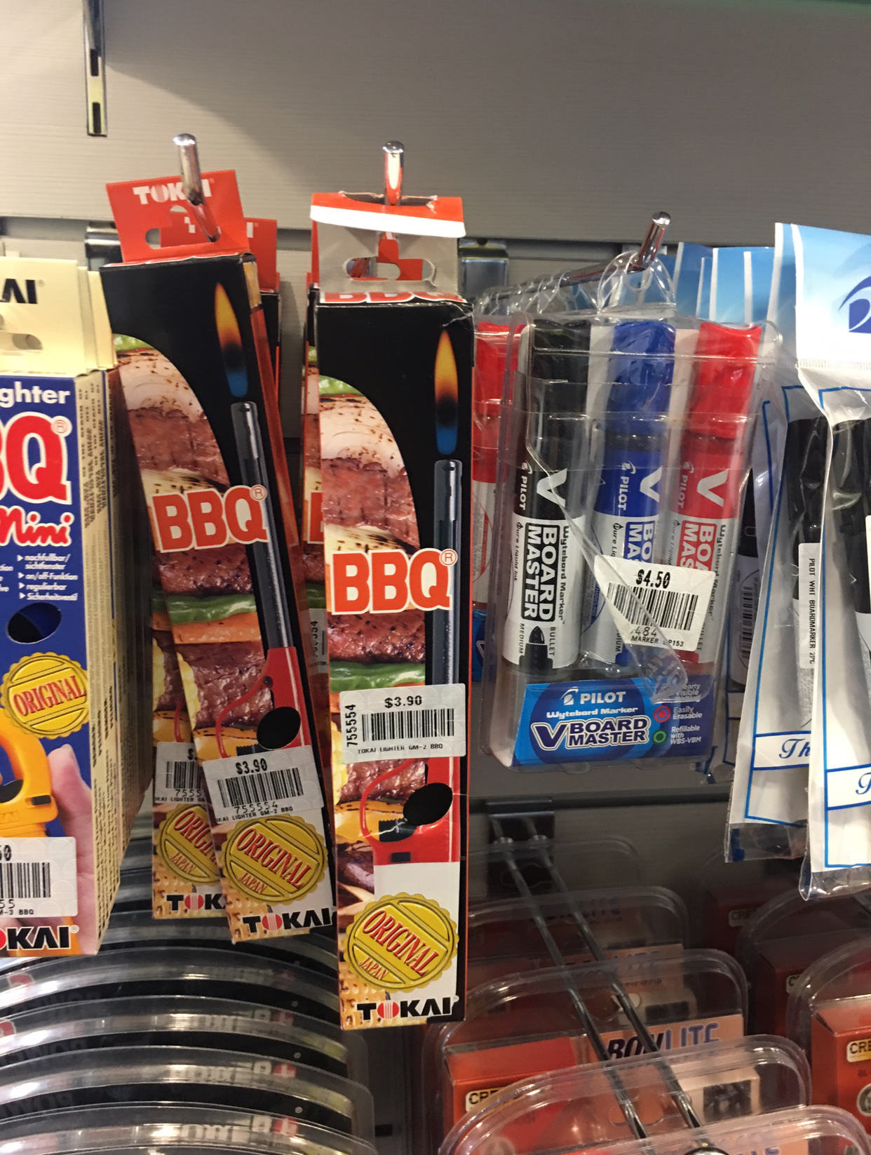
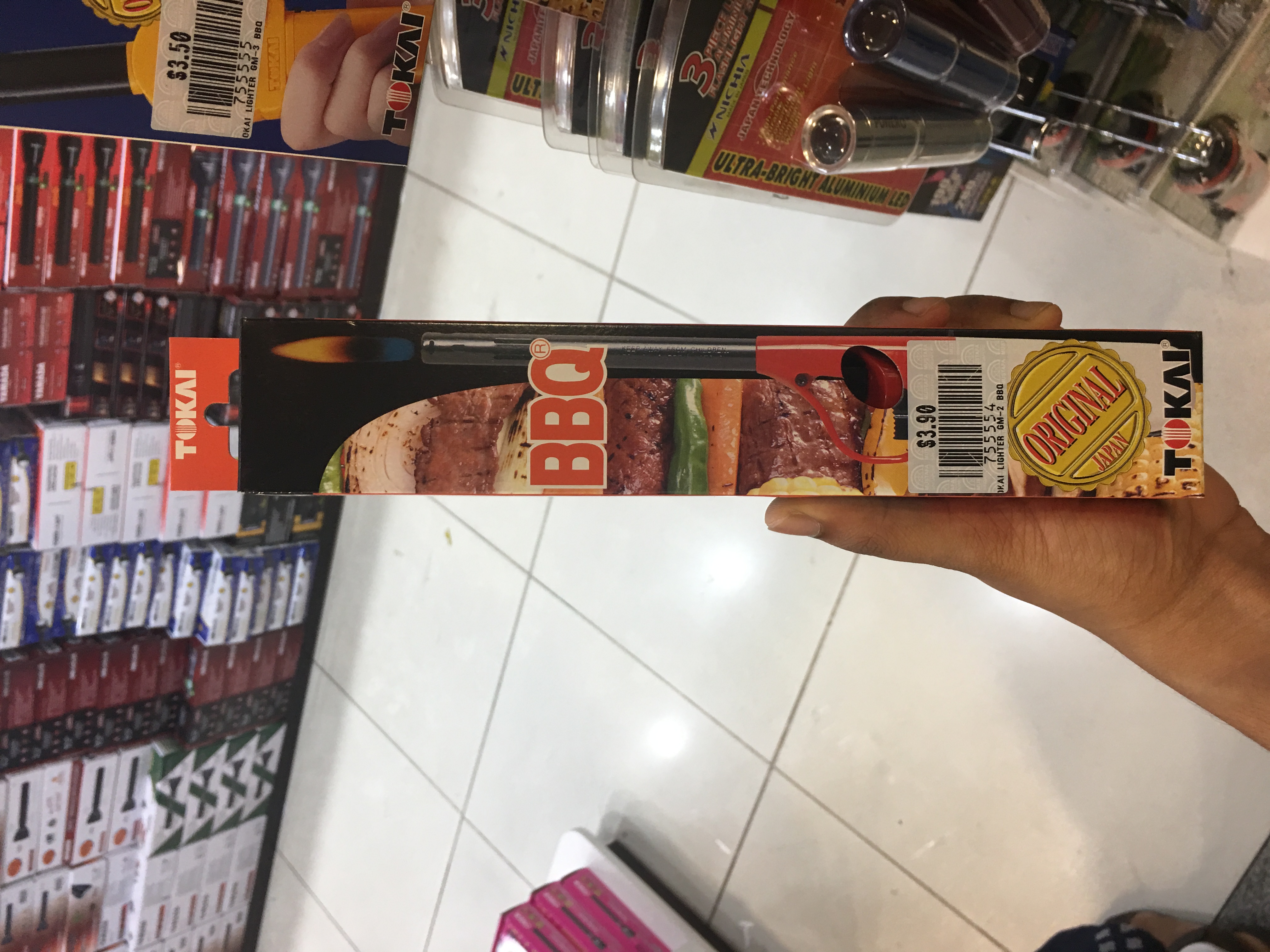
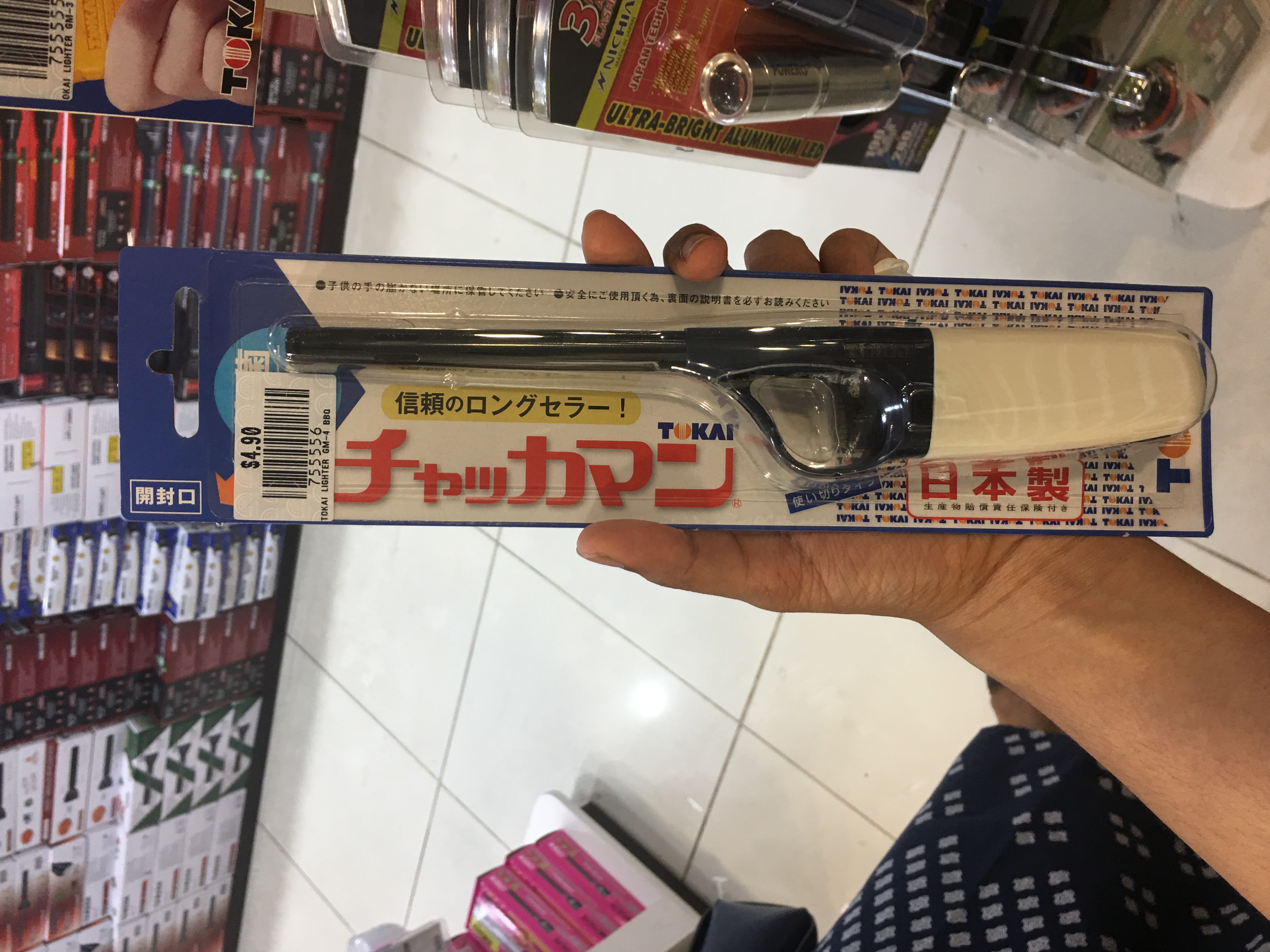
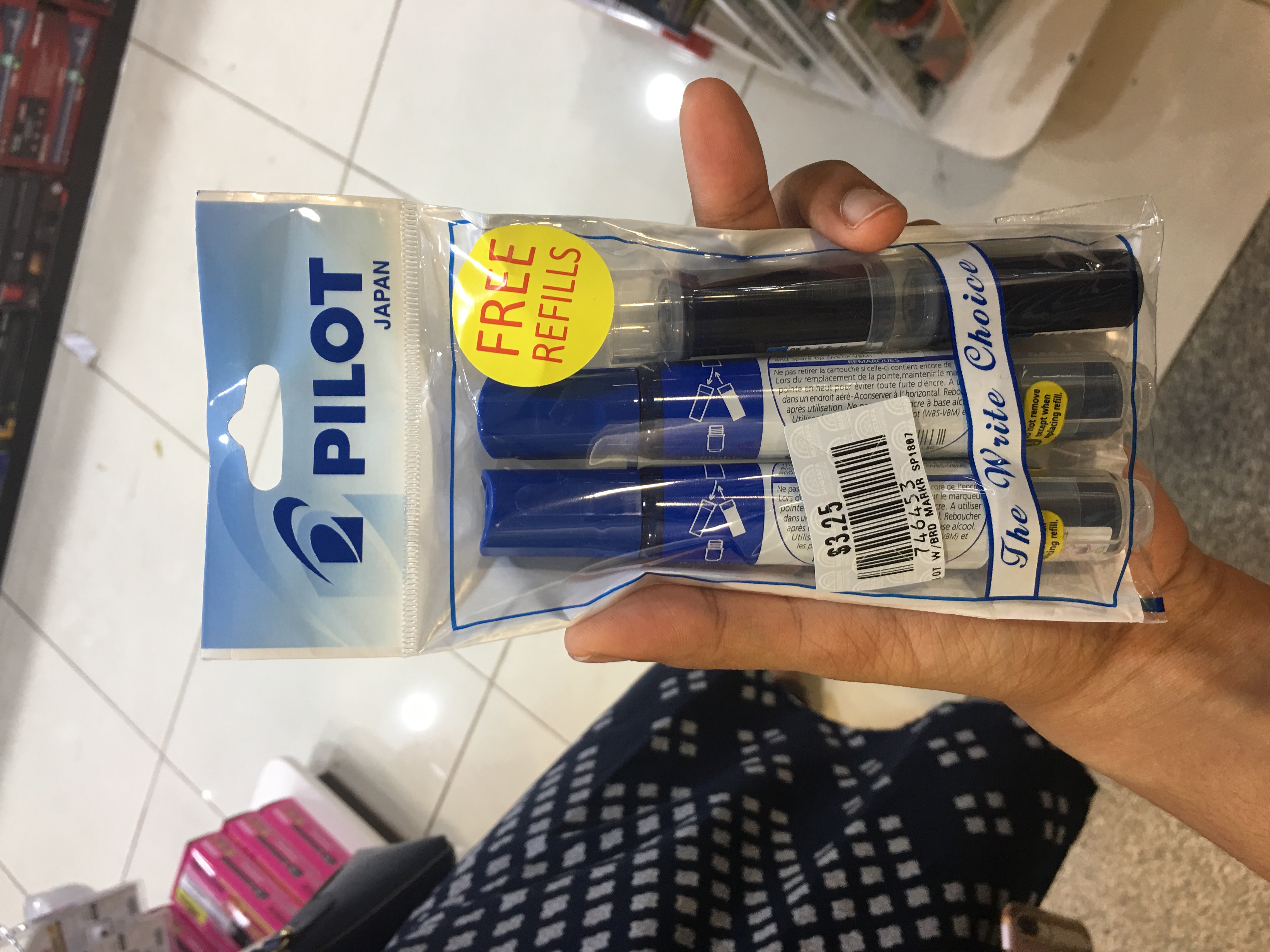
- Lighters next to whiteboard markers
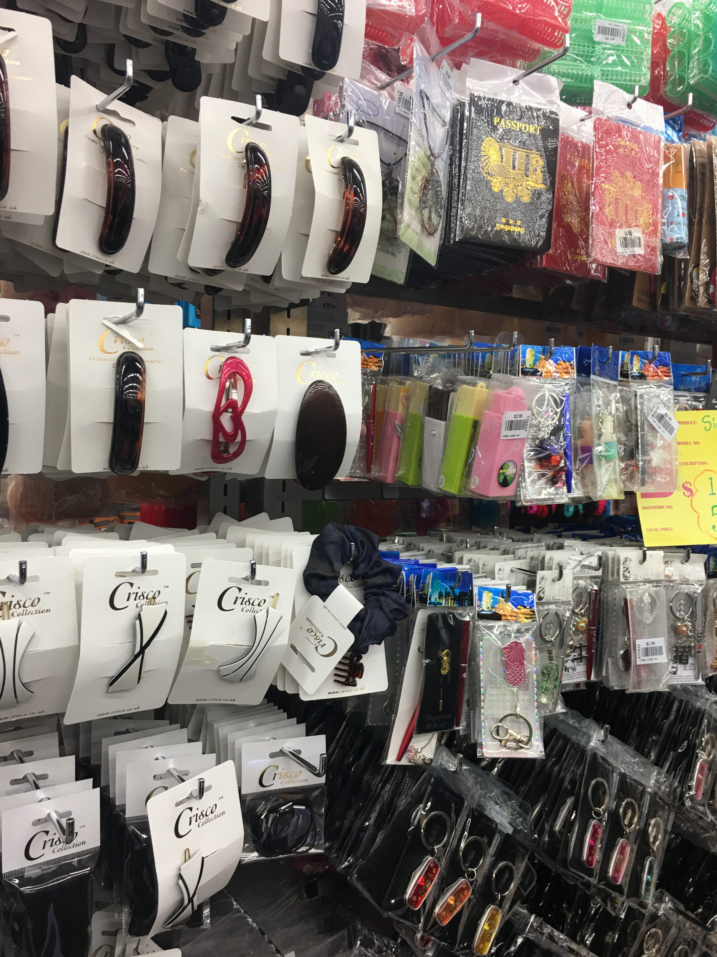
- Hair accessories next to passport covers
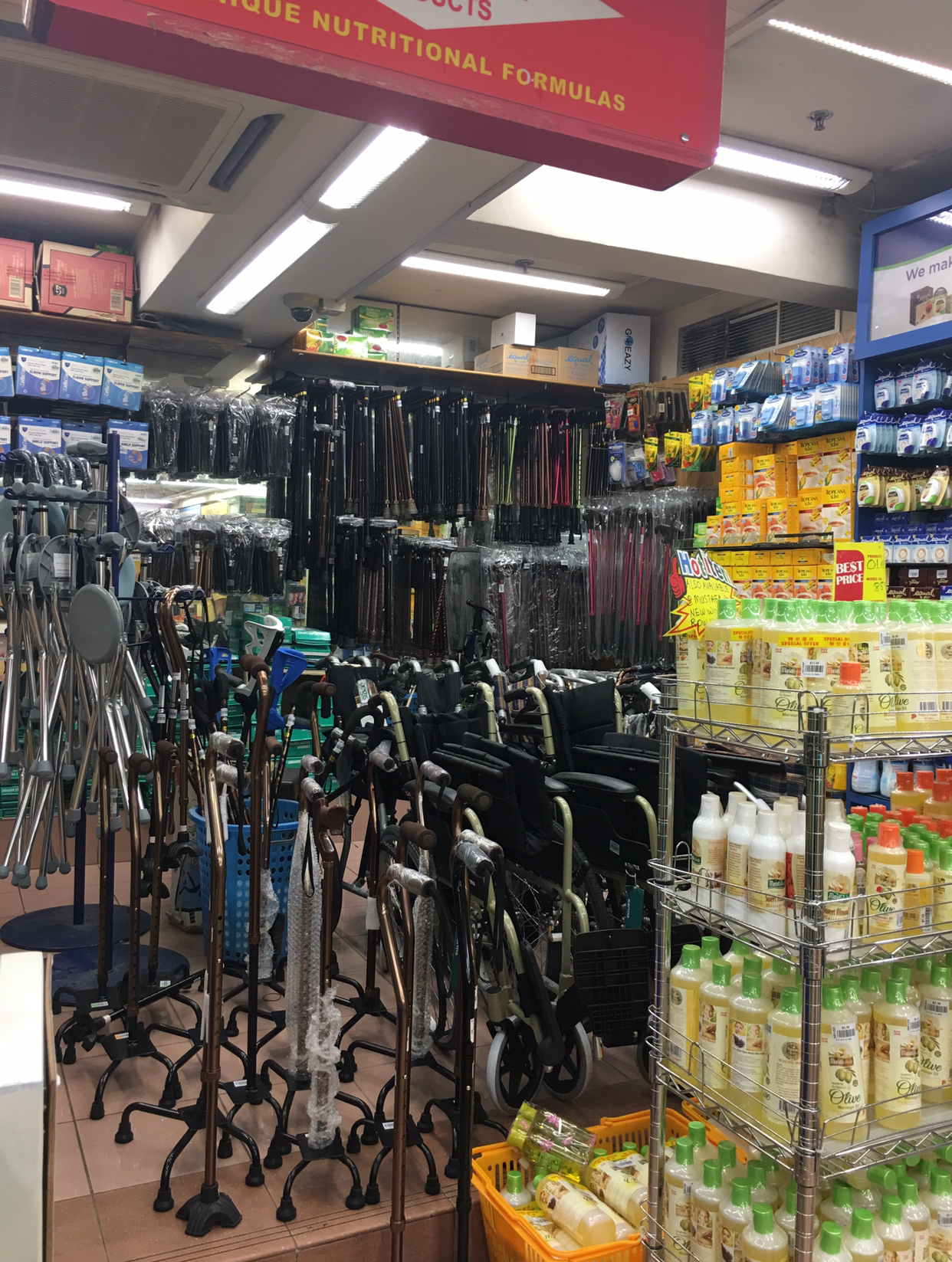
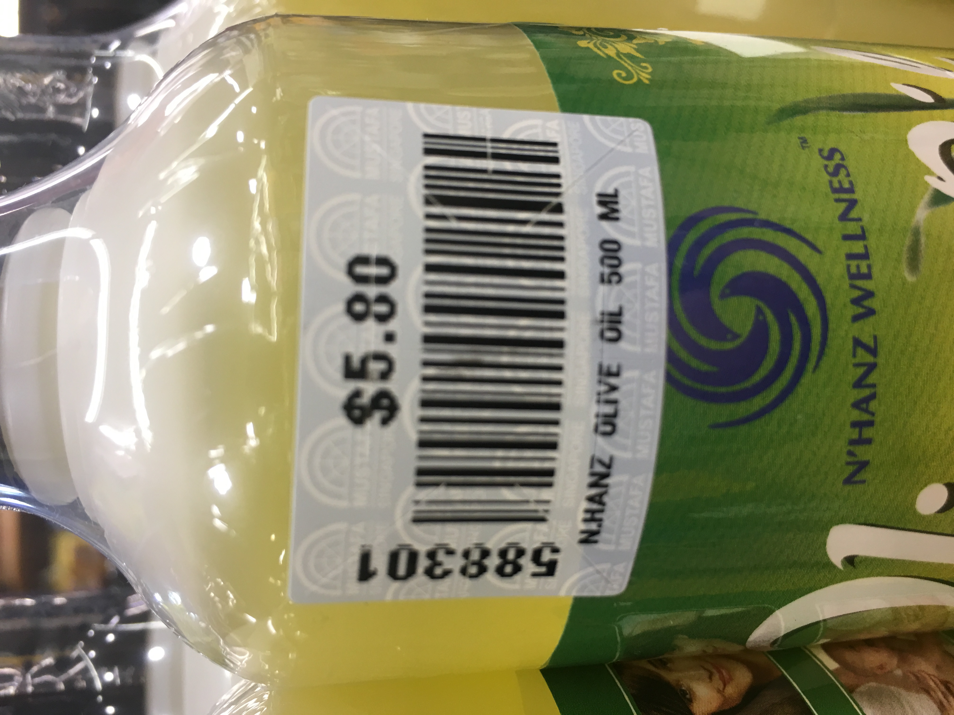
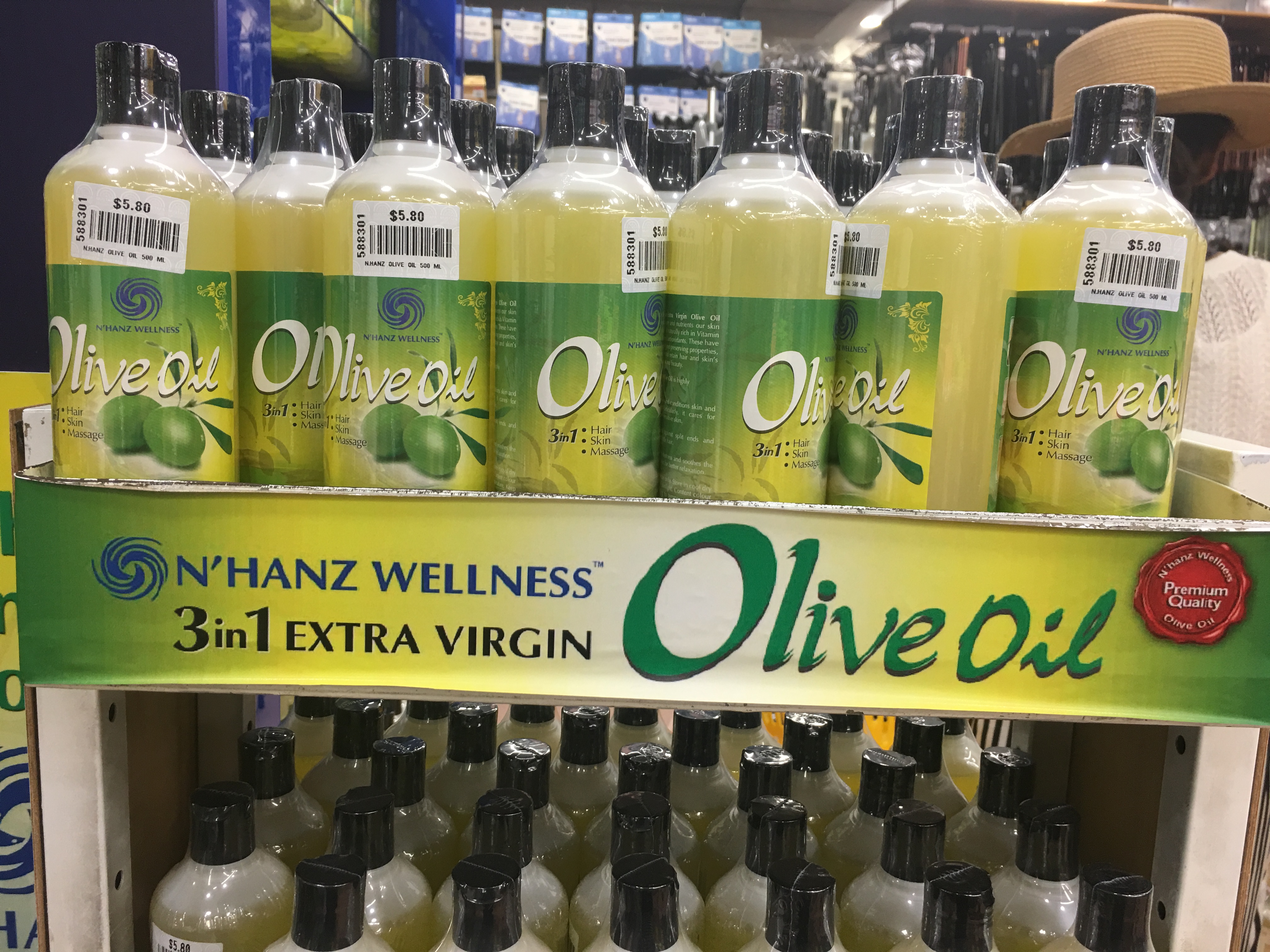
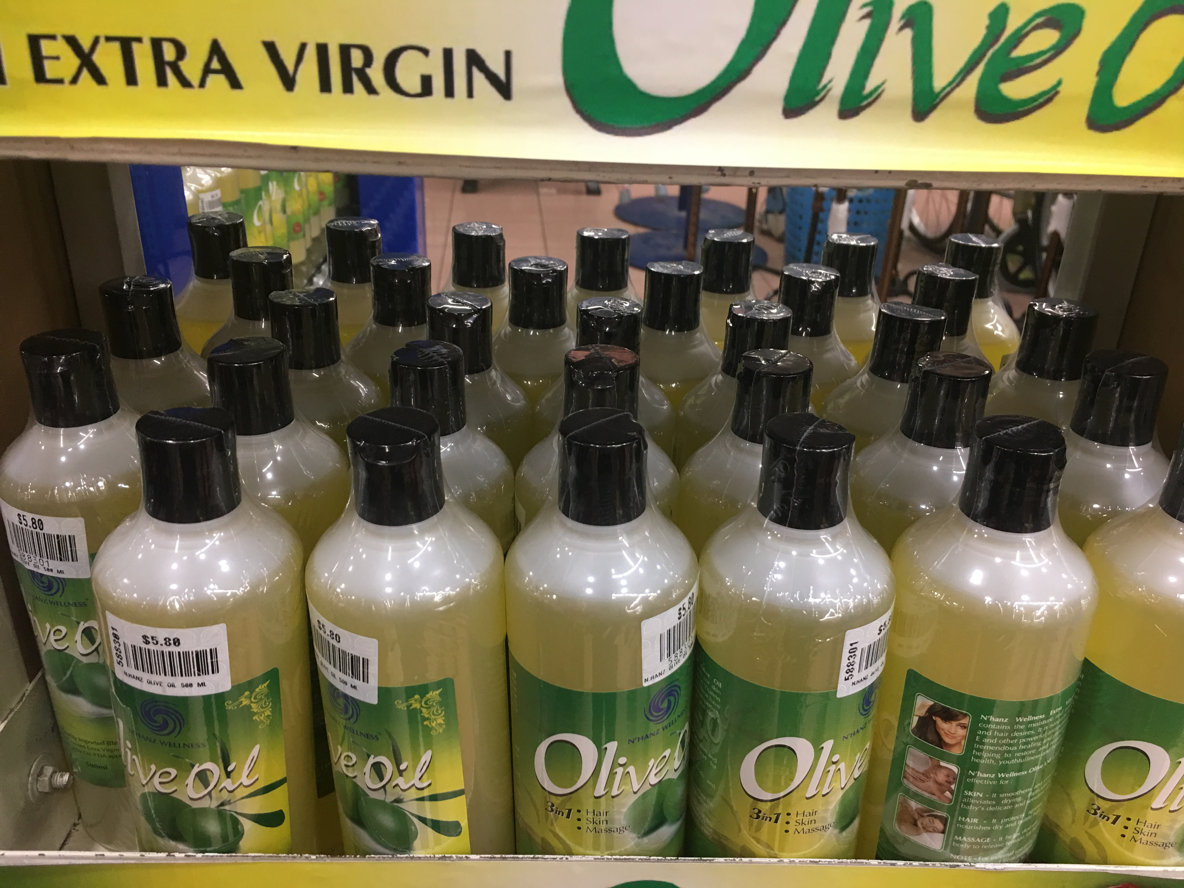
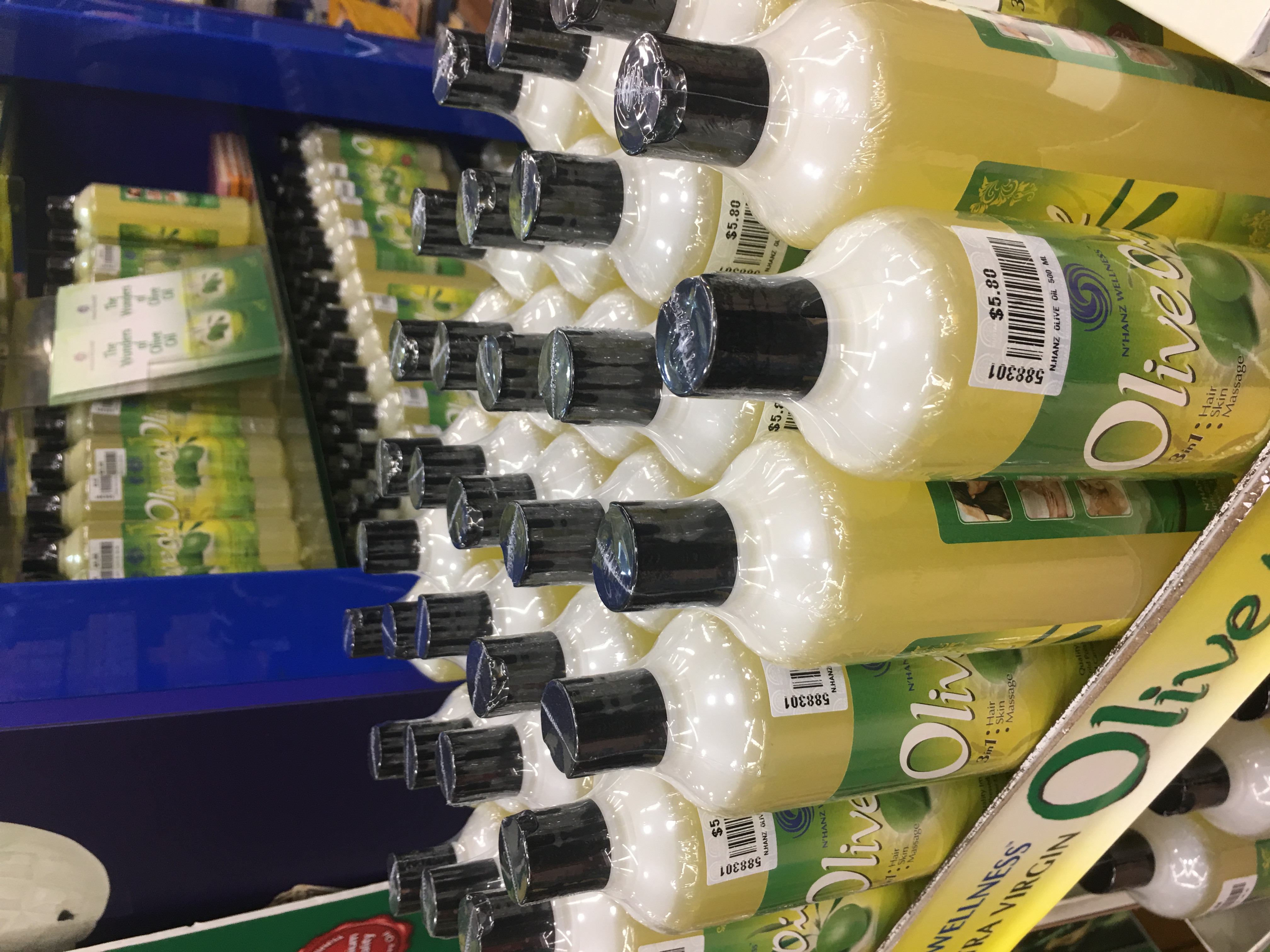
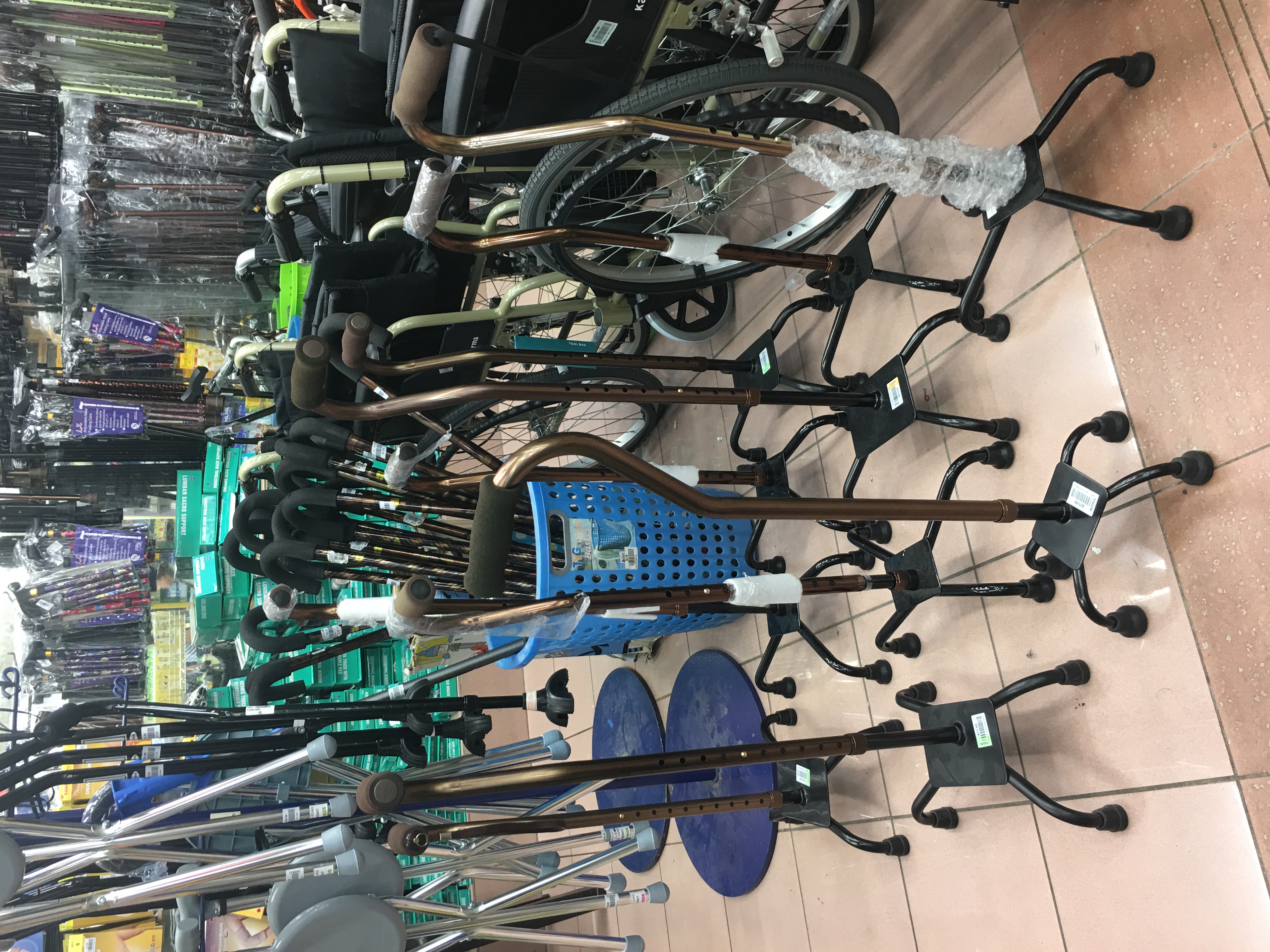
- Olive oil next to walking canes
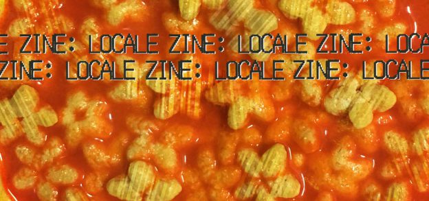
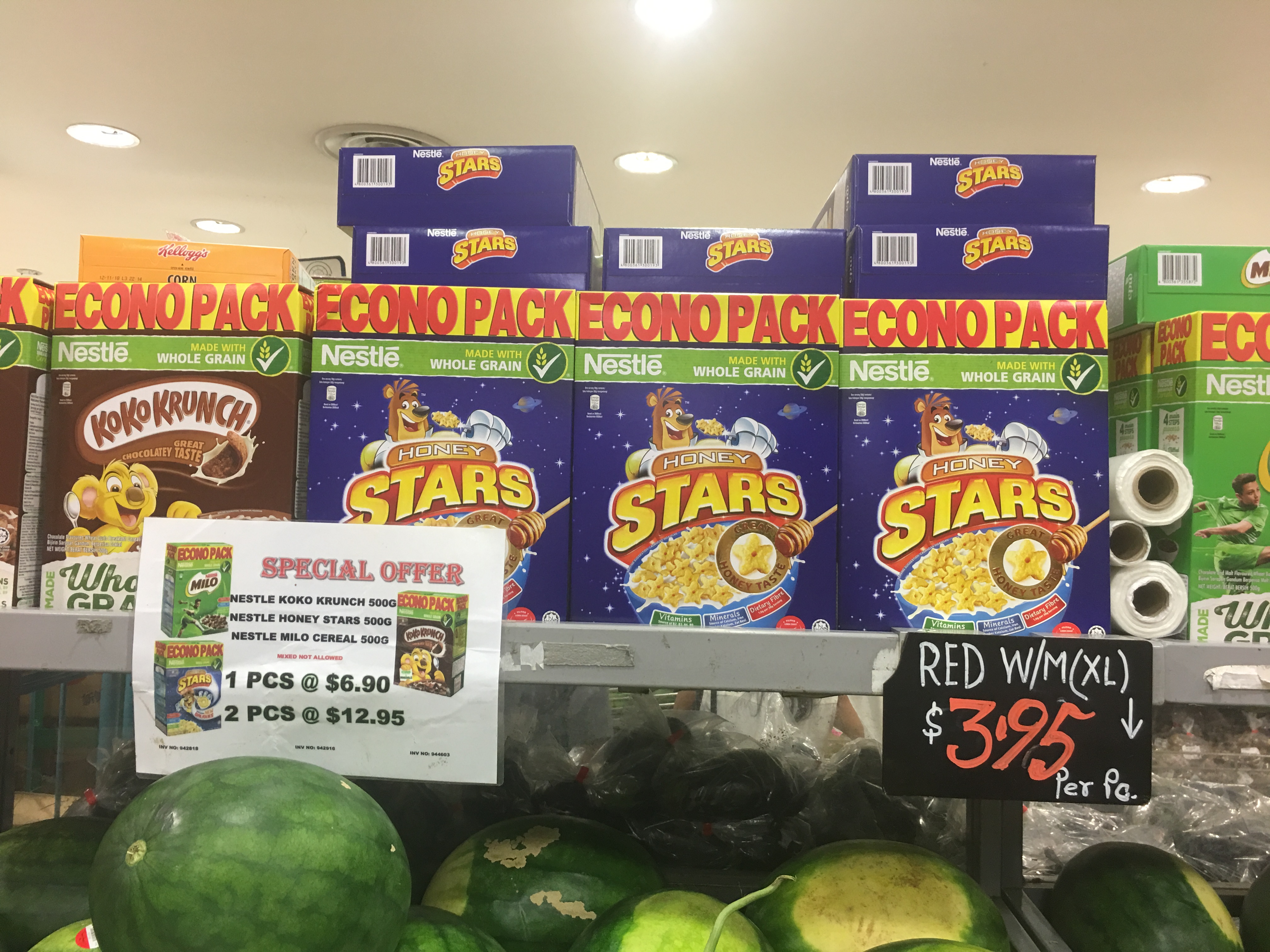
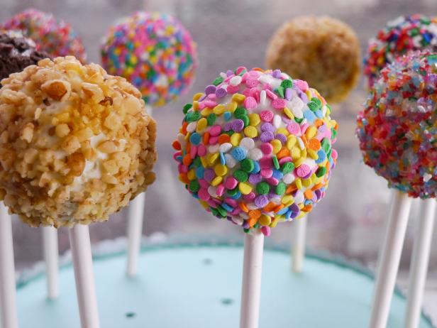
- Cereals above fresh fruit
- Umbrellas below guitars
- Diapers next to Thermoskins
From these, I tried to brainstorm how they could go together. Initially I went with a family theme (Mustafa for the Family) for my spread:
- Young kids: Nutritious breakfast (Watermelon + Cereal)
- Teenagers: Make your own guitars with umbrellas! (Umbrellas below guitars)
- Mom: Support your back as you change the diapers (Diapers next to Thermoskins)
- Dad: Escape away from the stress of home with a fashionable passport! (To dress up your passport… Hair accessories next to passport covers)
- Grandpa: Make walking fun (Olive oil next to walking canes)
I was initially thinking of having each A5 page be a representation of each of the family members above. After consulting with Joy, I realized that this was too ambitious and just too much visually, and Joy advised me to try going for three A4 spreads instead. This was actually a really pivotal moment because it allowed me to narrow in on the concepts I liked best and could explore deeply.
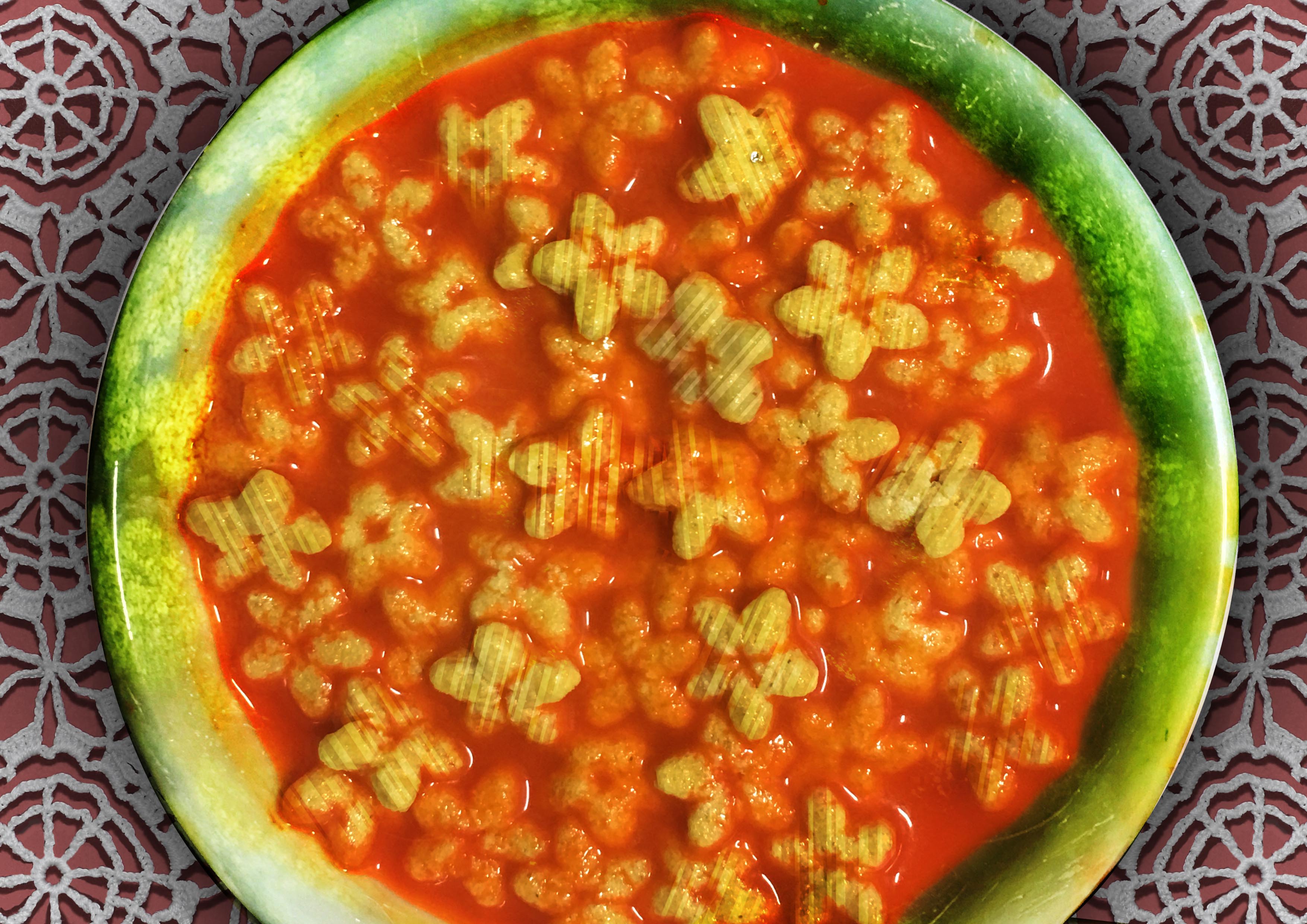
I zeroed in on the cereals above 1) fresh fruit (honey stars over watermelon, specifically), 2) lighters next to whiteboard markers, and 3) olive oil next to walking canes. My categories for them were 1) Dessert or Breakfast? A fun meal with minimal cutlery needed 2) Study on your birthday and 3) Make walking fun.
I went back to Mustafa and collected more reference images to manipulate.


The journey of each spread:
Spread 1: A nutritious breakfast
First version:

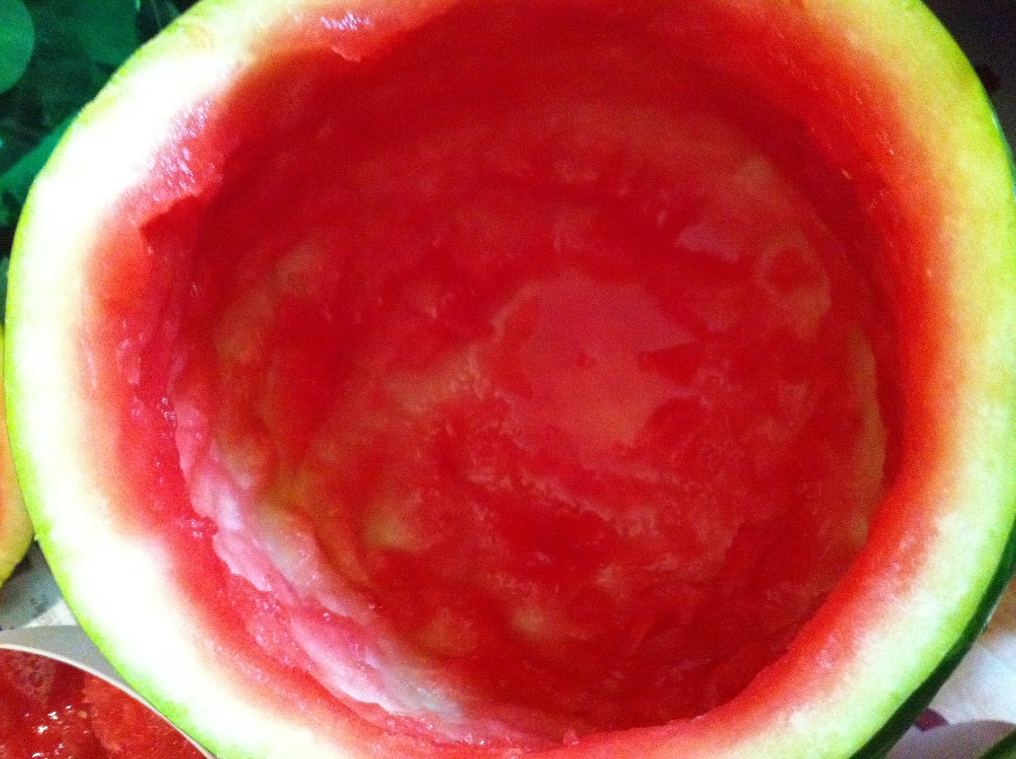
I referenced the Honey Stars packaging for the cereal and splashes of milk, as well as the below photograph of a watermelon’s inside. I used my own photographs for the watermelon itself, as well as the background (Mustafa’s floor at that section).

Feedback from consultation:
- Could make milk red-tinged
- Sense of gravity needs to be stronger, perspective needs to be clear
- Incorporate shadows!
- Make a watermelon bowl?
Version 2
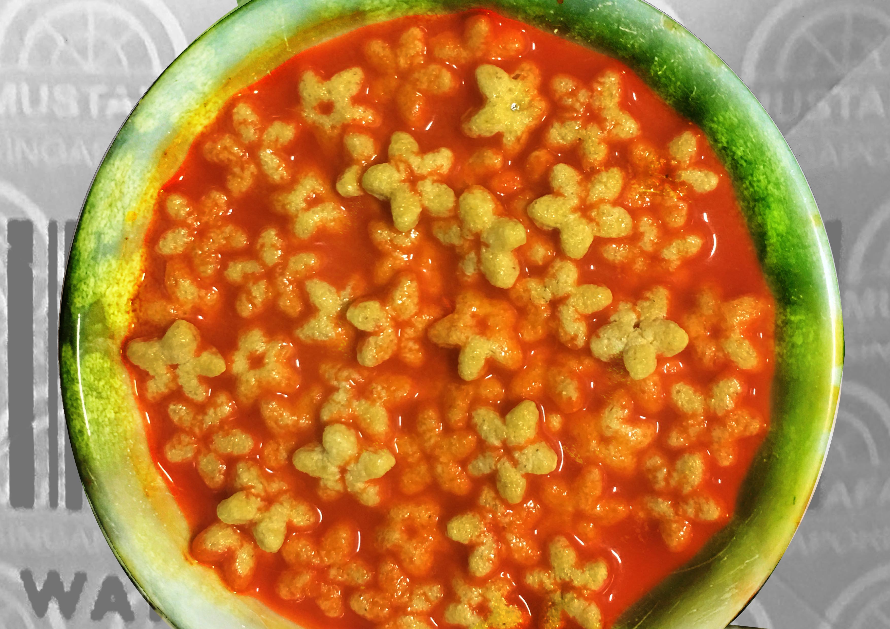
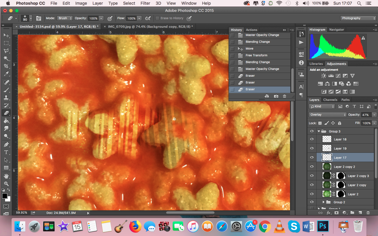
Process: I decided to not quite literally put honey stars in a watermelon, but imply it with a bowl that looks like a watermelon. I felt like this would go with the whole Surrealistic feel of the zine, because then it wouldn’t be so immediately obvious what I was doing. Also, it would solve the issues I had with perspective.
For the background, I decided to use the barcode on the watermelon instead of the floor because it might not be clear to viewers’ that I was using Mustafa’s floor – it just looked like any other floor in the previous composition.
I also overlaid the bowl with the watermelon textures from the photographs I took.
Feedback from consultation:
- Looks a lot better than the previous spread
- Shadow on the background needs to be obvious
- Barcode could be incorporated in other ways, like on the cereal itself
I agreed that the barcode could be incorporated in other ways, because the bowl looked like it was floating in mid air. Joy raised the question of what was so special about the barcode sticker, and I mentioned that the sticker had the Mustafa logo on it. She then suggested using the Mustafa logo for my candle spread, and I really liked that idea of using the Mustafa logo. Therefore, I considered the background more carefully for my final spread and used the logo as part of the tablecloth.
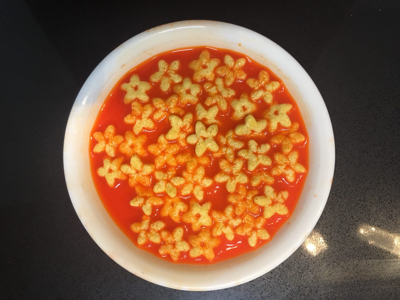
Final spread:
Process:


I took a closer look at the Mustafa logo and tessellated it. I then manipulated a lace tablecloth to look like the tessellated Mustafa logo.
Furthermore, as I wanted the barcodes to be a unifying factor throughout my zine, I incorporated it into my honey stars as well. I felt like this added an additional layer of meaning because with the Mustafa barcode, they would now be uniquely Mustafa honey stars, instead of cereal bought at any other store, giving the work more context.
I also made sure to add the shadows I missed out for the previous versions of the spread.
Spread 2: Study hard on your birthday!
Version 1:
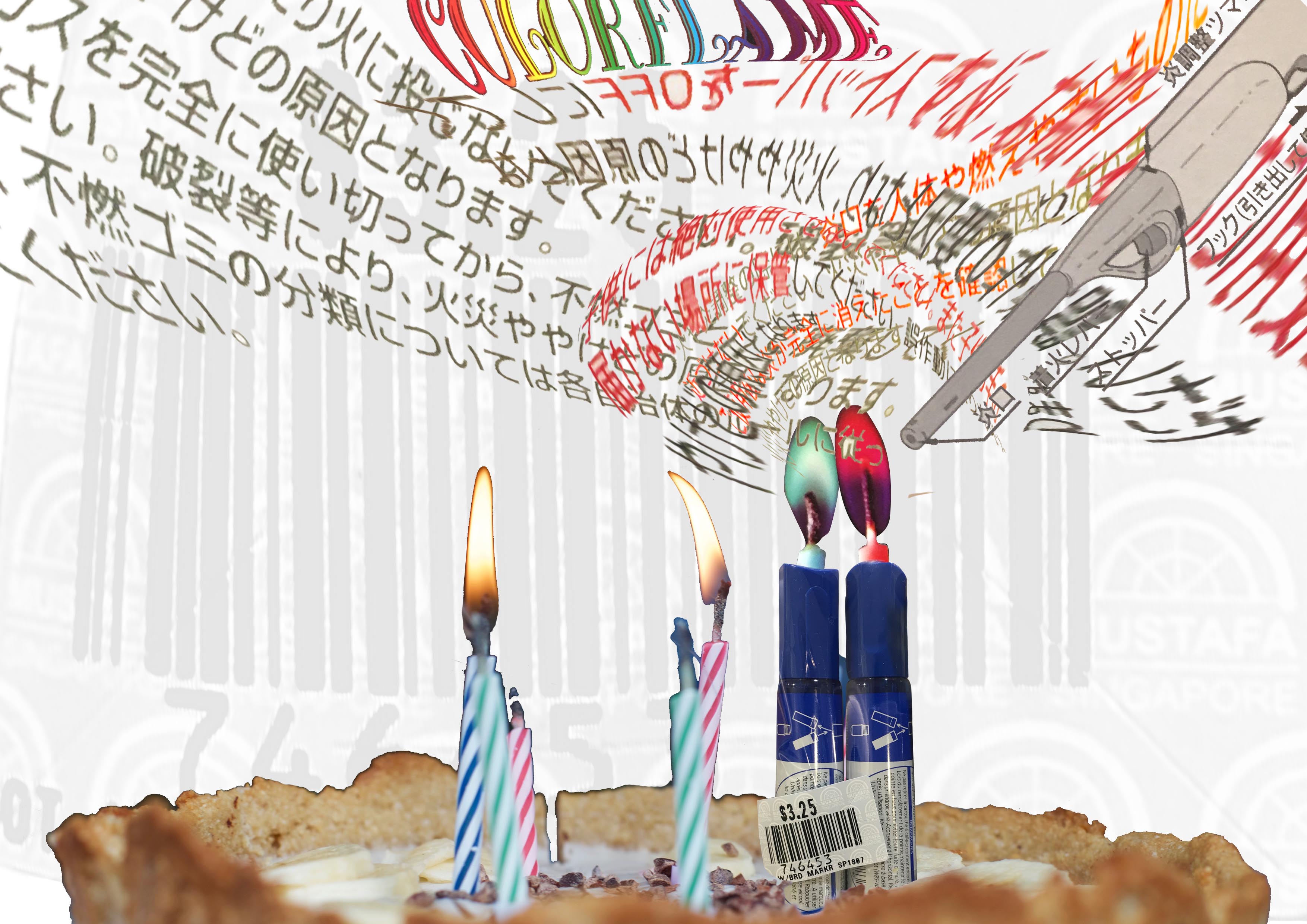
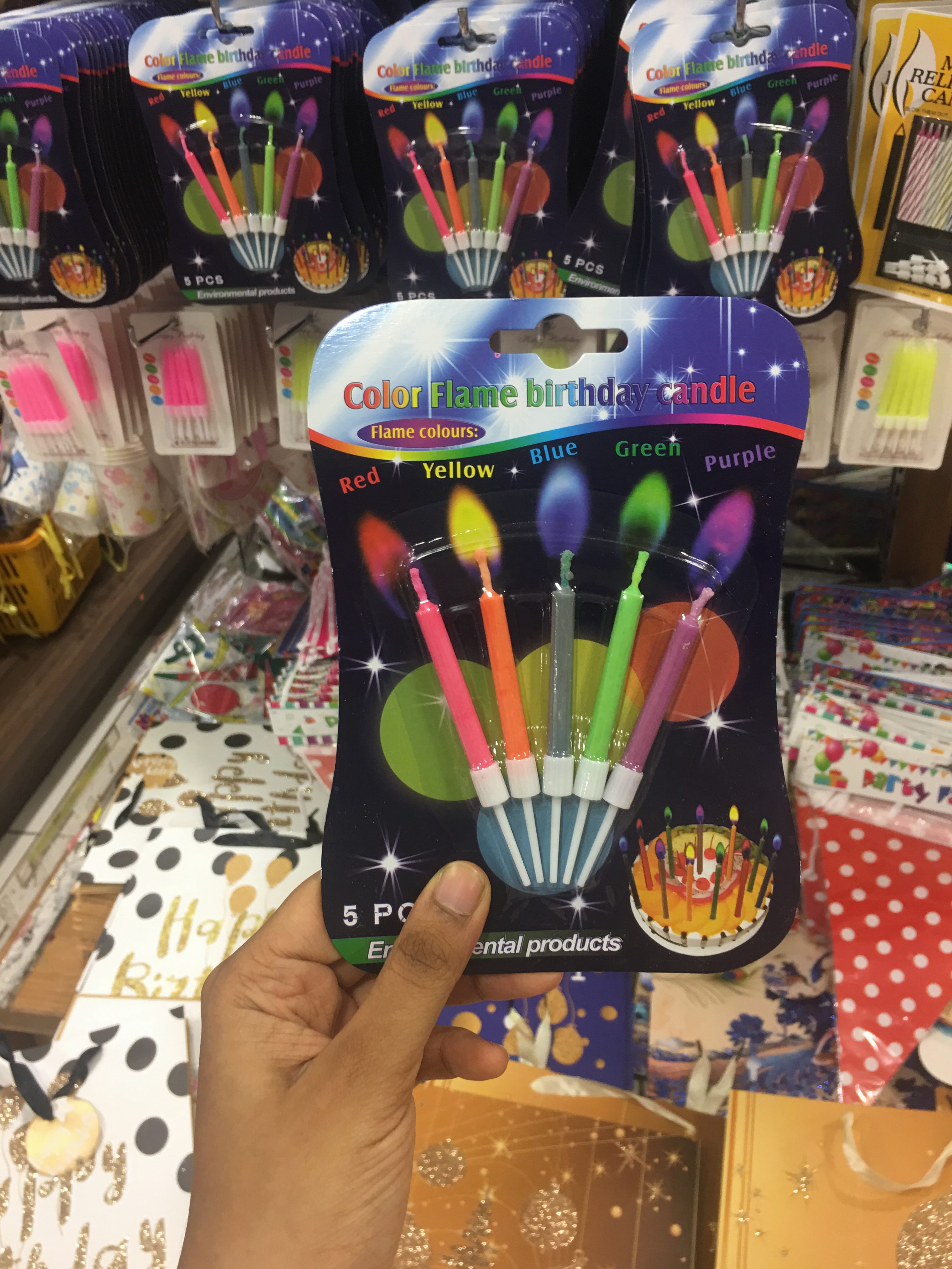
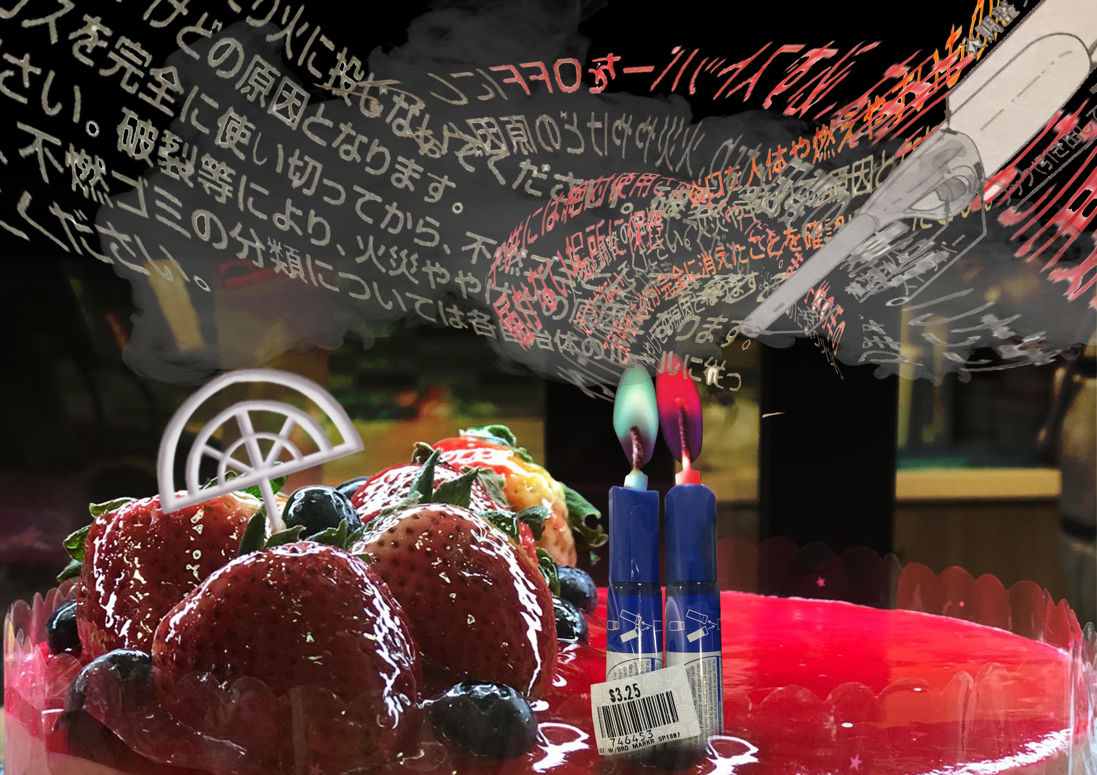
Process: I used the below stock image from Pexels for the base cake, and used the Mustafa markers as candles as well. The flames on the candle were from another Mustafa product (also below) – I used that because I thought that if markers burned, they would probably burn with a weird colored flame because of all the chemicals inside.

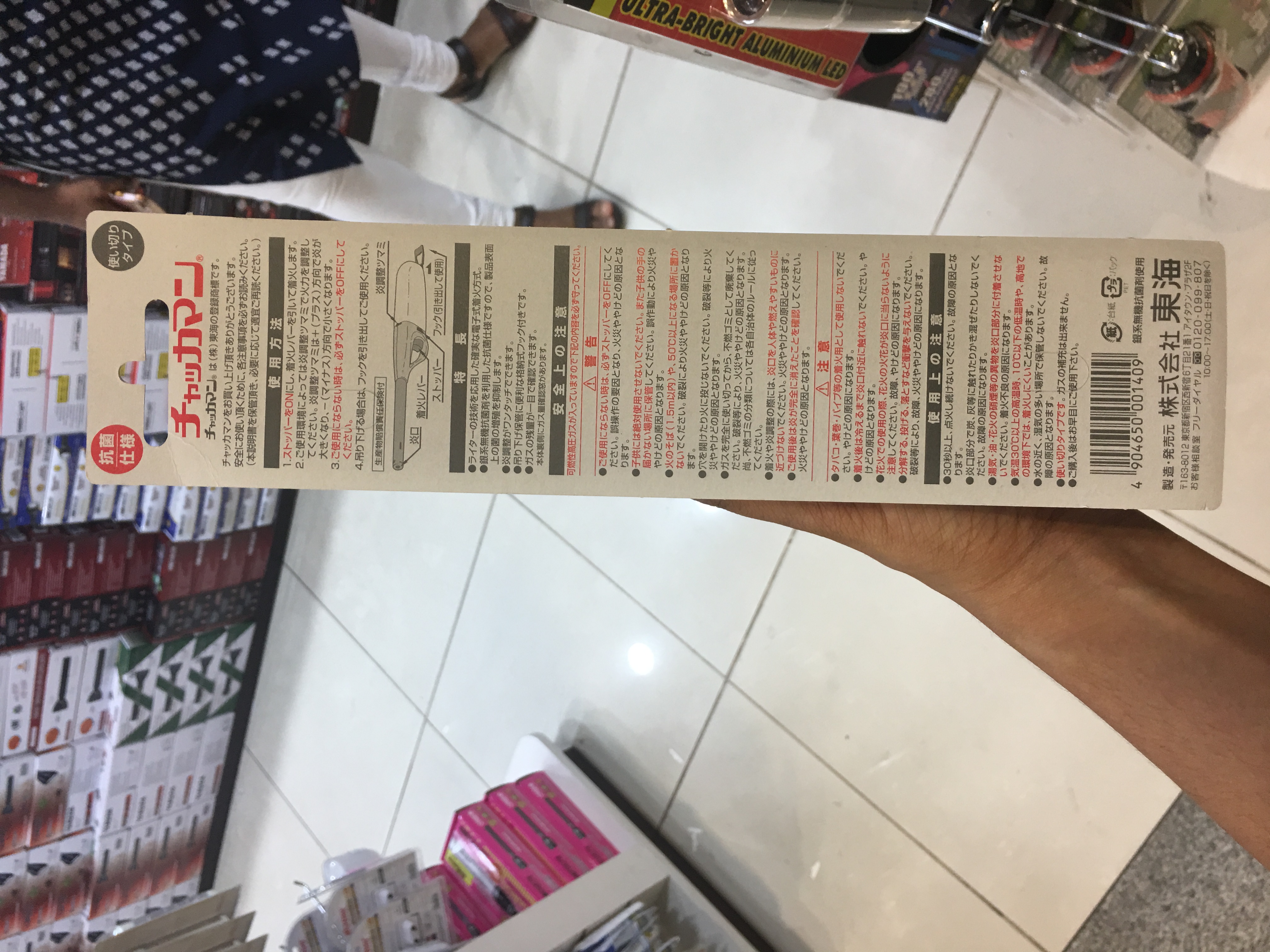
I thought about how it could be like if the candles burned, and came up with my own version of the smoke, consisting of the Japanese letters from the back of the lighter packaging because Japanese letters have a very abstract quality.

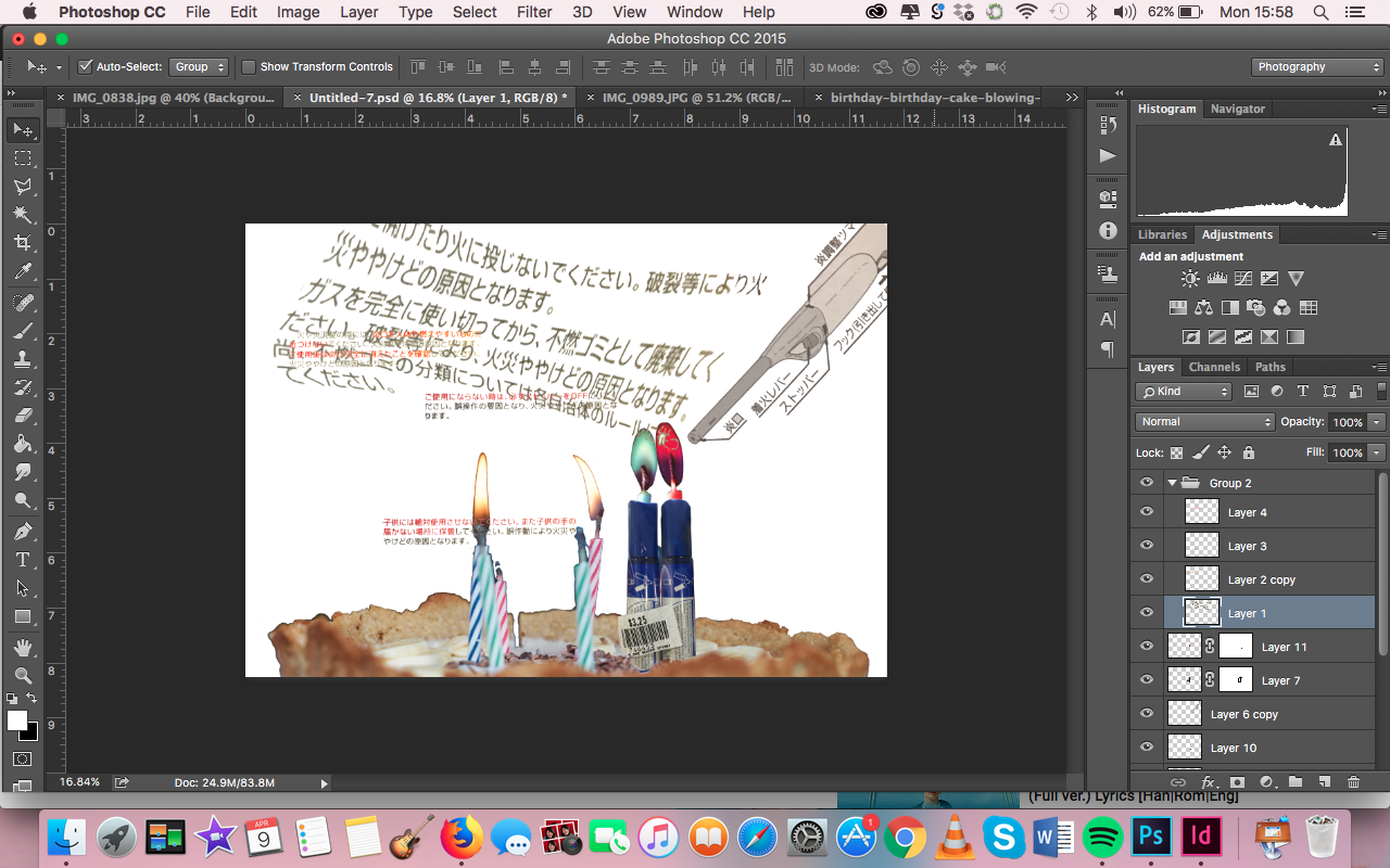
The background was a blowup of the barcode on the markers, with the opacity lowered.
Feedback:
- Balance the left with more candles because it is off-balance
- Not obvious that it is cake – use a better cake image
- Mustafa logo could mirror happy birthday cake toppers
Final spread:
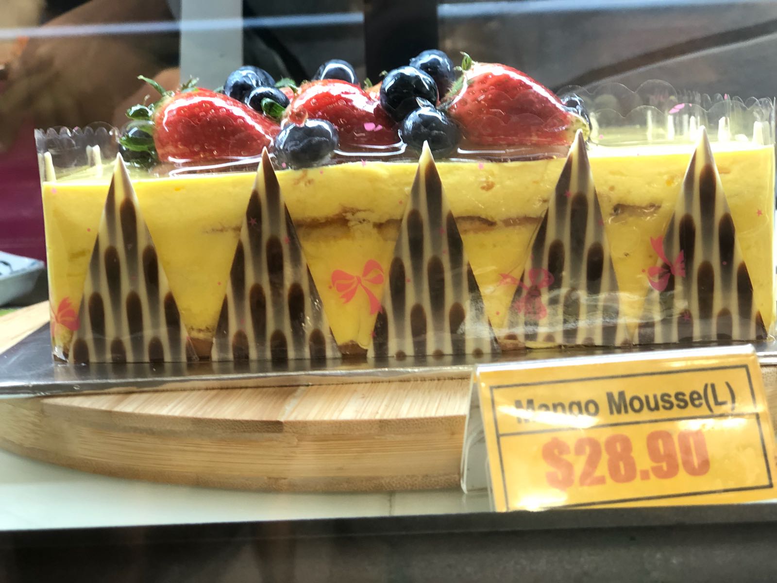
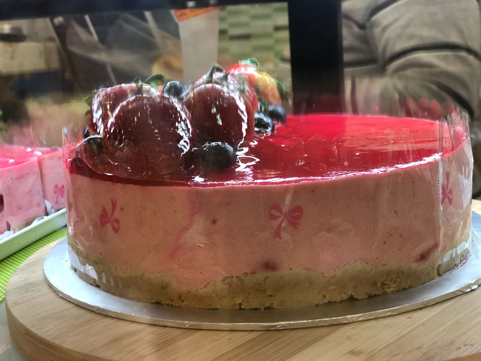
I completely agreed with the feedback on the use of the cake image. Therefore, I went back to Mustafa and took photographs of the cakes at Mustafa’s bakery, that I used for my final spread.
Moreover, the feedback on balance got me to come up with the idea of having the zine be progressively messier with more and more off-balanced spreads. This would tie in to my own experience – Mustafa seemed to get more chaotic the longer I stayed there, not only because I was noticing the messiness in the order, but also because of the external stimuli (the feeling of overwhelmingness). This is why my final zine, from the front cover to the back cover, get messier by the spread.
Finally, I made the cake topper with Mustafa’s logo, using the below stock photo as reference for the stick.
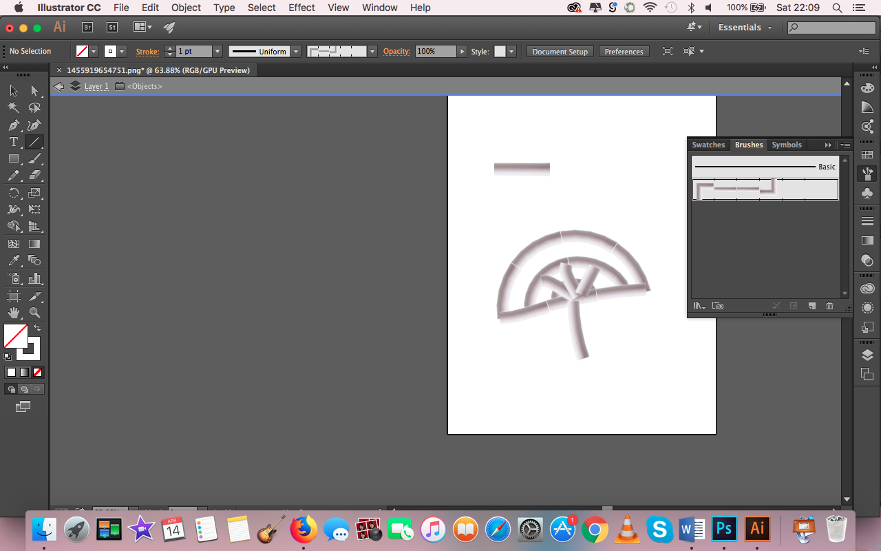
I initially faced some difficulty using the image as a brush on Illustrator, but I eventually figured it out! 🙂
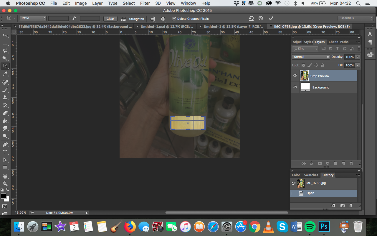
Spread 3: Make walking fun
Two variations of my first spread:
Process:

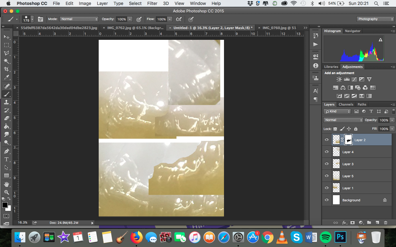
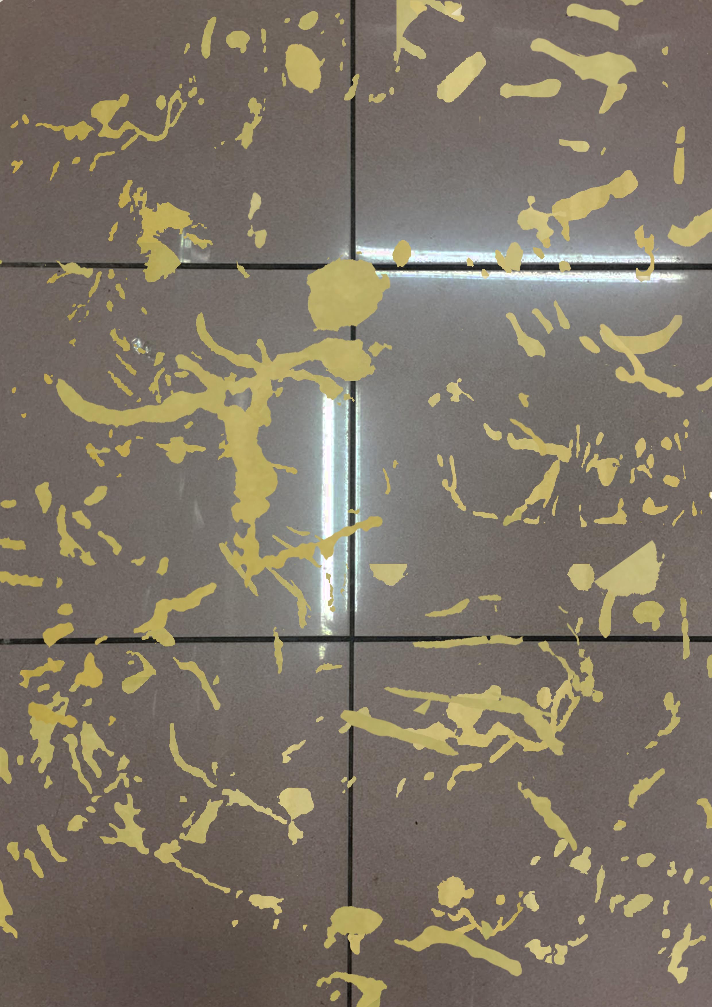
I noticed that the highlights on the photographs I took of the olive oil bottles looked really organic. I decided to manipulate them into the oil stains on the floor (hence “taking” from the site more, because the reflections would be those cast upon the bottle by Mustafa’s lighting).

I masked around the highlights, and clone stamped over them with an olive oil section cropped from another photo. The floor the olive oil is photoshopped onto is Mustafa’s floor at that section!
Feedback from consultation:
- Integrate the stains with the floor more; could spill into cracks
- Cane could interact with floor
- Lighting needs to be fixed, cane can’t really be seen
- Make splats look more realistic
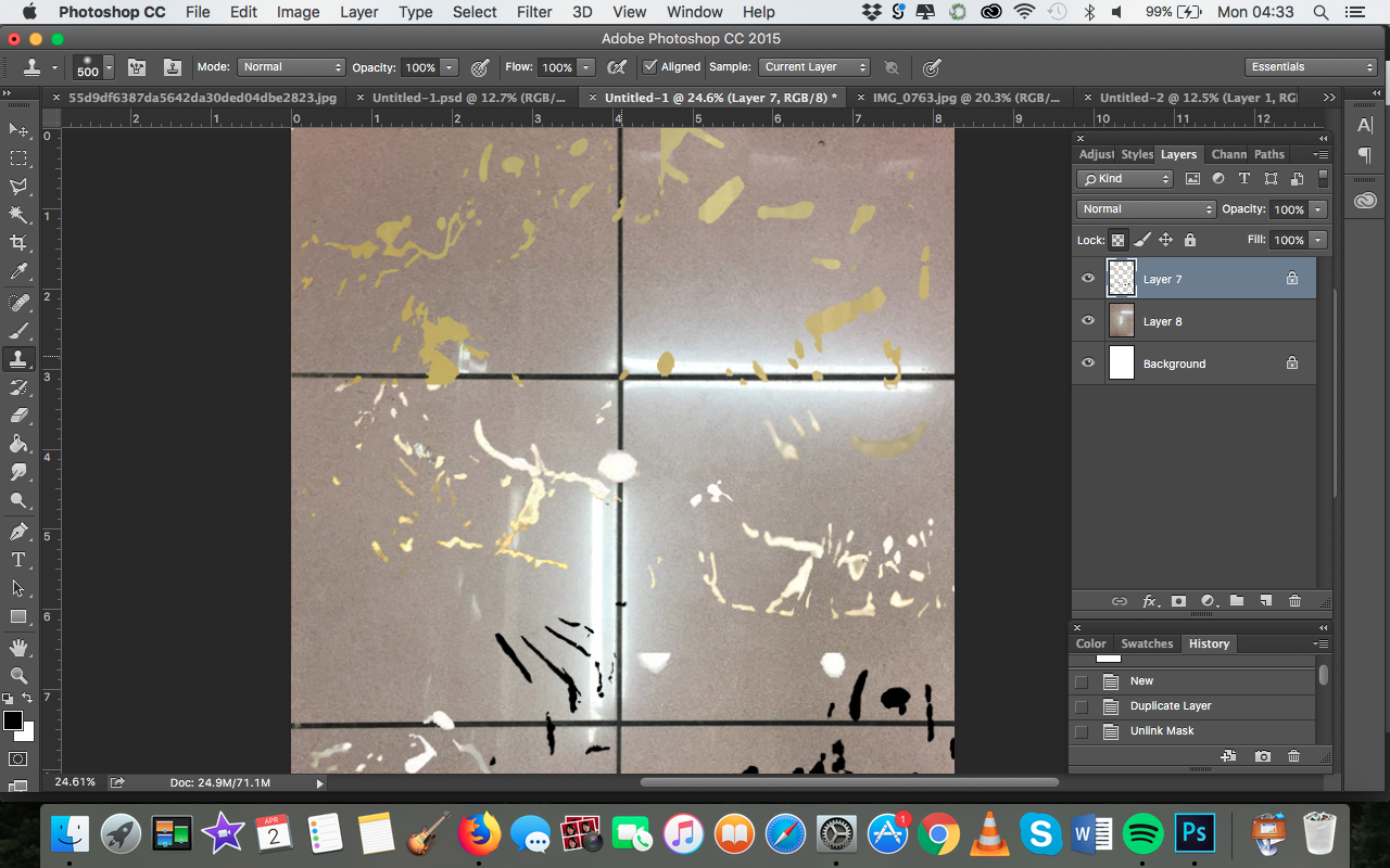
Final spread:
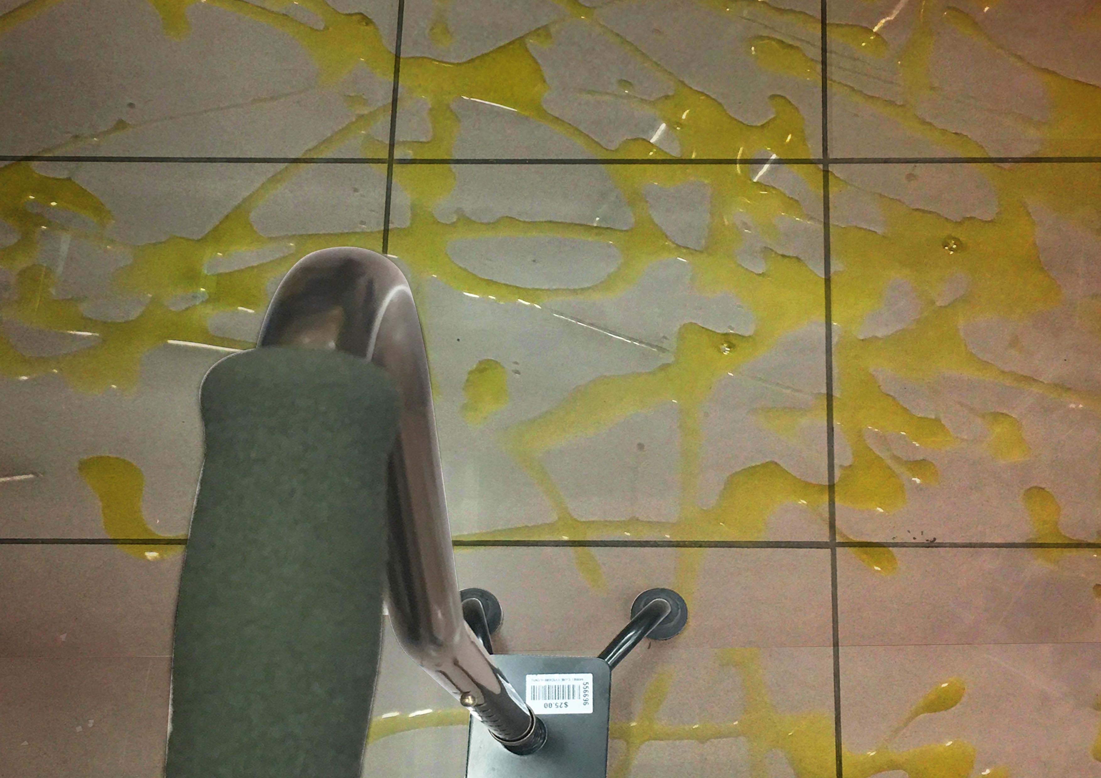
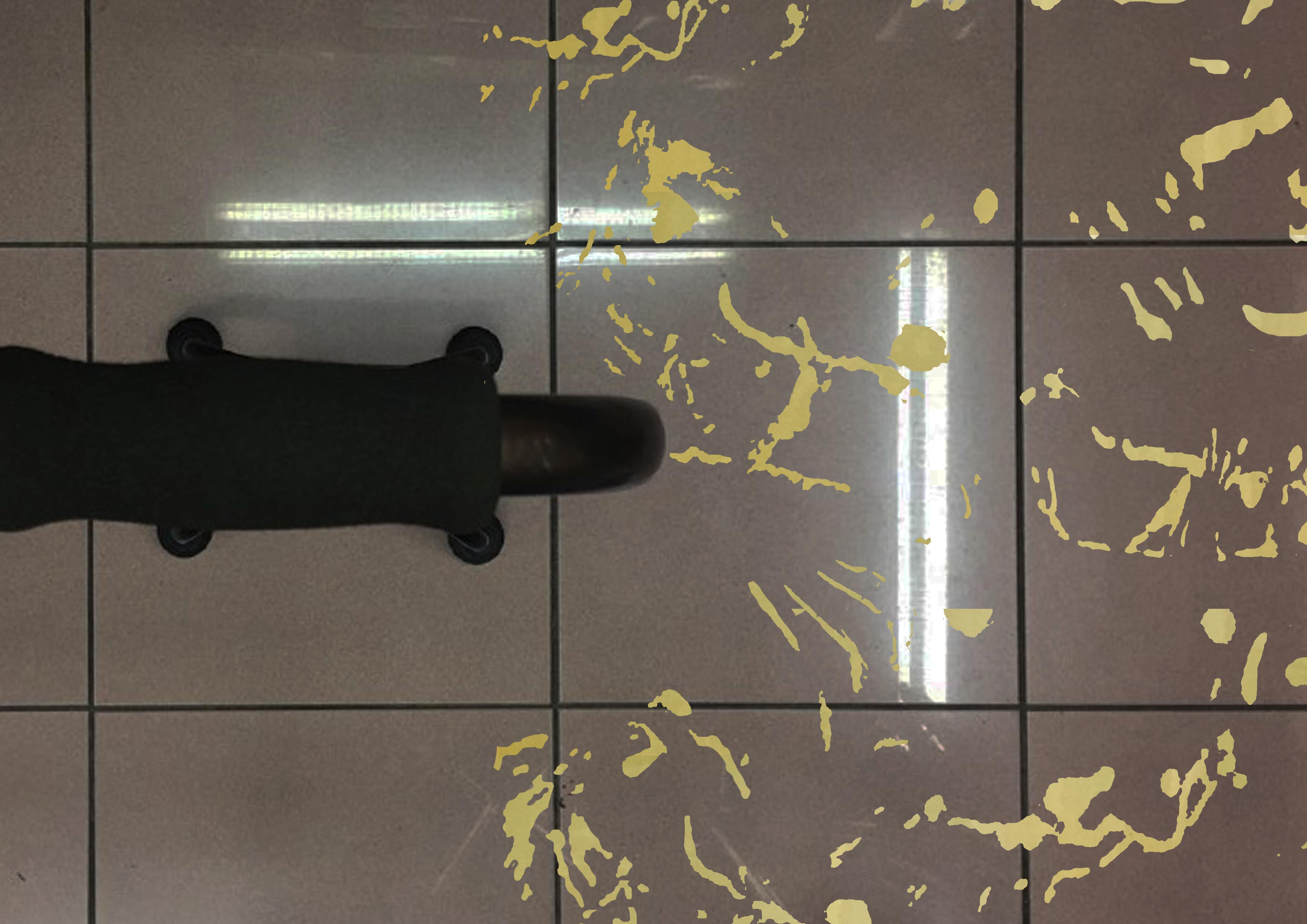
Process: Because I got markedly better results by staging my own set-up with my watermelon spread, I decided to do the same for this one. I splashed olive oil over a white tile and overlaid it over a composition that showed the cane more clearly and had better lighting than the previous version.

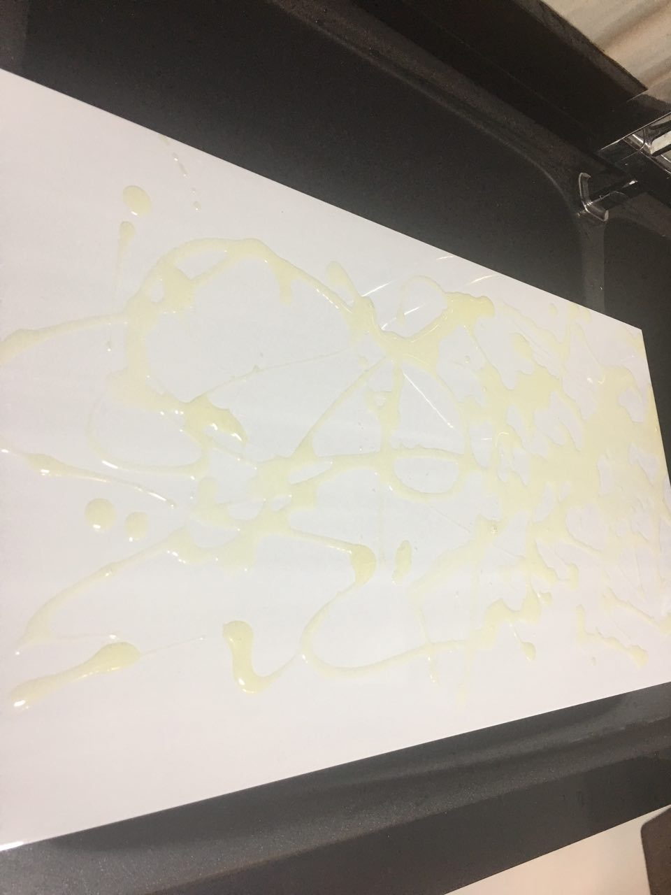
I was inspired by Jackson Pollock by this piece, and tried to have my oil splatters resemble his drip paintings as much as possible by using quick, vigorous strokes.
Feedback from critique: This was the weakest spread – more could have been done to bring out the quirkiness. In all honesty, I agree, I would’ve liked to spend more time on this spread and formed images with the splatters as well. I think I spent too much time trying to make the splats look realistic instead of doing something more with them.
Spread 3: Front and Back cover
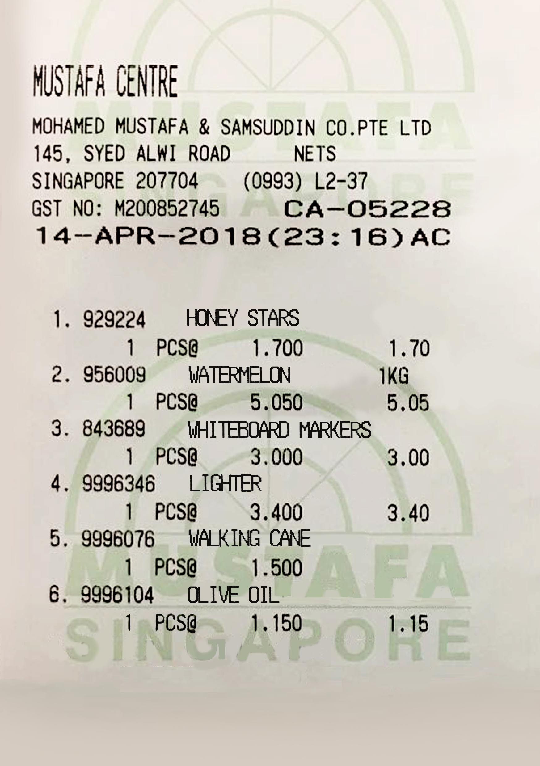
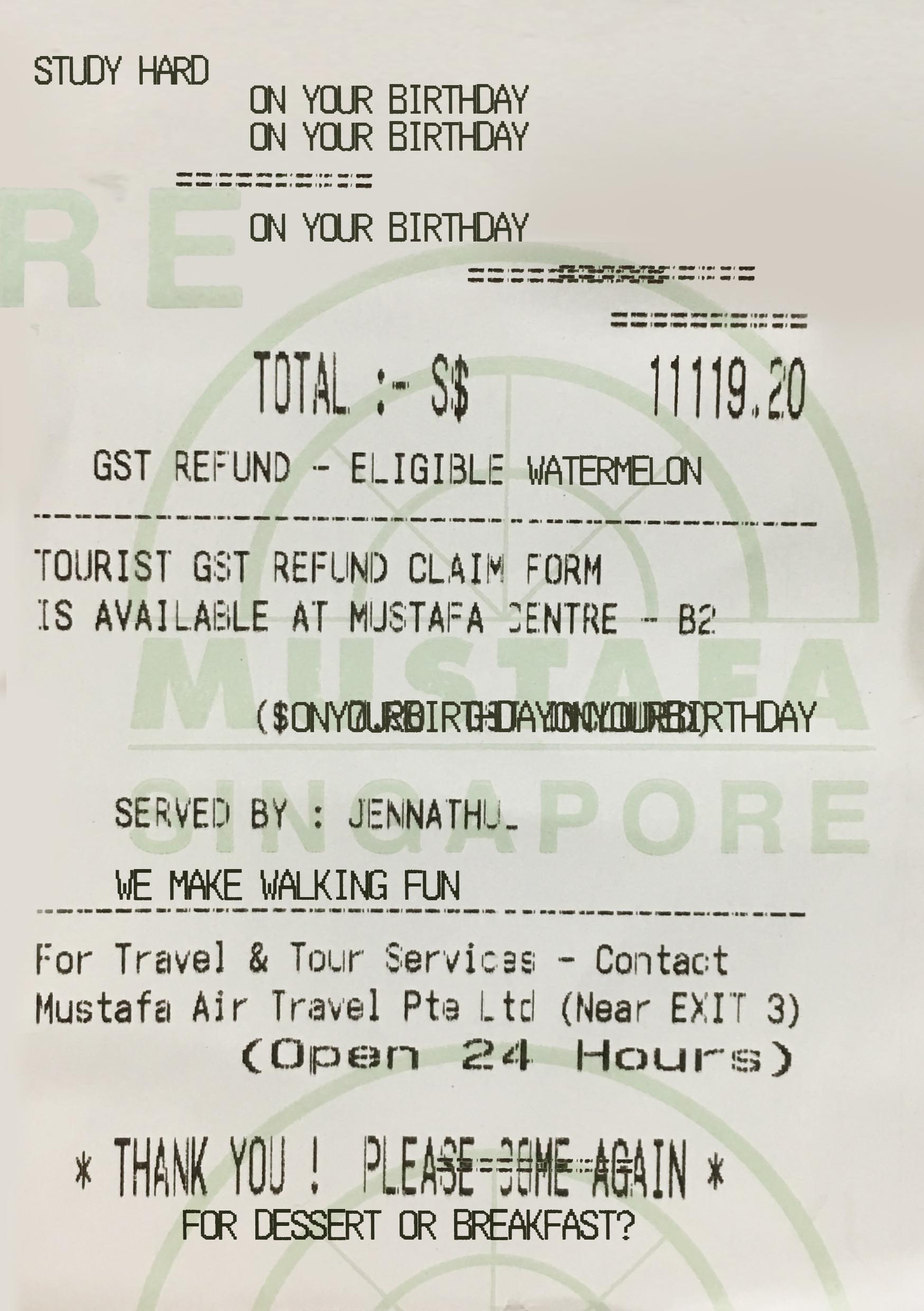
I used actual Mustafa receipts for the front and back cover.
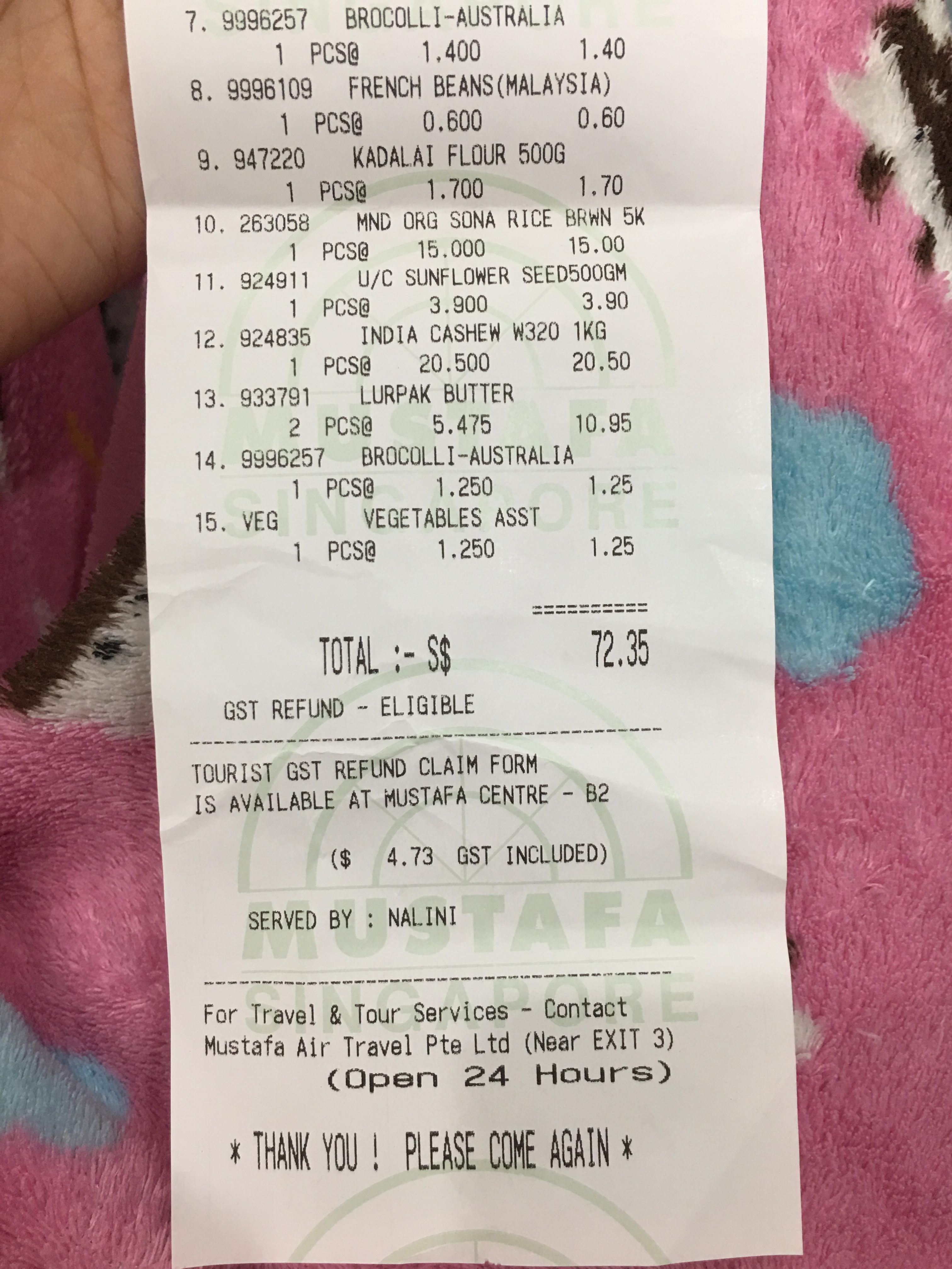

The back cover is more glitched up than the back cover to go with how my spreads get messier and messier, ultimately ending in the messiest back cover.