
In this post, I will be discussing about the overarching concept revolving my final submission for Project 1, Image Making Through Type. This post will also include some sketches involved with the project’s process, as well as some work in progress images that had been captured along the way.
—————————
For this project, we were tasked to create typographic portraits using either parts or our whole name to describe a future job. These jobs can either be fictional, that do not exist, or simply jobs that exist in our everyday lives.
ARTIST REFERENCE
You can find the artist who I was influenced and inspired by to create my typographic frames with the paper cut medium imbedded in this link right here!
INSPIRED CONCEPT OF NAME
The first thing I sought to do was research on the meaning of my passport name, that isn’t commonly used in addressing me, yet has stuck with me through thick and thin since birth. I wanted to use a part of it which I, previously was embarrassed about during my middle school years but have since, embraced the weirdness of it in relation to my personality today.
My passport name is Cheng Boon Ruan and I’ve always been curious about the meaning of it. According to my parents, the name was given to me by a Chinese fortune teller hired by my grandfather yet I’ve never been to curious to know its significance until this project. Apparently, the gist of it goes along the lines of being able to study and work hard as well as being intelligent when translated from its Chinese to interpretation, to English.
However, I decided to take the literal word of ‘Boon’ from my name and research on its meaning with an English dictionary. According to Oxford dictionaries, a boon is ‘a thing that is helpful or beneficial’. Known for my witty and clumsy personality, I found this to be completely ironic. Realising that at times, the definition of Boon, is the complete opposite of who I portray myself to be, I found a literal approach to demonstrate this juxtaposition.
Still using ‘Boon’ as part of my typography, I also decided to reverse the order of letters used. Contrasting the meaning of Boon, Noob was also portrayed within my type form. The meaning of a noob, according to Oxford dictionaries, is a person who is ‘inexperienced in a particular sphere or activity.’
In order to keep consistent to my concept’s weird persona as well as the contrast already established between the two, I wanted to portray 2 jobs that were out of the box and the other 2 being jobs found in our everyday lives. I wanted to get the message out that even in both situations, the clumsy side of me will take charge and I will have the ability to mess things up either way. In order to further strengthen my concept of having 4 completely different jobs that have the decency of going wrong as a whole, Joy suggested to me on having a general common theme/image that appears in each frame.
This was when I thought of my pet dog, Snowy. People usually associate dogs with their owners with the saying that dogs usually carry the persona of their owners. Even so, my friends have mentioned that the vibe which Snowy gives off seems to be a representation of how I too, present myself. Snowy is also clumsy and carries a constant look of confusion and somehow at the same time; innocence. Dogs are quick to learn new tricks under human instruction. Inspired by this thought of like owner, like dog, the 4 panels consist of the common sighting of me in illustrative human form as well as a number of dogs performing tasks they have been trained to do under my instruction. Instead of skilfully executing these tasks, they end up messing up and leading me to my own ‘downfall.’
While encompassing this ‘mess it up’ within my compositions, the portrayal of ‘Boon’ and ‘noob’ appears at least once or more when cleverly hidden so that the works do not lose a sense of focus.
PROCESS
With each piece of paper cut, the steps involved consist of:
* Creation of each individual part takes about 10 – 15 minutes depending on the size and number of curves each part had
- Sketching out the design on paper
- Outlining the design with a black marker
- Using a window with the sun rays shining against it as a light box, I was able to trace the prototype that was to be cut out on a separate sheet of paper
- Using the cut out stencil, I traced the shape out lightly on top of the actual colored paper used, with the use of a mechanical pencil for accuracy purposes
- The paper cutting begins with the use of a X-acto knife in order to accurately get the shape of the sketched out design
- Steps above are repeated for other parts of the subject matter being created
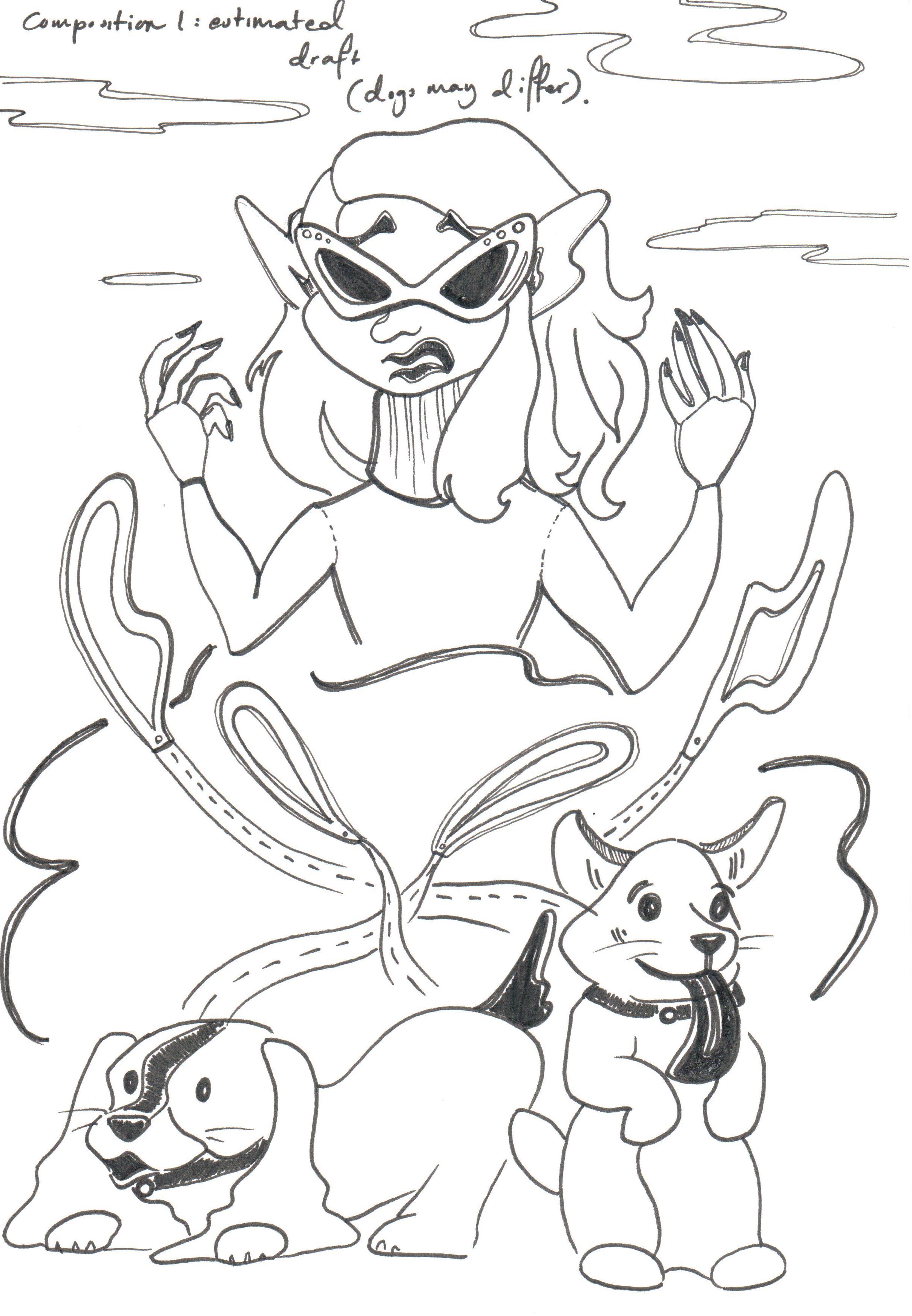
PROCESS IMAGES


EXAMPLE SKETCH IMAGES

—————————
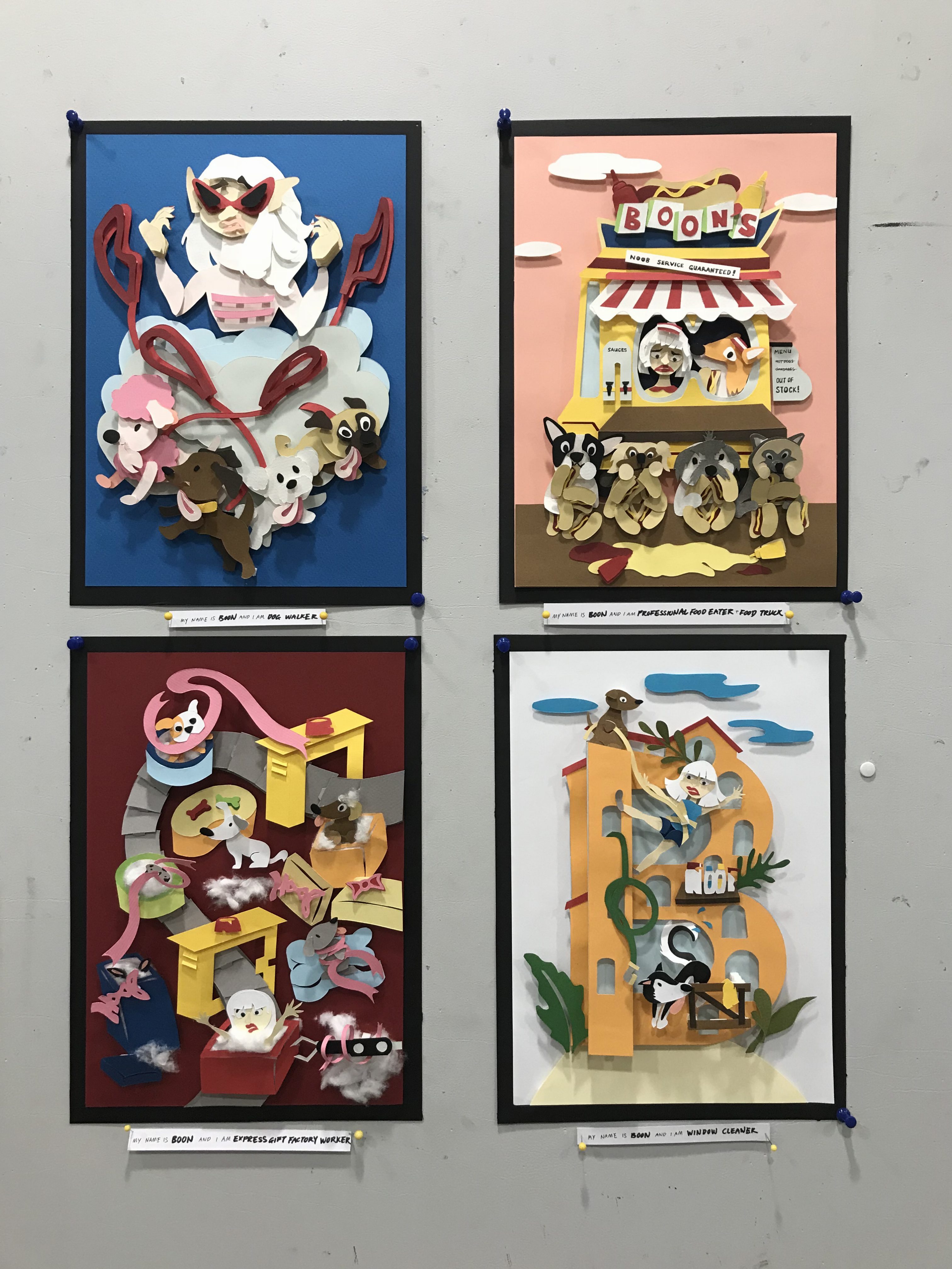
FINAL WORKS
Dog Walker
1st Composition
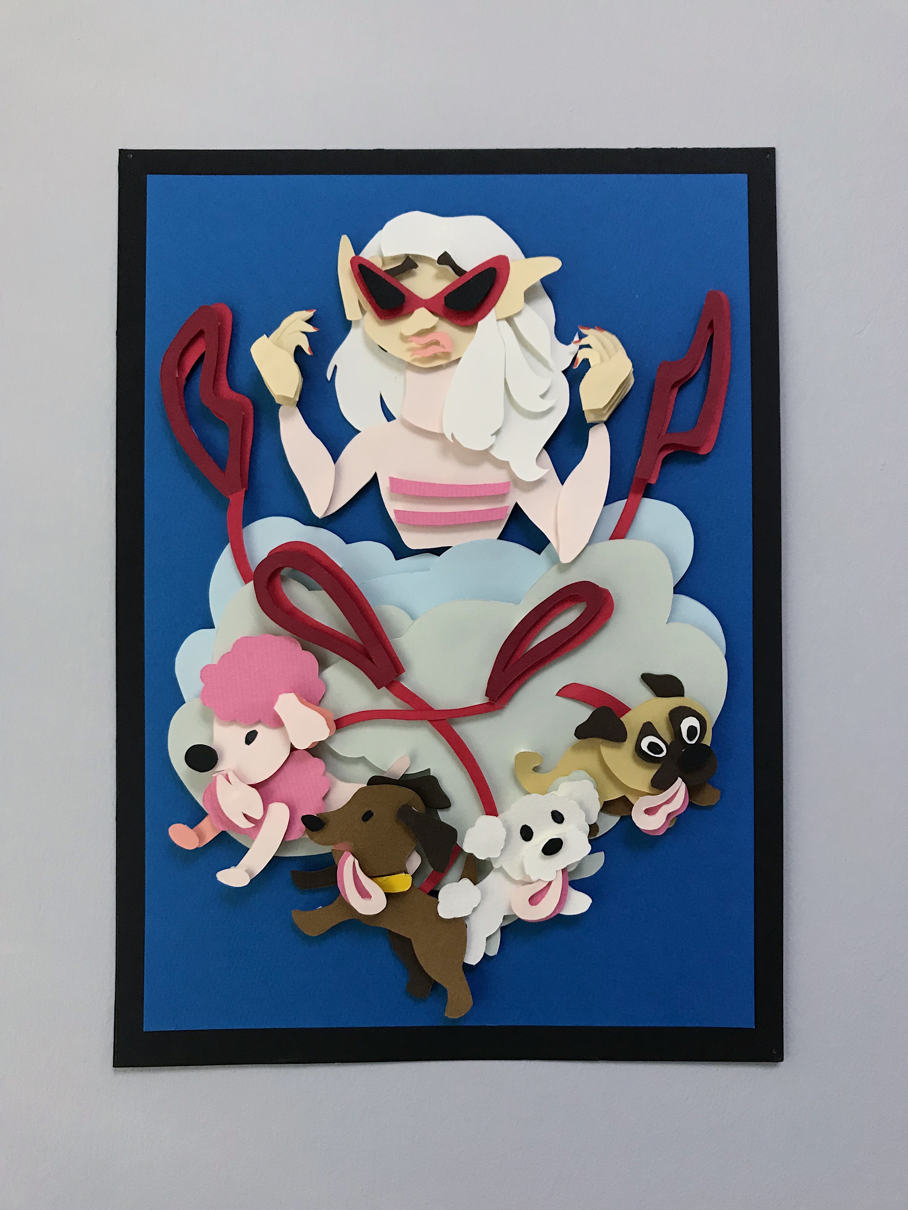
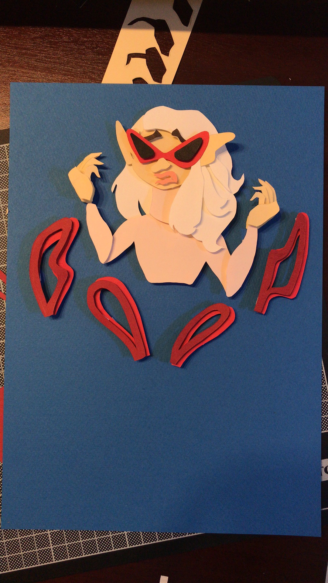
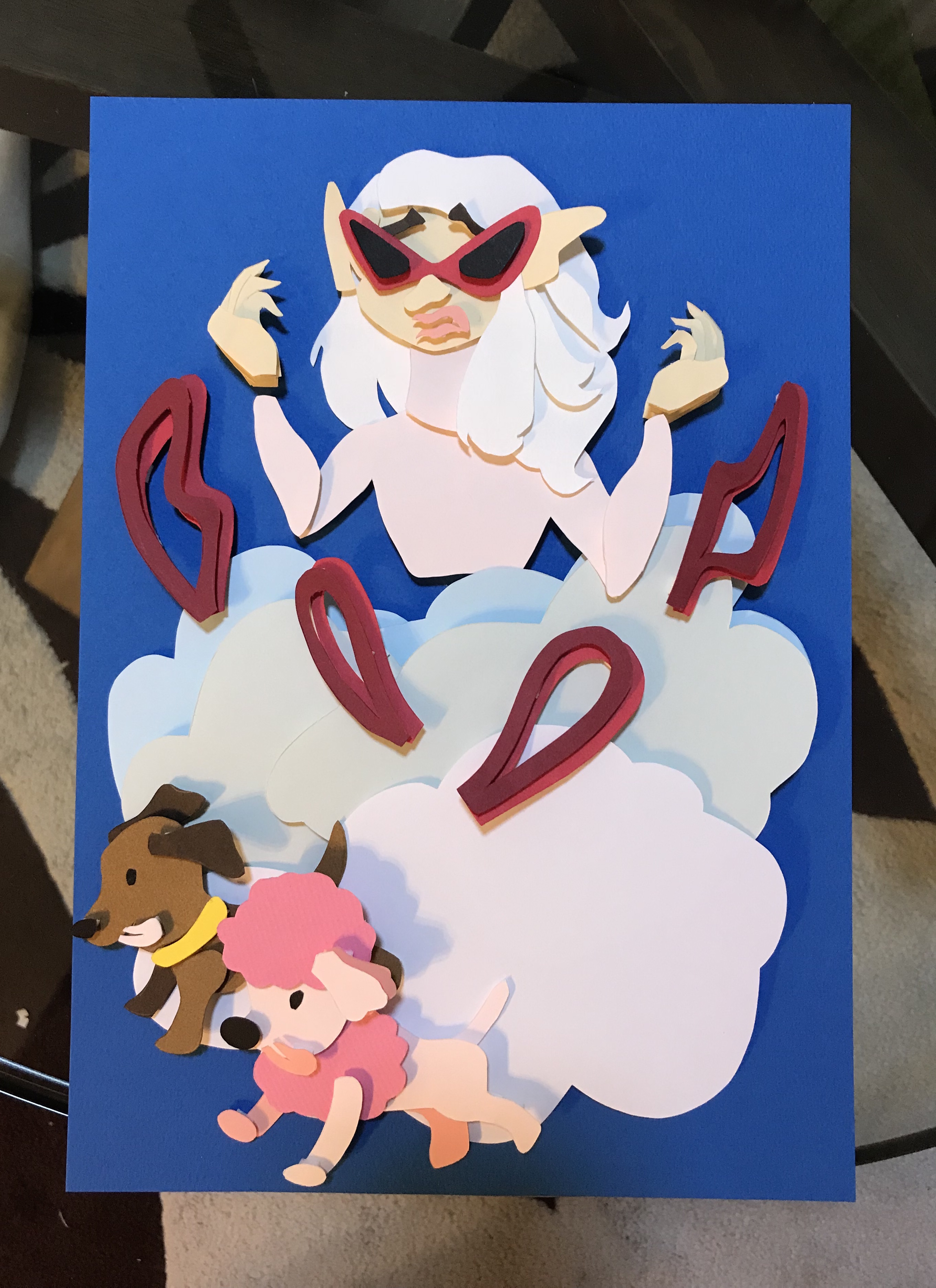
In this very first composition, I am a Dog Walker.
(This is one of the ‘daily life’ jobs)
Here, the word ‘Boon’ is portrayed in the dramatic and chaotic dog leashes flung into the air in the foreground. The dog leashes, forming my name ‘Boon’ should be most significant by size and scale in comparison to the carefully hidden word ‘noob’. The point is to playfully hide the word ‘noob’ from the viewer’s first sight as they ponder upon why, in all panels, everything seems to be in chaos. The dog leashes are complimented by a cloud fury of smoke and dust caused by a pack of excited dogs at the closest to audience foreground. The word ‘noob’ is carefully hidden in the top one third of the composition. The ‘N’ and ‘B’ make up the woman’s (representative) ears, while the ‘O’s are formed by her sunglasses. Another area in which the word ‘noob’ is hidden, is the bottom third of the composition. Here, the dogs’ tongues make up the word ‘noob’ when seen from left to right. Although the woman’s hands seem neatly manicured and she holds a rather cool and possess an ‘I got this’ vibe, things still manage to go awry for her as the dogs pounce in different directions.
The dramatic cloud smoke background as well as the composition’s main background are all made out of similar tones of blues and grays, for a consistent balance. The main background is made out of the deepest blue, in order to contrast the pastel colors I intend to bring into the viewers’ main focus as they stand out more.
A diamond composition to the overall structure is used in order to pull the viewers’ eyes from both top and bottom as the content meets in the middle to form the name ‘Boon’.
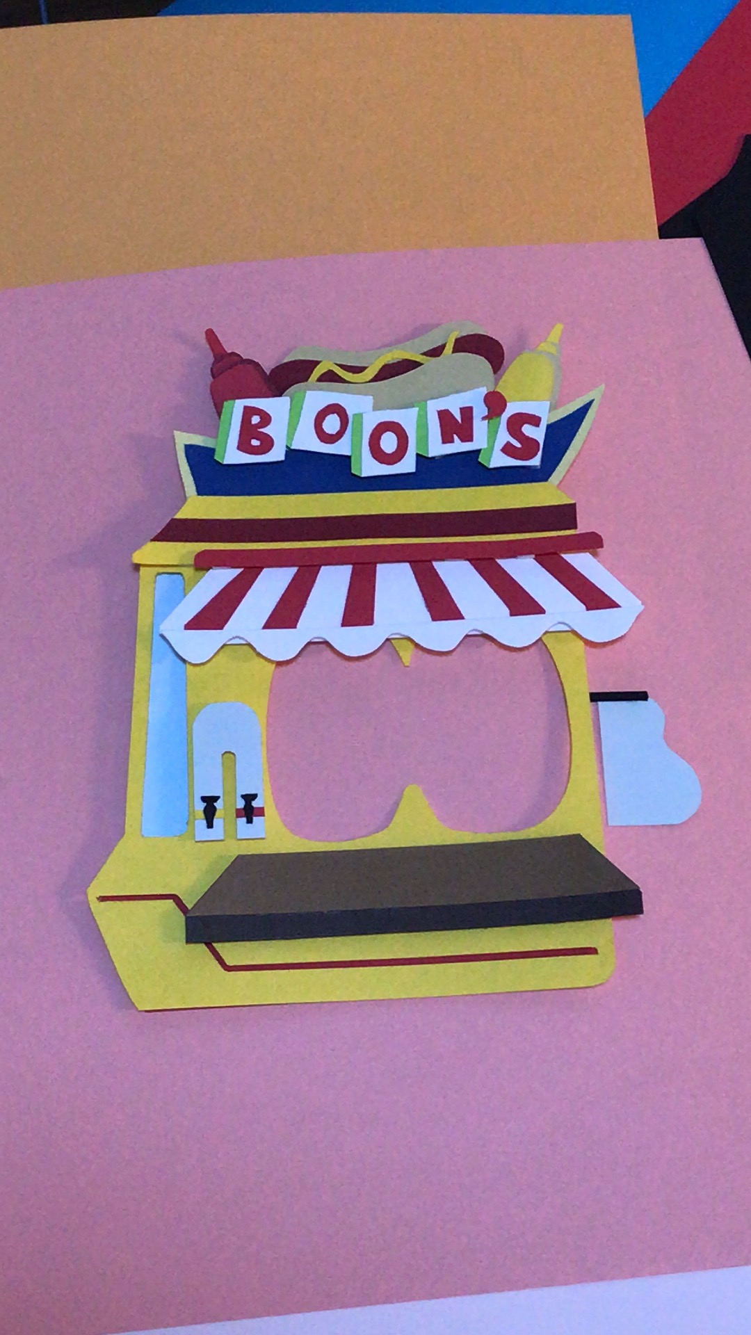
Professional Food Eater & Food Truck Vendor
2nd Composition
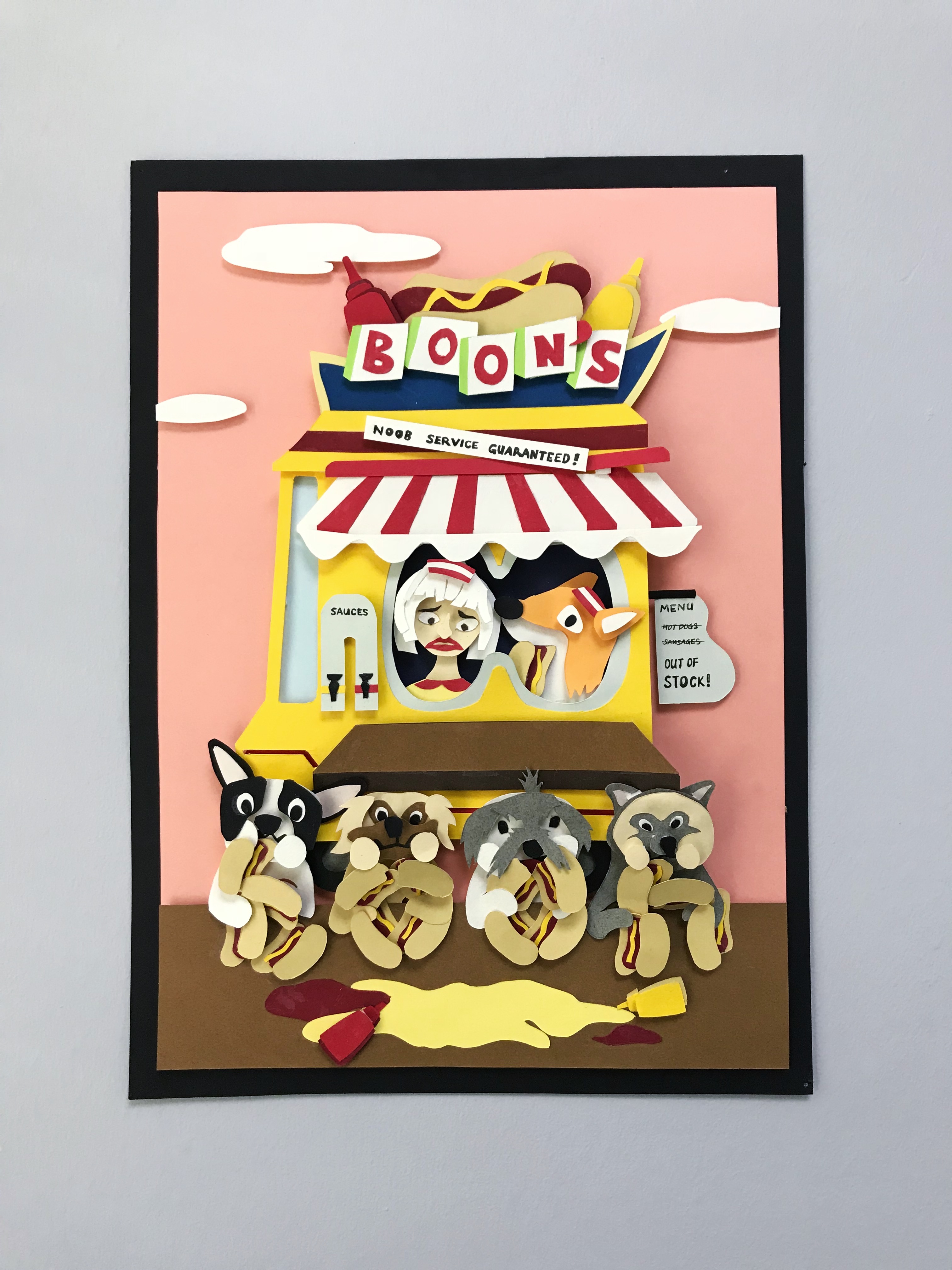
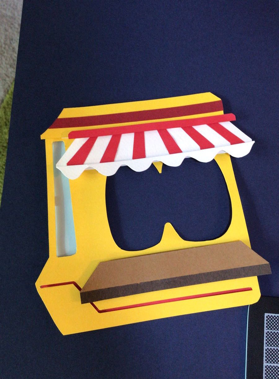
In this composition, I am a Professional Food Eater & Food Truck Vendor.
(This is one of the ‘out of the box’ jobs)
Here, a reversal of composition 1 is portrayed. Instead of ‘Boon’ appearing in the middle section, the word ‘noob’ is slyly designed to be place here. The word ‘Boon’ now appears twice, once being at the upper third and the second time in the lower third. In the middle part of the composition, the ‘n’ of noob is made out of a sauce dispenser while the ‘o’s’ make up the hot dog truck’s windows. The ‘b’ of noob on the other hand, is made out of a signboard sticking out of the food truck. On the upper third, the ‘Boon’ is represented loud and clear on the hot dog truck’s signboard. The color of it being red contrasts the simple, white background of the sign board. This white is further contrasted by the dark blue right behind. In the bottom third, the name ‘boon’ is made out of a repetitive pattern of hotdogs lining up and into the dogs’ mouths. The usage of repetitive pattern contrasts the organic formation of a scenery happening in the background and immediately captures the audience’s attention.
The clumsiness aspect of it comes in where, instead of selling the hot dogs like any other food truck does, the dogs end up holding a professional food eating contest, leading to my food business being out of order due to the lack of stock. Here, we see that they can’t even do a good job with the food eating contest. Mustard and tomato sauce is spilled everywhere and the dogs can barely get much of the hot dogs eaten; except for a mere mouthfuls or nibbles.
A regular flow chart method of trailing your eyes gradually, from up to down, is used for viewing the composition. The light heartened and pastel color of pink contrasts the major colors of dark red and browns, helping to create depth and perspective when establishing foreground and background.
Express Gift Factory Worker
3rd Composition

In this composition, I am a Express Gift Factory Worker.
(Another one of the ‘out of the box’ jobs)
In this composition, the word noob and my name ‘Boon’ becomes interchangeable in the way of reading due to the flow of the conveyor belt. Our eyes follow the curvature flow and design, of which the conveyor belt is portrayed in the composition. The yellow security gates are prominent and contrast with everything else, especially the gray belt, helping our eyes to focus on either one which helps us in reading it from top to down as NOOB or BOON when read from bottom to top. The ‘O’s in the middle are made out of opened gift packages that travel down the belt’s flow. Other ways which the word ‘noob’ is hidden include the bows of some of the gift packaging. The word ‘noob’ is forced into the form of a bow itself. Another way in which the words noob and boon are interchangeable include the red sirens fixed on top of the yellow security gates. Where there is a ‘B’ yellow security gate, there is a ‘N’ red siren. Similarly, the reversal is also seen where when there is a ‘N’ yellow security gate, a ‘B’ red siren is located above it.
Here, instead of wrapping and packaging the gifts, the dogs are making a mess of the cotton gift stuffings as they lay them lying around the factory’s ground. Dogs are hiding in some of these boxes as they become tangled in the stuffing, accidentally tying themselves up with gift decorative ribbons. At the same time, they accidentally place me in one of the gift boxes as I am seen in the lowest third of the composition flaying my arms around amid all the cotton stuffing. A claw machine reaches in from the right, ready to send me away for delivery.
Window Cleaner
4th Composition
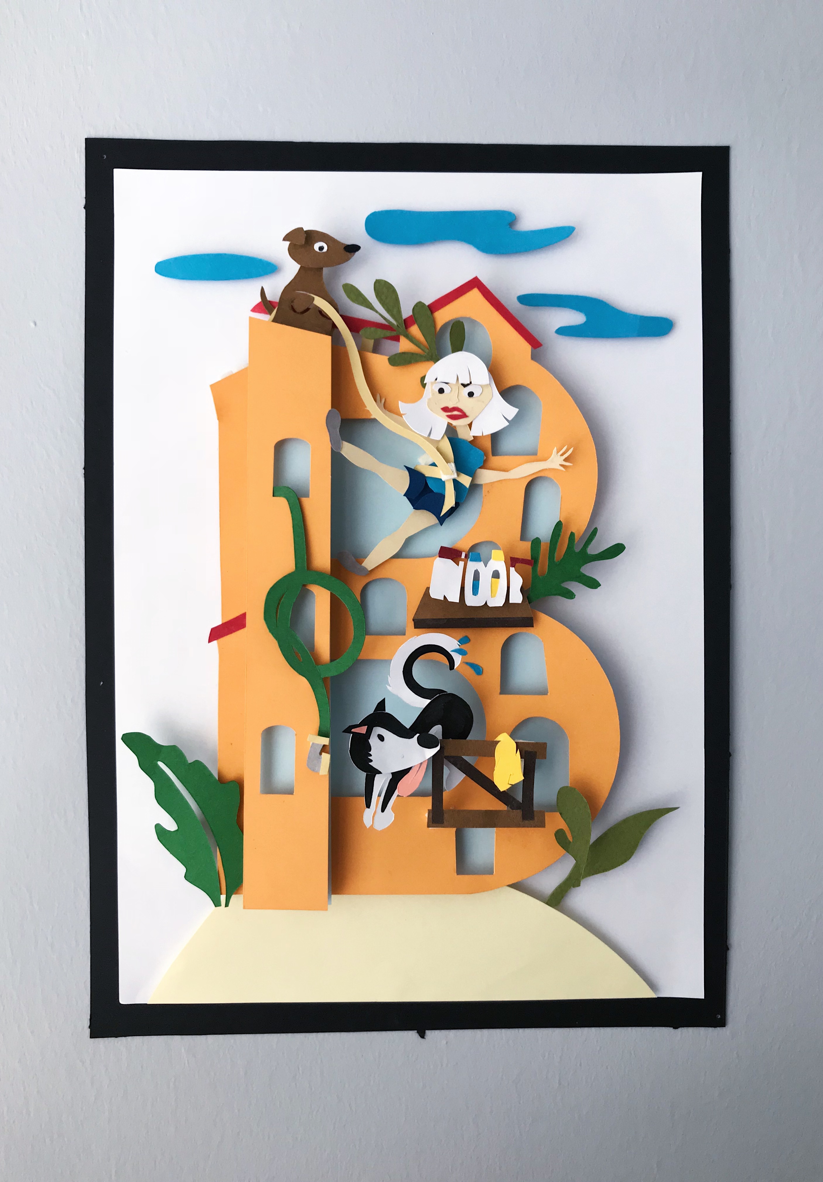
In this composition, I am a Window Cleaner.
(Another one of the ‘daily life’ jobs)
With this last composition, the focal point is straight and clear a capitalised ‘B’ in the form of a multi-story building. The name form of ‘Boon’ can be found in the lower half panel. The ‘B’ of Boon takes the form of the building itself while one ‘O’ makes up a green water hose dangling out of one of the building windows, The other ‘O’ is created by the dog’s tail wiping the windows dry. Lastly, the ‘N’ is designed to make up the wooden safety railings, supporting the window cleaner dog. The word ‘noob’ can also be read in the opposite direction; starting with the wooden railing of ‘N’ and ending with the overall building’s ‘B’. Another area where the word ‘noob’ is placed, is around the half mark of the composition. It takes the form of cleaning products sitting along a wooden plank attached to the building’s surface. The different scaled leaves decorated around the building, helps the surrounding negative space to interact with the ‘B’ shaped building itself.
For this 4th composition, there is a clear central focus when interacting with the artwork. The colors of the environment; the hill that the building sits upon and the atmosphere itself, are made up of lighter colors that help to mute the contrasting colors within the middle that immediately catch the viewer’s attention. They also lead the direction of our eyes to naturally drift towards the middle.
PRESENTATION DAY
That’s the conclusion to Semester 2’s Project 1, Image Making Through Type! Thank you Joy for all your feedback during consultations 🙂
I felt that this project was thoroughly enjoyable even though it did take a lot of patience and will to not give up.
Overall, it was a great experience!