In this post, I will cover the research I have done on color theory as well as include write ups on artists who have inspired my art direction for Project 3’s Ego In Different Settings, leading to its final outcome.
Monochromes Harmony
Before jumping into what the monochromes harmony is all about, we first have to become familiar with the basic components of this scheme.
The three main components of the monochromatic color scheme would be…
Hue – particular color chosen within the color wheel
Shade – the darker version of that particular color
Tint – the lighter version of that particular color
This color scheme can be achieved by looking at variations of a particular color. Monochromatic means one shade of a singular color. As we have now addressed shades and tints, we can imagine that by adding an increasing amount of black to a particular color, this would result in achieving darker shades of the particular color. Again, by adding an increasing amount of white to the hue, the result would be lighter tints of the particular color.
For example… if we picked a color and that choice would be pink.

Focus on the chosen pink right around the middle of the color spectrum. We can see that by adding increasing amounts of white overtime, a lighter tint of pink such as peach, is eventually achieved. On the other hand, by adding more black, the red hue is resulted and maroon can be seen.
How Can Monochromes Be Seen In Everyday Applications?
If we were to pick another hue in this instance as our next example, it would be blue.

Here, we can see a similar effect taking place. By adding more black, darker shades of blue can be achieved in comparison to the blue we have chosen (middle color). As our eyes drift towards the right, ocean blues and navy can be seen as a result. As we look towards the left, lighter tints of blue such as baby blue or sky blue is resulted when we add increasing amounts of white.

Hospital Setting
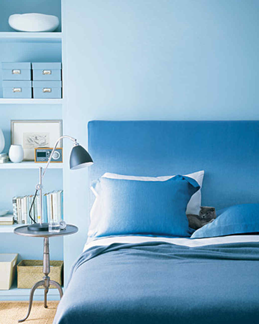
Bedroom setting (Martha Stewart).
Blue monochromes can be seen in hospitals or bedrooms especially, since moods of peace and tranquility is desired to be achieved within such places. Shades and tints of the color, blue, evoke a sense of calmness.
Analogous Harmony
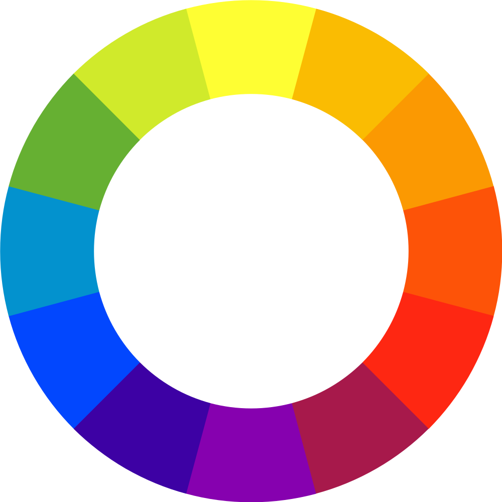
Before we can get into what analogous harmony is, we first have to understand the basics of the color wheel such as primary, secondary and tertiary colors.
Primary colors – Starting point with red, yellow, blue, where all colors can be made.
Secondary colors – As we look at the primary colors on the color wheel, we can see that they are evenly spaced out. By mixing the primary colors with one another such as red and yellow, we can achieve the color evenly placed in between; orange. Alongside that, blue and yellow creates green while red and blue creates purple as such. Therefore our secondary colors are orange, green and purple.
Tertiary colors – These colors are the mixture of both primary and secondary colors, being next to one another on the color wheel. For example, red (primary) and violet (secondary) creates a color in between them known as red-violet (tertiary). Another example, yellow (primary) and orange (secondary) creates yellow-orange (tertiary). Colors belonging to the tertiary scheme include red-violet, red-orange, yellow-orange, yellow-green, blue-green and blue-violet.
The definition of analogous is having similarity or analogy between colors. Analogous colors is having three colors next to one another on the color wheel. For example, refer to the color wheel below. One example of an analogous color group would be violet, red-violet and red. Another group would be yellow, yellow-orange and orange. Yet another would be yellow, yellow-green and green.
Artists use analogous colors to create a harmonious feeling while creating an image perceived to be pleasing to the eye itself. They usually match well with one another and are often used to create comfortable and serene designs. One color is usually used to dominate while the second is used as a support. The third, alongside black, white and grays, would be an accent.
How Can Analogous Harmonious Colors Be Seen In Everyday Applications?

by Alice Andreinis.
This painting by Alice Andreinis, an artist who portrays everyday things within her paintings, uses the analogous color scheme distinctively here. She creates a rather harmonious setting while adding contrast within the image itself through the use of green, yellow-green, yellow. Green as the chillies’ natural color, yellow-green to emphasise their highlights and yellow as the backdrop. Monochromes are also seen to be in use here to create shadows which the chillies are casting upon the standard yellow background. Black is added to create darker shades of the standard yellow hue, making up the shadows with it. Using the ideas of dominance, support and accent, green would be the dominating color here with yellow as support and yellow-green & the darker shade of yellow as accents.
Analogous Harmony: Warm & Cool
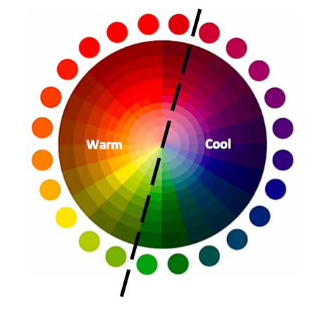
The color wheel can be split into two sides distinctively portraying colors that are described as warm or cool. Colors next to one another in groups of three whether it is on the warm or cool sides are analogous and could be used to portray various moods. Warm colors are used to portray a more positive and brightened perspective while on the cool side, these colors are used to promote tranquility or a rather saddened mood.
Here, the colors are separated into two sides:
Left-hand side (Warm): from green, yellow-green to yellow… yellow, yellow-orange, orange… orange, orange-red, red… red, red-purple, maroon.
Right-hand side (Cool): from green, blue-green, blue… blue, blue-purple, violet… violet, red-violet, red.
Complementary Hues
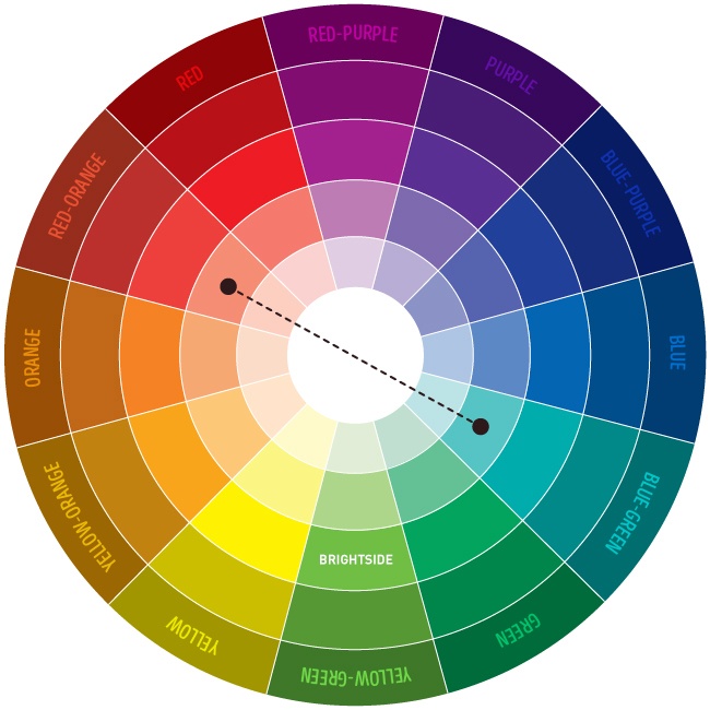
Complementary hues, simply put, are two hues (colors) that are placed opposite or across one another within the color wheel. Whenever these two opposite colors are mixed together, they should cancel one another out, thereby creating a muddy brown or black color. The example shown in the above color wheel is a complementary mix of tertiary colors; blue-green and red-orange. Simpler and more well-known complementary hues using primary colors include red and green, blue and orange, purple and yellow.
How Can Complementary Hues Be Seen In Everyday Applications?
A common pair of complementary colors would be orange and blue.

Notice that when this peach, made out of this orange hue, is placed against a blue backdropped table, the colors contrast one another to create a vibration of sorts. The image is eye capturing and grabs our attention immediately.
Split Complementary Hues
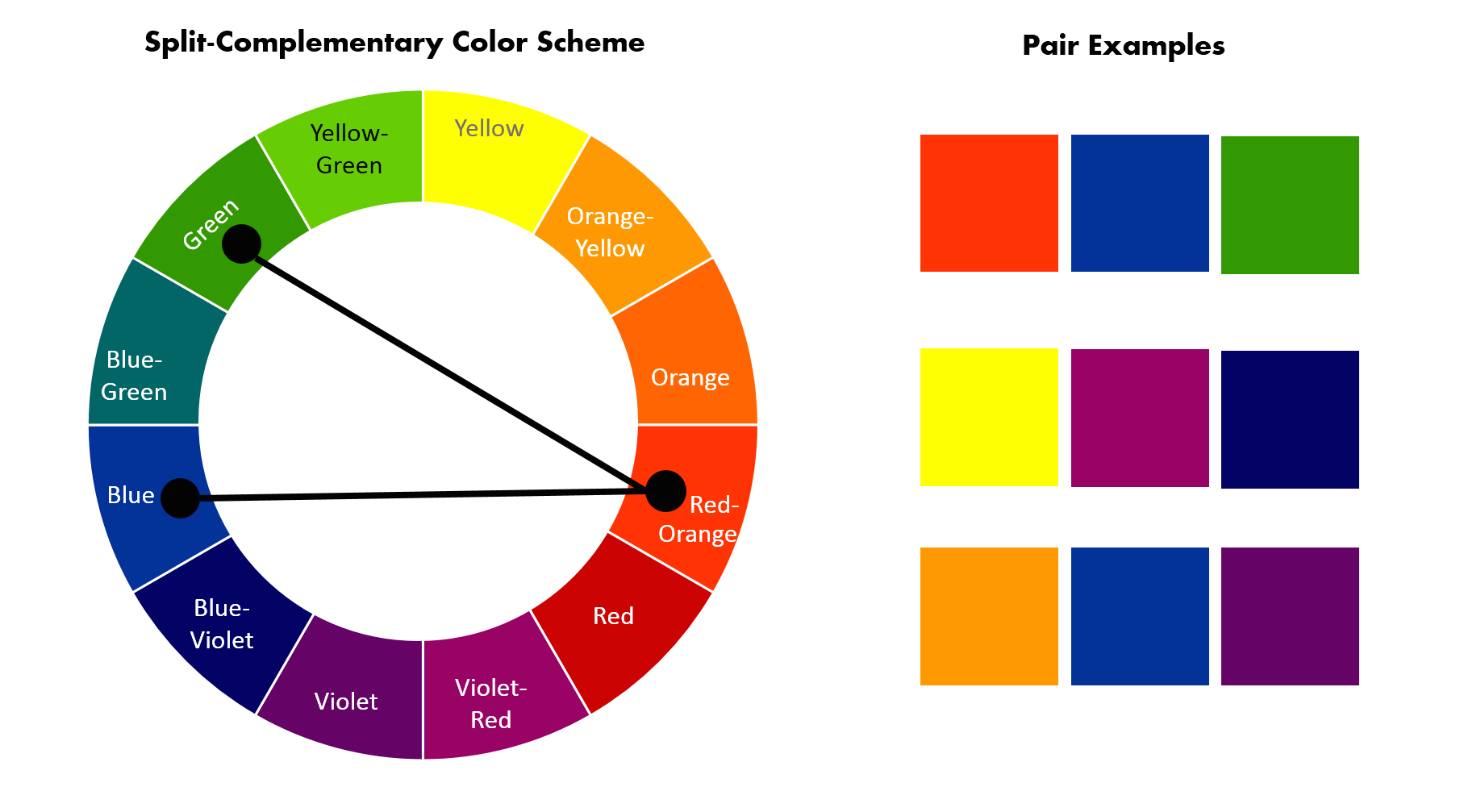
Split Complementary hues are a variation of complementary hues. Alongside the base color, it uses the colors that are adjacent to its complement. There is a strong visual contrast apparent in split complementary but it does not come out as jarring as complementary colors.
The above example demonstrates red-orange as the chosen base color. Red-orange’s complementary would be blue-green since it is directly across from it in the color wheel shown above. Beside blue-green would be green and blue, making them red-orange’s split complementary pair.
Other examples of split complementary may include paired examples as shown on the above right. Yellow as a base would make violet-red and blue-violet its split complementary pair while orange-yellow as a base would make blue and violet its split complementary pair.
Research from: www.study.com
—————————————–
ARTIST RESEARCH
Influence Within Art Direction for Final
Abbey Lossing
Image taken from the ‘About’ section of her website
Abbey Lossing is an illustrator that lives in Brooklyn, New York whom I follow on the social media platform, Instagram. She is a freelance illustrator & staff illustrator at Vice News. One noticeable thing about her works which I greatly admire is the quirkiness of the characters she includes within her artworks. The colors that she uses are prominent and bold and her subject matters are usually much bigger in comparison to the people figures she portrays.
Find out more about her at: http://www.abbeylossing.com/
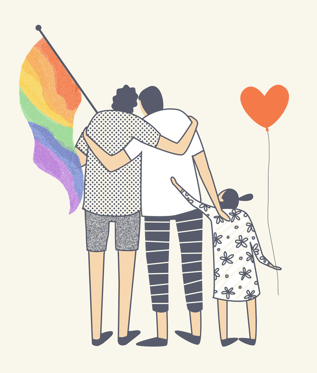
Artwork on Gay Rights 6/26/2015
Notice the standardised body parts Lossing demonstrates within this artwork of hers which she has titled Gay Rights 6/26/2015. The heads of these people are also much smaller in comparison to the body weight she shows from the shoulders down. Legs and hands are also constantly skinny and elongated in contrast to the rest of the body. She also portrays a differing pattern through the use of dots and stripes demonstrating the varying identities of the two people. Flower motifs are also somehow hinted in her artworks, whether they are small or large scaled.
Signs of Strain in the Stock and Bond Love Affair
As mentioned above, Lossing is drawn towards portrayal of human figures in a significantly smaller scale as contrasted by the larger than life objects surrounding. She sticks with a small amount of colors but employs them strategically to encompass her entire composition. Lossing makes use of lines and dots in a patterned manner to establish liveliness and movement within her works as well.
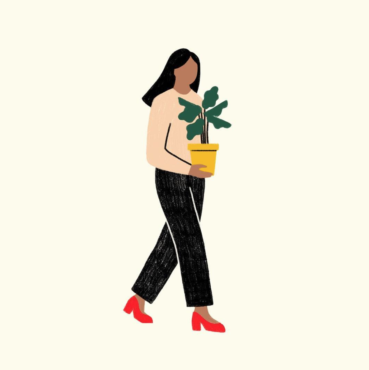
Untitled
Unlike the above two images which were obtained from her website itself, this image was retrieved from her Instagram profile. As seen by the lines outlining her pants, Abbey Lossing manages to blend the figure right against the simplistic background color. The effect is not too jarring and creates a singular plane for the whole figure itself. There are no additional effects, it is minimalistic yet captures the attention of the eye through the boldness and solidness of colors used in contrast to the lighter shade of background. Again, plants, rocks and nature are a strong motif within Lossing’s work, making me want to develop my ideas based on this as well to keep a constant theme within all of my equations.
It is through these tiny details have I been influenced by the illustrator’s work which you can find in my final submission right here!