Task 1: Object and Representation of Self


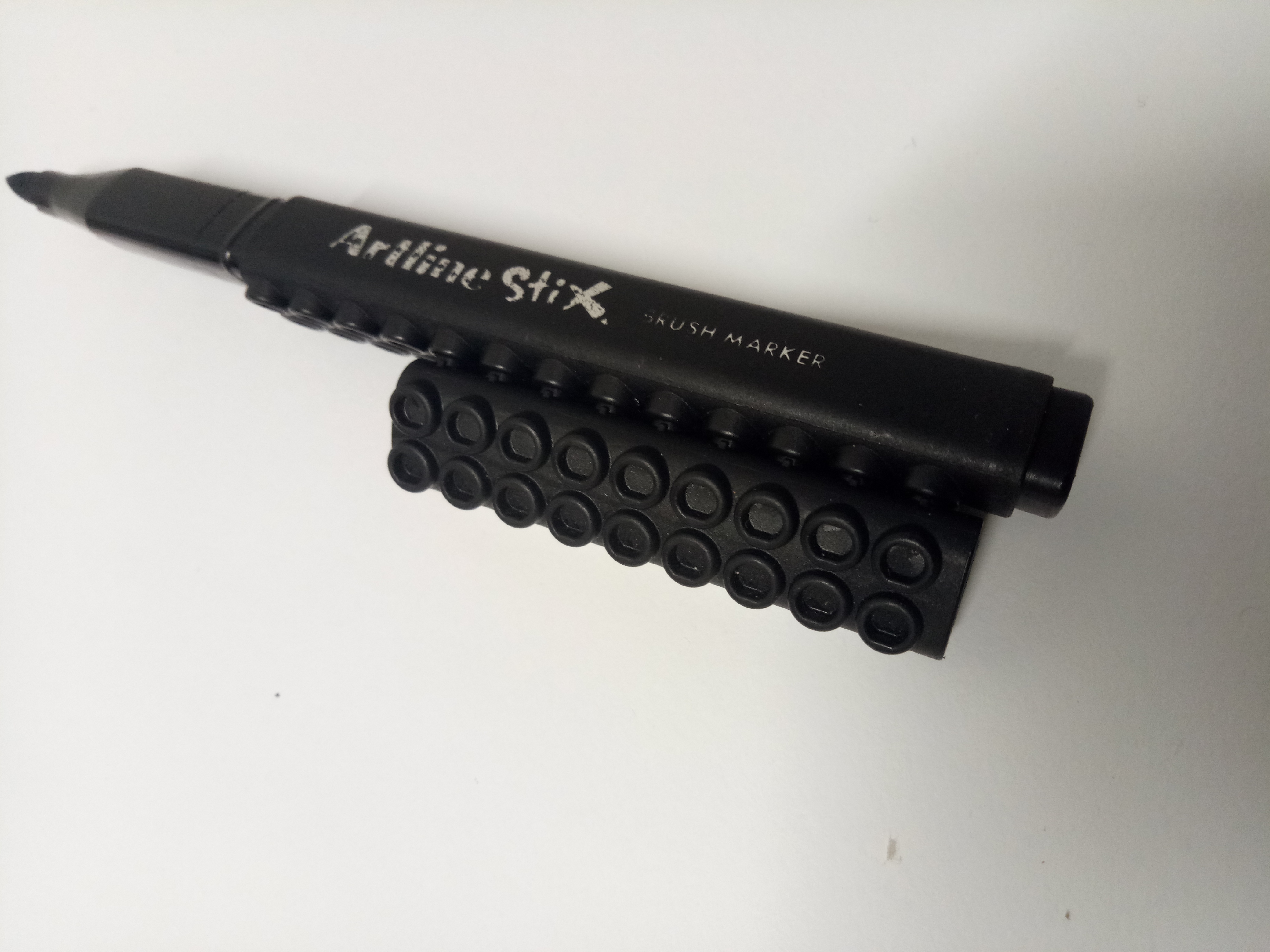
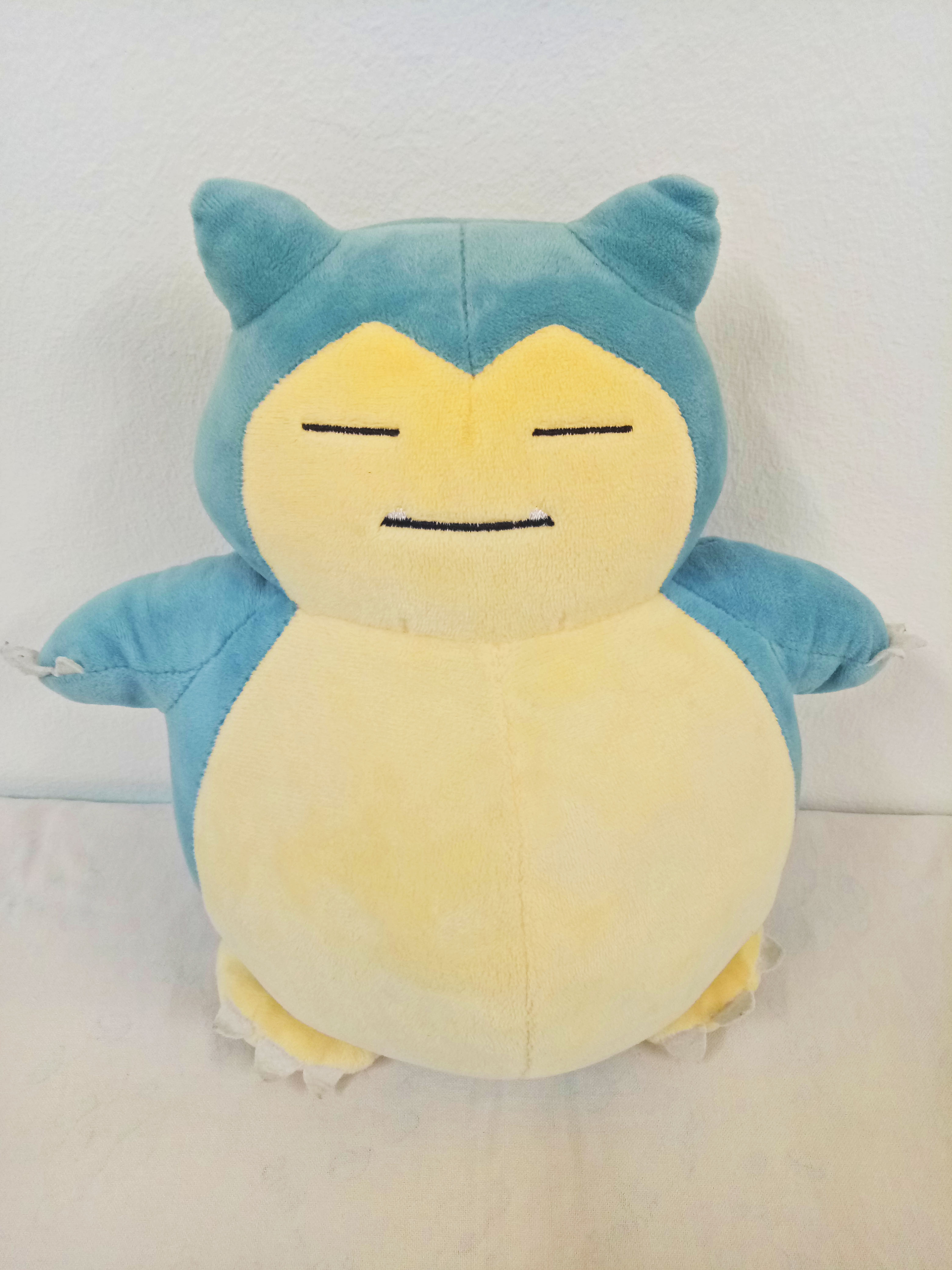
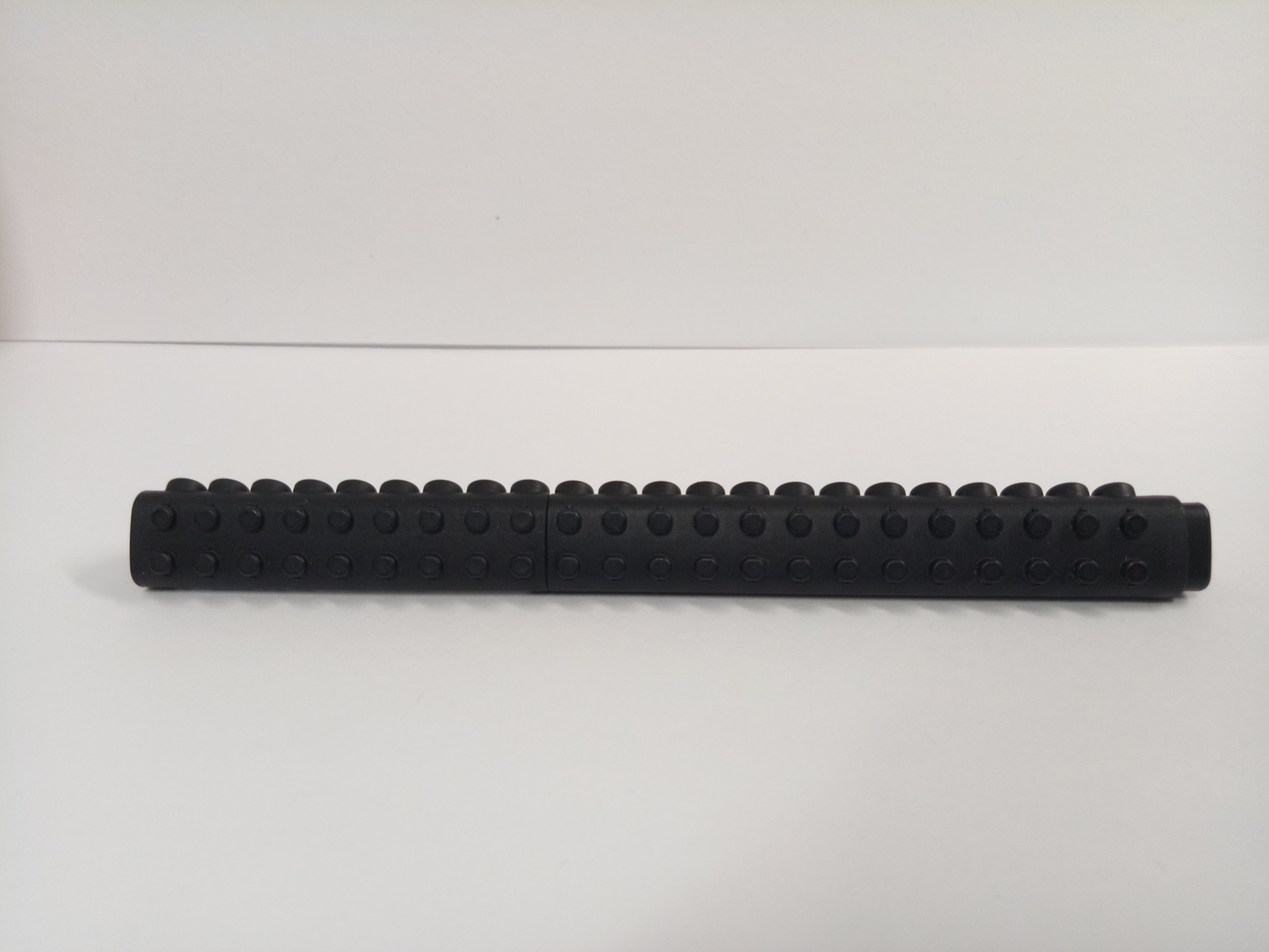
I have a lot of significant things in life: my collection of postcards, my Harry Potter book series, letters from my friends, my handmade friendship bracelets… but since most of them are back in my house in Indonesia, it actually saved me the trouble of choosing. (Not implying that this object is any less significant!) So the significant object that I chose is my Snorlax doll. His name is Hashtag.


Say hi, Hashtag.

Hashtag was given by my JC friends as a farewell gift. In JC, I had this group of friends, consisting of five people from different countries. However, we knew that after graduation, we are going to continue our studies in different countries. We knew that meeting up again would be difficult, so we prepared gifts for each other as a symbol of our friendship. They chose to buy a Snorlax doll for me since they knew I like Snorlax (I can relate a lot to its unwillingness to move) and dolls. For the name, we decided on a name together based on our inside joke.


Hashtag can’t hug back, his arms are too short. But that’s okay! I hug him because I love him, not because I was expecting a hug back.

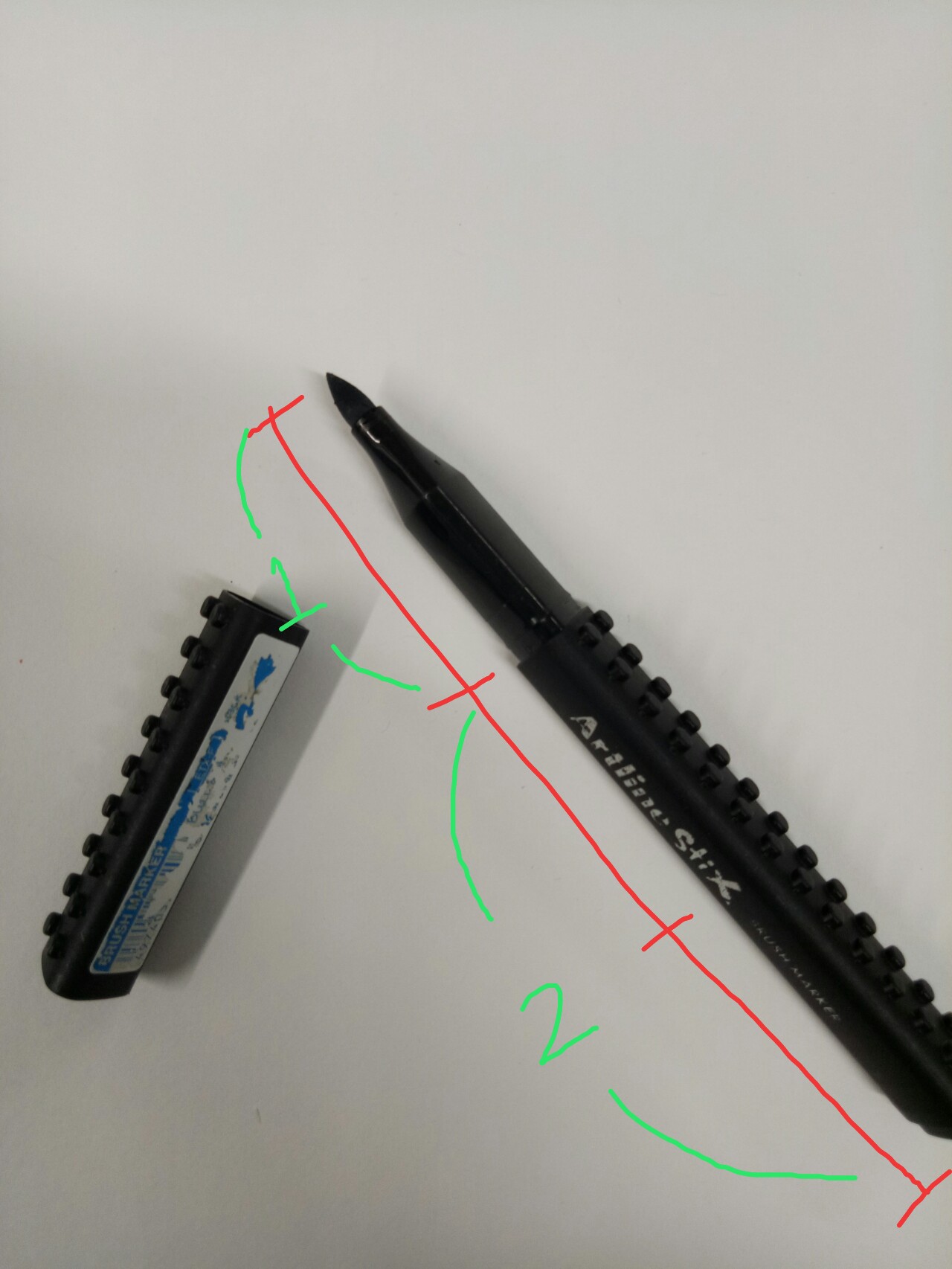
The picture of Hashtag alone, for me, shows that it is just a normal doll – and it is interesting because it means a lot to me nonetheless. I have a lot of dolls, yet when I came to Singapore, I only brought Hashtag. I felt like Hashtag was enough to “accompany” me.

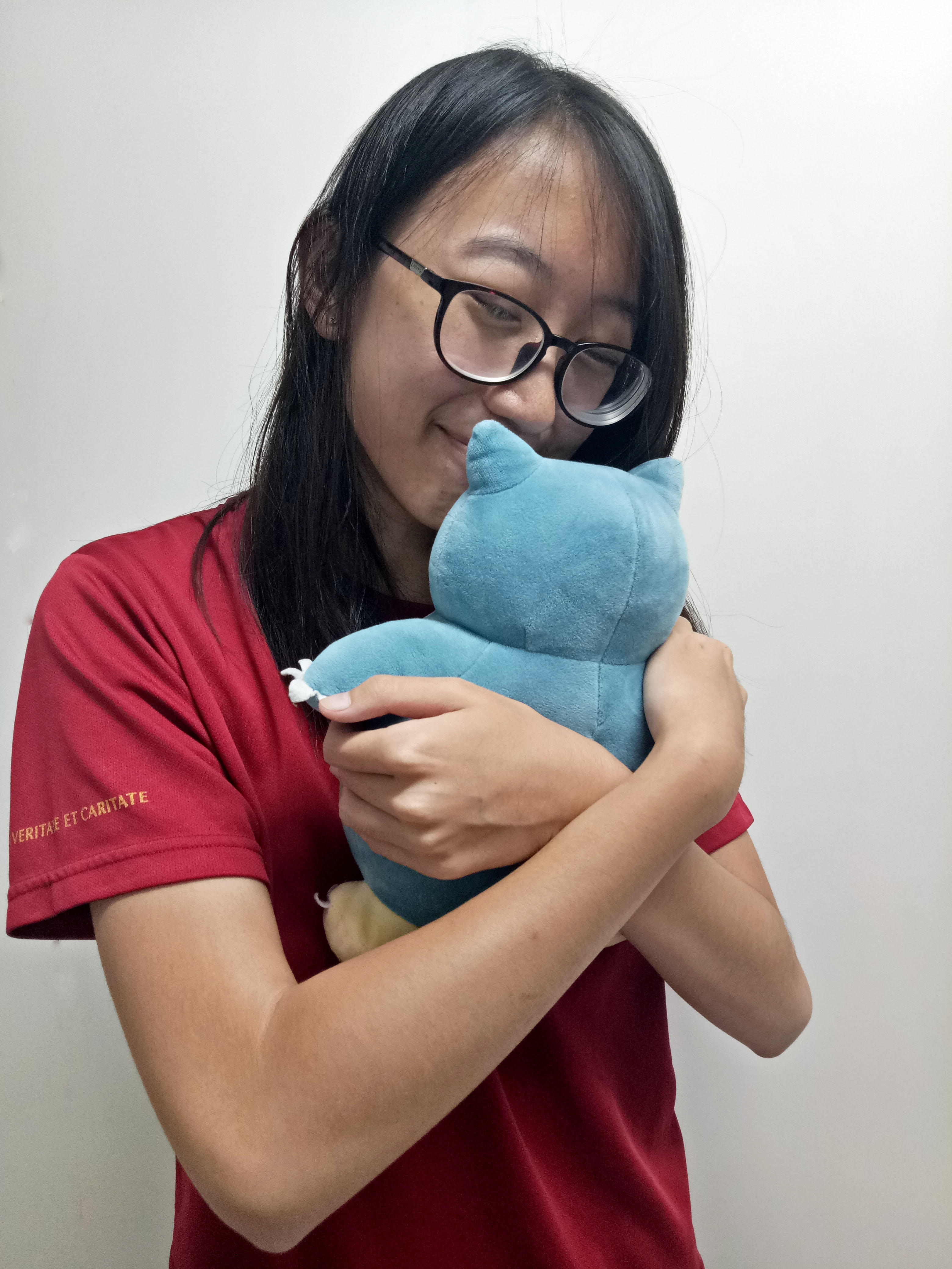
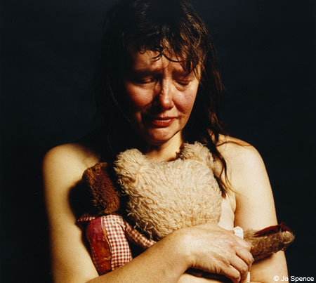
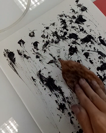
The picture of me hugging him illustrates my relations

hip with my friends. My friends know I like hugging people, and that’s why I like dolls or soft toys – they are huggable. For me, hugging makes me feel less lonely.

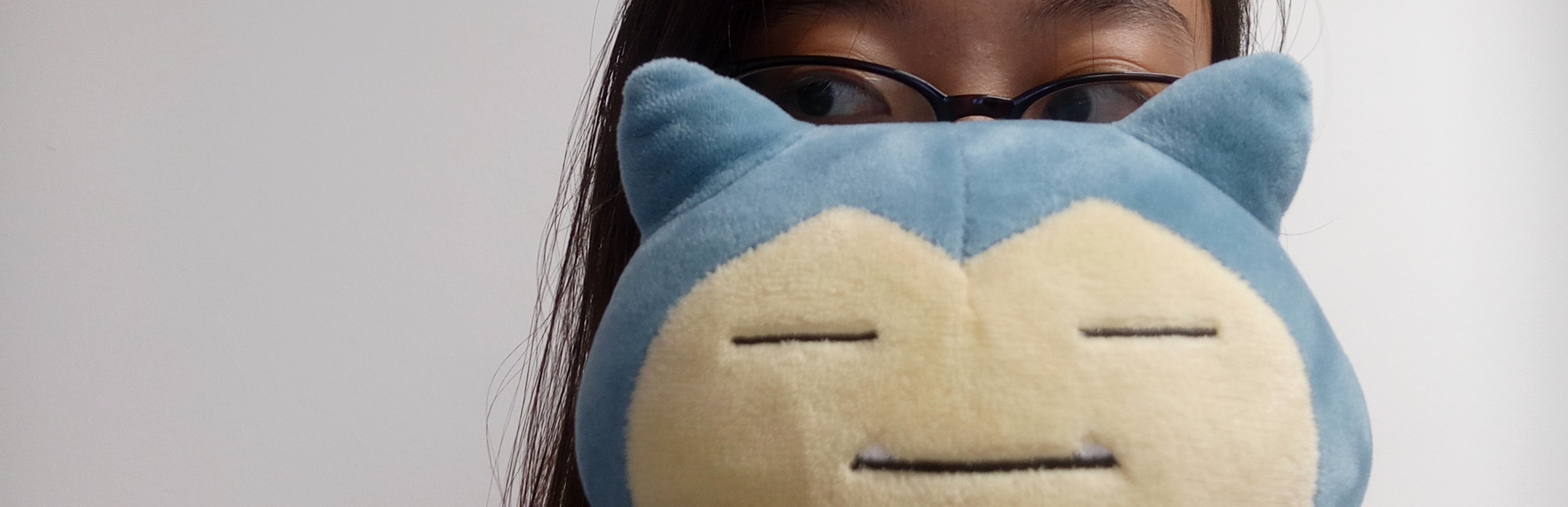
The close-up picture of Hashtag and I looking at each other, for me, symbolizes that relationship is a two-way thing – “It takes two to tango.” I relate to that phrase

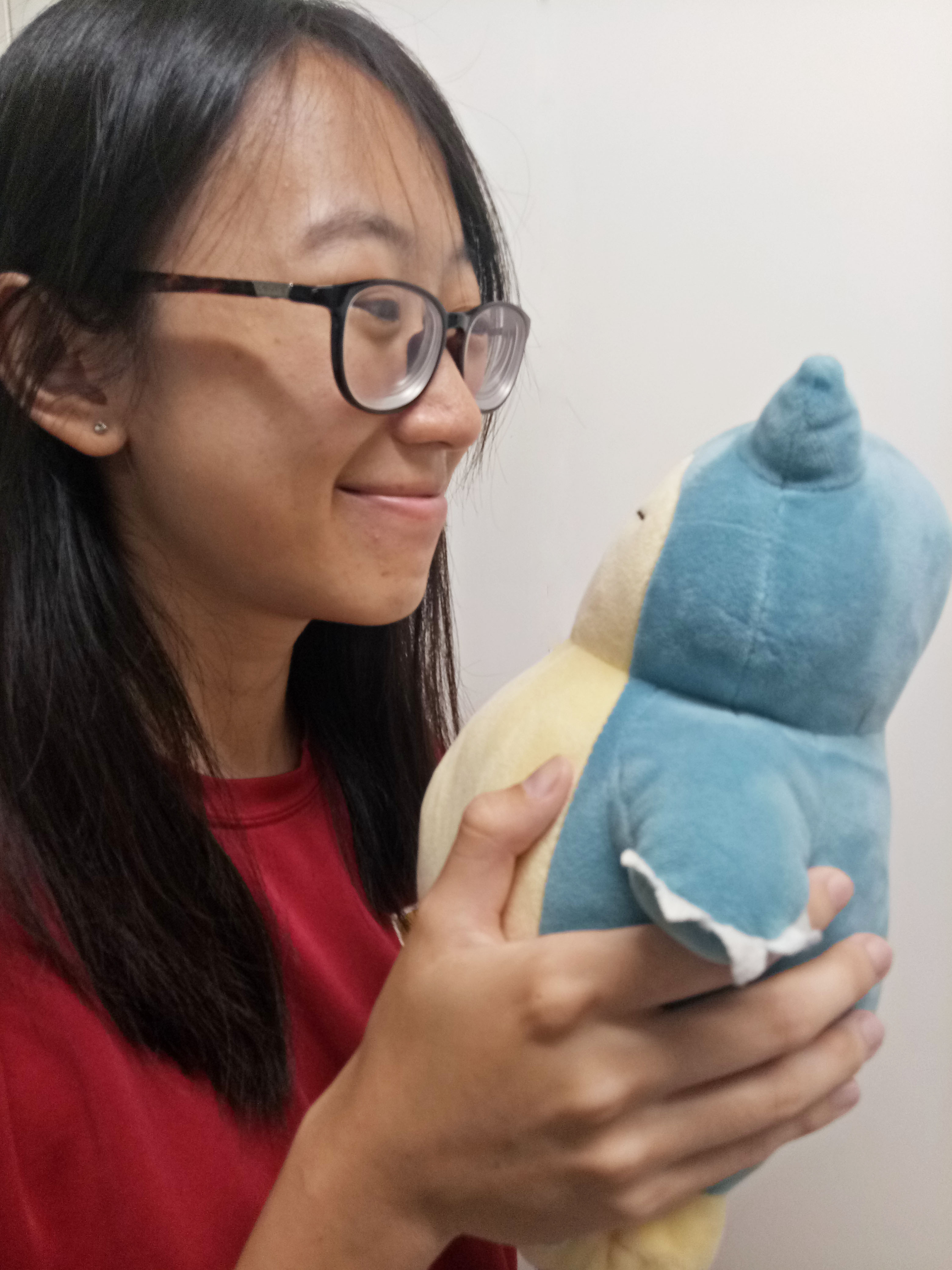
“It takes two to tango”

a lot since when facing difficulties in my relationships, I always try to remember that there are two people involved in the relationship, and that I have to try looking from another person’s perspective as well.

Fortunately, I still stay in touch with this group of friends quite regularly. I hope we can meet again someday.


Task 2: My World


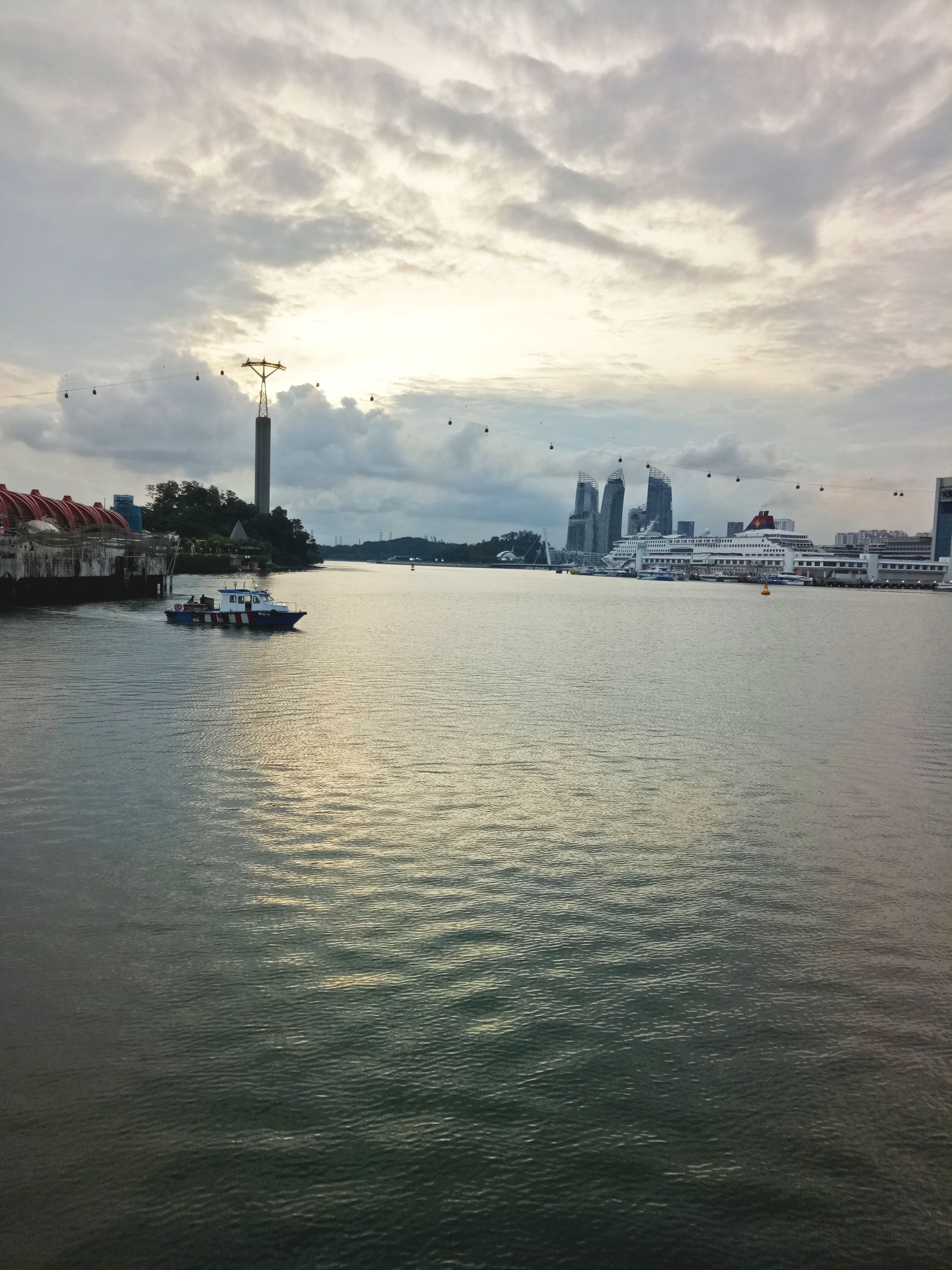
As for a significant place, I have to say I love looking at the sea.


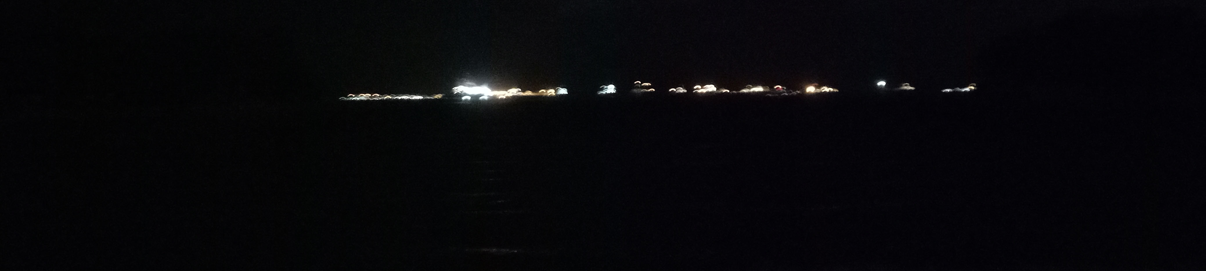
The sea at night is incredibly calming. The lights seem to be so far away, distancing me from everything else.


The thing I like about the sea is the vastness. When I’m sad or tired, I like to stare at the sea. Listening to the gentle waves and smelling the slightly salty air – those feelings give me a sense of peace and calmness.

In a sense, the sky is also vast, and I love looking at the sky as well – but when I’m staring at the sea, when I look at the horizon, I always feel dwarfed. The sky and the sea, they both make the world seems like a huge place, and make me feel like a grain of sand. When I’m facing a lot of problems, I often go to the beach just to sit down and stare at the sea. The vastness always reminds me that my problems are temporary and insignificant in such a big world.

Not only that, I have a lot of memories about the sea; playing Frisbee inside the water with my friends, splashing water at my sister, playing orientation games, crossing the sea to Batam for my overseas project, and even canoeing during my Outward Bound.

Funny moments, happy moments, and even sad moments – I have experienced them all by the sea. That’s why it is such a significant place for me.


The sea is calming, but also mysterious – who knows what’s lurking in its depths? In a sense, the sea intrigues me as well.

This picture illustrates the idea of vastness.


I know I’m bad at taking photographs and my emotions may not come out as much as I want them, but I do hope they can convey some of my feelings.

I found this project to be a challenge.

I looked up some of the reference artists to find inspiration. Some of them really captured my attention, like Jo Spence’s self-portraits, for example. I was also intrigued by Richard Billingham’s works. From my Google image search, I found a lot of self-portraits done by him. Compared to Spence, I found Billingham’s works to be more “relatable” since he used a lot of colored background, or background which features a lot of other things. However, I think they are similar in a way that they capture a lot in a seemingly simple picture.

One of Jo Spence’s works. [Taken from http://metro.co.uk/2008/07/03/jo-spence-self-portraits-246644/]

One of Richard Billingham’s works. [Taken from https://www.theguardian.com/artanddesign/2016/mar/13/richard-billingham-tower-block-white-dee-rays-a-laugh-liz]


As for landscape picture, I found a picture by Mariko Mori that I really like. It looks very relaxing and balanced to me, maybe due to the idea of vastness captured here. Similarly, the idea of vastness is also reflected in some of Catherine Opie’s work (which I came to enjoy).

Mariko Mori’s work that I really like. [Taken from http://www.tokyoweekender.com/2016/06/artist-mariko-mori-brings-a-mysterious-ring-to-the-rio-olympics/]

One of Catherine Opie’s works. [Taken from http://www.tfaoi.com/aa/8aa/8aa298.htm]


I hope I can integrate the idea of simplicity in my works too.

We did some mark-making experiment in class this week, and it was fun!

I didn’t bring a lot of tools, actually. Here are the things I brought: a fake rose, a paperweight, a brush marker, some bottle caps, and a used, bent glow stick.

The texture came out very faintly.


First, I tried using my bottle cap. I didn’t think it worked out very well; since there is a slight difference in height, the sharp texture didn’t come out as much as I expected.


After that, I switched to the other type of bottle cap. I like how this one turned out.

I rolled it on the paper.

Result (with my fingerprints)


I also tried using my fake rose, although I was hesitant at first. I thought it wouldn’t make an interesting texture, but it turned out quite well.

I rolled the petals on the paper in a circular motion.

Result


So was the experiment with the glow stick.

I rolled it around on paper, and use my hand as a pivot before dabbing them on the paper in a circular motion.

Result

I also tried using the end of the glow stick, dabbing it on paper.


I decided not to use my paperweight and brush marker, partially because I didn’t want to get them dirty. For the brush marker, I intended to make small circular shapes, but I used the end of the glow stick and it worked okay, so I didn’t need the brush marker. As for the paperweight, I thought it wouldn’t work very well because the bottom part was slightly convex; I guessed it would turned out like the first bottle cap.

After that, I turned to my friends to borrow their tools. One of the items that I got was a dry leaf. At first I tried pressing it on the paper, hoping for the texture of the leaf to be printed, but it didn’t. So in the end I dragged the leaf instead.

Result


I also got a cotton ball. I dabbed it on the paper.

Result


The last tool that I got to borrow was a plastic knife. I used both the sharp edge and the flat side to give different ink thickness.

Result


Besides those, I also used the tools available in the studio, such as brush and roller.

Result (with roller)


I used brush for the flowy parts and my fingers for the circles.


I used my fingers to put fingerprints on the paper before by dabbing them, and I tried dragging my fingers as well. It created an interesting result.

For the next class, I hope I can experiment using more tools. I’m thinking of using candies, stapler bullets, and coins. Let’s see if I can make something even more interesting.

Today, we learned about the use of perspective to create the illusion of depth within a frame. In a frame, there can be multiple perspectives or no perspective; but in creating depth, the commonly known perspectives are one-point perspective, two-point perspective and three-point perspective. The numbers suggested the amount of vanishing points apparent in that one frame.

As a class exercise, we have to walk around ADM building to capture those three perspectives using our cameras. Let’s see what I take:


One-point perspective

There is one vanishing point here; that is, at the top of the stairs, which makes it the focus.


Two-point perspective

There are two vanishing points here, and they intersect at the corner. Our eyes are naturally drawn to the corner.


Three-point perspective

There are three vanishing points now. Usually to create the three-point perspective, we take picture from high eye level or low eye level.

For the first F3D class, I brought my Artline Stix brush marker as a three-dimensionally interesting object.


Here it is.


At first I am only intrigued by its triangular shape, which is different from normal markers or pens. However it’s actually much more interesting than that. Let us analyze it one by one.


1. SHAPE

As I have mentioned above, the shape of the marker is like a triangular prism, not cylindrical like commonly found markers. If we draw the principle axis through the center of the marker, we can see that the marker is almost symmetrical. Almost, because interestingly, all three sides of the marker have different faces.

First, there’s the plain side. (Refer to the picture above.)

Second, there’s the side with small convex cylinders.

                                                Zoomed in.


Third, there’s the side with small concave cylinders.

                                                 Zoomed in.


Those different shapes add to the contrast in a single marker. In addition, the convex cylinders fit into the concave ones, just like Lego! So if you have a bunch of them, you can stick them all together and make a circle. (Sadly I only have one.)

The small cylinders are also uniformly distributed throughout the body of the marker, making it look like a repetition (cross-section?).

The convex-concave contrast is also apparent at the top and bottom of the marker. And yes, they fit too. (Wow.)

Bottom (concave)

Top (convex)

They fit!

I find it very interesting that in a single marker, there are so much contrast, yet they can complement each other as well. It provides some kind of visual balance.


2. SIZE / PROPORTION

The sizes of the convex and concave cylinders on the marker’s sides are small compared to the body of the marker, so for the relative proportion… I’d say those cylinders are XS while the pen is like M or L? Probably M, but I can’t be sure. It provides a pair of contrasting volumes within the marker, and cluster of similar volumes as well (because the cylinders are “repeating” on their own sides).

If you uncap the marker, you can also see the application of the rule of thirds! The length from the marker tip to the point where it’s supposed to be capped is roughly one-third of the whole body length of the marker.


Rough proportion.


Also, this might be wrong but I feel that the proportion of the positive-negative space is also applying the rule of thirds. As I have mentioned, the marker has three different sides, where two of them are covered with little cylinders (positive space?) and one of them is plain (negative space?). The presence of the plain side prevents the marker from looking too bulky and, again, giving balance to the whole look.


3. COLOR AND TEXTURE

As for color, we can see the brand name in shiny silver against the all-black body clearly, hence straight away drawing our attention to it and putting emphasis on the brand although the body of the marker is actually pretty interesting. Well-played, I’d say. The silver shine adds “magic” to the marker, so I guess it is the subordinate whereas the all-black body is the dominant and the small cylinders on the sides are the subdominant. (I might be wrong about this.)

As for texture, when the marker is uncapped, we can see that while the body is matte black, the part between the tip and the body is glossy black. (You can see the difference from the picture above.) Although both of them are still black (which emphasizes that they are still one entity), the difference in texture emphasizes that they are of different parts. The glossy part is somehow smoother, so it is easy to slide your fingers there; but the matte part isn’t very smooth that your hand won’t slip easily while gripping the marker. They both complement each other not only in tactile experience, but also in function.

Moreover, the texture is a bit different between the marker sides (comparing the sides with cylinders and without cylinders). The plain side is slightly smoother compared to the sides with cylinders, so if you turn it while gripping it, you can actually experience slightly different feelings. Even the concave-cylinders side have a slightly different texture compared to the convex-cylinders side. I am genuinely amused by this marker now.


I know I might have gotten some things wrong, so please correct me if you find a mistake or a point to elaborate. Thank you!

“It is all a game of construction – some with a brush, some with a shovel, some choose a pen.”

-Jackson Pollock


This is one of Pollock’s artwork, “Ocean Greyness”. [Taken from https://www.guggenheim.org/artwork/artist/jackson-pollock]

I have no idea what mark-making is at first, so I did a little bit of research. I found out the usual stuffs – the explanation of what mark-making really is, its history, and the artists who often apply mark-making techniques in their artworks. (I like Jackson Pollock’s works.) However, I also read something that I found interesting, which is what makes a mark-making “good”.

So what constitutes the facility for ‘good’ mark-making by being aware of marks that:

  1. Are appropriate to our intentions – right for the job.
  2. Are ‘alive’ and embody and express the ‘life-energy’ of their maker, the artist.
  3. Help to communicate and express qualities of light and its invisible energy, and the material substance, form, volume, and surface of the objects we are drawing.
  4. Present the eye with changes of pace and rhythm that collectively offer variety and interest. [The rich and varied texture of nature and the world around us is our guide].
  5. Express and stretch the properties of the medium that the drawing is made from.

[Quoted from http://www.utdallas.edu/~melacy/pages/Drawing/AS01_MarkMaking_DrawingProjects/MarkMaking.html with changes]


This is what I planned to bring at first.

After reading that, I feel like I should try to explore more ideas, so as to find one that I feel is more “alive” to me and to provide more variety – not only to make it more interesting for the audience, but also for me to better express my ideas. In my previous post I mentioned using bottle caps, but I would probably bring other things (like my brush pen or my paperweight?). My idea is to bring things that can be found in my room, because that’s simple and easy, yet the results may be surprisingly good. (I hope.)


I think maybe other types of bottle caps might be a good idea.


And this is my paperweight.


After all, there shouldn’t be right or wrong; people have different ideas and choose to use different tools. It is just about who is able to present their ideas more effectively, more attractively, and more expressively.

All in all, I’ll have fun learning and experimenting. I’m looking forward to tomorrow (I mean today).

So we are supposed to bring things for mark-making. I actually have no idea what I want to bring, so I just think of things I have on my table… and I find a lot of things, because my table is a complete mess. One of them is a bottle cap. Don’t ask why.

http://www.bottlecapco.com/Lime-Green-Bottle-Caps-Standard_p_19.html