The theme that I’m trying to convey is ignorance towards preservation, especially poaching activities, in Labrador Park. Labrador Park is the only rocky seashore left in mainland Singapore, with abundance of marine life. Due to illegal poaching and other reasons such as safety, the beach area has recently been closed to public.
I feel that not enough people know about those aforementioned facts (or maybe they know, but choose not to be concerned about it) and that is why I want to take the theme up. However that proved to be a big challenge for me because my intention is to show the ignorance or lack of knowledge, but the zine just came out very vague (i.e. people can’t tell at all what my place is). I want to say that it proves my point that people are unaware, but I still feel a little concerned since it wouldn’t go with the zine brief.
In the end I went with something I’m more comfortable with, that is, by focusing on the narrative and flow instead of the actual layout. I’m also concerned since it looks more storybook-ish rather than a zine, and although it’s very reflective of my personality, it may not be very suited for the project.
Here is my final zine!
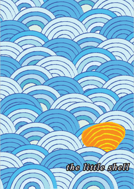
cover page
page 1 and 2
page 3 and 4
page 5 and 6
back cover page
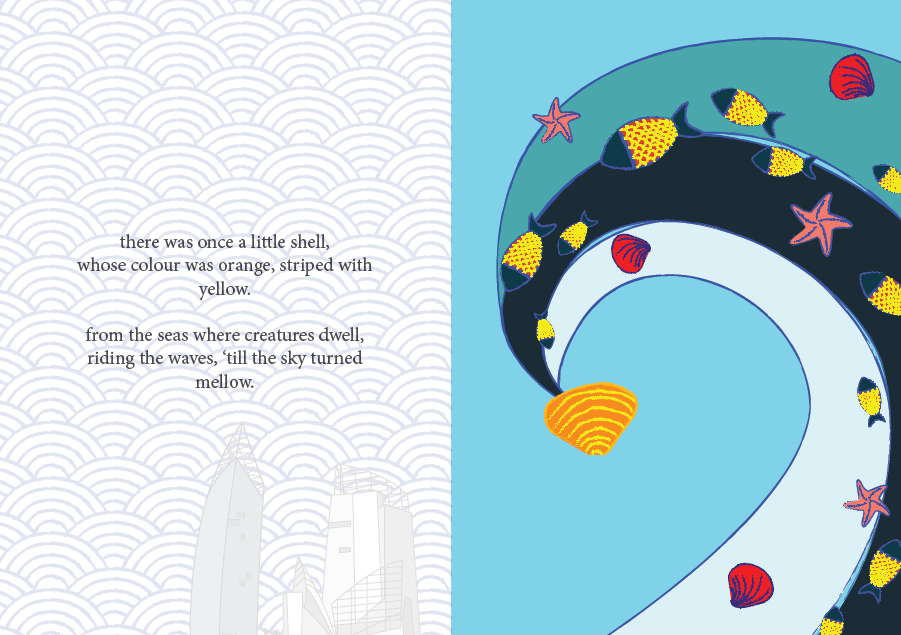
So the narrative revolves around a little shell who gets poached for aquarium decoration. Since the zine is intended more for children, I want to evoke the feeling more that “sea creatures too don’t want to be separated from their home”.
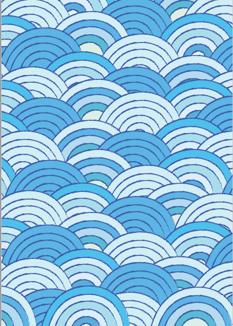
About the cover page
The cover page took me way too long to make, since at first I made one row of waves and just copy-pasted everything, but my friend said it’s too repetitive so I went through the trouble to make the rows one by one so they all look more varied. To be honest I really love the colors that I used. For the pages I used different blues for the backgrounds and the blues get darker at different pages because I want the feelings to slowly become “darker”.
About the narrative
The first and last page inside kind of envelope the whole experience with narrative; I received a comment saying they wish the narrative is a bit longer. I feel that that may reduce the impact since if the narrative is too long people will get bored faster, especially children.
By the way, I tried so hard to make a rhyming poem, and I actually think they’re okay. Maybe I should’ve chosen a different font, but I actually feel like this font is enough since it fits the storybook feeling. I also received comments saying that I should have capitalized the first letter. I did that at first, but then the letter stands out (of course) and I don’t really like the overall look, so I stuck with the all-small letters.
About the pattern
As for the background pattern on the first and last page, at first I only made the sea waves pattern but after consulting, I realized that it lacks representation of the place so I added the buildings that you can view there. Some people say it adds more characters, some people say it’s kind of out of place, but I like it.
About the character
I choose orange as the shell color because I want a contrast to the blue, since I already know from the beginning I will use a lot of blue. I tried red, but I think it comes out too jarring. Orange provides a warmer, friendlier feeling while staying bright.
I choose a shell because it’s simple to make, and also I want it to blend with the sea waves at first.
About page 2
In the wave, I added different sea creatures to tell audience about the diversity. The yellow scales on the fish provides a line that people can follow to see the orange shell at the end. For the other creatures, I outlined them blue and use mainly red-dark orange-pink so they won’t draw too much attention. I want the shell to be the star of the page.
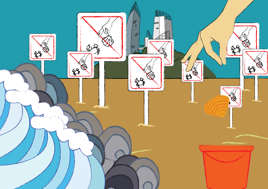
About page 3 and 4
At first I only put one sign there, and it looks very empty. So I put an excessive number of signs there instead to show that there are efforts in preserving the sea, it’s just that people choose to ignore them. In some ways, it’s a sarcastic remark to point out people’s ignorance. I put rocks right by the waves to illustrate Labrador Park’s rocky shorelines. The characteristics are also shown by the sign, which is considered pretty unique of Labrador Park, and the buildings which can be viewed from Labrador Nature Reserve. I do regret not putting in more characteristics (like the Dragon’s Tooth Gate or some of the war relics?), maybe I could have put them floating between the sea waves pattern on other pages or something.
At the right side of the page, you can see a hand dropping a shell into a bucket. The hand gesture may be a little unclear, it looks like someone is picking up something instead.
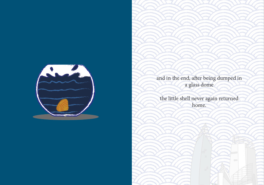
About page 5
This is the page I had the least trouble with, because I had envisioned this ending right from the start. I just now think that maybe the aquarium shouldn’t be placed right in the center of the page, but a little bit lower so the shell looks like they’re “falling” from its positioning in other pages. For this page, I made the shell’s color darker so as to say that it’s losing its vibrancy after being separated from home, and subconsciously saying that even if you take a beautiful shell for yourself to decorate your aquarium with, it won’t look as beautiful there compared to when it’s in the sea.
Overall
I’m actually really happy about how my zine turns out! Looking back, I never thought I would have made this. I like the flow of the story, however again, it feels more storybook-ish than a zine. I was worried it’s not graphic design-ish enough, but then I decided to go with something more reflective of my personality and focus on the narrative instead. I realize I wasn’t pushing myself out of my comfort zone enough and decided to play with something I know I can do better at; I definitely should have explored more.
I tried to portray the characteristics of the places more by adding the buildings, but still maybe the characteristics aren’t portrayed enough since people can’t tell about the place at all. (Which proves my point of lack of knowledge, but goes against the brief.)
For the software, I used mostly Adobe Illustrator, but I can’t make a whole page and just copy-pasted them to InDesign because I used the chalky brush stroke, and it came out very pixelated in InDesign. (Turns out it’s just my display preference, but I only noticed it later.) Because of that there’s a lot of layers in InDesign and it took forever compressing them into a PostScript file (I spent an hour at the printing place trying to make it right, fortunately the people are so nice to wait for me and even teach me what to do). My laptop is laggy especially bad whenever I use InDesign, so I have to be smart in choosing what to create in Illustrator and what to create in InDesign and I spent more time than I should have (I also took shortcuts), but luckily they turn out as I want them to.
As for the printing, surprisingly I didn’t have a lot of problems with it. I went to RJ Papers and took my time looking at different papers. I didn’t know there are so many different kinds of papers before! I was considering between using a glossy, magazine-style paper or the paper that I used in the end (I forgot the name, I think it’s Maple Bright?). Glossy paper will make my color pop up more, but it feels colder somehow, so I decided to use the maple paper to convey a warmer feeling of “home” to fit in with my narrative. I choose the 170 gsm one because I want it to be thicker, so it feels nicer to flip.
The colors come out exactly how I wanted them, except for the hand on the 4th page–the printed hand is too yellow compared to my digital illustration, but that’s fine. The different shades of blue came out brilliantly and I like them very much. I even printed an extra zine for myself to keep.
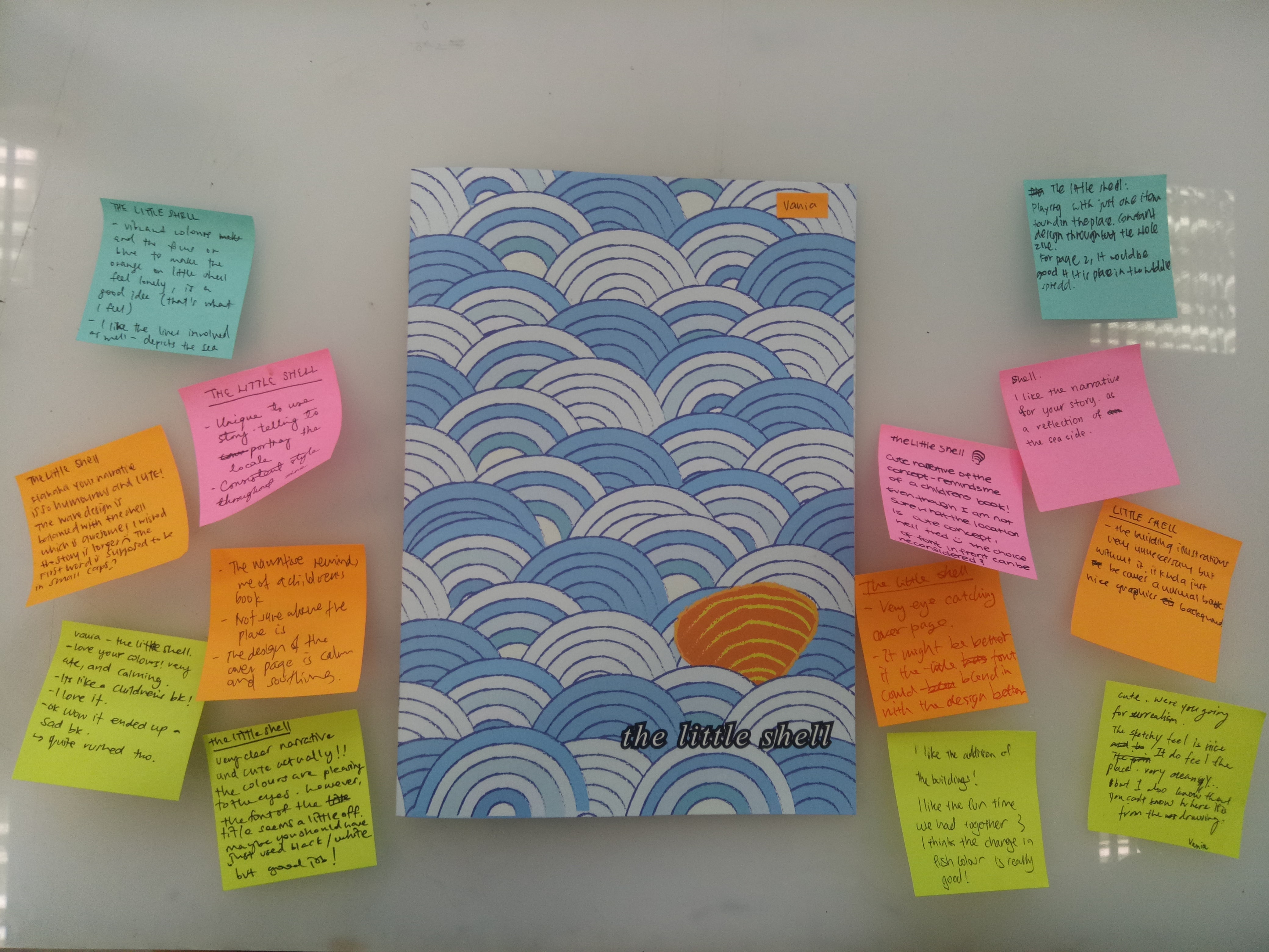
My final zine and feedback (thanks for the comments!)
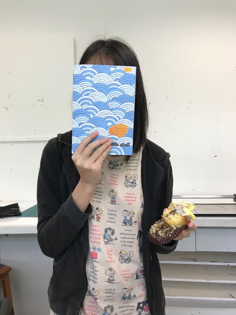
Me, my zine, and cupcake
All in all, it’s a valuable experience for me. At first I wasn’t sure if I could do it, but I did, and I’m proud of myself (although it actually is something that I am supposed to do so I shouldn’t be too proud of it). I learn a lot more about my style and work attitude. I also learn to ask help from my friends more, be it to comment or to guide me in using software. I was always reluctant to ask for comments because I tend to take things negatively, so I’m glad that my friends are willing to put up with my stubbornness and continued to give me insights.
And thanks to the people who say it’s cute. I think my zine is cute too.
It’s been a really fun journey!