About ‘Accounts of Chemical Research’
I tried to look through the abstracts for the articles in the journal, but I was lost. Very lost. I couldn’t even understand the words individually, let alone as sentences.
I tried.
From what I was able to understand, there are several types of articles; for example, discussions and research results. Research results consist of what they were aiming to gain more knowledge about, how to go about it, and what their findings could be used for (references for future researches or improvement opportunities for medications and technologies, to name some). Meanwhile, discussions provide more insight into the researchers’ perspectives in addition to their researches, such as the analysis and challenges in researching that particular topic.
It is clear that the journal is not intended for the general mass. While each article includes an introduction to the covered topic, people without sufficient background in science (especially chemistry) would not be able to understand it well. The journal would be a reference source for people who are writing papers, or people who are looking into doing chemical research or experiment. To a certain extent, people who want to keep up-to-date with findings and development in chemical research might read it as well.
Nevertheless, just looking through the titles, the diagrams, and parts of the abstracts was interesting. It provides some insight to an outsider like me as to what people who work in this field are interested in. For example, the efficiency of the molecule shapes and structures. It is also interesting to see the “behind the scene” (like the molecule names or actions) of the applications of science, such as cancer immunotherapy and vaccines, or wearable energy storage. I don’t know how it sounds to them, but to me, it sounds highly complicated, yet revolutionary. It makes me wonder how many of these articles have to be produced for an actual scientific breakthrough to be made.
We talked to the client about the project. The main theme for the cover would be “A curved polyarene building block for the construction of functional materials”.
Yes, I understand those words separately.
I think, more easily put, it should be about how these curved polyarenes are produced and applied. The key points that we should include in the cover are the symmetry of the curved polyarenes (sort of like a soccer ball pattern) and the fact that they use a lot of light to generate. The client had also mentioned that there is no need to be too chemically accurate.
Inspiration
1. Wijtze Valkema

Check your contract when having a new house built, for Eigen Huis Magazine
This is an illustration of an article about the importance of checking contracts when having a new house built. I like the use of texture; it gives the illustration a richer feeling instead of just being simply flat. They also give the shadow effect at certain places.
This is also sort of a playful take on the article, making the readers or “you” a giant character inspecting a smaller house by taking off the roof while having a small character (who we can tell immediately is the worker in charge of the construction). I think the illustration is able to convey the essence of the article clearly without being too metaphorical or detailed.
2. Kotryna Zukauskaite

Memory aid: Stanford researchers have found that blood from newborn humans can rejuvenate learning and memory in aged mice, a discovery that could lead to new treatments for age-associated declines in mental ability. Client: Stanford Medicine, 2017
I think the interpretation of the article here is excellent. While I cannot catch the meaning alone from the illustration, once you read the topic, the illustration makes a lot of sense and enhances the reading experience. The article is about how blood from newborn humans could rejuvenate learning and memory in aged mice, which could lead to potential new treatments regarding mental abilities. The illustration encapsulates the idea of blood, brain, and research.
The illustration itself looks simple with few colors, so it feels like the illustration is not there to be the “star” of the article, but rather as a “supporter”; yet, it manages to simplify the long-winded topic well.
3. Beth Walrond

An animated GIF for Zetland about children getting stuck in a YouTube rabbithole
This is technically a GIF. But it is made of illustrations. So I digress.
Before I looked at the title, I can tell immediately it’s going to be something about the overuse of the Internet. The use of animation here conveys the idea of YouTube well.
I am actually amazed by how I can tell that 1) it is a child and 2) the child is holding a laptop. As for (1), I think the color palette and her pink hairpin help a lot, also, the proportion of the child to the laptop. As for (2), I think from the pose and the play on the logo brand, we can see that it is a laptop. Somehow I find it interesting that they are simple, yet so easy to process that I didn’t even ask myself “what is that?” or “how was I able to recognize that?” at first.
Compared to the other illustrations, this one has a freer, more handmade feel since the creator didn’t use clean, sharp lines. When I look at her other illustrations, she does like not to use sharp lines, but even this one is particularly more “wobbly”, for lack of a better term. (Sorry, my brain is fried after reading the journal.)
Takeaway
All of them uses digital media; Walrond even uses animated GIF (for a good reason). I think that reminds me that when you’re doing something and you want to go further, you have to ask yourself, is it necessary? What is the purpose of bringing it beyond? Sometimes we’re so fixed to just making things look “cooler” that we didn’t consider if it actually contributes to the objective.
(Disclaimer: this is not an excuse for wanting to make things simpler.)
Each illustrator has different ways of bringing the articles to life. But the similarity is, all of them do the job well without actually portraying anything in a too straightforward manner. Valkema’s one is more straightforward, but they did a more playful take instead of just portraying someone reading a contract (which, now that I think about it, is very easy to fall into. If there’s an article about the importance of reading a contract, wouldn’t people jump at the idea of drawing someone reading a contract?). Zukauskaite’s topic is more abstract, but even then, they did not just illustrate a brain or a research lab. Walrond also did not need to draw the YouTube logo, for example, for us to realize the character was watching way too many videos.
All of those illustrations are also able to summarize the topic well and enhance the article. To a certain extent, they make reading the articles easier.
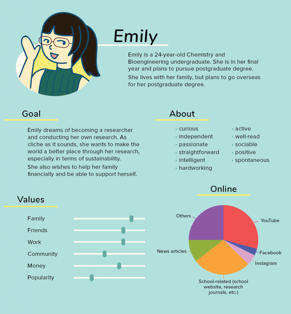
User Profile
Here is the user profile that I have created.