Here are my end results for this project! Featuring: the mouse, the elephant, the banana, and the turtle.
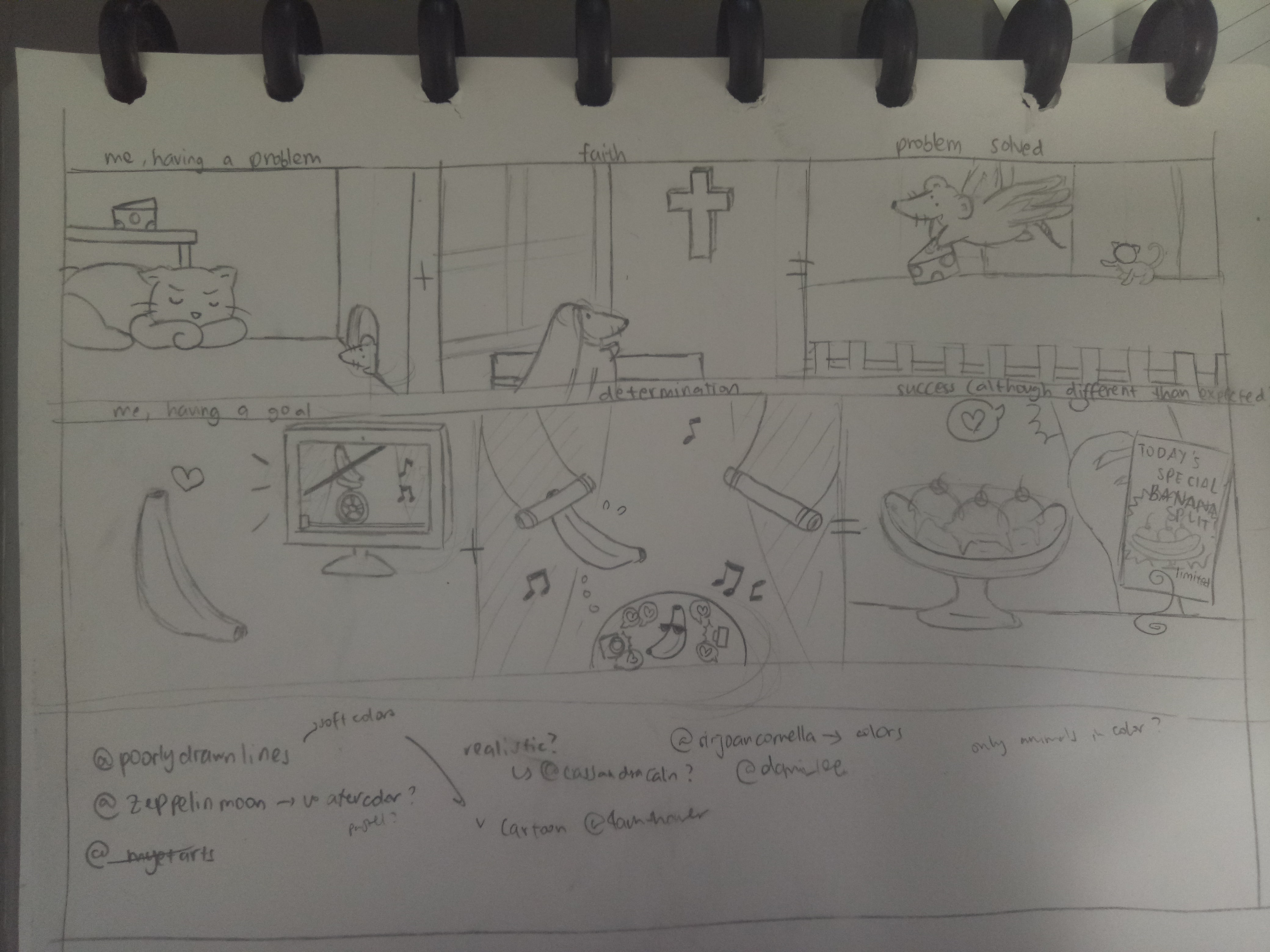
1. The Mouse

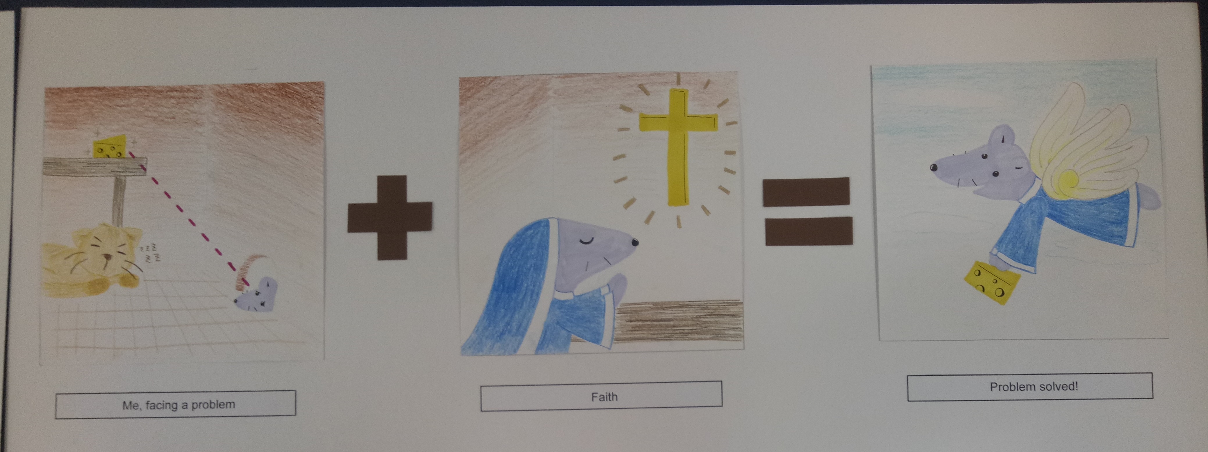
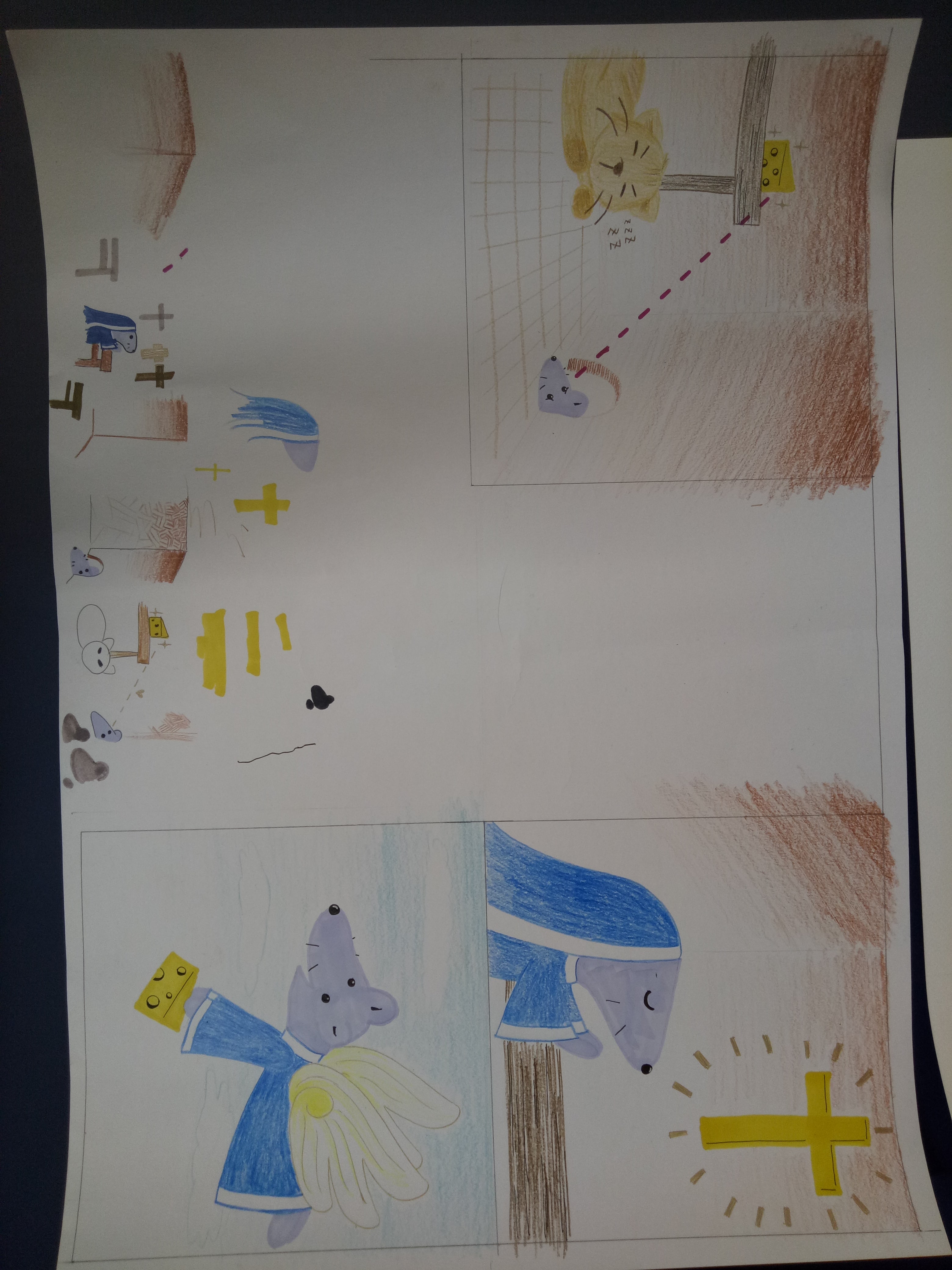
Me, facing a problem + Faith = Problem solved!


I represent myself as a mouse because (I think) my Chinese zodiac is a rat, so my family at home sometimes refers to me as the “mouse” in the family.

The story is that the mouse wanted to get the cheese but was hindered by the presence of the cat. So the mouse began going to church and gained a pair of wings, which enabled her to overcome the problem.

This is the representation of me when I face a hindrance or problem in doing something. The “faith” here is represented by going to church, but actually it’s not necessarily a religious faith. It can also represent faith in my own abilities, since I tend to think that I can’t do things before I actually try them. By having faith, I can actually overcome my troubles in achieving what I want.

I chose to use colored pencils and markers because I wanted to work with something simple, and I wanted to give a child-like vibe. I used markers for the important objects in the panels as emphasis. As for the colors, I used similar colors (shades of brown) for the first panel except for the mouse and cheese because I wanted to emphasize their significance. The background of the second panel also has brown color to create some connection between the panels. From the second to the third panel, the mouse wore the same habit (apparently the uniform that nuns wear is called a “habit”) to create a connection.
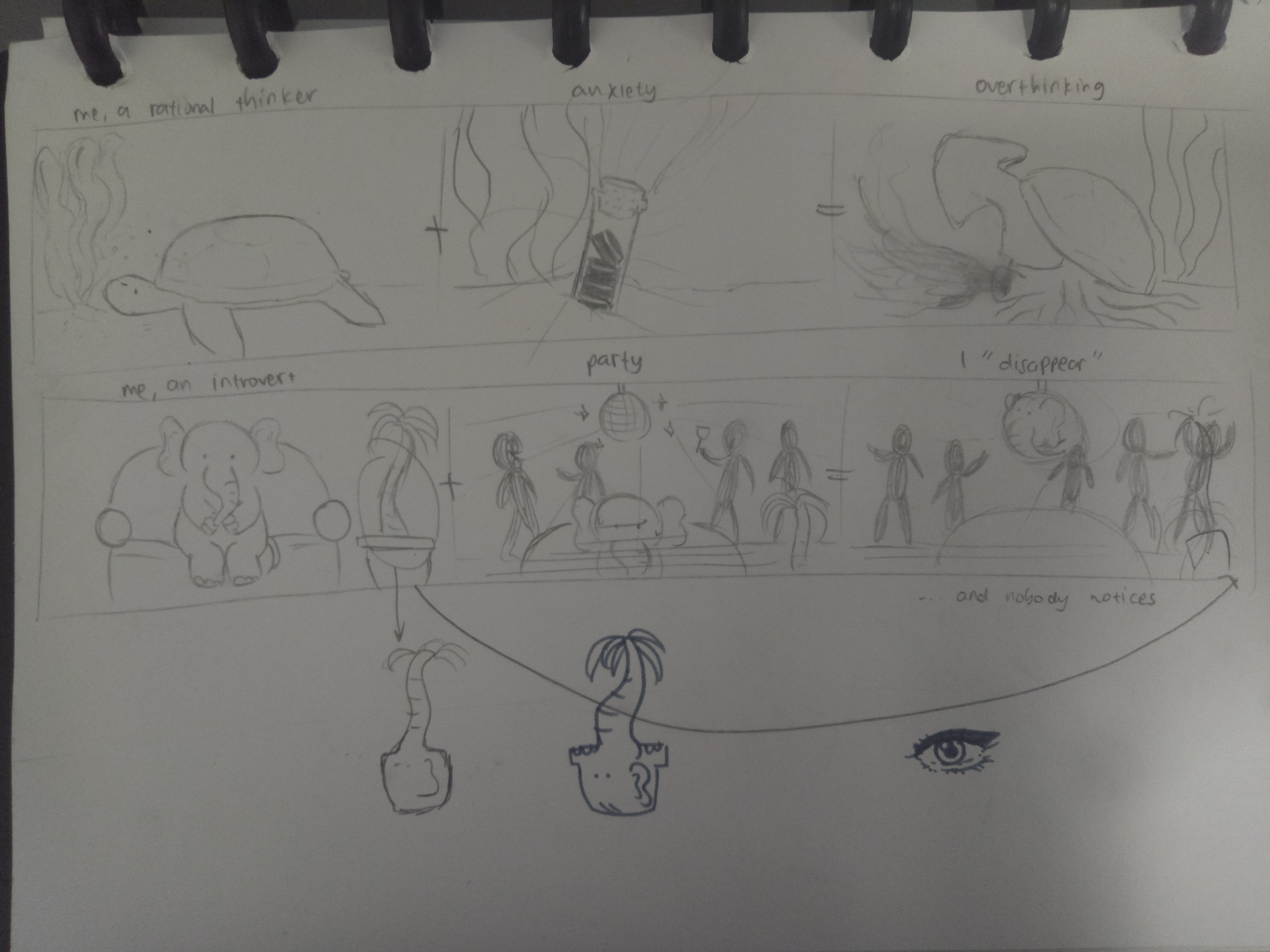
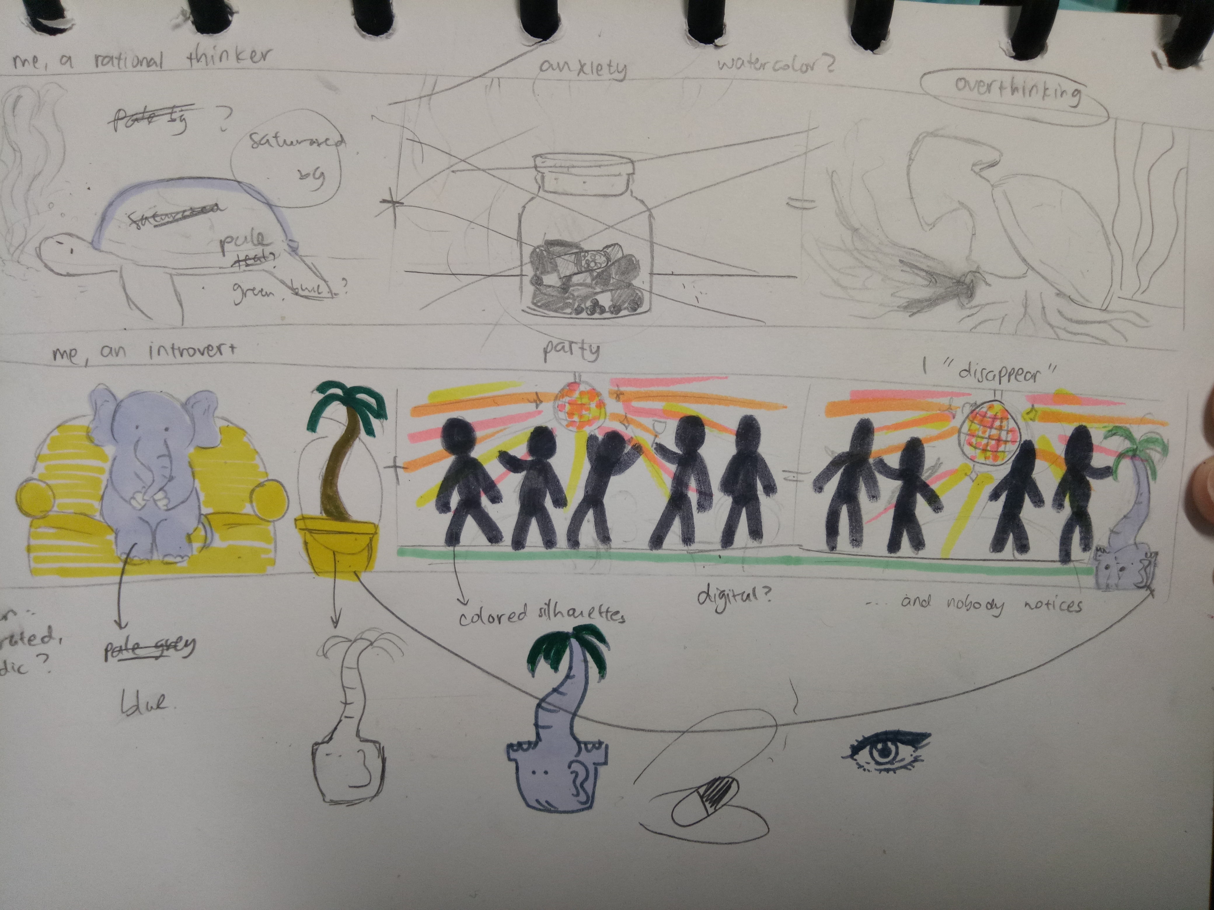
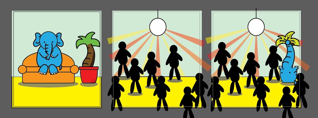
 

2. The Elephant

Me, an introvert + Party = I “disappear”


I used an elephant because of the phrase “elephant in the room” – it’s there, but people don’t talk about it.

The story is that the elephant is so introverted that when she went to a party, she blended in right away with the surrounding and became unnoticed. It was as if she became a furniture, a part of the background.

The elephant represents my introverted and awkward side. I’m not good around strangers, and even within my circle of friends, I’m not good at interacting with people in big groups. In a sense, I’m physically there, but it feels like I “disappear”.

I used the color blue for the elephant because blue is my favorite color. The sofa in the first panel is orange to complement the blue elephant. I used yellow for the floor since yellow and orange are analogous colors. The background (the wall) is supposed to be pale blue, but the color came out a little differently than I expected. I used blue background to emphasize the feeling of the blue elephant “blending” into the environment.
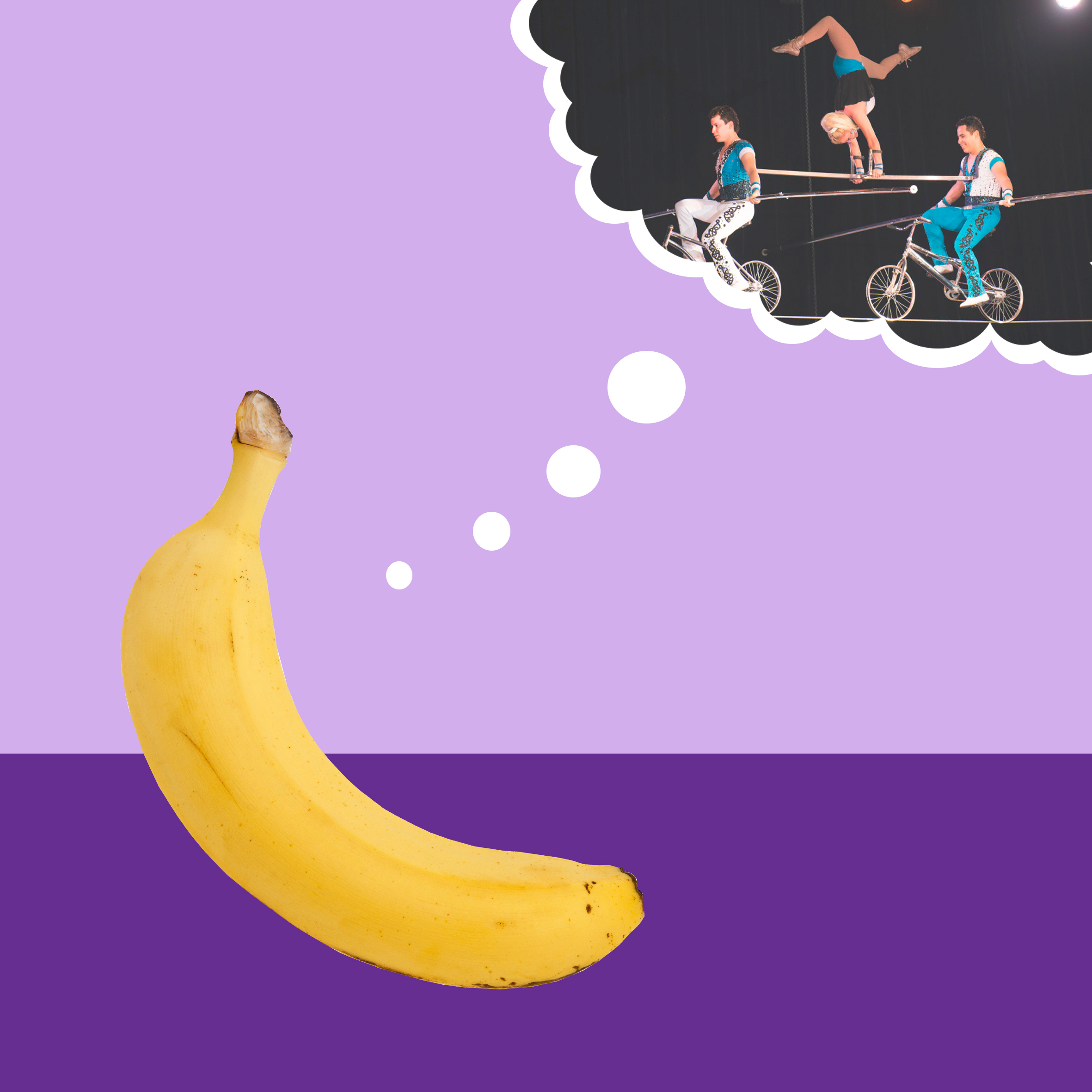
 

3. The Banana

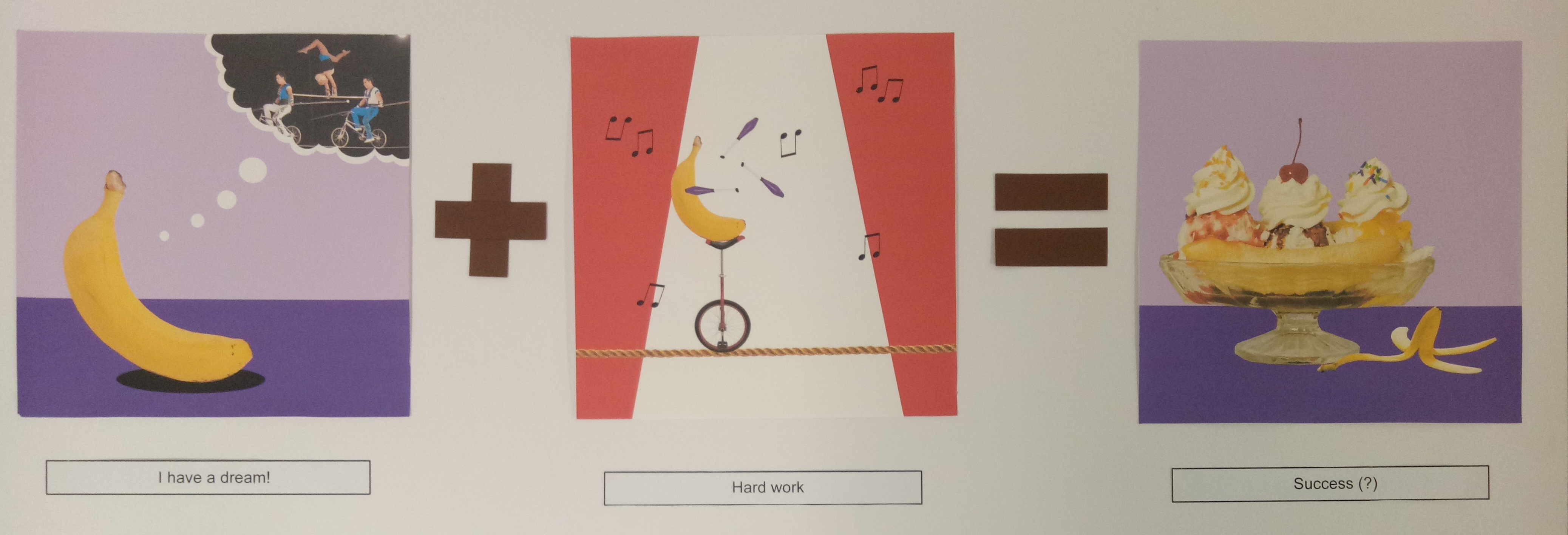
I have a dream! + Hard work = Success (?)


Banana is one of my favorite fruits. That’s why.

The story is that the banana wanted to become an acrobat. To achieve that dream, the banana worked hard to practice circus acrobat. In the end, the banana became banana split instead. (It’s a pun, because split is kind of a gymnastic movement, and gymnastic is usually related to acrobat.)

To me, it is a good representation of me when I set a goal for myself. Sometimes we dream high and work hard for it, but the end result is not exactly as we want. However that doesn’t mean you’re not successful – you still succeed, although the success might be different from your initial intention. That’s how I feel sometimes when the end result of my work is not exactly like how I want it to be, but I know I worked hard for it, and thus the journey still makes a success in the end.

I used purple background for the first and third panel to complement the yellow banana. As for the second panel, I used the red-and-white background to show that it’s a circus. I used purple juggling pins to make some sort of connection between the panels.
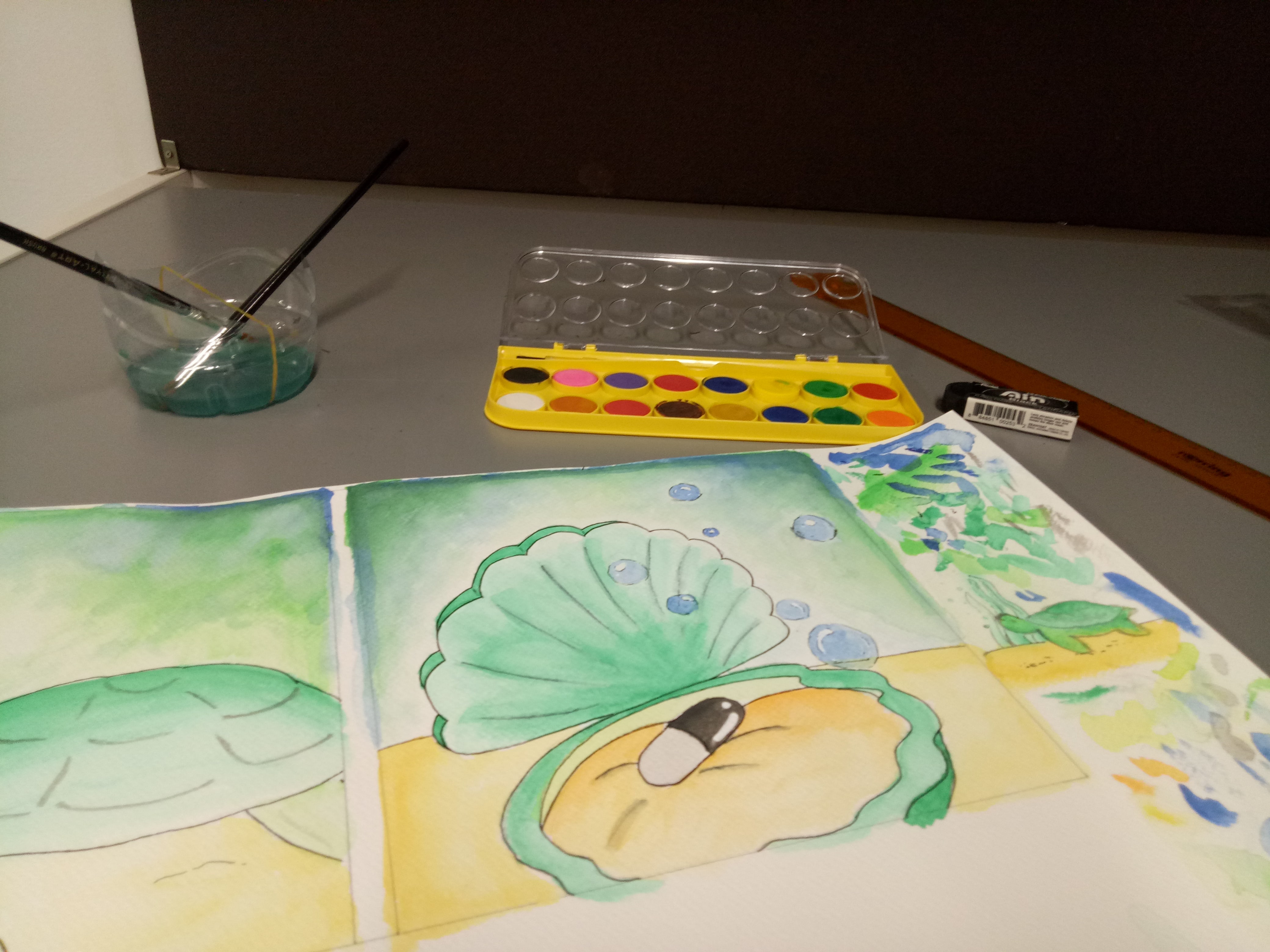
 

4. The Turtle

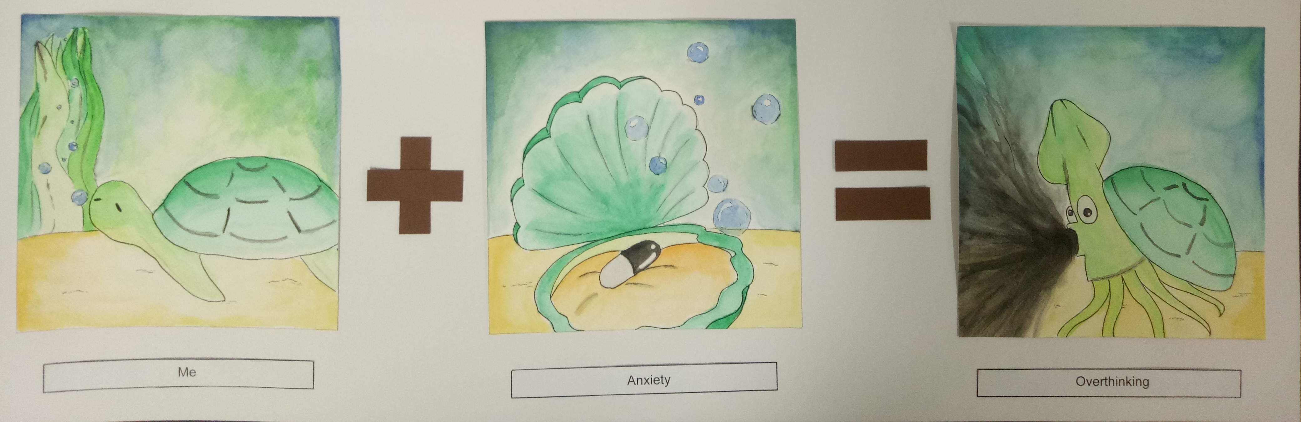
Me + Anxiety = Overthinking


Turtle, in my opinion, is a very chill animal. I like it because I’m a chill person (most of the time), so I feel that I can relate to it.

The story is that the turtle, a very chill animal, was just chilling. But then the turtle ate a mysterious black pill and turned into an ink-spewing sotong. (This story sounds more reasonable in my head, but now that I wrote it down, I understand why my friend – to whom I showed my sketches – looked extremely confused.)

The turtle represents me as a person. Usually I’m very chill and somehow normal, but when I’m anxious (I represent anxiety with the black pill), I tend to overthink trivial things until they muddle my thoughts. I represent the state of overthinking with the black ink muddling the seawater. In a sense too, the sea represents my thoughts. It’s usually very calm and clear before I start getting anxious.

I used mainly cool colors like green and blue for this one since I want to give the calm vibe to represent my thoughts. I used some yellow and orange also for the seabed and the inside of the shell as green-yellow are nice analogous pair and blue-orange are complementary.


Reflection

I had trouble deciding what style to go with, so in the end, I told myself, why not just try different styles?

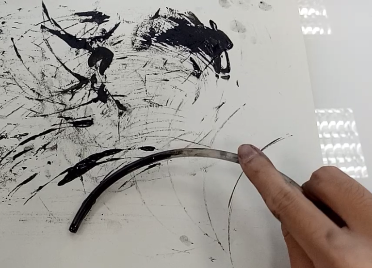
Since I didn’t really do art before studying here, I didn’t have an idea what my style would be like. I’m not even sure what technique I’m good at. So I decided that this project can be a good opportunity to explore my options more, and see what technique or style I’m more comfortable with. It’s really fun, and it’s a really good learning experience for me. I realize that working digitally ensures a “cleaner” result (and there’s undo button as well), but it requires a lot of time (or maybe just because I’m not used to it). I spent a lot of time tracing the outline of the banana split. Also, I learned some illustrator techniques, which I find to be really fun.

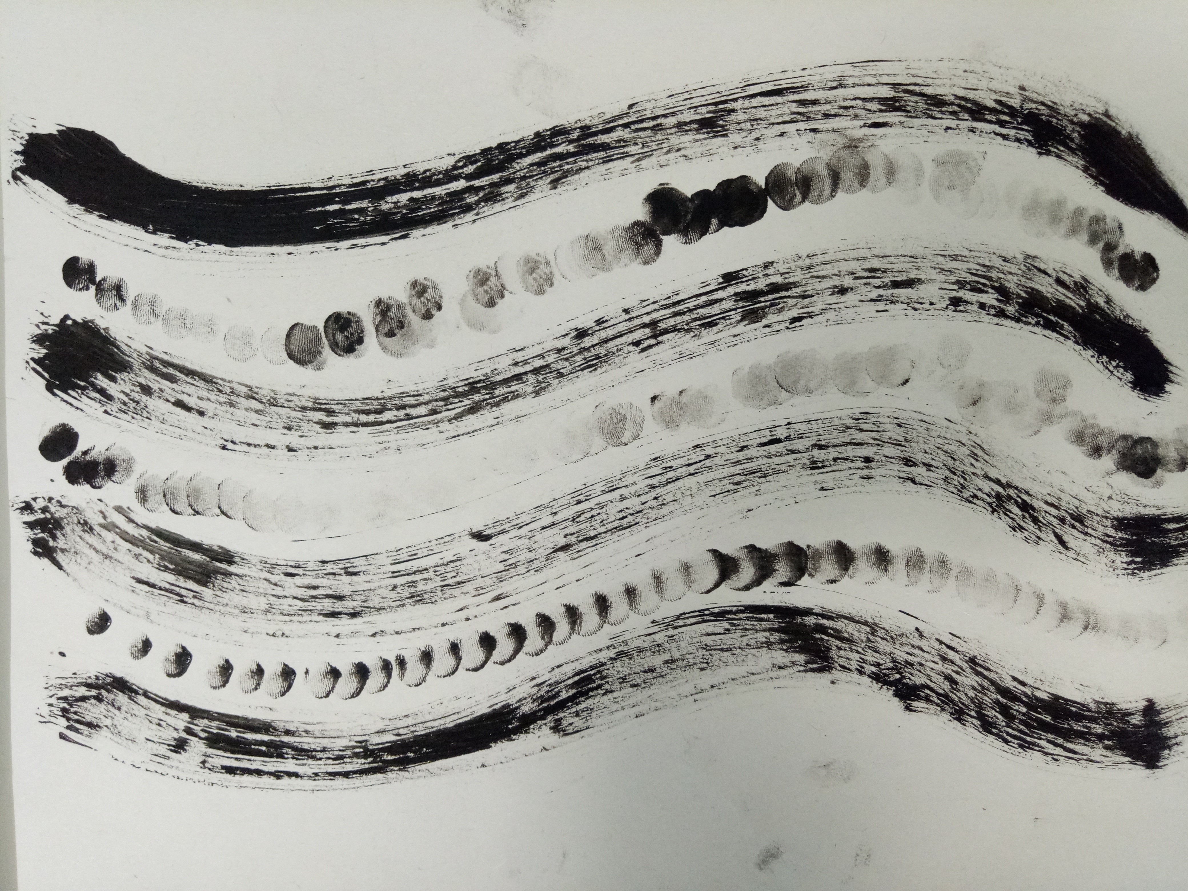
Working traditionally is faster, yet since I’m a messy person, there’s bound to be some mess. Moreover, there’s no undo button, so I have to be extra careful. I think the mouse story is really messy since the colored pencils smudged a little. As for the watercolor, I actually had a lot of fun doing it. I’ve always liked watercolor, although I’ve never really worked with them. I just tried putting layers of colors and smudging them with more water. Although they’re very messy (I didn’t expect the pen lines to smudge that much), in fact, I really like how they turn out.

Coming up with ideas isn’t the hardest part – the hardest part is realizing the ideas. I realize that it’s not enough to just have a good idea; I have to consider the feasibility and the aesthetics as well.

I also learn that doing projects is not a show of skills. I’m worried at first because I feel that I’m lacking in skills and experience, and thus my work might turn out “less” compared to other people. I’m scared that my work may be too simple, too child-like – what if I look like I don’t put in enough thought or effort into this?

But then again, why should I compare myself to other people? This is my project, and I’m proud of what I have done. Looking back, I have definitely improved – from someone who never used Photoshop to someone who can create a story using Illustrator. You see, when you’re at the bottom, there’s nowhere else to go but up.

All in all, this project has been a really fun and enlightening ride.

For this final project, I think I have a lot of difficulties trying to figure out what style I should go for. There are so many choices, but of course I have to choose rationally, considering the amount of time I have and my skills as well.

Research: Style

As for the style, at first I was thinking of doing some “watercolor”-ish style because I like soft colors and lines, but then I realized that it might be difficult (especially since I don’t really use watercolor).

Image result for watercolor styles

Something like this. [taken from https://watercolorblast.wordpress.com/styles-of-rapid-watercolor-sketch/]


So I turned to other simpler styles and from Instagram, I found some comic artists whose style I really enjoy because they’re simple, yet they can convey the intended messages effectively. Here are some of my references;


Image result for dorrismccomics

instagram.com/dorrismccomics (Artist: Alex Norris)


Image result for thesquarecomics

instagram.com/thesquarecomics (Artist: Alvin Juano)


Image result for safely endangered comic

instagram.com/safely_endangered (Artist: Chris McCoy)


In general, the three artists use thick outlines, simple art style, and bright colors. I’ll need some time, but I think I can make something with that style using Adobe Illustrator.

I’m also thinking of combining “realistic” photos and plain digital color background. That idea is inspired by movies that mix animation and real actors in one frame, like Space Jam.


Image result for space jam

A scene from the movie Space Jam (1996)


Research: Color

I found a website where they provide color palettes to download, and from there I found a lot of analogous color palettes that I think can work, like this one:

Image result for analogous color palettes

[taken from http://www.color-hex.com/color-palettes/?keyword=analogous]

But I will look at other types of color palettes as well, like the triadic color scheme, for example. I’ll see which one can bring out my ideas best.
Image result for triadic color palettes

[taken from https://shannon-brinkley.com/blogs/shannon-brinkley-studio-1/color-confidence-for-quilters-part-4-triadic-color-palettes]


Experiment

Here are my concepts.


In the end, since I couldn’t decide on one style, I ended up using four different styles.

The first one I did is just a combination of various things, such as colored pencil and copic marker.


Colored pencil, pen, and marker


I wanted it to have a cartoon-ish, childish look. I also didn’t give an outline because I think it will look less cute if I did. I used the markers only for the important figures, such as the cheese, the mouse, and the cross. For the wings, I used gold pen (which I used for the “shiny” effects as well). I used minimal coloring for the background because I feel that too much color would distract viewers from the actual point.

For the second one, I used Photoshop to merge pictures.


Photoshop trial


I showed that one to my friend and he said that my “contemporary art is on point”. I feel like the end result is interesting, although it is plainer than I expected. I chose purple background to complement the yellow banana.

The third style that I tried is watercolor.


Watercolor experiment

End results (mirrored image)


They actually turned out better than I expected. I never really tried watercolor before, so I watched a couple of YouTube videos before trying it out. It was messy and there was some smudges, but overall, I actually love the end result. I think I would do more watercolor in the future. I especially like how the background turned out. I used mainly calm colors like green and blue, which made the color black stood out even more.

Lastly, I used Illustrator.


Illustrator trial


This is my first time actually using Adobe Illustrator, so I needed a really long time just to create those three panels. I used blue elephant because blue is my favorite color, and pale blue background to emphasize the idea of “blending in”. The sofa and floor are orange and yellow to complement the blue.


All in all, I actually enjoy making all of those. Although they take a lot of time to create, I had fun experimenting with different tools and styles. I just hope they turn out well in the end.

I tried to find the keywords from the quotes and find elements to represent them.

Quote 1

“Happiness can be found even in the darkest of times, if one only remembers to turn on the light.” -Harry Potter and the Prisoner of Azkaban (2004)


Keywords:

Light, happiness = light bulb, a little girl (represents hope), intricate background

Dark times = dark surroundings


At first I wanted to use daffodils to represent happiness, because in the flower language, daffodil means happiness. However my first draft turned out awful; there are just too many things going on, but they are not interacting with each other.

In the end, things are kept simple. The light bulb acts as a source of light or “hope”. Hope is also represented by the face of a little girl. As for the part “happiness can be found”, it implies that happiness is actually there, but we just can’t see it because it’s obscured by the darkness. Hence happiness can be represented by the intricate background that is slowly revealed by the light. In further distance, it looks all black and dark due to the absence of light.

I put the light bulb off the center so it won’t be symmetrical. Also, the face of the girl inside the light bulb is facing to the right side, to lead our eyes into the dark void all around the canvas.


Final


Quote 2

“A paper girl for a paper town.” -Paper Towns (2015)


Keywords:

Paper = fake, mask, mirror


I used a lot of masks to represent a lot of “fake” people, which represent a “paper town”. As for the girl, I used a broken mirror as a face. It represents the idea of fakeness as a broken mirror can’t show exactly what’s reflected there.

At first I wanted to use the mirror as a background and use human figures looming at the girl to show a “paper town” but it didn’t turn out very nicely. Actually I even wanted to use the figure of Cara Delevigne (the main actress in the movie Paper Towns) as the girl but I couldn’t find a perfect picture of her. To save time tracing path, I purposely searched for pictures of girls with straight hair.

The whole canvas actually looked pretty symmetrical if not for the broken mirror. At first I considered adding something else, but I liked the idea of using the broken mirror to “break” the symmetry. I also didn’t want to make the canvas more jam-packed since there were a lot of masks as the background.

The symmetry also represented uniformity, which can be caused by herd mentality. Usually people tend to follow popular beliefs although that go against their own convictions. For me, that is the idea of “fakeness”.


Final


Quote 3

“Even miracles take a little time.” -Cinderella (1950)


Keywords:

Miracle = butterfly

Time = hourglass, clocks


I represented miracles with a butterfly, since just like Cinderella who turned from rags to riches, beautiful butterflies were once ugly caterpillars too. The change or the rebirth is representative of the “miracle”.

As for the time, I used two things; hourglass and clocks. Hourglass indicates more about a time that is running out. In a way, it is implying that in the end, if you wait long enough, something (in this case, a miracle) will happen.

The clocks leading to the butterfly were supposed to represent time passing and to lead us to the result of a miracle, which is the butterfly.

I wanted to put magical elements in it at first such as a magical wand or glittery effect, but it looked very childish, so I scrapped it off.

To make the picture looks more dynamic, I tilted the hourglass and put it slightly off the canvas. The clocks were also placed in a curve and were getting smaller to lead our eyes to the butterfly.


Final


Quote 4

“It’s not like there isn’t air inside.” -Narnia: The Lion, The Witch and the Wardrobe (2005)


Keywords:

Inside = a confined space

Air = atmosphere, wind, sky


I used a jar to represent “inside”. I made it look transparent to make it the overall look more cohesive. Moreover, the transparency also suggests that there is actually a very thin line between “inside” and “outside” – it’s only the confines of walls. To emphasize the idea of “inside”, which is contrasting with “outside”, I put a scenery as a background.

The jar is slightly open and clouds are coming out from it. For me, the quote is saying that things that usually can be found outside can be found inside as well. Talking about air, I connect it with the sky, and hence the clouds.

Actually I did a pretty positive interpretation of this quote although it was meant to be mocking. Edmund, the character who said that quote, was arguing with his siblings. They told him to go play outside with them to get some air and he countered with that quote sarcastically.

I made the jar disproportionately bigger to make the comparison between the inside and the outside easier. I also put more things at the lower half (the jar and the scenery) to balance out the void at the top. I filled around two-thirds of the top part with clouds, leaving a completely empty void above the jar area, which should be roughly one-ninth of the canvas.


Final


Reflection

Somehow my gifs are not moving and I don’t know why.

I have no experience using Photoshop before, so it was a challenge (especially the tracing part – I am not patient enough sometimes). Moreover I had troubles interpreting the quotes and turning them into a cohesive picture. My interpretations are bits and pieces that did not speak to each other at all, resulting in a very disconnected picture. I have to admit, I really have a lot of problems with this project.

Even with these finalized pictures, although I am happy with them, I realize they’re far from perfect.

I hope I can use this as a stepping stone and for me to learn so I don’t repeat the same mistakes again.

HOPE


Hope (noun): a feeling of expectation and desire for a particular thing to happen.


Materials: ink on paper, powder


For me, hope is more like a glimpse of light in the darkness. It is telling you to not give in to your troubles, to the darkness inside you. From that, I had the idea to make the paper pitch black and add a strike of white.

At first I tried white paint mixed with water, but since there was too much water, it didn’t work out very well. It puddled instead. Then I tried using powder, which was quite difficult since it wouldn’t stick as I wanted to to the paper, but it turned out quite well in the end. I wished the corner could be brighter, though. I tried to add more powder, but they wouldn’t stick; and I didn’t want to use other materials like paint or correction fluid because I didn’t want to make it seem as if there were different “ideas” for hope. I tried putting some correction fluid on paper and spraying powder around it, and they looked like two separate entities.

I chose to position the white part at the bottom corner since I was inspired by the Greek mythology, Pandora’s box. In the myth, when the box (actually it was a jar called pithos and not literally a box) was opened, evils came out, and hope remained inside. My idea is that hope was “left” at the bottom of the box inside the darkness, all alone, yet still glimmering.


LONGING


Longing (noun): a yearning desire.


Materials: tissue paper, glue


I had a difficult time trying to portray longing. For me, longing is the feeling of wanting something and reaching out to it. After researching more, I found out that unlike desire, when someone longs for something, he or she doesn’t necessarily do anything actively to achieve their wants.

Another difference is that longing might be a want for something that cannot be achieved. Going by the second definition, I put nothing at the end of the “tentacles” reaching out, because people might long for something that might not even exist in the first place, or something they already have.

I chose tissue paper due to its transparency. By putting it against gray paper, the tissue can be barely seen. The same thing goes for longing; not everyone knows what other people are longing for, or even what they themselves are longing for. I actually tried using transparent keyboard protector, but after I cut them into pieces, their shapes looked very controlled and that wasn’t what I was going for, so I just discarded the idea.


FRUSTRATION


Frustration (noun): the feeling of being upset or annoyed as a result of being unable to change or achieve something.


Materials: pencil lead, glue


I chose to make up-and-down, zig-zag lines to represent frustration. In my opinion, frustration is when you are trying hard to find a solution to a problem that bothers you, and trying to stay calm at the same time; hence the line looks calm and normal at first. However the lines gradually get messier since you keep trying to stay calm but you can’t. In the end, when you can’t hold back anymore, all the lines just meshed up, disturbing your thoughts.

At the end part, the change from three lines to one huge line might seem very rushed; but I want to show the “snap”, the sudden trigger that makes someone lost calmness all at once.

At first I tried making this using ink and plastic knife, and it actually turned out very well. However I wanted to experiment with materials, and I felt that pencil lead was a good choice since it was easy to break and could form lines. They weren’t easy to manipulate as the glue kept sticking to my fingers, so I spent quite some time on it, but I’m pretty satisfied with how it turned out – although I feel like I could still improve it.


SURPRISE


Surprise (noun): an unexpected or astonishing event, fact, etc.


Materials: ink on paper, straw


Surprise wasn’t easy for me to portray either. For me, surprise is when something doesn’t go according to your plan or against your expectations.

I was just trying out things for fun when I made this; I mixed ink with some water, sucked them using a straw, and dropped the mixture from a height. They created a nice splatter effect, and I liked it, although they weren’t so special. When I was about to carry it back to the table (I did it on the floor to reach greater heights) (it wasn’t intended to be a pun), I tilted it and hence, they flowed sideways.

After that, I actually made another one where the spillage flowed downwards, but the splatter effect wasn’t as nice, and I felt that the first one was more “surprising”, simply because it is unexpected for the ink to spill sideways – against the gravity.

I wanted to make the paper all black and create a white splatter in the middle at first. However, I thought that would be very similar to my “Hope” piece, so I dropped the idea.


ANXIETY


Anxiety (noun): a feeling of worry, nervousness, or unease about something with an uncertain outcome.


Materials: ink on paper, water bottle cap


I am a very anxious person, so anxiety is actually one of the easiest emotions for me to portray. Anxiety, to me, is the presence of “but”s in your mind. It is when you overthink a problem so much that a simple 1+1 question can lead you to think of quadratic formula, driving you away from the answer.

At first I tried using the other type of bottle cap (the one with teeth), but they didn’t come out nicely. So I used the water bottle cap and it actually gave me the anxiety idea. I dipped the side part of the cap in ink and rolled it with the help of my hand. It is interesting to see how the lines don’t go straight although they can reach the end of the paper quickly if they just go straight. Moreover, the ideas of the lines intercepting each other also represent how overthinking a problem leads to another.

The circles were actually an accident; the bottle cap stumbled sideways as I rolled them. At first I was anxious about it (yes, I said anxious on purpose) but then I decided to let it be, because the circles represent distractions well. When you worry about something, you got distracted from the original problem; you don’t know what started your racing thoughts anymore. You just know that you are worried, and that now you’re worried about something you’re not even thinking about in the first place.

After my first time making “Anxiety”, I actually considered making it more 3D by using other materials; but then I thought that the “flatness” of the piece could represent “inactivity”. When you spend too much time worrying, you spend less time working on the problem.


ISOLATION


Isolation (noun): the process or fact of isolating or being isolated.


Materials: pepper, glue


The idea for this actually came from a song – Starlight by Muse. It’s one of my favorite songs.

This is the idea that I worked the longest with. At first, I just made a black circle in the middle of nothing, but I didn’t like how it turned out. So I tried making some black circles on paper, but they didn’t capture the idea very well also since it cannot be seen whether the circles are touching or not.

For me, isolation is a situation when someone is completely alone. It’s not exactly a feeling of loneliness because when you’re lonely, you’re reaching out for other people; but when you’re isolated, you’re just alone. It’s more like an observation.

Since I related this more to human interaction, I wanted to use something like grains or seeds to represent humans, and separated one grain or seed from the others. Since I didn’t want to buy anything (I was scared I would waste them since I don’t cook in hall anyway), I took packets of pepper from… McDonalds. I took a few handfuls of them and went home as if nothing happened.

The pepper stuck pretty well to the paper, although if you touch it, some will definitely come off. However if you shake it, little to no grains will come off, so it was enough. I thought it would be hard separating a grain of pepper and making it obvious enough to see, but it was not as difficult. In order to emphasize the “isolation” of the grain, I made a larger empty space around it.


I learned a lot of things from this project; that research is always a good idea, that expressing emotions is difficult, and that different people can portray the same emotion differently. Above all, I had a lot of fun.

We did some mark-making experiment in class this week, and it was fun!

I didn’t bring a lot of tools, actually. Here are the things I brought: a fake rose, a paperweight, a brush marker, some bottle caps, and a used, bent glow stick.

The texture came out very faintly.


First, I tried using my bottle cap. I didn’t think it worked out very well; since there is a slight difference in height, the sharp texture didn’t come out as much as I expected.


After that, I switched to the other type of bottle cap. I like how this one turned out.

I rolled it on the paper.

Result (with my fingerprints)


I also tried using my fake rose, although I was hesitant at first. I thought it wouldn’t make an interesting texture, but it turned out quite well.

I rolled the petals on the paper in a circular motion.

Result


So was the experiment with the glow stick.

I rolled it around on paper, and use my hand as a pivot before dabbing them on the paper in a circular motion.

Result

I also tried using the end of the glow stick, dabbing it on paper.


I decided not to use my paperweight and brush marker, partially because I didn’t want to get them dirty. For the brush marker, I intended to make small circular shapes, but I used the end of the glow stick and it worked okay, so I didn’t need the brush marker. As for the paperweight, I thought it wouldn’t work very well because the bottom part was slightly convex; I guessed it would turned out like the first bottle cap.

After that, I turned to my friends to borrow their tools. One of the items that I got was a dry leaf. At first I tried pressing it on the paper, hoping for the texture of the leaf to be printed, but it didn’t. So in the end I dragged the leaf instead.

Result


I also got a cotton ball. I dabbed it on the paper.

Result


The last tool that I got to borrow was a plastic knife. I used both the sharp edge and the flat side to give different ink thickness.

Result


Besides those, I also used the tools available in the studio, such as brush and roller.

Result (with roller)


I used brush for the flowy parts and my fingers for the circles.


I used my fingers to put fingerprints on the paper before by dabbing them, and I tried dragging my fingers as well. It created an interesting result.

For the next class, I hope I can experiment using more tools. I’m thinking of using candies, stapler bullets, and coins. Let’s see if I can make something even more interesting.

“It is all a game of construction – some with a brush, some with a shovel, some choose a pen.”

-Jackson Pollock


This is one of Pollock’s artwork, “Ocean Greyness”. [Taken from https://www.guggenheim.org/artwork/artist/jackson-pollock]

I have no idea what mark-making is at first, so I did a little bit of research. I found out the usual stuffs – the explanation of what mark-making really is, its history, and the artists who often apply mark-making techniques in their artworks. (I like Jackson Pollock’s works.) However, I also read something that I found interesting, which is what makes a mark-making “good”.

So what constitutes the facility for ‘good’ mark-making by being aware of marks that:

  1. Are appropriate to our intentions – right for the job.
  2. Are ‘alive’ and embody and express the ‘life-energy’ of their maker, the artist.
  3. Help to communicate and express qualities of light and its invisible energy, and the material substance, form, volume, and surface of the objects we are drawing.
  4. Present the eye with changes of pace and rhythm that collectively offer variety and interest. [The rich and varied texture of nature and the world around us is our guide].
  5. Express and stretch the properties of the medium that the drawing is made from.

[Quoted from http://www.utdallas.edu/~melacy/pages/Drawing/AS01_MarkMaking_DrawingProjects/MarkMaking.html with changes]


This is what I planned to bring at first.

After reading that, I feel like I should try to explore more ideas, so as to find one that I feel is more “alive” to me and to provide more variety – not only to make it more interesting for the audience, but also for me to better express my ideas. In my previous post I mentioned using bottle caps, but I would probably bring other things (like my brush pen or my paperweight?). My idea is to bring things that can be found in my room, because that’s simple and easy, yet the results may be surprisingly good. (I hope.)


I think maybe other types of bottle caps might be a good idea.


And this is my paperweight.


After all, there shouldn’t be right or wrong; people have different ideas and choose to use different tools. It is just about who is able to present their ideas more effectively, more attractively, and more expressively.

All in all, I’ll have fun learning and experimenting. I’m looking forward to tomorrow (I mean today).

So we are supposed to bring things for mark-making. I actually have no idea what I want to bring, so I just think of things I have on my table… and I find a lot of things, because my table is a complete mess. One of them is a bottle cap. Don’t ask why.

http://www.bottlecapco.com/Lime-Green-Bottle-Caps-Standard_p_19.html