After we tackled rectilinear shapes, now we’re moving to curvilinear stuffs like cones, cylinders, and spheres. Cutting foams into those shapes isn’t easy at first (and it still isn’t until now, actually) but it gets better with practice.
Here are some of the models I created. Pardon the masking tapes, since all of them unexpectedly crumbled down after I brought them to class, probably due to me swinging the plastic bag they were in.
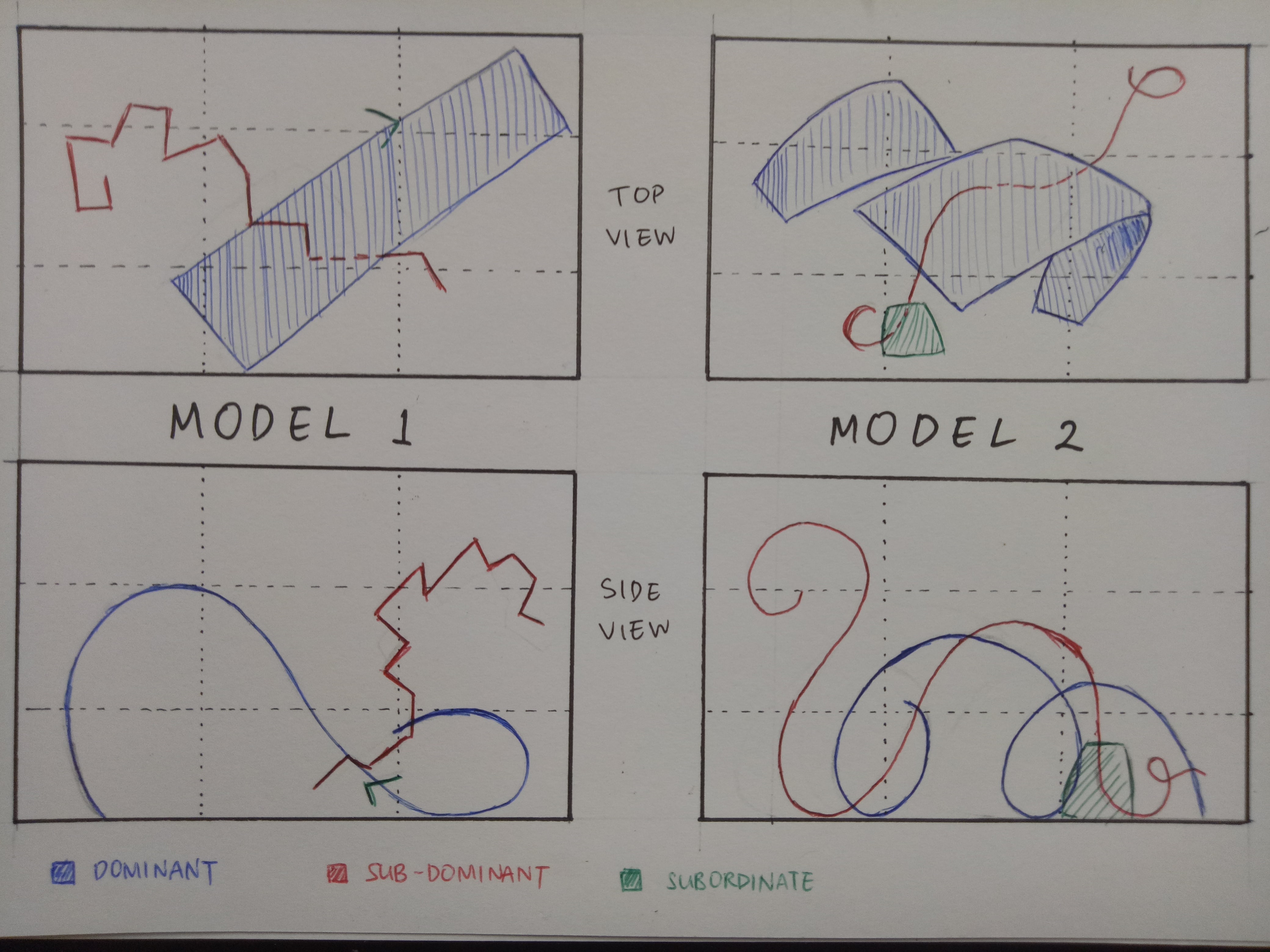
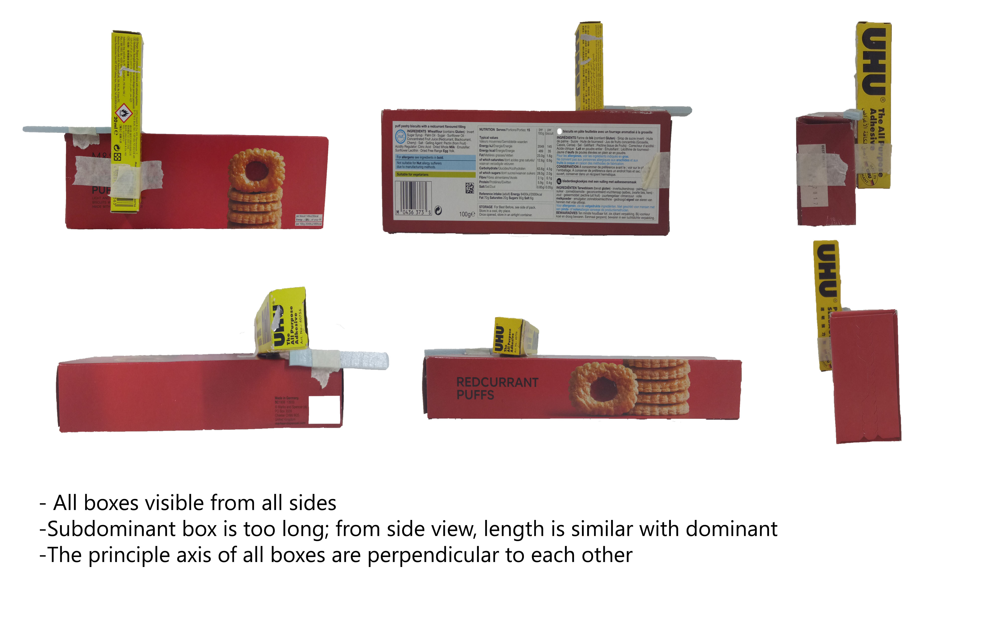
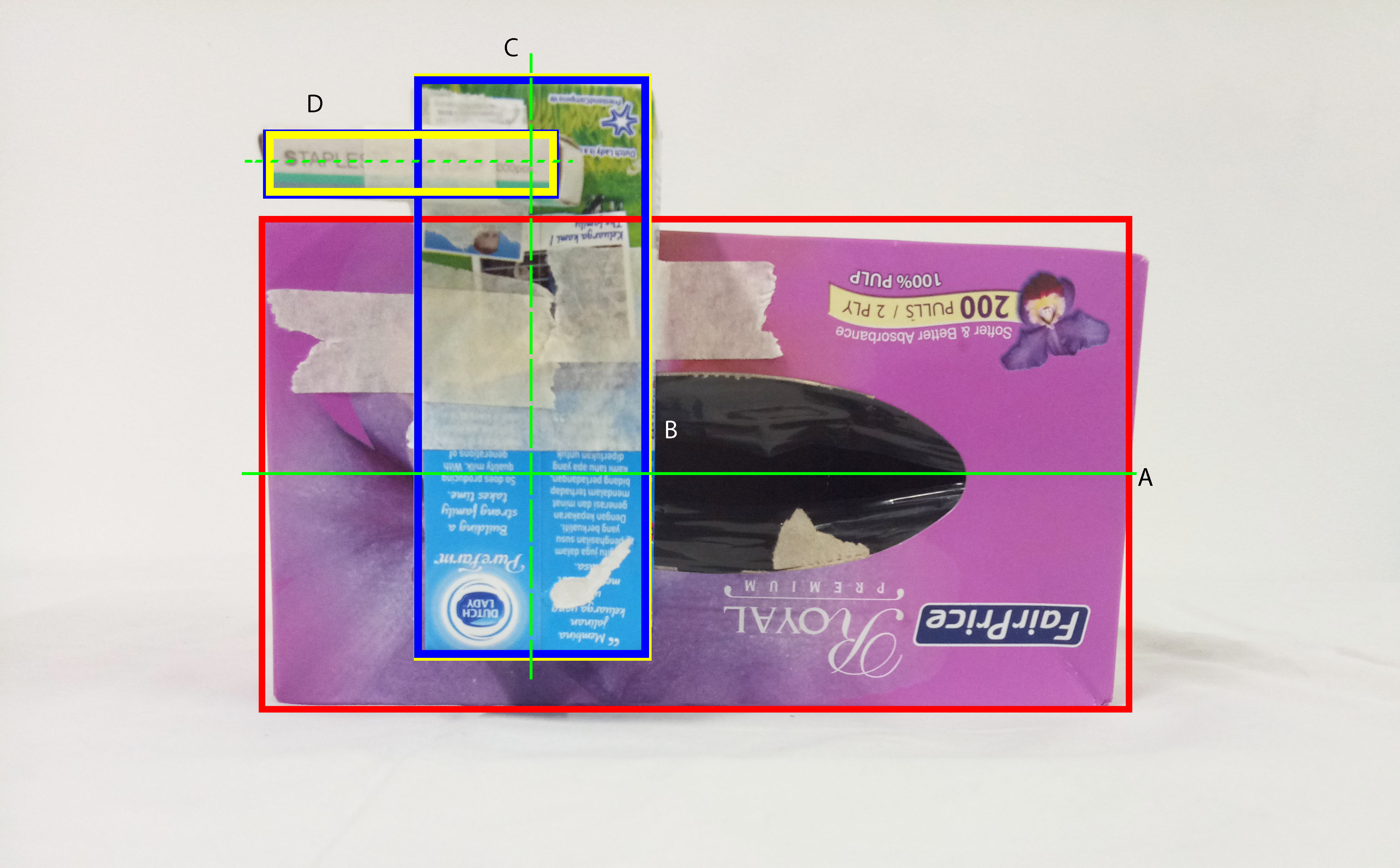
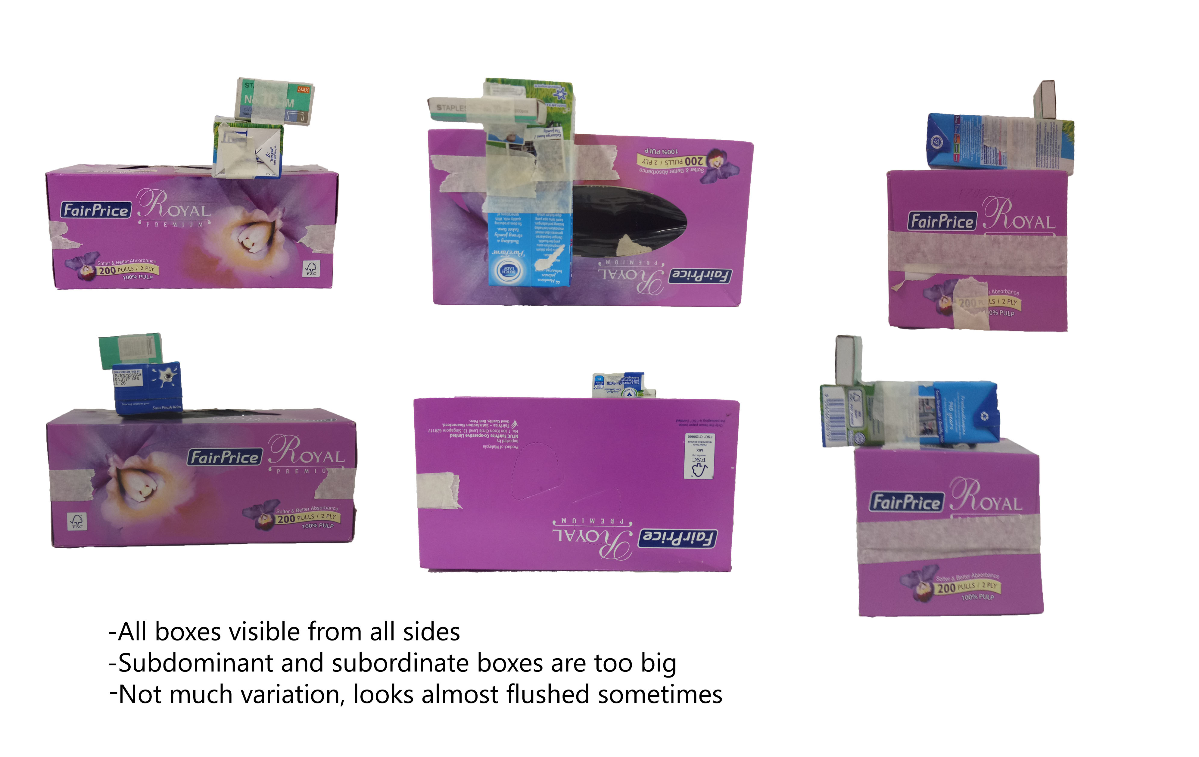
[Red – dominant, yellow – subdominant, blue – subordinate, green – correction]
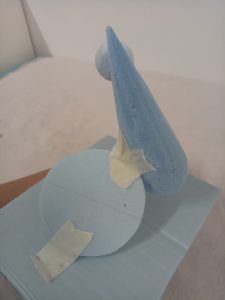
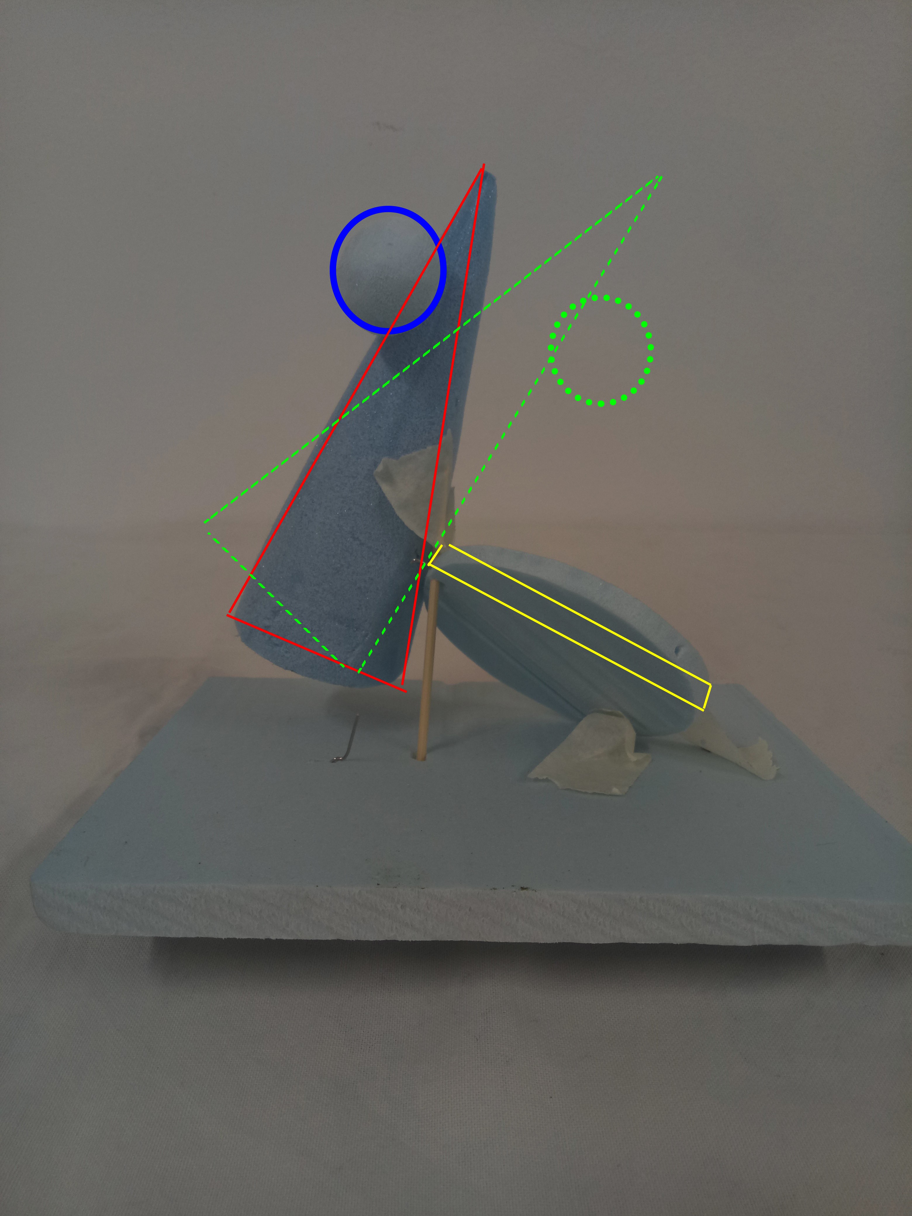
Model 1
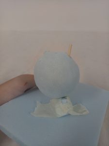
 This model doesn’t actually have a story, I just tried putting things together. I like the proportion, since the roles are very clearly defined, although I could work with the presentation. I used a lot of masking tape since the tip of the cone came off unexpectedly.
The cylinder looks almost perpendicular to the base, and it couldn’t be seen from some angles due to the sphere as well. So the cylinder probably needs to be moved up and angled more to make the overall look more dynamic.
The apex of the cone also looks hidden by the sphere which is not good, since the apex is supposed to be the cone’s main appeal. The cone may need to be angled more so less of the apex is “hidden” by the sphere. As for now, the balance looks precarious, but maybe independent angle will work better.
Model 2
 The idea for this model is “f
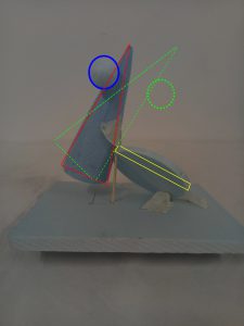 alling”. I wanted to make the whole thing looked like the sphere is going to fall and the cone is trying to catch it, and the cone now is going to fall too, so the cylinder is trying to catch it. The angle of the cylinder is independent, and the cone is just slightly floating.
As for the sizes, the sphere could be smaller. The cone could be longer and bigger to give it more weight. The cylinder could have a slightly smaller diameter, and maybe be thinner.
In order to incorporate more of the “falling” idea, the cone should be put at a more “dangerous” angle.
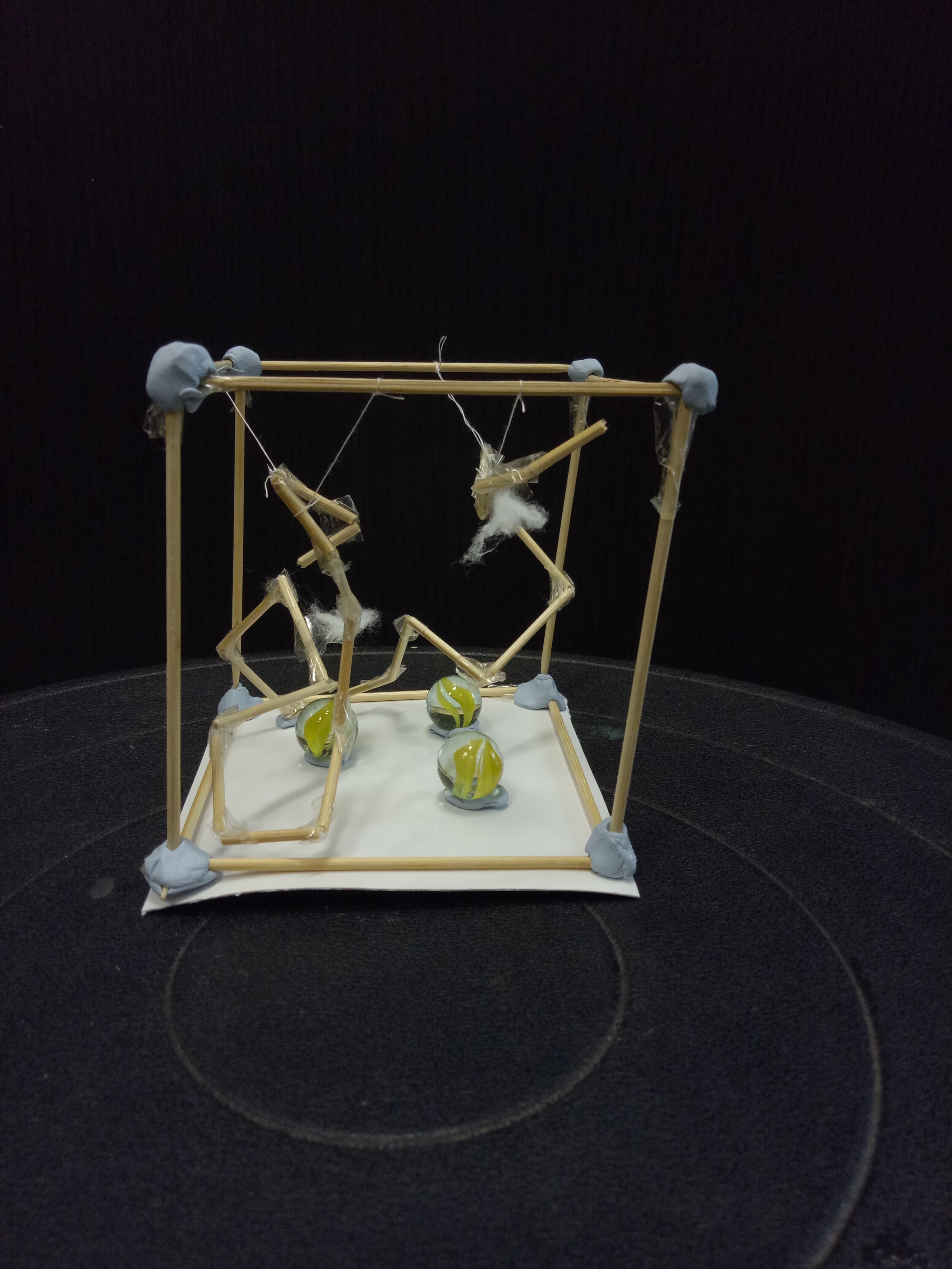
Model 3
 For this one
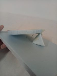 , the most important point is the cradled sphere. It looks somewhat like a child being “protected” and “cradled” (of course) by the “parents”, or the obviously bigger cylinder and cone in this situation. Moreover, the cone and cylinder are dependent while the sphere is nicely cradled in the middle, which emphasizes the idea of the two “parents” working together for the sake of the “child”.
Of course, the sphere needs to be slightly bigger because now it couldn’t be seen properly from some angles. But other than that, I feel that the proportions are quite okay. I just need to make sure that the cone and the cylinder don’t look like they’re perpendicular to each other.
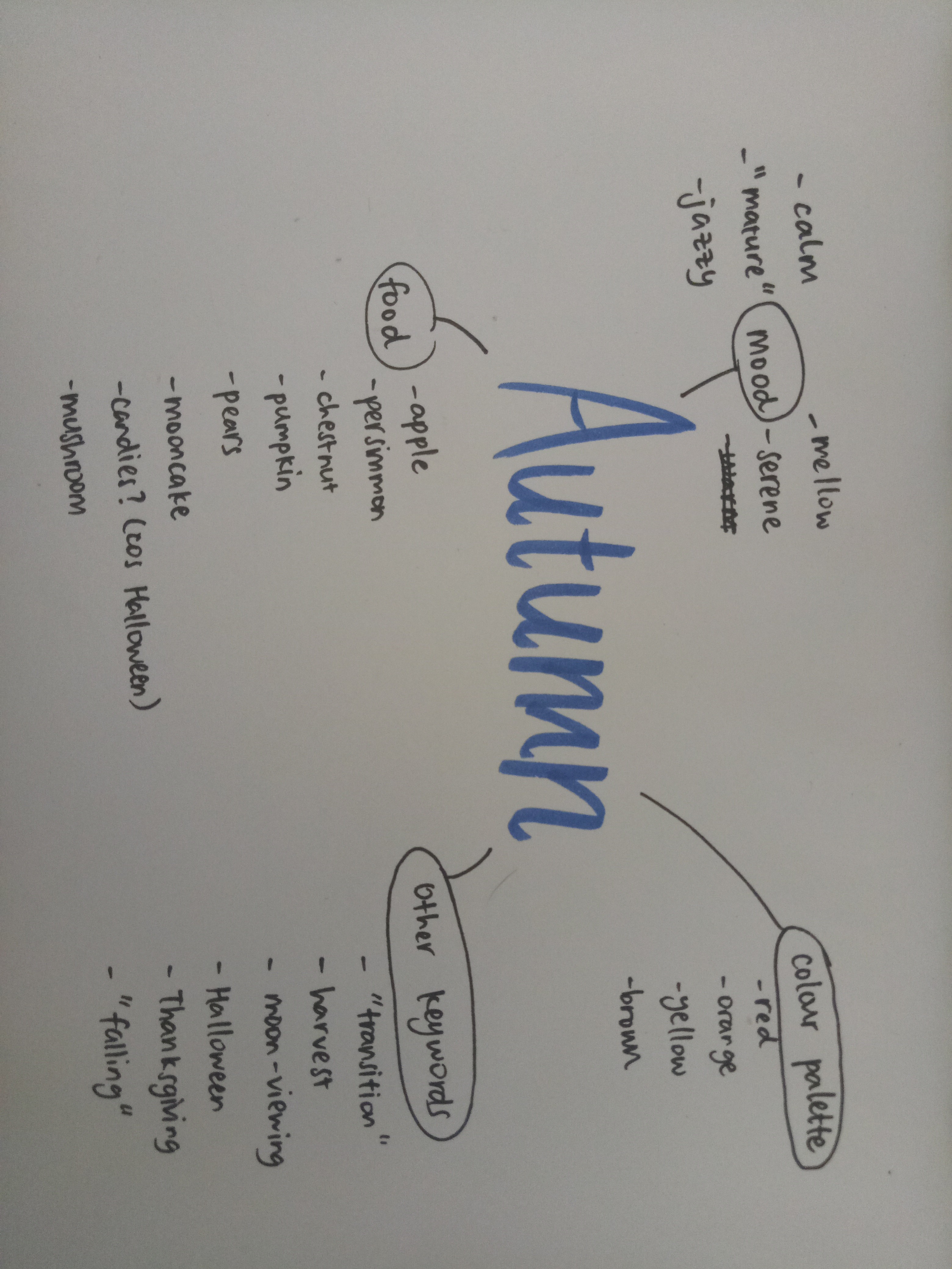
Autumn
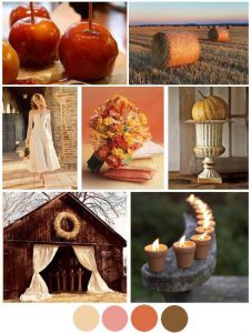
https://www.pinterest.com/pin/29343835041617544/
As for my final model, I based it off model 3. My word is “autumn” (which is what I wanted!) and I have done some research about that. Autumn is usually associated with maturity, and to me, autumn can also represent transition as it is somehow the transition season between the bright summer to cool winter.
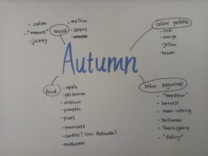
Rough mindmap
At first I was thinking of using model 2 due to the idea of falling (and autumn = falling leaves, right?), but model 3 has a more interesting look and the story can somehow fit as well. Since model 3 has the idea of a “child being cradled“, I think we can relate that to “transition to maturity“. A child that needs to be taken care of at first before it can transition to maturity, to become like the parents.
Autumn can also represent “serenity” and “calmness“, and I think that can add to the story. The fact that the child/sphere is still being cradled despite the idea of wanting to mature shows that the parents/cone and sphere are not in a rush to push the child/sphere to mature.
As for the food, I haven’t thought of any yet. I did gather ideas about autumnal foods (such as persimmon, chestnut, apple, pear, mushroom, and pumpkin) but I still have no idea how I want to incorporate them into my model. I was thinking of using sturdy foods as the “parents” and soft one for the “child”.
In addition, as for the branch, since there is a void behind the sphere, maybe the branch should be behind and piercing through the cylinder, pointing fairly low. It can incorporate the idea of falling and strengthen the hold of the cylinder to the model, symbolizing the sturdiness of the cylinder. (I think the cylinder can be the dad, since it’s the dominant shape and looks sturdier, so the cone can be the mom.)
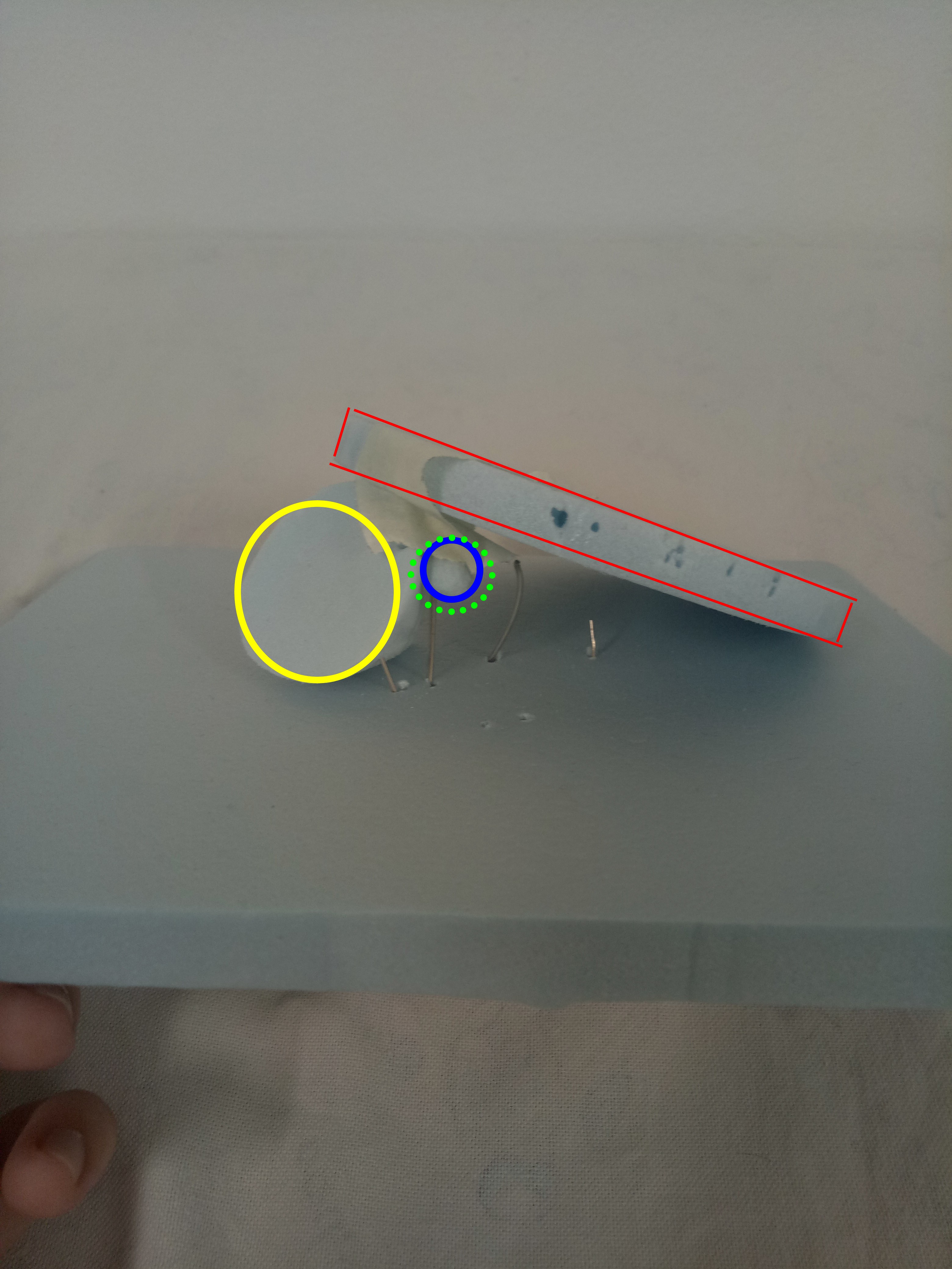
Final Model (Fail)
For me, this task is really challenging.
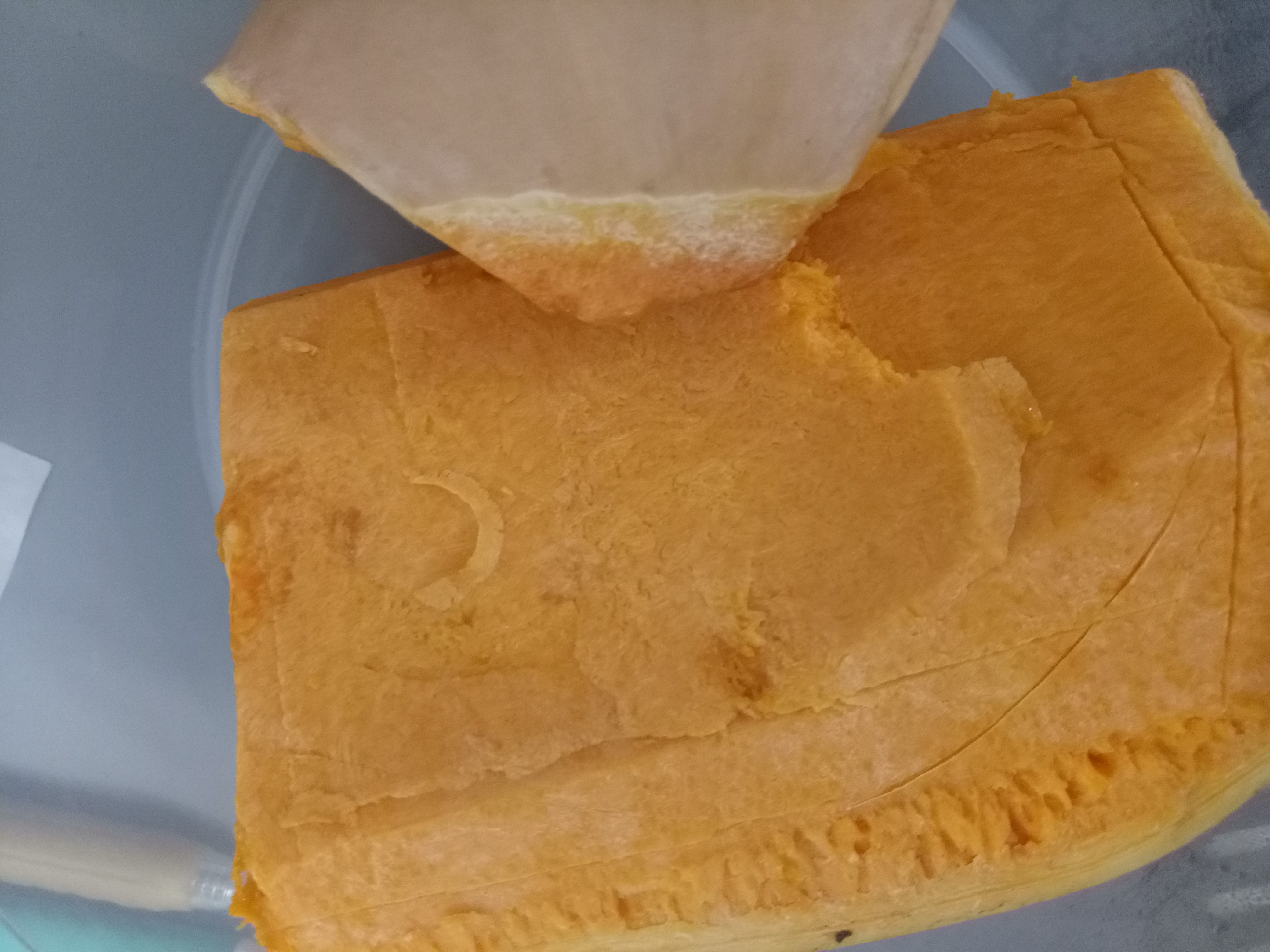
At first I had the idea of using pumpkin as the cylinder. That sounded good to me since pumpkin is sturdy, and it would represent my idea well. Besides, pumpkin has a vibrant orange color and is one of the most popular autumn fruit (because of Halloween).
Pumpkin (before cut). I marked the outline and I still messed up.
However, the pumpkin turned out to be harder than I expected. I cut myself by accident while cutting it. After I did cut it, I kept on making mistakes, so I kept trying to cut a little bit more to save the shape. In the end, it turned out to be really, really small that it might as well be the subdominant. Because of this unpredictability, I didn’t manage to complete my project in time. I was so disappointed.
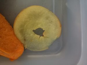
It’s too flabby to be dependent.
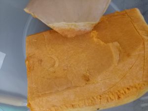
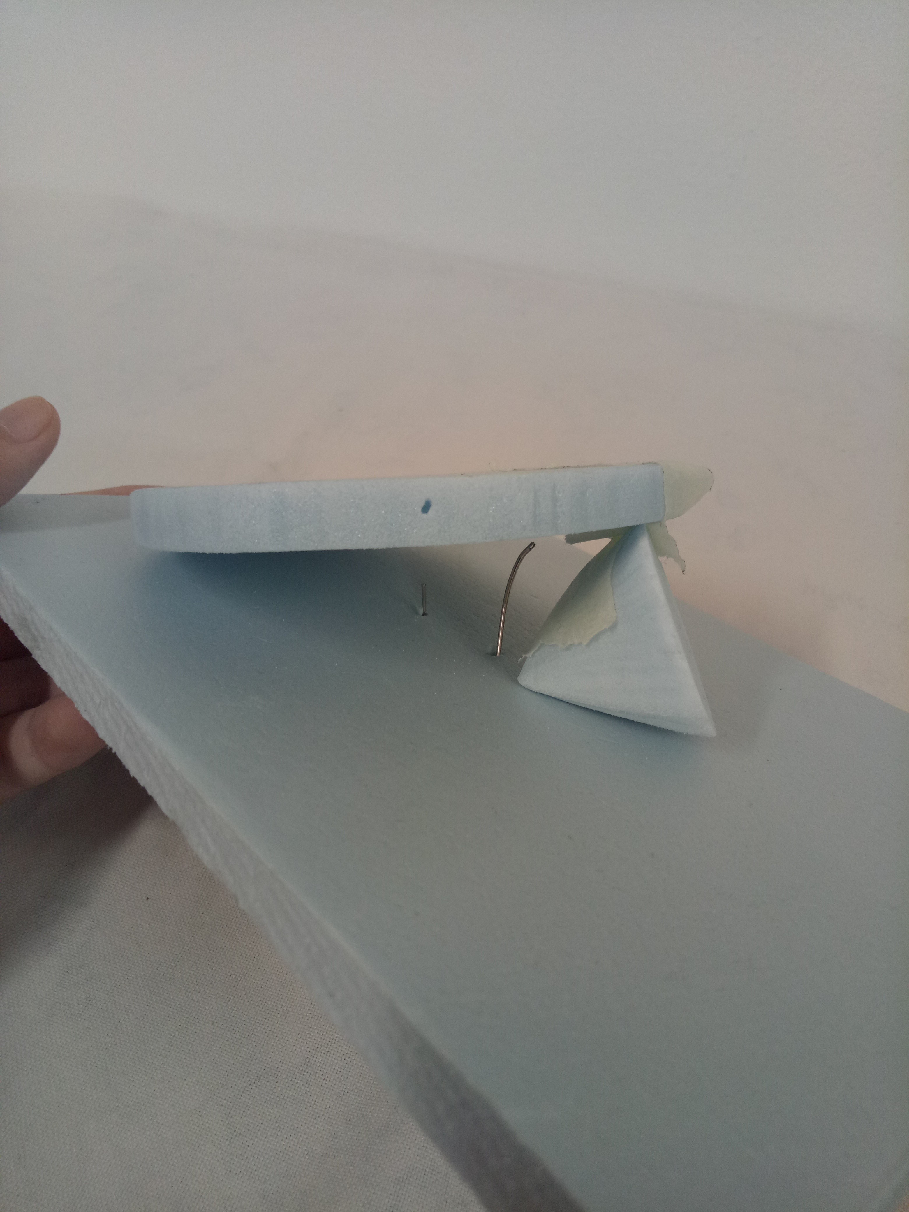
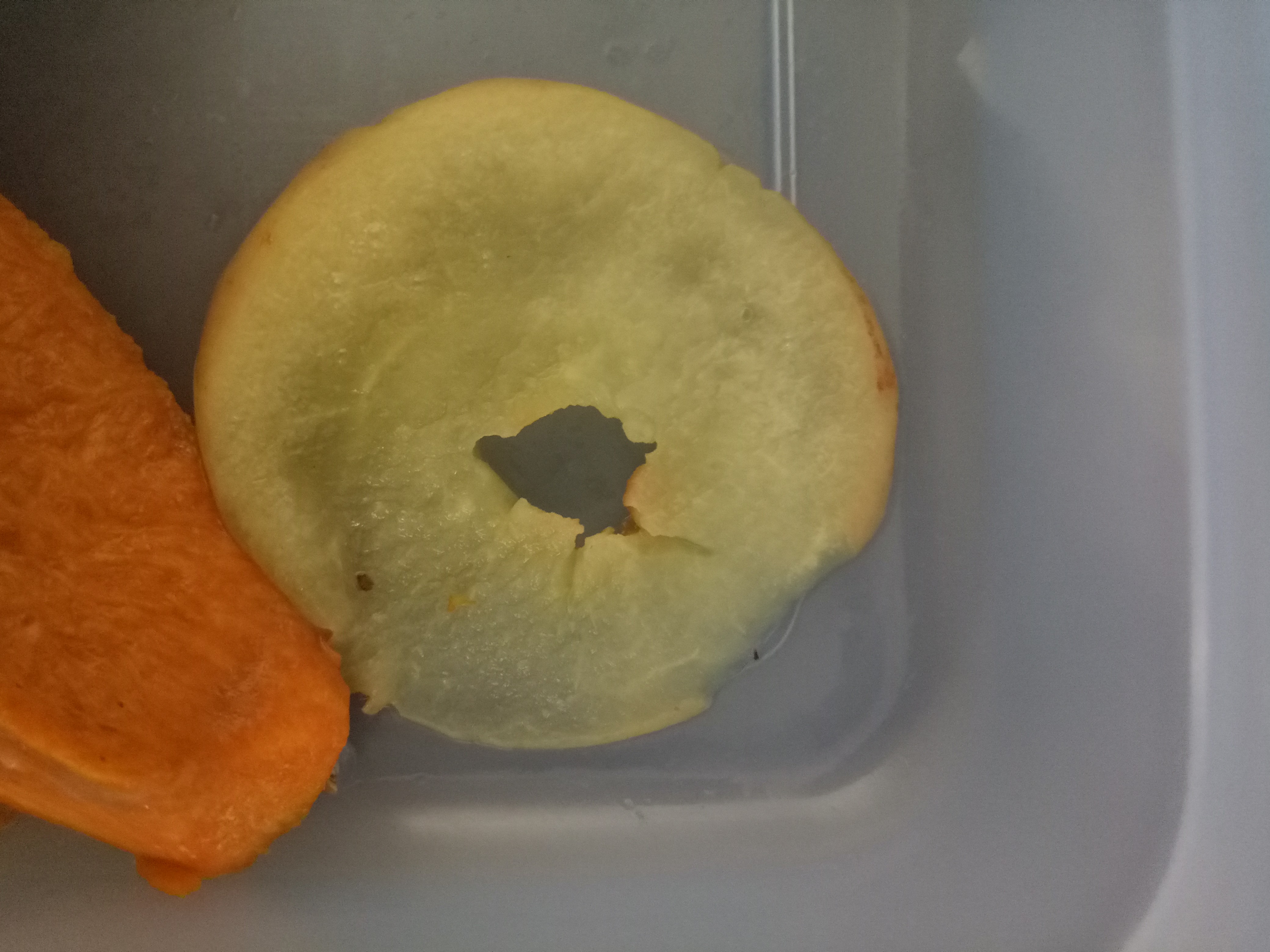
Moreover, I planned to use apple crisps as the cone. I wanted to put them into a bowl and microwave them, but again, it didn’t turn out as expected. I guess I should’ve used an oven. The heat from the microwave wasn’t enough, so the apples just turned to be really flabby instead.
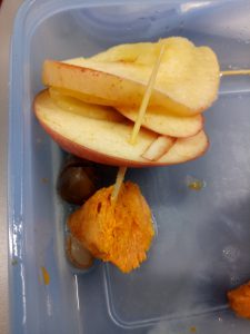
Flabby apple and pumpkin (after cut). Sigh.
I tried it again, but there wasn’t enough ingredients, time, nor patience. Hence I decided to just scrap the whole thing and come up with a new idea.
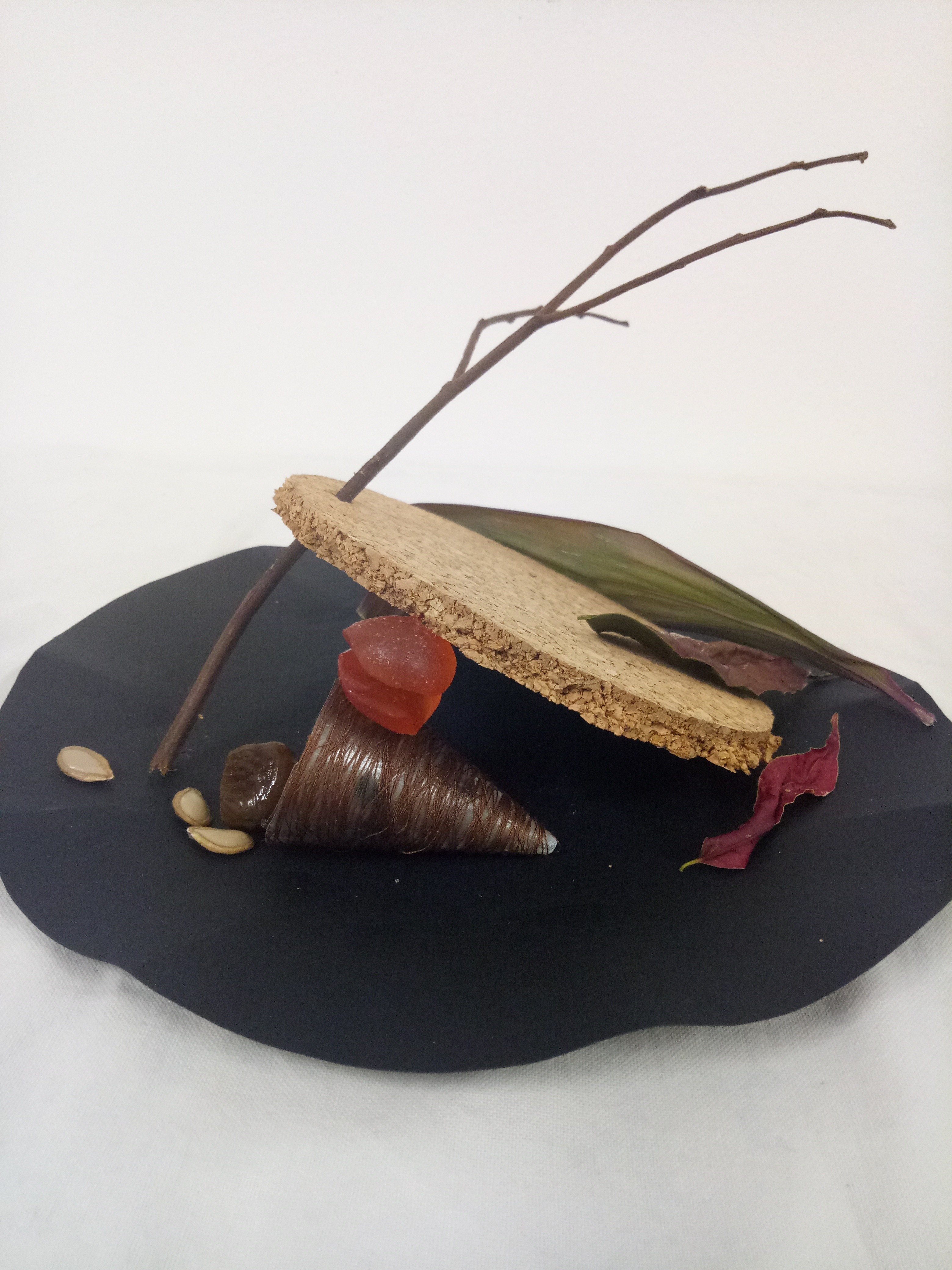
Final Model (Final)

This time, instead of focusing on the food, I changed my perspective and focused on the other aspects of autumn and on my original story idea (the family thing).
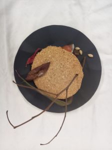
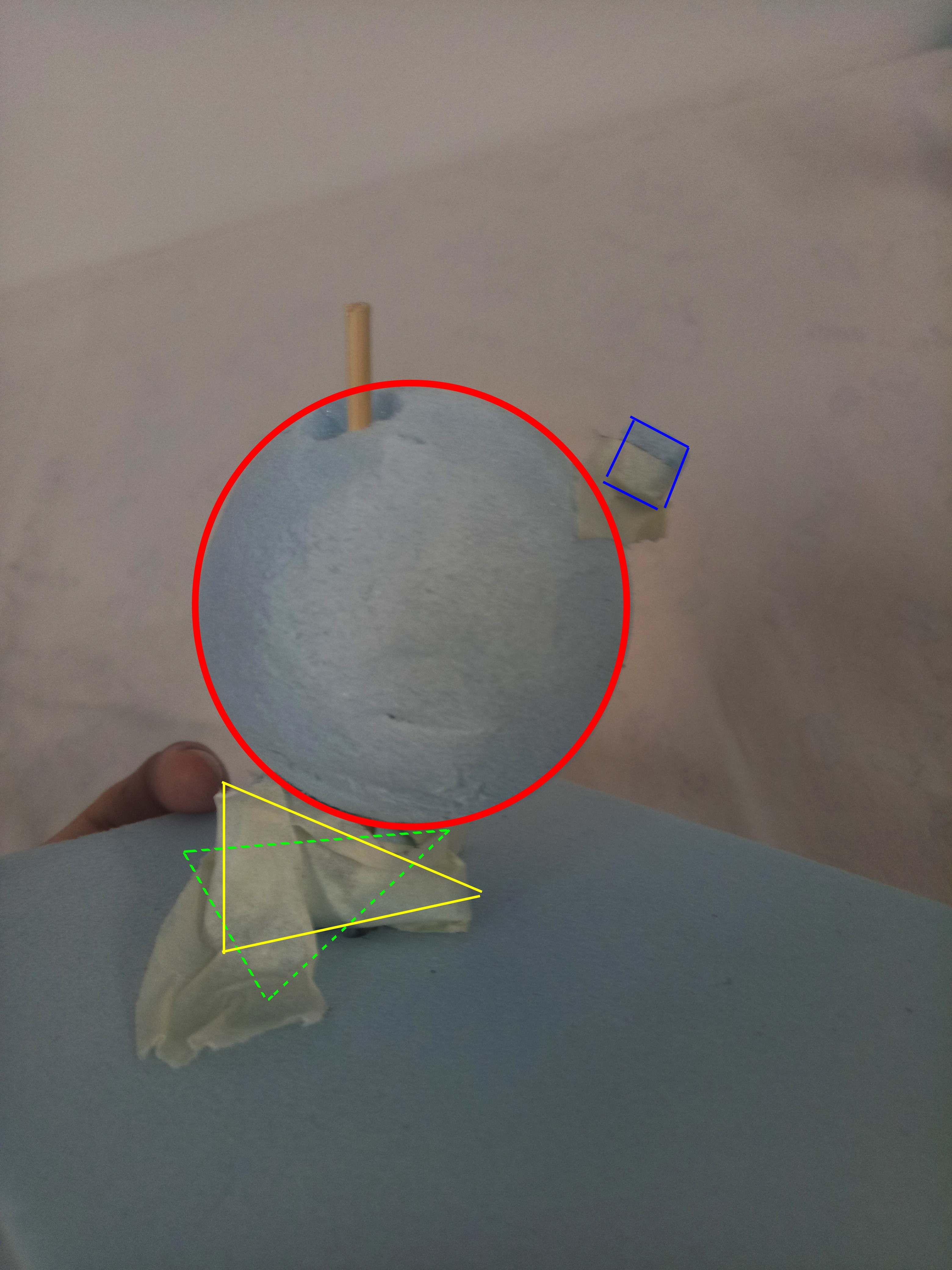
For the dominant (cylinder), I actually cut a cork board. The color and texture of the cork board made it look like a piece of ground, which fits the branch very well since the branch is piercing through the cylinder. Ground can represent the sturdiness of the “father”.
For the subdominant (cone), my idea came from the Latin word “cornucopia” which means “horn of plenty”. It is used to represent abundance in the old times, as it would be overflowed with flowers, fruits, and corn, which are the things usually harvested. The idea of “abundance” linked with “harvest”, and autumn is known as the season of harvest.
The cornucopia idea is implemented by making the cone looked like a basket (dark brown color) and things are spilling out of it (pumpkin seeds and chestnut). Both are autumnal food, and they also act as subordinates.
Cradled between the cone and the cylinder is the subordinate (sphere). I made it by putting together two chewy candies. I think candies are representative of Halloween. The candies are red in color since they are apple-flavored, and apple is one of the popular autumnal fruits. The red color gives highlight to the mainly brown look.
In relation to my “family” idea, I think chewy candy can represent children well since they still can be shaped (i.e. not stiff). Children still have the capacity to grow and change. That contrasted the cylinder/”dad” and the cone/”mom” which have fixed, sturdy shapes and more “mature” colors.
There is a huge void on top of the cylinder to counter the subordinates near the cone. I added a few dried leaves which could act as subdominants in order not to make the void too much. My idea is to combine the branch and dried leaves as one entity, so it looked as if the leaves fell to the ground from the branch.
Since most of my things are on the “plate”, I made the branch point upwards to balance the visual.
I learned a lot from this project, mainly because I have failed on the final model. I learned to be more flexible and not to dwell on mistakes for too long. It was a great learning experience.

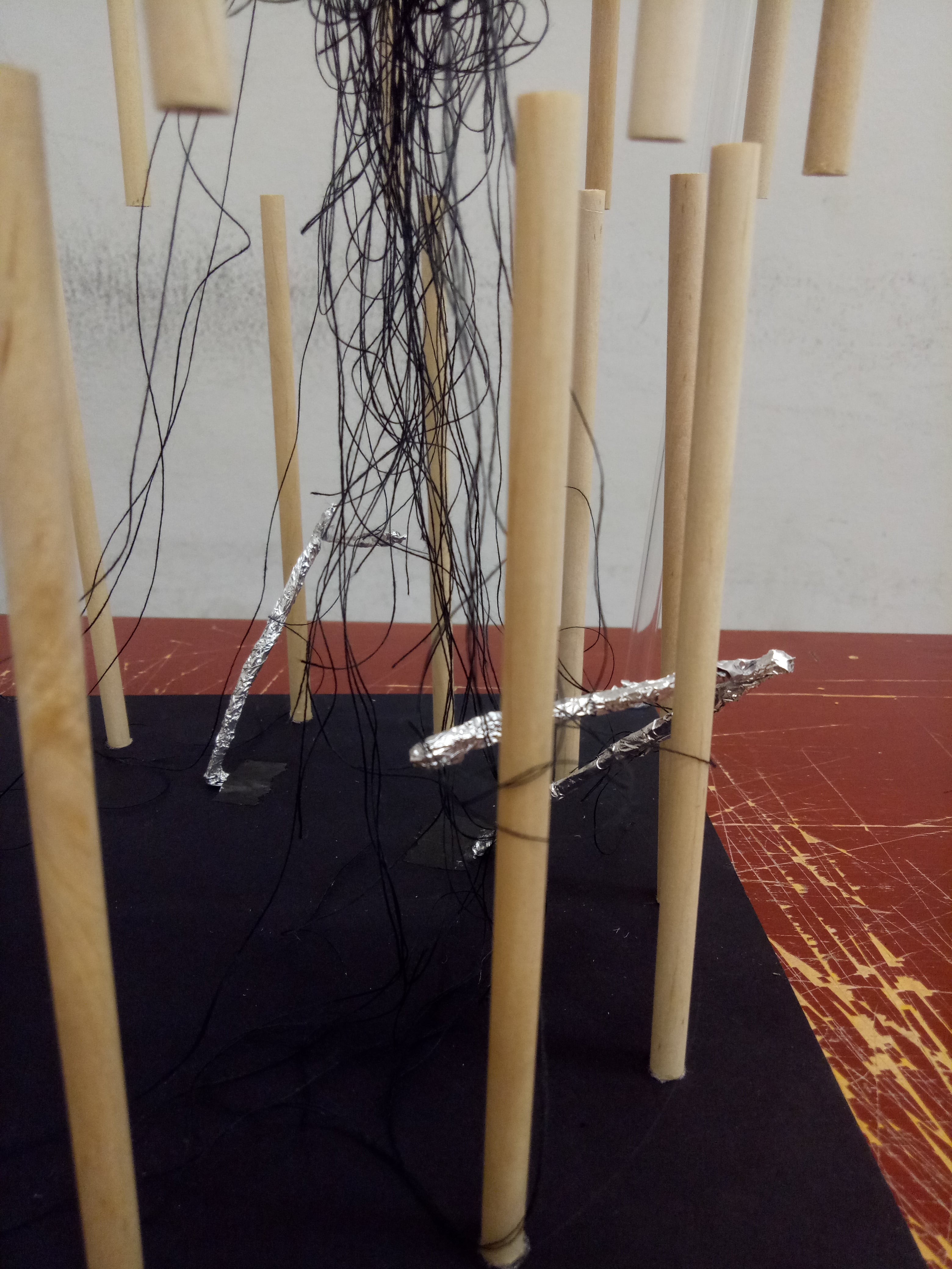


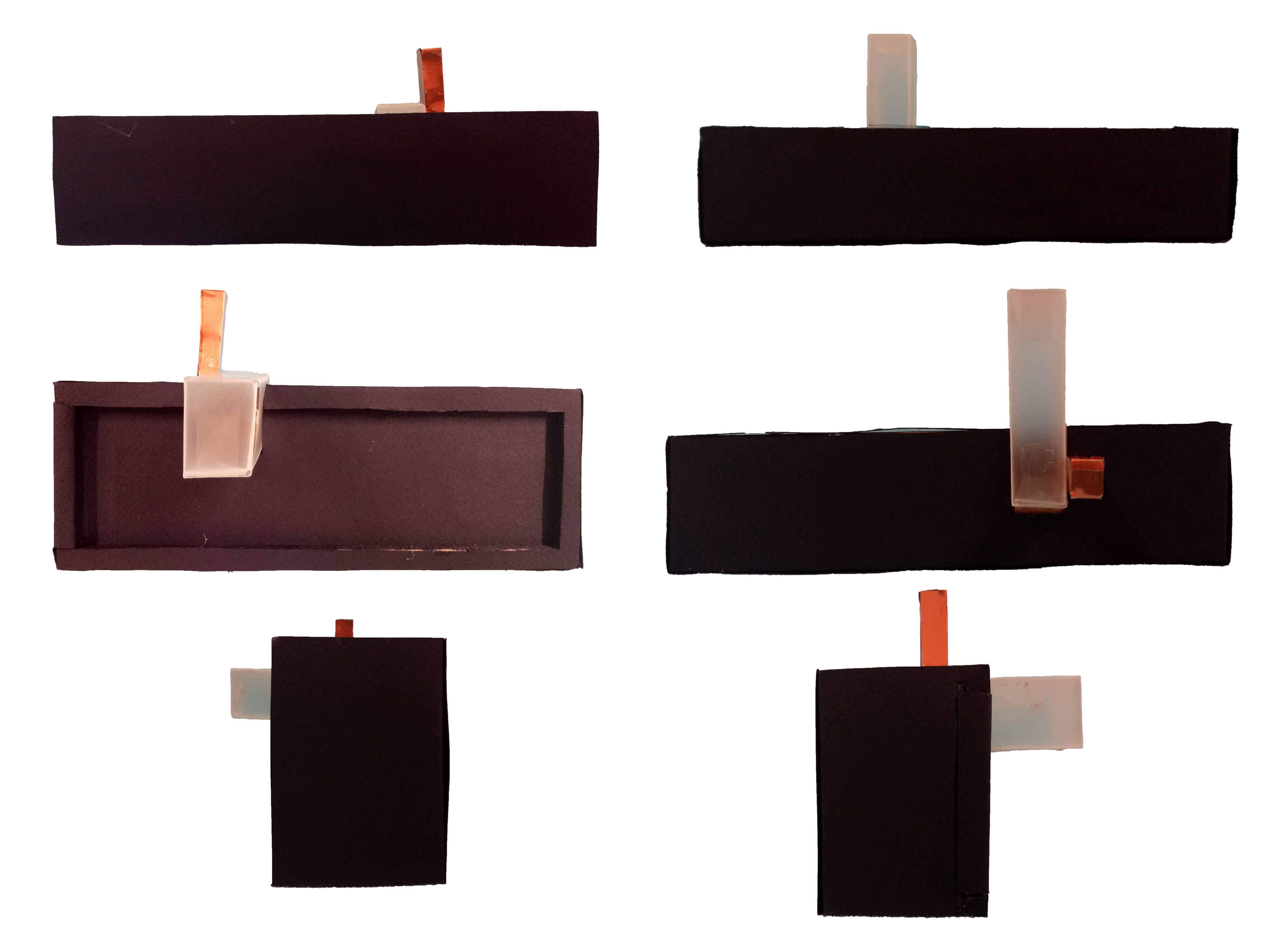


 Zoomed in.
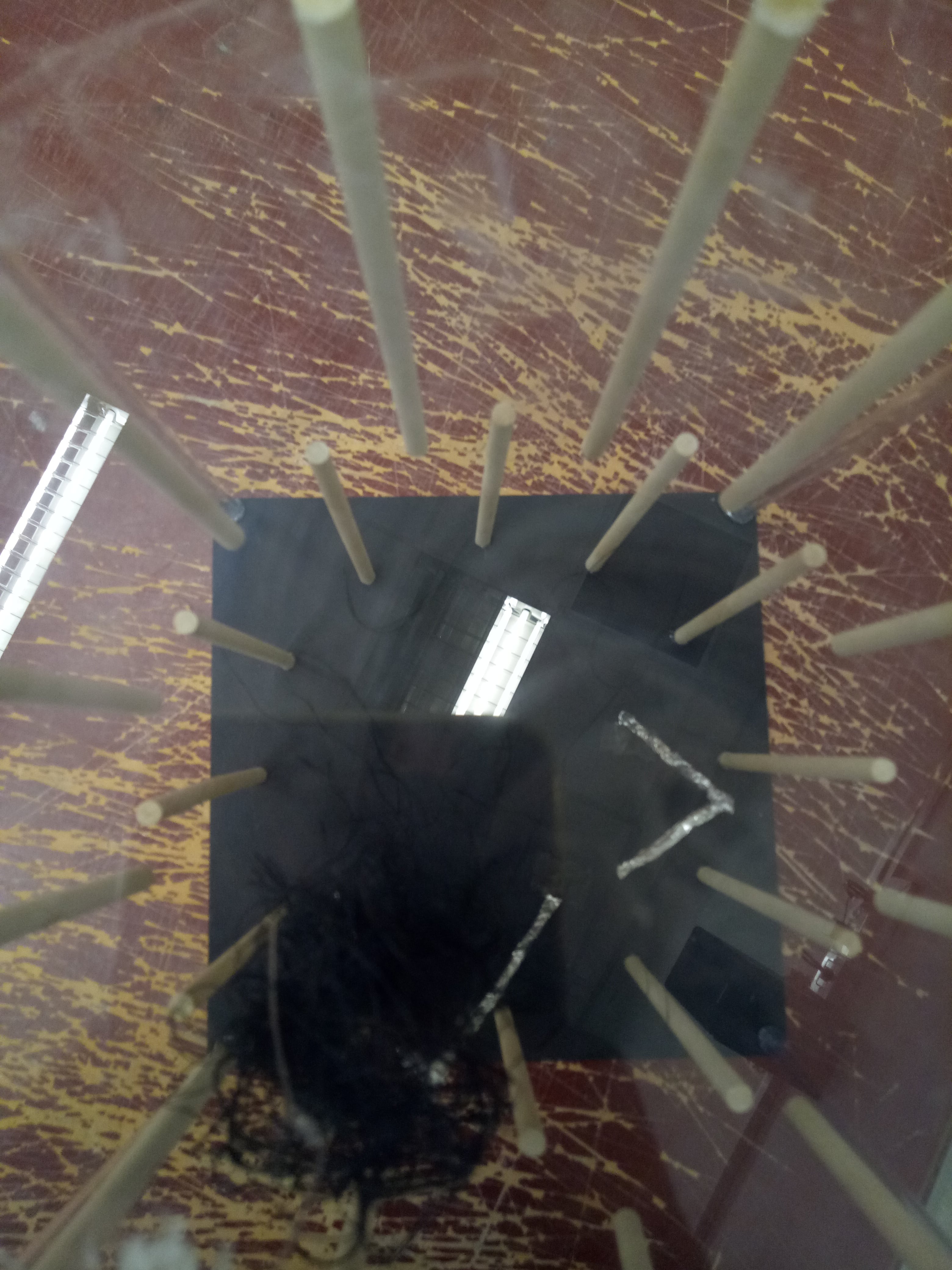