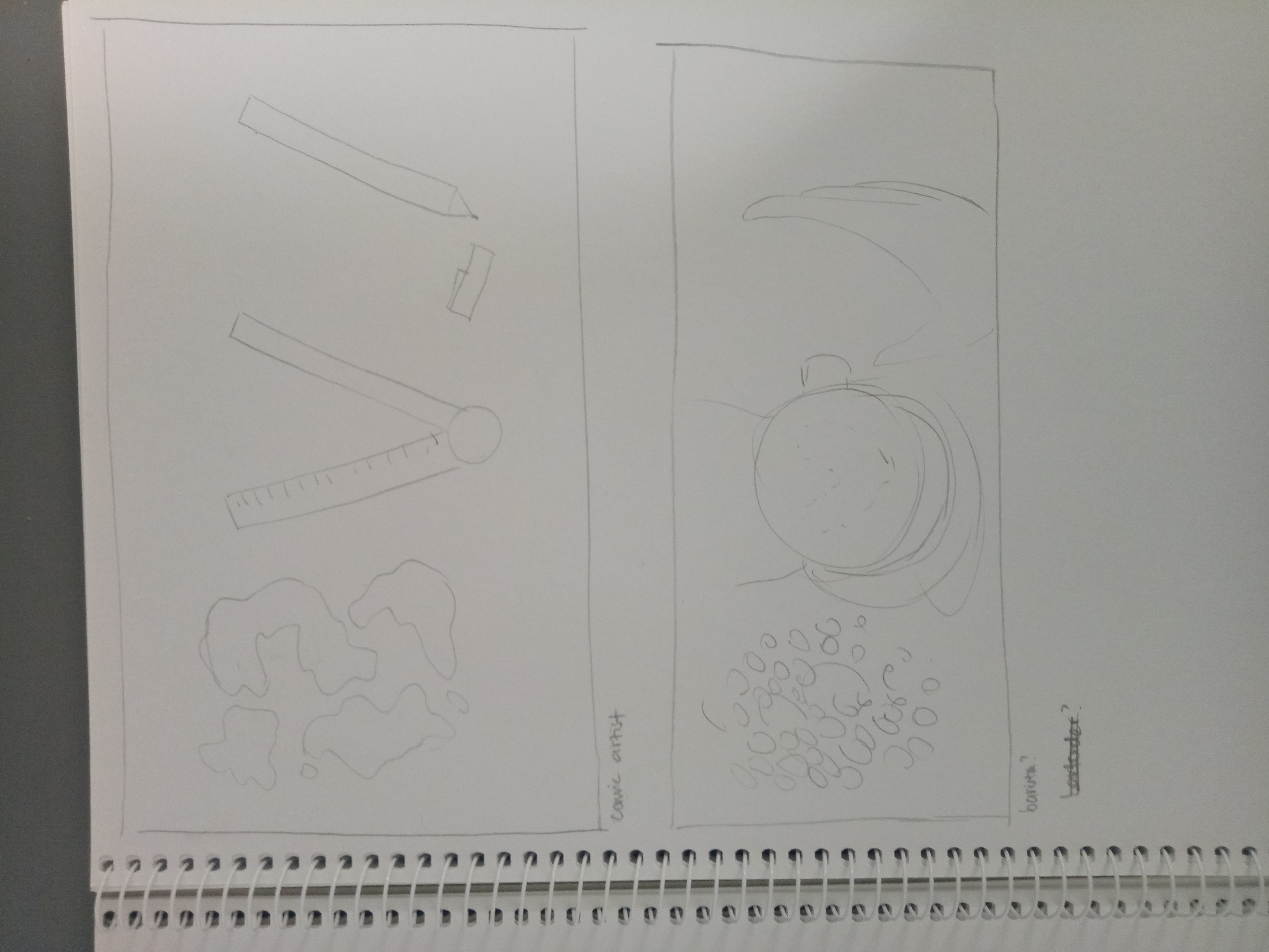
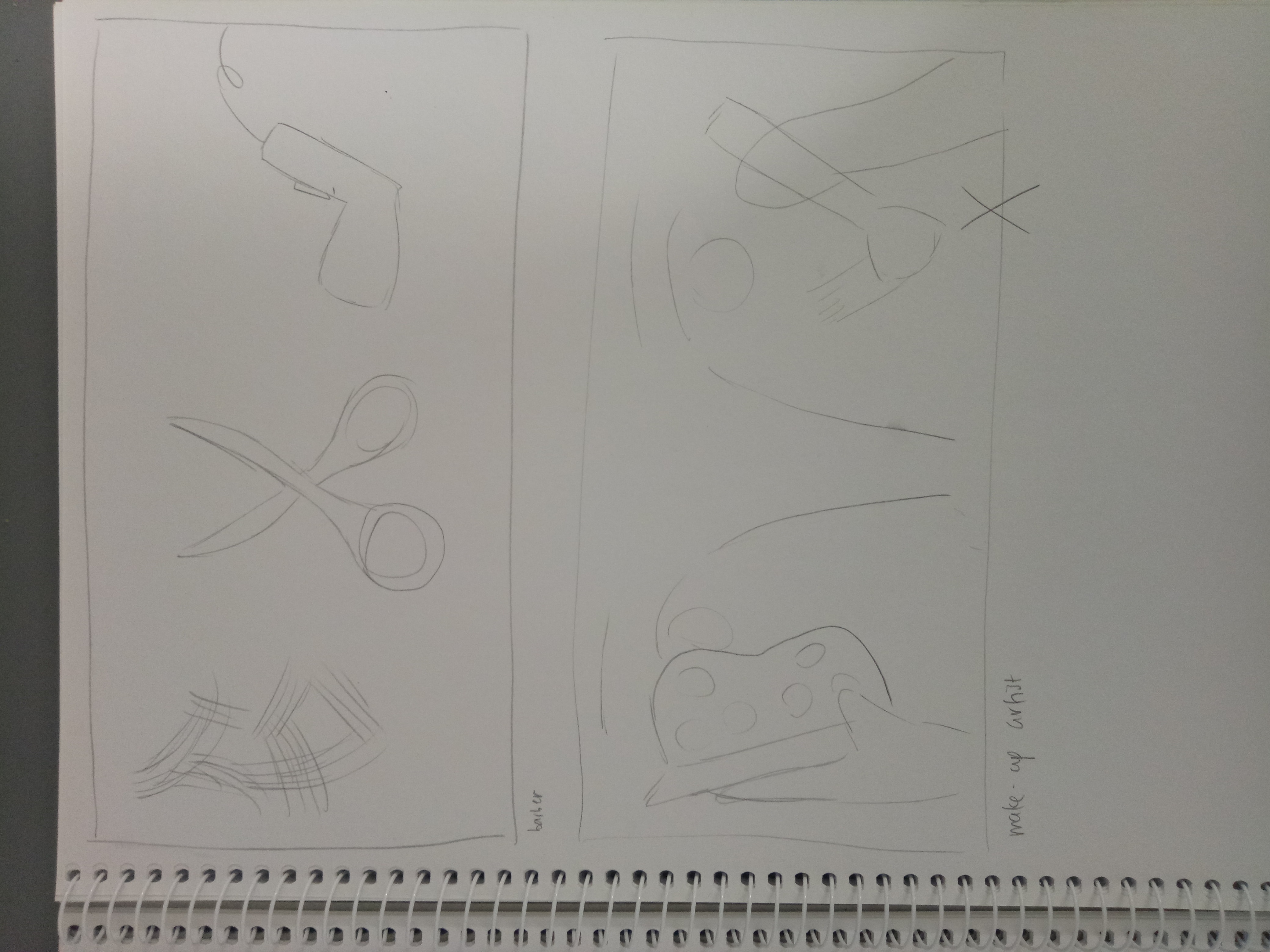
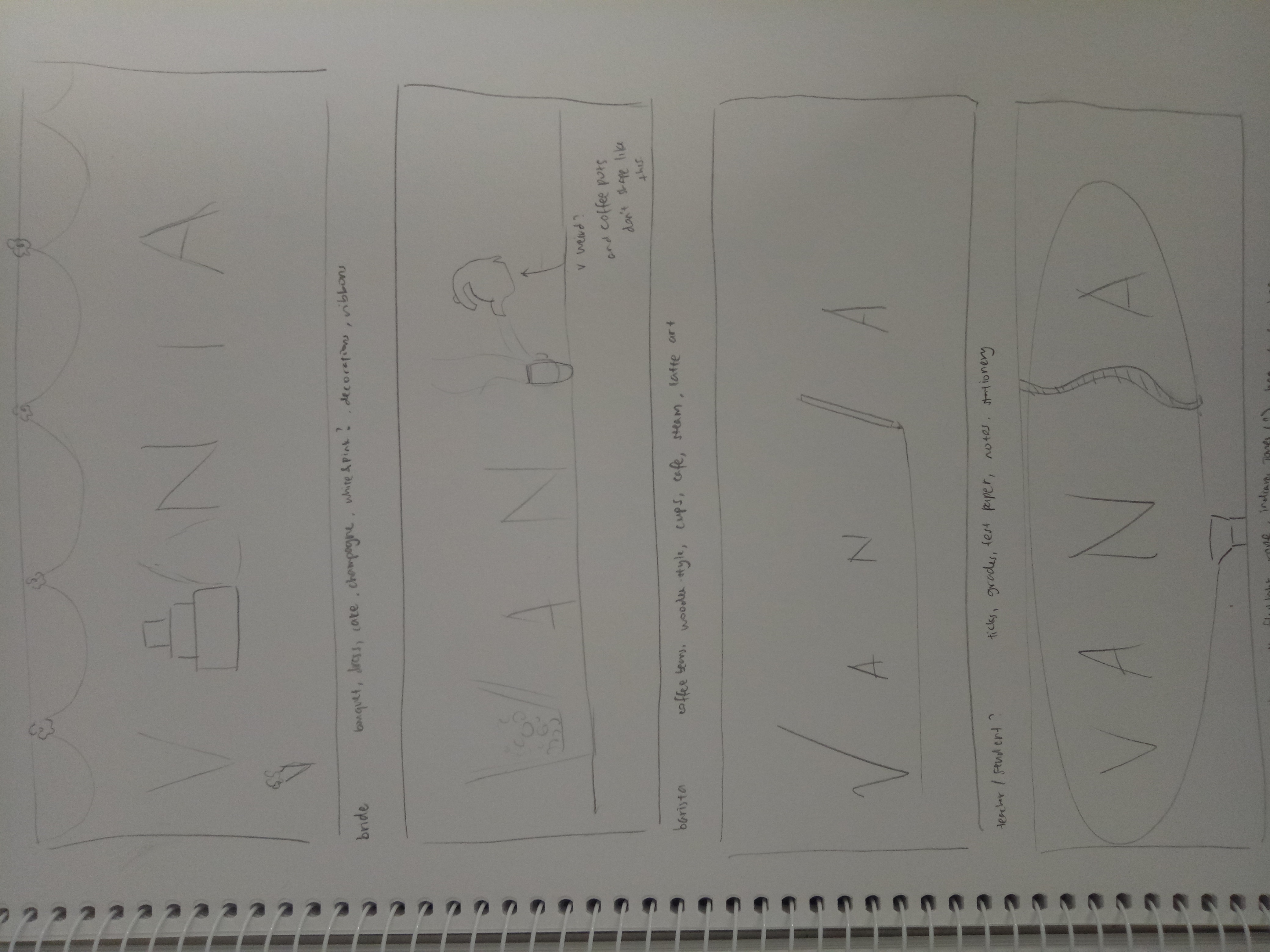
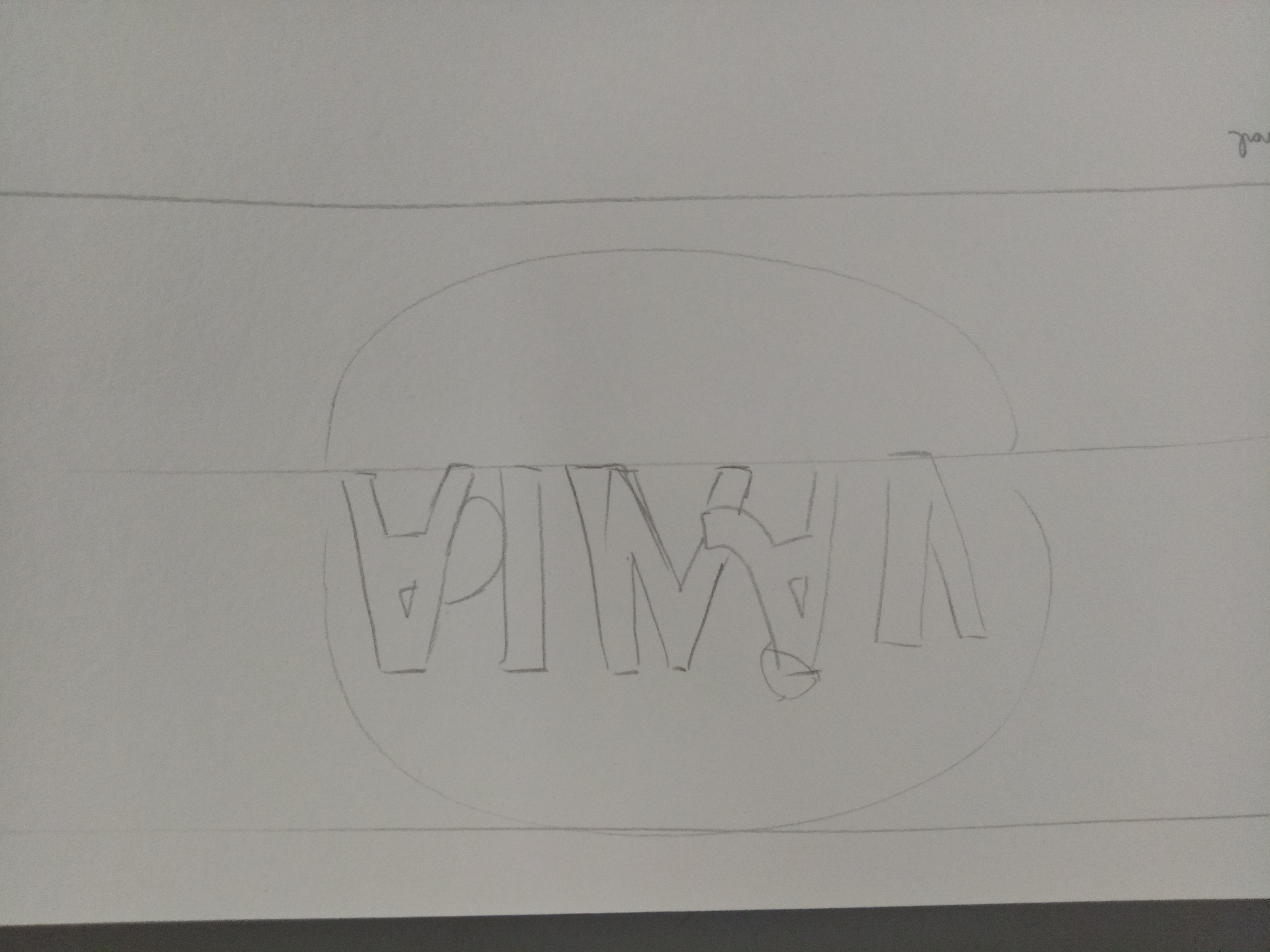
My final jobs are thief, barista, gamer, and watchmaker.
To be honest I was pretty disappointed after printing because:
1. The printing person stretched the image to fit A3, so the images are not A4 anymore (and I just noticed it when I was arranging them)
2. Some of the colors didn’t turn out like I hoped they would or didn’t even turn out at all. For example, my thief job supposedly has a different color for the hole on the wall and some shadow, but they’re not there.
And the worst is,
3. The barista job did not turn out well at all. The wood grain is lost and replaced by super dark brown, making it impossible to see the coffee beans. The shadows on the coffee beans are lost too.
I’ll show you the image comparisons later.
Printing aside, the images turn out pretty well for me, in a sense that I enjoyed the process of creating them and they all pretty much turned out like I had pictured them to be. I learned a lot about Illustrator and Photoshop about this project.
Without further ado, here are the end products:
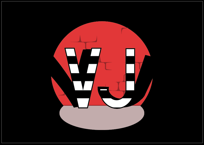
1. Thief
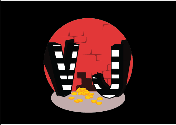
Compared to the first draft, I made the letters three-dimensional to give more depth and added some sort of “action” to emphasize the idea of “stealing” something. I used clipping mask to make the surroundings all black to give the idea of thieves being caught in action by a flashlight.
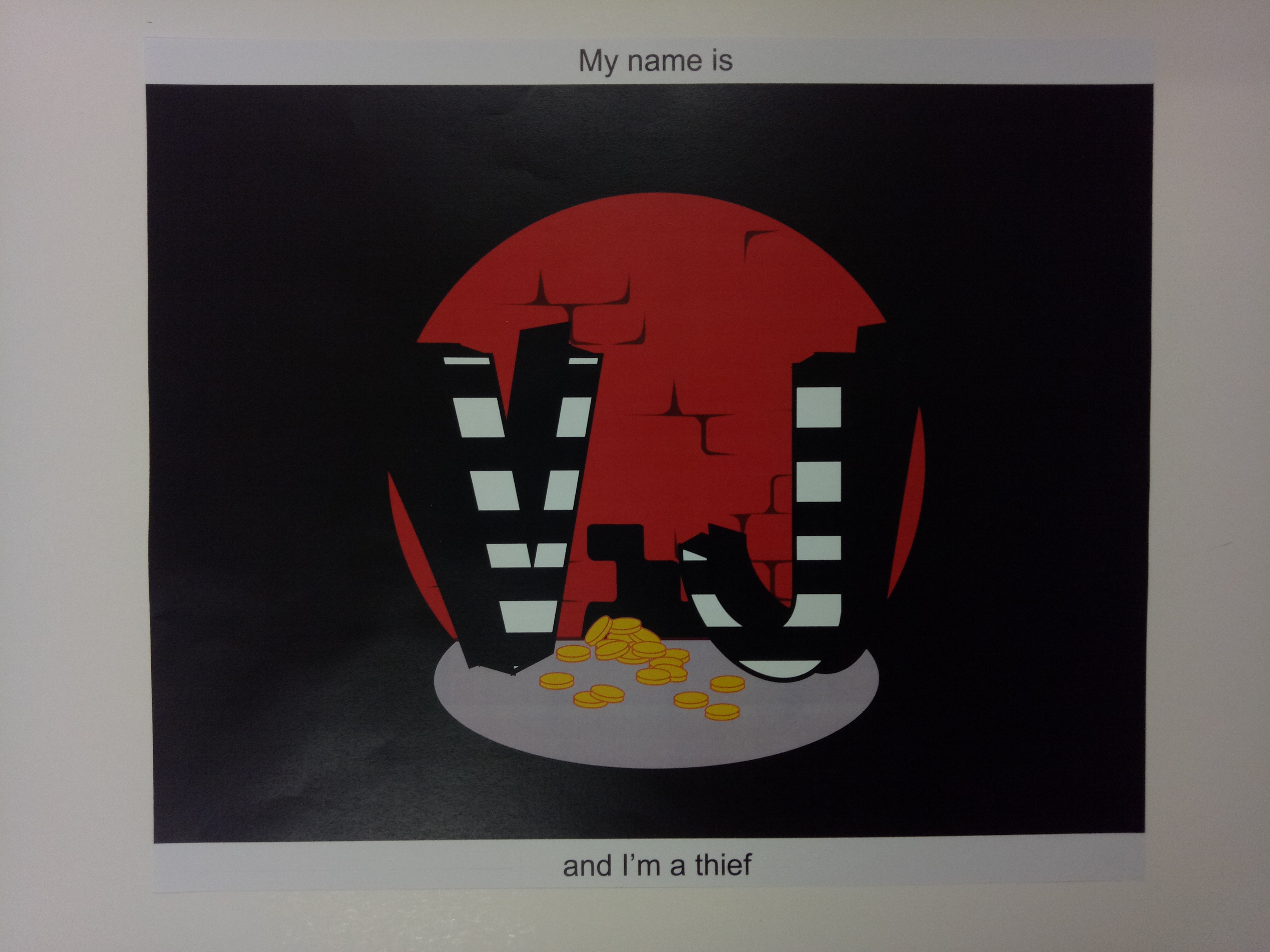
Printed version
Although it’s not very obvious, the color of the hole on the wall is different from the printed version, and the opacity of the shadow is not shown. (To be fair, I put 95% opacity so maybe that’s why it turned out really close.)
2. Gamer
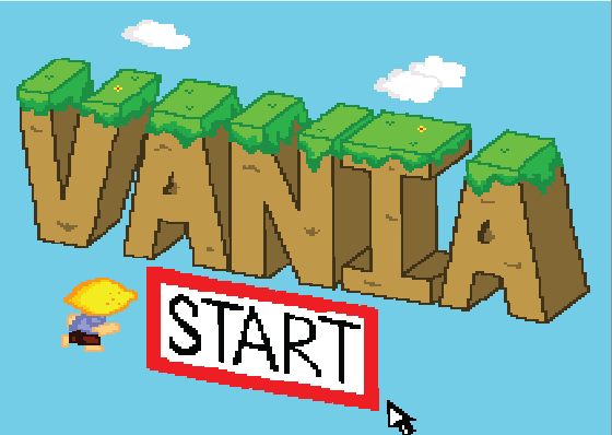
To emphasize the idea of gaming, I added the start button, the mouse, and a character (to make it look like the starting of a game). I didn’t want to add too many clouds since I thought it would be too messy, but without clouds it was too plain so I just added a few. As for the character, I made it up myself to represent “me”.
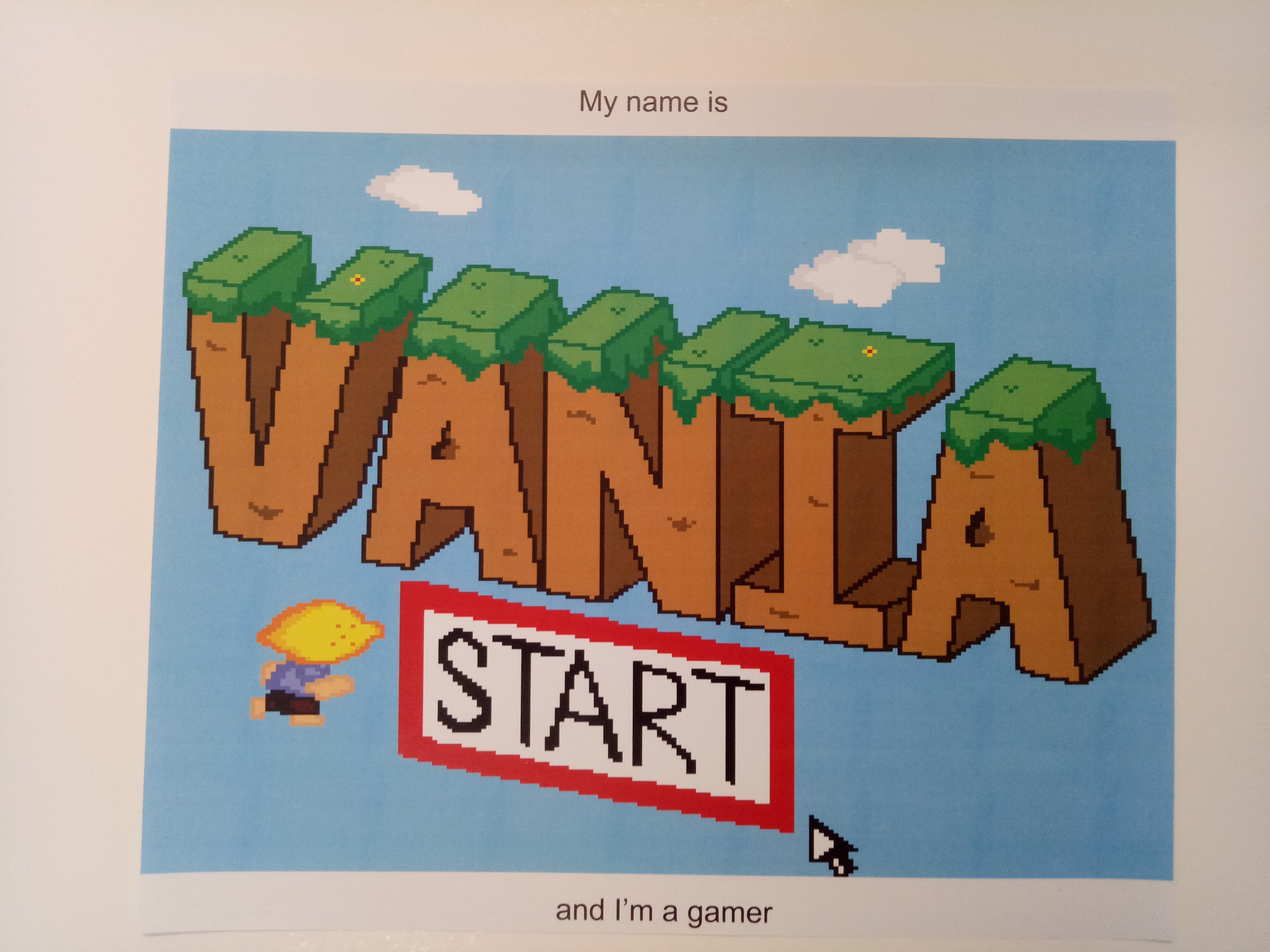
Printed version
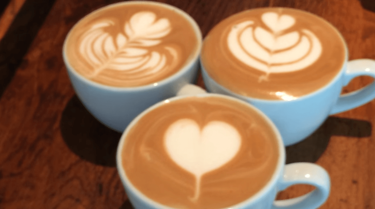
3. Barista
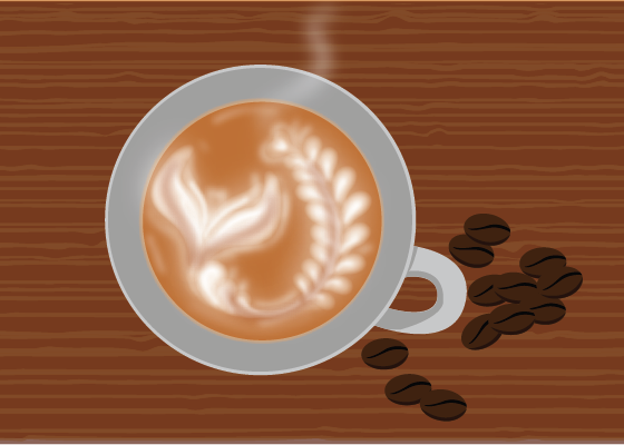
Making the latte art is so. Hard. I played around with the effects and I think this quite resembles real latte art, although I have to admit the letters are not very obvious. I added coffee beans to emphasize the “coffee” idea, and I also added a wood grain texture at the back. At first I just wanted to trace a ready image of wood grain texture but apparently they’re pretty simple to make, so I just tried although it may not be THAT good.
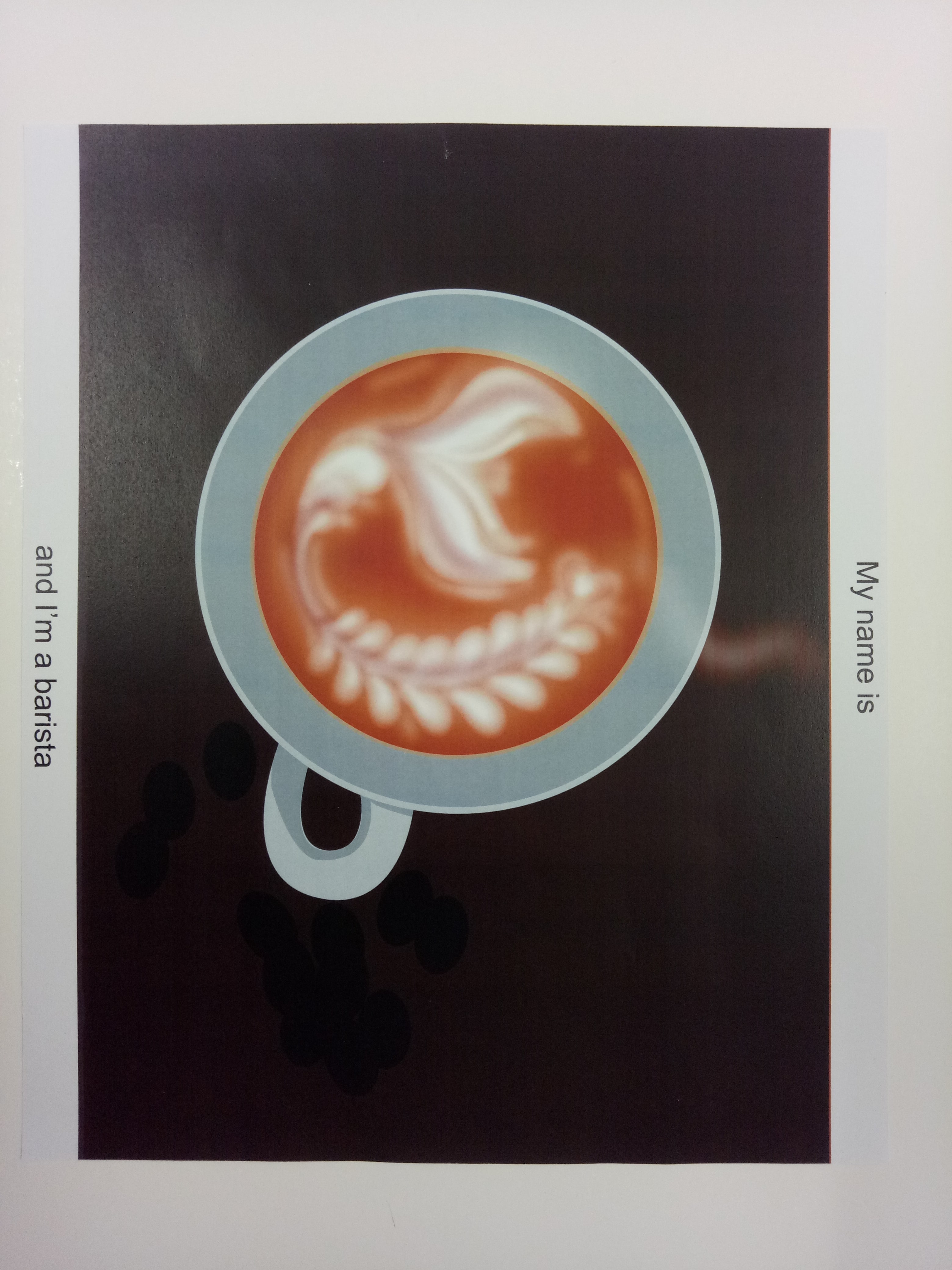
Printed version
The printed image is… really bad. You can’t see anything in the background at all; it just looks like a dark brown background.
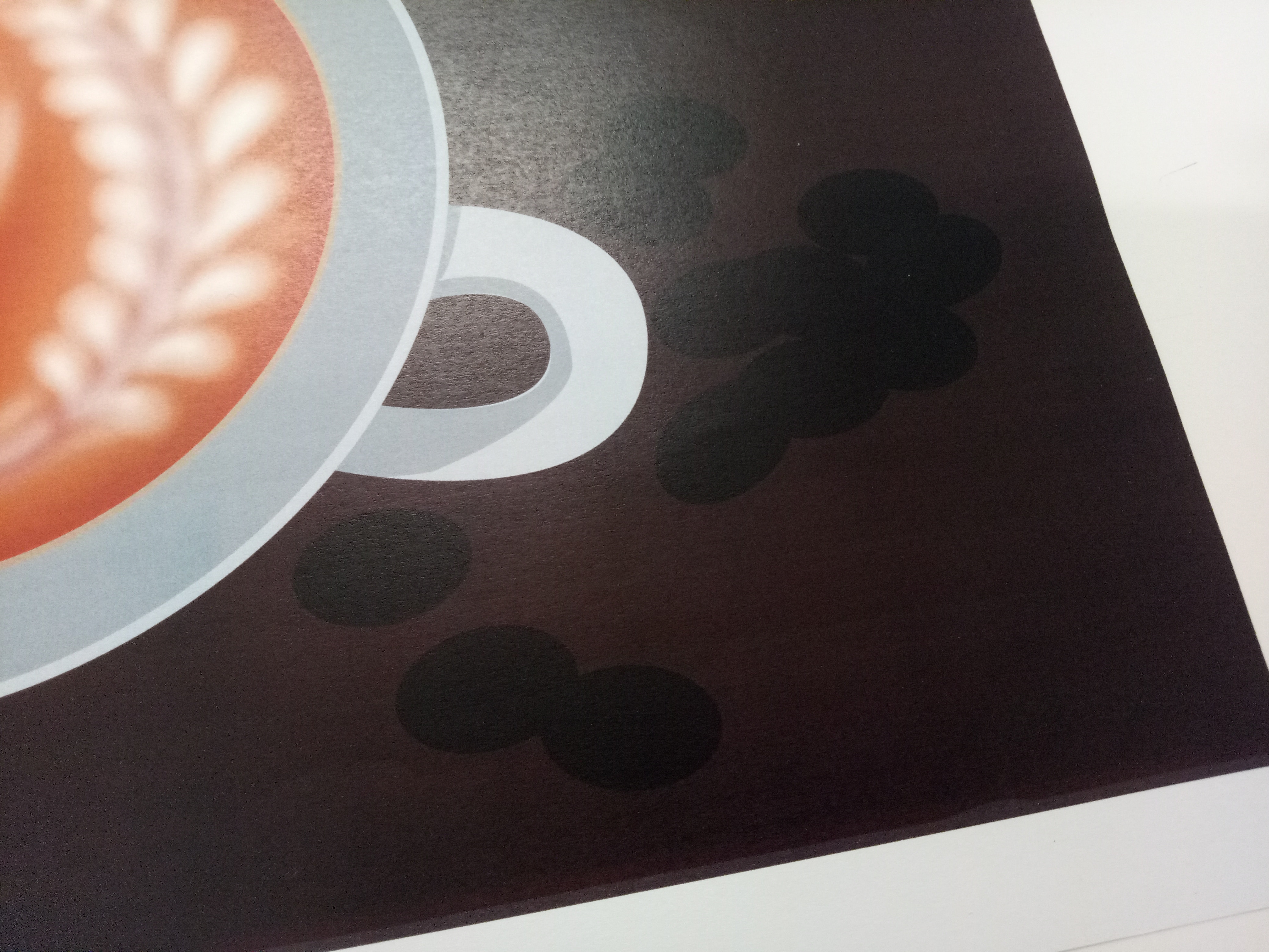
Zoom in to the background and coffee beans
It’s very different from the image I created. I tried re-printing it but the result is more or less the same.
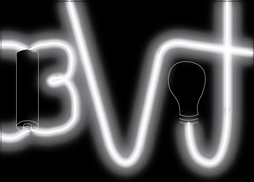
4. Watchmaker
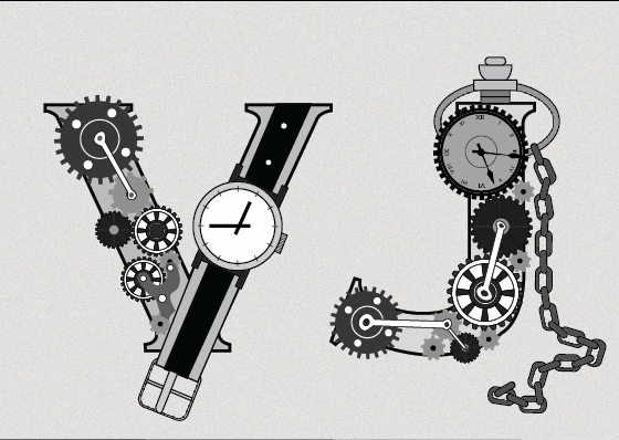
For this one, I tried to find a sort of vintage font and traced it. After that it’s just creating some different gears and putting things together. It was pretty simple actually. I chose not to add colors to emphasize the “mechanical” feel. There’s also some contrast between the letter V, which contained a wrist watch, and the letter J, which resembles a pocket watch. Both of them are watches so they still fall under the watchmaker’s expertise, but they sort of represent “modern” watch and “vintage” watch so I want to put them both.

Printed version
Some shades didn’t turn out exactly right (like the chains) but it’s still okay.
Reflection
I’m the type of person who usually jumps into things before thoroughly thinking about it first (doing before thinking), that’s why I tend to go backwards when generating ideas but I realized I have to redo a lot of steps that way and it’s not very efficient.
As for techniques, I really learned a lot about digital drawing. I realized that I encountered a lot of problems because I didn’t arrange my layers nicely. Another point: I need to be tidier while working.
Lastly: I shouldn’t print in north spine again.