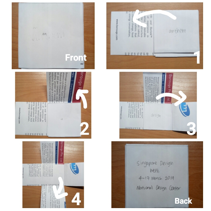
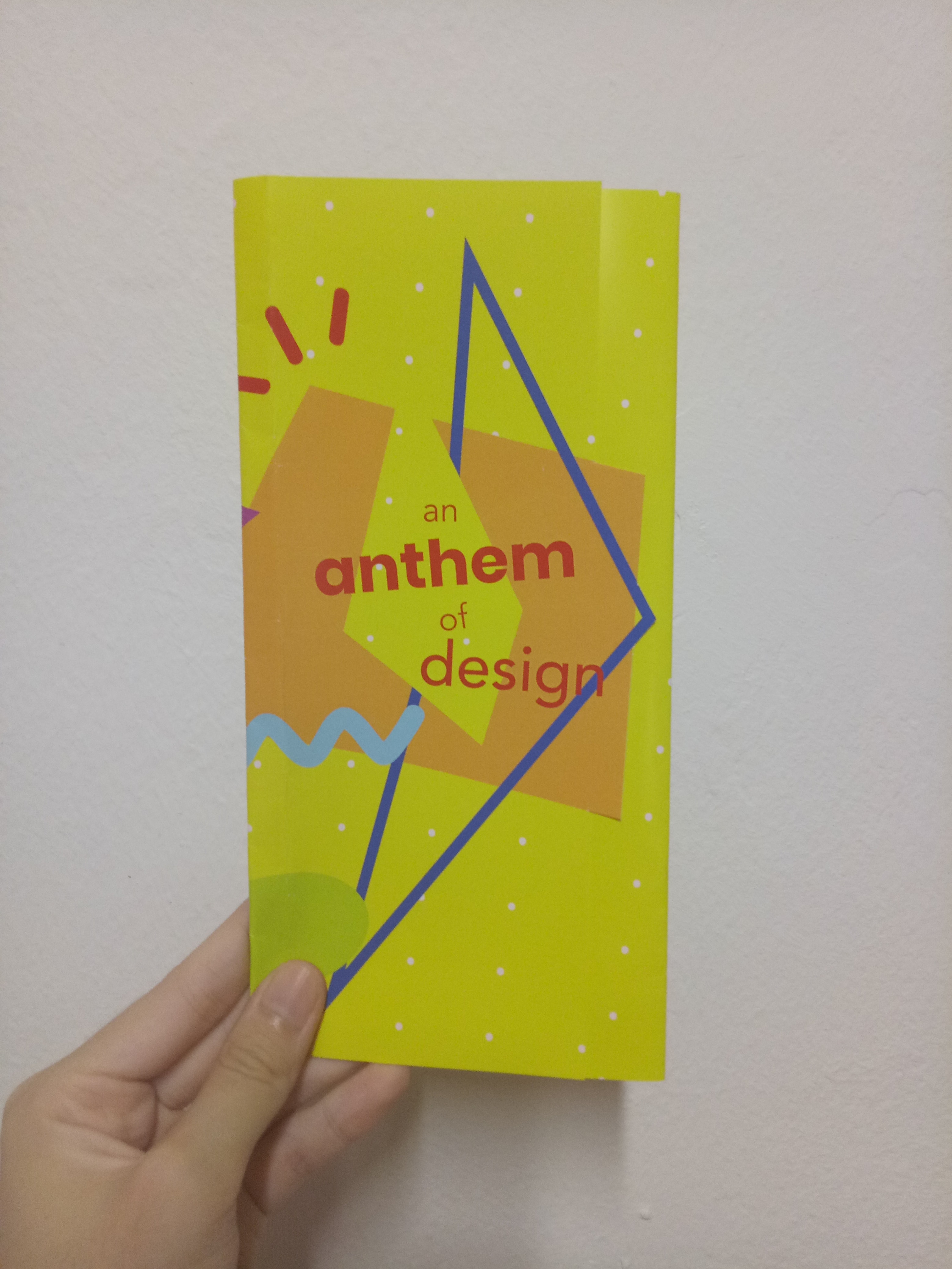
For my final brochure, I decided to use gate fold design – but it’s not completely gate fold since the first page are pretty much overlapping. It’s kind of styled like normal trifold, but the first and second page are not covering each other completely. (Honestly, I don’t know what this is called.)

Here is my final design:

Physical copy

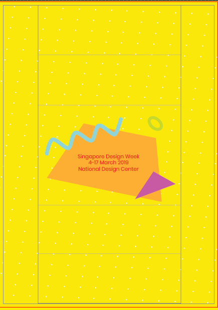
Front view when opened

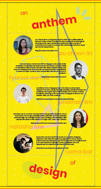
Inside view when opened
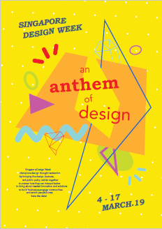
Fully closed

I folded it wrongly at first. Since it’s glossy, it’s very obvious. (I’m sorry.)


Digital

outside view when opened

inside view when opened


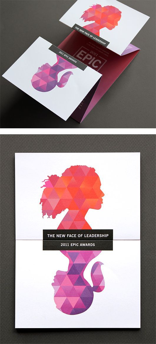
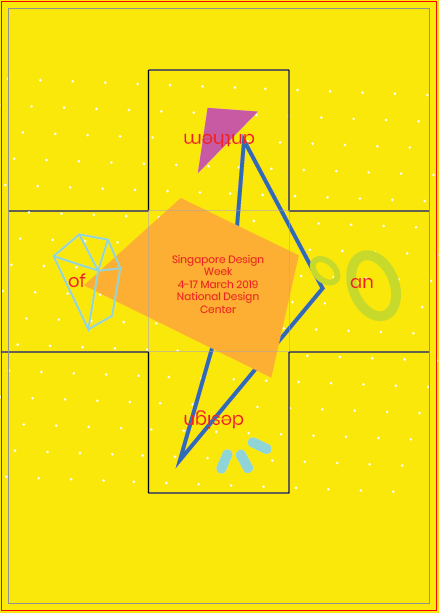
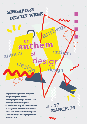
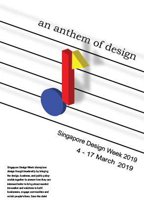
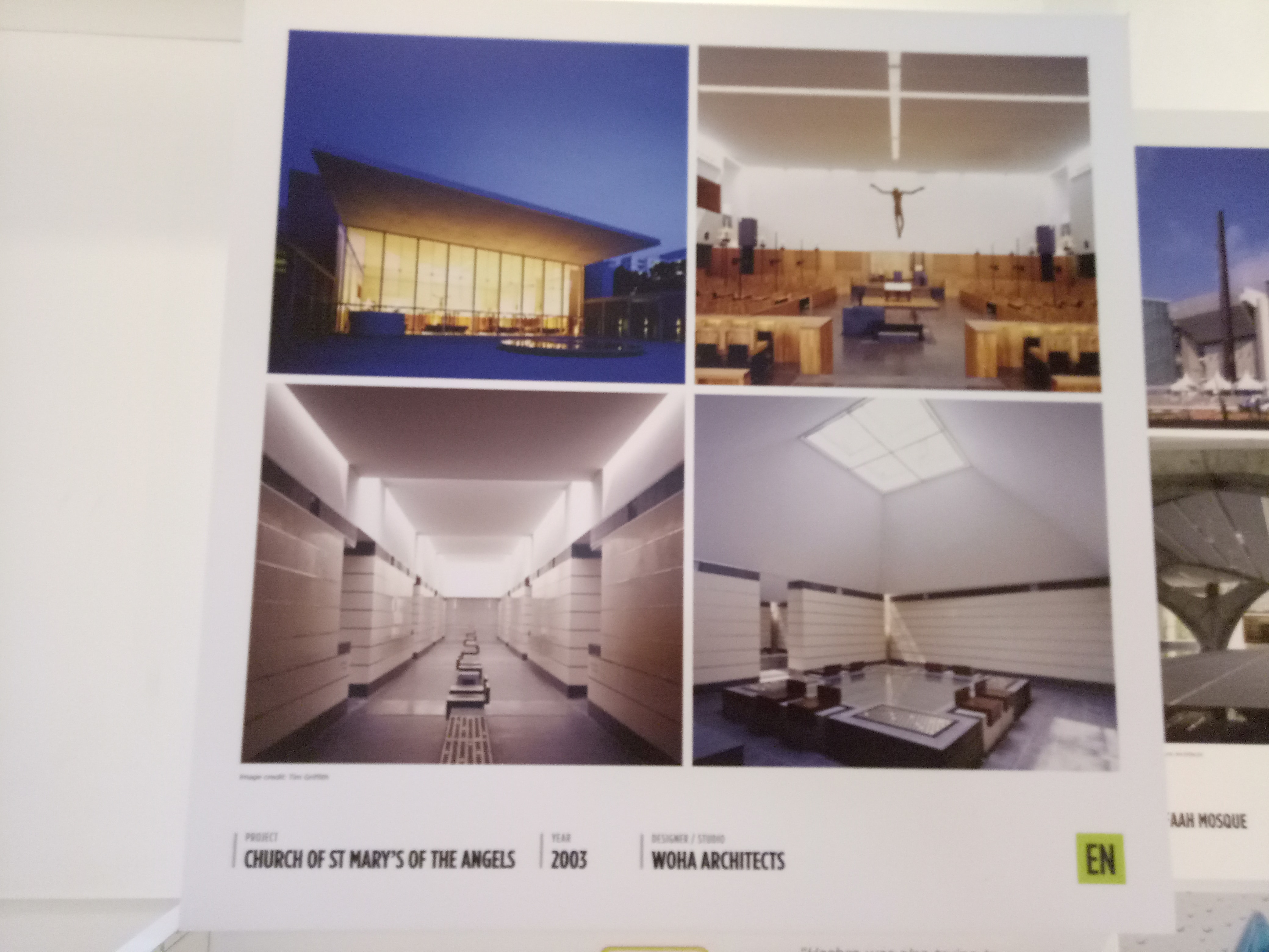
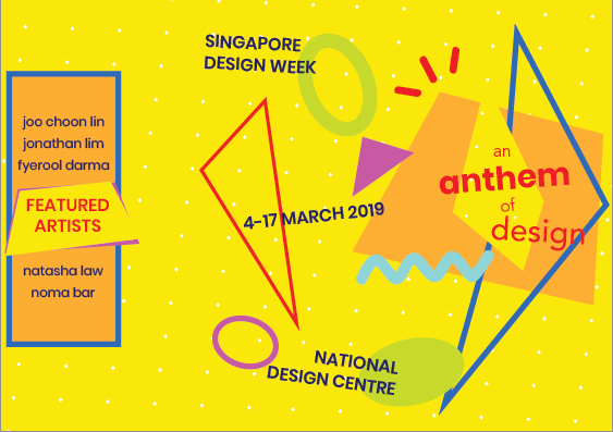
For the front page, I’m sure I want to use a design similar to my poster from project 2 (see here) and put the details on the back page. I wasn’t sure about what to put on the second page at first since there won’t be much space. I thought of putting the details (the dates, etc) there, but there wasn’t enough space to make it look like those details are important, so I put them at the back. After trying out, I decided to put the names of the artists there, sort of like an “opening”.

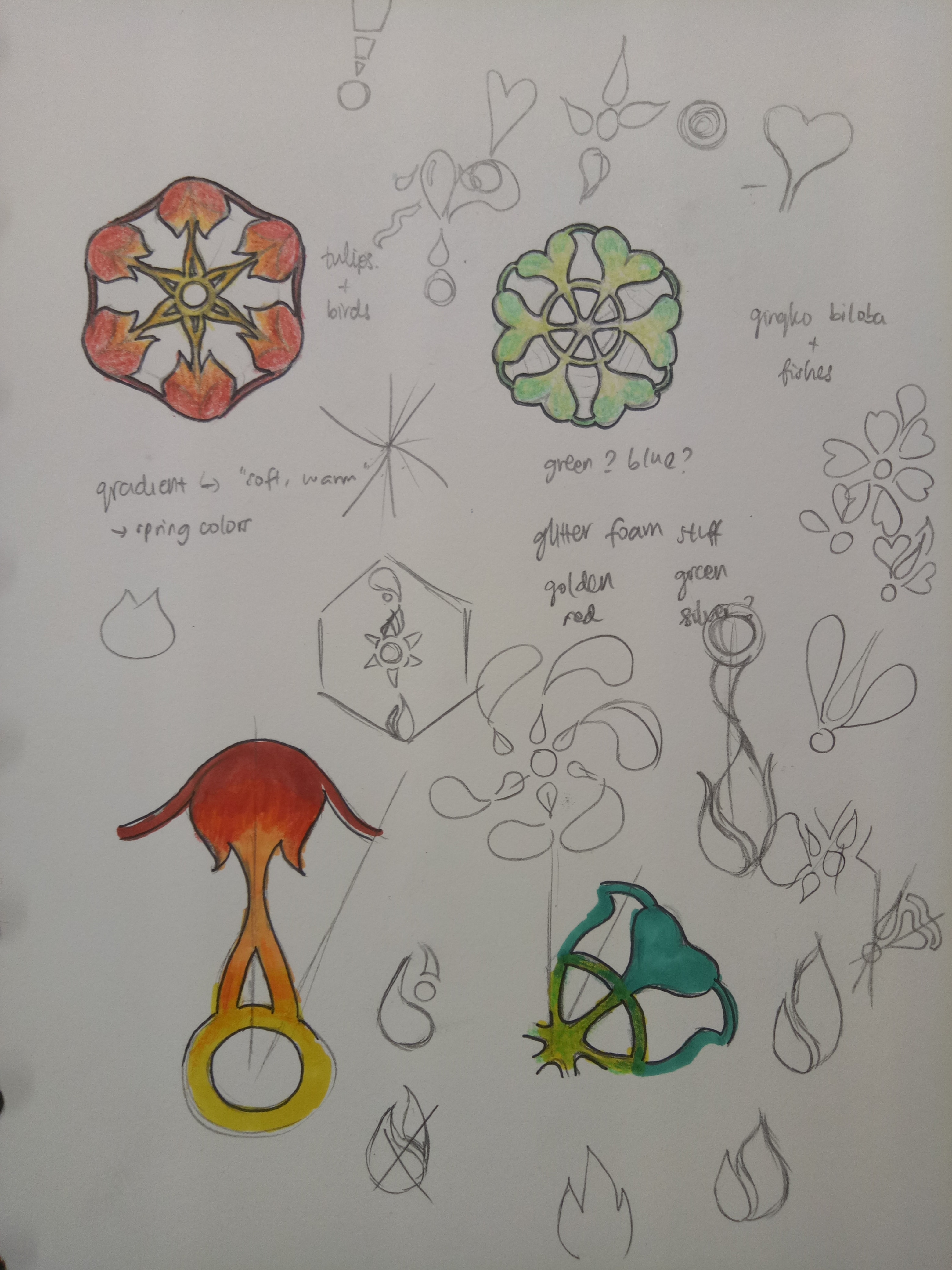
I chose red and dark blue as the main eye-catchers, since they stand out the most when put with the yellow background.

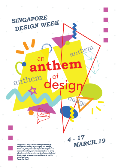
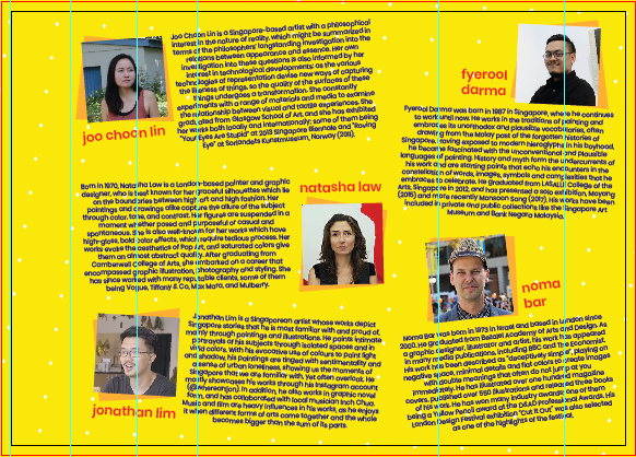
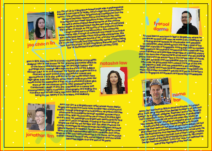
As for the inside page, I put elements there at first. However, they don’t help to lead the eyes, and make the overall look more messy since it looks as if the elements were just thrown in without purpose. It also somewhat makes the texts harder to read. I was worried that just yellow with the polka-dotted background would be too plain, but since the page is packed with texts, it doesn’t look empty.

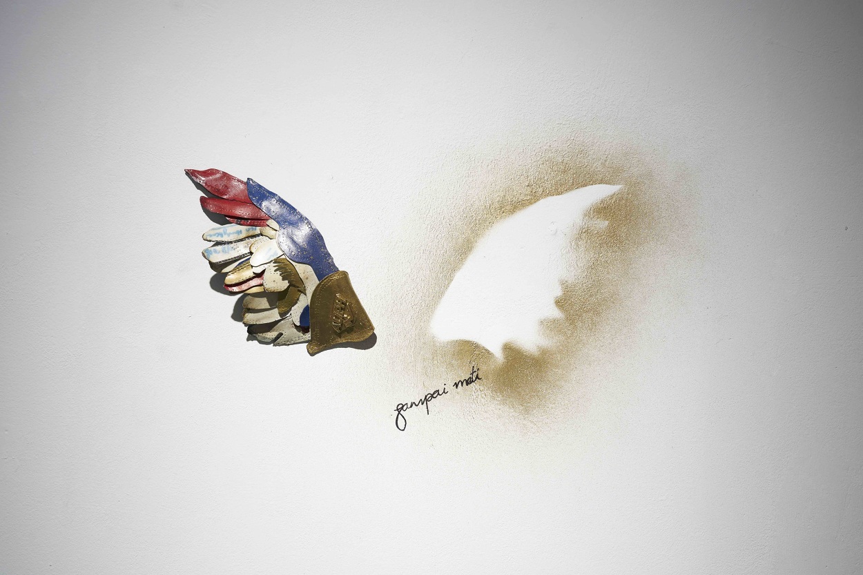
how it looks with elements


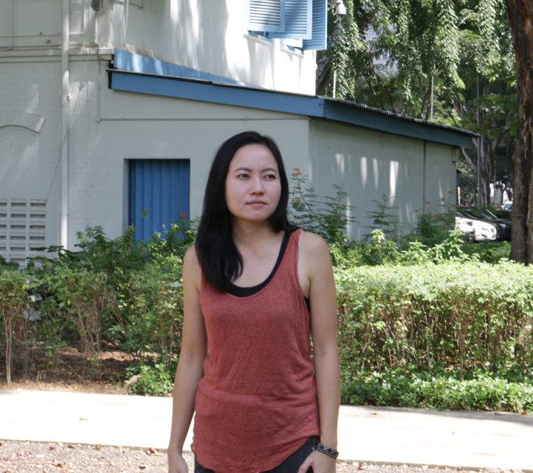
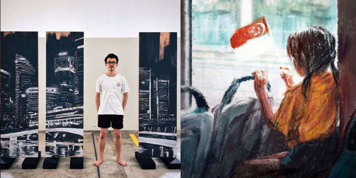
I added some geometrical shapes behind the photos of the artists to instill the elements that I incorporate in my front page. At first I wanted to make the photos circle, but I realize that my “title” design is quite angular despite having circles because the main elements in the design are the angular line and the trapezium lookalike. After trying out both design, I decided that squares are better, also because there are already circles (the polka-dots) in the background.

I also slanted the photos and the texts to add the “fun” element and make the whole look not as rigid, but I do think it does look slightly messy.

One big problem that I had was the texts; since I had to reach up to ~150 words, the texts are very chunky and space-consuming. I wanted to stick with overall A4 size, so I hope the texts didn’t turn out too small.


Afterthoughts?

I have made a brochure before (for my part-time job), but since it was a professional brochure, the layout was much more rigid and easier to arrange. Moreover, I just had to stick with the NTU-approved colors and font, so there was not much “trying out” to do. When I was making this, I really felt the need to be creative, to be fun, to be quirky. I was trying to find a really complicated, unique fold design at first. I felt pressured by the title “anthem” that I created myself.

But then, in the end, I decided to forget all about it and just focus on creating a brochure first. I feel that above anything, a brochure has to cater to the needs of the audience – in this sense, to inform them about the featured artists of SDW, while still incorporating the whole theme / slogan of the event. That doesn’t necessarily mean I have to be “oh-so-different” – I just have to stick with what I have to do, and not try to do too much at once.

For the brochure, I looked up for different design folds.

Since my theme is anthem, I wanted to do something about “opening up” to reveal the contents.

I had three design ideas:

1.Stack square fold

how it works

inside view

outside view


I like this one at first since the idea of revealing was fun; one word will be revealed at a time. However, I realize it makes the very front interface (when not opened at all) confusing and even boring since there will only be the word “an” in it. I also had troubles incorporating the elements to the shape of the brochure.

2.Vertical gate fold

how it works

outside view

inside view


I feel that this one is very clear-cut and clean. However, I am not making use of the back interface at all, which makes it look incredibly plain.


I asked for Michael’s feedback, and he said that both my design and visuals could afford to be stronger, and should be able to lead the eyes. For those brochures, I relied more on the layout rather than the visuals to lead the eyes. However, I’m so stuck with the arrangements for those brochures since I already had a vision for them from the beginning. I tried taking the elements out and putting them back in again separately, but I didn’t make any significant difference (especially the stack square fold). So in the end, I decided to try and start fresh with a completely new design fold.

3.Horizontal gate fold

I already had the idea of using the normal gate fold from the beginning, but I was worried it would be too plain. But then I realized that if a brochure’s design is too complicated, it might confuse the readers instead, and that layout and visuals matter as much as the design fold.

In the end, I went with the horizontal gate fold design since I feel that the possibilities for this design are more “open” compared to the other two.

More about the design will be talked about in my final project post.

I decided to go with the slogan “An Anthem of Design”. Following my research and development post, I mentioned that the draft I made was not reflecting the spirit of anthem that I wanted, so I created a second draft.

I found inspiration for this from Pinterest, especially the color scheme. (I’m bad with colors.) Here is the image that I used for inspiration:

However, turns out that the pale grey background was muting the energy of the poster. I really liked the pale color since it makes the bright shapes stand out, but I do agree that everything does not seem as exciting as it potentially can be. I changed it to white afterwards.

Based on the feedback, I then tried just changing the background with any color that I think are “exciting”: I used green, orange, blue, etc. But eventually I settled with the color yellow, since it looks the most playful in my opinion. Here is my final design:

At first I wanted to use red as a “guide” for people to read the parts, but apparently the dark blue catches more attention, so in the end I changed the color font to dark blue and refrain from using that color for the other shapes, except for the one shape that I want to use as a line guide. Since the slogan is kind of special, I used red for it. I also didn’t use red for any other shapes.

I also change the orientation of the shapes to create some kind of contrast. I took out all the shapes from the canvas and realized, I used so many shapes, it’s confusing even for me. So I cut down the number of shapes to make it less messy and to create more focus. I also cut down the colors that I used. After that, I just play around, putting the shapes one by one.

I took away the squares at the side too. At first I wanted to show that although it’s something fun and very free-spirited, there is still some kind of pattern or order to it. But then it does look like it’s framing the whole shape, restricting the canvas somewhat, so I took it out and enlarged the shapes instead.


Afterthoughts?

It wasn’t perfect. In fact, there are still things I can improve on. I was so focused on playing with the shapes and colors that I didn’t experiment much with the font types. But I think my design definitely improved from the beginning, and I actually had fun arranging the layout. I think this project pushes me out of my comfort zone. When I went to consult and showed my first drafts, I realized that I usually play safe with my designs, choosing something with less colors and less “experimental”, especially since I think my sense of colors is not as good. It might not be the best, but I’m satisfied with what I have made.

For this project, we’re supposed to make a poster for Singapore Design Week. I took out some keywords from the event description like design, innovation, engaging, etc and brainstormed them, finding phrases or words that are short and simple to be made into a slogan.

As for the art style, I am more inclined towards the flat illustration styles instead of something realistic.

So with the basic ideas and style somehow “settled”, I started out with a few concepts:


1. Design as innovation

So my first idea is something along the line that conveys the idea that design is something innovative, and that design is something everybody can think of or produce.

When I think of innovation, I think of new ideas, so I thought of a light bulb to represent the innovative part. As for the slogan, I thought of something simple like “Think Design” since it captures attention immediately and encourages people to consciously think of design.

However, I think it turned out very ordinary; there’s nothing special or exciting about it. It doesn’t really convey the idea of being innovative, and it doesn’t have personality.

2. Design as a bridge through time

I was thinking of something that could get through the gap of generations, so I wanted to use something that represented the past, combined with something that represented the future. I chose Peranakan patterns to represent the past and something technology-like for the future. (I wanted to make it look like there are branches of lights coming out of the screen.)

I had a lot of troubles coming up with the slogan; I was thinking something like “The Past and The Future”, or “Design Through Time”, but nothing really catches my attention. Besides, I wasn’t sure about the layout and color as well. I think this draft looks awful.


3. Design as connection

For this last one, I was looking for inspiration from the past SDW poster slogan. Their slogan is “A March of Design” (which, I think, is really smart since SDW is held in March). I wanted “connection” to be the concept; so I want it to be something that everybody knows and can relate to, something that everybody shares. Then I thought of the word “anthem” (by accident) and I liked it, hence the slogan: “An Anthem of Design”.

Since it’s about anthem, I wanted to create something shaped like a tone at first, but using geometric shapes (like Bauhaus). But it turned out very stiff and didn’t convey the excitement and energy of an anthem.


In the end, I decided to work on the third idea: An Anthem of Design.

Here are the five artists/designers that I would like to feature in the Singapore Design Week.

Joo Choon Lin

Joo Choon Lin is a Singapore-based artist with a philosophical interest in the nature of reality. She has interest in technological developments, and constantly experiments with a range of materials and media to examine the relationship between visual and tactile experiences. She graduated from Glasgow School of Art, and she has exhibited her works both locally and internationally; some of them being “Your Eyes Are Stupid” at 2013 Singapore Biennale and “Roving Eye” at Sorlandets Kunstmuseum, Norway (2011).

http://www.joochoonlin.com/


Your Eyes Are Stupid by Joo Choon Lin

Fyerool Darma

Fyerool Darma was born in 1987 in Singapore. He works in the traditions of painting and embraces its unorthodox and plausible vocabularies. History and myth form the undercurrents of his work and are starting points that echo his encounters in the constellation of words, images, symbols and complexities that he embraces to celebrate. He graduated from LASALLE College of the Arts, Singapore in 2012, and has presented a solo exhibition, Moyang (2015) and recently Monsoon Song (2017).

https://www.fyerooldarma.com/


“At dusk we return to perch together” from Fyerool Darma’s Moyang exhibition

Jonathan Lim (@whereartjon)

Jonathan Lim is a Singaporean artist whose works depict Singapore stories, mainly through paintings and illustrations. His paintings are tinged with sentimentality and a sense of urban loneliness, showing us the moments of Singapore that we are familiar with, yet often overlook. He mostly showcases his works through his Instagram account, @whereartjon. He also works in graphic novel form, and has collaborated with local musician Inch Chua. Music and film are heavy influences in his works.

https://www.instagram.com/whereartjon/?hl=en


Natasha Law

Natasha Law is a London-based painter and graphic designer, who is best known for her graceful silhouettes which lie on the boundaries between high art and high fashion. Her paintings and drawings alike capture the allure of the subject through color, tone, and contrast. Her figures are suspended in a moment whether posed and purposeful or casual and spontaneous. After graduating from Camberwell College of Art, she embarked on a career that encompassed graphic illustration, photography and styling. She has since worked with many reputable clients, some of them being Vogue, Tiffany & Co, and Mulberry.

https://elevenfineart.com/pages/natasha-law

Yellow Socks on Pink by Natasha Law

Noma Bar

Noma Bar was born in 1973 in Israel. As a graphic designer, illustrator and artist, his work has appeared in many media publications, including BBC and The Economist. He has illustrated over one hundred magazine covers, published over 550 illustrations and released three books of his work. He has won many industry awards; one of them being a Yellow Pencil award at the D&AD Professional Awards. His London Design Festival exhibition “Cut It Out” was also selected as one of the highlights of the festival.

https://www.dutchuncle.co.uk/noma-bar/

From Noma Bar’s Cut It Out project

So we went to the National Design Centre. I’ve seen the exhibition a few times, but I’ve never actually paid attention closely to them.

Some types of design practices I saw:

Product design


Graphic design


Fashion design


Architecture


Over the years, I could see that in the beginning (starting from the 1965-1975), Singapore was still very focused on building the country. Design was made with a clear purpose to serve the needs of the people, instead of actually building the identity of the nation. However as time passed, design in Singapore began to take shape. A lot of design was made to promote Singapore’s national identity, especially when Singapore started to be noticed globally. As new technologies were introduced, Singapore slowly got modernized, but even until now the design in Singapore never really left the roots. Now the design in Singapore, I feel, is modernized, yet still really showing the national identity. Design is also not just “art”; it’s always used to improve other sectors such as economy and education.

I think even in the future, the goal for design in Singapore is to continue to develop fresh ideas that not only are aesthetically pleasing, but also contribute to Singapore’s growth and promote national identity at the same time. While that is not easy, I feel that Singapore designers are moving in the right direction. I can see some designs nowadays that combine some of the ideas – like, combining modernization and national identity.

Design continues to be of importance, and I feel like people’s awareness of that will only grow from now. Some things that used to just be functional, now can possess aesthetic values – a simple example is HDB buildings which walls are painted in pleasing colors or certain colors to create rainbow / gradient. And as more people see the significance of design, more people will be encouraged to think critically about it, and design in Singapore will hopefully grow to be better.

Here are the two posters that I find interesting.


Poster for Frankfurt exhibition by Kazumasa Nagai (from http://theanimalarium.blogspot.com/2011/01/life-is-change.html)


I found this on Pinterest and can’t find who made it. (from https://www.designspiration.net/save/1446483313272/)


I will be talking about the second poster, the yellow one.

This poster is promoting a festival of industrial design in Sydney, and the slogan is “Ignored Everyday”. At first I’m really interested because of the minimalist appearance, with only yellow and black colors. My eyes were immediately drawn to the title due to the black highlights that contrasted the yellow background. After that, I shifted to the yellow paperclip, which didn’t blend with the background due to the outline and the shadow. It created a visual interest that makes people question, “Why a paperclip?” And that prompts the audience to read the information provided.

The information is written using sans serif fonts, which makes the whole look consistent and simple. All of them used black color, which contrasted the bright yellow background very well. I feel that the font size of the festival information could be a little bit bigger because the font is very narrow and thin, which compromises the readibility – but overall, I think it’s eye-catching, simple, and effective.

The theme for my project is the spring that comes after winter – the starting of hope, an early spring.

Winter is something that is associated with death, with coldness. On the contrary, spring symbolizes the birth of life and warmth. I want to symbolize hope as something that you can find even in the hardest moments.

My initial idea was to create a snowflake design made of flowers, but after the first presentation, I got the idea of putting the “spring” using the negative space in the snowflakes instead.

The very first design that I did was all connected because I was still thinking of the shape as something that needs to be able to be cut out from a paper. Moreover, the shapes are all either vague or too obvious. So after consultation, I tried to break free from the cut out form, combining the idea of winter and spring. The things that I chose to symbolize spring is sun, fire, water, and plants.

I made two snowflake designs. The first one is made of the shapes of leaf, sun, and fire. I chose yellow and red as the colors, as I want it to be triadic with the blue snowflake color.

The second one is made of the shapes of flower, water, and gingko biloba (a type of tree that grows in Japan and blooms in spring). For the colors, I chose orange and two tones of blue, playing on the complementary colors.

I gave a pale blue color to define the snowflake shapes, but they got lost after printing. The slight difference between the red and orange was also lost, making them look like the same color. The yellow was definitely too bright as well. (This taught me not to print last-minute.)

I arranged them randomly, with three foam circles on top to represent a cloud. I used nylon strings because I want it to be invisible, so it looks more like snowing, but it turned out really messy. I couldn’t really tie them properly. My craftsmanship is… bad. The paper cuts are pretty messy (I didn’t know something like x-acto knife exists before, or even if I spelled that right) and I only glued them with glue stick. I did leave them for hours under heavy books, but I forgot to attach the string so I had to rip them open again.

“I can cut all of these in 30 minutes”


*1 hour later* “…well I’m halfway there”


My bad.

Craftsmanship aside, I actually like my end design. It’s something I’ve never thought of before, and I felt like I understand more about forms after doing this. Positive-negative space is not as easy as it seems, no matter how cool they seem. I do think that I’m not pushing myself out of my comfort zone enough, that I still could do better – but overall, I’m satisfied. I did kind of lost my purpose halfway and realized that the mobile did not really represent hope; the blue color gave some cold feeling to it. Moreover, some of the edges for the snowflakes are quite harsh. I agree that at first glance it doesn’t convey hope, but I think that if you look at it closer, you can see the hope in it, and that goes with my initial idea.

I was so worried the day before submission because I felt like I haven’t done enough. Well, true, I could have done more, but I’m content with what I have made. Hopefully from now on I can make better and better works.

UPDATE: I took off all the fishing lines and replaced them with strings. Initially I poked the strings through the foam circles using a needle, and it was fine but it started falling apart the day I planned to submit it. I fixed them hastily with masking tape. It doesn’t look as neat, but it actually looks better than the fishing line.

Here’s my final design!


The theme for this project is hope. I started out by searching for keywords that symbolize hope; stars, candle, fire, dove, flower, butterfly, sun, rainbow, fish…

In the end, there are a lot of keywords that can be used to describe hope. Hope is different for everyone, after all.

I started by looking for some themes. I came up with two major ideas.


Yin and Yang

I want to represent that life is always balanced; in goodness, there is always something bad – but conversely, in badness, there is always something good as well.

My plan is to make koi fish and arrange them differently; one school of fish will be “swimming” upwards, but one fish in that school of fish would be going against the flow (going downwards). Another school of fish will be doing the reverse, “swimming” downwards with one fish going upwards. Their colors can work inversely, or maybe complementary colors. But with that idea, I actually hadn’t really though about the positive-negative form (which is the whole idea of the project), so I thought I should scrap the idea off.

(Unfortunately, I lost my sketch for this one.)


Early Spring

This idea came from when I was looking at snowflakes cut-out tutorials from Pinterest.

I was thinking that the shapes of snowflakes are really interesting and unique, since they are all different from one another. At first I was thinking of making the snowflakes flower-shaped, but then after the first presentation I realized that I could make use of the negative space instead of just leaving them meaningless.

In the end I chose to work with the “early spring” idea. At first I wasn’t sure if I should go with the idea since my others smaller ideas, which I haven’t really thought through, were said to have some potentials as well. Like the birds and propeller idea, or the tortoise idea, which could be developed following the story of the hare and the tortoise.

I was debating between the tortoise and the snowflake in the end, but I couldn’t really think of an original, exciting story for the hare and the tortoise, as well as the positive-negative space.

I didn’t think that it would be so difficult to play and make use of a form. Whenever someone makes use of positive-negative space – for example, when I see posters or advertisements that use those, I would notice them, but never think much about it. In the end, when I tried making it myself, I spent myself stressing about it. How do I make a form that is subtle, but noticeable, yet interesting and can convey my idea as well?

I finally chose the snowflake idea – “early spring”, simply because its form is the one that I can picture the clearest (and also because it’s the one I like the most). See my final post for the end result of my idea!