For this project, we’re supposed to make a poster for Singapore Design Week. I took out some keywords from the event description like design, innovation, engaging, etc and brainstormed them, finding phrases or words that are short and simple to be made into a slogan.

As for the art style, I am more inclined towards the flat illustration styles instead of something realistic.

So with the basic ideas and style somehow “settled”, I started out with a few concepts:


1. Design as innovation

So my first idea is something along the line that conveys the idea that design is something innovative, and that design is something everybody can think of or produce.

When I think of innovation, I think of new ideas, so I thought of a light bulb to represent the innovative part. As for the slogan, I thought of something simple like “Think Design” since it captures attention immediately and encourages people to consciously think of design.

However, I think it turned out very ordinary; there’s nothing special or exciting about it. It doesn’t really convey the idea of being innovative, and it doesn’t have personality.

2. Design as a bridge through time

I was thinking of something that could get through the gap of generations, so I wanted to use something that represented the past, combined with something that represented the future. I chose Peranakan patterns to represent the past and something technology-like for the future. (I wanted to make it look like there are branches of lights coming out of the screen.)

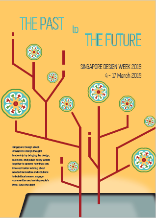
I had a lot of troubles coming up with the slogan; I was thinking something like “The Past and The Future”, or “Design Through Time”, but nothing really catches my attention. Besides, I wasn’t sure about the layout and color as well. I think this draft looks awful.


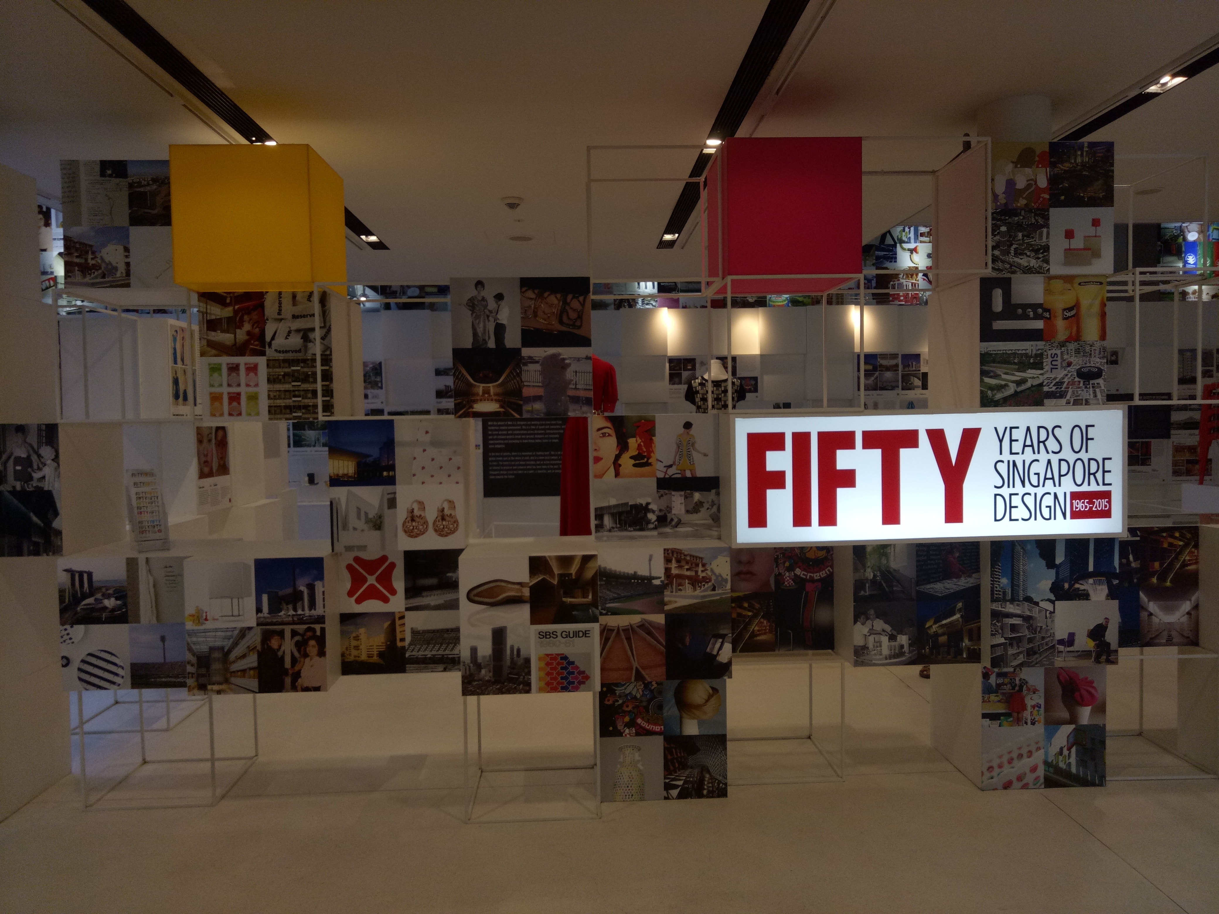
3. Design as connection

For this last one, I was looking for inspiration from the past SDW poster slogan. Their slogan is “A March of Design” (which, I think, is really smart since SDW is held in March). I wanted “connection” to be the concept; so I want it to be something that everybody knows and can relate to, something that everybody shares. Then I thought of the word “anthem” (by accident) and I liked it, hence the slogan: “An Anthem of Design”.

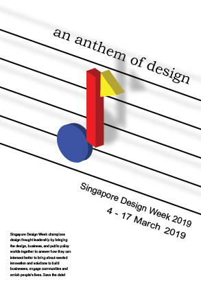
Since it’s about anthem, I wanted to create something shaped like a tone at first, but using geometric shapes (like Bauhaus). But it turned out very stiff and didn’t convey the excitement and energy of an anthem.


In the end, I decided to work on the third idea: An Anthem of Design.

So we went to the National Design Centre. I’ve seen the exhibition a few times, but I’ve never actually paid attention closely to them.

Some types of design practices I saw:

Product design


Graphic design


Fashion design


Architecture


Over the years, I could see that in the beginning (starting from the 1965-1975), Singapore was still very focused on building the country. Design was made with a clear purpose to serve the needs of the people, instead of actually building the identity of the nation. However as time passed, design in Singapore began to take shape. A lot of design was made to promote Singapore’s national identity, especially when Singapore started to be noticed globally. As new technologies were introduced, Singapore slowly got modernized, but even until now the design in Singapore never really left the roots. Now the design in Singapore, I feel, is modernized, yet still really showing the national identity. Design is also not just “art”; it’s always used to improve other sectors such as economy and education.

I think even in the future, the goal for design in Singapore is to continue to develop fresh ideas that not only are aesthetically pleasing, but also contribute to Singapore’s growth and promote national identity at the same time. While that is not easy, I feel that Singapore designers are moving in the right direction. I can see some designs nowadays that combine some of the ideas – like, combining modernization and national identity.

Design continues to be of importance, and I feel like people’s awareness of that will only grow from now. Some things that used to just be functional, now can possess aesthetic values – a simple example is HDB buildings which walls are painted in pleasing colors or certain colors to create rainbow / gradient. And as more people see the significance of design, more people will be encouraged to think critically about it, and design in Singapore will hopefully grow to be better.

Here are the two posters that I find interesting.


Poster for Frankfurt exhibition by Kazumasa Nagai (from http://theanimalarium.blogspot.com/2011/01/life-is-change.html)


I found this on Pinterest and can’t find who made it. (from https://www.designspiration.net/save/1446483313272/)


I will be talking about the second poster, the yellow one.

This poster is promoting a festival of industrial design in Sydney, and the slogan is “Ignored Everyday”. At first I’m really interested because of the minimalist appearance, with only yellow and black colors. My eyes were immediately drawn to the title due to the black highlights that contrasted the yellow background. After that, I shifted to the yellow paperclip, which didn’t blend with the background due to the outline and the shadow. It created a visual interest that makes people question, “Why a paperclip?” And that prompts the audience to read the information provided.

The information is written using sans serif fonts, which makes the whole look consistent and simple. All of them used black color, which contrasted the bright yellow background very well. I feel that the font size of the festival information could be a little bit bigger because the font is very narrow and thin, which compromises the readibility – but overall, I think it’s eye-catching, simple, and effective.