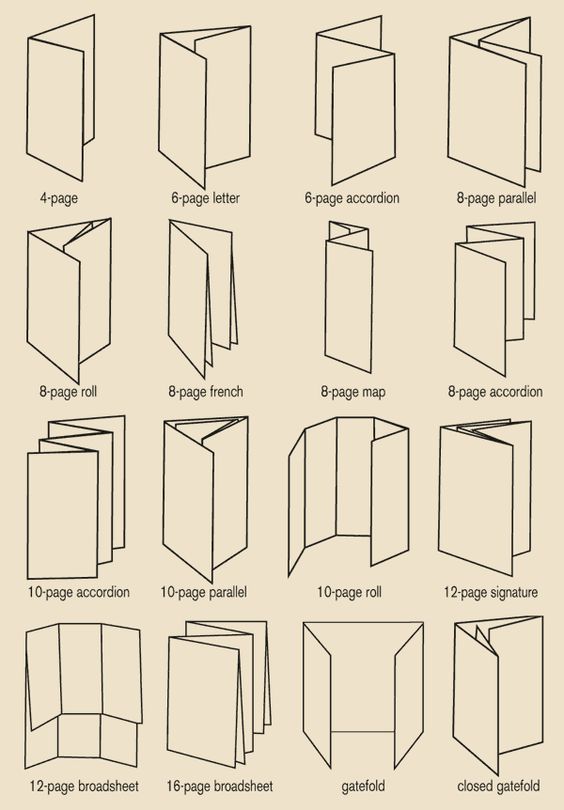
For the brochure, I looked up for different design folds.
Since my theme is anthem, I wanted to do something about “opening up” to reveal the contents.
I had three design ideas:
1.Stack square fold
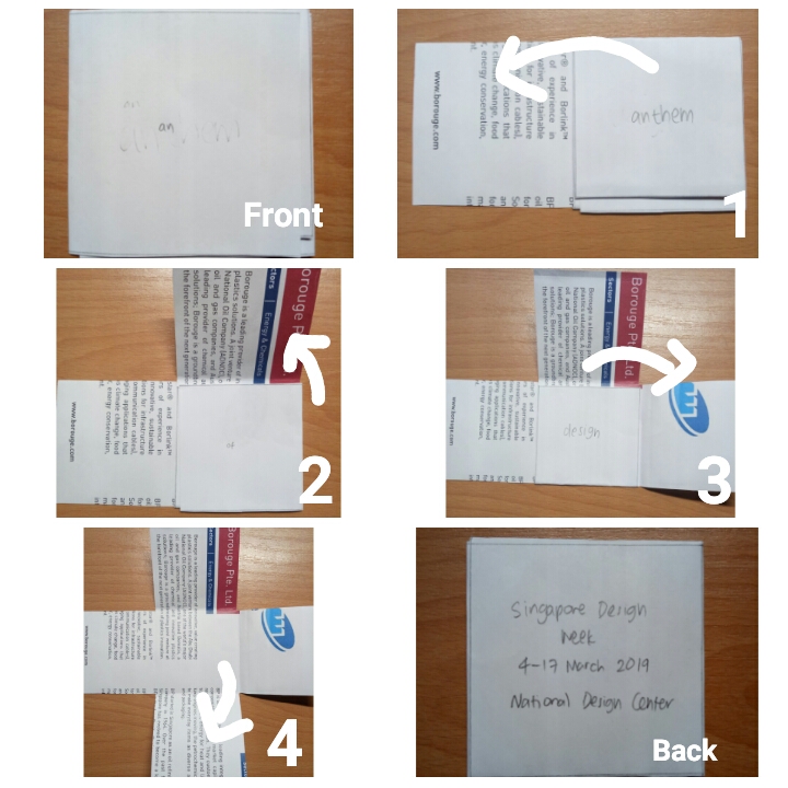
how it works

inside view
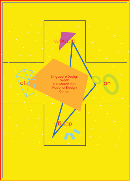
outside view
I like this one at first since the idea of revealing was fun; one word will be revealed at a time. However, I realize it makes the very front interface (when not opened at all) confusing and even boring since there will only be the word “an” in it. I also had troubles incorporating the elements to the shape of the brochure.
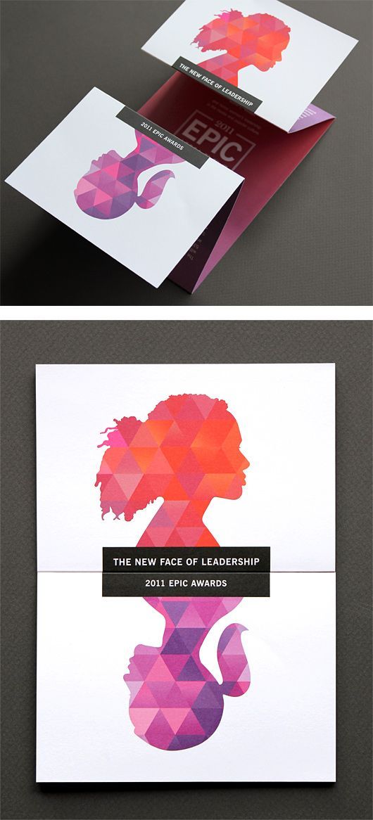
2.Vertical gate fold
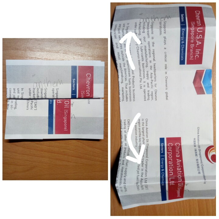
how it works
outside view
inside view
I feel that this one is very clear-cut and clean. However, I am not making use of the back interface at all, which makes it look incredibly plain.
I asked for Michael’s feedback, and he said that both my design and visuals could afford to be stronger, and should be able to lead the eyes. For those brochures, I relied more on the layout rather than the visuals to lead the eyes. However, I’m so stuck with the arrangements for those brochures since I already had a vision for them from the beginning. I tried taking the elements out and putting them back in again separately, but I didn’t make any significant difference (especially the stack square fold). So in the end, I decided to try and start fresh with a completely new design fold.
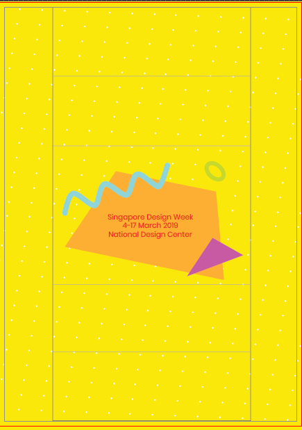
3.Horizontal gate fold
I already had the idea of using the normal gate fold from the beginning, but I was worried it would be too plain. But then I realized that if a brochure’s design is too complicated, it might confuse the readers instead, and that layout and visuals matter as much as the design fold.
In the end, I went with the horizontal gate fold design since I feel that the possibilities for this design are more “open” compared to the other two.
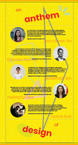
More about the design will be talked about in my final project post.