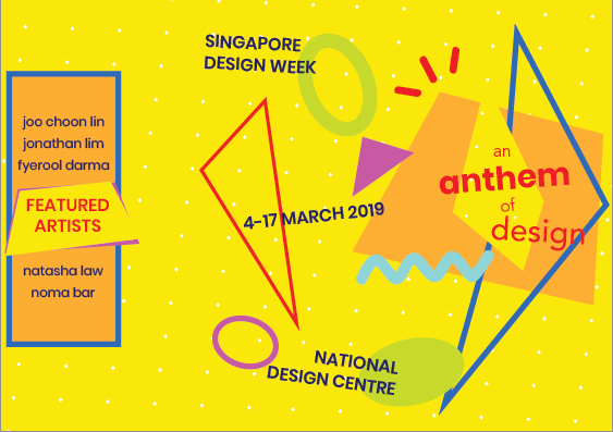
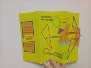
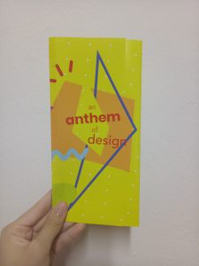
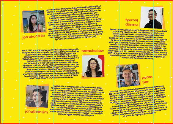
For my final brochure, I decided to use gate fold design – but it’s not completely gate fold since the first page are pretty much overlapping. It’s kind of styled like normal trifold, but the first and second page are not covering each other completely. (Honestly, I don’t know what this is called.)
Here is my final design:
Physical copy
I folded it wrongly at first. Since it’s glossy, it’s very obvious. (I’m sorry.)
Digital
For the front page, I’m sure I want to use a design similar to my poster from project 2 (see here) and put the details on the back page. I wasn’t sure about what to put on the second page at first since there won’t be much space. I thought of putting the details (the dates, etc) there, but there wasn’t enough space to make it look like those details are important, so I put them at the back. After trying out, I decided to put the names of the artists there, sort of like an “opening”.
I chose red and dark blue as the main eye-catchers, since they stand out the most when put with the yellow background.
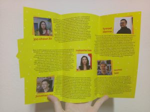
As for the inside page, I put elements there at first. However, they don’t help to lead the eyes, and make the overall look more messy since it looks as if the elements were just thrown in without purpose. It also somewhat makes the texts harder to read. I was worried that just yellow with the polka-dotted background would be too plain, but since the page is packed with texts, it doesn’t look empty.
I added some geometrical shapes behind the photos of the artists to instill the elements that I incorporate in my front page. At first I wanted to make the photos circle, but I realize that my “title” design is quite angular despite having circles because the main elements in the design are the angular line and the trapezium lookalike. After trying out both design, I decided that squares are better, also because there are already circles (the polka-dots) in the background.
I also slanted the photos and the texts to add the “fun” element and make the whole look not as rigid, but I do think it does look slightly messy.
One big problem that I had was the texts; since I had to reach up to ~150 words, the texts are very chunky and space-consuming. I wanted to stick with overall A4 size, so I hope the texts didn’t turn out too small.
Afterthoughts?
I have made a brochure before (for my part-time job), but since it was a professional brochure, the layout was much more rigid and easier to arrange. Moreover, I just had to stick with the NTU-approved colors and font, so there was not much “trying out” to do. When I was making this, I really felt the need to be creative, to be fun, to be quirky. I was trying to find a really complicated, unique fold design at first. I felt pressured by the title “anthem” that I created myself.
But then, in the end, I decided to forget all about it and just focus on creating a brochure first. I feel that above anything, a brochure has to cater to the needs of the audience – in this sense, to inform them about the featured artists of SDW, while still incorporating the whole theme / slogan of the event. That doesn’t necessarily mean I have to be “oh-so-different” – I just have to stick with what I have to do, and not try to do too much at once.
