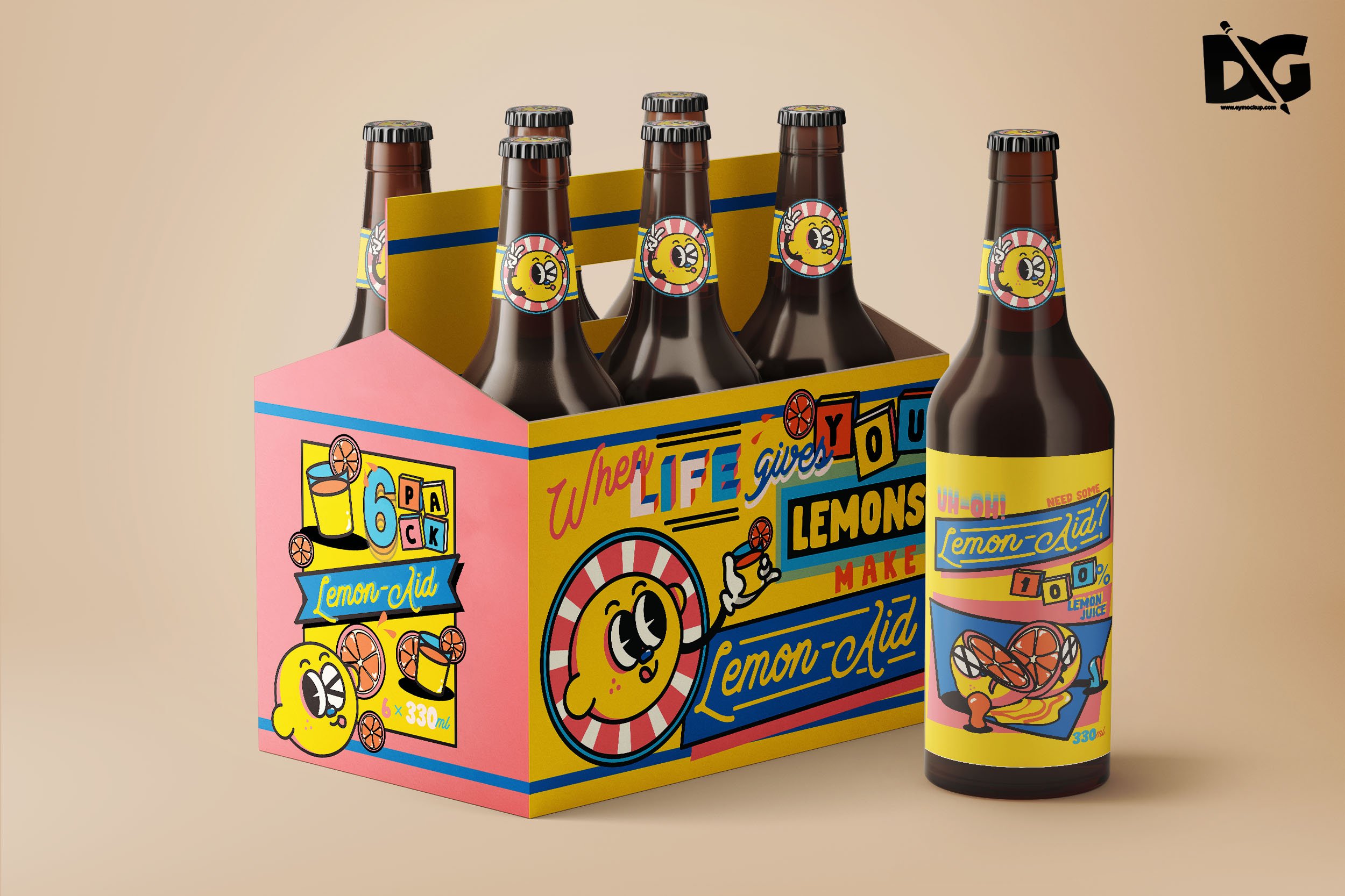
So, the event that I chose to do is a stand-up comedy show that is a little dark and/or sarcastic. The concept is lemon-related puns with a lemon as the main character for the design.
The collaterals that I decided on are a poster promoting the show, a bottle label, and six-pack packaging for the bottles. The idea is the audience will be given a bottle for free to drink during the event, but they can choose to purchase packs of the drinks after the event. (Disclaimer: the drink is lemonade. This is a lemon event, after all. But for the sarcastic points, I do admit that they look like alcoholic beverages.)
Process & Final
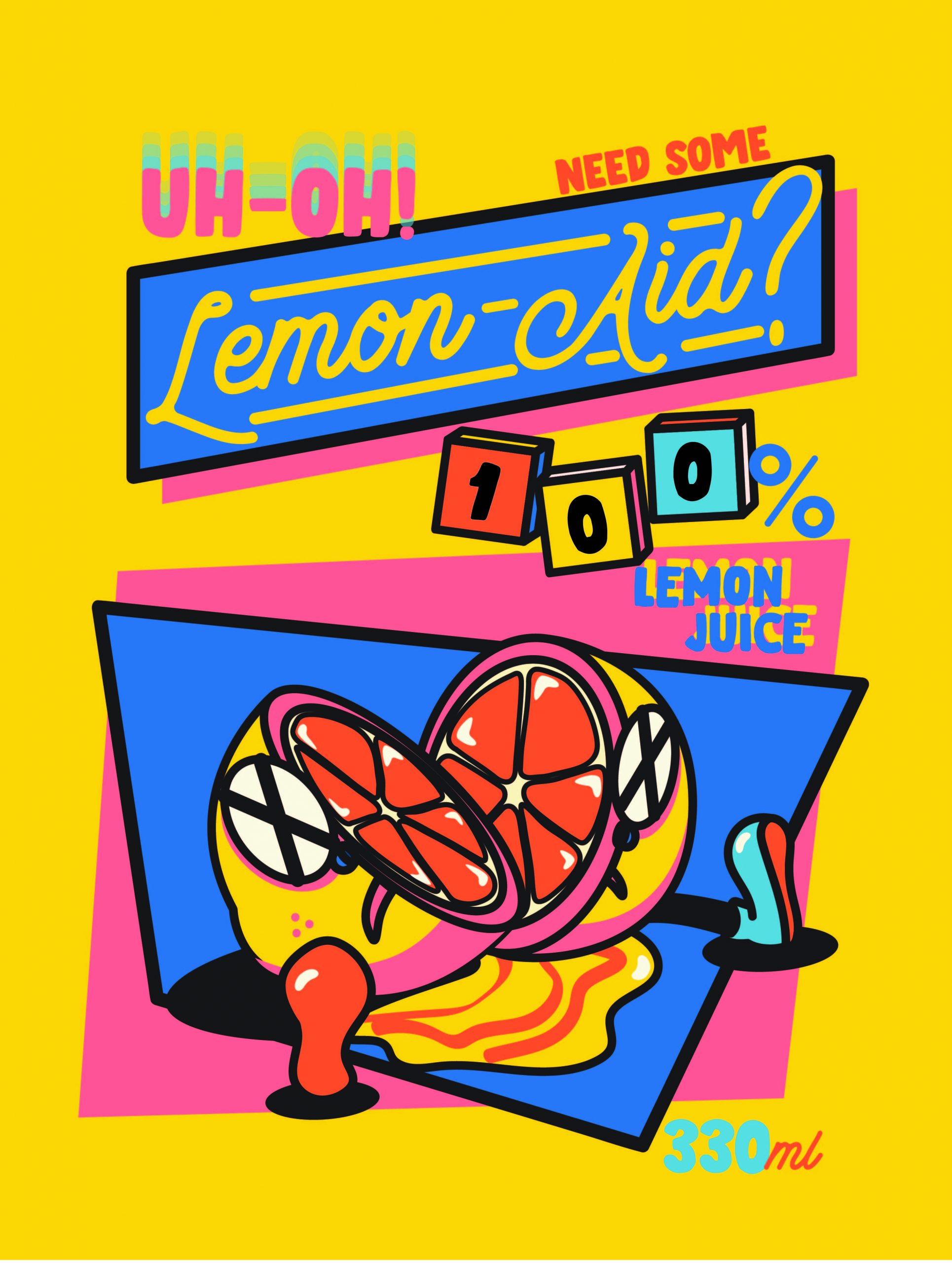
Poster
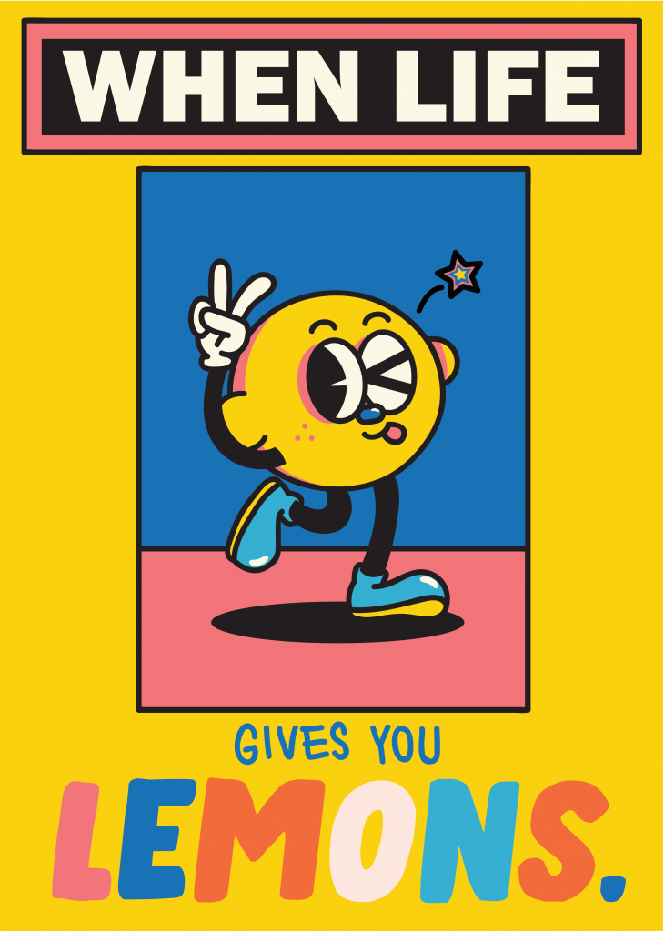
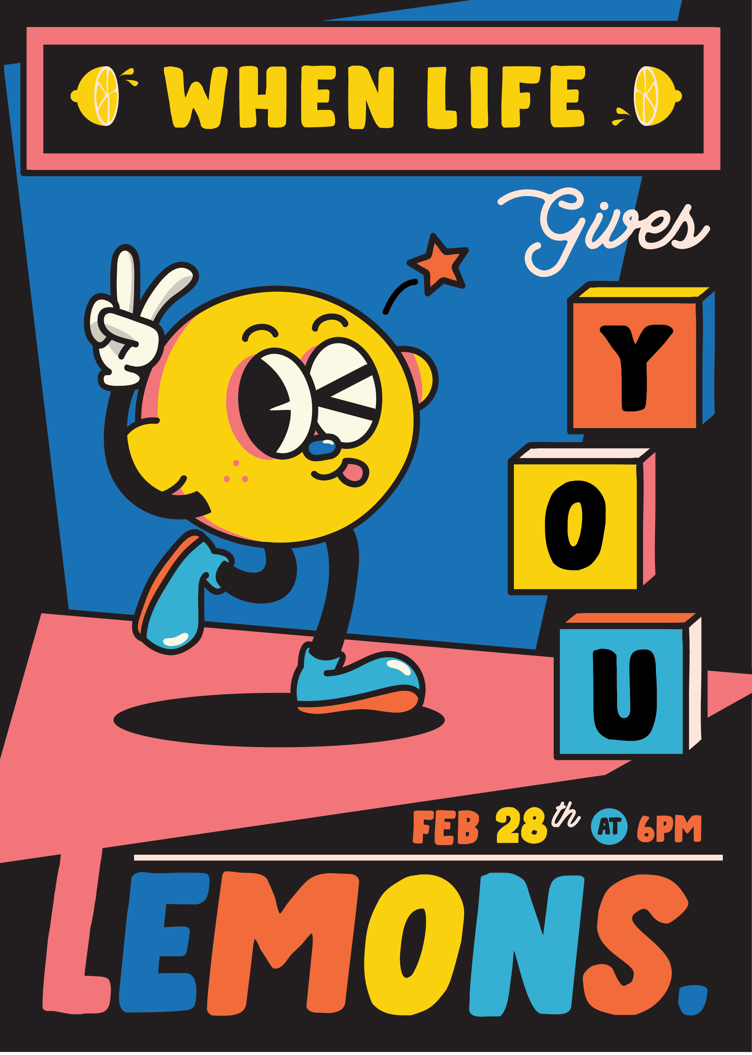
So I came up with the character (lemon) and the “title”: When Life Gives You Lemons. Here are some of the drafts:
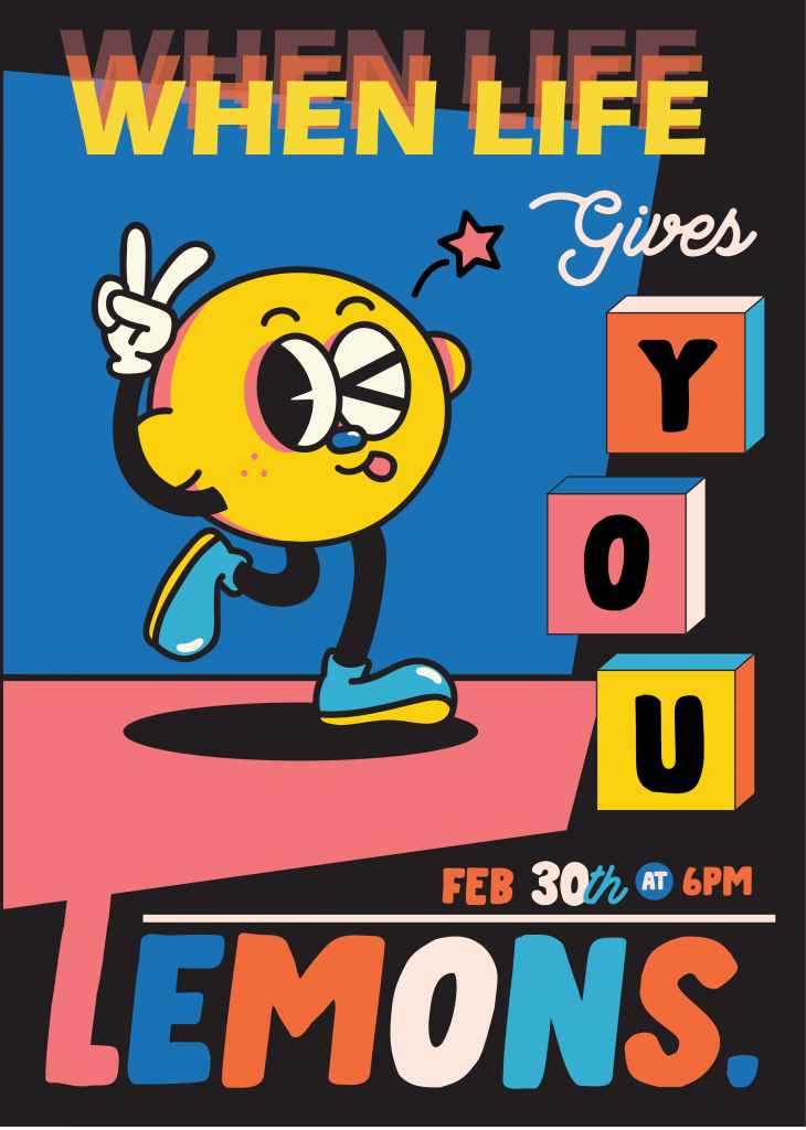
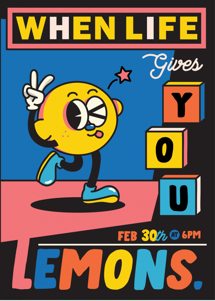
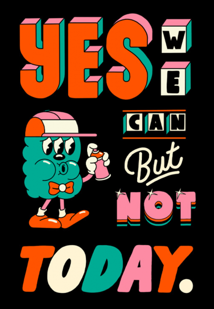
At first I came up with this, but it felt very limiting and way too similar to Yeye Weller’s style.
After some trial and error, here is the final poster:
For the typefaces, I chose a thick handwritten-style font, paired with an elegant yet friendly cursive for contrast. I think they make a good pair in the theme I’m going for.
The biggest challenge with this poster was adjusting the colors, but I’m satisfied with the end result.
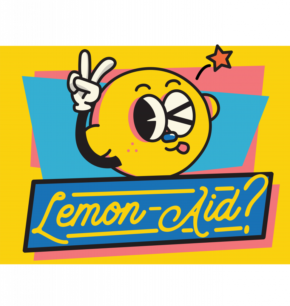
Bottle Label
So for the drinks, I used a pun with lemonade and called the drink “lemon-aid”. Since it’s an “aid”, my immediate idea was to draw the lemon sick or injured. Also, since the concept of the event is pretty dark, I figured that drawing a lemon cut in two will be perfect. So that’s what I did.
Here’s how the label looks like:
It’s definitely not perfect, but I’m really happy with how it turned out. Again, adjusting the colors is one of the biggest challenges I faced in the design process.
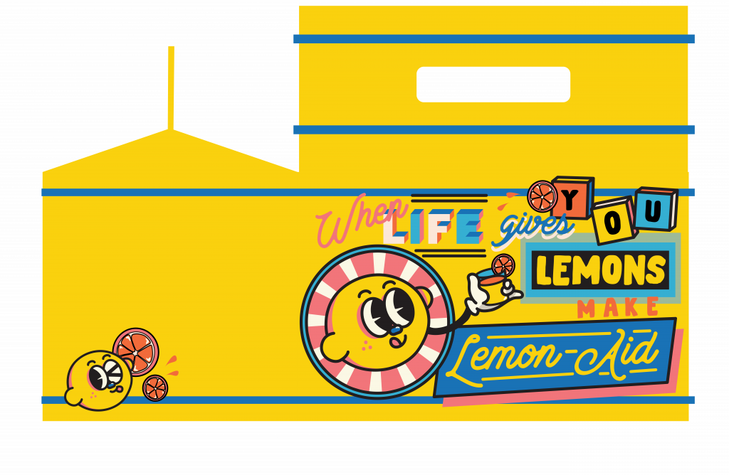
Six-Pack Box
Again, same with the other two, my issue was adjusting colors. So pretty much I did a lot of trial and error with different colors.
Another issue that I had was the composition. Unlike the poster and the bottle label, I wasn’t sure what to put at the front and how to arrange them in a way that is still within the theme, interesting, yet not too similar to my previous designs.
This is my first draft:
When I put it on the mockup file, I thought that having different colors for the side and front would be fun. Also, the side was too empty and it was too much of a “drop” compared to the front, so I added more stuff to the side. Here is the final:
Others
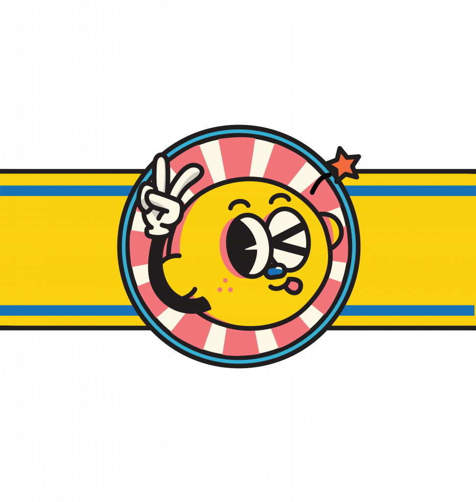
Besides the collaterals, I also made a label for the neck of the bottle.
I came up with two designs for the neck label:
I decided to go with the first one after trying both out on the mockup file since it looks less packed.
Final (Bottle & Box)
Putting everything together on the mockup file, here’s how they look like (minus the poster):
I think it turns out fun and cute while being a little sarcastic, just the way I wanted it.
Reflection
I find out that I really like doing this style. Also, that designing with this style is not as easy as it looks. I’ve always been drawn to flat illustrations and softer colors, but doing things with a fixed set of strong colors is actually good for me since I’m weak in color composition.
While doing this project, I asked for my friends’ opinions a lot (since we study together a lot) and I find that I can be quite stubborn with my ideas. When they give me feedback, I keep trying to justify why I did it that way. Now I’m a little worried about having to deal with clients in the future.
Adjusting colors has always been a big weakness for me, and I think there’s no other way rather than trial and error to come up with the best color composition. The thing is sometimes I’m not patient enough; when I see something that’s “pretty good”, I tend not to continue trying and settle with that. Which is also why feedbacks from my friends helped a lot in pushing me out of that comfort zone.
In addition, since the style for the design direction is more playful and “packed”, I had to be smart with the arrangement and styling of the words. Even just adjusting which component comes in front can make a huge difference in creating the overall look.
Also, designing things for 2D and 3D objects are similar, yet different. I had to adjust the label for the bottle several times to make it fit better with the face of the bottle, considering the way the bottle curved and everything.
All in all, I had a really good time working on this assignment. I think it’s become one of my favorite works. I might just use the concept and the character for something else in the future.
Here’s the link to my Google Drive folder for the final PDFs. Cheers!
For assignment 3, we have to come up with an event and collaterals for said event. For the event, I came up with 3 initial ideas:
1. Home Party (video call party with friends)
Collaterals: invitation, gift box with things you can use/wear at home i.e. comfortable pajamas, indoor slippers, scented candle, etc.
2. Virtual Run
Collaterals: invitation, medal for finishers, a certificate for participants, T-shirt, drawstring bag
3. Stand-Up Comedy Show
Collaterals: ticket, poster, banner, canned/bottled drinks, souvenirs i.e. stickers, iron-on patches, tote bag
After discussing with Lisa, we agreed that the stand-up comedy show would be interesting to take on. Personally, I also like that idea the most and it would fit well with the design direction that I was thinking of, so I was ready to go into it.
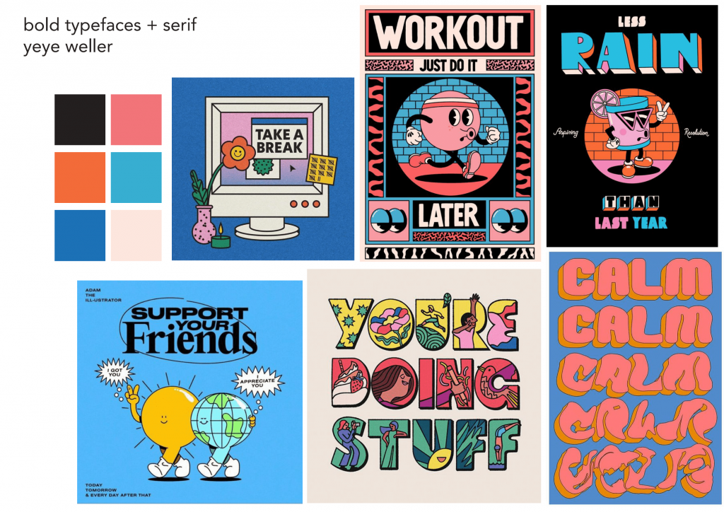
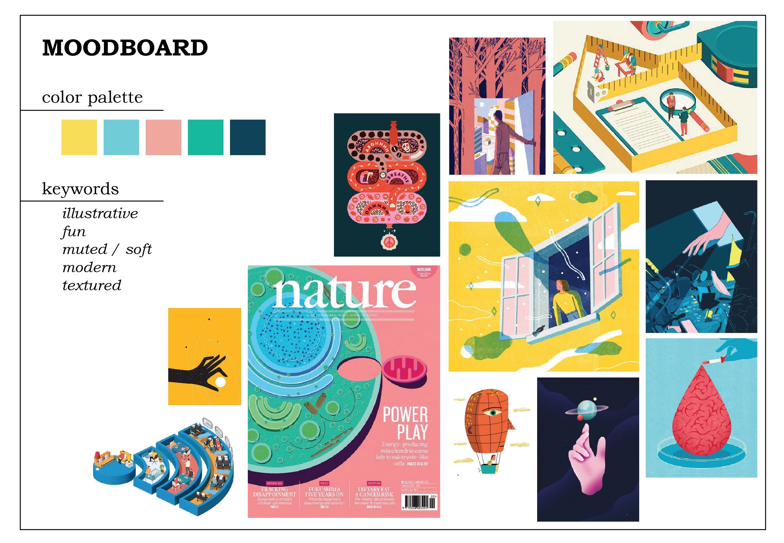
Design Direction
I was looking for inspiration when I came across Yeye Weller‘s works. I was immediately taken by the style, so I decided to go in that direction.
I picked several strong colors, including white-that-is-not-so-white and black-that-is-not-very-black. As for the font, I wanted to pair bold typefaces and serif (like the light blue image at the bottom left of the first picture, the moodboard).
Character Ideation
Yeye Weller’s works always have a certain “character” in the center, so Lisa suggested I create a character. I asked my friends for ideas since I was stuck, and they suggested something similar to a character I made before, which is a lemon head. It came to mind that I could make the theme of “when life gives you lemons” for the show; something punny, witty, and a little sarcastic. (Also, I like it.)
Lemonhead: a character I sort of came up with? This is a sticker I made for fun
So those are my inspirations and initial ideations. For the rest of the progress, you can see my final post!
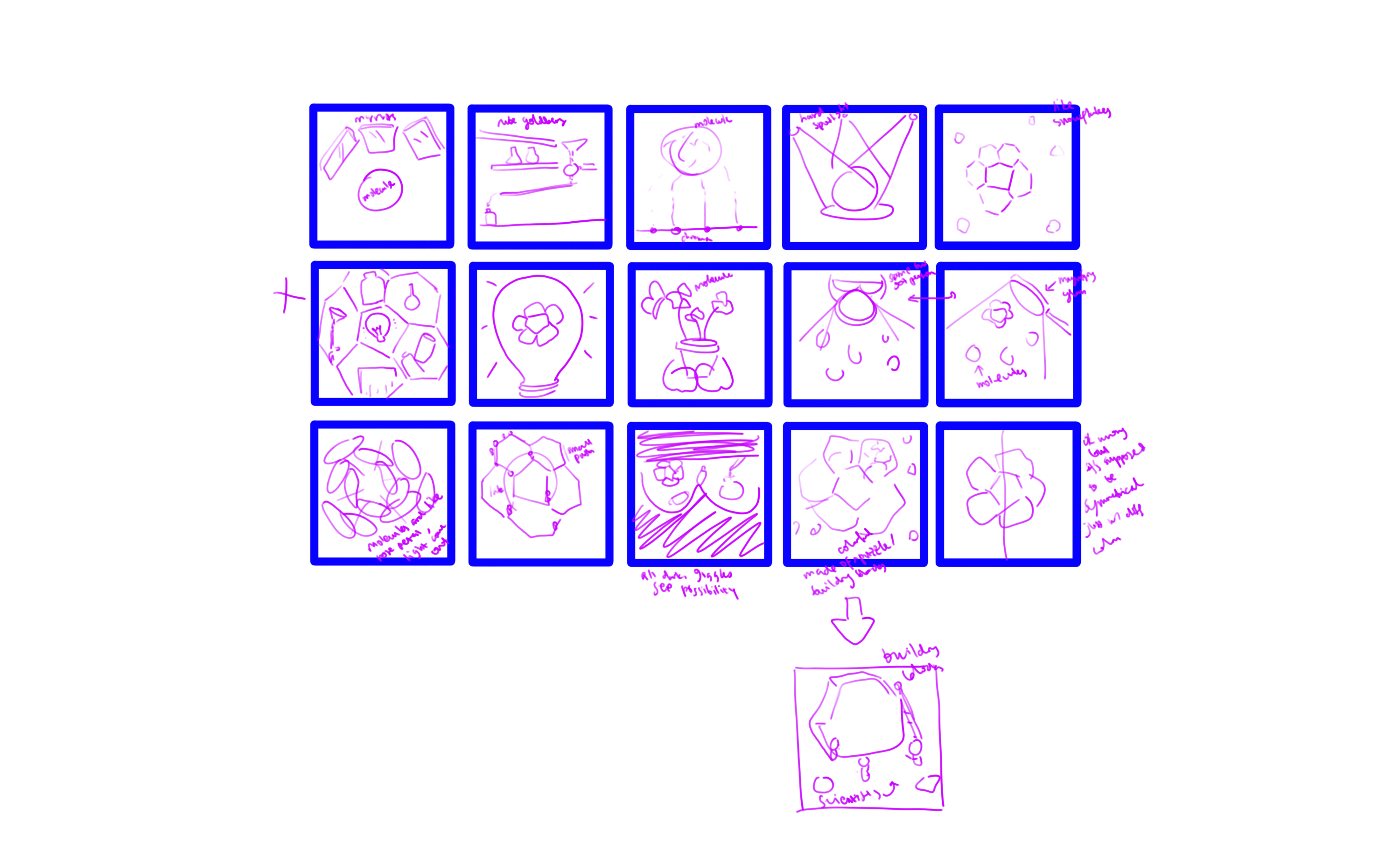
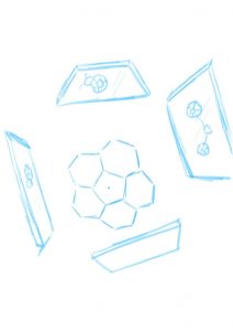
I came up with the thumbnails. Some of the keywords that I used in my ideation process are light, mirror/reflection, possibilities, symmetry, beauty, research, and discovery.
Sketches
From the thumbnails, I decided on three of the strongest ideas.
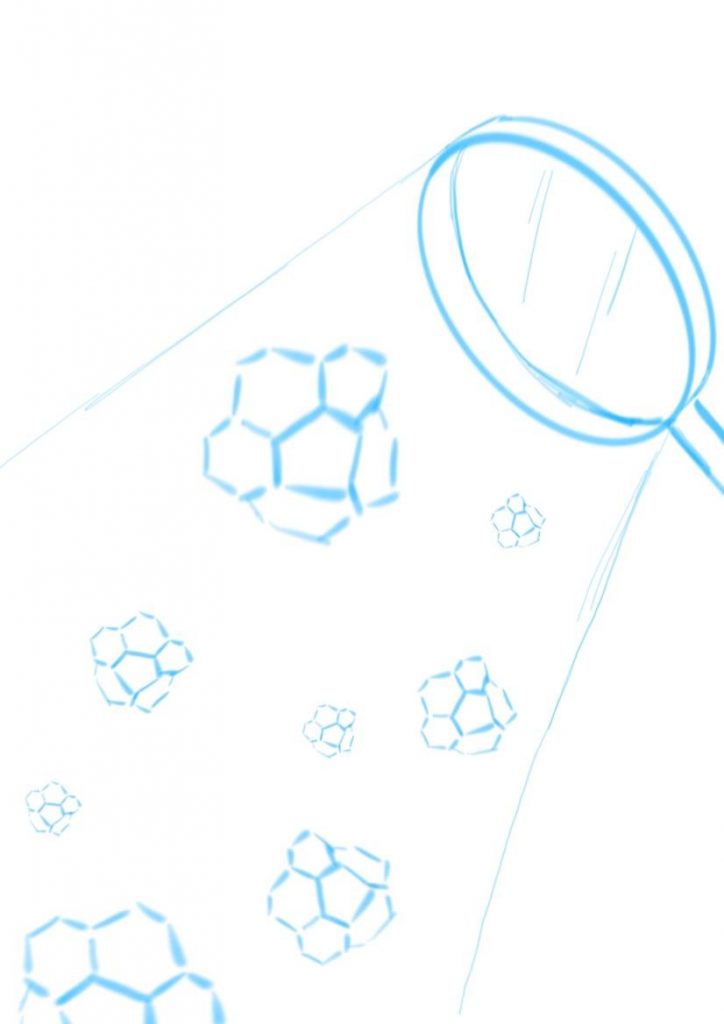
Corannulenes under the hard spotlight from magnifying glass. Straightforward, simple, illustrating discovery and research. The corannulenes would be in different colors to suggest possibilities. I was thinking of making them look like falling snowflakes.
Idea 1
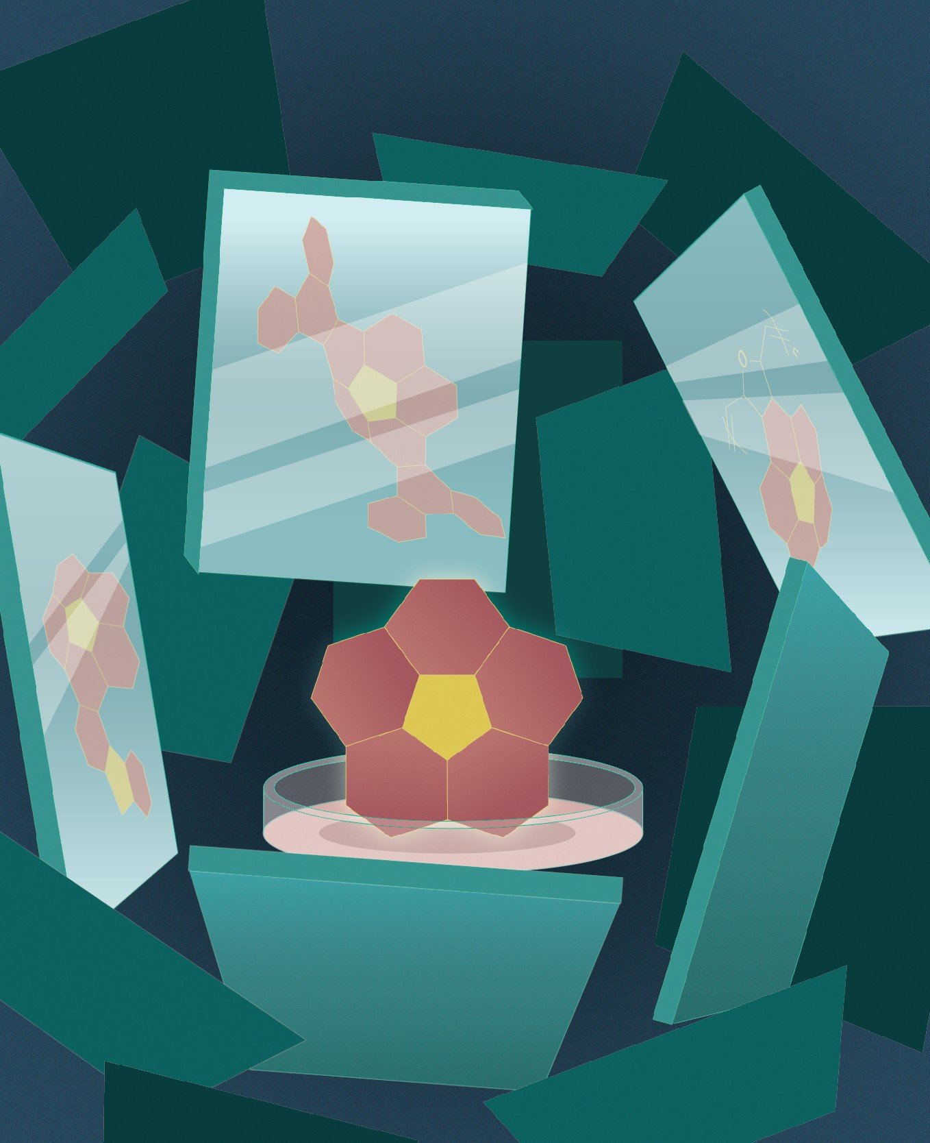
Corannulene in the center as the main character, with mirrors surrounding it and showing reflections of the different possibilities of what it could be. The focus is on possibility and variability in research and discovery.
Idea 2
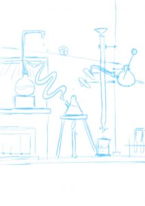
I’m not sure what it is but it’s sort of like pinball machine/Rube Goldberg machine/just some kind of mechanism, like an arcade game where a ball rolls down to the bottom. Instead of a ball, a corannulene will roll down. It portrays the fun and insightful side of research.
Idea 3
I asked for feedback from Professor Ela and she really liked the mirror idea (idea 2). To be honest, that is not my favorite idea (mine is idea 3). I wasn’t sure whether I should go with the idea that I liked the most or the one that the client liked the most. In the end, I went with idea 2. It is not going out of my comfort zone per se, since I don’t have any comfort zone (I am not that well-versed in illustration yet…) so I thought it’d be a good exercise for when I go out into the “real world” to follow what the client likes more. It is, in a way, a challenge I posed to myself.
Moodboard
I want to practice drawing flat illustrations more, so here is my moodboard. I love the soft colors, especially the pink and yellow, and wanted to try using them.
I had some difficulties as I was envisioning idea 3 with this art style. For idea 2, I thought I had to go with a more realistic style for it to fit, but then I thought again, why not. Just try it. So I didn’t change my original moodboard and decided to just… go with it.
Final
This is my final result.
I put the corannulene in a petri dish to emphasize the fact that it is a molecule because one of the feedbacks that I got from my friend(s) is that they didn’t recognize it as a molecule, especially because I used color fill on them instead of the molecular skeleton. Taking into account the fact that the title of the journal would be in white, I used dark colors as the background. To draw attention to the corannulene, I gave it a bright color, although now I’m wondering if the pink and the yellow are too eye-catching.
My biggest struggle is giving depth to the whole composition. I added more mirrors with darker colors to illustrate mirrors that are further away, but it still fell flat. I also added noise (which made my Illustrator run slow…). In the end, I added gradients to most of the elements and a slight glow to the corannulene as an attempt to “save” the flatness. It’s still lacking, but it’s admittedly much better than before. However, I really should have made the gradient on the background more contrasting. I could also do better with my color choices.
I didn’t want to use gradients at first because they often turned out duller in prints compared to in screen, and prone to printing failures. I wanted to use a stipple brush for a shadow effect, but I am not sure how to do that (even after watching a video on how to do that) and I was running out of time (yes, I have terrible time management) so I took the shortcut which is using gradients.
There are so many things I could do better. However, it has passed! I’m kind of relieved since I was struggling and stressing over this assignment so much, and the result is certainly not the best I could’ve done, but I’ll give myself a pat on the back. All in all, that had been a great exercise for me.
I tried to look through the abstracts for the articles in the journal, but I was lost. Very lost. I couldn’t even understand the words individually, let alone as sentences.
I tried.
From what I was able to understand, there are several types of articles; for example, discussions and research results. Research results consist of what they were aiming to gain more knowledge about, how to go about it, and what their findings could be used for (references for future researches or improvement opportunities for medications and technologies, to name some). Meanwhile, discussions provide more insight into the researchers’ perspectives in addition to their researches, such as the analysis and challenges in researching that particular topic.
It is clear that the journal is not intended for the general mass. While each article includes an introduction to the covered topic, people without sufficient background in science (especially chemistry) would not be able to understand it well. The journal would be a reference source for people who are writing papers, or people who are looking into doing chemical research or experiment. To a certain extent, people who want to keep up-to-date with findings and development in chemical research might read it as well.
Nevertheless, just looking through the titles, the diagrams, and parts of the abstracts was interesting. It provides some insight to an outsider like me as to what people who work in this field are interested in. For example, the efficiency of the molecule shapes and structures. It is also interesting to see the “behind the scene” (like the molecule names or actions) of the applications of science, such as cancer immunotherapy and vaccines, or wearable energy storage. I don’t know how it sounds to them, but to me, it sounds highly complicated, yet revolutionary. It makes me wonder how many of these articles have to be produced for an actual scientific breakthrough to be made.
We talked to the client about the project. The main theme for the cover would be “A curved polyarene building block for the construction of functional materials”.
Yes, I understand those words separately.
I think, more easily put, it should be about how these curved polyarenes are produced and applied. The key points that we should include in the cover are the symmetry of the curved polyarenes (sort of like a soccer ball pattern) and the fact that they use a lot of light to generate. The client had also mentioned that there is no need to be too chemically accurate.
Inspiration
1. Wijtze Valkema
Check your contract when having a new house built, for Eigen Huis Magazine
This is an illustration of an article about the importance of checking contracts when having a new house built. I like the use of texture; it gives the illustration a richer feeling instead of just being simply flat. They also give the shadow effect at certain places.
This is also sort of a playful take on the article, making the readers or “you” a giant character inspecting a smaller house by taking off the roof while having a small character (who we can tell immediately is the worker in charge of the construction). I think the illustration is able to convey the essence of the article clearly without being too metaphorical or detailed.
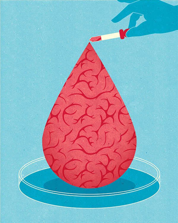
2. Kotryna Zukauskaite
Memory aid: Stanford researchers have found that blood from newborn humans can rejuvenate learning and memory in aged mice, a discovery that could lead to new treatments for age-associated declines in mental ability. Client: Stanford Medicine, 2017
I think the interpretation of the article here is excellent. While I cannot catch the meaning alone from the illustration, once you read the topic, the illustration makes a lot of sense and enhances the reading experience. The article is about how blood from newborn humans could rejuvenate learning and memory in aged mice, which could lead to potential new treatments regarding mental abilities. The illustration encapsulates the idea of blood, brain, and research.
The illustration itself looks simple with few colors, so it feels like the illustration is not there to be the “star” of the article, but rather as a “supporter”; yet, it manages to simplify the long-winded topic well.
3. Beth Walrond
An animated GIF for Zetland about children getting stuck in a YouTube rabbithole
This is technically a GIF. But it is made of illustrations. So I digress.
Before I looked at the title, I can tell immediately it’s going to be something about the overuse of the Internet. The use of animation here conveys the idea of YouTube well.
I am actually amazed by how I can tell that 1) it is a child and 2) the child is holding a laptop. As for (1), I think the color palette and her pink hairpin help a lot, also, the proportion of the child to the laptop. As for (2), I think from the pose and the play on the logo brand, we can see that it is a laptop. Somehow I find it interesting that they are simple, yet so easy to process that I didn’t even ask myself “what is that?” or “how was I able to recognize that?” at first.
Compared to the other illustrations, this one has a freer, more handmade feel since the creator didn’t use clean, sharp lines. When I look at her other illustrations, she does like not to use sharp lines, but even this one is particularly more “wobbly”, for lack of a better term. (Sorry, my brain is fried after reading the journal.)
Takeaway
All of them uses digital media; Walrond even uses animated GIF (for a good reason). I think that reminds me that when you’re doing something and you want to go further, you have to ask yourself, is it necessary? What is the purpose of bringing it beyond? Sometimes we’re so fixed to just making things look “cooler” that we didn’t consider if it actually contributes to the objective.
(Disclaimer: this is not an excuse for wanting to make things simpler.)
Each illustrator has different ways of bringing the articles to life. But the similarity is, all of them do the job well without actually portraying anything in a too straightforward manner. Valkema’s one is more straightforward, but they did a more playful take instead of just portraying someone reading a contract (which, now that I think about it, is very easy to fall into. If there’s an article about the importance of reading a contract, wouldn’t people jump at the idea of drawing someone reading a contract?). Zukauskaite’s topic is more abstract, but even then, they did not just illustrate a brain or a research lab. Walrond also did not need to draw the YouTube logo, for example, for us to realize the character was watching way too many videos.
All of those illustrations are also able to summarize the topic well and enhance the article. To a certain extent, they make reading the articles easier.
For this project, I asked my non-ADM friend to become my client. (She’s happy to do it.)
We have known each other for years, so suffice to say, I know her pretty well. I asked her about what she’s passionate about nowadays and she said sustainability; she’s been trying to reduce plastic usage more by bringing her own lunchbox for take-away food from the canteen and always using reusable bags when shopping.
Recently she encountered something that made her realize that a lot of people around her are aware of sustainability issues, yet are not moved to do something about it, and it made her rather upset.
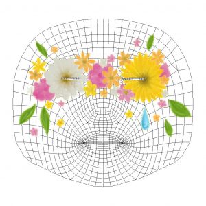
Taking that, I put two keywords together: nature and sadness.
Here is the artwork.
Nature here is symbolized by flowers and leaves. I chose a daisy and a sunflower as the main flowers as those are my friend’s favorite flowers. Since my friend is a bright and positive person, I chose a bright color palette for the flowers in general, with occasional pale white flowers to balance out the daisy. Yellow and orange are especially her favorite colors.
As for the sadness, I put a single teardrop. It also portrays the loneliness of being alone, since she felt that she was fighting with the issue alone sometimes. Since the flowers are mainly yellow-white-orange-pink, the blue teardrop stands out well.
I also outlined the entire artwork with glowing pencil texture, but it’s not very visible. I wanted to give it a handmade feeling since my friend loves arts and crafts. I made it “glowy” to represent her confidence, the way she carries herself.
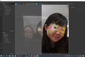
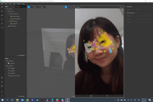
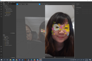
At first, I created the flower to cover the eyes completely to represent blindness to the issue of sustainability, but it might not look good as a filter, so I create openings for the eyes. I wanted to portray the saying “see no evil, speak no evil, hear no evil” but I got stuck on thinking of what elements to put. I didn’t want to ruin the composition altogether by adding too many unnecessary details, so I decided to focus on one, which is the eye part.
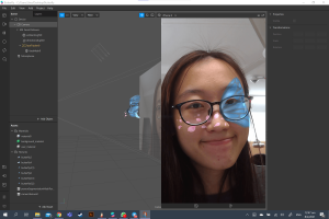
Here’s how it looks on her:
(She was excited to model for me.)
It does look a little weird on some types of faces since the brown centers of the flowers are located right at the corner of the eyes, but I’m quite satisfied with how it looks on my friend.
Filter 2: Self
One thing I need to say: I like BTS. I chose three BTS songs that I love the most, and I feel, represent me in different ways. (Also disclaimer: it didn’t take me very long to decide on this. Really, whenever I have projects about myself or my interests, my personality is suddenly reduced to either mental health or K-pop or both.)
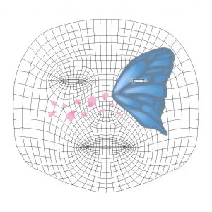
Before I go into the explanation, here is my artwork.
The half-wing of a butterfly represents the loss of hope and the inability to live up to potential. I am not the most positive person and I also have issues with self-esteem, so I think it’s a perfect representation of my inner problems. It is also linked to a BTS song titled “Butterfly”, which speaks about the fear of losing loved ones. In a sense, it also relates to me. In this pandemic, I can’t return back to my home country, so I’m really concerned about my family back in Indonesia and whether they are doing well.
The color of the butterfly is blue and grey, which is the title for another BTS song: “Blue & Grey”. The song symbolizes depression and loneliness as the colors blue and grey, and I relate to that a lot.
Lastly, the flower petals are the symbolization of the song “Spring Day” (because there’s a line that says “Flower blossoms are falling”), which is about longing to meet loved ones. This relates back to the point about my current situation of not being able to return home, and the desire to do so.
For the technicality, I tried to make it look more sentimental since the topics that I’m symbolizing are mostly emotional ones. I like how it turns out; it’s simple yet aesthetic, and there’s a nice balance between the somber blue and grey and the lively pink. Overall they look like they are symbolizing the arrival of spring (referral to “Spring Day” again?) and budding of new hope, which contrasts my representation of the half-winged butterfly. (I hope it makes sense.)
Here’s me with the filter:
I think it doesn’t look half bad on me. I still really like the colors. Blue just happens to be my favorite color as well.
Reflection
After I finished creating these, I was excited to see how they look on the faces. However, I was (and am) worried that it may be too simple. This is almost my first time creating digital illustrations (I’ve also never drawn anything by hand and scanned it digitally). I don’t know what my style is; I don’t know what to do, I don’t know how to blend colors. Time passed by so fast when you know nothing.
However, despite that worry, I’m still satisfied with how they turn out. Mostly though, it’s just me, just doing it. I didn’t think much about stylization, honestly, because I’m lost myself. So I told myself to just draw and that’s how it turns out. I suppose I should have dug deeper to find my style. For now, I’m happy just exploring. One step at a time!
Also, you can see that I drew the flowers first before the butterfly since the flowers are all drawn on one layer while the butterfly is very beautifully layered. I have learned from my mistakes.
I still feel like I should’ve done more, adding more elements? But this is what I can make within the time. So. Yeah.
Through the interview, I also learned the differences when I’m making things for myself compared to when I’m making things for others. For me, it was easy to just create something very personal. Also, when I’m creating for others, inevitably I’m adding things that reflect my perception of them.
All in all, this has been a fun project. Learning about Spark AR is interesting, and I can feel my own personal development throughout this assignment as well. Hope I can do better next time.
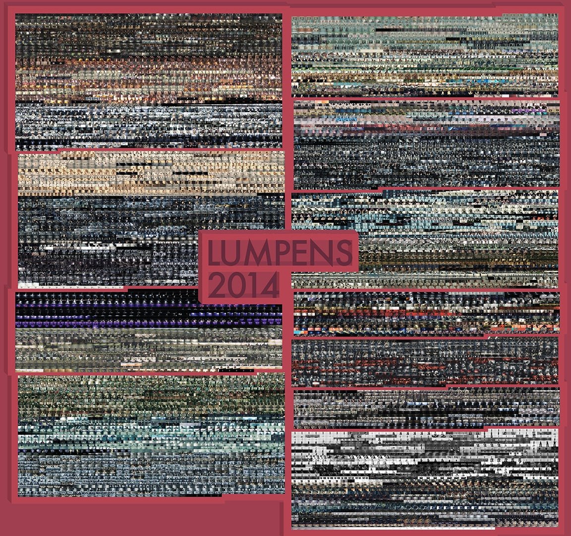
Lumpens: Pursue the Fantasy of Visual and Auditory Senses
Who?
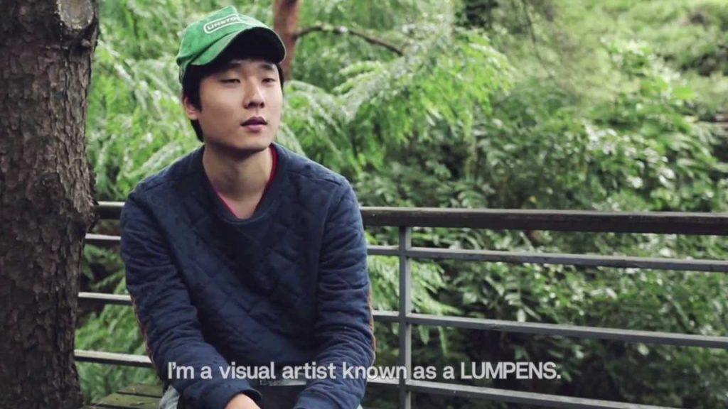
Although what he does may not be what I am (and probably would be) doing, I admire Lumpens—a group of directors and producers in the field of video production, mostly specialized in the production of music videos (MVs), TV advertisements, experimental films, and visual art, based in South Korea. They were created by Choi Yong-Seok in 2009 and consist of 4 people, but Lumpens usually refers to Choi Yong-Seok specifically.
I came to know them as they directed a lot of BTS music videos, which I enjoy immensely.
Choi Yong-Seok, the creator of Lumpens who is also known as Lumpens himself.
Why?
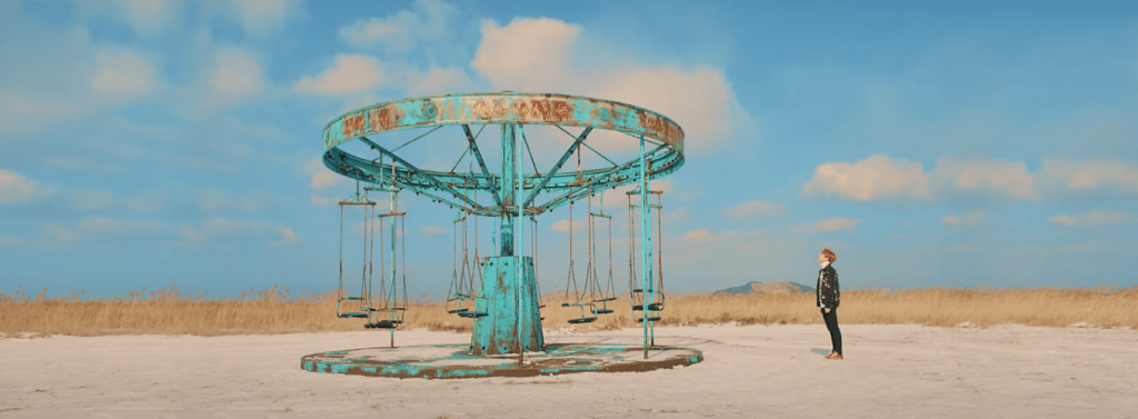
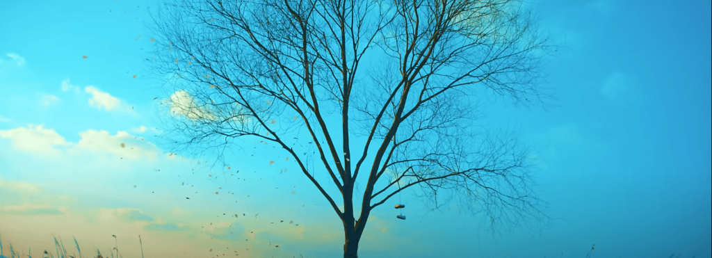
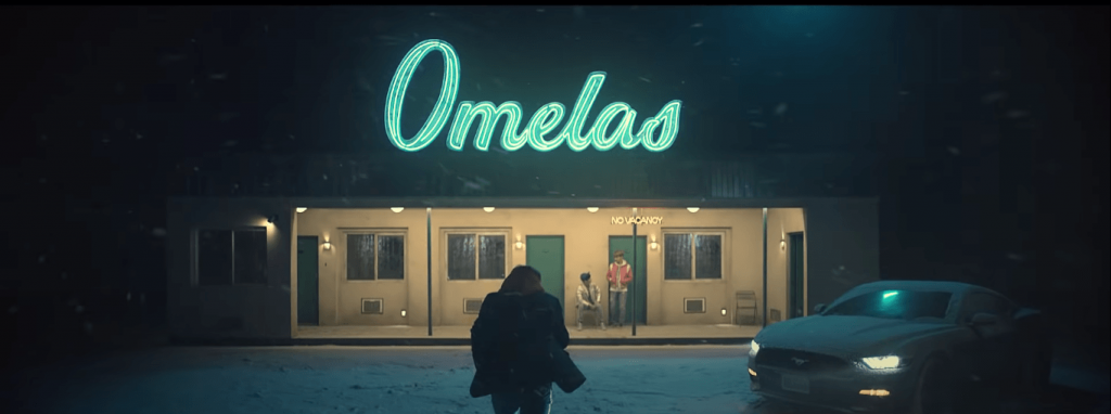
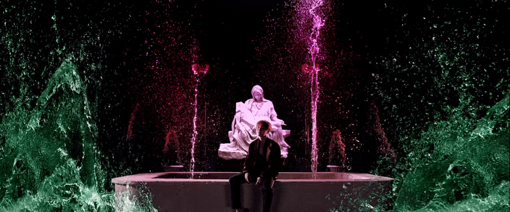
Firstly, they like to insert stories and/or references into their MVs; especially with the stories, it gave his MVs a cinematic feeling. One of my favorite MVs is BTS’s “Spring Day”.
I love the quiet aesthetics (the use of colors and how they match with the song lyrics), and also the implied (and obvious) references (Snowpiercer—a movie about inequality, The Ones Who Walk Away from Omelas—a philosophical fiction about injustice, and the Sewol ferry disaster—the sinking of a ferry which sparked social and political reactions in South Korea).
Some of the shots from the MV:
It gives depth to what people perceive as “just a music video” due to the hidden meanings and messages, on top of being aesthetically pleasing.
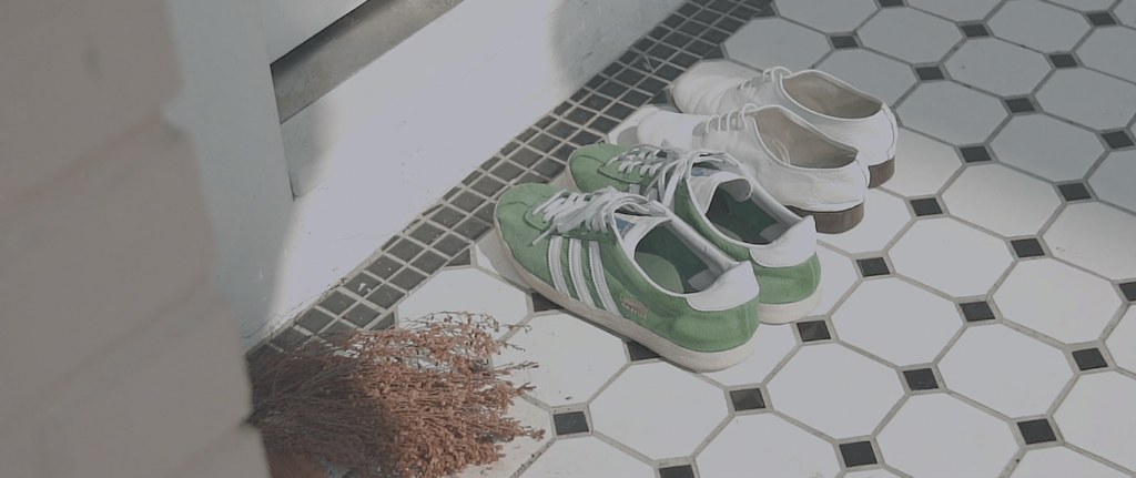
Other favorite shots from various of his MVs:
Secondly, I admire Choi Yong-Seok’s way of thinking. He graduated from a Visual Communication major, but he always wanted to express himself outside of the “screen”. He started making videos and exhibitions as personal activities. It’s almost as if he didn’t intend to be a director, but he just did his own thing to have fun and learn, and somehow, that’s how he became one. It reminds me that sometimes, things are that simple. You just have to work on what you like and be confident in yourself, and not worry too much, too far into the future.
When we listen to stories, we only listen to one side of the story. But often we fail to recognize this, and taking everything face value, thinking that what we heard is the fact instead of just a side to the story. Even worse – often we realize that, yet we don’t try to find out the truth. We make ourselves content with what we know. We overlook that lack of understanding, although we know it is there.
Based on the theme of “interstice of understanding”, we created project Door.
The Door
Group members: Dan Ning and Vania
Materials / Components
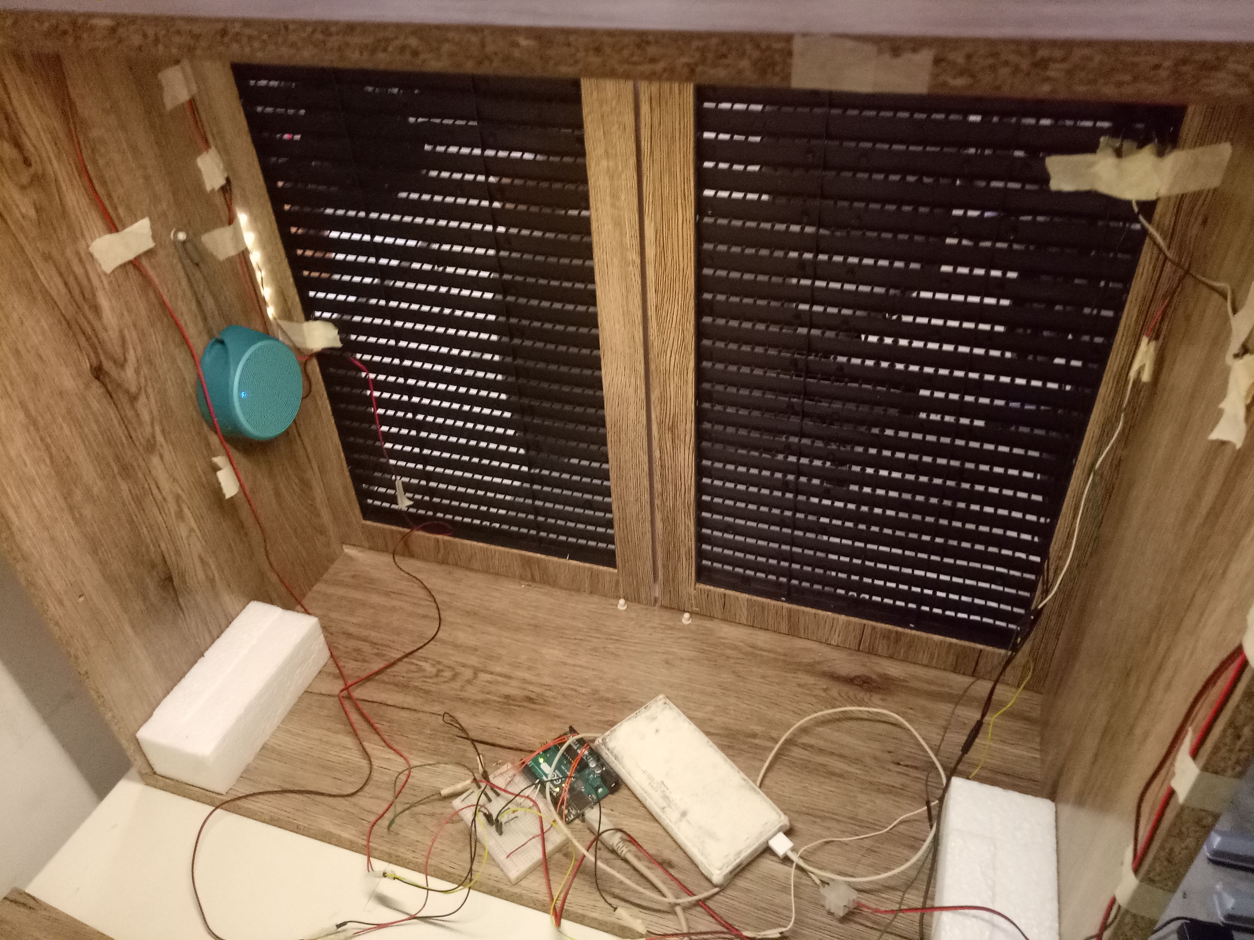
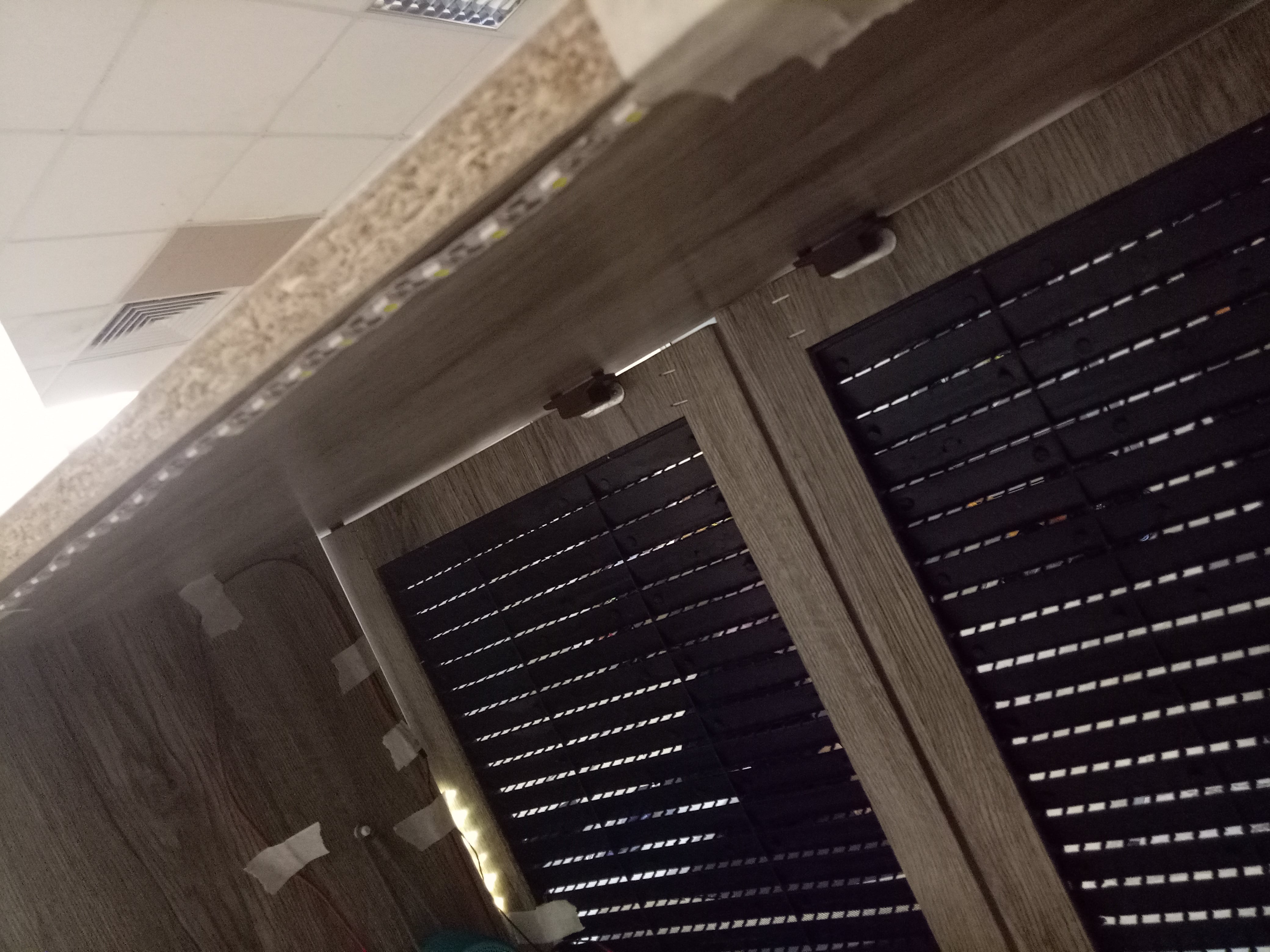
Inside of the cabinet
Cabinet (pre-bought and self-arranged)
Laptop
Power bank
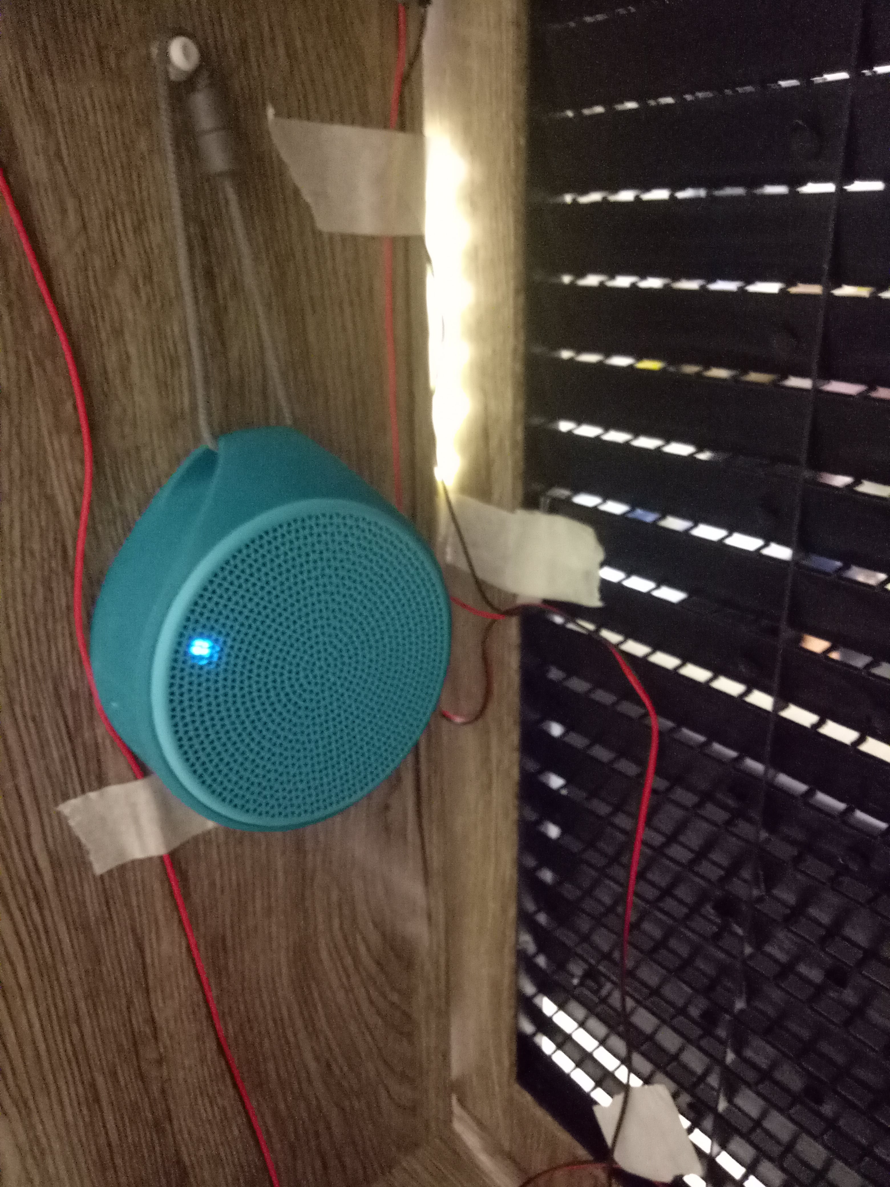
Bluetooth speaker
Earphone
Arduino UNO
Breadboard
LED strips
Photoresistors
About the Narrative
Bluetooth speaker and earphones
Recordings were played using bluetooth speaker and earphones at two different points.
Since the theme that we explored revolves around “understanding”, we thought it’s apt to convey that using a narrative. We wrote down dialogues and split them into several parts of recordings after settling down on a base plot and characters.
In a nutshell, our story is a reverse Cinderella story – we used a base story that is familiar with most people. We all know that in the Disney version of the story, Cinderella was abused by her stepmother and her two stepsisters. Eventually, with the help of a fairy godmother, she managed to get a life she finally deserved.
In our narrative, we simply ask a question: What if Cinderella was never abused, but it’s just what people thought happened?
Through the dialogue, we conveyed the idea that Cinderella actually helped out due to her own will, to the point that people suspected she was being forced to work. In actuality, Cinderella got along with her stepmother and stepsisters well. We gave the stepsisters more personality by giving them two different perspective; one of them was very fond of Cinderella, yet scared to step out and actually tell the people off; another one didn’t exactly hate Cinderella, but not fond of her because she felt that Cinderella’s presence made their family suffer. She also grew to be upset towards her own sister (the other stepsister) as her sister didn’t say anything against the people.
If you listened to the recordings, you will realize the similarities and differences of the perspectives among the characters – who strongly opposed the people’s accusation, who hated the people, who hated Cinderella, who blamed themselves.
A final recording revealed that actually the people’s accusation came from Cinderella’s grandmother. She bore hatred towards the stepmother as she felt that she took everything away – her son (Cinderella’s father) and Cinderella. She didn’t spread the words just to abuse the stepmother, but rather because she truly believed that the stepmother was in the wrong. She thought she was saving Cinderella by doing so – which, as the other recordings suggested, was not the case.
Basically, the whole narrative showed multiple perspectives. Through this, we wanted to compel people to think critically of everything they heard.
List of the recordings:
Behind the Scenes
At first, we planned to use 2 Arduinos: one for the main components (photoresistors and LED strips) and one for the background components (PIR and background LED strips).
How they work
The main components will allow the LED strips to be turned off when someone comes near it, and light up under normal condition. It is to attract people to come to the right spots (near the speaker and earphone) so people don’t need to search the source of sound blindly. We used photoresistors as the sensor, so when light is blocked by the presence of someone, the lights will go off.
Photoresistor (the small dot on the door) and the LED strip to attract attention to that spot
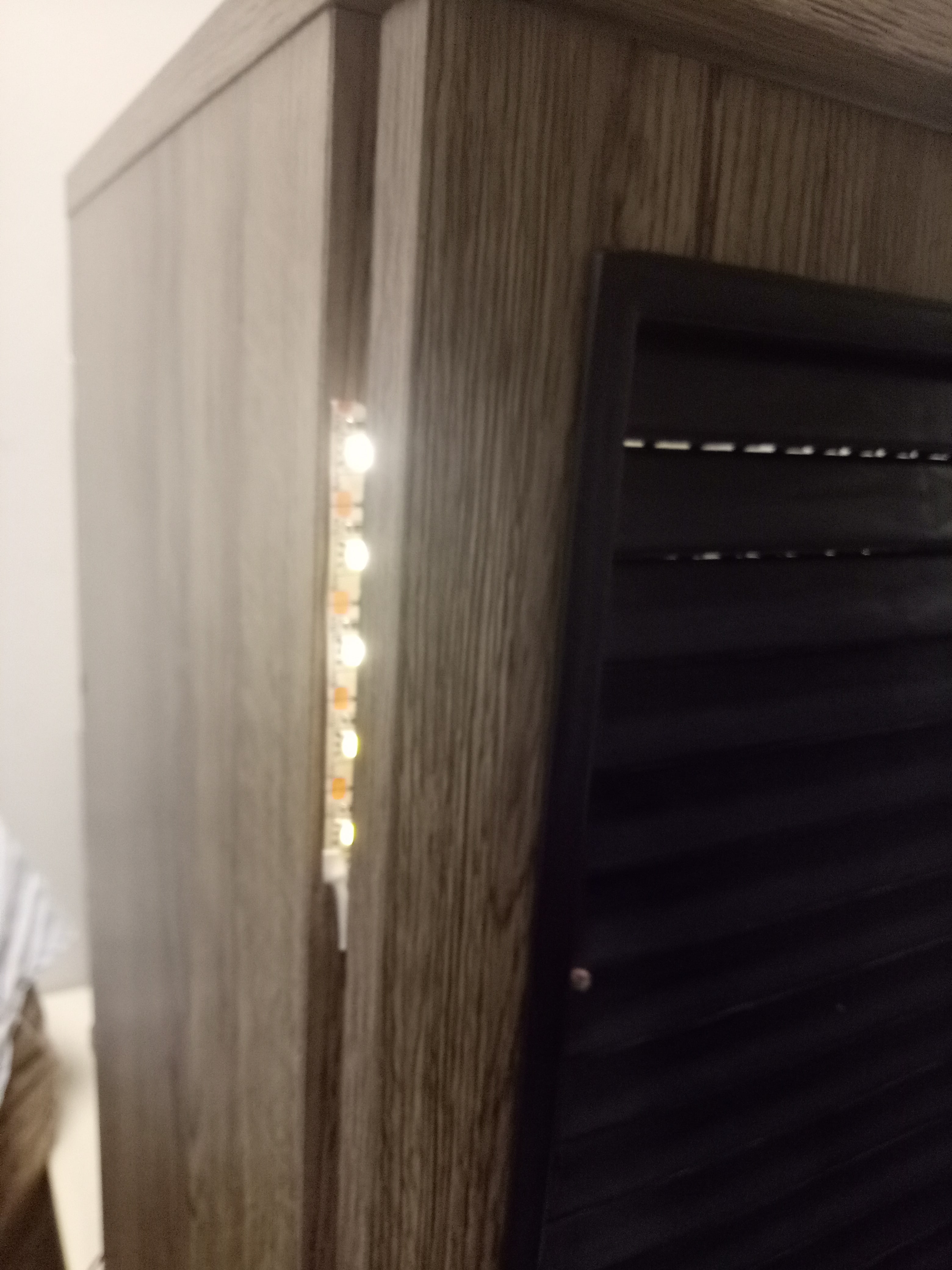
The background components will allow motion to be detected using the PIR. When someone comes close to the cabinet, the background light will go off to focus attention to the holes where the LED strips for the spots are located. When someone opens the cabinet door, a final recording will play, stopping all the subsequent recordings (which will be played at random between the two sources of sound).
LED strip taped to the upper side of the cabinet as the background light
Change of plans
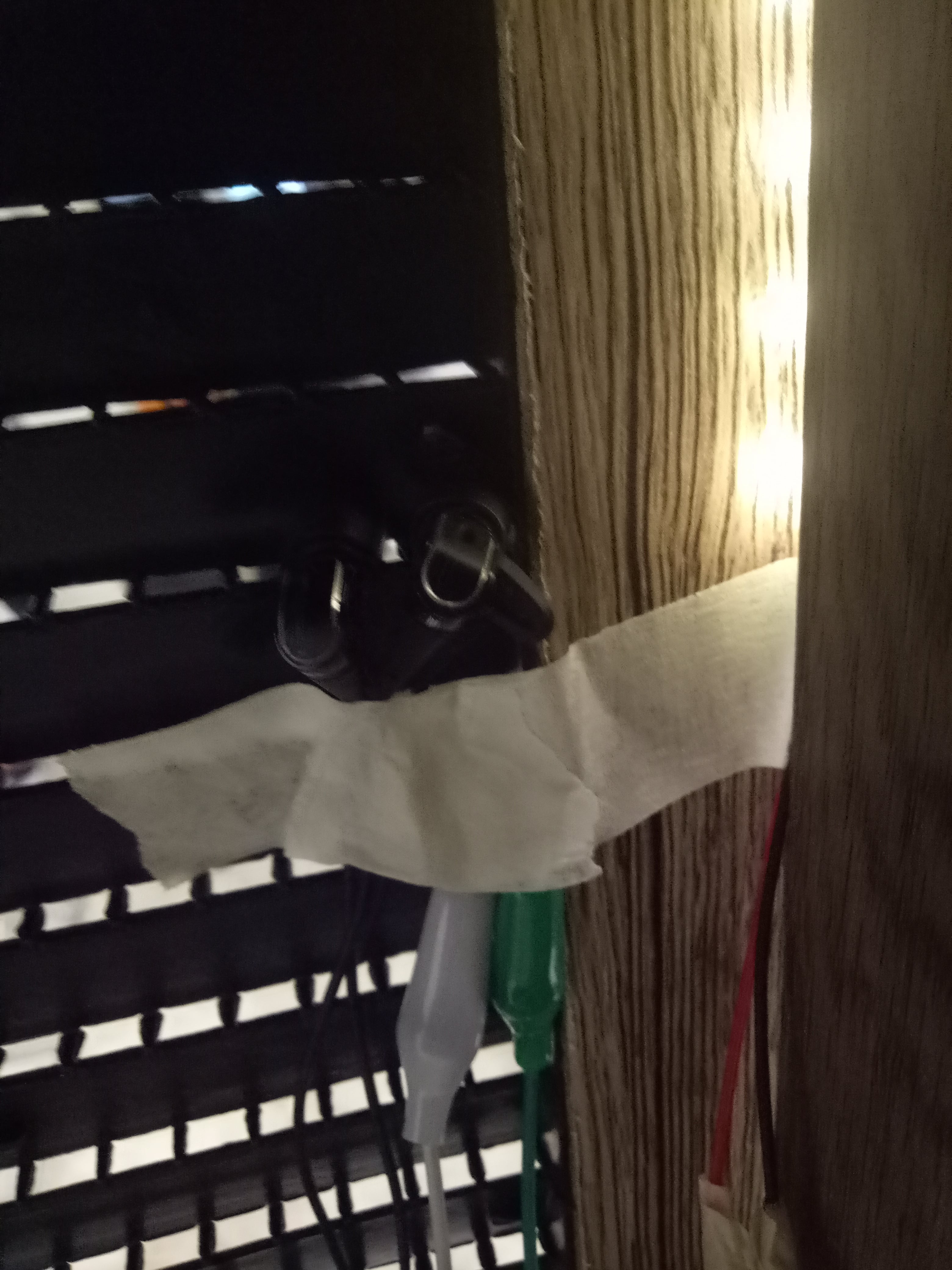
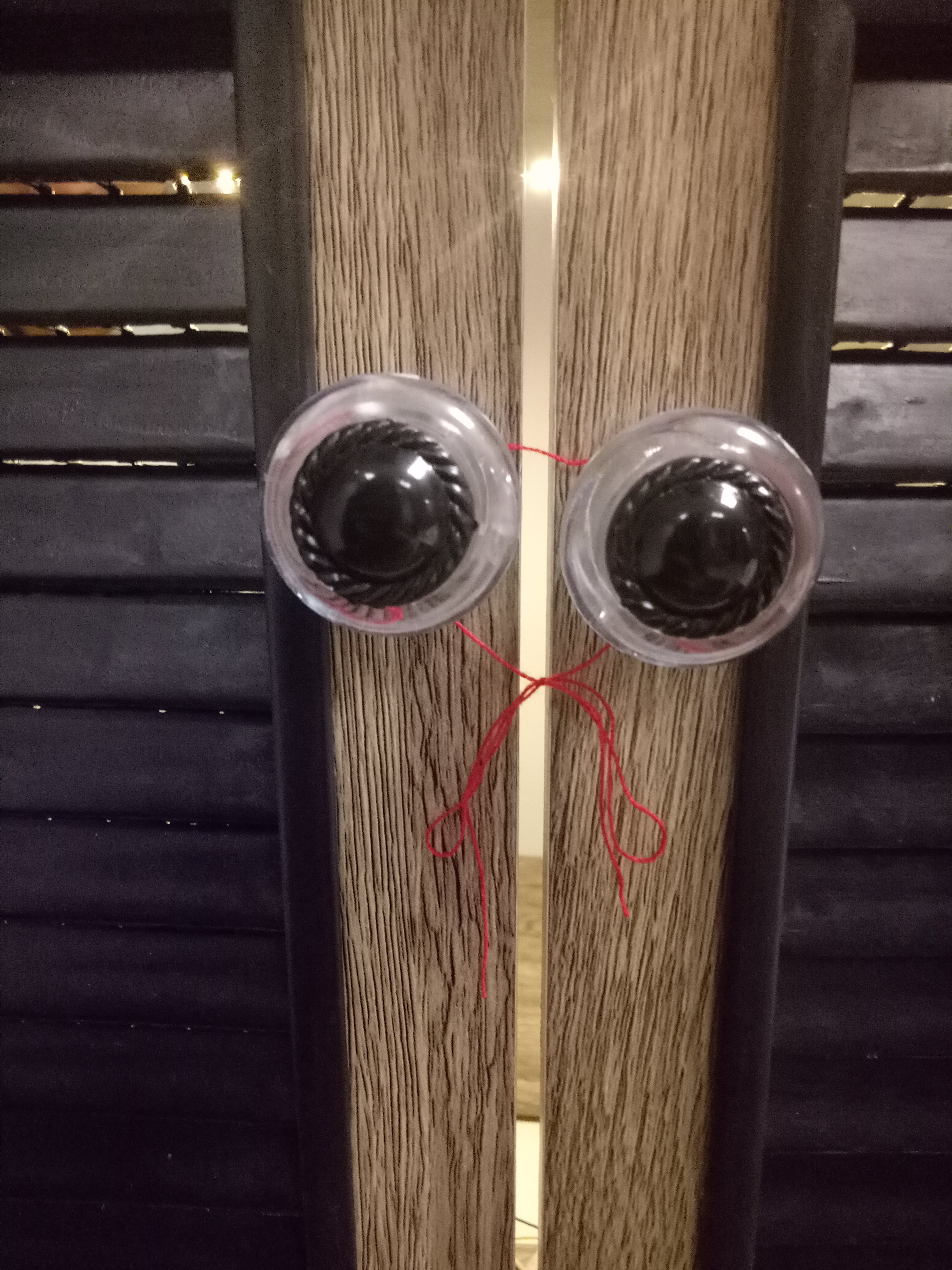
The PIR worked at first; however when we were coding and trying things out, the PIR suddenly just wouldn’t detect motions, although it was fine before. Since it was nearing the deadline, we decided to just scrap the PIR out and used external power supply (power bank) to light up the background LED strip. Because of this, we can’t let people open the cabinet, so to indicate that the cabinet is not to be opened, we tied a string on the handle. But conceptually, it can be a good analogy: how much effort are you going to put to find out the truth? Is a simple string going to stop you?
String tying the handles together
How it goes
Since our project is contained within a cabinet, it was easy to move it around.
After we installed our components into the cabinet, however, suddenly one of the photoresistors refuse to work. So we had to present with one of them not working, but afterwards, we solved the problem; we put a wrong value for the brightness setting in the code because the conditions are slightly different. Since the photoresistors were not working when we presented, it was hard to determine where the sources of sound were.
We constantly played the recordings on loop, but not loud enough for people to hear. It compelled people to come closer and put their ears right by the cabinet in order to be able to hear, so in a sense, it can only be used by one person at a moment. However I wouldn’t say that this is an individual experience, since although you “interact” with it individually, you can ask around on what other people hear and combine your stories to find out the truth. That, again, refers to the idea of how much effort are you going to put?
Characteristics
Level of interactivity
I think the feedback is more interactive since as soon as you approach the cabinet, there is a clear and immediate action that happened, which is the LED strips lights going out due to the change detected by photoresistors. It is visible even to people who are not interacting with it at that time.
The automation in our project is also not very high; the automated feedback that is set is only the photoresistor-LED light. We’re supposed to have the PIR and background light as well, but it didn’t work and because of that, I think the automation falls more to the passive rather than interactive side. There is still a certain amount of audience control as we used LED lights to guide them to where the speakers are exactly, navigating them to approach those spots instead of wandering around.
I also think there is an indirect collaboration to this project, in the sense that you can “exchange” the recordings that you heard with other people to reveal the actual story. But then again, this collaboration depends heavily on the audience, and may not necessarily happen.
About the adaptivity, I think our project doesn’t really possess automated adaptivity. It doesn’t possess memory that can provide feedback through continuous interactions, which will allow different actions to happen to counter whatever weakness was encountered throughout previous interactions.
The communications in this project is also very one-sided, since people can only listen to the recordings without responding back. This project doesn’t really have an identity or personalization, but rather more just like a platform that is different from usual, which allows people to “overhear” a conversation.
Characteristics of the interface
Firstly, it is kind of separated from real world experience since in order to interact with the project fully (that is, to listen carefully to the recordings), you will have to concentrate fully to the cabinet at that time or you will miss the sounds from the recordings since they are very soft. However, even after that the experience still may continue by exchanging the recordings with other audience, and that one will involve more real-world experience. That was our intention; to mimic the story to a real-world story so people can discuss about it outside the actual physical interaction with the cabinet, bringing it even to the real world.
The interaction is also intuitive, as the recordings would be played in a continuous loop. People will subconsciously be compelled to find out what the sounds are about, and they would go to the spots where the LED lights are turned on, where they can hear the sounds clearer. They can also tell intuitively that they’re not supposed to open since the handle is tied with strings. There is also a certain degree of subtlety as all the components is being contained in the cabinet where people can’t see them.
(That one refers to our final project that was presented, which scrapped the idea of revealing of final recording after opening the cabinet. But in case we did it and the cabinet could be opened, we would cover the components with wood anyway.)
However, the experience wasn’t monitored and used to provide feedback in the future; the installation has no memory. The experience is going to be the same no matter how many times people come to it; in a sense, the audience acts more like an observer. There is no selection at all and the experience is mostly linear; the only randomness comes from how we randomize the order of the recordings played, but in the end, they’re all the same recordings.
Conclusion
Individual parts
Dan Ning: main coding, research for material, doing the recordings, troubleshooter, physical installation
Vania: helping with the coding, main writer for the narrative/dialogue, editing the recordings, physical installation
Reflection
I think one biggest weakness that we didn’t solve is how to attract people enough to stay and listen to all the recordings. Moreover, we looped them at random, which means after the final recording, the other recordings will just start playing again immediately – there is nothing that distinguish the most important final recording from the others.
At first, the connections between the wires weren’t very secure since we used crocodile clips and taped them using masking tape, but then we switched to jumper wires.
I think we’re trying too hard to achieve something that is conceptually interesting instead of getting our basics down first, which resulted in a lot of problem in the coding process since both of us are not that well-versed in programming to begin with.
One of the biggest problem Dan Ning encountered was the setting of the sources of sound. We initially wanted to use more sources, but there were problems with the coding. Moreover, the USB speakers were not working, so we had to use bluetooth speaker and earphones – the experience when listening using both of them are vastly different, and she had to program the volume every time we set it up.
We were also kind of worried about the recordings since we asked our friends to do those, and they might not be able to convey the proper emotions (they’re not actresses, after all), but I think it turned out fine.
I think another problem that we have is that we don’t have backup plans; a lot of our things failed at the last minute, and we didn’t have spare components or backups, so we have to settle for something else (i.e. the bluetooth speaker and earphones instead of USB speakers, not using PIR since it didn’t work)
All in all, we encountered a lot of troubles. For me, this personally reminds me not to do things last minute (I do that a lot). We also learned to always have spares and back up plans, no matter how minute the problem may seem. Overall, besides learning more about coding and installation, we also learn more about group work and the importance of setting up specific deadlines for each person, so there won’t be any last minute things.
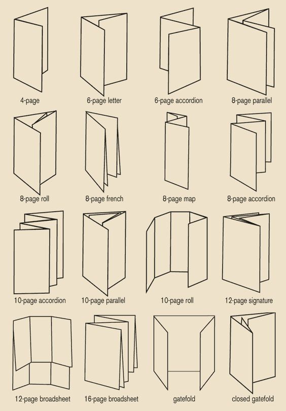
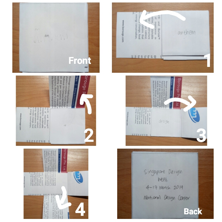
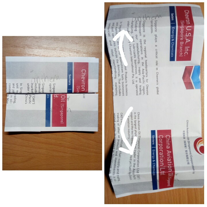
For the brochure, I looked up for different design folds.
Since my theme is anthem, I wanted to do something about “opening up” to reveal the contents.
I had three design ideas:
1.Stack square fold
how it works
inside view
outside view
I like this one at first since the idea of revealing was fun; one word will be revealed at a time. However, I realize it makes the very front interface (when not opened at all) confusing and even boring since there will only be the word “an” in it. I also had troubles incorporating the elements to the shape of the brochure.
2.Vertical gate fold
how it works
outside view
inside view
I feel that this one is very clear-cut and clean. However, I am not making use of the back interface at all, which makes it look incredibly plain.
I asked for Michael’s feedback, and he said that both my design and visuals could afford to be stronger, and should be able to lead the eyes. For those brochures, I relied more on the layout rather than the visuals to lead the eyes. However, I’m so stuck with the arrangements for those brochures since I already had a vision for them from the beginning. I tried taking the elements out and putting them back in again separately, but I didn’t make any significant difference (especially the stack square fold). So in the end, I decided to try and start fresh with a completely new design fold.
3.Horizontal gate fold
I already had the idea of using the normal gate fold from the beginning, but I was worried it would be too plain. But then I realized that if a brochure’s design is too complicated, it might confuse the readers instead, and that layout and visuals matter as much as the design fold.
In the end, I went with the horizontal gate fold design since I feel that the possibilities for this design are more “open” compared to the other two.
More about the design will be talked about in my final project post.
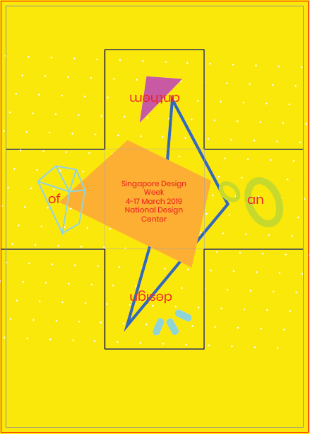
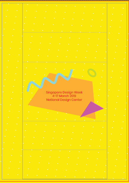
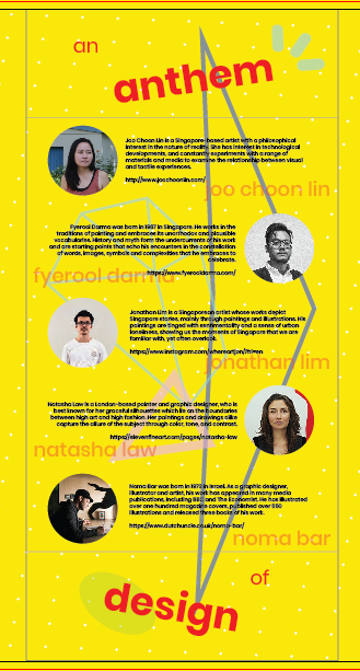
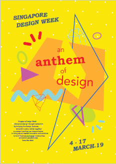
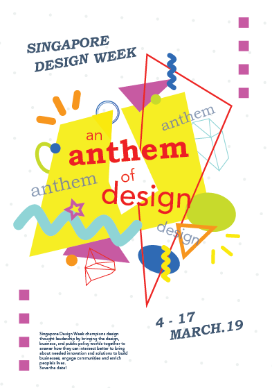
I decided to go with the slogan “An Anthem of Design”. Following my research and development post, I mentioned that the draft I made was not reflecting the spirit of anthem that I wanted, so I created a second draft.
I found inspiration for this from Pinterest, especially the color scheme. (I’m bad with colors.) Here is the image that I used for inspiration:
However, turns out that the pale grey background was muting the energy of the poster. I really liked the pale color since it makes the bright shapes stand out, but I do agree that everything does not seem as exciting as it potentially can be. I changed it to white afterwards.
Based on the feedback, I then tried just changing the background with any color that I think are “exciting”: I used green, orange, blue, etc. But eventually I settled with the color yellow, since it looks the most playful in my opinion. Here is my final design:
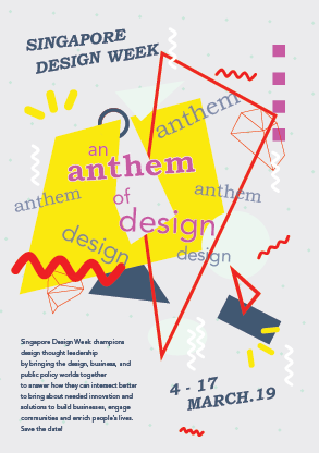
At first I wanted to use red as a “guide” for people to read the parts, but apparently the dark blue catches more attention, so in the end I changed the color font to dark blue and refrain from using that color for the other shapes, except for the one shape that I want to use as a line guide. Since the slogan is kind of special, I used red for it. I also didn’t use red for any other shapes.
I also change the orientation of the shapes to create some kind of contrast. I took out all the shapes from the canvas and realized, I used so many shapes, it’s confusing even for me. So I cut down the number of shapes to make it less messy and to create more focus. I also cut down the colors that I used. After that, I just play around, putting the shapes one by one.
I took away the squares at the side too. At first I wanted to show that although it’s something fun and very free-spirited, there is still some kind of pattern or order to it. But then it does look like it’s framing the whole shape, restricting the canvas somewhat, so I took it out and enlarged the shapes instead.
Afterthoughts?
It wasn’t perfect. In fact, there are still things I can improve on. I was so focused on playing with the shapes and colors that I didn’t experiment much with the font types. But I think my design definitely improved from the beginning, and I actually had fun arranging the layout. I think this project pushes me out of my comfort zone. When I went to consult and showed my first drafts, I realized that I usually play safe with my designs, choosing something with less colors and less “experimental”, especially since I think my sense of colors is not as good. It might not be the best, but I’m satisfied with what I have made.
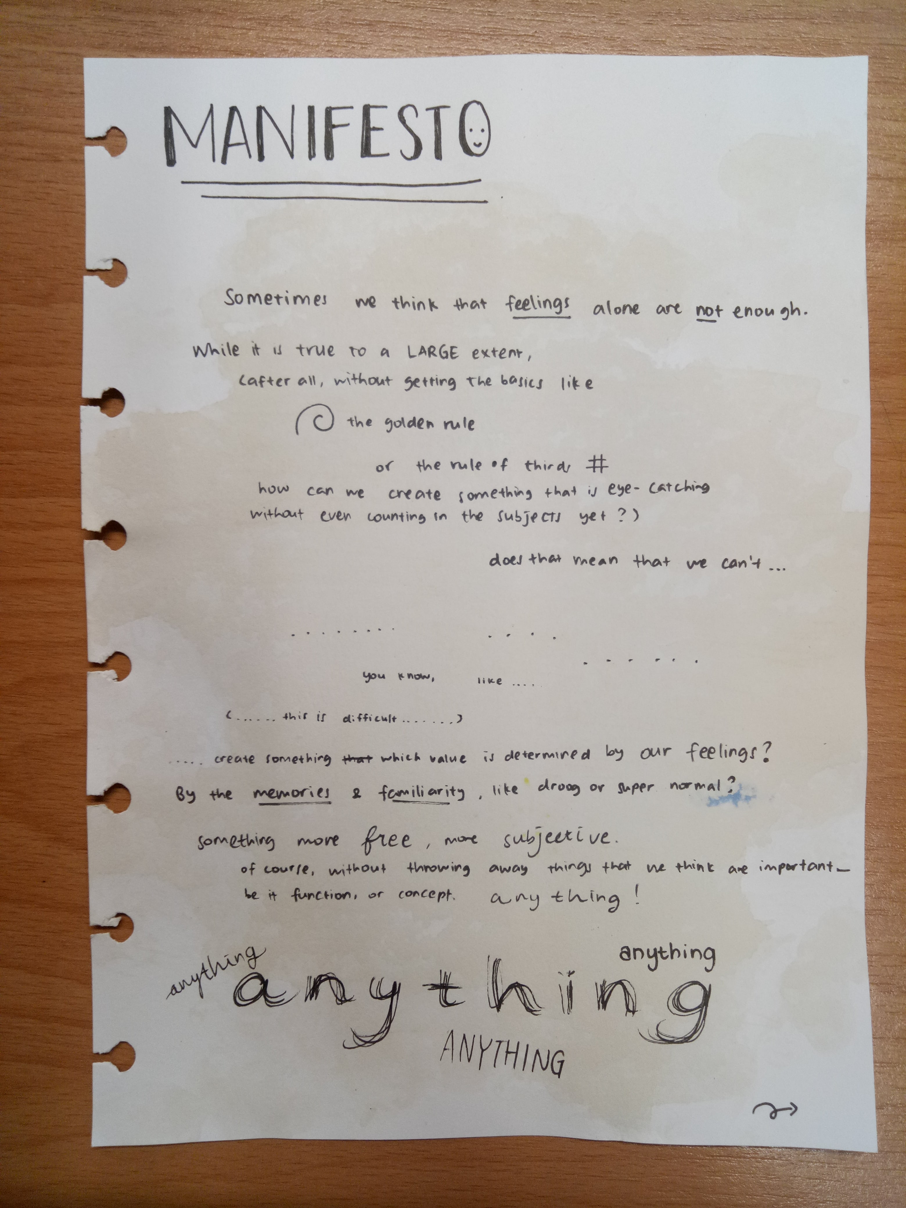
Sometimes we think that feelings alone are not enough. While that is true to a large extent (after all, without getting the basics like the golden rule or rule of thirds, how can we create something that is eye-catching without even counting in the subjects yet?), does that mean that we can’t…
…
You know, like…
(…this is difficult…)
…Create something which value is determined by our feelings? By the memories and familiarity, like Droog or Super Normal? Something more free, more subjective. Of course, without throwing away things that we think are important—be it function, or concept. Anything!
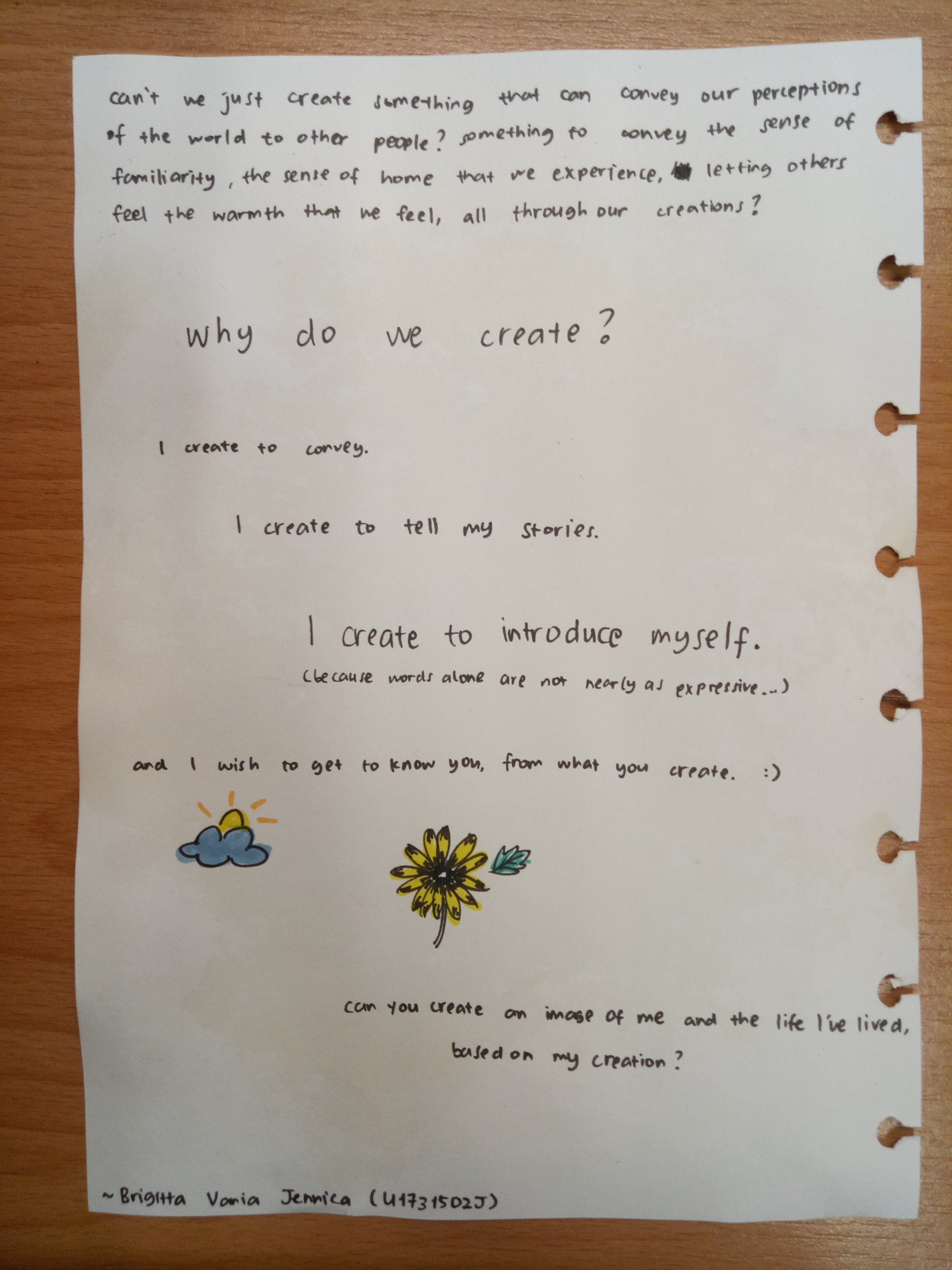
Can’t we just create something that can convey our perceptions of the world to other people? Something to convey the sense of familiarity, the sense of home that we experience, letting others feel the warmth that we feel, all through our creations?
Why do we create? I create to convey. I create to tell my stories. I create to introduce myself.
(Because words alone are not nearly as expressive…)
And I wish to get to know you, from what you create.
Can you create an image of me and the life I’ve lived, based on my creation?