The artist that I chose for my hyperessay is Aaron Koblin.

Aaron Koblin is best known for his innovative use of data visualization and work in crowdsourcing, virtual reality, and interactive film. In his TED talk (see below), he mentioned that he believes “data can actually make us more human”, as it can show us how we have been living our lives and tell our story. He is highly interested in collaborative projects, where people can come together to create something, since more people will mean more data and more data will result in a greater story produced.

I think his works are worth discussing because a lot of his works are highly interactive and immersive. Most of his works that I have explored require direct audience participation in order to be able to work (for example, the Johnny Cash Project and This Exquisite Forest), making it highly interactive. There’s also one project that I think is highly immersive, called The Wilderness Downtown, where the experience is tailored specially for each individual (it’s pretty interesting, I actually tried it out). There’s also a very high variability in his work because of the unpredictability of what the participants will do.

In addition, I like that he’s making use on the rise of technology (more specifically, the internet and social media) to create interactive media. Some of his works require contributions from the audience through websites or mobile apps, for example, and I think that encourages people to participate even more.


Based on Lev Manovich, there are five principles of New Media: numerical representation, modularity, automation, variability, and transcoding. Now I will talk about how they can be applied to my group’s project, the Door.


Numerical Representation

Basically, a principle of new media that distinguish it from old media is that new media is programmable. New media objects are essentially composed from digital code, and hence can be manipulated via algorithms. In my group’s project, the numerical representation comes from the codes that are embedded into photoresistors. We set a certain numerical value based on the level of brightness that is required to “trigger” the photoresistors, which will result in recordings being played.


Modularity

Modularity reflects the presence of separate elements or parts, which can be modified or used independently, that create a whole new media object. In my group’s project, I think it can be seen from the separate recordings that we are going to play; we can edit the contents of the recordings without affecting the main code, for example. Moreover, in the code that we made, there are also separate elements—for example, we can edit the timing delays or the brightness trigger for one photoresistor without affecting the other photoresistors.


Automation

Automation involves the computer programme to produce a response using template or algorithms by itself, without direct human interference. An example is web-based search engine. For my group’s project, I think there’s not much automated response as an audience has to come and trigger the photoresistors; in a sense, interaction from audience is constantly required for something to happen.


Variability

Another principle that differentiates new from old media is variability, which means something that is not fixed or possibilities that can be explored. In a sense, I think my group’s project doesn’t possess a great variability; the final outcome is fixed, no matter how many times an audience interacts with it, or who interacts with it. We do give the audience the flexibility of interpreting the story itself before revealing the actual story, but the storyline is more or less fixed which doesn’t allow broad interpretations; it’s more of a selection rather than variability, since the possibilities are finite.


Transcoding

Technically, transcoding refers to the translation of an object from one format to another, or from one platform to another. I think it could be related to my project in a sense that the movement of the audience will be “translated” into the recordings that will be played due to the trigger from the audience, but I’m not really sure because it’s not exactly a translation like a change from text to image.


In conclusion, I do think my group’s project possesses some of the principles of new media, but some of them are not very strongly reflected as there are limitations to how much they can be applied to our project.

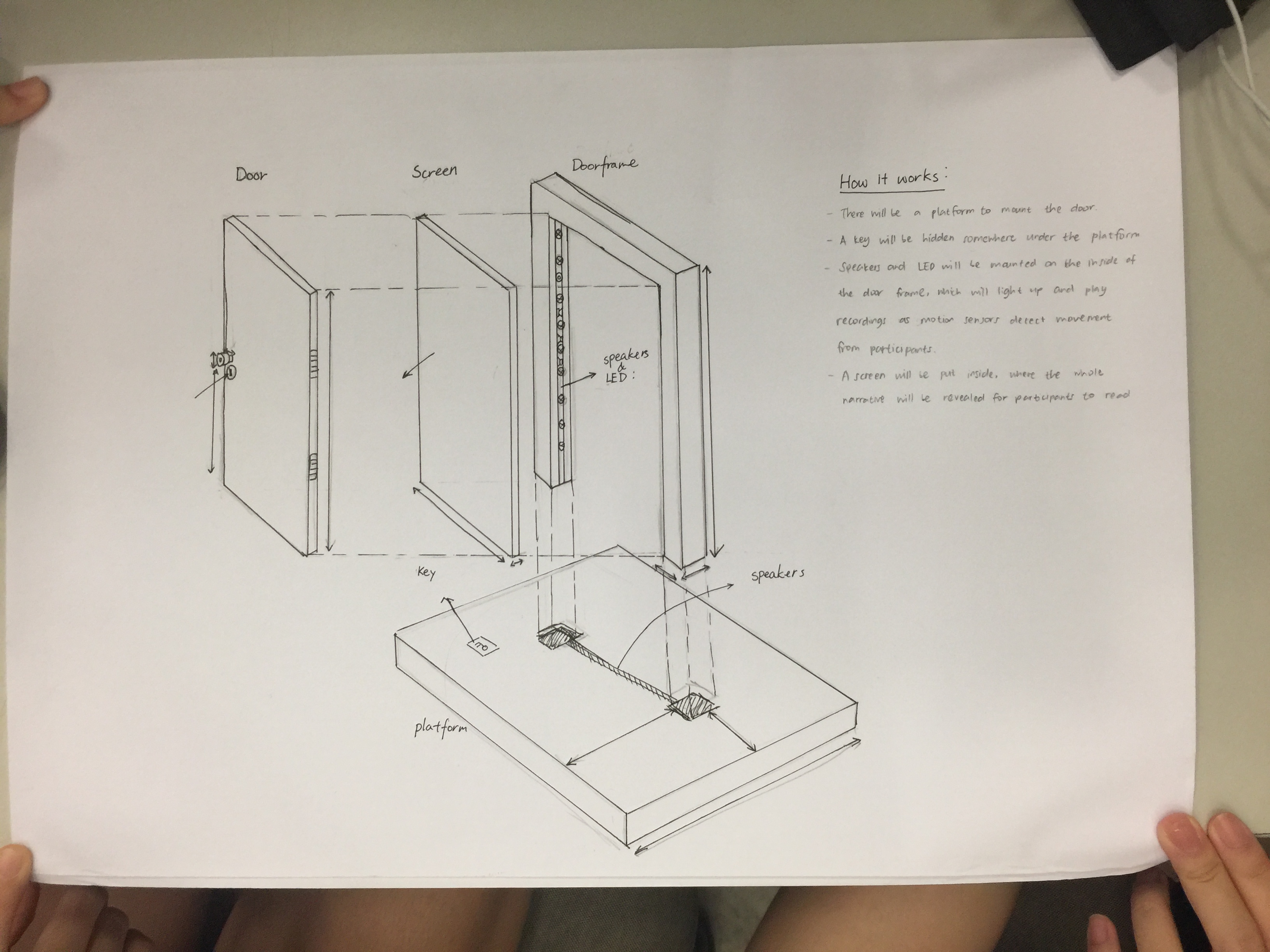
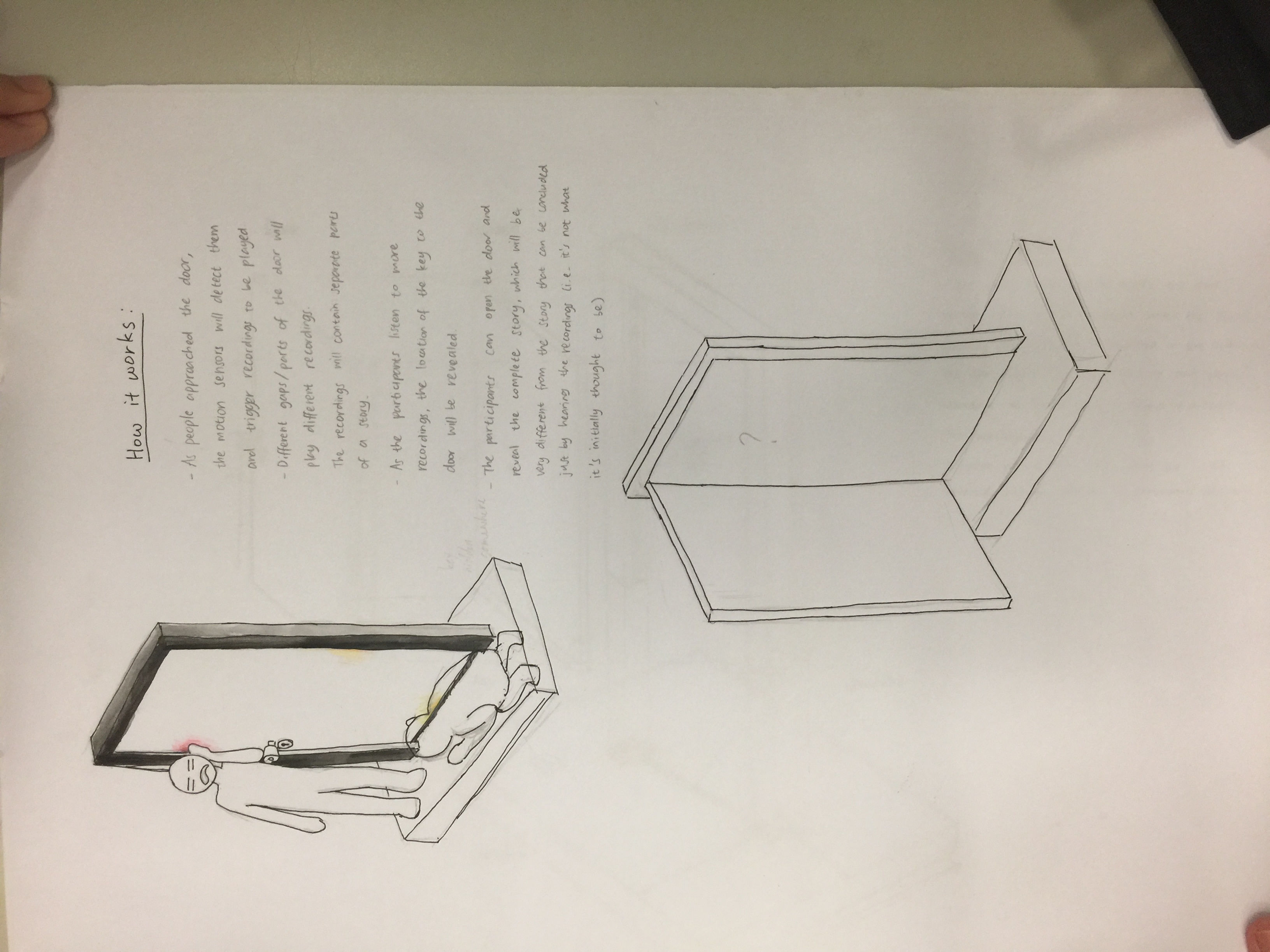
Naoto Fukasawa designed aluminum stools to be displayed at 2005’s Milan Furniture Fair—however, instead of being displayed on plinths like other new products, the Japanese designer’s stools were “plonked” on the floor, where people were allowed to sit on them. Fukasawa was worried that no one would notice the stools. However, a British designer named Jasper Morrison praised them, and their mutual friend gave a term to describe the stool: “super normal”.

That was the beginning of Super Normal movement.

Both Fukasawa and Morrison defined the Super Normal design as something that is “used on a daily basis to the point that they become invisible” (Fukasawa, 2006), something which use is “instinctive or even subconscious… and we take them completely for granted” (Morrison, 2015). In addition, they also mentioned that Super Normal objects are valued by how you feel about them. Their value did not come from an extremely intricate or well-thought design, but rather from the memories and sense of familiarity that develop over time. Hence, it could be said that naturally, some objects will have more spirit than others, as it highly depends on how and how long people have been using them or interacting with them.

Although functionality is a significant factor, feeling and meaning are more important in Super Normal objects—but the feeling does not come from tiresome expressions. Morrison felt that the design world “has drifted away from normality” and that designers have forgotten the basics of design. They wanted people to realize that simple, basic designs are design too, and that the idea of something new is not always better than something good that has been continued over time.

The characteristics special to this movement are its simplicity, familiarity, and anonymity. Anonymity not only in the sense that the creator is unknown, but also the nuance that the creator was not trying to “design” or “express himself”—similar to yugen (a Japanese design philosophy, where the beauty is subtle) and mingei (another Japanese design, which roughly means “folk art”, where the creators are average people as opposed to known designers, hence making the creators anonymous). Mingei especially resembles Super Normal due to the fact that mingei objects are very simple and normal, as they are made by average people, yet they are still used for centuries—which is the same as the concept of Super Normal, that the value of the object comes from the experience and normality. Super Normal objects are also context-sensitive, as something that is familiar in a setting does not necessarily mean it is familiar in other settings.

The movements that are similar to and/or influence Super Normal movement are Minimalism (1960s – 1970s) and Neo-Conceptualism (1970s – 1980s).

It is especially easy to mistake Super Normal and Minimalism due to the similar concept of simplicity. However, Minimalism is a design movement where the concept is reducing everything to the simplest form, but still with the visual aesthetic in mind. The focus of Minimalism is creating something that is simple, yet still pleasing to the eye. On the contrary, Super Normal does not focus on becoming simple. The focus of Super Normal lies in the concept of familiarity, where an object is “super normal” because we have grown so accustomed to it, that we often do not realize that it is also an object that also possesses design values.

Meanwhile, between Super Normal and Neo-Conceptualism, the similarity lies in the idea that both of them focus on the concept or the meaning behind the creations. However, Super Normal objects still place functionality of high importance, because the value of those objects can be found through constant use and experience over time. Meanwhile, Neo-Conceptualism does not care about functions—it’s all about the concepts the designers want to convey, which are usually something unconventional and unique, as opposed to Super Normal objects which are usually something ordinary and less obvious.

We can see also that Super Normal bears similarity to Droog concept (1980s – now). Just like Super Normal, Droog pointed out the idea of over-production and consumption in the society by emphasizing the value of objects in the memory and associations attached to them—which also shows how powerful inanimate objects can be in evoking emotions and thoughts, transcending the time. Both movements boil down to Dadaism, which basically defies logic, reason, and aestheticism of the capitalistic society. It also shows that objects can have spirit that evokes feelings and gives meaning—which contrasts the Bauhaus movement (1920s – 1930s), where objects are more valued through their industrial-like practicality—almost scientific even.

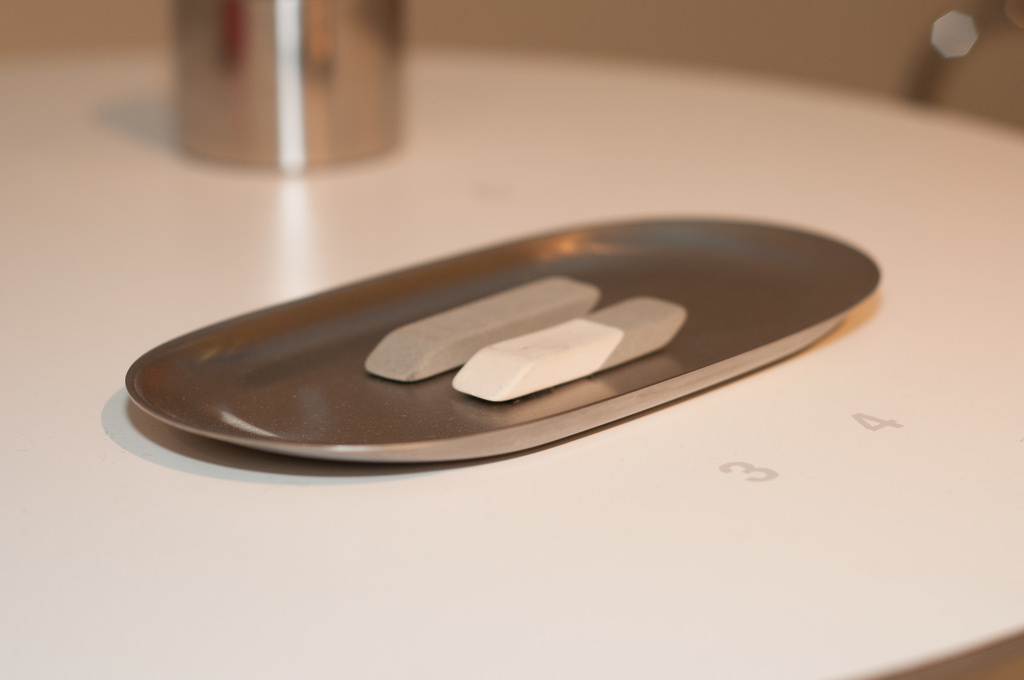
An example of a Super Normal object, taken from the Super Normal exhibition by Fukasawa and Morrison: a uni-tray.


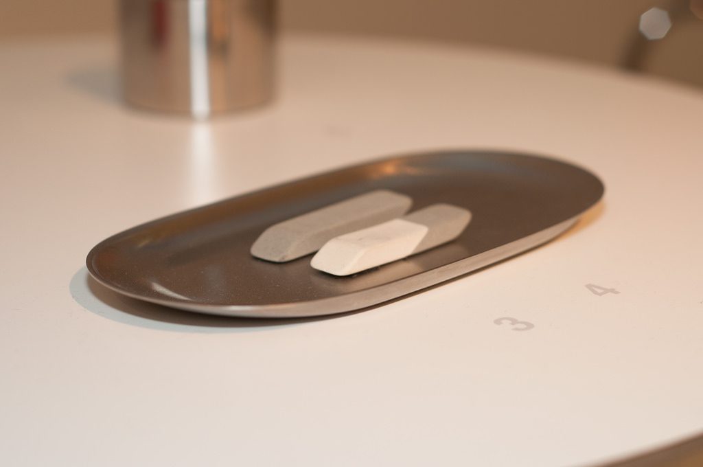
Uni-tray (Riki Watanabe & Sato Shoji, 1976)


At one glance, one can easily tell that it is a tray—its shape and simple design are familiar to you. It gives off the super normal radiance—something that you see in your house, or other people’s, every day. However, do you know what tray it is? Is it an accessories tray, or a pen tray, or a coin tray? It is strange that you feel familiar seeing the object while it is your first time seeing it, and you are even unable to accurately pinpoint its use. However, just like “love at first sight”, you can immediately tell that “it is the one” without actually having to experience interacting with it before. The familiarity does not come from sight, but from phenomena. Moreover, the idea that it is a “universal” tray (because you don’t know what specific type of tray it is) allows people to “misuse” it intentionally as the tray is familiar to different uses, depending on who is using it.

In hindsight, I would like to say that super normal is not necessarily a design movement—it’s more of a concept, an idea that Fukasawa and Morrison are trying to convey to public—that we often overlook things around us and take them for granted. In this globalized world, we start to forget where the actual value of things lies—is it in its price, its function, its creator, or simply in how it makes us feel?

You may not think much about it, but one day you might come back into your house and realize that your favorite mug is not there—and although it’s just a cheap Daiso mug, you would feel a sense of loss that you yourself could not explain why.

This time, we attached the circuit into our cardboard prototype.

We did write the codes, but they didn’t work the way we wanted to, so for the presentation, we just tested out the sensitivity of the photoresistors. At first I was a bit worried that the photoresistors wouldn’t be a very good sensor, but they turned out to be more sensitive than I expected.

Feedback received from the presentation:

  • Use backlight instead of LEDs on the gap so it won’t interfere with the photoresistors
  • Add ambience noise (e.g. whispers) to attract audience
  • Play around with the volume

So now, the things that we need to focus on are:

  • Think of the materials we need and the exact amount of each of those
  • Start making the story: think of how many recordings to make and the length for each one
  • Settle the code

Video of the class presentation:


After that, I went back and tried to fix the code. We need to make a circuit where when the light that falls on the photoresistors is on the minimum (darkest), the sound will start playing. Since we don’t have ethernet shield to read SD card (is that what we need?), for now the sounds are just from the buzzer. Here’s the working circuit.

However, I’m still not sure whether we need the sounds to overlap each other when both of them are triggered or not, but for now there will only be one sound played regardless of the number of sensors activated.

As for now, I think we’ll need to just try the different things first and make sure the electrical component works.


Group: Vania, Dan Ning

So we went to the National Design Centre. I’ve seen the exhibition a few times, but I’ve never actually paid attention closely to them.

Some types of design practices I saw:

Product design


Graphic design


Fashion design


Architecture


Over the years, I could see that in the beginning (starting from the 1965-1975), Singapore was still very focused on building the country. Design was made with a clear purpose to serve the needs of the people, instead of actually building the identity of the nation. However as time passed, design in Singapore began to take shape. A lot of design was made to promote Singapore’s national identity, especially when Singapore started to be noticed globally. As new technologies were introduced, Singapore slowly got modernized, but even until now the design in Singapore never really left the roots. Now the design in Singapore, I feel, is modernized, yet still really showing the national identity. Design is also not just “art”; it’s always used to improve other sectors such as economy and education.

I think even in the future, the goal for design in Singapore is to continue to develop fresh ideas that not only are aesthetically pleasing, but also contribute to Singapore’s growth and promote national identity at the same time. While that is not easy, I feel that Singapore designers are moving in the right direction. I can see some designs nowadays that combine some of the ideas – like, combining modernization and national identity.

Design continues to be of importance, and I feel like people’s awareness of that will only grow from now. Some things that used to just be functional, now can possess aesthetic values – a simple example is HDB buildings which walls are painted in pleasing colors or certain colors to create rainbow / gradient. And as more people see the significance of design, more people will be encouraged to think critically about it, and design in Singapore will hopefully grow to be better.

Here are the two posters that I find interesting.


Poster for Frankfurt exhibition by Kazumasa Nagai (from http://theanimalarium.blogspot.com/2011/01/life-is-change.html)


I found this on Pinterest and can’t find who made it. (from https://www.designspiration.net/save/1446483313272/)


I will be talking about the second poster, the yellow one.

This poster is promoting a festival of industrial design in Sydney, and the slogan is “Ignored Everyday”. At first I’m really interested because of the minimalist appearance, with only yellow and black colors. My eyes were immediately drawn to the title due to the black highlights that contrasted the yellow background. After that, I shifted to the yellow paperclip, which didn’t blend with the background due to the outline and the shadow. It created a visual interest that makes people question, “Why a paperclip?” And that prompts the audience to read the information provided.

The information is written using sans serif fonts, which makes the whole look consistent and simple. All of them used black color, which contrasted the bright yellow background very well. I feel that the font size of the festival information could be a little bit bigger because the font is very narrow and thin, which compromises the readibility – but overall, I think it’s eye-catching, simple, and effective.

The theme for my project is the spring that comes after winter – the starting of hope, an early spring.

Winter is something that is associated with death, with coldness. On the contrary, spring symbolizes the birth of life and warmth. I want to symbolize hope as something that you can find even in the hardest moments.

My initial idea was to create a snowflake design made of flowers, but after the first presentation, I got the idea of putting the “spring” using the negative space in the snowflakes instead.

The very first design that I did was all connected because I was still thinking of the shape as something that needs to be able to be cut out from a paper. Moreover, the shapes are all either vague or too obvious. So after consultation, I tried to break free from the cut out form, combining the idea of winter and spring. The things that I chose to symbolize spring is sun, fire, water, and plants.

I made two snowflake designs. The first one is made of the shapes of leaf, sun, and fire. I chose yellow and red as the colors, as I want it to be triadic with the blue snowflake color.

The second one is made of the shapes of flower, water, and gingko biloba (a type of tree that grows in Japan and blooms in spring). For the colors, I chose orange and two tones of blue, playing on the complementary colors.

I gave a pale blue color to define the snowflake shapes, but they got lost after printing. The slight difference between the red and orange was also lost, making them look like the same color. The yellow was definitely too bright as well. (This taught me not to print last-minute.)

I arranged them randomly, with three foam circles on top to represent a cloud. I used nylon strings because I want it to be invisible, so it looks more like snowing, but it turned out really messy. I couldn’t really tie them properly. My craftsmanship is… bad. The paper cuts are pretty messy (I didn’t know something like x-acto knife exists before, or even if I spelled that right) and I only glued them with glue stick. I did leave them for hours under heavy books, but I forgot to attach the string so I had to rip them open again.

“I can cut all of these in 30 minutes”


*1 hour later* “…well I’m halfway there”


My bad.

Craftsmanship aside, I actually like my end design. It’s something I’ve never thought of before, and I felt like I understand more about forms after doing this. Positive-negative space is not as easy as it seems, no matter how cool they seem. I do think that I’m not pushing myself out of my comfort zone enough, that I still could do better – but overall, I’m satisfied. I did kind of lost my purpose halfway and realized that the mobile did not really represent hope; the blue color gave some cold feeling to it. Moreover, some of the edges for the snowflakes are quite harsh. I agree that at first glance it doesn’t convey hope, but I think that if you look at it closer, you can see the hope in it, and that goes with my initial idea.

I was so worried the day before submission because I felt like I haven’t done enough. Well, true, I could have done more, but I’m content with what I have made. Hopefully from now on I can make better and better works.

UPDATE: I took off all the fishing lines and replaced them with strings. Initially I poked the strings through the foam circles using a needle, and it was fine but it started falling apart the day I planned to submit it. I fixed them hastily with masking tape. It doesn’t look as neat, but it actually looks better than the fishing line.

Here’s my final design!


The theme for this project is hope. I started out by searching for keywords that symbolize hope; stars, candle, fire, dove, flower, butterfly, sun, rainbow, fish…

In the end, there are a lot of keywords that can be used to describe hope. Hope is different for everyone, after all.

I started by looking for some themes. I came up with two major ideas.


Yin and Yang

I want to represent that life is always balanced; in goodness, there is always something bad – but conversely, in badness, there is always something good as well.

My plan is to make koi fish and arrange them differently; one school of fish will be “swimming” upwards, but one fish in that school of fish would be going against the flow (going downwards). Another school of fish will be doing the reverse, “swimming” downwards with one fish going upwards. Their colors can work inversely, or maybe complementary colors. But with that idea, I actually hadn’t really though about the positive-negative form (which is the whole idea of the project), so I thought I should scrap the idea off.

(Unfortunately, I lost my sketch for this one.)


Early Spring

This idea came from when I was looking at snowflakes cut-out tutorials from Pinterest.

I was thinking that the shapes of snowflakes are really interesting and unique, since they are all different from one another. At first I was thinking of making the snowflakes flower-shaped, but then after the first presentation I realized that I could make use of the negative space instead of just leaving them meaningless.

In the end I chose to work with the “early spring” idea. At first I wasn’t sure if I should go with the idea since my others smaller ideas, which I haven’t really thought through, were said to have some potentials as well. Like the birds and propeller idea, or the tortoise idea, which could be developed following the story of the hare and the tortoise.

I was debating between the tortoise and the snowflake in the end, but I couldn’t really think of an original, exciting story for the hare and the tortoise, as well as the positive-negative space.

I didn’t think that it would be so difficult to play and make use of a form. Whenever someone makes use of positive-negative space – for example, when I see posters or advertisements that use those, I would notice them, but never think much about it. In the end, when I tried making it myself, I spent myself stressing about it. How do I make a form that is subtle, but noticeable, yet interesting and can convey my idea as well?

I finally chose the snowflake idea – “early spring”, simply because its form is the one that I can picture the clearest (and also because it’s the one I like the most). See my final post for the end result of my idea!

Our idea is to portray a gap in people’s understanding by portraying them using physical gaps on a door.

Our prototype was kind of a miniature of what the actual thing is going to be. Our whole idea is revolved around a story that would be revealed after “exploring” around the door, but we didn’t have a story yet. We put earphones behind the cardboard door and played some e-book as substitute.

For the set of actions we required the participant to do, we only told the participant to approach the door and just try to listen carefully. At first she looked unsure of what to do since the sound from the earphone was very soft, but then she could still catch the sound. She began exploring different spots on the door and I tried to match that by playing different recordings as she moved, but I couldn’t keep up and she didn’t get what the recordings were about either, so it just confused her. But she did think that she felt like eavesdropping (which is kind of our idea) due to the low volume, so that’s good. She also said that the concept is interesting, and if the gaps do play different recordings or sounds, she would be interested to test all of them to find out. She also added that at first she wasn’t sure of what to do because the door was a plain piece of cardboard with no handle or keyhole, but if there is a handle and keyhole, she would know naturally that the participants are expected to open the door.

Feedback we received:

  • The door may not have to be real-life size, it can just be something like a dollhouse
  • The concept of revealing a story is interesting; maybe we can make the door have several screens inside, so you can open it up like pages of a book to fit in the concept
  • We can make use of the gaps between door and door frame to put in speakers, but we can also put in a lot of keyholes instead so participants will have to continuously find keys to progress with the story. Moreover, it will be visually intriguing.
  • We can also make use of different heights of people; so maybe in one big door, there are smaller doors. The different gaps will play different people’s sounds, e.g. a small door will play a child’s sound and a big door will play an adult’s door. So we can make a story but through different perspectives.
  • One-person experience would be better. If the door is placed in an empty room, people will definitely be compelled to approach the door and find out more about it.

As for now, what we have to do based on the feedback is to focus on what we want to do first. Now we received a lot of feedback because we still have a lot of things we can play around with, and we still haven’t decided which idea to use exactly. After we decided on one idea, only then we can move forward with the project.

I do think this bodystorming helped a lot because the feedback we received are really valuable. They provide objective opinions and point out the strength and weaknesses we didn’t see in the beginning. At first I was really worried that people won’t be interested to find out about the door, but the participant told me she would be interested and even gave her idea on how to improve on that. Moreover, I can see other people’s works and learn from their troubleshooting as well.

Group members: Vania, Dan Ning

Watch our bodystorming process here: