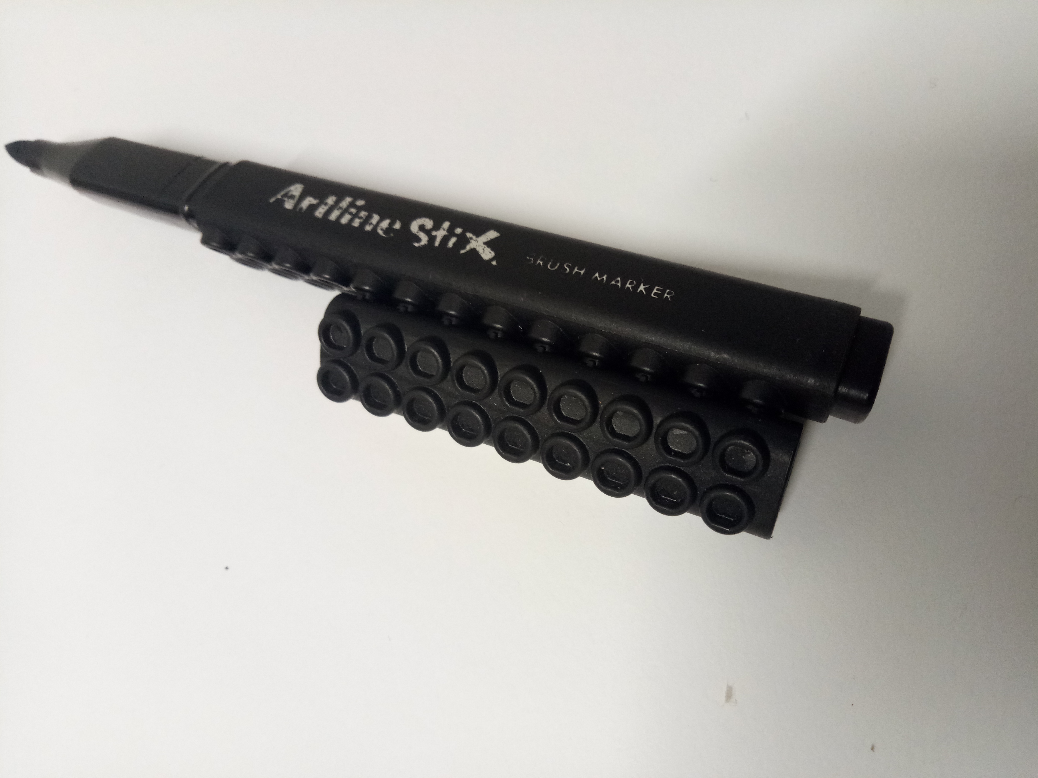
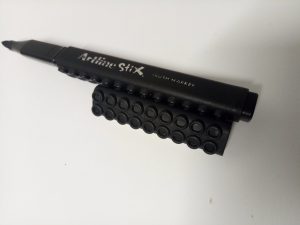
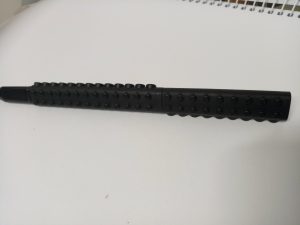
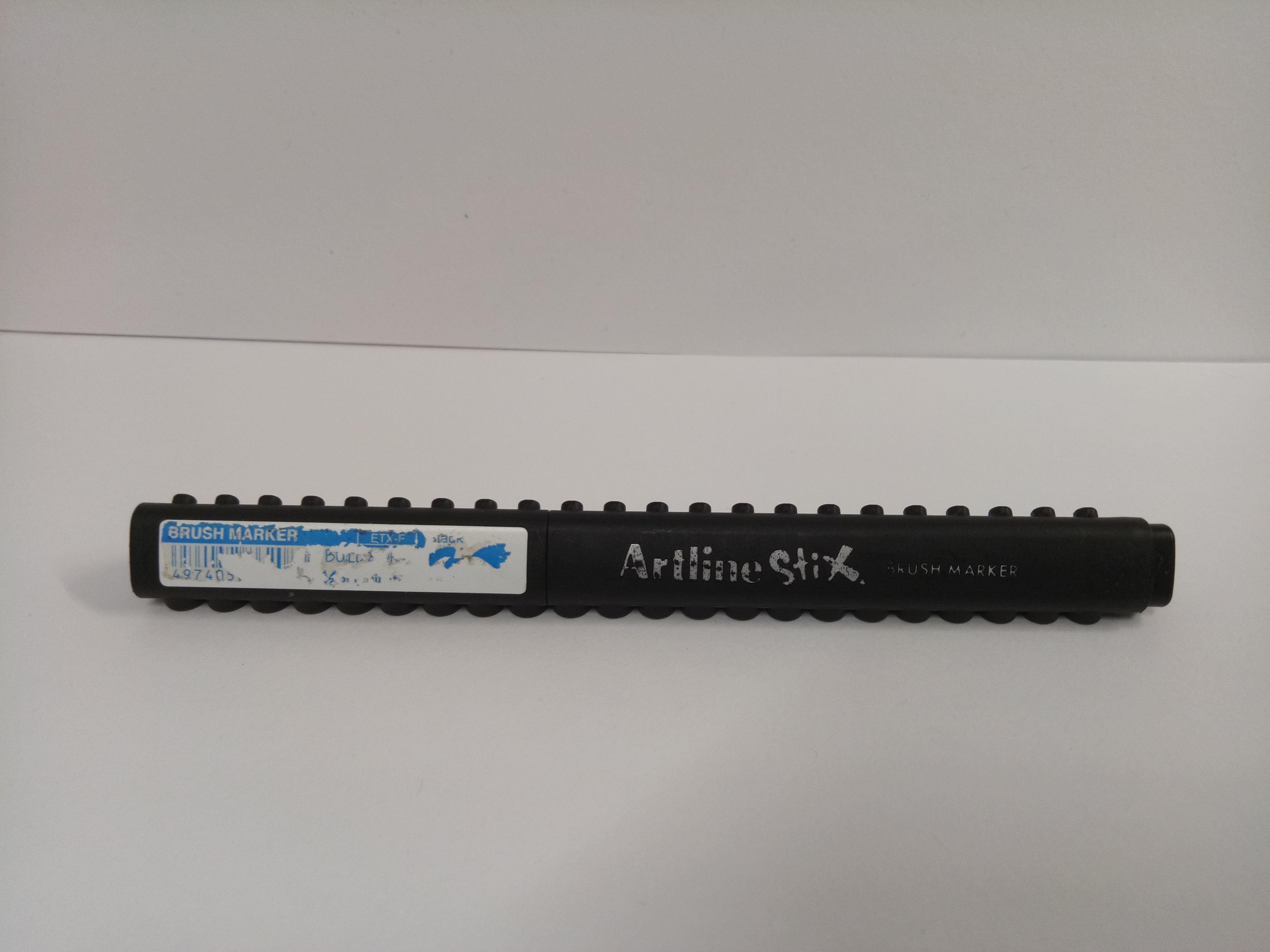
For the first F3D class, I brought my Artline Stix brush marker as a three-dimensionally interesting object.
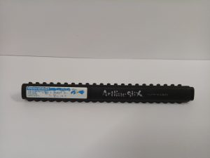
Here it is.
At first I am only intrigued by its triangular shape, which is different from normal markers or pens. However it’s actually much more interesting than that. Let us analyze it one by one.
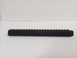
1. SHAPE
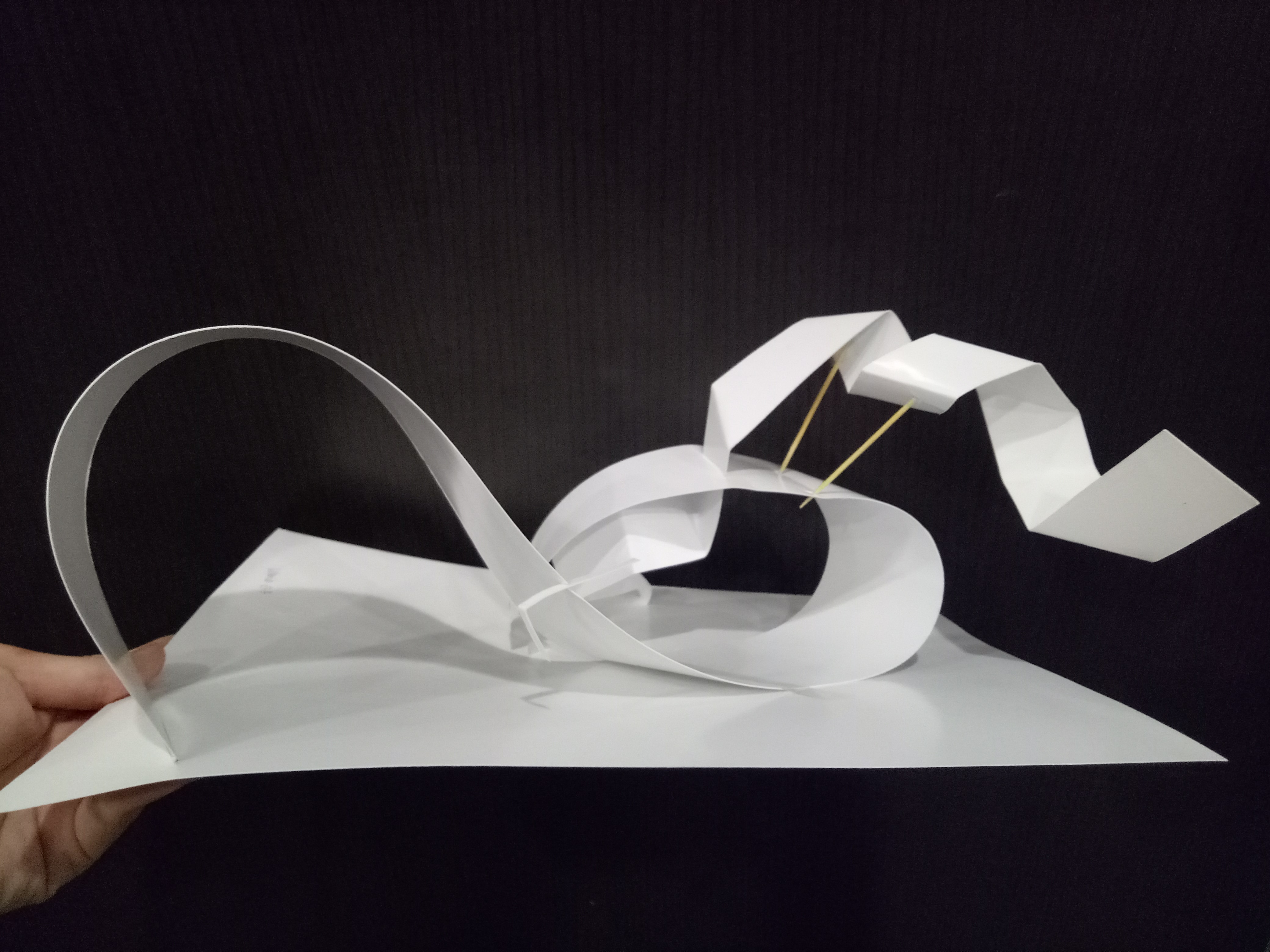
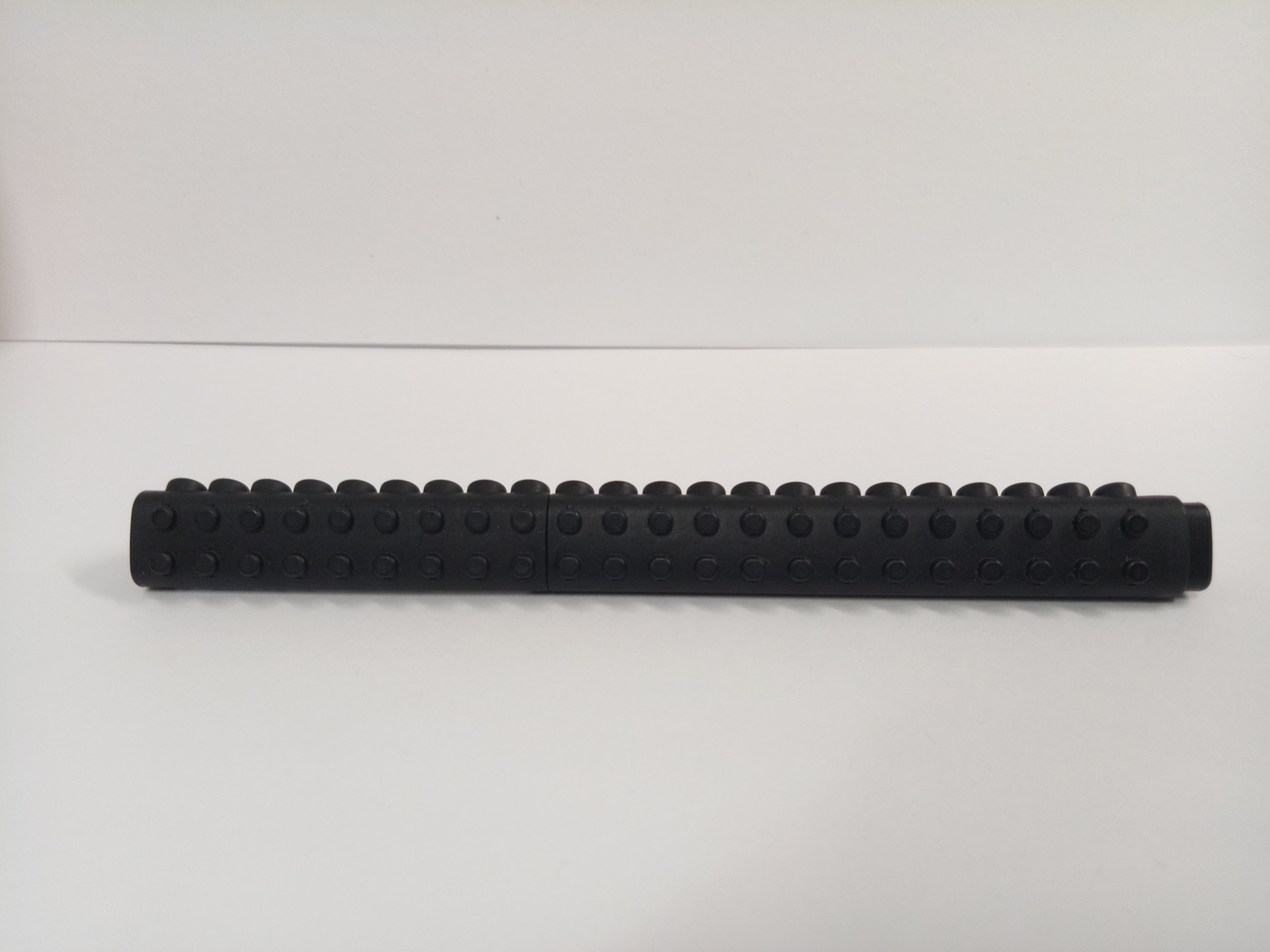
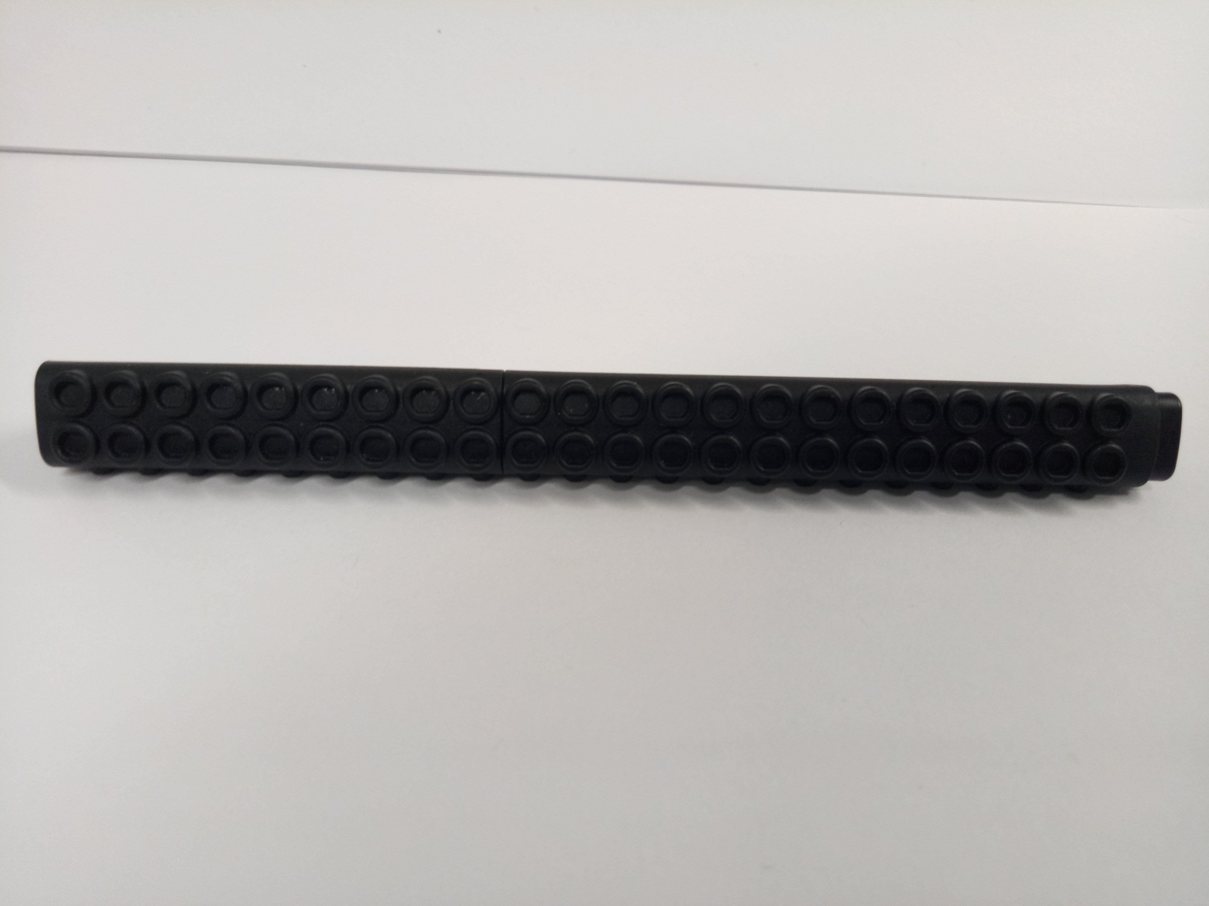
As I have mentioned above, the shape of the marker is like a triangular prism, not cylindrical like commonly found markers. If we draw the principle axis through the center of the marker, we can see that the marker is almost symmetrical. Almost, because interestingly, all three sides of the marker have different faces.
First, there’s the plain side. (Refer to the picture above.)
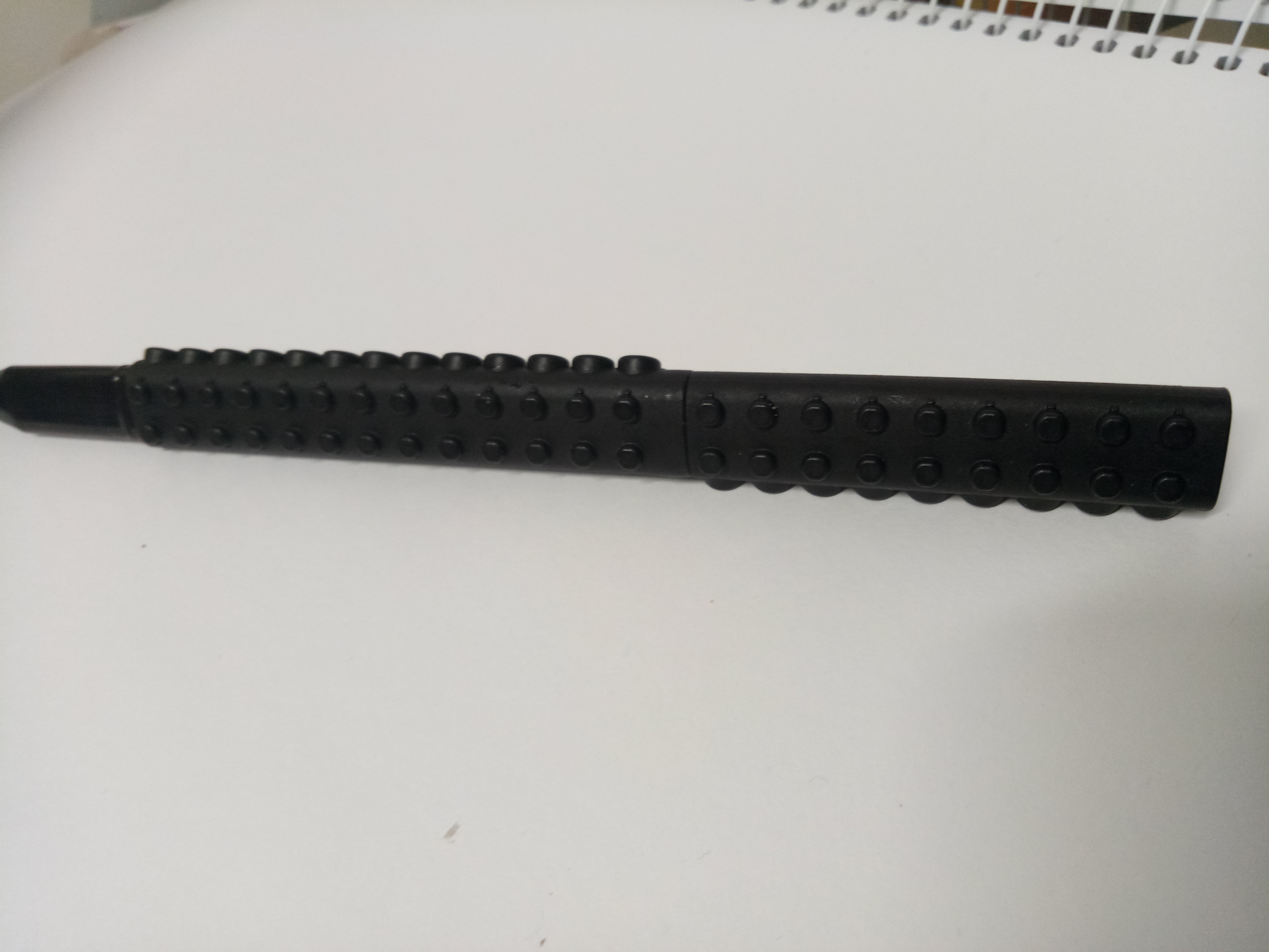
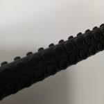
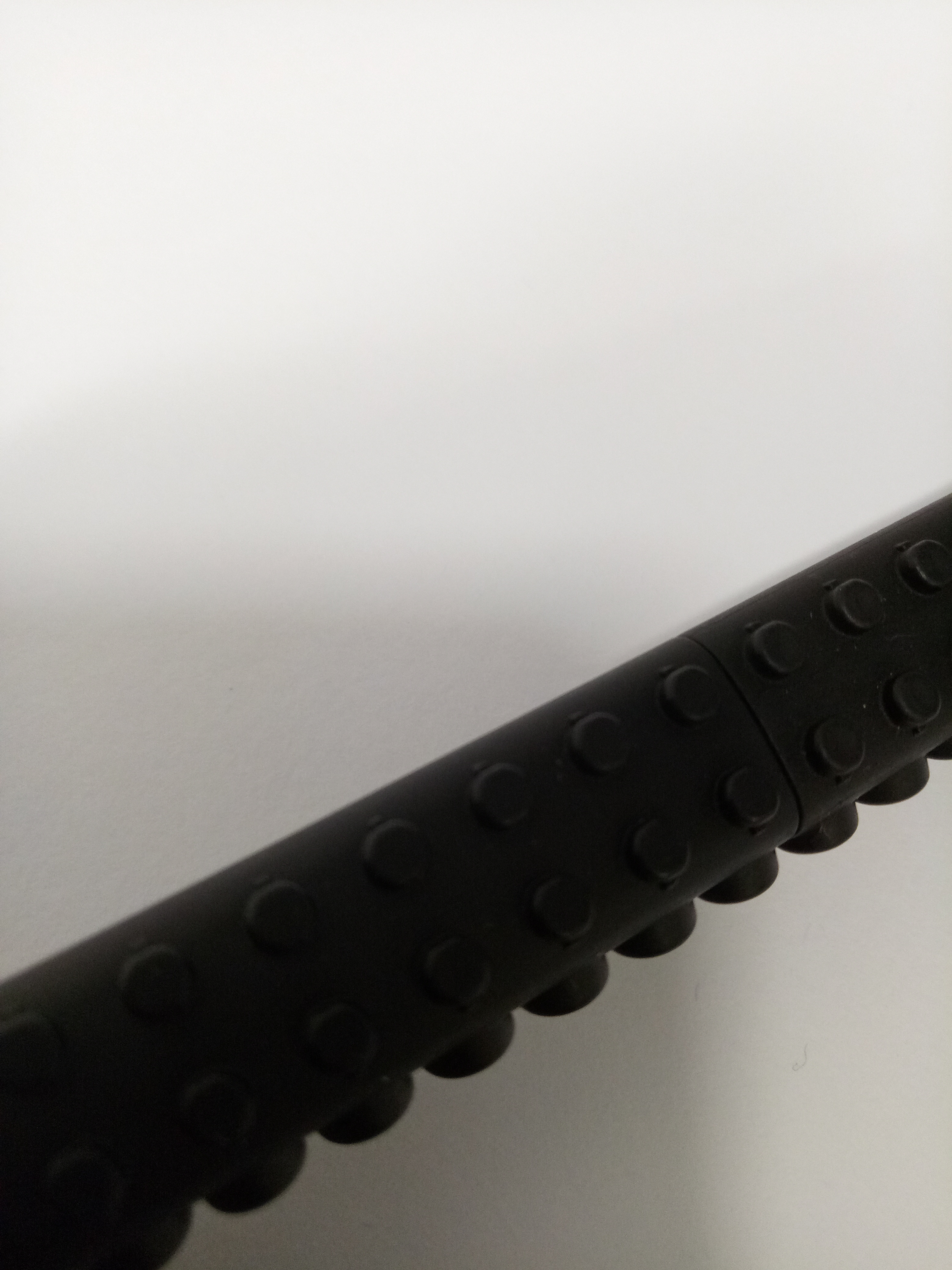
Second, there’s the side with small convex cylinders.
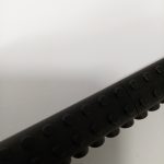 Zoomed in.
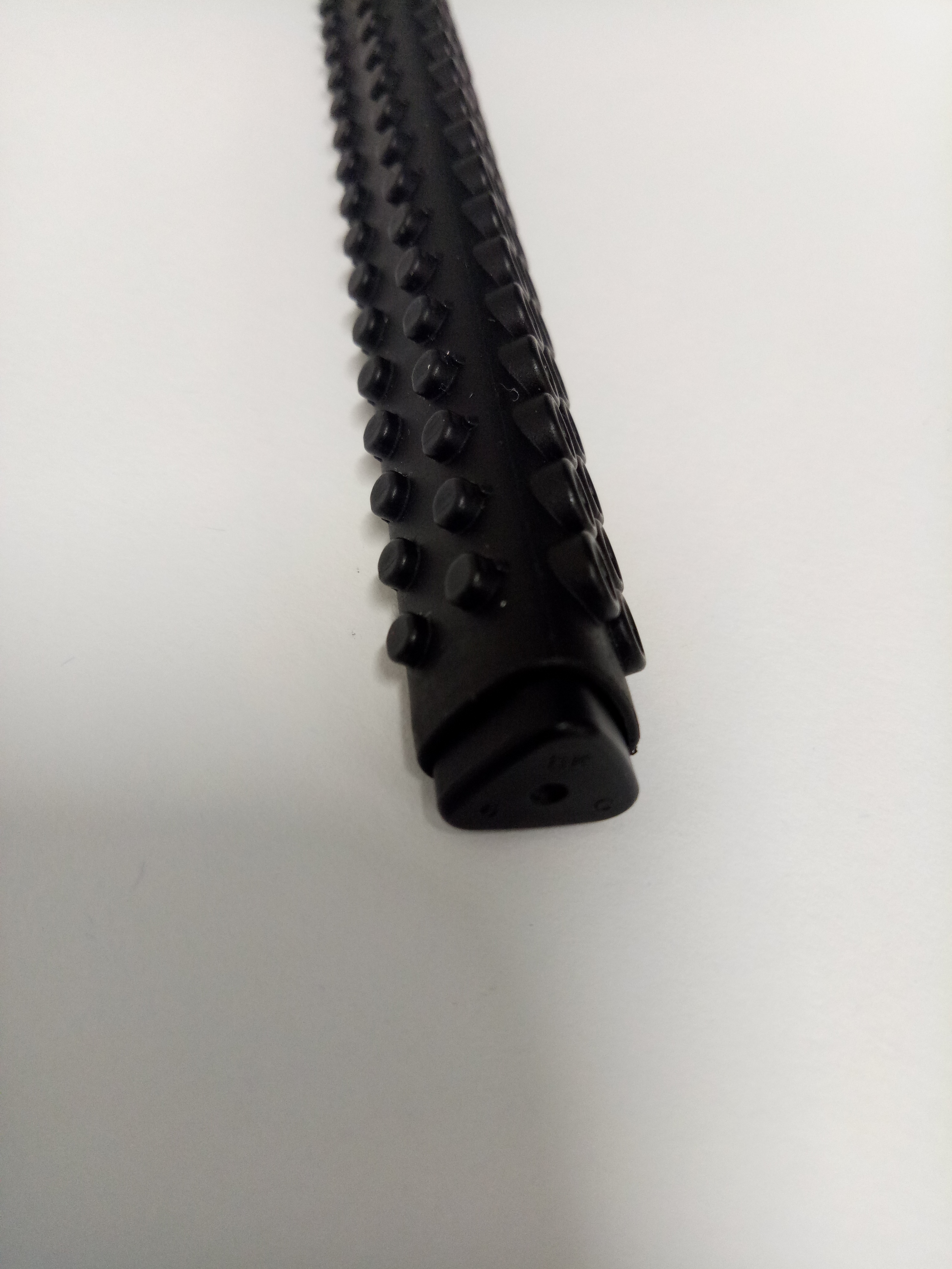
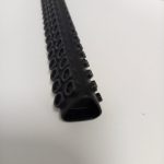
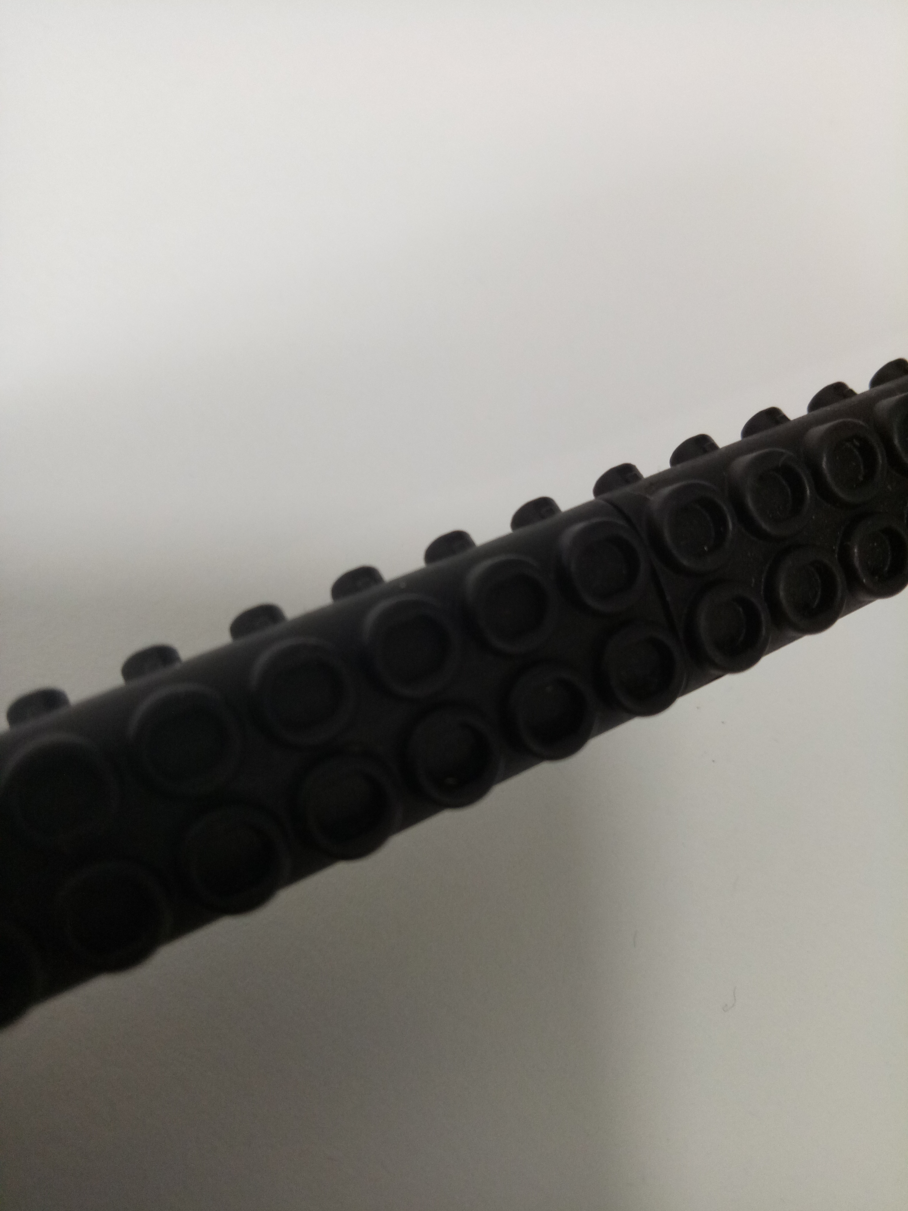
Third, there’s the side with small concave cylinders.
 Zoomed in.
Those different shapes add to the contrast in a single marker. In addition, the convex cylinders fit into the concave ones, just like Lego! So if you have a bunch of them, you can stick them all together and make a circle. (Sadly I only have one.)
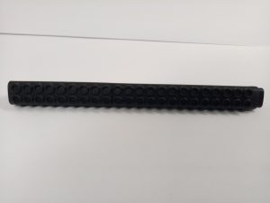
The small cylinders are also uniformly distributed throughout the body of the marker, making it look like a repetition (cross-section?).
The convex-concave contrast is also apparent at the top and bottom of the marker. And yes, they fit too. (Wow.)
Bottom (concave)
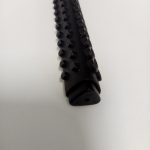
Top (convex)
They fit!
I find it very interesting that in a single marker, there are so much contrast, yet they can complement each other as well. It provides some kind of visual balance.
2. SIZE / PROPORTION
The sizes of the convex and concave cylinders on the marker’s sides are small compared to the body of the marker, so for the relative proportion… I’d say those cylinders are XS while the pen is like M or L? Probably M, but I can’t be sure. It provides a pair of contrasting volumes within the marker, and cluster of similar volumes as well (because the cylinders are “repeating” on their own sides).
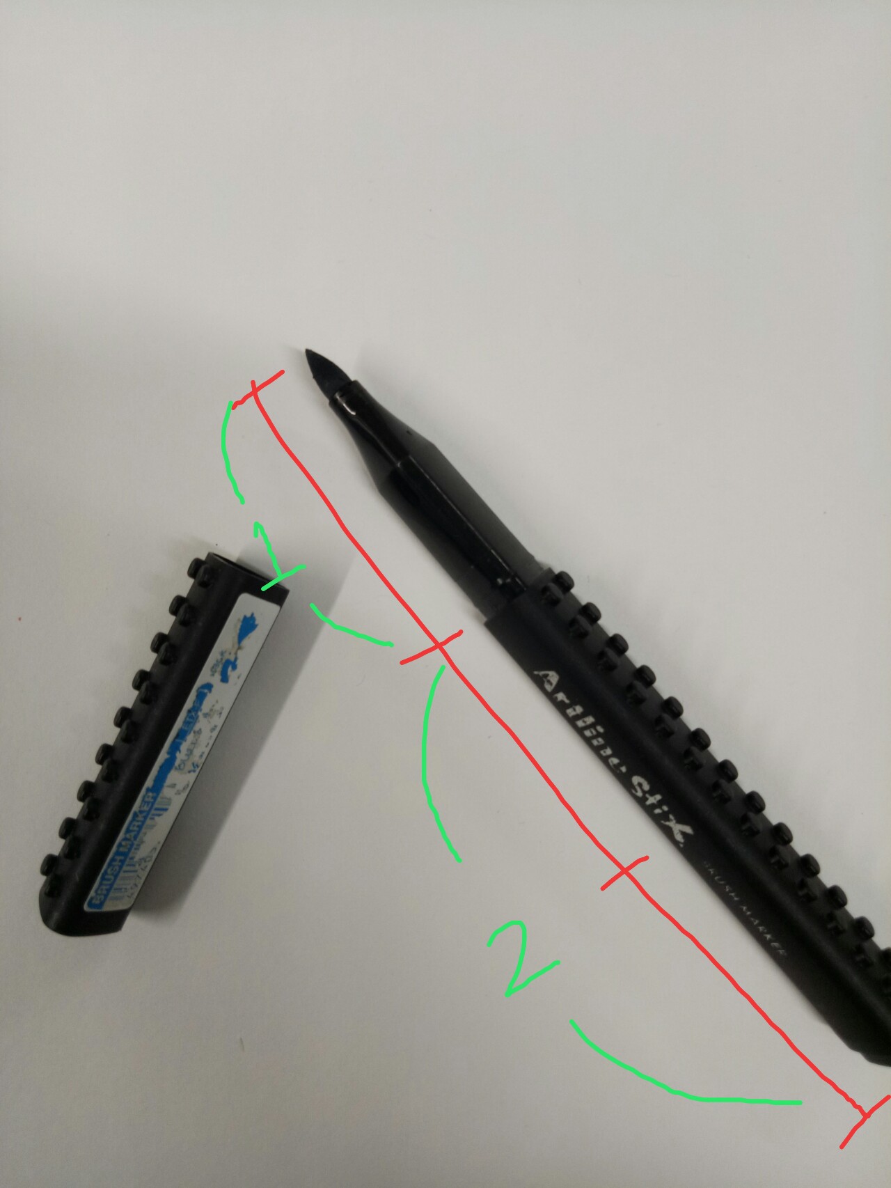
If you uncap the marker, you can also see the application of the rule of thirds! The length from the marker tip to the point where it’s supposed to be capped is roughly one-third of the whole body length of the marker.
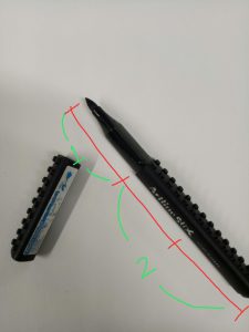
Rough proportion.
Also, this might be wrong but I feel that the proportion of the positive-negative space is also applying the rule of thirds. As I have mentioned, the marker has three different sides, where two of them are covered with little cylinders (positive space?) and one of them is plain (negative space?). The presence of the plain side prevents the marker from looking too bulky and, again, giving balance to the whole look.
3. COLOR AND TEXTURE
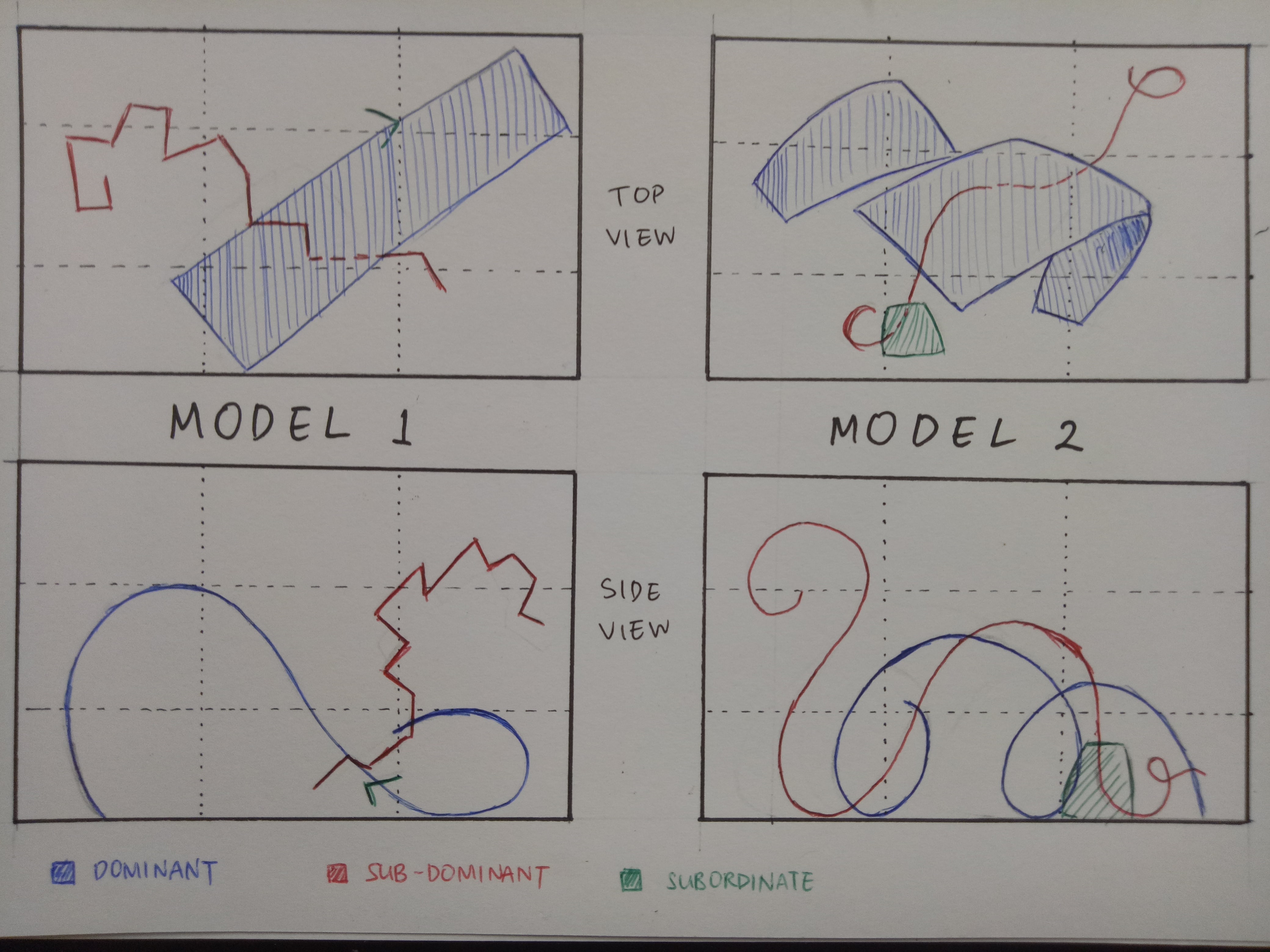
As for color, we can see the brand name in shiny silver against the all-black body clearly, hence straight away drawing our attention to it and putting emphasis on the brand although the body of the marker is actually pretty interesting. Well-played, I’d say. The silver shine adds “magic” to the marker, so I guess it is the subordinate whereas the all-black body is the dominant and the small cylinders on the sides are the subdominant. (I might be wrong about this.)
As for texture, when the marker is uncapped, we can see that while the body is matte black, the part between the tip and the body is glossy black. (You can see the difference from the picture above.) Although both of them are still black (which emphasizes that they are still one entity), the difference in texture emphasizes that they are of different parts. The glossy part is somehow smoother, so it is easy to slide your fingers there; but the matte part isn’t very smooth that your hand won’t slip easily while gripping the marker. They both complement each other not only in tactile experience, but also in function.
Moreover, the texture is a bit different between the marker sides (comparing the sides with cylinders and without cylinders). The plain side is slightly smoother compared to the sides with cylinders, so if you turn it while gripping it, you can actually experience slightly different feelings. Even the concave-cylinders side have a slightly different texture compared to the convex-cylinders side. I am genuinely amused by this marker now.
I know I might have gotten some things wrong, so please correct me if you find a mistake or a point to elaborate. Thank you!


 Zoomed in.